Sunday, June 30, 2024

Nitro Deck+ review: a slick upgrade, but not a transformative one

Two-minute review

Peripherals manufacturer CRKD is back with the Nitro Deck+, an upgraded version of its fantastic Nitro Deck handheld Switch dock/controller. While said upgrades here essentially boil down to a handful of quality-of-life improvements, these changes make the Nitro Deck+ unequivocally the best product the manufacturer has put out so far. But it’s not necessarily the one that offers the best value for money.

The Nitro Deck+ features a slick translucent shell not unlike the Crystal Collection limited edition variants of the original model. It offers six remappable buttons as opposed to the original’s four, comes packaged with an HDMI adapter that allows you to play on the TV and an improved kickstand that feels notably less stiff and fiddly.

Performance remains excellent across the board, with class-leading Hall Effect thumbsticks that effectively eliminate the risk of drift. The face buttons, extra remappable buttons, and bumpers all still feel snappy, responsive, and tactile - though the mushy triggers of the original Nitro Deck sadly remain here. It, unfortunately, hasn’t lost any weight off of the original model either, meaning that one of its few real drawbacks - the overall bulkiness - hasn’t been improved upon.

Price is also a bit of a sticking point, costing notably more than standard edition Nitro Decks while coming in at the same price as its many special editions. On top of this, the bundle that includes the HDMI adapter costs slightly more on top. As a result, it’s tough to recommend the upgrade to existing Nitro Deck owners when the overall improvements are slight.

That being said, the Nitro Deck+ is still easily one of the best Nintendo Switch controllers and one you should consider if you haven’t already purchased the original Nitro Deck. It also helps that customization via the CRKD Ctrl app is excellent, allowing users to fine-tune the feel of the controller and its various modules to a high degree.

Nitro Deck Plus

(Image credit: Future)

Price and availability

  •  $69.99 / £69.99 list price 
  •  $79.99 / £79.99 for the controller bundled with a HDMI adapter 
  •  Considerably more than the standard Nitro Deck ($49.99 / £49.99) 

If you’re looking to purchase the Nitro Deck+, it’s available to buy right now from CRKD’s website for $69.99 / £69.99 (around AU$99). At this price, you’re getting the peripheral itself as well as a lovely microfiber string bag that I feel is a cut above most carry cases thanks to its luscious build quality and adjustable strap.

At $79.99 / £79.99, you can nab a bundle that includes the Nitro Deck+, carry case, and a USB-C to HDMI adapter that’ll transfer the Switch’s output to your TV, allowing you to play on a larger display while your console is still docked in the Deck.

The Nitro Deck+ is a good deal pricier than the standard Nitro Deck model ($49.99 / £49.99) and the same price as most of its limited edition bundles ($69.99 / £69.99). You’re also looking at $10 / £10 more than that for the inclusion of that HDMI adapter. Unless you really like the idea of playing on your TV with the Nitro Deck+, we’d recommend opting for the version without the adapter to save yourself some cash.

Specs
Nitro Deck Plus

(Image credit: Future)

Design and features

  •  Exceptional build quality 
  •  Like a suit of armor for your Switch 
  •  Fairly bulky with Switch docked 

The Nitro Deck+ brings a number of improvements to the table in terms of build quality and aspects of its design. Like the base model, it feels sturdy in the hands while you’ve got the Switch tablet docked in. And while we’re happy its superb build quality carries over to this new model, there hasn’t really been any effort to shed some of the device’s size and weight. If you’re heading out and about, expect that half-a-kilo weight (including the Switch) to feel quite bulky during lengthier play sessions. Thankfully, the included carry case, made from lovely microfiber material, does alleviate this with its high-quality design and over-the-shoulder strap for ease of portability.

There have been some excellent improvements over the base model, mind. The new metallic thumbsticks feel fantastic, backed up once again by Hall sensors that help to greatly reduce the risk of stick drift. We also noted that the rear remappable buttons feel a good deal more tactile here, and the addition of two more on either side of the Nitro Deck+ is welcome if you want to customize your button layout to a higher degree.

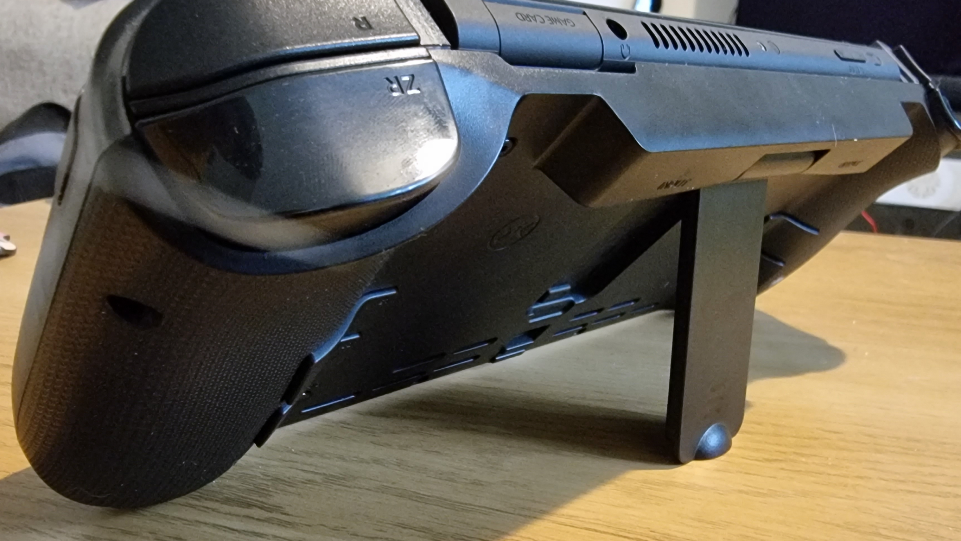
On the back of the Nitro Deck+, you’ve still got an adjustable kickstand and an eject slider used for undocking the Switch tablet. These both feel far sturdier here; on the original Nitro Deck, the kickstand was quite fiddly and often refused to click back into its resting position. That’s no longer the case with the Deck+, making it excellent for setting up on your desk for YouTube viewing or for playing touch-based games.

Nitro Deck Plus

(Image credit: Future)

Performance

  •  Improvements to sticks and remappable buttons 
  •  Fantastic mobile app-based software 
  •  USB-C to HDMI connectivity is more suited to playing on a monitor 

The Nitro Deck+ remains a fantastic option for handheld play, thanks to improvements to its various modules as mentioned above. While face buttons, D-pad, bumpers, and triggers are all comparable to the original model, those upgraded thumbsticks and remappable buttons make portable play feel more responsive and tactile than ever.

We found the Nitro Deck+ to be a fantastic controller for the recently-launched Super Monkey Ball Banana Rumble. Its tiltable obstacle courses often require pinpoint precision with the analog stick, and the Deck is more than up to the task here thanks to ultra-responsive sticks and Hall-sensing technology.

One thing worth noting is that the analog stick layout has been swapped around on the Nitro Deck+. The sticks here are symmetrical, as opposed to the asymmetrical layout found on the base Nitro Deck. This did take some getting used to, being so familiar with that original design, and there’s certainly some awkwardness involved in having to move your thumb downwards to access the face buttons. But after a period of adjustment, it felt no worse to play the best Nintendo Switch games here.

Now let’s talk about the Nitro Deck+’s HDMI compatibility. The USB-C to HDMI adapter allows you to play games on your telly while your console is docked in the Nitro Deck+. It’s perfectly responsive, and we didn’t note any kind of intrusive input latency playing games this way. However, we feel it’s an incredibly niche way to play your Switch games and somewhat defeats the purpose of the Nitro Deck’s incredible portability factor. 

Furthermore, the cable is extremely short, meaning you’ll likely have to play sitting quite close to your TV. That being said, it is a solid option if you have a monitor and gaming desk setup, and this feels like the intended way of using that HDMI adapter given the shorter distance required.

Lastly, the accompanying CRKD Ctrl app - available for both Android and iOS - is an extremely robust app that lets you perform firmware updates for your Nitro Deck+, as well as customize pretty much every aspect of your controller’s performance. That includes stick dead zones, remapping those ancillary buttons (as well as all standard buttons, bumpers, and triggers should you desire or need), vibration strength, and trigger sensitivity. It’s one of the most intricate pieces of software we’ve seen for a Nintendo Switch controller and is perfect for players who really like to tailor their play experience to their specific preferences.

Nitro Deck Plus

(Image credit: Future)

Should I buy the Nitro Deck+?

Buy it if...

You want the best handheld play experience on Switch
With superb customization and luxurious build quality, the Nitro Deck+ is essential for players who prefer going handheld with their Switch console.

You enjoy customizing your experience to a granular degree
The CRKD Ctrl app is fantastic for tailoring a personal play experience. With it, you can adjust your stick’s dead zones, trigger sensitivity, rumble strength, and more.

Don't buy it if...

You already own a Nitro Deck
The $69.99 / £69.99 asking price for the Nitro Deck+ is pretty steep when the experience is quite comparable to the base model outside of some slight upgrades.

Also consider...

If the Nitro Deck+ isn’t quite what you’re looking for, we recommend checking out the following Nintendo Switch controllers. We recommend these in confidence if, say, you’re after something cheaper or would simply prefer a more traditionally-designed gamepad.
Nitro Deck
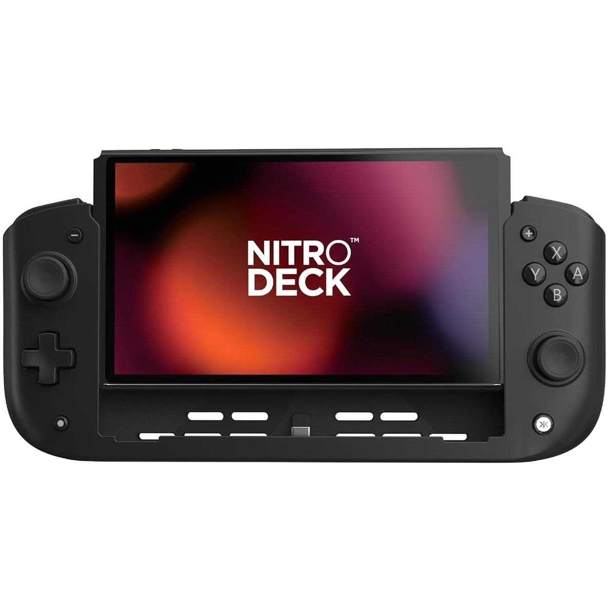
The standard Nitro Deck tops our best Nintendo Switch accessories list for a reason; it’s simply the finest portable experience you can have with the console at its price point. It’s very similar to the Nitro Deck+ minus a few improvements. We’d consider checking out this base model if the Nitro Deck+ is a little beyond your price range.

Read more in our full Nitro Deck review.
8BitDo Ultimate
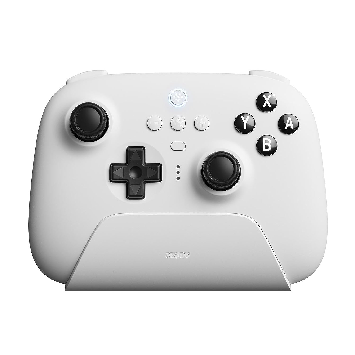
One of the very best third-party Nintendo Switch controllers, it packs phenomenal value for money by coming with its own charging dock, 2.4GHz dongle as well as PC and SteamOS support if you prefer to play on Steam Deck.

Read more in our full 8BitDo Ultimate review.

How I tested the Nitro Deck+

  •  Tested over two weeks almost every day 
  •  Compared against the standard Nitro Deck 
  •  Played in handheld, and on TV and a gaming monitor via the HDMI adapter 

I tested the Nitro Deck+ over the course of about a week and a half with several Nintendo Switch games including Super Monkey Ball Banana Rumble, Paper Mario: The Thousand-Year Door, Splatoon 3, and Endless Ocean Luminous. I felt that these games are all well-suited to the Nitro Deck+’s improvements including those lovely metallic Hall effect sticks, gyro support, and a wealth of remappable buttons.

I made sure to test the device across all supported formats, including handheld as well as play on TV and a monitor via the USB-C to HDMI adapter. While I maintain that there’s niche appeal to the latter methods, playing on a gaming monitor with the Nitro Deck+ was a fantastic and responsive experience that’s well-suited to Switch games’ relatively lower resolutions.

First reviewed June 2024
Astell & Kern HC4 review: a petite but powerful DAC that sometimes oversteps the mark

Astell & Kern HC4: Two-minute review

Astell & Kern is no stranger to digital audio in all shapes and sizes, and the A&K HC4 is its latest attempt to coax worthwhile sound quality from your smartphone or laptop – and for good measure, it’s got strong gaming credentials too.

It’s a thoroughly specified little device, from its high-end AKM AK4493S DAC chipset via its balanced and unbalanced headphone outputs to its support for UAC 1.0 as well as UAC 2.0 to ensure compatibility with as many gaming devices as possible. Its aluminium construction looks and feels smart, too – so while there’s not much of it, the AK HC4 nevertheless appears to offer decent value for money.

And when it comes to its single function – taking the digital audio information from your source device and converting it to the analogue equivalent – there’s plenty to admire here. The HC4 sounds big and organised, and extracts a lot of detail from a recording – it’s a peppy and informative listen. It overplays its hand somewhat where the highest frequencies are concerned, though, giving treble sounds a rather insubstantial and unyielding edge that is at odds with the rest of the work it’s doing. In a competitive and saturated market, then, does the A&K's plucky performance still make it one the best portable DACs going for the money? Let's see. 

Astell & Kern HC4 review: Price and release date

Astell & Kern HC4 on a wooden table

(Image credit: Future)
  • Released in November 2023 
  • Priced at $220 / £219 / AUS399

The A&K HC4 portable headphone amp/DAC is available now for $220 in the United States, £219 in the United Kingdom and in Australia, it'll cost you AU$399 or somewhere closely in that region.

The world is hardly short of portable USB headphone amp/DACs, though, and while the A&K refreshingly undercuts the $499 / £449 / AU$769 iFi GO Bar Kensei, it's still dearer than the five-star iFi hip-dac 3 (which can be yours for $199 / £199 / AU$349). 

So, competition is fierce at the level, and missteps will likely have repercussions. 

Astell & Kern HC4 review: Features

Astell & Kern HC4 on a wooden table

(Image credit: Future)
  • AKM AK4493S DAC chipset
  • 3.5mm and 4.4mm outputs
  •  ‘Digital Audio Remaster’ technology

When it comes to features, you don’t have to read all that far down the HC4’s spec-sheet to realise that Astell & Kern is deadly serious. By prevailing standards, the feature-set here is formidable. 

The main business is taken care of by an AKM AK4493S DAC chipset that’s more commonly found doing its thing in (among many other devices) Astell & Kern’s well-regarded and witheringly expensive digital audio players. It’s compatible with every worthwhile digital audio file type, and is capable of dealing with content of up to 32bit/384kHz and DSD256 resolution.

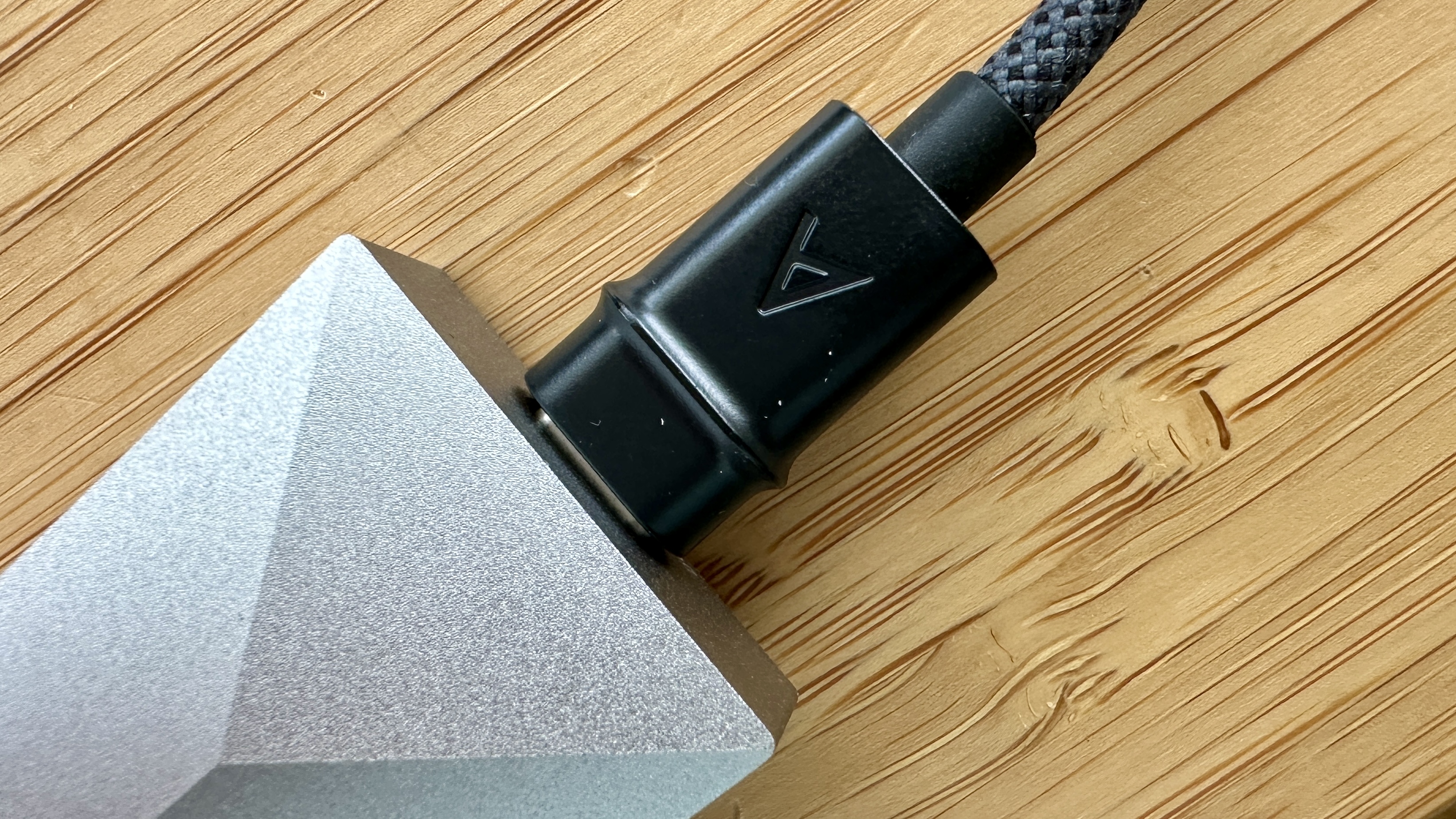
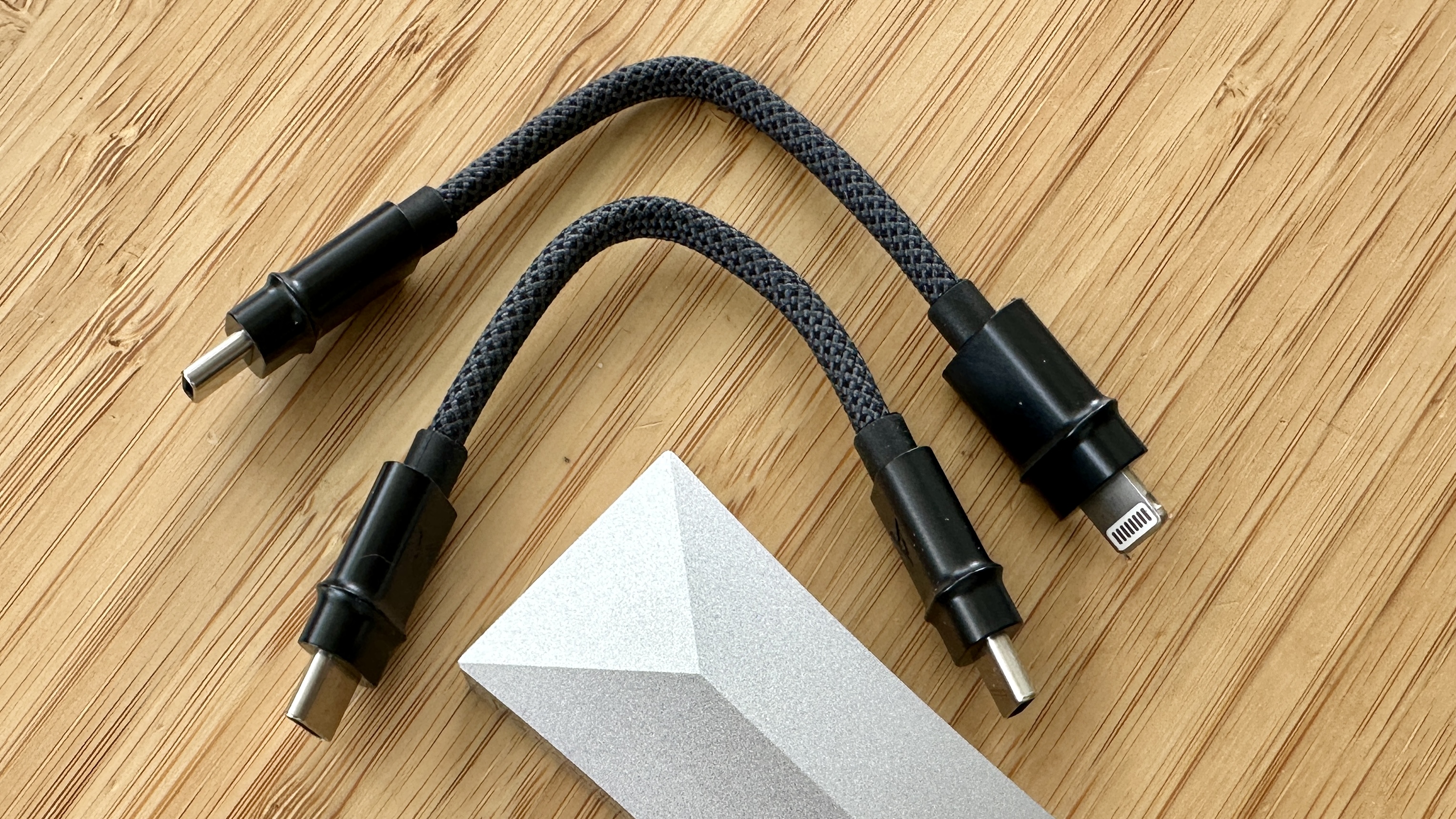
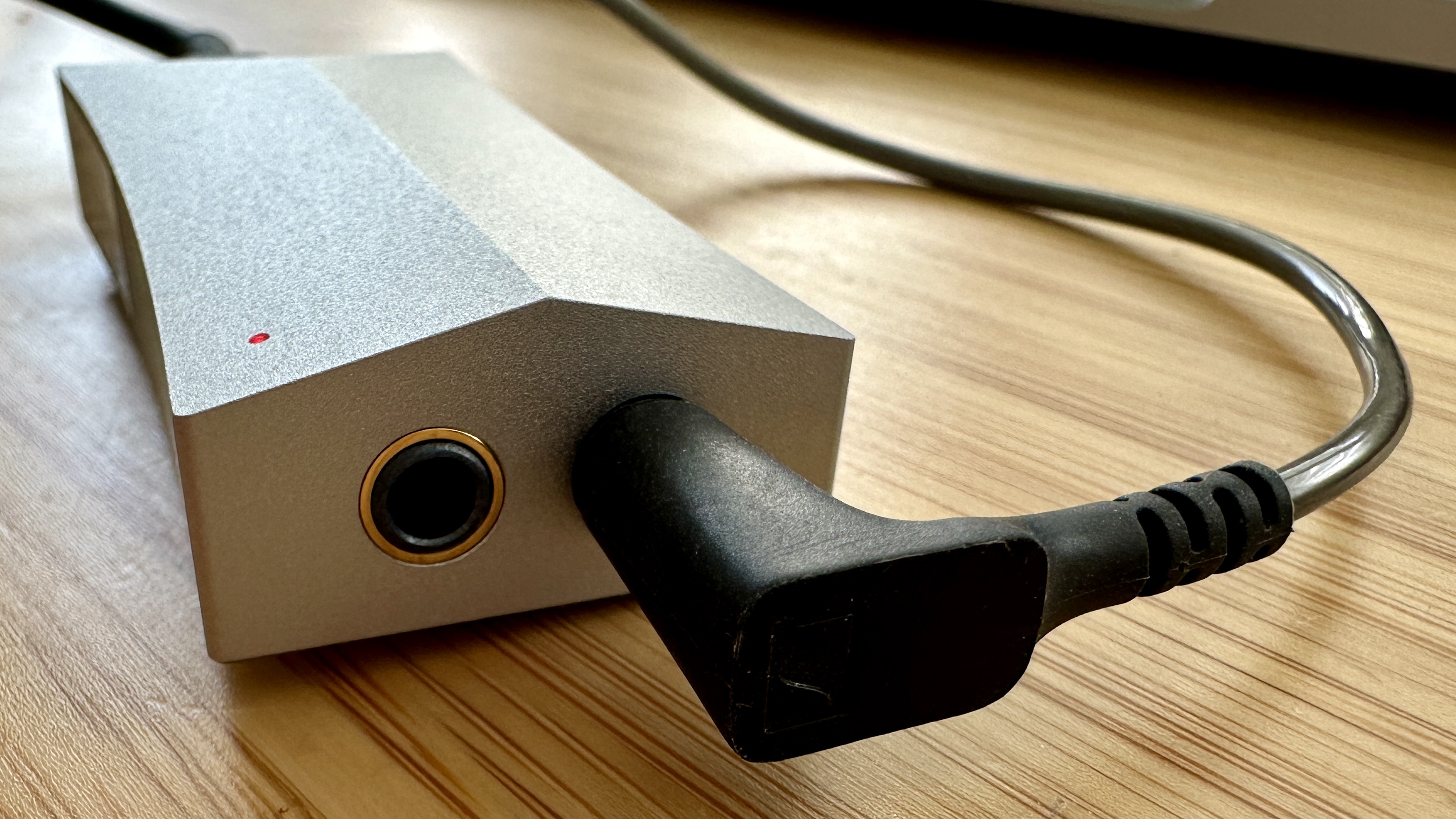
Getting the information into the HC4 in the first place happens via the USB-C slot on the bottom of the device - Astell & Kern provides both USB-C / USB-C and USB-C / Lightning cables to get the job done. Getting it out again happens using either the unbalanced 3.5mm socket or the balanced 4.4mm equivalent on the top – it’s worth noting the 4.4mm output only supports five-pole jacks. 

Another feature Astell & Kern has incorporated from its pricey digital audio players is ‘digital audio remaster’ technology – it is designed to upsample the native sample rate of the source material to go beyond the limits of the source format. Sounds like quite a trick, doesn’t it? Astell & Kern reckons it delivers – and I quote – “more refined playback and… a delicate, analogue-like sound”. 

And by way of an encore, Astell & Kern has ensured the AK HC4 is compatible with as wide a selection of devices as possible by making the device’s USB-C input supports UAC 1.0 as well as UAC 2.0. Almost every smartphone, laptop and tablet supports UAC 2.0, but there are plenty of gaming devices that are still UAC 1.0 – but if you want a low-latency connection to your Playstation, Switch or what-have-you, the HC4 has you covered.   

Features score: 5 / 5

Astell & Kern HC4 review: Sound quality

Astell & Kern HC4 on a wooden table

(Image credit: Future)
  • Detailed, informative sound
  • Open and well-defined presentation
  • Slightly skewed towards the top end

The AK HC4 is an admirably consistent device. During the course of this test I listened to 16bit/44.1kHz and 24bit/96kHz FLAC files via the Tidal app, loaded onto both iOS and Android smartphones, as well as some DSD128 stuff stored on the internal memory of a MacBook Pro. And while there are, of course, advantages to the higher-resolution stuff, the Astell & Kern doesn’t really alter its overall stance no matter what standard of content you’re listening to or the type of music you enjoy. Its fundamental attitude is always the same.

And in broad terms, it’s a revealing and explicit attitude. No matter if it’s the voice-and-guitar intimacy of Lua by Bright Eyes or the rather more complex Dirty Paws by Of Monsters and Men, the HC4 is able to see to the bottom of the mix and return with all sorts of information regarding tone and texture you may not previously have been aware of – certainly not if you’ve been listening directly from a smartphone to some wired or wireless headphones before now. 

Throughout the frequency range, detail levels are sky-high – and rather than draw attention to how clever and insightful it is, the HC4 puts everything into the correct context in order to poverty serve the recording. It’s dynamic both in the sense of ‘quiet/LOUD’ and where harmonic variations in a strummed guitar are concerned. And it creates a big, well-defined and easy-to-follow soundstage, and lays out a recording explicitly – but it doesn’t make any part of a recording sound remote from any other. There’s a singularity and idea of ‘performance’ to the sound of the HC4 that’s as enjoyable as it is impressive.

Low frequencies are substantial and properly controlled, so there’s never an issue where rhythms or tempos are concerned. The midrange is perhaps the greatest beneficiary of the A&K’s powers of analysis – there’s a stack of information about a vocalist available, and it makes for an immediate and positive description of a singer’s abilities and motivations.

It’s only at the top of the frequency range that things are anything less than fully impressive. There’s a glassiness and a rather relentless edge to the way the HC4 serves up treble information that a) puts it at odds with the rest of the frequency range where tonal balance is concerned, and b) discourages the listener from increasing volume levels much beyond ‘moderate’. The relative hardness and lack of substance to the top end makes those recordings with a high-frequency emphasis sound edgy – and overall it doesn’t make for all that relaxing an experience.  

Sound quality: 4 / 5 

Astell & Kern HC4 review: Design

Astell & Kern HC4 on a wooden table

(Image credit: Future)
  • 65 x 30 x 15mm (HxWxD) 
  • 31g 
  • Aluminium construction

There’s usually not a lot of scope for ‘design’ to happen when a product ideally needs to be as light and compact as possible. But this is Astell & Kern we’re dealing with here – you won’t be surprised to learn that the company has given it a good go where ‘design’ of the AK HC4 is concerned.

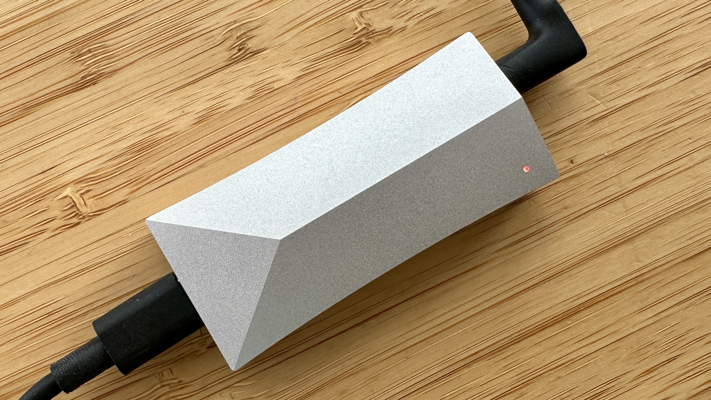
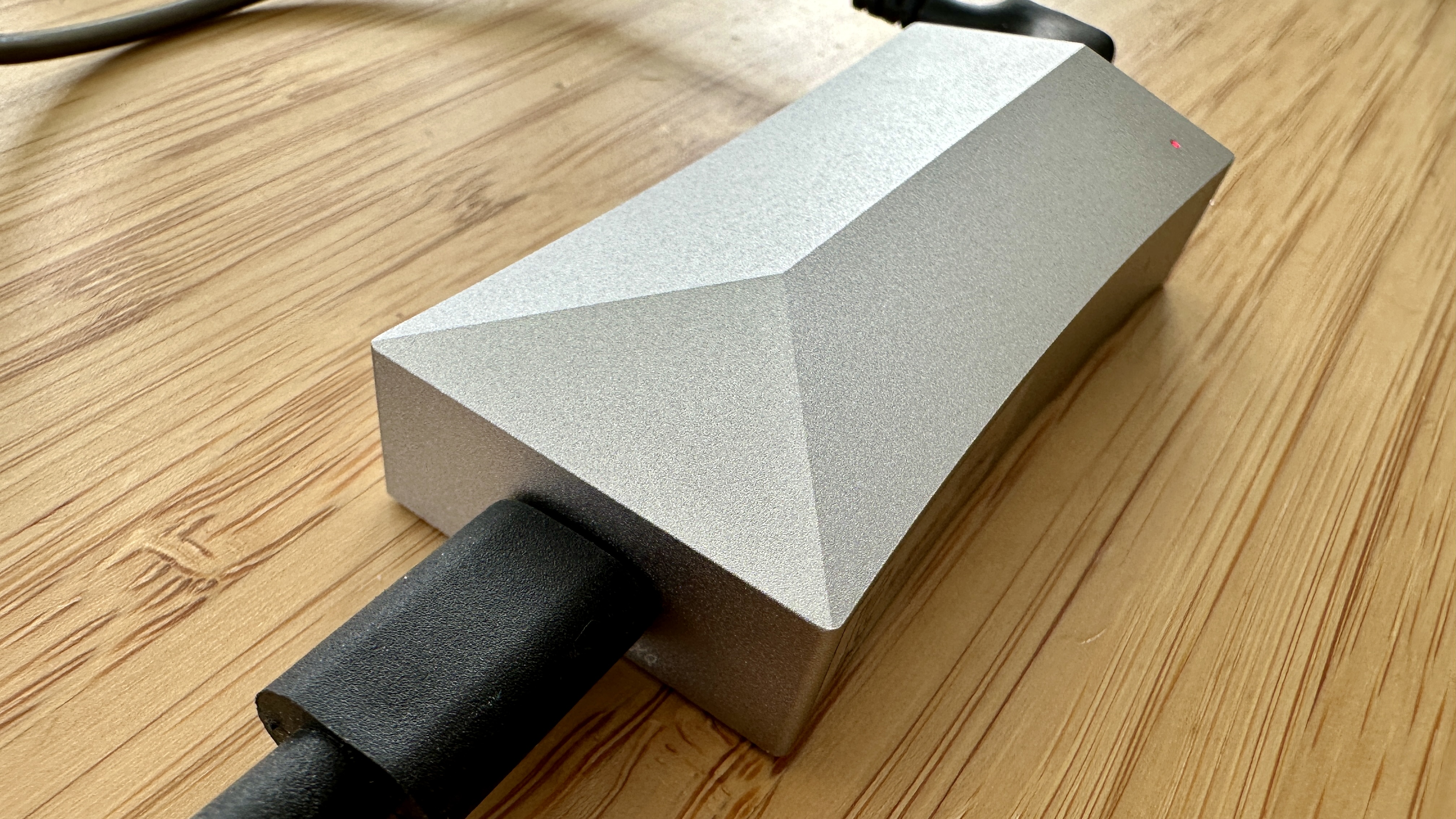
The all-aluminium construction keeps the weight of the device down to a trifling 31g. It also allows for a hint of the trademark Astell & Kern angularity on the top surface, and for the sides to be mildly curved in order to make the HC4 easily graspable. 

One of the curved sides features a shallow rocker switch and a DAR on/off slider. At one end of the chassis there’s the USB-C input, and at the other end the balanced 4.4mm and unbalanced 3.5mm outputs. Apart from a tiny LED (which lights up in white to indicate standby, red for PCM and blue for DSD audio files), that’s your lot. And frankly, I am tempted to ask what else you might reasonably be expecting? 

Design score: 5 / 5 

Astell & Kern HC4 review: Value

  • Priced in line with rivals
  • Not a nailed-on winner

Astell & Kern HC4 on a wooden table

(Image credit: Future)

Just as you can’t judge a book by its cover, you can’t judge the effectiveness of a piece of consumer electronics simply by how big and/or heavy it is. The AK HC4 may not look like much, but the effect it can have on your listening experience can’t be denied – so in this respect, it represents decent value. 

When you compare it to the best of its rivals, though, it ceases to be a nailed-on favourite and becomes more of an interesting option… which probably undermines its value-for-money credentials somewhat.

Value score: 3.5 / 5 

Should I buy the Astell & Kern HC4 review:?

Buy it if...

Don't buy it if...

Astell & Kern HC4 review: Also consider

iFi hip-dac 3
Now, you do get the looks; it's even styled like a hip-flask. This likeable, cheaper DAC won't fit in your pocket quite as easily as the A&K HC4 but it's nothing if not a conversation starter – and a talented one soncially at that.
Read our in-depth, five-star iFi hip-dac 3 review.

How I tested the Astell & Kern HC4

  • Used for over a week (after a thorough running in)
  • Tidal and Qobuz were go-tos, using various headphones/IEMs

I spent over a week listening to the Astell & Kern HC4, using Apple iPhone 14 Pro and Samsung Galaxy S23 smartphones. I connected it to Sennheiser IE900 in-ear monitors via its 4.4mm balanced output and to a pair of Grado SR80x using its 3.5mm connection. 

I used it at home, navigating traffic, and on the train. I listened to music almost exclusively from Tidal and Qobuz (since these streaming services are full of high-resolution content and 24bit/192kHz standard), and I made sure to check for connectivity and cable noise as I did so (you're fine there). 

KitchenAid 7 cup / 1.7L Food Processor review: convenient but costly

KitchenAid 7-cup Food Processor: two-minute review

Product info

This model has slightly different names and product codes in different territories:

US: KitchenAid 7 Cup Food Processor KFP0718
UK: KitchenAid Food Processor 1.7L 5KFP0719
AU: KitchenAid 7 Cup Food Processor KFP0719

The products with 719 in their codes have extra accessories, specifically a thick-slice disc, and a plastic dough blade. For this review, I tested the UK model. There may be minor differences between different countries' models.

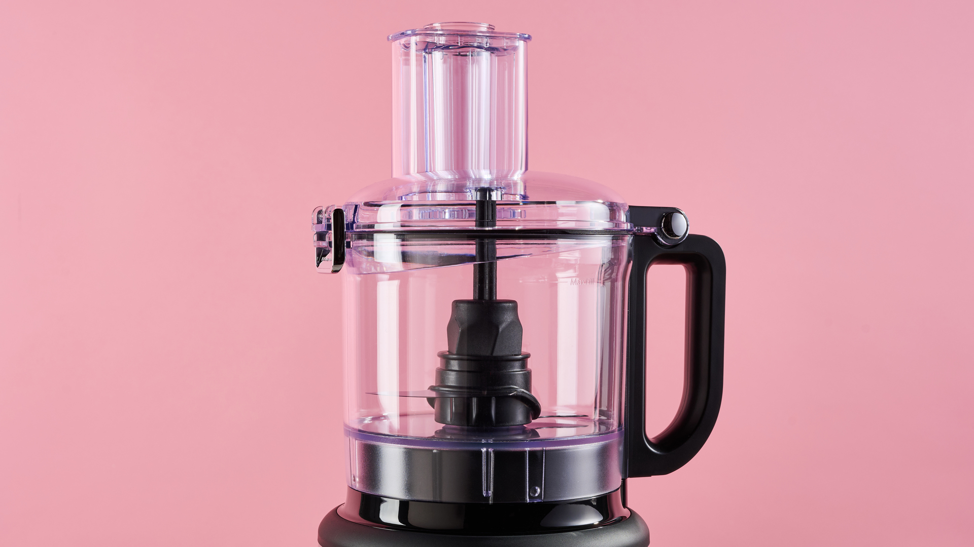
The KitchenAid 7 cup Food Processor (known as the KitchenAid Food Processor 1.7L in the UK) is compact, thoughtfully designed and has proven to be a great time saver when meal prepping.

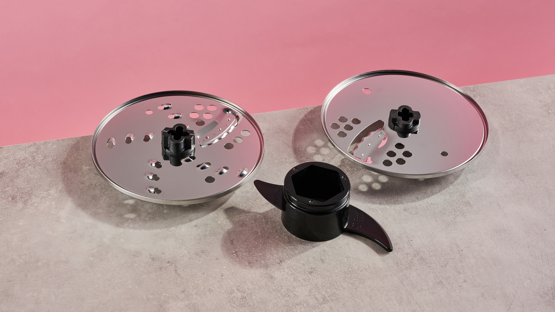
Something to mention straight off the bat is that the UK and Australian models have a couple more accessories than the US model, which is reflected in the price. At the time of writing, the 7 cup / 1.7L Food Processor is on sale for $84.99 / £143.65 / AU$219, while the list price is $99.99 / £169 / AU$299. The US model KFP0718 is essentially the same as the UK and Australian KFP0719 models, with all models coming with a multipurpose stainless steel blade and a reversible slicing and shredding disc, but only the UK and Australian models coming with a thick-slice disc and a plastic dough blade. For this review, I tested the UK version of the KitchenAid Food Processor 1.7L.

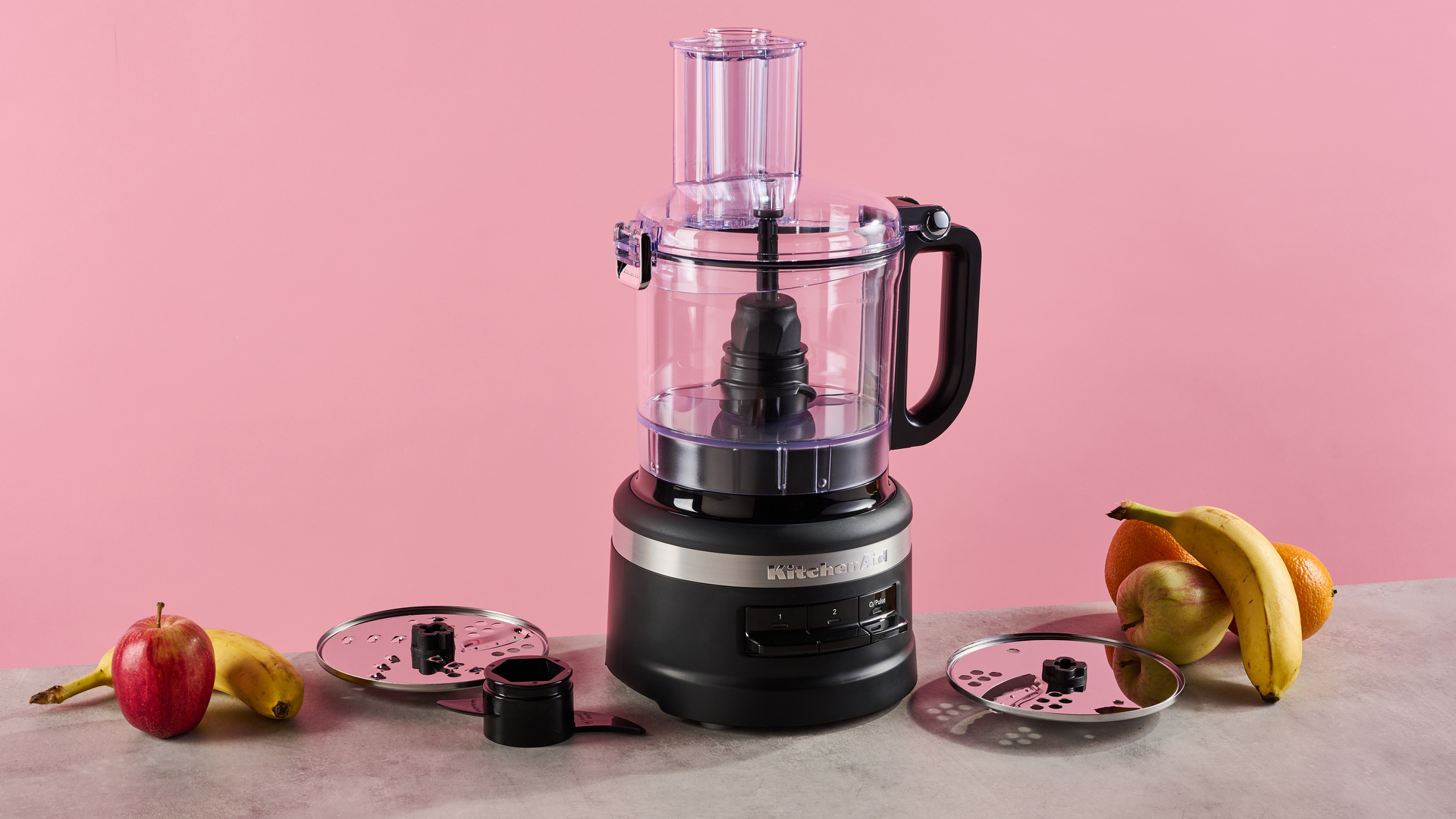
A matte black KitchenAid 7 cup food processor is pictured against a pink background. It is sitting on a grey stone-effect surface on which also sites the reversible slicing and grating disc on the left, with the plastic dough hook positioned just in front, and to the right, the thick slice disc that is only available with the KFP0719 configuration.

(Image credit: Future)

Setting up the KitchenAid 7 cup / 1.7L Food Processor was straightforward. All of the accessories were neatly stored inside the work bowl, which is a convenient feature, saving you from cupboard-diving each time you want to process something. And the accessories fit into place with ease: there are markers on the top of the disc and the drive shaft to ensure you place it in the correct position for either processing or storing. 

The 7 cup / 1.7L Food Processor is available in a range of colors that will fit in with most kitchen decors. It doesn’t take up unnecessary space, measuring 9.7 x 7.7 x 15.4 inches / 245 x 195 x 390mm and weighing just 6.6lb / 3kg. The work bowl easily clicked into place every time thanks to its convenient twist-free design, and although I had the occasional issue putting enough pressure on the lid to get the latch to shut, the lift-out design of the hinge made it simple to remove. One downside with the design, however, is that the work bowl handle can only be positioned on the right-hand side, which could prove inconvenient for some users. 

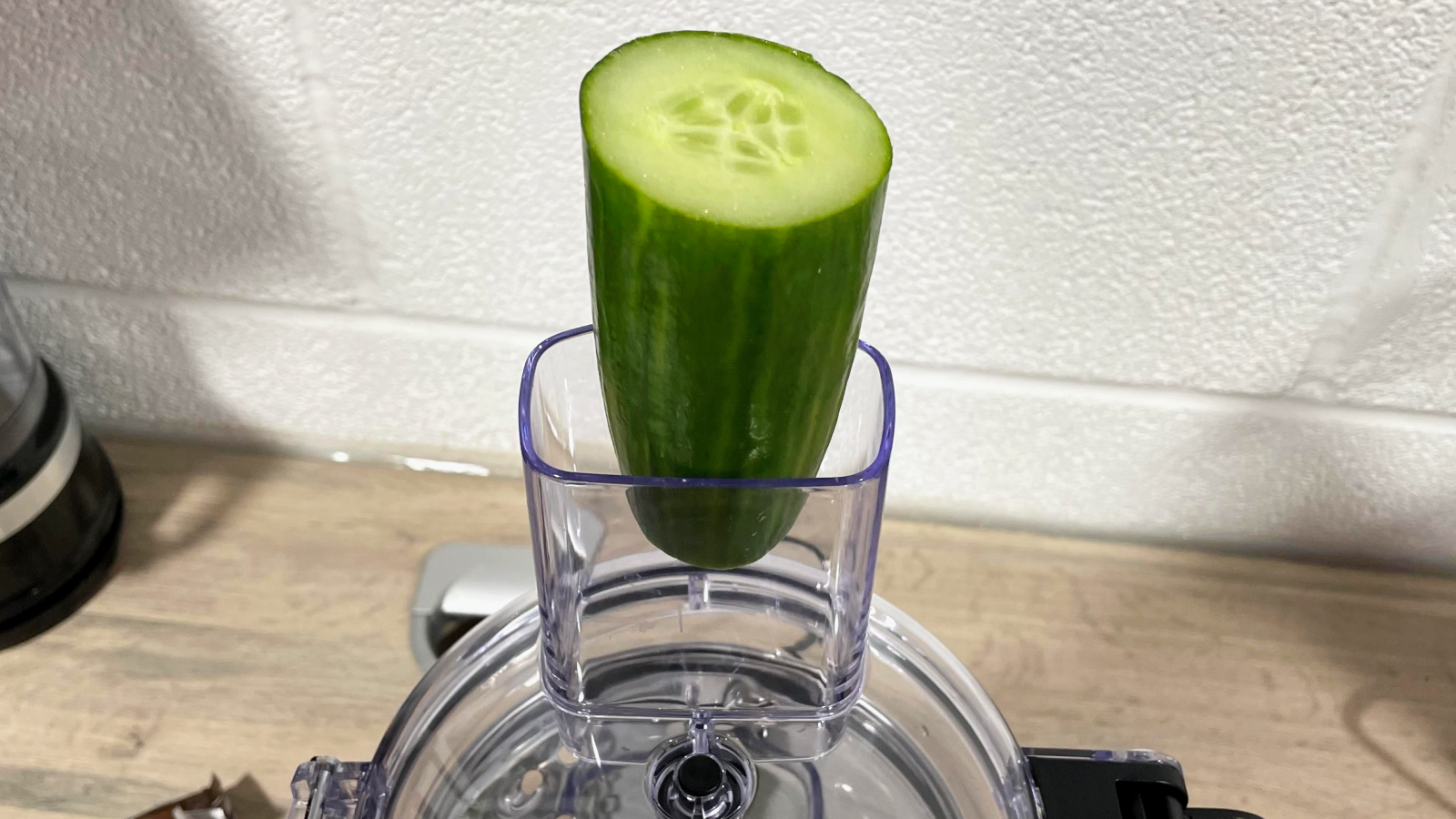
A closeup of the KitchenAid 7 cup food processor feed tube, showing that a larger-diameter cucumber is too large to fit inside.

(Image credit: Future / Cesci Angell)

Using the two feed tubes and pushers was easy, but the bigger feed tube still isn’t big enough for larger-diameter fruit and veg, so if you want large, neat circles of sliced cucumber, you may be out of luck. If you get into the habit of buying slimmer cucumbers though, you’ll probably be fine. 

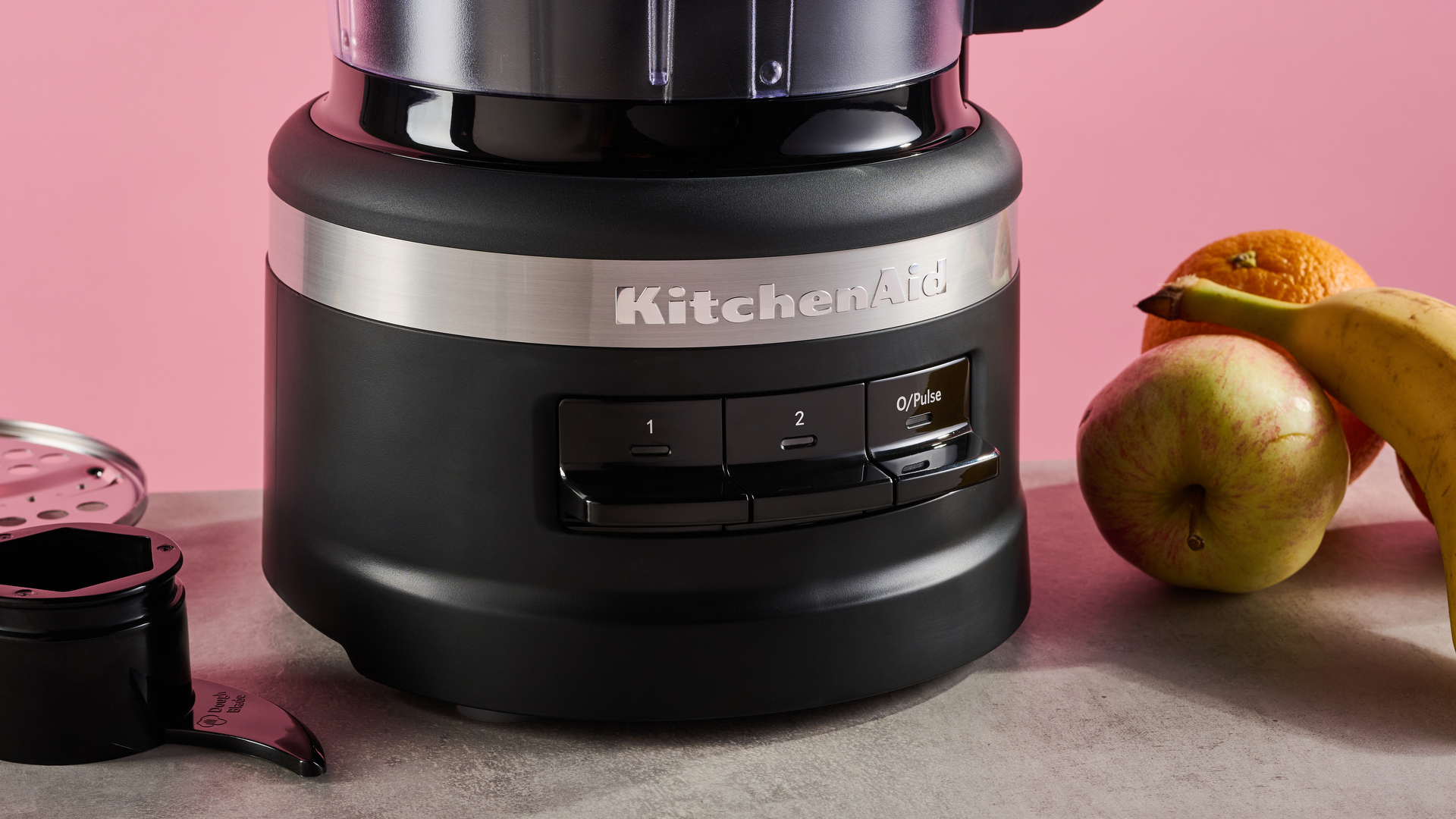
There are two speed settings labeled 1 and 2 on the easy-to-press buttons, with one being low speed, and two being high. There is also a Pulse button. Speed one and two aren’t overly noisy, but the noise level was uncomfortably loud when using the Pulse function, especially when chopping almonds.

Everything but the base unit is top-rack dishwasher-safe, which proved to be a great time saver. These parts were easy to hand wash too, although removing pastry from tight areas proved difficult. At the end of the testing, I put the work bowl, lid, and accessories in the dishwasher. Everything came out fine, although the work bowl did show some water marks.

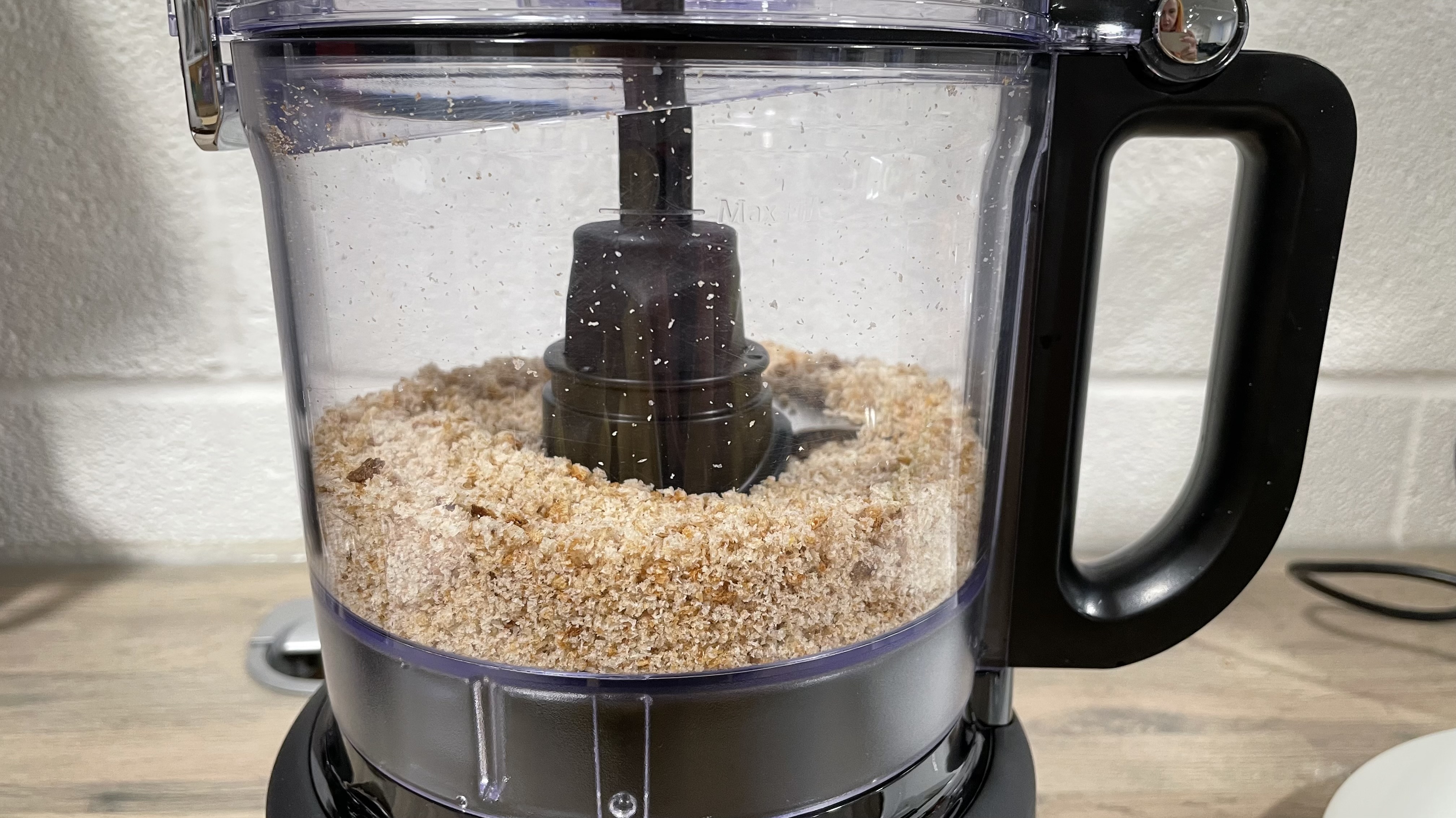
A closeup of the KitchenAid 7 cup food processor food bowl with breadcrumbs inside.

(Image credit: Future / Cesci Angell)

The performance of the KitchenAid 7 cup / 1.7L Food Processor was adequate. For my tests, I used it to slice or chop carrots, onion and cucumber, as well as whizzing bread into breadcrumbs, finely chopping almonds and combining the ingredients for pastry. It managed all these tasks quickly and with no trouble. 

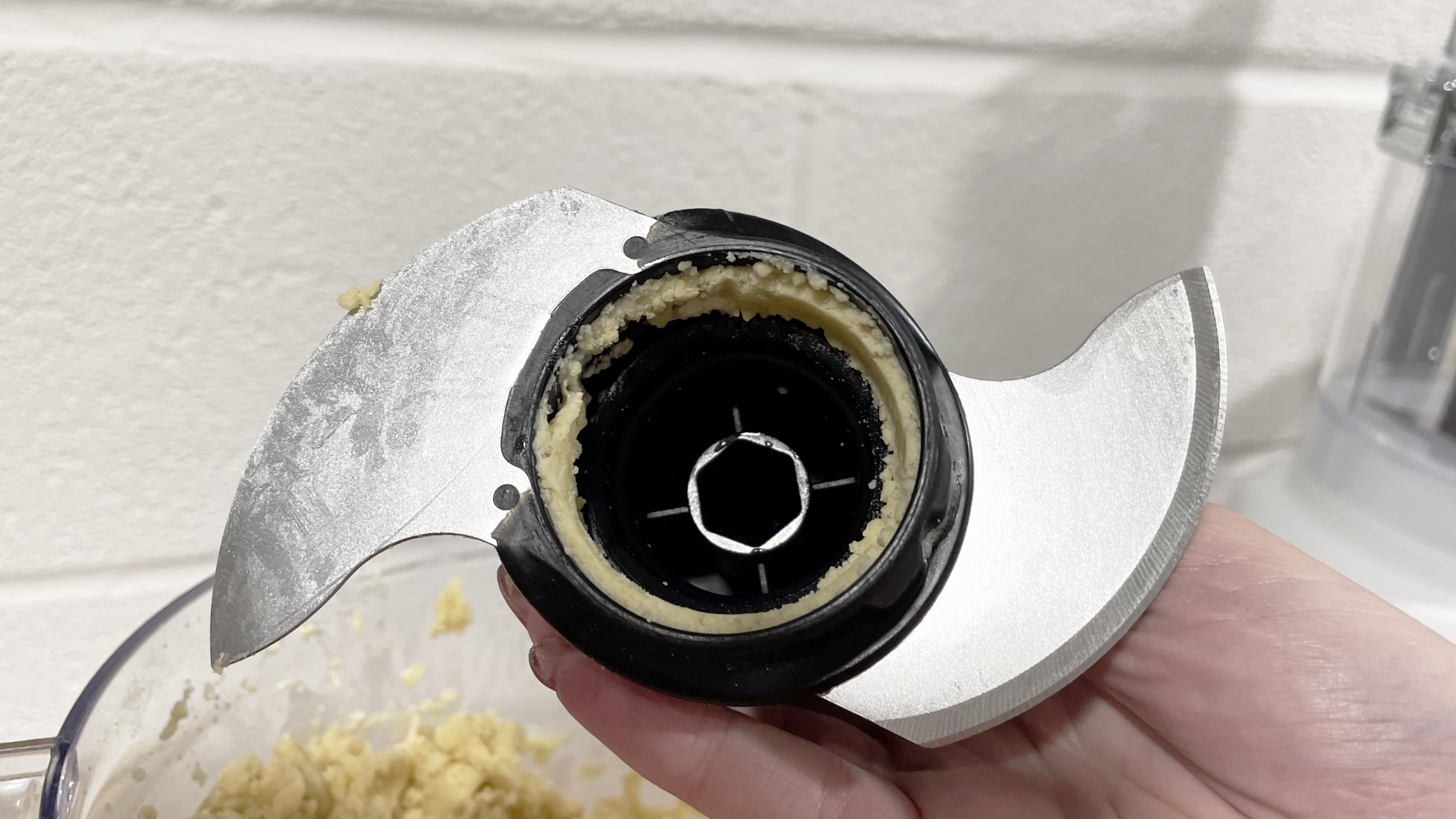
However, the consistency of the processed foods wasn’t the best. There is only one grade of shredding, which seems to be somewhere between fine and medium. For example, the processed carrot looked somewhat unappealing; it certainly wouldn’t have fared well if subjected to a Rate My Plate jury. A fair amount of carrot also ended up inside the lid, which wasn’t ideal. When chopping the almonds the results were inconsistent, with pieces that ranged in size from large to dust. There were also occasions where ingredients such as breadcrumbs, almond dust, and pastry mixture migrated inside the fitment ring of the chopping blade, which proved tricky to remove when hand washing.

A closeup of shredded carrot inside the clear work bowl of the KitchenAid 7 cup food processor.

(Image credit: Future)

Overall, there are a few issues with the KitchenAid 7 cup / 1.7L Food Processor, like that smaller feed tube and the uneven shredding, which may mean it doesn't quite stand up against the best food processors on the market. However, if you want something that is compact for the capacity available, has convenient accessory storage, and has a no-twist design, then this is a food processor to consider. The consistency of the processed food may not be Instagramable, but it’s the taste that counts, right?

KitchenAid 7 Cup Food Processor: price & availability

  • List price: $99.99 / £169 / AU$299
  • Often available for cheaper
  • Currently available in the US, UK, and Australia

The KitchenAid 7 cup / 1.7L Food Processor is currently on sale at $84.99 / £143.65 / AU$219, (usually $99.99 / £169 / AU$299). If you’re querying why the US model is cheaper than the UK and Australian models, it is because it comes with fewer accessories. I will elaborate further on the accessories in the Design and features section below. 

The 7 cup / 1.7L Food Processor isn’t the cheapest. There are similar products on offer from our pick of the best food processors. These include the Cuisinart Easy Prep Pro FP8 food processor, which is slightly lower in price and comes with two reversible shredding and slicing discs, plus a small bowl add-on to use when the large work bowl feels excessive for the task. Or, you could spend just a little extra for more versatility with the Ninja 3-in-1 Food Processor with Auto-IQ, which is currently on sale for $179.99 / £169. The KitchenAid 7 cup / 1.7L Food Processor has some innovative design features and performed adequately during testing though, so it’s still worth considering.

The KitchenAid 7 cup / 1.7L Food Processor is available now, on the US, UK, and Australian KitchenAid websites as well as various third party retailers.

  • Value for money score: 3.5 out of 5

KitchenAid 7 Cup Food Processor specs

KitchenAid 7 Cup Food Processor: design & features

  • Feed tube could be larger
  • Fixed handle position
  • Different accessories per region

Setting up the food processor was quick and easy. All the parts and accessories were stored inside the work bowl, so it was a simple case of removing them, before washing them along with the work bowl, lid, and food pushers. After this step was completed, I had to place the drive adapter on the drive pin in the center of the work bowl. Installing the different cutting accessories was also a straightforward process, which I was thankful for, as it avoided any unnecessary delays when I was working through lots of different types of food.

The food processor doesn’t take up a load of unnecessary worktop space, the cable length is adequate at 35 inch / 90 cm, and the work bowl easily attaches to the base (a useful design feature that I much prefer to the twist-to-secure designs that are often used with some other food processors). Additionally, the lid catch is easy to unclip, and once the lid is in an upright position, the hinge design means that you can easily lift it off. 

On replacing the lid, slotting it into the hinge side was no issue, although sometimes I needed to put a fair amount of pressure on the lid to get the latch to close again.

A closeup of the KitchenAid 7 cup processor food bowl and lid clearly showing the feed tube, and the handle placement.

(Image credit: Future)

Due to the way the work bowl sits on the base, the handle placement is somewhat limiting, as it can only be on the right-hand side. This was frustrating enough for me, as I like to hold the handle in my left hand while using a utensil to get the ingredients out with my right – but it could really make this product less accessible for people who aren’t able to use their right hand.

KitchenAid is known for having some enticing color options. In the 7 cup / 1.7L Food Processor’s case though, the color range is somewhat basic, with glossy-finished Onyx Black, and Empire Red available in the UK, US, and Australia, plus additional color variants including Contour Silver, Almond Cream, White, and Matte Black, depending on your region.

There is a 2-in-1 feed tube on the top of the work bowl lid, with a two-piece plastic food pusher. Together, they can be used to push in wider ingredients, or the inside section of the pusher can be removed to enable you to accurately feed in slimmer food items such as celery. Unfortunately, the bigger feed tube was not wide enough for a larger-diameter cucumber, so it needed to be cut down. Therefore if you want neat, round slices of cucumber this may not be the processor you’re looking for.

A closeup of the control buttons on the front of the KitchenAid 7 cup food processor.

(Image credit: Future)

There are three operational buttons on the front of the 7 cup / 1.7L Food Processor’s base: setting one (lower speed), setting two (higher speed), and a pulse mode. You don’t need to worry about getting tired fingers with the two speed settings, as you don’t need to hold the button down for the processor to operate. It takes one press to set them off, and a second press or a press on the O/Pulse button to stop the processing.

There are two design features that I found particularly useful. Firstly, the lid, work bowl, and accessories are all dishwasher-safe when washed on the top rack. 

I also hand-washed all of these components repeatedly in-between ingredients during testing. All parts were easy to clean and dry; however, I did find that small amounts of the ingredients would easily end up inside the fitment ring of the multipurpose blade, so I had to pay particular attention to this area. 

Secondly, the accessories can easily be stored inside the work bowl when the food processor isn’t in use, saving cupboard space and preventing you from wasting time trying to find the desired accessory.

Three of the KitchenAid 7 cup processor accessories, the plastic dough blade, reversible slicing and shredding disc, and the thick slice disc.

(Image credit: Future)

The 7 cup / 1.7L Food Processor doesn’t come with as many accessories as larger models such as the KitchenAid1319, but it is perfectly adequate for day-to-day food prep. Please note that some accessories are not included with the KFP0718 model, which is sold in the US. This model comes with a multipurpose stainless steel blade and a reversible slicing and shredding disc. The KFP0719 models, sold in the UK and Australia, include these accessories, along with a thick-slice disc and a plastic dough blade.

  • Design & features score: 4.5 out of 5

KitchenAid 7 Cup Food Processor: performance

  • Shredded and chopped effortlessly
  • Some waste carrot from shredding
  • Consistency of processed food varied

The KitchenAid 7 cup / 1.7L Food Processor performed well during testing. I tested its ability to slice, chop, mix, and grate a variety of foods. I used the shredding side of the reversible slicing and shredding disc to grate some carrots, running it on speed setting two as per the user manual. While it managed the job in a matter of seconds, the result was finer than I would have liked – some other models, such as the KitchenAid 13 cup / 3.1L Food Processor, have dedicated grating discs with fine and coarse options that give a more desirable result. Due to how fine the shredding was, the results were a little on the wet side, and a lot of carrot shot into the lid during processing.

The underneath of the reversible shredding and slicing disc with a small amount of carrot on it, the lid of the KitchenAid 7 cup food processor is visible in the background, with grated carrot around the inside edge.

(Image credit: Future / Cesci Angell)

Next I used the slicing side of the reversible slicing and shredding disc to slice a cucumber on speed setting one. Because the diameter of the cucumber was too large even for the larger feed tube, I had to manually cut a slice off of the side of it to enable it to be fed into the processor. The machine sliced the cucumber quickly, with next-to-no remnants left on the disc or in the lid. The slices were fairly even, although some were slightly wedge-shaped, thicker at the rind, and thinner where the cucumber was sliced down to fit.

A close up of sliced cucumber inside the KitchenAid 7 cup food processor work bowl.

(Image credit: Future / Cesci Angell)

I used the multipurpose stainless steel blade to chop onions, almonds, and to make breadcrumbs from slightly stale wholemeal bread. The onions and almonds were chopped using speed setting one. The food processor had no issues chopping up a large onion that I’d cut into quarters: it quickly chopped it into fine pieces and while the pieces weren’t that even, none of them were overly large. When I pulsed the almonds for 10 seconds, the result was again pretty uneven, with larger pieces, smaller pieces, and a fair amount of almond dust. Upon removing the accessories, I found that some of this dust had made its way inside the plastic cutting blade ring. 

A close up of the unevenly chopped almonds in the KitchenAid 7 cup processor work bowl.

(Image credit: Future / Cesci Angell)

When making the breadcrumbs, I used speed setting two to blitz two slices of bread. In just 45 seconds the processor had turned them into fine breadcrumbs with an even consistency, and no bread was left under the blades.

I also used the multipurpose stainless steel blade, using the lowest speed setting to combine flour, margarine, and water for pastry. At first, the ingredients didn’t mix evenly – a layer of flour remained at the bottom and didn’t begin to mix in until water was added and the mixture started to form a proper dough. Apart from that detail, the processor combined the pastry ingredients easily, it didn’t rock about on the work surface, or overheat, both of which can happen with food processors that don’t have strong enough motors for pastry making.

A close up of the inside of the multipurpose blade which has a coating of pastry around the inside of the ring.

(Image credit: Future)

While conducting the tests, I found that settings one and two were not overly loud; however, the pulse mode may make your ears ache if you need to use it for a long period of time. At no point during testing did I encounter issues with ingredients getting stuck under the blade or disc inside of the work bowl – I did however find that ingredients would end up on the inside of the fitment ring of the multipurpose stainless steel blade that sits on the drive adapter. This was particularly evident when chopping the almonds, and combining the pastry ingredients. There was a layer of pastry mixture coating the inside of the blade's plastic ring, which was tricky to clean out.

  • Performance score: 3.5 out of 5

Should I buy the KitchenAid 7 Cup Food Processor?

Buy it if...

Don't buy it if...

KitchenAid 7 Cup Food Processor review: also consider

How I tested the KitchenAid 7 Cup Food Processor

  • I assessed the setup and performance
  • I ran our usual series of chopping, grating, and combining tests
  • I checked how easy it was to clean

I spent time getting the KitchenAid 7 cup / 1.7L Food Processor setup, read the instruction manual, and assessed the design and accessories.

To put the KitchenAid 7 cup / 1.7L Food Processor through its paces, I used the chopping blade and reversible slicing/shredding disc to shred carrot, slice cucumber, chop onion, and almonds. I also used it to process bread to make breadcrumbs and combine flour, margarine, and water to make pastry. These are the same tests we run for all food processors, making it easy to see how different models compare. 

I tested how easy it was to clean the processor parts by hand-washing, and using the dishwasher to establish how well you can clean the parts with either method.

  • Read more about how we test
  • First reviewed: June 2024
Saturday, June 29, 2024

JBL Live Beam 3 review: a strong case for stellar earbuds that easily outlast the rest

JBL Live Beam 3: Two-minute review

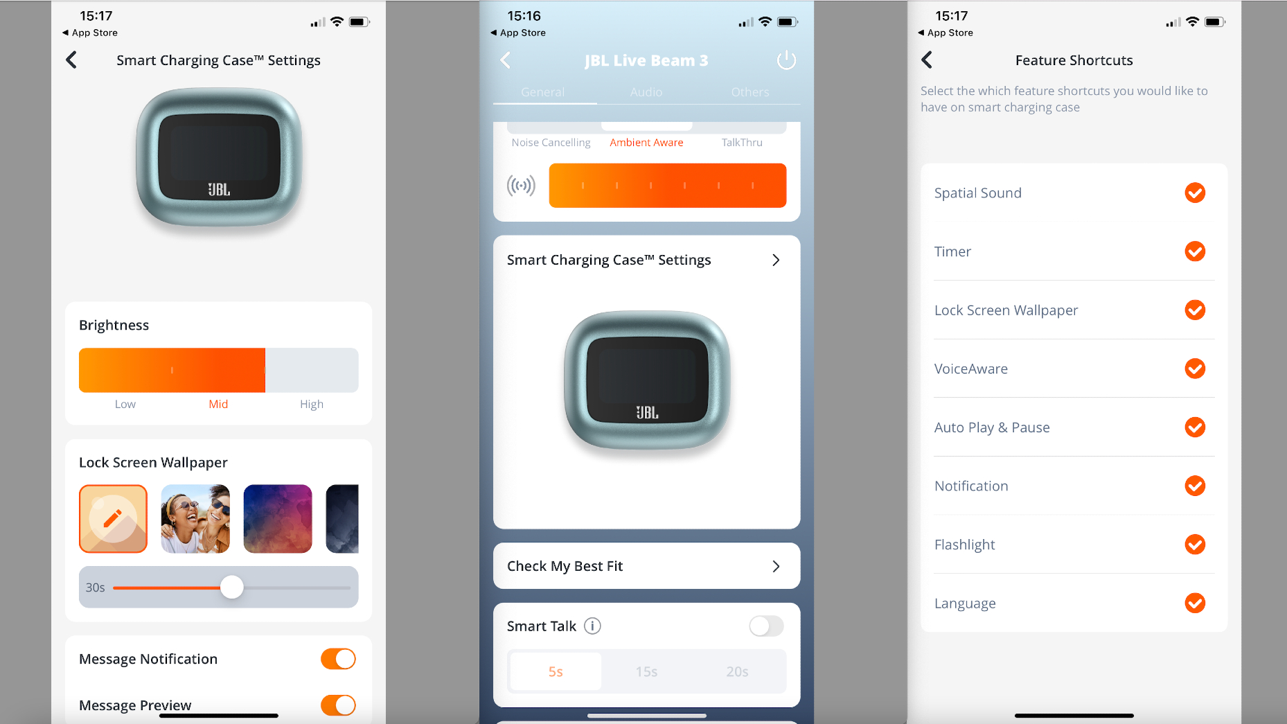
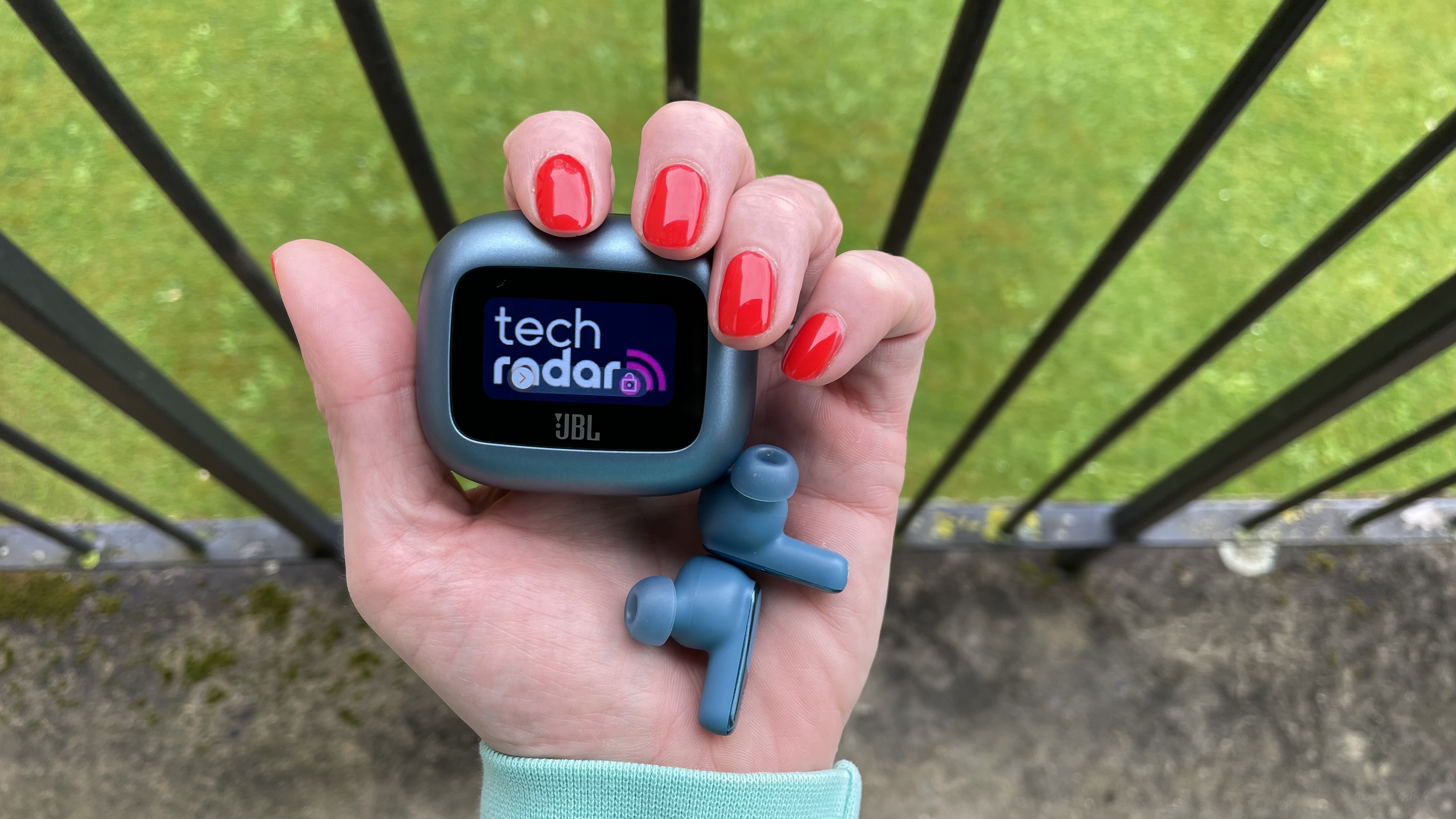
There are lots of great options on our guide to the best noise-cancelling earbuds, but there's one feature that none of those excellent buds offer: a screen on the case. And the screen on the JBL Live Beam 3 is so much more fun than the display of its predecessor, because now you can select a lock-screen wallpaper from any of the photos stored on your paired smartphone, and the image will even flip so it stays the right way up (so all your friends can see it) when you snap open the case. 

I still wouldn't describe it as a must-have – it still feels as if JBL could deliver greater more through this touchscreen, since it still doesn't present functionality that your smartwatch can, for example –  but given the fact that to tweak the volume by tapping the buds results in the loss of either playback control or ANC profile-scrolling (you don't have to sacrifice anything using the box), it's certainly useful. In addition, the lock-screen wallpaper personalization feature is a nice touch. 

However, the real improvements here aren't to do with the screen. No, the real star here is the improved audio quality. It's typically Harman curve-esque and meaty – but in the best way. There's an expansive soundstage; there's dynamic agility; there's cohesion across the frequencies this time around. 

Plus, battery life is excellent at up to 12 hours from the earbuds alone, minus noise cancellation, or 10 hours with it engaged (and nearer nine with adaptive ANC on –more on the efficacy of this later). The case, too, delivers three further charges, taking your total audio playback time up to a class-leading 48 hours. For clarity, Apple's priciest Pro-suffixed AirPods only deliver 5.5 hours with its top-tier Spatial Audio deployed, or a maximum of 30 hours including the case. 

The JBL Live Beam 3 also boast a very well-rounded feature set, including auto-off when you remove one bud, a fit test, multipoint connectivity, plus a few novel bits and pieces – including "Personi-Fi", where a detailed hearing test of each ear enables you to better tailor the sound to your liking. 

I wasn't convinced by the spatial audio profiles, which is a shame, since JBL has offered a total of three immersive soundscapes for music, movies and games. If you're expecting sonic articles in a three-dimensional space here, you'll be disappointed – and although the ANC is fine, it isn't about to challenge Sony or Bose in the supreme bubble-of-silence stakes. Yes, low-level constants are massaged (my microwave humming away didn't filter through, for example), but the sound of cars outside simply floating away wasn't quite there. 

One truly valuable addition few competitors offer is something JBL is calling Smart Talk. It lowers the volume of your music and activates JBL's TalkThru mode as soon as you speak, then resumes to normal service either five, 15 or 20 seconds after you've stopped. It's a great little feature because you don't have to touch the buds to engage it  – for example, when someone in the office wants to know where that report is. And, of course, if you don't like it, it's easy enough to toggle it off in the JBL Headphones app. 

The fit is great, the battery is seemingly never-ending and, honestly, the JBL Beam 3 quickly became my go-to earbuds for confident, banging, thumping bass – and given my qualms over the audio in previous stablemates, it's a big leap forward for JBL, for which I commend the company. 

For the price, JBL offers a very reasonable sound-per-pound proposition here. Having said that, the price in the UK is currently £179.99 – not the initially reported £149.99. Nevertheless, the JBL Beam 3 still represent value for money, particularly if stamina is a priority in noise-cancelling earbuds. 

JBL LIve Beam 3 on starry blanket

(Image credit: Future)

JBL Live Beam 3 review: Price & release date

  • Unveiled January 2024 (but only available to buy from June 3, 2024)
  • Priced $199.95 / £179.99 / AU$249

The keen-eyed will note that the prices above mean the JBL Live Beam 3 (thus called because of the "beams", or stems attached) retail for $50, £50 or AU$100 cheaper than the screen-on-case-enhanced earbuds they effectively replace, the JBL Tour Pro 2.

The Live Beam 3 are actually one of three earbuds propositions with cases that JBL unveiled simultaneously in January 2024. The Live 3 range comprises the Buds, Flex and Beam, the latter of which we're reviewing here. The Buds 3 look most like standard earbuds; the Flex 3 are akin to the shape of regular Apple AirPods, with a stick design but no silicone tip that sits in the ear canal; and the Beam 3 are similar to Apple's AirPods Pro, with a stick design plus an in-ear fit and ear tips. 

All three options boast JBL's smart screen case, True Adaptive Noise Cancelling, Bluetooth 5.3 with LE Audio, JBL Spatial Sound, LDAC Hi-Res Audio for compatible phones, multi-point connectivity, wireless charging, and six external mics to facilitate noise cancellation and to help with calls. Also, all are similarly priced. 

There are a few differences to quickly scoot through: Buds and Beam are certified IP55 for water-resistance, while the Flex are IP54; the Buds and Beam have 10mm dynamic drivers compared to 12mm for the Flex; and the quoted battery life is up to 40 hours on the Buds, 48 on the Beam, and 50 on the Flex (for the buds and case combined).

A picture of a seal on the JBL Live Beam 3's lock-screen

Want a photo of a judgemental seal on your case? Have it…  (Image credit: Future)

JBL Live Beam 3 review: Specs

Becky Scarrott dancing, in a lock-screen on the JBL Live Beam 3

Or how about a dramatic dance shot by Peter Mares?  (Image credit: Peter Mares (Avid Images))

JBL Live Beam 3 review: Features

  • Excellent call quality features
  • Personal amplification and Personi-Fi add value
  • The case – you can't ignore it

JBL has thrown everything it has at these earbuds – and that's putting the charging case to one side for a moment, concentrating on the various audio augmentations and fixes instead. 

Call-handling is ace, thanks in no small part to the numerous options you have available to enhance the experience, including Sound Level Optimiser, which balances the volume of the voice on the other end of the line; Sound Setting, with which you can increase the bass or treble of that voice, or keep things "natural"; Voice Setting, which is the same thing, but for your own voice; VoiceAware, which is a slider to control how much of your own voice you'd like to hear during calls; and Private Call Mode, which actually lets you remove one bud and use it as a mic, so you might lower your voice a little and keep the convo private. During tests, the majority of folk on the other end said that I sounded as if I was just talking on the phone – which certainly can't be said of every set of earphones I've ever tested. 

This level of attention to detail continues across the board. You have six EQ presets or the option to create your own, plus Adaptive EQ for real-time adjustments, with the option of toggling on "Low Volume EQ" to boost highs and lows, even if you're listening at low volumes. There's even "Leakage Compensation", to sort the sonics if the tips you've fitted don't offer an optimal seal. 

The ANC has similar scope. Deploy ANC (over Ambient Aware, TalkThru or off all together) and you can customize functionality by toggling Adaptive ANC – which adjusts the level of cancellation based on your surroundings – and Auto Compensation, which adjusts things based on your ear canal and wearing status once more. 

But we're not done: if you switch Adaptive ANC off, you're presented with a slider that offers seven increments of noise-nixing, irrespective of your location. On paper, it sounds exceptional – and in reality it's good. The seventh level nixes most low-level thrums happily; it certainly doesn't color or negatively impact the presentation. Nevertheless, I think Adaptive is the way to go, because I felt it did a fair job of making adjustments when I was at the beach, on the street, and at home. Does it lower the noise floor in your noggin as deftly as the Bose QuietComfort Ultra Earbuds or the AirPods Pro 2 can? Not quite. And that goes for the JBL Beam 3's spatial audio profiles (movies, music or gaming have been supplied), too. Things feel a little warmer, more bass-centric and cosier for sure; but it isn't the eyebrow-raising, bullets-over-my-head performance I might have dreamt of. 

That's the reason I knocked half a star off the score for this section, but I maintain that there's still so much here to love – and I haven't even spoken about Personi-Fi yet! This involves a lengthy hearing test of ever-quieter tones at various frequencies dealt to each ear (after an initial fit test). But it's worth it. 

After the tests, you're presented with a written report, which offers a mini verdict on the compensation required for each ear and the option to "have a try" by toggling it on and off. Suffice to say, it's not just parlour tricks or fun graphics (although there is one); it does genuinely make the music ever-so-slightly more detailed, the leading edges of notes more impactful, and the overall presentation is layered with greater precision – to my ears, at any rate. I tended to deploy this, but leave spatial audio to one side when wearing the JBL Live Beam 3. 

Lastly, to the case. I used it much more than I did when testing the JBL Tour Pro 2. It's responsive and far easier to navigate than the previous iteration, plus you can hide features you won't use in the app – the flashlight feature is fun, but it essentially just turns the screen a bright white; my iPhone's torch feature is better. I also really liked the lock-screen wallpaper. Yes, it might be the high-tech equivalent of a Polaroid sticker on your earbuds case; but so what? We're allowed to want that. 

  • Features score: 4.5/5

JBL Live Beam 3's JBL Headphones app, three screen-grabs showing smart charging case settings

(Image credit: JBL )

JBL Live Beam 3 review: Sound quality

  • LDAC tracks are beautifully relayed 
  • Bass is resolute; treble well handled
  • Greatly improved audio 

No matter what you listen to, the JBL Live Beam 3 will sound rather good, but it seems a shame to listen to lowly compressed Spotify streams when Sony's LDAC (from a compatible device – a Sony Xperia smartphone, for instance) is on the menu with these JBLs. Apple Music tracks are handled with zeal and flair, as are my trusted Qobuz tracks. 

Melissa Etheridge's' I'm the Only One is a bass-walking, axe-talking country romp. Etheridge's textured vocal is central and emotive in a mix that shines a light on each solo, riff or musical passage; it will have you dancing wherever you listen to it. 

Baby Lasagna's Rim Tim Tagi Dim is a tough ask for the driver-snap, dynamic nuance and musical cohesion in any set of earbuds, but the JBL Live Beam 3 don't shy away from it. This is techno, and it can easily be muddied in lesser earbuds. Here, though,  I felt every cymbal as it darted from my left to right ear, but never at the expense of the vocal. 

The JBL Live Beam 3 are able to unearth an extra ounce of detail through the strummed guitars and vocal in Noah Kahan's acoustic Stick Season, too, and the fact that I was tapping my foot along is proof that the timing here and agility through the low end is greatly improved over the JBL Tour Pro 2, which I felt were a tad treble-centric, even tinny on occasion. 

The sound is typically JBL at its best again, and you love to see it – sonically, they're a big hit. Want big, exuberant sound that knows when to deliver large, but also when to pull back just a little, allowing the detail to shine through? That's the sonic recipe the JBL Beam 3 present – and I like it for the money. 

  • Sound quality score: 5/5

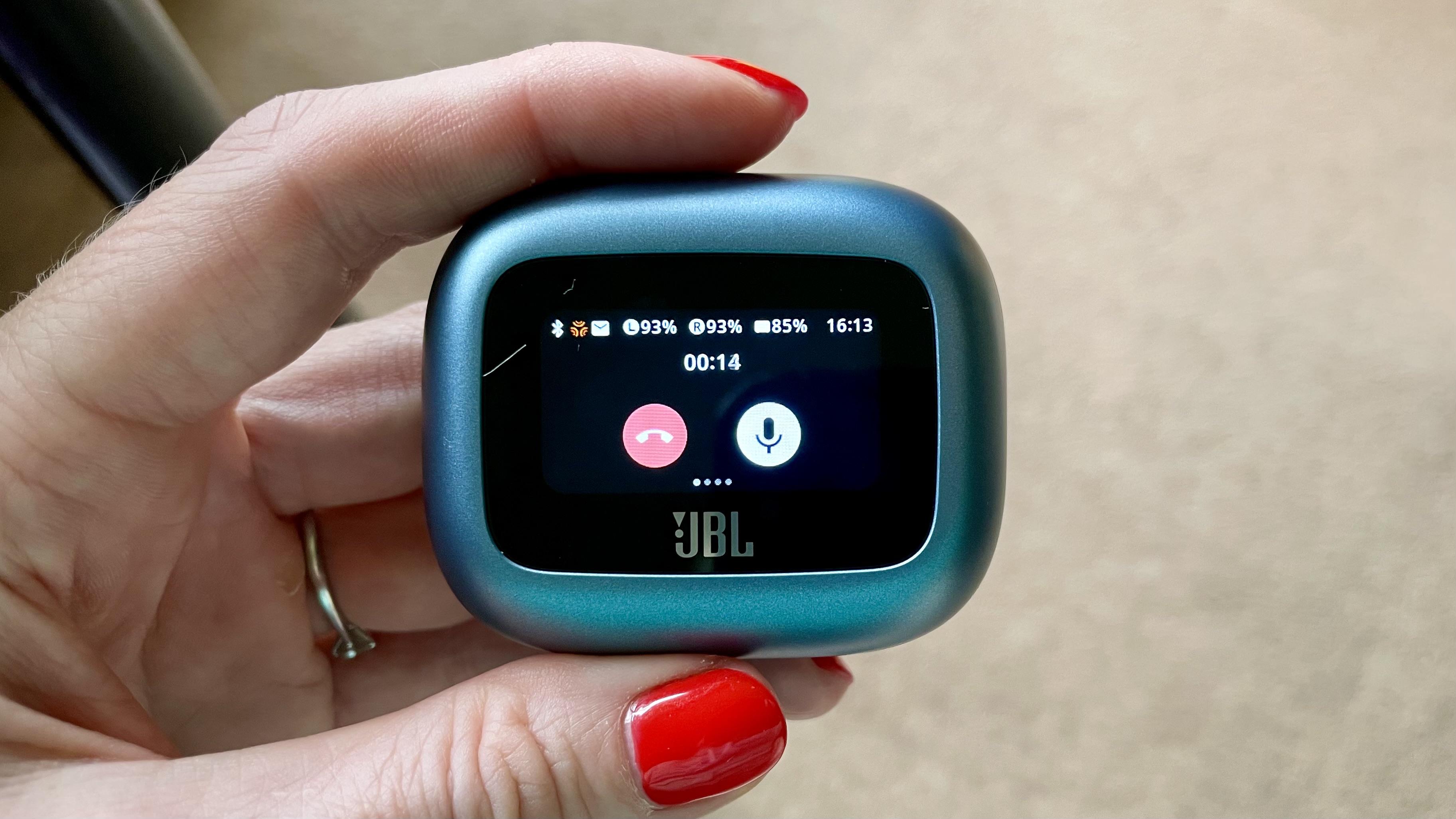
JBL Live Beam 3, showing an incoming call, case held in a hand with red fingernails

The multi-function button on the WF-C700N beats any capacitive touch option I've tried. (Image credit: Future)

JBL Live Beam 3 review: Design

  • Earpieces fit snugly and securely
  • On-ear functions require compromise
  • The case is very likeable

I found these earbuds easy to wear – despite my small ears. However, it's worth noting that the Live Beam 3's earpiece design does sit rather far into your ear canals. Those who find this type of fit claustrophobic – think AirPods Pro 2 – may want to look at JBL's other designs, although I can't vouch for those. Again, it won't be an issue for most, just worth noting. 

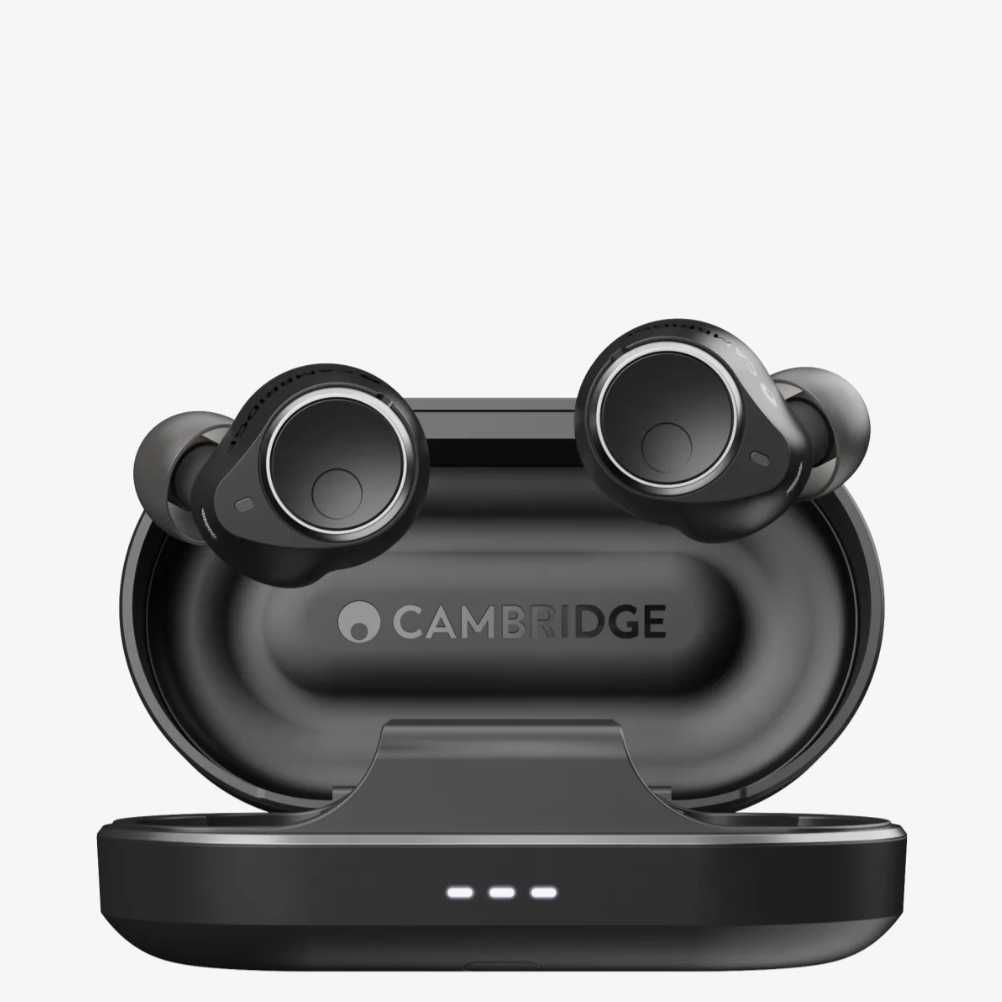
The on-ear touch functions respond well and can be customised, but this does lead me to a minor negative: you need to ditch a set of functions. To explain, your command options are Playback Control, Ambient Sound Control, and Volume Control, but you have only two ears – and only two earbuds to assign jobs to. I often criticize earbuds that don't offer a way to tweak the volume of music without having to dig out a phone (or ask Siri); while the JBL Beam 3 do offer volume control, assigning that to the left earbud and Playback Control to the right meant I had to forego on-ear ANC. Yes, the touchscreen enabled me to quickly access the ANC, Ambient or TalkThru modes (although not the extra adaptive toggles), but at this level I don't think it's churlish to expect your earbuds to be able to handle all three – because other options, such as the Cambridge Audio Melomania M100, do. 

However, that's where the criticism ends; because the case is very fun. Where the JBL Tour Pro 2 felt like a prototype, the JBL Beam 3 feel every millimeter a second-gen upgrade. They've been refined, made more sleek – and more svelte, too. Yes, the case is still deeper than your average case at 3.25cm (or just over one-and-a-quarter inches) thick, but the little lanyard spot on the top right (as you look at the screen) is quite delightful – because you've now got lock-screen wallpaper to show off. 

The build quality of this case feels resoundingly expensive – and I maintain that Apple is watching from afar, to implement in future AirPods designs. And while the screen isn't an essential yet for functionality, the resolution, responsiveness and brightness – which can be adjusted; you get three levels – is spot on. 

  • Design score: 4/5

JBL LIve Beam 3 on starry blanket

The buds are comfy, honestly!  (Image credit: Future)

JBL Live Beam 3 review: Value

  • Exceptional battery life; great sound
  • The classy finish feels expensive
  • Spatial audio performance is the only issue 

The JBL Live Beam 3's battery life, sound quality (with its smorgasbord of customisations), build and finish are more than worthy of the money here. And the noise cancellation will please all but the most picky of noise-nixers. Oh, and you also get a screen – which in no way affects the stellar stamina. 

My only real gripes are the compromises relating to on-ear functionality, plus the somewhat disappointing spatial audio trio JBL offers here. If you're after buds that are great for movies, for example, I'd point you to the (much more expensive) Sonos Ace headphones, or the Bose QuietComfort Ultra Earbuds

But given the competitive asking price of the JBL Live Beam 3 (the Bose alternative listed above cost $299 / £299 / AU$449, which is $100 / £120 or AU$200 more than the JBLs), there's so, so much still to enjoy for the money. 

  • Value score: 5/5

Should I buy the JBL Live Beam 3?

Buy them if...

Don't buy them if...

JBL Live Beam 3 review: Also consider

Cambridge Audio Melomania M100
Another pricier option (although not as pricy as the Bose), but the ANC here is very good indeed – as is the sound quality. And to top it all off, you also get the option of Matt Berry on voice prompts (his "Waiting to pair!" is the best you've ever heard). No screen on the case, mind, and the overall aesthetic is far more shy and retiring.
Make your choice by reading our Cambridge Audio Melomania M100 review

How I tested the JBL Live Beam 3

JBL Live Beam 3 held in a hand with red fingernails

(Image credit: Future)
  • Tested for two weeks; listened against the Cambridge Audio Melomania M100, AirPods Pro 2 and Bose QuietComfort Ultra
  • Used at work (in the office, walking through London, on a train), at home and on the beach
  • Listened to Tidal Masters, Apple Music Lossless tracks and Spotify on an iPhone 13 Pro, a Sony Xperia 1 V and a MacBook Pro

The JBL Live Beam became my musical companions for two weeks – after a thorough 48-hour run-in period (during which I loaded many lock-screen wallpaper options to the case). 

They accompanied me to work on weekdays (walking brusquely to the station; on the London Underground network; at the office), and throughout a week in Dorset, with regular trips along the promenade and to the beach at low tide – which is a great way to test any wind-interference from mics during calls.

To better test the comfort levels and security of the JBL Live Beam 3, I wore them to the gym – and they certainly did not budge during training. 

To check the audio quality across the frequencies, I listened to various playlists (spanning everything from classical to crunk) on Apple Music, Qobuz and Tidal, but also to podcasts and albums on Spotify – and YouTube tutorials (mostly about soldering sterling silver bezels to make jewelry from the sea glass collected at the beach, if you're curious) on my MacBook Pro. 

I’ve been testing audio products for over five years now. As a dancer, aerialist and musical theater performer in another life, sound quality, fit and the user experience have always taken priority for me – but having heard how wonderful ANC can be when done well, I know what to look for. 

Read more about how we test

  • First reviewed: June 2024
Edifier QR65 review: great-looking powered stereo speakers – but perhaps not for your desktop

Edifier QR65: Two-minute review

It's easy to assume that your desktop computer just needs cheap and cheery monitor speakers so you can hear your email chimes or the sound of the YouTube videos you watch when you're pretending to work, but the Edifier QR65 make a good case as to why you should stretch upwards into the realm of the best stereo speakers.

The QR65 are the newest speakers from Chinese audio company Edifier, which sells plenty of other desktop and monitor speakers for gaming, studios or just general computer use. These new models are classed as part of its 'Wireless Speakers' line-up but it also calls them 'Desktop Active Monitors' so they're clearly designed for desktop use.

I wouldn't recommend buying them solely for desktop use, though, because the Edifier QR65 function much better as multi-media speakers.

The Edifier QR65 are mid-range speakers and the sound fits; it's pretty good, with thumping bass and clear treble, even if the maximum volume won't exactly rock the house (unless you have a small house).

There are a fair few connection options too, as you can connect via USB (that's for the desktop connection) as well as wired and Bluetooth audio, so the speakers really do work for multi-media enjoyment.

And while I'm listing positives, I want to touch on the look of the speakers: they're fashionable and good-looking, even though they have LED lights which will raise red flags for audiophiles (and red LEDs for everyone else).

Then onto the... not 'bad', per se, just 'annoying' bits. While the QR65 have an app for control on your phone, they don't on PC, which feels like an odd omission given that these are meant to be desktop speakers. They also don't turn off or on with your computer, so you have to keep manually turning them on and off when you want to use them or contend with their LEDs lighting up your room all day and night.

Because of these two hurdles I ended up preferring to stream music over Bluetooth during the testing period, rather than testing them alongside my Windows PC.

Edifier QR65 review: Price and release date

The Edifier QR65 on a white background.

(Image credit: Future)
  • Announced in April 2024
  • Mid-range at $369.99 / £329.99 / AU$449

Edifier announced the QR65 in April 2024, to join its busy range of audio products. 

The Edifier QR65 cost $369.99 / £329.99 / AU$449, and they’re generally considered to be towards the low end when it comes to desktop speakers. Sure, you can find Amazon cheapie options for a tenth of the price, but you can also find many options for ten times that cost (or more, see the KEF LS50 Wireless II). They’re also snugly in the middle of the options on our list of the best computer speakers

Another thing this price puts the Edifier QR65 roughly in the middle of? Edifier’s range of speakers – Edifier has a lot of speakers in many categories such as bookshelf, computer or studio speakers, and the QR65 are actually part of its wireless speaker range, despite being designed to work with desktops.

If you want to see what else is at this price range, specifically when it comes to dual-speaker desktop set-ups, then the Kanto Ora4, FiiO SP3 and Audioengine HD3 all hover roughly at this price point. 

Edifier QR65 review: Specs

Edifier QR65 review: Features

The Edifier QR65 on a white background.

(Image credit: Future)
  • Phone app, but no PC one
  • LED lights with customizable effects
  • Audio cable, USB and Bluetooth connections

If you’re connecting the QR65 to your smartphone, you’ll need to download the Edifier ConneX app to control them. Not Edifier Connect, nor Edifier Home, nor Edifier Enhance, and I had to deploy the trial and error approach when working out which app to use, which was an annoying waste of 10 minutes. Sure, Edifier isn’t the only tech company which refuses to consolidate its apps, but that doesn’t excuse it.

ConneX lets you change the EQ of music, customize the light effects and change the audio codec of streamed music, amongst a few select extras. You can certainly use the QR65 without it, but there’s no harm in exploring these extra features.

So what about if you’re using these desktop speakers while paired to a desktop PC or Mac? Well then you’re out of luck, because there’s no app support when you’ve got the QR65 hooked up to your computer by Bluetooth. You can use the dial to change the light effects a little but there are no EQ options, and if you want to turn up the volume, you’ll have to reach over to the speaker and turn up the dial manually (if you’re already at 100% PC volume, that is).

That’s why I said in the introduction that these speakers fare better as general multimedia speakers than desktop-exclusive ones; if you only use these connected to a computer, you’re going to miss a few features. The exception is if you connect the speakers to your computer and your phone, which lets you use the latter to equalize and change light effects, but that’s a lot of faff.

One other thing to bear in mind when using the Edifiers as your desktop speakers is that they don’t turn off or on with your computer – you’ll need to remember to separately turn them off or on, which is something I was constantly forgetting.

The other form of connectivity is via audio cable, with RCA plugging into the speakers and a 3.5mm jack to connect to your phone, MP3 player or other device. Pretty straightforward. Talking of connectivity, there’s actually a Sub Out port in one of the speakers that you could use to connect to an external subwoofer if you want more bass than the Xtreme Bass Series. I don’t see most people needing this, but it’s a nice optional extra.

  • Features score: 3.5/5

Edifier QR65 review: Design

The Edifier QR65 on a white background.

(Image credit: Future)
  • Two good-looking rectangles
  • Stands included in box
  • Dials and ports in one speaker

The Edifier QR65 consists of two fairly large speakers, with one measuring 13 x 21.3 x 21.2 cm and the other a touch bigger due to it having extra dials and ports. This latter is the ‘active speaker’ which you use to control the music and connect to power and inputs/outputs, while the former is the ‘passive speaker’ which only has a port to connect it to the active speaker. Yes, they're actually 'powered' speakers even if they're listed as 'active', since the amplification is squirrelled into one of the boxes. 

Setting up the Edifier is a little bit of a faff but once you’ve connected the active speaker to power, the passive speaker and your PC (via USB-A cables), Bluetooth device (via Bluetooth, obviously) or other audio device (via ports in the back and an included cable), and also directed the speakers towards you (using included stands, which sit at a 10-degree angle) you’re ready to go.

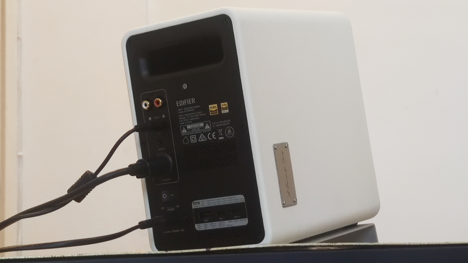
As well as the aforementioned ports, there are three charging ports which you can use to power up other devices (one USB-A and two USB-C) which is a handy extra feature.

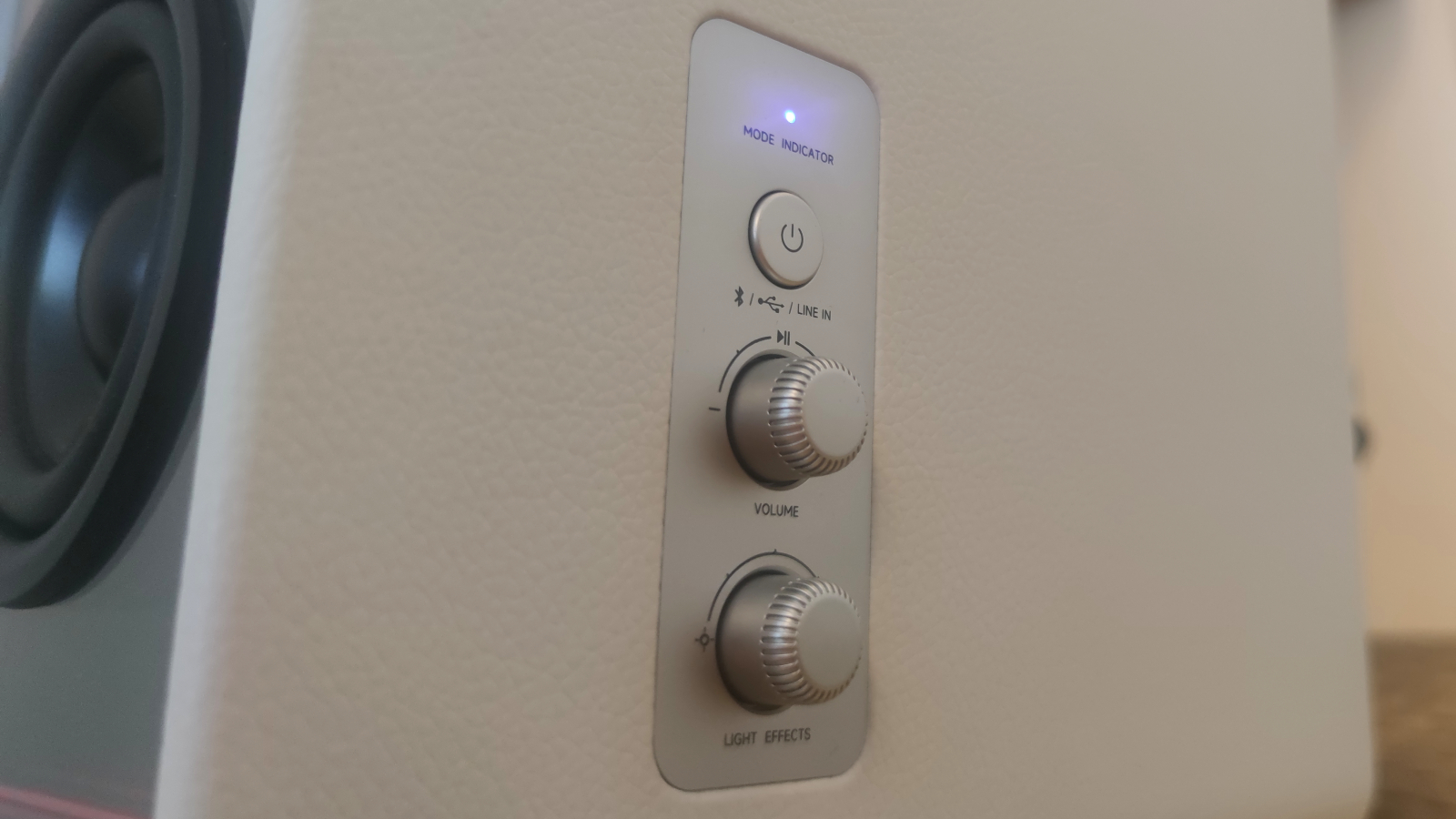
On the right side of the active speaker is a button and two dials. The button is to switch between inputs (each press toggles you between Bluetooth, USB and Line In) and to turn off the speakers by pressing and holding. I ended up leaving them on though, to save myself the journey of going into my computer settings to change the active output.

Then onto the two dials: the first is for volume which is pretty self explanatory, though pressing it also pauses or plays music. The lower dial is for changing the light patterns of the speakers: turning it increases or lowers the brightness, and pressing it toggles between various patterns for the lights to display.

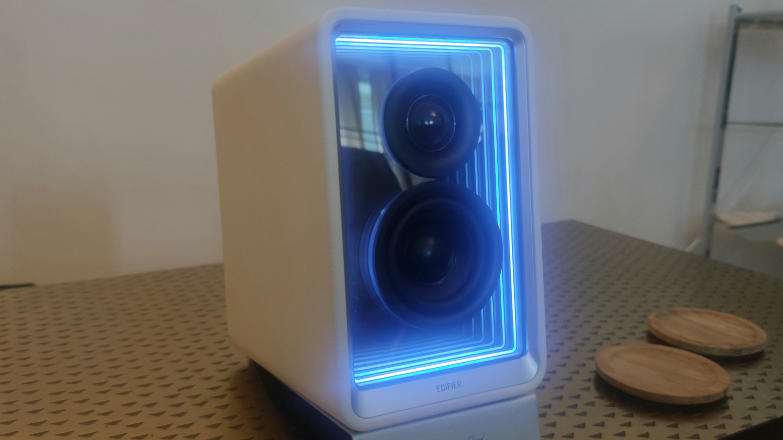
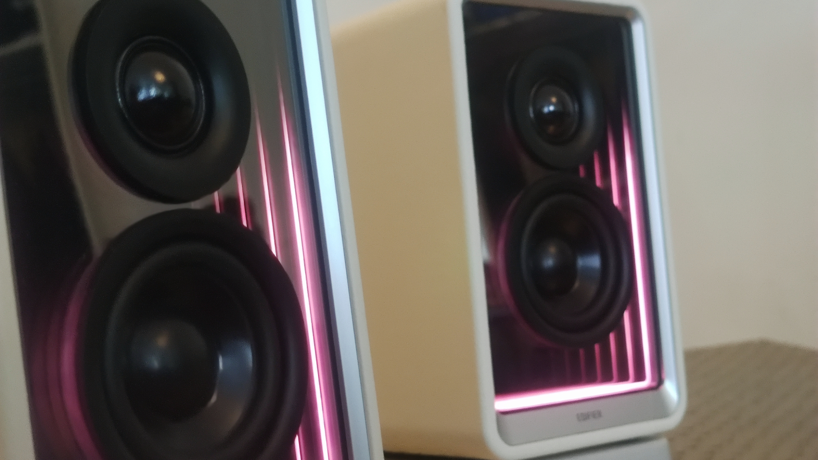
Oh, did I not mention the lights around the front of each speaker? That’s because of the (earned) stigma around LED lights in speakers, with many audiophiles assuming that they incur noise and indicate a probably bad-sounding product. That’s not a wrong assumption, but it’s not applicable in this situation, as the sound quality section describes. Saying that, I’m not sure the LED lights add much to the QR65, beyond the novelty factor. 

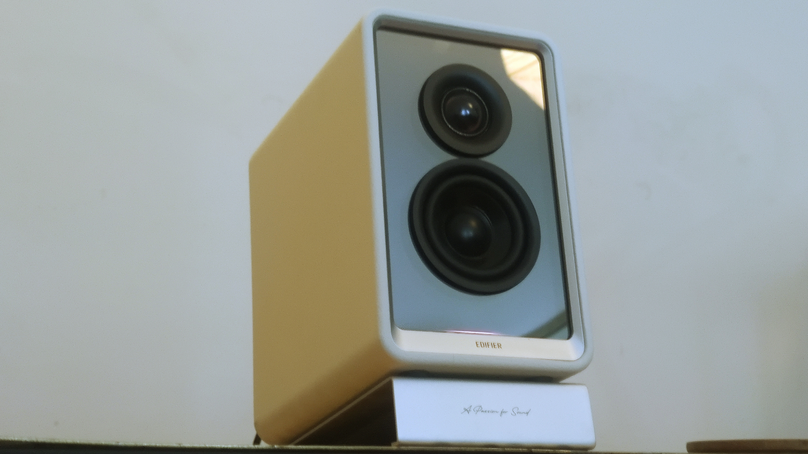
I’m a big fan of the white version of the speakers I tested (there’s also a black version but it’s a little more bland, in my opinion). The clean-looking shell contrasts with the silver dials and the black front in what is a fairly minimalist boxy look (apart from the LEDs). If you’re a Mac user who insists on having a fashionable svelte desktop, these could well fit into your set-up better than most rival options.

  • Design score: 4/5

Edifier QR65 review: Sound quality

The Edifier QR65 on a white background.

(Image credit: Future)
  • Full sound with lots of bass
  • Lots of codecs and Hi-Res certifications
  • Max volume could be louder for certain use cases

Each unit of the Edifier QR65 consists of a 1.25-inch dome tweeter and a 2.75-inch mid-low driver, and together they provide a nice warm sound.

When listening to music, you’re getting a sound that’s nice and bassy, though that’s not to say you’ll struggle to hear treble sounds. That’s not quite true of the mids, which do fall through the cracks a little bit, as does sub-bass. But that’s why you can plug a subwoofer into the speakers!

Playing games, the full-bodied sound works well for creating a layered soundstage – I could hear the background hum of cities and the echo of damp dungeons all around me. 

The bassy emphasis was more noticeably when watching TV or movies, as it meant voices occasionally sounded a little low and muffled – they’d often blend into the rest of the mix a little, and I lost a few lines of dialogue in shows as a result. 

If you’re using the Edifier QR65 as your PC speakers, you’ll find the 70W power output more than adequate. I played PC games with them and even at medium volumes, I was surrounded by sound – the shriek of an enemy behind me in Lords of the Fallen nearly gave me a heart attack when I thought it was something behind me in real life!

That’s not quite the case if you’re using these as general media speakers, as even at their maximum volume the QR65’s sound didn’t fill my living room – I wouldn’t recommend buying these in lieu of a TV soundbar or a set of tower speakers for your hi-fi system.

Depending on your audio input, you can enjoy listening with LDAC codecs, Hi-Res Audio or Hi-Res Audio Wireless certification, and that all means that you can enjoy great-sounding music whether you’re using Bluetooth 5.3 to connect your smartphone, are plugging in an aux-cord or have plugged the Edifiers into your computer.

  • Sound quality: 4/5

Edifier QR65 review: Value

The Edifier QR65 on a white background.

(Image credit: Future)
  • Good value for money as a multimedia option
  • … but they definitely aren't for everyone

You're emphatically getting your money's worth with these Edifiers. They look good, provide decent music quality, all things considered, and do work well as jack-of-all-trades options for desktop, Bluetooth and wired audio.

However, if you just want any old speakers for your desktop, these are overkill. For workplace computers or on devices you won't use for multimedia entertainment, you don't need speakers that cost this much. If that's all you need, you might try looking for inexpensive speakers that cost a third (or less). 

  • Value: 3.5/5

Should I buy the Edifier QR65?

Buy them if…

Don’t buy them if…

Edifier QR65 review: Also consider

How I tested the Edifier QR65

The Edifier QR65 on a white background.

(Image credit: Future)
  • Tested for over two weeks
  • Tested at home connected to phone and computer

The testing process of the Edifier QR65 was just over two weeks. 

About half of the testing process was done with the speakers connected to my Android phone via wired and Bluetooth audio, for music streaming. I streamed from Spotify, YouTube and briefly from Netflix during this time.

For the other half I connected the speakers to my custom-built Windows PC using the USB port, and used it for watching movies and TV shows and playing video games on my computer.

I've been reviewing devices for TechRadar for over five years now, a time which has seen my test speakers, headphones, earbuds and gaming peripherals, including a previous gadget from Edifier.

  • First reviewed in June 2024

!!!!!!!!!!

Popular Posts

Categories

Blog Archive