I punched my way through Yakuza Kiwami 2 on Nintendo Switch 2, and it’s a decent port of an excellent RPG
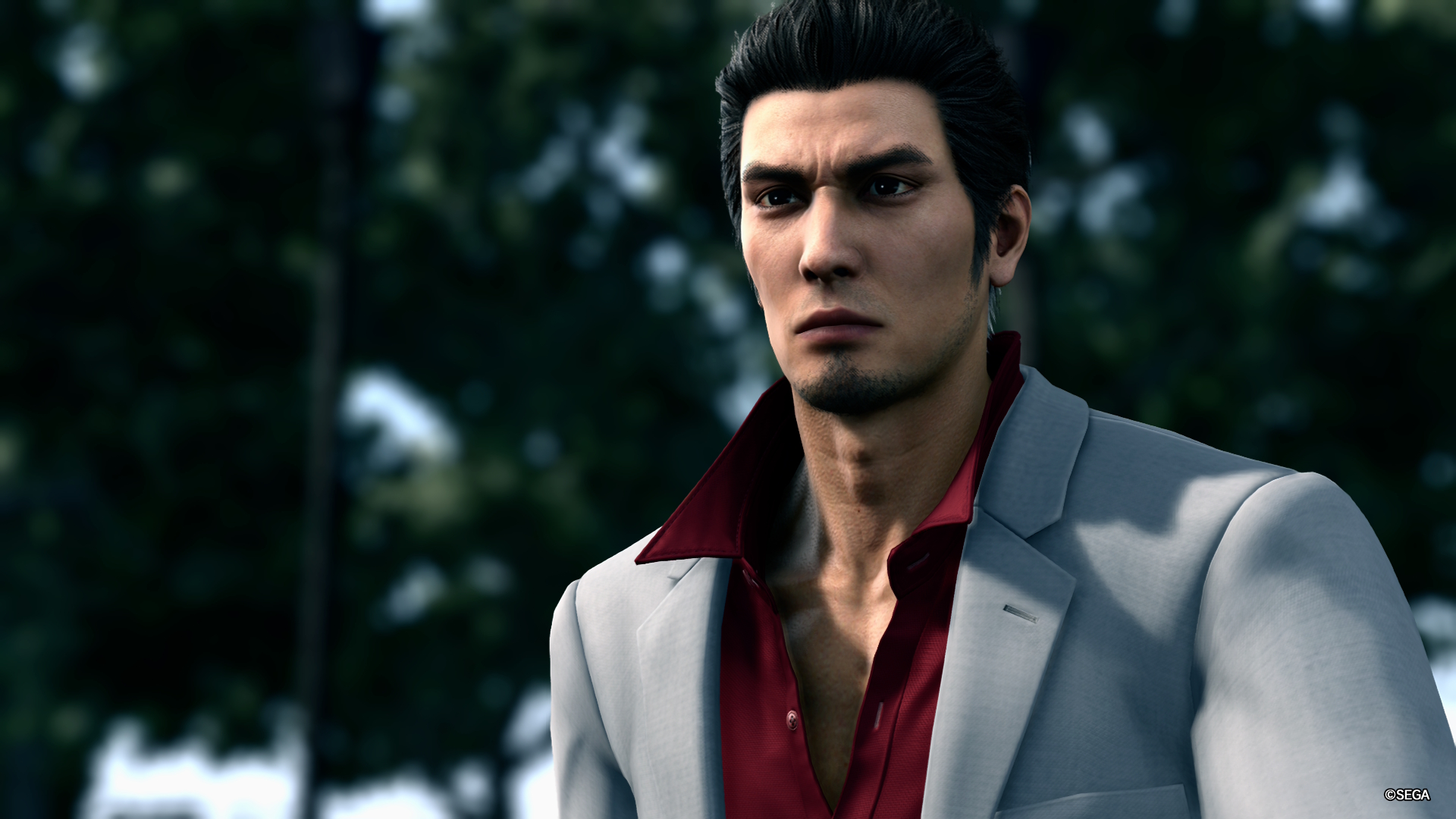
Kiryu is back on Nintendo Switch 2, with Yakuza Kiwami 2 – a remake of the second installment in Ryu Ga Gotoku Studio’s famed and celebrated series. This is a port, and arrives eight years after Kiwami 2 first launched in Japan on the PS4.
Platform reviewed: Nintendo Switch 2
Available on: PS4, PS5, Nintendo Switch 2, Xbox One, Xbox Series X and Series S, PC
Release date: November 13, 2025 (Switch 2)
This game is a direct follow-up to the events of Yakuza Kiwami, and continues the story of ex-Yakuza Kazuma Kiryu. Without spoiling too much, the game follows Kiryu’s journey to find a new chairman for his former employer, the Tojo Clan, and prevent an all-out war between the Clan and its rival, the Omi Alliance. It’s a very strong follow-up, and the tension running throughout the narrative really sucked me in – I could barely put Kiwami 2 down.
But how does the Nintendo Switch 2 port hold up? Is this a good way to play the game? After spending hours brawling through Kiwami 2 on Nintendo’s latest hardware, I’ve got a few thoughts, so let’s dive in.
A visual upgrade that comes at a cost
Before I talk about the game itself, I want to discuss the quality and performance of Kiwami 2’s Switch 2 port.
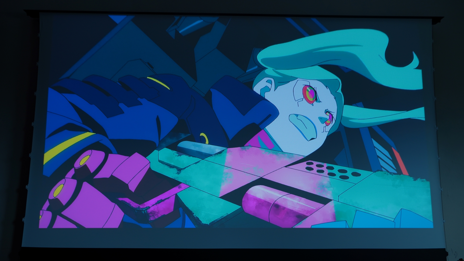
Visually, this hits the sort of levels you’d expect. It runs at 1080p, as I also experienced when playing it on PS4. Character models and environments are replicated well on Switch 2, although of course, they do show their age. Still, this is a flashier looking game than Yakuza Kiwami, largely due to its development on the more advanced Dragon Engine. The intricacies of clothing, character expressions, and lighting of shops look more detailed and shiny in this entry.
But with the more advanced visuals and effects comes a price. Yes, Yakuza Kiwami 2 only runs at 30fps. And given that I’d played Yakuza Kiwami right before this – a game that runs comfortably at 60fps on Switch 2 – that drop down was all too obvious.
As understandable as it is, this does mean that movement and navigation lacks the fluidity you’d experience with Kiwami or even Yakuza 0 Director’s Cut.
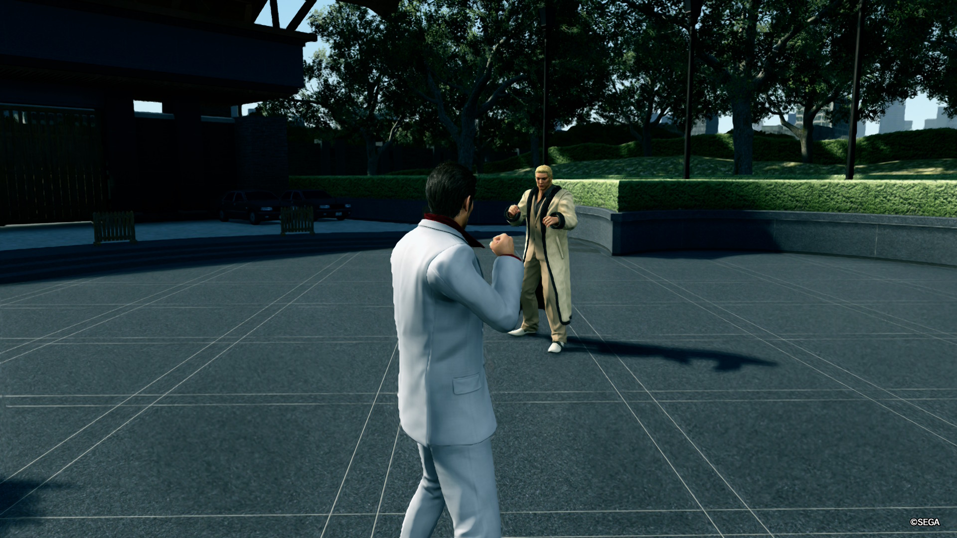
Fairly early on you get to battle it out against The Dragon of Kansai, and it's truly epic. He's got a ton of health, so you have to carefully block and dodge, then strike when there's an opening. There are also weapons hidden in the bushes which you can use to really batter him. It's a face-off that prepares you for the tougher one-on-ones that lie ahead, and was super satisfying when I landed the finishing blow.
Also, there are unfortunately a few frame drops to contest with, as was the case on PS4. When walking through busy parts of Kamurocho or entering into high-octane sequences, I noticed a few dips, which could be pretty frustrating. This is the case in docked or handheld mode.
Is performance bad? No – it’s about on-par with what the PS4 could plate up, and frame drops never made combat feel more challenging than it should do, crucially. But if you’re expecting the smooth 60fps gameplay of the recently released PS5 version, you’re going to be disappointed.
All in all, this port is decent. You get to enjoy Kiwami 2 on the go, and that in itself is a major positive. Sure, it’s not the definitive way to play, but if you’re looking for portability over top-tier performance, this is still a worthwhile way to play. Oh, and for those wondering, the green filter is still alive and kicking on Switch 2.
Two Dragons
So, the Switch 2 edition of Yakuza Kiwami 2 is solid overall, but how about the game itself?
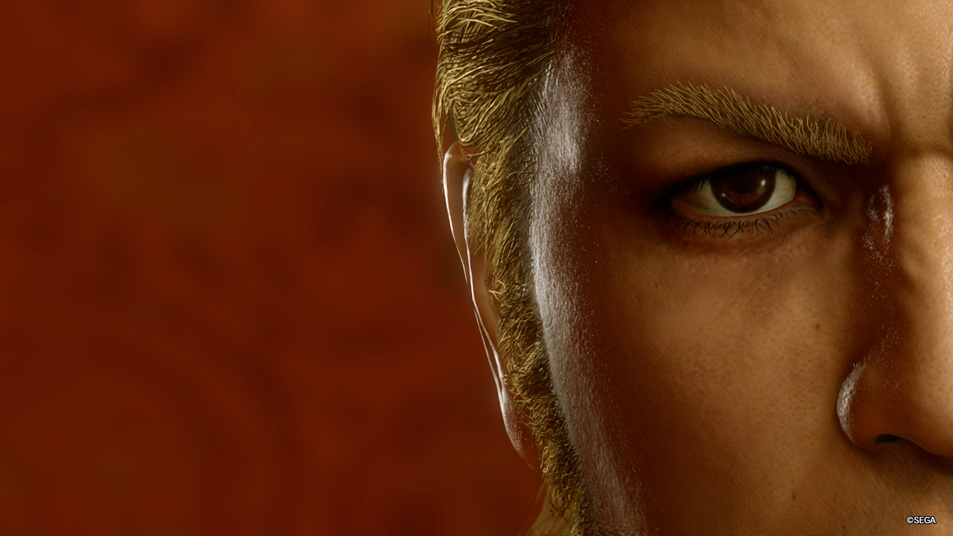
I’ll put my cards on the table – I had an absolute blast with Kiwami 2. First of all, the story is kept tight and is gripping from start to finish. The narrative is paced fantastically well, and the cast of characters is excellent once more. This time around, there’s a ‘big bad’ who you’re introduced to right from the off, Ryuji Goda. He refers to himself as The Dragon of Kansai, and serves as the ultimate rival to Kiryu – himself known as The Dragon of Dojima.
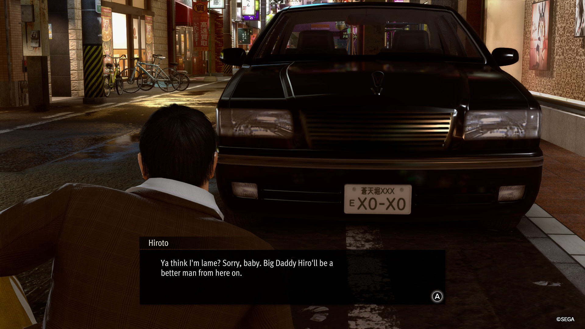
There are plenty of twists and turns to navigate, and there’s a brief set of chapters where you can play as the sadomasochistic Goro Majima, which are pretty entertaining. Of course, there are plenty of whacky substories to complete too, running from claw machine antics through to defeating a band of men dressed up in diapers.
Anyway…something I really appreciated about Kiwami 2 – coming straight off playing the first Kiwami game – was the streamlined nature of its gameplay. There’s a technical side to that, like the lack of loading screens when Kiryu walks into restaurants or other buildings, for example. But also, I liked how the multitude of combat styles were substituted for a more singular approach to battle.
In Kiwami, you had to learn skills for specific styles, whereas now, every ability you learn is available to you through a unified Dragon style. Personally, I prefer this more centralised approach – being able to use all of my flashy new moves without having to change into a different mode is a significant upgrade. Some may miss the variety of unique styles, but luckily, I’m not ‘some’!
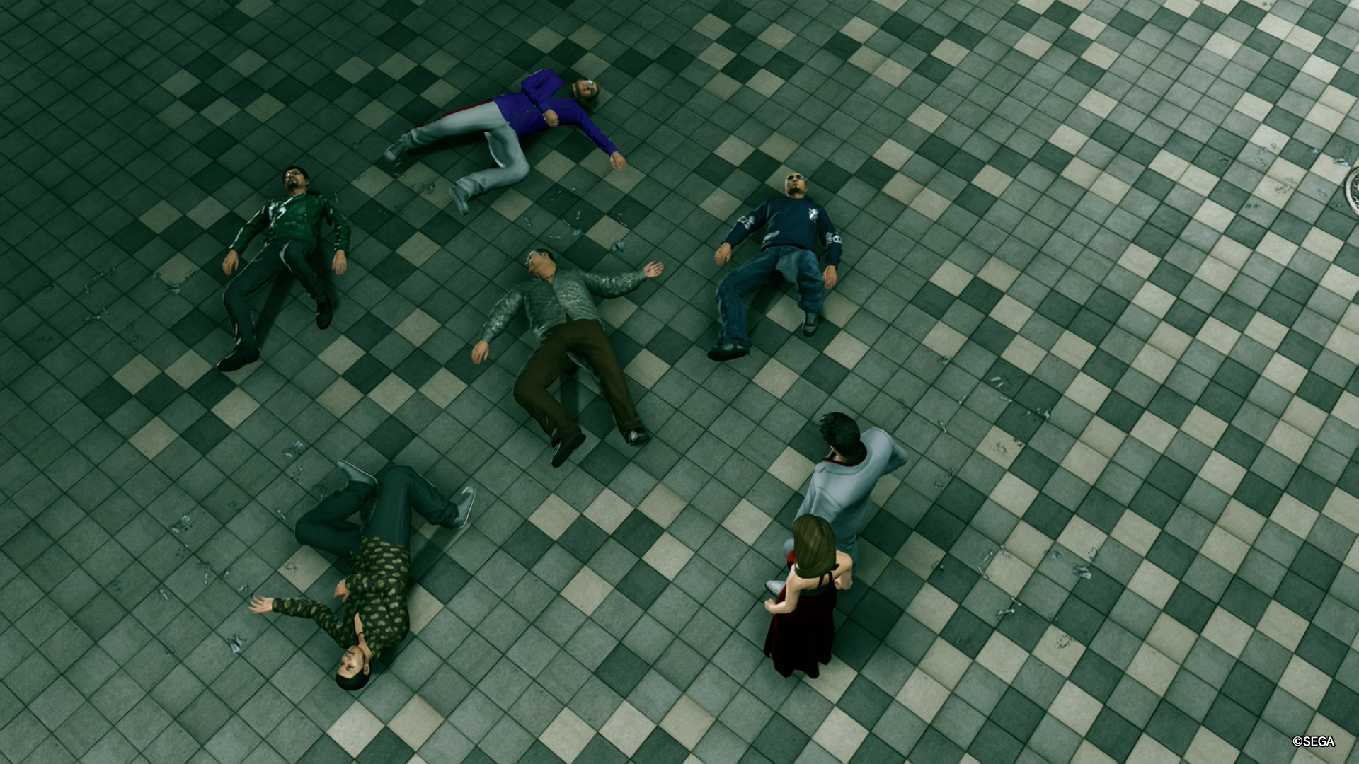
More generally, combat is awesome. It’s simplistic yet rewarding, and piecing together killer combos on seriously beefy bosses feels exhilarating. Heat actions also let you crush your foes in style, and you’ll unlock more of these as you progress, making it genuinely feel as if Kiryu grows in strength as the story unfolds.
Before I wrap up, I also want to pay kudos to the excellent, electrifying soundtrack that runs throughout this game. I love the music in Yakuza games, and it sounds as good as ever in Kiwami 2. Japanese voice acting is also superb, and the mid-2000s setting is captured beautifully, with background music, murmuring passers-by, and the sound of pouring rain creating an incredibly immersive atmosphere.
All in all, Yakuza Kiwami 2 is a great game, and a must-play for any fans of the Yakuza series on Switch 2. Sure, its drop down to a targeted 30fps can feel jarring at times, and I did pick up on a few frame drops, but visually it’s still enticing, and when you combine that with addictive combat and a top-notch story, there’s just so much to like.
Should you play Yakuza Kiwami 2 on Nintendo Switch 2?
Play it if...
You want to play Yakuza on the move
It may seem obvious, but the real beauty of this port is that it lets you take Yakuza on the go, and enjoy the whacky world and engaging story no matter where you are. The game runs admirably in handheld mode too, so it’s a tempting way to play.
You’re a fan of high-octane combat
The action-packed combat of Yakuza Kiwami 2 is incredibly addictive. There are some seriously epic boss fights where perfectly timed dodges and finishing blows feel oh-so satisfying, and even getting into street brawls never gets old.
Don't play it if...
You’ve got a PS5
Kiwami 2 targets 30fps on the Switch 2, and some occasional frame drops can cause frustration when exploring busier areas. However, the recently released PS5 version of the game runs at 60fps, making for a smoother and more seamless way to experience the game.
You’ve not played other games in the series
Although there’s a recap sequence at the beginning of the game, I would strongly recommend playing Yakuza Kiwami before you get into this one. And although some may disagree, I think playing Yakuza 0 before both of these is the optimal way to go – you’ll get the full backstory of Kiryu and Majima, which adds considerable depth.
Accessibility features
As was the case on Yakuza Kiwami, there are a few useful customization options available in the settings menu. For instance, you can change camera controls, enable subtitles in a wide range of languages, and alter difficulty as well as blood levels. There’s also an option to toggle display tips on or off. Unfortunately, there are no colorblind modes, though.
How I reviewed Yakuza Kiwami 2 on Nintendo Switch 2
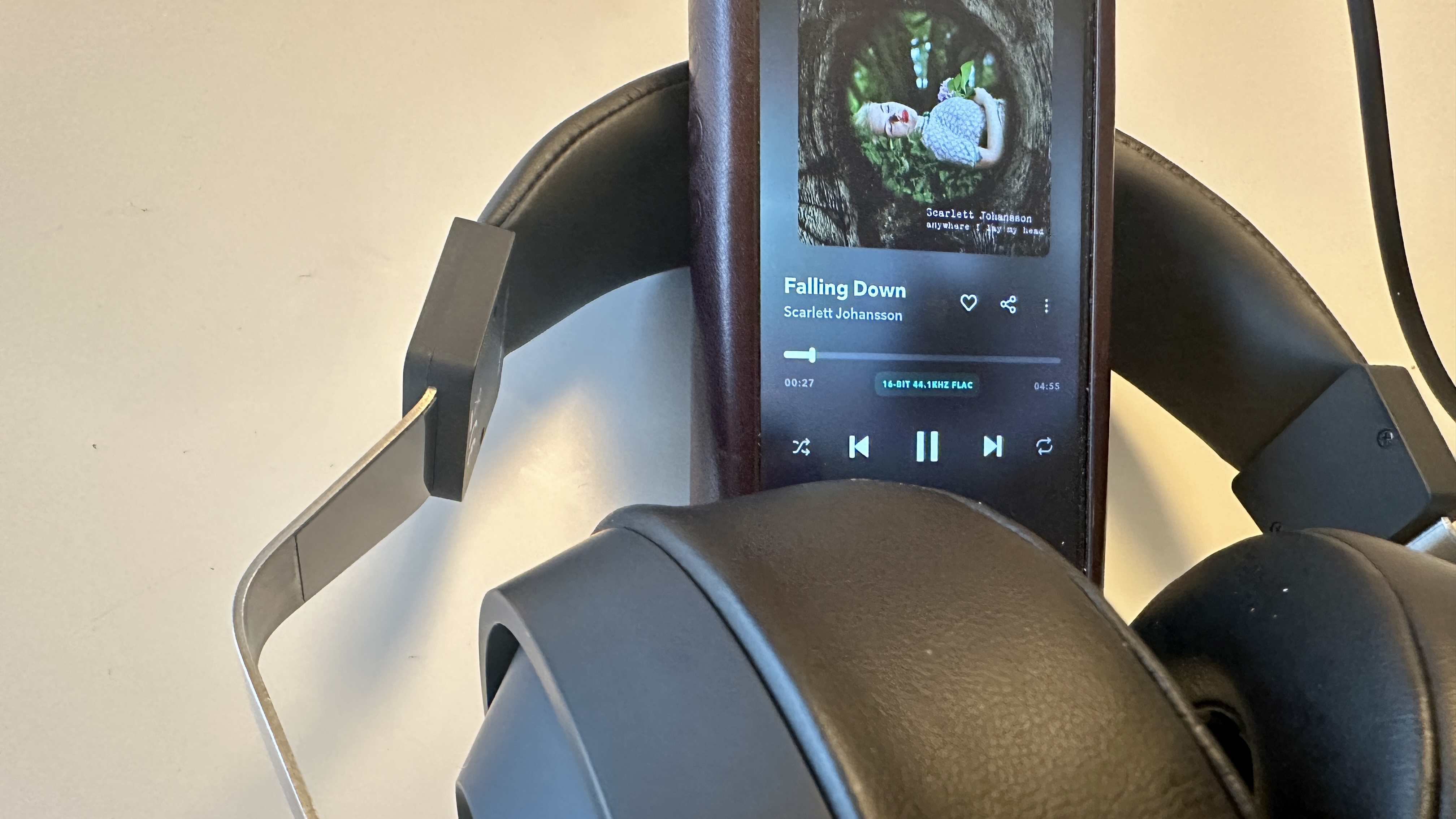
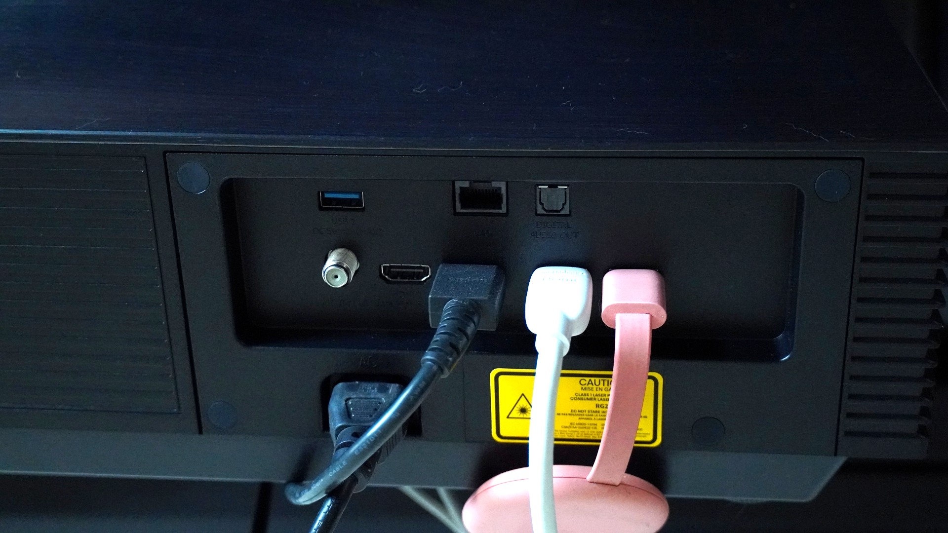
I clocked more than 15 hours of playtime on Yakuza Kiwami 2. During this time, I completed a handful of substories and minigames, but mainly focused on the main story. I spent most of my time playing in handheld mode on Nintendo Switch 2, sometimes enjoying game audio with my Sony WH-1000XM6 headphones. However, I also tried the game out in docked mode, with my console connected to the Sky Glass Gen 2 TV and Marshall Heston 120 soundbar.
Before taking on this title, I played through Yakuza Kiwami on Nintendo Switch 2, but I’m generally a big fan of the Yakuza series, with 0 standing as my favorite entry in the franchise.
More generally, I’ve been a Nintendo Switch 2 owner from launch, and have reviewed a wide range of games for the console. This includes other RPGs like Dragon Quest 1 & 2 HD-2D Remake and Raidou Remastered: The Mystery of the Soulless Army, but also titles from other genres, like Kirby Air Riders and Drag x Drive.
First reviewed December 2025