Tuesday, August 31, 2021

Branch Standing Desk

Working in a seated position all day long has been proven to have negative effects on your health which is why more office workers and even those working from home have decided to upgrade their workspaces with a standing desk. With an electric standing desk, you can easily move from sitting down to a standing position with just the push of a button.

After working in the commercial real estate industry for years and furnishing dozens of offices, Greg Hayes set out to simplify the process of purchasing high quality office furniture by starting his own direct-to-enterprise office furniture company originally called Bureau in 2018 that was later renamed to Branch. While the original iteration of the company grew rapidly and succeeded in completing installations across the US and Canada, enterprise office furniture sales began to dry up at the beginning of the pandemic. For this reason, Branch made the shift to becoming a direct-to-consumer business and these efforts have paid off well for the company as its consumer business is now larger than its enterprise business previously was.

While Branch continues to make a number of high-end desks for offices and enterprise businesses, the company launched its Standing Desk in 2019. Unlike other standing desks that you’ll need to research extensively before buying, if you’re located in New York City or planning a trip there, you can actually go look at Branch’s Standing Desk in person as the company’s flagship showroom is located just two blocks away from Penn Station. However, you will need to book your visit first as Branch isn’t accepting drop-ins at this time.

In this review, we’ll be taking a closer look at the packaging, assembly process, ease of use and the features offered in Branch’s Standing Desk to help you decide whether it’s the right fit for your office or home workspace.

Pricing and availability

Branch’s Standing Desk is available on the company’s website in two configurations. The smaller Team Plus version costs $699 while the larger Executive version costs $799. Despite the fact that the desktop can weigh anywhere between 43lb (19kg) and 51lb (23kg) depending on which version you choose and the base weighs 73lb (33kg), Branch offers free shipping on most home office orders within the continental US. The company’s desks typically arrive within 1-5 business days if they are currently in stock.
Design

(Image credit: Future)

Design

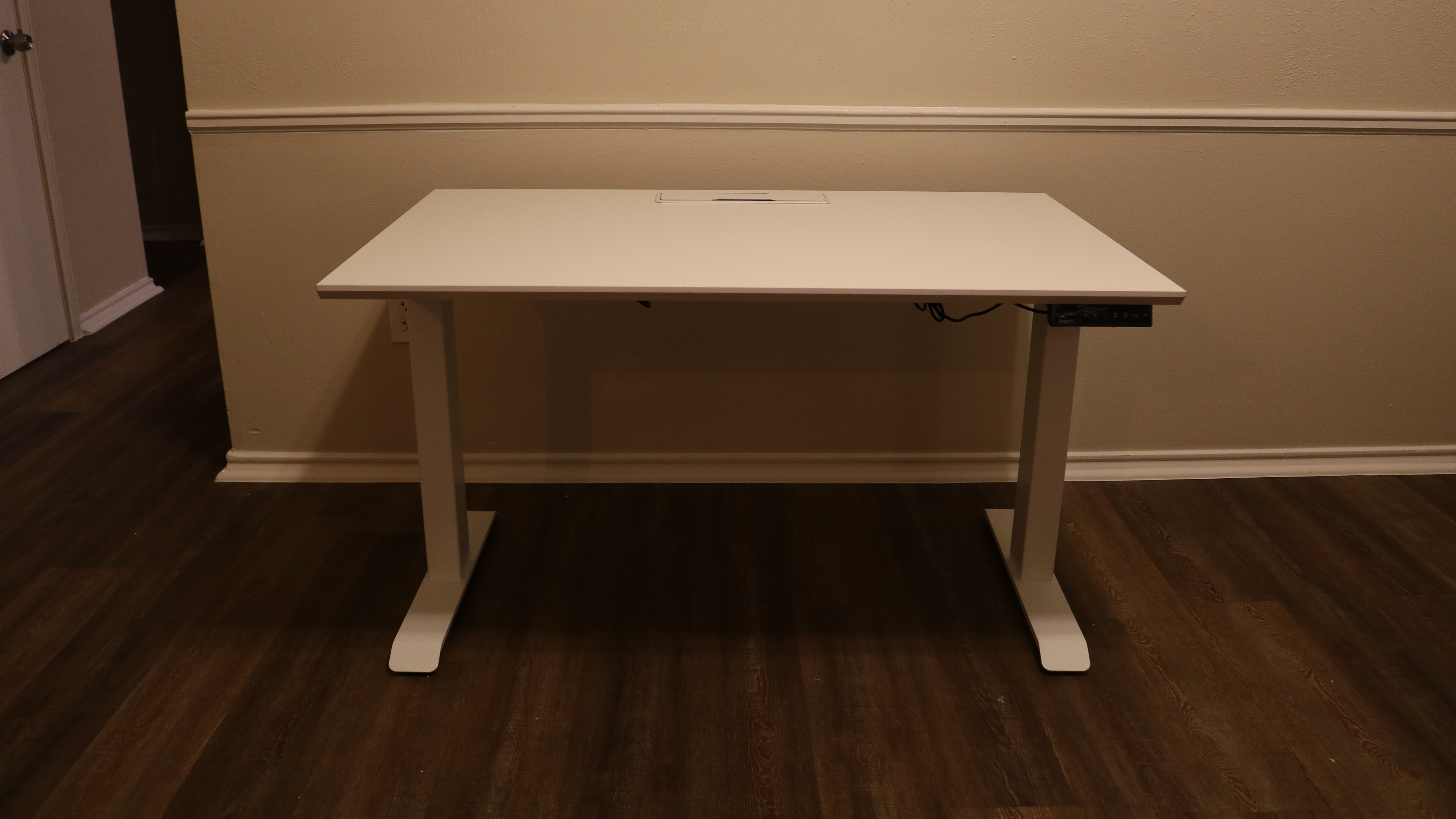
Regardless of whether you choose the Team Plus or Executive configuration, both desks feature a depth of 30 inches and have a minimum height of 25 inches and a maximum height of 52 inches. However, while the Team Plus version of the desk has a width of 48 inches, the Executive version of the desk has a width of 60 inches. One of the things that sets Branch’s Standing Desk apart from the competition is the fact that it has a lift capacity of 275lb (124kg).

Branch’s Standing Desk features a modern design with an impact resistant melamine top that’s available in woodgrain, white or walnut. While you can pick the color of the desktop, the desk’s legs are only available in white. Still though, the white legs give the desk a premium feel especially when paired with the white top.

Each leg contains a low-decibel EasyGlide motor, three-stage lift columns for a smooth, stable raise and tapered, adjustable feet. Both legs slot into the desk’s frame and brackets on either side of the frame are used to attach the desktop to the base of the desk. 
Control Box

(Image credit: Future)

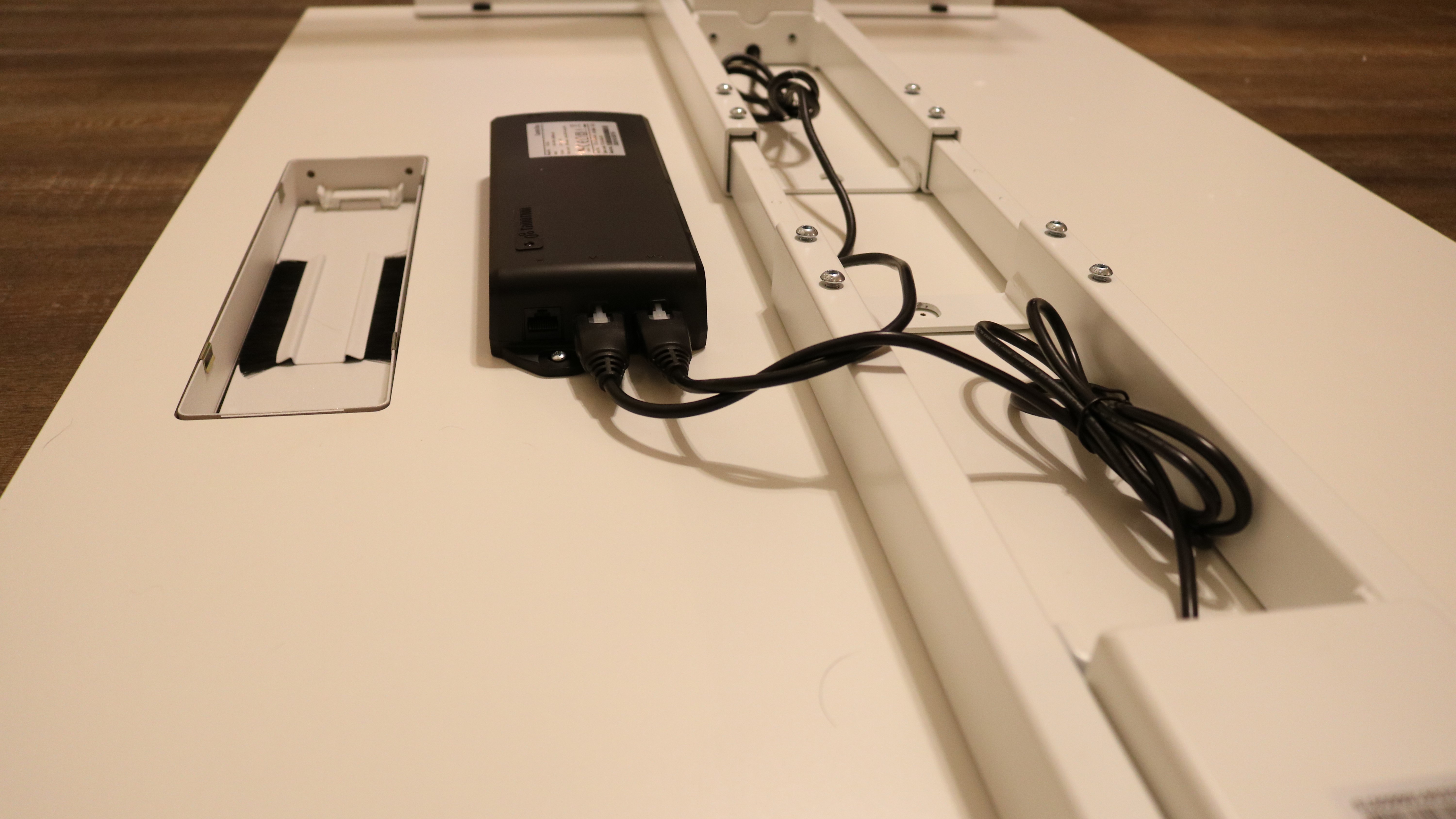
Mounted between the frame and the brushed grommet used for running cables on the underside of the desk is a control box which both legs plug into as well as the power cable and keypad.
Keypad

(Image credit: Future)

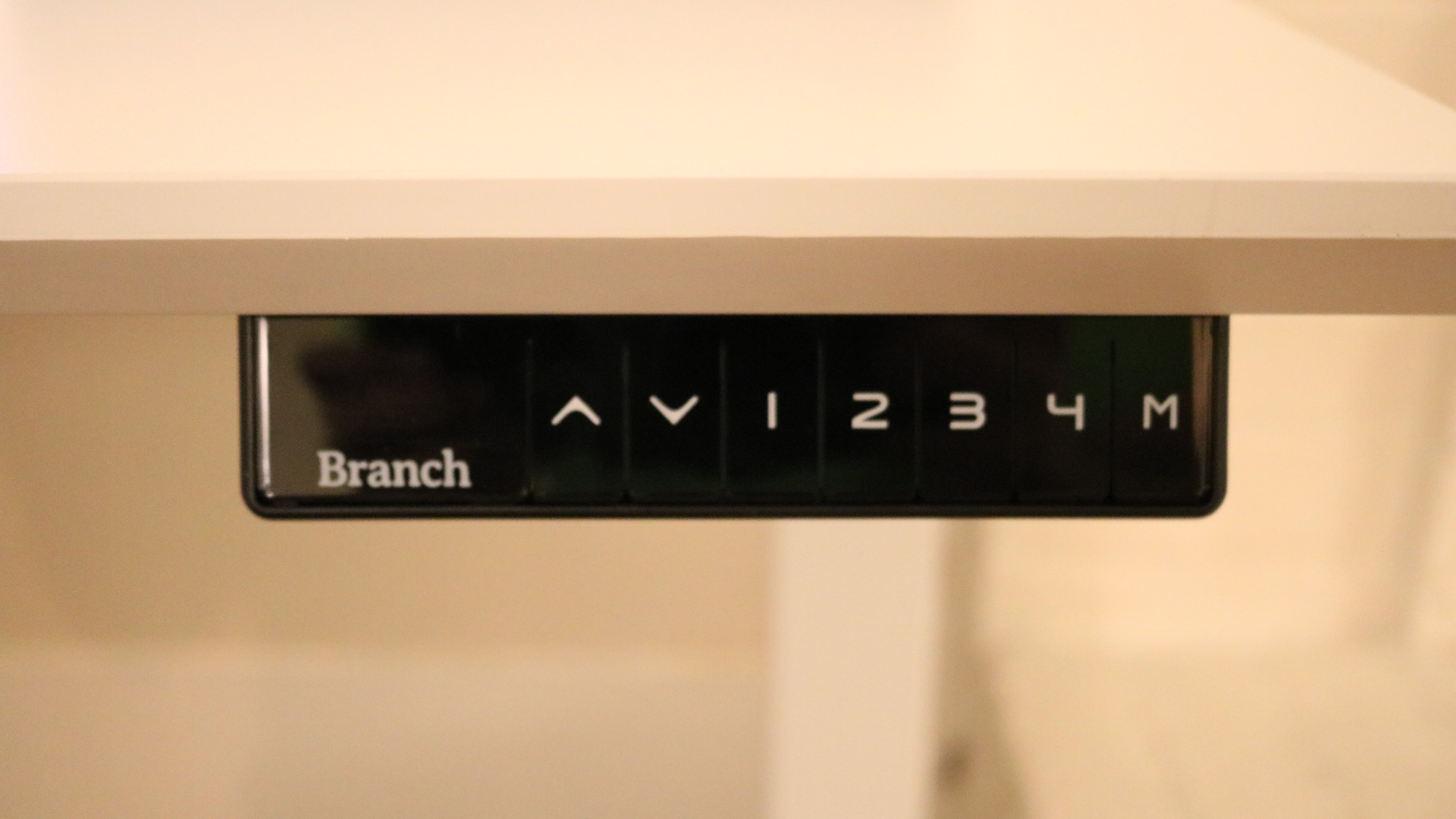
The keypad used to raise and lower the desk as well as for storing your sitting and standing preferences is mounted on the right side of the desk. While there aren’t any pre-drilled holes on the left side of the desk, you can mount the keypad to that side as well as the cord, which needs to be plugged into the control box, is quite long.
Cable Management

(Image credit: Future)

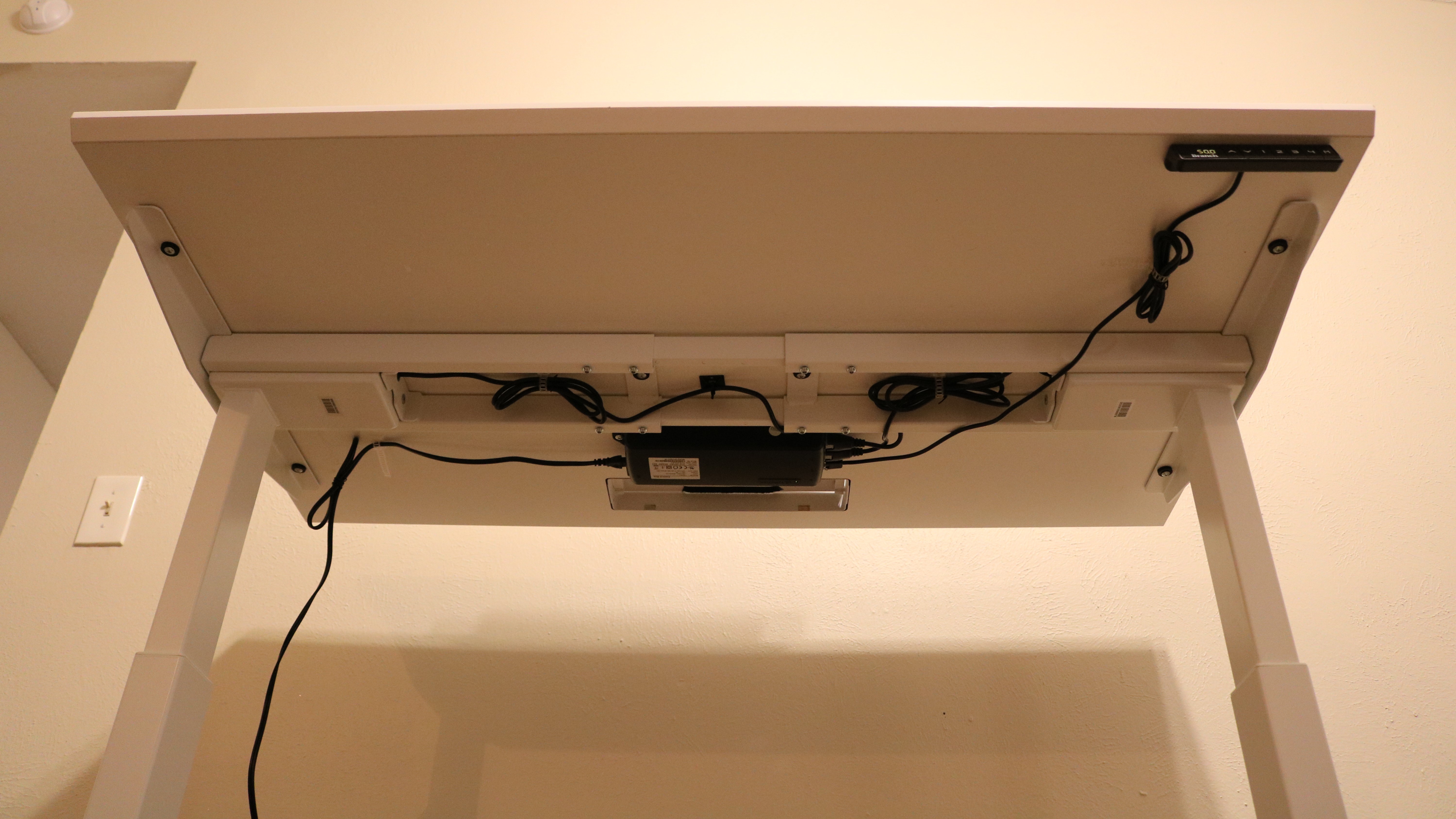
Branch provides a number of cable ties as well as some adhesive-backed zip tie mounts to help you tidy up the cables running from both legs as well as from the keypad.

Boxes

(Image credit: Future)

Setup

Branch’s Standing Desk arrived in two boxes with one containing the Standing Desk Base and the other containing the desktop.

Unboxed

(Image credit: Future)

You also receive an instruction manual, a bag with all of the screws, an Allen wrench and five cable clips.
Frame

(Image credit: Future)

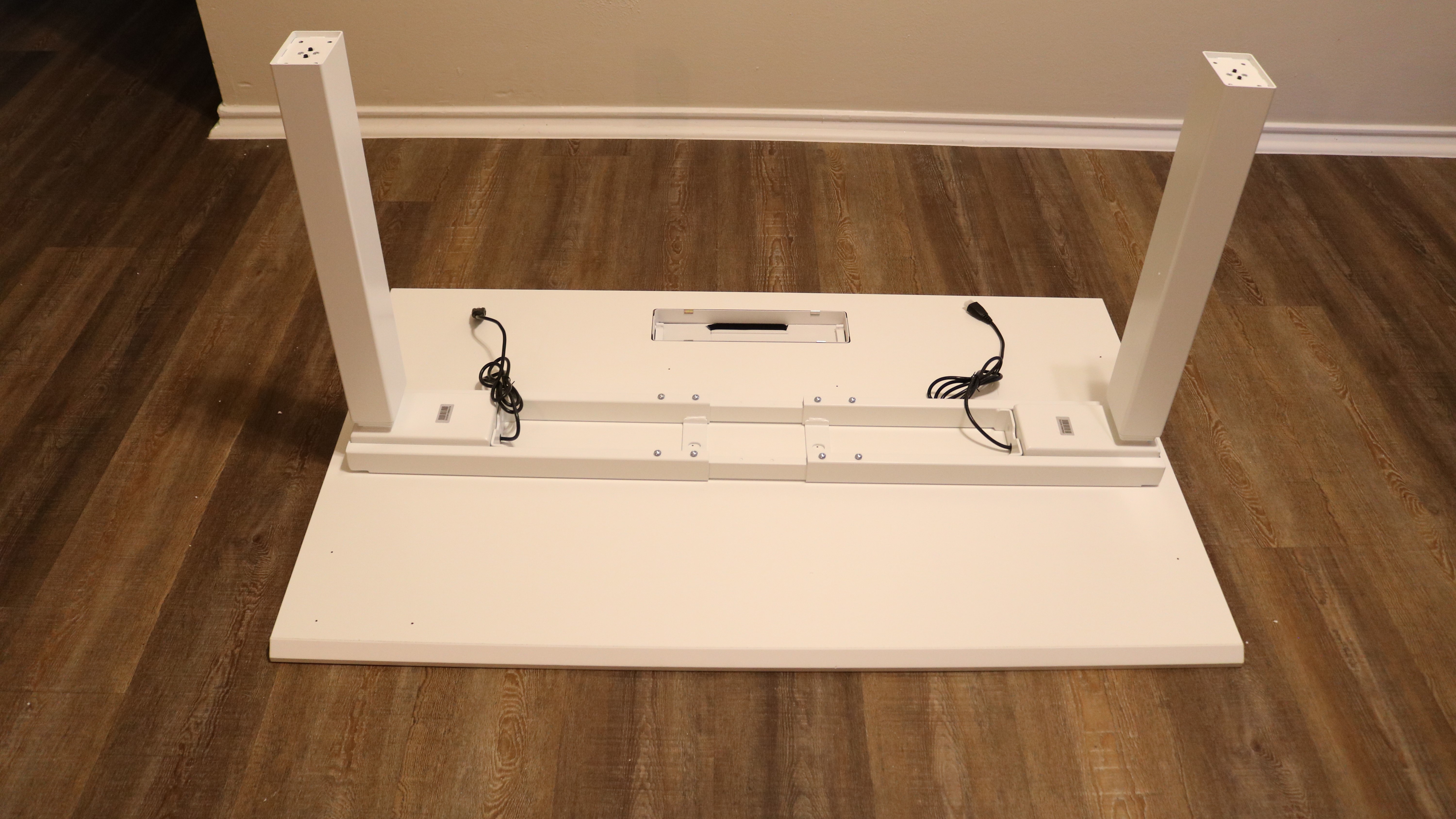
To begin assembling the desk, you first need to adjust the two bars in the middle of the frame to line up with two pre-drilled holes at the center of the desk. The reason for this is that both the Team Plus and Executive configurations of Branch’s Standing Desk use the same base. From here you slot in both Lifting Columns and connect them to the frame and then attach the feet to the Lifting Columns. 
Brackets

(Image credit: Future)

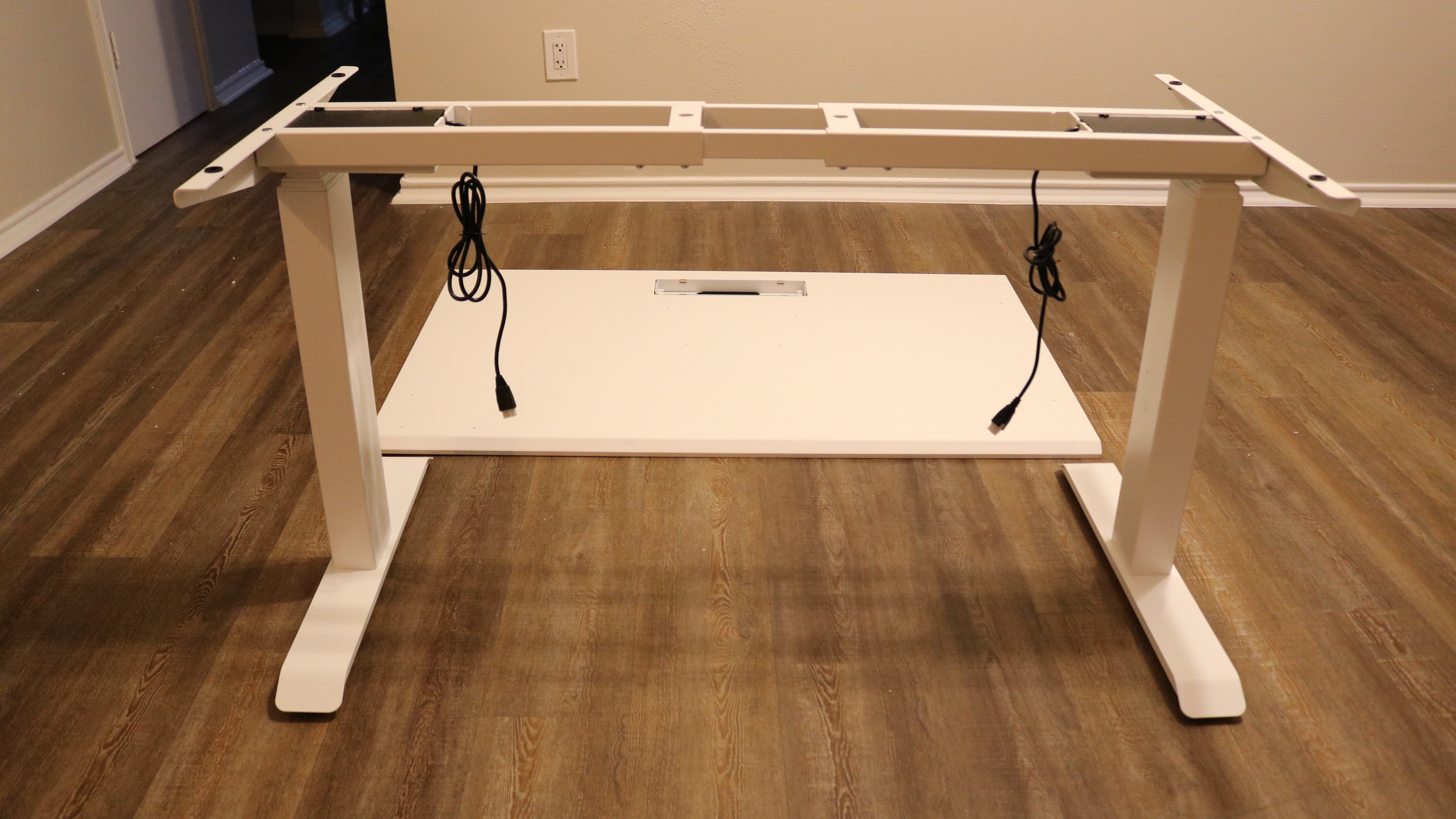
After flipping over the frame, you need to attach the two brackets to either side before flipping it over again and attaching it to the desktop using a Philips head screwdriver.

Once this is complete, you need to attach the control box between the frame and the brushed grommet. The cords from both Lifting Columns need to be plugged into the control box along with the cord from the keypad that is secured to the right side of the desk at the front. You will then need a friend or co-worker to help you flip the desk over one last time. 

To finish setting up Branch's Standing Desk, you need to plug it in and hold the up and down buttons at the same time. The desk will lower itself all the way down and you’ll hear a slight beep followed by a brief flash on the display. After pressing the up button once to engage the motors, your desk should be activated and ready to go.
First Test

(Image credit: Future)

In use

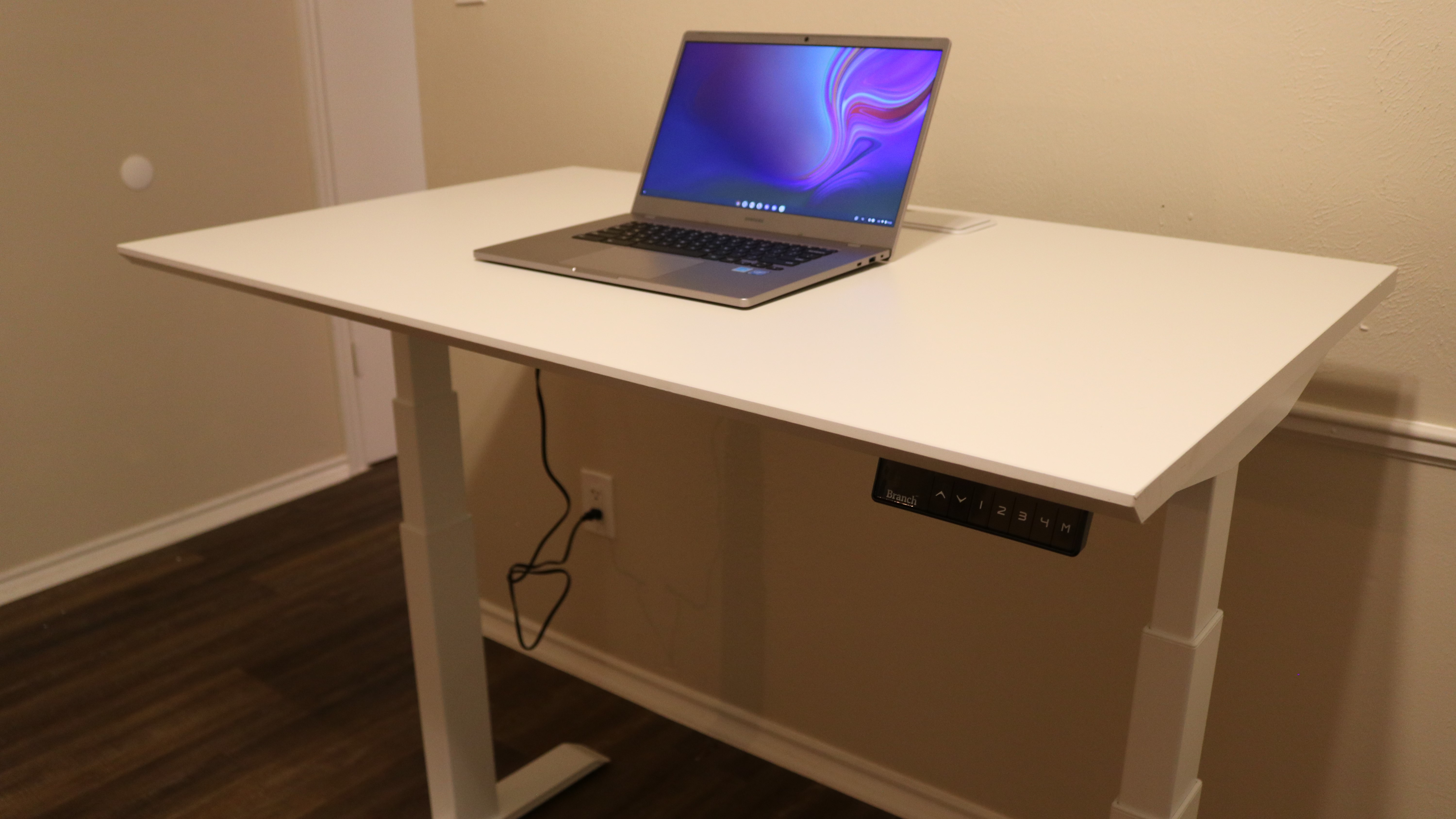
After we finished assembling Branch’s Standing Desk, we did our first round of testing using a Chromebook from Samsung. The desk itself was very sturdy and we found its lifting mechanism to be both quick as well as quiet. You can also save up to four different height configurations to the keypad using the 1-4 buttons. To save a configuration, simply adjust the desk to the height you want it at, press and hold the “M” button until the display flashes and then press the number key you want to assign it to.

Branch also offers an In-Desk Power accessory for its standing desk which consists of a wire box that holds a power strip with two USB ports for $160. While having a power strip attached to your standing desk is highly recommended especially if you want to use a desktop PC and a monitor instead of a laptop, the design of branch’s In-Desk Power accessory makes it difficult to plug in devices with larger power bricks. Although you can plug in a larger power adapter you won’t be able to close the top door of the brushed grommet when charging your laptop.

For this reason, we decided to mount one of Ikea’s SIGNUM cable management systems to the underside of the desk instead. This allowed us to have a power strip under the desk with enough room that we could plug in all of our adapters and use the brushed grommet to run our cables. However, a Branch spokesperson did explain to us that the company plans to release a cable tray early next year and this should make it much easier to keep all of your cables as well as a power strip neatly tucked away under its standing desk.
Second Test

(Image credit: Future)

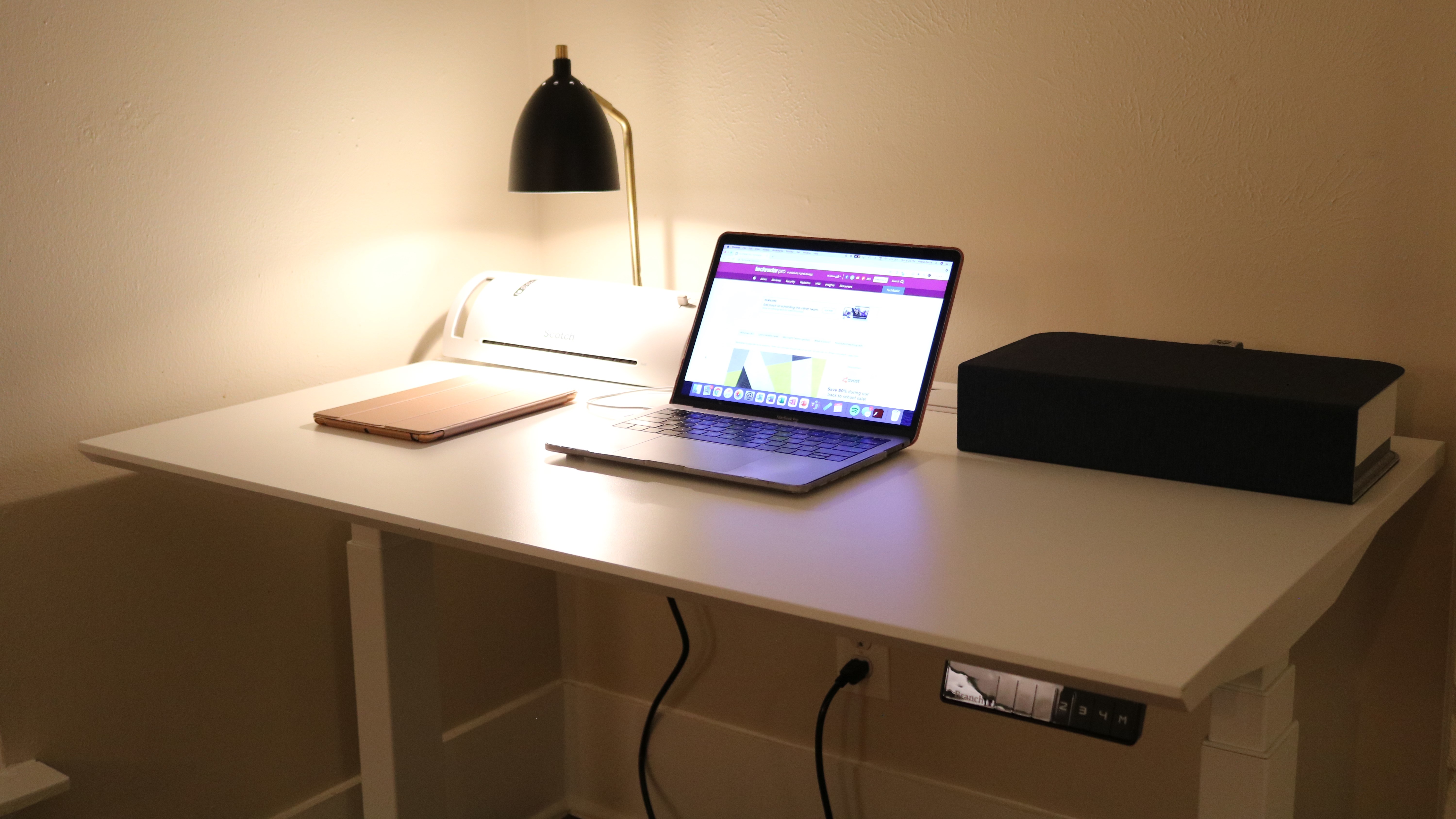
During our second round of testing, we used Branch’s Standing Desk with a MacBook Pro though we also had an iPad as well as a desk lamp, a laminator and an HP Tango X printer on top of the desk. Even though we opted for the smaller Team Plus configuration of the desk, there was still plenty of room for all of our devices.

The premium look and feel of Branch’s Standing Desk really impressed us as well as how quickly it could make the transition from sitting to standing height with just the push of a button.

The competition

As Branch’s Standing Desk is available for either $699 or $799 depending on the size of the desktop you choose, we’ll be looking at similarly priced electric standing desks that offer similar features.

Vari’s Electric Standing Desk is available in multiple configurations to suit the size of your workspace starting at $595 and going up to $795. The company also offers an extra wide desk with a width of 72 inches and its desktop is available in five finishes as opposed to just three. Vari’s Cable Management Tray is also significantly cheaper than Branch’s In-Desk Power at only $50. If you plan on using multiple monitors with a workstation, Branch’s Standing Desk is the better choice as its desk supports up to 275lb while Vari’s Electric Standing Desk supports from 180lb to 220lb depending on which configuration you choose.

If you really want to customize your desk to suit the look and feel of your workspace, the Uplift Standing Desk V2, which costs $599 for its base configuration, could be a good choice as Uplift Desk offers 24 different desktop styles to choose from, five desktop sizes, frames in four colors and multiple keypads in a variety of styles and even colors. The company also offers free shipping within the continental US. Surprisingly, the Uplift Standing Desk V2 is capable of lifting up to 355lb (161kg). Uplift Desk also offers a number of accessories for its desk that mount to its frame including a PC mount, a power strip, desk extensions and even a hammock for your feet.

Final verdict

Branch’s Standing Desk is a testament to just how well the company was able to transition from a direct-to-enterprise to a direct-to-consumer model. While its standing desk can easily be shipped to your home for you to assemble yourself, the company also offers White Glove Installation, which includes, delivery, assembly and cleanup for an additional fee, in major cities across the US including Atlanta, Austin, Boston, Chicago, Houston, New York City, Los Angeles, Philadelphia, Seattle, Washington DC and others.
Although Branch’s In-Desk Power accessory is a bit on the expensive side and makes it difficult to hide large power adapters from view, the company is working on a cable tray for its standing desk that is expected to be released early next year. This new accessory will likely fix some of the cable management concerns we had when setting up our standing desk.
If you’re looking for a new desk with a premium look and feel that can be used in a sitting or standing position and don’t want to break the bank, you’ll be hard pressed to find a better option than Branch’s Standing Desk. Also as the company has a worry-free return policy, you can send your desk back to Branch for a refund within 30 days of purchase but you will need to hold onto the original packaging to do so.
Huawei Watch 3

Two-minute review

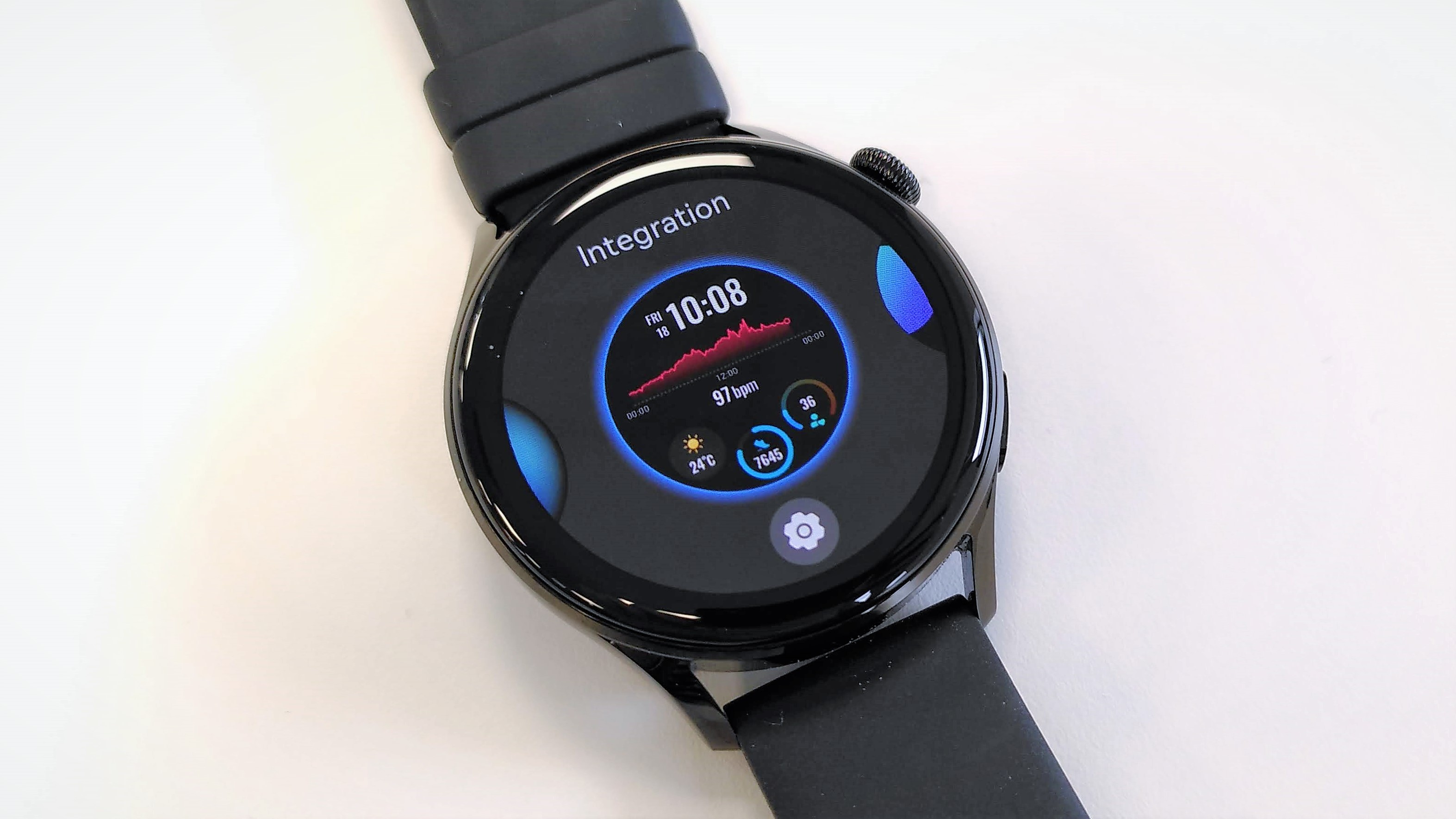
The Huawei Watch 3 is a great looking smartwatch, and is the first to use Huawei’s own HarmonyOS. It runs smooth as silk, but as you’d expect, it’s not quite fully polished yet. There’s only a handful of extra apps available to download, and support for third-party services is limited.

Nevertheless, if you’re using an Android handset (or one of Huawei’s own handsets), the Watch 3 is definitely a smartwatch worth your attention – and it’s likely to get even better as the ecosystem develops.

The Watch 3 is built with fitness tracking in mind, and it comes with an impressive suite of tools for monitoring your everyday wellbeing (including sleep, step counts and SpO2) as well as workouts. We found its heart rate monitoring a little inconsistent during intense training sessions, occasionally registering unexpected peaks during interval sessions, but location tracking proved accurate during our pre-measured run, as did pace and cadence.

We can see a lot of potential in the Watch 3; the hardware is very impressive, and its excellent display would lend itself very well to on-screen navigation, as well as guided workouts with animated instructions. It’ll just take time for HarmonyOS to come into its own, with a wider selection of apps and more support for popular third-party services.

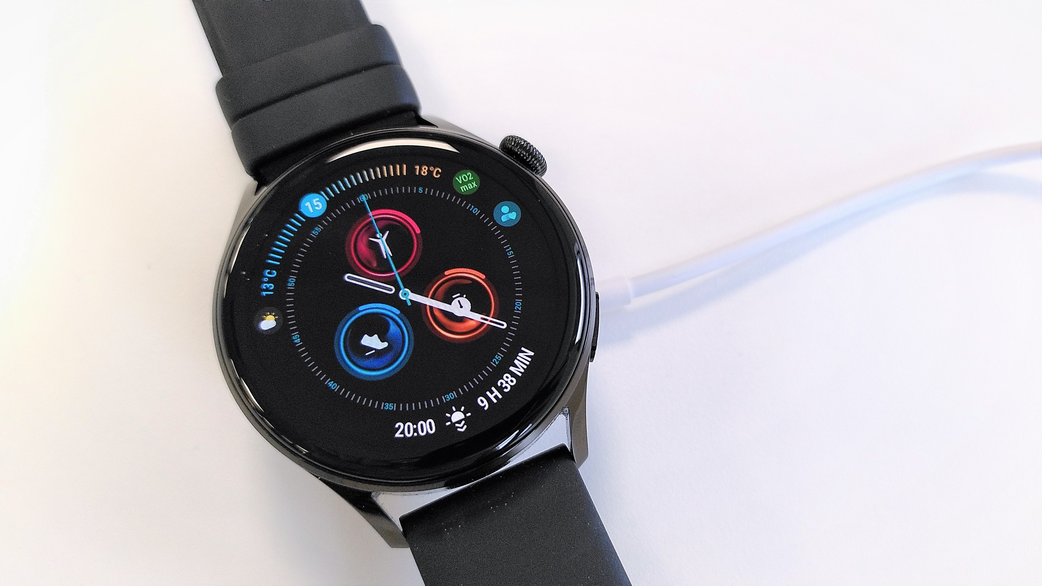
Selecting a watch face on the Huawei Watch 3

The Huawei Watch 3 has a very impressive display, and the many downloadable faces show masses of data at a glance (Image credit: Future)

Price and availability

  • Out now
  • No US release expected
  • Pro version also available

The Huawei Watch 3 was released in selected countries in June 2021, and starts at £279.99. That’s about $390 / AU$530, but no US releases is expected, and an Australian release date has yet to be announced.   

We tested the standard Huawei Watch 3, but there’s also a premium version – the Huawei Watch 3 Pro – which offers a few extra features such as dual-band GPS for improved accuracy, plus improved battery life. It also has a considerably higher price tag, starting at £499.99 (about $690 / AU$940).

Design

  • Rotating crown
  • Large case
  • Bright, crisp AMOLED display

In terms of design, the Huawei Watch 3 is a big departure from the chunky Watch 2, instead bearing more than a passing resemblance to the Watch GT with a large, glossy face, minimal bezels, and glass that curves at the edges to meet the case.

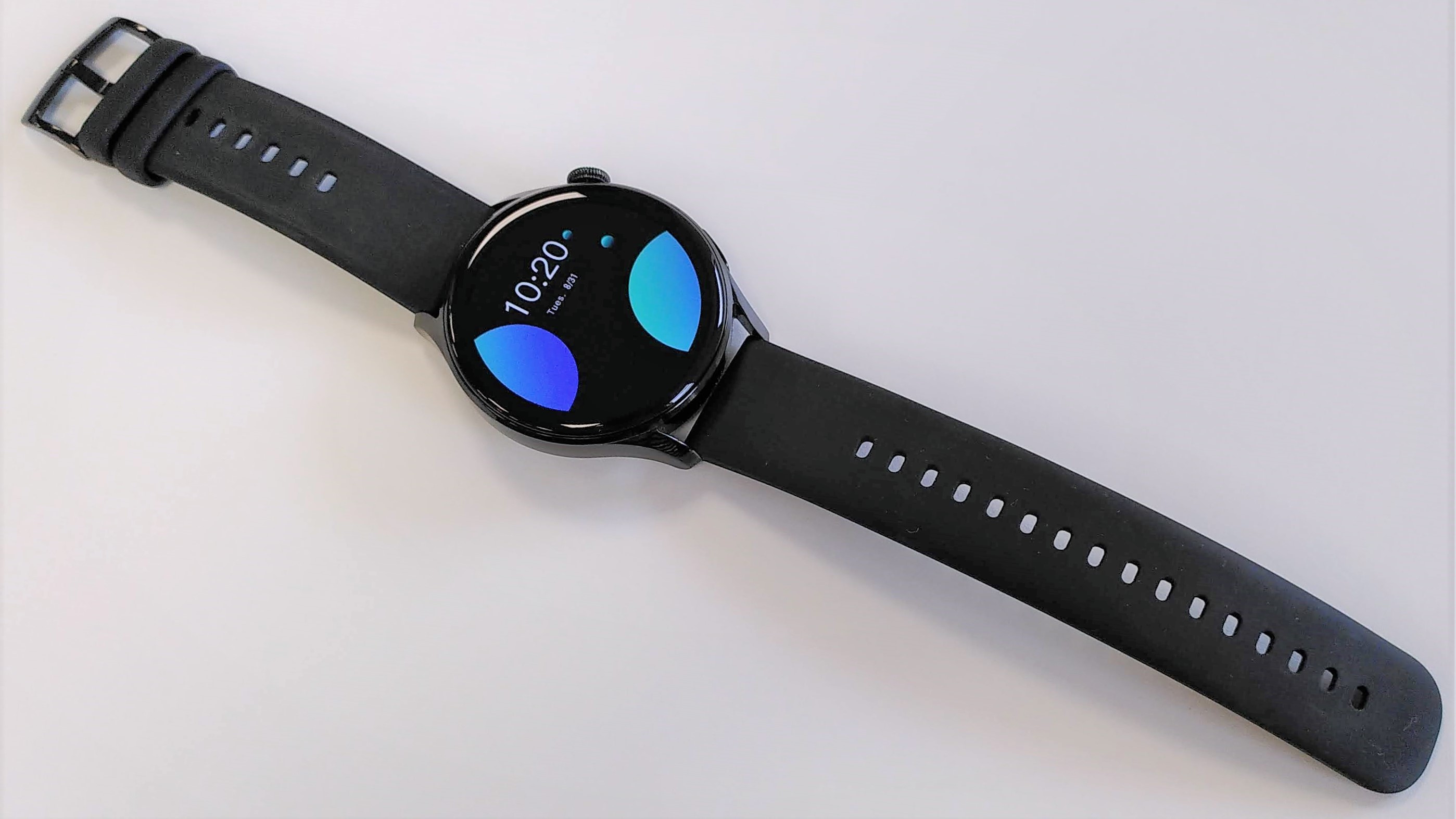
The Huawei Watch 3 active edition (tested here) has a 46mm case, and is supplied with a black silicone band, which isn’t quite as soft as that of the Apple Watch 6, but still comfortable. The band has quick-release pins so you can easily switch it to something a little more stylish, and is secured with a conventional buckle rather than the loop-and-tang style fastening that’s becoming increasingly popular with smartwatches and fitness trackers.

Huawei Watch 3 showing full length of strap

The Huawei Watch 3 active edition comes with a black silicone band, but woven and leather options are also available (Image credit: Future)

If you’d prefer something a little more stylish for everyday and formal ear, there’s also a classic edition (with a silver-toned case and either a leather or woven nylon strap), and an elite edition (with silver-toned case and metal link bracelet).

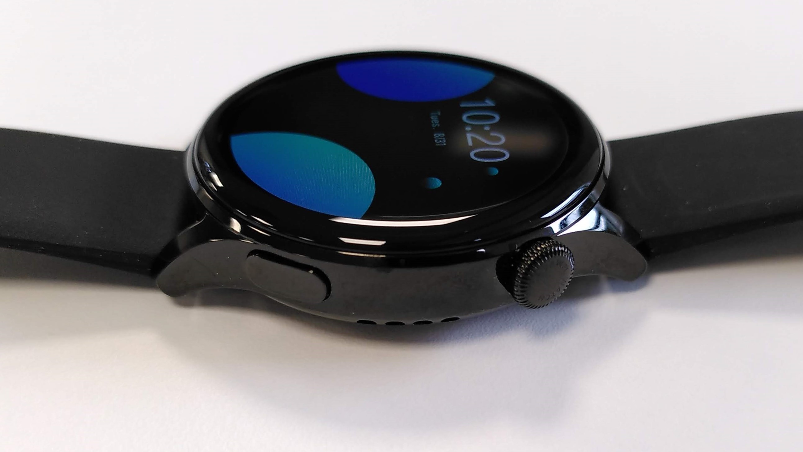
The Watch 3 has just two physical controls: a small button the serves to navigate backwards through menus or return you to the home screen, and a crown that you can press to select options and apps, or turn to scroll through text and menus – a feature that was lacking on the Huawei Watch 2.

It’s a system that works well, and scrolling with the crown is smooth and responsive. It’s also just about large enough to make typing feasible with the Watch 3’s on-screen keyboard, though it’s still pretty fiddly – you’ll be thankful for its autocorrect feature.

Huawei Watch 3 side profile, showing crown and button

The Huawei Watch 3 has an Apple-style rotating crown for scrolling and zooming (Image credit: Future)

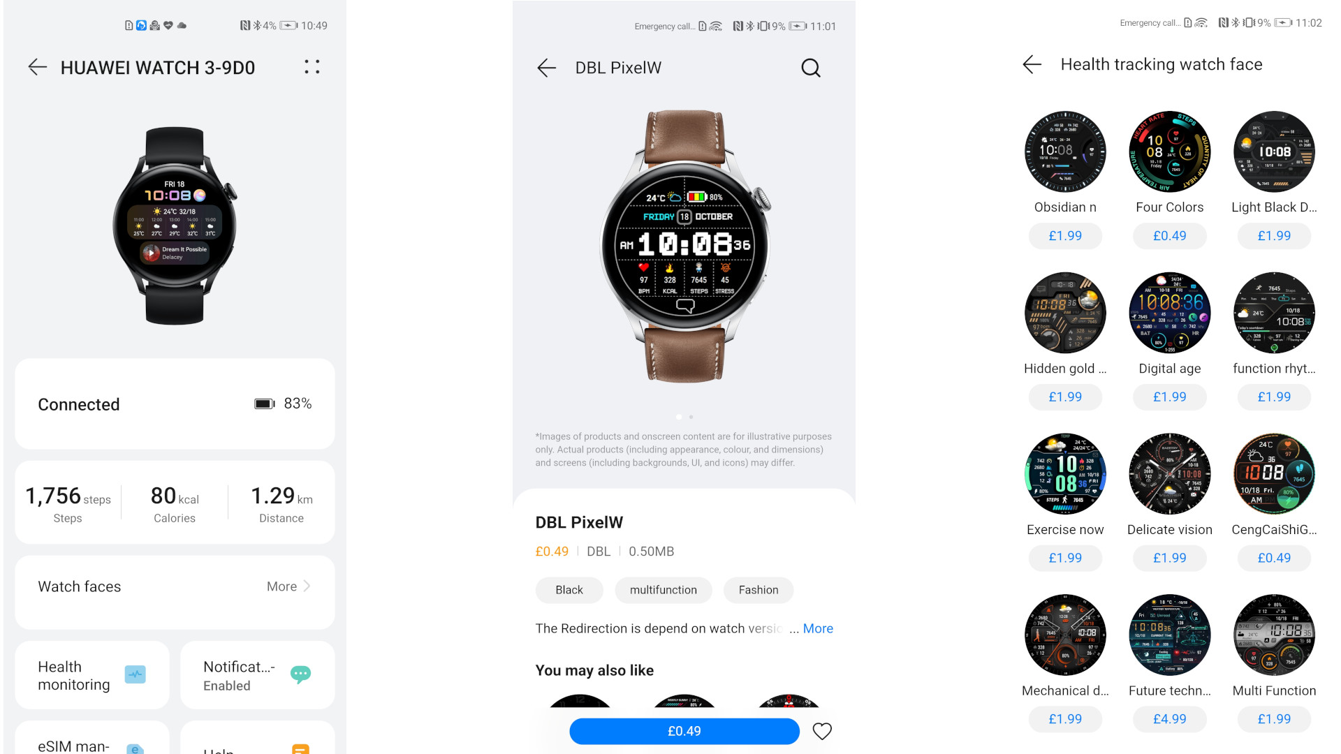
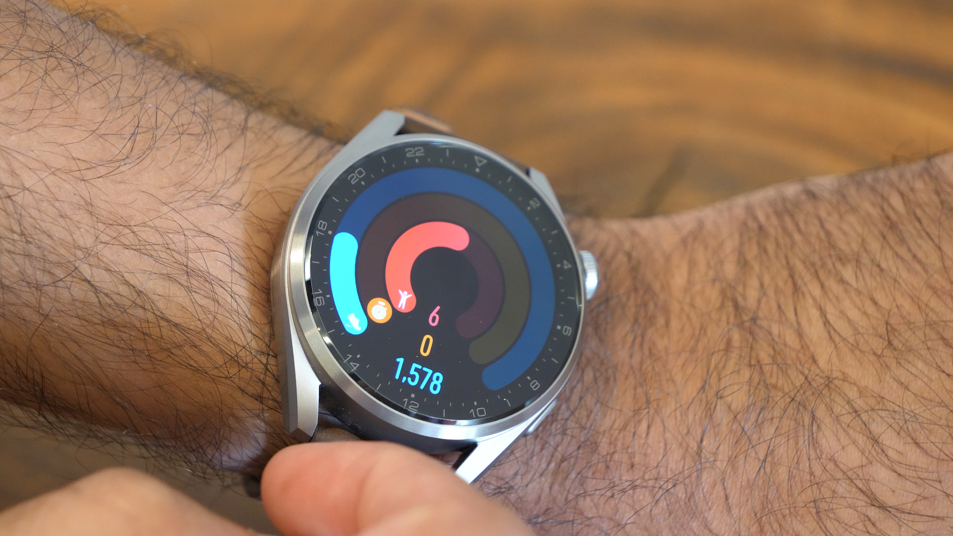
The Watch 3’s standout feature is its 1.43in AMOLED display, which is crisp and vibrant, allowing you to see plenty of data or text on screen at once. There’s a huge array of watch faces to choose from in the Huawei Health app, many of which are animated to really show off the display, though it’s worth bearing in mind that most of these are paid-for, and very considerably in price.

Smartwatch features

  • eSim support
  • Good time-saving tools
  • Few extra apps (so far)

The Huawei Watch 3 is heavily fitness-focused (which we’ll discuss in more detail shortly), but it also has a good range of tools that make it a practical everyday smartwatch, particularly if you have an Android phone and an Apple Watch is out of the question.

With an eSim installed you can make and receive calls, play music, and download apps without an active Bluetooth connection to your phone (ideal for working out without your handset), but even without that, there’s a lot to appreciate – especially when it comes to time-saving.

Huawei Watch 3

Setting up the Huawei Watch 3 is straightforward, and the array of downloadable faces really take advantage of its excellent screen (though very few of them are free) (Image credit: Future)

For example, you’ll receive detailed app notifications on the watch’s face, eliminating the need to open the relevant app on your phone in many cases, and you can accept or mute calls with hand gestures that make use of the watch’s accelerometer; clench your fist then release it to accept the call, or turn your wrist sideways to mute it.

You can also control calls using Huawei’s voice assistant, Celia (which you can access by saying ‘Hey Celia’). This allows you to perform simple searches too, and control connected devices. Like the operating system itself, it’s not yet as developed as Google Assistant, Siri or Amazon Alexa, but there’s certainly potential and we look forward to seeing where Huawei takes it in future.

Another of our favorite features was the ability to make quick voice recordings through the Notes app, so you can make a record of anything that crosses your mind in a few seconds without using the watch’s on-screen keyboard.

If you want to download additional apps, however, you’ll find Huawei’s AppGallery pretty empty. This is no surprise for a watch running a brand new operating system, and hopefully it’ll soon be filled out with additional tools for the Watch 3. It would particularly benefit from third-party apps from the likes of Spotify for music streaming, and Strava for running and cycling.

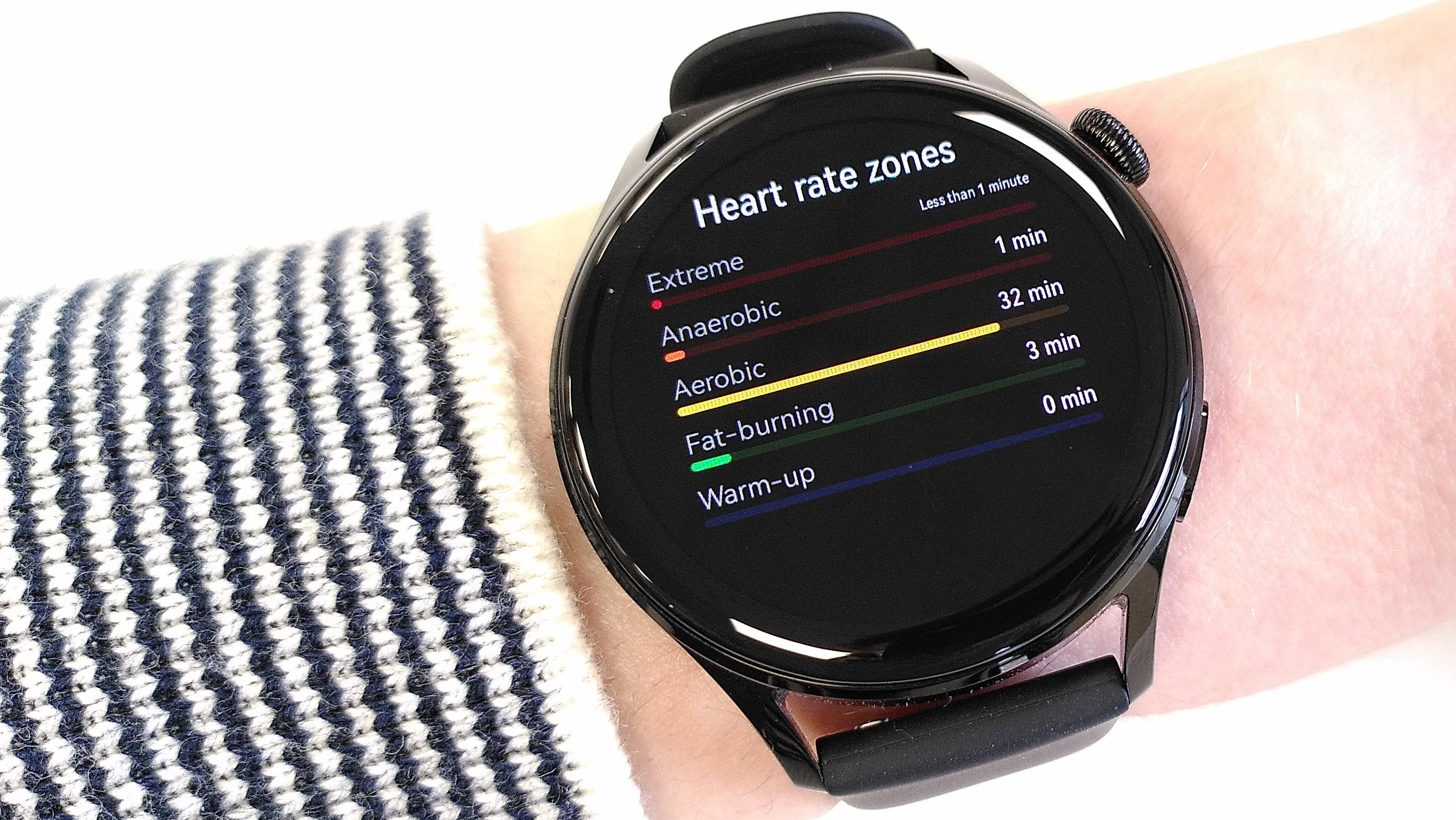
Huawei Watch 3 heart rate zone tracking

The Huawei Watch 3 comes packed with apps for fitness tracking, including monitoring heart rate zones during interval training, but there are few third-party tools available to download at the moment (Image credit: Future)

The pre-installed apps have been carefully curated though, and include some particularly welcome safety features. Like many modern smartwatches, bike computers, and other fitness-tracking devices, the Huawei Watch 3 can alert an emergency contact if it detects a sudden impact, indicating that you’ve taken a fall. This will start a countdown, which you can dismiss to cancel the alert.

You can also alert the emergency services automatically by tapping the crown button five times in succession – a feature similar to the emergency alert on the Garmin Lily, which helps provide peace of mind if you’re out alone.

Fitness features

  • Activity rings to complete
  • Impressive choice of workout modes
  • Accurate GPS tracking

The Huawei Watch 3’s main focus is fitness tracking. For everyday motivation, there’s a set of Apple Watch style rings that you should aim to complete before bedtime. You’ll also be prompted to get up and move periodically with the typical inactivity alerts (complete with a nice little animation of a man having a stretch).

For workouts, there’s a comprehensive selection of indoor and outdoor activities (including a triathlon mode to track swimming, cycling and running stages in one go), though there’s no need to scroll through the entire each list each time, as you can customize the menu to prioritize those you use most frequently.

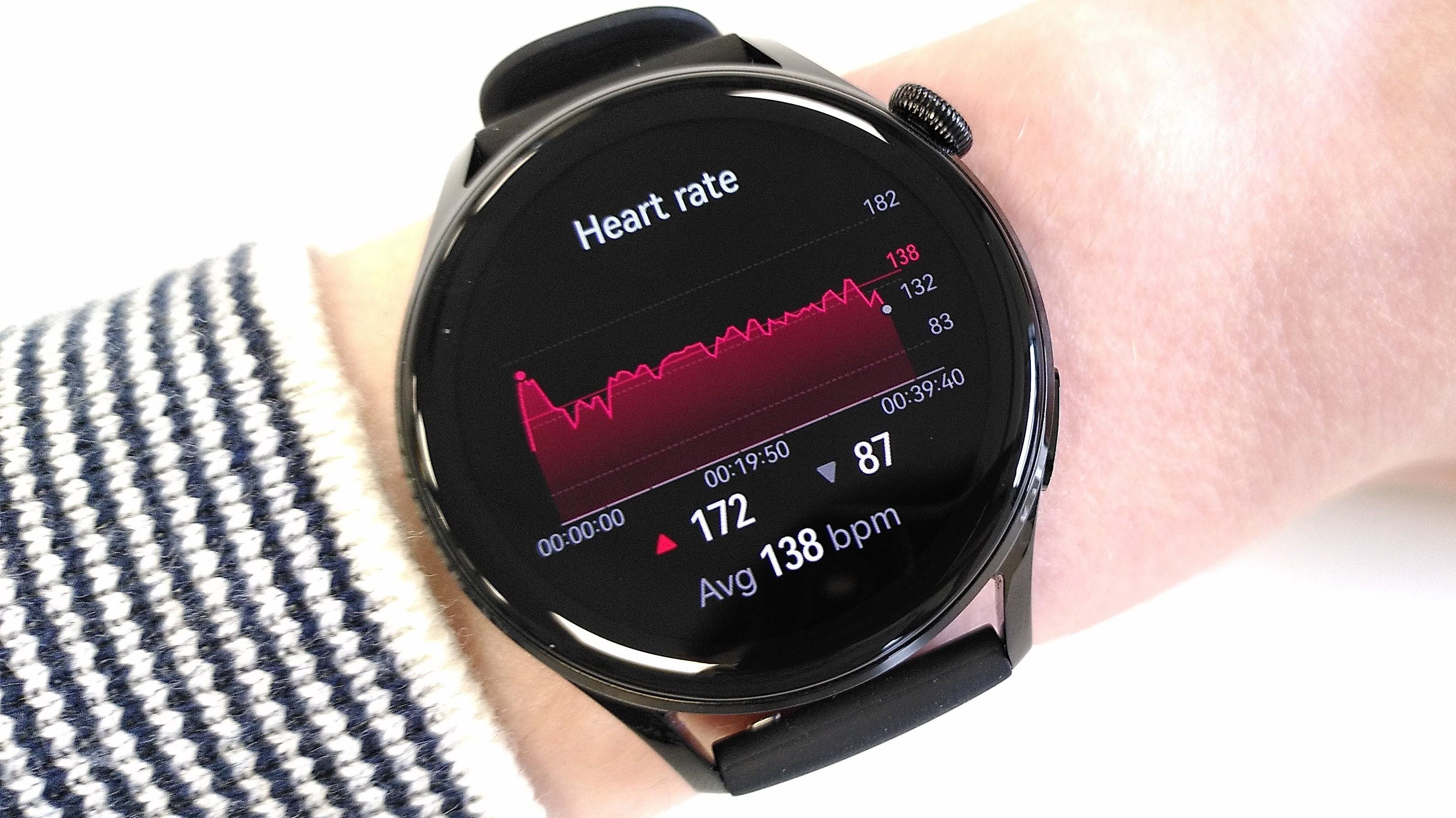
Huawei Watch 3 heart rate data

Heart rate tracking was generally accurate, but occasionally registered an unexpected spike during high intensity training (Image credit: Future)

We tested the Huawei Watch 3 for several outdoor runs and indoor spin sessions. It took a while for the watch to establish a GPS lock before we began running (longer than our Garmin Instinct Solar) but once it did, the Watch 3 recorded our pre-measured course fairly accurately, coming up just a few meters short of the expected distance.

We used high-intensity spin sessions to test the Watch 3’s heart rate monitor. It responded fairly quickly to changes in heart rate throughout a session (not as swiftly as a chest strap monitor, but that’s to be expected), but the numbers it recorded were higher than we’d expect from a standard session, with an unexplained peak during one warmup where the watch registered a heart rate of over 170bpm.

You can choose to have the watch announce your time, pace and distance at each mile or kilometer, which it does loudly and clearly. Indeed, with its dependable GPS, clear screen and solid text-to-speech software, the Watch 3 seems ideally suited to navigation for running, cycling and walking, but at the time of writing there are no such tools available.

Guided workouts on the watch, with animations to demonstrate proper form, would be another welcome addition, and one we’re hoping to see in the future.

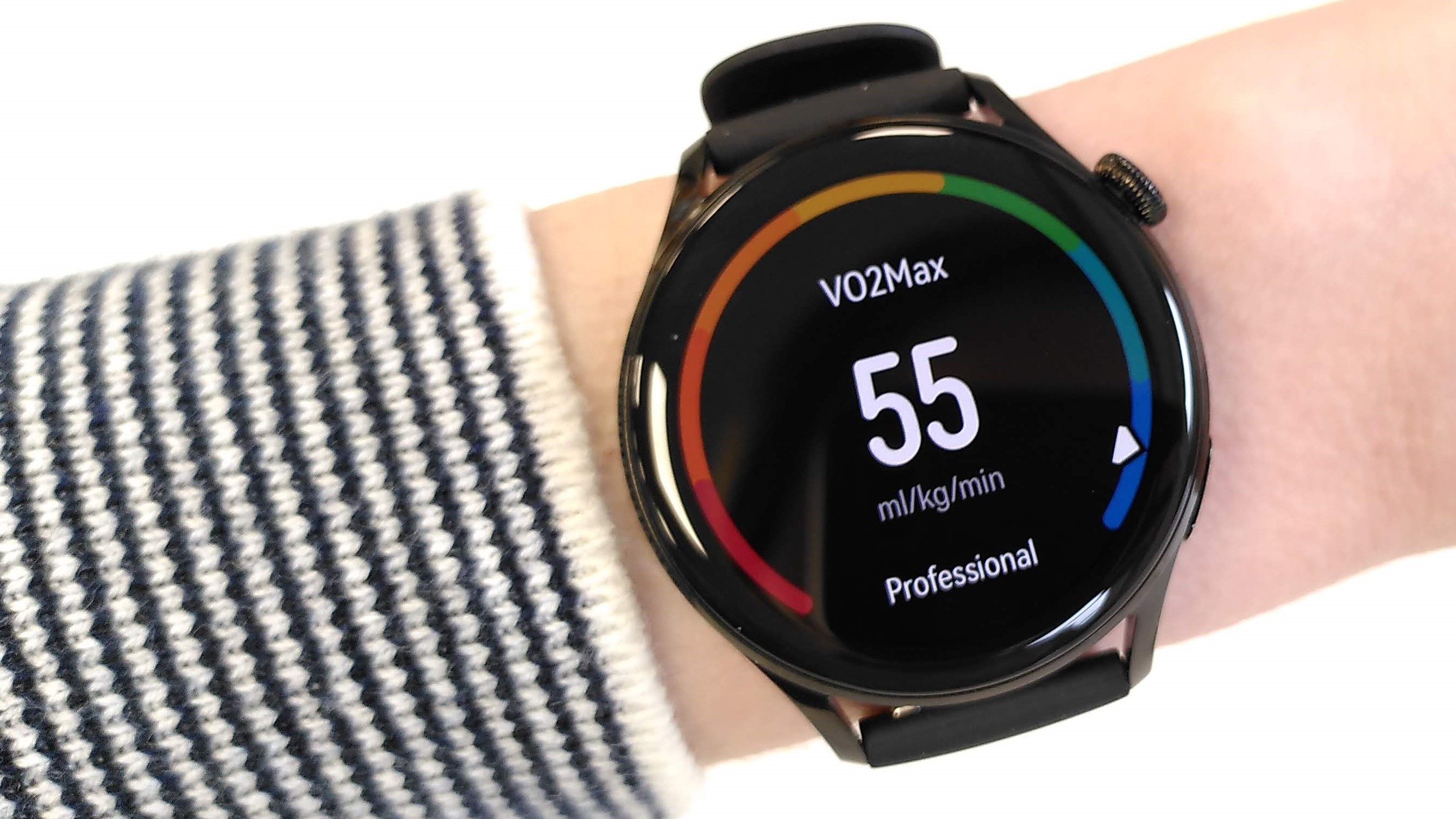
VO2 max displayed on Huawei Watch 3

Most workout and health stats matched those from our Garmin Instinct Solar, including VO2 max (Image credit: Future)

We always take calorie burn measurements from wearable devices with a grain of salt, but the figures recorded by the Huawei Watch 3 matched a Garmin Instinct Solar. VO2 max figures also match Garmin’s, though again these are only estimates (actual VO2 max testing requires a lot of specialist equipment in controlled conditions.

Sleep tracking seemed fairly accurate in terms of mapping sleep stages, but when we compared the results with those from an Oura ring, we found that the Watch 3 recorded all time in bed as time spent asleep, resulting in a sleep score that was somewhat inflated.

Battery life

  • Magnetic charger
  • Lasts 2-3 days between charges

The Watch 3 is charged via a magnetic puck, very much like an Apple Watch 6. Unlike Apple’s chargers, however, Huawei’s has a USB-A connector rather than USB-C.

Huawei estimates that the watch will last around 14 days in power-saving mode, and three days in smartwatch mode with all features enabled (again, much like the Apple Watch 6), though in our tests we found it came up a little short, lasting more like two and a half days when recording a daily workout in addition to everyday steps and heart rate.

Huawei Watch 3 attached to charger

The Huawei Watch 3 uses a very similar magnetic charger to the Apple Watch 6, but with a USB-A connector rather than USB-C (Image credit: Future)

Companion app

  • Compatible with HarmonyOS, iOS and Android
  • Lots of health stats clearly presented
  • Great choice of training programs

The watch connects to the Huawei Health app, which is available for iOS, Android, and comes preinstalled with HarmonyOS. Connecting the watch is a simple matter of creating an account (if you don’t already have one), entering a PIN from the watch face for verification, and granting it the necessary permissions.

We tested the Watch 3 with both a Huawei P40 Pro, and a Fairphone 3 Plus running Android 10. Connecting on the Huawei handset went without a hitch, but we found that the Android app didn’t list the new smartwatch and couldn’t locate it. If this happens, the company advises updating the Huawei health app in AppGallery from your phone to solve the problem.

Running statistics in the Huawei Health app

All your health and training stats are available at a glance, and the Huawei Health app also includes a generous library of training guides (Image credit: Future)

The app itself is refreshingly simple to navigate, providing all your daily and historic health stats in one location. Unlike Fitbit’s app, Huawei Health doesn’t lock certain statistics behind a paywall; instead, all data is available at a touch of your finger.

There’s also a wide array of training programs in the Huawei Health app – something else you’d have to pay for in the Fitbit app. These include introductory sessions, plus tempo, HIIT and interval sessions to help mix up your training. The app and watch won’t suggest which training plan you should try based on your past activity (though perhaps this will become possible in a future update), but the choice is impressive and on a par with many subscription services.

Udacity learning platform

Udacity grew from an experiment in online digital learning. Two Stanford University instructors, Sebastian Thrun and Peter Norvig decided to offer an online course for “Introduction to Artificial Intelligence” on a free basis for anyone. The response exceeded expectations, with more than 160,000 learners across 190 countries. Spurred by this initial success, Udacity then decided to “Democratize education” and over time made the decision to focus the effort on “Mastery of in demand education.”

Currently, Udacity counts over 100k graduates, with over 100 Enterprise customers worldwide, and over 200 industry experts helping to create the content. Udacity has partnered with tech companies including Amazon Web Services, Google, and IBM.

Features

Udacity starts with the bold claim to “Get the skills you need for a $100k+ tech career in just 3 months,” which sounds like a pretty good deal. After all, folks go to an in person college for four years, and are often not compensated as highly. The courses of study are quite business and tech heavy, with areas such as Data Science, Artificial Intelligence and Cloud Computing.

There is significant support claimed, as Udacity indicates that it has over 1,400 mentors available to help. Additionally, they are available on a 24/7 basis. Furthermore, to unblock learning, the goal is to provide this support on an impressive 1 hour turnaround time. These mentors are “Highly vetted,” as each has to complete not only the nanodegree in the respective area, but also they go through a 5-step hiring process. The mentors review each project submission on a line by line basis, for comparison and to provide feedback to the learner. Overall, Udacity indicates that its reviewers have given their critique to its learners on approximately 2.7 million projects, and have an average rating that is a high 88 out of 100 points. Reviewers provide feedback that is personalized, feedback loops to provide the critique, use industry best practices to give tips to the learner, and also provide additional resources for even more improvement.

Cybersecurity Courses

Udacity offers a wide range of cybersecurity and technology courses (Image credit: Udacity)

To get a better feel for the process we created an account, and looked at the course catalog. We went into the School of Cybersecurity area, and found courses, and as in any college catalog that were laid out by Beginner (“Introduction to Cybersecurity”), Intermediate (“Security Analyst”) and Advanced (“Ethical Hacker”) categories. We then went into an intermediate course, which is the nanodegree program for a Security Engineer. To help with a decision on the course, we liked the ‘Download Syllabus,’ which provides a detailed overview of the course, including the final project.

Nanodegrees

These are just several of the Nanodegrees available from Udacity (Image credit: Udacity)

Plans

While some competitors offer a range of tiered plans for learners, Udacity is far more limiting for individual learners. Rather than offering individual courses, certificate tracks, and different types of degrees, Udacity terms its offerings ‘Nanodegrees,’ somewhat between a certificate program and a more formal online degree.

Udacity also is one of the more expensive options, with the Nanodegrees we reviewed all coming in at a lofty $399 per month. However, on at least some of these pathways, there is the option to prepay for 3 months at once, which would net a 15% discount. However, we would have liked to see an option to prepay for the course until completion, rather than being time limited.

Support

Udacity has FAQs, a support community and live chat available on its site should you run into problems or have questions on its courses (Image credit: Udacity)

Support

Udacity has support available via its “Contact Us” page. Here, things get divided into three categories: a FAQ, Content Questions, and Everything Else. The FAQ has predone and fast answers, along with a support community, and live chat that is available on a 24/7 basis. The Content Questions requires an account to be created to go further. Under Everything Else, is essentially a support portal to submit a query, which gets categorized to get routed to the correct team.

A number of contact options are not present, such as a phone number for direct human contact, let alone a toll free number or fax number. We also did not find any support videos, ebooks, or even a simple direct email which are notable omissions.

User reviews

Udacity previously had smartphone apps and decided to remove them for both iOS and Android back in 2019. We find this fairly annoying at a time when so much content is migrating to the mobile space. As such, there are no user reviews of these apps.

User Reviews

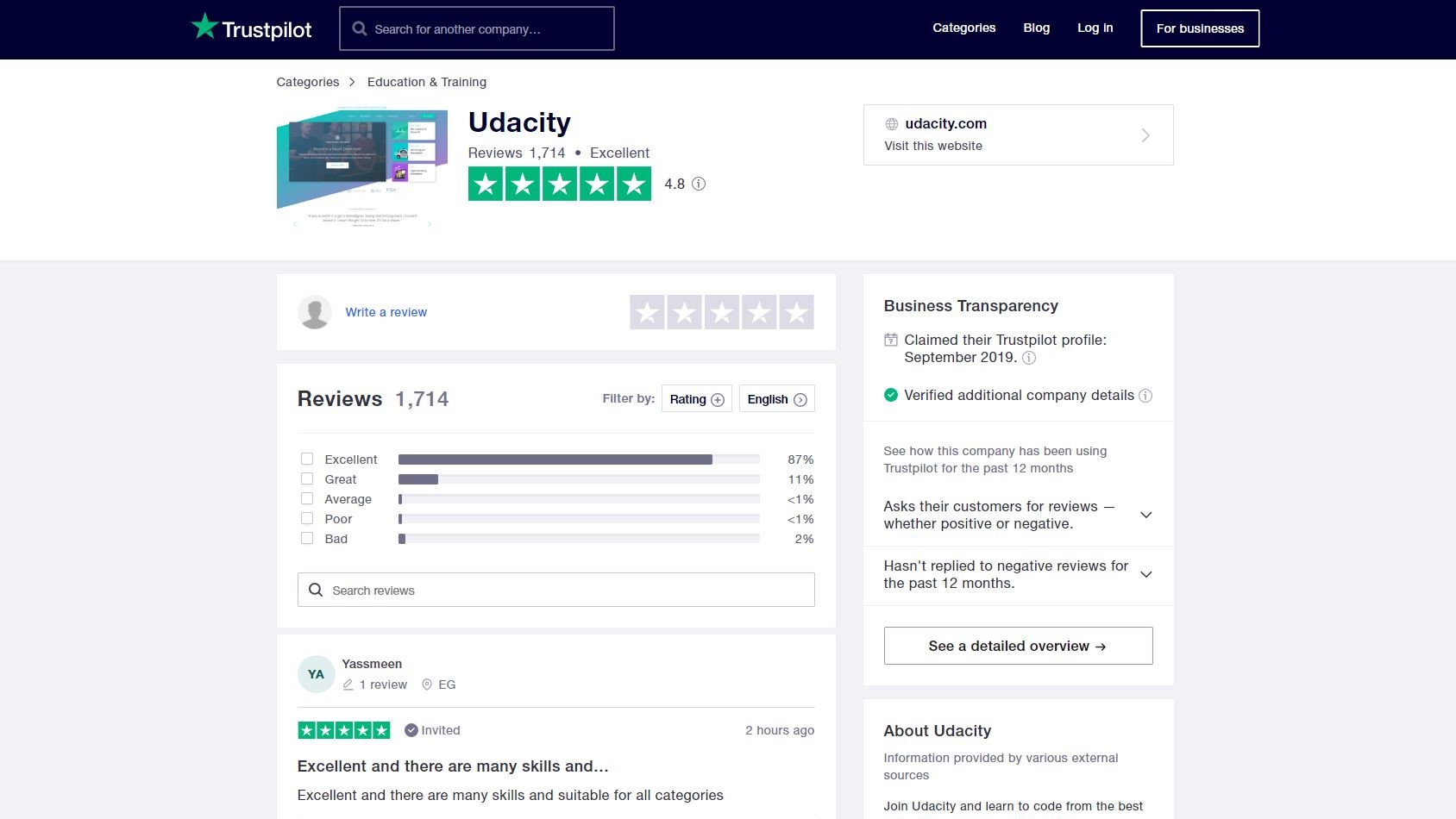
Udacity has a number of positive user reviews on TrustPilot (Image credit: TrustPilot)

The reviews we did find online are really hit or miss, although numerically Udacity gets high marks with TrustPilot giving it 4.8 out of 5 stars, and Facebook and even higher 4.9/5 stars. Some learners indicate the power of this platform, and the ease of gaining practical knowledge. There are frequent complaints about the high cost. Others point out that the projects done in the course are not relevant to the course material, and the reviewers' critiques are hit or miss. Some finally take issue with the entire course, complain about the amount they learned, and did little with the knowledge they did gain. Finally, there are some complaints about the support options, as when there is a complicated issue that needs attention for resolution, users have issues in directly communicating (which we can predict from the available support options above).

Final verdict

Udacity provides an online learning platform for acquiring a new skill with its nanodegrees. The pros include the practical education, the robust reviews, and the detailed syllabus to help to decide to pursue the education. The cons cover the expensive price (although some discounts are available), the lack of support options, and the missing smartphone apps. While we like the choice of courses, realize that there are more affordable options out there to pursue.

GHD Flight

One-minute review

GHD is most well known for its hair straighteners. The company has spent the past two decades offering ceramic-plated flat irons, taking over from steam-powered straighteners as the must-have tool for hair styling. 

However, more than nine years ago, GHD also dipped its toe in the world of hair dryers, and now offers three different models, the smallest and most compact of which is the GHD Flight. Designed to be packed in your suitcase, the GHD Flight is 50% lighter than the GHD Air, but offers 70% of the power, at 1400W, allowing you to dry your hair in a relatively short frame of time. 

The GHD Flight comes with a folding handle, which ensures the hair dryer takes up as little space in your suitcase as possible. It operates on both 120V and 240V electrical supplies, so it really can be used anywhere in the world.

It has two temperature settings, along with a slower, cool-shot option for setting styles, and the hair dryer will automatically switch off if held too close to the hair when blow-drying to prevent overheating, too. In the box you’ll find a concentrator nozzle and a carry pouch.

At $99 / £59 / AU$99, the GHD Flight is the most affordable hair dryer GHD offers, and is ideal for those on a budget. It also makes a great additional hair dryer for those who travel, easily slipping into a bag or suitcase, safe in the knowledge that it won’t send luggage over a weight limit. However, those looking for a hair dryer with a plethora of attachments to create a wide array of hair styles might be better looking elsewhere.

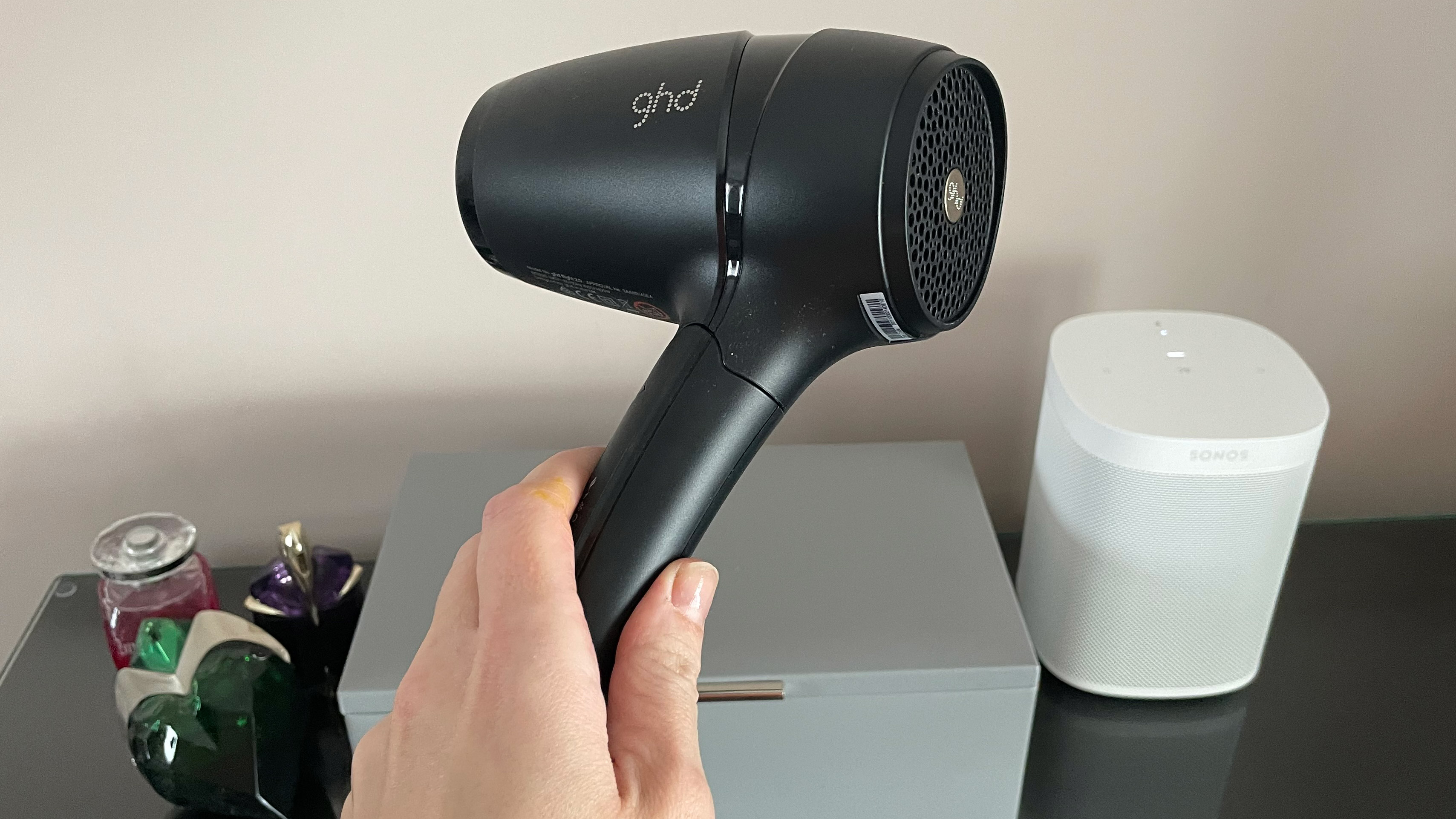
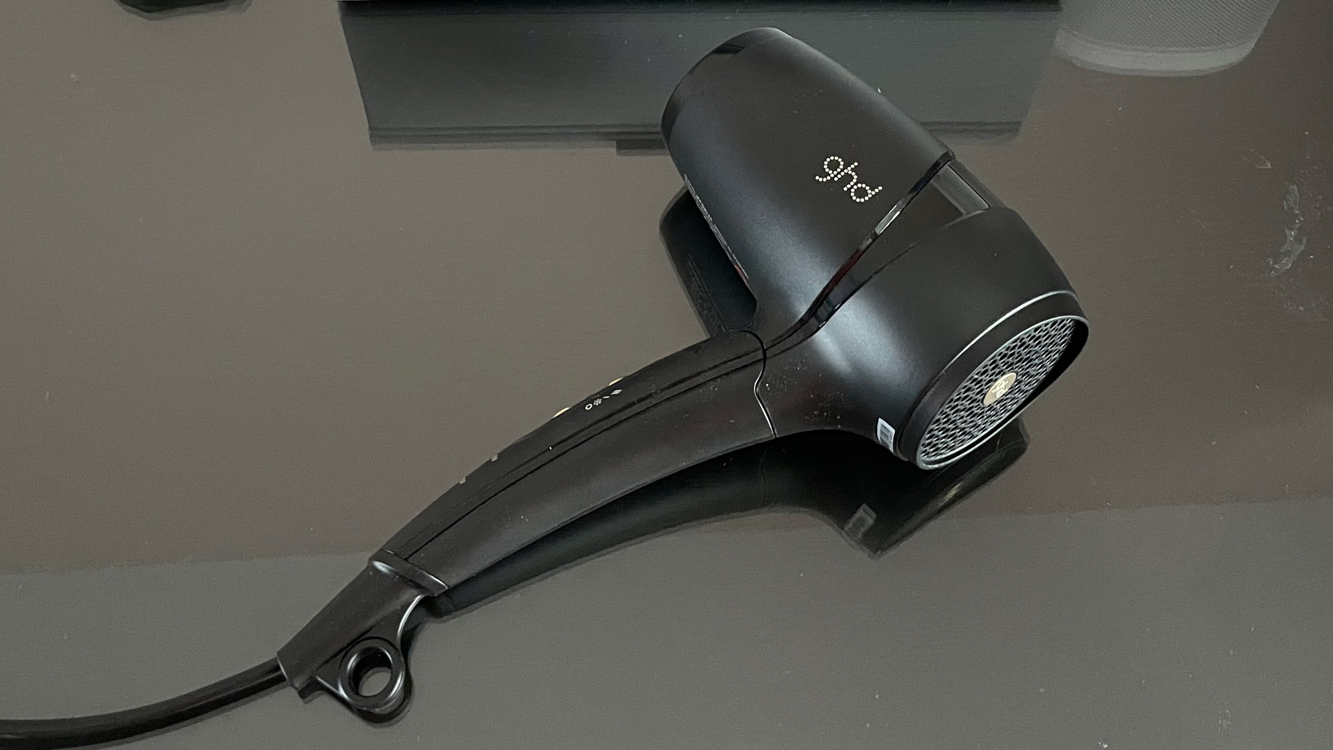
The GHD Flight being held in a hand

(Image credit: TechRadar)

GHD Flight price and availability

  •  List price: $99 / £59 / AU$99

The GHD Flight is the brand’s entry-level hair dryer and is priced at $99 / £59 / AU$99. It’s available from GHD or Amazon worldwide. 

GHD also offers a mid-range hair dryer, the GHD Air, which will set you back $199 / £99 / AU$220, while it’s top-of-the-range model, the GHD Helios, costs $249 / £159 / AU$295.

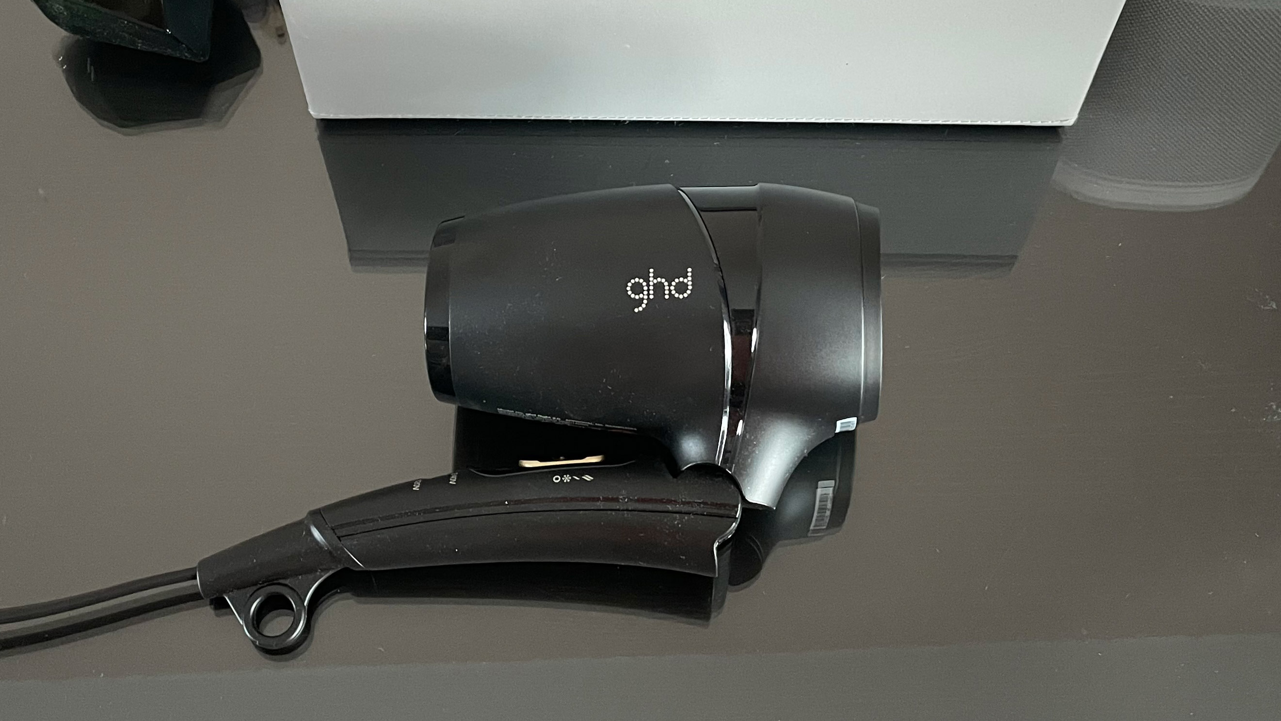
The GHD Flight folded up ready for travel

(Image credit: TechRadar)

Design

  • Foldable design
  • Two temperature settings
  • Comes with one attachment

The GHD Flight is the most compact hair dryer we’ve tested to date, measuring 9.6 x 5.2 x 2.7 inches / 24.4 x 13.3 x 6.8cm (h x w x d). It’s folding handle means its dimensions come down further still to 7.9 x 4.1 x 2.7 inches / 20 x 10.5 x 6.8cm. It’s lightweight, too, coming in at just 0.9lb / 422g.

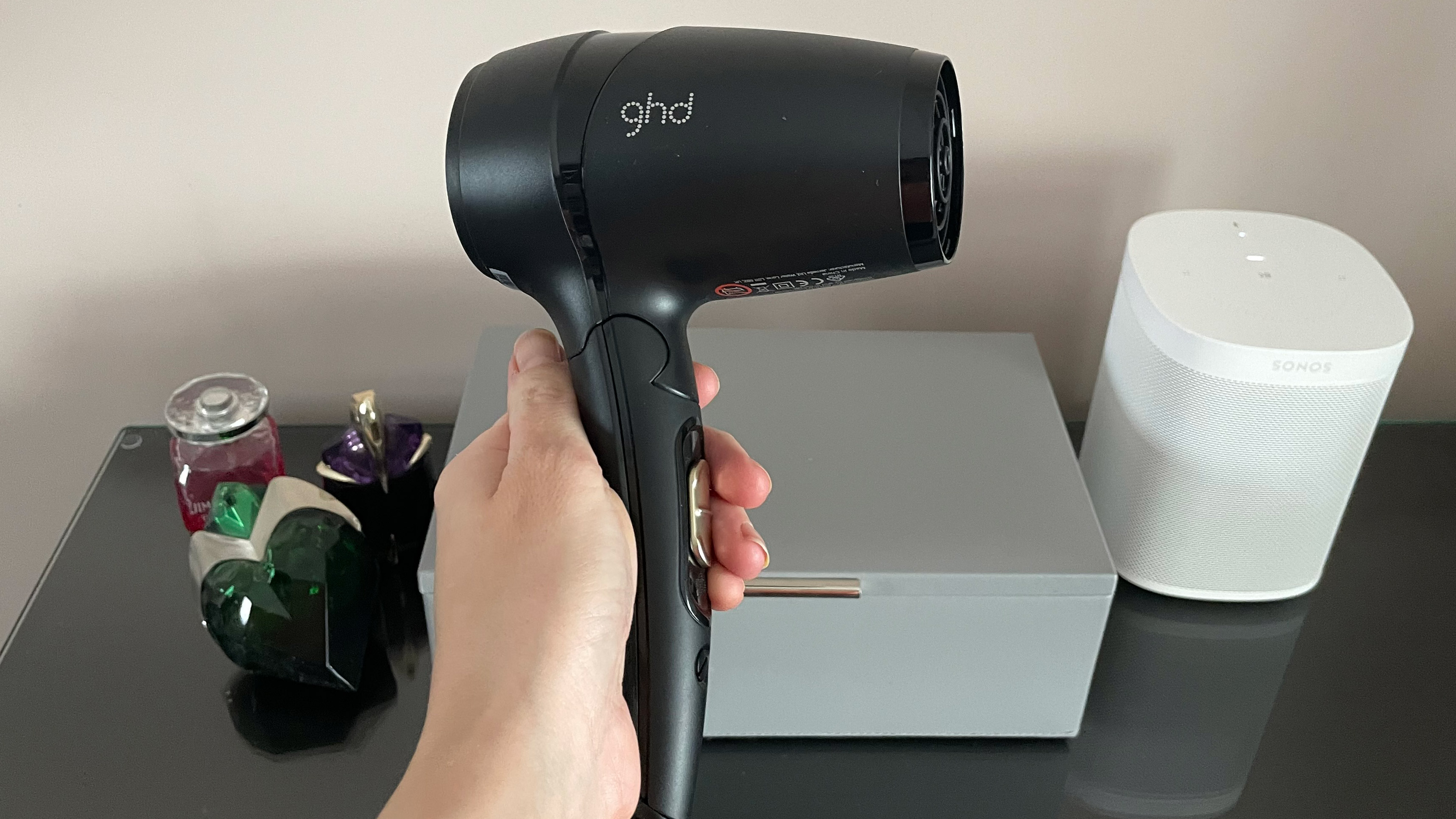
The hair dryer features a stylish matt black design, with a gold slider that lets you select one of the two temperature settings, or the cool-shot function for setting your hair after styling – a look that apes the GHD Air, although the gold band around the barrel of the Air hair dryer has been dropped in favor of a glossy black accent. 

As already mentioned, the 1400W hair dryer is dual voltage, so it can be used anywhere in the world. Simply use a coin to turn to the dial to select the correct voltage (either 120V or 240V) for the country in which you’re using it. The hair dryer has a 6ft / 1.8m cable and comes with a concentrator nozzle and a soft carry pouch in the box.

The hanging loop is also a nice touch, and is usually a feature on hair dryers used in salons. 

The GHD Flight hair dryer being held in a hand

(Image credit: TechRadar)

Performance

  • Fast drying times
  • Balanced in use
  • Automatically switches off when too close to hair

Even though the GHD Flight offers less power than some of the brand's other hair dryers, it certainly isn’t sluggish when it comes to drying times. On the lowest temperature setting, it took 5 minutes and 52 seconds to take below-shoulder-length fine hair from damp to completely dry. Using the hottest settings shaved 1 minute and 51 seconds off this time. On both settings, locks were left smooth – although they lacked the shine we’ve achieved with other hair dryers, plus there were more fly-away strands than usual.

We put this down to the lack of technology that uses negative ions to speed up evaporation and reduce flyaway strands. 

The GHD Flight felt balanced in the hand when blow-drying hair, and was comfortable to hold, both in the left and right hands (we switched hands, depending upon the side of the head being styled). The hair dryer was easy to fold into its more compact form, while the hinge felt durable and offered a reassuring click as the handle was moved. 

Also notable is the fact that the GHD Flight will automatically switch off if held too close to the hair, to stop the hair dryer from overheating. However, we were disappointed to find that the filter isn’t removable, which can make cleaning the hair dryer more difficult. 

For noise, the GHD Flight registered 77.8db on our decibel meter on its fastest setting. This puts it middle-of-the-range when it comes to noisy hair-care appliances, and is equivalent to the level of noise made by a vacuum cleaner. However, since it is likely to be on for only a few minutes at a time, it’s unlikely to bother too much.

The GHD Flight resting on the glass top of a dressing table

(Image credit: TechRadar)

Should I buy the GHD Flight?

Buy it if...

You want a compact hair dryer
Measuring 7.9 x 4.1 x 2.7 inches  / 20 x 10.5 x 6.8cm when folded, and weighing just 0.9lb / 422g, the GHD Flight is one of the most compact hair dryers we’ve tested.

You’re on a budget
While it isn’t the cheapest hair dryer on the market, it’s the most affordable hair-care appliance GHD offers. As such, if you’re after a salon brand but money is tight, this hair dryer is worth considering. 

You want dual voltage
Many travel hair dryers, while compact, aren’t necessarily suitable for use all over the world. The GHD Flight offers variable voltage, making it ideal for those who want a hair dryer that will work abroad in various countries.

Don't buy it if...

You want a range of attachments
If you’re looking to create a range of hair styles when blow-drying your locks, you’ll need a number of different attachments including concentrator nozzles and diffusers. The GHD comes with only one attachment, so is best avoided if you’re looking for greater versatility. 

You want a quiet hair dryer
Registering 77.8db on our decibel meter means this isn’t the quietest hair dryer we’ve tested. It isn’t the loudest either, but it’s one to avoid is noisy appliances are a frustration.

You want a removable filter
This is a small point, but one that makes all the difference for keeping your hair dryer in tip-top condition. Fixed to the hair dryer, it will be difficult to remove a build-up of lint off the GHD Flight’s filter.  

First reviewed: August 2021

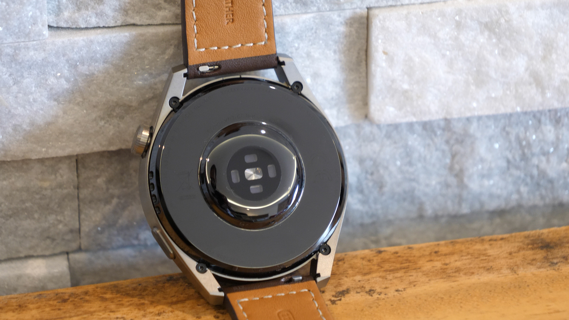
Huawei Watch 3 Pro

One-minute review

For its past few watches, Huawei had switched from WearOS to its own Lite OS. This change led to Huawei losing access to apps on its watches but gaining a much better battery life. Huawei has now folded Lite OS into Harmony OS, which is expected to power all Huawei smart devices moving forward.

For its 2021 flagship wearable, Huawei is relying on HarmonyOS 2.0 that not only brings third-party app support, but with a battery saver option, helps the Watch 3 Pro last for up to 21 days. The new OS also brings a particular new flair to the Watch 3 Pro, resulting in a clean interface, smooth animations, and an overall pleasant experience to navigate. 

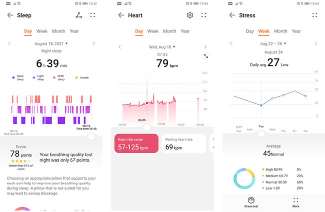
Along with the new look comes a whole host of smarts, including temperature tracking, SpO2, stress and sleep monitoring, and much more. For a watch as stylish as the Watch 3 Pro, there’s a lot that can be done just by sitting on your wrist.

A new addition is the eSIM feature, which breaks the Watch 3 Pro away from your smartphone to operate as an independent device. This allows you to make phone calls, listen to music, and enjoy fairly accurate GPS tracking during outdoor runs. Battery life is quite solid despite all the tech packed into this watch, with the ability to go for even longer periods of time if you dumb down the watch a bit and turn off most of its tech. But this watch isn’t meant to be just a standard showpiece – it’s meant to integrate tightly into your life (and phone) to help you out on the daily.

There are still a few things here and there that might be a bit of a downer for early adopters of the Watch 3 Pro. NFC payments have yet to launch in the region, and eSIM compatibility will depend heavily on which carrier your phone is currently tied to. There’s also the sheer size and weight of the Watch 3 Pro which may be a little awkward on smaller wrists, and uncomfortable to wear at night as a sleep tracker. 

Huawei Watch 3 Pro price and release date

  • UAE pre-orders from August 26th to Sept 1st 
  • Priced at AED 1,999

In the UAE, pricing for the Huawei Watch 3 Pro is set at AED 1,999. Pre-orders will be available from August 26th to September 1st, with customers getting Freebuds 3 for free, valued at AED 529.

That’s a lot to ask for a smartwatch, and is considerably more expensive than the likes of the Apple Watch 6 and Samsung Galaxy Watch 4. The Huawei Watch 3 Pro is clearly aimed at a more refined user base, with premium looks and materials to match.
Design and display

  • Large 1.43-inch screen with 466 x 466 resolution
  • Strap options include leather and metal links
  • 63g weight, 48mm case

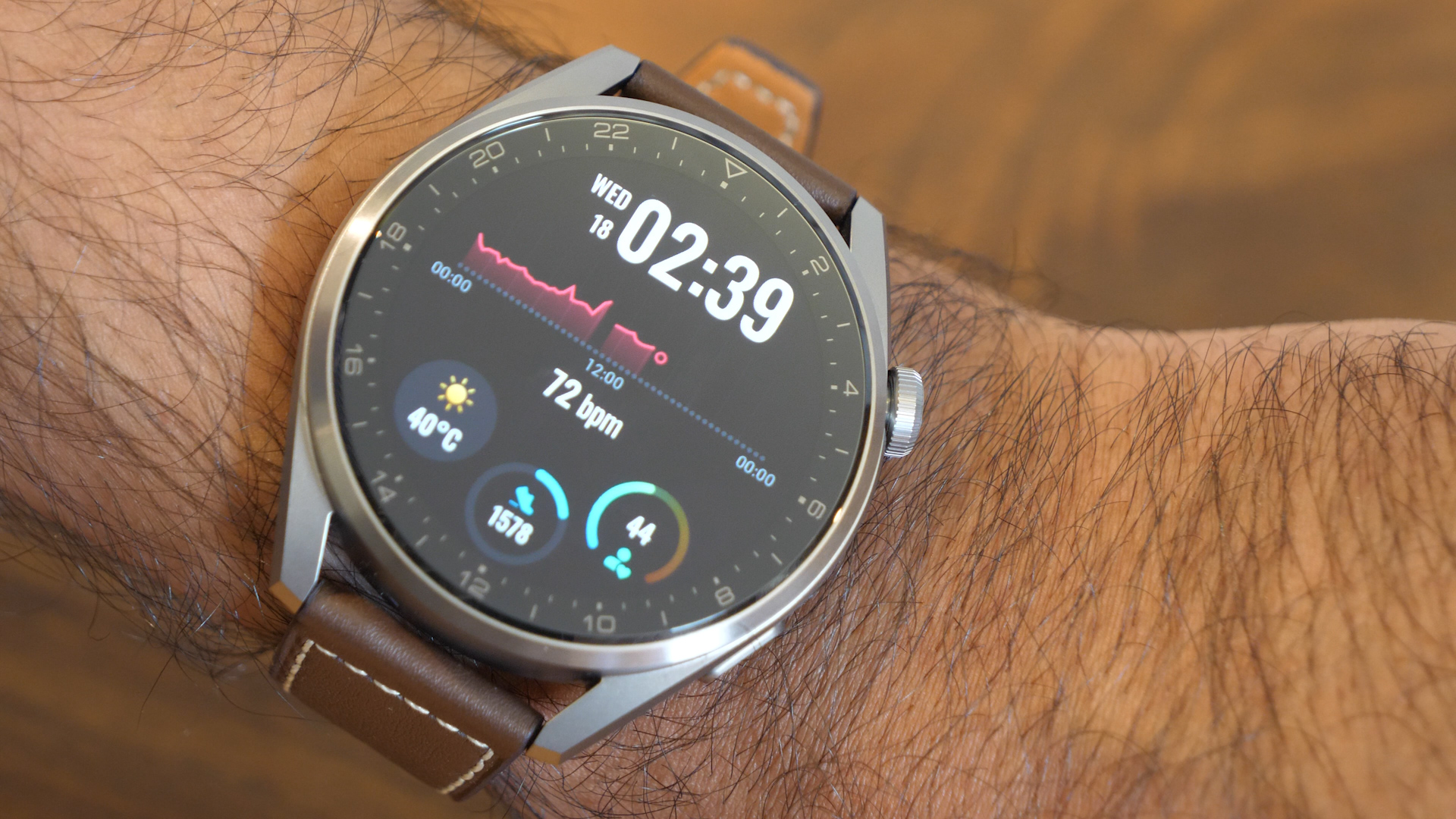
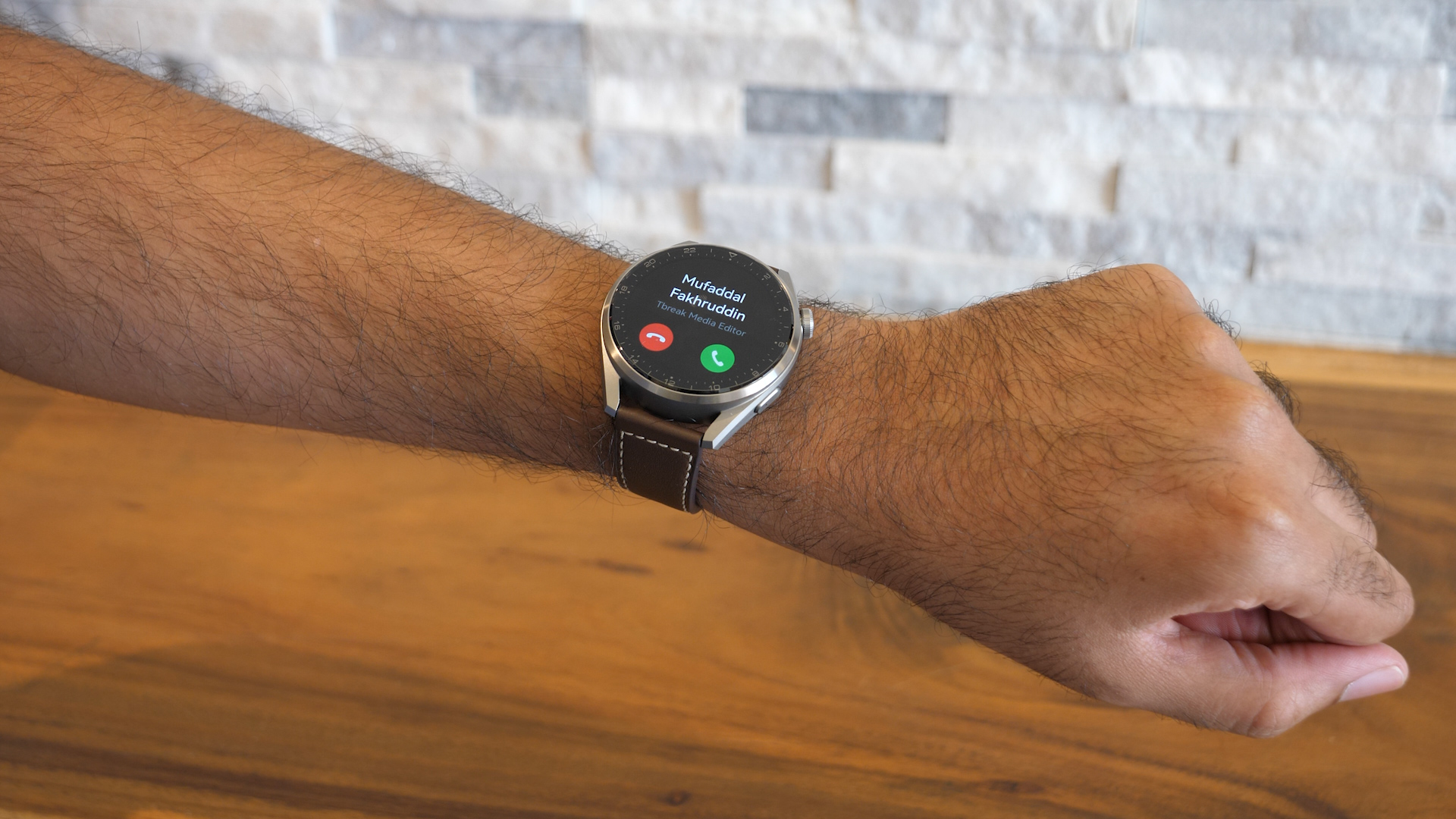
Huawei’s gotten very good at making wearables that look like watches. Big, bold, round faces, modest bezels, and buttons on the right side. For the Huawei Watch 3 Pro, those buttons include a familiar rotating crown, giving you all the scroll-wheel familiarity of an Apple Watch, but none of the WatchOS rectangular vibes. 
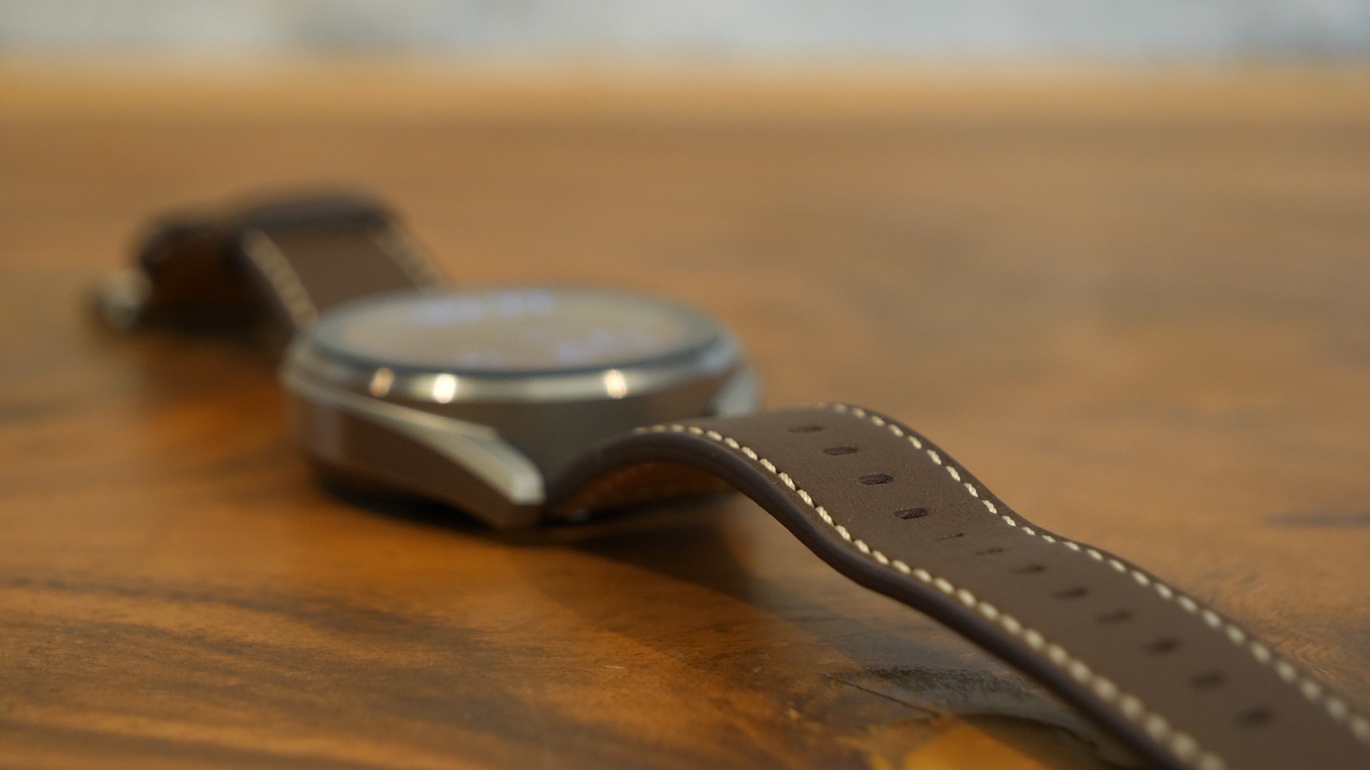
The Watch 3 Pro can be picked up with a leather strap like our review model had, or also with a metal link strap. 

Huawei Watch 3 Pro

(Image credit: Future)

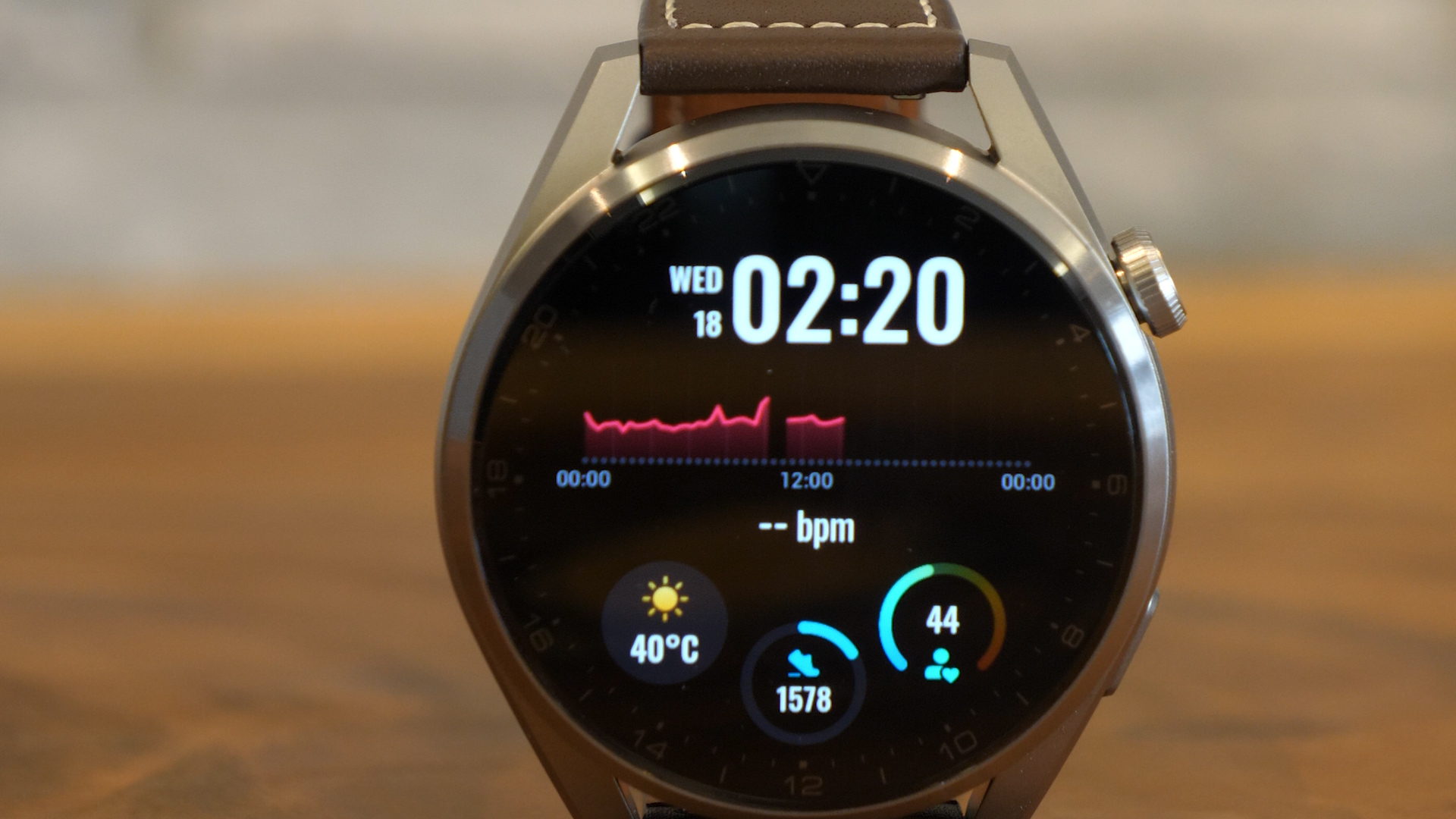
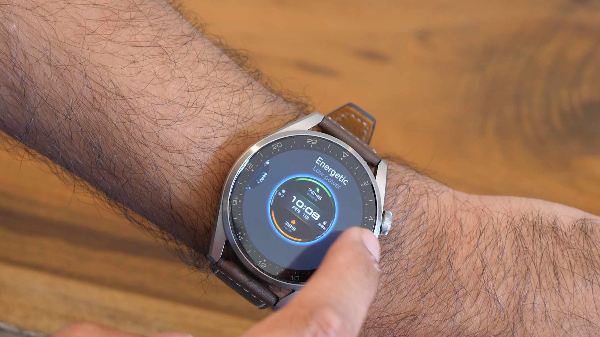
Bright and sharp, the Huawei Watch 3’s AMOLED display climbs up 1,000 nits, making for easy outdoor viewability even in direct sunlight. Automatic brightness and a 60Hz screen makes scrolling and menus look and feel very responsive. At 326ppi, the 1.43-inch AMOLED panel screams quality, while the curved glass atop it is comfortable for a finger to swipe over.

The titanium body is certainly an eye-catching feature, spanning all sides of the watch body, including the lugs. This makes it especially durable to drops, scratches, and weather conditions – particular in harsher climates. It’s also water-resistant, making it ideal for outdoor running or monitoring your swimming performance. 

Huawei Watch 3 Pro

(Image credit: Future)

The leather strap is a great choice for those who wish for a more classic look, but won’t really be suitable for other activities such as gym work or outdoor running. Luckily, the 22m straps can be easily swapped around to something different, so we’d personally keep the leather look for office/everyday wear and switch to a different band for workouts.

The rotating crown on the side of the Watch 3 Pro is a great touch, and allows you to zoom in and out as well as scroll quickly through options. The ‘Huawei Watch’ text etched on the crown shows how much detail Huawei put into this tiny feature. It’s smooth to use and navigate with, and definitely a nice touch. Like the Apple Watch, you get slight haptic feedback as you scroll using the crown.

Huawei Watch 3 Pro

(Image credit: Future)

Below that is a secondary button which by default launches the workout mode, but can be configured for other uses such as music, alarms, contacts, and more. You can also long-press it to activate Huawei’s digital assistant, which we’ll come to later.

The watch’s size and weight does make it feel a bit odd on smaller wrists, which is something you’ll just have to live with for this Pro variant. Further adding to the slight awkwardness is wearing the Watch 3 Pro as a sleep tracker. It’s something we were very conscious that we were wearing while trying to fall asleep, and you certainly have to be careful of accidentally hitting a partner with it in your sleep. 

Software

  • Runs Harmony OS 2.0
  • Controlled through Huawei Health app
  • Notifications are not interactive

If you’re looking to use the Huawei Watch with a non-Huawei phone, you’ll need to install the Huawei Health app on your iPhone or Android device and pair the Watch over Bluetooth - with varying degrees of functionality. It’s important to note that the Health app must be downloaded from the Huawei app store only – we tried a version from the Google Play store and it just didn’t play along when trying to pair the watch with our phone.

Huawei Watch 3 Pro

(Image credit: Future)

While previous Huawei wearables ran either Android Wear or LiteOS, the Watch 3 runs Harmony OS 2.0. It feels like Lite OS 2.0, with full app support through the Watch’s AppGallery, slick menus, and an Apple Watch-style grid of apps. It’s quick and easy to navigate around, and menus are easy to read. 

Customization is key here, and you can browse from over 1,000 watch faces to pick one that suits your mood and needs. On iOS however, that selection drops to fewer than 100. There are a number of great watch faces to choose from, however we noticed that some of the more intricate (and nicer looking) watch faces were paid only, some set as high as AED 20. Whether or not you want to spend money on a watch face is entirely your call, but we opted to just go with what was already installed on the watch. For further customization, you can even create your own animated watch face using a short video clip from your phone, but bear in mind that animated watch faces will start to drain your battery life.

Huawei Watch 3 Pro

(Image credit: Future)

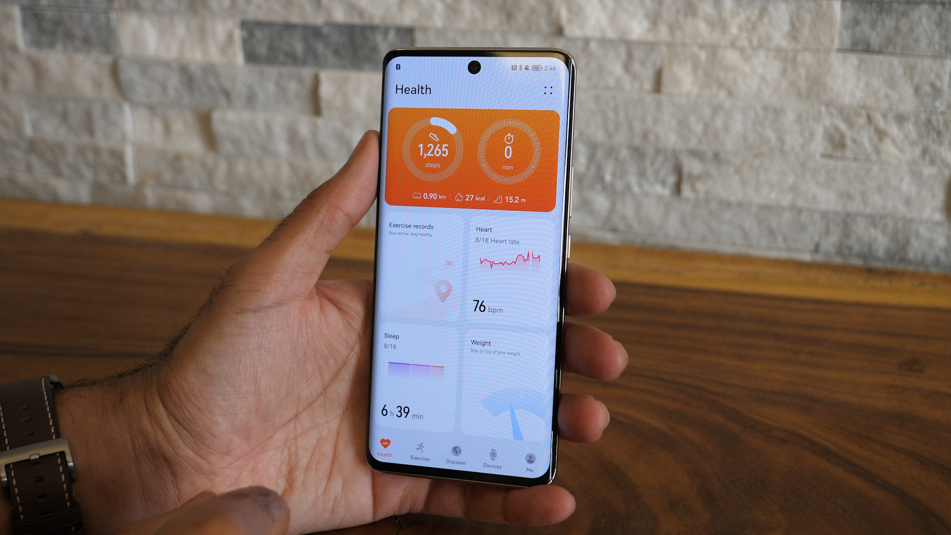
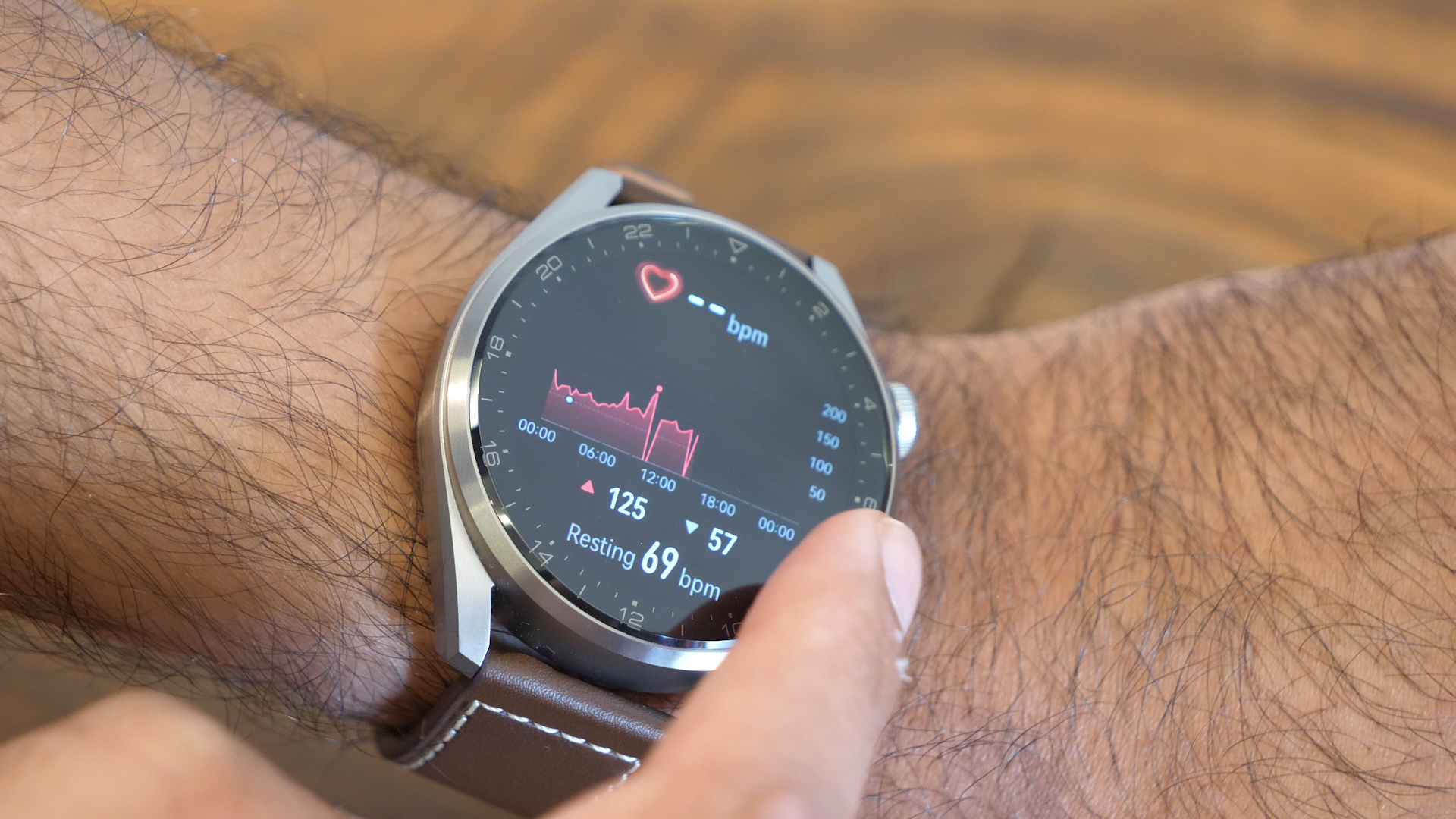
The Huawei Health app is where all the action lies, containing a plethora of tracking activity including heartbeat, stress, sleep patterns, and more. There’s a wealth of information that can easily be drilled down into, so long as you’re wearing the Watch 3 Pro for most of your day – and at night for sleep tracking. Everything is organized efficiently, and you really get a good breakdown of your fitness goals with information gathered from the watch. 

Huawei Watch 3 Pro

(Image credit: Future)

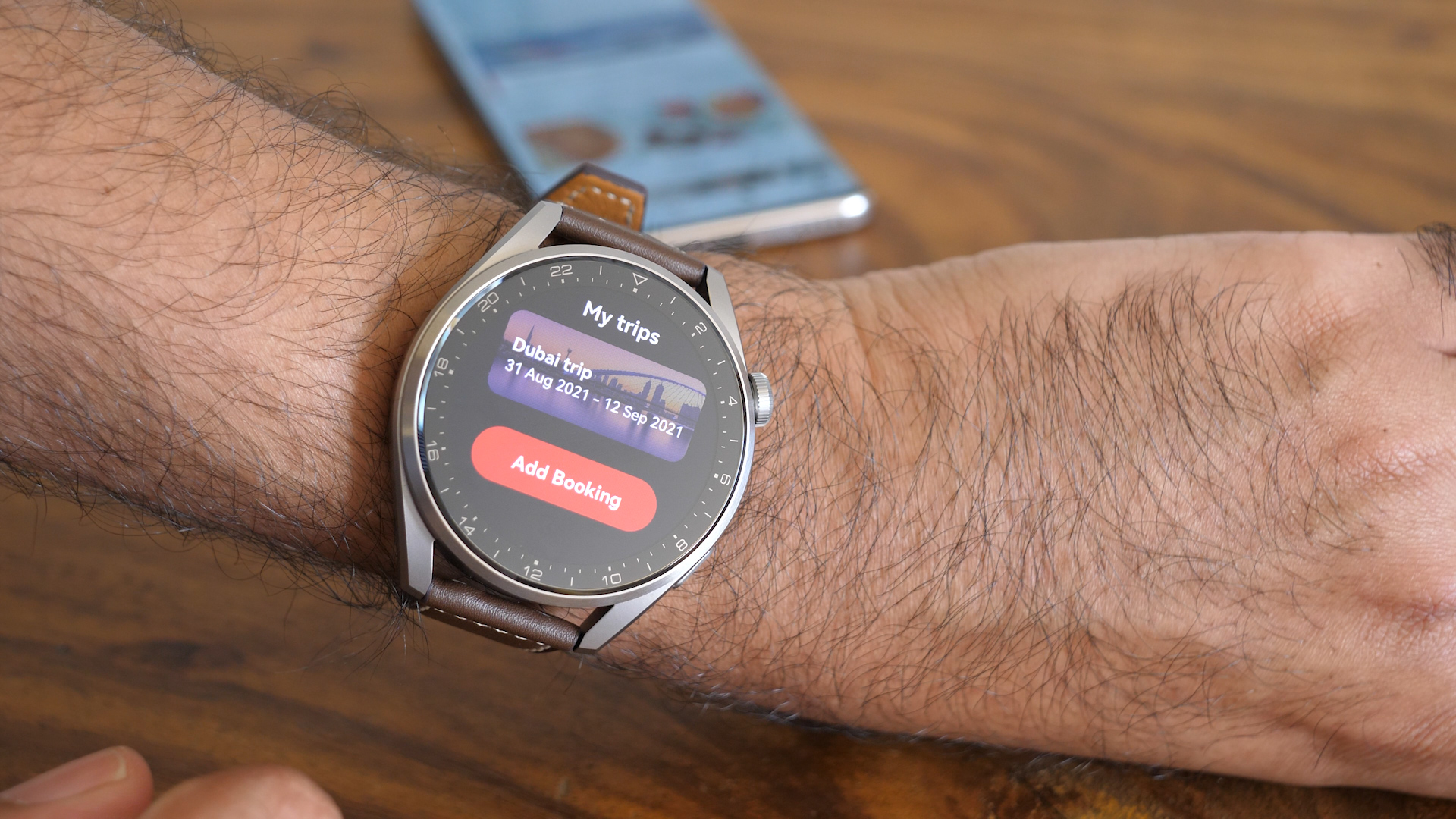
Also new on the Watch 3 Pro is the ability to natively install apps from Huawei’s app store, right from the watch-no phone needed. App availability is limited at the moment, but there are a few apps that stand out. Emirates, for example, has an app that allows you to input your flight booking reference and then get flight information and updates directly on your watch. Talabat and Dubai Taxi apps pair with your smartphone to deliver ride and food delivery updates. It’s an ecosystem that’s slowly growing, and more and more integrations are bound to make their way over in the coming months.

Huawei Watch 3 Pro

(Image credit: Future)

Notifications on the Watch 3 Pro are sadly a bit lacking, only because they only display information – you can’t interact or respond to them in any way. So if you get a quick WhatsApp message and want to shoot a reply, you’ll have to pull out your phone – despite the Watch 3 Pro having keyboard input built in. This is possibly because the Watch 3 Pro isn’t running Watch OS – Android can be very picky about what data it shares with other devices and apps, so you’re sadly stuck with being unable to interact with your watch notifications beyond just reading them. 

One thing that the Watch 3 Pro touts loudly is its new eSIM support. In the UAE, both Etisalat and du offer eSIM to subscribers, though you’ll have to either pop down to a local branch or use their dedicated apps to activate it properly. Once activated, you can use your Huawei Watch 3 Pro independently from your phone, and can even make and receive calls from it. Even without activating eSIM, the Watch 3 Pro works fine to make and receive calls through your paired phone. 

Huawei Watch 3 Pro

(Image credit: Future)

Phone call clarity was pretty decent, with callers not even realizing we were using a smartwatch to call them on. It’s certainly useful for when you’re running outdoors and an urgent call comes in, but eSIM activation isn’t required in order to enjoy using the Watch 3 Pro for calls. The speaker on the Watch 3 Pro is loud enough to hear what’s being said, so for quick calls that won’t last more than a few minutes, you’ve got yourself covered.

Mind you, we don’t envision having full-length conversations through the Watch 3 Pro – it’s handy to just quickly make a short call to someone or tell them you’ll call them back later. A better usage for LTE connectivity is streaming music or podcasts when and hearing them over wireless earbuds.

Huawei Watch 3 Pro

(Image credit: Future)

Also on the Watch 3 Pro is Huawei’s smart assistant, Celia. Designed to mimic other digital assistants, you can set simple alarms, ask for weather updates, or call contacts. But the overall experience is spotty – when we asked what the time was in Miami, Celia responded with ‘Sorry, I couldn’t understand that’. That happened for a lot of queries we tried, so there’s still a ton of work to be done to come up to the levels of Siri or Google Assistant.

Fitness

  • New temperature sensor
  • Over 100 workout modes
  • Fall detection with SOS calling

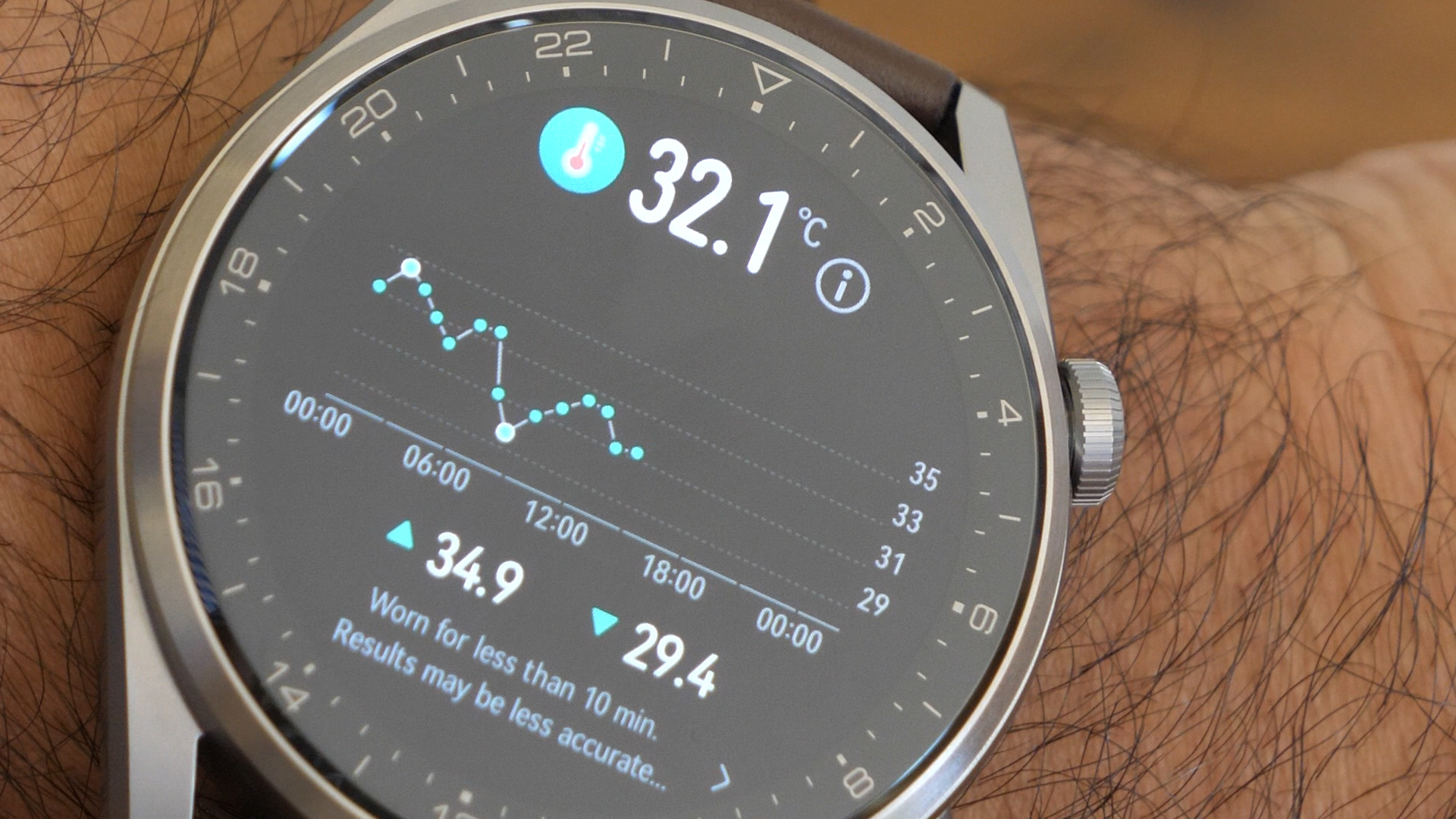
The Huawei Watch 3 wouldn’t be a competitive smartwatch without a laser focus on wellness, but it’s the first mainstream smartwatch with a temperature sensor loaded up, so you can track another aspect of your health throughout the day. 

The temperature sensor worked pretty well during the day, but the huge asterisk is that it’s not designed to be an accurate reading of your actual body temperature. Skin temperature can vary greatly, and Huawei is keen to stress  that this – along with their other trackers – does not make the Watch 3 Pro a medical device in any way. Temperature readings were a few degrees off from what an actual thermometer registered, but might still come in handy for a ballpark reading every now and then.

Huawei Watch 3 Pro

(Image credit: Future)

Fitness is where the Watch 3 Pro really does shine, with over 100 workout modes being available to try out. Whether it’s weight lifting, cycling, swimming, or running, the Watch 3 Pro can detect them all and keep track of your progress. GPS tracking is also excellent for following routes, though we found that it was much more accurate when the watch was paired with a smartphone than when we just took it out on its own. If you’re regularly using the Watch 3 Pro while swimming, there’s even a nifty Drain feature which emits a high-pitched sound from the watch speaker in order to help drain water from it.

Huawei Watch 3 Pro

(Image credit: Future)

The Watch 3 Pro also now includes fall detection, with the watch prompting if emergency services need to be called. This can also be triggered by pressing the crown five times, which gives you a list of emergency services that you can call directly. 

Battery life 

  • Smart and battery-saving modes both feature health tracking
  • Battery lasts up to five days in smart mode
  • Charges wirelessly

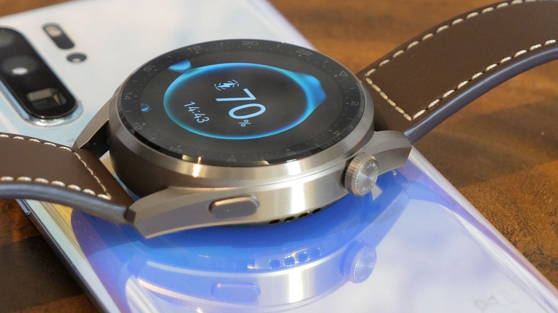
The Huawei Watch 3 Pro bundles with a small magnetic charger, but it can also charge wirelessly with Qi charging. Our experience with this was mixed – while the watch charged perfectly with the bundled charger, we had a bit of difficulty getting the battery past 70% with two other Qi wireless chargers, so it’s probably best that you use the charger that Huawei includes. The Watch 3 Pro can also be charged with reverse charging on compatible Huawei smartphones.

Huawei Watch 3 Pro

(Image credit: Future)

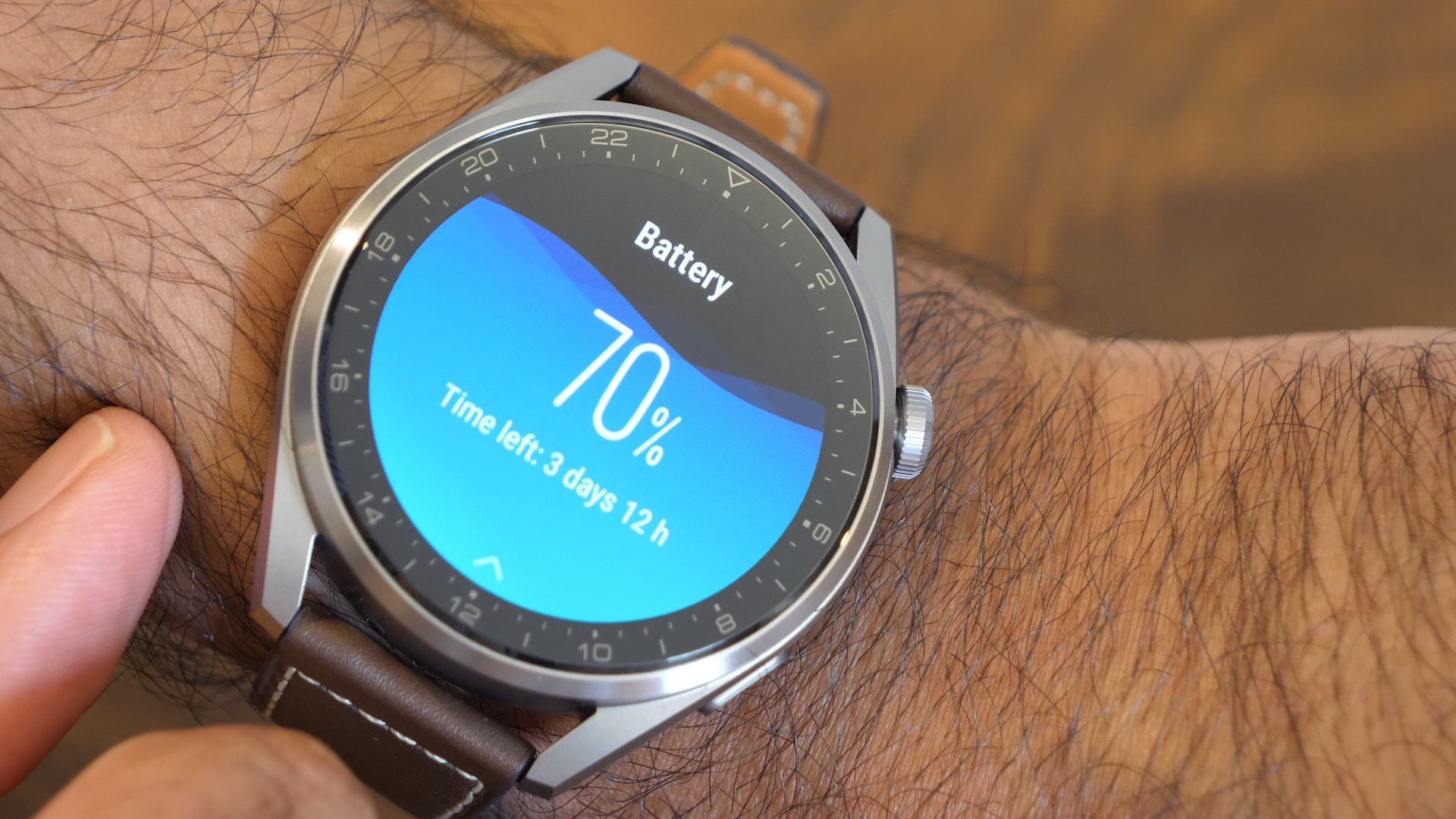
The Watch 3 Pro promises five days in smart mode, and in our regular use we got about four and a half days before the watch prompted us to recharge. This was with Wi-Fi and Bluetooth always on, display set to automatic, and constant heartbeat and SpO2 monitoring. 

If you want to keep it going past five days, you can turn on ultra-long battery life mode, which stretches battery life to 21 days at the expense of turning off most of the smart features. This effectively negates the actual usefulness of the Watch 3 Pro, but it’s available if you want to activate it. For everyone else, Huawei’s claims of five-day battery life are fairly spot on, though of course your mileage will vary, especially if you’ve got the Always On screen mode active, coupled with constant health monitoring.

Huawei Watch 3 Pro

(Image credit: Future)

Recharging takes just under three hours from a drained battery to 100%, but it’s honestly going to be a rare occasion where you’ve drained the watch completely, so a top up charge every alternate day or so would work great.

Should I buy the Huawei Watch 3 Pro?

Huawei Watch 3 Pro

(Image credit: Future)

Buy it if…

You want a classy smartwatch
While the Watch 3 Pro may be on the slightly larger side, it still looks fantastic for everyday wear, and the straps can easily be swapped out for when you want to use it for swimming or the gym.

You’re into working out
The number of trackable exercises is very impressive, and eSIM functionality means that you can wear the watch while running without bringing along your phone.

You need good battery life
With five days of battery life to its name under regular use, the Watch 3 Pro really fits the bill for everyday tracking and fitness use.

Don’t buy it if…

You’ve got an iPhone
The Watch 3 Pro fairs less well on iOS, with limited watch faces, less impressive battery life, and limited notifications.

You want something cheaper
The pricing for the Watch 3 Pro is definitely at the high end, so opt for the classic Watch 3 or other market offerings if you’re on a budget.

You want better Android integration
The lack of supporting apps and view-only notifications may get on your nerves – if so, then a Watch OS device would be better suited to your needs. 

Wachete web content monitoring

Webpage change monitors are a useful tool for personal and business use. For instance, you can monitor things like job openings or best prices on e-commerce stores. For business, they can be used to track prices and other data on your competitor’s website. You can also check to see if any unauthorized changes have been made to your own website.

In this Wachete review, we’re going to look at what makes Wachete stand out from the competition, and see why it earned the top spot in our best website change monitoring software guide.

Pricing

The clear pricing page helps you choose your subscription (Image credit: Wachete)

Plans and pricing

Wachete offers a free forever version, with the caveat that you can only monitor five static web pages, and you can only check every 24 hours. 

On the pricing page, note that all prices shown exclude VAT. The first option is $4.90 per month/$54.90 per year, and you can monitor 50 webpages and one dynamic web page, with checks conducted every 60 minutes. In addition, you can monitor 12 months of data history.

Option 2 is the $9.90 per month/$109.90 per year subscription. This monitors 100 webpages and 2 dynamic webpages, and checks every 10 minutes. 

With the $49.90 per month/$549.90 per year subscription you can monitor 500 pages and 10 dynamic pages, and check every five minutes. You can also monitor PDFs and doc, docx, and xlsx files, and pages from different locations.

The highest tier is $299.90 per month/$3299.90 per year. This provides monitoring for 3,000 pages and 100 dynamic pages, and checks every five minutes. 

For personal use or a small business, the $9.90 per month tier is probably the best value, while the next two tiers will suit bigger businesses who need to monitor a lot of pages in different locations constantly.

Features

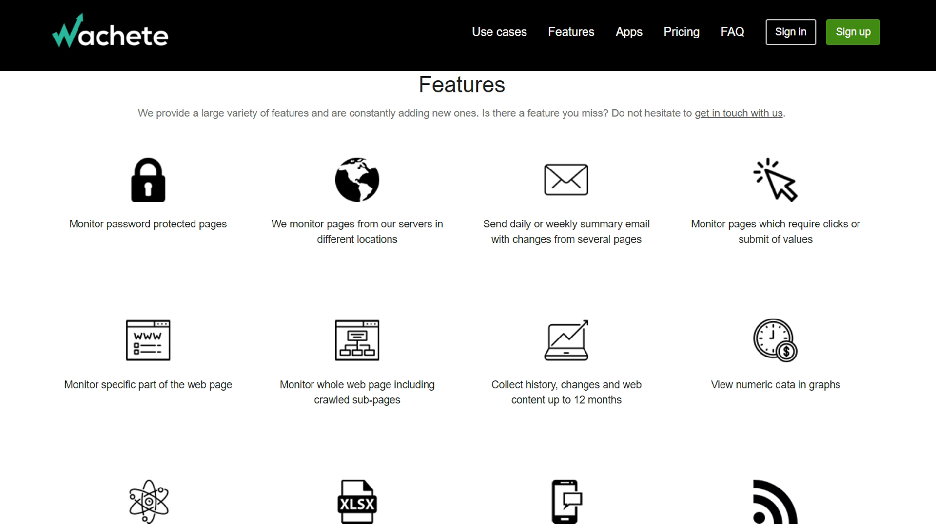
Wachete is useful for a range of purposes (Image credit: Wachete)

 Features

Please be aware some features are only available on more expensive tiers.

Wachete will monitor any website content and also automatically crawls the subpages. Wachete will also enable you to monitor pages that require a login and password, as well as track any changes on specific parts of the website.

The dynamic monitoring feature lets you check changes in dynamic pages with graphs or JavaScript generated content. You can also batch monitor and collect history, changes, and web content for up to 12 months, download data as an Excel sheet, and monitor the availability of a web page at any time.

Another useful feature is Wachete’s ability to extract text from various file types, including PDF, doc, docx, and xlsx files. You can then use Wachete to monitor them for any changes.

This tool will inform you about any unauthorized changes to the content on your web pages.

Receive daily or weekly reports from Wachete in email form to help you make fast decisions. You can also receive notifications about changes through different platforms, including email, the company's mobile app, Slack chat, Discord chat, Google Chat, Microsoft Teams, and Telegram.

If you run a company providing law compliance audits, get notified when your customers modify their website content.

Interface

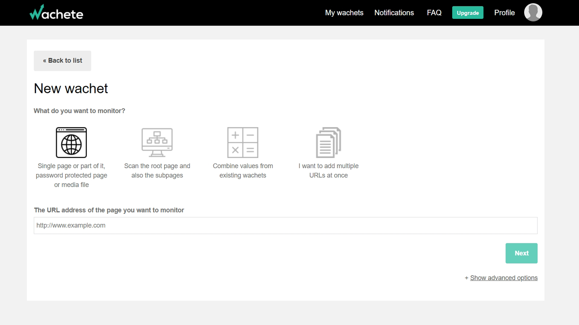
Wachete has a very simple and clear user interface (Image credit: Wachete)

Interface and in use

You need to sign up for a Wachete account, which is free, and there’s no software to download.

Click on the Create New Wachet button and enter the website URL of the page you want to monitor, then choose any extra options from the icons. Click Next, and you’ll see a preview. Choose if you want to monitor the full page or just a selected area. All you do then is adjust the notifications and select the frequency for monitoring.

The interface is very clear and simple to use, and a complete beginner could set up and use Wachete without any trouble.

Support

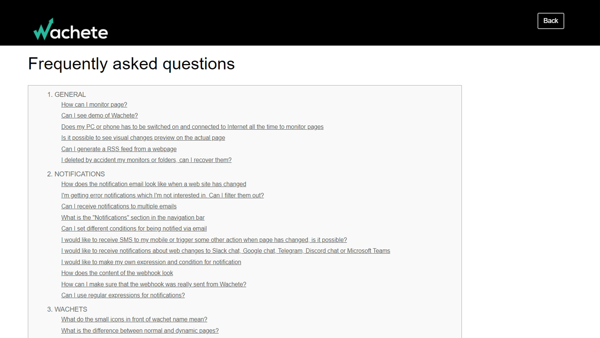
Customer support includes a comprehensive FAQ section (Image credit: Wachete)

Support

Wachete’s website provides an extensive FAQ section covering both general and more specific questions. The other support options include an email address and live chat. 

However, there are no hours of availability on the website, which is frustrating. When we attempted to contact Wachete through live chat, we were informed that the support team was not online and would email us back. 

When chat replied, we discovered that support is prioritized for paying customers and is available during standard central European business hours. You can expect the quickest response during those times, but they state they will try to reply outside business hours. 

The competition

ChangeTower has a Power User subscription that starts at $9 per month, with monitoring of up to 500 dynamic URLs, which is much more than Wachete offers at this price point. Its top subscription monitors every three minutes, and costs $299 per month.

Distill.io is better for more advanced users, as it allows you to refine your selections with XPATH, CSS and regular expressions, as well as automate workflow with JavaScript.  Its Flexi top tier subscription costs $80 per month, and monitors every two minutes if you wish. Distill.io’s Flexi subscription is the best value for big business users, but Wachete and ChangeTower are easier to use.

Final verdict

Wachete is a content monitor that manages to combine high functionality with a clear, user-friendly interface, and it provides value for money. The customer service could be better, though, and it would be helpful to have the hours of availability for customer support featured on the website.

Although the free version of Wachete doesn’t offer much, the tiered plans do, and the extensive features are versatile enough for different types of users. These include website administrators, recruiters, and businesses that want to track data across different websites to help with their sales strategy or monitor a competitor's prices for real-time changes. Wachete is also useful for consumers who want to check out the best deals on shopping websites or buy concert tickets as soon as they become available.

Monday, August 30, 2021

Klipsch T5 II True Wireless ANC

One-minute review

It’s natural to compare the Klipsch T5 II ANC to Sony’s class-leading WF-1000XM4 buds given their similar price points and feature sets, and while the Klipsch certainly make a solid case for themselves, they don’t quite offer as well-rounded a product as Sony’s slightly more affordable competition.

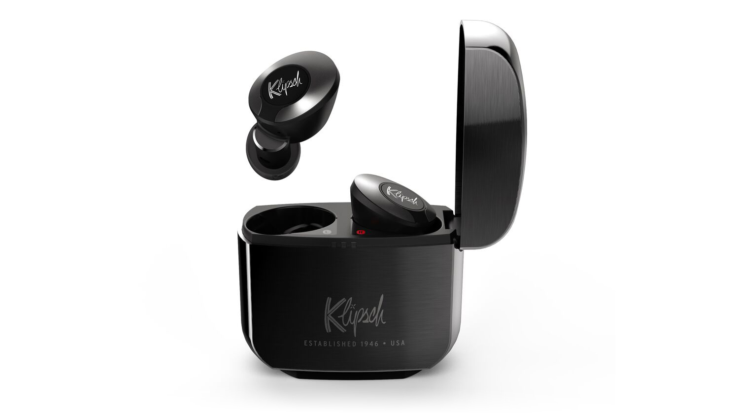
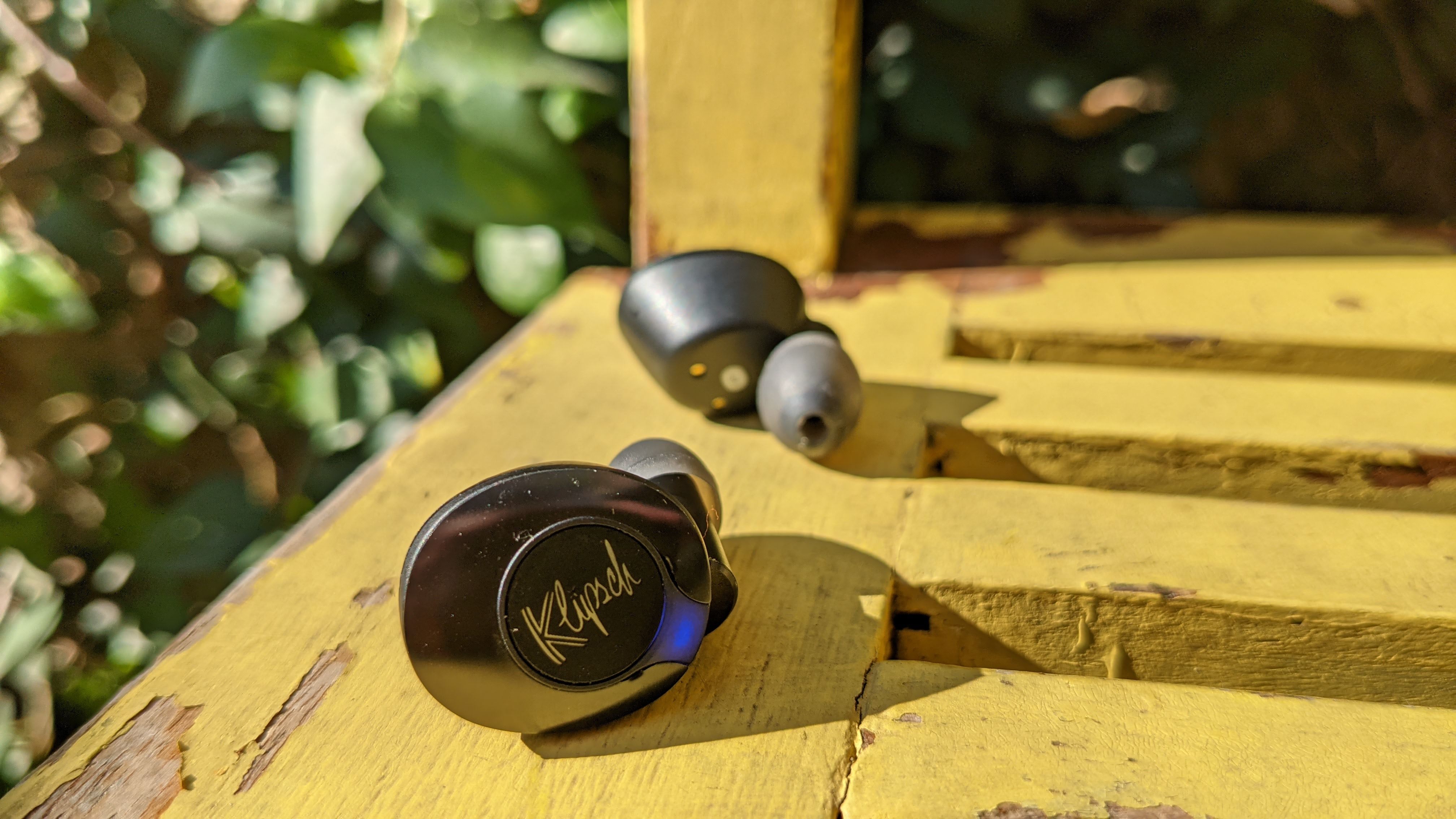
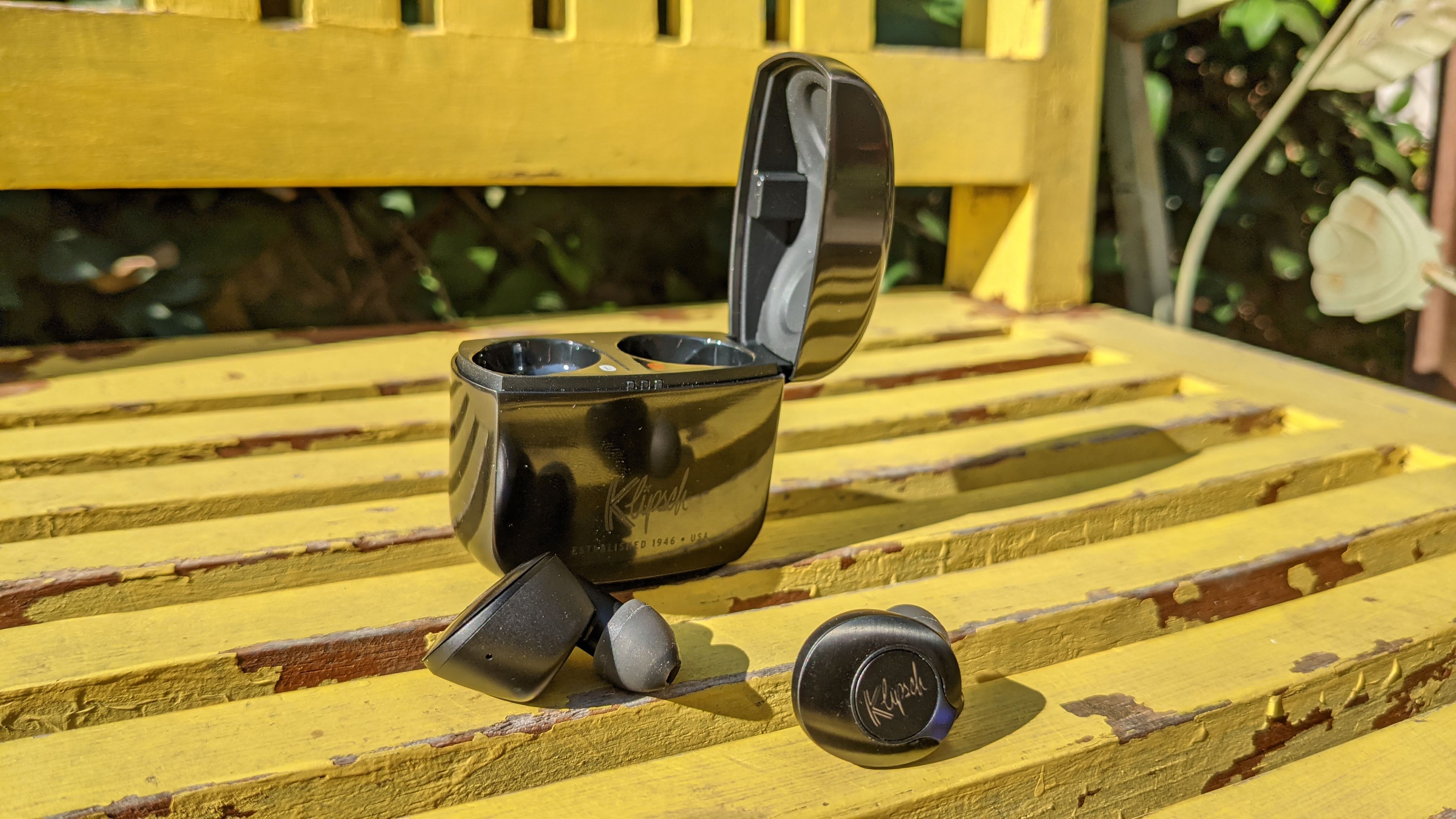
Available in three classy colors along with a limited (and more expensive) McLaren Edition, the T5 II ANC look classy and feel premium. The case is all-metal and hefty while the buds themselves are lightweight and comfortable, and both are tastefully styled.

A pair of soft-touch buttons (emblazoned with the Klipsch logo) allow you to painlessly take control, although customization of their functionality is limited to just the left bud. Six oval-shaped, silicon tips are included and – paired with the light weight of the buds – make fit and seal a breeze.

The Klipsch Connect app allows for all kinds of clever adjustments, including a six-band EQ, automations for enabling transparency mode when pausing music or taking calls, and settings to allow Bragi Moves’ head-nodding or shaking gestures to answer or decline calls or skip tracks.

The ANC on offer isn’t quite up to the standard that Sony and Bose have set, but it’s certainly capable and will serve perfectly well unless you need the absolute best. It’s a similar case with call quality, being about on-par with most of the true wireless market at the moment – good but not outstanding.

The audio quality of the T5 II ANC is where they truly shine – thanks to Dirac HD (an algorithmic enhancer with mysterious workings), the sound is rich and clear at once, offering punchy bass, pronounced mids and clarity between instruments.

With ANC enabled, you’ll get 5 hours out of the buds themselves with an extra 15 stored in the case, which is average for the industry but not great. The case sports wireless charging but there’s no fast-charge capabilities on offer.

The buds feature a Bluetooth 5.0 connection – not the latest, but not a dealbreaker either – and support for SBC and AAC codecs, which will be ample for the vast majority of listeners.

The Klipsch T5 II ANC are a great pair of true wireless earbuds and are largely let down by the stellar performance of their peers and the reduced cost at which the competition comes.

True Wireless Earbuds: Klipsch T5 II True Wireless ANC

(Image credit: Klipsch)

Klipsch T5 II True Wireless ANC price and release date

  • $299 / £299 / AU$429
  • Available now
  • McLaren Edition for $349 / £379 / AU$499

The Klipsch T5 II True Wireless ANC earbuds are available now globally and priced at $299 / £299 / AU$429, making them pretty close competition to Sony’s class-leading WF-1000XM4 buds ($279 / £249 / AU$449).

In the UK, the Klipsch’s price is a considerable £50 jump over the Sony’s, whereas in the US the $20 difference is a little more palatable. In Australia, they’re technically AU$30 cheaper than Sony’s RRP but every retailer in the country is stocking the WF-1000XM4 at AU$389 by now, so it’s fair to say the Klipsch buds are pricier across the board.

There’s also a limited McLaren Edition model of the T5 II ANC that includes a wireless charging mat and a unique carbon fiber and tire-rubber finish on the case, but this model will set you back a rather luxurious $349 / £379 / AU$499.

Design and controls

  • Premium, stylish and hefty case
  • Soft-touch buttons
  • Nodding and shaking head gesture control

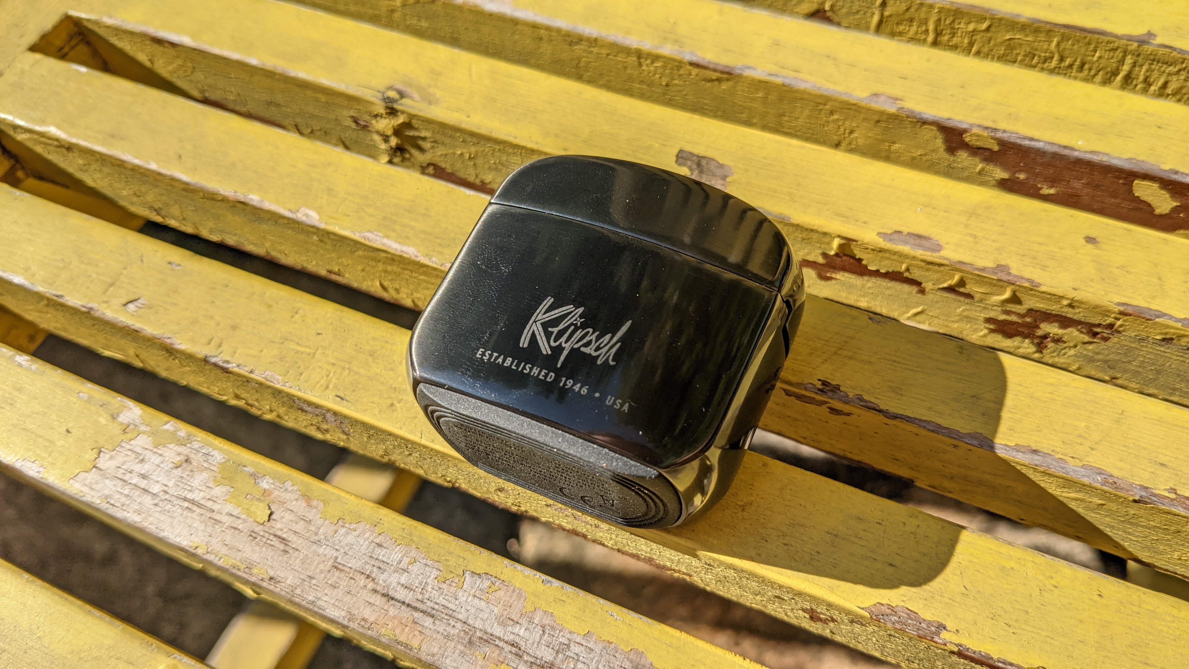
From the outset, there’s no doubt that the Klipsch T5 II ANC are a premium pair of buds. The charging case feels like a fancy Zippo lighter with its considerable heft, metal casing and side-hinged flip-top lid. For some context on this solidity, the Klipsch’s case and buds weigh 82.4g (77g for just the case), twice that of the Sony WF-1000XM4 buds-and-case combo (41g).

They’re available in a stylish array of finishes – Gunmetal, Silver, Copper and a limited McLaren Edition – with each upholding the premium chic the brand is known for. While the finish on the case certainly feels nice and comforting to the touch, there’s no doubt that it’s also a fingerprint magnet (seen below).

One neat addition worth celebrating is the integrated rubber foot on the case’s base. Perhaps introduced to help keep the case secure on a wireless charging mat, its security translates to any surface you place the T5 II ANC on.

True Wireless Earbuds: Klipsch T5 II True Wireless ANC

(Image credit: Future)

As for the earbuds themselves, the units are relatively compact and lightweight, enough so to sit comfortably in the ear and reduce fatigue when worn for extended periods. They also feature an IPX4 rating which, while rather low on the scale and a downgrade from the regular T5 II’s IP67 score, will still keep them safe from sweat and other light splashes (although the case does not share this protection).

They’re adorned with a button, each brandishing Klipsch’s cursive logo, along with a single large indicator LED surrounded by a trim featuring a different accent depending on your choice of color.

These buttons have a relatively soft actuation that isn’t the most satisfying to press, and although it doesn’t provide as much tactile feedback as some other buds, it does alleviate the issue of applying extra pressure to your ear canals when pressing them.

Within the Klipsch Connect app, you can customize the actions performed by these buttons, but oddly this is limited to just the left earbud. The usual array of options is present – playing, pausing, skipping, volume adjustment, ANC or transparency mode, answering or declining calls, and voice assistant activation are all here.

As for fit, there are a generous six included eartips in the box, all silicon and all sporting Klipsch’s patented oval-shaped design. We found the default medium tips to provide an easy and solid seal, and we imagine one of the other five options should suit most users’ ears if the standard tips don’t.

As compared to Sony and some other competitors, the T5 II ANC don’t feature any sensors to detect the proximity of your ear, which would allow for automatic pause and playback of music.

One of the most unique features of these buds is their integration with Bragi Moves – a system that allows head-movement gestures like nodding or shaking to activate certain controls (currently limited to answering or declining calls and skipping tracks). We found it to work reliably and as intended.

For those with physical impairments, we imagine this could be a god-send. For others, we suspect the infrequent cases in which you’d prefer not to touch the T5’s button would mean that you’d forget this functionality even existed, relegating it to the realm of novelty.

Audio and ANC

  • Wonderfully clear and rich audio
  • Decent but not class-leading ANC
  • Excellent automated functions

As the product title may suggest, one of the main changes from the regular T5 II True Wireless earbuds is the addition of active noise cancellation (ANC), and while they perform admirably, they’re still no match for Sony’s competing buds or Bose’s exceptional noise-cancelling QuietComfort Earbuds.

Most static environmental noises are dealt with effectively thanks to the twin-mic ANC design (one feedback and one feedforward), but there is a low-level background noise introduced by the function itself, and more dynamic sounds like construction noise aren’t handled as elegantly as Sony and Bose manage it. Overall the ANC performance is great, but we’ve truly been spoilt for choice at this stage.

On the topic of microphones, there’s six beam-forming mics (three on each bud) that help with voice clarity when on calls. While they do a solid job, it’s a limitation of the true wireless format that you won’t be rivalling phone-to-face quality or even that from over-ear cans – the microphones are simply too far away from your mouth and are prone to picking up other external sounds as a result.

As is to be expected by this point, the T5 II ANC feature a transparency mode that allows external sound to enter the buds for the sake of awareness and conversation. This feels natural in practice and comes with a built-in noise shield to stop unexpected loud noises.

We previously mentioned the buds’ gesture control, but another feature that Klipsch’s integration of Bragi tech enables is called Sidekicks – essentially allowing for multiple settings to be enabled via a single command or action.

This includes automatically enabling transparency mode when on a call (excellent news for those that need to hear their own voice in order to speak properly), automatically engaging ANC when listening to music, and enabling transparency mode when pausing it.

These Sidekicks are genius and we’d love to see them integrated into more headphone designs (frankly, we’re surprised they’re not). We suspect the most common reason a listener pauses their music is in order to hear their surroundings, so why make this process require multiple commands or the removal of the buds altogether?

True Wireless Earbuds: Klipsch T5 II True Wireless ANC

(Image credit: Future)

The T5 II ANC are the first true wireless earbuds to boast Dirac HD – a somewhat mysterious enhancement setting that Klipsch claims improves “staging, clarity, vocal crispness, and bass fidelity”.

As we hinted at, it’s difficult to pin down exactly what this setting does to work its magic, but we found the above claims to be accurate, with its particular frequency adjustments resulting in a more rich and 3D experience.

When engaging this feature, we couldn’t help but feel that these buds were designed specifically to sound good with it enabled, potentially sacrificing some of the vanilla audio fidelity in the process. This influence was by far the most prominent when toggling the mode on and off and hearing the direct comparison – although a few minutes of listening allowed us to acclimatize to either setting.

This enhancement mode makes it tricky to get a sense of the T5 II ANC's overall audio profile, but with Dirac HD engaged the response moves from being relatively flat to having more excited bass and upper-mids. 

When put up against the WF-1000XM4, the T5’s bass is a little more punchy and the overall response feels a little less dampened in the high-end when Dirac HD is enabled, but when comparing the out-of-the-box sound, Sony’s signature warm profile was more pleasant and appeared less thin.

It’s a tasteful sound that provides exceptional clarity even at higher volumes, at which there’s no sign of distortion, and offers solid separation between musical components without disturbing the glue of the overall mix. If you’re not happy with the balance, the Klipsch Connect app provides a helpful 6-band EQ with each band’s associated frequency listed (something we’ve seen excluded from competitors too often).

The initial snare hit of MorMor's Heaven's Only Wishful is punctual and crisp, and throughout the track the Klipsch allows each synth and guitar component to comfortably coexist with the vocal rather than compete. The same is true during the song’s climax when a crunchy guitar solo is paired with an octave jump in the vocals, both delivered with a pleasant smoothness considering their abrasive nature.

In Off-Piste by Photay, the intro’s glitches are given three-dimensional life before being replaced with the off-kilter drop and kick-ducking bass. In a song where individual elements are threatened with being submerged in the wide-open wash of synth pads and sustained notes, the T5 do a remarkable job of distinguishing each melodic nuance and percussive dynamic.

On Deserta's shoegaze delight, Hide, this ability to create distinction is even more obvious – the delicate balance between an oppressing wall of noise and musical interplay is maintained without losing its sense of raw power.

For something a little softer, Westerman's 'Sketch' version of standout track Blue Commanche displays all the tenderness and faults that come with a demo recording. The characteristic slapback echo provides a rich sense of space to the mournful vocal delivery while the compressed acoustic guitar fills out the rest of the soundstage with gorgeous and intimate detail.

Battery and connectivity

  • 5 + 15 hours with ANC on
  • Wireless charging but no fast-charge
  • Bluetooth 5.0 and SBC, AAC support

As we’ve mentioned, the charging case for the Klipsch T5 II ANC supports wireless charging, another upgrade from the regular T5 II buds, or you can plug it in via USB-C. Disappointingly, there’s no sign of fast-charging, which has become a rather standard inclusion in the earbud market and is a real lifesaver for those that are about to leave the house only to find the buds completely drained.

The battery life is fairly average for the industry – there’s 5 hours in the buds themselves with an extra 15 in the case (this extends to 7+21 if you forego ANC). By comparison, Sony’s WF-1000XM4 boast 8 hours in the buds and 16 in the case with ANC enabled, and the full package weighs half as much.

As for connectivity, the T5 II ANC features Bluetooth 5.0, which isn’t the latest standard – the WF-1000XM4 sports 5.2 while the QuietComfort Earbuds has 5.1. In practice, the differences between these technologies doesn’t yet have much of a real-world impact, but we always like to see the latest standard adopted to better futureproof products.

The Klipsch buds support SBC and AAC codecs, neither of which are especially hi-res but are capable of 320Kbps streams, which is more than enough for the majority of listeners relying on streaming services or on-device MP3s.

Should I buy the Klipsch T5 II True Wireless ANC?

True Wireless Earbuds: Klipsch T5 II True Wireless ANC

(Image credit: Future)

Buy them if...

You’re chasing rich, detailed audio

The main highlight of these Klipsch buds is their excellent audio detail, with the Dirac HD technology offering truly rich and immersive audio. While audiophiles wanting to play lossless audio will be disappointed with the codec support, these buds still manage to breathe new life into compressed audio formats.

You want premium design and feel

The design of the T5 II ANC is indisputably premium, especially the schmick metal charging case, so if you’re after a stylish pair of buds with a case that feels good and can likely take a bit of a beating, these are the go.

You need gesture control and some automation

While the head-nodding and shaking gestures offered by Bragi Moves may be a novelty to some, it could be a gamechanger for those with accessibility needs. We’re also incredibly fond of Bragi’s Sidekicks, which allow for clever automations to disable or enable ANC in appropriate situations.

Don't buy them if...

You’d prefer to save some money for similar performance

The premium brand, design and audio come at quite the cost with these earbuds – the retail price is above that of the Sony WF-1000XM4, which we find to excel on all fronts to produce an especially well-rounded product.

You’re after the best-in-class noise-cancellation

As we’ve mentioned in our review, Sony and Bose both outclass Klipsch on the ANC front, and while the offering is certainly respectable here, we’d recommend looking at an alternative at this price if it’s a priority of yours.

!!!!!!!!!!

Popular Posts

Categories

Blog Archive