Wednesday, January 31, 2024

Strava is still the best training app for runners and cyclists, but it's getting expensive

Strava: One-minute review

Did a workout even happen if it's not logged on Strava? We've been using the smartphone app to track weekly miles since it launched in 2009. Yes, there have been periods in my life where I haven't run at all – just before this review, for example. But when I am ready to pound the pavements again, I find it hard to imagine not using Strava.

Strava is part-fitness app and part-social platform. You can record and review activities, then share them with friends for "Kudos" (similar to giving a "like" on other media platforms). Run, Bike, Hike is the app's motto, but there's support for over 50 activities, including kayaking, swimming – great for triathletes – and yoga.

You can track activities using the GPS on your iPhone or Android device and get time, distance, route, estimated calories, and elevation. But using Strava on the best fitness tracker or the best running watches (all the major brands are compatible) elevates the experience, allows you to go phone-free, and can add more metrics for a full picture of your workout intensity. 

The service is brand-agnostic, and I record from my Apple Watch 8, a budget Garmin Forerunner 45, and my iPhone 15 Pro, depending on the context. Each device provides a seamless experience, and the app's interface allows you to set up and start recording in moments.

The Strava app open on an iPhone 15 Pro

The Strava app can effectively turn your smartphone into a cycling or running computer (Image credit: Lauren Scott)

According to Strava's Year In Sport Trend Report, more than 10 billion activities were shared on the app in 2023. There's more to Strava than recording, though; it's about celebrating movement and creating community through your favorite sports. By connecting with friends and colleagues who also use it, I've become part of a small but consistently encouraging group that will cheerlead my activities – even the slow ones.

And there's the metrics element. In the modern world, we usually rely on data to improve performance, and Strava can provide this in spades after a workout. How much you can access depends on your plan; if you just want to log your distances and interact with friends, the free version gives you the basics. 

Strava has come under fire for its huge price hikes in the last year, and it's a shame to see features like maps, routes, and monthly progress stats behind a subscriber paywall. The app has some competition from alternatives like Nike Run Club and Runkeeper (owned by Asics). But are these a better proposition?

I think Strava is still one the best fitness apps for runners, cyclists, and adventurers, with a blend of statistics and a social community that's hard to beat. But is it the best for you? And is the subscription worth it in 2024?

Note: I'm reviewing the Strava iOS app using an iPhone 15 Pro, which is also available on Android. I've used both the Premium and Free plans.

Strava: Specifications

Strava: Price and availability
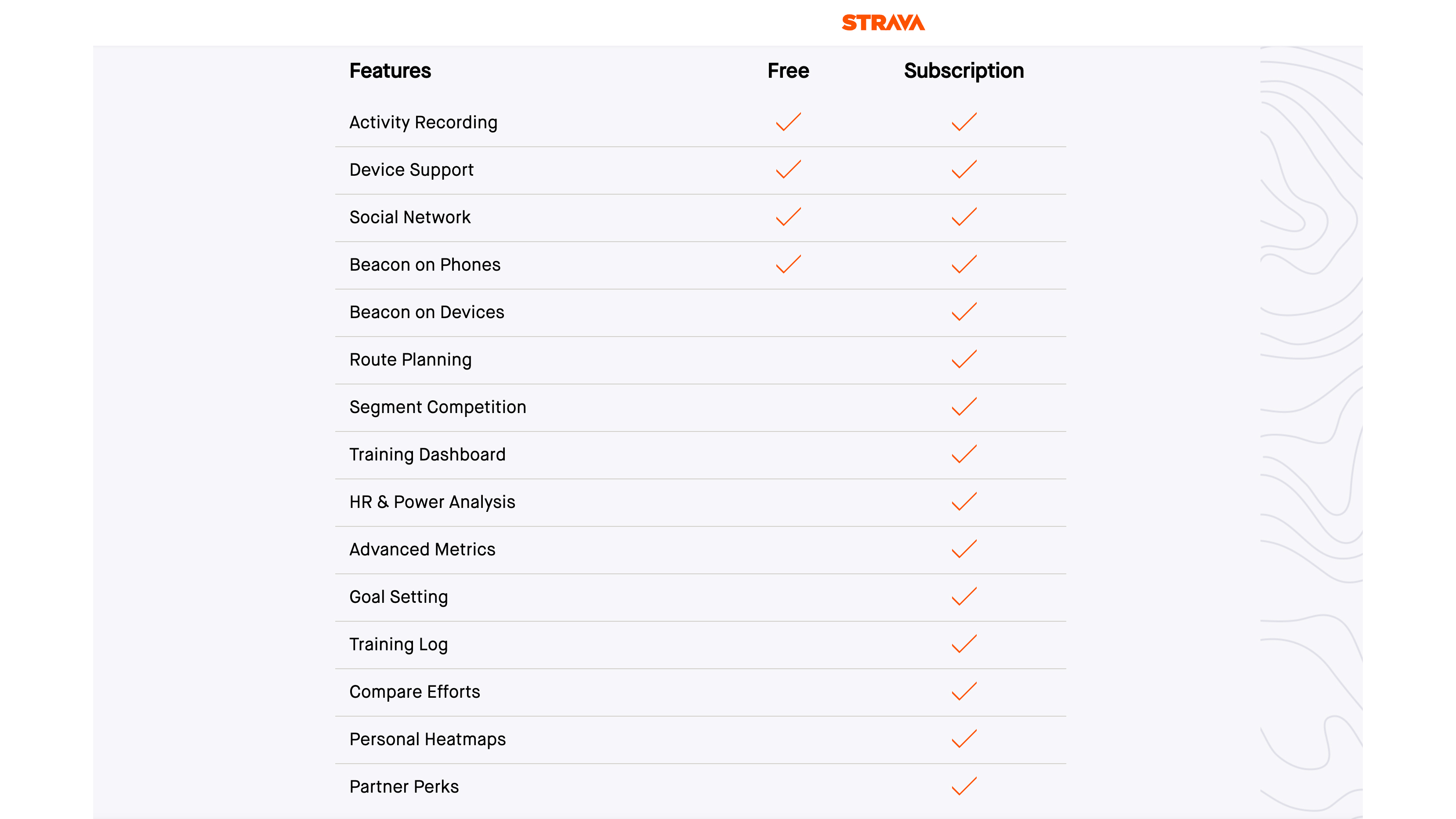
The features you get with a free or paid version of Strava

As of January 2024, the features you get with a free or subscription version of Strava (Image credit: Strava)
  • Subscription: $11.99/£8.99 per month
  • $79.99/£54.99 billed yearly
  • Free version available

Strava is free to download, and free to use forever if you want to. But you'll get limited features without a subscription. In January 2023, Strava announced that it was moving to consistent subscription pricing by country, and the current cost is $11.99/£8.99 monthly or $79.99/£54.99 annually.

A 30-day try-before-you-buy option gives you full access to training logs, segment competitions, maps, and more. It's easy to cancel the free trial before the month is up if you don't think these are worth paying for.

There's been a lot of negative press about Strava's rising subscription cost, but it's in the same ballpark as the fitness apps Fitbit Premium ($79.99 / £79.99 per year) and Fiit Unlimited ($9.99 / £9.99 per month).

By comparison, Runkeeper charges $39.99 / £39.99 per year or $9.99 / £11.99 per month for its premium features like live tracking, and progress insights over time. That's half the annual price of Strava in the US, but more per month in the UK. As its name suggests, Runkeeper is an app built mainly with runners in mind, and the activity types it supports are more limited than Strava.

Athletes, competitive runners, and cyclists who are serious about planning routes and improving their performance over time will benefit from subscribing to Strava. If you're training for a specific event or goal, I'd recommend paying monthly until you no longer need the extra features.

  • Value score: 4/5

Strava: Design and UX

The maps feature of the Strava app open on an iPhone 15 Pro

(Image credit: Lauren Scott)
  • Clean but utilitarian aesthetic
  • Small text during navigation
  • Route-making fiddly on a phone

On the whole, Strava is intuitive to use and navigate around. At the top, you'll find a plus symbol for adding a post, photo, or manual activity, a search function to find friends or clubs, and messages and notifications icons on the right. So far, so simple. I do find it fiddly to build a route, but you can log into the desktop app to do this with far more control.

The app is made up of shades of white and gray – a clean and minimalist look with orange accents to highlight your tab selection. The UX designers have done a good job at packing a lot of information onto the screen, but at times the text can be very small. Again, rely on the desktop version if you need to dig deep into stats on a big screen.

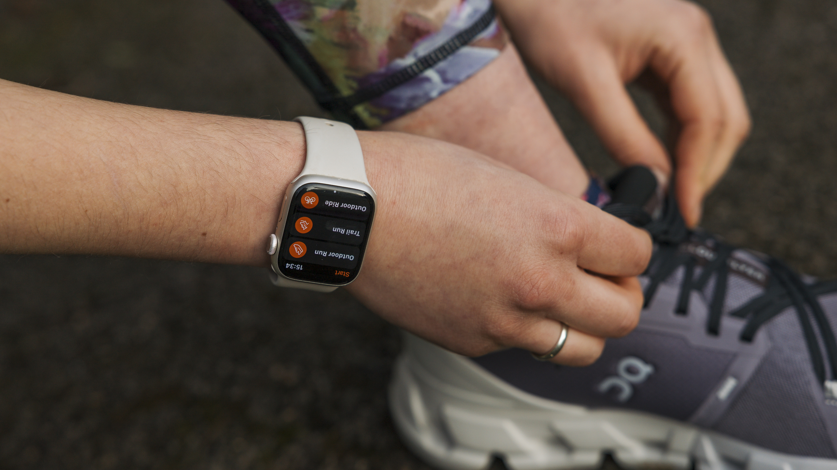
Before a workout, I don't want anything to put me off going. Thankfully, the Strava interface is easy to navigate, and you can start tracking with just a few taps. To start a session, you go to the record section, choose a sport, and press start. On my Apple Watch 8, I tap on the Strava app and tap Outdoor Run. Both approaches take seconds. 

Once an activity has started recording, the time, average split pace, and distance are big and bold on your phone screen – so you can scan them while you're pacing along. Toggling the map button hides these numbers and brings up your location, which is helpful if you're exploring somewhere you haven't been before. And when you're at the end of your adventure, the big orange stop button is easy to find.

  • Design score: 4/5

Strava: Features

Image 1 of 2

Screenshots from the Strava app

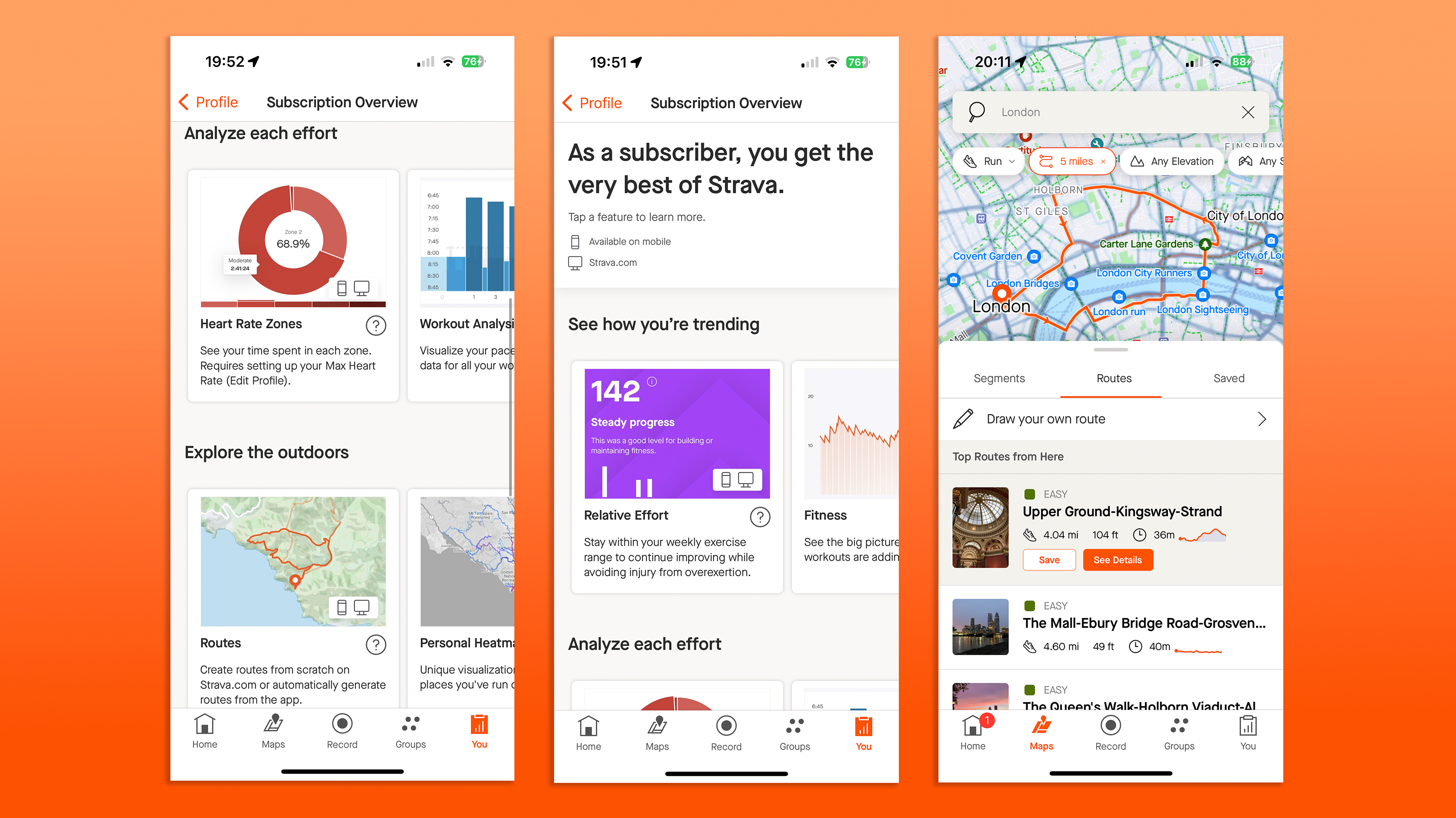
As a subscriber, I get analysis on each activity, and suggested exercise routes (Image credit: Lauren Scott)
Image 2 of 2

Screenshots from the Strava app

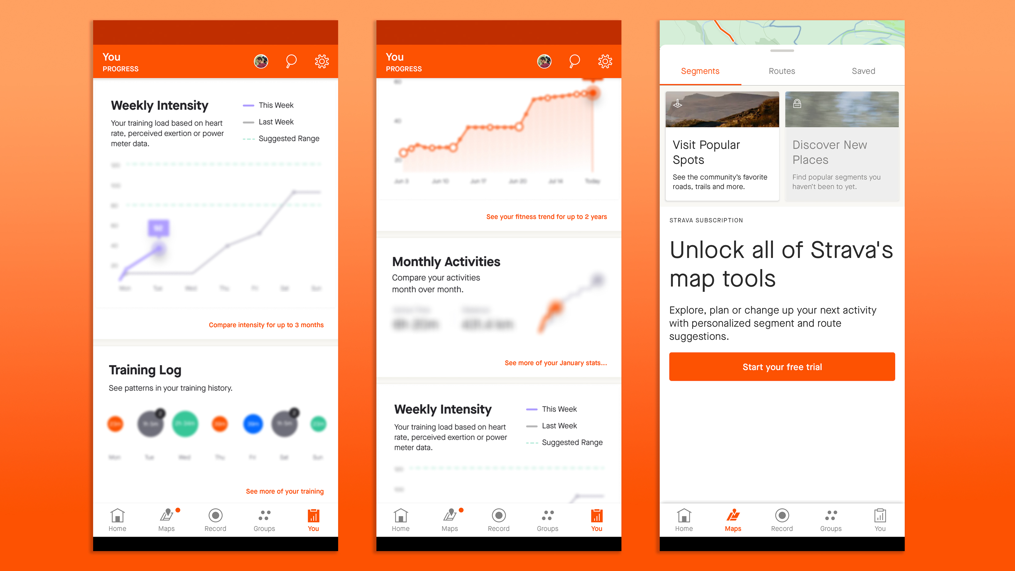
Advanced metrics are hidden in the free version of the app (Image credit: Lauren Scott)
  • Training dashboard is insightful
  • Free features are limited
  • Route planning is excellent

Strava is designed for athletes – especially cyclists and runners – to track and analyze their fitness activities. Its main features revolve around recording workouts and giving insights into them to help you improve.

Users can track generic sports such as running, cycling, swimming, and hiking, along with niche exercises like skateboarding, squash, or HIIT sessions. Sports are grouped into further subcategories by genre; under Cycle Sports there's a generic "Ride" option, but also Gravel Bike Ride and E-Bike Ride, among others. The real difference here is how your workout is displayed on the dashboard. For example, "Runs" show Distance, Pace, and Time, but "Trail Runs" are likely to involve mixed terrain and show Distance, Elevation Gain, and Time.

During a workout, Strava gives you an analysis of each activity on the screen, with metrics such as time, distance, speed, elevation gain, heart rate (if you're synced up with compatible devices, like a smartwatch), and power (for cyclists using power meters). This data is also saved afterward with more nuance.

For free users, I'd say there's little data crunching beyond what a smartwatch records. You will be able to see your workout stats as recorded on your smartwatch, but Weekly Intensity is out, as is making a training plan. However, if you're using one of the best Garmin watches or a competitor like Polar, you'll be able to put together training plans in those native apps.

Strava has become well known for its segments; specific sections of routes where you can compete for the fastest time with other users, or track your improvement over time. These are also now subscriber-only, which is a real shame, as they help to foster competition and motivation for users of all levels.

Image 1 of 2

The Strava app on an iPhone 15 Pro

(Image credit: Lauren Scott)
Image 2 of 2

The Strava app on an iPhone 15 Pro

(Image credit: Lauren Scott)

Accountability can be a big factor in whether we choose to exercise or not, and I know that the social nature of Strava has often spurred me on to go further and faster. I already mentioned the ability to give and receive Kudos and leave comments on activities – the networking features let you follow and interact with friends as well as pro athletes. Because who doesn't want to nosey at other people's training plans?

On the flip side of social features, Strava also has plenty of privacy features with safety in mind. It's possible to set the visibility of your whole profile to friends only, to everyone on Strava, or to completely private. You can also change each activity's visibility individually. I love the ability to hide and end the start point of your run (or the entire map), which goes some way to protecting your identity if you often run straight from your front door.

Strava Beacon is a safety feature for subscribers that allows users to share their real-time location with selected contacts during an activity. The aim is to offer peace of mind, especially if you're working out after dark, or in a new area. I've used it a few times when running alone at night.

The biggest and best feature for adventurous runners and cyclists is Strava's Maps tab, which gives you thousands of downloadable routes from other users, plus the ability to draw your own. When I'm stuck for inspiration, firing up the maps tab, setting an ideal distance and following a saved route nearby has given me fresh inspiration and allowed me to run knowing I'll end up finishing where I want to.

  •  Features score: 4/5 

Strava: Performance

  • Excellent fitness tracker integration
  • Challenges and goals
  • Plenty of subscriber metrics

Strava The Strava app open on an Apple Watch 8

(Image credit: Lauren Scott)

Strava is generally well-regarded among athletes and fitness enthusiasts, but it's not perfect. It's also fair to say that the performance aspect of Strava depends on what activities you're tracking, what plan you're on, and what device (if any) you're wearing.

One of the best things about Strava is its integration with popular fitness platforms and services like Garmin Connect, meaning you can sync Strava with these services to upload workouts automatically. For premium users, ahuge range of compatible devices can be used to compete in Live Segments while running or cycling.

Lots of people start Strava on their phones, though. So to be thorough for this review, I recorded the same run on a Garmin Forerunner, Apple Watch, and the Strava app. Distance-wise, they were all within 0.05 miles of each other, which is comforting. 

However, I've found that Strava will more often round down the distance from a Garmin watch, meaning you end up with an annoying 5.99 miles rather than the six miles recorded on your watch screen. This is a phenomenon known as "Strava tax" and has to do with the file that Strava uses. It's hardly a dealbreaker for most users, but competitive runners might see this as a frustration.

The Strava app on an iPhone 15, Garmin Forerunner 45 and Apple Watch 8 Pro

(Image credit: Lauren Scott)

The reports from activities are clear and helpful, but again optimal with a fitness tracker. Elevation, pace, and heart rate are available to free users, while heart rate zones and pace zones are unlocked for premium app users. They're all fed back to you via the analysis section, and incorporated automatically into your Relative Effort score, so you can see whether you performed above or below average. The numbers are crunched and presented in a friendly way, and I've loved seeing my Fitness score increase over the weeks.

Maps and route mapping are other compelling reasons to subscribe to Strava, but are they any good? Definitely, if you're visiting a new area, on holiday, or working away from home, and want to find or plan a new route for exercise. The mapping interface is easy to use; just a few clicks, drags and drops and you've made a circuit. 

The route mapping feature is available on desktop and mobile, but I find it quicker to make new routes on a bigger screen. Strava uses global maps with detailed road and trail data, so when you add two points to a route, there's the option to stick to roads or trails automatically. I mostly run solo, but the ability to share a route with friends or club members makes it easy to organize group rides or runs.

One of the standout aspects of Strava's performance is its emphasis on community and social interaction. The leaderboards, challenges, and the ability to follow and interact with friends and athletes provide real motivation, and I've never found anything but support on the platform.

  • Performance: 4.5/5

Strava: Scorecard

Strava: Should I buy?

Buy it if...

Don't buy it if...

Also Consider

How we tested

I've used the free version of Strava ever since 2015, and have been a Premium subscriber for around a month at the time of writing this review. I generally track runs between 10-20 miles a week – to complement my workouts with Fiit Unlimited – but I've also been hiking and swimming to test out more of Strava's sports modes. I've used the app on iOS (an Apple iPhone 15 Pro), and have tracked activities on an Apple Watch 8 as well as an older Garmin Forerunner 45. As well as recording and syncing with fitness trackers, I also tried manually uploading activities to Strava on the website to see how easy and effective it was.
Paycor review

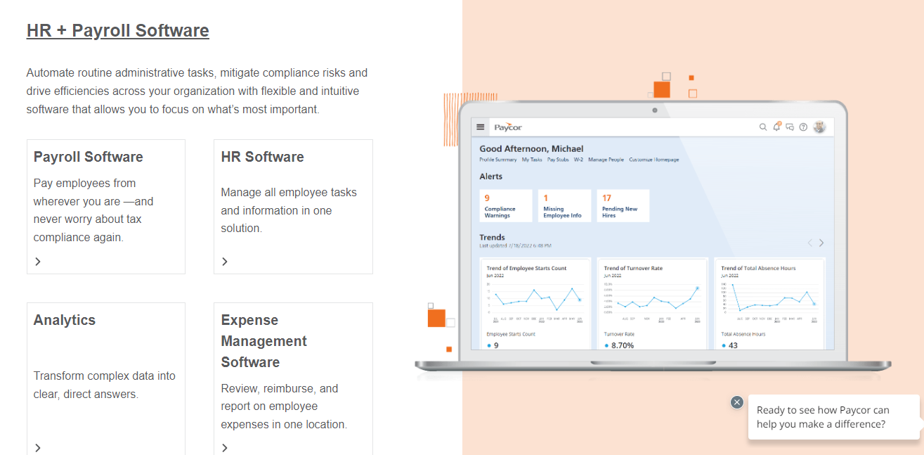
Paycor, a human capital management (HCM) platform that is cloud based, offers payroll, HR, and other services for small and mid-sized businesses. Paycor was founded in 1990, is headquartered in Cincinnati, Ohio, and has a worldwide customer base. Its notable customers include Wendy’s, Pure Dental Brands, and the Detroit Zoo. 

Paycor: Features

Paycor offers various features for payroll, HR, and other services for small and mid-sized businesses. Some of the functions that Paycor provides are:

Payroll and tax: Paycor automates payroll processing, tax filing, direct deposit, check stuffing, employee self-service, and new hire filing. You can also set up the AutoRun feature to process payroll on a specific day and time- without the need to even log in.

Time management: Paycor allows you to track employee time and attendance, manage schedules, approve time-off requests, and sync data with payroll. You can also use geofencing, biometric clocks, and mobile apps for increased accuracy in time tracking.

HR and benefits: Paycor helps you with onboarding, benefits administration, performance management, compliance support, employee engagement, and more. You can also access an HR support center with templates, guides, and best practices. Paycor, a comprehensive HR and benefits solution, streamlines and simplifies various HR processes to empower businesses, while enhancing those increasingly important employee experiences.

Paycor payroll

(Image credit: Paycor)

Onboarding Made Easy: With Paycor's onboarding feature, new hires are welcomed smoothly and efficiently. The platform offers customizable templates, automated workflows, and e-signature capabilities to streamline the onboarding process, ensuring a positive and organized start for new employees.

Seamless Benefits Administration: Paycor's intuitive benefits administration module enables businesses to manage employee benefits effectively. From health insurance and retirement plans to commuter benefits and flexible spending accounts, Paycor allows employees to make informed choices while providing employers with real-time data and insights for strategic decision-making.

Performance Management Simplified: Foster a culture of continuous improvement and recognition with Paycor's performance management tools. Set clear goals, conduct performance reviews, and provide feedback to employees to help them grow and excel. The platform's intuitive interface allows for easy tracking and monitoring of employee performance, facilitating fair and accurate evaluations.

Compliance Support at Your Fingertips: Stay ahead of the curve and maintain compliance with Paycor's extensive compliance support resources. Access a vast library of templates, guides, and best practices curated to help businesses navigate complex employment laws and regulations. Stay updated on the latest changes and mitigate risks with Paycor's expert guidance and support.

Driving Employee Engagement: Enhance employee engagement and foster a positive work culture with Paycor's employee engagement tools. Create and implement surveys, conduct pulse checks, and gather valuable feedback to identify areas for improvement. Paycor's engagement platform provides actionable insights to drive initiatives that boost employee morale, motivation, and productivity.

Paycor survey

(Image credit: Paycor)

HR Support Center for Guidance and Best Practices: Paycor offers an HR support center equipped with a wealth of resources to help businesses navigate HR complexities confidently. Access customizable templates, comprehensive guides, and industry-specific best practices to streamline processes, enhance efficiency, and elevate HR practices.

Reporting and analytics: Paycor enables you to create custom reports and dashboards, analyze trends and insights, and export data to various formats. You can also use predictive analytics to forecast turnover, overtime, and labor costs.

By leveraging Paycor's robust HR and benefits solution, organizations can streamline operations, empower employees, and create a positive and productive work environment.

Paycor: pricing

The service is provided as a cloud based, subscription software offering.

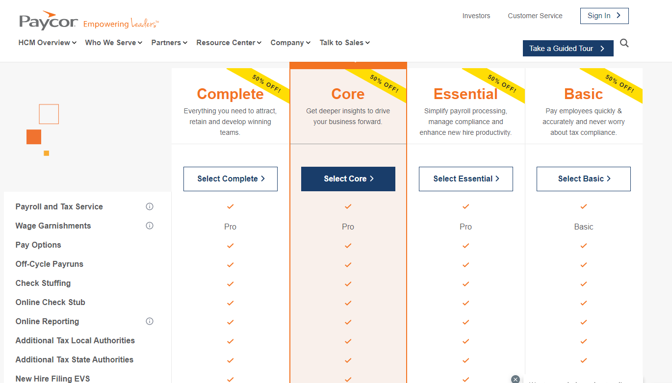
Paycor has four pricing plans for small businesses with up to 49 employees: Basic, Essential, Core, and Complete. The Basic plan costs $99 per month plus $5 per employee and includes payroll and tax services. The Essential plan costs $149 per month plus $7 per employee and adds onboarding, time off manager, and HR support center. The Core plan costs $199 per month plus $10 per employee and adds analytics, expense management, and recruit and hire. The Complete plan costs $199 per month plus $14 per employee and adds engage, career management, compensation planning, and talent development. You can also customize your plan by adding any of the products or services listed on the website for an additional cost. 

For those companies that have more than 50 employees, they will need to contact Paycor for a custom quote.

While there is no free tier, there is an available free trial, along with a demo. For flexibility, subscriptions can be canceled at any time.

Paycor pricing

(Image credit: Paycor)

Paycor: Support

Support is available for Paycor via a variety of methods.

On the direct support side, phone support is available via a toll free number (1-800-381-0053) with reasonably generous hours of Monday-Friday, 8 a.m. to 8 p.m. EST, but it should be noted that this is not available on the weekend and overnight hours. There is also a direct email address ([email protected]), which we often prefer to a clunky to use support portal, but there is no turnaround time specified for an answer. There is also the option for chat on the website, which can provide a faster answer than email, and has the same hours of operation as the phone support. Unfortunately, there is no direct support available on the nights and weekends.

There is also a searchable database, which is an online support center. This database gets divided into sections- employees, and administrators, the latter requiring login with account credentials. On the employee side, there are the expected topics, such as setup and use of the mobile app, and we appreciate that some of this info is presented via short and easy to understand videos.

Finally, there is a news section of the support website, with regularly updated content including from this month.

Paycor: Final verdict

Paycor is a cloud-based human capital management (HCM) platform specifically designed to meet the needs of small and mid-sized businesses. Its commitment to innovation and customer satisfaction sets it apart in the HCM software market. Its cloud-based platform provides secure and scalable access to HR and payroll data, ensuring businesses can operate efficiently and effectively. By leveraging Paycor's HCM platform, small and mid-sized businesses can streamline their operations, reduce administrative burdens, and focus on growth. 

Tuesday, January 30, 2024

SteelSeries Tusq gaming headset review - the best gaming earbuds for chatting

The SteelSeries Tusq gaming headset ranks among some of the best gaming earbuds right now thanks to its superb detachable boom microphone. This offers clear communication in multiplayer games and while using online chat services like Discord with a useful secondary microphone if you prefer a more covert look. The headset’s overall sound quality impresses, too, with crisp and clean audio suitable for top titles like Call of Duty: Modern Warfare 3 and Counter-Strike 2.

Its wide compatibility makes the SteelSeries Tusq easy to recommend no matter your choice of gaming platform, though the lackluster performance when watching movies or listening to music means that it falls short of being a better all-rounder.

There’s also the matter of the overall design, which is very compact and comfortable to wear but feels noticeably cheaper than other SteelSeries products overall. This is likely in an attempt to ensure that the headset stays a comfortable weight, but it’s still a little disappointing given the brand’s superb reputation and the product’s relatively high asking price.

Price and availability

The SteelSeries Tusq gaming headset costs $39.99 / £44.99 / around AU$74.99. This price is higher than competing products like the Turtle Beach Battle Buds, which are priced at $29.95 / £24.99 / around AU$44.99, but significantly cheaper than premium wireless options. 

Compared to the Turtle Beach Battle Buds, you’re getting far better audio quality, a more streamlined design, and an improved microphone that makes the additional cost quite a compelling prospect if you have the budget.

The headset is available to buy via the SteelSeries website or at third-party retailers like Amazon in the US, UK, and Australia.

Design and features

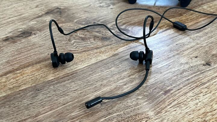
SteelSeries Tusq gaming earbuds on a wooden table.

(Image credit: Future)

When it comes to gaming earbuds, the SteelSeries Tusq boasts a very understated design. The earbuds themselves are on the larger side but rest comfortably and securely in the ears thanks to a rigid section cable that doubles as an over-ear hook. This can be shaped to your liking with a small amount of pressure for a tighter or looser fit. This, alongside a set of alternate larger and smaller ear tips that are included in the package, ensures that they stay comfortable over extended periods of use.

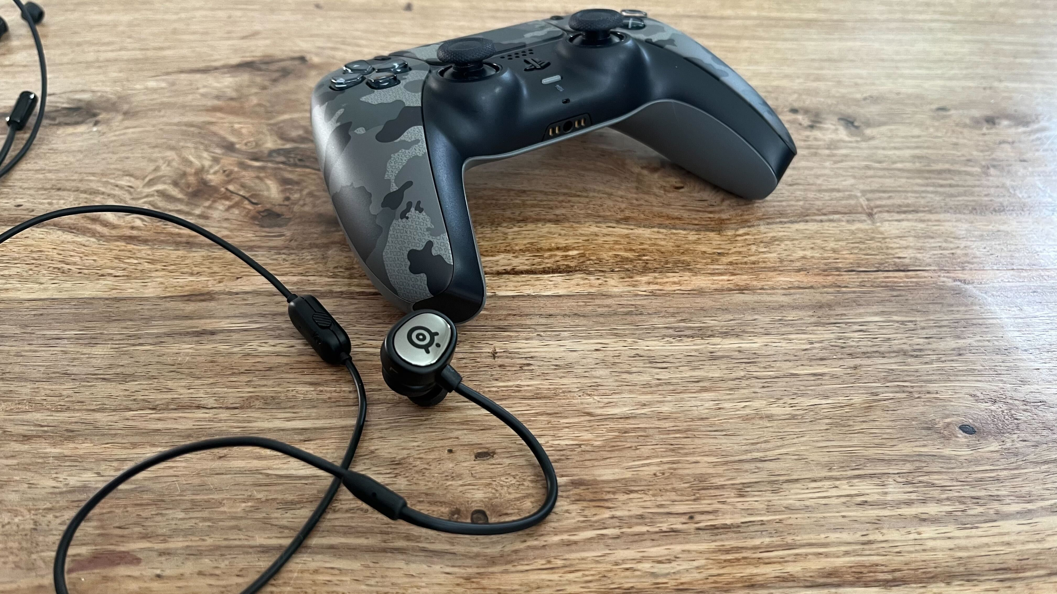
Although the earbuds are plain, black plastic, the sides have a small shiny plate adorned with a SteelSeries logo which helps elevate the overall aesthetic. Unfortunately, this plate is also plastic rather than metal and leaves the earbuds feeling a little less premium in the hands than they might otherwise look.

The left earbud has a small jack on its front that allows you to attach the miniature boom microphone. While I never experienced the boom mic becoming detached or falling out of position while playing, its physical connection feels somewhat weak and could stand to be more secure. Luckily, the design of the microphone itself is much better as it’s constructed of a flexible wire which means it can be easily adjusted and positioned as you play.

In addition to a mute switch and pause button, the SteelSeries Tusq has a second integrated microphone for when you don’t have the boom mic attached. Although the quality of your voice will suffer with the boom mic removed, this greatly enhances the earbuds’ portability. Playing on the go with the boom microphone can be quite awkward, especially if you don’t want to stand out from the crowd on public transport, so the option to remove it while still being able to chat is welcome. 

The package also includes a basic black carrying bag: a solid bonus that makes it easier to store the headset in a pocket without the risk of losing any parts.

Performance

SteelSeries Tusq gaming earbuds with their microphone attached on a wooden table.

(Image credit: Future)

The SteelSeries Tusq performs well across the board for gaming. The 3.5mm jack ensures plug-and-play compatibility with all major consoles in addition to PC, and I found that the light weight made them a very pleasant alternative to traditional wired gaming headsets.

The audio quality is high, delivering solid sound across multiple genres. Key audio cues like footsteps and voice communication are clear in first-person shooter (FPS) titles but there’s also more than enough bass for sound effects like explosions and gunfire to feel suitably punchy.

Thanks to the secure fit, the passive noise cancellation was effective and could block out much of the commotion when I tested them with the likes of Fire Emblem Engage and Pokémon Shining Pearl on the Nintendo Switch Lite during my commute.

It’s only when you attempt to use the SteelSeries Tusq for applications outside of gaming that any audio issues become apparent. While listening to music, the audio has almost sharp quality thanks to some very harsh midrange frequencies. This is not an uncommon configuration in audio products geared heavily towards gaming (as it allows certain sounds in games to be heard more easily) but it does negatively affect the experience if you intend to use the headphones for more general listening too.

Where the SteelSeries Tusq really cements its position ahead of the pack is in terms of microphone quality. With the boom mic attached, your voice is loud and clear with little background interference. It’s not flawless, but it’s easily comparable to a full-size gaming headset in the same price range (such as the Nacon RIG 300 Pro HX wired headset) which is an impressive achievement for such a small form factor. It’s also a substantial improvement on the crackly DualSense microphone, making this a very worthwhile upgrade for players who are currently relying on it. 

On PC or mobile, it’s ideal for voice calls, and the all-black aesthetic means that it won’t look too out of place in a work meeting. The integrated microphone of the SteelSeries Tusq is less impressive, however, as it’s much quieter on the whole and does not provide close to the same level of clarity. It’s an incredibly useful backup option, but there are better all-in-one alternatives like the HyperX Cloud Earbuds if you don’t intend to make use of the boom mic most of the time.

Should I buy the SteelSeries Tusq?

SteelSeries Tusq gaming earbuds and a PS5 controller.

(Image credit: Future)

The SteelSeries Tusq is a fantastic choice if you’re searching for a pair of wired gaming earbuds. It's portable, widely compatible, and comfortable to wear. The boom mic provides superb audio quality considering the tiny size too, which more than makes up for some complaints regarding the build.

 Buy it if… 

 Don’t buy it if… 

How we reviewed the SteelSeries Tusq

I used the SteelSeries Tusq as my main pair of earbuds for over a week. In addition to attending meetings and taking calls with friends, this included plenty of gaming across consoles such as the Xbox Series S, PlayStation 5, and Nintendo Switch where I was careful to test compatibility. 

I also used the headphones with my iPhone 13 Mini and a Lightning to 3.5mm headphone jack adapter, playing mobile titles like PUBG Mobile and League of Legends: Wild Rift. I took the earbuds out and about with me on several occasions to test their performance in various public settings using both my phone and a Nintendo Switch Lite console.

For other gaming audio recommendations, see our reviews of the Sony Inzone H5 or the JBL Quantum 360X Wireless Headset. 

Persona 3 Reload review - it doesn’t miss

Review info

Platform reviewed: PlayStation 5
Available on: PlayStation 5, PlayStation 4, Xbox Series X|S, Xbox One, PC
Release date: February 2, 2024

Whether you’re wandering around the vibrant Iwatodai Strip Mall to grab a beef bowl, hanging out with quirky characters, or fighting fierce battles in the dead of night, it’s hard not to get fully absorbed into Persona 3 Reload. Atlus’ remake of its 2006 turn-based role-playing game is a triumph that successfully updates a slightly dated adventure into something that fans new and old won’t want to miss. 

Persona 3 Reload puts players into the shoes of a quiet high schooler who moves to Tatsumi Port Island’s Gekkoukan High School as a transfer student. Upon arriving on the island, he becomes aware of the Dark Hour, an extra hour of the day that the majority of the population is blissfully unaware of. During this time, monsters called Shadows appear in the world, and only those who awaken to the power of Persona can fight and defeat them by summoning manifestations of their personality. Luckily for us, the protagonist is one of these people, and, alongside his fellow Persona-wielding friends, sets out on a quest to defeat the Shadows and uncover the mysteries of the Dark Hour.

At the heart of Persona 3 Reload is Tartarus - a sprawling, tower-like dungeon that emerges from Gekkoukan High School during the Dark Hour. More and more floors open up throughout the game’s lengthy runtime, which are filled with increasingly challenging foes and bosses to fight. Given that the floor structure randomizes each time you enter, revisiting old floors will never be quite the same. Don’t worry though; there are plenty of checkpoints, which you can transport to by using teleporters found throughout the dungeon (including the entrance). 

Dangerous nightlife

Mitsuru Kirijo attacking an enemy in Persona 3 Reload.

(Image credit: Future / Sega)

Within Tartarus, players are able to use new consumable items known as Twilight Fragments. These shiny-looking objects can be obtained in Tartarus itself, as well as out in the world, as a reward for certain quests. You can use these to unlock special treasure chests containing particularly rare items, which are definitely worth cracking open whenever you can.

Using clock-like structures in Tartarus, players can spend seven Twilight Fragments to fully restore their party’s health and Spirit Points (SP), which is very handy for longer dungeon crawls. On top of that, spending Twilight Fragments can randomly spawn a special location which allows the user to select two allies to strengthen, instantly bringing them to the same level as the protagonist in the next battle they win. I can’t understate what a fantastic quality-of-life feature this is - it completely removes the need to grind EXP for any party members who’ve been keeping the bench warm, meaning you can comfortably switch the team around without any extra fuss.

Best bit

Koromaru's All Out Attack victory screen in Persona 3 Reload.

(Image credit: Future / Sega)

The fact that you can have an actual Persona-wielding dog on your team was incredible in 2006, and it still is today. Koromaru is the best boy. The fact that he runs around with a knife makes me laugh every time I see it, and yes, you can pet the dog. 

The battle system itself has also been updated, perhaps most notably with the addition of the ‘Shift’ option, which is comparable to the Baton Pass mechanic from Persona 5. When one of the party knocks down an enemy (either by hitting them with something they’re weak to or landing a critical hit), they trigger ‘One More,’ giving them another action, which can be repeated by knocking down another enemy. Using the Shift mechanic, the attacking party member can provide this extra turn to a different ally, which is perfect for striking more weaknesses and building towards a powerful All-Out Attack, which can be initiated when all enemies are on the ground. 

Also new to Persona 3 Reload’s combat is the Theurgy mechanic. Theurgy moves are unique to each character and boast various effects depending on the user. Junpei, for example, can unleash a powerful Slash attack on one foe, which ignores any resistances, while Akihiro can hit every enemy on the screen with a substantial Electric attack. In order to pull them off, you’ll need to fill a character’s Theurgy Gauge by landing attacks, knocking down foes, and performing ally-specific actions. For example, Yukari’s is boosted when she heals her allies. They’re instrumental in more challenging fights and look delightfully flashy, too.

Forging bonds

The protagonist speaking to Bebe in a social link in Persona 3 Reload.

(Image credit: Future / Sega)

Outside of Tartarus, your protagonist is tasked with keeping up a normal school and social life, attending lessons, completing exams, and hanging out with friends to boost your ‘social links.’ These power up the Personas you create and also provide a fantastic way to learn more about the people around you, such as those on your team and at your school - and they’re all fully voiced. Within your team, you can only complete social links with your female allies (more on that later), but special ‘Link Events’ have been added as a way to bond with your male friends. They’re time-limited, so it’s advisable to view them as they become available, and without spoiling anything, they’re well worth exploring for the extra background they can provide on Reload’s characters.

I’d also like to give a special shoutout to the new ‘Rewind’ feature, which has come in handy for me more times than I’d like to admit. Essentially, the game automatically creates a list of save states from throughout your in-game days, and you can reload the most recent few via your options menu, even if you’ve been playing a bit gung-ho and haven’t saved in a while. This feature is perfect for advancing social links effectively, as you can redo conversations as many times as you like until you choose all of the dialogue options that provide the most points. My only gripe here is that you can’t open up this menu in the middle of a conversation, so I’ve often had to fast-forward through the text until I’m finally given control again, knowing the whole time that I’ll be going through it all again in a couple of minutes. 

Missed opportunities

Yukari Takeba holding an Evoker in Persona 3 Reload.

(Image credit: Future / Sega)
Accessibility features

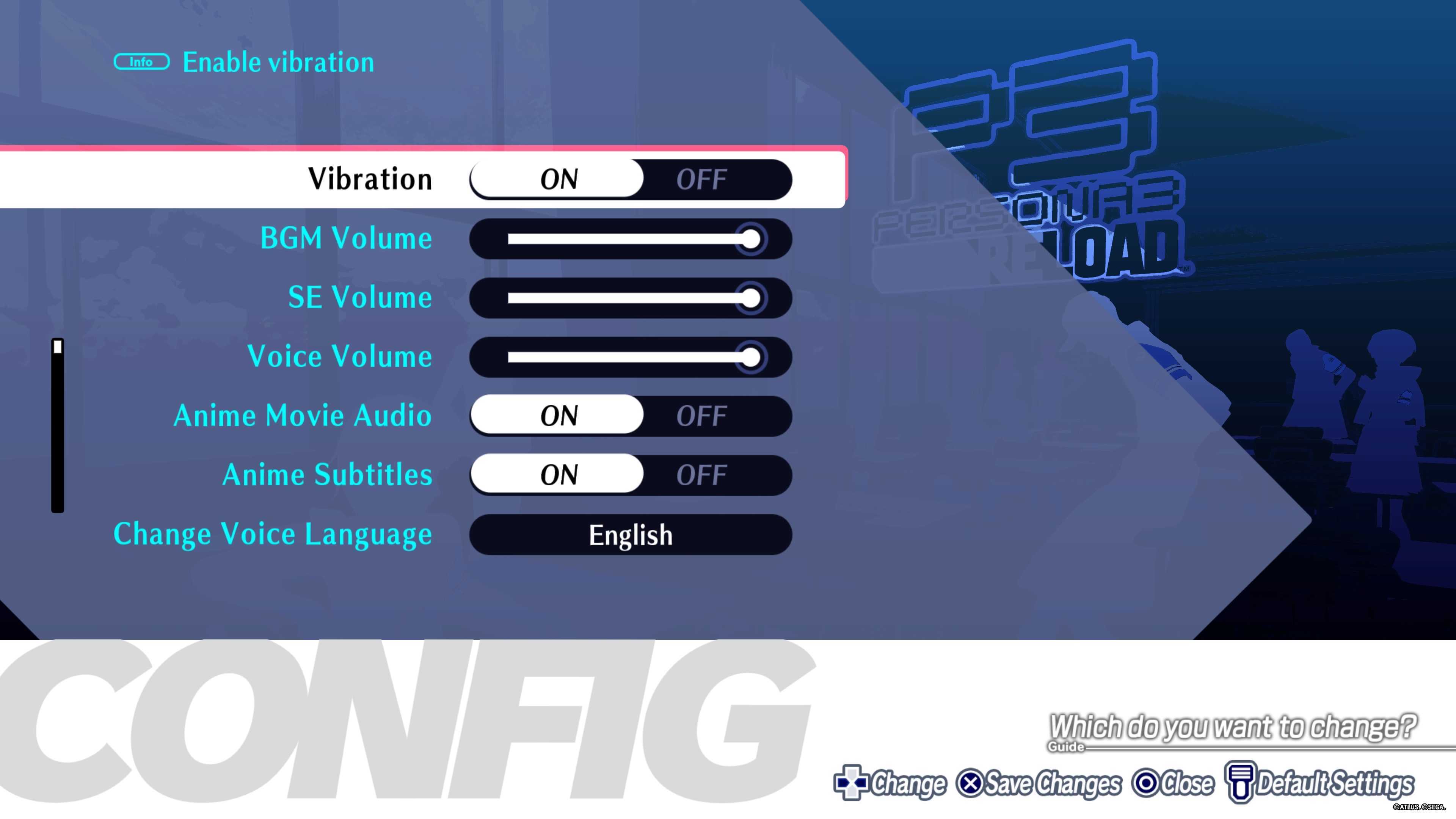
A screenshot showing some of the accessibility features in Persona 3 Reload.

(Image credit: Future / Sega)

Persona 3 Reload includes relatively standard accessibility options, with sliders to adjust the volume of background music, sound effects, and voices independently. Vibration can be switched off, subtitles can be toggled on or off for animated cutscenes, and the controls for the camera and mini map can be inverted. 

Camera speed can be adjusted with a slider and set to center automatically behind the player as they move. The mini map can also be tied to the camera so that it rotates automatically depending on where you’re looking. Background brightness can be altered, too. 

As a faithful remake of the original Persona 3, it’s challenging to find fault with Reload. However, it’s hard not to look at the female protagonist included in Persona 3 Portable and be disappointed that she’s not included here. Sure, this isn’t a remake of Portable, but, given that the protagonist is meant to be a self-insert, having a female character should never have been considered a bonus feature in the first place. It should have been the standard back in 2006, never mind in 2024. 

Although not included in any of the previous iterations of Persona 3, it’s also a pity that the protagonist has no male romance options. While the mainline Persona series hasn’t included any same-sex romances since Persona 2: Innocent Sin, one scene in 2023’s Persona 5 Tactica allowed protagonist Joker to imagine his dream wedding with any of the main cast, including Ryuji and Yusuke, which was a promising sign of more to come. Unfortunately, Reload doesn’t follow in these footsteps, which is a real shame as it could have offered a meaningful improvement on the original. Moving forward in the series, I sincerely hope that this is something Atlus addresses.

These missed opportunities aside, Persona 3 Reload is a delight. Each area is a joy to wander around, battles are engaging, and exploring Tartarus never gets tiresome. You'll soon find yourself playing for ‘one more day’ to unlock a new social link, progress the story, or just go to your favorite eatery and live vicariously through your protagonist’s hectic social diary. The soundtrack is also fantastic, and players will potentially never hear the words ‘disturbing the peace’ without mentally bursting into song ever again.

For more games like Persona 3 Reload, be sure to check out our lists of the best RPGs, as well as the best story games.

Adata Elite UE800 1TB portable SSD review: Move over traditional external SSDs, there’s a new kid on the storage block

Adata Elite UE800: One-minute review

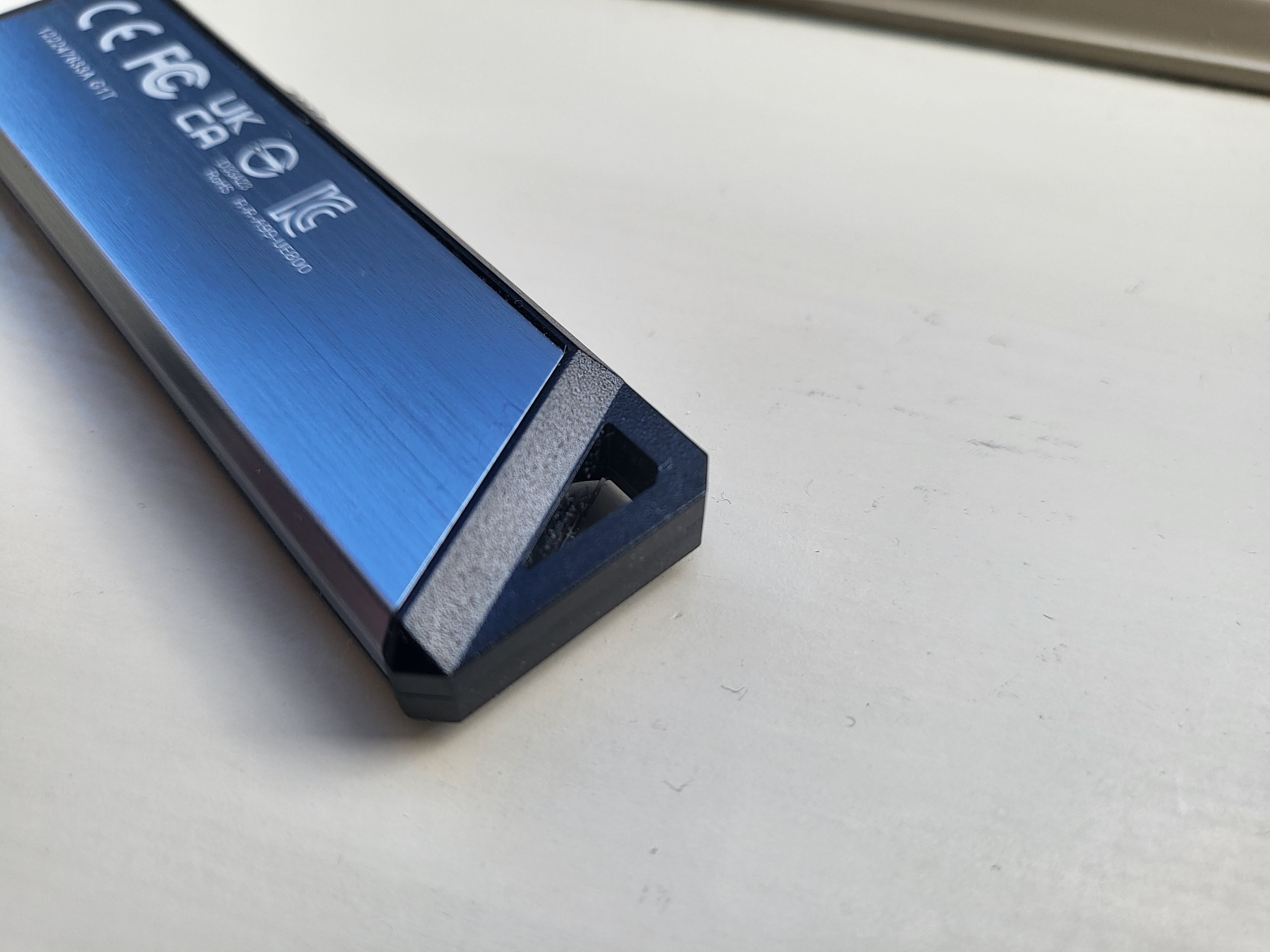
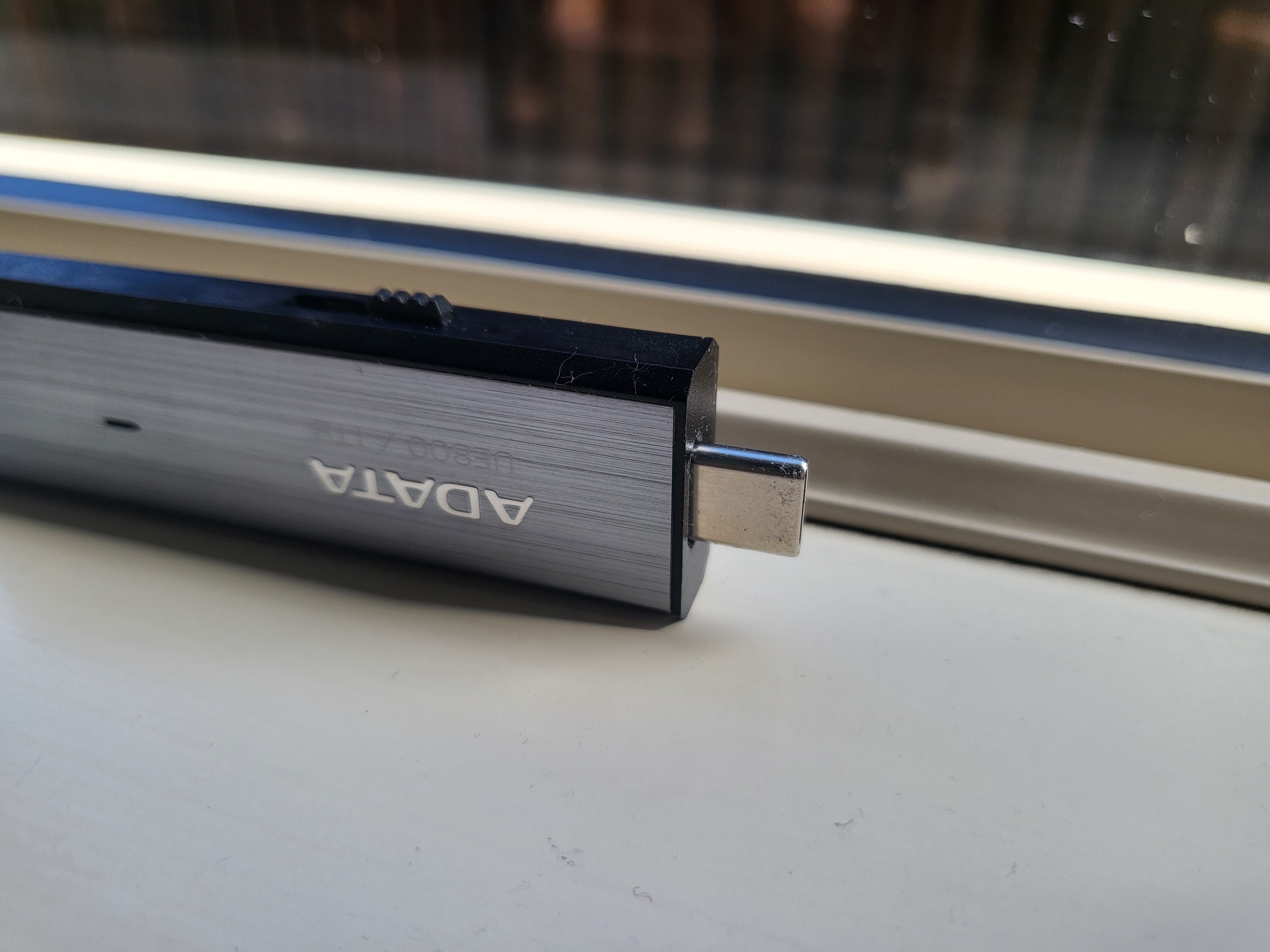
Adata strikes again with the UE800, a USB flash drive that delivers what was promised: a stunning overall performance wrapped in a solid package that ticks all boxes and is barely bigger than an average adult thumb. Manufacturers can’t really go wrong when it comes to getting the basics right; after all, USB sticks - as they are colloquially known - have been around for more than two decades and the UE800 fits that template to a tee. A rectangular body with a push-out Type-C connector (which means it can be used by a smartphone or tablet with OTG enabled), a capless design (so no caps to be lost), a brush-metal finish with an activity light and a lanyard hole (although I wouldn’t recommend dangling your storage device at the end of a lanyard). 

There’s no software (data recovery software, encryption or a backup application), cables or other accessories and its speeds (up to 1.05GB/s, delivered thanks to USB 3.2 Gen 2) should be sufficient for most use cases until USB 4 becomes mainstream. As for the price, you can get it for as little as $69.99 from Amazon, which is far cheaper than the competition. You need to have Prime as you’d otherwise pay $99.99; speaking of which, I would love Amazon to offer a 3-year data and photo protection plan for the UE800. After all, it is available for just under $6 (about £4.70, AU$9) for the Kingston DataTraveler Max and can be a real sanity saver. 

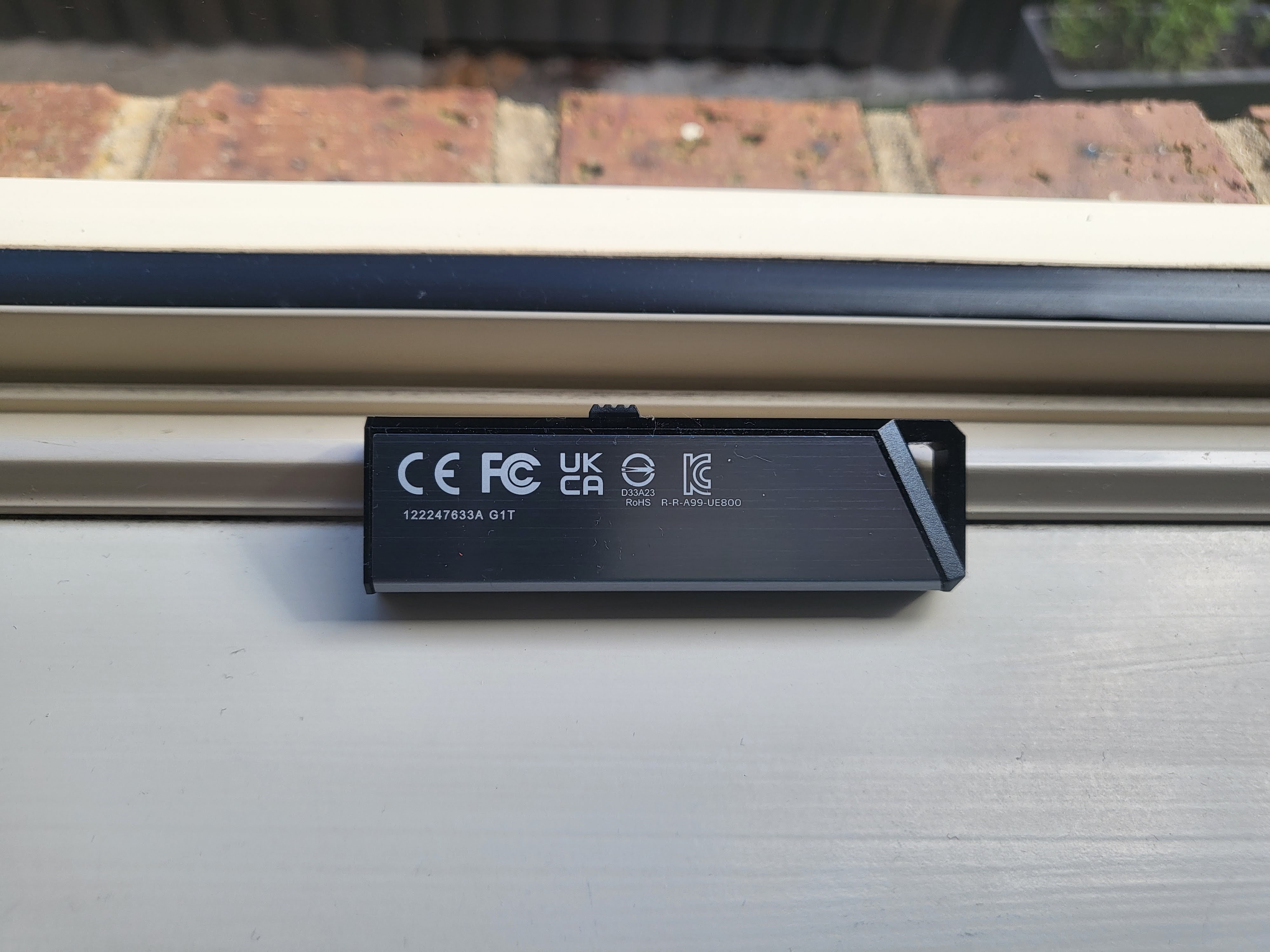
Adata UE800 1TB SSD on a window sill during our test and review process

(Image credit: Adata)

Adata Elite UE800: Pricing and availability

  • How much does it cost at the time of writing? $69.99 on Amazon (about £55, AU$106) 
  • When is it available? It is available now 
  • Where can you get it? It is available in the the US and other countries 

The AELI-UE800-1T-CSG as it is known is available in 512GB and 2TB capacities. The latter selling for a better-than-expected $129.99 (about £102, AU$197); personally I’d rather get that one as it delivers enhanced value-for-money.  

Adata UE800 1TB SSD on a window sill during our test and review process

(Image credit: Adata)

Adata UE800: Benchmark

In a nutshell, the Adata Elite UE800 delivered on the promised 1,050/1,000 MBps speeds, coming close to 1.1GBps on CDM write and inching into 1GBps territory on write, which is superb. Yes, CrystalDiskMark tends to be overtly generous as it is a synthetic benchmark but overall, it was a good showing. The drive became warm on extensive use which was expected. 

Adata UE800: Specs

Should I buy the Adata UE800?

Adata UE800 1TB SSD on a window sill during our test and review process

(Image credit: Adata)

Adata UE800 alternatives

Rugged USB flash drives: Where are they?

There are scores of rugged hard drives and portable SSDs that are IP-rated or have been put through the MIL-STD-810G. Yet I couldn’t find a single IP-rated USB flash drive out there. There’s no real reason why that is the case other than the perceived lack of demand. Drives like the UE800 are intrinsically less sturdy than the likes of the MS70 because of moving parts. And yet, even the latter is not deemed good enough to carry any IP rating. Let’s hope that this will change in a near future.

 Let’s start with the Silicon Power MS70. Alastair Jennings tested the 2TB version giving it a 4.5 stars; his biggest bugbear was the presence of USB Type-A, which means that you can’t use it with a smartphone as it requires a Type-C adaptor. 

Plus it is chunkier because it is more robustly built, probably a preferred solution should you want a more resilient portable storage device.

The DataTraveler Max by Kingston is the only one that comes from what I’d call a Tier-1 vendor, one that is almost a household name (a la Seagate or Sandisk).

How I tested the Adata UE800

After having formatted the Adata UE800 to exFAT, I test it the same way I test other storage components (external HDD, microSD cards etc). I use the latest versions of CrystalDiskMark, Atto, AS SSD and AJA benchmarks, noting the best scores achieved in each. They are all free and can be downloaded by anyone. I then transfer a folder of files, roughly 10GB in size, to get a rough idea of real life performance. 

Adata UE800 1TB SSD on a window sill during our test and review process

(Image credit: Adata)

Monday, January 29, 2024

Flexispot C7 ergonomic office chair review

I love a good ergonomic chair. I've been able to test dozens of chairs, yet I still enjoy it. There is something about unboxing new gear, getting to try it out, and customizing it to what I like that I cannot get enough of.

Flexispot C7: Unboxing and First Impressions

The Flexispot C7 fits this category beautifully with its impressive customization and highly comfortable sitting experience. Having hand-tested many of the best office chairs, I can say this is one I would happily pick up for an entire day of use. Further, I'd be ok with this being my only chair if I had only one. Ergonomic chairs, as a whole, are vital to a healthy working experience if that work is at a desk. If you spend long hours sitting at a desk or in front of a computer, finding a supportive chair that prevents back pain and doesn't encourage slouching is crucial. This will make you more comfortable and help maintain your overall health.

I set up straight away after the delivery man dropped off my chair. The unboxing was simple; I could set everything up, even with two toddlers dancing around me. After only 10 minutes of build time, I had the chair fully assembled, and I was on to adjustments. I could have easily spent a solid 20 minutes fine-tuning every adjustment feature, but I was pretty happy after just 5 minutes of twisting and turning some adjustment levers and knobs.

Specs

Dimensions: 28 x 30 x 47-56in

Maximum Load: 300 lb

Colors: Black or grey + black

Warranty: Up to 10-year warranty

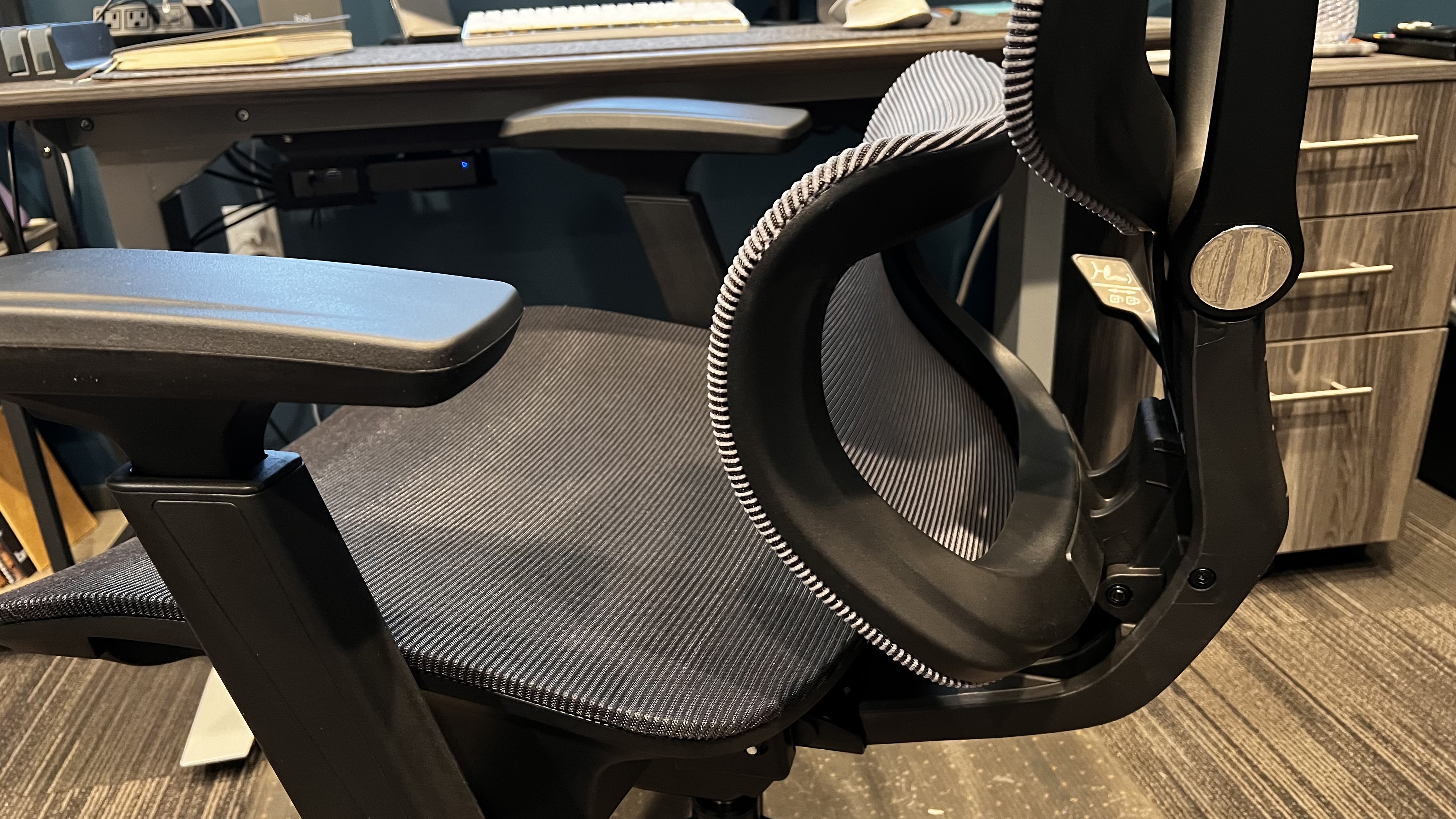
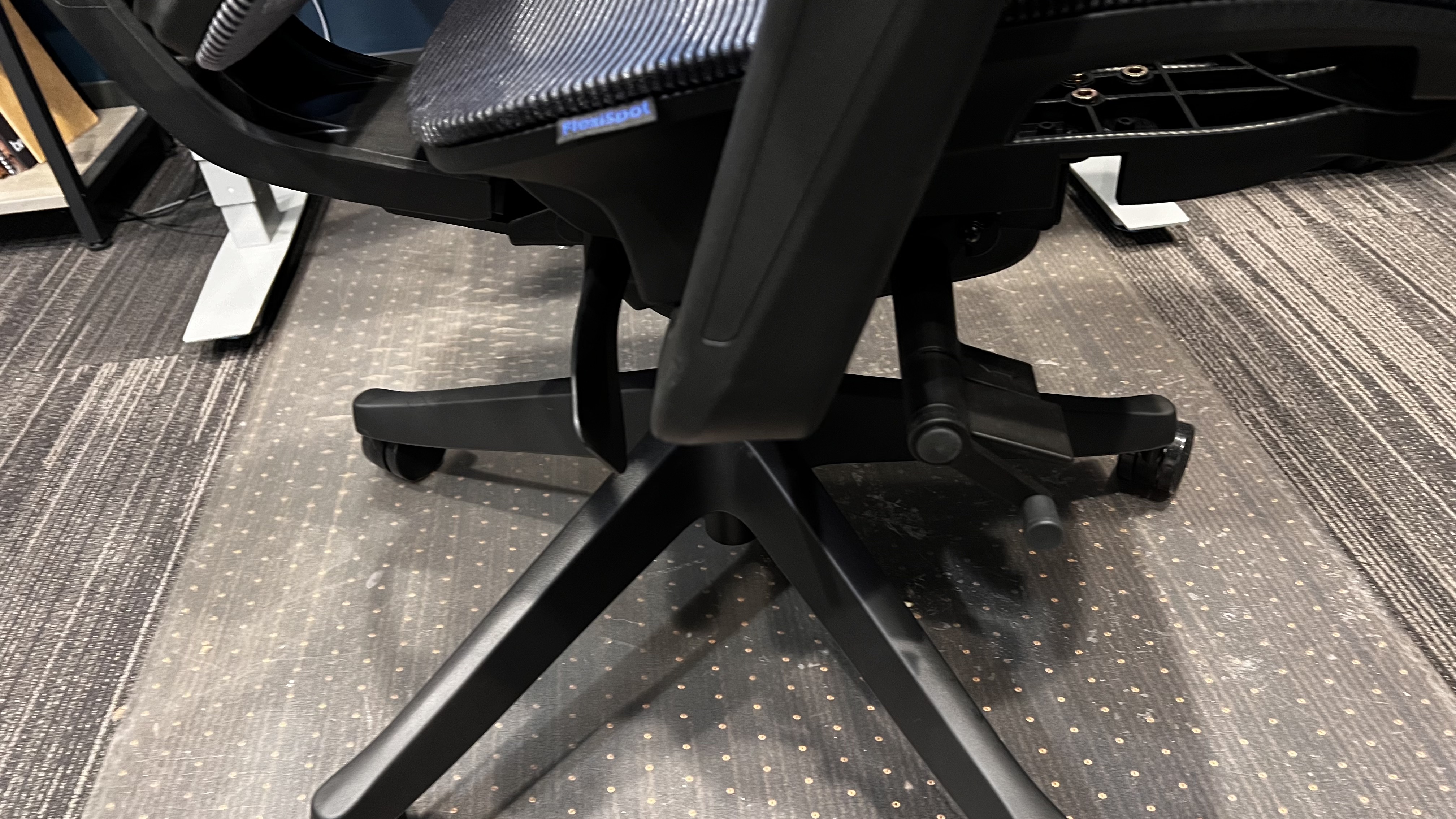
A few key features help make this chair stand out as a great ergonomic chair. First, the adjustable lumbar support for personalized back comfort is an obvious win. This self-adaptive back support moves with me even with the most minute movements to continue to support my lower back. Second, the breathable mesh back has allowed me not to overheat, as I have experienced in other non-mesh back chairs, nor bunch up and feel uncomfortable. 

The mesh back has enough balance between support and give that I can sit without feeling like I need to adjust constantly. Next, I can move the 4D armrests to match my needs perfectly. I am 6'1" with broad shoulders. With these 4D armrests, I can easily adjust each armrest to support my arm for my current task. Lastly, the reclining feature in this chair is excellent. I chose not to do the footrest of this chair, as I have it on my OdinLake Ergo Plus 743 and only occasionally use it for work. However, this chair's 90 to 128-degree recline range is insane and is excellent for all working positions.

Flexispot C7

(Image credit: Collin Probst // Future)

Flexispot C7: Design and Build Quality

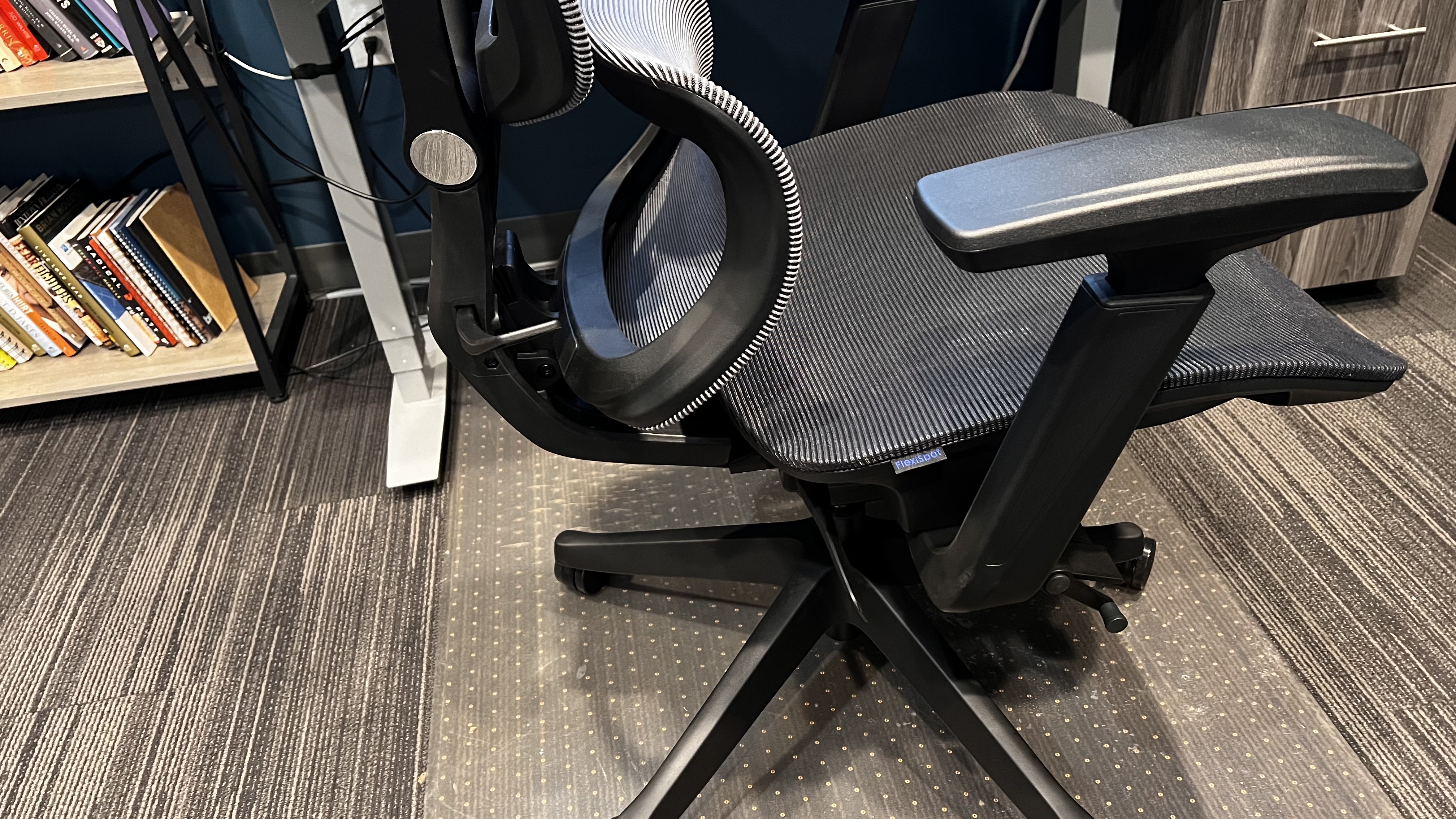
Flexispot has always impressed me with its build quality. I have reviewed several from the company's range over the years, and every time I have picked up their newest item, I have been thrilled to see their craftsmanship and build quality continues to stay high. With the C7 Ergonomic Office Chair, I love how modern and straightforward this chair looks. I have never been a fan of the flashy gamer chair look, so a sleek and minimalist office chair is much appreciated. This chair could be in a home office, a board room, a professional cubicle, or an executive office.

As mentioned, the overall construction is excellent. I don't hear any creaking when I move, I don't feel anything catching or slipping when I adjust or recline, nor do I feel any concern that this chair won't last me years of daily use. Flexispot's chairs, much like their desks (like the Flexispot E7 Pro), are fantastic all around.

Flexispot C7

(Image credit: Collin Probst // Future)

Flexispot C7: In use

I have enjoyed using this chair over the last several weeks. In this line of work, I have become accustomed to high-end ergonomic chairs and fancy gear. The C7 from Flexispot does not disappoint when it comes to my expensive and high-functioning taste. 

Flexispot C7

(Image credit: Collin Probst // Future)

The Flexispot C7 is comfortable. I have been sitting in this chair for my entire working day for about eight workdays in a row now, and I have not noticed any pinch points or pain in my back. Usually, in lower-quality chairs, I need to adjust, stand up, or change chairs altogether due to lower back pain.

With the C7, I haven't had to do that at all. Now that I have dialled into how I want it for my body, I have not had to adjust it. The lumbar support helps promote better posture for me. Looking at the design, I thought I'd be slouching to sit in the chair upright. However, the lower back portion helps support me, while the upper back area gives tension without pushing me where I don't want to go. All of this, of course, can be adjusted for different weights, heights, and use cases. Compared to other mid-tier ergonomic chairs, I have yet to see a ton with this level of customization. You can adjust the chair's many areas to make it a perfect, custom fit.

Flexispot C7: Final verdict

I really like this chair all around. It's minimalist, can blend in without being overly flashy, can adjust to my back, fits my tall frame, is comfortable to sit in all day, and doesn't cost as much as a car. This chair is an excellent solution for office managers looking for a quality ergonomic office chair for their employees; it's great for home office use, for your office, cubicle work, and more. 

After all, if you are going to spend your working hours, which is a large portion of your day, sitting in a chair to get your job done, which is your livelihood, it's worth investing in a quality chair that will help support you throughout the day and not leave you exhausted, in pain, and wishing you had a better chair. 

If I have learned anything in my professional career, choosing the right gear, only sometimes a bit more expensive, is always worth the return. This doesn't mean I endorse spending the most money possible and buying the most expensive gear, but splurging a little, like on this C7 chair, will leave you thrilled that you did so. 

Astell & Kern A&norma SR35 review: hardly an entry-level DAP, but so, so worth it

Astell & Kern A&norma SR35: two-minute review

If you came here looking to buy into hi-res audio for a song, you’ve come to the wrong place. This may be Astell & Kern’s most affordable digital audio player, but the A&norma SR35 nevertheless represents a significant investment – and, what’s more, an investment that strongly suggests you should spend pretty big on headphones too.

The good news, though, is that it’s completely worth it. The A&norma SR35 is easily one of the best MP3 players on the market (and in terms of file support, even to call it such a thing is to do it a disservice). From the understatedly lavish nature of its build and finish to the in-no-way-understated nature of its specification, there seems no apparent compromise where the SR35 is concerned. 

Quite obviously, Astell & Kern set out to wipe the floor with any and all price-comparable competitors when the SR35 is considered as an overall package – and that’s what it’s done.

This player is nice to hold, simple and logical to operate, and a pleasure to listen to. Sonically, it’s very accomplished indeed, with the sort of all-court game that not only makes your smartphone sound like someone playing music in the next train carriage, but puts some quite well-regarded (but inevitably less expensive) dedicated digital audio players into sharp perspective too. 

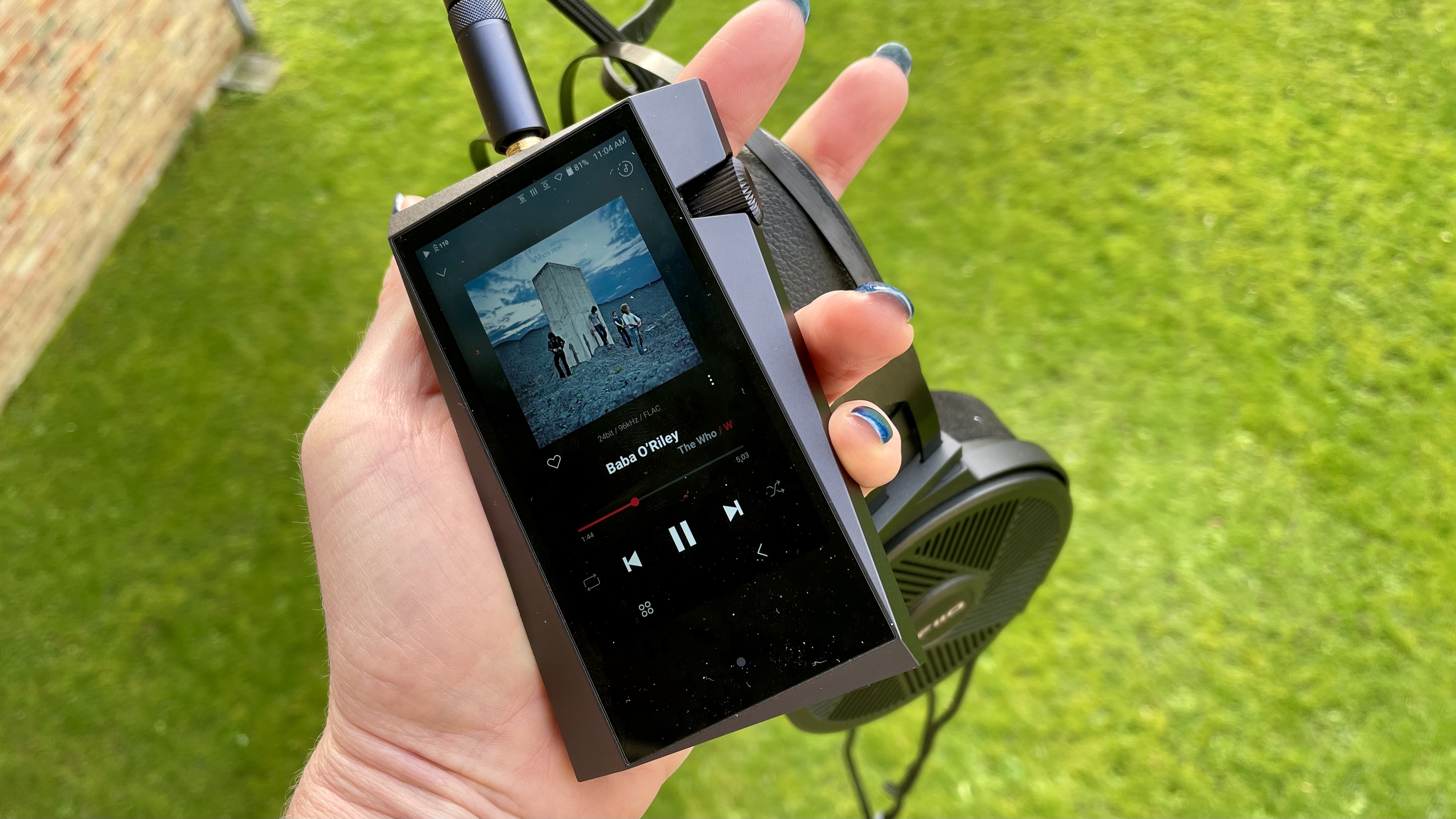
Astell & Kern A&norma SR35 held in a hand with headphones, on green background

If the slanted screen doesn't bother you, there's so much to love (Image credit: Future)

Astell & Kern A&norma SR35: Price and release date

  • Priced $799 / £799 / AU$1,299
  • Released May 2023 

The Astell & Kern A&norma SR35 is on sale now, and in the United Kingdom it will cost you £799. It’s yours for $799 in the US, while in Australia you’ll need to part with AU$1,299.

Only in Astell & Kern-land can this be considered ‘entry-level’ – being one of the company's most affordable products in a range is not the same as being authentically ‘affordable’.

For context, the company's flagship offering, the fabulous A&ultima SP3000, will set you back an eye-watering $3,699 / £3,799 / AU$5,499. At the other end of the scale, its November 2021-issue excellent Astell & Kern A&norma SR25 MKII is now available for a little less than the newer SR35, at around $749 / £699 / AU$1,099. The difference in ticket price is negligible, especially when you factor in the age of the SR25 MKII. 

All of which is a roundabout way of saying that the SR35 had better be something pretty special to justify that price-tag…

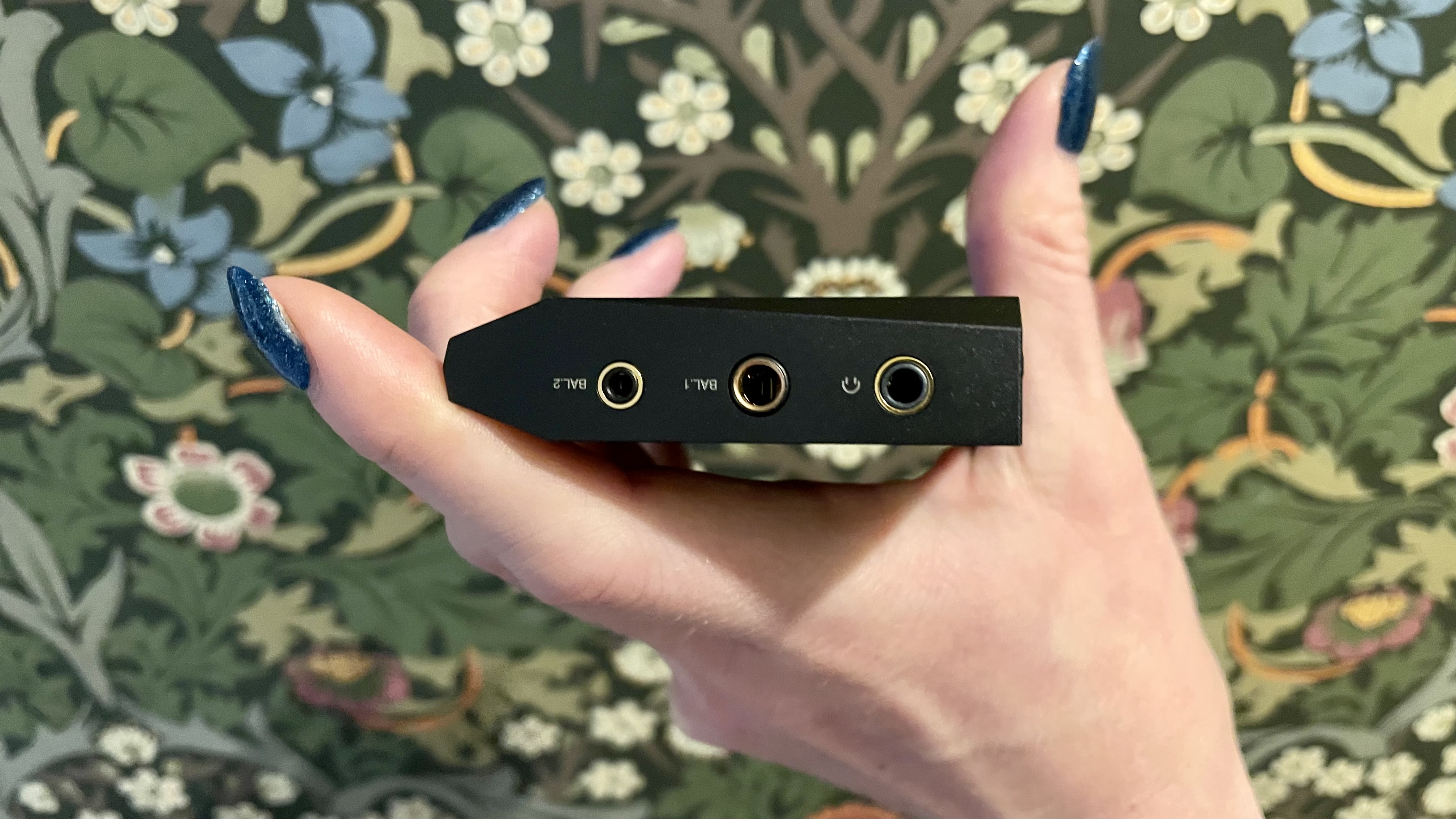
Astell & Kern A&norma SR35 held in a hand to show the headphone ports

As with the SR25 MKII, there's a 4.4 balanced headphone jack for extra connectivity (Image credit: Future)

Astell & Kern A&norma SR35 review: Features

  • Quad Cirrus Logic CS43198 DACs
  • 64GB of internal memory
  • Three headphone sockets

Like I said, it’s only possible to describe the A&norma SR35 as ‘entry level’ when you’ve digital audio players costing the thick end of four grand in your line-up. Because make no mistake, Astell & Kern has specified this player well in excess of what you might reasonably expect of the ‘entry level’. 

Amplification, for instance, is provided by a new in-house A&K design called ‘New Generation AMP’. Digital-to-analogue conversion is handled by no fewer than four Cirrus Logic CS43198 DAC chips – and if you’re trying to eke out battery life, or listening to less than fully hi-res content, the SR35 can run in ‘dual-DAC’ mode instead. This hardware is part of Astell & Kern’s ‘Teraton Alpha’ platform, designed to minimise noise, maximise performance and offer what the company casually calls ‘ultimate sound’. ‘Teraton Alpha’ has featured in Astell & Kern players before now, but only the much more expensive ones.

There are wired and wireless connectivity options here, of course. Wireless stuff runs to dual-band wi-fi (handily, the SR35 is ready to download and run numerous music streaming service apps like Apple Music, Qobuz and TIDAL – and it’s Roon Ready too) and two-way Bluetooth 5.0 (with aptX HD and LDAC codec compatibility). The USB-C socket on the bottom of the chassis can be used to transform the SR35 into a DAC (if you want to use it to deal with content stored on, for example, a laptop computer), as well as being the way to charge the internal battery.

Battery life is very dependent on how you’re using the player. Listen to 16bt/44.1kHz CD-standard content at moderate volume using wired headphones, and you should expect 20 hours or so of playback. Switch up to some properly high-resolution stuff, at big volumes, using wireless headphones, and that figure will reduce by over 50 percent. Charging from ‘flat’ to ‘full’ takes around two-and-a-half hours.   

Wired headphones can be plugged into one of the three headphones sockets on the player’s top edge. There’s an unbalanced 3.5mm output, of course, and there are 2.5mm and 4.4mm balanced alternatives – because, as I said, this device is only nominally ‘entry level’.

Internal memory is 64GB. The operating system eats into this just a little, of course – and if you’re loading in big high-resolution files, it’s not going to be long before that’s all used up. There’s a microSD card slot next to the USB-C on the device’s base, though, and it can accept cards of up to 1TB. Which should last you a little longer.

  • Features score: 5/5

Astell & Kern A&norma SR35 review: Design

  • 108 x 64 x 16mm (HxWxD)
  • 184g
  • Angular and aluminum

No, at 108 x 64 x 16mm (HxWxD) this isn’t the smallest digital audio player you’ver ever seen, and at 184g it’s far from the lightest around. But believe you me, by Astell & Kern standards the SR35 is compact and lightweight. 

Some of this is explained by everything that’s going on inside, of course. But it also doesn’t do to understate Astell & Kern’s desire to ‘design’ all their products to within an inch of their lives. The SR35 is built mostly of aluminium, and its chassis is so complicatedly angular that the device’s 3.6in touchscreen has to sit at an angle to fit between all the pointy edges. 

It’s equally true to say that A&K doesn’t compromise when it comes to build quality either, though. The A&norma SR35 is beautifully made, impeccably finished, and has genuine credentials as a ‘luxury accessory’ almost as obvious as it does as a ‘very nice digital audio player’.

  • Design score: 5/5

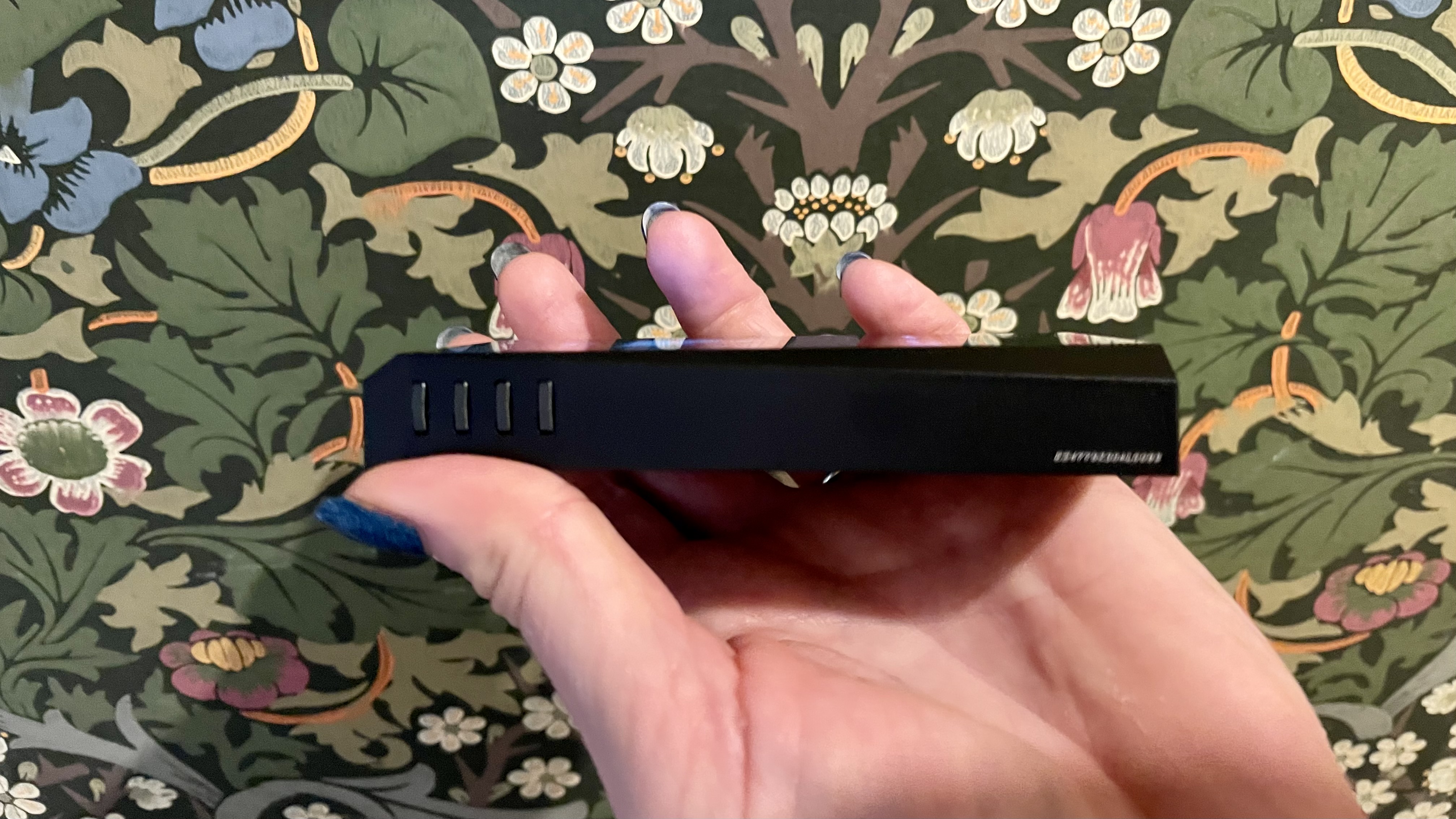
Astell & Kern A&norma SR35 on its side, to show the four buttons

An unmarked quartet of brutalist black buttons. But once you know, you know (Image credit: Future)

Astell & Kern A&norma SR35 review: Sound quality

  • Lovely tonal balance 
  • Scale and dynamism to spare
  • Iron fist and velvet glove in equal measure

You may own some downloaded audio files you wish to load onto the SR35’s internal memory. You may be a top-tier subscriber to a properly worthwhile streaming service like Qobuz or TIDAL (or both). You may be the owner of some similarly expensive and appropriately talented headphones. If you are, then you’re good to go. 

And with everything I’ve already said about battery life (and how to maximise it) taken into consideration, it’s nevertheless safe to say you’ll end up needing to recharge the SR35 more often than you anticipate. This is one of those audio devices that will steal your time away, making even the most perfunctory ‘quick listen’ into a long and pleasurable session.

Even though the SR35 thrives on the best standard of content, it’s more agnostic than many alternative players. So while you should ideally be loading up on stuff like a 24bit/192kHz FLAC file of David Bowie’s Word on a Wing via TIDAL, the Astell & Kern is perfectly happy to tolerate a 320kbps Spotify stream of We’re in Love by Boygenius. In both cases, the sound this player makes is deft, musical and entertaining like you wouldn’t believe.

Low frequencies are authentically deep, loaded with texture and alive with variation, and so very well controlled that rhythmic expression is as natural as can be. At the opposite end, treble sounds bite and crunch with real purpose – but they carry plenty of substance along with them, so they’re never splashy or hard even if you like to listen at big volumes. In between, the soundstage the Astell & Kern generates is such that voices in the midrange have an absolute stack of space in which to stretch out and express themselves – and detail levels are such that every facet of a vocal performance, its attitude and intention, is made completely plain. 

The tonal balance is every bit as pleasant; it’s natural and convincing, and utterly smooth in its emphases from the bottom of the frequency range to the top. Detail retrieval is little short of epic, and the SR35 is able to identify and accurately contextualise even the most minor, most transient occurrence in a recording. It has the sort of barrel-chested dynamism that means the quietest moments in a recording contrast with the loudest in the same way night contrasts with day. And it’s just as attentive to the spaces and silences in a recording as it is to the sounds themselves – and it makes sure the silences are pitch-dark, too. 

‘Musical’ may seem like a redundant term when talking about a digital audio player, but not every DAP deserves the description. This one, though, is musical and then some.  

  • Audio performance score: 5/5

Astell & Kern A&norma SR35 held in a ahnd to show off the rotary volume dial, on colorful background

The rotary volume dial: still a winner  (Image credit: Future)

Astell & Kern A&norma SR35 review: Usability and setup

  • 3.6in 720 x 1080 hi-res touchscreen
  • Adapted Android interface
  • A few physical controls too

The A&norma SR35 sees the first appearance of Astell & Kern’s new crimson-and-black user interface – and the company is right when it says it’s easier on the eye and more straightforward to understand than the rather more sudden interface it replaces. And that’s just as well, because at 3.6in this is far from the biggest touchscreen around; users with fingers like His Royal Highness will need to be very careful indeed.

Astell & Kern is to be congratulated for not just porting over the full Android interface – after all, why take up valuable memory and processing power duplicating functions your smartphone is perfectly capable of dealing with? So this interface is familiar, but far more focused on what’s actually important.

This means that as well as the nuts-and-bolts of installing your preferred music streaming services, you can adjust the player’s audio output via a 20-band equaliser. You can rearrange the layout of playback controls. You can adjust screen brightness, set a volume limit, and toggle the USB mode between ‘media player’ or ‘DAC’. You can audition four different DAC filters and a few amp settings. And you can do plenty more besides – so if you’re the sort of end user who likes to get fully involved, the SR35 has you covered.

There are a few nicely implemented physical controls here too. The top right of the chassis features Astell & Kern’s trademark jewel-like volume control – it moves with very pleasing weight and resistance. On the top left, meanwhile, four little buttons take care of ‘power on/off’, ‘play/pause’, ‘skip forwards’ and ‘skip backwards’. A&K doesn't mark these buttons, that would upset the aesthetic. But you'll be listening so often, you'll soon get the hang of it. 

  • Usability and setup score: 5/5

Astell & Kern A&norma SR35: Value

  • A&K's entry-level player – but 'entry-level' is questionable at best
  • Tech from models much higher up the food chain
  • A&K's premium players cost quadruple the price, but still 

In absolute terms, the A&norma SR35 represents, at best, questionable value for money. 

That it is well-made and sounds excellent is not up for question, and it’s hard to argue with the user experience it offers too. But there’s no doubt you’re paying a premium for the industrial design that always sets Astell & Kern products apart.

  • Value score: 4.5/5

Astell & Kern A&norma SR35: Should you buy it?

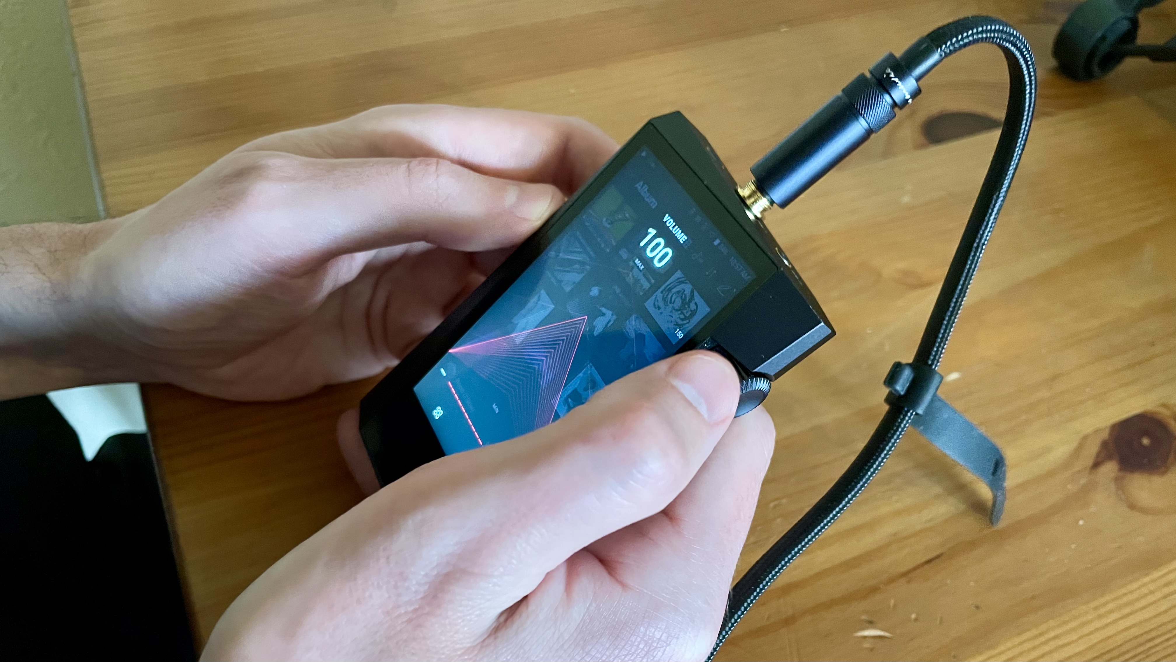
Astell & Kern A&norma SR35 held in a hand, scrolling the volume up to 120

This plucky player was driving the huge, open-back FT5 headphones at the time and – doing a marvellous job (Image credit: Future)

Buy it if...

Don't buy it if...

Astell & Kern A&norma SR35 review: Also consider

Astell & Kern A&norma SR35: How I tested it

  • Myriad styles of music
  • Lots of different file types and sizes
  • A long listen (although not as long as I would have liked)

I plugged balanced and unbalanced headphones into the A&norma SR35, as well as wireless alternatives, and I used both in-ear and over-ear models. I listened to music from Arvo Pärt to Aretha Franklin and all points in between, and I listened to big, uncompressed FLAC files as well as indecently compressed stuff from Apple Music. 

Overall, I listened for what must have been a week or so – although it seemed much less than that when the time came to return the player to Astell & Kern… 

  • First reviewed January 2024

TriLab AzteQ Industrial review

When I reviewed the Trilab DeltiQ 2 a couple of years ago, it was one of the best 3D printers I had ever tested. Moving forward, the AzteQ Industrial has been on the market for a while and is the larger, more powerful sibling, specifically aimed at business and industrial use rather than domestic.

Upon the printer's arrival, the full scale of this machine becomes apparent. While many larger printers may match its footprint, few, if any, come close to its height. This stature is necessary to accommodate the 300 x 300 x 400mm build area, which is larger than even the biggest of the large-scale printers I've reviewed in recent years.

But that's not all. Size isn't the only major selling point justifying the $6,500/£6,500 price tag. Unlike the neat desktop DeltiQ, the AzteQ Industrial is fully enclosed with a heated inner chamber, greatly expanding its material compatibility.

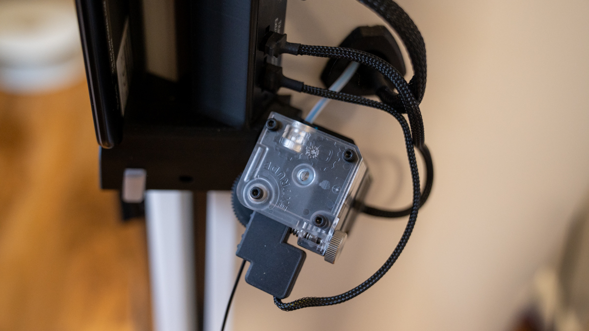
As with their other printers, it comes with a checklist of desirable features. It is, of course, Mosaic compatible and relies on that tried-and-tested system for multi-filament compatibility. There are also quick-change tool heads, enabling you to switch between the standard head for ASA and PLA and the specialist head for metal and carbon-filled materials.

There's really little that doesn't impress once the machine is unpacked. While it breaks from the standard 3D printer design, everything about the AzteQ Industrial is tailored towards professional business and design use. However, one question remains: is its size enough to justify the significant price tag?

TriLab AzteQ Industrial: Design

TriLab AzteQ Industrial

(Image credit: Alastair Jennings)

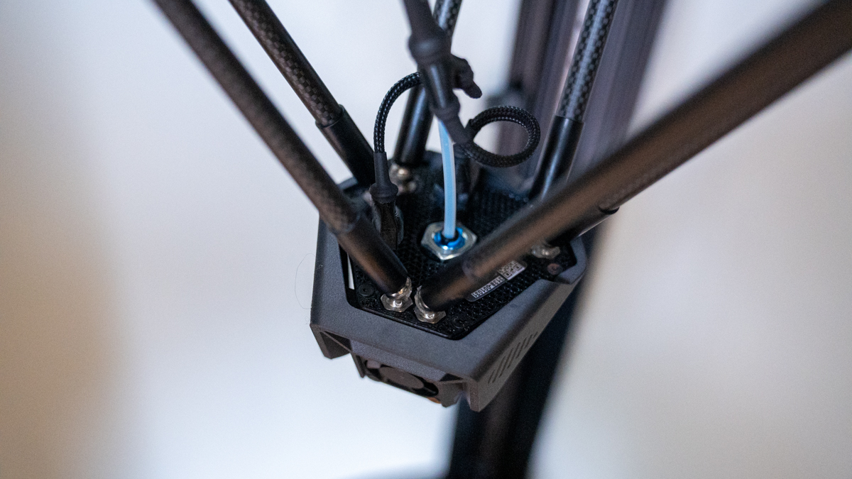
Following a Delta design style rather than the more common Cartesian or emerging CORE XY, the AzteQ Industrial stands out even before you consider the uniqueness of the Delta design. The three arms with the head suspended beneath look otherworldly, and while with most other printers, you can kind of understand how they work, the Delta design is baffling and slightly hypnotic once in action.

Design aside, the Delta mechanics have many advantages over more common 3D printer designs. The first is that they usually take up a far smaller footprint, with no need for a build plate that moves back and forth during the printing process. Then there's the fact that the print stays static, with the build plate fixed and only the print head moving through the three axes. This means that far more intricate prints can be developed, as there's generally less vibration.

TriLab AzteQ Industrial

(Image credit: Alastair Jennings)

Then there's the speed. Or at least, there was the speed - until CORE XY machines started to appear. Traditionally, Delta machines could be cranked up to print speeds that few standard printers could compete with.

The AzteQ Industrial incorporates and benefits from all the usual Delta features but adds to them with the fully enclosed and heated interior, which is capable of baking in prints. Then there's the wireless networking, superb browser-based print software, and the option to connect to the excellent Mosaic hardware for extended functionality.

TriLab AzteQ Industrial: Features

TriLab AzteQ Industrial

(Image credit: Alastair Jennings)

The TRILAB AzteQ Industrial utilizes high-precision delta kinematics, a design choice that lies at the heart of Trilab's product lines due to its speed, accuracy, and superior surface finish. The quality of print achievable from Delta-style machines made them a preferred choice in the past for professionals who prioritize dimensional accuracy and reliability above all else.

One feature that distinguishes the AzteQ Industrial from other 3D printers is its actively heated print chamber, which is capable of reaching temperatures up to 80°C. This feature isn't just about handling heat; it's crucial for enabling the use of advanced materials like ABS, ASA, PA, and PC, known for their durability and high-temperature resistance. A heated chamber aids in maintaining print quality, accuracy, and reliability, especially over the extended print times this printer facilitates.

A feature I appreciated in the DeltiQ, which is also present in the AzteQ Industrial, is the swappable magnetic printheads. These allow for swift transitions between different printing materials without lengthy recalibrations. The AzteQ automatically calibrates with each new printhead, streamlining the process.

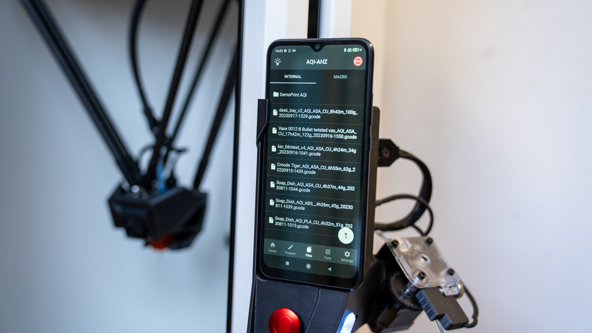
Ease of use has been a consistent theme in Trilab printers, and the AzteQ Industrial is no exception. It features an intuitive DeltaControl interface, operated via a connected Android smartphone that is integrated into the system, essentially offering a familiar smartphone-style interface to interact with the printer.

Specs

Print Technology: Fused Deposition Modelling (FDM); Delta kinematics

Print Volume: AzteQ: Ø 300 mm (X, Y) × 400 mm (Z)

Printhead: Lightweight printhead with magnets for easy replacement, E3D V6 Volcano hotend, Dedicated printheads for individual materials

Extruder: E3D Titan extruder in Aztec Hub, Bowden filament guide to the printhead

Optional Extruder: Not specified

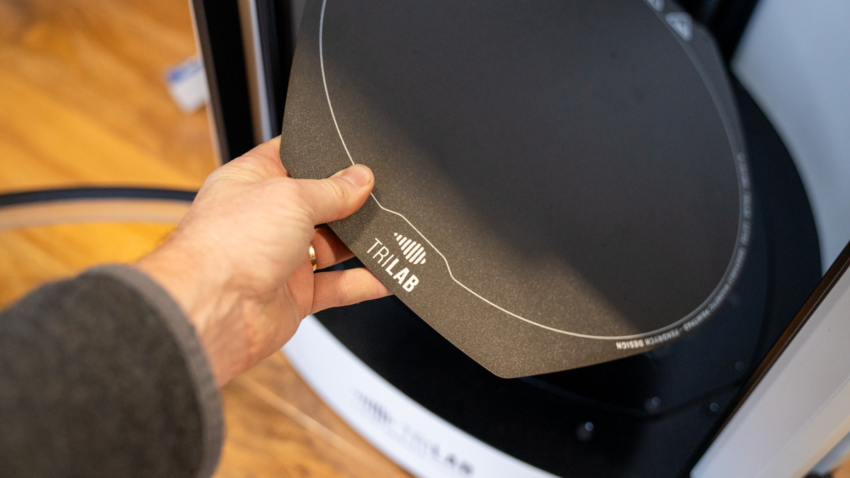
Print Platform: 8 mm thick aluminium heated bed, Integrated magnets for PrintPad sheets, Flexible & swappable PrintPads with rough PEI surface

Control Interface: Wireless 6.5" DeltaControl in-hand display, AzteQ Hub charging station on frame

Connectivity: 3× USB port for WiFi/LAN module, USB flash drive, TRILAB QuadPrint webcam, or extension

Print Monitoring: LED colour indicator on AzteQ Hub, Upper integrated camera, Adjustable LED lighting of printing space

Supported Input Formats: STL/gcode; Primarily supported PrusaSlicer, Kisslicer; Alternatively, gcode from Cura, Simplify3D

Dimensions and Weight: Printer: 59×52×105 cm (WxDxH) / 38 kg, Package: 60×60×120 cm (WxDxH) / 55 kg (w/o pallet)

Power: EU 220-240V; 10A; 50-60Hz, USA and Canada 100-120VAC; 15A; 50/60Hz

While print monitoring is becoming more common in consumer printers, it's essential for professional models. The AzteQ Industrial's integrated camera, complete with adjustable LED lighting, enables remote monitoring of prints. This is particularly useful for lengthy prints where on-site supervision is impractical.

In terms of build volume, the AzteQ Industrial is substantial, offering a build area of 30 cm in diameter and 40 cm in height. This size is ideal for catering to large-scale business and industrial printing needs, particularly for larger prototypes.

While many printers boast wide material compatibility, the AzteQ's enclosed design makes its compatibility with a broad range of materials far more practical. It can handle standard filaments like PLA and PETG, as well as more industrial options such as ABS and ASA. Throughout this test, I've chosen to use PLA, ASA, and PETG.

When it comes to features, the AzteQ Industrial checks almost every box one could wish for in a 3D printer. However, being a machine that costs significantly more than average, it needs to offer more. Beyond covering the majority of mechanical and technological aspects, it's the build quality that stands out as a key feature. Designed, made, and intended for the professional market, it has the build quality and design that underscore this fact.

TriLab AzteQ Industrial: Performance

TriLab AzteQ Industrial

(Image credit: Alastair Jennings)

When I looked at the DeltiQ, it stood among a small and select group of outstanding 3D printers, all unique or standout for their features or performance. However, the market has changed rapidly, driven forward by a handful of companies that have advanced 3D printing to a place we couldn't have imagined even a year ago.

Bambu Lab, Creality, and Trilab's parent company, Prusa, have all embraced and developed new machines with size, price, and performance that make it increasingly difficult for machines like the AzteQ to justify their price. For most consumers and small businesses, the likes of the Prusa MK4, with its quality and accuracy, are hard to beat. However, having tested the AzteQ for four months, I can safely say that there is still a significant place for these industrial machines.

Firstly, the Creality K1 Max is an excellent consumer machine but lacks the day-in, day-out reliability that you get from BamBu or Prusa. While I like the BamBu machines, it's like having a Tasmanian devil in the workshop; great for quick one-offs, but for larger prints, the extended period of noise and the pile of filament it tends to spill onto the floor are a bit much. Then there's the Prusa MK4, which, with its recent update, boosts speed when needed and finesses much of the process. But again, its open design makes it unsuitable for printing ABS and other fume-generating materials in the workshop.

With all three machines, reliability is excellent, but none can quite touch the day-to-day accuracy and reliability of the Trilab AzteQ. In this test, I utilized three materials: PLA, ASA, and PETG. With PLA and PETG, I printed with the door of the machine open and with ASA closed.

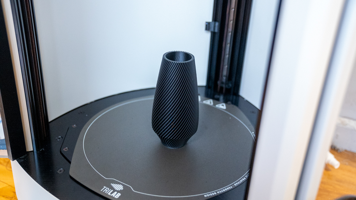
In all cases, the dimensional accuracy of the machine excelled, with prints being produced at a decent speed, if not quite at PRUSA MK4 speed, and with superb accuracy. While the top speeds didn't match those of the smaller machines, the print quality surpassed them. Even at the lowest quality and fastest print speeds, it was only the layering that became increasingly visible, not any print errors.

Going through the quality settings, the surface quality of the prints becomes almost completely smooth, and it isn't easy to discern the layering effect. A little finishing is needed, and the surface quality is absolutely smooth.

TriLab AzteQ Industrial

(Image credit: Alastair Jennings)

Although not designed for the purpose, printing characters and figures worked well. Throughout the test, I only utilized the out-of-the-box single filament, so traditional support structures were used rather than support material. Still, the accuracy of the supports generated enabled the production of detailed prints.

Used for the more focused purpose of prototypes, the printer performed admirably, enabling me to print out large format pieces that could be used to test out designs and concepts, from small leg holders to mid-sized brackets and robust background supports.

The heated chamber also seems to have done the job intended, as all prints retained accuracy from the base to the top. I'm unsure whether the temperature of the chamber helped anneal the prints to make them stronger, but the quality is certainly there.

After a few months of using the machine and comparing it to consumer printers, there's no doubt about the machine's absolute reliability and easy integration into a business workflow. One of the key features is the browser-based software that enables remote upload and monitoring of prints.

In real-world tests, I have no reservations about saying this is one of the best I have used, and thankfully, the results of the print test seem to back this up. It's also worth noting that the results from this test were carried out when the printer arrived and at the point of my recording these results. While there was a slight difference in some dimensional accuracy results, they are minor, showing that the performance of the machine has remained consistent throughout the test.

TriLab AzteQ Industrial: Print quality

Dimensional accuracy - score of 5

Target 25 = X: 24.82mm / 0.18mm Error | Y: 24.91mm / 0.09mm Error 

Target 20 = X: 19.91mm / 0.09mm Error | Y: 19.95mm / 0.05mm Error

Target 15 = X: 14.97mm / 0.03mm Error | Y: 15.09mm / 0.09mm Error 

Target 10 = X: 9.94mm / 0.06mm Error | Y: 10.06mm / 0.06mm Error 

Target 5 = X: 4.91mm / 0.09mm Error | Y: 4.97mm / 0.03mm Error

X Error Average = 0.009

Y Error Average = 0.056

X&Y Error Average = 0.0605

Fine Flow Control - score of 2.5

Fine Negative Features - score of 5

Overhangs - score of 4

Bridging - score of

XY resonance - score of 2.5

Z-axis alignment - score of 2.5

Adding up the totals gives a final score of 26.5 out of 30.

TriLab AzteQ Industrial: Final verdict

TriLab AzteQ Industrial

(Image credit: Alastair Jennings)

The Trilab DeltiQ 2 was one of the most impressive machines I had looked at during its time, and now the AzteQ Industrial builds on that reputation. The two machines share many attributes, from the obvious design to the software and print quality, as well as premium pricing. However, there are differences, with the main ones being the increased build area and the heated chamber.

Really, when it comes to print quality and finish, the DeltiQ was good, and the AzteQ was equal. Placing the prints next to the latest batch of 3D printers, it isn't easy to assert that spending a huge amount more on a printer will get you a better quality print, at least in the short term.

Where the AzteQ Industrial finds its market is with businesses and industries that need a printer capable of large-format printing at 30cm by 40cm, and it does so with absolute reliability. There are, of course, other large format 3D printers that are cheaper, but their open design doesn't afford the same level of reliability offered here.

Then there's the fully enclosed environment, which not only enables proper printing with more advanced materials but also ensures accurate results from beginning to end. The workflow also plays a massive part in the professional market; being able to operate and monitor the printer remotely is a huge advantage and will be essential for many.

While other printers offer scale, workflow, accuracy, expandability, and more, there are few, if any, other options that provide everything in one package. When it comes to FFF technology, the Trilab AzteQ is difficult to beat for businesses as it's reliable, flexible, and an ideal solution for on-site, accurate production and prototyping.

!!!!!!!!!!

Popular Posts

Categories

Blog Archive