January 2026 is going to be the Tom Hiddleston takeover month, with the much-anticipated The Night Manager season 2 hitting BBC from January 1 and Prime Video from January 11. After 10 years, shrewd and aloof spy Johnathan Pine returns... or does he?
Technically speaking, Hiddleston assumes a myriad of identities in the new season, but for the sake of UK security, I won't be revealing what they are. When we pick up with him a decade later, he's still working with the Night Owls. But when he spots a henchman of deceased villain Richard Roper (Hugh Laurie), all hell breaks loose.
The fact there's been a ten-year wait probably plays to The Night Manager season 2's advantage, but these new episodes blow season 1 straight out of the water. They feel sharper, more self-assured yet dares to creatively play in ways that more stringent, straight-up crime dramas in the 2010s didn't dare to.
Hiddleston is just as in control too. In the time that The Night Manager has been away, he's shot to international fame in the MCU. There's something cathartic about bringing him back to his roots, able to play with an outrageous situation (being an MI6 spy) with a sense of grounding (i.e., he's not a superhero).
The drama takes to the global stage in an entirely new way this time around, and it's a refreshing change. Instead of the war zones of the 2011 Egypt revolution, we're heading to the hushed-up drug trades of Colombia. But if you think the two scenarios aren't directly linked, think again.
Tom Hiddleston breathes fresh air into a creatively liberated The Night Manager season 2
If you've ever watched a John le Carré adaptation before, you'll know that second seasons aren't really a thing. However, with Carré's approval before he died in 2020 (according to son and producer Simon Cornwell), a new creative concept has been born. Therefore, The Night Manager season 2 finds itself in an unusual sweet spot – stick to a pre-constructed foundation while taking as many dramatic liberties as it wants to.
Luckily for us, this works incredibly well. The BBC is well-known for its high-stakes, high-quality crime dramas, but in the last few years, the pedal has well and truly been put to the metal. Their output is confident, daring, inviting you to be challenged in a way that you didn't think you would be. When it comes to Jonathan Pine's ever-shifting identity, the challenge remains heightened at all times.
I don't need to spell out the fact the Hiddleston is bloody good as his job, and no matter how difficult or complex the action gets, we're being steered along with safe hands (even if Pine himself isn't making the smartest decisions). He's joined by a smorgasbord of new faces in season 2, with the irresistibly sexy Diego Calva playing opposite as calculated and cool-headed antagonist Teddy dos Santos.
Plop a romantic entanglement between the pair – in the form of smart yet seductive Roxana, played by Camila Morrone – and things only get spicier by the second. I can't quite believe that the BBC has essentially recreated the viral Challengers scene at a pool party in Medellín (you can see a sneak preview in the above trailer), but hey, everyone's throwing caution to the wind these days... and it's hot.
For all the flourish, the basics haven't been lost
See? Challengers, eat your heart out.(Image credit: BBC)
We don't get much in the way of frivolous fun when it comes to The Night Manager – you'll need to tune into Death in Paradise or Black Ops in iPlayer for that. But playing it straight is exactly what's needed, and in a way plays against the genre stereotype all the best streaming services have come to cultivate. For Pine, his business never rests.
Frankly, that's great news. Sure, he might risk his life in the name of fictional entertainment every two seconds, but the payoff is colossal. Not only is Olivia Colman back for more scenes in season 2 (and not just in a half-hearted cameo way, either), but the MI6 is now under the control of Indira Varma's head of operations. She's a slippery one, so watch out for her... that's all I'll say for now.
It's Hayley Squires I want to give the biggest kudos to, though. Ever since her breakout performance in I, Daniel Blake, she's somehow fallen off the radar when it comes to exceptional British acting talent. If Pine is the show-stopper, Squires' character Sally is a true glue that holds the operation together. Without her, nothing would be effectively achieved, and I think that's just as true of The Night Manager season 2 itself.
Basically, we're kicking 2026 off in the most alluring, intricate, and devilishly thrilling way possible. Good things come to those who wait, and we're certainly being rewarded.
The Hisense L9Q represents the pinnacle of what Hisense can do for home theater projection. It’s a sizzlingly bright 4K ultra short throw (UST) projector that boasts the wide color gamut of triple-laser projectors alongside the accurate color of Pantone Validated hardware.
The Hisense L9Q is a capable streamer on its own thanks to integrated Google TV, and it has fast-enough hardware to run the operating system smoothly. It can also serve as a hub for various video sources with its multiple HDMI ports and an ATSC 3.0 tuner input – a rare feature on the best projectors. And though it doesn’t include a screen like some earlier Hisense L9 models, this version has a variable focus to let it adapt to different setups.
Where most other projectors settle for two or maybe four speakers, the L9Q packs in a whopping ten Devialet-designed speakers in a 6.2.2 configuration for the most impressive sound I’ve heard from a projector. It may not beat actual surround sound speaker systems, but it’s enough to put even the best soundbars to shame.
The L9Q is even a solid gaming projector with its ability to display 4K 60Hz gameplay with low input lag or switch over to 1080p 240Hz for extra smooth visuals and responsive gaming.
It’s a serious package, but it comes with a seriously high-end price at $5,999 / £3,999. That may seem steep, but considering how quickly the prices of TVs ramp up when you go past 75 inches, the math starts to work in Hisense’s favor. The L9Q can put out a 150-inch picture just as easily as it can do 100 inches, and has flexible setup features to get up and running.
For most people who don’t need the added brightness and already have a good sound system, the $3,499 / £2,499 Hisense PX3-Pro will be a more reasonable option. But if you demand the best, the L9Q delivers.
The Hisense L9Q is available for $5,999 / £3,999. In Australia, the projector comes bundled with a 120-inch screen and sells for AU$9,999. Given that it launched towards the end of 2025, the L9Q is unlikely to see any major discounts until sometime in late 2026.
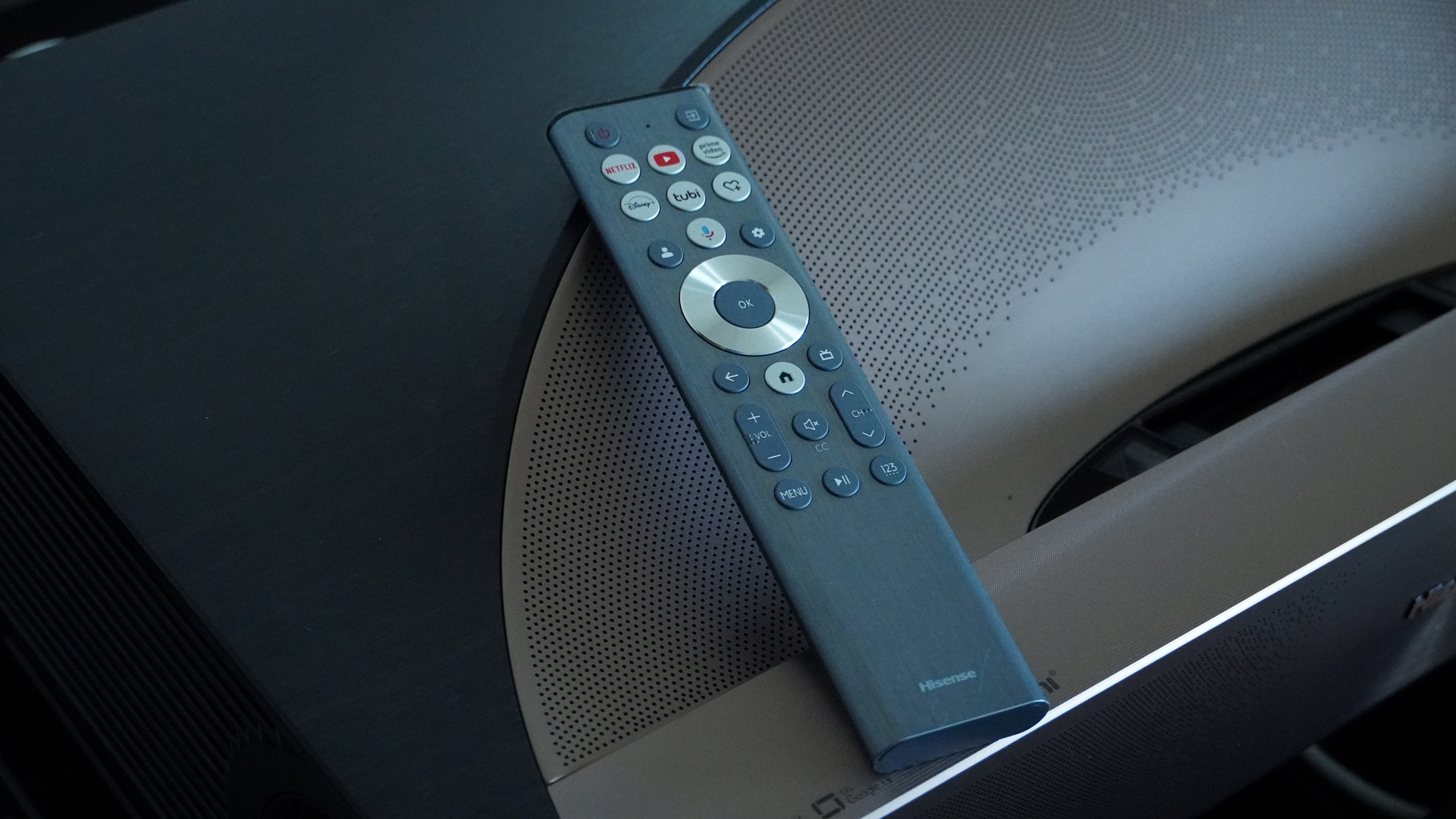
The Hisense L9Q comes with a full-size remote control and uses the Google TV platform for streaming(Image credit: Future)
TheL9Q has four HDMI ports (1 with eARC and two HDMI 2.1) and supports gaming at 1080p/240Hz(Image credit: Future)
Hisense L9Q Review: design and features
Stunning design
Projector, sound system, and streamer all in one
Plentiful connection options
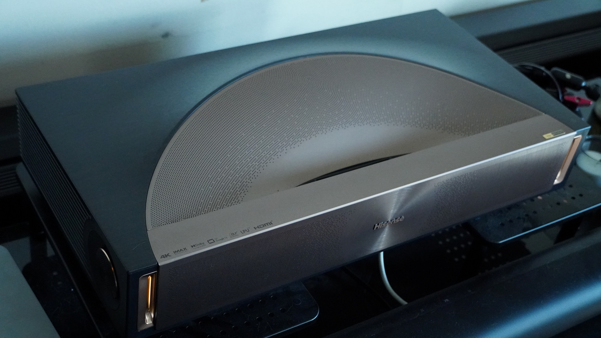
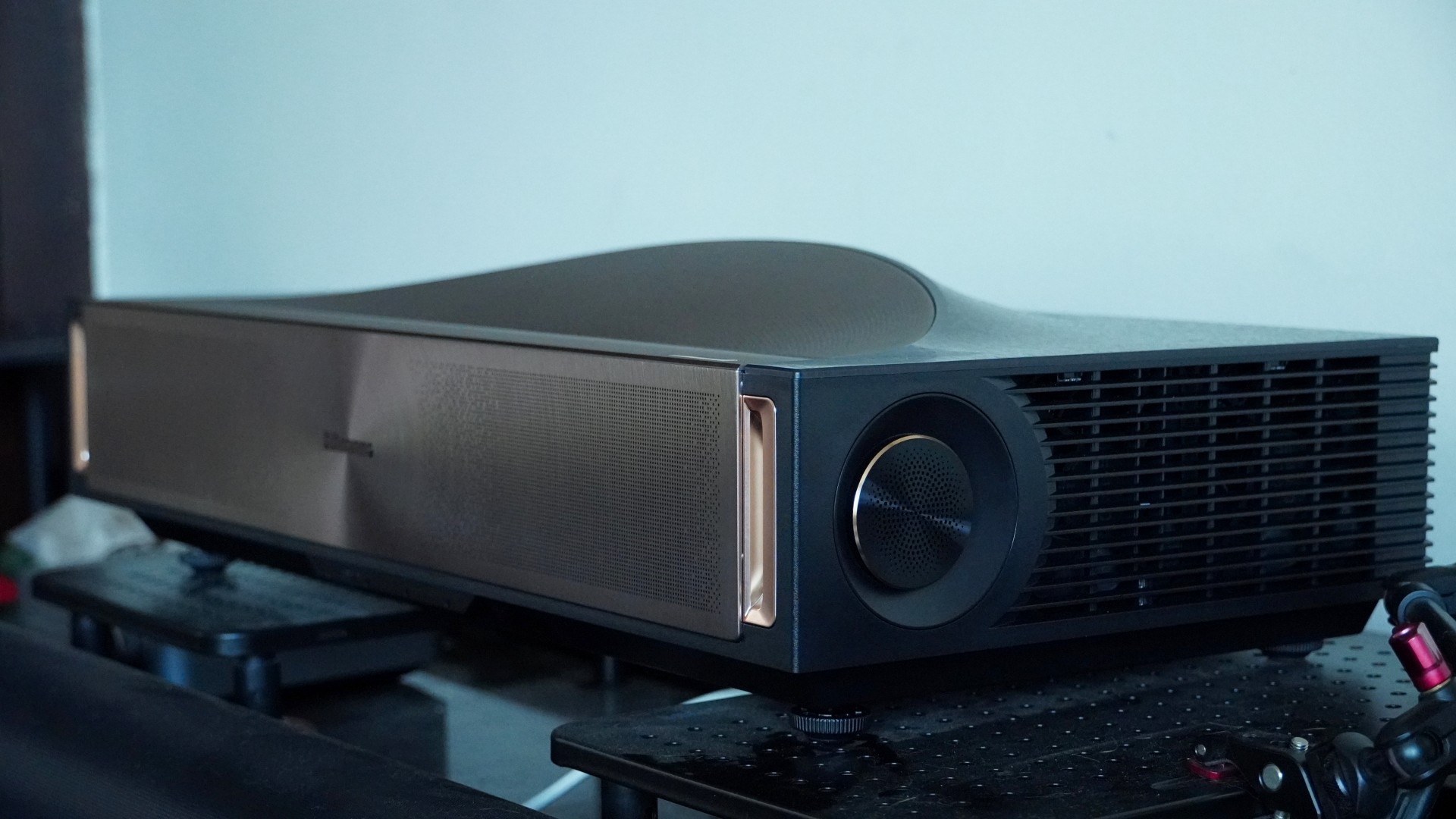
Hisense here has created what I think is its best-looking UST projector yet. The L9Q borrows some of the ideas from the retro-futuristic PX line to deliver a bronze-kissed work of art. Most of the frame of the L9Q is a little boxy, keeping it simple with clean lines, but the front has small channels with power indicator lights and the top bears a curved sort of wave meant to evoke Roman amphitheaters. That’s not just for style either, as the top integrates several speakers. The front is emblazoned with concentric rings and a grille on the front hides even more speakers. Around the side, there are two discs housing yet another pair of speakers.
While the design is very appealing, it’s also functional. The projector sits on four height-adjustable feet to help you level the projector and get a perfectly square image. Where its Hisense L9G predecessor was designed with specific screen sizes in mind (and included those screens), the L9Q is more flexible, offering adjustable keystone and focus to let you adapt it to your needs. The flip side is that the L9Q does not include any screen, which was an addition worth easily $1,000 on earlier models. Whatever screen you do set it up with, the projector can automatically fit the picture to it, though it's a software solution and will reduce the actual image resolution.
Another set of sensors at the top of the projector helps protect your eyes. When these detect someone is close to the projection, they'll dim the display, and after 5 seconds, turn it off entirely. That's good to have since this projector uses bright lasers, and in my testing, the sensors have been fairly responsive.
Another update with the L9Q is that the throw ratio has been reduced to 0.18:1. This lets you get a big image while getting the projector closer to the wall.
Around back, the L9Q has a good selection of connections. You get four HDMI ports, two of which meet the version 2.1 spec. A separate HDMI offers eARC, so you don't have to use up an HDMI 2.1 port for audio output. There's also an optical digital audio output, an Ethernet input, and an RF input for the L9Q’s ATSC 3.0 receiver. The projector even supports a PVR recording system for broadcast TV using an attached storage device. Three USB ports round out the options, with two offering USB 3.0 speeds, and one of those using a Type-C connection.
Even if you don't connect the projector to an external source, you can stream content on the built-in Google TV operating system. While many projectors include built-in operating systems like this, the L9Q actually has the hardware to run it smoothly. In my time testing, the system remained responsive even as I launched and navigated apps, and I could reliably control the projector at all times. The Wi-Fi 6E connection used by the streaming platform is also robust.
Hisense’s included remote is almost the same as what came with the PX3-Pro. It's a long silver handset made out of plastic with the typical Google TV navigation ring. At the top, it features a handful of shortcuts to streaming apps, including one customizable shortcut. There's also a dedicated input select button, which is always handy to have.
One difference between the remotes is that instead of having a control for brightness, the L9Q remote has a channel select button. This and the volume controls are on tall, pill-shaped buttons that are easy to feel out. One great feature of the remote is that it reacts to movement and will light up many of the controls if you simply move it. This is very helpful in the typically dark home theater environment.
Design and features score: 5/5
Powered by 5,000 lumens, the Hisense L9Q's picture stands out even in bright lighting conditions(Image credit: Future)
Hisense L9Q Review: performance
Wonderfully bright picture with rich color
Support for 1080p/240Hz gaming
Potent 10-speaker Dolby Atmos sound
The Hisense L9Q brings UST projector picture quality to new heights. Hisense already impressed me with earlier models such as the L9G and PX3-Pro, but the L9Q carries the torch even further. It’s their brightest projector yet while still providing the stunning color of Hisense’s RGB laser light engine.
Ultimately, its specified 5,000 lumen brightness may be overstated, as maximum brightness comes via a high-brightness mode that results in some horrible color shift. But even without that, the projector beams a brilliant picture. The vivid colors it is capable of don’t mean a sacrifice in accuracy either, as the L9Q is both Pantone Validated and Pantone SkinTone certified.
All of that is delivered with strong contrast. The black levels aren’t so low that letterbox bars disappear completely, especially in darker movie scenes, but when the projector is beaming bright, the bars become hard to see thanks to the projector’s contrast.
The L9Q’s black levels and contrast aren’t quite on the level of the Sony Bravia Projector 7, but it gets closer than most projectors I’ve seen, and it manages it with more vivid color and higher brightness. Not to mention that the L9Q is almost half the price of Sony’s projector.
With most picture presets, you’ll be facing some unfortunate motion smoothing, though, since the projector’s SDR and HDR picture profiles default to using motion smoothing. This has its benefits for some content by smoothing out camera pans and moving objects, but it adds a soap opera effect to movies. The “Film” setting avoids these unsightly artifacts while still keeping judder subdued, however.
The L9Q delivers good focus from corner to corner with manual setup, making the most of its 4K resolution. And the amount of detail you can see with the picture stretching up to 100 inches or larger is exceptional.
Gamers can get plenty from the L9Q as well. Even when it’s beaming a 4K 60Hz picture, it’s able to keep the input latency low enough to make for a fairly responsive experience. Like the Hisense PX3-Pro, the L9Q can drop down to 1080p and crank its refresh rate to 240Hz for super smooth gaming (just make sure to set the HDMI input source to Enhanced Pro or it will top out at 120Hz). I took it for a few runs in Hades, and it was stunningly smooth with virtually no detectable lag.
Though the L9Q did a good job of hiding the rainbow effect most of the time, it is susceptible to it like many other DLP projectors. I didn’t notice it much when watching 4K content, where it only occasionally cropped up and was most visible on white areas of the image. It was also more noticeable while running the projector at 1080p/240Hz.
The projector’s very robust speaker system was an extra pleasant surprise. It uses a total of 10 speakers in a 6.2.2-channel configuration. Four of those speakers are in the front, two on the sides, with four more positioned along the curved top. It’s not as engrossing as a proper surround system or as booming as a double-sub setup (nor is it hitting deep sub-bass), but the sound is weighty, loud, and presents a surprisingly wide soundstage for such a small unit.
With Dolby Atmos audio piping out of the speakers during Star Wars: The Force Awakens, blaster shots seemed to come out from different points in space, there was some height to the TIE fighters flying over, and explosions were properly booming. Ultimately, it’s worth pairing a projector of this quality with an external sound system, but if you don’t, there’s a lot to get from the built-in speakers.
Performance score: 4.5/5
The L9Q has a very appealing, yet functional design(Image credit: Future)
Hisense L9Q Review: value
High price
Extra value as an all-in-one system
No projector screen included in US and UK
The Hisense L9Q is a serious piece of kit, and it has the price to match. At $5,999 / £3,999, you have to expect a lot from this home theater projector, and for the most part, it delivers. Its picture is bright and color-rich, it has powerful built-in sound, and it has Google TV for streaming. But for most people, the $3,499 Hisense PX3-Pro is going to be the more sensible option, since it offers much the same experience but without quite the same brightness, audio power, or extensive connectivity options.
It's kind of a shame that the L9Q doesn't come bundled with a projector screen in the US and the UK, but its flexible lens control means you can pair it with whatever screen you want for the most part. Hisense had offered pre-order customers the option of either a free screen or its HT-Saturn sound wireless speaker system, both of which would have made this an astounding value, but that deal appears to have since expired.
Value score: 4/5
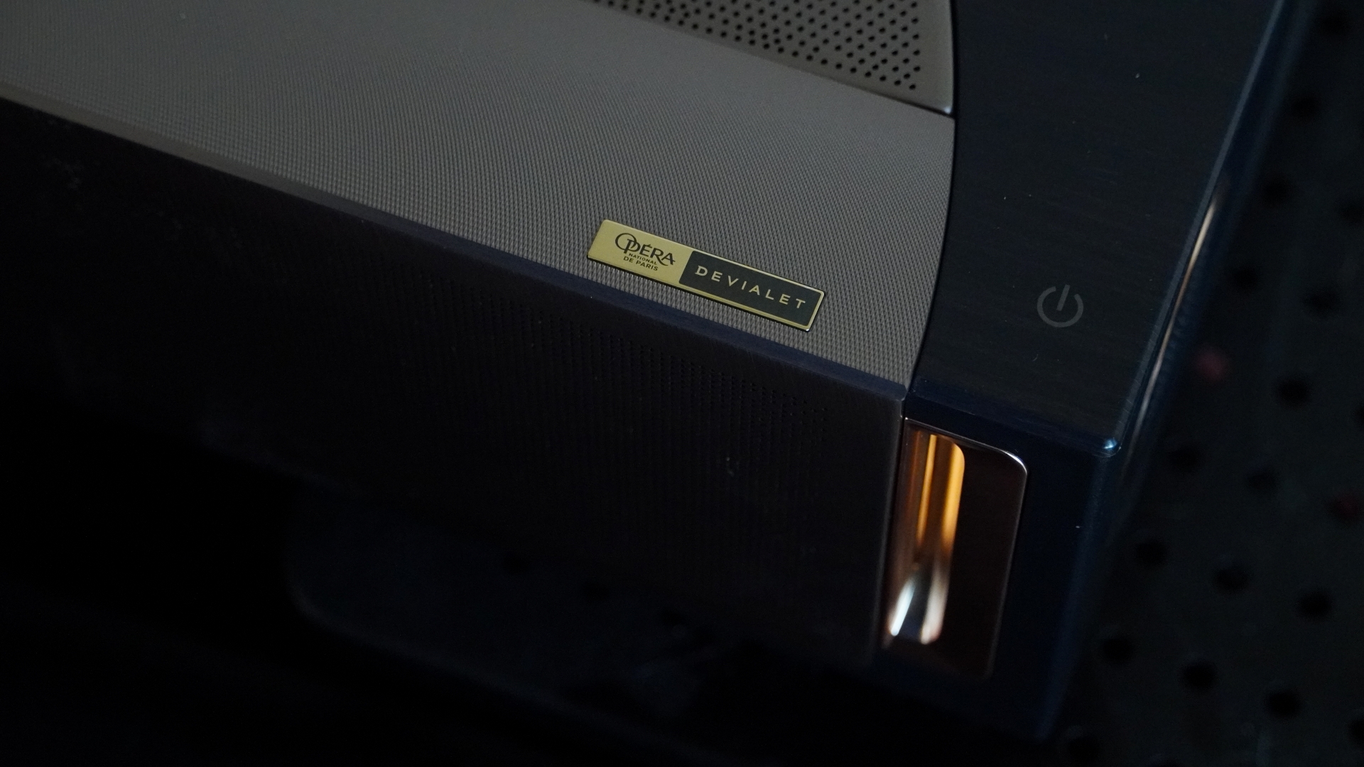
French speaker and amplifier manufacturer Devialet designed the L9Q's built-in audio system(Image credit: Future)
Hisense L9Q
Notes
Rating
Design and features
The Hisense L9Q is gorgeously designed and feature-packed. It has the most robust sound system I’ve heard built into a projector, it offers bright and flexible projection, and it has Google TV and plenty of ports for other video sources.
5/5
Performance
The L9Q’s picture is gorgeous. This projector beams bright, has a wide color gamut, strong contrast, and great clarity. It works well for movies and games alike. And that picture is paired with impressive speakers. Even the operating system runs smoothly, which is not always the case with projectors running Google TV.
5/5
Value
The Hisense L9Q packs a lot into one package. Its price isn’t surprising for even just its projection, but the speaker system makes it even more reasonable. It’s just too bad Hisense isn’t throwing in a screen as well.
4.5/5
Should I buy the Hisense L9Q?
(Image credit: Future)
Buy it if...
You want the ultimate UST projector
The Hisense L9Q beams bright pictures and has powerful audio. It plays twitchy video games just as well as it can play cinema masterpieces. And it’s got all the ports you need plus Google TV built-in.
You want powerful built-in audio
The L9Q's speaker system is far more robust than what you’d get from its competition. If you’re looking for a projector that can stand on its own without needing to be connected to an external sound system, this is your best bet.
You need a projector for brighter rooms
Almost no projector is going to look great in a bright room, but there’s a big difference between a 1,000-lumen and a 5,000-lumen projector where viewability is concerned. The L9Q’s high brightness is a big advantage it has over the competition.
Don’t buy it if…
You plan to always watch in the dark
A huge part of the package here is the brightness. If you’re always going to be watching in a dark home theater, the L9Q’s 5,000-lumen brightness is likely going to be over the top. Better to instead buy the PX3-Pro and apply those savings to a quality screen and sound system.
You want a sub-100-inch picture.
The L9Q can support a smaller picture, but it’s almost unfeasible to get one. With a 5.4-inch gap between the projector and your wall, you’ll get a 100-inch picture. At 2.2 inches, the picture size will be 80 inches.
You won’t use a screen and have imperfect walls
As great as the L9Q itself is, its picture is dependent on other factors. It will look best with a screen, though it can still look great on a bare wall. But due to the extreme angle of UST projection, any imperfections in your wall — warping, pits, texture — will have an easier time showing up in the picture.
While it’s no match for the color or audio provided by the L9Q, Epson’s EpiqVision Ultra LS800 can get close to its brightness, offering a picture that works well in brighter rooms. Its use of 3LCD technology also avoids rainbow artifacts, and the projector is a good deal cheaper.
The Xgimi Aura 2 is a competent alternative with a quality picture that also benefits from a wide color gamut. It has an elegant design and a similar throw ratio to the Hisense. It’s not nearly as bright and doesn’t have the same gaming capabilities, but if you’re looking for a sleek UST home theater projector, it is a strong option.
If you’re not sure you need the L9Q's high brightness or powerful built-in speakers, then the PX3-Pro is the way to go. It uses similar underlying technology to give you a gorgeous, colorful picture and has the same 240Hz gaming prowess. It’s also a bit smaller. More importantly, it’s substantially cheaper, giving you extra room in your budget for a sound system and quality screen.
Tested at home in multiple, real-world viewing conditions
Presented the display with a variety of media and formats
I have tested numerous projectors and displays over the last half-decade
I tested the Hisense L9Q at home, in real-world conditions. This saw it faced with ambient light coming in from numerous windows, in-room lighting, as well as ambient noise that both the projector and speaker systems had to overcome. The projector was tested both against a bare, white wall and an Akia Screens CineWhite screen. It was presented with streamed content, HDR and non-HDR, and PC gameplay.
My testing evaluates the projector’s performance with respect to its price and competition from other models that my colleagues and I at TechRadar have tested.
I have been testing projectors since 2021 and displays for even longer.
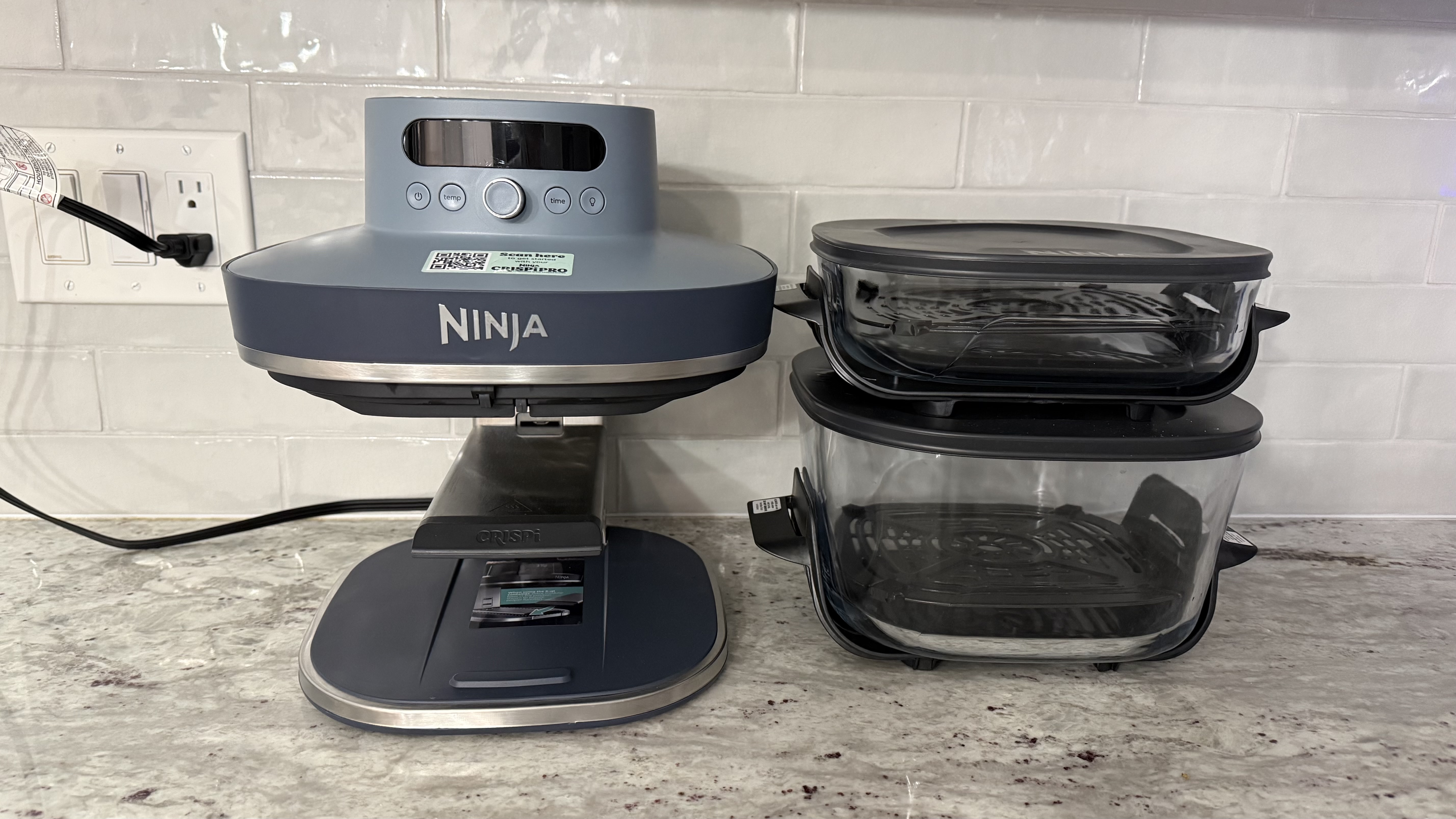
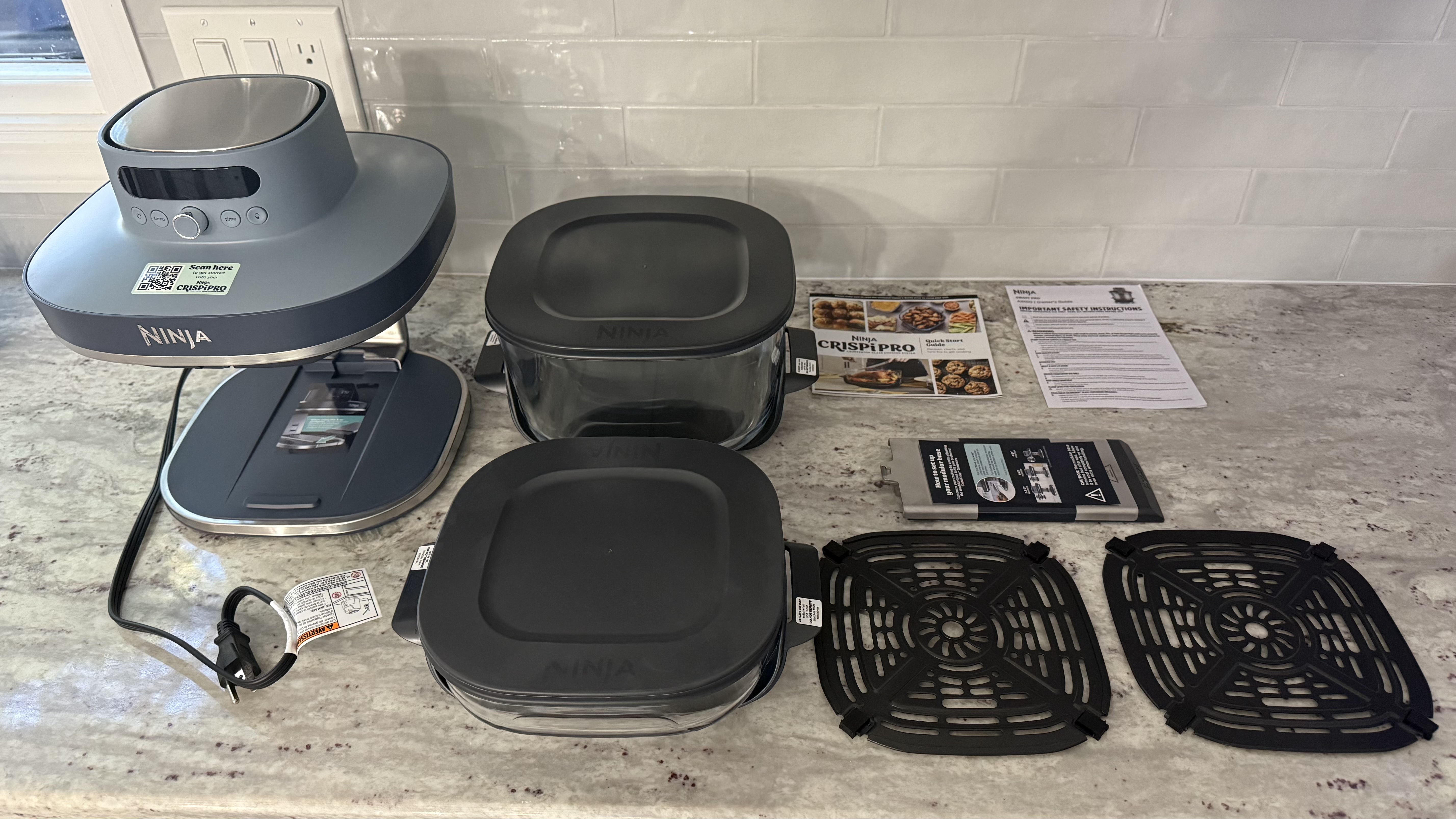
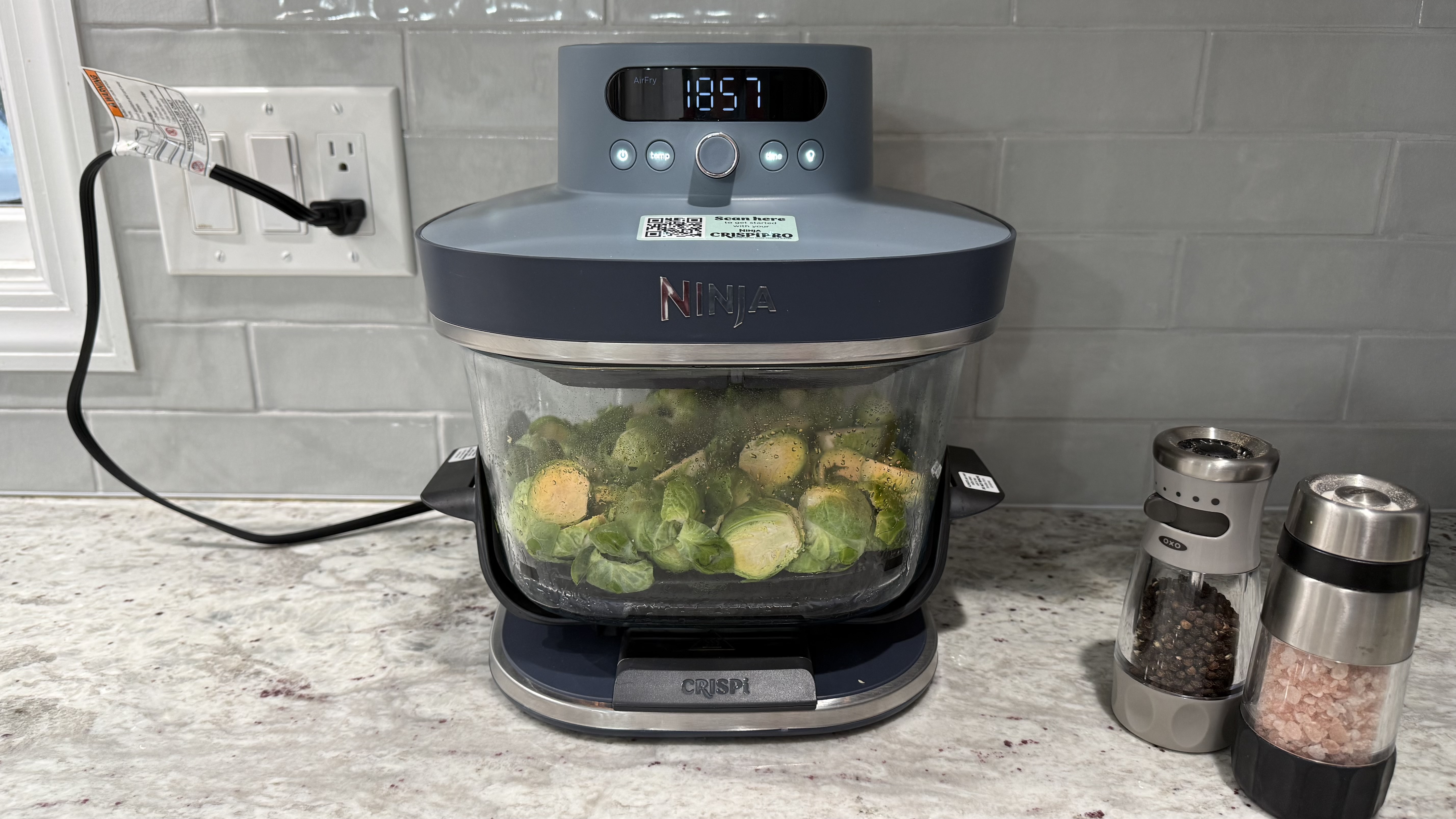
The Ninja Crispi Pro 6-in-1 Glass Countertop Air Fryer is the plus-sized version of the Ninja Crispi 4-in-1 Portable Glass Air Fryer Cooking System. Instead a traditional drawer-style air fryer, the Ninja Crispi Pro is a stand to which you can attach different-sized glass cooking containers. Since the glass containers are separate from the frying mechanism, they can be used for both storing and serving in addition to cooking. The handles stay cool so they can go directly from the fryer to the table without potholders or trivets. Lids are included for storing your food in the glass containers. The Ninja Crispi Pro 6-in-1 Glass Countertop Air Fryer comes with two cooking containers, the small one has a 2.5-quart capacity and the large one holds six quarts and can even be used to roast up to a 7.5-pound chicken. There is also a medium four-quart size which is sold separately.
Six cooking modes let you make a variety of dishes: Max Crisp, Air Fry, Bake/Proof, Roast, Recrisp, and Dehydrate. Select your mode, temperature, and cook time as desired. Since the containers are glass and there is a light bulb inside, you can easily keep an eye on your food as it cooks. This is an easy-to-use, flexible air fryer, and all the food I made came out well. Note that with its multiple cooking containers, it does take up a good bit of storage space.
Ninja Crispi Pro: price and availability
List price: $279.99 (about £209 / AU$421)
The Ninja Crispi Pro 6-in-1 Glass Countertop Air Fryer is available at all major retailers both online and in brick-and-mortar stores such as Amazon, Target, Macy's, Best Buy, Ninja's own website, and more. Choose from four color options: Cyberspace (dark gray), Bone (off-white), Rose Quartz, and Ash Gray (light gray). The retail price is $279.99 USD and it comes with two cooking containers including crisping trays and storage lids: 2.5-quart and 6-quart.
Value score: 4/5
Ninja Crispi Pro: specifications
Price
$279.99
Cooking functions:
Max Crisp, Air Fry, Bake/Proof, Roast, Recrisp, and Dehydrate
Size:
11.8 in L x 12.2 in W x 11.0 in H
Container material:
Glass
Containers included:
6-quart, 2.5-quart
Color options:
Cyberspace (dark gray), Bone (off-white), Rose Quartz, and Ash Gray (light gray)
Ninja Crispi Pro: design and features
Small and large cooking containers go from air fryer to table to fridge
Six cooking functions
Interior light
The Ninja Crispi Pro 6-in-1 Glass Countertop Air Fryer has a modular base that sits on the counter and two interchangeable glass cooking dishes, 2.5-quart and 6-quart. Ninja also makes a 4-quart medium size, but that will be sold separately. The cooking dishes have stay-cool handles so they can go right from the fryer to the table. Lids are also included so you can store your leftovers. The glass cooking containers, including the metal crisper plates and storage lids, can be washed in the dishwasher or by hand if you prefer.
(Image credit: Karen Freeman / Future)
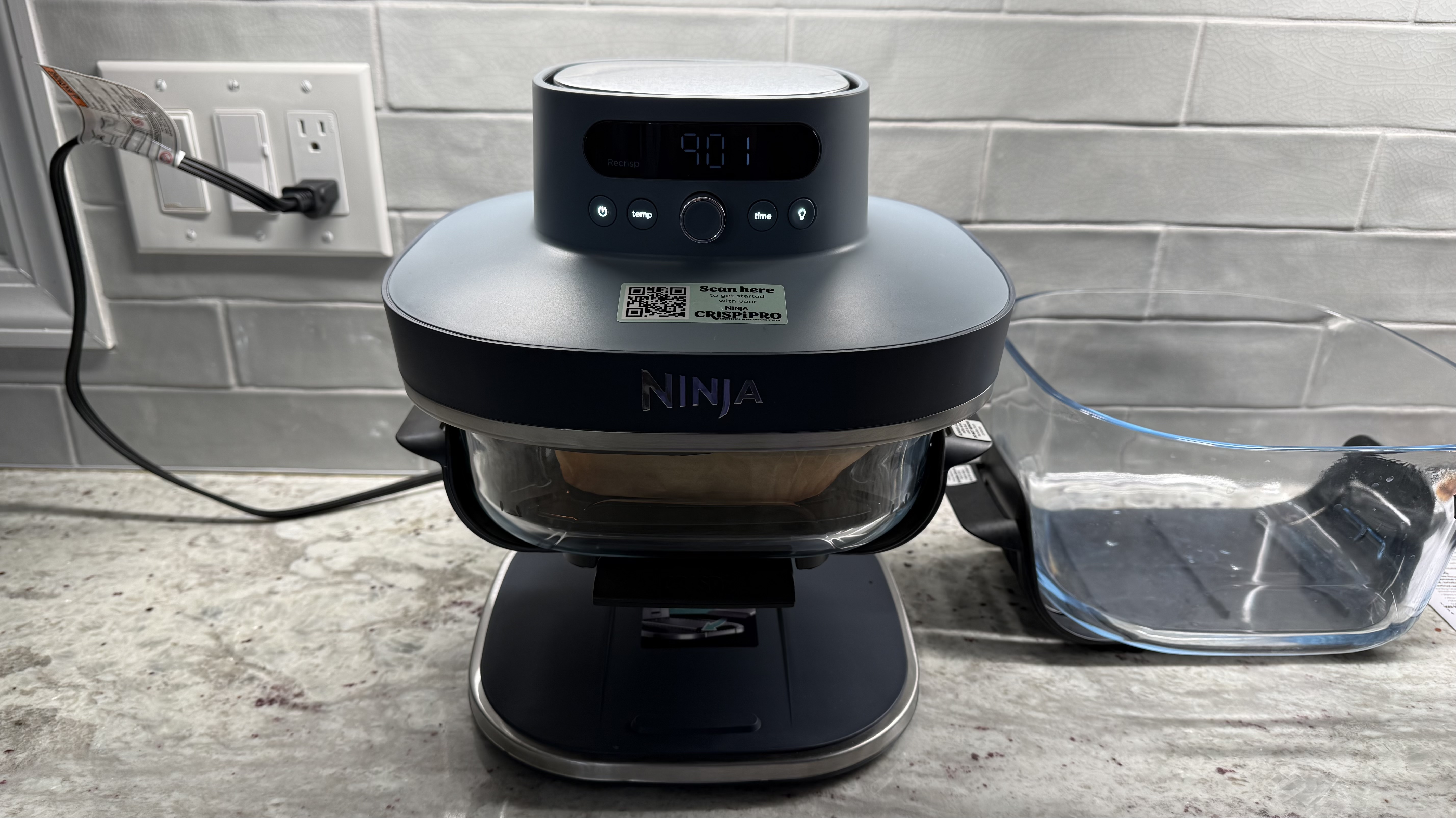
The air fryer itself has a modular base, which can be moved up or down depending on which glass cooking container you'll be using. Place the base at the highest notch to use the small container or at the bottom notch for the large container. There is a middle notch for the medium cooking container (not included.)
(Image credit: Karen Freeman / Future)
Once you've adjusted your modular base to the correct height, put your food on the crisper plate within the glass cooking dish and slide the dish onto the base. This can be a bit fiddly, but once you get used to doing it, muscle memory kicks in.
The controls are quite intuitive. Power on the air fryer and turn the knob to select your cooking mode: Max Crisp, Air Fry, Bake/Proof, Roast, Recrisp, or Dehydrate. Tap the temp button and turn the dial to adjust the temperature. Tap the time button and turn the dial to adjust the time. Press the center button to start cooking. Illuminate your food at any time by pressing the button with the light bulb icon.
(Image credit: Karen Freeman / Future)
I wouldn't say the Ninja Crispi Pro 6-in-1 Countertop Glass Air Fryer is the prettiest appliance I've ever seen; air fryers rarely are. It does take up a bit of counter space. You could store it away when not in use, but it's pretty heavy. The bottom is weighted to counterbalance the cooking mechanism at the top, making it difficult to take in and out for frequent use. You could keep one container in the air fryer on the counter and store the other away to minimize how much counter space it takes up, but either way, it's a space commitment.
Still, the Ninja Crispi Pro 6-in-1 Countertop Glass Air Fryer is well-designed for maximum flexibility with its extra-large cooking container, particularly for people with larger families or who entertain frequently. The smaller container is perfect for snacks and smaller portions. Its six cooking functions cover all the bases.
Design score: 4.5/5
Ninja Crispi Pro: performance
I made a dozen different foods, utilizing all of the different cooking modes, and everything I made came out delicious! As with any air fryer, you'll want to flip or rotate your food partway through cooking. And I noticed that using a small amount of oil or cooking spray made for better results; without it the food was a little bit dry.
Image 1 of 7
(Image credit: Karen Freeman / Future)
Image 2 of 7
(Image credit: Karen Freeman / Future)
Image 3 of 7
(Image credit: Karen Freeman / Future)
Image 4 of 7
(Image credit: Karen Freeman / Future)
Image 5 of 7
(Image credit: Karen Freeman / Future)
Image 6 of 7
(Image credit: Karen Freeman / Future)
Image 7 of 7
(Image credit: Karen Freeman / Future)
I used Air Fry mode to make: potato wedges from scratch, frozen egg bites, frozen veggie burger, tofu from scratch, frozen french fries, fresh vegetables, and frozen "air fryer" Mexican corn. Everything came out well, crispy on the outside and tender inside. I'd actually never made tofu from scratch before and I was surprised how easy and delicious it was!
Image 1 of 5
(Image credit: Karen Freeman / Future)
Image 2 of 5
(Image credit: Karen Freeman / Future)
Image 3 of 5
(Image credit: Karen Freeman / Future)
Image 4 of 5
(Image credit: Karen Freeman / Future)
Image 5 of 5
(Image credit: Karen Freeman / Future)
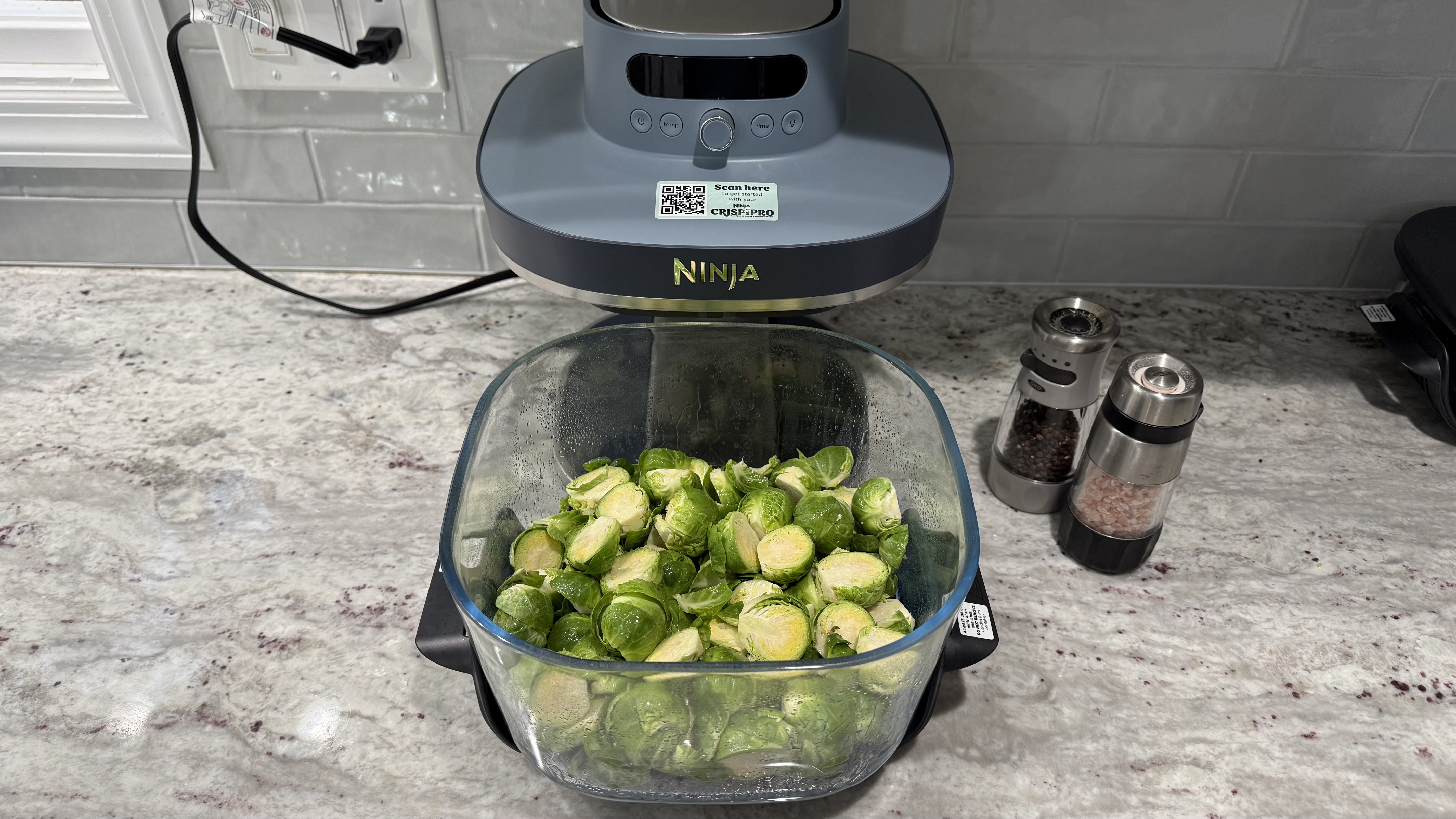
Roast mode worked beautifully for the Brussels sprouts and mixed peppers I made. Perfectly browned, tender, and delicious. As a vegetarian, I didn't make one, but the 6-quart container allows you to roast a whole chicken of up to 7.5 pounds.
Image 1 of 2
(Image credit: Karen Freeman / Future)
Image 2 of 2
(Image credit: Karen Freeman / Future)
I made a simple two-ingredient "bagel" (greek yogurt plus self-rising flour, and, ok, Everything Bagel seasoning makes three ingredients) in Bake mode, and it came out perfectly. Such a simple and delightful treat made quickly in the Ninja Crispi Pro.
Image 1 of 3
(Image credit: Karen Freeman / Future)
Image 2 of 3
(Image credit: Karen Freeman / Future)
Image 3 of 3
(Image credit: Karen Freeman / Future)
Max Crisp mode gives you the highest temperature range, which is great for vegetables if you like them blackened as I do. The zucchini and tomatoes I made came out great. The sweet potatoes look frightening but they were deliciously sweet and tender inside!
(Image credit: Karen Freeman / Future)
I used Dehydrate mode to make dried fruit for the first time. It took a full seven hours on a low temperature, but it worked. The apple chips had a leathery rather than crispy texture, but they tasted good.
(Image credit: Karen Freeman / Future)
Cleanup is pretty easy. The air fryer mechanism doesn't really need to be cleaned other than wiping it down with a cloth occasionally, and it cannot contact water. The glass cooking dishes, metal crisping plates, and plastic lids can be easily washed by hand or in the dishwasher. Sometimes the spatter gets really baked on, requiring some serious elbow grease to remove. I'd imagine this is the case for all air fryers, it's just that you can't see all the spatters in a dark metal cooking drawer. I actually feel better knowing my cooking container is getting completely clean, so it's worth the extra scrubbing to keep it pristine.
Performance score: 5/5
Should you buy the Ninja Crispi Pro?
Ninja Crispi Pro 6-in-1 Glass Countertop Air Fryer report card
Attributes
Notes
Rating
Value
This is a pretty expensive air fryer, though if you want that large capacity flexible-use glass cooking dish, it's worth it.
4/5
Design
Designed for maximum flexibility rather than looks, function wins over form.
4.5/5
Performance
Performance was great overall, food was generally crispy yet tender.
5/5
Overall
The air fryer-to-table-to-fridge glass cooking containers plus the ability to cook a 7.5-pound whole chicken make this stand out from the air fryer crowd.
4.5/5
Buy it if
You need to feed a crowd sometimes
You can make up to a 7.5-pound whole chicken or a whole lot of french fries at once in the large 6-quart capacity cooking container. Use the smaller container for smaller portions.
You want to make a variety of foods
Six cooking modes, each of which allows for a range of times and temperatures, mean you can make just about anything. You can even make dried fruit or meat jerky with the more unusual Dehydrate mode that most air fryers lack.
You want a totally removable, functional, and washable cooking container
The glass cooking containers can be washed in the dishwasher or by hand so you know they are totally clean. The plastic handles allow you to comfortably handle the hot containers directly from the air fryer and place them right on the table without potholders or trivets. The included lids let you store leftovers in them.
Don't buy it if
You lack counter or storage space
The Ninja Crispi Pro 6-in-1 Glass Countertop Air Fryer is pretty large and heavy, so it won't be easy to put away and take out for every use. It comes with two glass cooking containers, and they don't nest, so you'll need plenty of space to store them.
You want the cheapest possible no frills air fryer
This is a pricey one, you're paying for the flexible glass cooking containers, multiple cook modes, and extra large capacity. You can find much cheaper options that air fry simply and efficiently without all of the extra features.
You prefer an all-in-one drawer-style or toaster-oven-style air fryer
There are plenty of other options if the glass container style doesn't appeal to you. The drawer-style air fryers tend to be cheaper and a toaster oven/air fryer combo could mean one less appliance in your kitchen.
Ninja Crispi Pro: also consider
If you're not sure about the Ninja Crispi Pro 6-in-1 Glass Countertop Air Fryer, here are some other options to consider ...
Ninja Double Oven Air Fryer
If you prefer a toaster over that doubles as an air fryer, check out the Ninja Double Oven Air Fryer. You can actually cook two separate dishes at the same time using two different cook modes. This multi-purpose champ maximizes your countertop space.
More than just a gimmick, this easy-to-use air fryer's touchscreen takes the guesswork out of air frying and countertop cooking. Just a few taps on the screen and you'll have perfectly crisped food in minutes.
Ninja Crispi 4-in-1 Portable Glass Air Fryer Cooking System
If you love the idea of the Ninja Crispi Pro 6-in-1 Glass Countertop Air Fryer but it's bigger than what you really need, check out the original, smaller version. It's actually intended to be portable, so you could even take it with you to potlucks or to the office. This one made our list of the best air fryers.
I used it for weeks to prepare a variety of food items
I cleaned it after every use
I love to eat and I do try to eat healthy even though I don't particularly enjoy cooking. I prepare the majority of my meals at home rather than getting takeout. So, I'm always looking for quicker ways to make healthy and delicious food. I tested the Ninja Crispi Pro 6-in-1 Glass Countertop Air Fryer by making the following foods: lots of different fresh veggies using different cook modes, frozen egg bites, frozen french fries, fresh french fries from scratch, bagel from scratch, marinated tofu, frozen Mexican corn, frozen veggie burger patty, baked sweet potatoes, and dehydrated apple chips.
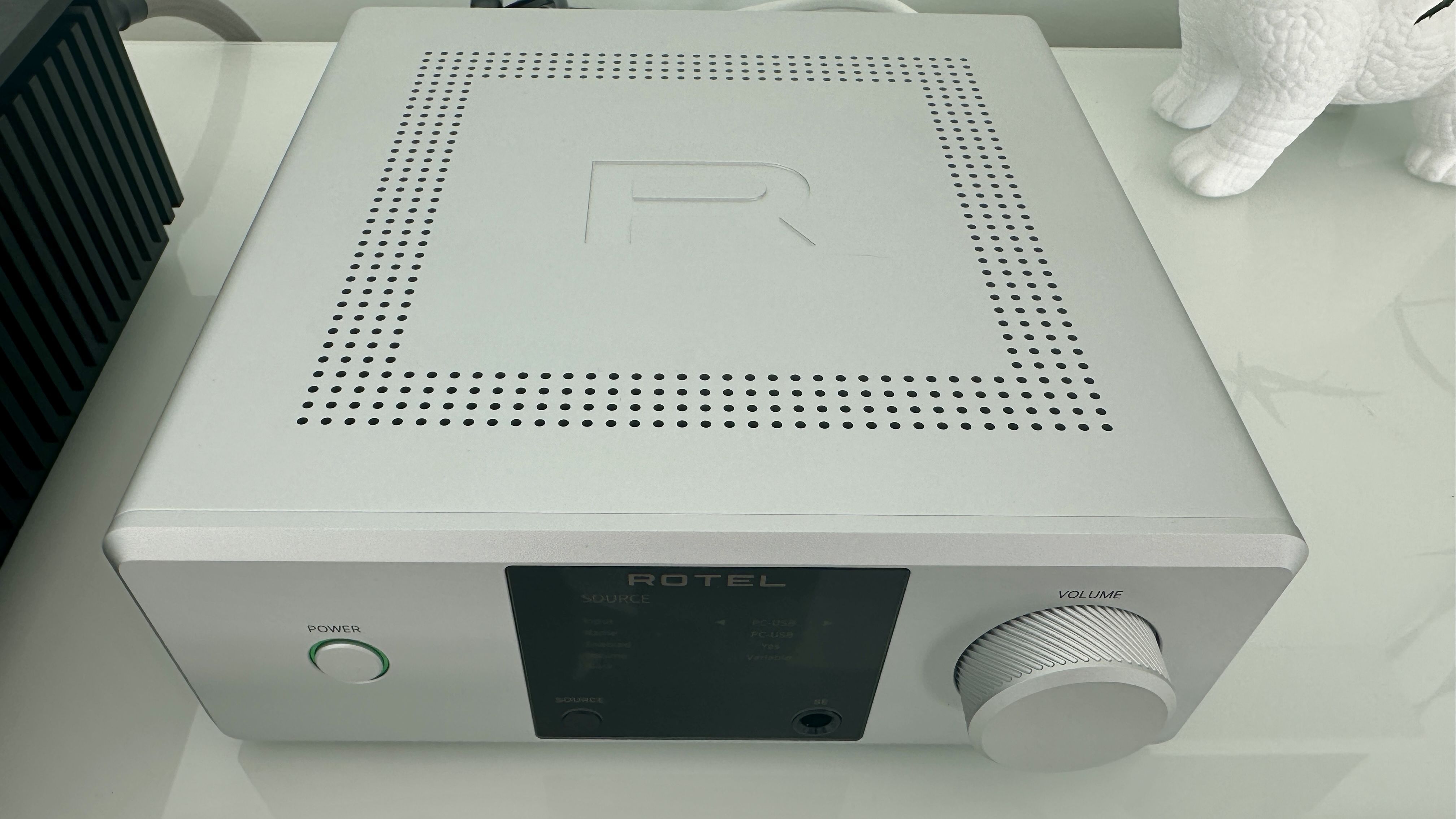
The Rotel DX-5 is a compact, beautifully constructed and very nicely designed stereo integrated amplifier with the emphasis firmly on digital sources of sound. It looks and feels good, it’s quite obviously built to last, and it’s specified to handle hi-res sources via its USB, coaxial and optical inputs as well as TV sound thanks to its HDMI ARC socket. A single line-level analog input deals with your properly legacy equipment (but not a turntable unless it’s pre-amplified).
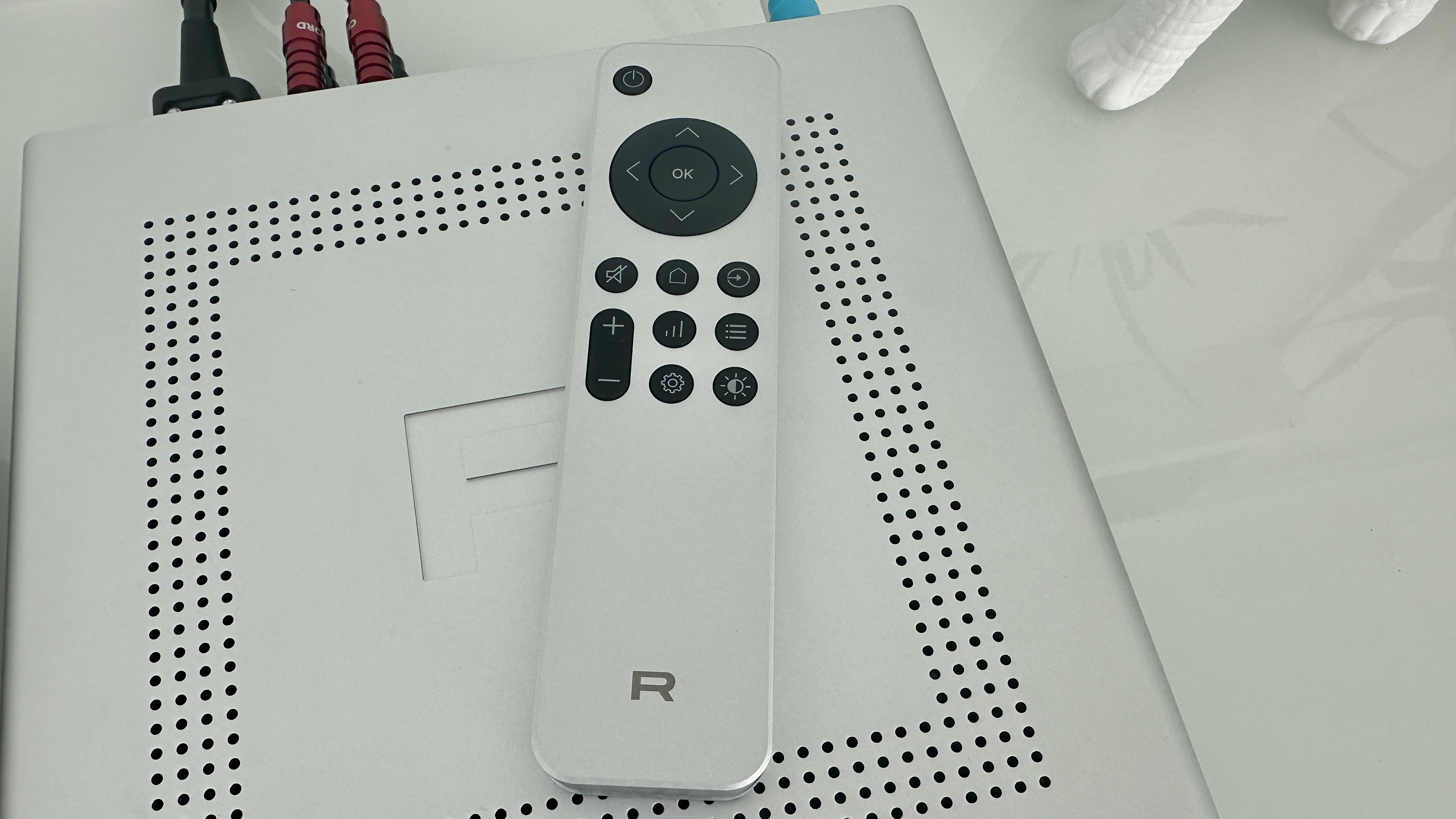
Because it’s not a network device, it doesn’t have a control app. It has a remote control, though, which looks and feels just as swish as the device it’s controlling – but is more dependent on line-of-sight to the device it’s controlling than is the norm, and by quite a distance.
Sound quality is straightforwardly impressive. The DX-5 is an open, revealing and entertaining listen, one that has a real facility with dynamics and can express rhythms confidently. It retains and contextualise all the detail in a recording, has nicely even frequency response and is adept at unifying a recording even at the same time that it can pick it apart for your inspection. It demands you spend some time considering system-matching, because it’s quite assertive at the top of the frequency range – but other than that, its sound is no kind of chore to enjoy.
Rotel DX-5 review: Price and release date
(Image credit: Simon Lucas / Future)
Released in April 2025
Priced $1,499 / £1,399 / AU$2,199
The Rotel DX-5 is on sale now, and in the United Kingdom it sells for £1,399. In the United States the going rate is $1,499, while in Australia you’ll have to part with AU$2,199.
This is not hair-raising money for an integrated stereo amplifier from a renowned brand, but it’s quite stiff if you apply the ‘physical stuff/asking price’ ratio…
(Image credit: Simon Lucas / Future)
Rotel DX-5 review: Features
ESS Sabre ES9039Q2M DAC
Digital inputs outnumber analog inputs
25W per channel into 8 ohms
There’s not a huge amount of space inside the Rotel DX-5, but it seems fair to say it’s been utilised to something approaching ‘the maximum’.
Under the lid, the most space-hungry element is the high-current toroidal transformer – it’s wound in-house, and can churn out 25W of Class AB power per channel into an 8-ohm load (rising to 33 watts per channel into 4 ohms). The crucial business of digital-to-analog conversion is handled by the deeply fashionable ESS Sabre ES9039Q2M chipset – it supports 32bit/384kHz PCM and DSD512 via the amplifier’s USB-B input (some source devices will need a driver to be installed, but not all) and 24bit/192kHz PCM via its coaxial and optical inputs. The DX-5 is certified Roon Tested, and Rotel suggests the machine is capable of a considerable 10Hz - 80kHz frequency response. It’s also claiming vanishingly low intermodulation distortion and signal-to-noise ratio numbers at the same time.
The three digital inputs I’ve already mentioned line up alongside an HDMI ARC socket and a single line-level analogue input accessed via a pair of stereo RCA inputs. Outputs amount to a pair of speaker cable binding posts, a pre-out for use with a subwoofer, and a fascia-mounted 6.3mm headphone socket. Wireless connectivity is handled by Bluetooth, and here it’s compatible with SBC, AAC and aptX HD codecs. A small, discreet Bluetooth aerial is integrated into the rear of the chassis.
The strong implication, then, is that yours is an overwhelmingly digital set-up – and, what’s more, a set-up in which your source devices don’t have digital-to-analog conversion circuitry that can lay a glove on the DX-5’s. That may well be true, but nevertheless it might be nice to see a second analog input if only for flexibility’s sake. The omission of a phono stage for use with a turntable is more understandable, though, despite the record player’s sudden front-and-centre position in any modern stereo system – keeping costs and physical dimensions down do rather make it a bit of a non-starter.
Features score: 4.5 / 5
(Image credit: Simon Lucas / Future)
Rotel DX-5 review: Sound quality
Open, detailed and properly defined presentation
Equally adept with rhythms and dynamics
Requires some system-matching in order to play nicely
It might be worth starting with the one area where the Rotel DX-5 is anything less than entirely easy to enjoy – this way I’ll be able to finish on a long and enthusiastic high… In the simplest terms, the DX-5 needs a greater degree of care taken with system-matching than many of its price-comparable rivals.
Sources of music or loudspeakers that count ‘high-frequency excitability’ among their attributes will find this trait compounded by the DX-5 – and if the Rotel is part of an entire system that shares this kind of emphasis, you may end up with rather too much of a good thing. Even a tonally warm recording like Otis Redding’s That’s What My Heart Needs enjoys plenty of shine at the top of the frequency range, and unhelpfully trebly tunes like FKA twigs’ Cheap Hotel could conceivably become problematic in a properly unsympathetic set-up. A moment or two spent ensuring you’re not going to provoke the Rotel is time well spent.
But with that out of the way, I think it’s safe to say the remaining news is good without qualification. From the deep and carefully shaped low frequencies to the top end, the tonality of the DX-5 is consistent and even (provided you’ve paid attention to the previous paragraph), and quite carefully neutral – it’s able to describe the fundamental tone of a recording without meaningfully sticking its oar in.
And the same is true of frequency response, again from the very bottom to the very top of the frequency range: the bottom end is detailed and textured, and so well-controlled where onset attack is concerned that the Rotel expresses rhythms with real confidence. The midrange is similarly informative and similarly articulate, and there’s a directness to the way the DX-5 delivers the voices of the two vocalists I’ve already mentioned that makes them sound positive and eloquent. The top end is similarly accomplished in this respect – it’s just as packed with information as the rest of the frequency range, and receives just as much emphasis and drive.
All this good stuff takes place on a large, well-defined and easy-to-understand soundstage – even a fairly complex recording like Bath is Black by Marika Hackman is organised to the point that it’s simple to follow. Each individual element gets the necessary space in which to express itself – but the DX-5 is also able to let these elements cohere into a unified whole. There’s a sense of togetherness that’s not always available when an amplifier is as capable of separation and focus as this one.
The dynamic variation in this recording, where attack, intensity and sheer volume are concerned, is identified and contextualised carefully, and the smaller harmonic variations are given the correct amount of weight too. The Rotel is very talented in this regard, and can put very worthwhile distance between ‘quiet’ and ‘loud’ despite what is, on paper at least, a less-than-promising amount of power on which it can call.
But it’s the facility with detail retrieval that I’ve already referred to that’s possibly the single most impressive thing about the way this amplifier goes about things. From the broad strokes to the most minor transients, it can locate and position any details in a recording in the most naturalistic and convincing manner – which means you’re never in any doubt as to whether or not you’re getting the complete picture.
Sound quality: 4.5 / 5
(Image credit: Simon Lucas / Future)
Rotel DX-5 review: Design
76 x 215 x 251mm (HxWxD)
Anodised aluminium construction
Black or silver finish
There may not be all that much of it (it’s a titchy 76 x 215 x 251mm, HxWxD), but what there is of the Rotel DX-5 is nicely designed and flawlessly built.
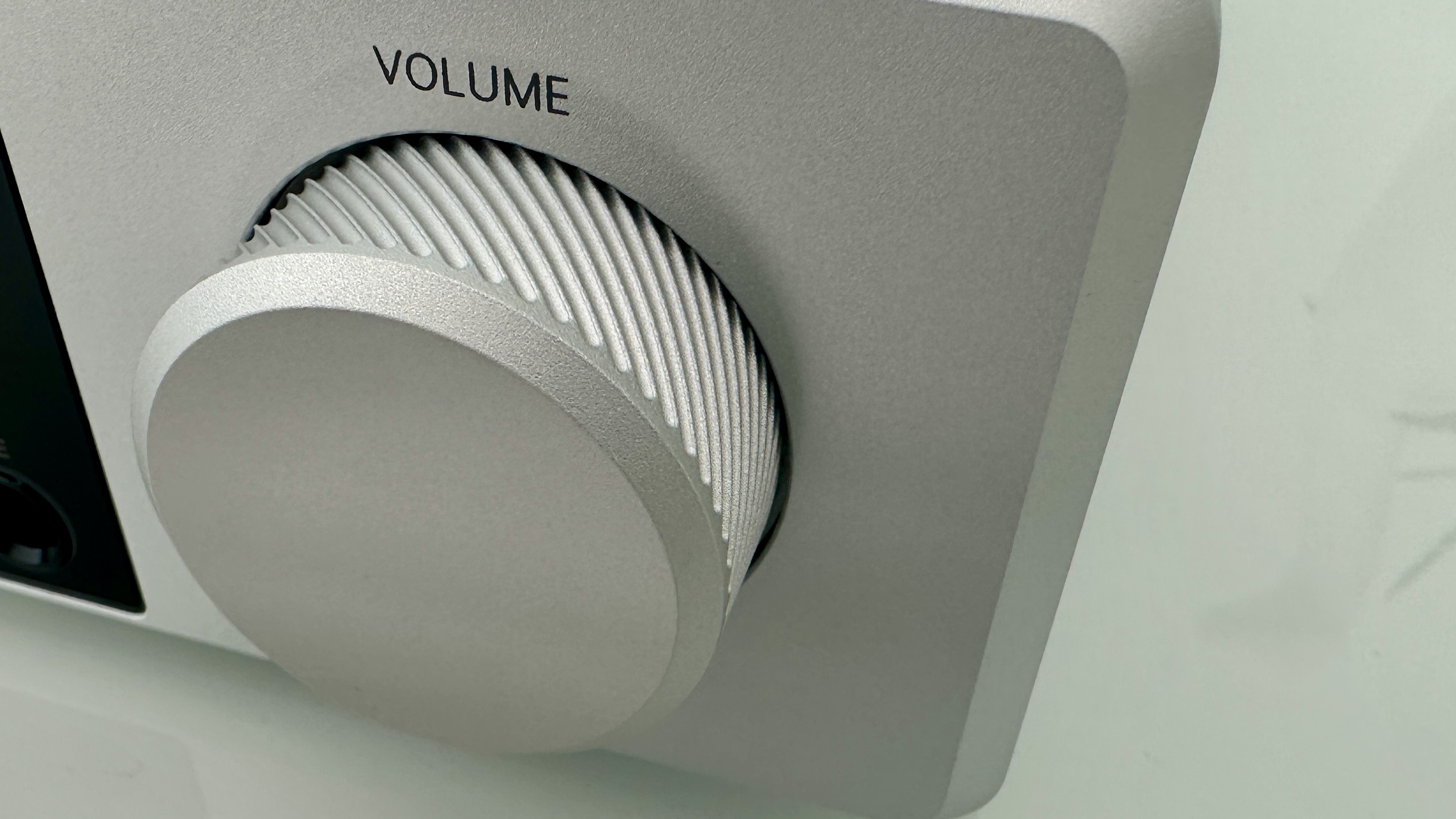
It uses a luxurious amount of anodised aluminium in its construction, and is a visually and tactile treat no matter which of the black or silver finishes you choose. The industrial design is sophisticated, and nice little touches like the knurling of the volume control and the confidently embossed ‘R’ on the ventilated top of the box don’t do any harm either.
As the asking price demands, the DX-5 is built and finished to an extremely high standard. Nothing about the design or construction of this device suggests a single penny has been pinched, and it feels ready to last for the long haul.
Design score: 5 / 5
(Image credit: Simon Lucas / Future)
Rotel DX-5 review: Usability and setup
Full-colour TFT display
Heavy, luxurious and unhelpful remote control
A (very) few physical controls
This is not a wi-fi -enabled device, and so there’s no control app. Getting what you want from the Rotel is done the old-fashioned way.
There’s a big, bright, crisp TFT display in the centre of the fascia – it features an indication of volume level, confirmation of selected input, and some reasonably in-depth set-up menus too. It also has a ‘source selection’ button embedded in its bottom left, opposite the 6.3mm headphone output. There’s an illuminated ‘power’ button on the left of the fascia, and a big, tactile volume dial on the right.
The DX-5 can also be operated using a remote control handset that’s a weird combination of ‘sky-high perceived value’ and ‘marginal usefulness’. Its weighty aluminium construction, sensible button layout and nicely judged dimensions all fall into the first category, while its absolute insistence on being pointed precisely at the sensor on the fascia in order to operate falls strongly into the second. If there’s a remote control that’s more dependent on pin-point line-of-sight in order to be of any use, I’ve yet to encounter it.
Usability and setup score: 3 / 5
Rotel DX-5 review: Value
If it’s the amount of stuff your money buys that’s important, then the DX-5 obviously doesn’t represent the same sort of value for money as an alternative that uses much more metal.
Its specification could be said to be slightly lacking, too, if you squint. But if you concentrate on the quality of componentry, the sophisticated nature of its design, its bank-vault build quality and its lavishly detailed, wide-open sound, there’s unarguable value on offer here. Best not to dwell on the remote control, though…
Value score: 4 / 5
Should I buy the Rotel DX-5?
Attributes
Notes
Rating
Features
Stuffed to the gills, just one more analog input might have meant full marks
4.5/5
Design
Luxurious anodised aluminium – a tactile treat!
5/5
Sound quality
Consistent, even, neutral, faithfully detailed (just get the system-matching right)
4.5/5
Value
If you want more physical product for your money, it's a tough sell. We all know that's not always the point though
4/5
Buy it if...
Your system is mostly digital
Physical and wireless digital inputs outnumber the analogue equivalent by quite a margin
You admire understated industrial design
There’s nothing shouty about the design here, and it makes the perceived value of the DX-5 all the greater
You enjoy entertaining, insightful sound
Not every amplifier combines forensic levels of detail retrieval with an overall attitude of uncomplicated musicality, but this one does
Don't buy it if...
You’ve more than a single analog source
There are numerous amplifiers that will suit your analog ways better than this one
You don’t have particularly steady hands
The remote control handset insists on being pointed precisely at the IR receiver on the amp’s fasciaView Deal
Your system is already happy to fully attack high-frequency information
Unsympathetic partners in the system, and/or unsympathetically recorded music, can bring the Rotel’s treble reproduction to the foreView Deal
Rotel DX-5 review: Also consider
If you like the Rotel’s dinky dimensions, will happily trade a USB input for a phono stage, and will forgo some tactility in exchange for a more aggressive price tag, the Rega’s excellent Brio mk7 ($1,095 / £799) could be just the ticket. It’s a punchily exciting listen, but capable of deft insight at the same time. Or if you want to retain the size but hang the expense, then Cyrus (who could fairly lay claim to having the idea of full-on sound from a half-pint box in the first place) has just launched its $4,995 / £3,995 AMP 40 – and it’s a bravura performer in every respect.
How I tested the Rotel DX-5
I connected the Rotel DX-5 to a pair of Bowers & Wilkins 606 S3 Signature loudspeakers using Chord Company Clearway X speaker cable. I used my Naim Uniti Star as a streamer and a CD player (attached to the sole analog input, of course) and plugged my Colibri-enhanced Apple MacBook Pro into the USB-B socket to get the highest-resolution content possible on board.
And then I listened to lots of music, of many genres and of many file-types and -sizes – probably for longer than was absolutely necessary…
The KEF XIO can be installed either on a tabletop (shown above) or flipped up for a flat wall-mount configuration(Image credit: Future / Simon Cohen)
The KEF XIO Dolby Atmos soundbar brings a new level of power, elegance, and versatility to the normally utilitarian soundbar category. And though KEF asks a pretty penny as the price of admission, the XIO delivers a performance that few soundbar systems can match. The fact that it looks just as good hanging on a wall as it does when placed horizontally is the icing on the cake.
As the company’s first Dolby Atmos soundbar, the KEF XIO is not quite as mesmerizing for height and surround effects as the Sonos Arc Ultra or Sennheiser Ambeo Soundbar Plus, but it makes up for that small weakness with sublimely clean audio and impressively robust bass. And when it comes to playing music, it’s no contest; the XIO is the best soundbar I’ve ever tested.
There are a few small quibbles. Not enough inputs, a smartphone app that doesn’t do as much as many competitors, and a remote that could do with a few more buttons. But overall, the KEF XIO is a formidable sound machine for all of your entertainment needs.
KEF XIO soundbar review: Price & release date
The KEF XIO's included remote control could use a few more buttons to be truly useful(Image credit: Future / Simon Cohen)
• $2,499.95 / £1,999.00 (around AU$3,765)
• Released July 2025
KEF launched the XIO, the company’s first Dolby Atmos soundbar, in July 2025 in a variety of markets, including the UK and the US.
While KEF is well-known and widely praised for its long heritage of producing passive hi-fi speakers, the British brand is no stranger to powered audio. Its LS series of wireless, amplified bookshelf speakers has been a favorite of audiophiles since the first models debuted, and KEF continues to expand its active lineup, most recently with its reboot of its passive Coda speakers as the Coda W.
KEF brings this amplified speaker experience to the XIO, along with its Uni-Q driver technology, and throws in some new innovations for good measure, like its Velocity Control Technology, a sensor-based system that actively monitors the XIO’s four low-frequency drivers to minimize distortion.
At $2,499.95, the KEF XIO lives in a soundbar category dominated by other high-end audio brands, like Bang & Olufsen’s Beosound Stage ($2,900), Sennheiser’s Ambeo Soundbar Max ($2,999.95), and the Devialet Dione ($2,199).
Price isn’t the only thing these models have in common: All are designed to be single-speaker solutions. Although you can add an external subwoofer to the XIO and the Ambeo Soundbar Max, none of these soundbars offers surround channel expansion.
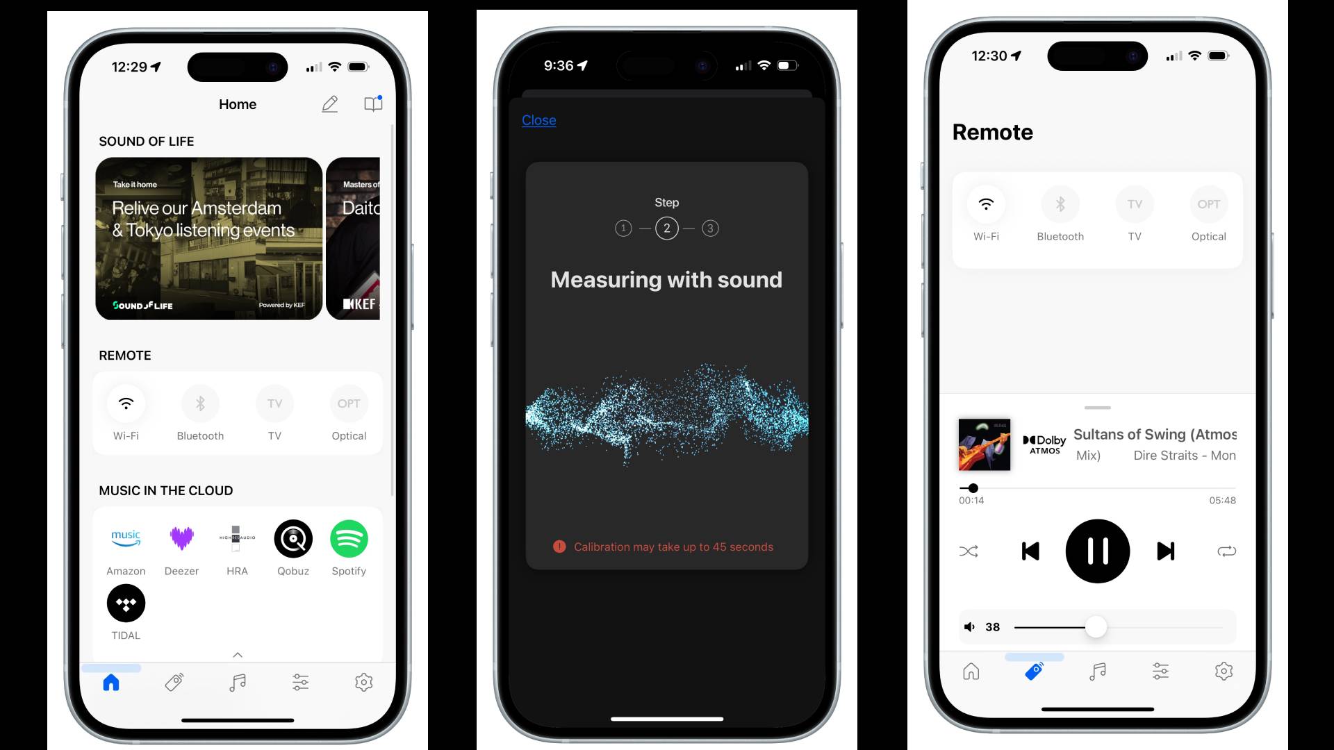
AirPlay 2, Google Cast, Tidal Connect, Spotify Connect, UPnP, Dolby Atmos Music, 360 Reality Audio, Night Listening mode, Room Correction, native integration of music services including Tidal, Qobuz, Amazon Music, more
KEF XIO soundbar review: Features
Image 1 of 2
The KEF XIO rear panel ports include a wired subwoofer output(Image credit: Future / Simon Cohen)
Image 2 of 2
The XIO's surface controls(Image credit: Future / Simon Cohen)
Bluetooth and Wi-Fi with comprehensive streaming support
Room correction
Four built-in subwoofers with force cancellation
Let’s get the bad news out of the way first. Despite its hefty price, the KEF XIO is a little shy on ports. You don’t get any HDMI inputs to make up for the one it will grab from your TV, and there’s only a single optical port as an alternative for physically connected external devices.
This makes the XIO less desirable for those who want to hook up turntables, Blu-ray players, or game consoles. On the other hand, KEF has included a dedicated subwoofer output, a fairly rare feature on soundbars at any price.
Its wireless connection suite, however, is excellent, with both Bluetooth and Wi-Fi, plus Apple AirPlay 2, Google Cast, Tidal Connect, Spotify Connect, and UPnP/DLNA support. Depending on your music source and the protocol you choose, you can stream to the XIO at up to 24-bit/384kHz for lossless, hi-res audio playback.
Thanks to all of those wireless protocols, it’s easy to stream from almost any app. You can also access several leading streaming services inside the KEF Connect app, including Amazon Music, Tidal, Qobuz, and Deezer.
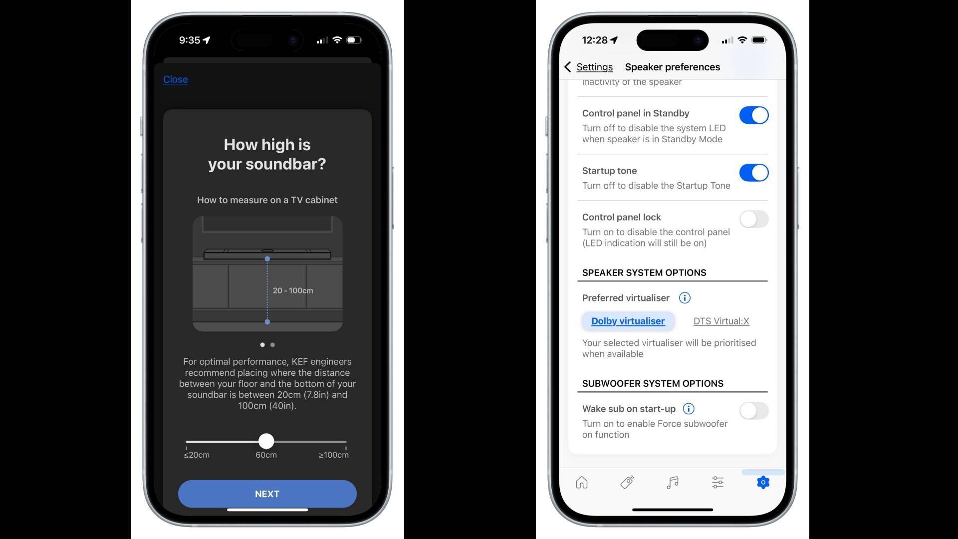
Using the KEF Connect app, you can trigger the XIO’s room correction feature. I’d characterize it as semi-automatic: you still need to tell the app how high the speaker is mounted and how big your room is, but after that, it does the rest.
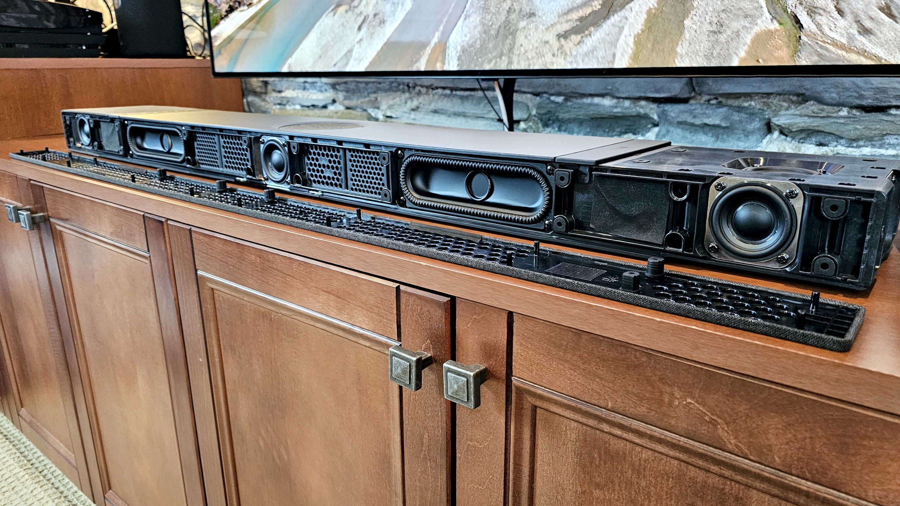
If there’s one area that sets the XIO apart from other soundbars, it’s the driver configuration, especially KEF’s approach to low frequencies. The XIO uses a set of four 2 x 6-inch P185 racetrack subwoofers mounted in horizontally opposed pairs. This force-cancelling arrangement reduces cabinet vibration, while KEF’s newly developed Velocity Control Technology uses sensors and a feedback loop to minimize distortion.
Features score: 4 / 5
KEF XIO soundbar review: Performance
(Image credit: Future / Simon Cohen)
Brilliant Dolby Atmos performance
Astonishing two-channel stereo rendering
Missing height and surround level adjustment
Can a single soundbar recreate true movie and music magic? While purists may scoff, the KEF XIO is exceptional.
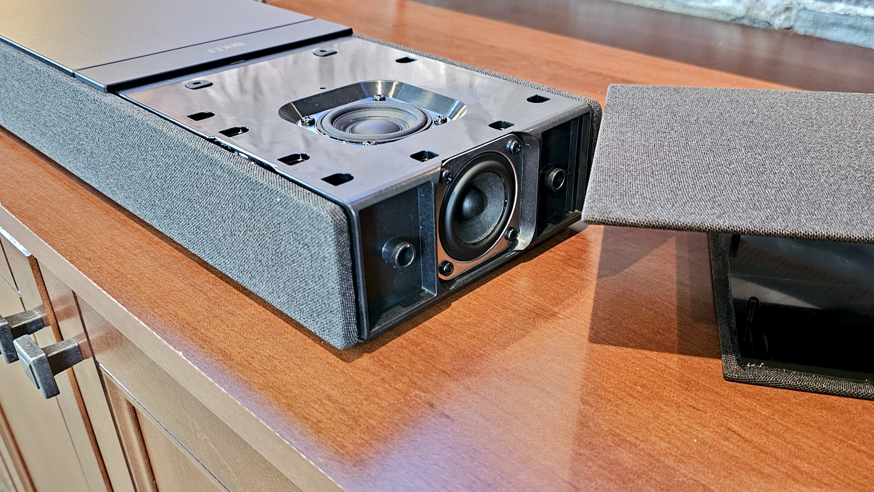
Buried under its low-key exterior is a series of six, 2-inch Uni-Q MX drivers, two 2-inch full-range drivers, and a four-driver subwoofer array, all of which are discretely powered by class D amps, to the tune of 820 watts of total power.
What those specs can’t convey is how great the XIO sounds when it gets going. The performance is smooth, balanced, and immensely powerful. Your neighbors probably won’t agree, but the XIO rewards loud listening better than any other soundbar I’ve tested.
The benefits of KEF’s acoustic design start to reveal themselves at 50% volume. Bass is deeply resonant, yet detailed and at times quite musical. Yes, you can feel it, but it stops just shy of shaking furniture. Could it be further improved with a subwoofer? Sure. But believe me, unless you have a really big room, or aren’t happy unless your vision gets blurred by sub-bass, you don’t need one.
Image 1 of 3
The XIO's speakers include a built-in four-driver subwoofer array(Image credit: Future / Simon Cohen)
Image 2 of 3
(Image credit: Future / Simon Cohen)
Image 3 of 3
(Image credit: Future / Simon Cohen)
In fact, if you want more of a gut-punch, more immersion, or just more, simply dial up the volume. Doing so had a proportional effect on my smile. The XIO’s sound is so clean, so free from vibration or distortion, you may not even notice as the decibels approach unhealthy levels.
As I ran the XIO through my usual Dolby Atmos test clips from Mad Max: Fury Road, Ford v Ferrari, Unbroken, Dune, and No Time To Die, I was impressed by both the immersiveness and the dialogue clarity. The soundbar also does a decent job with Dolby Atmos Music.
However, I wouldn’t classify the XIO as the best single-speaker Atmos soundbar I’ve heard.
In fact, Sonos’s Arc Ultra ($1,099) can go toe-to-toe with the XIO for thunderous bass, and even edges out the XIO for surround channel effects. Meanwhile, Sennheiser’s Ambeo Soundbar Plus ($1,799.99) runs in the opposite direction, with slightly less low-end punch, but with far more effective surround and height immersion.
It’s not entirely surprising, given that the XIO is KEF’s first kick at the Dolby Atmos can. Moreover, in making the XIO wall-and-surface-mount friendly, it compromised a little on the directionality of its drivers. The side-firing drivers always face out at a 90-degree angle, as do the height drivers. It’s hard to do any kind of beam-forming when that’s the setup.
All of this fades into the background when you stream music. The XIO may not be the king of the Atmos hill, but when it comes to delivering two-channel sound, it’s staggeringly good.
The challenge that all soundbars face with stereo music is achieving sufficient separation of left/right channels. At just over 47 inches, the XIO isn’t any wider than other flagship soundbars, and yet it convinced me I was listening to discrete speakers set much farther apart. When sitting dead center, it gave me a level of stereo imaging I wasn’t expecting, and a nearly perfect phantom center channel. Given that nearly all soundbars have actual center channels, you’d think this would be a no-brainer, but it rarely works out that way.
The KEF Connect app offers only six EQ presets (Default, Movie, Music, Night, Dialogue, and Direct), with no manual equalizer controls. There are no bass/treble or loudness controls either, unless you create a new EQ profile using the app’s Expert mode.
For most content, the Default mode worked best for my tastes, but each preset is enjoyable in its own way. Dialogue mode can improve the intelligibility of TV speech, but it’s also a handy way to improve vocal clarity when listening to Dolby Atmos Music mixes that may push vocals further away.
Performance score: 5 / 5
KEF XIO soundbar review: Design
Image 1 of 3
The XIO is available in Slate Black (seen here) or Silver Grey fabric finishes(Image credit: Future / Simon Cohen)
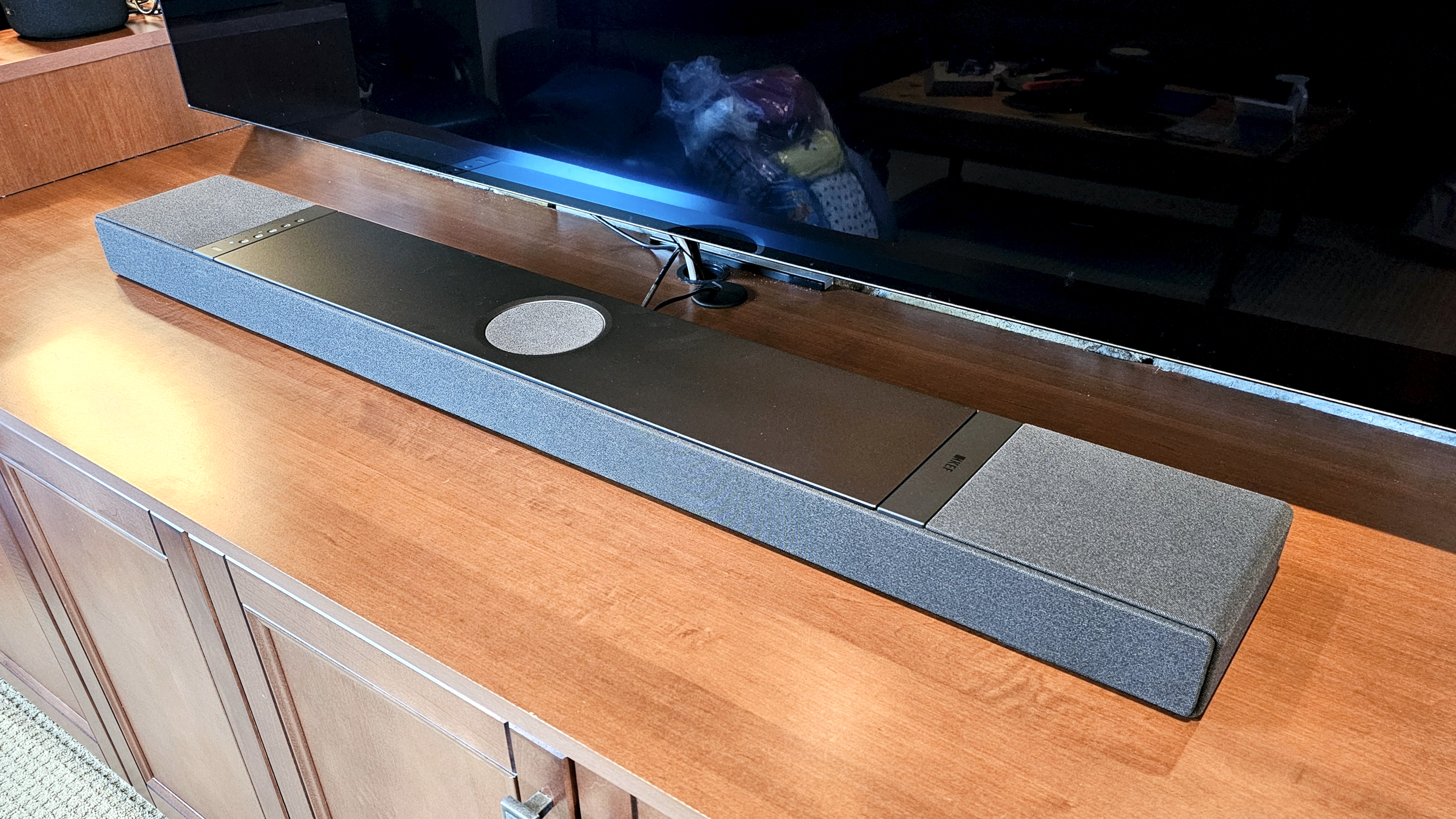
From a design perspective, the KEF XIO is a radical departure from the company’s trademark aesthetics, which puts exposed speaker drivers proudly on display. The XIO, by contrast, is demure, hiding all 12 of its drivers behind elegant, splash-proof fabric grilles in Slate Black (seen here) or Silver Grey finishes.
Those grilles cover all but the central top aluminum surface, which houses the bar’s touch controls on one side, a discrete KEF logo on the other, and a covered driver in the middle.
Though it may not scream “KEF,” it’s a smart choice. Soundbars are generally in your line of sight when watching TV, so the fewer visual distractions, the better. Klipsch went loud-and-proud with the drivers on its Cinema series soundbars, and my eyes kept being drawn to their metallic glint. Want to see the XIO’s drivers? Peel away those grilles and, voila.
Though deeper, at 6.5 inches, than many soundbars, the XIO still comes in under three inches tall, which should keep it from blocking the bottom of most TV screens. It also keeps the XIO from sticking too far off your wall when wall-mounted.
Around the back, you’ll find the XIO’s ports, dedicated buttons to reset the speaker and put it in Bluetooth pairing mode, and something we rarely see on soundbars: a physical rocker switch for power. Typically, soundbars are always on, even if they may drop down to a low-power mode when not in use. It’s nice to see the option to completely power a speaker down when you’re going to be away for extended periods.
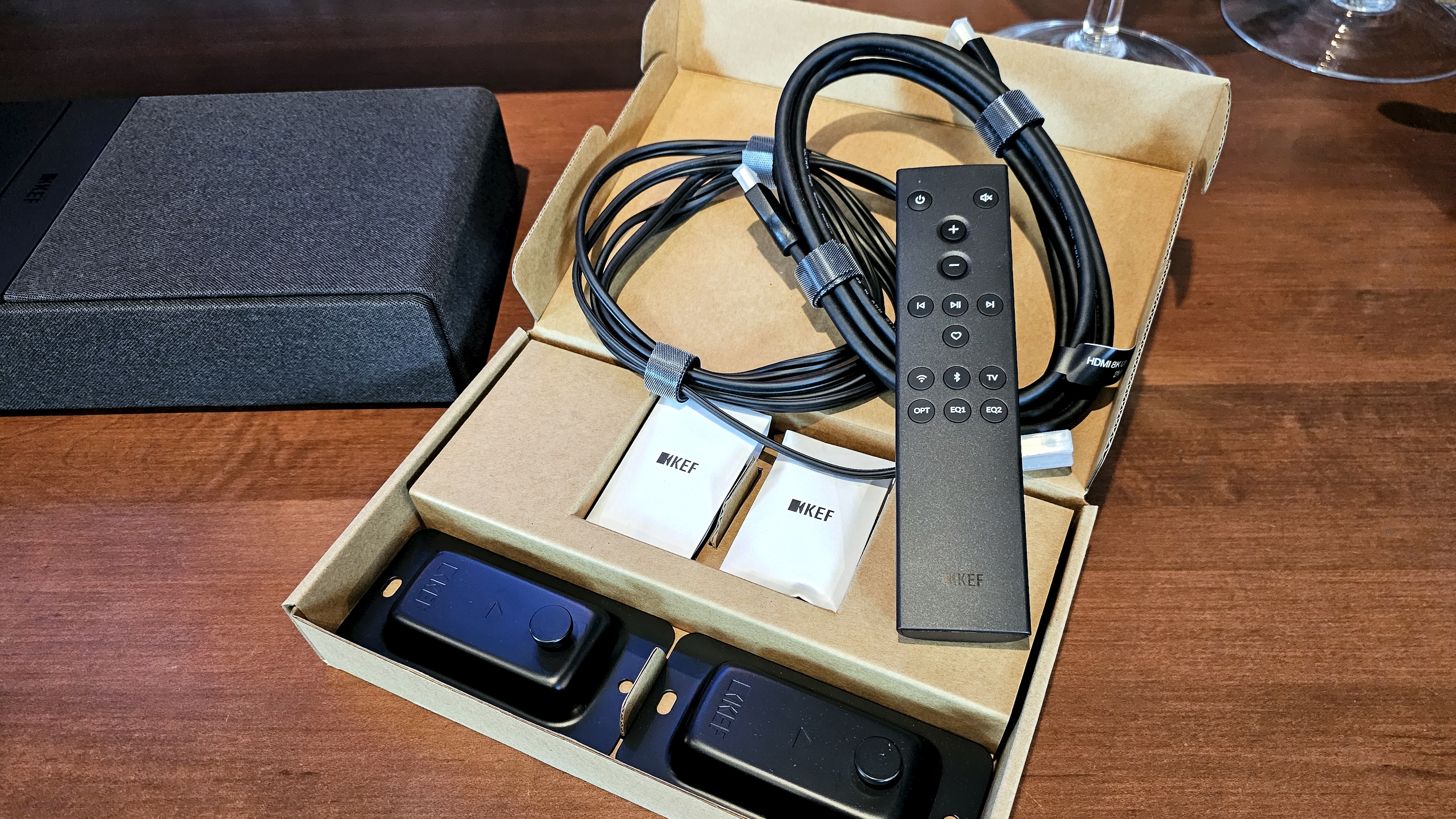
Many soundbars can be wall-mounted, but in the case of the XIO, it’s a key feature. The speaker automatically detects its orientation, and KEF includes all the hardware you need to get it on a wall. Just be careful — this box is a beast, at 23.1 pounds. Hiding the power and HDMI cable may prove tricky. The HDMI and power ports are very close to the bottom edge of the speaker. And while the included power cable has an L-shaped connector to minimize its protrusion, the included HDMI cable doesn’t. KEF also includes a backlit remote control.
The XIO’s touch controls let you choose your source, set your volume level, mute the sound, and wake the speaker from its low-power state. Beside the controls is a volume meter – a string of little white LEDs. If you wall-mount the XIO, these indicators will be plainly visible, but when sitting on a surface in front of your TV, they’re invisible, and KEF didn’t include a secondary set behind the front grille.
Design score: 4 / 5
KEF XIO soundbar review: Setup & usability
Image 1 of 2
Once connected to Wi-Fi, the XIO's streaming options include AirPlay, Google Cast, Spotify Connect, and Tidal Connect, with specific services available within the KEF Connect app(Image credit: Future / Simon Cohen)
Image 2 of 2
(Image credit: Future / Simon Cohen)
Easy setup and calibration
KEF Connect app is a work in progress
Remote could use a rethink
If all you want to do is crank your TV sound, the XIO only takes a few seconds to install. Plug the HDMI cable into the TV, plug the XIO into a power outlet, and flip the power switch on the back panel. As long as you stick with TV, Bluetooth, or Optical sources, you’re good to go.
But don’t stop there. Using the KEF Connect app, you can join the XIO to your Wi-Fi network, which opens up all of the high-quality streaming options like AirPlay, Google Cast, Spotify Connect, Tidal Connect, and others. It also lets the app configure the XIO, including the room correction feature, which can’t be initiated from the soundbar or the remote.
These steps only take a few extra minutes (more if a firmware update is required). My only complaint is that KEF insists that you create an online account before it lets you do any of this. The rationale is that, should you wish to control the speaker from other devices, an account ensures that all settings are shared between them. In fairness, Sonos, Bose, and many other soundbar companies require the same thing.
Pro tip:Ensure you add TV as a second wake-up source in the preferences section; otherwise, the XIO won’t automatically power up when you turn on your TV.
The KEF Connect app takes some getting used to. It’s divided into five tabs: Home, Remote, Music, EQ settings, and Device/app settings. And yet, it could probably get away with just the Home and EQ/Device settings sections, since the features of the Remote and Music tabs are duplicated on the Home tab.
Having integrated music service access in the app makes sense, but only if it increases convenience and/or sound quality (versus using the service’s standalone app). The potential is there, but KEF’s execution is weak. There’s a very limited number of services available, with Apple Music, Spotify, and YouTube Music being the big omissions. Within each supported service, navigation can be slow as the app populates the available menu items.
Visually, it’s a Spartan experience: Menus are text-only, and album art is presented as tiny thumbnails alongside the playlist, album, or track info. I could chalk this up to KEF’s minimalist aesthetic, but there’s also a lack of a universal search, the single biggest benefit of bringing together music sources in one app.
Having a physical remote is handy. And since KEF’s is an infrared (IR) model (as opposed to Bluetooth or other RF standards), you can use any universal IR learning remote instead (including Logitech’s now-defunct Harmony line). I like that it’s backlit (though just barely) and has an easy-to-use button layout. However, the heart (favorite) button is a bizarre tool. It only lets you pick a favorite function, e.g., Next Source or Set Maximum Volume, and not a favorite album, playlist, or radio station, which you’d normally expect from a favorite button.
I’m also a bit disappointed with the EQ shortcut buttons. For some reason, there are only two, and yet the XIO has six EQ modes to choose from. Why are we limited to just two of our favorites? I think KEF should take a page from Yamaha’s remote control playbook and give us access to all EQ modes.
My biggest critique of the XIO’s usability, however, is the lack of front indicator lights I mentioned earlier. I don’t think you should ever be in the dark when it comes to your soundbar’s selected source or volume level, and unless you consult the KEF Connect app, you won’t know either if you’ve got the speaker setup horizontally. Normally, HDMI-connected soundbars can provide feedback to your TV so that you see an on-screen display of volume level, but this didn’t happen during my time with the XIO.
Setup & usability score: 3.5 / 5
KEF XIO soundbar review: Value
The XIO's bundled accessories include wall-mounting hardware(Image credit: Future / Simon Cohen)
Expensive
Good for Dolby Atmos, superb for music
Limited expansion options
Soundbars are, first and foremost, all about getting better TV sound. The KEF XIO delivers on that mission effortlessly, with big, bold, and perfectly clean audio. But it doesn’t perform this role significantly better than lower-priced options, specifically, the Sonos Arc Ultra ($1,099).
You can add a subwoofer (wired or wireless) to the XIO, but unlike the Arc Ultra and many others, you can’t add surrounds, which would significantly increase the XIO’s ability to immerse you in a soundtrack.
Still, if you believe a soundbar should be just as killer for music as it is for movies, the XIO rocks, and I have yet to hear a competitive single-speaker system that can touch its music chops.
Value score: 3 / 5
Should I buy the KEF XIO?
Section
Notes
Score
Features
Wi-Fi and Bluetooth streaming plus room correction but shy on ports
4 / 5
Performance
Excellent Dolby Atmos and stereo music performance with powerful bass for an all-in-one soundbar
5 / 5
Design
Elegant, fabric-wrapped design, but no alphanumeric LED display
4 / 5
Setup & usability
Easy setup and calibration, but app and remote control could use some work
3.5 / 5
Value
Expensive, but unbeatable when it comes to soundbar music performance
3 / 5
Buy it if...
You want a single speaker that can do it all
The KEF XIO belongs to a new generation of soundbars that don’t need dedicated subwoofers to deliver big, bold bass that you can feel. Whether for movies or music, it’s a full sonic experience.
You need to wall-mount your soundbar
The XIO isn’t just wall-mount compatible, it’s designed from the ground up to be hung below a TV. You’ll get the same sound quality as a horizontal placement and you’ll find everything you need in the box — no optional accessories needed.
You don’t own (or plan to own) multiple external devices that need connections
With no extra HDMI inputs and only a single optical input, the XIO is aimed at those who are content to stream wirelessly or source their audio from a connected TV.
Don't buy it if...
You want to expand
Not only are there no wireless surround speakers for the XIO, but there’s also no good option for making it part of a multiroom sound system. You can add it to Google Home or Apple Home apps, but these are only basic options that lack the power and convenience of Sonos, Denon Home, Bluesound, or Wiim.
Your TV doesn’t have Dolby Atmos
Without any HDMI inputs, you’ll be missing out on the XIO’s spatial audio prowess if your TV can’t pass through Dolby Atmos via HDMI ARC.
You want to play vinyl
Without any kind of analog input, you’ll need a turntable that connects via Bluetooth. That might be convenient, but if you’re spending KEF XIO money on sound, you deserve better than Bluetooth for your record collection.
KEF XIO soundbar: Also consider
KEF XIO
Sonos Arc Ultra
Sennheiser Ambeo Soundbar Plus
Samsung HW-Q990F
Price
$2,499.95 / £1,999.00 (around AU$3,765)
$999 / £999 / AU$1,799
$799 / £699 / AU$1,299
$1,999 / £1,699 / AU$2,099
Dimensions (w x h x d)
47.6 x 2.8 x 6.5 inches (1209 x 71.2 x 165mm)
2.95 x 46.38 x 4.35 inches (75 x 1178 x 110.6mm)
27.6 x 2.6 x 3.9in (700 x 65 x 100mm)
Soundbar: 1232 x 70.8 x 138 mm (48.5 x 2.8 x 5.4 inch); Subwoofer: 249 x 251.8 x 249 mm (9.8 x 10.0 x 9.8 inch); Rear speaker: 129.5 x 201.3 x140.4 mm (5.1 x 8.0 x 5.5 inch)
Speaker channels
9.1.4
9.1.4
7.1.4
11.1.4
Connections
HDMI out (with eARC), 3x HDMI 2.1 in, optical digital audio, Ethernet, Wi-Fi, Bluetooth, USB-A
1HDMI with eARC, Ethernet, Wi-Fi, Bluetooth
HDMI eARC, Wi-Fi, Bluetooth 5.0, USB-A
1x HDMI out (with eARC), 2x HDMI 2.1 in, optical digital audio, Wi-Fi, Bluetooth
Dolby Atmos/DTS:X
Yes/Yes
Yes/No
Yes/Yes
Yes/Yes
Sonos Arc Ultra
If you’d like to expand your system over time, Sonos’ excellent Arc Ultra ($1,099) offers a similar starting point to the XIO in terms of TV sound and can be expanded with a variety of wireless subs and surrounds. It’s also one of the best multiroom systems you can buy. However, it won't solve the XIO’s lack of inputs, and it lacks features like Tidal Connect and Google Cast.
If a single-speaker Dolby Atmos system is your goal, but you’d like to spend a little less and get a few more connectivity options, Sennheiser’s Ambeo Soundbar Plus is well worth a look. It’s under $2,000, it’s got the most immersive sound I’ve ever heard from a single speaker, and it has tons of inputs, including 2 HDMI ports, an optical input, and an analog input. Like the XIO, it supports Dolby Atmos, DTS:X, 360 Reality Audio, MPEG:H, and can even act as an Alexa-powered smart speaker.
If you want to achieve maximum cinematic immersion and don’t mind dealing with a few extra speakers, Samsung’s HW-Q990F is considered by many to be the best Dolby Atmos home-theater-in-a-box product you can buy, and it’s still $500 less than the XIO. It lacks the XIO’s refined looks with its all-plastic construction, but it delivers stellar spatial performance and includes two HDMI 2.1 inputs.
Sources: Apple TV 4K, Nvidia Shield 2019, and streamed music from various apps
I spent a full week with the KEF XIO as my main audio system for watching movies, shows, and music in my basement media room. During that time, I played a variety of Dolby Atmos test clips from movies like No Time To Die, Ford v Ferrari, Mad Max: Fury Road, Dune, and Unbroken, paying special attention to details like dialogue clarity, surround sound, and height channel impact.
I streamed most content from an Apple TV 4K connected via an LG OLED TV, which fed the MK2 from its ARC output, but I also connected an Nvidia Shield TV to an eARC extractor so I could hear the XIO’s treatment of Dolby Atmos in Dolby TrueHD.
I evaluated the effect of the various EQ modes as well as the XIO’s room correction feature.
For music, I used a variety of apps, including Apple Music, Tidal, Qobuz, and Amazon Music, listening to a wide range of genres and formats, like Dolby Atmos Music. Some were played from apps on the Apple TV 4K and Nvidia Shield, while others were streamed wirelessly using AirPlay, Bluetooth, Tidal Connect, and Google Cast. I tested several of these within the KEF Connect app as well.