Tilda website builder
Tilda is one of many website builder services out there, but does it offer anything special that sets it apart from the competition?
- Interested in Tilda? Check out the website here
Unlike some, Tilda does offer a free service, which gives you an idea of what’s available, without unlocking all features, and it’s a great way to see what all the fuss is about without committing yourself. Even better you can also try out the paid features free for 14 days.
- Also check out our complete list of the best web hosting services
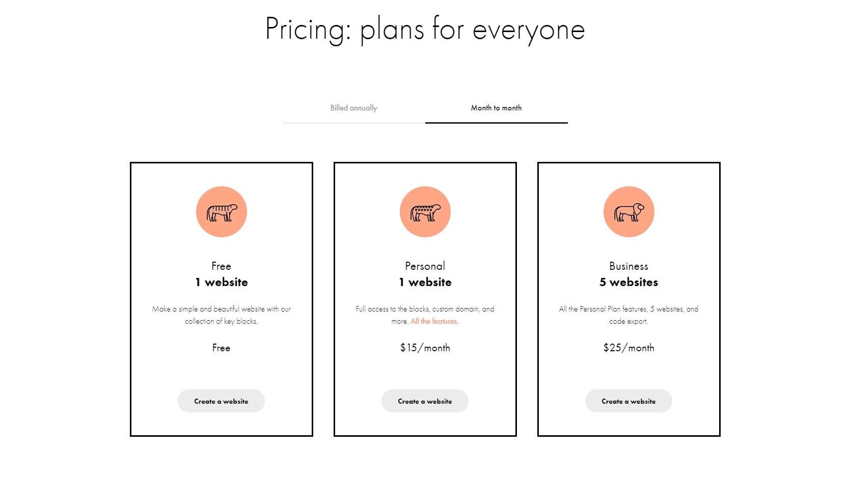
Plans and pricing
Three plans are available, as Tilda tries to make things as simple as possible. The first one is called ‘Free’, and allows you to create one website, with up to 50 pages and 50MB of storage. Your customisation is limited though, with only access to ‘key blocks’ to design and customise your online presence.
Next is ‘Personal’, the first of two paid plans. All the restrictions from ‘Free’ are lifted as you are not only able to fully customise your site, you’re also given up to 500 pages and 1GB of storage. Creating a blog and setting up an online store is also open to you. This plan would cost you $10/month when billed annually, or $15 monthly.
Finally there’s ‘Business’, which expands your creativity to five websites as opposed to one, for $20 a month when billed annually or $25 monthly.
Features
lda’s website service is based on blocks: you select those want, add them to your page, and build your site that way. There are currently over 500 fully customisable blocks with more being added regularly. You also have access to over 200 responsive templates, can add animations to jazz up your site, have access to a photo editor, a royalty free stock image library, a collection of icons, and are able to embed YouTube, Vimeo, SoundCloud and Coub media. Not to mention of course blogging and ecommerce facilities.
There’s a lot to entice potential customers, so let’s have a look at it all first hand…
Basic customization
After registering (which involves giving your name, email, and setting up a password), you’re given access to the dashboard without even having to provide any credit card details (that’s because the free plan is automatically selected when you do this).
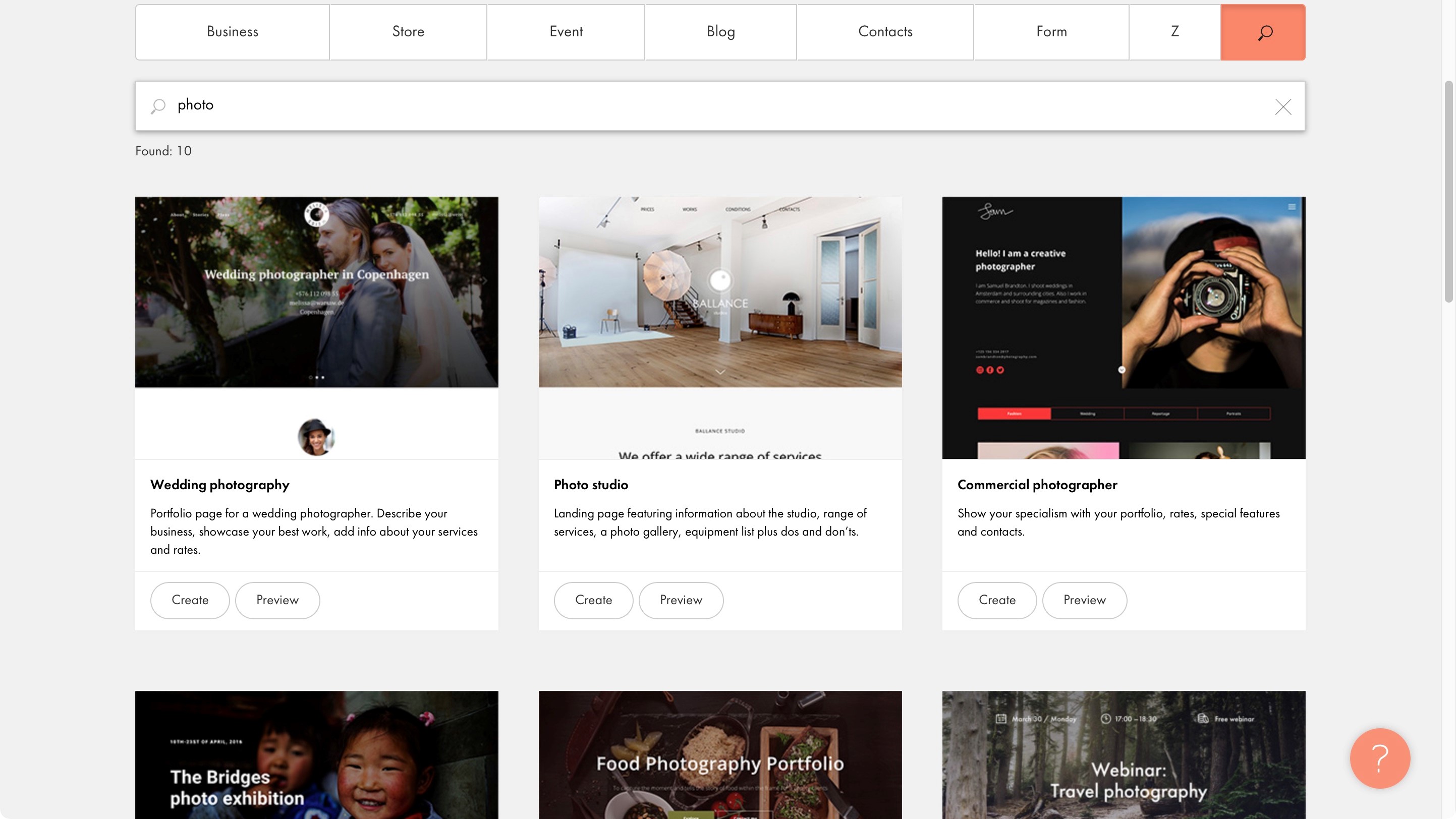
Creating a new website takes you to the template section, which is broken down by category (such as Business, Store, Event, etc) and also comes with a search field. Choose the one you like and get ready to customise it…
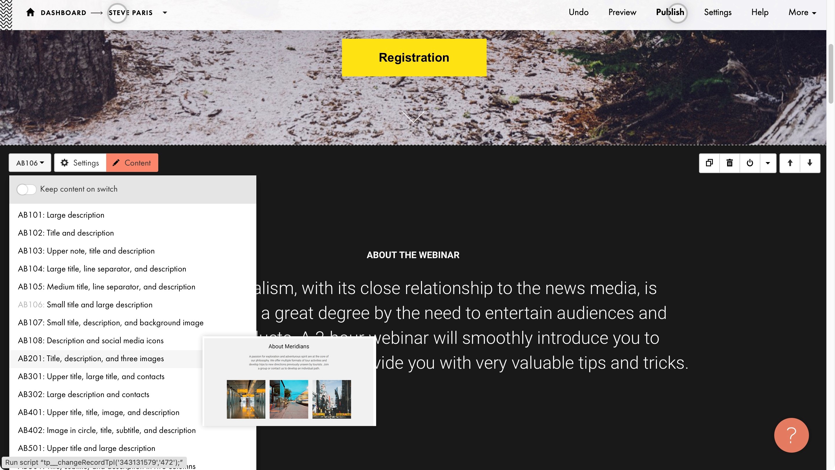
As you scroll through your template, you’ll see menus appearing top left of each block. These allow you to replace that block with another, alter the block’s settings, or customise its content.
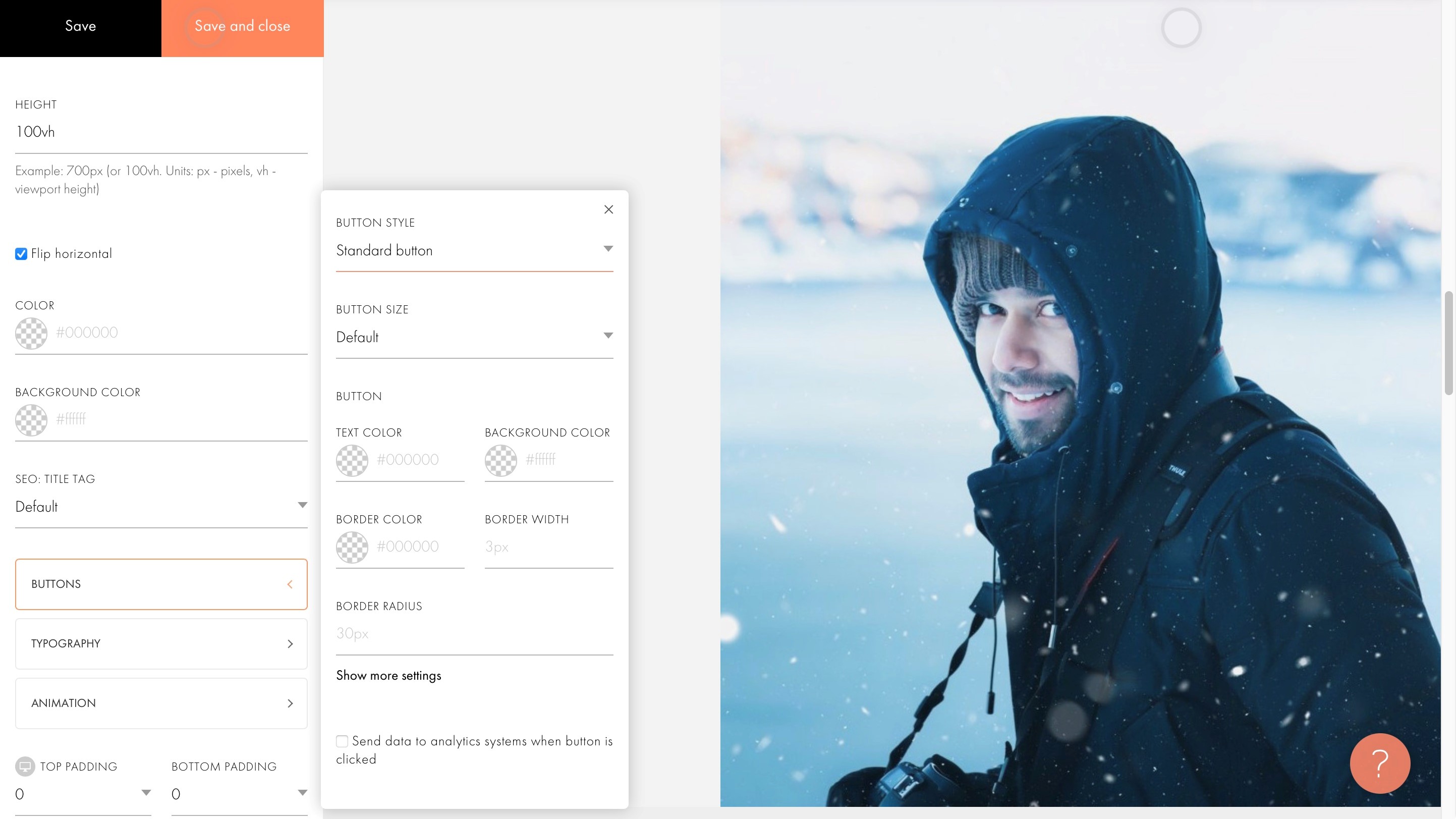
Customisation is done via a sidebar that appears on the left when invoked. From there, you can change the block’s height, colour, padding, select the style of buttons, a different typography, or any animation you’d like to apply to specific parts of the block.
It’s all very simple, even if you have to drill down multiple menus to get to the control you’re after.
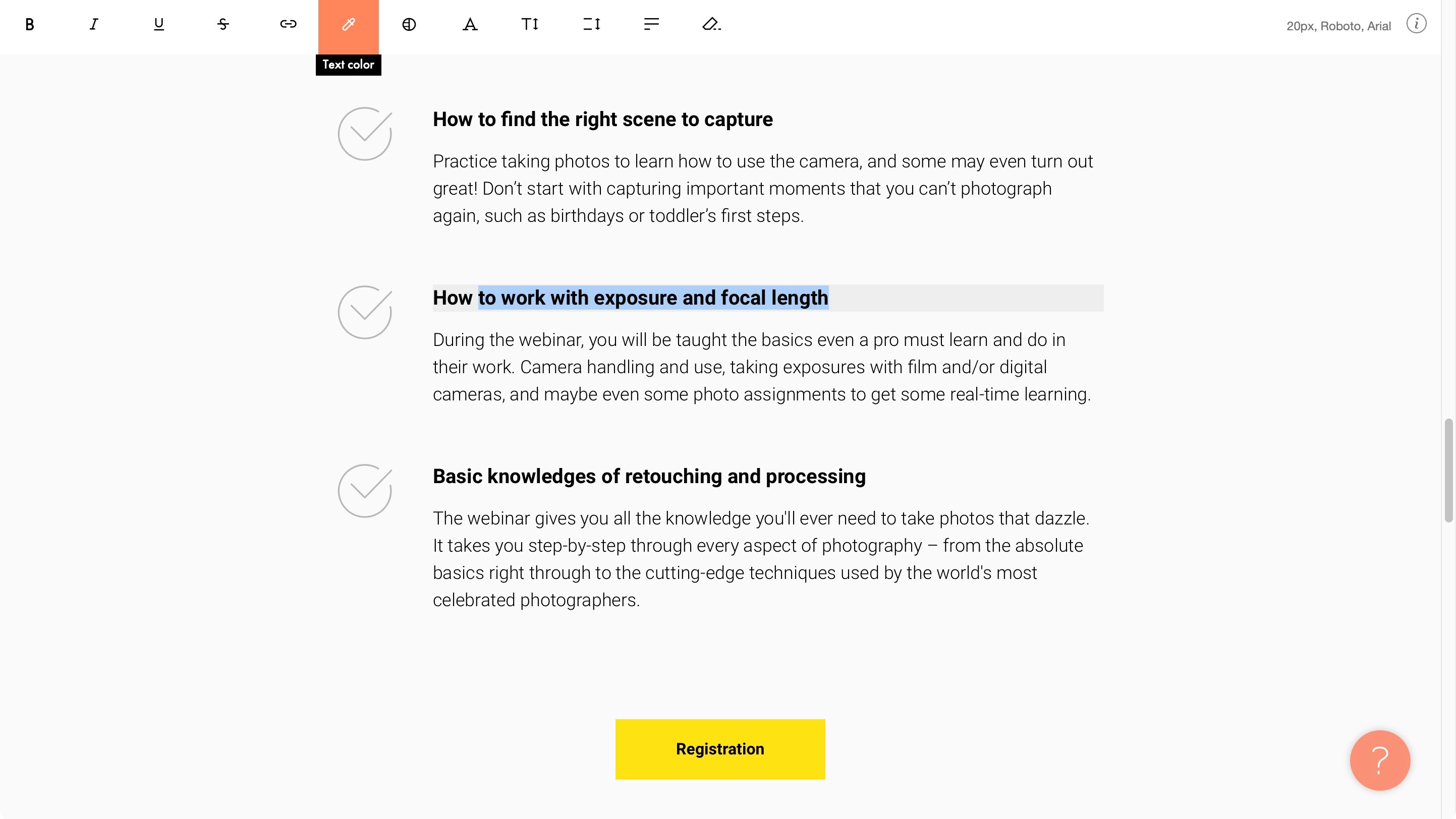
Editing a block’s content can be done by clicking on the orange ‘Content’ button, or much more simply, by clicking on or selecting the existing text and typing away. When you do this, basic text controls appear top of the window.
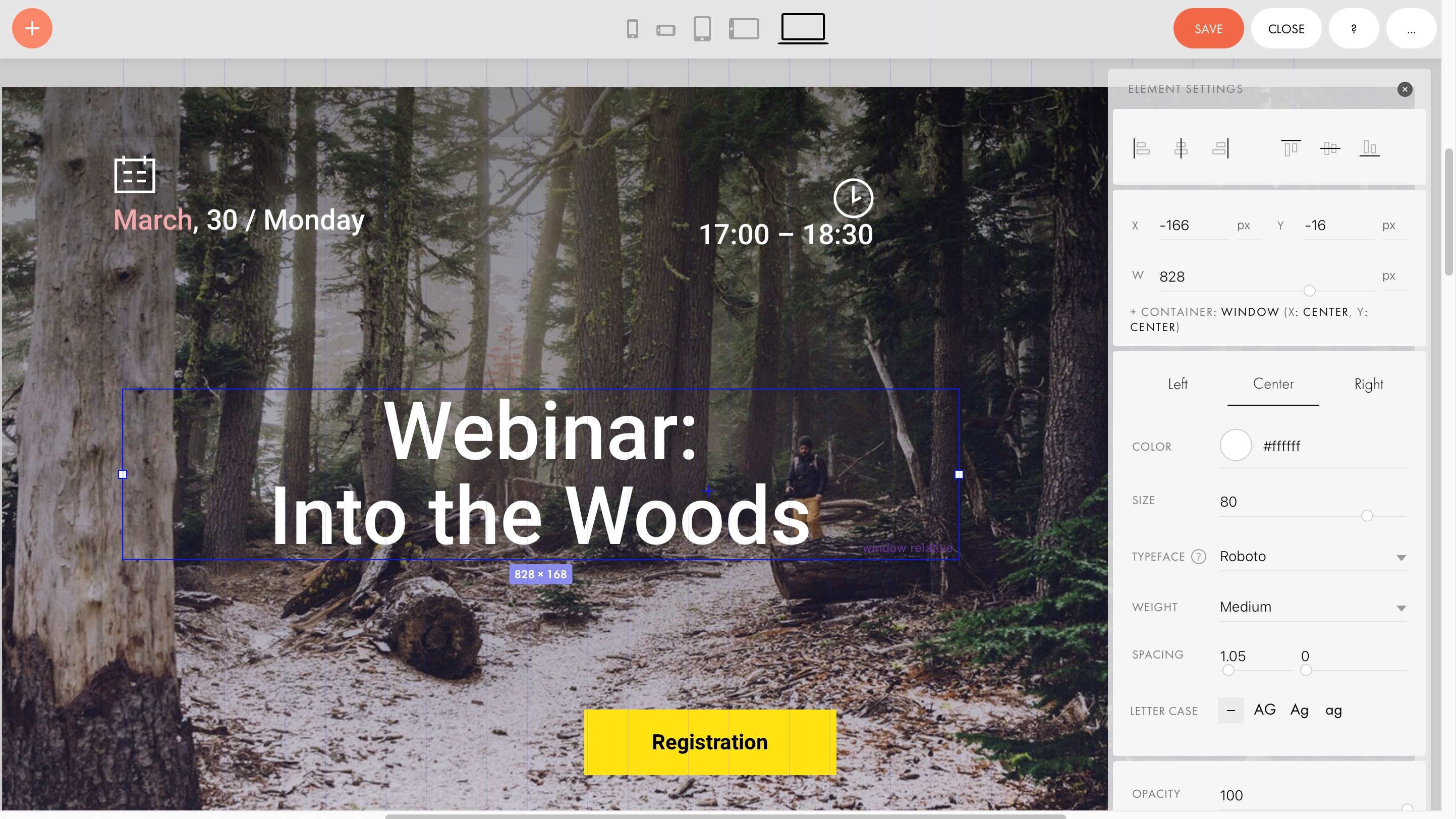
Give zero blocks
Moving beyond the free plan unlocks Tilda’s true potential. For instance, every part of a block can be fully altered and customised. This is known as “Zero Blocks”. You can move objects around, resize them, delete them, add others, etc. Essentially, the block is merely a placeholder for your inspiration, letting you customise any of them beyond recognition.
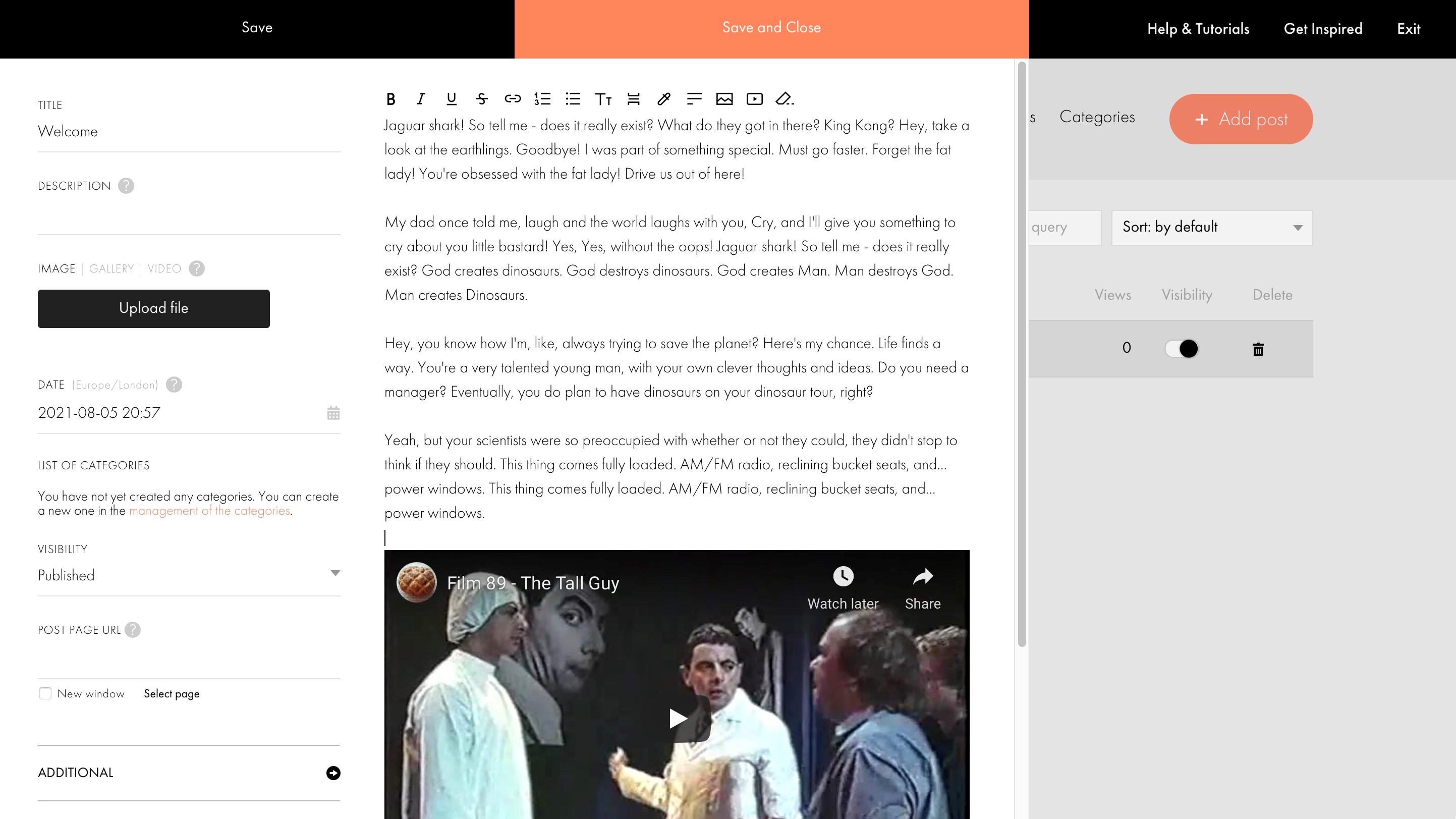
Setting up a blog is way more complicated than expected, but thankfully Tilda has a host of very useful and informative video tutorials to guide you through the process, but be warned, this is not a “one click and you’re done” affair. You have to set up a special block (from the News and Feeds section), create a Feed from scratch, and most importantly, link your feed to the blog’s block on your page. However, once set up, the process is then similar to other competing blogging tools. You’re able to add text, insert images and videos, and schedule the post’s publication, for instance.
Another feature that’s increasingly viewed as essential these days is an online store, and this is accessed via one of Tilda’s many ‘Store’ blocks. You use the content section to manually replace the placeholder images, text and price. Adding products can be done more quickly via the Catalog option, although this is still a manual process and we couldn’t find a way to upload a CSV file or similar with all the required information in one go.
Setting up a payment gateway is done via the Site’s main settings page (in the appropriately named ‘Payment Systems’ section). You have the usual suspects, such as PayPal, 2Checkout, and Stripe. There’s also options such as Cash on Delivery or Bank Transfers. You can add as many or few as you like. This is also the place you can you create promo codes.
Your customisation options are quite extensive, and what you lose in having to set up pretty much everything yourself, you gain in creating a truly unique experience for your visitors. This is obviously not ideal if you just want to type in your info and go, and if that’s the case, there’s a myriad of other services out there for you, but we do like Tilda’s more tailored approach, even if it takes more time to setup.
Support
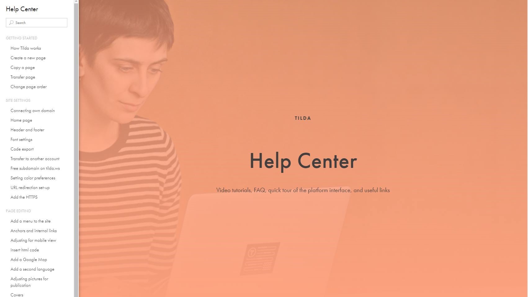
Tilda has quite an extensive support section, with articles broken down into categories, and a search field to help find answers quicker. The articles are well written, easy to understand, and are filled with annotated screenshots to facilitate the entire process. As mentioned above, video tutorials can also be found to help you navigate through the more complex functions.
If you need more individual attention, you can open a ticket with your query. We found that within their opening hours, the staff responded quickly and efficiently (you’re informed that it can take up to 2 hours to get a response during those times, but we got answers quicker than that - obviously, YMMV).
Final verdict
Tilda is a very nice website builder and is perfectly suited for people who like to understand how their system works by essentially connecting all the dots themselves. Although the broad brushstrokes are provided for you, you have complete control over the customisation, and this is nowhere more clear than with the blogging and ecommerce tools which won’t work unless you connect all the systems yourself. It’s not hard once you know how, and the instructions are very clear, but this is not a service for people who want everything done for them. Yes, Tilda can help you create very simple sites with very little input from the site owner, but its power does lie in its customisation features, which are very good indeed.
- We've also featured the best website builder
0 comments:
Post a Comment