Sunday, July 30, 2023

Razer Blade 14 (2023) review: thin and light with big performance

Razer Blade 14 (2023): Two-minute review

This year’s Razer Blade 14 refresh has been outfitted with the latest specs, including the AMD Ryzen 9 7940HS CPU, which sports a 5.2 GHz max clock speed and eight cores/16 threads, and up to the Nvidia GeForce RTX 4070 GPU. Despite containing such powerful and normally heavy components, it still manages to remain lightweight and thin, a contrast to the much larger laptop models like the 16-inch and 18-inch ones. And not only are the specs themselves impressive, but the overall performance is too. The laptop can get hot during more intensive gaming sessions but it never once stuttered, slowed down, or froze.

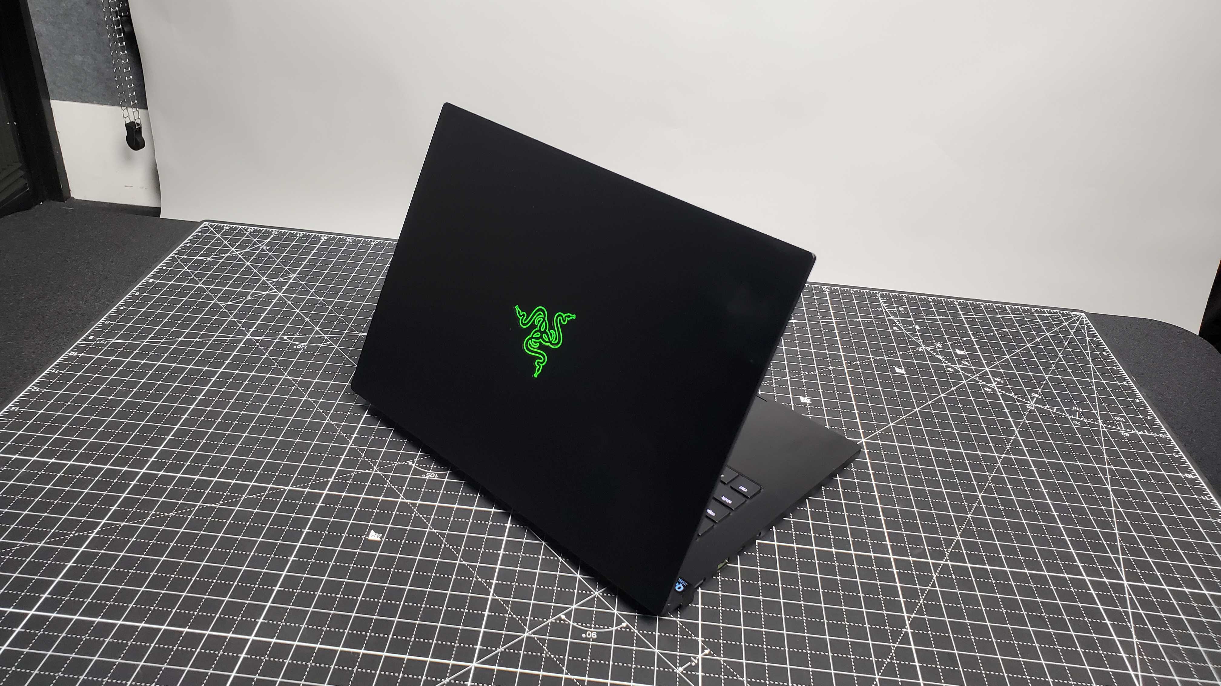
Its chassis is simply all black with the logo in green, the distinctive style of Razer products. There’s also a white version called Mercury, but unfortunately no Quartz from the 2022 model. It’s a little over four pounds with a thickness of less than one inch which, combined with the 14-inch display, makes it easy to carry around in most medium size bags. It’s ideal for those who need what might be one of the best gaming laptops to also be one of the best thin and light laptops for traveling.

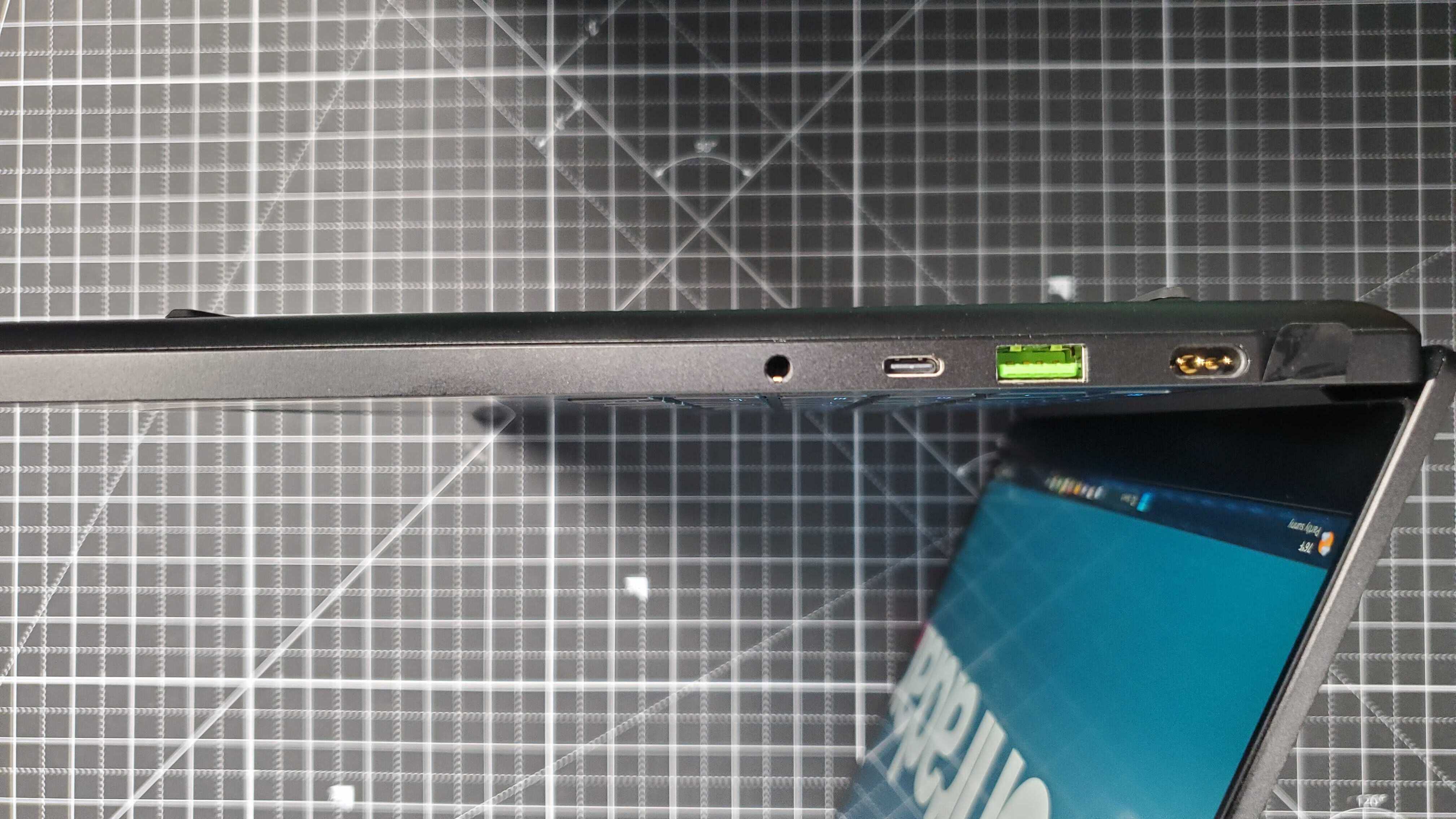
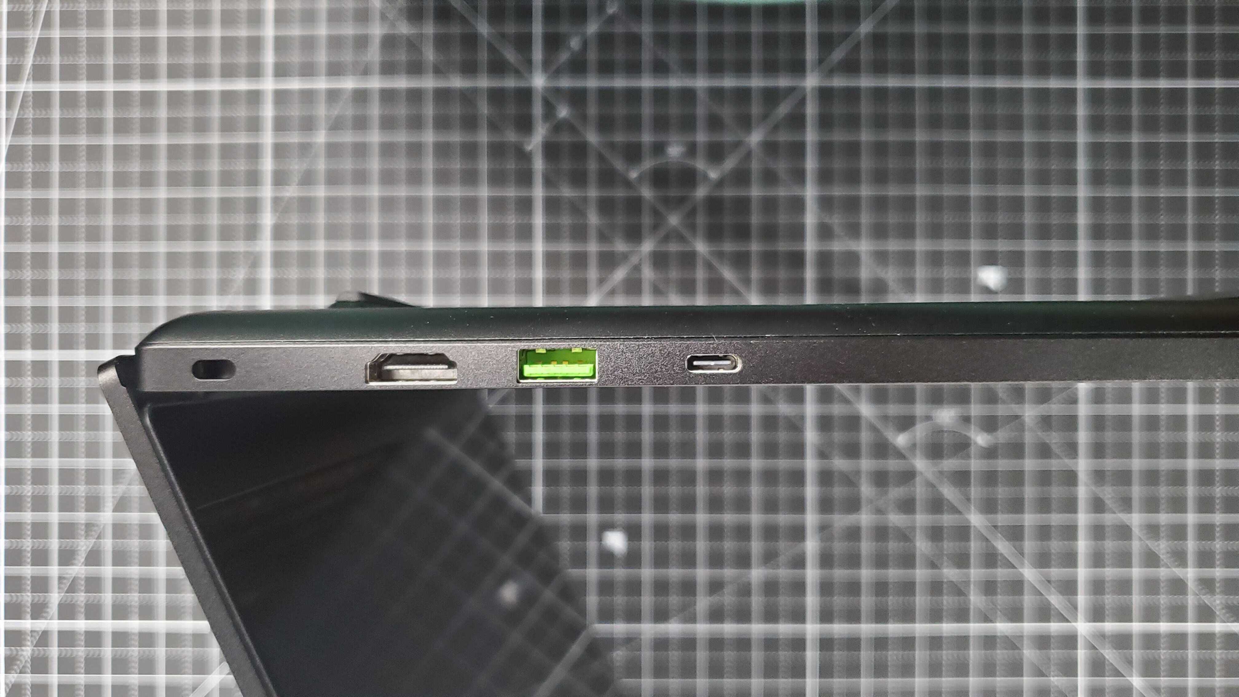
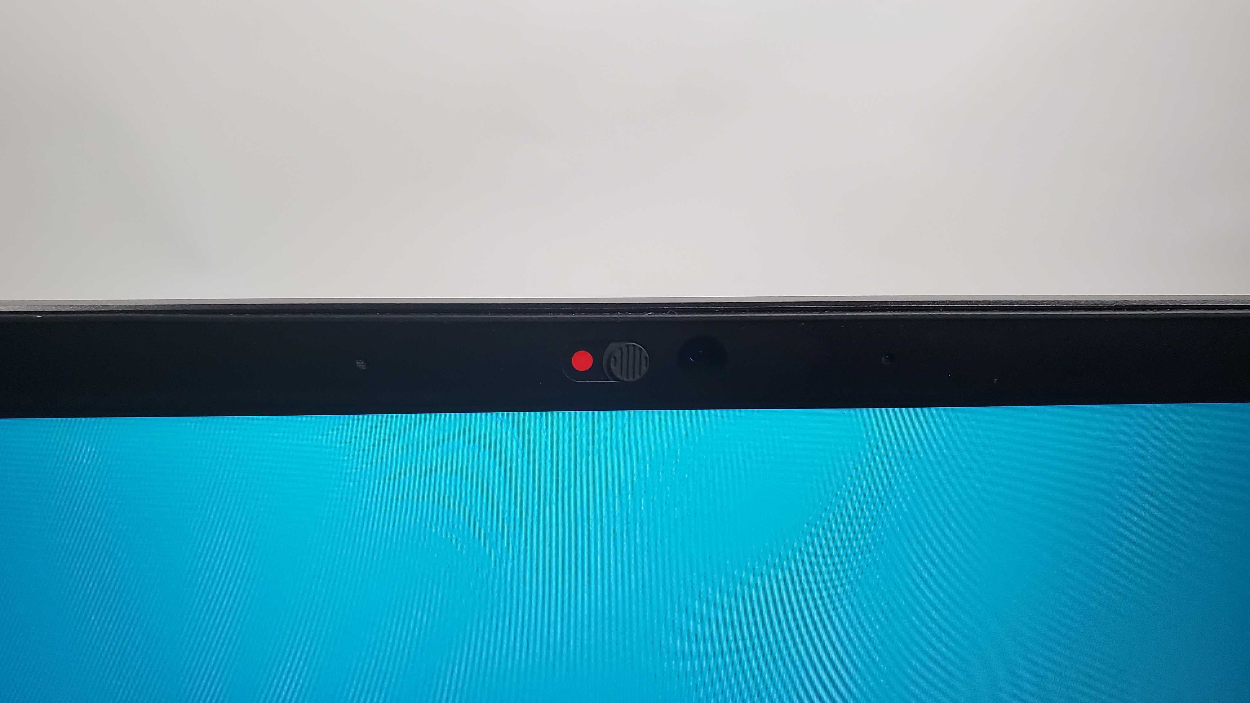
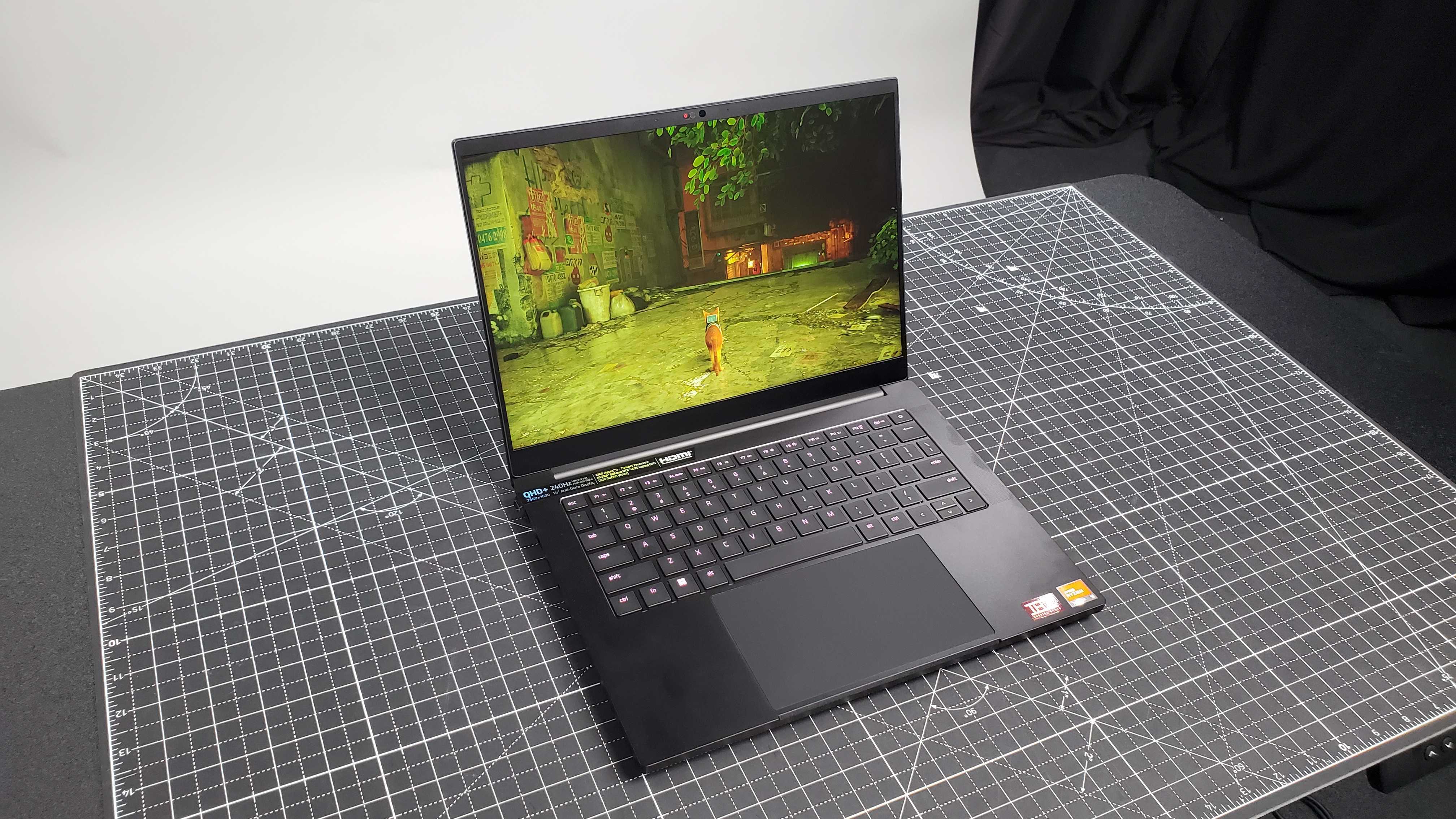
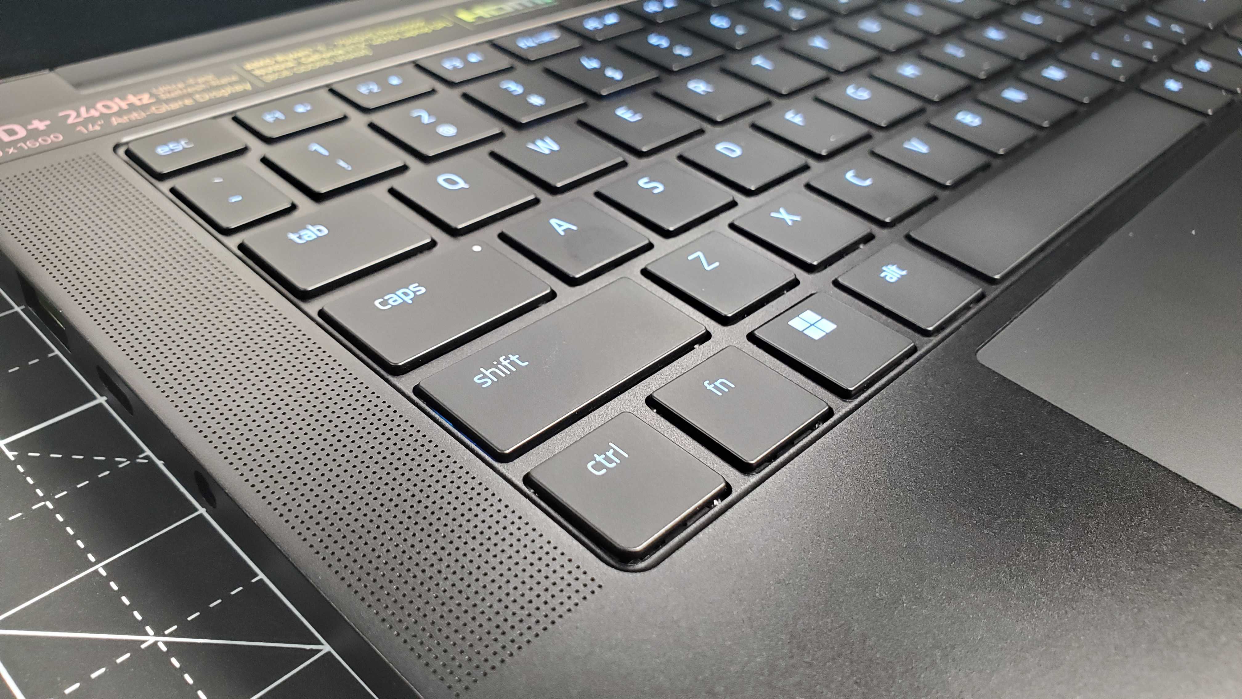
The display is gorgeous, featuring a QHD+ resolution and a mind-blowingly high refresh rate of 240Hz, an impressive response time of less than 3ms, and a 100% DCI-P3 color gamut. Both its keyboard and touchpad are responsive and have a satisfying snap. The keyboard also has customizable RGB lighting It also sports a solid port selection including two USB Type-A ports, two USB Type-C ports, an HDMI port, a power port, a Kensington lock, and an audio jack, though unfortunately there’s no SD card slot or ethernet port. Even better is that it has a physical webcam privacy shutter with a mechanical switch, an incredibly rare feature that’s more than welcome on the Blade 14.

Out of all the laptops that Razer released this generation, this is the most impressive one to me. Being able to produce a high-performance laptop with solid benchmark scores while not compromising on the build quality is no mean feat. The only spec that was a bit disappointing is the battery life. Razer claimed it could last up to 10-12 hours, and if going by pure productivity work then it gets close to that with eight hours of life. However, if you stream movies or play games, that gets cut down to a paltry four hours. It does charge quickly at least.

Its benchmark results are quite excellent, comparable to plenty of other similar spec laptops on the market like the Lenovo Legion 7i Pro or the Asus ROG Zephyrus M16. It’s able to keep pace with machines with better specs in benchmark tests. And for general performance, its framerate either keeps up with or passes other laptops with better specs. Ventilation isn’t too shabby either, as even when it does heat up, the performance never suffers.

When it comes to other performance metrics, like framerate, it also delivers great results. For instance, playing Cyberpunk 2077 on maxed-out settings gets you close to 60 fps, and I netted similar results for Dirt 5. Total War: Warhammer III naturally performed far above that amount in its highest settings. Titles like Marvel’s Spider-Man Remastered and Final Fantasy VII Remake also able performed well, consistently able to reach 70 fps or higher on the highest settings and with both ray-tracing and DLSS 3 enabled.

Razer Blade 14 (2023): Price & availability
rgb lit keyboard

(Image credit: Future)
  • Starting at $2,399 / £2,499 / AU$4,499
  • Available now 
  • Available in the US, UK, and Australia

Razer laptops tend to be quite expensive and the Razer Blade 14 (2023) is no exception. Despite it being a 14-inch laptop, it commands a starting price point of $2,399 / £2,499.99 / 4,499 which only increases as the GPU improves. With all specs completely maxed out including an RTX 4070 GPU, 32GB of RAM, 1TB of storage, and the Mercury color which costs an extra $400 and defaults to 32GB RAM and RTX 4070, you’ll be paying $2,799.99 / £2,899.99 / AU$5,299.

Compared to other laptops with similar builds but larger display sizes like the Samsung Galaxy Book3 Ultra, you’re paying far more money. And other gaming laptops with somewhat similar specs but much larger sizes, like the Lenovo start around the same price range. Thankfully this laptop is available in the UK and Australia, which means no import fees or much higher shipping costs.

  • Price score: 4 / 5

Razer Blade 14 (2023): Specs
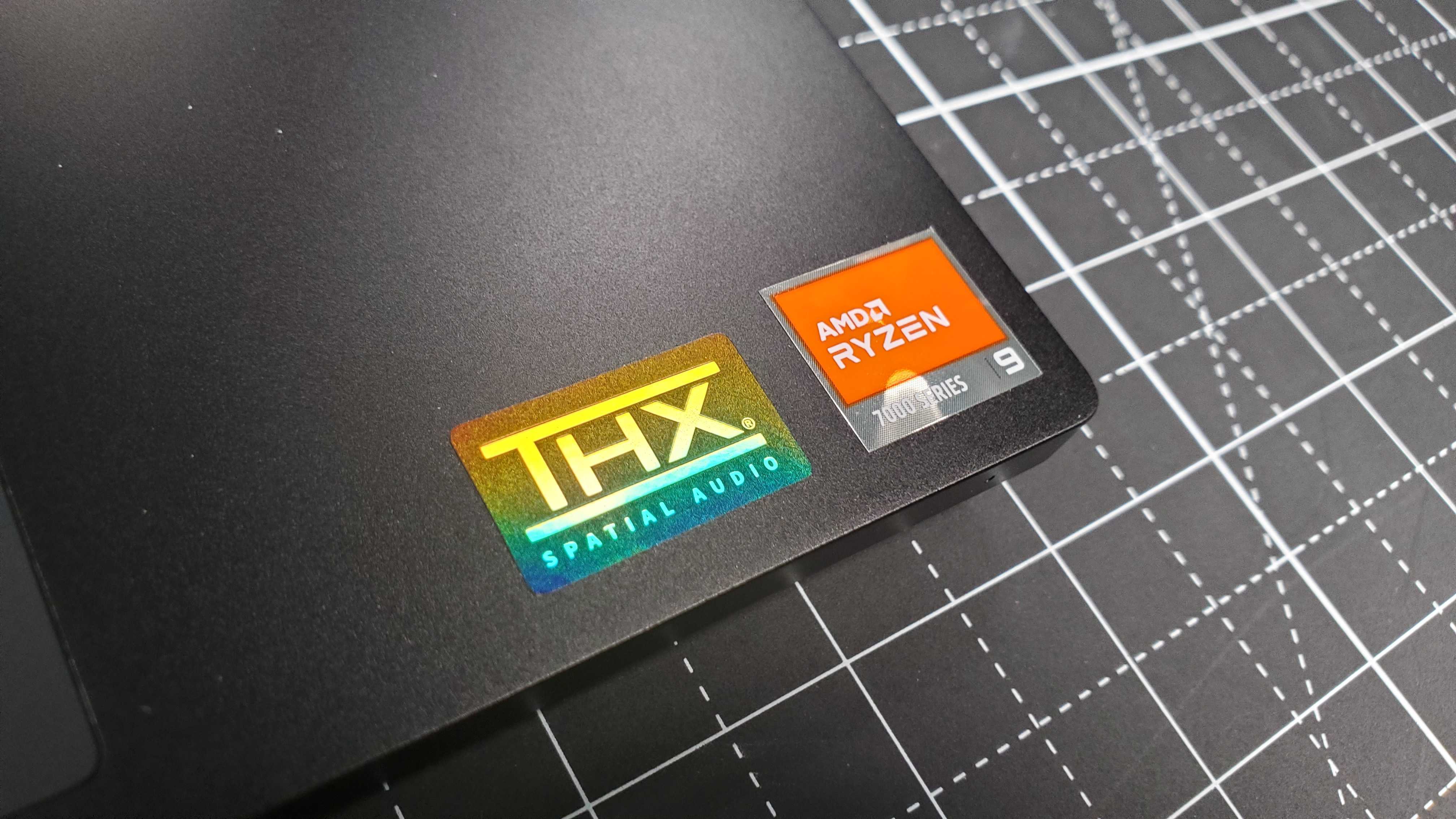
closeup of stickers

(Image credit: Future)

The Razer Blade 14 (2023) comes in two configurations, the base version is equipped with an Nvidia GeForce RTX 4060 GPU, 16GB of RAM, and comes in black. The second one has an RTX 4070 GPU, 32GB of RAM, and comes in the color Mercury. 

Only color, RAM, and GPU can be configured before purchase, and it's based on said color choice you make, with the Mercury version solely having access to the higher specs. Otherwise, it can’t be configured by the user after purchase.

  • Specs score: 4.5 / 5

black gaming laptop

(Image credit: Future)

Razer Blade 14 (2023): Design

  • Thin and light
  • Great audio system
  • Limited color choices

Razer is known for having some of the best thin and light laptops on the market. And while previously released 2023 models have bucked that trend by embracing the desktop replacement format, the Razer Blade 14 (2023) is a return to form. Despite being equipped with an RTX 4070 GPU at best, it’s a mere four pounds and is less than one inch thick. And thanks to the 14-inch display, it fits into most medium and up-size bags, making it easy to transport while barely feeling the weight.

It comes in two colors, black and Mercury, though the Quartz color from the 2022 version is not available. Disappointing as it set the laptop apart from the generic gamer aesthetic, which the other two colors unfortunately follow. Hopefully, Razer will release a refresh of the Quartz version later this year.
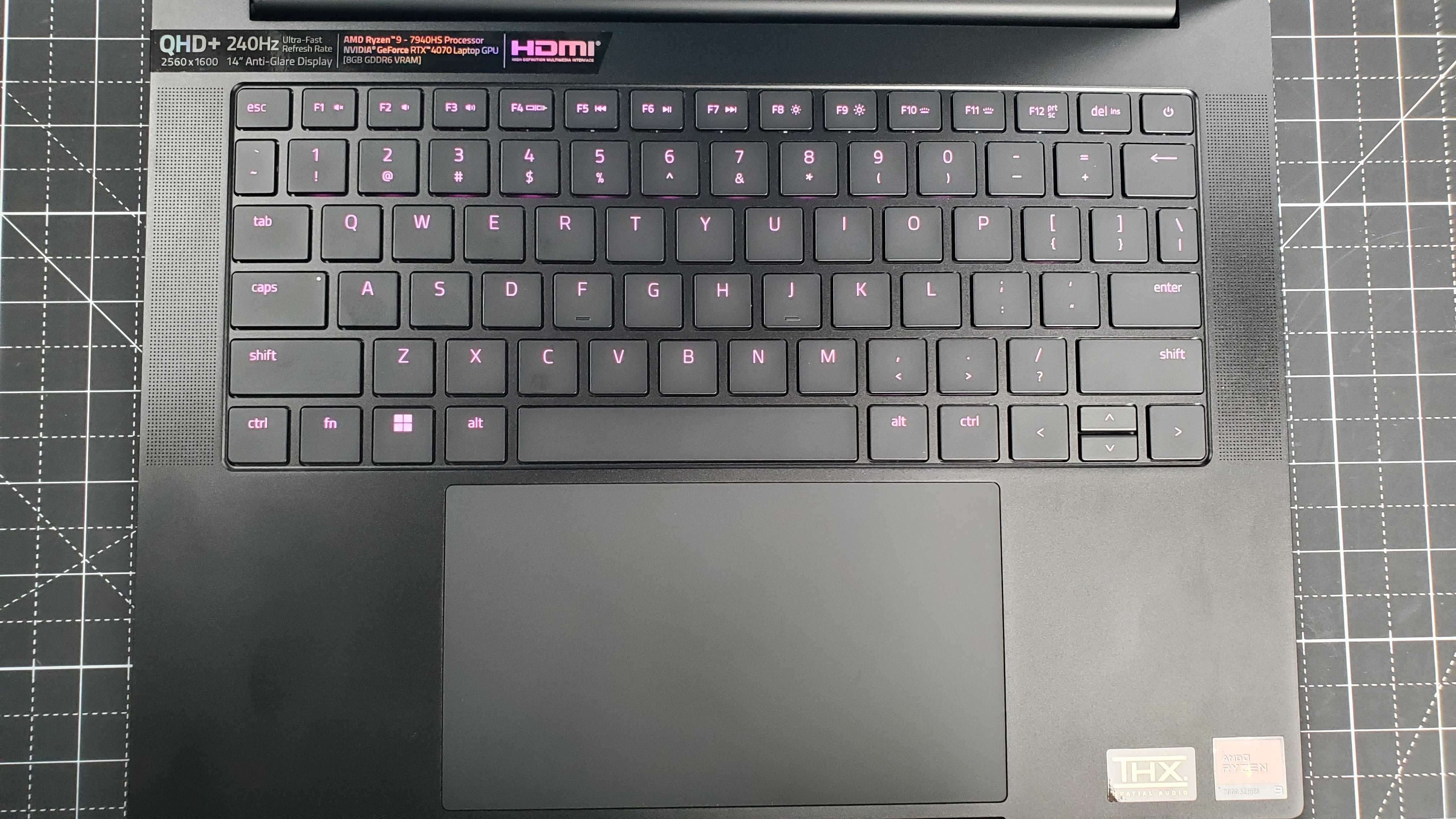
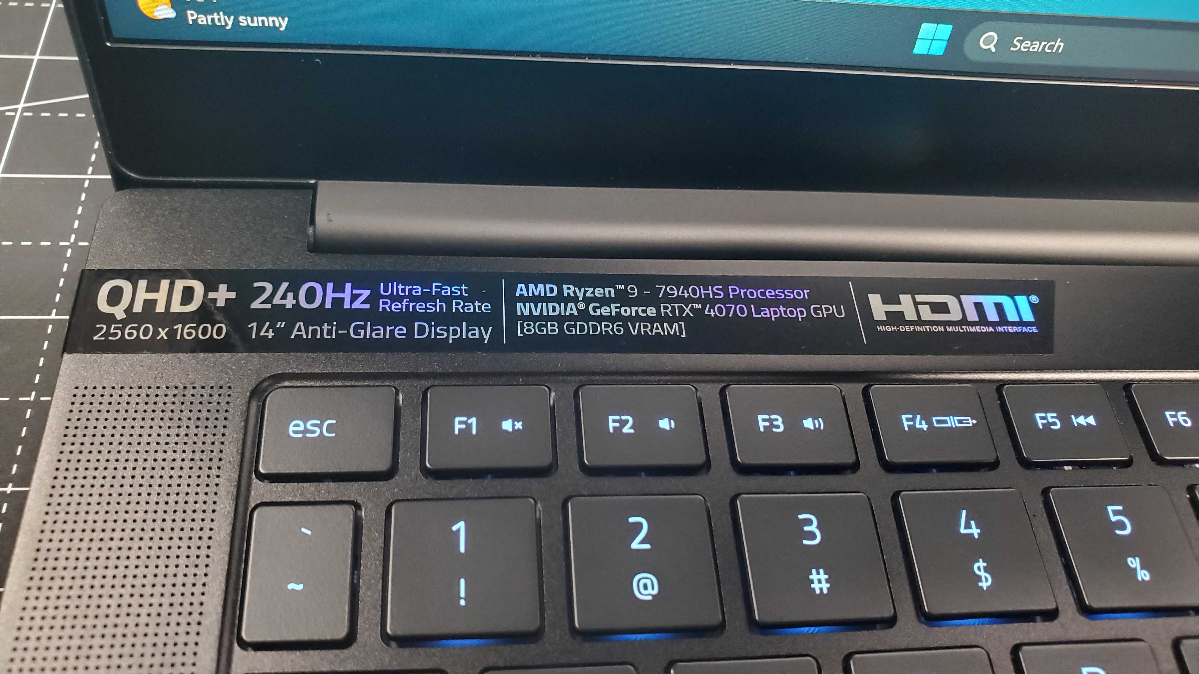
Image 1 of 6

rgb lit keyboard

(Image credit: Future)
Image 2 of 6

closeup of stickers

(Image credit: Future)
Image 3 of 6

black gaming laptop ports

(Image credit: Future)
Image 4 of 6

black gaming laptop ports

(Image credit: Future)
Image 5 of 6

black gaming laptop

(Image credit: Future)
Image 6 of 6

closeup of webcam switch

(Image credit: Future)

The display itself is beautiful with excellent performance thanks to the QHD+ resolution, a  refresh rate of 240Hz, a response time of less than 3ms, and a 100% DCI-P3 color gamut. The port selection is also solid as it includes two USB Type-A ports, two USB Type-C ports, an HDMI port, a power port, a Kensington lock, and an audio jack. On the downside, there’s no SD card slot or ethernet port, limiting your options to connect this laptop to another screen or a stable wired internet connection. It does come with a feature that many laptops lack, however, which is a physical webcam privacy shutter with a mechanical switch.

Both the keyboard and the touchpad have a satisfying snap when pressing down. The former’s keys are large enough to cater to most finger sizes and the latter is responsive with that clicky feedback I enjoy in a touchpad. 

Razer’s decision to have dual speakers on either side of the keyboard was a good one, as the sound quality is clear. Though the volume isn’t as loud as I would like it, the clarity in each musical instrument and audio cue while playing games or streaming is top-notch and more than worth the tradeoff. I wish the same could be said for the webcam’s visual quality, which isn’t bad but has the mediocre framerate and poor quality in low light that most gaming laptops suffer from.

  • Design score: 4.5 / 5

black gaming laptop with rgb lit keyboard

(Image credit: Future)

Razer Blade 14 (2023): Performance

  • Excellent gaming performance
  • Performs well in creative and editing projects
  • Can run hot at times
Razer Blade 14 (2023): Benchmarks

Here's how the Razer Blade 14 (2023) performed in our suite of benchmark tests:

3DMark: Night Raid: 51,538; Fire Strike: 26,443; Time Spy: 11,021; Port Royal: 7,001
GeekBench 5: 2,006 (single-core); 11,121 (multi-core)
Cinebench:
15,058 (multi-core)
Total War: Warhammer III (1080p, Ultra):
101 fps; (1080p, Low): 239 fps
Cyberpunk 2077 (1080p, Ultra): 59 fps; (1080p, Low): 122 fps
Dirt 5 (1080p, Ultra): 77 fps; (1080p, Low): 101 fps
25GB File Copy: 21.8
Handbrake 1.6: 4:45
CrossMark: Overall: 1,812 Productivity: 1,774 Creativity: 1,923 Responsiveness: 1,610
Web Surfing (Battery Informant): 8:34:52
PCMark 10 Battery Life: 3 hours and 54 minutes 

Despite the usual thin and light chassis of a Razor laptop, the Razor Blade 14 (2023) boasts excellent gaming performance that compares to other similar gaming laptops. Benchmark results are quite excellent, comparable to plenty of other similar spec laptops on the market like the Legion 7i Pro or the ROG Zephyrus M16. This is especially impressive considering that the test units of the other two laptops are more powerful than the Razer Blade 14, and yet the latter can nearly match scores. 

In terms of gaming performance, despite the difference in specs, it seems that the Blade 14’s CPU and GPU work much better in tandem, as frame rates usually match and in the case of Cyberpunk 2077, actually surpass the other laptops in high settings. In Marvel’s Spider-Man, the framerate doesn’t dip below 75 fps even under the highest possible settings. And thanks to the Blade 14 display’s high refresh rate, the gameplay looks and feels buttery smooth, a boon for hardcore and professional gamers.

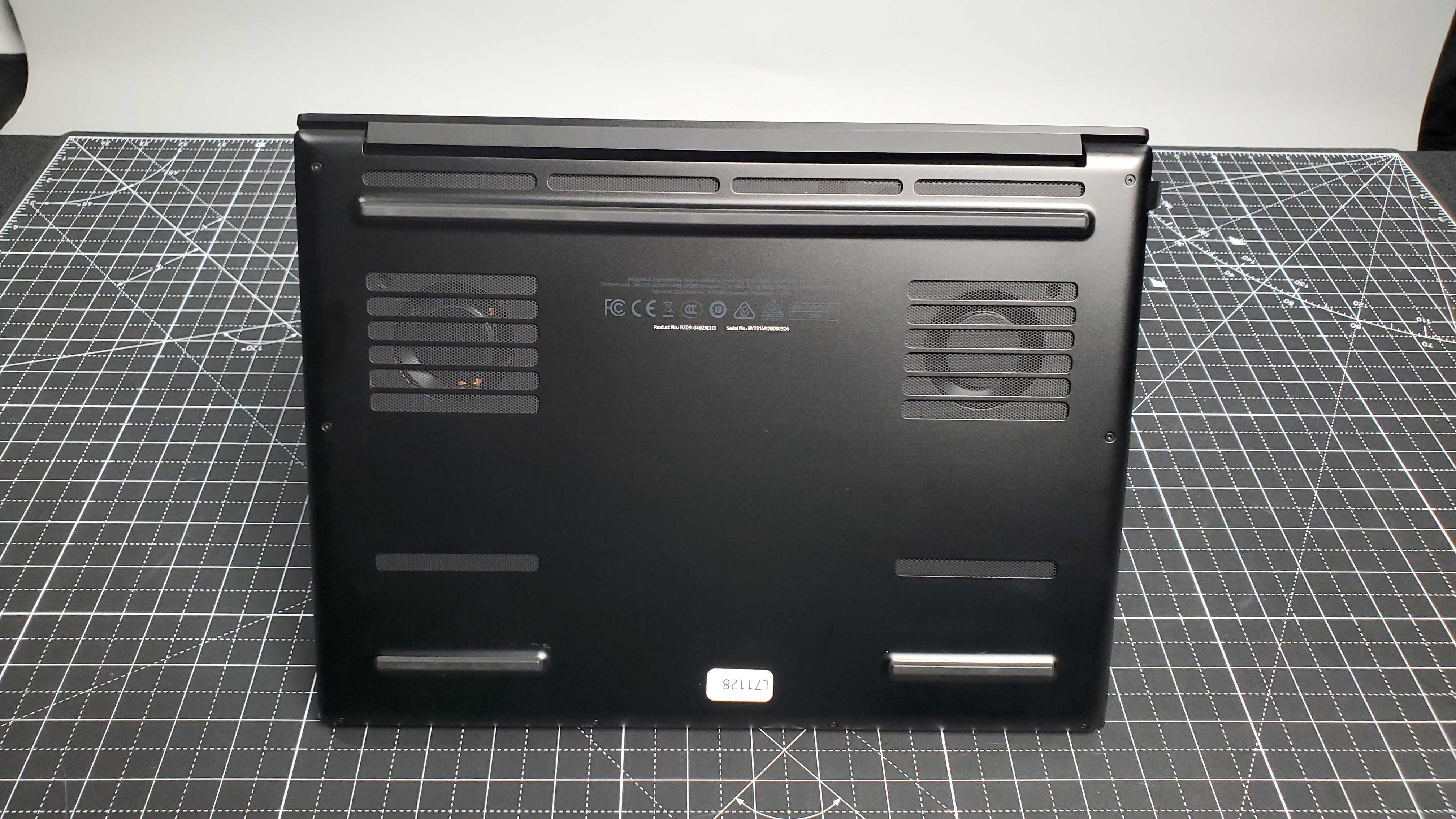
Ventilation isn’t bad for such a relatively thin laptop; even though it does heat up when during an intense gaming session, I’ve never experienced any stuttering, freezing, or slowing down while playing. 

It also performs well for those needing a creative or editing machine, as it netted pretty solid 25GB File Copy, Handbrake, and CrossMark scores, not to mention the 100% DCI-P3 color gamut. It’s a well-balanced laptop that, while specializing in gaming, can also dabble in pretty much any other need you have and handle it well.

  • Performance score: 5 / 5

Razer Blade 14 (2023): Battery
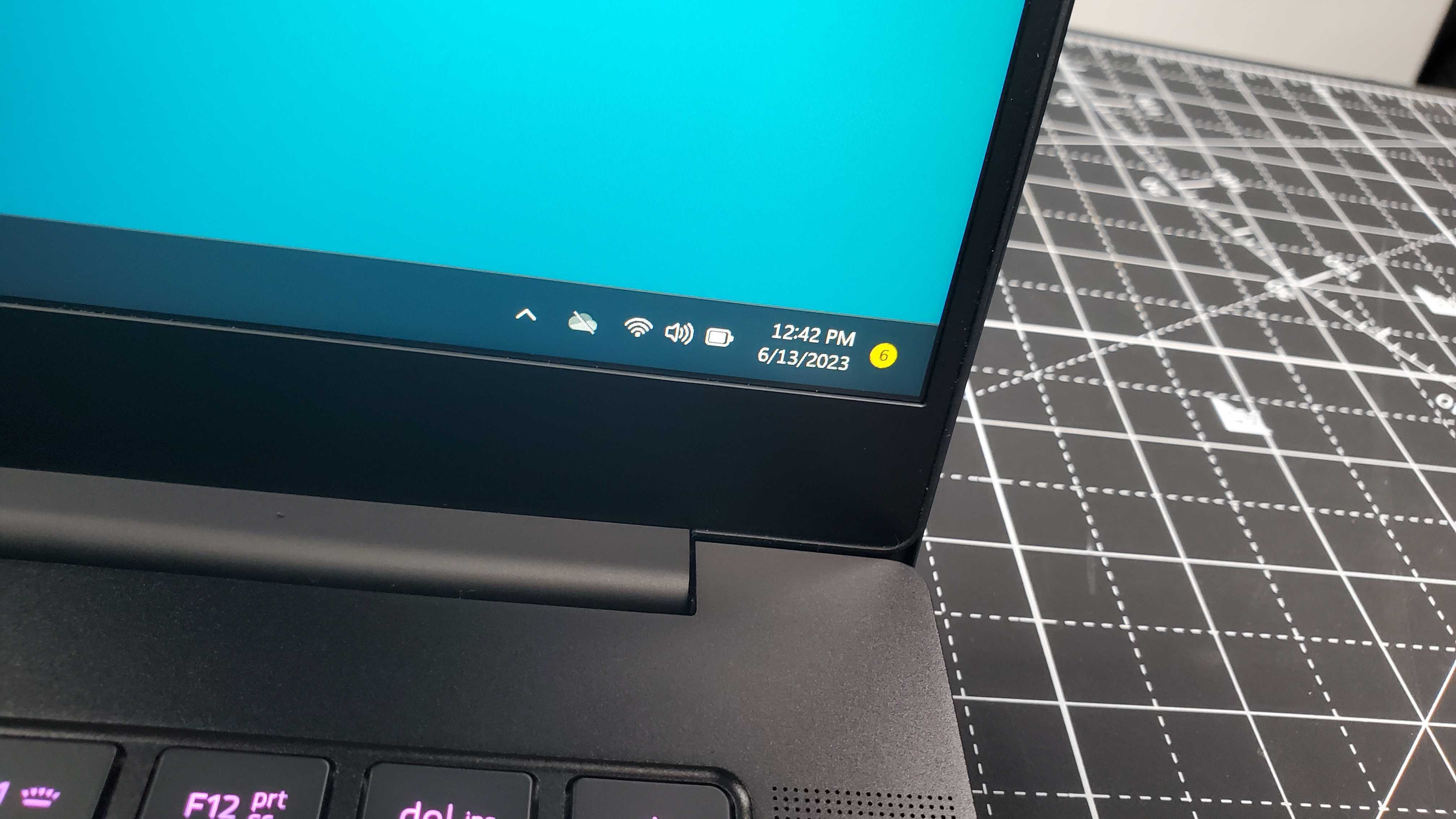
closeup of battery life

(Image credit: Future)
  • Poor battery life
  • Charges quickly

According to Razer, the Razer Blade 14 (2023) is supposed to have up to 10 hours of battery life. And it does come close to that, eight hours just about, but only when used for productivity work. When used for streaming or gaming, that battery life is cut in half to four hours at most, which means you’ll be keeping it plugged in for any intensive usage.

It does have the benefit of charging quickly, with it taking only an hour to fully charge the battery. So if you need a productivity laptop that will last for about a full workday then it’ll last and charge right back up in no time.

  • Battery score: 3.5 / 5

Should you buy the Razer Blade 14 (2023)?

Buy it if...

You want a thin and light gaming laptop
Just as Razer is known for, this laptop weighs surprisingly little for its specs and can fit into most bags and be carried around with ease.

Don't buy it if...

You’re on a budget
Razer laptops are not meant for those without excess cash flow and this model is no exception.

Razer Blade 14 (2023): Also consider

If the Razer Blade 14 (2023) has you considering other options, here are two more laptops to consider...

How I tested the Razer Blade 14 (2023)

  • I tested this laptop for about two weeks
  • I tested the gaming performance as well as productivity work
  • I used a variety of benchmark tests as well as high-end PC games to test this laptop.

To test out the Razer Blade 14 (2023) I used a full suite of benchmarks to rank both CPU and GPU performance, with more emphasis on the latter. I also tested out frame rate performance on max settings with a range of high-end PC games like Cyberpunk 2077, Dirt 5, Marvel’s Spider-Man Remastered, and more.

This laptop would primarily be used for gaming, specifically hardcore gaming. Due to its GPU and high color gamut, it can also be used for creative and editing projects, and its CPU means that productivity work is a breeze as well.

I’ve tested out many laptops, especially gaming ones, which gives me plenty of experience with properly benchmarking them. I also have extensive knowledge of testing out general performance such as framerate and graphics.

Read more about how we test

First reviewed July 2023
Victrola Stream Carbon review: a Sonos-connected turntable with style

Record players – they’re all the same, right? Well, not quite. Certainly the Victrola Stream Carbon has one or two points of difference. And it’s exactly the sort of product you’d like to think a company that’s fast closing in on its 100th birthday (as America’s Victrola is) might come up with: rooted in heritage and experience, but forward-looking and innovative at the same time.

Priced at $799 / £899 / AU$1,199, the Stream Carbon goes up against some of the best turntables on the planet, from some of the most dependable and high-achieving brands. The likes of Pro-Ject and Rega in Europe, and Audio Technica and Technics in Asia will sell you a hugely well-regarded alternative for very similar money. But, of course, those brands are ‘only’ selling you a classic wired record player, whereas Victrola is throwing in some very unlikely functionality for the money, in the form of wireless Sonos connectivity.

The Stream Carbon is a belt-drive turntable that can handle 33.3 and 45rpm speeds – speed-change is automatic, via a little button on its plinth. It’s fitted with a straight, carbon-fiber tonearm that’s 225mm long and comes with a very decent Ortofon 2M Red moving magnet cartridge already attached. It has an anti-skate control to adjust, and a counterweight that needs to be fitted – otherwise it’s pretty much ready to go. And, up to this point, far from extraordinary, but all very welcome.

On the rear of the chassis, alongside an input for power, there is a pair of stereo RCA outputs. The Stream Carbon features an ‘always on’ phono stage, which means it can be connected to pretty much any system or wireless speaker you fancy. And there’s also an Ethernet socket, which it’s safe to say is quite a rare feature on a record player. The Victrola has Wi-Fi built in, too, and it has a control app. Use the app to get the Stream Carbon onto the same network as your Sonos system, and it will integrate itself into the Sonos S2 control app as a source of music. This, then, is what constitutes ‘Works with Sonos’.

Victrola Stream Carbon close-up of the main body of the deck

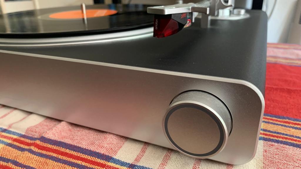
Just because the Victrola Stream Carbon goes Wi-Fi doesn't mean giving hi-fi treats, such a big chunky dial. (Image credit: Future)

At the front of the chassis there’s a big control dial with an illuminated section, the colour of which indicates a) power on, b) pairing to a Sonos system is available, and c) pairing is complete. After that, it works as a volume control.  

The way the platter is sunk into the top of the chassis makes for a very clean, quite sophisticated look. Fitting the dust cover, which sits almost flush to the platter and has a tunnel to accept the tone-arm, undermines the aesthetic somewhat – but then you didn’t buy a record player in order to look at it, did you?

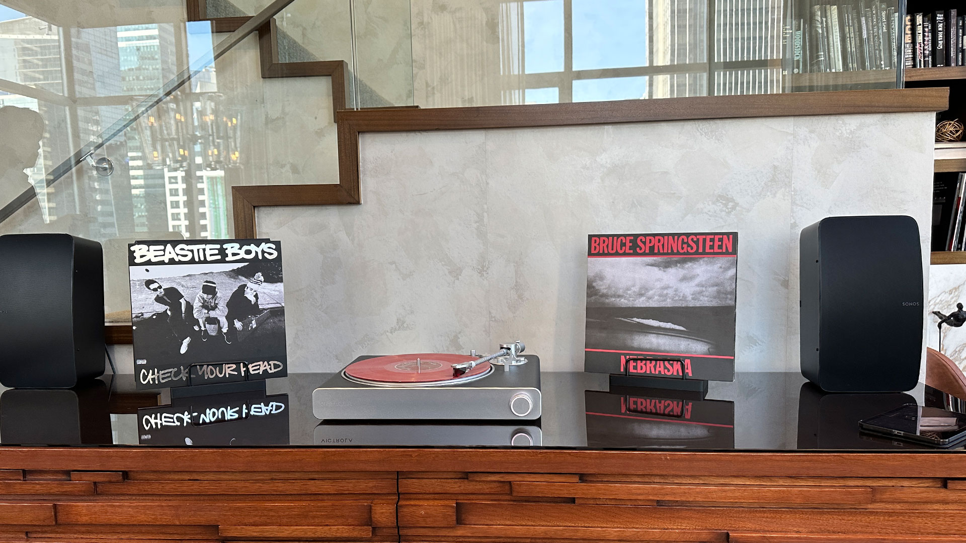
It seems only reasonable to begin by listening to the Stream Carbon as it wirelessly streams to a Sonos Era 300 (and to a Sonos Arc a little later, just for variety’s sake). The wireless connection is made in a trice, and proves flawless throughout my listening period – no drops, no wobbles. And with a selection of vinyl ranging from an elderly copy of David Bowie’s Pin Ups to a fresh 180g reissue of The Cinematic Orchestra’s Every Day playing, the Victrola proves a remarkably consistent listen.

Victrola Stream Carbon with Sonos speakers

Here's the Victrola Stream Carbon with a pair of Sonos Fives. (Image credit: Future / Lance Ulanoff)

It serves up a hefty, weighty sound with considerable low-frequency presence. But bass sounds are quite rapid and reasonably well controlled, so this chunkiness is not at the expense of momentum or rhythmic expression. Detail levels are acceptably high, even when we’re talking about those fleeting, transient details that are gone almost as soon as they arrive – the Stream Carbon is beady-eyed in this respect, and lets very little escape. 

It has quite neutral and natural tonality throughout the frequency range, which helps the consistency of its presentation no end. The soundstage it creates is reasonably spacious and well-defined, so the midrange projects well and allows a vocalist to express themselves to the full. The top end has a little of that crucial bite and shine, although ultimately treble sounds are rolled off and err on the side of caution.

Switch to a hard-wired connection to a stereo system and, in broad terms, the story is the same. Significant low-end presence, impressive detail retrieval, treble sounds that are definitely on the safe side, and a midrange that communicates well. The integration of the frequency range is smooth and, yes, consistent, and the Stream Carbon describes rhythms with square-edged precision.

Where the Victrola comes up short is when it comes to dynamics, intensity and any sense of engagement with the music it’s playing. It sounds completely matter-of-fact, unwilling or unable to deviate from a set level of intensity no matter if the music demands it or not. The distance between ‘gentle introspection’ and ‘eye-popping attack’ just isn’t any distance at all where the Stream Carbon is concerned. 

There’s next-to-no animation to the sound of the Victrola, and consequently no sense of engagement with the music it’s playing – ‘tedious’ is perhaps only slightly too strong a way of describing it.

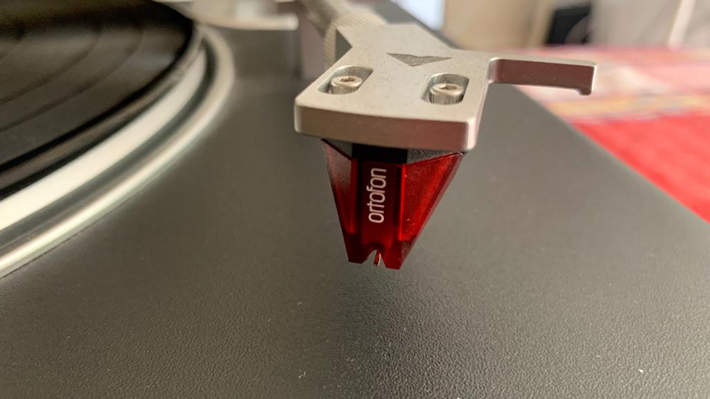
Victrola Stream Carbon, with a close-up of Ortofon cartridge

The Victrola Stream Carbon comes an nice Ortofon cartridge ready to go out of the box – just what the Sonos user wants. (Image credit: Future)

Victrola Stream Carbon review: Price & release date

The Victrola Stream Carbon was released in October 2022, and in the United Kingdom it’s priced at a chunky £899. It’s an altogether more acceptable $799 in the United States, while in Australia it sells for AU$1,199.

This, it hardly needs overstating, is Proper Turntable money – many credible brands have a record player to sell you at this kind of asking price. Mind you, none of them can do what the Stream Carbon can do…

Victrola Stream Carbon review: Specs

Should I buy the Victrola Stream Carbon?

Buy it if...

Don't buy it if...

Victrola Stream Carbon review: Also consider

How I tested the Victrola Stream Carbon

  • Tested for over a week
  • Used in a listening room, on a dedicated support
  • Wireless stream to Sonos Arc and Sonos Era 300, hard-wired to a reference stereo system

The real beauty of the Victrola Stream Carbon, of course, is that you can hear it all over your Sonos-equipped home without having to make much effort at all. So once it was positioned on the top of my equipment rack, I connected it to my stereo system and listened to it via its phono stage. And then I listened to it on a speaker in the kitchen, and then on a soundbar in the living room. 

At no point did it threaten to give up its wireless connection, and at no point did I find its sound compelled me to just put on record after record. Some record players can do that, but this is not one of them. 

  • First reviewed: February 2023

Emma NextGen Premium mattress review 2023: a sprung mattress with foam benefits

Emma NextGen Premium mattress: two-minute review

Announced in April 2023 and released not long after, the Emma NextGen Premium mattress is something of a departure for a sleep brand that's made its name selling memory foam and hybrid mattresses. With three thin layers of foam sitting on top of tall 18cm pocket springs, it appears to have more in common with traditional pocket sprung mattresses than with other hybrid beds that you'd find in our best mattress guide.

The advantage to having such a deep spring layer is that it facilitates airflow and helps the NextGen Premium regulate temperature, and unlike many hybrids it doesn't feature foam side supports around the springs, again helping with airflow but, I discovered, resulting in less edge support than I'd have liked.

Emma rates the NextGen Premium as a 6.5/10 medium firm; having slept on it for the past month, I'd suggest that this is understating its firmness a bit. My previous mattress was a firm pocket sprung mattress with a memory foam top layer, and the NextGen Premium feels only slightly softer than that; I'd rate it more as a 7 or even a 7.5.

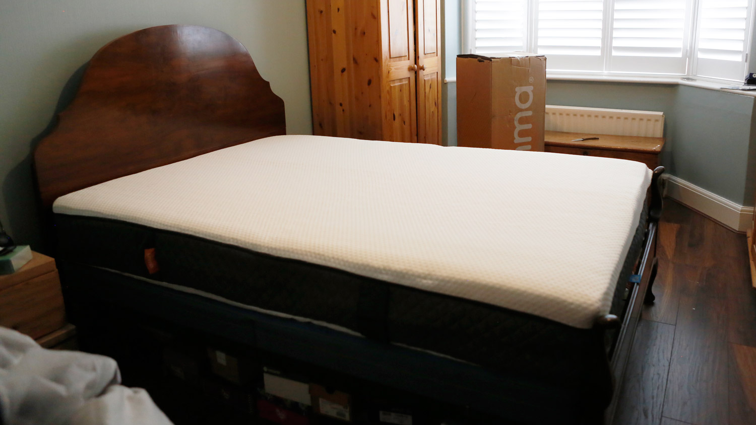
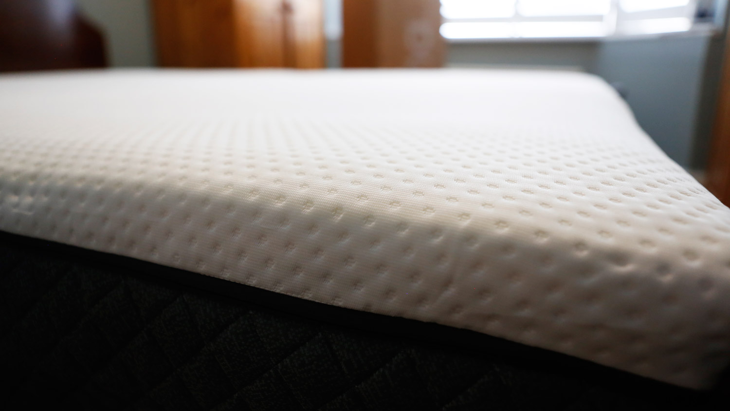
The Emma NextGen Premium just after decompressing

(Image credit: Future)

Hybrid and sprung mattresses tend to be a bit more bouncy and responsive than all-foam models, which means that they often don't deliver as well when it comes to motion isolation, and while the top memory foam layer in the NextGen Premium brings with it some sink-in comfort, it's not enough to completely deaden motion transfer. While the motion isolation isn't bad in the NextGen Premium, it's not brilliant; neither I nor my partner were disturbed by each other's movements in the night, there was definitely some small awareness of them. My subsequent tests confirmed that there's a bit of motion transfer going on, but not really enough to be a deal-breaker.

The Emma NextGen Premium comes in at the lower end of the premium price bracket, with a double selling for £959 at RRP. Mattress sales are a constant thing at Emma, but the brand switches up which mattresses are included in its sales on a regular basis; when it's reduced (which it is at the time of writing), the NextGen Premium can be had in a double size for £575.40, which to me feels like a much more realistic price.

I've been sleeping on the Emma NextGen Premium mattress for the past month, along with my partner, and we've found it to be good in terms of comfort, support and motion isolation, excellent when it comes to temperature regulation, and decidedly lacking in edge support. Does this mattress really live up to its NextGen and Premium descriptors? Let's take a closer look.

Emma NextGen Premium mattress review: price

  • Emma's second most expensive mattress
  • Double is £959 at RRP but often sells for £575.40
  • No extras included

Emma's mattress range has been through a bit of a shake-up over the last few months, so I'm never entirely sure what I'm going to find when I visit its site (which, as TechRadar's Sleep Editor, is something I do on a regular basis). Right now the Emma NextGen Premium mattress sits in the middle of the Emma range in terms of price; the Emma Original is the cheapest, with RRPs starting at £311, while at the premium end of the range you'll find the Emma Luxe Cooling mattress from £1,198.

The NextGen Premium is closer in price to the Luxe Cooling mattress than to the Original; here are the RRPs for each size, along with the discounted prices that you'll often pay:

  • Single: RRP £659 (often sells for £395.40)
  • Small double: RRP £799 (often sells for £479.40)
  • Double: RRP £959 (often sells for £575.40)
  • King: RRP £1,119 (often sells for £671.40)
  • Super king: RRP £1,249 (often sells for £749.40)

At the time of writing there's a 40% discount available on the Emma NextGen Premium in the Emma mattress sales, and while I feel that at RRP this mattress is overpriced, with the discount it's a much more attractive prospect. If you visit the Emma site and the NextGen Premium's selling at full price, I'd suggest you wait for a bit as it'll definitely be reduced again within a few weeks. And if you can hang on until the next big sales event (which will likely be Black Friday), you may find the NextGen Premium at a deeper discount.

Emma doesn't include any extras such as mattress protectors or bedding with your mattress, however you'll get free delivery and returns, plus a 200-night trial period and 10-year guarantee.

Emma NextGen Premium mattress review: specs

Emma NextGen Premium mattress review: materials and design

  • 25cm deep, five-layer hybrid design
  • Four layers of foam including Halo memory foam
  • 18cm pocket springs arranged in seven support zones

The Emma NextGen Premium mattress features a five-layer design that seems to have been conceived to keep the amount of foam inside to the bare minimum. Most of the inside of the NextGen Premium is taken up by an 18cm layer of pocket springs of varying gauges, arranged into seven zones in order to provide the right level of support for different parts of your body: head, shoulders, chest, lower back, hips, thighs, and feet.

The deep layer of springs gives this mattress a good amount of bounce and the zoning does the job pretty well; you definitely feel that the bits of you that need extra cushioning are well looked-after.

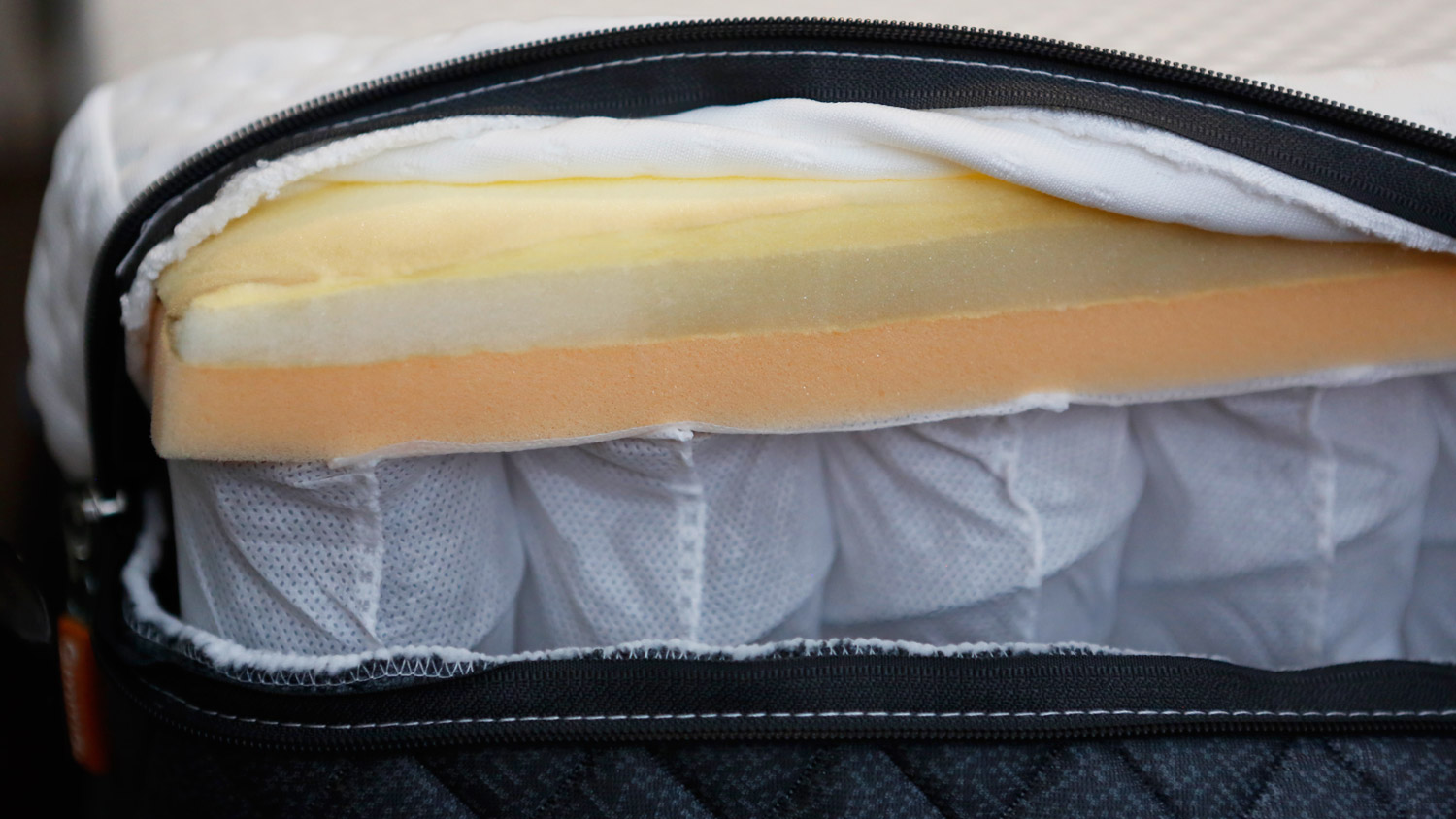
There are three foam layers on top of the sprung layer. The top layer is Emma's Halo memory foam, designed to mould to your body shape and provide sink-in comfort and pressure relief, and to help keep your spine aligned. Beneath that is a layer of Point Elastic Airgocell foam for breathability and temperature regulation, followed by a heavier support foam that further enhances spinal alignment and reduces pressure points.

The internal layers of the Emma NextGen Premium

(Image credit: Future)

There's a final layer of HRX base foam beneath the springs, and the whole mattress is wrapped up in a breathable, moisture-wicking cover; the top cover can be unzipped and machine-washed if you so wish. The cover also features handles on the side, which are a welcome addition and make the business of rotating the mattress a lot more straightforward.

Emma's making a big deal about the reduced carbon emissions of this mattress, which is largely down to a serious reduction in the amount of foam you'll find, compared to other models. In fact, it kind of feels like an exercise in figuring out how little foam Emma can get away with. The foam layers are a little thin (the top memory foam layer is maybe just over 1cm thick), and there's no foam edging to constrain the sprung layers; those springs run right to the edge of the mattress, which I don't think helps when it comes to edge support (I'll return to that later).

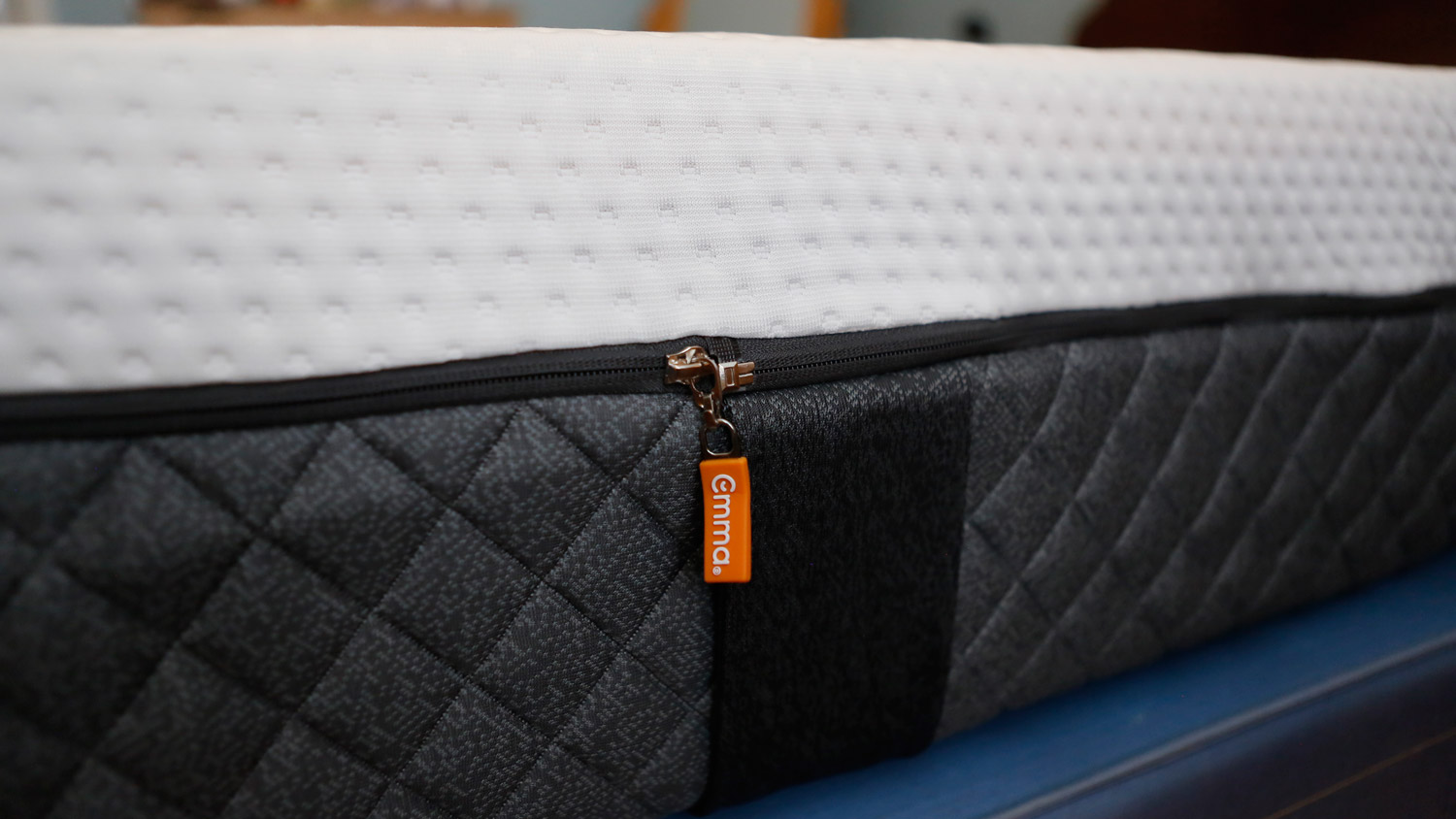
The edge of the Emma NextGen Premium, showing a zip with an Emma logo

(Image credit: Future)

Coming to the Emma NextGen Premium from a traditional tufted mattress that featured a spring layer topped with memory foam for comfort, I was surprised and just a little disappointed by how loose and slightly insubstantial the Emma feels by comparison; particularly the top cover. It's undeniably soft but the material doesn't seem all that tough to me. I'm sure many people value the ability to unzip the top cover and wash it, and I've no doubt that a heavier material would be harder to wash and a lot harder to put back in place afterwards, but personally I'd much prefer a more heavyweight and resilient non-removable cover that does a better job of holding everything together.

Design score: 4 out of 5

Emma NextGen Premium mattress review: comfort

  • Medium-firm feel that's suitable for all sleep styles
  • Zoned support keeps everything cushioned and aligned
  • Memory foam layer provides a little sink-in comfort

The Emma NextGen Premium is rated a 6.5 medium-firm feel by Emma, and both my partner I expected it to feel just a little bit softer than it turned out to be. I'm 6'3" and weigh around 10.5 stone, and while for much of my life I've preferred a firmer mattress, as I get older I find myself appreciative of a little more cushioning for my tired joints. My partner is shorter and more compact, and tends to sink a little deeper into any mattress than I do, but again she's been looking for just a little more sink-in comfort from a mattress.

Both of us have been finding our old mattress just a little too firm of late, and the Emma NextGen Premium seemed like the perfect antidote. It's definitely less firm than our previous mattress, but just a little more softness wouldn't go amiss for either of us. 

For me, when I'm lying on my back on the NextGen Premium I feel like I'm lying on top of it more than sinking in. I am, however, a total combination sleeper who switches between back, stomach and side sleeping throughout the night, and I generally end up sleeping on my side, and fortunately there's just enough sink in the NextGen Premium to cushion my undeniably skinny frame in that position. I've also found that the zoning in the spring layer means that moving slightly up or down the bed can make a big difference in how well cushioned and supported I feel.

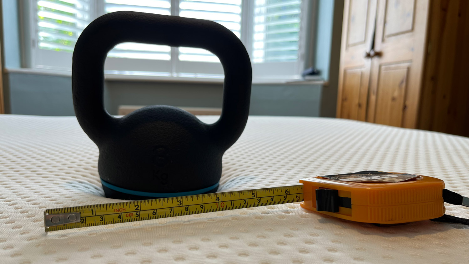
A kettlebell and tape measure on the Emma NextGen Premium

(Image credit: Future)

To get a proper scientific measure of the comfort, I placed an 8kg kettlebell on the Emma NextGen Premium to see how far it sank in. In the middle of the mattress the kettlebell sank in by around 5cm, while nearer the edges it sank by about 4cm. This tallies with my estimation of the NextGen Premium's firmness, and I'd suggest that it should suit most sleeping styles.

Comfort score: 4 out of 5

Emma NextGen Premium mattress review: temperature regulation

  • Temperature-neutral
  • Deep sprung layer provides plenty of airflow
  • Didn't get hot even during a heatwave

Because of its spring-heavy construction I wasn't expecting any temperature regulation issues with this mattress. And in this respect the Emma NextGen Premium lived up to my expectations.

It's not specifically a cooling mattress, however it does feel temperature-neutral. In a month of sleeping on it in the UK summer, including a couple of hot weeks when the temperature rarely dipped below 20ºC, the only times I felt myself getting hot in the night was when the ambient temperature simply got too warm; the mattress itself maintained an admirably comfortable temperature.

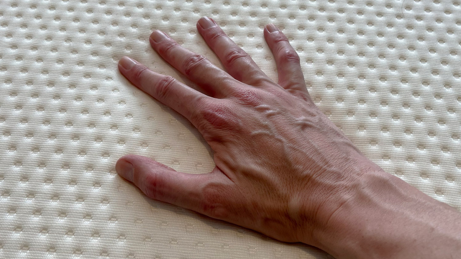
A hand pressing down on the Emma NextGen Premium

(Image credit: Future)

This isn't especially surprising; 18cm of the Emma NextGen Premium's 25cm depth is made up of pocket springs, which means much more airflow through the mattress, and it barely gives the other 7cm of foam any chance to absorb heat. While the breathable cover and Airgocell foam certainly play their part in the NextGen Premium's temperature regulation, it's clearly the pocket springs that are doing most of the heavy lifting, and the fact that they're not encumbered by airflow-restricting side supports doubtless helps (although that's a mixed blessing).

Temperature regulation score: 4.5 out of 5

Emma NextGen Premium mattress review: motion isolation

  • A little motion transfer, due to the deep spring layer
  • Foam deadens things slightly, so still a good choice for couples

The springs in the Emma NextGen Premium are about three times as tall as the three top foam layers combined, and consequently I wasn't expecting the greatest motion isolation from this mattress. However, even though it's quite a responsive mattress, the foam does a pretty good job of absorbing the bounce from the pocket springs.

As a result, while there's still a bit of motion transfer going on, it's not really enough to cause a disturbance; you're aware of a partner moving about while you're lying awake in bed, but it's not something that would actually wake you up.

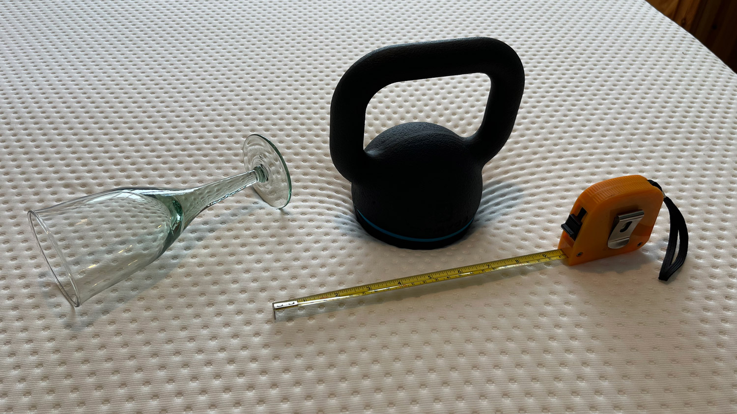
A wine glass, kettlebell and tape measure on the Emma NextGen Premium

(Image credit: Future)

To put numbers on it, I fetched a wine glass and stood it in the centre of the mattress, then dropped my 8kg kettlebell onto the mattress at distances of 25, 10 and 4 inches from the wine glass. At 25 inches the wine glass barely moved; at 10 inches it wobbled noticeably, and at 4 inches it pitched straight over. That's not the best motion isolation we've seen in our mattress tests, but it's far from the worst.

Motion isolation score: 4 out of 5

Emma NextGen Premium mattress review: edge support

  • Not the best edge support, especially on the long edges
  • No real danger of rolling off in the night, though

By far the weakest element in the makeup of the Emma NextGen Premium is its edge support; indeed it was one of the first things I noticed when I got onto it for the first time. This isn't a mattress that you can perch right on the edge of; rather you need to sit a bit back from the edge in order to feel comfortably supported. The edge support isn't so bad that either my partner or I have felt in danger of rolling off the edge in the night, but it's less than we'd prefer in an ideal world.

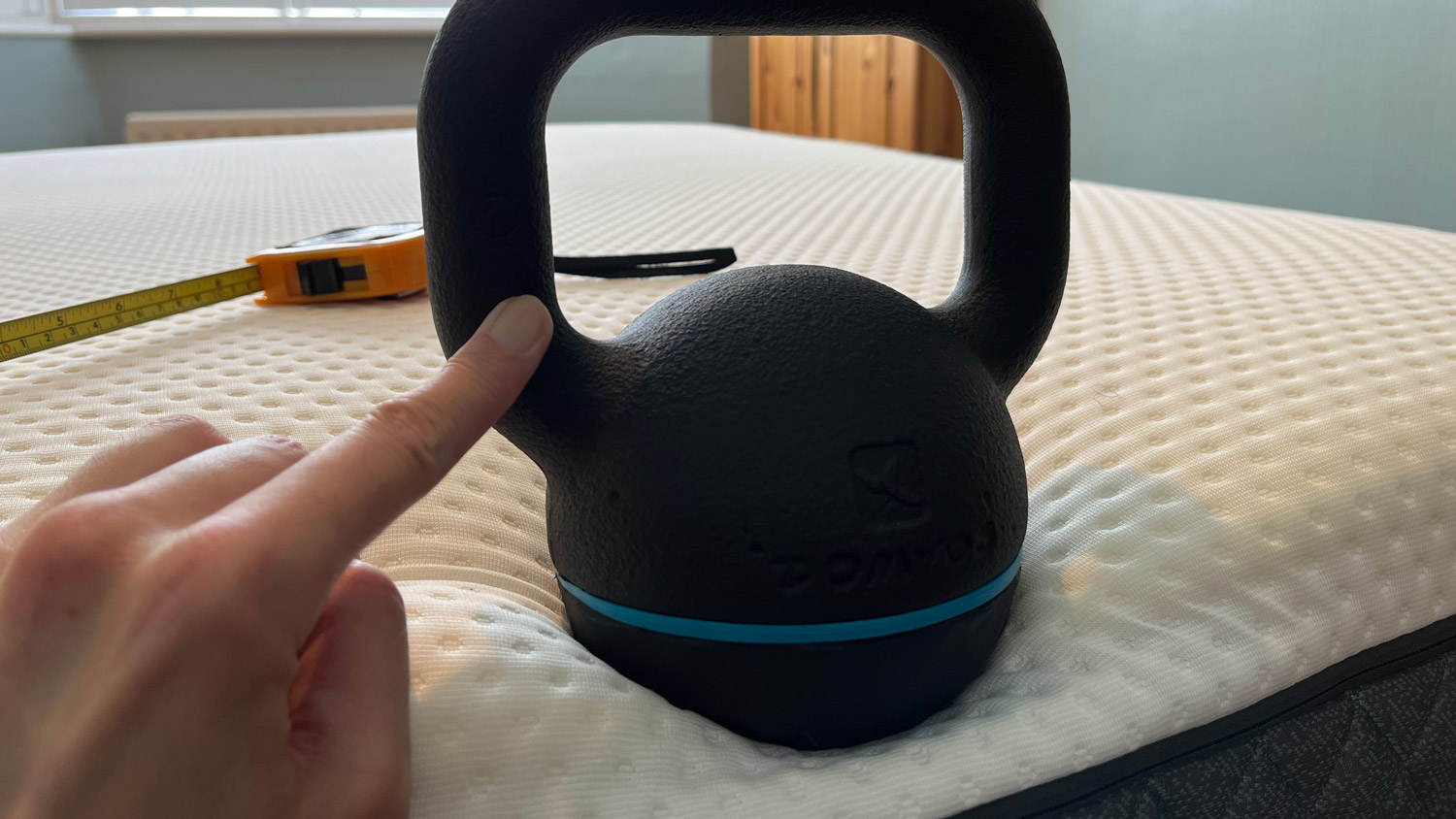
A kettlebell on the edge of the Emma NextGen Premium with a finger holding it in place

(Image credit: Future)

Testing the edge support with the 8kg kettlebell resulted in the kettlebell sinking about 8cm on the long edge of the mattress and at the corners, and about 6.5 cm on the short edge. You'll also notice in the accompanying photo that I'm holding the kettlebell steady with my fingertip; that's to stop it from rolling off.

Edge support score: 3.5 out of 5

Emma NextGen Premium mattress review: setup

  • Mattress arrived vacuum-packed, folded and rolled in a box
  • Free delivery to your door
  • Slight off-gassing smell

Emma provides free delivery to your front door, and for an extra £45 it'll also collect your old mattress on the same day and take it away for recycling. If you're worried about the prospect of having to haul a heavy mattress to your bedroom, don't be. I was honestly surprised by the size of the box that was deposited on my doorstep as it seemed far too small to contain a double mattress, but that made it a lot easier to manoeuvre into my bedroom.

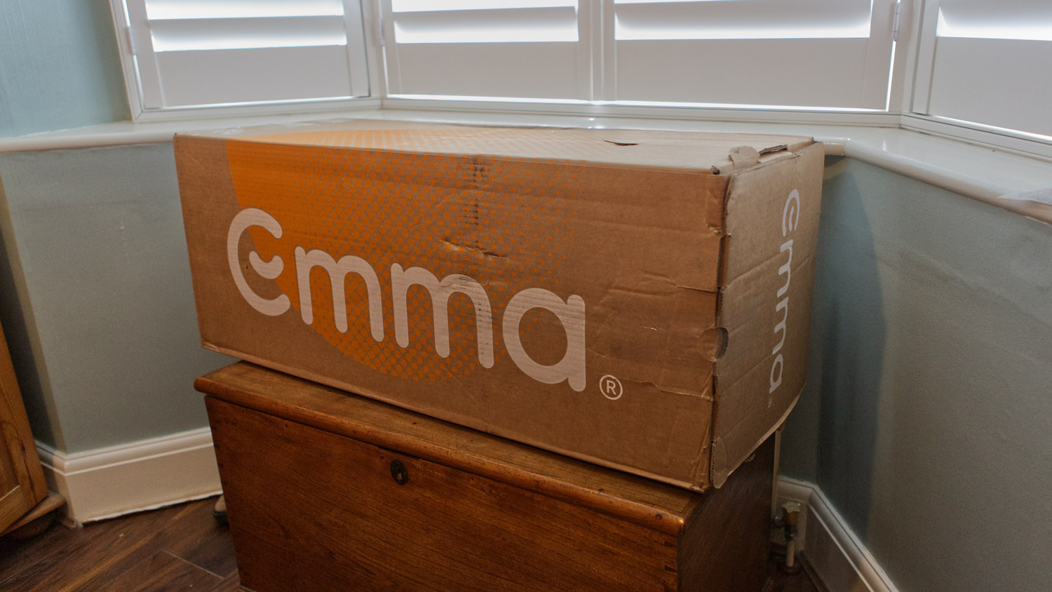
The Emma NextGen Premium in its delivery box

(Image credit: Future)

Having checked the measurements and confirmed that I'd been sent the right mattress, I found the business of setting the Emma NextGen Premium up to be plain sailing pretty much all of the way. The box was easy to open and featured a QR code that promised to take me to an easy setup guide; sadly it actually took me to a dead link on Emma's US site, but ultimately I really didn't need it.

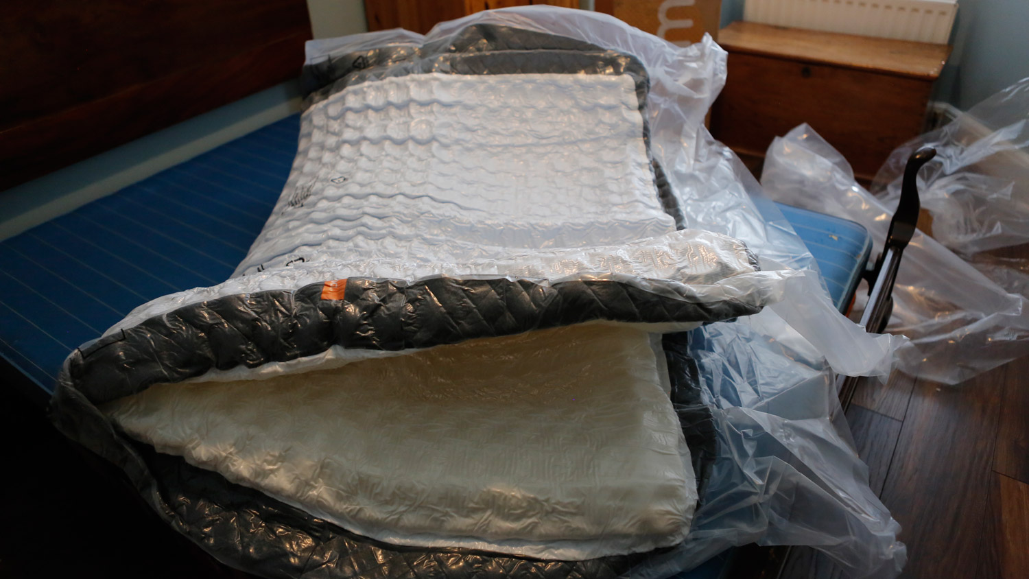
The Emma NextGen Premium folded and vacuum packed

(Image credit: Future)

It was easy to get the rolled (and, I then discovered, folded, which accounted for the box's size) mattress onto my bed and remove the outer plastic wrap. Emma doesn't provide a cutting tool to open up the vacuum packing, but it wasn't hard to find something suitably sharp, and after making one small cut in the plastic an ominous hissing told me that we were in business.

The Emma NextGen Premium decompressed to full size a lot faster than I'd anticipated; it seemed like it inflated within a few seconds (again, this is an area in which the large springs-to-foam ratio really helped). Certainly, within a few minutes it looked ready to sleep on, and while Emma states that it's good to go as soon as it's decompressed, I gave it a good few hours to settle down before putting a mattress protector and bedclothes on it. 

It might have been structurally ready to sleep on, but despite the low volume of foam there was a distinct off-gassing smell that I wanted to give time to dissipate; not overpowering but quite definitely there, and it took a good few days for it to fade completely.

Setup score: 4.5 out of 5

Emma NextGen Premium mattress review: customer reviews

  • New product so barely any reviews online
  • Average 3.8/5 Trustpilot score based on over 36,000 reviews

It's near-impossible to find customer reviews of the Emma NextGen Premium mattress online. It's only been on sale for a couple of months, which means that any reviews at all are hard to find. There are none on Emma's own site; in fact the closest you'll find to reviews on the Emma site are some customer quotes without much in the way of context, so they're no help at all.

The NextGen Premium mattress is only sold through Emma, so there's no way of getting customer reviews from the likes of Amazon. That means we have to fall back on TrustPilot, and it's not a pretty sight. Emma's Trustpilot rating has been creeping downwards over the past few months due to an influx of 1-star reviews over slow delivery and lack of communication from customer services; I contacted Emma about this a couple of months ago and was informed that this was due to a technical error with its warehouse systems, and that it had been resolved.

However I'm still seeing a number of fresh 1- and 2-star reviews, mostly regarding slow delivery and lack of communication, and Emma's overall Trustpilot score is now 3.8 (for comparison it was 4.0 when we reviewed the Emma Premium back in January). And while none of this really says anything about customer experiences with the Emma NextGen Premium, it's something you may want to keep in mind if you're thinking about ordering.

Should you buy the Emma NextGen Premium mattress?

Close-up of the corner of the Emma NextGen Premium

(Image credit: Future)

The Emma NextGen Premium, all told, is quite a comfortable mattress, and it's one that I've slept well on over the past month. Both my partner and I agree that we'd prefer it if it were just that little bit softer, but in general it's good for back, front and side sleeping (although lighter side sleepers than me might find it a little too firm for comfort).

I like the NextGen Premium's simplicity; this is not a complex mattress and I wouldn't really describe it as next-gen, more old-school. It's essentially a deep layer of pocket springs held in check by a foam section, and it works. Because the top cover's removable and washable it feels just a little flimsy; I think the whole mattress would feel a lot more solid if it was stitched closed.

Although the NextGen Premium has a premium RRP, it feels more mid-range to me and I'd be disappointed if I bought it at full price. Reduced by 40% in the Emma sale though, which it often is, it feels like much better value. At that price, however, there's some strong competition about, so unless you've absolutely decided that this is the mattress for you, it'd pay to shop around.

Emma NextGen Premium mattress review: Also consider

How I tested the Emma NextGen Premium

I've been sleeping on the Emma NextGen Premium, along with my partner, for over a month in mid-summer. Night-time temperatures have varied between well below and well above the seasonal average during this time, so I've been able to get a good all-round impression of the mattress's performance. I've been using the mattress with a mattress protector and Egyptian cotton sheets, and with a year-round 10.5 tog duvet.

As well as sleeping on the Emma NextGen Premium in all the popular positions, I've also subjected it to TechRadar's standard mattress tests to get a measure of its comfort, motion isolation and edge support.

Saturday, July 29, 2023

Garmin Fenix 7 Pro review: This top outdoor watch gets the Pro treatment

Garmin Fenix 7 Pro: One-minute review

The Garmin Fenix 7 Pro is a new version of the Fenix 7, which launched in early 2022. This isn’t the first time Garmin has launched a Pro version of its feature-packed watch aimed at lovers of the great outdoors and is likely to fill the void before we see the Fenix 8.

For the Fenix 7 Pro, the headline news is that one of the best Garmin watches is seeking to improve things even further in the display and heart rate tracking departments and now wants to help you better understand how well-equipped you are at tackling hills and endurance events.

The Fenix 7 was an impressive watch and it’s more of the same with the Pro, offering a rich array of sports profiles, metrics, training and analysis insights and the kind of battery life that can keep you away from a charger for weeks.

The problem that the Pro has is that many of the big software features have headed to the older Fenix 7 series, making the Pro version more of a sell for older Fenix owners and those that really want the newest outdoor features that Garmin has to offer.

Garmin Fenix 7 Pro: Specifications

Garmin Fenix 7 Pro: Price and availability

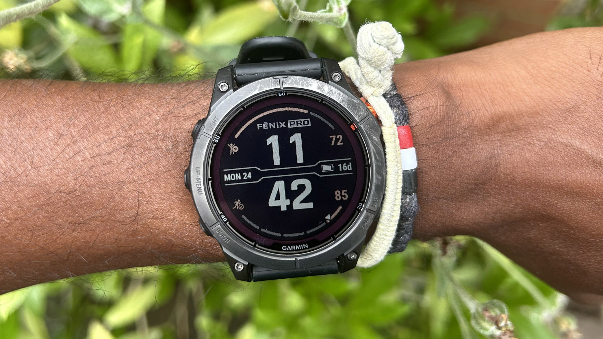
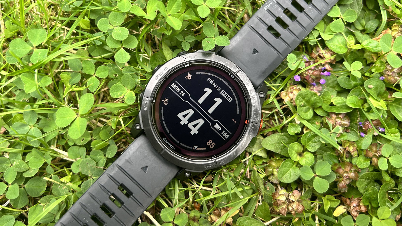
Garmin Fenix 7 Pro

(Image credit: Michael Sawh)
  • $799 in the US
  • £749.99 in the UK
  • $1,349 in Australia

The Garmin Fenix 7 Pro is available to buy now directly from Garmin and from a host of other retailers including Amazon. It has a current RRP of £749.99 in the UK, $799 in the US and $1,349 in Australia.

Garmin Fenix 7 Pro: Design and screen

Garmin Fenix 7 Pro

(Image credit: Michael Sawh)
  • New, clearer screen
  • Same rugged form factor
  • New flashlight added

The Fenix 7 Pro like the standard 7 is all about being a watch that’s built for some serious rough and tumble, so unlike Garmin’s Forerunner watches such as the Garmin Forerunner 265, you can expect a thicker case design, more tougher metal and generally a stronger level of protection against water.

Like the 7, the 7 Pro comes in three case sizes. I had the 47mm version, which is very similar to the 47mm Fenix 7 in terms of how it feels to wear and what you can expect in terms of weight and the space it soaks up on your wrist.

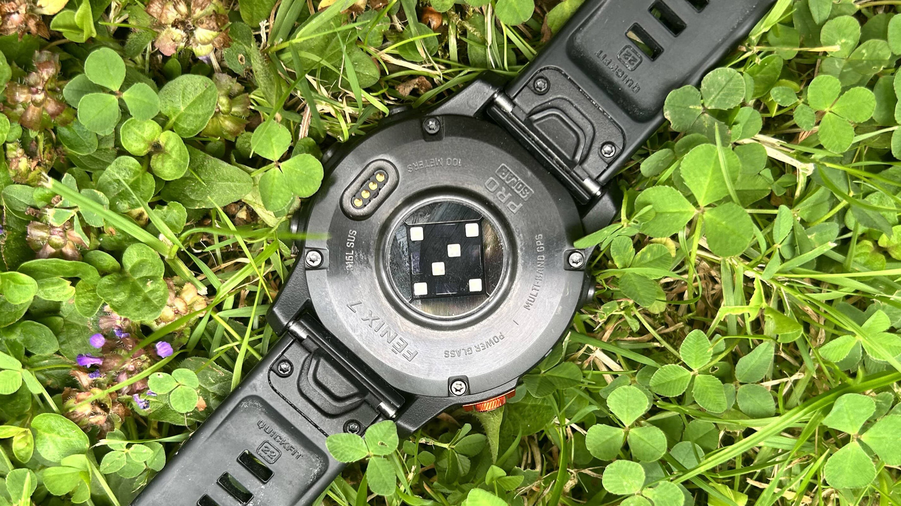
It’s a polymer case with steel around the back and a bezel built from stainless steel, which helps this watch to weigh in at 79g. Garmin pairs that with 22mm QuickFit straps, so you’re just a simple button press away from removing it and putting on a new one. As a package, it’s waterproof up to 100 metres making it safe for pool and open water swimming time.

Front and centre is a 1.3-inch, 260 x 260 resolution transflective memory-in-pixel display, which Garmin says is an improved one on the display included on the non-Pro 7. I’d say it’s a touch clearer, but there’s not a massive amount in it. It’s still a display technology that offers good visibility indoors, outside and the responsiveness of the touchscreen support is as good as you’ll find on a sports watch right now. It’s never going to be as bright as the Epix’ series AMOLED display, but is excellent for battery conservation. 

On top of that screen lies Garmin’s PowerGlass, which does mean you get solar charging powers here to boost the already big battery numbers Garmin promises, as long as you’re spending enough time out in the sun to enjoy the benefits.

The 47mm and 42mm Fenix 7 Pro now also grab the LED flashlight from the Fenix 7X, so you now have an extra source of light that can be enabled from the quick settings and can be configured to light up when you’re in tracking mode and is actually a useful extra to have if you don’t want to grab your smartphone.

Garmin uses the same charging cable to power it up as the one provided with the Fenix 7 and as a package you’re getting a lovely, well-built watch that doesn’t weigh too heavy or too light and has a screen that’s big enough to make sure you can absorb your real-time stats and view onboard maps.

  • Design score: 5/5

Garmin Fenix 7 Pro: Features

Garmin Fenix 7 Pro

(Image credit: Michael Sawh)
  • New weather overlays for maps
  • Endurance and Hill Scores now added
  • Heart rate sensor promises improved workout HR accuracy

The Fenix 7 Pro is a watch for the outdoors and doesn’t disappoint with the level of features on offer here for those who like to spend more time outside than inside. 

Along with core running, golfing (there's a reason Garmin fills out a lot of our best golf watches entries), swimming and cycling modes, there are the usual outdoor profiles aplenty covering everything from hiking to surfing, skiing and you're getting activity-specific metrics for most of those profiles as well.

On the navigation front, you’ve got preloaded topographic maps, road and trail maps and ski resort maps, with touchscreen support to navigate around those maps. Garmin has enhanced that mapping mode with Relief Shading to offer more detailed maps, the ability to see a split of your metrics and map on one screen and view weather information like temperature, although that isn’t available during the tracking mode screen. Up Ahead also offers trail runners and cyclists the location of Points of Interest nearby.

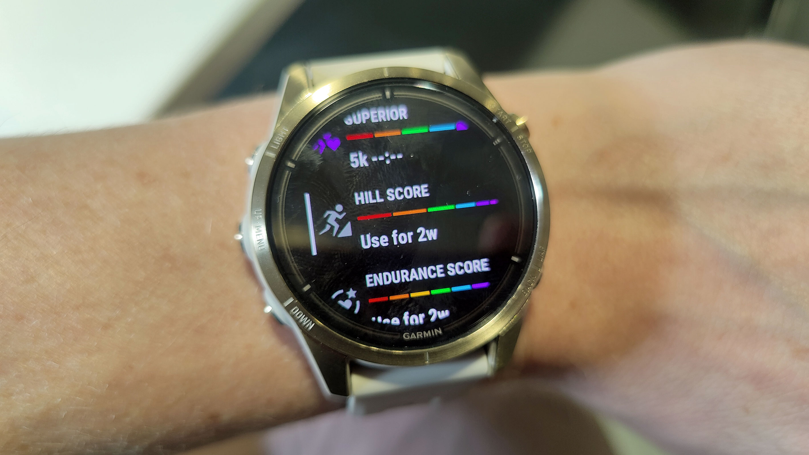
Along with the rich training analysis and metrics you already get on the Fenix 7, Garmin has introduced new Endurance Scores and Hill Scores metrics to help you better understand whether you have put in the right amount of training to handle a hilly route or really go long in training or an endurance event. It analyses hilly workout history and VO2 Max estimates to score your endurance and ability to tackle hills and make it easy to understand whether it’s good or bad.

Many of the Fenix 7 Pro’s training and analysis features are driven by good heart rate data and Garmin has sought to improve things on that front with a new optical heart rate sensor onboard and new algorithms to deliver improved accuracy, particularly when you’re exercising. 

You do still have the ability to pair up external sensors and while the accuracy during workouts has been solid overall, I don’t think you should be ditching that dedicated heart rate monitor just yet.

  •  Features score: 4.5/5 

Garmin Fenix 7 Pro: Performance

Garmin Fenix 7S Pro

(Image credit: Future)
  • Great multi-band mode
  • Endurance and Hill Scores are nicely presented
  • Same great battery life

All of the good traits from the Fenix 7 are retained for the Pro. Garmin’s great multi-frequency positioning GNSS mode, which improves tracking accuracy in return for sucking up more battery life than other GPS modes, performs really well and Garmin’s mapping support remains the best you’ll find on a watch right now. The mix of touchscreen and button interaction makes it easy to navigate the now more detailed presentation of those maps as well.

The new Endurance and Hill scores are interesting additions to the already rich array of metrics Garmin offers, but how reliable and useful they are going to be for most Fenix 7 Pro users is certainly up for debate. You need a few weeks of data to kick things off and while there’s some useful advice offered around those scores they weren’t scores that drastically changed the experience of using the 7 Pro over the regular 7. Plus, those features are coming to the older Fenix as well.

Something that thankfully hasn’t changed with the new hardware and software features on board is the kind of battery life you’ll enjoy on the Fenix 7 Pro. Garmin promises the same numbers with up to 22 days in smartwatch mode, which can be boosted by solar charging. If you’re planning to spend multiple days out on your feet, you can sacrifice the best GPS accuracy and opt for the Expedition mode to get you 40 days of watch time and potentially more again if you can expose the watch to enough sunlight to boost battery.

If you want to use the Fenix 7 Pro as a smartwatch, it has the same features as the baseline Fenix 7. The notification support is the strongest of those smartwatch features and you do have good music player and controls features as well. You do have Garmin Pay and access to Garmin’s Connect IQ Store, though don’t expect to pile on loads of big-name apps here. Some changes have been made to the user interface, mainly in the workout mode, but if you were hoping for more smartwatch skills than before, that’s not the case here.

Ultimately, this is a watch that can last for weeks, even with regular use of workout tracking, mapping and smartwatch features. Make use of the onboard power manager features and turning off features you don’t use and that will make things go further.

  • Performance score: 4.5/5 

Garmin Fenix 7 Pro: Should I buy?

Buy it if...

Don't buy it if...

Also consider

Kindle Scribe review: the biggest Kindle keeps getting better

One-minute review

Amazon Kindle Scribe e ink writing tablet

(Image credit: Future / Philip Berne)

The Kindle Scribe has improved enough since it launched to become my preferred tablet to recommend if you like reading, journaling, and now maybe even old school pen and ink games like crossword puzzles and sudoku. It has the biggest screen you can find on a Kindle, while keeping the display just as sharp as the best Kindle ereaders, so books and text look amazing, even better than reading on the best iPad

If you’re a hardcore handwriter and note-taker, you might prefer the Remarkable 2 tablet, which has many more options for pen styles, background templates, and productivity. The Kindle Scribe still has advantages, especially its backlight that lets you read and write in the dark, which the Remarkable can’t manage. The Kindle Scribe keeps things simpler, and this will work better for most people who aren’t using the writing tablet in the boardroom. The Scribe’s cost is also more consumer-friendly. 

I originally complained that the Kindle Scribe couldn’t write in the margins of books, a feature I would love for students, as a former teacher. Sadly, this isn’t Amazon’s fault, and unless you buy books as .pdf files or more industry-specific .epub files, no writing tablet lets you write on any books as you please. Amazon does own a bookstore, so it has come up with a solution since the Kindle Scribe launched. 

There are now ‘write on’ books in the Kindle store, and those let you write directly on the page on your Kindle Scribe. This turns out to be a game changer, because the selection, while small, is already unique and helpful. You get pre-filled journaling pages, some crossword and sudoku puzzles, and the promise of more to come. The possibilities are endless, and I’d love to see Amazon encourage some self-publishing in this ‘write on’ zone, to build Scribe adoption. 

Kindle Scribe review: price and availability

  • $339.99 / £339.99 / AU$549.99 for 16GB with basic pen
  • Premium pen includes eraser and shortcut button

Amazon Kindle Scribe E Ink writing tablet

(Image credit: Future / Philip Berne)

It’s hard to compare the pricing on tablets like the Kindle Scribe, considering different note-taking E Ink devices come with different feature sets. Overall, though, if you opt for the 16GB Kindle Scribe with the Basic Pen, there's decent value for what you get.

For example, the Kobo Elipsa comes in just one model that boasts 32GB of internal storage and ships with both the stylus and a sleepcover for $399.99 / £349.99 / AU$599.95 – so I'm inclined to say the Elipsa offers more value, but the writing experience isn't as smooth.

On the other hand, the reMarkable 2 costs a deceptive $299 / £299 / AU$499. I say deceptive because reMarkable doesn’t include a pen (which the Kindle Scribe and other writing tablets include) and charges exorbitant fees for accessories. The reMarkable also doesn’t have a backlight, so you need a light source to use it in the dark. It also cannot access the Kindle library, or any large eBook library easily.   

Kindle Scribe specs

Weight: 433g
Dimensions: 196 x 230 x 5.8mm
Display size: 10.2-inch
Storage: 16, 32, 64GB
Charging: USB-C charging
Backlight: LED (35 lights)
Pen Included: Yes

The Onyx Boox Note Air2 series isn't as widely available, but starts at $499 in the US for the base model. There are even more advanced E Ink tablets that use a pen, like the Onyx Boox Tab Ultra. That tablet is a more feature-packed device, and in its own class in terms of capability and price. It has a camera for document scanning and runs Android, for instance. For that reason, it’s almost twice the price of Amazon’s Kindle Scribe in the US.

Of course, let's not forget the iPad 10.2 (2021) which, incidentally only has a 264ppi resolution screen as compared to the Kindle Scribe's 300ppi e ink display, and prices start at $329 / £319 / AU$499 without a pen for 64GB of storage. Of course, comparing a colorful, extensible tablet like the iPad to the Kindle Scribe is like comparing apples to, er… Kindles. 

Amazon Kindle Scribe e ink writing tablet

(Image credit: Future / Philip Berne)

The more interesting price comparison is between the Kindle Scribe and other Kindle ereaders. The Scribe costs $90 / £110 / AU$150 more than the Kindle Oasis, which has only a 7-inch display, half the storage space, and no pen support. The only thing the Scribe cannot do is take a dip in the ocean, which the Kindle Oasis can legitimately handle, saltwater and all. 

Kindle Scribe review: design

  • Big and bright display doesn’t sacrifice sharpness
  • Port and power are weirdly placed on the side

The Amazon Kindle Scribe looks like a much larger version of the Kindle Oasis, thanks to the all-metal chassis. Where it differs, other than the obvious size, is the missing page-turn buttons and the asymmetric thickness that I love on the Oasis. 

The Kindle Scribe has rounded corners and smoothly curved edges with a wide, flat back, which interestingly has four tiny nubs for feet. It has a bezel all around, with a larger edge on the left side, if you hold the tablet Amazon smile-up. You can flip the Scribe and hold the larger edge with your right hand, but then the Amazon logo will be frowning. 

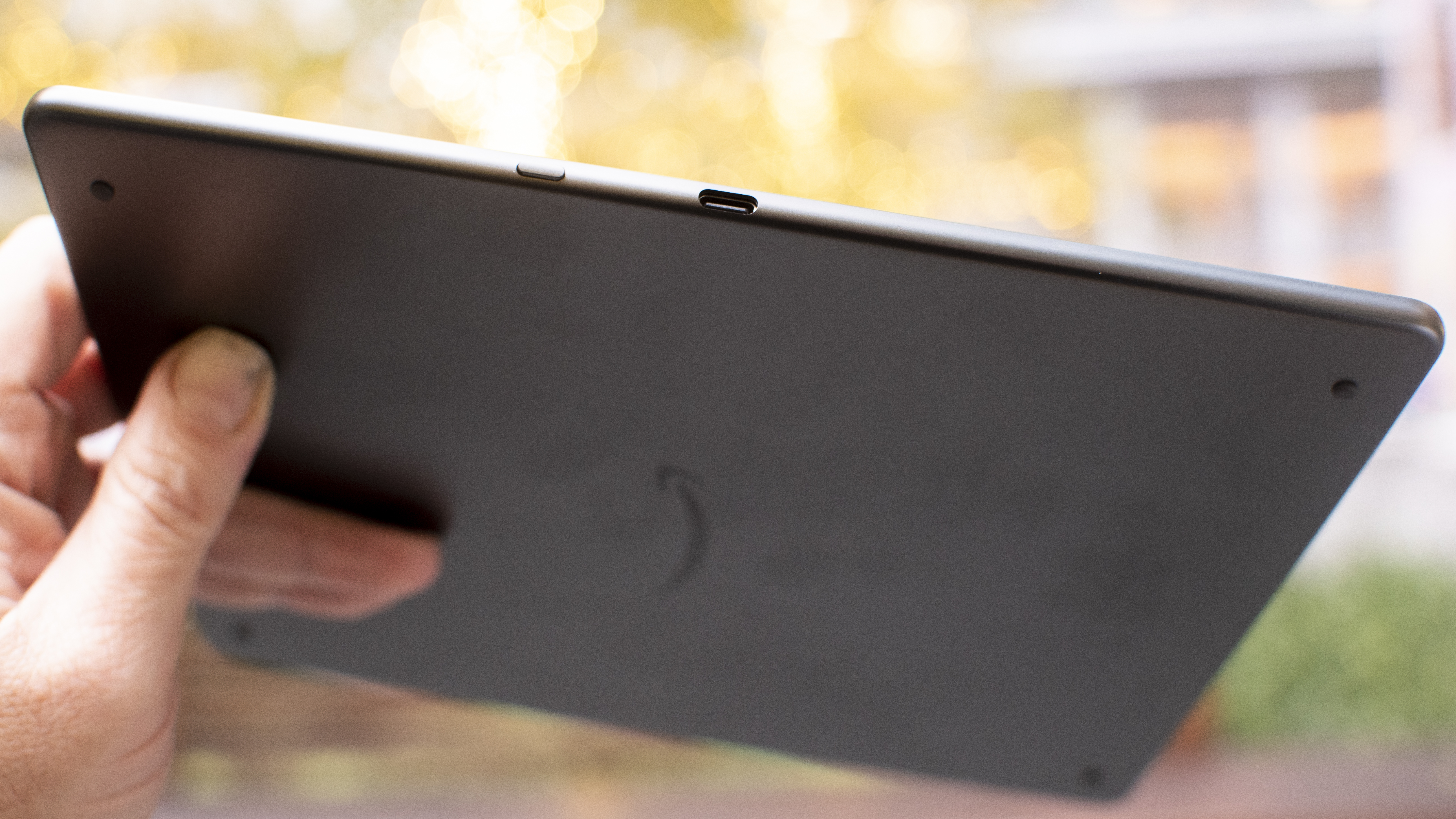
The USB-C port for charging, as well as the power button are both strangely placed on the side of the device, near the middle, but this isn't unique to the Scribe and can be seen on the Onyx Boox Note series tablets too.  

Amazon Kindle Scribe e ink writing tablet

(Image credit: Future / Philip Berne)

The pen, which is included, hangs on by a magnet on the opposite side edge of the Scribe. This is my least favorite way of holding a pen. The strongest rare earth magnets cannot keep a pen in place when I slide a tablet in and out of a backpack sleeve. I lost the Scribe pen on day one and spent a half hour searching before I found it. Thankfully, an old Galaxy Note pen works just as well in a pinch. 

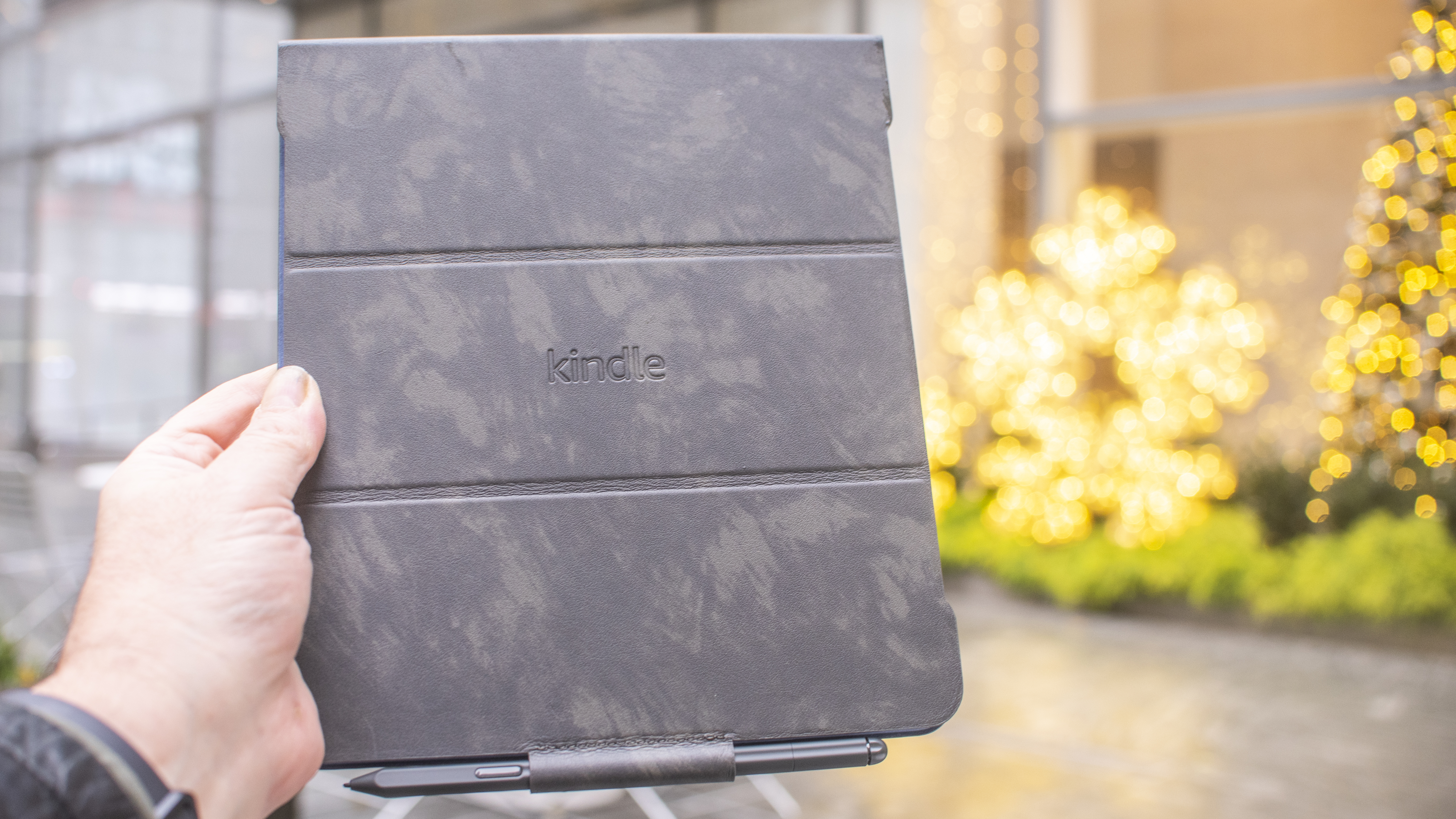
If you spring for the leather folio case – a nice addition that Amazon sent along with my review sample but you'll need to buy it separately – the flap opens up over the top like a reporter’s notebook, though much larger, similar to the sleepcover for the Kobo Elipsa (which ships with the tablet itself). The pen then slots into a holder on the edge of the flap. 

Amazon Kindle Scribe e ink writing tablet

(Image credit: Future / Philip Berne)

Compared to the competition, the Kindle Scribe is a bit thicker than the reMarkable 2 tablet – which makes sense because the reMarkable lacks a backlight – but is slimmer and sleeker-looking compared to the plastic body of the Kobo Elipsa. The Kindle has a very bright LED backlit screen, and it can switch from a bluish-gray tint to a blue light-free tint that’s better for nighttime reading. 

The Kindle Scribe is also wider than the reMarkable and Elipsa, and less tall, but has identical overall dimensions as the Onyx Boox Note Air2 tablets. The screens are all roughly the same size, it’s just that the reMarkable puts its big bezel edge at the bottom instead of the side. 

For reading, I found the Kindle very comfortable to hold and use, even for such a large tablet. I'd love to see it shed some weight, but it isn’t clumsy. 

Amazon Kindle Scribe e ink writing tablet

(Image credit: Future / Philip Berne)

Kindle Scribe review: using it

  •  Excellent large screen Kindle for reading books 
  •  Middling E Ink writing tablet for journaling and notes 

Amazon Kindle Scribe e ink writing tablet

(Image credit: Future / Philip Berne)

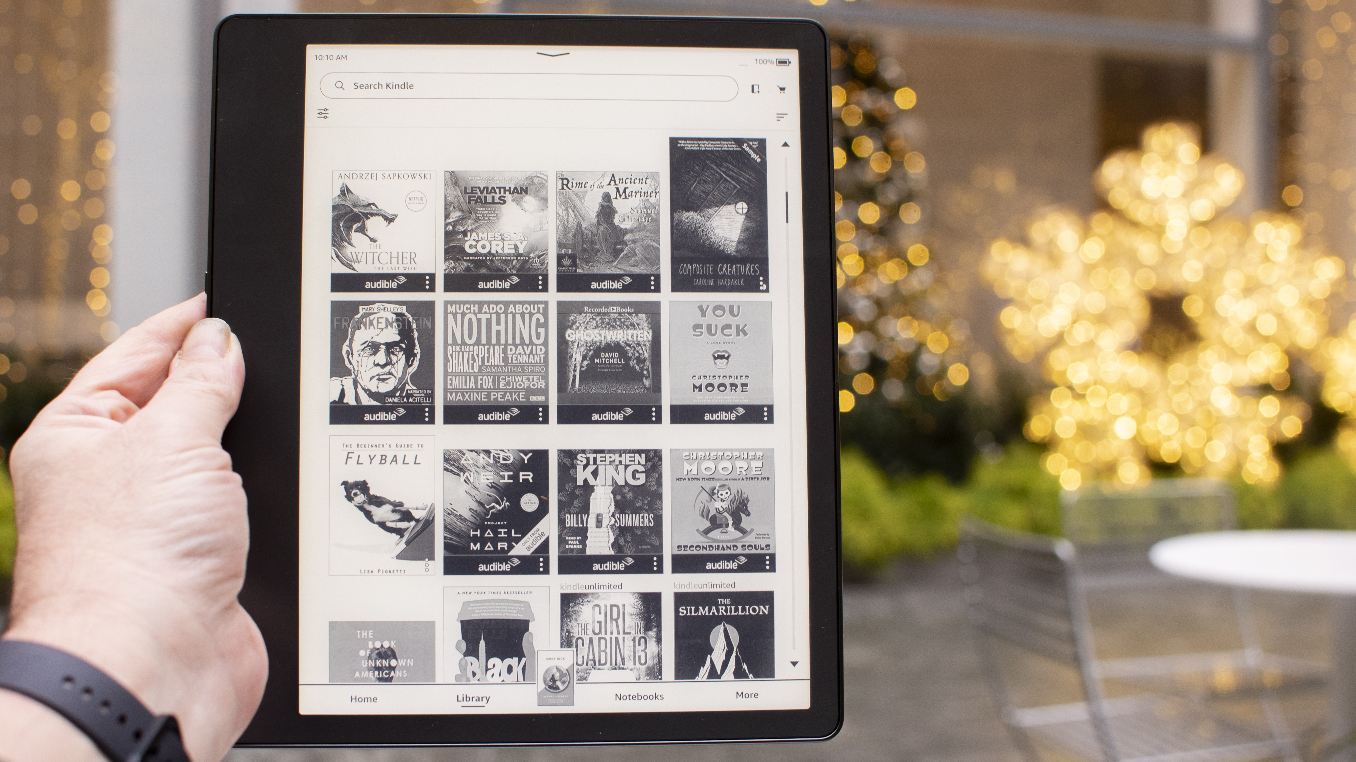
If you want to read books on a large-screen Kindle, the Scribe is an easy ereader to recommend, although the price is high for the category. Still, the screen is much larger than the next-biggest Kindle Oasis' 7-inch display and there's no sacrifice of the remarkable pixel density, so everything is super sharp and glorious on screen. If you’ve been craving a gigantic reading screen for bigger fonts and larger images, the Scribe is a joy to use. 

On the other hand, if you’ve been excited about a Kindle that you can also use for journaling, note taking, and other writing tasks, the Kindle Scribe isn't the best tablet you can buy, but it does have plenty of writing features, and you can always buy more journaling books and templates from the Kindle store. 

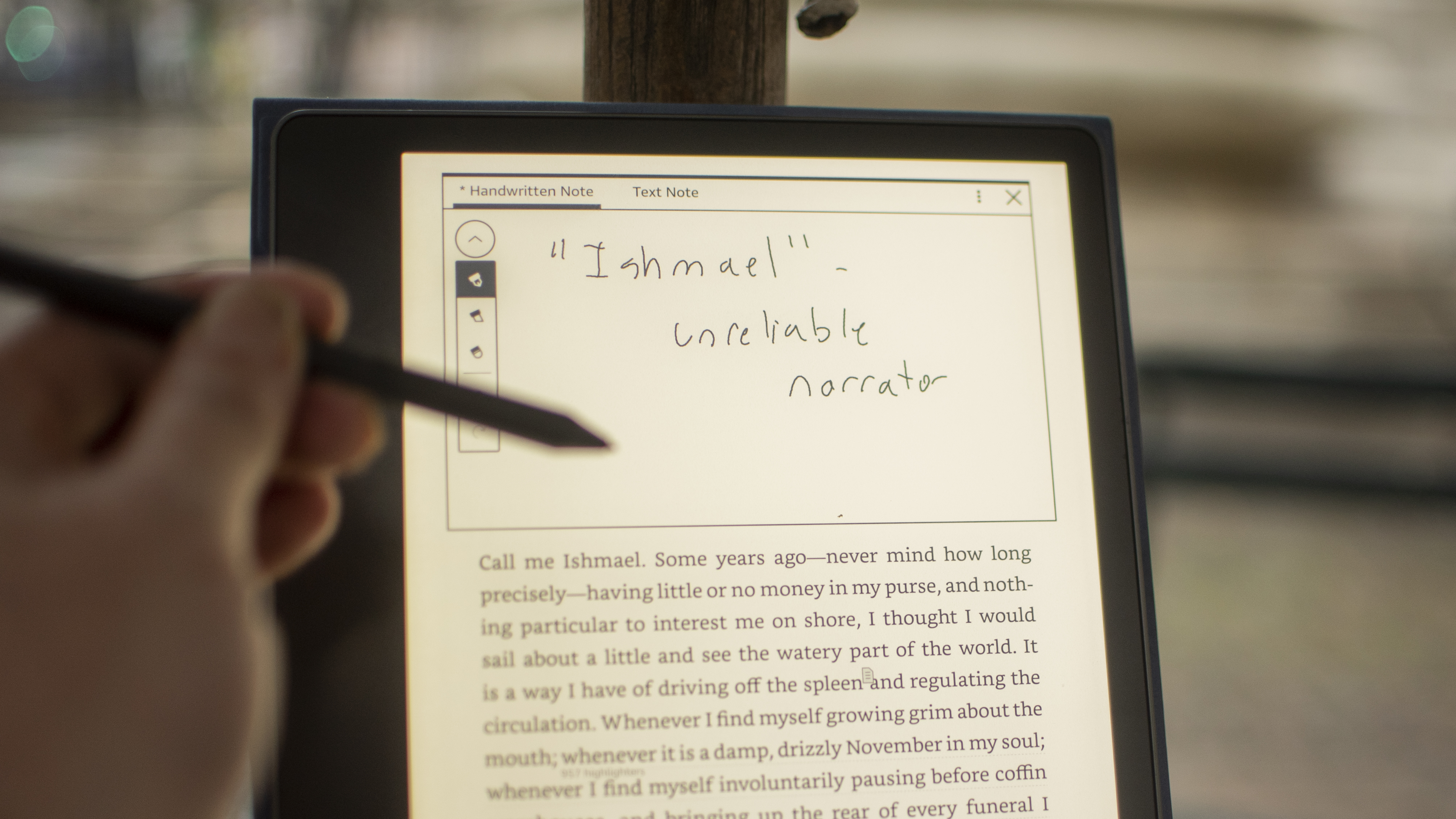
For students and academics, the Scribe only allows you to write notes as sticky notes appended to a book. You cannot actually write on the book page, in the margins, for instance. College students who buy their own books love the ability to interact directly with the text in writing, and it is a huge letdown that no current writing tablet can support this feature on every book you buy. 

Amazon Kindle Scribe e ink writing tablet

(Image credit: Future / Philip Berne)

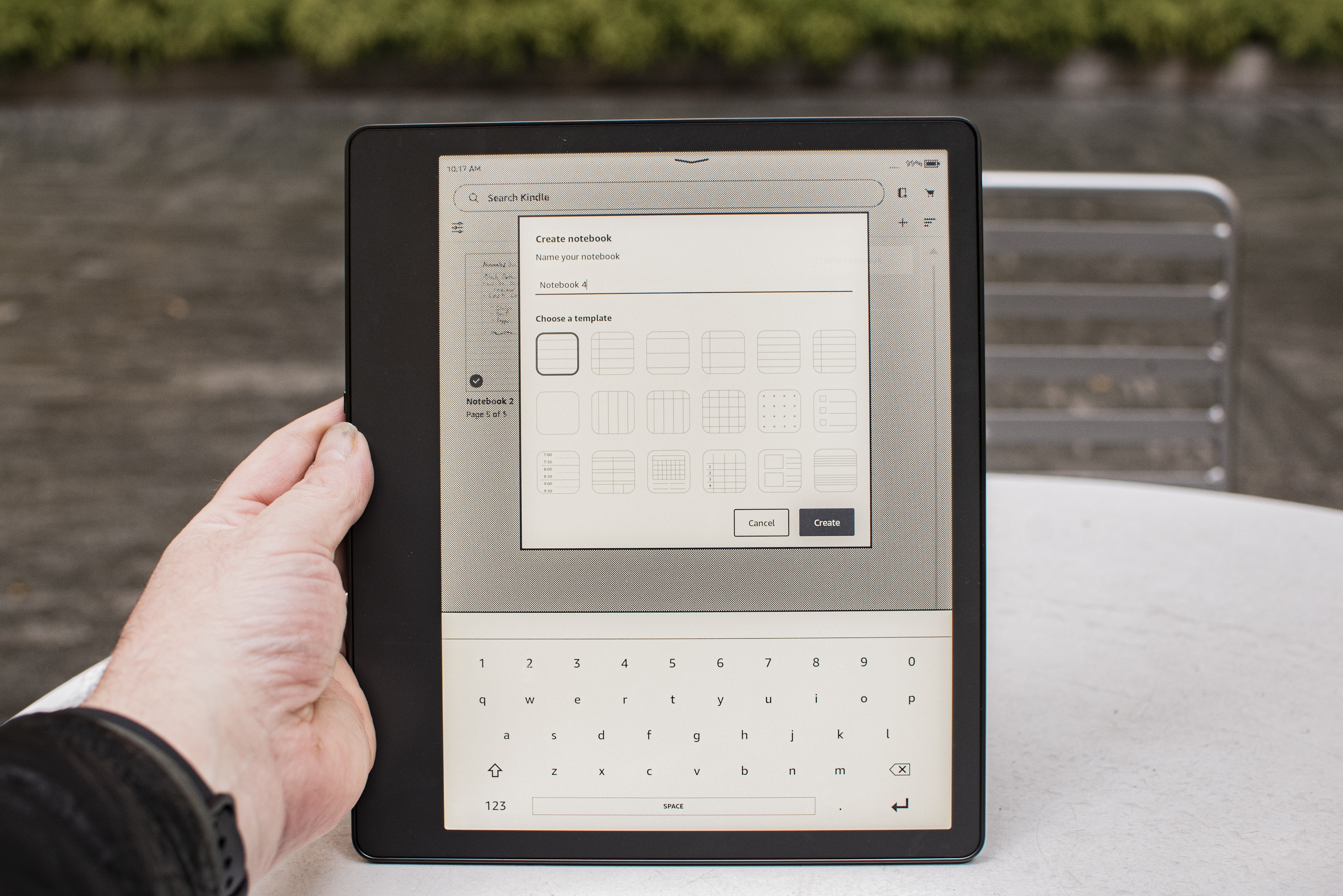
For journaling and freewriting, the Kindle Scribe offers few template options, and none that work well with popular journal methods. I use bullet journaling and found some basic dots and lined pages, but nothing as organized or creative as the templates I enjoy on the reMarkable 2 tablet. Even the Kobo Elipsa offers a lot more when it comes to note-taking, including adding formulae and diagrams in between notes. If you keep a journal or take detailed notes, I'm saying there are better options out there, and at a similar price point. 

Since it launched, Amazon has added more pen options to the Kindle Scribe, including more styles and thickness levels. It isn't quite as robust as the reMarkable tablet, but it's a great improvement over the original offering. Hopefully we'll see even more options in future updates, but Amazon hasn't promised anything. 

It isn’t difficult to use the Kindle Scribe for basic productivity. When I needed to sign a document, I simply sent it to a custom email address that I set up through my Amazon Kindle account. The PDF file arrived on my Scribe, and I could sign it and email it back with no trouble. But this will be difficult for anyone without a Kindle account. So, again, the Scribe is best served when you're embedded into the Amazon ecosystem. Even as an ereader, it's best used by customers already with existing Prime, Kindle Unlimited or Audible accounts.

The writing experience on the Scribe with even its Basic Pen is the best I've experienced to date. It is smooth as paper, and even that doesn't quite convey how good it really is to write on that screen.

Kindle Scribe review: connectivity

Amazon Kindle Scribe e ink writing tablet

(Image credit: Future / Philip Berne)
  • Easy setup over Wi-Fi, no device needed 
  • Send documents to a dedicated email address 

Amazon makes it easy to set up the Kindle Scribe and get all of your books and documents on and off the device. I had no trouble finding my Wi-Fi network, and the Kindle does not need a second device for setup. If you have a smartphone with the Kindle app, that helps speed the process along, but it isn’t required. 

When I needed to sign documents with the Kindle Scribe, I found a dedicated email address @kindle.com was the easiest way. It is set up with a random username by default, but you can change this online, and I made it more convenient. As soon as I sent a document it appeared in my library, and I could email it from the Kindle Scribe to five recipients.

Amazon Kindle Scribe e ink writing tablet

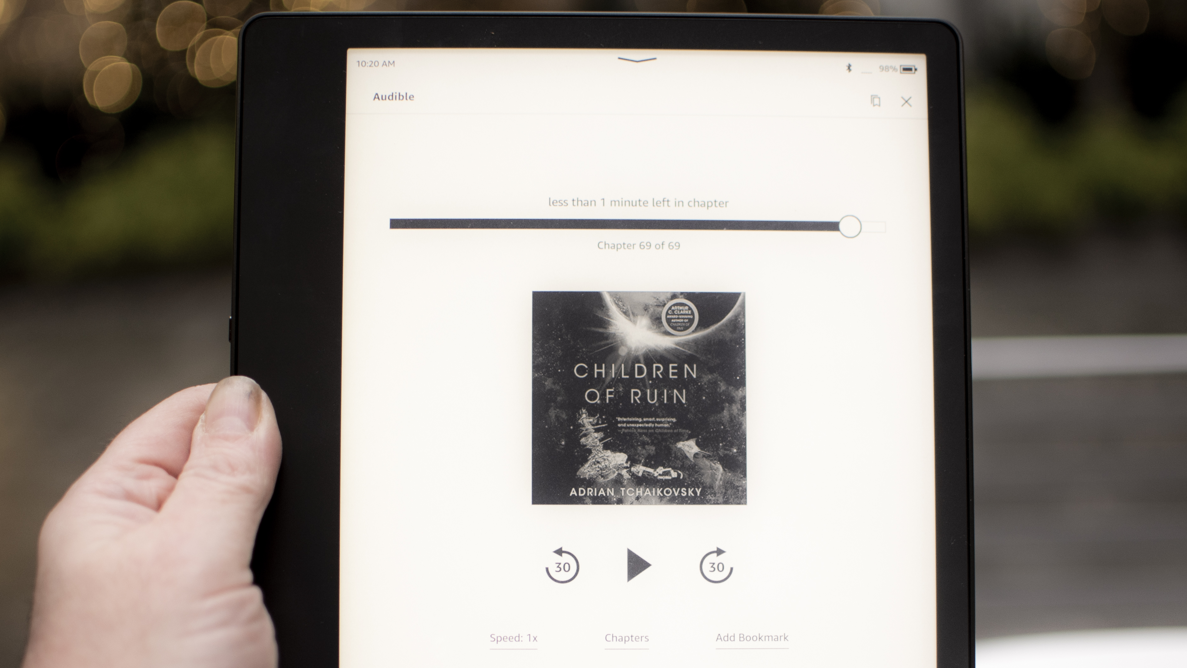
An Audible audiobook on the Kindle Scribe (Image credit: Future / Philip Berne)

Of course, there are many more connectivity options I'd like to see, but at this price the options are fair. Some folks may want an LTE connection at least for downloading books or emailing simple black-and-white documents. Amazon sells a deluxe version of the Kindle Oasis with 4G LTE connectivity for downloads on the go, so it's a little strange to see the Scribe miss out... although I suspect the price for that privilege would be quite prohibitive for most potential users. 

I could also imagine a microSD card slot being very useful for transferring and signing documents. If this were a more serious productivity tool, that would be a top request, but I've yet to see an alternative E Ink note-taking tablet offer this option. 

Should I buy the Kindle Scribe?

Buy it if

Don't buy it if

Kindle Scribe review: also consider

If our Kindle Scribe review still has you on the fence then consider this trio of alternatives below:

  • First reviewed: November 2022. Updated: July 2023.

Friday, July 28, 2023

Creative Flow+ review

There was something we kept quiet about in our recent Shutterstock review

While the Shutterstock service has long been hailed as one of the best free stock photo sites on the web, there’s more to the creative platform than assets and content library. There are also a series of online companion apps, available under the banner Creative Flow+. 

Creative Flow+: Pricing & plans

  • A service that’s included in Shutterstock subscriptions, available as a standalone product with a free trial 

Creative Flow+ is a standalone subscription, independent of the rest of Shutterstock’s offerings. Although it’s important to note that when you subscribe to one of Shutterstock’s monthly or annual plans, you’ll get Creative Flow+ included for free.

If you don’t need access to those plans, Creative Flow+ will cost you $13 per month, or $120 per year, and if you’re curious about the service, there’s a free month’s trial on offer as well, removing any reason you might have to not try it out. 

  • Pricing & plans: 5/5

Creative Flow+: Getting started

Shutterstock's Creative Flow Plus platform during our test and review process

You works with layers in Creative Flow+, enabling you to design complex, yet easy to manipulate, projects (Image credit: Shutterstock)
  • A series of apps, from scheduling to creating, all accessed from the sidebar on the left 

So what is Creative Flow+? Put simply, it’s a combination of web-based apps and graphic design software designed to help you organize yourself, and produce visual content to promote and market your business.

As such, it comes with five separate apps, all accessible from the interface’s sidebar on the left. ‘Plan’, for instance, is a calendar, made to keep you and your team organized. It’s even possible to link to collections you’ve already created to make sure all assets for a project stay together.

‘Predict’ is an AI-based tool to speed up the creation process of posts aimed at Facebook, Instagram or Pinterest. In order to facilitate the process you can provide it with images from Shutterstock’s library, upload some from your own collection, or just skip that step to see what Predict can… well… predict for you. But to be honest, aside from setting the right aspect ratio for your project, it’s hard to discern what the templates on offer have that the templates available in Create don’t. Still, maybe that’s why Predict is still in beta.

‘Catalog’ offers a quick link to your collections, assets and designs, making it easy to manage them all from the same place. Which leads us to the last two which we’ll look at in greater detail below: ‘Generate’ and ‘Create’.

  • Getting started: 3/5 

Creative Flow+: Generate

Shutterstock's Creative Flow Plus platform during our test and review process

Generate isn’t technically part of Creative Flow+ since you have to pay for the results you wish to use, but it’s an AI creation tool which can be added to your workflow  (Image credit: Shutterstock)
  • AI comes to Shutterstock, with varying degrees of success, but its output isn’t part of your Creative Flow+ subscription 

AI is everywhere - and that includes Creative Flow+. If you’re familiar with the concept of text-to-image AI art generators, it’s pretty much the same here: type in a description of what you’d like to see, add as many keywords as you can think of, and click on ‘Generate’. After a few seconds you’ll be presented with four images.

Don’t like what you see? Click ‘Generate’ again, or alter your description. By default you have no ‘Style’ set, giving the AI free reign over what to produce, but you can narrow down the outcome to Photo, Art, Digital, 3D or Scene if you like, and also choose from one of the displayed keywords.

The most interesting option which caught our eye was ‘Zoom out’, available on every thumbnail. Click on its icon, and three new images will be generated from the one you selected, each slightly further away from the last, revealing more of the scene -although, for us, the last one seemed to always be more of a flight of fancy than the other two.

Those AI images are created based on the assets already in Shutterstock’s library, and your mileage will definitely vary. However, we think it’s a bit of a stretch to include it in the Creative Flow+ sidebar, as the results generated aren’t actually part of your subscription. If you like them, you’ll have to pay for them via a separate Shutterstock subscription or through the purchase of on-demand packs.

  • Generate: 3/5

Creative Flow+: Create

Shutterstock's Creative Flow Plus platform during our test and review process

Creative Flow+ has many editing tools at your disposal, including a powerful background remover, filters, effects, and more (Image credit: Shutterstock)
  • An impressive array of tools to design content in your browser, although there are some limitations 

‘Create’ is the real star of the show. Think of it as a simplified version of Photoshop - a Photoshop alternative that uses templates to get you started fast. You can, of course, start a design from scratch, but templates are one of the biggest draws here. There are so many to choose from, all organized by category, such as Facebook Covers, YouTube Thumbnails, and Instagram Stories. The focus is certainly on social media, but Create also has ready-made canvases for print, such as Flyers, Invitations or Brochures for instance.

But choosing the right template or canvas size is but the start. The real fun begins in Create’s editing section.

You’ll find a wealth of tools to work with. For starters, although it’s perfectly possible, you don’t need to upload your own media to Create, but have thousands of photos to choose from - whose use is included with your subscription.

Doing a search will also display results from Shutterstock’s library however, and there’s sadly no way to discern which images belong to it, and which are part of your subscription - until you add one to your project and see watermarks all over it. It would be more user-friendly if some overlay could be displayed on the thumbnail to tell us at a glance which are free and which aren’t.

Shutterstock's Creative Flow Plus platform during our test and review process

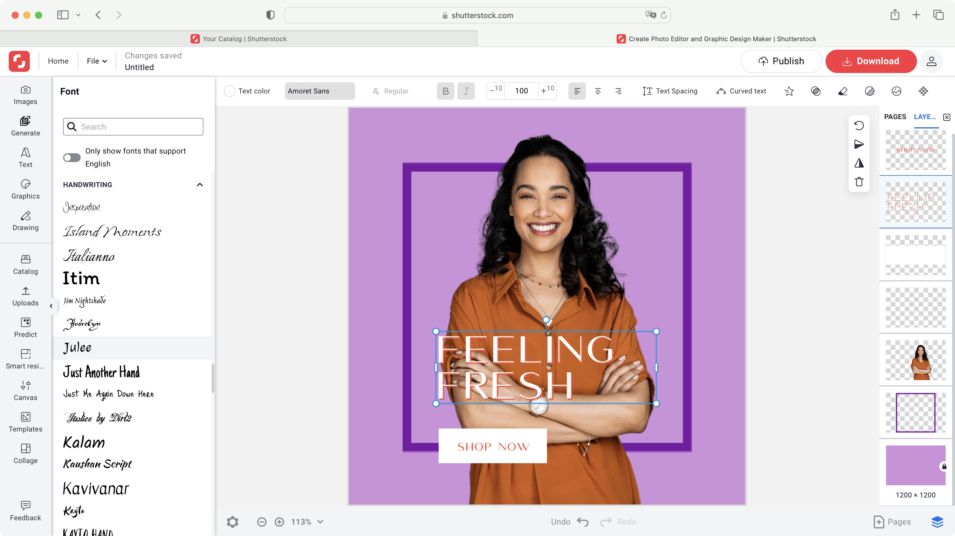
Creative Flow+’s text tools are quite broad and extensive (Image credit: Shutterstock)

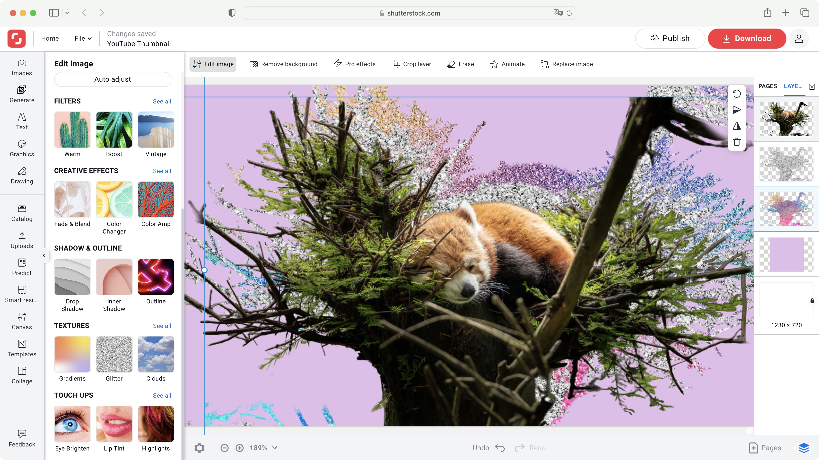
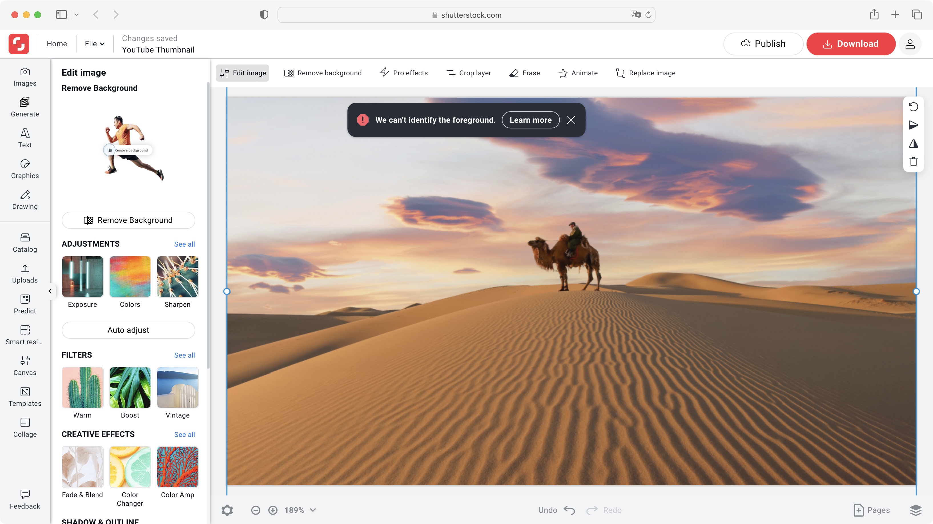
Add an image to your canvas, and perhaps one of the most useful and impressive tools is ‘Remove Background’. Now of course, the more uncluttered the background, the easier it will be for Create to excise the foreground from it, and we did encounter some whose composition was too complex for Create to handle. However when it works, it works very well, and you’re given some simple tools to refine the results.

You also have a selection of ‘Pro Effects’ at your disposal - they’re fun to use but they have no obvious editable options. You can color correct your image of course, crop it, erase sections, or even animate their appearance onto your canvas, should you be working on a project that supports such action.

There’s a wealth of graphics you can add and customize, a selection of brushes for freehand drawing, and a vast choice of fonts you can add to your project. And everything is layer-based, meaning you can reorder objects with ease, lock them into place, or even delete them altogether.

Of course, Create can’t hope to compete with dedicated software, but the wealth of features found in those programs can be overwhelming, especially if you’re new to content creation (or you just need to build a lot of assets fast).

Yet here you have in your hands a lot of options that can help you create relatively complex designs in very little time, ready to download and use to promote your work or product. It’s also effortless to duplicate your project (via Catalog) so you can work on a different version, or set up personal templates in that way, to speed up any future projects you might wish to produce.

  • Create: 4.5/5 

Creative Flow+: Scorecard

Should I try?

Shutterstock's Creative Flow Plus platform during our test and review process

Being web-based, Creative Flow+’s tools have their limits, but you can still do an impressive amount with them (Image credit: Shutterstock)

Try it if...

You need access to royalty free images to design projects quickly online, organize yourself, plan with other members of your team, and get AI help to predict the next trend. 

Don't try it if...

You’re not enamored with getting yet another subscription service, and would need the sort of powerful tools found in the best photo editors and dedicated software.

!!!!!!!!!!

Popular Posts

Categories

Blog Archive