Wednesday, October 31, 2018

Asus Chromebook Flip

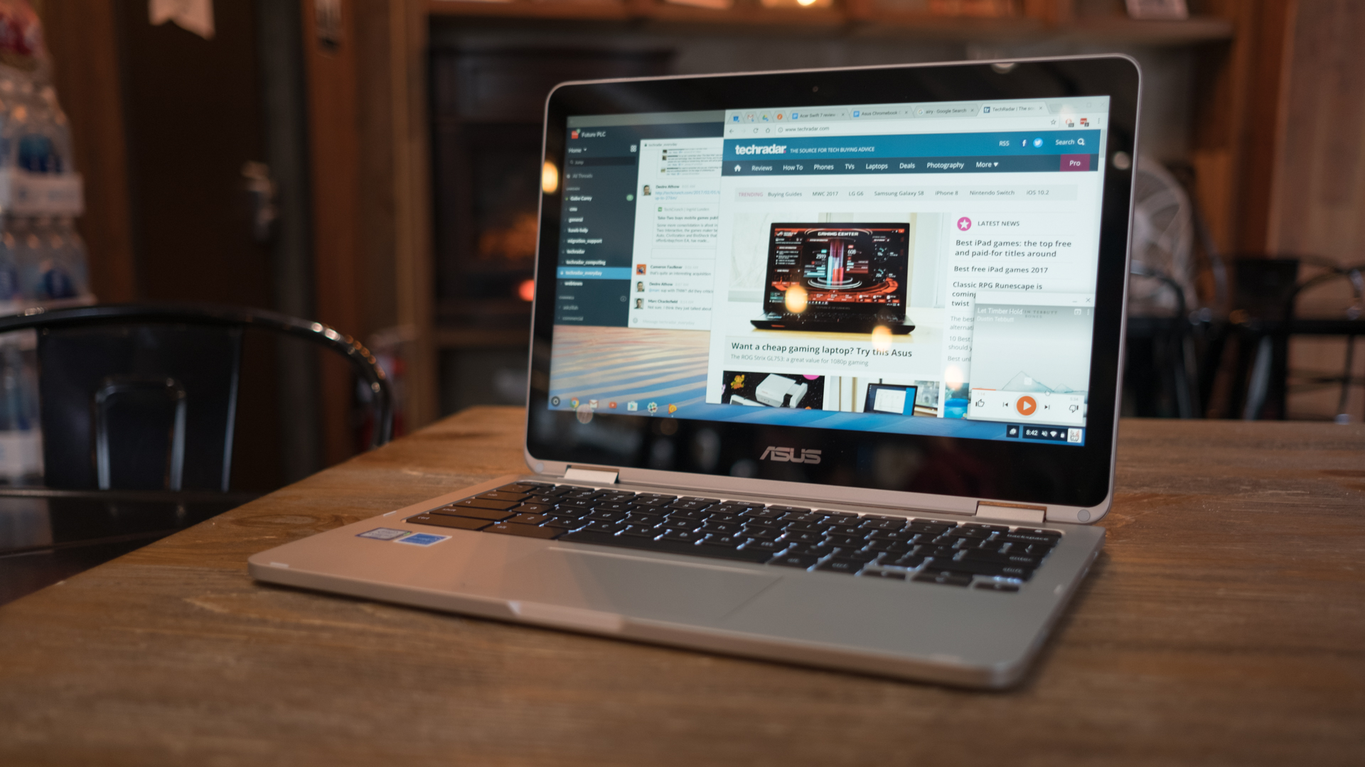
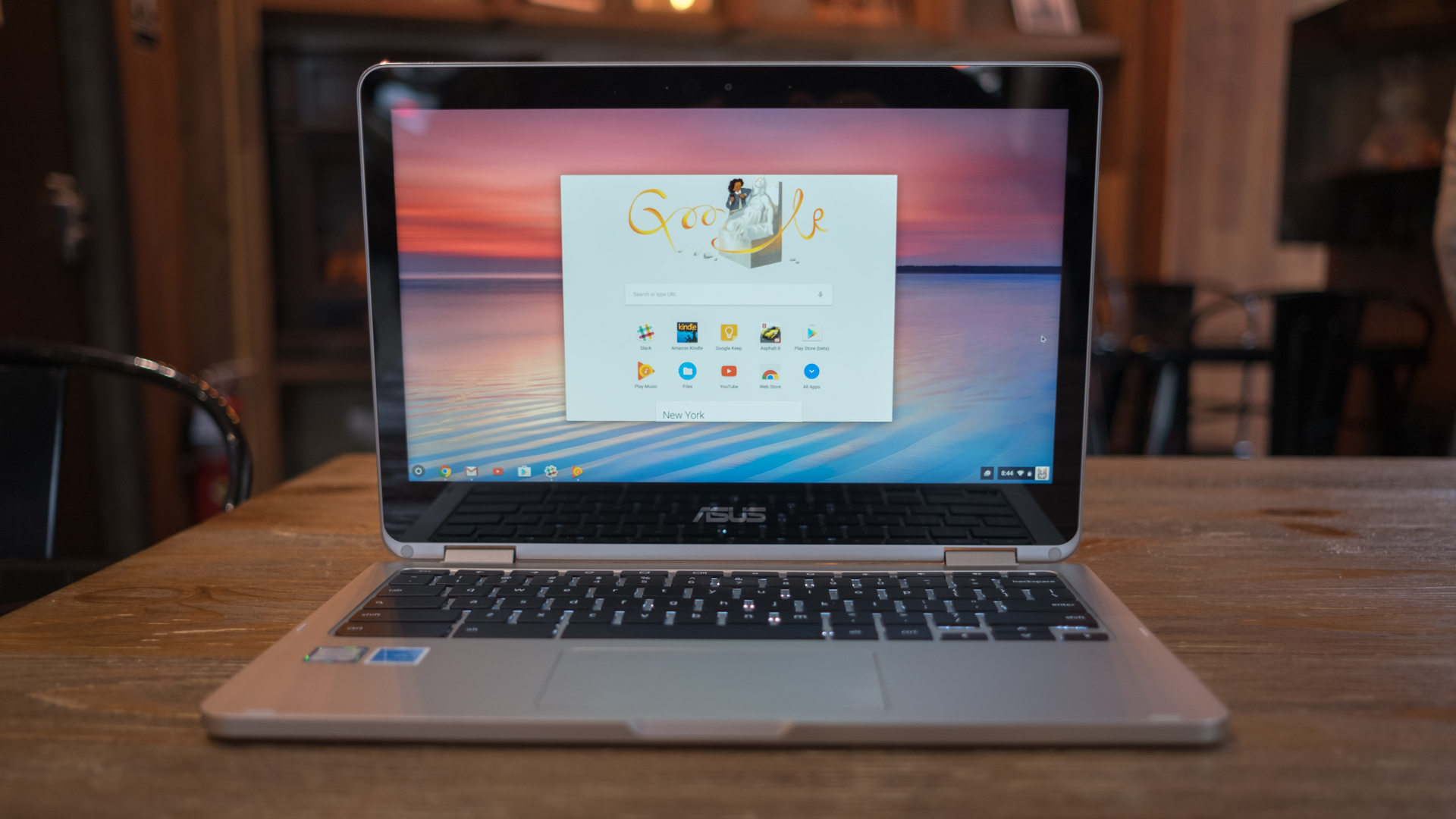
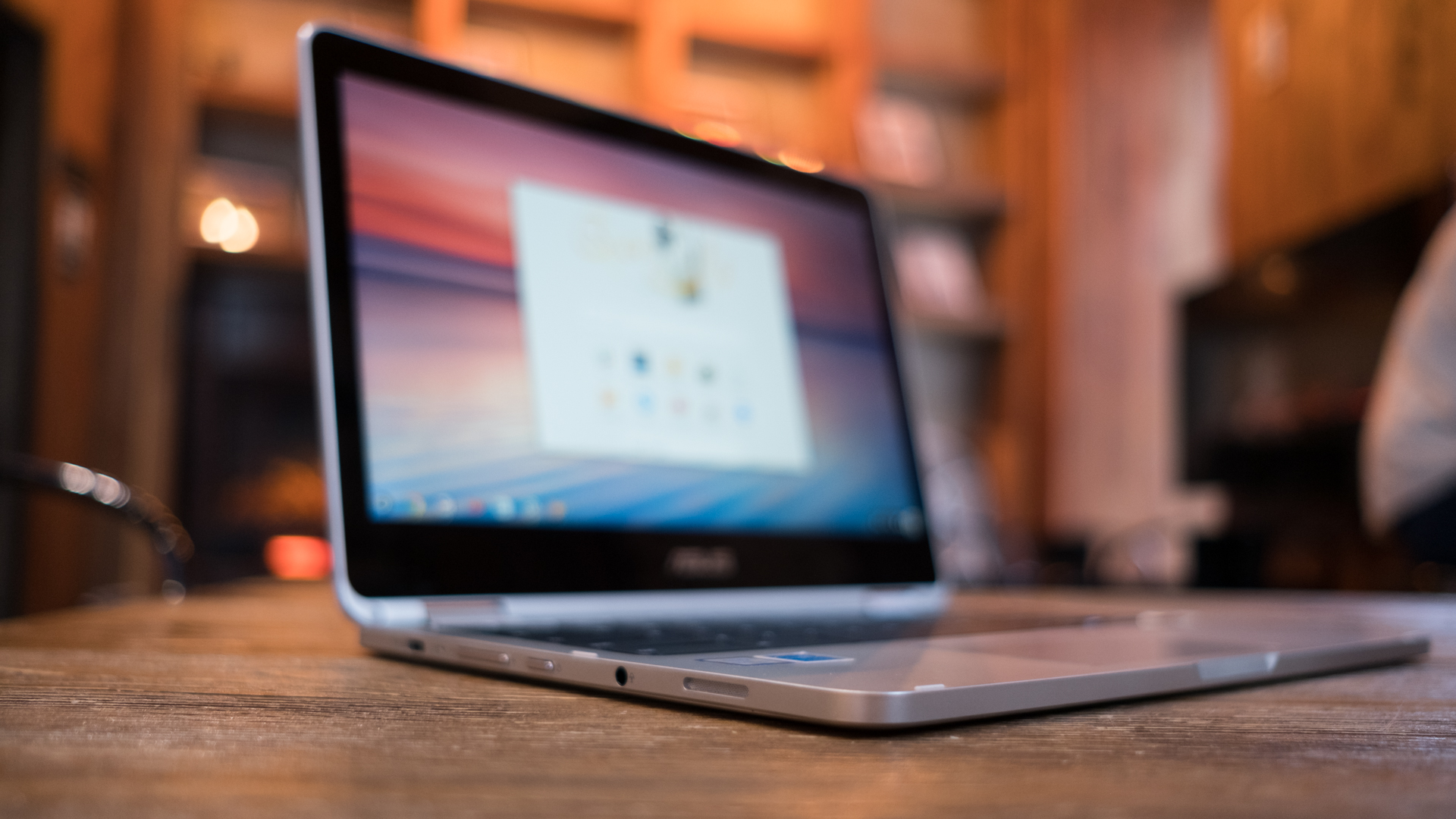
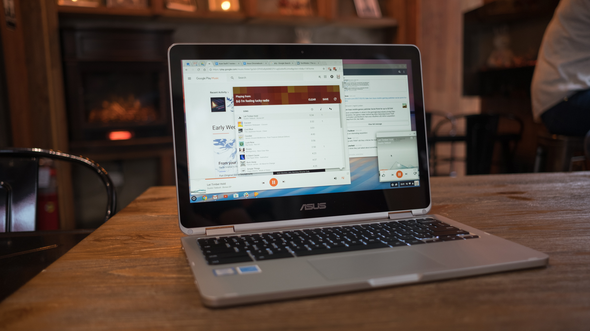
We’ve been kicking the idea of the premium Chromebook around for a while now. However, until the Asus Chromebook Flip came around, we never saw this concept so fully realized. We could go on all day about where early Chromebooks faltered, but there’s no need – the Asus Chromebook Flip is everything we want in a premium Chromebook.

It’s not quite as performant as the excellent Google Pixelbook, but it doesn’t actually need to be – it’s half the price and not that far off when it comes to performance. This attention to value, without sacrificing performance is exactly what makes the Asus Chromebook Flip so appealing.

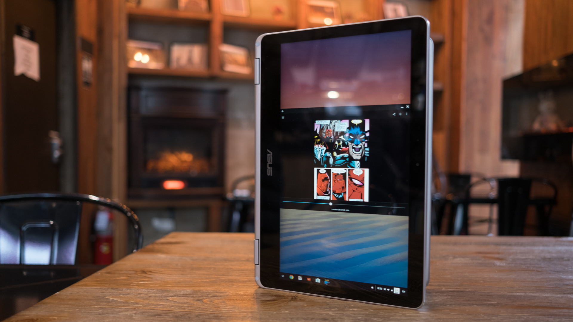
What’s more, the Asus Chromebook Flip has a 360-degree hinge that has it ‘flip’ inside out – hence the name. At 12.5 inches and 2.6 pounds, the Asus Chromebook Flip isn’t just ‘good for a Chromebook’, it’s one of the best laptops period – depending on what you’re looking for. 

Pricing and availability

We wouldn’t blame you for doing a double take after seeing the price of the Asus Chromebook Flip. Before the Black Friday and Cyber Monday deals, it comes in at $499 or £599 (about AU$650), which is pricey compared to a lot of other Chromebooks. After all, half a grand could get you a serviceable Windows laptop. However, value comes down to taste, and you could cut some corners on storage and processing power for $449 or £499 and get a slightly toned-down version of the Asus Chromebook Flip.

An equally powerful HP Chromebook 13 will set you back $619 or £590 (about AU$800) with half as much onboard storage, but a sharper QHD display. Meanwhile, the enterprise-oriented Acer Chromebook 14 for Work runs for $499 (about £372, AU$650) with an Intel Core i5 processor, 8GB of RAM and 32GB of flash storage.

The C302’s biggest rival is the Samsung Chromebook Plus, which undercuts it at $449 (about £360, AU$590) with an ARM processor, sharper 2,400 x 1,600 screen and a built-in stylus. What’s more, Samsung’s latest Chrome OS machine is also available in a Pro SKU that plops on the same Intel Core m3 chip for $549 (about £440, AU$720).

Of course, there are more affordable Chromebook options. The $399 or £399 (about AU$665), Acer Chromebook R13 also comes in a convertible form factor with a Full HD screen, though, its 2.1GHz quad-core processor doesn’t hail from Intel, but rather MediaTek.

Design

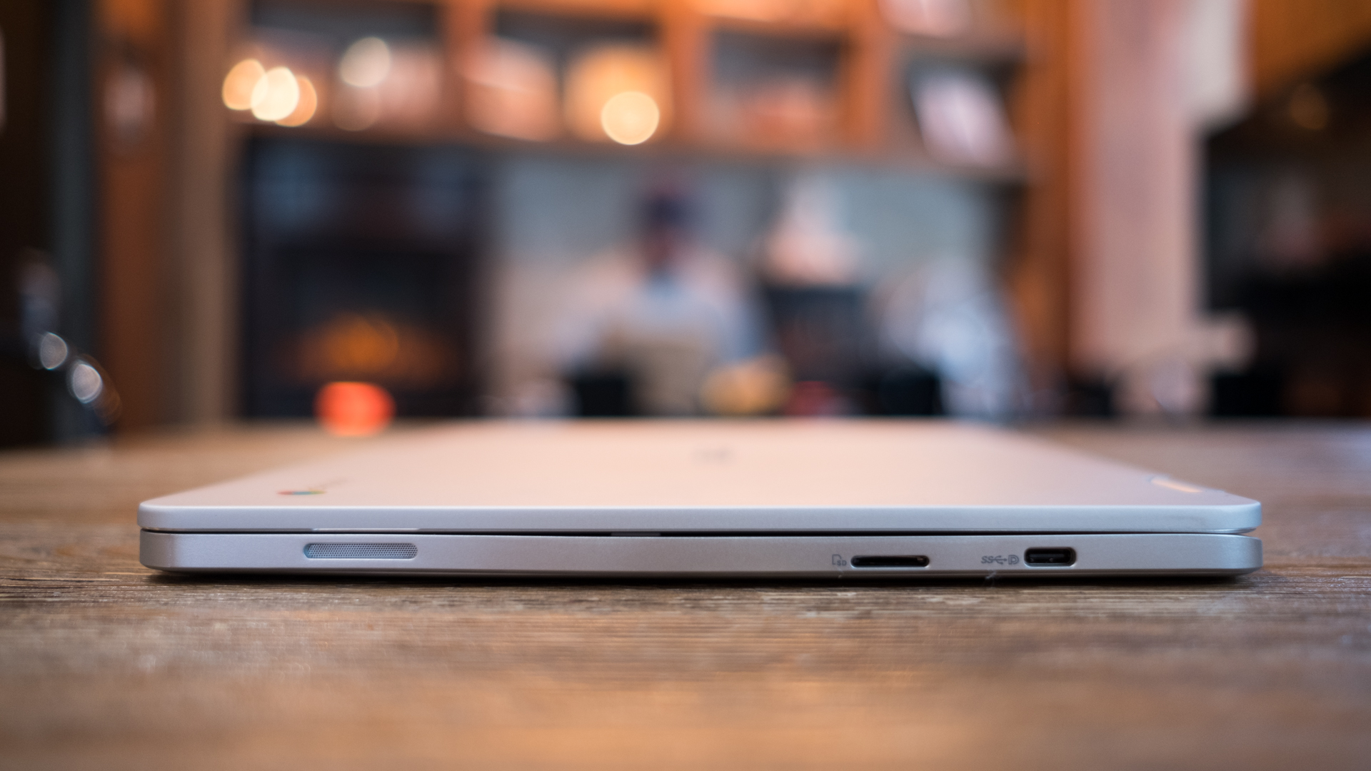
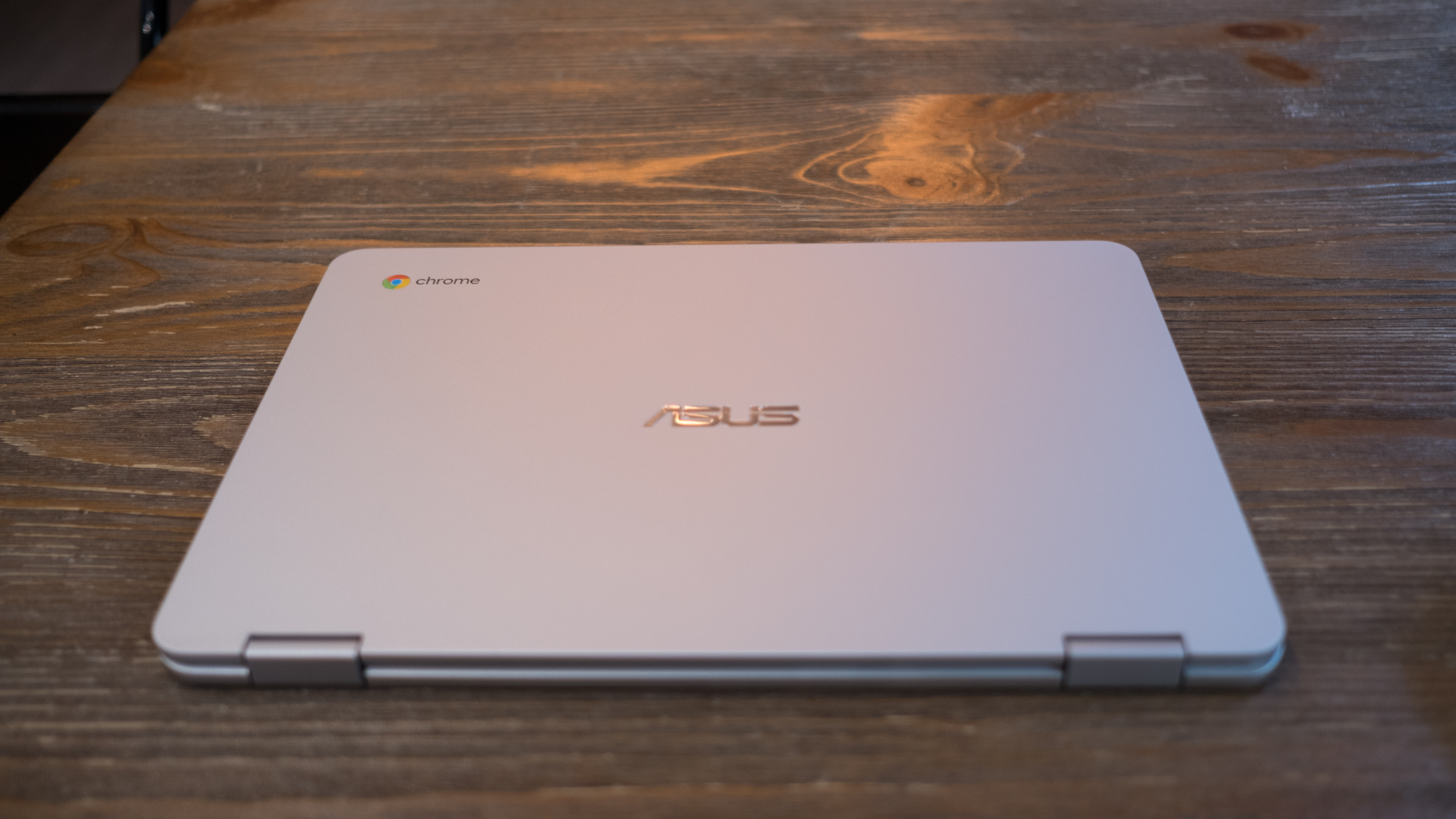
Like the original Asus Chromebook C100 before it, the C302 is built from an all-aluminium chassis, though, this time it has an anodized finish rather than a brushed texture. Overall, it has a clean, no nonsense aesthetic and it folds up to a nearly symmetrical slab of metal.

Thankfully, the original Chromebook C100’s long, bar-shaped hinge has been dropped for the ZenBook Flip UX360’s multi-gear, metal mechanism. The smaller, two-piece mechanism makes this machine feel like less of a toy while helping it to blend in as a regular notebook.

Overall, the Asus Chromebook Flip looks and feels like any other unibody laptop inspired by the MacBook Pro in the last decade. However, its rounded corners, straight edges and 0.9 inch (2.29cm) thin frame all add up to a slick design rivaling HP and Google’s most premium model at a much lower price.

Weighing in at 2.6 pounds (1.19kg), the C302 is one of the lightest Chromebooks, beating out the 2.86-pound (1.3kg) HP Chromebook 13. It’s also one of the first convertible Chrome OS machines you’ll actually want to use in tablet mode, unlike the 3.3-pound (1.5kg) Acer Chromebook R13.

Aside from being lighter, the C302 seems to have been specifically designed for tablet use. Asus has come up with a clever magnetic clasp that pulls the screen lid tight against the underside of the notebook. It’s an ingenious addition that helps the 2-in-1 Chromebook feel like one solid device rather than a foldable electronic, and we’re surprised this solution hasn’t come sooner.

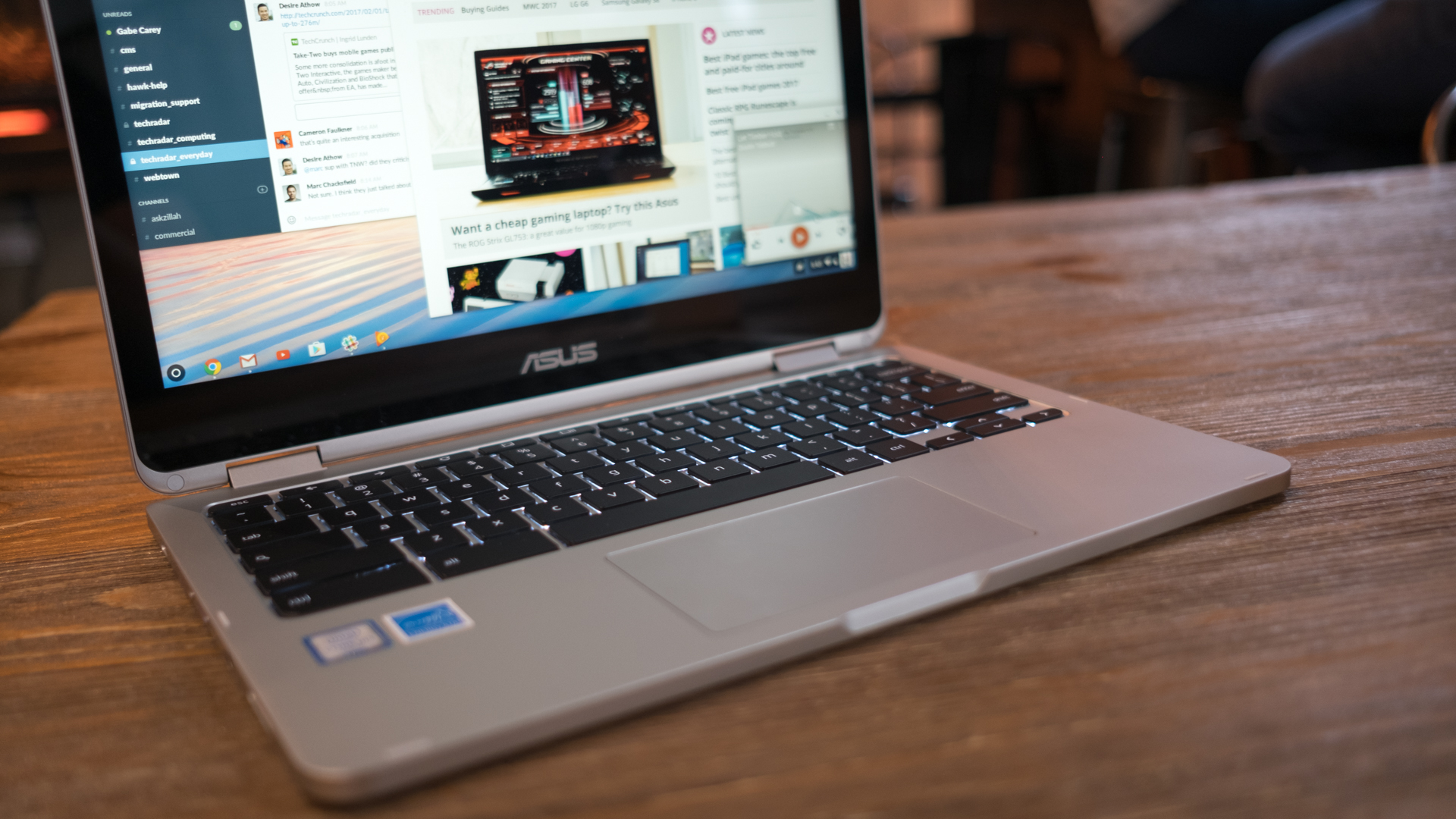
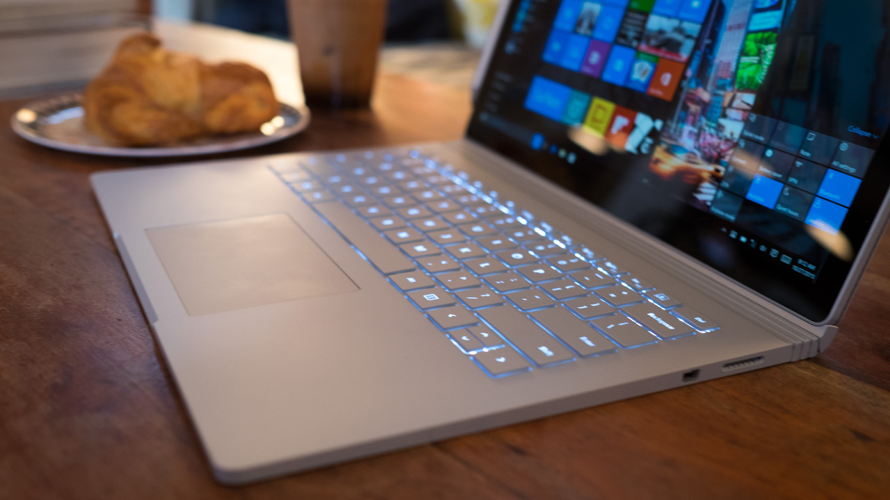
When you’re not using the C302 as a tablet, it falls back on a solid keyboard that makes it as familiar and comfortable as any traditional laptop. The keys offer a satisfying 1.4mm of crisp key travel that we’ve missed in a world of ever-slimmer notebooks.

As for the trackpad, we can really only say it exists. It offers accurate tracking, but without any multitouch features but two-finger scrolling, there’s nothing noteworthy about it.

Android apps on tap

Having a usable tablet mode is becoming ever more common in Chrome OS devices as Google has steadily increased the platform’s Android integration. Unfortunately, the C302 does not come with access to the Play Store right out of the box, and we had to switch over onto Chrome OS beta channel in order to download apps. 

Other than that small hiccup, the hybrid Chromebook is fully equipped to drive right into the Android ecosystem. We swiped and tapped into our favorite apps just as we would on any Google tablet. To our surprise, the hybrid Chromebook is also outfitted with gyroscopes, allowing us to play motion-controlled games like Asphalt 8.

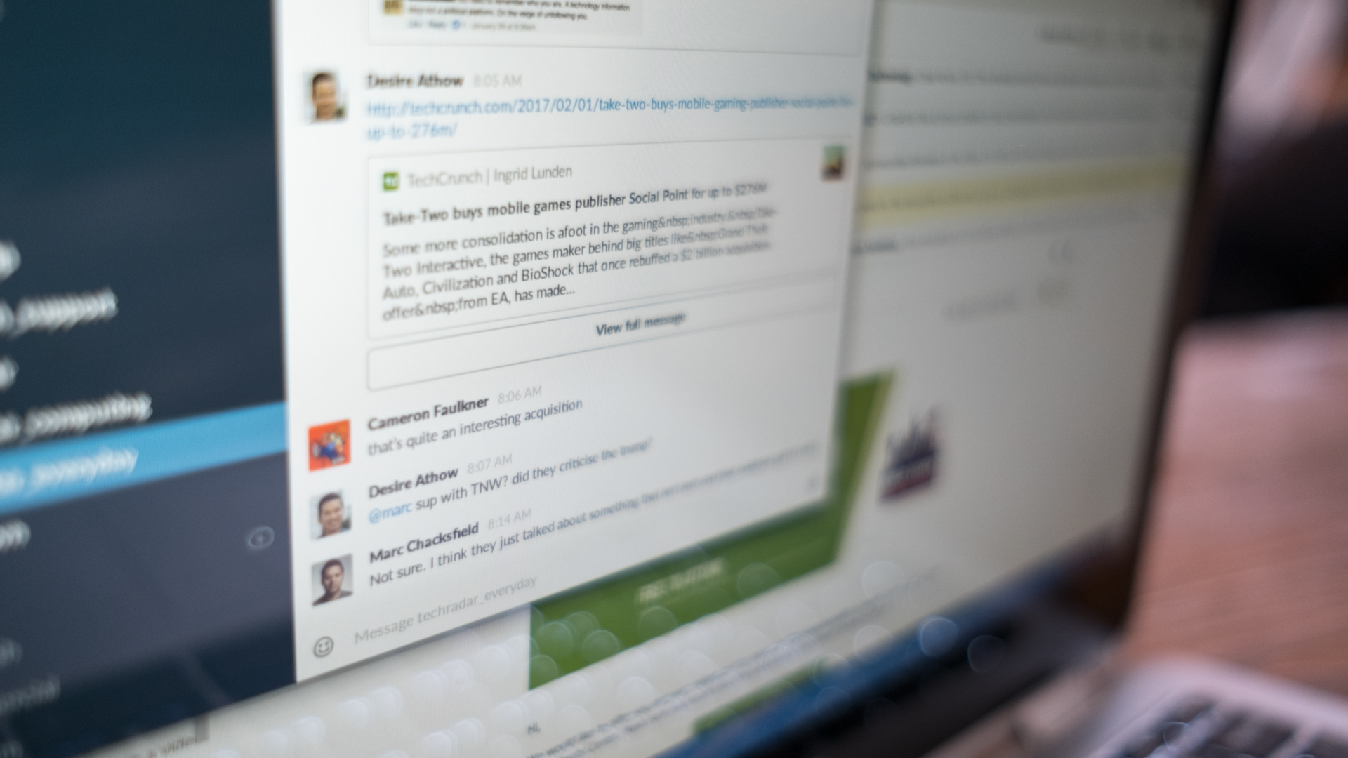
Unfortunately, not everything about running Android apps is perfect. Slack and many other important apps we typically use on an smartphone don’t scale properly on Chromebooks, leaving us with tiny text on certain apps, and the Kindle app isn’t able to display full screen in portrait orientation.

Mobile apps also are designed with a touchscreen interface in mind, and sometimes this doesn’t play well with the touchpad and keyboard setup of the C302. Of course, it’s easy enough to switch the hybrid to tablet mode.

We chalk these issues to the beta version of Chrome OS, which fixed some problems and introduced new ones during the course of our review. 

However, despite these issues, we don’t miss the days of sorting through the beleaguered Chrome Web Store full of knockoff apps and games. Though it’s only in beta, having access to the Play Store grants us access to so many more useful programs on the Asus Chromebook Flip.

We love using Android apps in tablet mode just as much as sitting down with the C302 as a traditional Chromebook for long browsing and writing sessions. The hybridization of Google’s two platforms also finally lets us use mobile apps alongside the staple elements of Chrome OS.

First reviewed November 2017

Performance

Intel Core M-series CPUs might just be the perfect part to power Chromebooks, as they offer more performance than your average Celeron chip while being more efficient. And that’s just not just us saying that: the benchmark results back us up here.

The C302, with its Core m3 processor, performs nearly twice as fast as the Dell Chromebook 13 with a Celeron processor. That said, this hybrid doesn’t quite have the gusto to keep up with the Intel Core i5-powered Acer Chromebook 14 for Work or the Core m5 chip inside HP Chromebook 13, though it’s only a quarter less power.

Numbers aside, the 2-in-1 Chromebook performs admirably even with two open Chrome windows with 12 open tabs each. Along with our heavy browsing habits, we also had Google Music playing in the background and the Slack Android app open.

Optimal performance

Chromebooks are known for having long battery life, and the Asus Chromebook Flip is a great example. In fact, it’s the longest-lasting premium Chromebook we’ve used – it ran for a whopping 10 hours and 46 minutes on our standard local movie playback test.

By comparison, the Acer Chromebook 14 ended its run an hour and 10 minutes earlier, and the HP Chromebook 13 only managed to last for just a minute over eight hours.

With our typical workload, the Asus Chromebook Flip ran just shy of hitting the eight hour, all-day battery life mark. However, any combination of running fewer tasks, turning off the keyboard backlight or lowering the display’s brightness would dramatically increase battery life with this Chromebook.

Screen and speakers

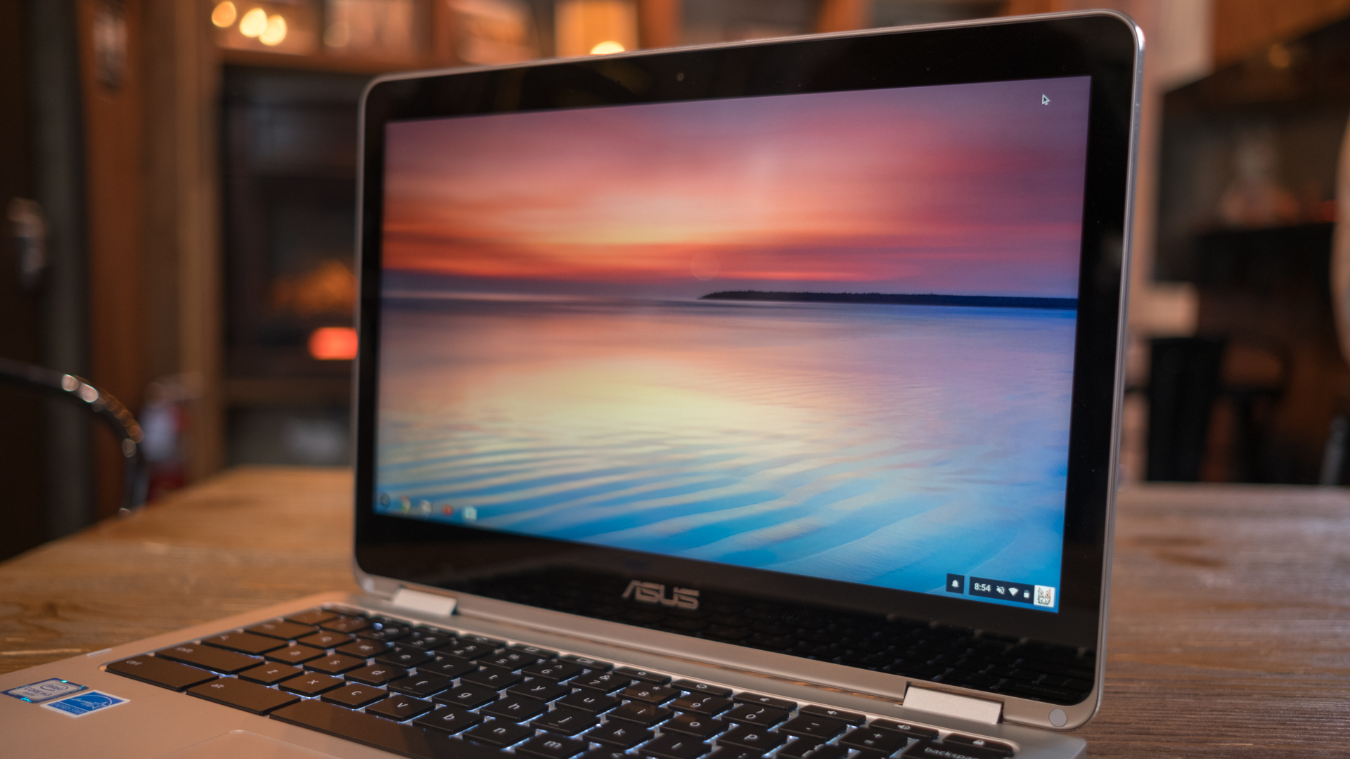
Although the Asus Chromebook Flip C302 only rocks a 1,920 x 1,080 display, FHD is really all you need on a 12.5-inch screen. It’s not as sharp as the QHD HP Chromebook 13, but the lower pixel count affords two more hours of battery life – a trade off we would gladly take.

Still, text and photos remain crisp and the C302 resolves strong colors, which is exactly what we want to see in a companion device to flip through e-comics and online video. Average contrast levels – dark pixels often falling off to deep blacks – is the only weak point of the display but it’s still better than most Chromebooks, and we prefer this to seeing muddy grays.

Audio-wise, the Chromebook Flip’s speakers are loud, but lack much nuance to really appreciate music. There’s also a slight hint of tininess that limits how high you can set the volume before it’s unbearable, so plug in a pair of headphones if you’re looking to rock out.

We liked

From top to bottom, the Asus Chromebook C302 is our most favorite Chromebook yet. It meets high standards set by the HP Chromebook 13 and other premium Chrome OS machine with a classy design and high-spec parts – yet it does all of this at a lower price.

We disliked

Our only legitimate complaint about this hybrid Chrome OS machine is it’s mediocre speakers, but it’s an issue we take with 80% of laptops. In other transitory problems, we wished Android app integration would have been more seamless, but for now, it’s an ongoing process. We’re sure Google will add Play store access to a stable Chrome OS build for this particular Chromebook as it has with others in the past.

Final verdict

If you’ve been on the fence about buying a premium Chromebook, this one has 100 reasons (read: dollars, pounds … you get it) to make you jump for it. Although it isn’t a huge price difference, the Asus Chromebook Flip C302 rises to its premium stature with a gorgeous screen and a better keyboard than you would find on some Ultrabooks.

This is the first Chromebook that actually feels as comfortable to use as a tablet as it is a traditional laptop. While the Samsung Chromebook Pro almost makes this version pointless with its sharper screen and built-in stylus, we have yet to see how it performs. For now, the Asus Chromebook Flip C302 is king of the Chrome OS hill and it’s still worth your time, even in 2018. 

Microsoft Surface Book

Did you know the Surface Book isn’t Microsoft’s latest flagship 2-in-1 laptop? No, that honor goes to the new, and now more affordable, Microsoft Surface Book 2 – now, read our Surface Book 2 review!

When the Surface Book, well, surfaced back in October 2015, it made massive waves in the computing world. Now, three years later, it’s not hard to see the massive influence the original Surface Book had on the best 2-in-1 laptops.

And, because the Surface Book 2 is such a premium laptop, the original Surface Book will be holding a dedicated fan base well into the future. It’s an enduring device that, with a constant flow of updates – like the Windows 10 October 2018 Update – has been growing and evolving since day one.

All you need to do is just look at the Surface Book, and you’ll know it’s an expensive device – but it’s worth it. The original Surface Book justifies its high price tag due to the fact that it’s essentially two devices in one, with an incredibly sharp 3,000 x 2,000 display, competent 6th-generation Intel processor and an Nvidia GeForce GTX 940M graphics card. We’d even go so far as to praise the controversial dynamic fulcrum hinge – even if it’s not quite of the same quality as the Surface Book 2’s hinge. 

Price and availability

The Surface Book 2 may have a lower starting price than it did upon release, now at $1,199 (£1,149, AU$2,199), but these days you can get the original Surface Book for even less – especially with Black Friday and Cyber Monday lurking around the corner. Of course, you’re not going to find it brand new on store shelves these days, but a refurbished Surface Book is still a Surface Book – and, really, that’s enough for us.

If you go on Amazon, you can expect to save hundreds of dollars when compared to similarly specced Surface Book 2 devices without losing too much performance – and retaining the fantastic form-factor.

Still, the Microsoft Surface Book stands out for more than its spec sheet. It’s the 2-in-1 convertible design that attracts the masses. While the Huawei MateBook X Pro might have you feeling seduced with its bezel-less design, the Surface Book is much more versatile with the detachable screen and native stylus support necessary to make it such an undeniable catch. Plus, it’s cheaper, even if it doesn’t have a webcam hiding under its F6 key. 
Surface Book

Design

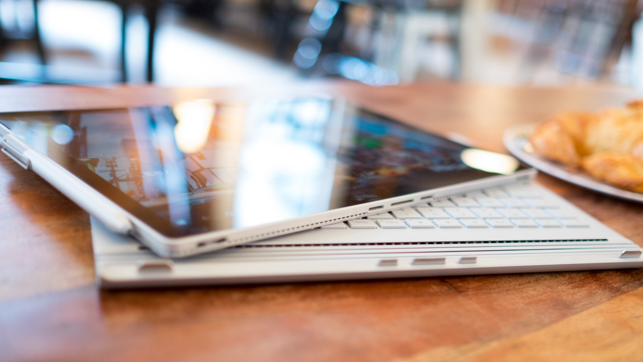
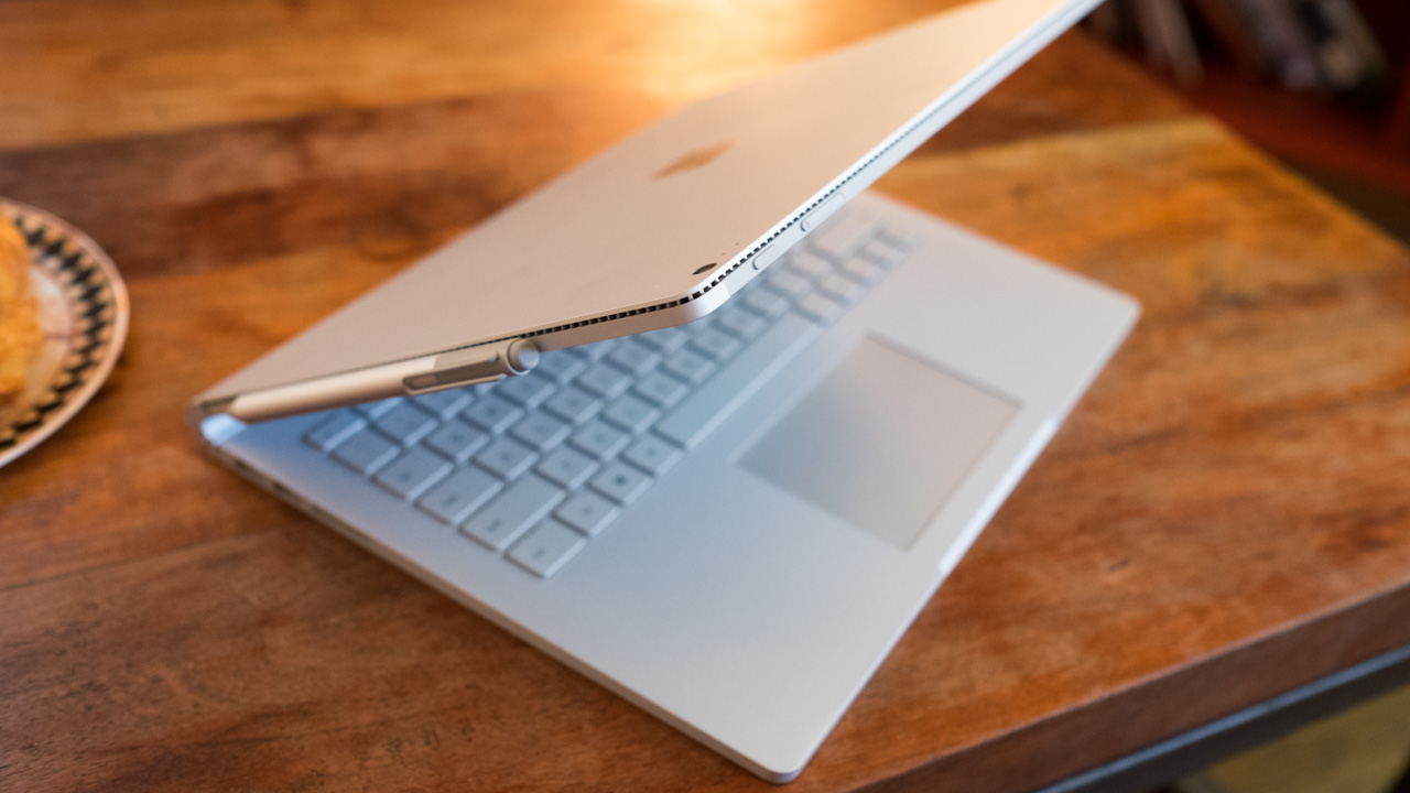
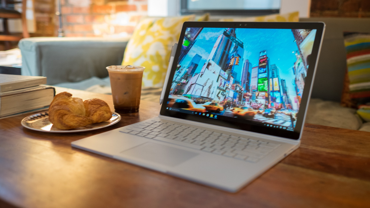
If a tear in the space-time continuum were to suddenly rip open, two things would fall out: the Terminator and then the Surface Book quickly tumbling to the Earth behind it. From the snake-like hinge, the flat design and even down to the washed-out silver color of this laptop, everything about it just seems like it came from the future.

Milled from two solid blocks of magnesium, the Surface Book feels sturdy and has a most minimalistic style unto its own.

From keyboard deck to the palm rests, the entire interior of the Surface Book is one flat surface of metal, except for the large space reserved for the glass touchpad. Likewise, the screen is made of one uninterrupted slate of magnesium, with its only extra flourishes being a mirror finished Windows logo in the center and a rear-facing camera.

Along the chiseled sides, you'll find two flat edges that start from the top of the display and terminate at the tip of the palm rest. That's not the only seamless transition.

Unlike most other convertible devices, the screen and base sections share nearly the same thickness and weight. Without the foreknowledge that the display can actually detach, the Surface Book looks like one continuous device, thanks to the hinge.
Surface Book

Mind the gap

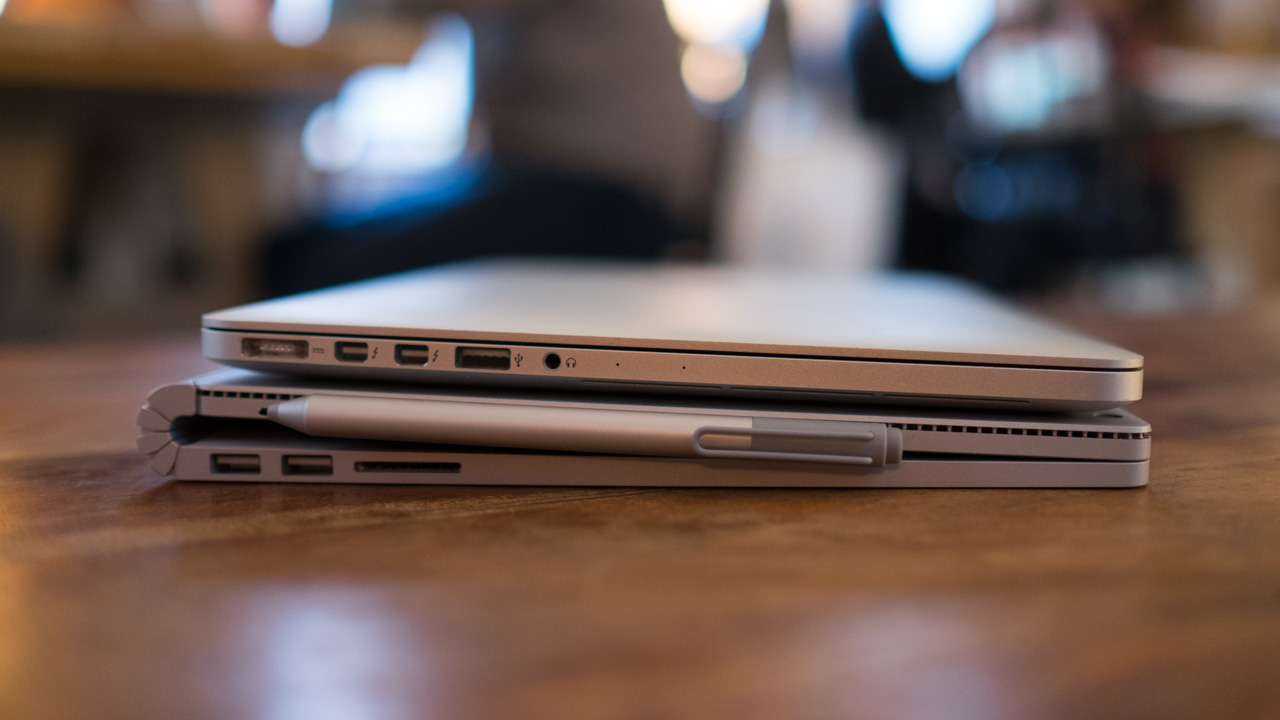
At the midpoint of the Surface Book, there's a piece of connective tissue that Microsoft calls the dynamic fulcrum hinge. Rather than simply bonding the screen and keyboard base together, it's this key piece that makes the whole device work.

Rather than folding flatly, like a normal laptop, the dynamic fulcrum hinge coils into itself, leaving a noticeable gap between the screen and keyboard when its closed. When opened, this same hinge rolls out and actually extends the base of the laptop, which in turn helps extend the support base for the tablet portion of the Surface Book (called the Clipboard).

While a traditional notebook display might weigh half a pound at most, the top section of the Surface Book weighs 1.6-pounds, because it contains all the necessary parts to act as a standalone tablet. As such, the hinge has been reinforced and contains extra mechanisms, not unlike the Lenovo Yoga 900's watchband-style hinge to keep it in place.

Surface Book is solid as a rock, and you can even pick up it by the display and shake it about without worrying about the whole thing falling apart. On a flat surface, the screen is held steady in place and even stays put when you have it in your lap.

The only times we got the screen to move were when we tried poking the Surface Book with the Surface Pen, but that really comes from trying to operate a touchscreen on a laptop. Fortunately, the hinge on the Surface Book 2 is a lot sturdier – but it’s much more expensive. Other than that, the strikingly similar design carries on to the Surface Book’s sequel.

To alleviate some of the worries about the gap in the middle of the system – yes, there’s a large open space right in the middle when it’s closed. No, dust and other bits of nasty gunk won’t slip into the interior anymore than with a standard laptop, unless you’re an especially messy person. After a week of using the Surface Book day-in and day-out, we were able to run our finger against the inside hinge and not find a single speck of dust.

Another plus side of having a laptop that doesn’t close completely flush is that you don’t need to worry about oily outlines of the keyboard appearing on the screen. It’s a design element that also eliminates the need to seat the keyboard into a recessed area. Rather, the keys stand at attention above the keyboard deck.

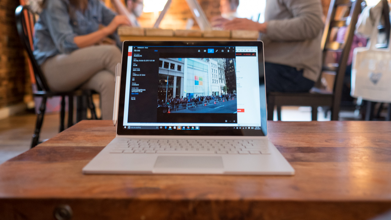
The keyboard itself offers a splendid 1.6mm of key travel that caps off with a satisfying thwack when you bottom out the keys. The trackpad is just as pleasing, with its glass-laminated surface. For the first time ever, we found ourselves using three-finger multi gestures to rotate through windows and reveal the desktop.

While this is a tiny element of the Surface Book, few – if any – other Windows notebooks on the market today offer such a tight tracking experience.

Mobilizing the desktop

The Surface Book’s other trademark feature is the screen, which can pop off the base with the tap of a button. Now, Microsoft was technically late to the 2-in-1 laptop game with other devices able to perform similar actions, including the Acer Switch family, Toshiba’s Click notebooks, some HP devices – the list goes on.

However, Microsoft was the first to make a system as seamless as the Surface Book.

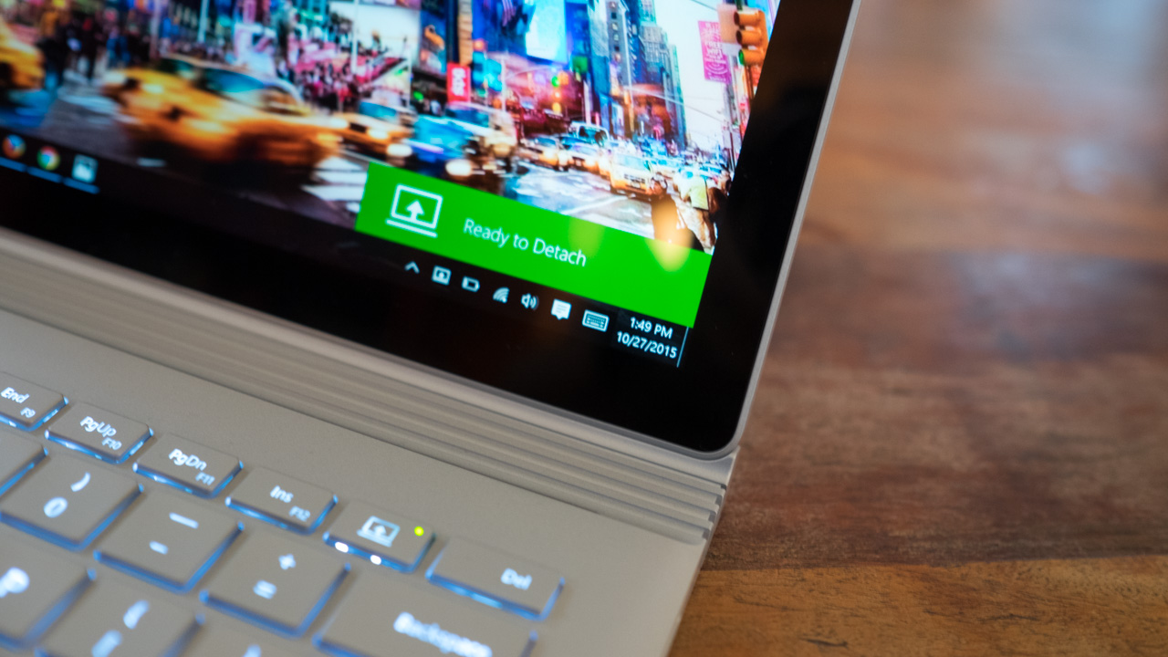
Undocking and attaching the Clipboard is nearly as seamless as the Surface Book's design. After either pressing the eject button on the keyboard or the virtual button in the taskbar, the screen will blink off for a second and then notify you it's safe to detach the screen with one quick tug.
Surface Book

It's fast and simple, however, the timing takes a little getting used to. After you get the prompt to detach the screen, you have to wait for about half a second before you can actually lift the display off its base.

Another unique feature to this notebook is it's the first to integrate a discrete graphics processor, or GPU, into a hybrid system. Tucked underneath the keyboard is a customized Nvidia GeForce GPU that makes this laptop just a bit more capable with media production and gaming.

We've seen this sort of GPU docking technology before in machines like the MSI GS30 Shadow with GamingDock and Alienware's GPU Amplifier solution. Microsoft has improved upon dockable graphics, as the Surface Book just needs a short moment to disengage the extra parts, whereas both the Alienware and MSI solutions require the laptop to reboot completely.
Surface Book

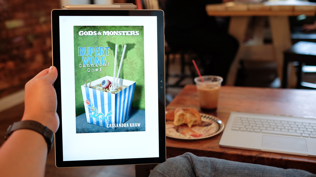
It's a neat feature that allows us to quickly show a friend something cool or when we want to read a digital comic book without having to lug the whole laptop around. But it didn't really click with us until we realized how easily it allows us to bring our entire PC to another place without having to disconnect our external monitor, keyboard, mouse, Xbox controller and all our other peripherals at home

It's the coolest mechanic since the saucer separation of the Enterprise-D. What's more, it leaves open a door to expandability. Because the Clipboard is compatible with all Surface Book keyboard bases, not just the one it shipped with, Microsoft could theoretically come out with future upgrades could be done through new bases. (Or maybe even a desktop rig that interfaces with the display? We can dream.) 

First reviewed: October 2015

Bill Thomas and Gabe Carey have also contributed to this review

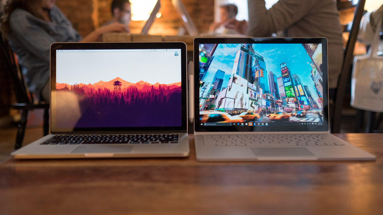
With a starting weight of 3.34 pounds (1.51kg), the Surface Book is one of the heaviest 13-inch laptops. And that's without the optional, discrete GPU, which ends up adding a few extra ounces and bumps up this laptop's total weight to 3.48 pounds (1.58kg). While this might look like a lot on paper for an Ultrabook-class device, consider the 13-inch MacBook Pro weighs just as much despite it packing a smaller screen, no dedicated GPU and fewer batteries. For a closer look at how the two devices compare, check out our Microsoft Surface Book vs Apple MacBook Pro versus article.

If you're looking for the power of a discrete GPU in an Apple device, you'll have to go all the way up to a high-end 15-inch MacBook Pro. And this is a machine that is significantly heavier (4.49 pounds or 2.04kg) and larger (14.13 x 9.73 x 0.71 inches or 359 x 247 x 18mm).
Surface Book

Thanks to its 3:2 aspect ratio and having a 13.5-inch screen, the Surface book is quite a bit taller than your average 13-inch laptop. Despite its peculiar 12.3 x 9.14 x 0.51-0.90 inches or 312 232 x 13-22.8 mm (W x D x H) dimensions, I had no problem slipping this laptop into bags designed to hold a traditional 13.3-inch laptop.

The Dell XPS 13 comes as the antithesis to the Surface Book in its mission to be the smallest 13-inch laptop in the world, weighing in at 2.8 pounds (1.27kg) while measuring 11.98 x 7.88 x 0.6 inches (304mm x 200 x 15mm).
Surface Book

Spec sheet

Here is the configuration for the Microsoft Surface Book techradar reviewed:

  • Processor: 2.4GHz Intel Core i5-6300U (dual-core, 3MB cache, up to 3GHz with Turbo Boost)
  • Graphics: Intel HD graphics 520; Nvidia GeForce graphics (1GB GDDR5 high-speed memory)
  • RAM: 8GB
  • Screen: 13.5-inch, 3,000 x 2,000 (267 ppi) PixelSense Display
  • Storage: 256GB PCIe3.0 SSD
  • Ports: 2 x USB 3.0, mini DisplayPort, SD card reader, mini headphone/mic combo jack
  • Connectivity: 802.11ac 2x2 MIMO Wi-Fi, Bluetooth 4.0 LE
  • Camera: Windows 8MP rear-facing auto-focus camera (1080p HD), 5MP front-facing Hello face-authentication camera (1080p HD)
  • Weight: 3.48 pounds (1.58kg)
  • Size: 12.3 x 9.14 x 0.51-0.90 (W x D x H) (312 x 232 x 13-22.8 mm)
Surface Book

With an $1,899 or AU$2,949 (about £1,239) price tag for the configuration above, the Surface Book asks for a pretty penny that's typically reserved for high-end gaming notebooks. And that's even applicable to the $1,499 or AU$2,299 (about £978) price associated with its most basic configuration, which is essentially a more expensive Surface Pro 4.

Not just a joke either, Microsoft's two Surface devices shares very similar standard specs including the same processor, storage space and memory allotment. However, there are several key differences, as Microsoft's first laptop possess a larger screen and a completely different design. It's for this reason, it makes sense to either throw in an extra couple of dollars in the hole to get the $1,699, US-only unit with discrete graphics and 128GB of storage space.

If you want to go whole hog on Microsoft's hybrid, you could also pick up a 1TB configuration that comes with an Intel Core i7 CPU, a discrete GPU and 16GB of RAM for $3,199 – but again, unfortunately, this is a US-only configuration.
Surface Book

The well-equipped, Skylake-powered Dell XPS 13 can be had for $1,649 (£1,149, $2,499). While it does not come with a discrete graphics chip, the XPS 13 has a leg up on the Surface book with a 3,200 x 1,800 resolution display and a 2.5Ghz Intel Core i7-6500U processor.

The 15-inch MacBook Pro is by far the most expensive machine, ringing up for $2,499 (£1,999, AU$3,799). However, for this kingly sum, it comes with double the RAM and SSD storage space, an AMD Radeon R9 M370X GPU, and it's the only one with a quad-core processor. Unfortunately, it has the lowest resolution display, pushing only 2,880 by 1,800 pixels.

If you're looking for something to serve your basic mobile computing needs, then the Dell XPS 13 is your smartest and most economical choice. However, if you're looking for something flashier and can do more, then the Surface Book is your ticket. For those who need a production workhorse, the 15-inch MacBook Pro still wins this race against Microsoft.

With a dedicated GPU, naturally the first tests we conducted were gaming ones. The Clipboard and its Skylake processor have more than enough power to make Hearthstone fly, even at full resolution. Plugging the display into the keyboard base unlocks even more performance from the dedicated GPU. With the discrete graphics chip in tow, the Surface Book can play Rocket League at 30 frames per second (fps) in full screen and medium settings.

For more ‘hardcore’ games, like Metal Gear Solid: the Phantom Pain, we were able to get it running between 24 and 29 fps, but only after dropping down to 1080p and practically turning off every setting. Microsoft’s first laptop won’t be replacing the best gaming PCs any time soon, but it’s surprising how well this machine gets along with only 1GB of VRAM.

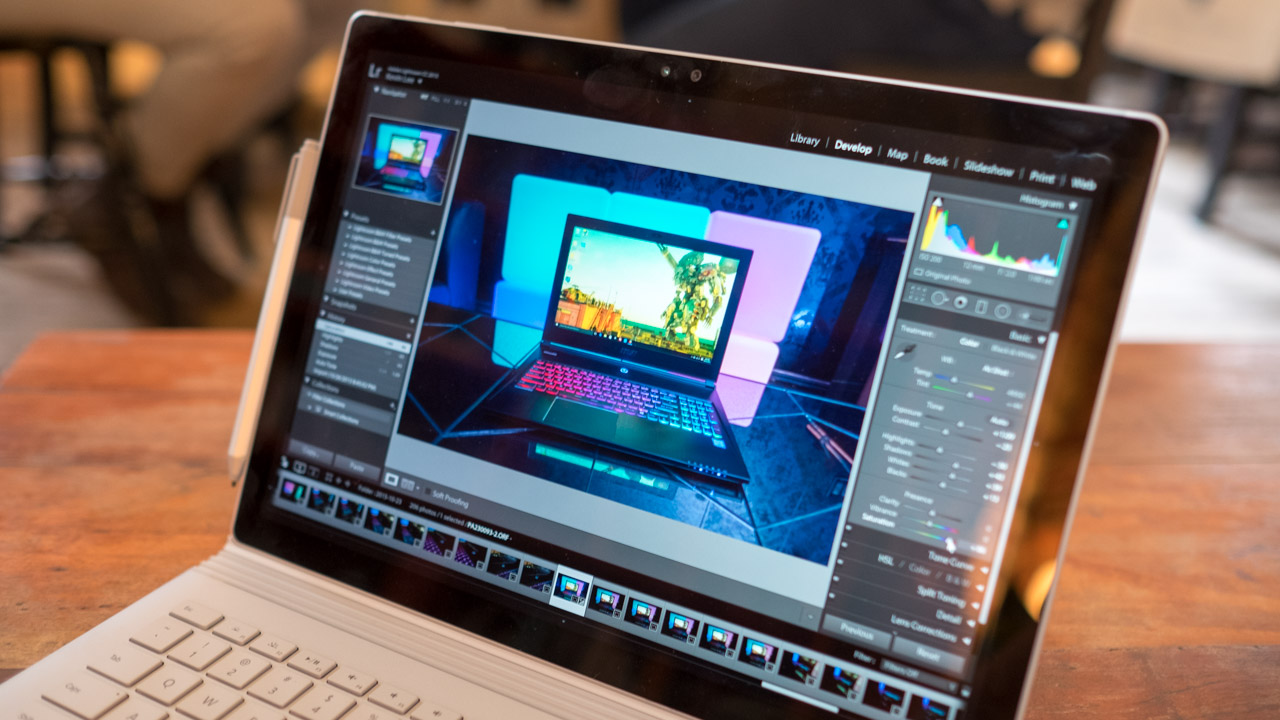
Of course, all this power also makes the Surface Book a productivity beast that easily takes on task after task. Lightroom runs incredibly fast on this 13-inch laptop, thanks to the added power of the Nvidia graphics. What's more amazing is we’re able to edit photos quickly while having a browser full of 10 tabs and streaming video pushed over to a connected monitor.
Surface Book

Benchmarks

Here's how the Microsoft Surface Book performed in our suite of benchmark tests:

  • 3DMark Cloud Gate: 7,285; Sky Diver: 6,089; Fire Strike: 1,868
  • Cinebench CPU: 301 points; Graphics: 32 fps,
  • GeekBench: 3,166 (single-core); 6,635 (multi-core)
  • PCMark 8 (Home Test): 2,336 points
  • PCMark 8 Battery Life: 3 hours and 58 minutes

The Surface Book has broken all sorts of benchmark speed record, thanks to its hot new Intel Skylake and Nvidia GeForce chipset. Just in terms of processing power alone, it's 301-point Cinebench score is significant jump compared to the Dell XPS 13, which ran with a last-generation Broadwell Intel Core I5 chip.

Thanks to the extra boost from the discrete graphics chip, the Surface Book also has more than double the performance for gaming. This is evidenced by its 1,868 point Fire Strike score compared to the Dell's 739-point performance.

The only figure we could draw to compare this machine to the 15-inch MacBook Pro is the GeekBench score. In the multi-core test, Microsoft's laptop finished with 6,635 points, whereas two outlets saw the 15-inch Apple's steely steed completed the test with an average of 14,258 – an unsurprising result, considering the MacBook Pro has twice the number of processor cores.
Surface Book

Pixels to please

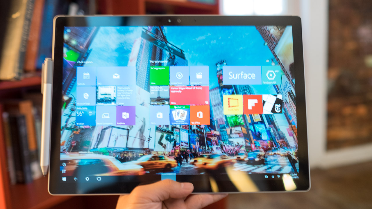
With 3,000 x 2,000 pixels under its belt, the Surface Book sits at a happy middle ground of being sharper than most other laptops (including every MacBook in existence) without the troubles that plague 4K screens. You'll never see the separation between the pixels, l because they're so tiny, and Windows 10 scales beautifully at 200%.

While most applications, including the Origin, Steam and Battle.net launcher would look tiny on a 4K screen, these windows look small, but not uncomfortably so, on the Surface Book.

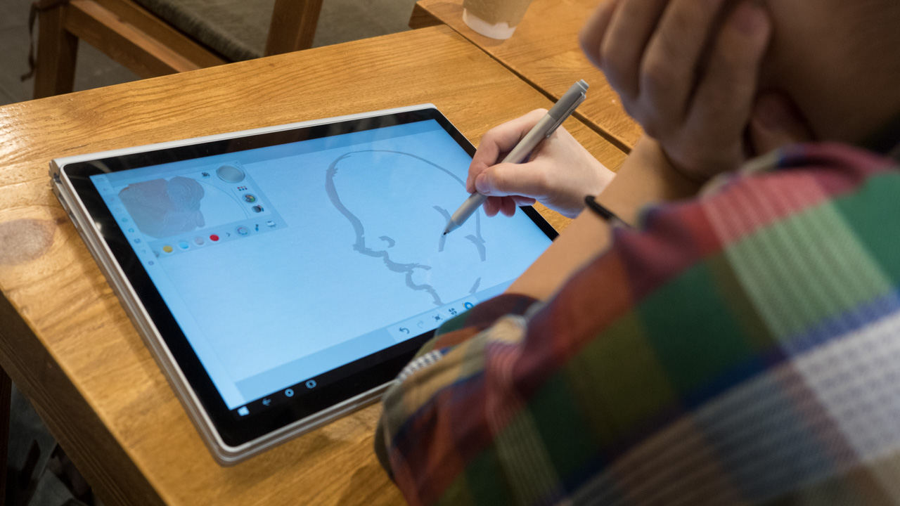
We even like the 3:2 aspect ratio. The ability to read more lines of text and not have a Lightroom window that's not vertically squished together more than makes up for the thick black bars that appear when you watch movies. Microsoft fashions its displays after A4 paper, which makes the Clipboard feel like a natural device for writing and art work.
Surface Book

Within five minutes of handing the Surface Book over to an artistic friend, who works as a designer in the fashion industry, she was already drinking the Kool-Aid. According to her, using the Surface Pen is incredibly accurate, and the screen gives just enough to the point where it emulates the feel of painting and drawing on real paper.

Now that Microsoft has started to patent new versions of the Surface Pen, complete with haptic feedback functionality and a touch-sensitive retention clip, we’re curious how else the company plans to improve upon its winning stylus in the future. For the time being, however, we’re admittedly satisfied by the 4,096 pressure sensitivity levels of the most recent Surface Pen. Should it get better, it would only be icing on an already delicious cake.

Sadly, the speakers don't make as big of an impression and really only sound good enough for some casual listening. While they avoid the problem of being tinny, as most laptop speakers are, they also lack any depth with barely any bass. If you're looking to settle down for a movie or a quick game, you'll want to plug in a pair of headphones.
Surface Book

Battery life

Battery life on the Surface Book is both pretty good and surprisingly disappointing. While Microsoft has promised 12 hours of continual usage and other outlets report getting even more juice out of the machine, our best time for the device was 7 hours and 39 minutes. As for the Clipboard on its own, the tablet can last for 4 hours.

While these are more than respectable numbers considering all the hardware inside the Surface Book, we honestly expected a much longer run time. The good news is this notebook recharges quickly, going from zero to 100% charge in under two hours.

This could largely be due some problems early Surface Book owners are running into. Our unit seems to be among this group of afflicted models. Just some of the major bugs include the system not starting up properly when connected to the dock and display driver failures. The latter of which cause battery life to drop dramatically by three or more hours.

Microsoft has said it is "aware of aware scenarios where Surface Book's display may deliver a display driver error and that we'll address through fixes issued via Windows Update within a few weeks after launch."

By comparison, the older generation Dell XPS 13 lasted for 7 hours and 40 minutes, while several outlets were able to stretch their usage of the most recent 15-inch MacBook Pro for an average of 9 hours and change. So again, the Surface Book's battery life is by no means terrible, but it could get a lot better with future updates.

Now, the question is: has Microsoft made the ultimate laptop? And the answer is not quite – not quite yet, anyway. The Surface Book still has some growing pains to get through, and its substantial size may not jive with everyone. However, this is a great first crack, and it's made the concept of 2-in-1 laptop look and sound more believable than anyone else has.

The majority of hybrid laptops to this point have followed the back-flipping model established by Lenovo's Yoga series. This is largely because models with detaching screens were clunky and chunky, but Microsoft has turned the perfected the concept by splitting the laptop in half.

All the essentials for a Windows 10 tablet are packed into the Clipboard, which can be used as Surface tablet unto it's own. But then the slate marries perfectly with its other half that contains extra batteries and a dedicated GPU.

We liked

The Surface Book's design isn't for everyone, but I simply fell in love with its futuristic look. Whether it looks odd or just ahead of the curve will depend on your perspective, but you can't deny Microsoft has made a daring move with its dynamic fulcrum hinge. 2-in-1 laptops – and especially those of the detachable variety – have had their ugly duck moments. This is no such moment for Redmond.

Beyond looks, every design element of this laptop is full of purpose, from the rolling hinge to how quickly you can detach the Clipboard. The Surface Pen and the display work together beautifully for creating art that I will never understand beyond jotting down my notes in chicken scratch. And then there's the Surface Book's undying performance that just won't let up whether you're working on spreadsheets, editing photos or even enjoying some light gaming.

We disliked

While we praise this hybrid for its incredible performance, there are heavy limits on just how many games it will play with only one gigabyte of video memory. The early bugs are also something I can't ignore, but they're to be expected from the first run of the first laptop ever created by Microsoft.

Though some small parts of the Surface Book experience are borked as of this writing, you can bet Microsoft won't be resting on its laurels. Updates will continue to come out quickly one after the other and just in the time of one week, we’ve already received two software patches that have fixed a few of my early problems with the device.

Final verdict

If you were to strip away the Clipboard's ability to detach, the Surface Pen, the neatness factor of the dynamic fulcrum hinge and just about everything that makes the Surface Book unique, you would be still left with terrific laptop. That's what we love the most about this device. Underneath all the extra stuff, the Surface Book is a solid laptop in terms of ergonomics, performance and, yes, even battery life despite the promises.

Incorporating all the extras – from the ability to run off with the clipboard, the incredible accuracy of the Surface Pen and the engineering feats of the hinge – they all serve to enhance the experience, rather than detract. In time, Microsoft will smooth out all the rough edges of its first go. Both the Dell XPS 13 and 15-inch MacBook Pro are well worth purchasing in their own right. But if you want an excellent laptop that does just a bit more, then the Surface Book is your ticket.

Razer DeathAdder Chroma

Razer has a reputation for creating some of the best PC gaming hardware. Some gamers swear by the brand and buy nothing but their products. But not everyone is in love with Razer’s often garish, neon-green designs.

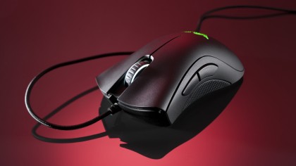
However, Razer’s latest peripheral, the Deathadder Chroma, is a mouse that anyone can get into. Whether you’re a claw or a palm grip user, it’s a brilliant mouse. The biggest style addition to this mouse is the subdued customizable lighting system that sets the Chroma apart from the competition.

And, now that Black Friday and Cyber Monday are right around the corner, you can have this fantastic gaming mouse at a low price, making an already great peripheral even better.  

Design

The Razer DeathAdder Chroma shares the same dimensions as the regular Razer DeathAdder - 5 x 2.76 x 1.73 inches (L x W x H) Don't worry about slipping with this mouse, as it's made out of a nicely textured hard plastic with grippy rubber on the sides, as well as the scroll wheel.

Razer DeathAdder Chroma review

The front of the mouse is formed into a concave, natural "W"-shape that allows for the perfect amount of finger space and does a great job of supporting the palm without fatiguing the wrist.

On the mouse you'll find five buttons: the standard right and left click buttons, a scroll wheel that functions as a third button, and two programmable buttons located on the left side of the mouse. The programmable buttons feel quite natural, and have been designed to have the same actuation as the main left- and right-click buttons.

Last but not least is the the IR optical sensor that delivers an outstanding 10,000 dpi.

Software and customization

While the mouse itself is great, Razer’s software (while being easy to use) can get sluggish, and the use of cloud computing rather than native memory for the mouse is an odd move. However, the mouse doesn’t necessarily need the proprietary Razer drivers to work, but you’ll need them to customize the mouse. What’s worse is finding the drivers on Razer’s website is convoluted and could really use an auto detect feature.

Synapse itself is a fairly robust customization program. It features Razer's typical design structure, and allows multiple users to each create their own profile, which is handy for those who have to share a computer. Razer also uses the cloud so users can access their settings from different computers. However, it seems a bit intrusive to expect users to install Synapse on every computer that they want to use the DeathAdder Chroma on if they want to keep their customized settings on the go; built-in memory would've been a better way to go.

Synapse offers plenty of options for users to change their sensor sensitivity, pointer acceleration and polling rate as well as the lighting for the mouse. Each LED can be set either together or independently and colors can be set to cycle through a set of hues with Spectrum Cycling, set to a single shade which can pulse or remain steady, or synced to other Razer Chroma devices for uniformity.

Razer DeathAdder Chroma review

Synapse can also be used to calibrate the mouse's optical sensor to be optimized to a particular surface, including a Razer mousepad or another surface, a function we first saw on the Logitech G502. Synapse is also used to set macros which can include any combination of keys or mouse clicks and can be assigned to one of the two customizable side keys.

Final verdict

The Razer DeathAdder Chroma isn't revolutionary or a huge improvement over the previous entries in the DeathAdder series, but it is a great barebones mouse for those who wish to have the quality, comfort and accuracy of a gaming mouse without all the flash.

The software is usable and for the most part fairly unobtrusive, but suffers from a bit of slowdown. The cloud computing features could be taken either as a pro or con depending on the user's preferences and usage - though, in all honesty, on-board storage would've made more sense. It won't affect those who only use their mouse on one computer, but those who game or work on various computers may find having to re-download and install Synapse multiple times to be a bit of a hassle.

Overall, this DeathAdder Chroma is great for the price ($69.99 about £40, AU$80) and is a fantastic entry-level gaming mouse for those who are either just getting started with PC gaming, or those who don't need or want the glitz and potential headache of the more expensive gaming mice.

Mekamon V2

It’s less than a year since we reviewed the first iteration of Mekamon – a spider-like robot designed to battle others of its kind, or virtual enemies in augmented reality via a smartphone app. Think Pokémon in real life and you’re most of the way there.

Mekamon V2 is available in white, black, and a fetching new grey camo pattern. The camo is exclusive to Apple Stores, but all robots are compatible with both Android and iOS. It’s also backward compatible, so V2 bots can battle their V1 counterparts without any trouble. Mekamon’s creator, UK-based Reach Robotics, says it intends to continue supporting its older models, so you don’t need to worry about your bot becoming obsolete when V3 struts into stores.

Design

The robot itself looks very similar to its predecessor, with four limbs (each with three joints), detachable armor plates, and a pair of removable ‘guns’ atop its torso. The main difference is the light within its head, which now glows different colors to indicate its mood.

If you lose a battle, or remove a piece of the robot’s equipment, it turns red and stomps angrily just to make sure there’s no confusion about its displeasure. Clip the accessory back on, or emerge from battle victorious, and it will glow green while bobbing with enthusiasm.

The original Mekamon was solidly built, and its predecessor is even more robust – which is just as well, as some of its ‘death’ animations involve the machine stiffening and toppling over on its back. In fact, animations have been improved across the board, giving Mekamon V2 more personality (and sass) than its predecessor. You can even create your own – more on that in a moment.

Companion app

When you first load the Mekamon app, you’ll be presented with a short comic-book style video summarizing some new lore, followed by a menu featuring three options: Play, Create and Discover. Discover is currently greyed out, but will eventually serve as a download center where you can find content made by other robot owners. Reach Robotics hopes to have it up and running soon, and will roll it out as a free update once it’s ready.

When you launch Create mode – a new addition for V2 – you’ll find two sections: MekaMotion and MekaCode.  The latter is currently unavailable, but will hopefully be unlocked before Christmas. When complete, it will let users create programs for their robots using blocks of pre-written code. This will be particularly useful for kids learning to code, and for schools that have invested in a Mekamon for teaching, or received one as a donation (education is a key priority for Reach Robotics’ founder Silas Adekunle).

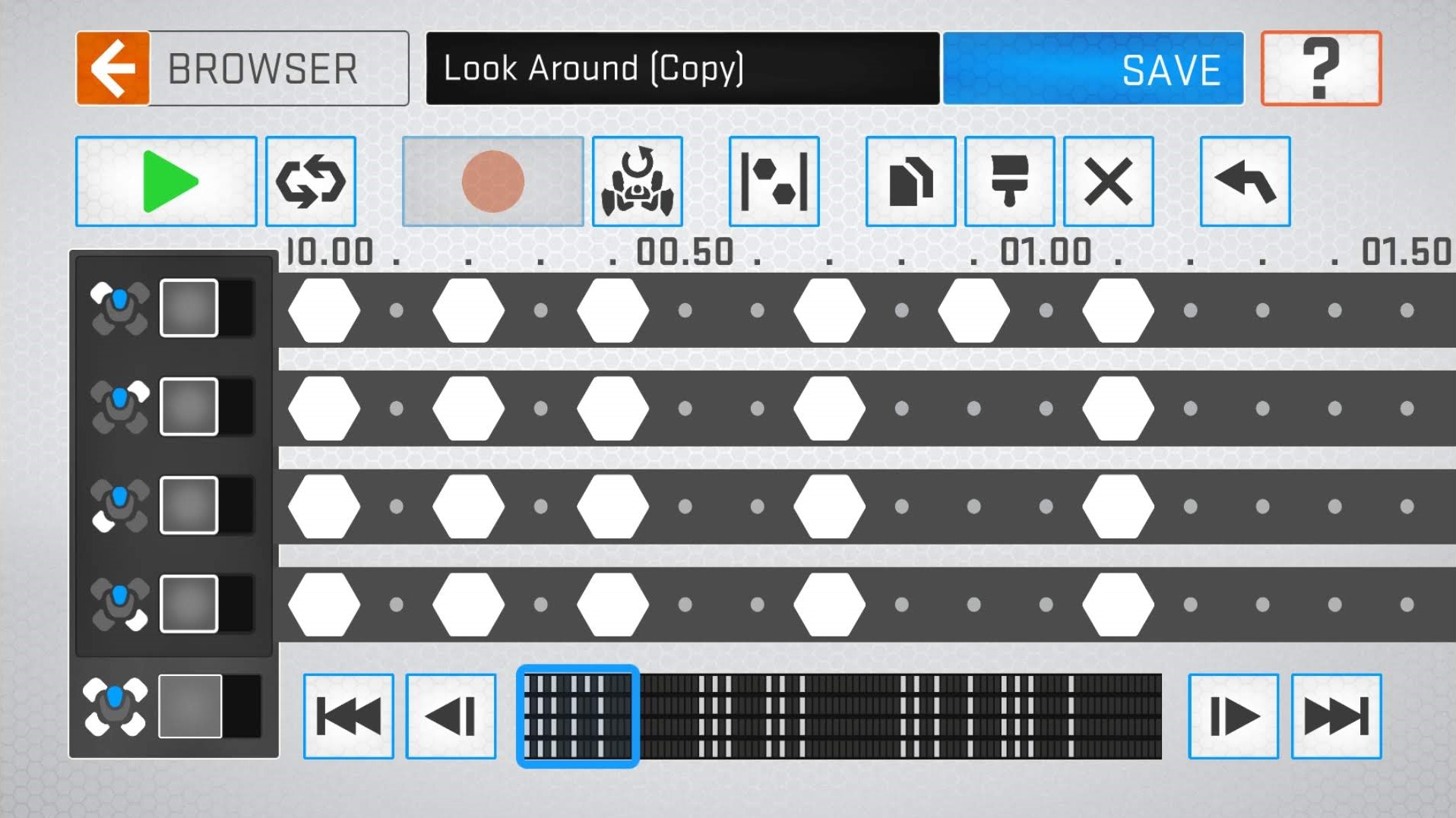
Another new addition is Mekamotion, which lets you download and create new animations for your Mekamon. In this mode, you can gently position the robot’s legs like a clay stop-motion figure, then use the app to ‘capture’ each pose as a frame of animation. When ‘unlocked’ for animation (individually or in groups), the legs take on a kind of waxy flexibility, allowing you to bend them gently and then remaining in their new position until changed manually. Frames can be copied and pasted if you want to repeat a motion. 

Sometimes you’ll have to support the Mekamon’s body to achieve a particular effect, and it feels like the process might be easier if the legs were a little stiffer (sometimes the machine sags a little after being posed), but it’s a novel idea that works well on the whole. To get an idea of what’s possible, there’s a selection of pre-made animations to download, including twerking, a dab, and enthusiastic tail-wagging to make just a few.

Play and fight

Selecting Play mode gives you two options: Freedrive and Skirmish. Freedrive lets you get a feel for operating the robot, and provides various options for tinkering with its movement, including speed, step height and more. Mekamon V2 moves faster than its predecessor, and there’s far less latency between you operating the controls and the robot responding.

One of the biggest differences for Mekamon V2 is that the robot no longer requires a specially marked map to orient itself. Just set it down (it works fine on hard floors and carpets) and it’s ready to use immediately in Create or Freedrive mode

Before starting a Skirmish, you’ll need to spend a moment walking around with your phone to map out a battlefield. As you move, the floor will be covered with a pattern of squares on your phone’s screen, showing the area where the fight can take place. It’s not perfect, and can be foxed by objects like low tables, but it’s much more convenient than the mat and generally works well.

Before entering battle, you’ll be prompted to choose a loadout. Each of these involves a different configuration of shields and guns, and comes with different properties, such as speed and types of attack.

The robot is steered using two on-screen ‘joysticks’  – one controlling its movement (forward, backward, left or right) and the other changing the direction in which it faces. It’s best to start by standing directly behind the robot, but the movement soon feels natural. To attack, ensure your Mekamon is facing its enemy (real or virtual) then tap and hold the weapon controls. Be careful, though – fire too often in rapid succession and your Mekamon will ‘overheat’, necessitating a cooldown period before you can resume battle.

Conclusion

Mekamon V2 is great fun, and although it's lacking some features at present, most of those are software-based and will be added with future app updates. There's great potential here to get kids interested in coding, and sharing their own creations.

Although it certainly isn't cheap, it's impressive that Reach Robotics has managed to knock down the starting price from the first robot's initial tag of $299.95 (£299.95, around AU$535). The commitment to backwards compatibility is also reassuring.

Mekamon is stocked in Apple Stores throughout the US and UK, so if you're not sure whether to invest you can head over and try one out on the shop floor. Just don't blame us if you're still there making the robot twerk when it's time for the staff to lock up for the night.

Sony FE 24mm f/1.4 GM

There's a decent selection of lenses out there for users of Sony Alpha cameras who like to shoot wide-angle images – provided they like zooms. Primes, though, are a bit thin on the ground, with Sony not offering anything wider than the FE 28mm f/2. 

That all changes with the arrival of the FE 24mm f/1.4 GM lens, an all-new wide-angle prime lens that sits at the top table of Sony's lens line-up on account of its G Master designation. 

Features

  • Features two XA elements
  • 11-blade circular aperture
  • New linear AF motor

With the focus on optical quality throughout the aperture range, the Sony FE 24mm f/1.4 GM sports an optical design that features two of the company's XA (extreme aspherical) lens elements, as well as three ED glass elements. 

The inclusion of the two XA elements is designed to control Sagittal flare. What's that you ask? It's a phenomenon that results in an unnatural spreading of point light sources, such as stars, that looks something like a bird spreading its wings, and it becomes more pronounced towards the image periphery. 

It's more common with large-aperture lenses, and it's something that can be a plague to astrophotographers, with clusters of stars often looking like flocks of birds in images captured at wide apertures. 

The FE 24mm f/1.4 GM also features Sony's Nano AR coating to suppress reflections that can lead to flare and ghosting, while it should be possible to shoot images with creamy-smooth bokeh thanks to the 11-blade circular aperture.

The FE 24mm f/1.4 GM is also the first Sony lens to feature a Direct Drive SSM (DDSSM) linear motor, which is designed to offer a combination of fast response, high positioning accuracy and quiet operation. 

Build quality and handling

  • Weighs just 445g / 15.7oz
  • Dust and moisture resistant 
  • Aperture ring

Considering the clever optical design, Sony's engineers have managed to make the FE 24mm f/1.4 GM weigh in at just 445g (15.7oz). That's quite a bit lighter than its main rivals, and the lens balances really nicely on the Alpha A7R III we tested it with. 

The lens is also nicely made, and features a fluorine coating to help prevent finger prints, dust, water and oil marking the lens, while it's also dust and moisture resistant. 

There's a decent-sized manual focusing ring at the front of the lens that enables a good degree of control, while towards the rear is an aperture ring. While you can set the aperture manually, if you prefer to adjust this via the camera's command dial you can select the 'A' position on the ring, and this shouldn't be easily knocked out of place, with enough friction to prevent any unwanted movement. You can also choose whether to enable or disable the aperture ring click stops – handy if you're shooting video. 

On the side of the lens is a useful customizable focus hold button, which can be customized in the camera's menu, while there's also a dedicated AF/MF switch. 

Focusing was very swift in our tests, and incredibly quiet – we were really impressed with the FE 24mm f/1.4 GM's precision and performance, especially when used in conjunction with the brilliant EyeAF mode on the A7R III. 

Performance

  • Excellent resolution
  • Smooth bokeh wide open
  • Vignetting appears well controlled

This FE 24mm f/1.4 GM certainly doesn't disappoint. The lens delivers excellent image quality, with impressive levels of sharpness out to the corners of the frame and good levels of contrast; even wide open at f/1.4 the lens is lovely and sharp. 

Expect to see a hint of chromatic aberration (purple/green fringing), but we've found this to be very well controlled and its presence can be reduced in post-processing. 

The FE 24mm f/1.4 GM also delivers some beautiful bokeh, with a pleasingly smooth transition from in-focus to defocused areas. Vignetting in also well controlled, and while there's a hint of it at f/1.4, it's handled pretty well, and doesn't detract from the image. This really is a lens that's just at home shooting wide open as it is stopped down. 

Verdict

If you've been holding out for Sony to launch a wide-angle prime lens, you won't be disappointed with the FE 24mm f/1.4 GM. It's a lovely lens that's been engineered to such a level that it should still deliver the goods on future generations of Alpha full-frame cameras. 

Lightweight and well-made, it captures stunning detail and beautiful bokeh, backed up by fast focusing and polished handling. 

This all comes at a price though ($1,400 / £1,450), with the FE 24mm f/1.4 GM costing more than twice as much as Sigma's very capable 24mm f/1.4 DG HSM | Art lens. If you've got deep pockets, you won't be disappointed.

MSI Trident X

The MSI Trident X is a small machine that packs in a surprising amount of new technology. Gaming grunt comes from one of Nvidia’s new Turing graphics cards, and processing power is delivered by one of Intel’s brand-new Coffee Lake-S processors.

Those are formidable core components, but the Trident X isn’t cheap - it’ll set you back $3,700 (£2,900, AU$5,200).

Price and availability

The $3,700 (£2,900, AU$5,200) MSI Trident X is only available in the configuration that we’ve reviewed here, which is a little irritating – we would have preferred a pricier model with the RTX 2080 Ti, and a more affordable machine with the RTX 2070 wouldn’t have gone amiss either. 

MSI could also include lesser CPUs for those who aren’t fussed about having a high-end, eight-core chip.

It’s also worth remembering that buying from a local builder will save cash. If you opt for a smaller machine from a company like Chillblast or CyberPower then you can save a few hundred pounds or dollars. 

If you’re willing to have a full-size tower, you’ll probably save a little more – and net yourself a bigger motherboard with more features and more upgrade room across the whole PC.

Design

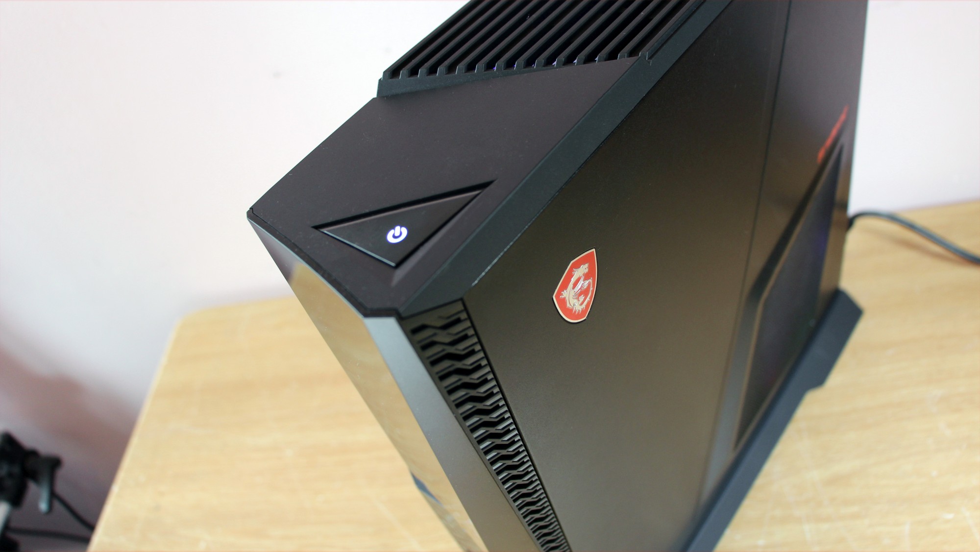
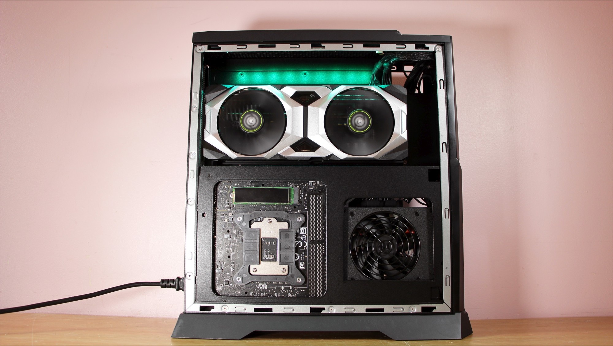
The Trident X is a narrow, eye-catching system, with glowing RGB LEDs and angled panels. The front has full-size USB ports and a handy Type-C connection, and the Trident’s 14.3 pound (6.5kg) weight means it’s relatively easy to carry to gaming events.

It’s larger than the older MSI Trident 3, but it is smaller and lighter than two other key rivals – the MSI Aegis 3 and the Alienware Aurora R5 were heavier and chunkier. It’s also a lot smaller than a full-size gaming PC.

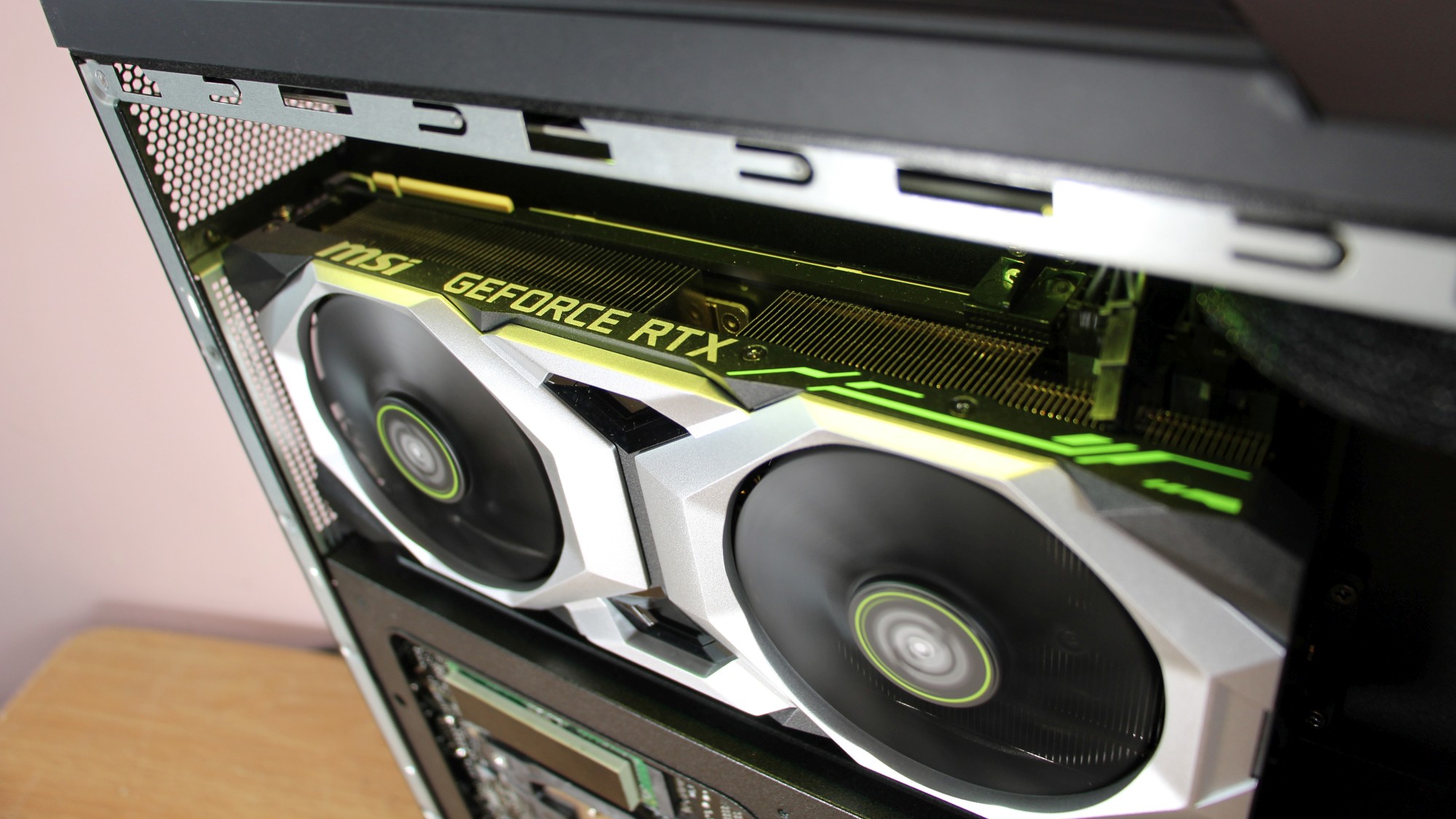
One side of the machine is dominated by the graphics card. It stretches across the whole width of the system, with meshed areas in the side panel to aid airflow. Below that you’ll find the rear of the motherboard, and the Samsung M.2 SSD.

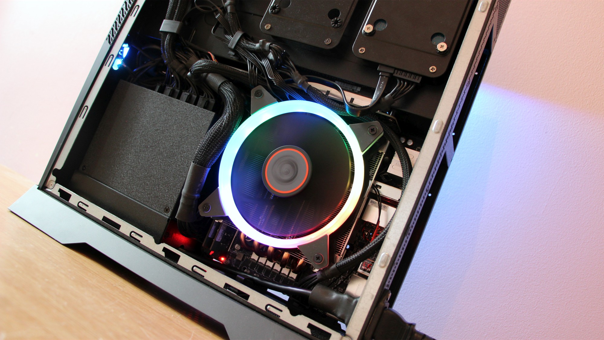
Behind the opposite side panel are more components. Here you’ll find the storage, motherboard and power supply, along with the majority of the cables. The cabling and large, low-profile 120mm CPU cooler means that it’s difficult to reach the motherboard, and the only expansion option is a 2.5in drive bay - and it’s tricky to use because MSI hasn’t installed a SATA cable.

This is a not a machine to buy if you want to tweak and change your specification, but that’s the same with every mini-ITX PC - including rivals. It's an inevitable compromise.

The other issue is build quality. The plastic slats on the top are flimsy, and the side panels are made of relatively thin metal. The tempered glass panel that MSI includes in the box is stronger, but we’d still be careful when taking the Trident to gaming events.

Intel inside

The Core i7-9700K is one of Intel’s new Coffee Lake-S chips. These parts retain the same architecture as last year’s Coffee Lake chips, but with notable changes to core counts and clock speeds.

The i7-9700K has eight cores, but no Hyper-Threading – so it’s configured differently than the i7-8700K it’s replacing, which had six cores with Hyper-Threading. It makes sense, because native cores will always function better than the artificial Hyper-Threading system – and hardly any consumer applications need more than eight cores or threads anyway.

The i7-9700K runs at 3.6GHz, which is 100MHz slower than the i7-8700K. However, the i7-9700K’s eight cores hit 4.6GHz on Turbo, with one core topping out at 4.9GHz. The older chip could only manage 4.3GHz across all cores and 4.7GHz on one core.

The MSI Trident 3 and Aegis machines use Core i7 chips from the Kaby Lake and Coffee Lake ranges – so you get fewer cores, but with Hyper-Threading. The Alienware Aurora also uses Coffee Lake.

Performance

The Coffee Lake-S chip inside the new MSI is superb. Its Cinebench score of 1,470cb is almost double the pace of the MSI Trident 3 and Alienware machines, and it’s more than 300 points beyond the MSI Aegis 3 and its Core i7-8700.

The gap was maintained in Geekbench 3. The Trident X’s single- and multi-threaded results of 5,868 and 27,594 are stellar. The MSI Aegis 3 is the nearest challenger, and that was five hundred points behind in the single-threaded test and four thousand points back in the multi-core benchmark.

Having eight cores without Hyper-Threading but with better Turbo speeds clearly gives Coffee Lake-S the edge when compared to six-core chips that are Hyper-Threaded. That’s because eight native cores will perform better in applications than six cores that are handling twelve threads. That’ll make a real difference in day-to-day use, where few applications – or even groups of applications -  need twelve threads to function well.

The Coffee Lake-S won’t bottleneck games, and it’ll handle day-to-day computing with ease. It’ll also run the vast majority of productivity applications, from video editing to streaming and content creation. The only software that won’t run well are tools that need proper workstation CPUs.

The factory-fresh CPU is joined by an Nvidia Turing graphics card. Despite its name, the RTX 2080 is designed to replace the GTX 1080 Ti. It has the new architecture’s improvements to integer, floating point and shader performance, and it includes a mighty 2,944 stream processors, 8GB of GDDR6 memory and a clock that starts at 1,515MHz and boosts to 1,710MHz.

It’s a great specification, but a question mark still hangs over Turing because of its headline features. Ray-tracing won’t work until Microsoft’s DX12 update arrives, and super-sampling needs to be implemented on a game-by-game basis.

Nevertheless, the GPU is no slouch. It zipped through our conventional 1080p tests with averages beyond 100fps in Deus Ex and Middle Earth: Shadow of War. The RTX 2080 has the power to handle 4K gaming, too: it ran through those two games with 4K averages of 40fps and 57fps.

It’ll play today’s top games at 4K, on widescreen panels and on VR headsets. The RTX 2080 may struggle with 4K gaming in the future or with graphics settings turned up in a handful of games, but you’re rarely going to hit issues.

The RTX 2080 destroys the GTX 1070 and GTX 1070 Ti cards that are used in most small form-factor gaming PCs. The Turing card scored 9,950 points in the 3D Mark Time Spy test. That’s nearly 4,000 points better than the GTX 1070 and about 3,000 points quicker than the GTX 1070 Ti.

Despite the power on offer from the CPU and GPU, the Trident X never performed badly in thermal tests. Its peak CPU and GPU temperatures of 81°C and 67°C are absolutely fine, and the MSI never proved loud – it produced a modest rumble that’s easy to mask with speakers or a headset.
The rest of the specification is fine. The Samsung PM981 SSD is reliably fast, with read and write speeds of 3,361MB/s and 1,906MB/s – quick enough to deliver rapid boot and load times. The 32GB of DDR4 is enough for work and overkill for games, but its 2,666MHz speed is mediocre. 

The components attach to a modified version of an MSI Z370i Gaming Pro Carbon motherboard that has been stripped of its RGB LEDs and snazzy heatsinks – not an issue in a PC that’s so locked-down.

Verdict

The new components deliver formidable performance. The Turing GPU pelted through games benchmarks with enough grunt for 4K and VR gaming, and for playing titles at extremely high refresh rates. It’s only going to get better as driver updates appear and the new features arrive.

The Coffee Lake-S CPU outpaces its predecessors while delivering enough power for almost every task, and the rest of the specification is fine.

The chassis is small and smart, with good thermal performance, plenty of ports and RGB LEDs. That makes it an ideal system for taking to LAN parties.

However, while the Turing GPU is fast, its headline features don’t yet work – and these cards remains a risk. There’s no way of knowing whether ray-tracing and super-sampling will transform games – or not be properly utilised.

Elsewhere, the MSI Trident X doesn’t have the best build quality. There’s little room to upgrade on the inside, which is cramped and crammed with cables.

The price is high, too. If you don’t need quite this much CPU or GPU power, it’s very easy to save money by opting for a machine with lesser components – and they’ll still handle games in the majority of resolutions and situations.

Overall, the MSI Trident X’s new components deliver exceptional speed in all situations – certainly more pace than we’ve seen from mini-ITX machines in the past. The rest of the specification is fine, and there isn’t much that this machine can’t do. The chassis looks good, and it’s cool and quiet.
Build quality is suspect, though, and there’s no room to grow here. It’s expensive, too. However, if you’re feeling flush then there’s no better way to get your hands on a small PC with a shedload of computing ability.

Jive

In a world that seems to be always connected, it’s easy for companies to become complacent in their use of technology, falling behind along the way. Take the desk phone, for example, an ageing concept in and of itself that some would argue no longer has a place in our offices.  

Once tethered to the same copper wire tech invented back in the late 19th century, it should come as no surprise that landlines are fading into obscurity. After all, now we all have phones in our pockets that are capable of so much more than taking analog phone calls. If our smartphones power the world, why aren’t we using them as our primary means of communication in the workplace? Why settle for the rather limited desk phones when you can opt for a pocket phone that runs apps and stores files in the cloud, no questions asked?

Well, one of the biggest concerns stacked against advocates for BYOD (Bring Your Own Device) programs is security. It’s crucial not only that we have the flexibility we need to work efficiently in an office environment, but that we also don’t let classified company information slip through the cracks. For that reason and more, PBX (Private Breach Exchange) phone systems exist as a safe middle ground between using old school landlines in the workplace and haphazardly letting employees use their personal smartphones for business.

Because PBX phone systems are cloud-based, they can integrate with smartphones to provide Voice over Internet Protocol (VoIP) services to your staff independent of the device that they’re using. In theory, these VoIP providers are there to make it possible for users to start one task on their desk phone and resume it later on their smartphone, laptop or desktop computer. Among those involved in the VoIP market is Jive Communications, a company owned by remote desktop software developer LogMeIn.  

Unlike some competing VoIP services, which include everything from RingCentral Office to Microsoft Skype for Business, Jive is dead focused on its mission to improve VoIP security. Complete with end-to-end encrypted “Jive Secure” calling that extends to virtually any device you use it with, Jive wants to ensure that you can identify every last piece of hardware connected to your company network in order to prevent the spillage of internal materials discussed over telecommunications.  

But that’s not where the functionality of Jive starts and ends either. Join us as we run down all the unique features that Jive has to offer while also exploring the various pricing options you can choose as you consider deploying one of the top VoIP services at your organization. Let’s take a look.

Features

Pricing and features

First off, the price. The cost of Jive for your business depends entirely on how many people will need to take advantage of its many features. More specifically, pricing is based on the number of “seats,” presumably at your office, that’ll be using Jive.  

If that number is between one and four seats, Jive is at its most expensive – $29.95 (£23.40) per month per user. If you need Jive at five to nine seats, the cost gets lower, at $25.95 (£20.27) while 10 to 24 seats will set your company back $23.95 (£18.71) per seat per month. Next up, get Jive for 25 to 29 users and you’ll be forking over $21.95 (£17.15) per seat every month. Lastly, 50 to 99 seats commands a price tag of $19.95 (£15.59) a seat each billing cycle.  

Jive also claims that “special pricing” is available for any business that calls for more than 100 Jive seats, perhaps indicating a slightly lower cost, though you’ll have to sit on the phone with a Jive customer service rep to find out for sure.

One of the best parts about Jive, as opposed to bigger name rival services like RingCentral Office or 8x8 Virtual Office Pro is that no matter what price you pay, you’re getting the same features. While those aforementioned VoIP providers have pricing tiers that raise and lower the amount of functionality employees can take advantage of, Jive is a one-size-fits-all solution. With it, you can bank on a long list of features (over 80, according to Jive), some of which we’ve yet to see elsewhere.  

Hero

You can peruse the full list here, but to summarize, Jive offers an auto-attendant, virtual fax, call recording, custom hold music, call parking, call forwarding in addition to call center-specific features such as wait time announcement and agent login/logout. More mundane, but highly necessary, features are also in place, such as speed dialing, call waiting and number porting for migrating over your existing PBX hardware should you make the switch to Jive.  

Unique features, like Whisper, which lets administrators discreetly give agents instructions while they’re on the phone speaking with customers, are also included at no extra charge. Jive even integrates with CRM services like Salesforce, Zoho and Redtail.  

Final verdict

It goes without saying that we are impressed with what Jive brings to the table. Instead of divvying up features into exclusive pricing tiers, the cost of Jive to your company is based on sheer volume of employees. The higher the number of employees in the office, the more likely you are to benefit from Jive’s various subscription plans.  

Stuffed with a wealth of useful knick-knacks, Jive is a feature-packed VoIP PBX phone system that has a great deal more to show for its accomplishments than a run-of-the-mill mobile app – it’s an excellent value made possible by a business model that every VoIP provider should adopt. Oh, and for a limited time, every Jive seat is entitled to a complimentary GoToMeeting Pro License, in case HD video conferencing is part of your workflow.

Tuesday, October 30, 2018

Asus ROG Zephyrus S GX531

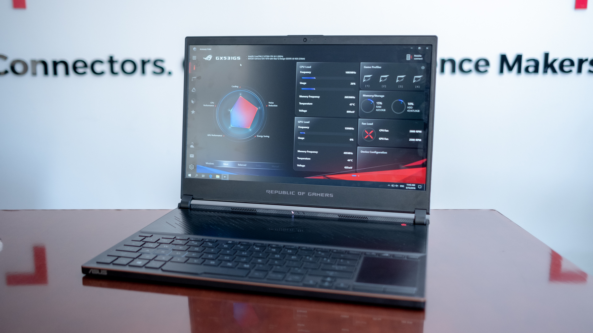
The Asus ROG Zephyrus S GX531 wants to be the thinnest, lightest and most silent Nvidia Max Q machine out there. Thanks to narrow screen bezels, thin chassis and a rigid build, this gaming laptop has succeeded the original Asus ROG Zephyrus GX501 in almost every way, while fixing so many problems we had with the original. 

Price and availability

Available in two flavors at launch in the US (but only one in the UK), we got our hands on the more expensive and powerful GX531GS version of the Asus ROG Zephyrus S equipped with a Nvidia GTX 1070 Max-Q graphics card. This particular version will only be available at Amazon for $2,199 (about £1,730, AU$3,030). At this price point the gaming laptop comes impressively equipped with an Intel Core i7-8750H processor, 16GB of RAM, 1TB NVMe SSD and a Full HD 144Hz display.

Outside of Amazon, Asus will be selling a lower-tier GX531GM version equipped with a Nvidia GTX 1060, but still the same processor, 16GB of RAM and 1TB NVMe SSD for $2,099 or £1,999 (about AU$2,890). This will be the only model available in the UK.

These price points are respectable enough, and we expect some Black Friday and Cyber Monday deals to make it even more reasonable. And, if you’re looking to get your hands on this laptop, you’ll be able to pick it up in stores now.

A comparably-equipped Razer Blade rings up for $2,599 (£2,329, AU$3,999) with all the same specs, except it only has a 512GB SSD. The $1,999 (£1,799, AU$3,339) MSI GS65 Stealth Thin mirrors the Razer Blade’s specs with an additional 1TB hard drive to be the most affordable, thin gaming laptop. 

Design

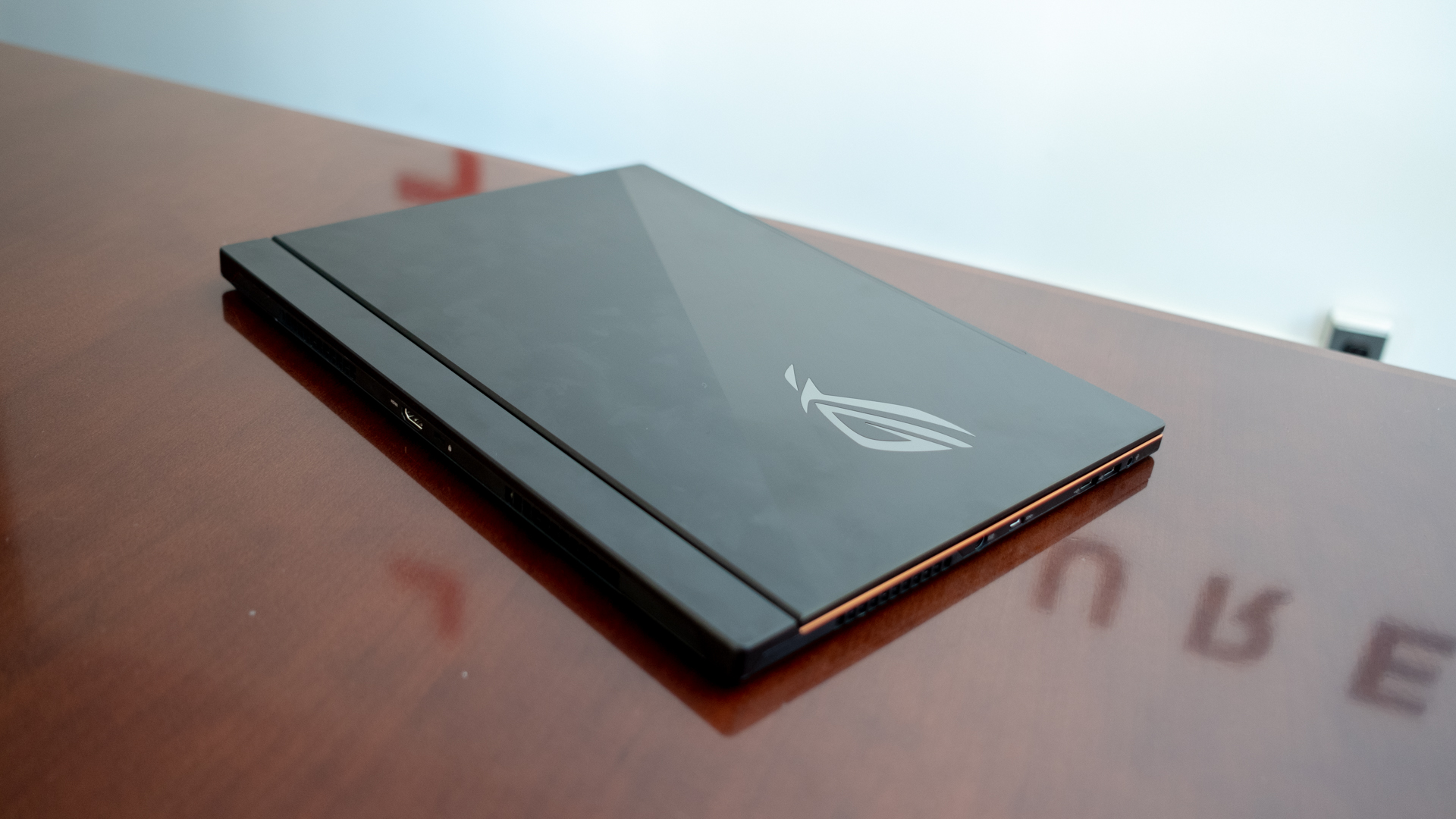
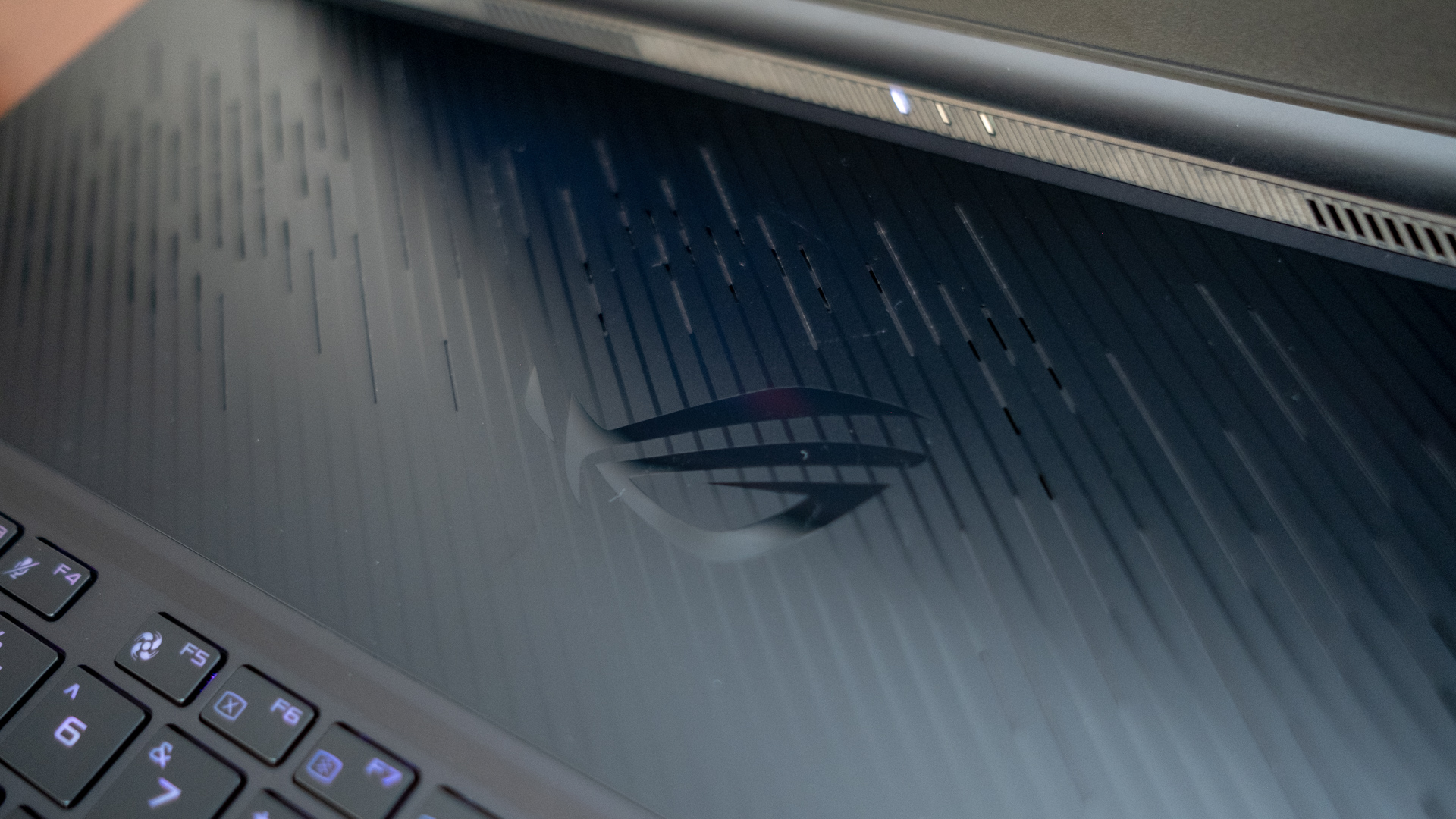
The original Asus ROG Zephyrus impressed us with how thin and light a gaming laptop could be with basically no compromises. And, the Zephyrus S is even more impressive. By diminishing the screen bezels and making it thinner than ever before, this machine is now a 15-inch gaming laptop in a 14-inch body on the same level as the Dell XPS 15 and the Gigabyte Aero 15 X.

The Zephyrus S measures 12 x 10.6 x 0.59-0.62 inches (30.6 x 26.8 x 1.49-1.57cm; W x D x H), whereas its predecessor was wider and thicker at 14.9 x 10.3 x 0.66-0.7 inches (37.9 x 26.2 x 1.69-1.79cm; W x D x H). Asus has also cut off some weight down from 4.85 pounds (2.2kg) to 4.63 pounds (2.1kg).

Surrounding the screen are noticeably thinner bezels that have been nearly cut in half. The 7.5mm bezels are a great improvement over the original Zephyrus’ 15.7mm bezels. Although the screen continues to sport a 15.6-inch, 1,920 x 1,080 Full HD panel running at 144Hz, this new display boasts a stunning 3ms response time.

Of course, the Zephyrus S isn’t just a smaller version of its predecessor, it’s also undergone some significant design changes.

The most obvious change is the slightly hinge forward design that gives the 15-inch laptop a bit of a rear lip when the screen is open – plus a silhouette that’s reminiscent of the Alienware 15. At the same time, the two little arms that connect the screen to the laptop are pretty similar to the cabinet-style hideaway hinges featured on the HP Spectre 13

Asus ROG Zephyrus S GX531 review

Call the Zephyrus S derivative if you want, but these new elements work well with its sharp and modern squared-off design. Even up against the suave MSI GS65 Stealth Thin, this is one of the most sophisticated-looking gaming laptops thanks to its futuristic styling and copper trimmed all-black exterior.

The Asus ROG Zephyrus S also has the unique Active Aerodynamic System, which basically opens up and lowers part of the laptop’s bottom to increase airflow. The mechanism still engages automatically as you open the screen lid as on the original Zephyrus, but now the gap is a little smaller at 5mm (opposed to 6mm). Asus claims this space allows for 22% better airflow than conventional designs.

Previously we complained that the AAS panel felt a little flimsy, and Asus has strengthened the design here as well. Rather than having the whole bottom side of the laptop drop down to create a ramp, the mechanism is restricted to about three-fifths of the notebook's total depth. Also, instead of a plastic panel, Asus has gone with making the bottom of its newest gaming laptop out of a much sturdier magnesium alloy.

Thanks to these improvements there’s barely any noticeable flex on the Zephyrus S bottom panel or practically anywhere.

Asus ROG Zephyrus S GX531 review

Performance

During our short hands-on time with the Asus ROG Zephyrus, we didn’t get a chance to actually play with it beyond navigating around the Windows 10 interface. Asus also told us that its pre-production unit was not tuned for performance testing.

That said, we’re looking to get more time with the unit at Gamescom with our coverage beginning on August 20th, so stay tuned.

Given that this laptop is equipped with the same Intel Core i7-8750H CPU and Nvidia GTX 1070 Max-Q GPU as the Razer Blade, MSI GS65 Stealth Thin and countless other thin-and-light gaming laptops, we would expect performance to be on par.

Unfortunately, in the process of making the Zephyrus S as thin as it rivals, it can no longer support the Nvidia GTX 1080 Max-Q as a configurable graphics option. This pretty much leaves the Acer Predator Triton 7000 and Alienware 15 as your only options to get Nvidia’s most powerful and thinnest mobile GPU.

Asus developed new lower-profile blades and fan modules constructed out of a special liquid-crystal polymer that prevents flexing at high RPMs. According to the company, each fan blade only measures 0.2mm at its thickest point, and this is how it managed to increase the number of fan blades from 71 to 83. 

We’re hoping all these fan blades will make the machine quieter under load than its previous iteration.

Asus didn’t mention anything about battery life, which is a little worrying. According to the specs, the Zephyrus S still makes use of a 4-cell 50WHr battery, which only saw the original Zephyrus through a maximum of two hours at best.

Asus ROG Zephyrus S GX531 review

Early verdict

The Asus ROG Zephyrus S looks to be an overall better gaming laptop than its predecessor with smaller dimensions overall, a more responsive screen and better build quality. We’re fans of the design changes, and the addition of Intel Coffee Lake H-series processors also brings it up to date with all other thin-and-light gaming laptops.

However, we’re not sure of all of Asus decisions, especially limiting this laptop to Nvidia GTX 1070 Max-Q as its best graphics option. We also have concerns over battery life that could potentially last for a maximum of two hours again.

It’s too early to tell if the Asus ROG Zephyrus S will be one of the best gaming laptops, but we certainly can’t wait to play with it more at Gamescom and get our hands on a review unit soon.

Microsoft Surface Go

The Surface Go, Microsoft’s latest tablet that aims to be a smaller – and more attainable – Surface Pro has finally arrived. The Surface Go doesn’t bring any major surprises, but maybe that’s a good thing.

The Microsoft Surface Go is what the best Windows tablets should have tried to be since their inception – everything you love about the Surface Pro, just smaller. No half-baked operating systems – though the Surface Go does use the oft-lamented Windows 10 S Mode – and no strange app compatibility issues. Everything just works, right out of the box, which is exactly why we love the Surface lineup.

Naturally, there were some compromises that had to be made to make a Surface tablet of this size, namely in the power department, so scale your expectations accordingly. The Surface Go is what the Surface 3 should have been years ago – and it was worth the anticipation.

Depending on what you actually need, the Surface Go may just be your go-to for everything from work to watching movies and TV. In the race for the ultimate tiny tablet for taskers, Microsoft just jumped ahead of everybody.

surface go

Price and availability

The Surface Go configuration we reviewed here will set you back $549 (£509, AU$839), and it’s the highest-end version of the tablet offered by Microsoft. Meanwhile, you can get the Surface Pro for as little as $399 (£379, AU$599), with 64GB of eMMC storage and 4GB of memory, with the rest of the specs remain the same. That’s not to mention all the Surface Go deals we hope to see on Black Friday and Cyber Monday.

The Surface Go is available now in the US and UK as well as Australia and New Zealand.

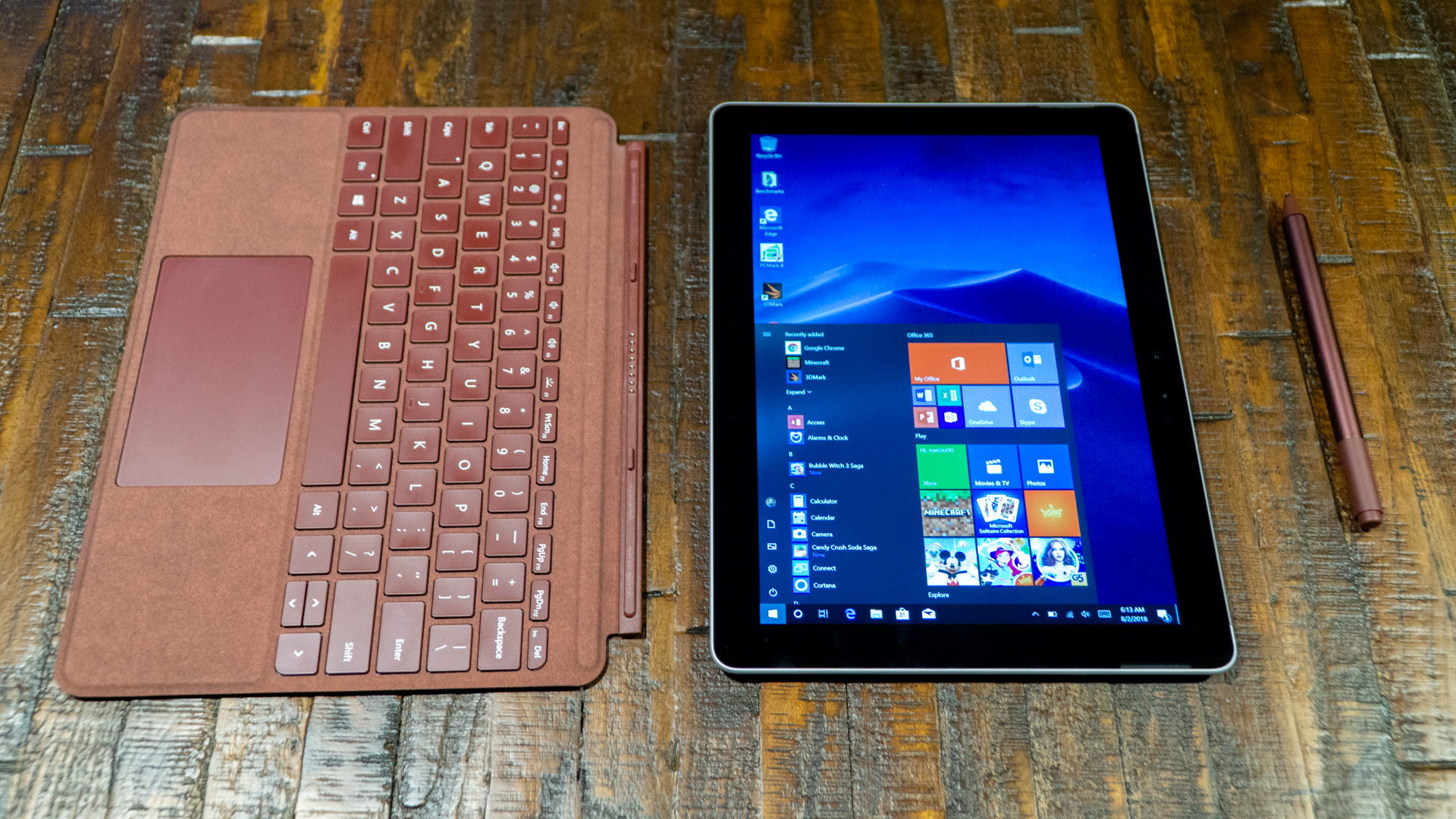
Annoyingly, Microsoft continues to sell the tablet’s all-but-essential accessories separately. The Surface Pen goes for $99 (£99, AU$139), while the new Alcantara fabric Type Covers designed for Surface Go ask for $129 (£124.99, AU$199). These come in burgundy, cobalt and platinum colors.

Finally, a standard black nylon Type Cover is available for a more palatable $99 (£99, AU$149), bringing all of the same features in a slightly less premium feel and look.

Apple’s iPad 2018, the Surface Go’s closest rival, goes for $329 (£319, AU$469) to start, which gets you 32GB of flash storage and 2GB of memory – half as much as the starting Windows tablet in either case, albeit with a sharper screen. For the iPad to match the Surface Go’s storage and memory, that would cost you $429 (£409, AU$599), though memory remains at 2GB in all configurations. All told, the iPad display is way sharper than the Surface Go’s.  

All the while, the Asus Transformer Mini is an awfully similar device to the Surface Go in that it offers a 10.1-inch Windows tablet with a kickstand. Plus, both the stylus and keyboard cover are included for only $399 (about £300, AU$534) to get the model with 128GB of storage. However, the screen isn’t as sharp as either alternative, and it comes with 4GB of RAM as its only memory option.

Design

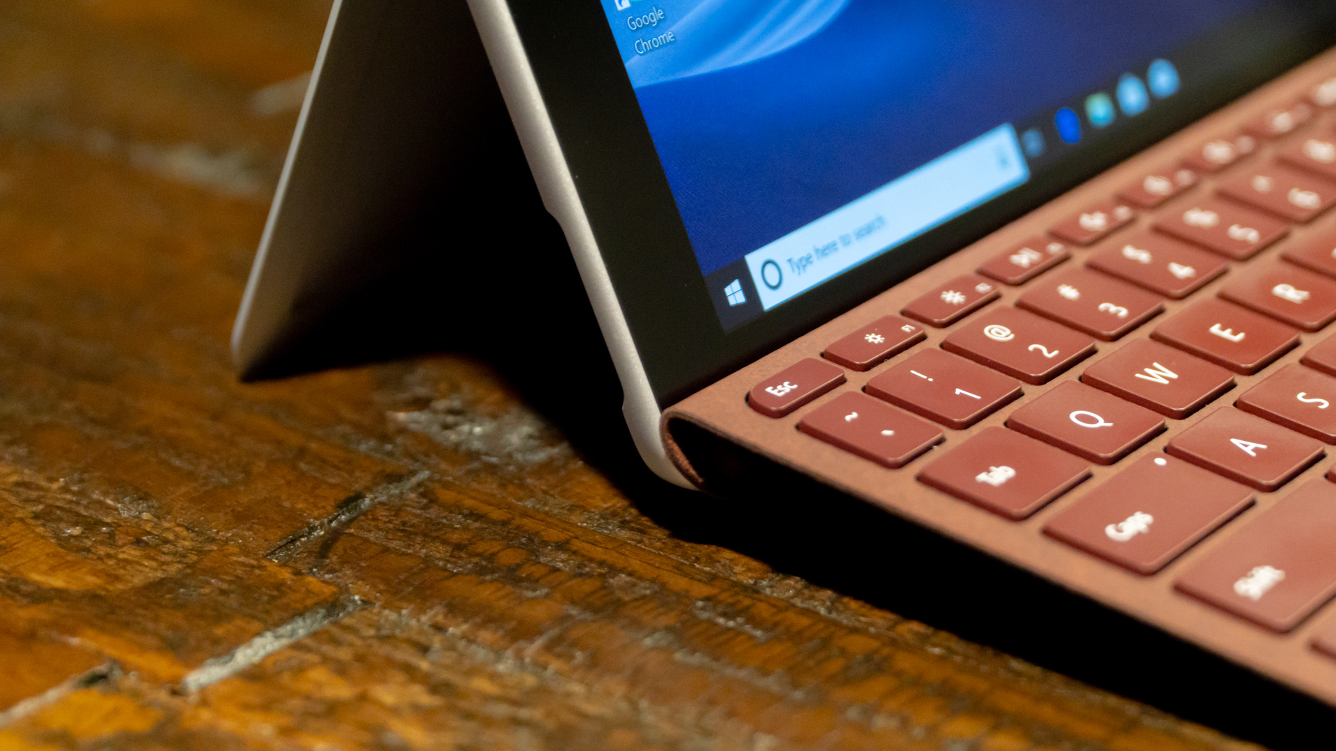
At first glance, the 1.15-pound (0.52kg) Surface Go appears simply to be the Surface Pro shrunken down by 2.3 inches on the diagonal, and that’s largely true – excellent kickstand and all. However, Microsoft clearly put some design effort into this version, opening it up to a larger audience, specifically students.

The first major hint toward the Surface Go’s intended audience is the rather prominent rounding of the edges and angles that Microsoft has applied to the device. Gone are the stark, angled edges of the Surface Pro in lieu of rounder, softer edges that help give this version of the Surface its own distinct identity.

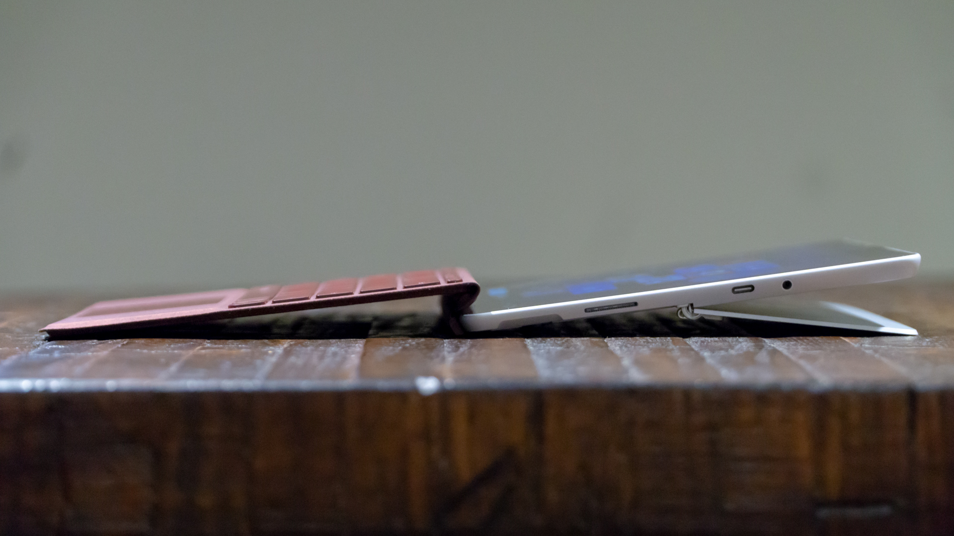
Beyond that, this device is largely the same in design as its forebears, except smaller. The excellent hinge returns and can bend nearly 180 degrees like before, making this device an ideal canvas for digital drawing and note taking.

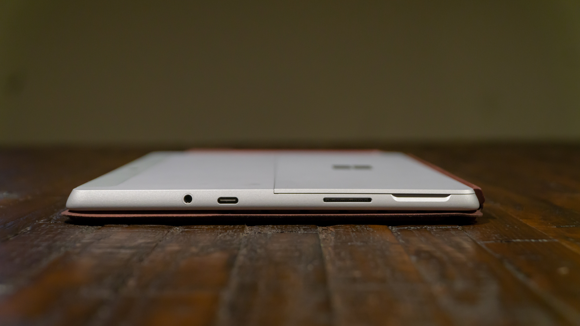
Microsoft still managed to cram a USB-C port and microSD card reader into the smaller Surface Go, neither of which the latest iPad has. This means that not only can this tablet’s storage be expanded, but it has two ways to hard-wire a dock and expand displays compared to the iPad’s single method, thanks to the mainstay Surface Connect port.

As for the new, obviously smaller, Type Cover, Microsoft manages to deliver full-sized keys (now with more pronounced curves) within a smaller amount of space, and has included a glass trackpad that’s larger in depth than that of the Surface Pro. All told, the Type Cover feels just as snappy as it has before – we would say ‘only smaller,’ but it doesn’t feel that much more cramped when typing.

That said, you will need to get used to a slightly tighter typing experience, especially when the device is on your lap. The keys are spaced closer together than normal keyboards, which alters exactly where your fingers naturally rest, so as to keep your index fingers on the F and J keys.

Otherwise, typing on the Surface Go is much more comfortable than on other 10-inch devices, which should be lauded. For what it’s worth, the iPad Smart Keyboard uses strange, completely round, keys and doesn’t even feature a touchpad – because iOS doesn’t support mouse input.

surface go

Display and audio

Microsoft’s display game continues to be top notch on the Surface Go. At 1,800 x 1,200 pixels, it’s not the sharpest 10-inch tablet display by a long shot, with the latest iPad coming in at 2,048 x 1,536 pixels.

Still, though, the Microsoft Surface Go’s display is beautiful in everyday use. The display is extremely color accurate, and movies and photos look amazing on it. Of course, that 3:2 aspect ratio is great for work and web browsing, but gives full-screen 16:9 videos some wasted space with black bars.

Like most tablets, the bezels around the screen are pretty large, but that just allows users to grip the device from any side without accidentally triggering anything on the screen. It also allows for the Type Cover to connect to the bottom bezel via magnet for a better typing angle.

Regarding the relatively thick bezels, the Surface Go’s speakers reside within them on both sides of the screen. For such tiny drivers, these speakers sound surprisingly powerful, deep and nuanced in the amount of channel separation they can deliver. This makes the Surface Go just as good of a multimedia tablet as it does a mild productivity device.

Before getting too deep into details just yet, let’s make it clear that you generally shouldn’t buy a tablet or laptop for this price and expect a powerhouse. However, you should get something competent enough to handle basic workloads and casual games, and the Surface Go does exactly that – but not much more. 

surface go

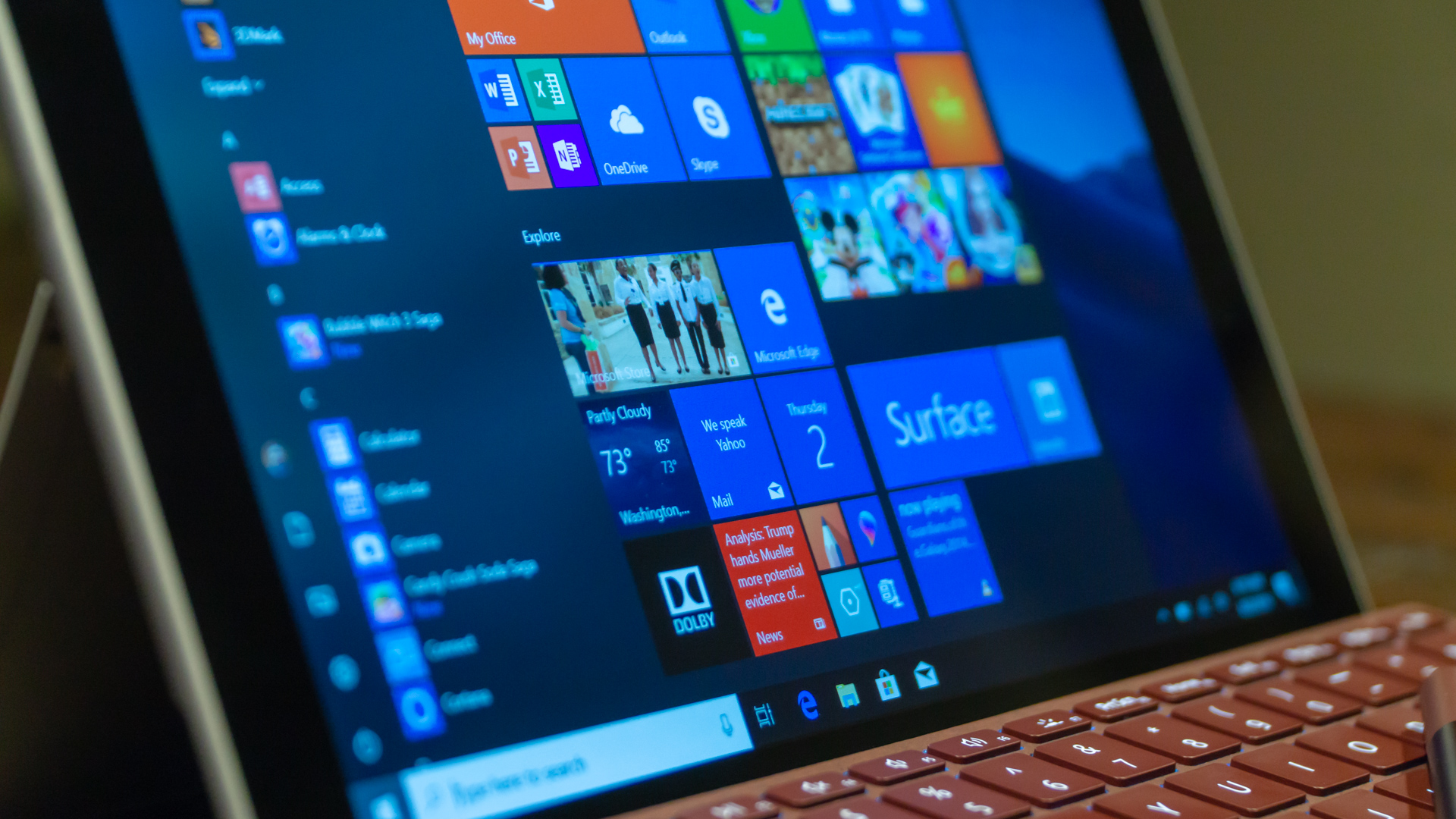
The Surface Go, with its Intel Pentium Gold processor, can handle basic browser-based workloads, like word processing and content management, as well as the suite of Office 365 apps, with ease. With 8GB of RAM in the higher end model, you could even run several tabs-worth of projects and websites and media players.

However, don’t expect this processor to handle high-resolution image or video editing and rendering in the same way that a proper laptop does. That’s not this tablet’s forte.

That said, the CPU inside employs Intel’s HD Graphics 615, which isn’t far off from the integrated graphics inside the Intel processors used in gaming laptops. This allows for some surprisingly powerful 3D rendering on the Surface Go, to the point that Minecraft runs like a dream on the tablet. Furthermore, education apps that use 3D modeling – particularly in the science field – run without issue here, as does Microsoft’s own Paint 3D tools.

Now, the Intel chip here isn’t all that comparable to the latest iPad’s A10 processor, as both were made with entirely different architectures and on different chipsets. Also, Apple literally designs its own chips to work the absolute best they can with iOS – Microsoft cannot do this to the same degree. So, yes, the iPad processor is more powerful than the Surface Go’s, but it’s an apples to oranges comparison.

The iPad ousts the Surface Go in pure speed tests, like Geekbench 4, but the Surface Go is a far more versatile device – even in Windows 10 S Mode. Speaking of which, unless you’d like to keep your device on lockdown for security or simplicity reasons, just upgrade to Windows 10 Home for free once you get this device.

The performance hit to the system with the overhead of full Windows 10 Home ranges anywhere from negligible to nonexistent. At that point, all that Windows 10 S Mode is giving you is peace of mind, which is easily found in Windows Defender and smarter web browsing habits.

surface go

Battery life

Microsoft promises up to 9 hours of continuous use from the Surface Go. Shocking no one, those aren’t the numbers we could reproduce in our testing, but they’re not awful. What’s weirder is how we’ve found the device to actually last longer in Windows 10 Home than in S Mode.

The difference in our tests is less than an hour, and at any rate, expect the Surface Go to last around six hours on a charge, and perhaps a bit longer if the Battery Saver feature is used.

For folks in fields that are light on hardware requirements and heavy on travel, this device could be a go-to for you. Stay tuned as we test the battery even further in both modes of Windows 10.

surface go

Software and features

The Surface Go ships with Windows 10 in S Mode. Because this device uses an Intel processor, however, this is largely fine for day-to-day use. While the app selection on the Microsoft Store is paltry in comparison to the software available to download from the internet, at least the device can run every app designed for Windows 10 natively without issue.

Windows 10 devices with Qualcomm’s Snapdragon 835 chip installed can’t say the same, as their processor architectures aren’t compatible with how many Windows 10 apps were built. Windows 10 S might bring with it more security, but if you're careful online (and have Windows Defender installed) you should be alright.

The Surface Go doesn’t have many other standout features to speak of, but we especially appreciate facial recognition login via Windows Hello. While it doesn’t operate in the same way, Microsoft has essentially beat Apple to bringing hands-free, secure login to its tablet.

Microsoft’s implementation here works fantastically, which is buoyed by a very good 5MP webcam and 8MP camera on the rear. The webcam shoots 1080p video that’s crisp and detail-rich, making Surface Go also ideal for video meetings. For comparison’s sake, the iPad uses only a 720p FaceTime camera.

surface go

Final verdict

The Surface Go may very well be a niche device, but it’s a niche that’s only growing. With every major hardware vendor focused on smaller productivity tablets, Microsoft has finally nailed the concept of the smaller Surface device, once again showing the world how it’s done.

While you could reduce the Surface Go to being just a smaller Surface Pro, the truth of the matter is that the market is trending toward smaller and smaller computing devices. Now, the Surface Go is there to meet them with a full-blown, 10-inch computer.

Of course, we could complain about how there are still no accessories included, that it’s technically less powerful than the new iPad and that the screen could be sharper, and they’re all valid complaints. However, if you’re looking at the new iPad or another 10-inch tablet to be your next primary computing device next to the Surface Go, or even a secondary gadget, it’s tough to beat this gorgeous machine that’s truly a computer in every sense of the word.

!!!!!!!!!!

Popular Posts

Categories

Blog Archive