Constant Contact Website Builder
Selecting the best website builder for your needs can be difficult, but there are plenty of decent options available. Some are targeted at website building newbies, others prioritize design flexibility, while yet more come with advanced features for those with experience.
In our Constant Contact website builder review, we take a close look at this popular tool. Targeted at beginners and those looking for a simple, no-frills website building solution, it’s got a lot to offer.
- Interested in Constant Contact? Check out the website here
Plans and pricing
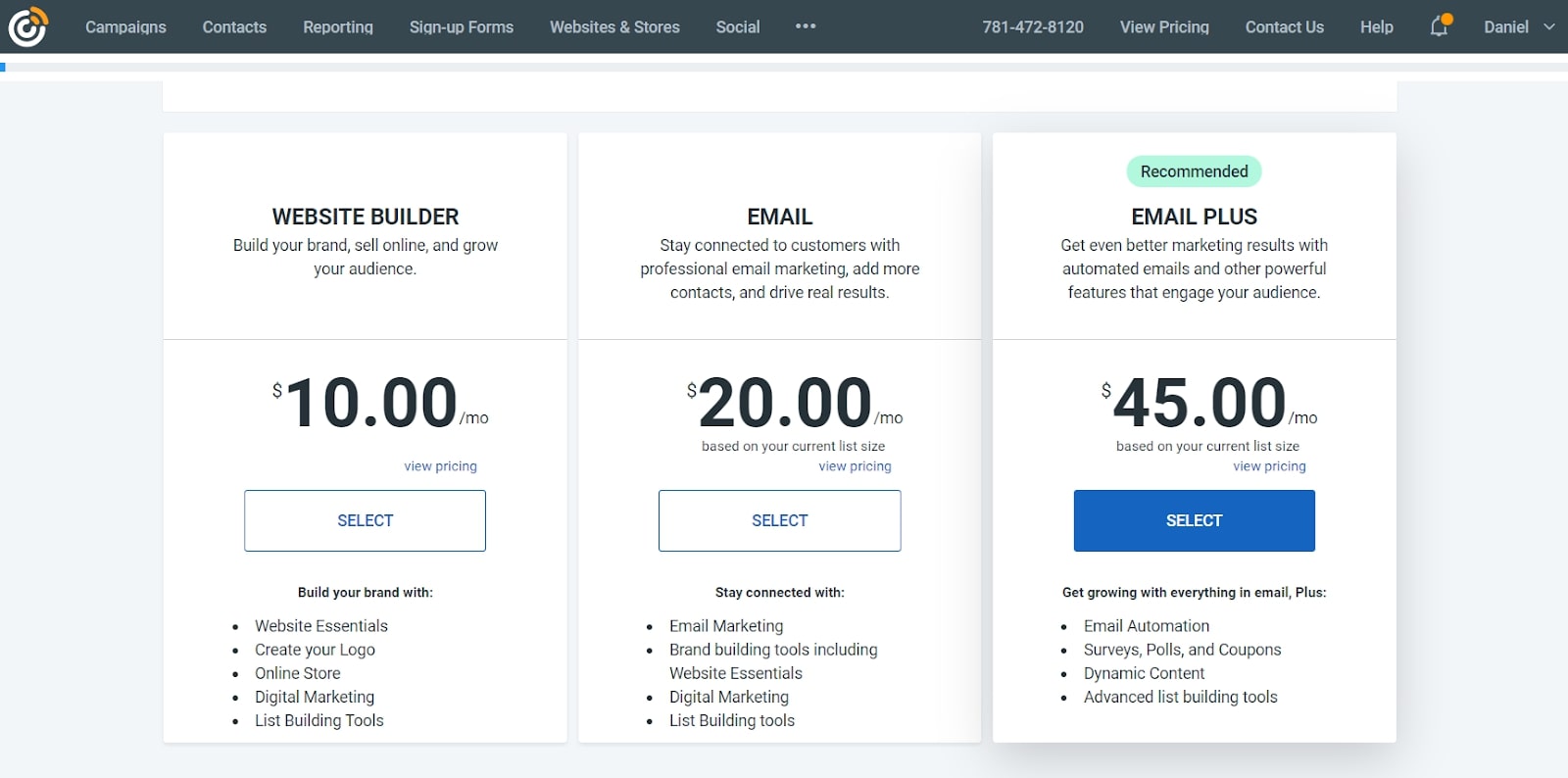
Constant Contact offers three plans. The first one is ‘Website Builder’ and as its name suggests is focused on offering you an online presence, complete with blog and online store, for $10 per month. The price for the other two may not be the one you end up paying: it’s all based on the number of contacts you feed the service. For instance, the ‘Email’ plan’s cost starts at $20 per month, but that’s if you have up to 500 contacts, and can go up to $335 for up to 50,000 contacts. That plan allows up to three users, you can send unlimited emails, have sign up forms, e-commerce marketing, it offers a contacts management tool, basic marketing automation, website capabilities, including an online store, among many other features.
The top of the line plan is called ‘Email Plus’, and starts at $45 per month for 500 contacts (and reaches the same $335 for up to 50,000 contacts limit as ‘Email’, indicating that the bigger your company, the most cost effective the high end plan gets). Some of the added benefits of this plan include the inclusion of polls, coupons, donations, and dynamic content.
Features
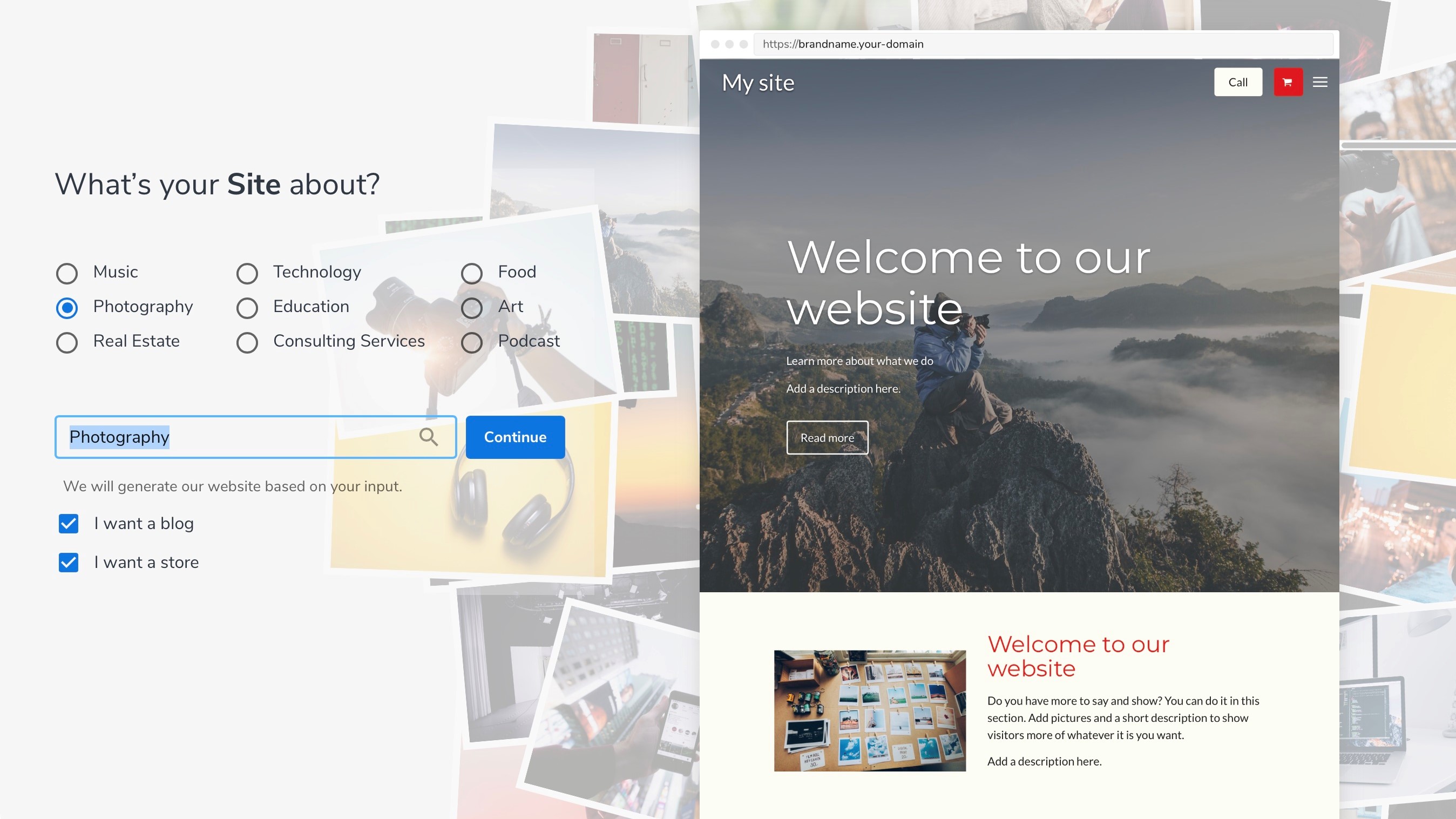
Constant Contact uses an AI-based site creator to help you get started. Once you’ve signed up for a free trial or premium subscription, you will be guided through a quick-start guide. Here, you will be asked to select what sort of website you’re building, fonts and color schemes, navigation styles, and more.
Next, you will be taken to the builder itself, where you will be able to take a quick tour to familiarise yourself with the platform. Quickly switch between pages to edit specific elements, add new sections, and personalise everything from colour schemes to global layouts.
The builder itself is very user-friendly, but design flexibility is somewhat limited. Since it uses a section-based editor, you can only add pre-designed elements. Of course, you can personalise everything, but just don’t expect to be able to place elements in pixel-perfect positions.
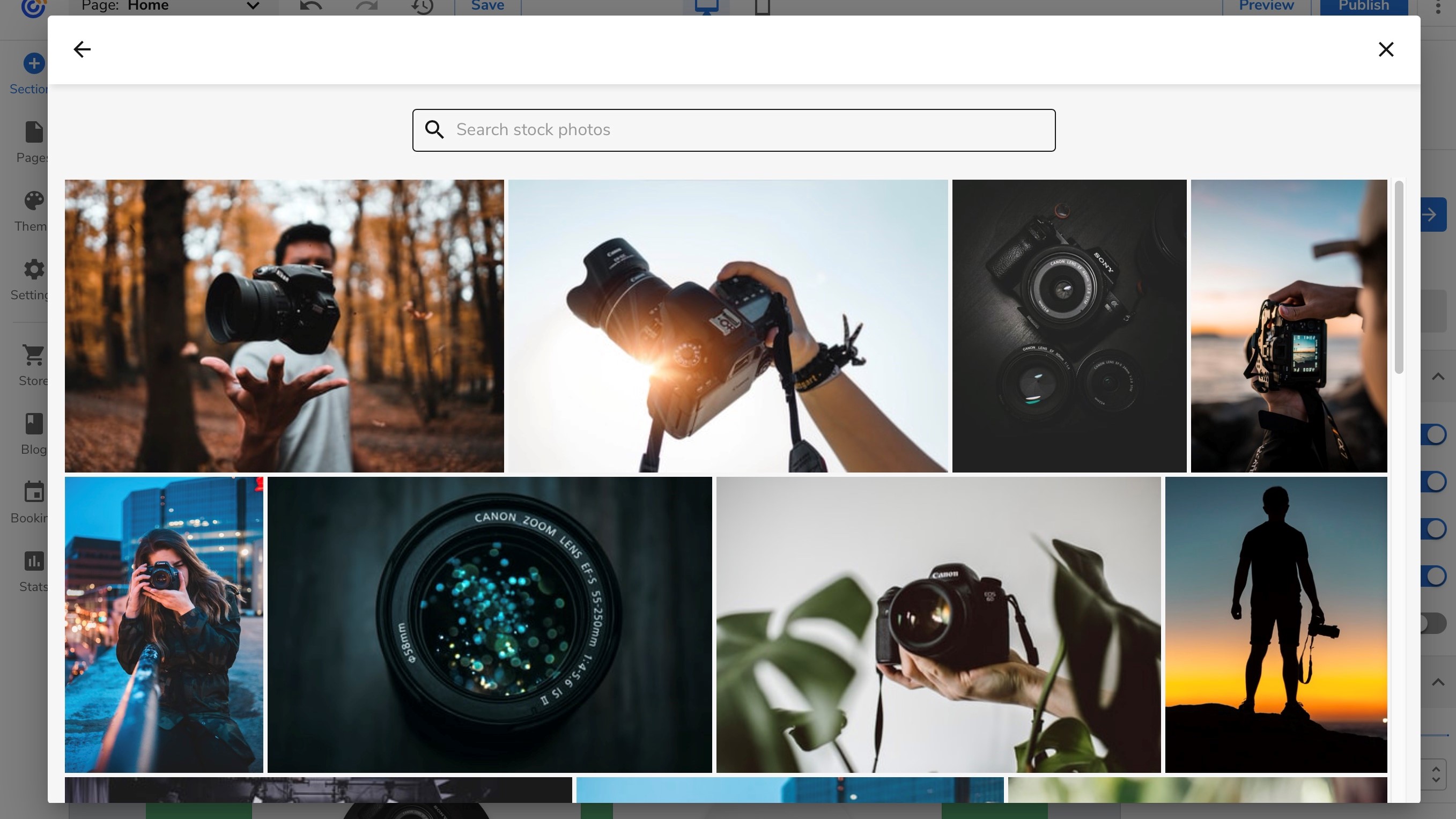
You can also take advantage of the excellent selection of stock images available courtesy of Constant Contact’s Unsplash integration. Here, you’ll find a selection of hundreds of thousands of professional-grade images, all absolutely free.
The Constant Contact platform tracks various statistics for your website, including visitor numbers, locations, devices, browsers, and more. Take advantage of these via the selection of customizable reports, and take data-driven, informed action to improve your site and its performance.
Blogging
Choosing to add a Blogging category automatically creates a new section on the front page linking you to your blogging page.
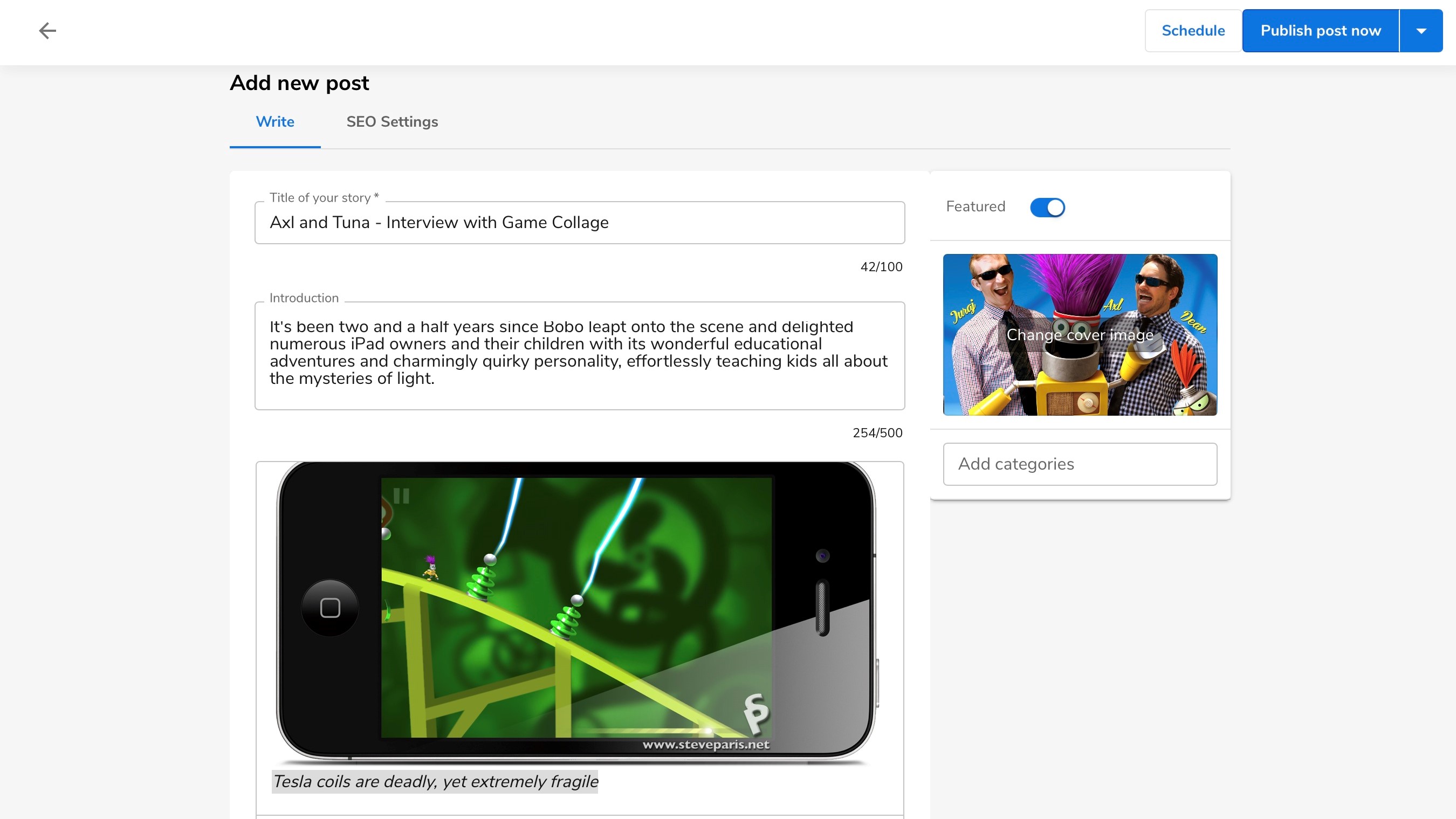
The interface look very sparse but all the basic features you’d expect are there. You have the usual formatting options, like bold, italics, underline, H1, H2, H3 headers, and quote indents. Hyperlinks and dividers are available, as are very welcomed undo and redo buttons.
But that’s the extent of your options.
Adding photos anywhere on your post is easy: just click the camera icon, find an image and you’re done. You have no formatting option though. You can’t even resize the image or put it to the right or left of your text. Your only option is to place it in between paragraphs, filling the width of the page. You can also insert a video that’s been uploaded to YouTube. Other video platforms aren’t supported.
There are some SEO settings where you add a title, description and slug, but that’s all. You don’t have a comments section, but you can save posts as drafts and schedule when to publish them.
Sell, sell, sell
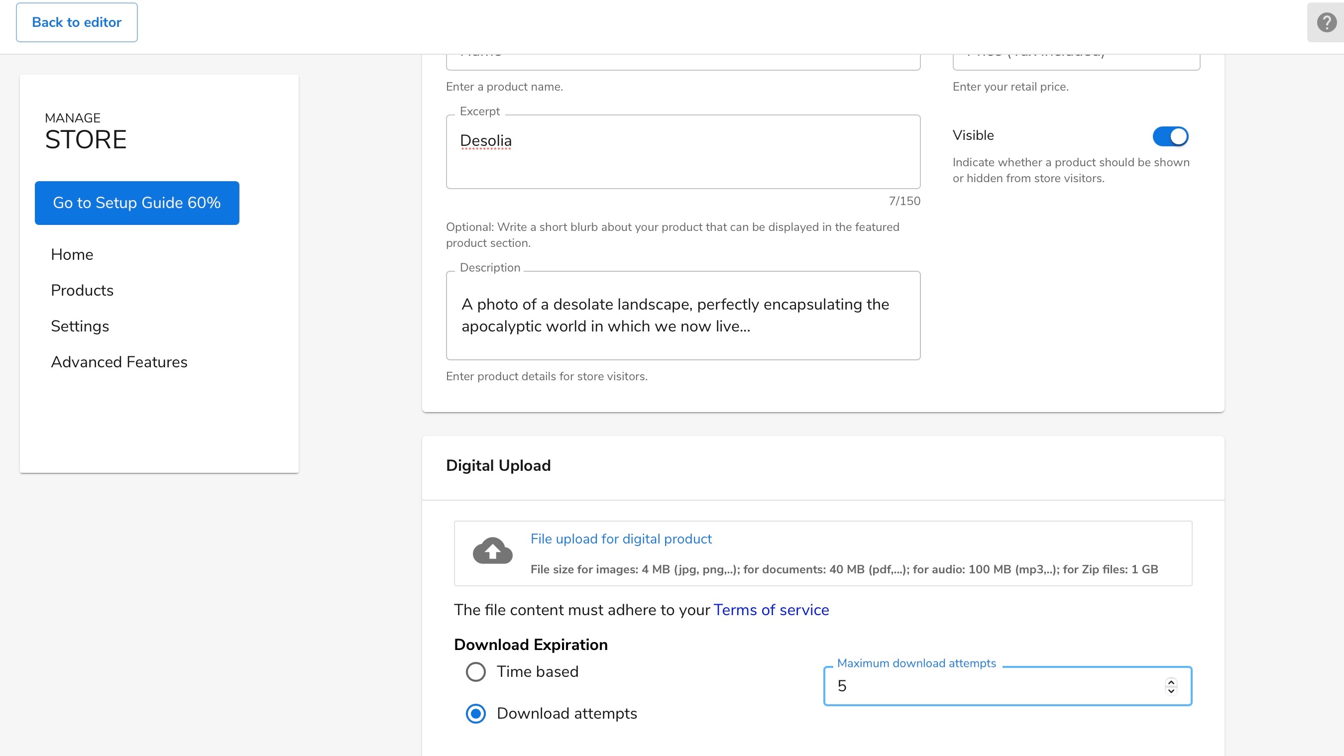
The Online Store feature looks promising, and we appreciate the fact you can choose to sell physical products, or digital downloads. Adding a description is very simple and the tutorial guides you through the steps you need to set up your first item quickly and easily.
Payment is done through PayPal, and you’ll be charged the usual PayPal transaction fees, with an additional 3% fee for Constant Contact. Free accounts can only sell up to three products. Digital products can be set up to be downloaded a certain number of times for each sale, or have a time limit.
Depending on the plan you choose, you have options to set discounts, global variants (like small, medium or large), and product categories. If you want the site to print shipping information for you, or import a pre-made list of products you’ll have to venture into the paid tiers.
Other features
You can create an unlimited number of pages, even with the free account, which is very welcome. The ‘Page Management’ section allows you to reorder pages, so you can choose which ones show up first in your navigation menu. You can also use that section to delete unwanted pages, or duplicate them. You can’t create submenus though, so if you have a large number of pages, it could become difficult for your visitors to navigate through them.
Constant Contact also has a very useful preview section so you can see how your site will look like when viewed on a computer, or portable device.
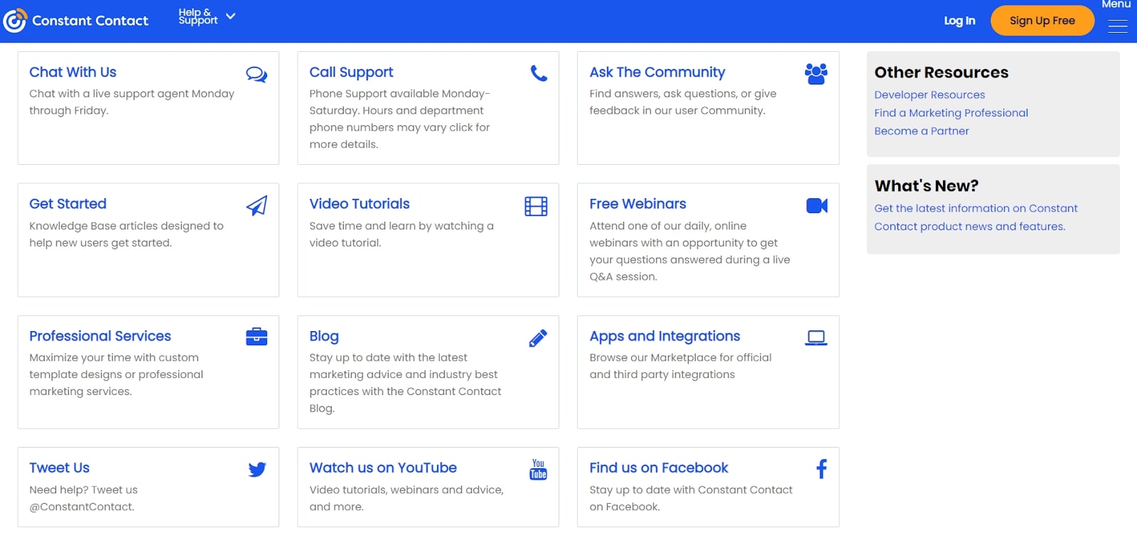
There’s a lot to explore, and especially if you’re new to website builders, the quick tutorial you get at the start may not be enough to help you get the most out of the service. If you feel you’re not getting anywhere, the Support Center is there to help you out. You can either chat with an advisor or browse through the knowledgebase.
We went down the latter route and found the instructions clear and easy to follow, and there were numerous screenshots to help you understand everything.
Final verdict
At the end of the day, Constant Contact just doesn’t quite bring enough to the table to stand out from the crowd. Sure, it’s a nifty little website builder, but it really doesn’t offer anything to make us recommend it over its competitors.
In saying that, it’s still a perfectly acceptable option for anyone who wants to get online fast and with a minimum amount of fuss. It’s quite affordable, and the email marketing tools are excellent. If the Constant Contact builder does appeal to you, then by all means, sign up for the 60-day free trial, test the platform, and then re-evaluate after using it for some time.
- We've featured the best small business website builder
You might also want to check out our other web hosting buying guides:
0 comments:
Post a Comment