Yahoo website builder
If you’re looking for an easy to moderate skill website builder built directly for small businesses, then you’re in luck. Yahoo website builder has many features designed to create a website that fits your niche. There’s a free plan available that you can use for an unlimited time, which includes SEO.
- Want to try Yahoo website builder? Check out the website here
If you need more assistance building your site (beyond traditional hosting) you can sign up for website design services. This provides a team of experts who will create your website for you. You won’t have to waste time on the details and can focus your time on the bigger picture. Whichever needs you have, you’ll find ways to improve your small business and start sharing your ideas and products with the world.
- Also check out our roundup of the best web hosting
Plans and pricing
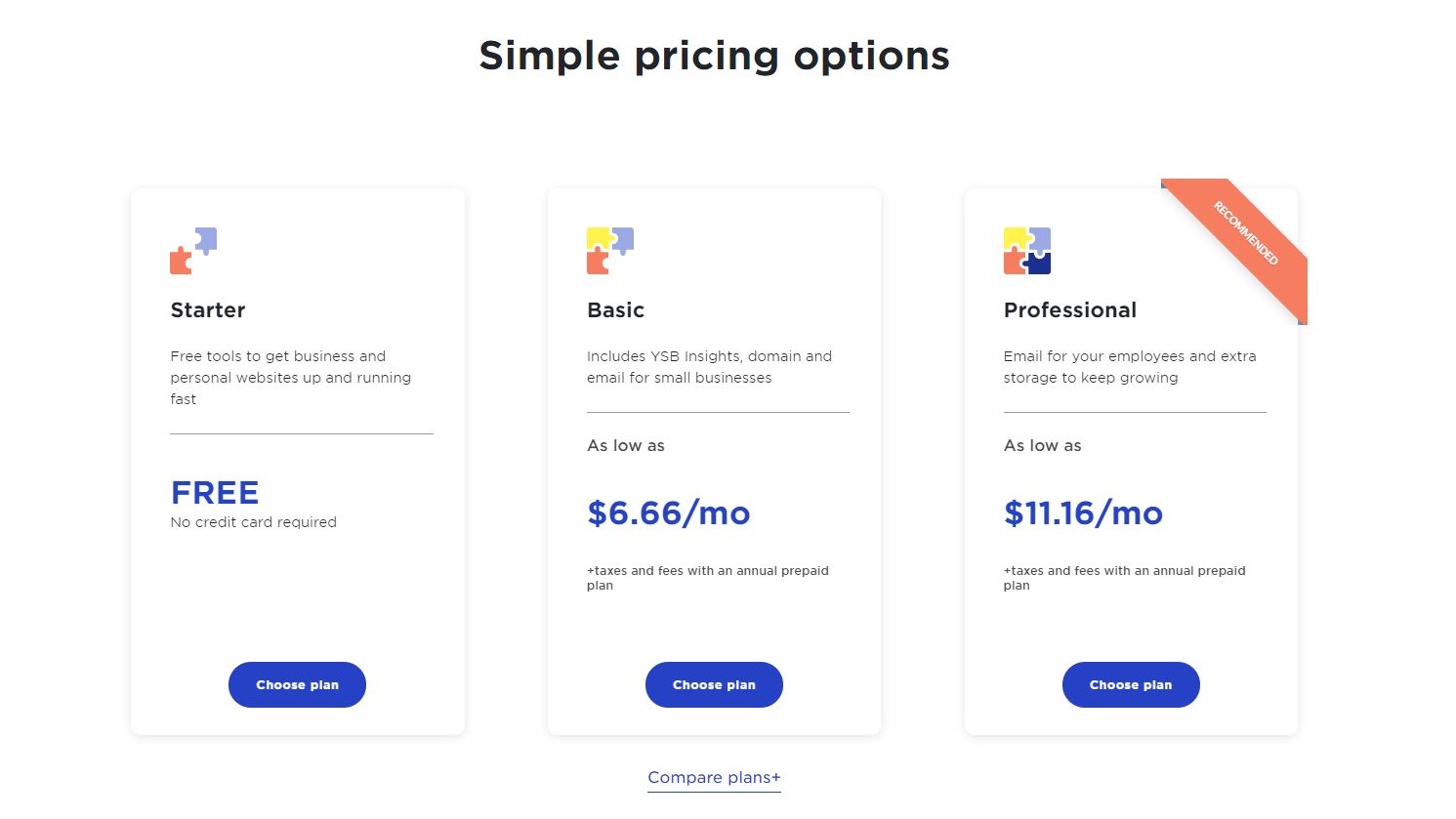
There are three plans available. As mentioned above, one of these is free. The other two offer additional services.
The free one is known as Starter. It’s designed to help small businesses get online right away, and you don’t even need to hand over your credit card details to access it. As a bonus, all templates are available. This plan includes one free yahoosites.com domain, 3GB of storage, unlimited website pages, and one SSL certificate. Best of all, this free version is not time limited.
Next is Basic. It includes more features and starts at $6.66 per month when paid annually. You’ll have access to one custom domain (free for the first year), 5GB of storage, one email inbox (with the ability to configure multiple aliases), and unlimited bandwidth. This plan also includes the Yahoo Small Business app, where you will receive updates on website activity and manage your site easier.
Finally, we have Professional. It’s aimed at small businesses with a slightly larger team. This service will cost you $11.16 per month when paid annually, and includes everything in the Basic plan, along with 10GB of storage, five email inboxes, and private domain registration.
Getting started
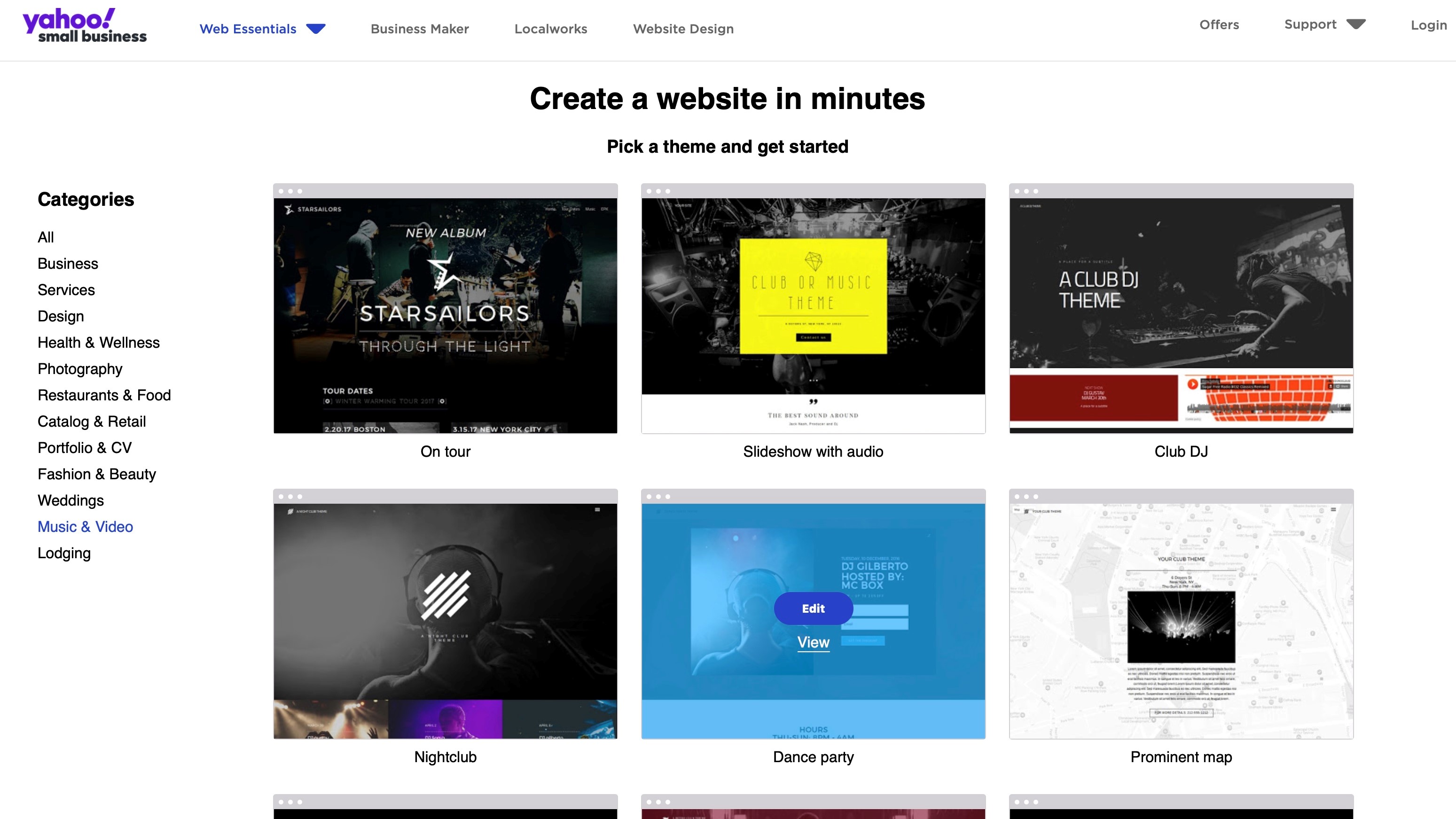
You start the process of creating your site by selecting from one of 33 templates. To help you find the one that suits your business best, they’re broken down by category, such as Services, Photography, and Weddings. As a bonus, you’re not limited to the thumbnails to make your decision: a preview option is available, allowing you to see the template as it would look on a desktop or mobile device. Choose your favourite one by clicking on ‘Edit’.
Interface
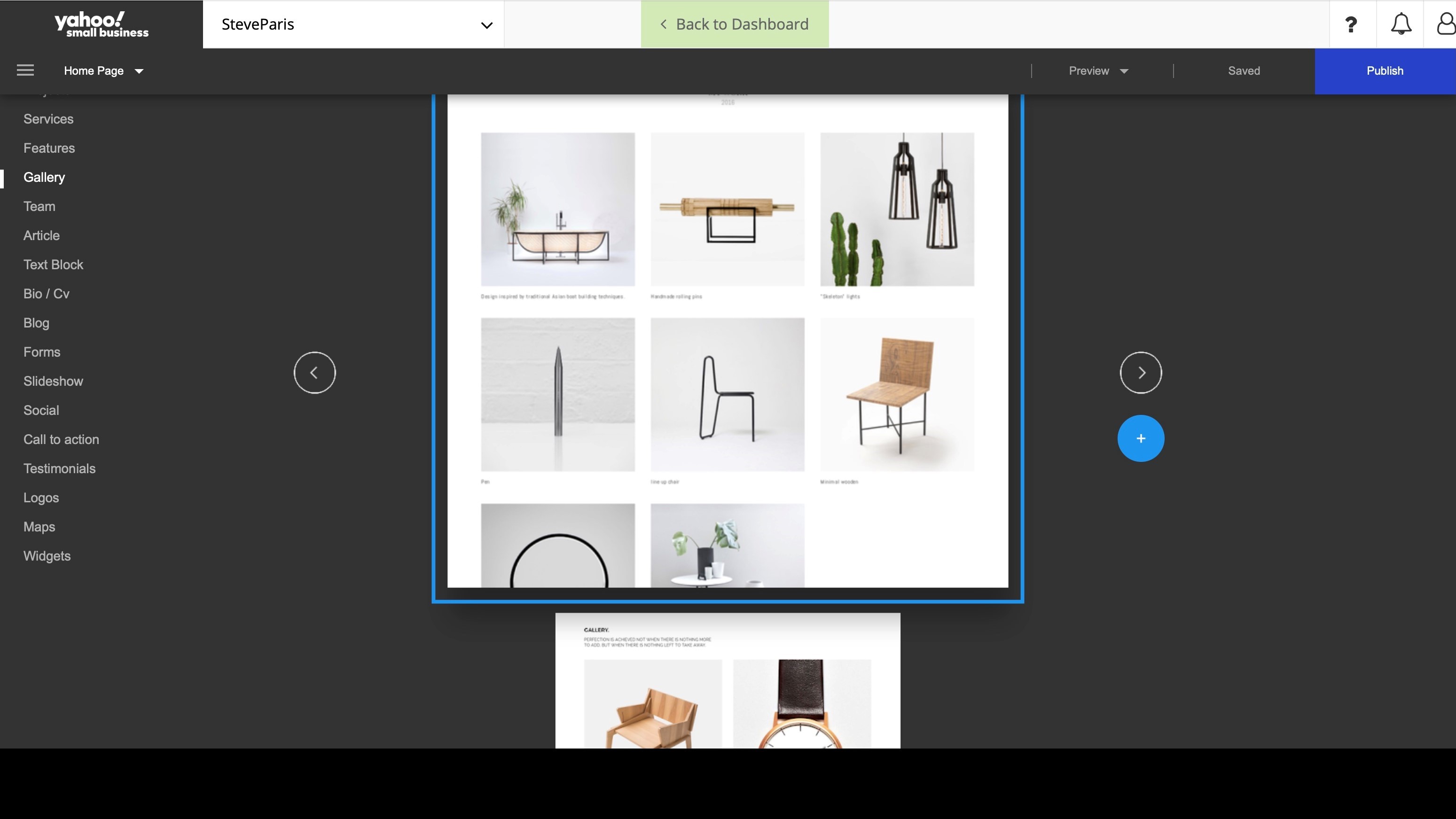
Like so many other website builder services, this one uses the concept of blocks. To add a block, mouse over your site until you see a blue line with a ‘+’ appear. Click on it to choose the type of section you’d like to insert there. All available options are broken down into categories. The interface is a little confusing because you can’t see all of them in one go: you have to cycle through your options by clicking on the left or right arrow to the side of the block currently being previewed. What’s confusing is the animation that takes you to the next preview goes up or down depending on whether you click on the left or right arrow. Use your mouse or trackpad to scroll up or down merely scrolls the page, not the templates. It’s a weird visual decision.
Thankfully, there’s an icon represented by four small squares top right of the window which turns the large individual thumbnails into rows of smaller ones. This lets you see all available versions, but the preview is then too small to know exactly what you’re getting, and clicking on one adds it to your page.
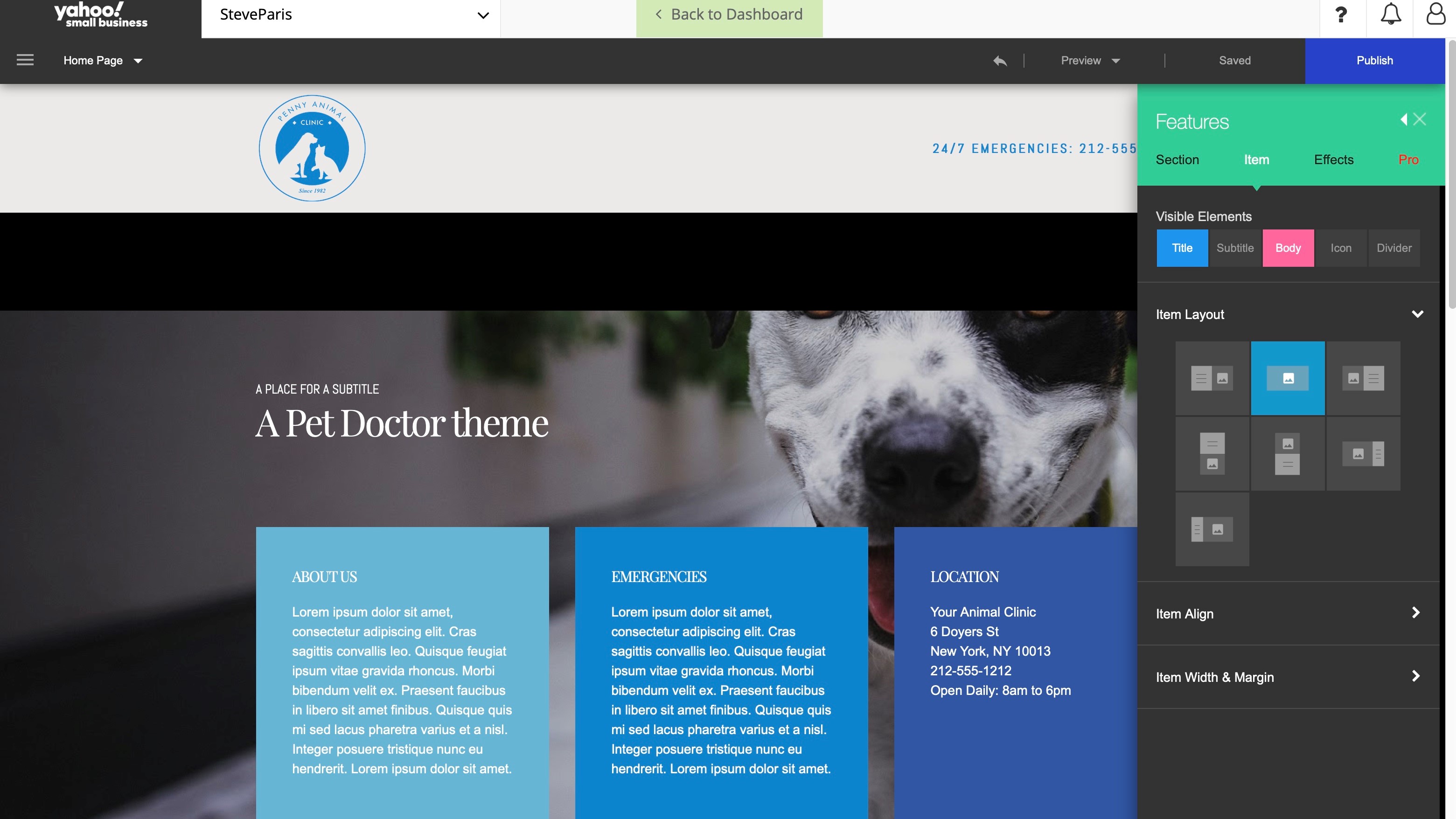
By contrast, editing sections is nice and elegant. Click on any element to be graced with a small expandable contextual menu. Click on a text box to have text formatting options; click on the background to gain access to filters and colour effects, as well as the ability to swap the image for another.
When commands are too numerous, or it’s impractical for them to appear near the element, a sidebar reveals itself to the right of the window. It’s all very intuitive and easy to grasp in minutes.
Blogging
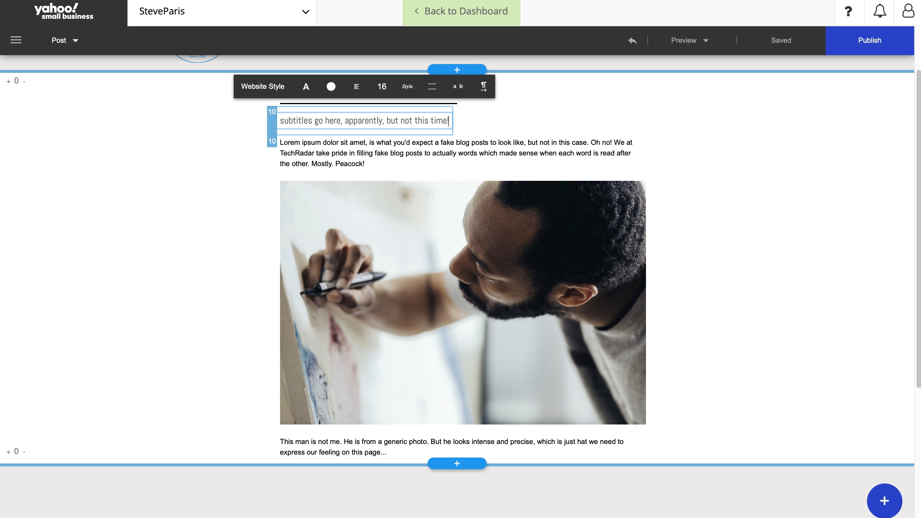
You’ll find a blogging section, which you can populate with post after post. The design process is the same as for other pages: add sections and build your article. We couldn’t however find a way to schedule posts. It seems you have to go old school and publish them manually when you’re ready. We also couldn’t find an tools for readers to add comments.
Media
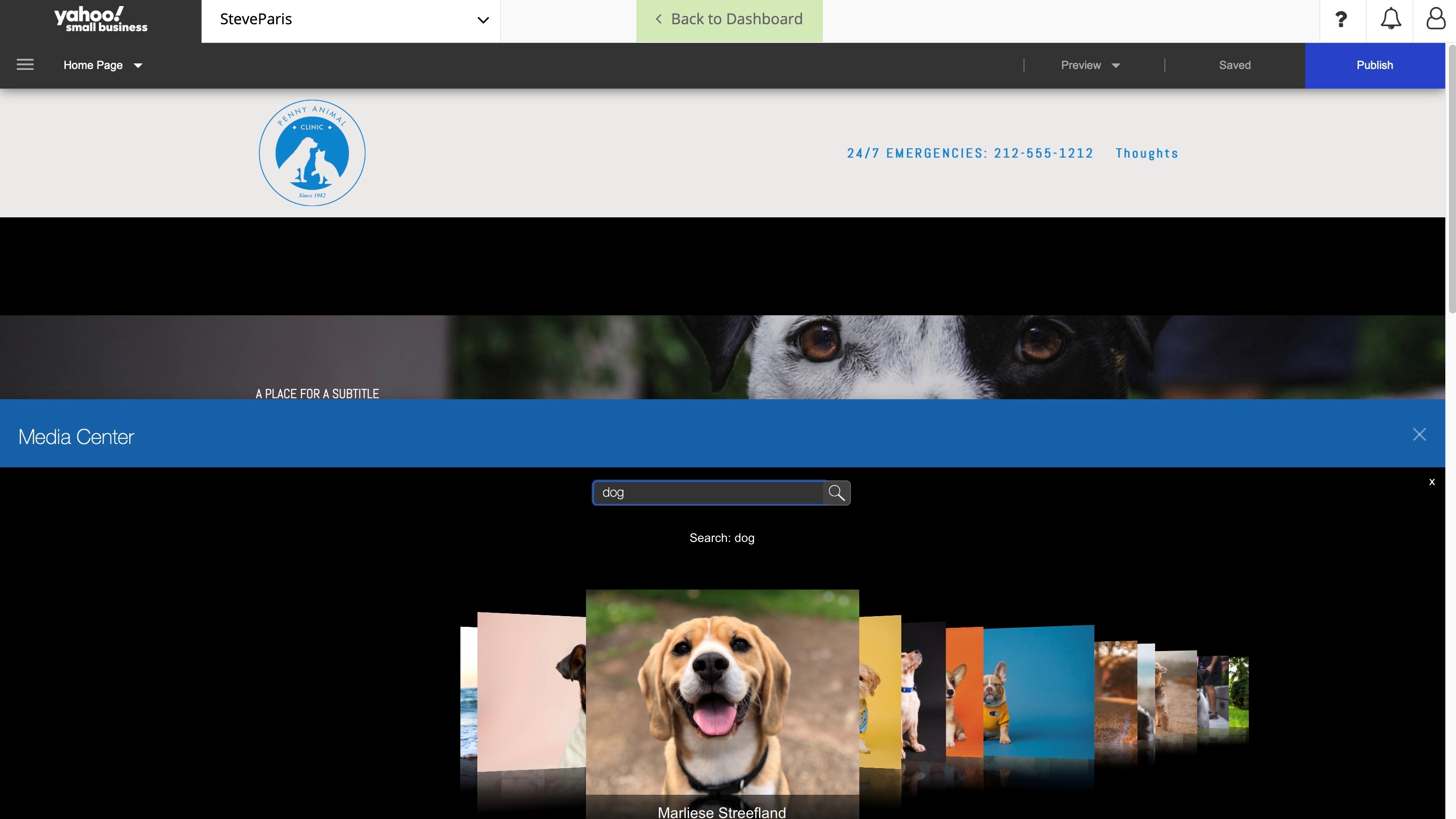
As you’d expect, you’re able to add your own images and photographs, but if you run short, you have access to Yahoo’s Media Center. It’s search driven. Type in ‘dog’ for instance, to be graced with a handful of photos you could use. Alternatively, you also have a few categories to select from, such as People, Nature, or Animated GIF.
Once inserted into your page, you’re given a few filters, you can alter the opacity and even choose a background colour for your photo, but your editing options are pretty limited. Parallax is nice, but it’s hardly new these days.
Other features
The right sidebar does contain a lot of options, like being able to add elements to any selected section (like an icon, a button, a subtitle, … select it there and a default version will appear on the page ready for you to edit). You can alter the layout of any section, and the alignment of items within them. You’re able to add animation effects to introduce a little dynamism when a visitor scrolls down the page.
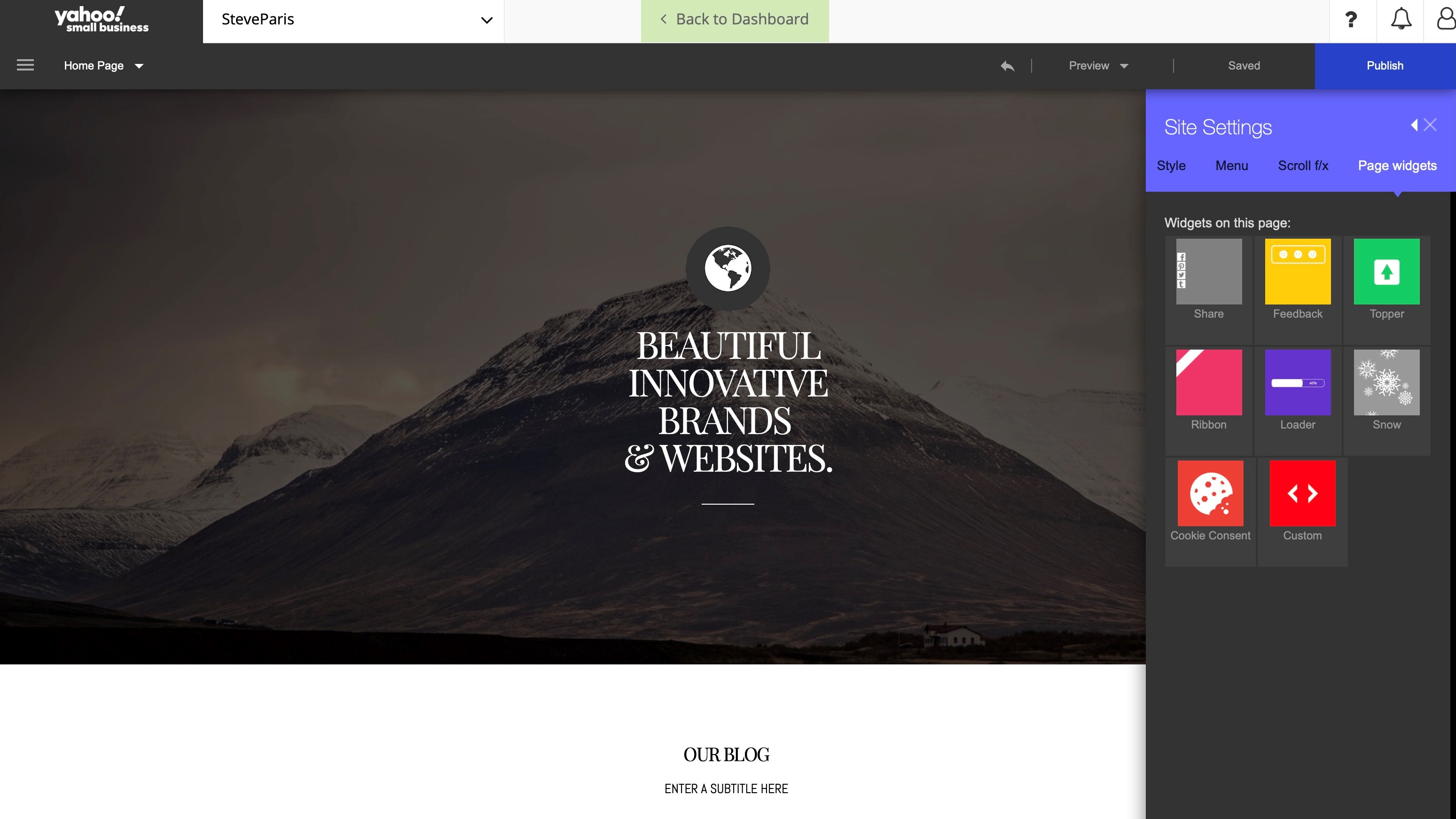
General settings are invoked via a menu on the left. From there you can choose how your site’s navigation menu is presented, the general style of your page (this is where you get to set your site’s font preference for instance), including the inclusion of various widgets (the social media share widget might be the most useful of the small selection).
Google Analytics and Facebook Pixel are built into the service - just add your respective ID for Yahoo to start sending the relevant data to them. Those who know a little code, also have the option of adding some HTML into the site header.
Final verdict
Yahoo website builder offers a good service focused on small businesses. There’s space to grow your online presence easily - you can build your site right away for free, or talk with professionals to help get the ball rolling. Overall, the interface makes it straightforward to build your pages once you get used to some of the quirks.
- We've also highlighted the best website builder and the best free website builders
0 comments:
Post a Comment