Garmin Forerunner 265S review
This is an early review of the Garmin Forerunner 255S. We've only spent around an hour with the watch, so stand by for a more comprehensive full review in a few weeks' time.
The Garmin Forerunner 265S, alongside its siblings the Garmin Forerunner 965 and Garmin Forerunner 265, has only just been announced at the time of writing. However, given that the watches are essentially last year's world-class Forerunners with updated screens and added features, I feel quite confident they'll earn their places on our best Garmin watches list – as long as the screen doesn't impact the watch's battery performance beyond what's listed.
Garmin's beautiful new AMOLED touchscreen is on par with any other smartwatch you care to mention, even the best Apple Watch, and still measures battery life in days and weeks rather than hours. The Garmin Forerunner 265S purports to have 13 days of life in smartwatch mode, and up to 25 hours in GPS mode. Time will tell if that's accurate.
Otherwise, there are a few differences beyond the screen that separates the Forerunner 265S from its predecessor, the Garmin Forerunner 255S. There's no dedicated 'music' model to signify that the watch has music storage: that's now baked-in to every model in the updated Forerunner line. It's also got the Training Readiness score previously available to the 955, which we'll dive into later in this review.
Garmin Forerunner 265S: Price and availability
- $449 in the US
- £429 in the UK
- Australia pricing TBC
The Garmin Forerunner 265S is priced at $449 in the US, and £429 in the UK. We'll have pricing information for Australia as soon as possible, but the Garmin Forerunner 265S will be available in all three markets, just like the rest of Garmin's flagship range.
At present, the watch is available from the Garmin website.

Garmin Forerunner 265S: Design
- Screen looks great, with only slight judders
- Gorilla Glass means it's as rugged as ever
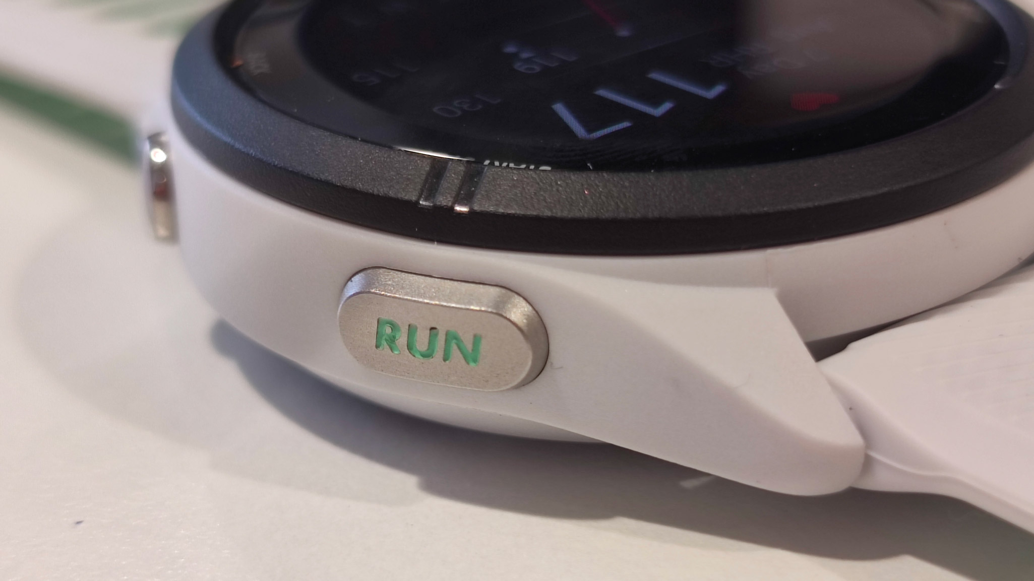
- New, larger 'run' button easier to operate mid-workout
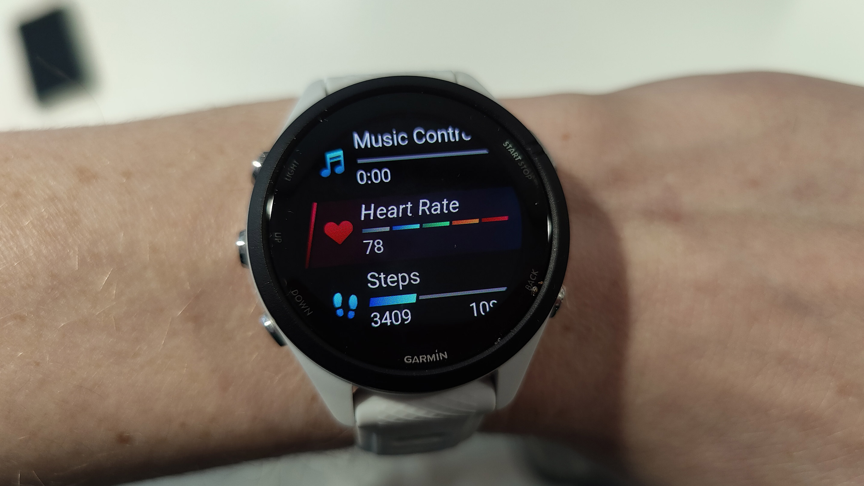
The watch is only slightly bigger than the 255S was, at 42mm (well, 41.7) compared the older model's 41mm. The screen is eye-popping and absolutely gorgeous: 360 x 360 AMOLED, with a Corning Gorilla Glass lens to ensure the watch stays rugged and hard-wearing enough to survive adventures and triathlons with peace of mind.
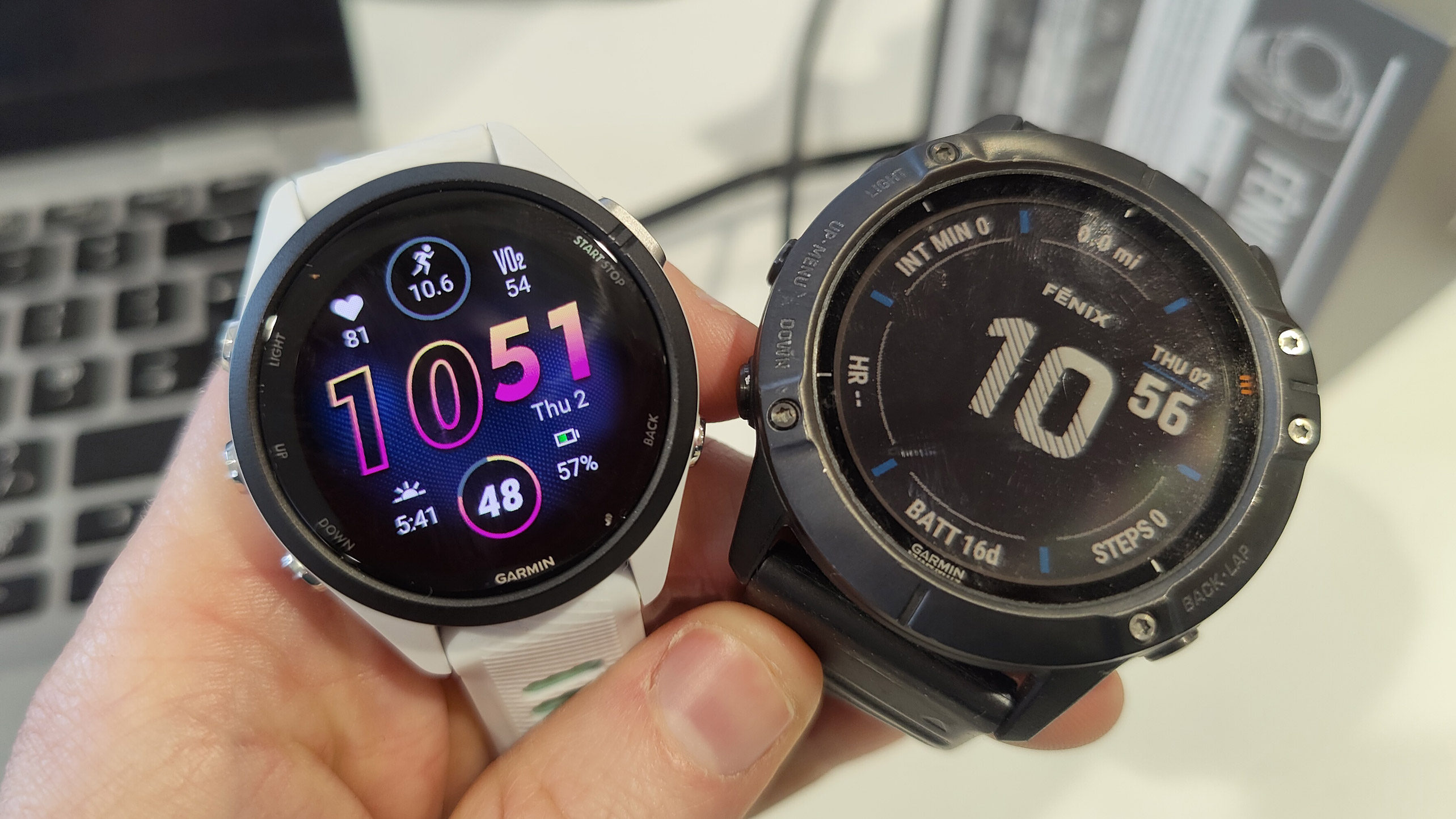
Scrolling through the screens, it's not quite as smooth as the Samsung Galaxy Watch 5 Pro, but considering it's got around five times the battery life, I can forgive a slight bit of motion blur. You can see the AMOLED next to the old memory-in-pixel format below, side-by-side with the Garmin Fenix 6X:

The watch packs a slightly redesigned titanium case and bezel, complete with the larger start-stop button in the top right, appropriately redesigned as a 'run' button. Even though the other buttons are unchanged, the larger profile of your 'main' button is going to make operating the watch quickly during a workout a breeze, even while wearing gloves. It's more or less the only functionality I use on most runs, unless I need to scroll through my navigation options.
The larger start/stop button reminds me of the Apple Watch Ultra's Action Button, which protrudes from the case to operate on the same principle. I think we're seeing a trend forming among fitness watches right now, and I wouldn't be surprised to see other brands follow suit.
Otherwise, the watch comes with new faces such as the one shown, which takes full advantage of the updated screen and the new ability to tap on a feature to bring up the appropriate widget. Scrolling through your options using the up and down buttons on the watch's left-hand-side will be familiar to anyone who's ever used a Garmin watch before: there's no reinventing the wheel here. It's a brighter version of the 255.
The whitestone color I was able to get my hands on is complemented by those lime-green undertones in the band, which extends to the underlay in the recesses of the run button. It's a neat design choice, and I think the watch looks great.

Garmin Forerunner 265S: Features
- Touchscreen is responsive
- Training Readiness Score added
- Music included
- No topo maps
The 265S has a few new tricks, the touchscreen being first among them. This is only the second touchscreen that has arrived on the Forerunner series, the first being the Garmin Forerunner 955 last year. You can use the touchscreen to scroll up and down the list, rather than using the buttons, and a tap to hone in on different features, instead of using the start/stop button to select. But it's an option, not a requirement: if you're training hard, getting sweaty or wearing gloves, you'll default to using the buttons as normal.
The added Training Readiness score is a feature Garmin implemented last year, again on the 955, and it's good to see it filter down toward the smaller watches. An updated version of the Body Battery score, your Training Readiness score takes into account the intensity of your last few sessions of exercise, your sleep, heart rate, time elapsed between sessions, and so on. It then feeds you an updated score based on how ready for performance your body is likely to be.
It's a really useful feature, and I use it a lot on the 955. I'm currently training for my first marathon, so I use the Training Readiness score to understand how long it takes my body to recover from big runs so I can plan my tapering strategy ahead of race day. But the Training Readiness score was added to the Garmin Fenix 7 via a firmware update last year. Did we need a whole new watch for it this time?
The other nice thing about the 265 and 265S is that music is included as standard: on the previous models, we had the 255, 255 Music, 255S, and 255S Music. The 265 watches come with 8GB storage as standard, enough for plenty of music to see you through long races.
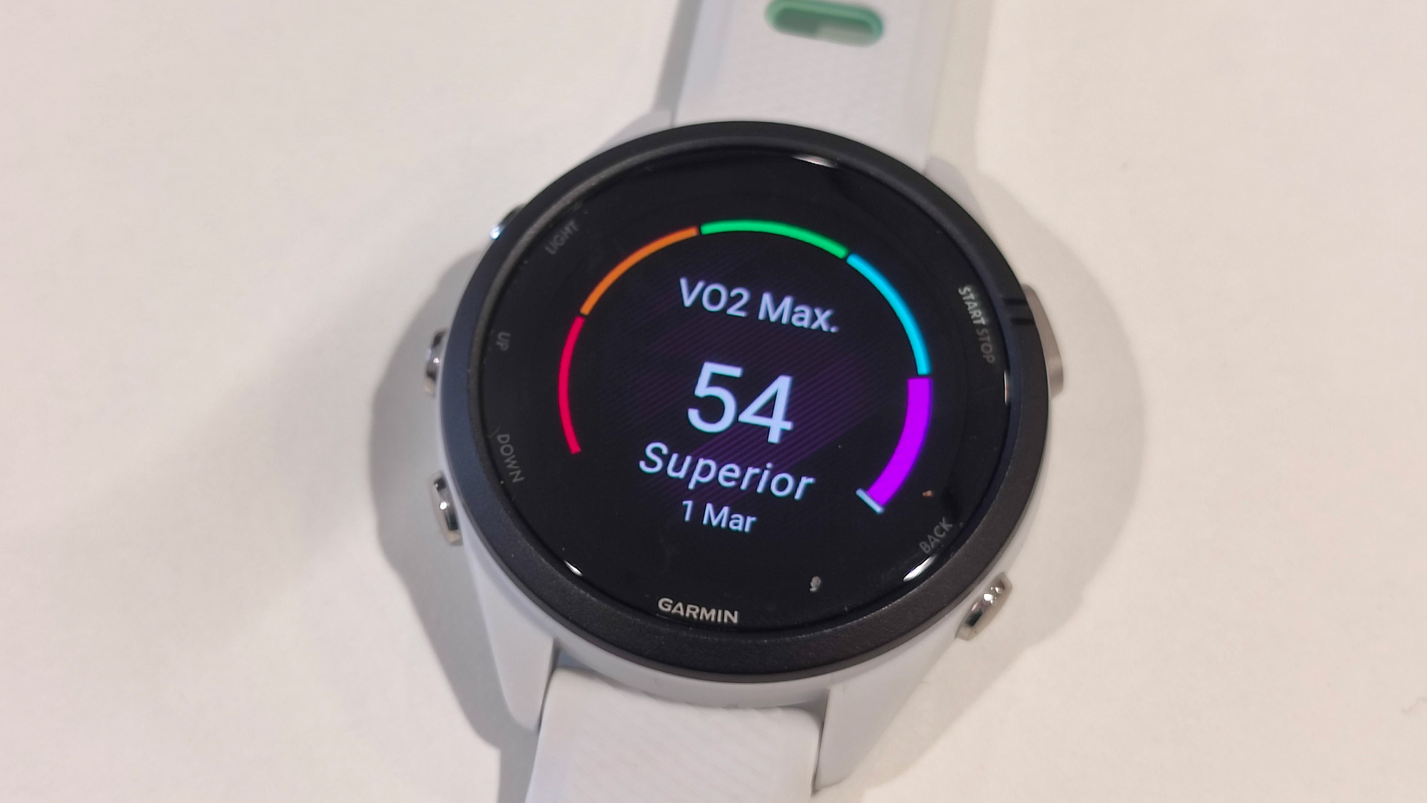
Otherwise, the 265 doesn't seem to have actively lost any features per se, or slimmed down the number of its available widgets. VO2 max, weather and tide information, the 255's impressive running metrics, and Garmin's state-of-the-art GPS are all here. It's still an awesome watch that's only adding to the already-impressive chassis of the 255. But other than the above, it is the 255: a brighter, sleeker, more attractive version, but a 255 nonetheless.

Garmin Forerunner 255S: Early verdict
Garmin's new small Forerunner looks great. The 255 wasn't a bad-looking watch, but the 265S looks sporty and fun, with its two-tone redesign and bright, bold screen. It'll stand out on the wrist (although not in a bad way) and is easily seen in all the lighting conditions we've tested so far. The touchscreen is fun, and a good addition for anyone unused to the way Garmin's buttons work.
The Garmin Forerunner 265S has also added a smattering of new features, but not enough to differentiate it properly from the 255. It could have been called the Forerunner 255X or something and I wouldn't have batted an eyelid. But it's come so soon after the release of its predecessor – not even a year! – that there just hasn't been time for a real update of these watches.
We're starting to get into Apple Watch territory here, with smaller, cosmetic updates designed to draw new customers in each year, rather than encourage existing ones to upgrade. It's a great watch, but one I couldn't recommend to existing Forerunner users because of how similar it is to last year.
0 comments:
Post a Comment