Tuesday, October 31, 2023

Gigabyte Radeon RX 7700 XT Gaming OC review: great performance for the price

Gigabyte Radeon RX 7700 XT Gaming OC: Two-minute review

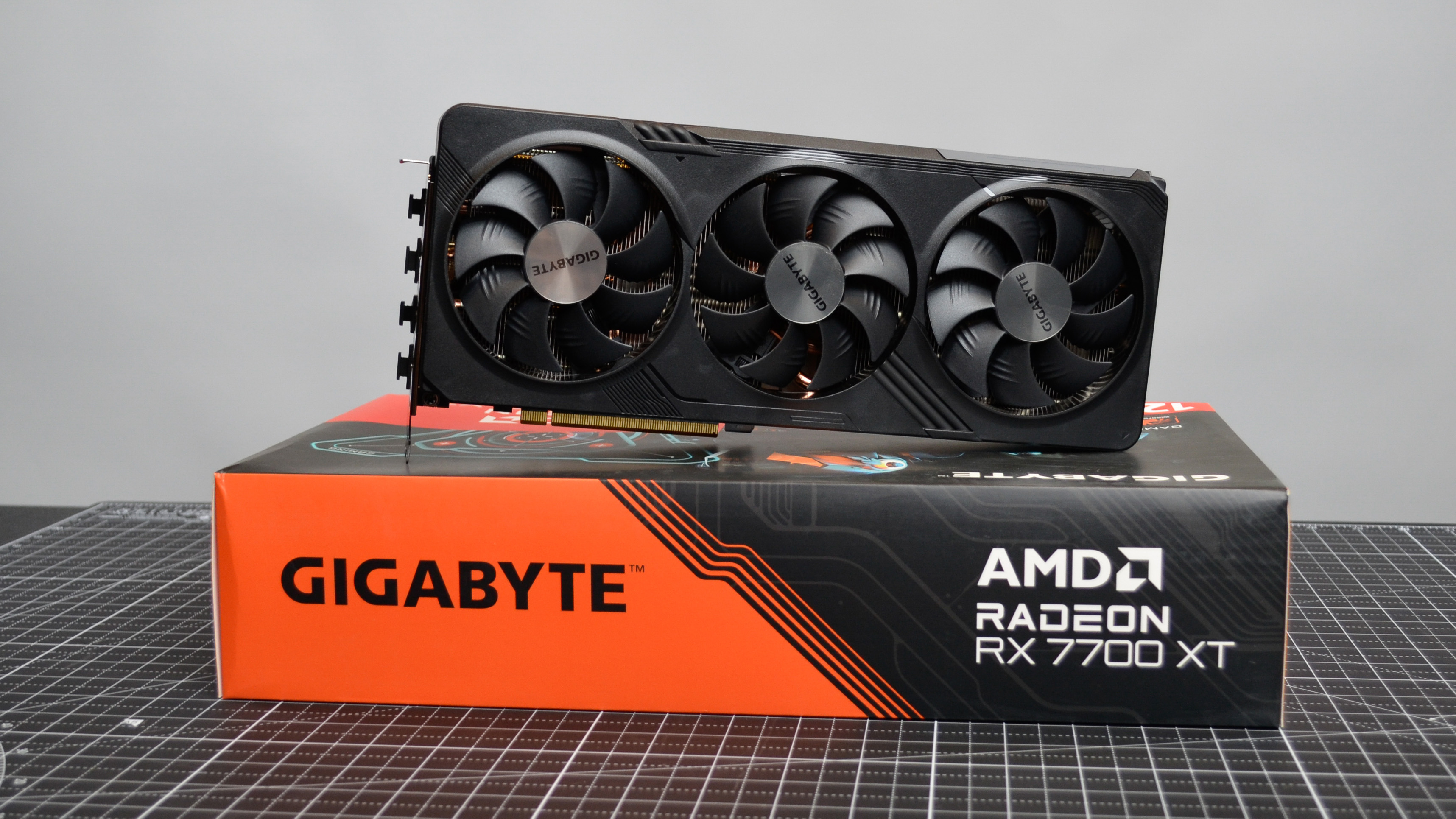
The Gigabyte Radeon RX 7700 XT Gaming OC is the best version of a difficult card to recommend generally, but it goes a good way towards ameliorating the biggest issue I had with the AMD Radeon RX 7700 XT: its price.

The Gigabyte Radeon RX 7700 XT Gaming OC is available for $439.99 (about £360/AU$695), which is only $10 less than AMD's official MSRP for the RX 7700 XT, so it's not the biggest savings here, but it does make this card at least somewhat more competitively priced with the Nvidia GeForce RTX 4060 Ti, which comes in at $399.99 (about £320/AU$630).

However, it's not just a price cut off the reference MSRP from AMD that makes the Gigabyte RX 7700 XT card a good bargain. You also get some extra perks over AMD's reference specs to make it more enticing as well, making it one of the best graphics card options for midrange gamers on a tighter budget.
A Gigabyte Radeon RX 7700 XT Gaming OC on a desk

(Image credit: Future / John Loeffler)

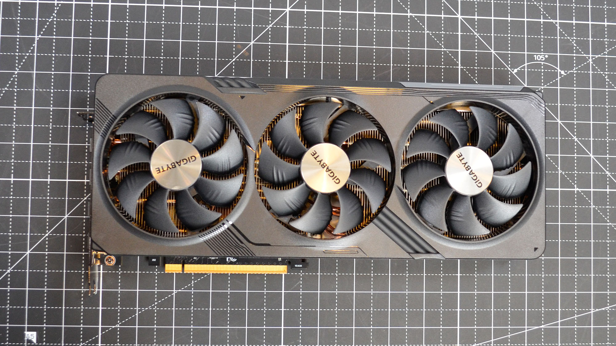
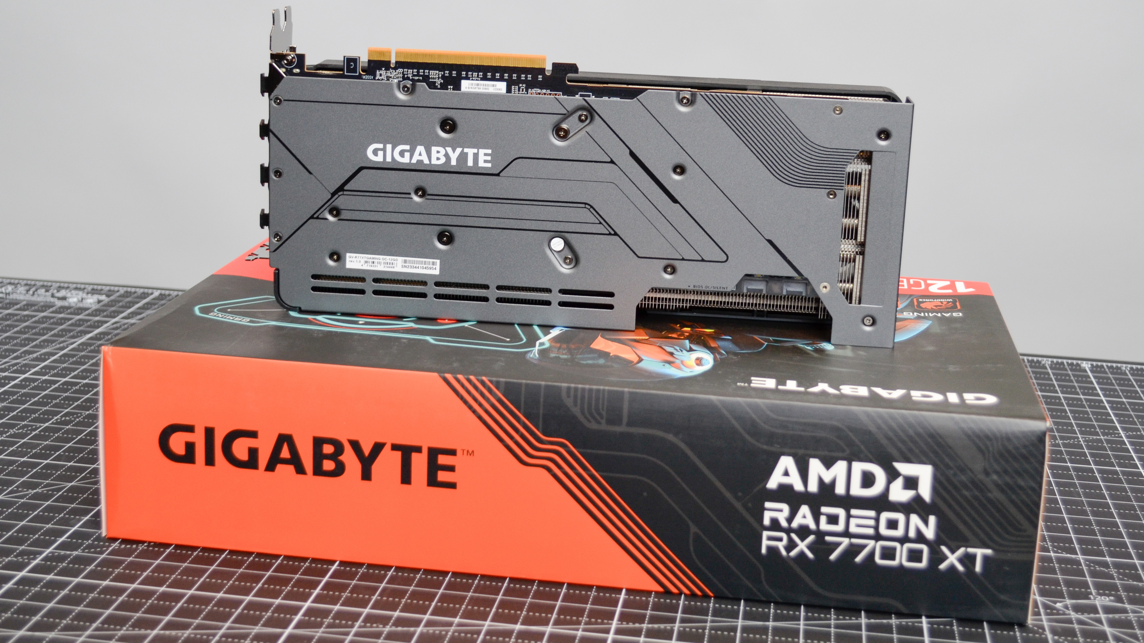
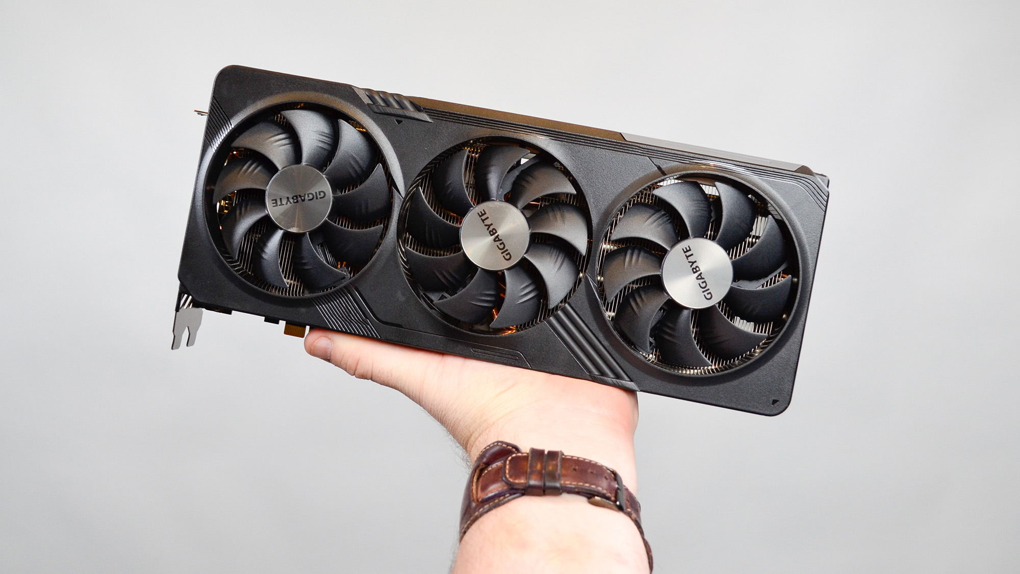
Starting with the design, you get a triple-fan design that definitely helps thermal performance, which isn't egregious on the RX 7700 XT to begin with. There is no reference card for the RX 7700 XT, mind you, but given that the AMD Radeon RX 7800 XT does have a reference card that sports a dual-fan design, you do get something over the higher-tier AMD card.

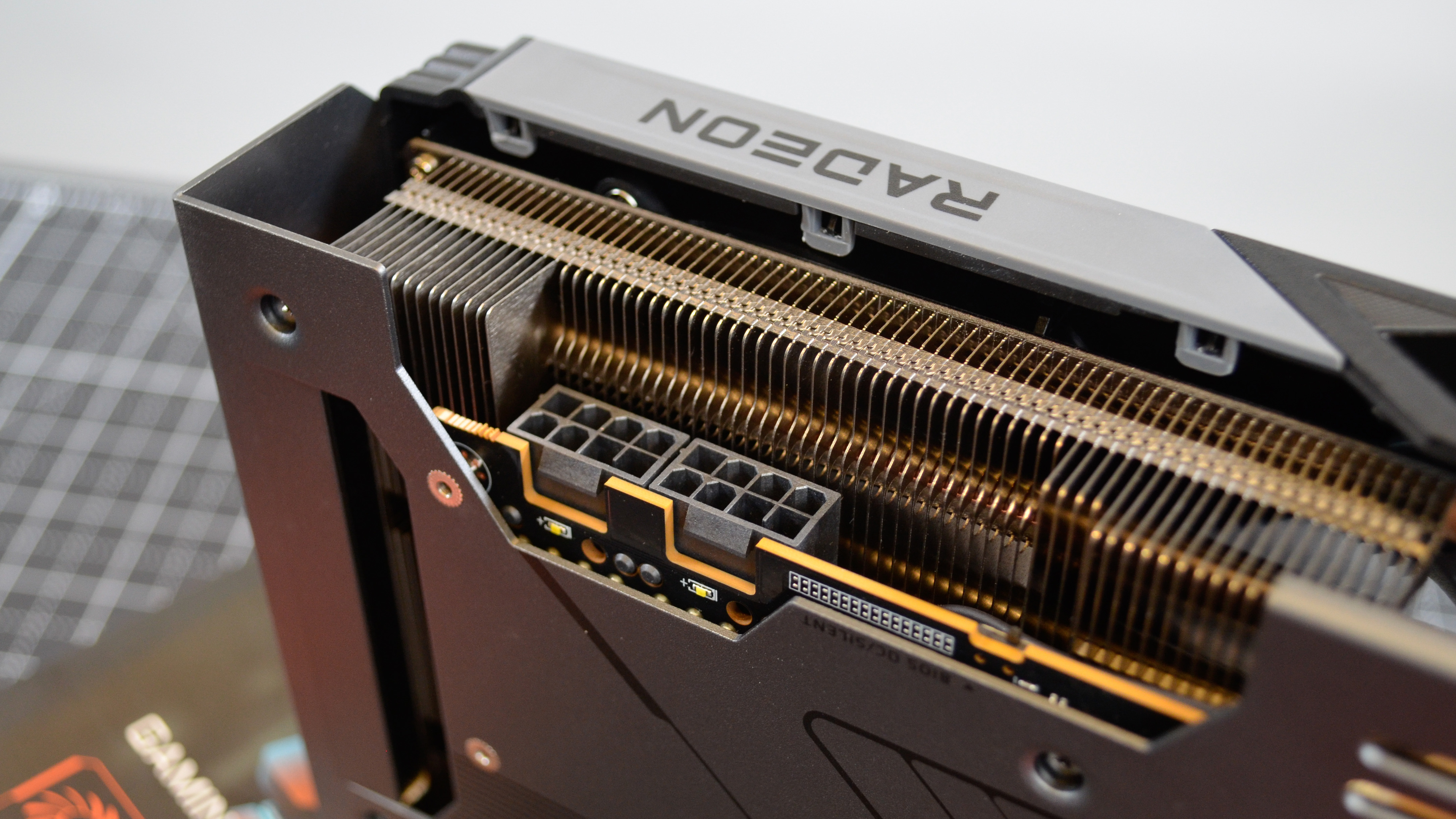
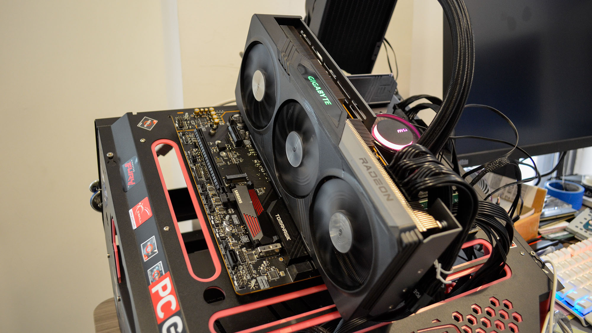
That's not nothing, and the card itself isn't so long that it can't fit inside a typical midtower PC case. The RX 7700 XT does require a good bit more power than the RTX 4060 Ti (245W to the 4060 Ti's 160W), so it needs two 8-pin power connectors to run it. On the other hand, it doesn't require a 16-pin power cable like the rest of Nvidia's reference RTX 4000-series cards.
A Gigabyte Radeon RX 7700 XT Gaming OC on a desk

(Image credit: Future / John Loeffler)

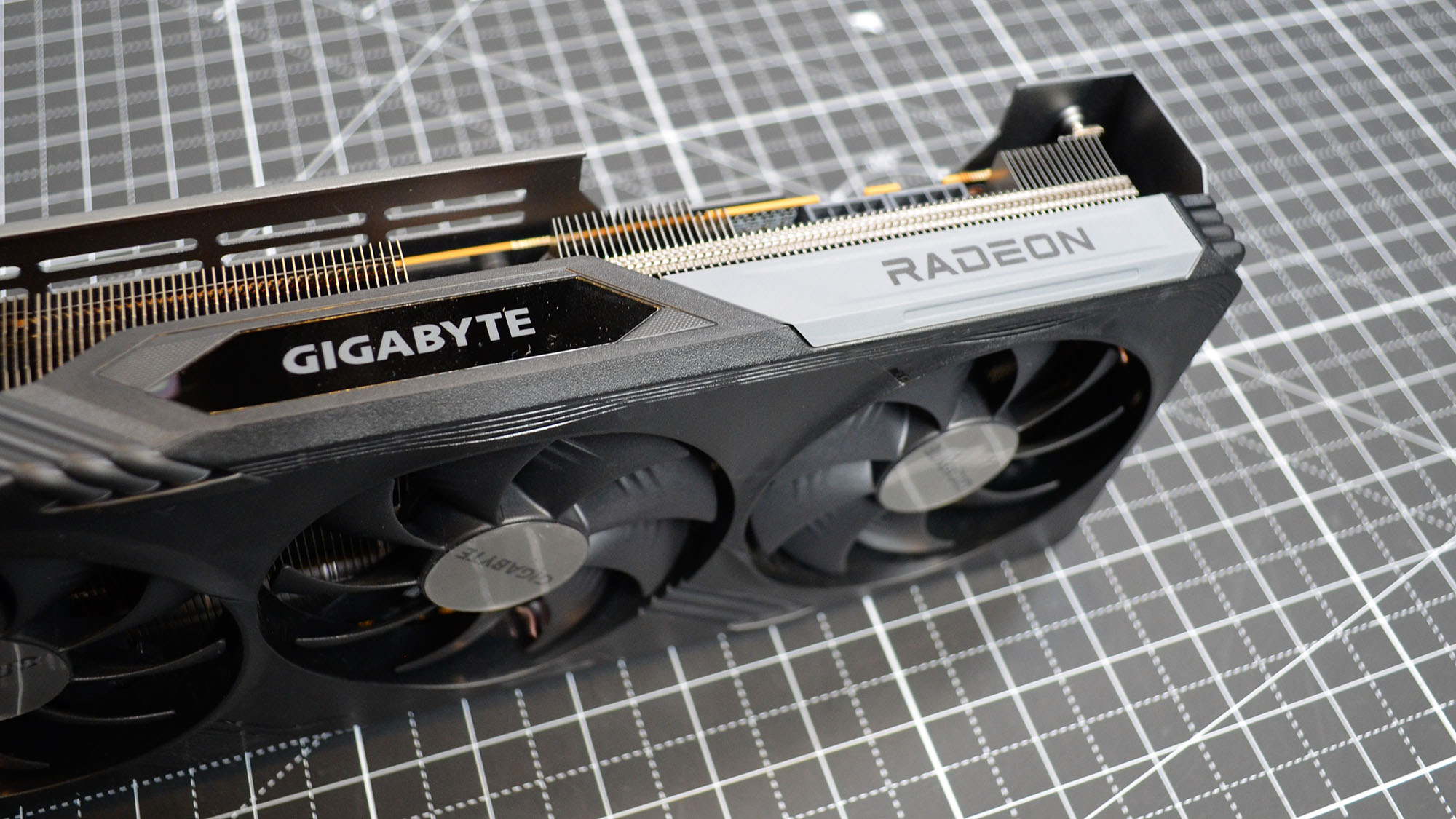
The Gigabyte card also lacks any real RGB lighting beyond the Gigabyte logo along the top edge of the card, which is either a good thing or a bad thing, depending on your perspective, but it's good to have options regardless. Non-RGB fans will appreciate the more subdued aesthetics of this GPU for sure.
A Gigabyte Radeon RX 7700 XT Gaming OC on a desk

(Image credit: Future / John Loeffler)

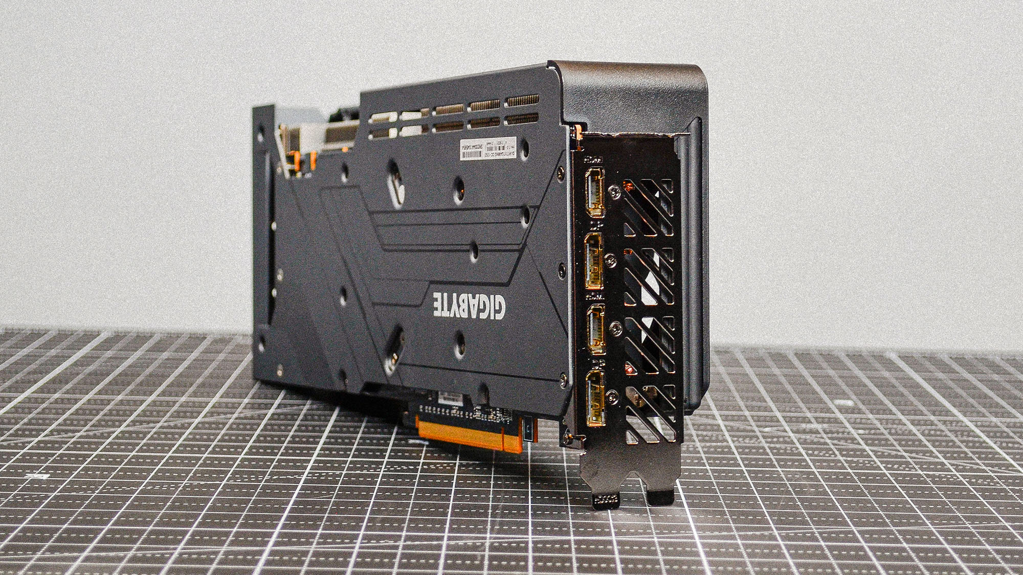
In terms of ports, you have your standard 2 x HDMI 2.1 and 2 x DisplayPort 2.1 output on most AMD RX 7000-series cards, so you can hook it up to several of the best gaming monitors of your choosing.
A Gigabyte Radeon RX 7700 XT Gaming OC on a desk

(Image credit: Future / John Loeffler)

Performance-wise, you can read more about the individual benchmarks in my RX 7700 XT review, and for the most part, the Gigabyte RX 7700 XT Gaming OC card performs a few percentage points better than the XFX Speedster QICK319 RX 7700 XT Black card given that it has about 100MHz higher game clock and a roughly 55MHz faster boost clock.

The difference is only going to be a few fps depending on the game you're playing, but given the Gigabyte card is cheaper, you're really getting extra FPS for less money, which is a fantastic deal no matter how you look at it.
A Gigabyte Radeon RX 7700 XT Gaming OC on a desk

(Image credit: Future / John Loeffler)

In the end, then, the Gigabyte Radeon RX 7700 XT Gaming OC makes a strong case for the RX 7700 XT, especially if spending north of $400 is really stretching your budget to the max. My original criticism that the RX 7700 XT is just too close in price to the AMD RX 7800 XT to make it the best 1440p graphics card to buy still applies to this card, but Gigabyte at least offers more than a non-OC card at a better price to make it a much more palatable purchase if you can't go for the RX 7800 XT.  

Gigabyte Radeon RX 7700 XT Gaming OC: Price & availability
A Gigabyte Radeon RX 7700 XT Gaming OC on a desk

(Image credit: Future / John Loeffler)
  • How much does it cost? $439.99 (about £360/AU$640)
  • When is it available? Available now
  • Where can you get it? Available in the US, UK, and Australia

The Gigabyte Radeon RX 7700 XT Gaming OC is available now for $439.99 (about £360/AU$695). This is cheaper even than the AMD reference spec's MSRP of $449.99, and offers a better value by giving you some extra performance thanks to its factory overclocking.

It also brings you closer in price to the Nvidia RTX 4060 Ti while generally outperforming it. All in all, this is still too expensive to be the best cheap graphics card on the market, but it's definitely the best cheap midrange graphics card you're going to find.

Gigabyte Radeon RX 7700 XT Gaming OC: Specs
A Gigabyte Radeon RX 7700 XT Gaming OC on a desk

(Image credit: Future / John Loeffler)

Should you buy the Gigabyte Radeon RX 7700 XT Gaming OC?
A Gigabyte Radeon RX 7700 XT Gaming OC on a desk

(Image credit: Future / John Loeffler)

Buy it if...

You want great 1440p performance on a tighter budget
This card offers great 1440p performance for the price, especially if you can't stretch your budget to the RX 7800 XT.

You want some extra overclocked performance for free
Normally, OC cards cost more than the reference card, but this one actually costs less than AMD's official MSRP.

Don't buy it if...

You can stretch your budget to get the AMD RX 7800 XT
With the AMD RX 7800 XT offering such incredible performance, if you can stretch your budget to get that card (especially the Gigabyte Radeon RX 7800 XT Gaming OC), you absolutely should.

You want better content creation performance
If you're a content creator working with 3D rendering or other GPU intensive creative workloads, chances are an Nvidia card is going to offer much better performance than anything AMD can offer.

Gigabyte Radeon RX 7700 XT Gaming OC: Also consider

How I tested the Gigabyte Radeon RX 7700 XT Gaming OC

  • I spent about three weeks with the Gigabyte Radeon RX 7700 XT Gaming OC
  • I used it to play games, produce and edit creative content, and more
  • I used our standard battery of benchmarking tools to test it

I spent about three weeks with the Gigabyte Radeon RX 7700 XT Gaming OC, running my standard suite of benchmarks as well as assessing its general performance in real-world use cases.

I paid special attention to its gaming performance, since this is specifically targeting gamers, and paid less attention to its content creation performance since non-Radeon Pro cards are generally not marketed for those purposes.

I've been a computer hardware reviewer for years now and have tested all the latest graphics cards of the past several generations as well as having nearly a decade of computer science education, so I know my way around this kind of hardware. What's more, as a lifelong gamer, I know what to expect from a graphics card at this price point in terms of gaming performance.


We pride ourselves on our independence and our rigorous review-testing process, offering up long-term attention to the products we review and making sure our reviews are updated and maintained - regardless of when a device was released, if you can still buy it, it's on our radar.

Read more about how we test

First reviewed October 2023

Tineco Pure One S11 smart vacuum review: an effective and robust cordless vacuum with some niggles

Tineco Pure One S11: Two-minute review

The Tineco Pure One S11 may not be as advanced as the pricier Tineco Pure One S15 Pro (one of the best cordless vacuum cleaners on our list), but it’s a very efficient option for those looking for an affordable model with powerful suctioning. And one that gives Shark’s more popular vacuum cleaners a good run for their money.

Now, Tineco isn’t exactly a household name – at least not yet – but it is a good lesson in product diversification. This lesser-known company offers great-quality alternatives to big-name-brand products that may have fallen behind in terms of quality due to complacency and lack of competition. And, speaking as someone who has owned and used her share of subpar models from bigger brands, I am absolutely here for it.

Sitting in the same price range as many of the best Shark vacuum cleaners and a couple of Dyson’s 'budget' offerings, the Pure One S11 is more of a mid-range purchase, one that’s not cheap but won't burn a massive hole in your bank account either. However, there are many things it does better than the most popular Shark models that make it an easy recommendation to consumers who want the convenience of cable-free cleaning.

Is it one of the best vacuum cleaners on the market? It does come with its share of niggles that might make some doubt its eligibility to that exclusive list. However, it does follow in its more premium brother’s footsteps in the world of cordless vacuums.

Tineco Pure One S11: Price and availability

  • How much does it cost? $399.99 / £269 / AU$699
  • When is it available? Available now
  • Where can you get it? Available in the US, UK, and Australia

On par with many vacuum cleaners from Shark and Samsung Jet, the Tineco Pure One S11 has an entry price of $399.99 / £269 / AU$699. That isn’t what many would call cheap – there are a lot of cordless vacuums out there that are about half that price.

However, it’s what I would expect a more robust and powerful model to cost. My own Samsung Jet 70 Pet Cordless Stick Vacuum bears the same price tag, and is actually a little more rudimentary in features – though it has proven to be a powerful option robust enough to be your long-term cleaning companion. 

It costs about $100 / £100 less than both the Shark Stratos Cordless (which claims the top spot on our cordless vacuum list at the time of writing and is lauded for its smart Clean Sense IQ feature and powerful suctioning) and the Dyson V15 Detect

  • Value: 4 / 5

Tineco Pure One S11: Specs

The  Roborock S8 Pro Ultra comes with a robot vacuum and base station.

Tineco Pure One S11 in use by author

(Image credit: Future / Michelle Rae Uy)

Tineco Pure One S11: Design and features

  • Solid build and great design but top-heavy
  • Squeaky wheels on the power brush
  • Controls aren’t the most convenient

If the Tineco Pure One S11 looks familiar, it’s probably because it has the same rounded architecture as Dyson’s offerings – so much so, you’ll be forgiven for thinking that Tineco is coming after the popular premium brand. It even comes with an LCD display and power brush illumination, two things the Dyson V15 Detect has that most of its competitors don’t. 

And, honestly, hats off to Tineco for the valiant attempt because while Dyson’s products should be lauded for their thoughtful features, they’re also known to be overpriced and overrated when it comes to performance. But, I digress.

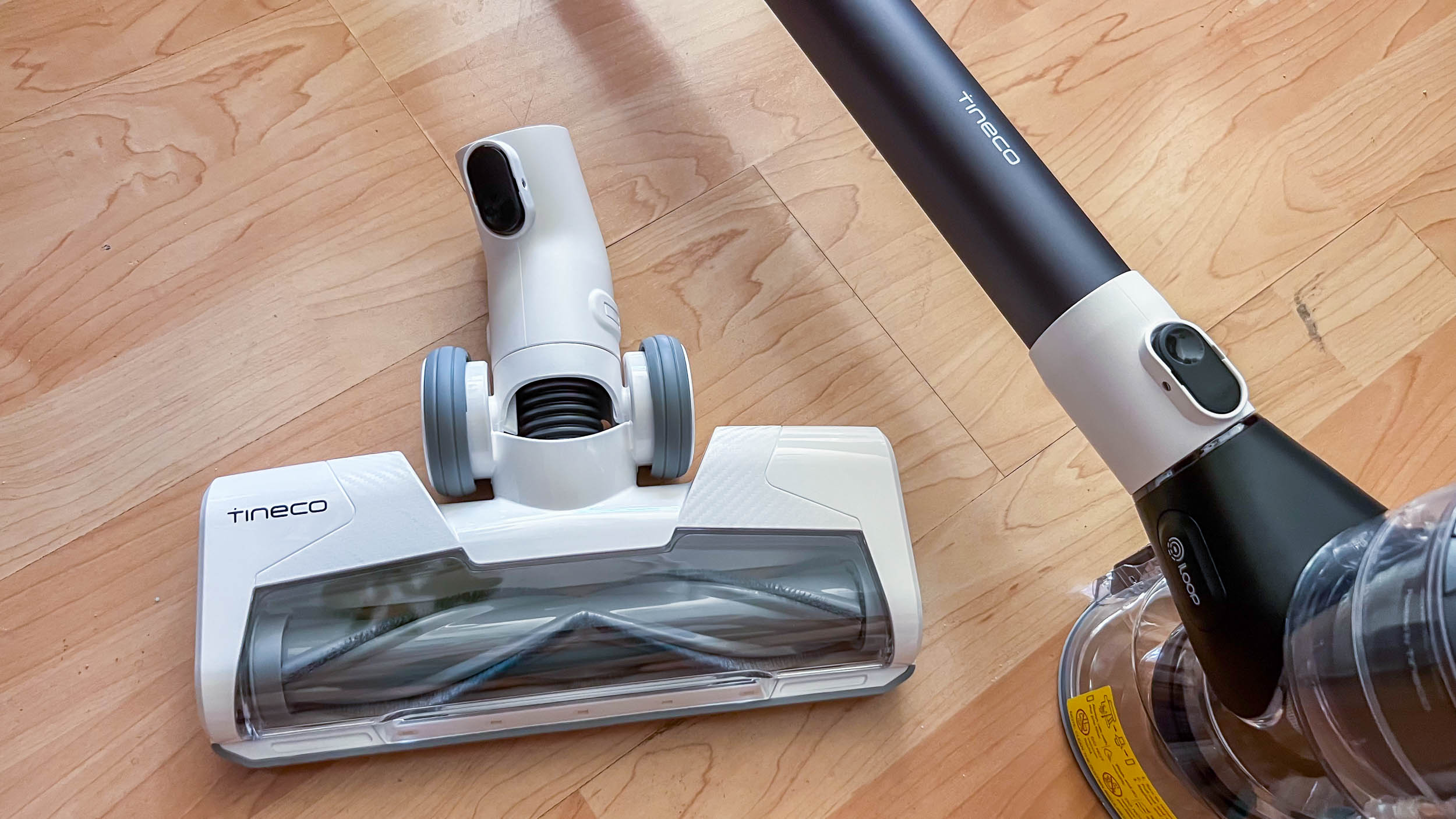
The Pure One S11 is solidly built, with parts that feel robust and premium, and its Dyson-inspired design not only sets it apart from others but also makes it look like a luxurious item. That’s especially true with its black, white, and dark gray colorway.

Tineco Pure One S11 in use by author

(Image credit: Future / Michelle Rae Uy)

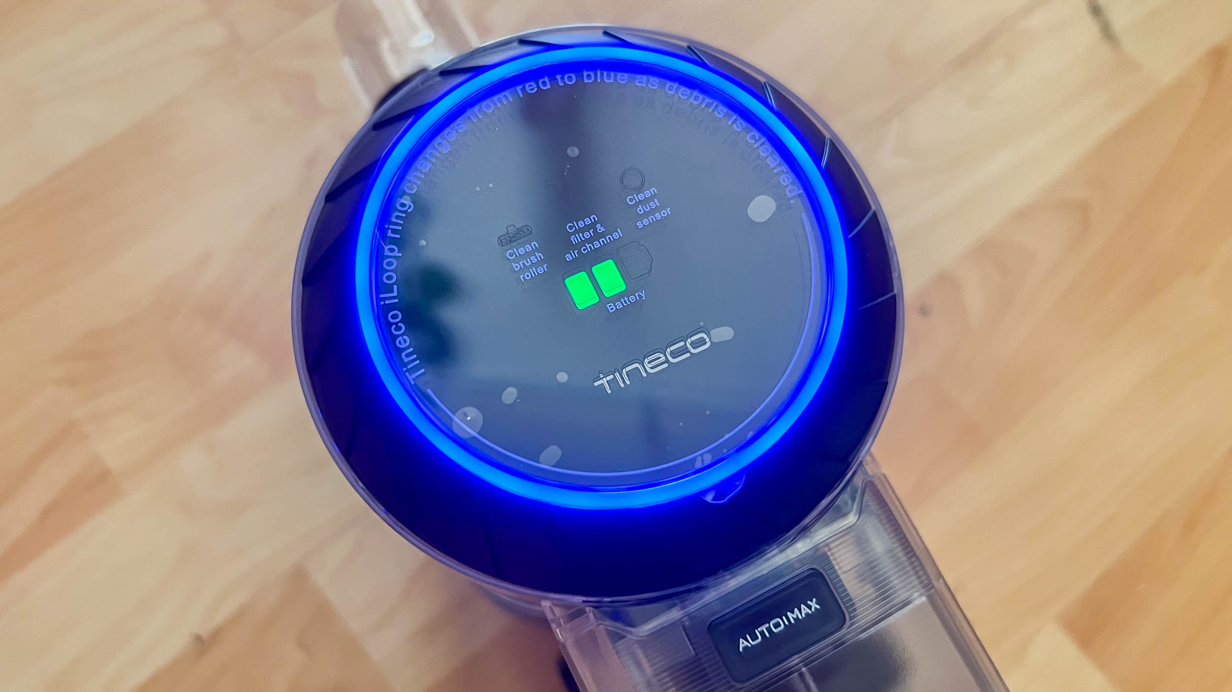
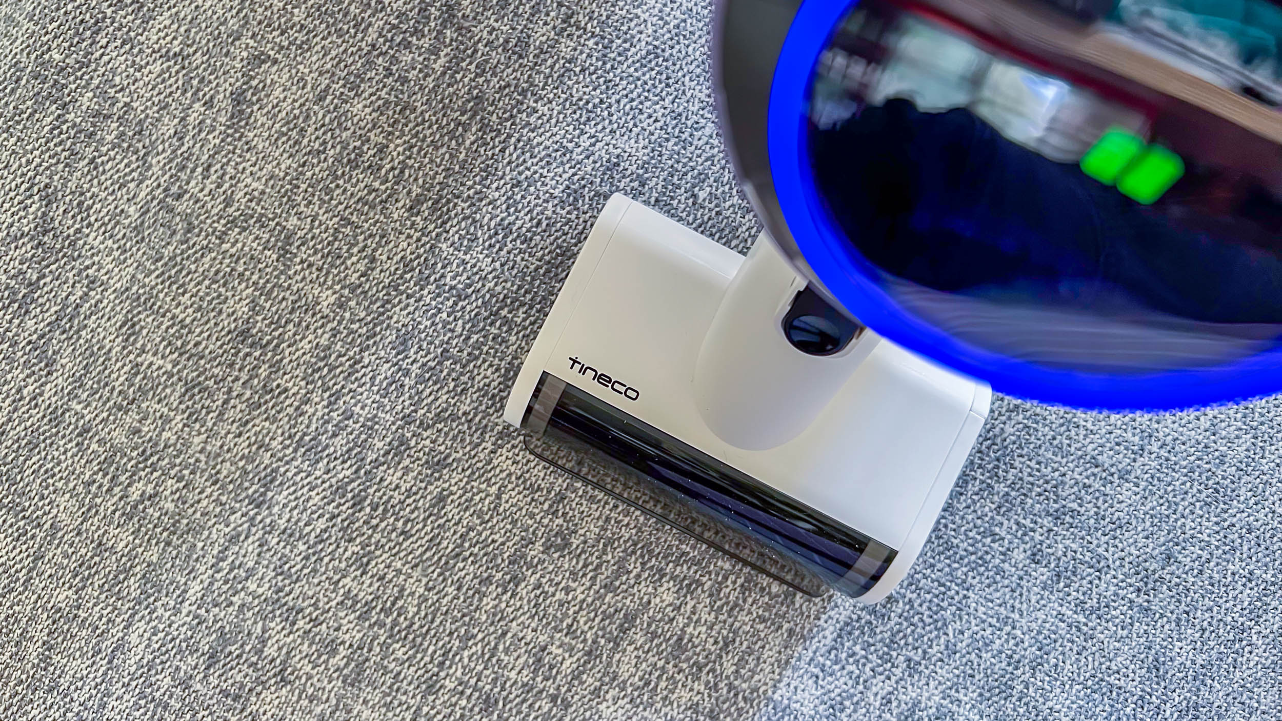
I especially appreciate that its LCD display is at the front so it’s easy to look at when the vacuum is in use. However, while the one on the V15 Detect or the Pure One S15 Pro offers a lot of information, this one just displays battery life and lets you know if there are any device errors. The light ring around the display, called the Dust Monitoring Loop, also alerts you to the amount of dust in a specific area by changing colors from solid blue to pink to magenta.

Tineco Pure One S11 in use by author

(Image credit: Future / Michelle Rae Uy)

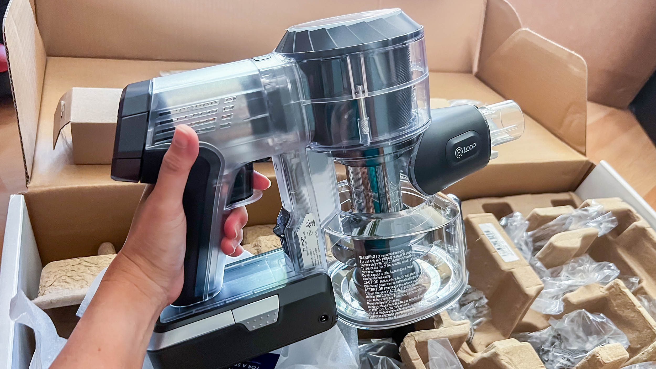
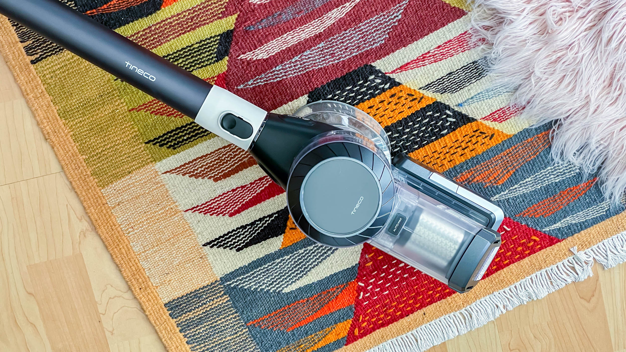
While this cordless vacuum is slightly more lightweight than the V15 Detect, it is a little heavier than my Samsung Jet 70. While that isn’t a big deal – there are, after all, even heavier vacuums out there – it's also top-heavy. The top part that houses the motor, battery, filtration system, LED display, and dust bin bears most of its weight, making its weight distribution a lot more uneven than my Samsung and easier for users to experience hand, wrist, and shoulder fatigue. That’s despite the fact that the handle is spacious and comfortable to hold.

That’s not the only gripe I have about its design. The controls on the Pure One S11 aren’t the most convenient. Instead of pressing a button to turn on the vacuum, you pull a trigger, which starts the motor when pressure is exerted and stops it when that pressure is taken away. I get the energy-saving aspect here – if you have to do something else like move things out of the way, the vacuum stops running when you take your finger off the trigger. However, it also means that you have to keep up that pressure while you’re vacuuming.

There is a trigger lock you can use to give your finger a rest, but accessing that lock, located to the side of the trigger, means overextending one of your other fingers or using your other hand instead. I found this to be a little inconvenient, especially when I’m also picking up stuff off the floor.

While this vacuum is one of the quietest I’ve ever used (more on that later), the two wheels on its power brush are squeaky. I’m not sure if this is true on all units or just mine, however, I have to mention it as it is a point of annoyance when I’m vacuuming.

Image 1 of 2

Tineco Pure One S11 in use by author

(Image credit: Future / Michelle Rae Uy)
Image 2 of 2

Tineco Pure One S11 in use by author

(Image credit: Future / Michelle Rae Uy)

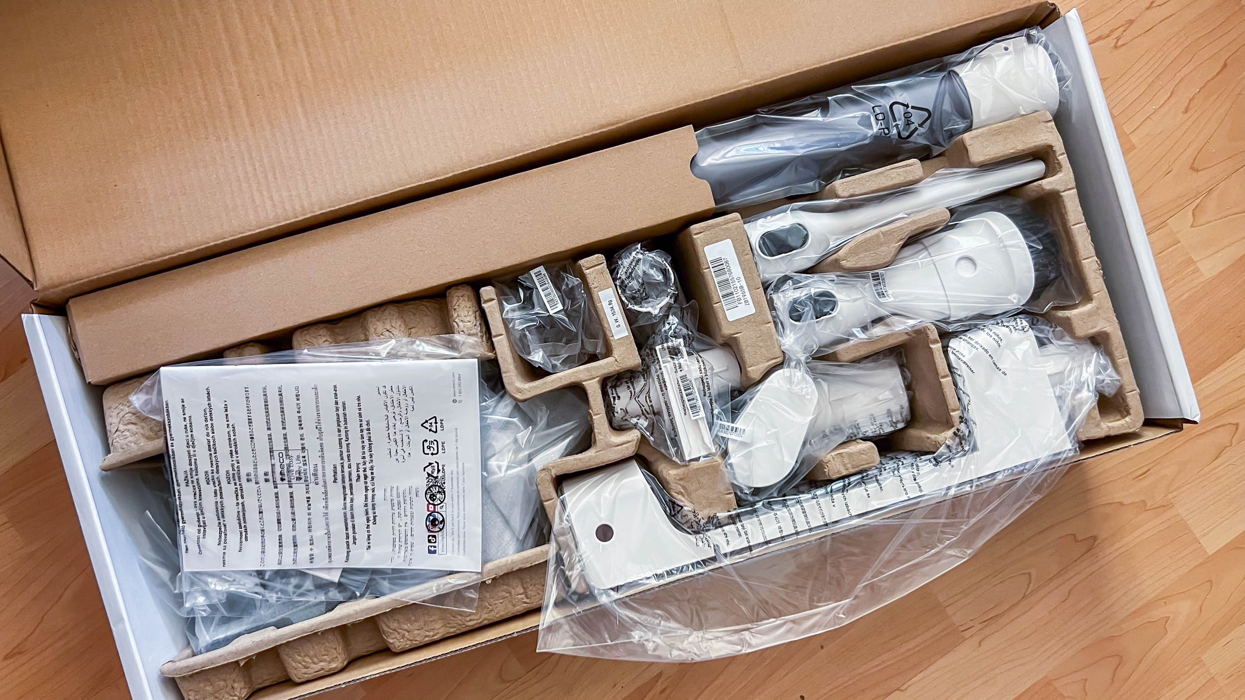
Still, there’s a lot to like about the Pure One S11’s design and features. I love that all its removable parts snap in place as well as come off easily, making it convenient to do things like swap out the removable battery (another plus as you can purchase an extra one if you’re covering a large area), empty the trash bin, clean out the filters, and swap out the tools. 

Image 1 of 5

Tineco Pure One S11 in use by author

(Image credit: Future / Michelle Rae Uy)
Image 2 of 5

Tineco Pure One S11 in use by author

(Image credit: Future / Michelle Rae Uy)
Image 3 of 5

Tineco Pure One S11 in use by author

(Image credit: Future / Michelle Rae Uy)
Image 4 of 5

Tineco Pure One S11 in use by author

(Image credit: Future / Michelle Rae Uy)
Image 5 of 5

Tineco Pure One S11 in use by author

(Image credit: Future / Michelle Rae Uy)

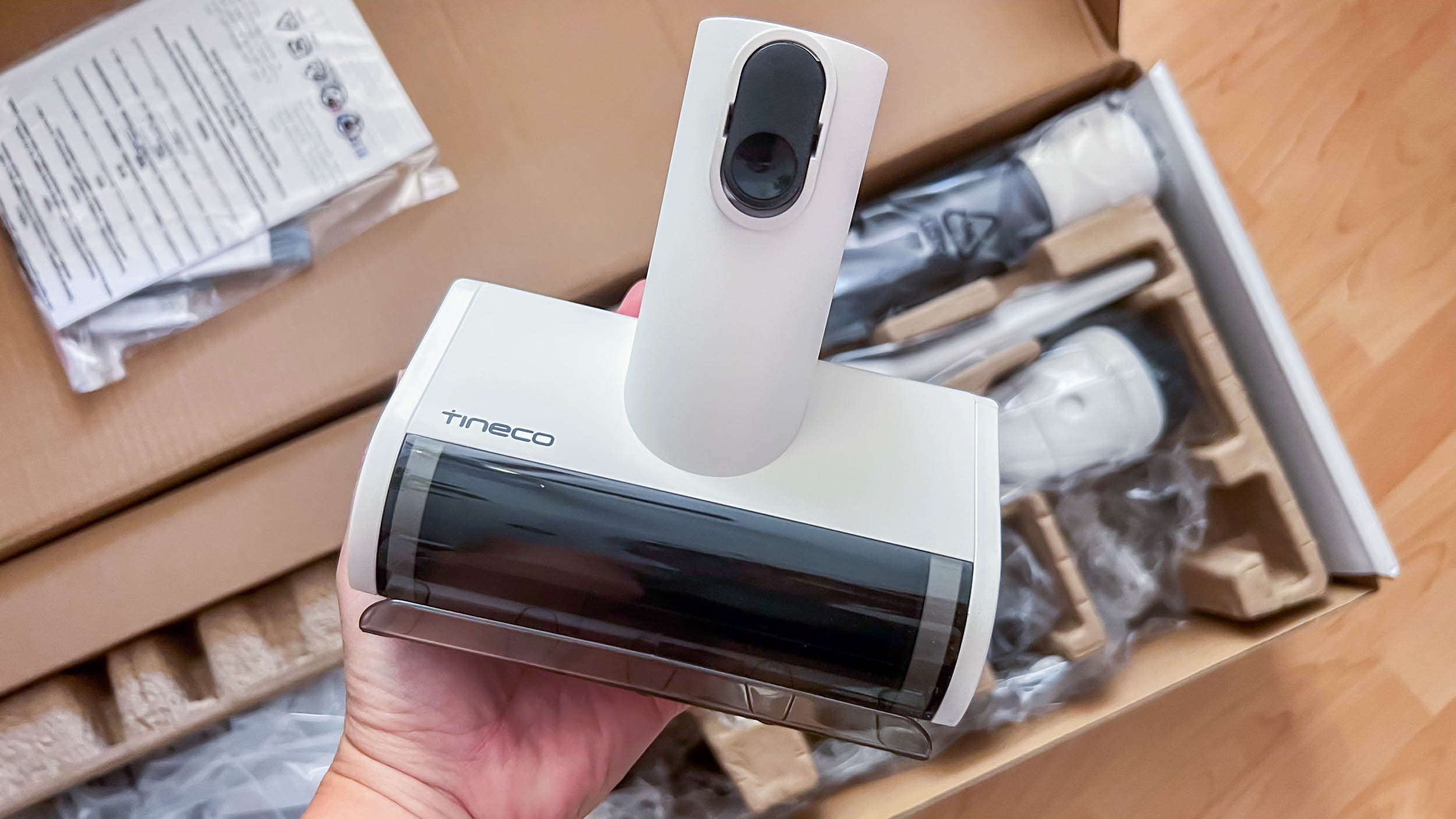
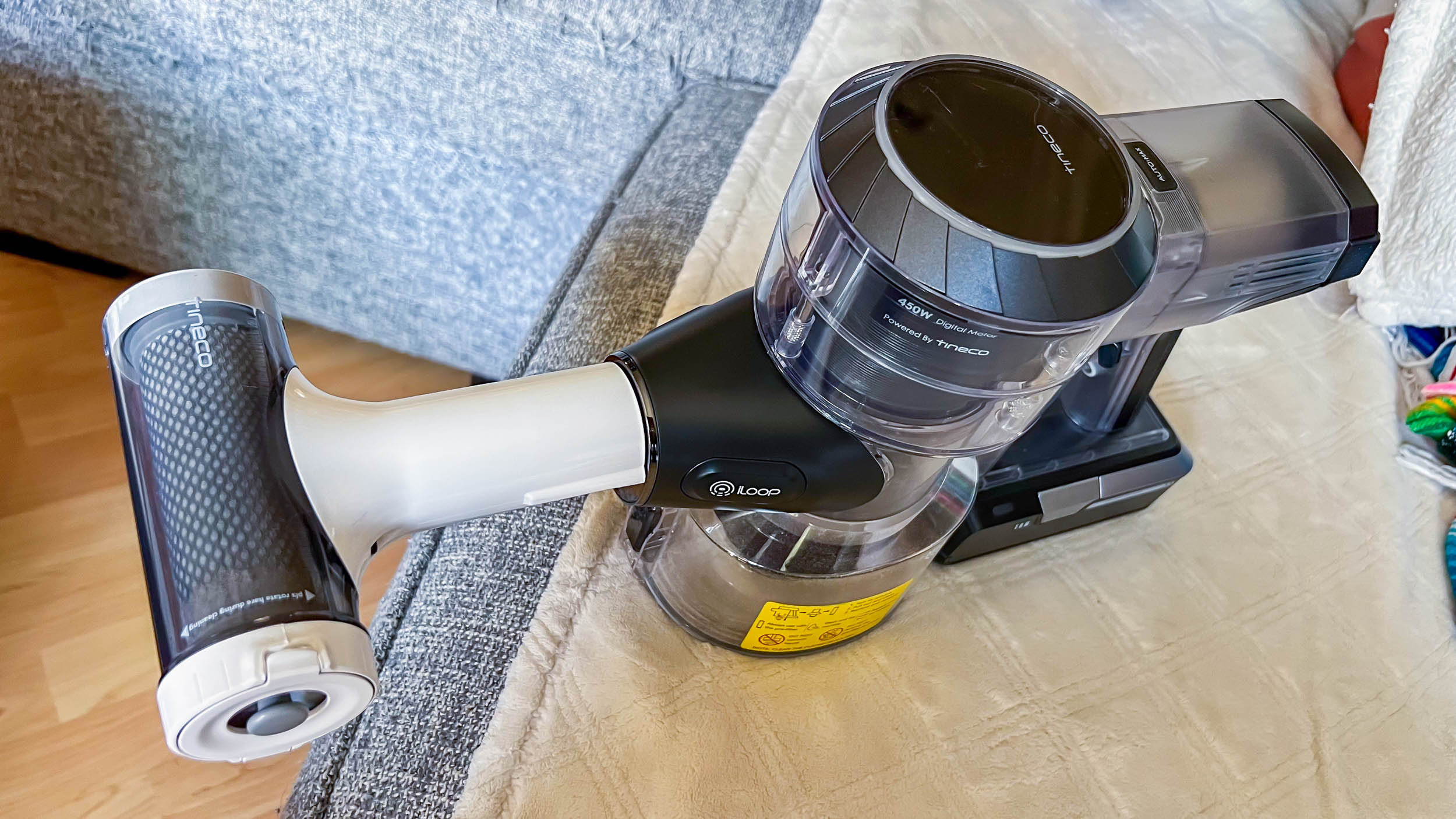
One tool I like in particular is the pre-filter cleaning tool, which most cordless vacuums do not have. It also comes with an extra pre-filter inside. Though you do have to manually turn it, it lets you clean a dirty pre-filter without the mess as it attaches to the vacuum. This lets you suck all that dust straight into the dustbin. It’s another thoughtful addition to a vacuum full of thoughtful details.

  • Design: 4 / 5

Tineco Pure One S11 on the author's floor

(Image credit: Future / Michelle Rae Uy)

Tineco Pure One S11: Performance

  • Efficient suction that can tackle particles small and large
  • Very effective smart dust sensor that adjusts suction power automatically
  • Great tools for versatile cleaning

Tineco advertises the Tineco Pure One S11 as having “whisper-quiet” operation, though that's not quite accurate. However, I do have to give it credit for being one of the quietest vacuums I’ve ever tested. Comparing it to some of the cordless vacuums I have at home, it scored a quiet 60 dB – Tineco rates it at 72 dB(A) – on average on the decibel meter I was using. That’s impressive considering my Samsung Jet 70 Pet Cordless scored an average of 68 dB, while the Shark Wandvac scored an average of 70 dB on the same test.

Tineco Pure One S11 in use by author

(Image credit: Future / Michelle Rae Uy)

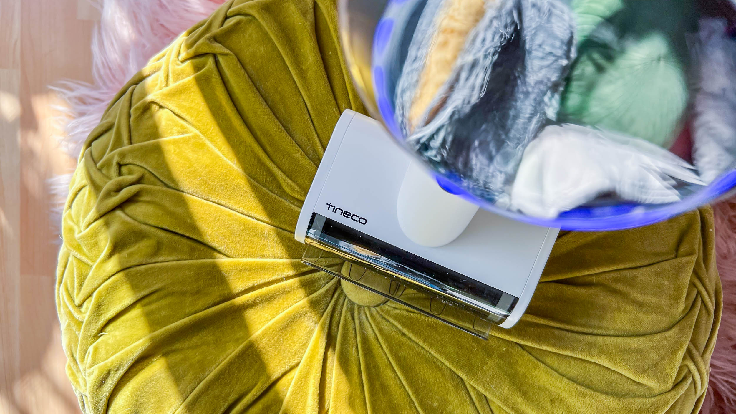
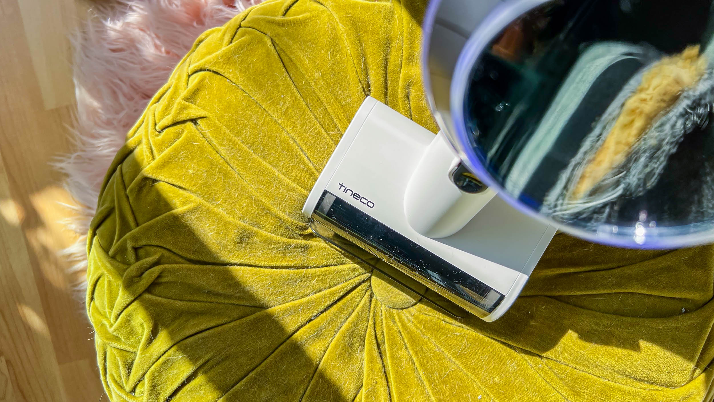
The Pure One S11 also shines in suction prowess, often only requiring a single run of a section to suck up all the tiny particles, including the smallest pieces of litter and the finest pet hair. It also does a good job of sucking up pieces of cat food or kibble, something the Jet 70 Pet Cordless ironically struggles with. Kudos to the motor for being that powerful and making it all look – and sound – effortless.

Tineco Pure One S11 in use by author

(Image credit: Future / Michelle Rae Uy)

And its iLoop Smart Dust Sensor does a fantastic job of sensing when there’s more dirt in the area, alerting the vacuum to automatically adjust suction power to Max for even stronger suctioning. 

Image 1 of 3

Tineco Pure One S11 in use by author

(Image credit: Future / Michelle Rae Uy)
Image 2 of 3

Tineco Pure One S11 in use by author

(Image credit: Future / Michelle Rae Uy)
Image 3 of 3

Tineco Pure One S11 in use by author

(Image credit: Future / Michelle Rae Uy)
Image 1 of 3

Tineco Pure One S11 in use by author

(Image credit: Future / Michelle Rae Uy)
Image 2 of 3

Tineco Pure One S11 in use by author

(Image credit: Future / Michelle Rae Uy)
Image 3 of 3

Tineco Pure One S11 in use by author

(Image credit: Future / Michelle Rae Uy)

This capability isn’t just limited to the multi-tasker power brush, which by the way has LED lights that highlight the area directly in front so you can see the finest dust particles better. It works effectively with all the other tools too, including the mini power brush, which I use to clean litter track and cat hair off my couch, and the dusting brush, which I use to clean hard surfaces in my apartment.

What’s more, it does a fantastic job of minimizing dirt and particle kickback – definitely better than the Jet 70 Pet Cordless. This is a massive time-saver as I don’t have to go back and clean areas I’ve already vacuumed.

Tineco Pure One S11 in use by author

(Image credit: Future / Michelle Rae Uy)

The Pure One S11 also has great maneuverability, despite the annoying squeaky wheels on the power brush. I would say that my Jet 70 Pet Cordless is better at accessing crevices, rounding at tight corners, and ducking under furniture – the Pure One S11’s power brush has an attachment that angles down so that when I’m trying to reach under my coffee table or TV console, it lifts the brush up when the vacuum hits that 20-degree angle with the floor – however, that doesn’t take away from the fact that it’s easy to maneuver.

  • Performance: 4.5 / 5

Tineco Pure One S11: Battery life

  • Up to 40 minutes of battery life
  • Trigger helps save energy
  • Battery is swappable

The Tineco Pure One S11 may not have fast-charging capabilities or the longest battery life. But at full charge, it does offer up to 40 minutes of runtime on auto. During my time using it, I could clean the floor of my entire one-bedroom apartment and still have some juice left over for dusting some furniture and vacuuming the debris on my couch.

Both its auto mode and trigger help save energy so that it’s not using up that battery life unnecessarily. Meanwhile, its removable battery means you can purchase another one so you can have up to 80 minutes of juice – just the ticket if you have an entire house to cover.

  • Battery: 4 / 5 

Should you buy the Tineco Pure One S11?

Tineco Pure One S11 on the author's floor

(Image credit: Future / Michelle Rae Uy)

Buy it if...

Don't buy it if...

Tineco Pure One S11: Also consider

If the Tineco Pure One S11 isn't for you, why not consider other cordless vacuums?

How I tested Tineco Pure One S11

  • I tested it for a week
  • I used it to clean floors as well as appliances and furniture
  • I tested its features and tools plus checked its noise level with the Decibel X app

Giving the Tineco Pure One S11 the temporary role of being my main vacuum cleaner for a week, I ran it through its paces by using it to clean my one-bedroom apartment, carefully observing how effective it is at picking up different-sized debris like cat litter, which my cats track around every time they use their litter box, and pieces of dry cat food, which are much bigger and something my trusty Samsung Jet 70 Pet Cordless has trouble picking up.

It comes with many of the tools I need for keeping my furniture and appliances cat hair free, an almost impossible task with my two boy cats running rowdy all day, so I was able to test all those. I also made sure to use its nifty pre-filter cleaner to see how easy it is to use and how effective it is at cleaning the pre-filter.

I’ve been testing and reviewing vacuum cleaners, home appliances, and smart home devices for different digital publications for years. Currently, I’ve taken on the role of Interim Homes Editor for TechRadar.

Read more about how we test

First reviewed October 2023

Robocop: Rogue City review - aye, robot

Review information

Platform reviewed: PC
Available on: PlayStation 5, Xbox Series X|S, PC
Release date: November 2, 2023

It only takes the length of the pulse-pounding TV station shootout that kicks off first-person shooter Robocop: Rogue City for you to feel like ol’ chrome dome himself. Whether it’s the recognizable Auto-9 in your hand, the clunking gait, or just the fact your 9mm pistol is blowing off limbs with spurts of claret, it’s immediately apparent that this isn’t just another run-of-the-mill shooter, but a faithful adaptation of the Robocop universe.

Rogue City makes a hell of a first impression, and while it doesn’t deliver on its promises all of the time, it’s charming and full of ambition. It’s also a hell of a lot of fun, a combination of my own personal nostalgia and the fact that it’s a very solid shooter that constantly mixes up what you’re fighting against. There are, however, a lot of bugs here - I had to restart at a checkpoint several times because a gate wouldn’t open or a hidden enemy was blocking progression, and when that happened I was happy with the generous checkpointing. Elsewhere, some assets were in Polish and had not been translated, and at the start of one gunfight, I strafed left and dropped through the world.

These experiences showed off the game’s low-budget status, but they didn’t really hinder my enjoyment.

If you’ve never seen RoboCop, it’s a dystopian vision of the '80s but flung into the future. It’s 2043 in Detroit, Michigan, and capitalism has won. The police force is privatized and Robocop is a, er, robot cop. It’s a vision of 2043 where people still use VCRs and payphones, a terrible future where the criminals are all tremendously evil people and nuance is just a thing Robocop has crushed under his big metal feet on the way to gunning down another perpetrator.

The Robocop of the films immediately feels like a video game character already, with an unlimited ammo sidearm built into his leg, nigh-invulnerability, and a built-in targeting visor that highlights enemies and has a little heads-up display too. As a result, developers Teyon have merely lent into this and given us a faithful rendition.

He’s the cop that can’t be stopped

Robocop: Rogue City screenshot

(Image credit: Nacon)

In the original trilogy of films, it’s all a satire - although I try to forget the terrible Robocop 3 exists - and the game is clearly swinging for that same position. This is, ultimately, a story about corporate greed and the militarization of police that’s as relevant today as it was back in the late 80s. It doesn’t quite have the same bite of Verhoeven’s original movie, but it feels like a facsimile of this, and the branching storylines and skill-specific dialogue options remind me of Alpha Protocol, an unsung classic that I suspect will be joined in the cult status basket by Robocop: Rogue City.

This story is set between Robocop 2 and 3 and does a much better job of capping things off than the third movie, and it’s incredibly compelling. Welling returns to give his likeness and voice to the role of Robocop, a role he’s returned to for KFC commercials and an appearance in Mortal Kombat 11, but hasn’t been the lead in since 1990’s Robocop 2

Best bit

Robocop: Rogue City

(Image credit: Nacon)

A shootout at an arms fair highlights everything Robocop: Rogue City is best at. The flimsy walls come apart under the heavy gunfire and explosives while you can get your hands on some of the meatiest weapons in the game, even hurling prototype missiles at your opponents. It’s an arena shooter moment in the best way.  

When you’re not blasting baddies you’re digging into investigations and exploring a chunk of downtown Detroit in a hub world that you’ll revisit time and again. This is most involved the first time and has you solving murders, investigating an arcade, and issuing citations for crimes, with the choice often being a binary one of warning the criminal or fining them for their misdemeanor. This can be a little agonizing because the area is decently sized and Robocop moves slowly, but it’s almost like the game is bored of serving this up to you too because there are fewer and fewer of them each time you revisit the hub.

Combat feels pretty distinct in Robocop: Rogue City too. Part of this is down to your sluggish movement and the fact you feel like a tank, with even sustained small-arms fire being barely an inconvenience. Enemies will throw grenades at you or open up with heavy machine guns and sniper rifles to do damage, but generally in the early days, you’re free to move through combat in a fairly relaxed way, a predator amongst a pool of enemies that really can only hope to overwhelm you with numbers.

Later, you’ll fight more heavily armed gangs, corporate mercenaries, and even a variety of different robots, but the power curve is often just about right and you never feel outmatched, at worst it’s just harried by the enemies that have the sheer insolence to try and bring you down.

Robocop: Rogue City screenshot

(Image credit: Nacon)

Of course, Robocop’s iconic Auto-9 is the star of the show. This would have happened regardless - the three-round burst is iconic and makes an absolute mess of enemies. But the game has a ridiculously convoluted upgrade system for the sidearm that means you can power it up and ensure it’s a high-quality weapon throughout. Elsewhere, every weapon from the Robocop series shows up for a little bit, whether it’s the Steyr Aug’s used by megacorp OCP, junky submachine guns, and even the iconic Cobra assault cannon, used in one memorable scene.

There’s an RPG-lite skill system that gives you percentage-based increases to different stats (the worst), which is a series of linear paths with unlocks given when you hit certain milestones. These are often very powerful: max out your armor and not only will you negate 50 percent of your damage, but all small arms fire will also ricochet off you, hitting nearby enemies. Max out your health and you’ll regenerate 75 percent of your health without needing healing items.

As you can see, I built my Robocop in the “being a tank” style, but I felt like the combat was already punchy enough. I also put a lot of points into scanning so I could ricochet bullets around corners to hit enemies - a cool idea that rarely works in the game as I just throw explosives at anyone silly enough to hide and most enemies just assault you regardless - and deduction which gave me a 30 percent experience point boost, which is incredibly useful but very boring to write about. It’s a lightweight system but like everything else in Robocop: Rogue City punches way above its weight class.

Robocop: Rogue City screenshot

(Image credit: Nacon)

You can feel this particularly in how authentic the game feels. Whether it’s in how “Robocop” you feel as the leading man, the exhausting police griping in the station, or even just the way everyone in a suit is trying to ruin your day. It also looks the part, whether that’s the grainy scanlines when you hold right-click to enable Robocop-vision or just the haze coming off the streets. It’s also clearly made by fans, because there are a lot of fan-serving moments here, both in terms of some impressive boss fights but also in terms of beats of dialogue and even some of the areas you’ll throw down in.

At times, Rogue City feels like a five-star game. Flashes of brilliance that go above and beyond what I’d expect. Sadly, the lack of budget means that things feel unpolished and occasionally cheap. Again, it doesn’t hinder my enjoyment, but with a little extra polish, this could have been an all-timer, instead of a faithful adaptation of the franchise.

Still, perhaps that’s fitting. The game here feels like Robocop himself, a shiny exterior sitting on top of a mechanically sound but clunky chassis, backed up with a human side that elevates the mechanical.

Accessibility

There’s no dedicated accessibility menu here and the offering is fairly weak. Subtitles can be turned on and off and there are options to lessen screen shake, but that’s about your lot. There’s also a toggle to reduce how loud Robocop’s footsteps are, which may not seem useful now but is likely to feel incredibly worthwhile after playing the game for ten hours. 

How we reviewed Robocop: Rogue City

I played Robocop: Rogue City for 13 hours on PC, finishing the main campaign, every quest, and only missing out one secret area - I have 25 of 27 achievements for the game so I feel like I’ve seen pretty much all of it. 

There’s no New Game+ mode or anything of the sort, so it feels very much like a one-and-done game.

Want even more game recommendations? Visit our list of the best FPS games or the best free games.

Levoit 600S air purifier review: floor-standing air purifier that efficiently extracts whiffs

Levoit 600S: two-minute review

Air purifiers are designed to remove dust, dander and dodgy odours, leaving you with a fresher smelling and healthier home. In the height of summer, or faced with an overly-heated home you soon start to notice the whiff of other people and pets. 

They differ from fans, which waft the air around at speed, creating a cooling effect, instead extracting impurities and particulates that cause smells and cause germs. An electrostatic or fabric filter captures these as they are blown towards them by the air purifier’s gentle fan mechanism and, as with the Levoit 600S model, are collected in a disposable bag at the bottom of the device. Once cleansed, the air is sent back out into the room, leading to a fresher atmosphere. 

The Levoit 600S promises to filter as much as 99.97% of PM2.5 particles (particulate matter less than 2.5 micrometre diameter). This covers the fine dust, pollen and pet hair as well as road traffic pollution and pollen. These can all irritate and, in the longer term, damage the lungs and impact respiratory function. Levels of less than 12μg/m3 should pose no health issues, and we were pleased to find that the existing levels in the first of the two properties in which we tested out the air purifier were already below this figure. 

When things get whiffy or lingering sprays have been applied, the Levoit 600S is capable of changing the air in a 147m sq room twice an hour. This is a lower rate of air change than the best air purifiers TechRadar reviewed recently but is plenty for all but larger rooms or the most persistent smells and pollutants. 

Although the 600S can be operated directly using the on/off button on the top, the VeSync app provides far more control, showing current PMS levels and the air quality steadily improving as its four-speed fan whips everything through its HEPA and carbon filters to remove airborne nasties. Both the LED on top of the unit and the app give real-time PMS readings and offer one-touch fan adjustments. The app adds scheduling and light-sensing options, making it ideal for use in a bedroom where the fan will automatically reduce in power so you can drop off to sleep. 

Levoit 600S: price and availability

  • How much does it cost? £299.99 (about $360, AU$574)
  • When is it available? Available now
  • Where can you get it? Available in the UK

The Levoit 600S is available from Amazon UK for £299 (about $360, AU$574). A £50 discount voucher is currently active, bringing the price down to £249). Although you won’t need a replacement filter immediately, if you like to be organised you can get ahead by adding this £69.99 consumable or a pet allergy version for £101 to your online shopping cart.

This model launched last year in the US, but Amazon notes the current unavailability of the Levoit 600S model (although both branded and third party replacement HEPA filters are for sale there), while Australia has only the filters for sale.

  • Value: 4 / 5

Levoit 600S: Specs

Levoit 600S in use in the author's home

(Image credit: Future / Rosie Hattersley)

Levoit 600S: Design

  • Large but lightweight unit
  • Useful status indicator lights
  • Whisper-quiet fan

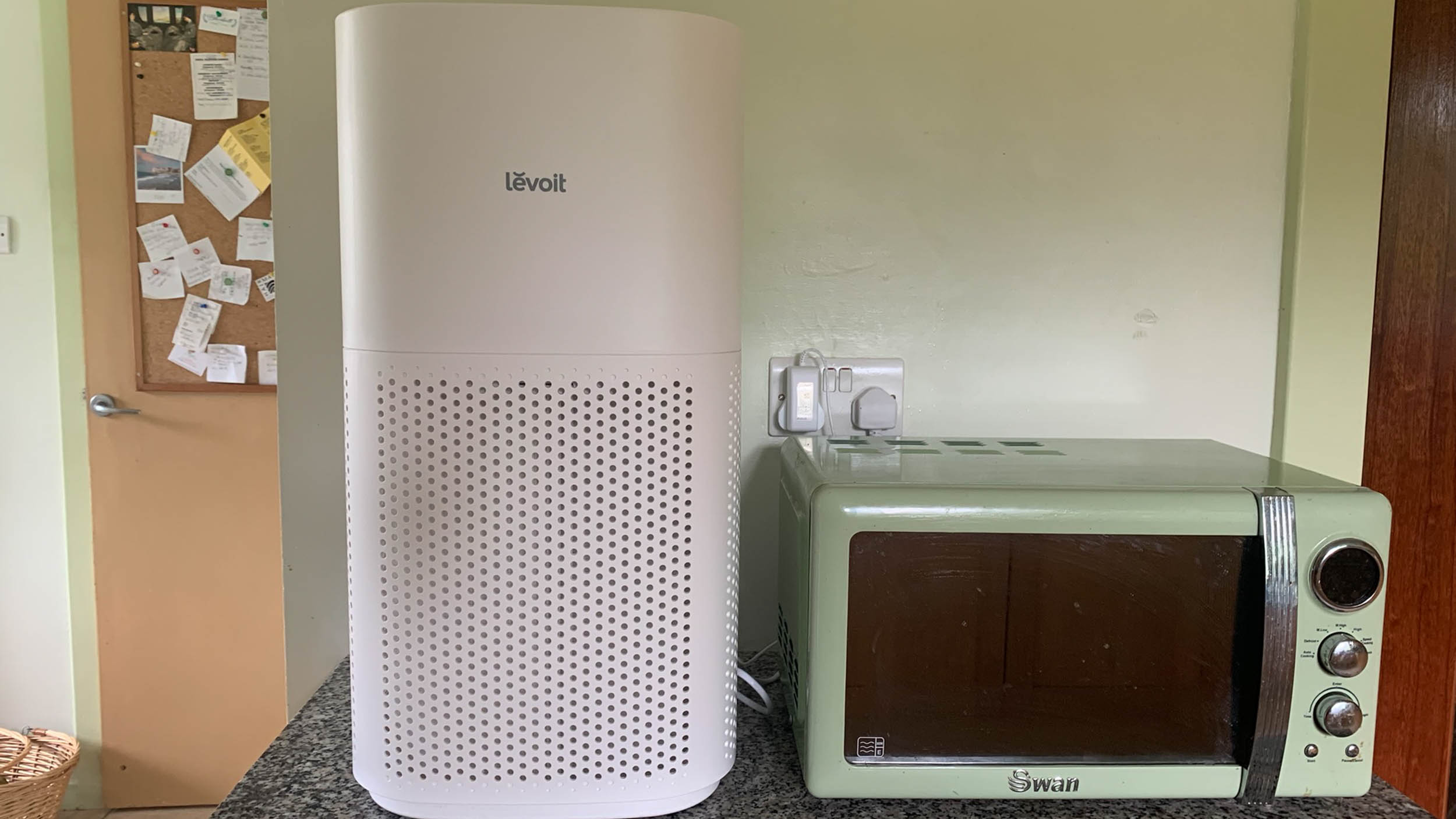
The imposing but elegant Levoit 600S seems to take up more room than its stated 60cm height suggests. While its 300S stablemate sits happily and fairly unobtrusively on a kitchen countertop, the 600S model is a real presence. Placed alongside our microwave, it dwarfed it. If space is at a premium, you will probably want to store it out of sight and bring it out for specific use rather than keeping it on standby. We found this particularly true when we were in the more cramped environment of our terraced home. 

However, the curved design and off-white finish are stylish, and the materials sturdy.  And, while it weighs 6.2kg, it feels far lighter. The well-positioned recessed handles on either side of the upper section also make it easy to move around. 

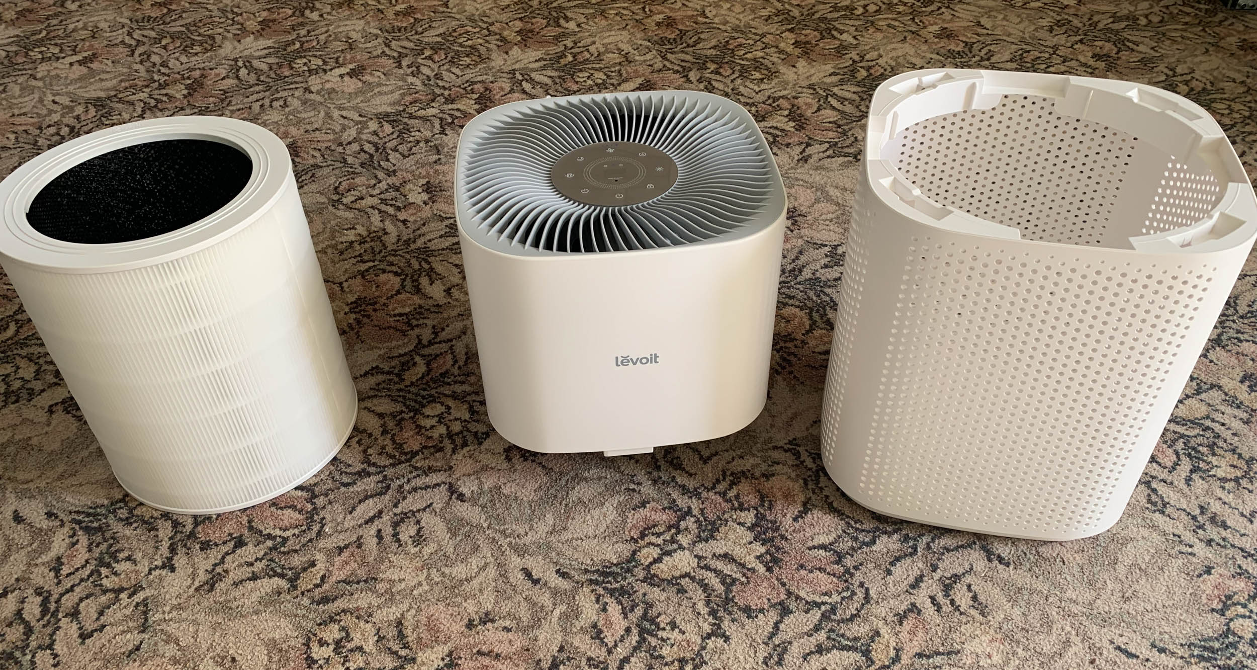
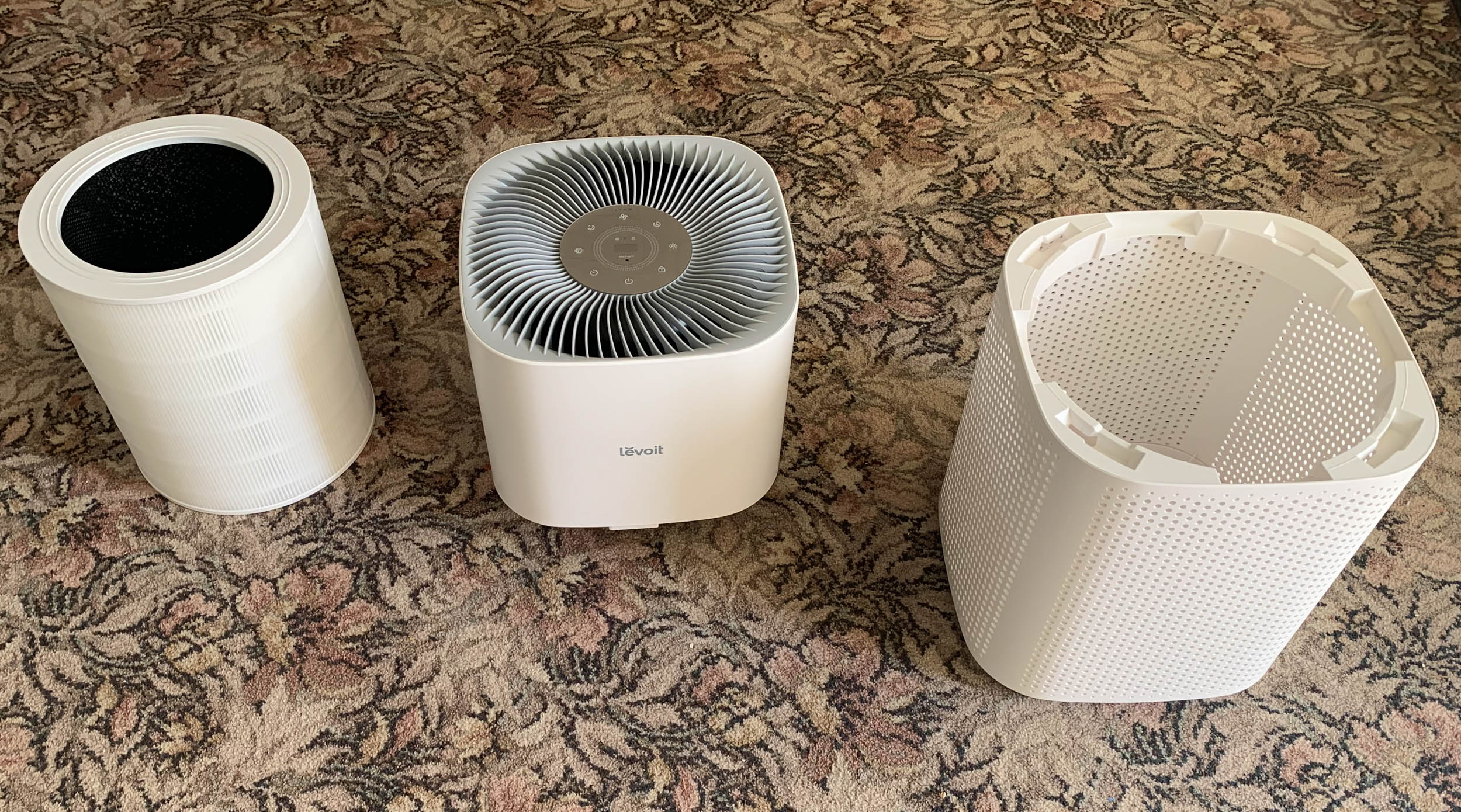
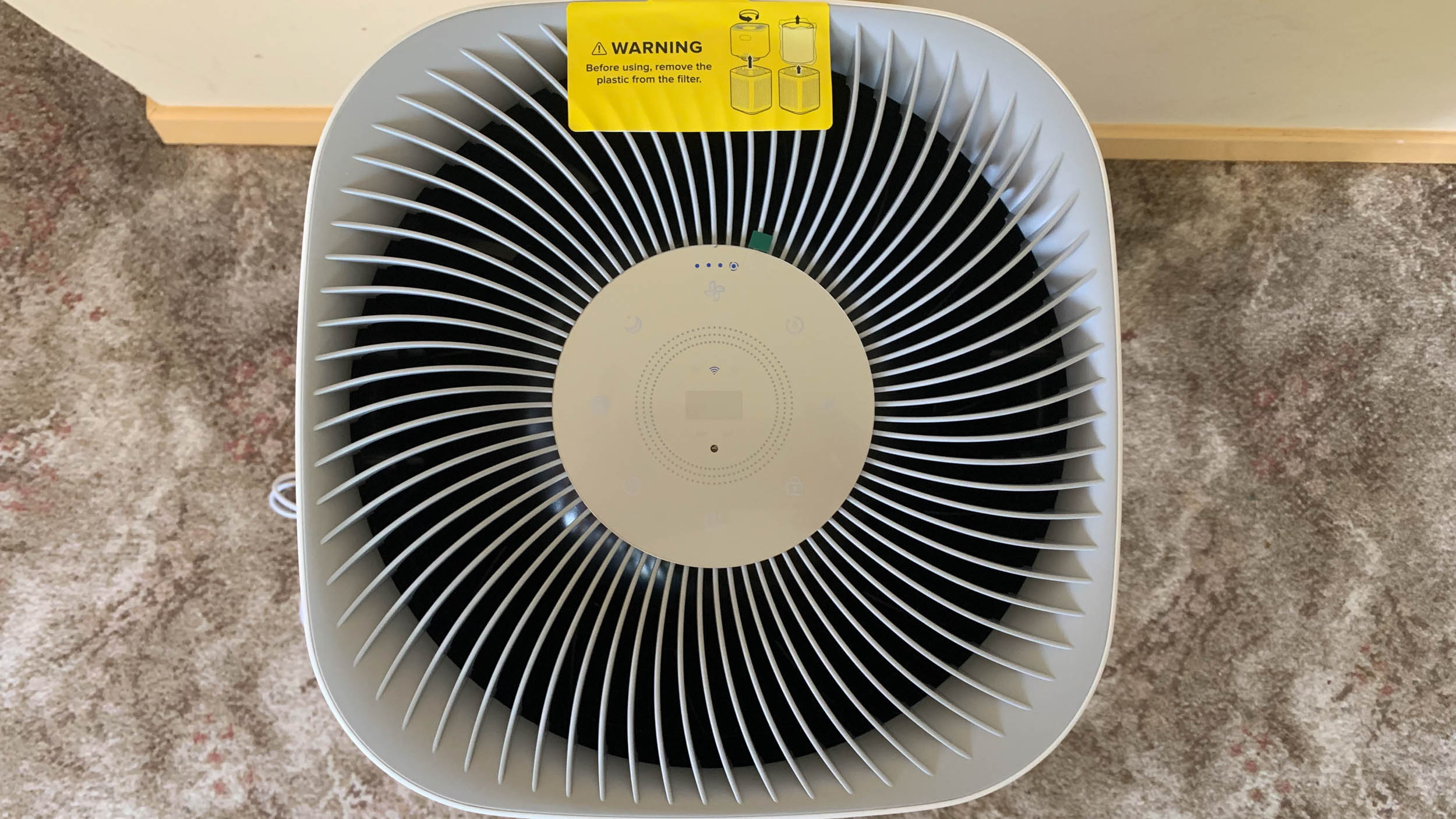
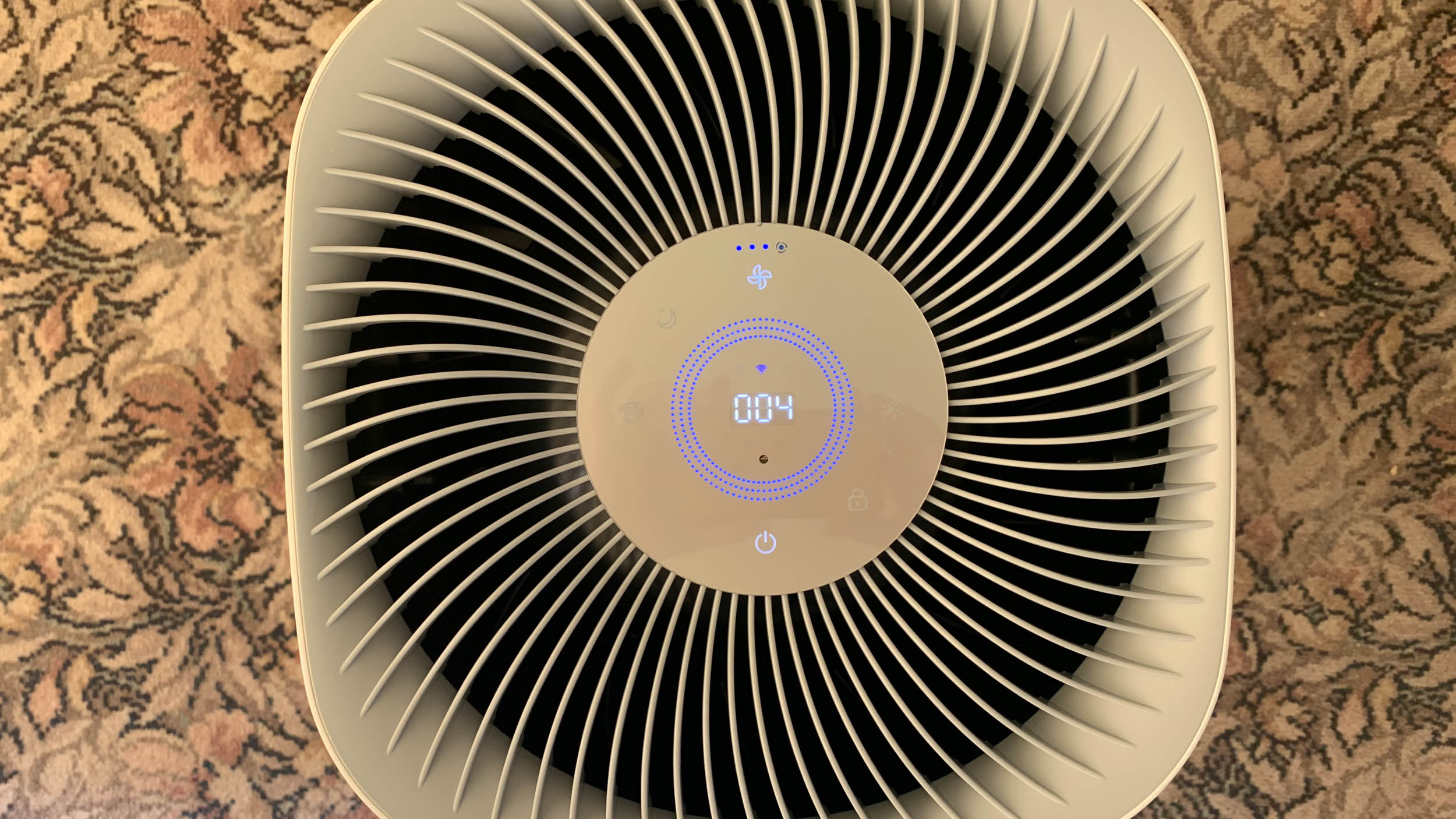
Looks-wise, the Levoit 600S is smart with a sleek curved body and large fan blades covering the top. In the centre of the fan are the Levoit 600S’ controls and options to change the fan speed, set a timer, check on the filter and current air quality, and determine whether it is connected to Wi-Fi or using Bluetooth for the associated VeSync app. The lower half of the purifier features a fretwork effect, and contains the filter and the bag into which particles sucked in by the fan are deposited. 

Image 1 of 2

Levoit 600S in use in the author's home

(Image credit: Future / Rosie Hattersley)
Image 2 of 2

Levoit 600S in use in the author's home

(Image credit: Future / Rosie Hattersley)

Setup involves twisting apart the top and bottom halves of the air purifier’s body, extracting the filter that it comes with from inside, and removing its packaging before popping it back in place. There is a bright yellow sticker on the top of the unit that prompts you to do this before use. The two halves of the unit then click to lock together. It doesn’t matter which way round the top half faces, but the corners need to align with the corresponding corners on the bottom half, a simple enough process. 

Although the Levoit 600S is a freestanding unit with no external moving parts, it needs space to operate so it doesn’t overheat. It should, therefore, be placed around 40cm away from the nearest walls. The power cable is more than a metre long, which is ample to accommodate this requirement. 

Once switched on, the Levoit 600S can be used either manually using the controls on top, or via the VeSync app. Each of the on-device controls lights up when you touch them, with multiple presses used to increase or reduce the fan speed.

  • Design: 4.5 / 5

Levoit 600S in use in the author's home

(Image credit: Future / Rosie Hattersley)

Levoit 600S: Performance

  • Effective dust and dander removal
  • Quickly gets rid of aerosol particulates
  • Less effective on kitchen odours

I tested the Levoit 600S in both an open plan 1960s detached house and a 1930s terraced house, the latter home to two asthmatics and a cat who is less than impressed at the ongoing renovations. The contrasting challenges were larger rooms with carpets, lots of upholstered furniture, and the odours associated with the older generation versus the renovation dust and the pet dander of our London home, which has wooden floors and tiles throughout. 

Both have open plan kitchens where food is often oven-baked or prepared on a hob. I tested the changing air quality while sauteing a variety of vegetables as well as frying fish and meat, and noted whether having the window adjacent to the cooker made much difference to the rate at which the air purifier cleaned the air. 

To set up the Levoit 600S air purifier, I first installed the VeSync app (iOS and Android versions are available). Next, I switched on the device and pressed the on/off switch on top until the Wi-Fi icon flashed blue. It was then recognised by the app and the two paired over Bluetooth. Next, the app searched for my home Wi-Fi network and prompted me for a login and password. 

Although it accepted my previously registered email address, it doesn’t actually want you to provide the password for your VeSync app at this stage and is really after your Wi-Fi password. This tiny misunderstanding took moments to correct. Once connected, you will need to keep the VeSync app open as the firmware is updated. However, the 600S will start operating as soon as it’s connected to Wi-Fi, with its internal fan working at its level 4 maximum rotation speed. 

Once the app has updated the firmware, you will be able to adjust the duration and schedules. You will also be shown the current air quality status based on the level of PM2.5 particulates it detects. What is not quite as apparent is that this screen also gives you the option to change the fan speed. 

Levoit 600S in use in the author's home

(Image credit: Future / Rosie Hattersley)

Sitting across the room, I found the Levoit 600S giving off a gentle rhythmic hum that was noticeable but unlikely to upset all but the most sound-sensitive family member. It hums along gently, with an unobtrusive decibel rating of less than 40 on the slowest speed setting and no more than 64dB when it kicks into its top speed rating and then settles at around 52dB. The ambient background noise in the room prior to switching on the air purifier was 38dB, so it barely disturbs the tranquillity. 

Even my sound-sensitive mum was untroubled by its operation at the lower fan settings, but pleased with the improved room freshness after 30 minutes of use. Blasting Febreze at the fan itself for a sustained 10 seconds filled the room with choking levels of air freshener, but the purifier removed the lot in 12 minutes at setting 3 (of 4), while our comparison on opening the patio doors and other windows wide had no discernible effect after the same period. 

I also found the Levoit 600S effective in removing dust from the air after a weekend of DIY, taking less than 20 minutes to clear the hallway and landing of visible particles. Sharing a home with a cat, I also appreciated it filtering stray hairs and slight odours. 

However, it impressed me less when it came to removing cooking smells and signs of domesticity: the kitchen levels were modest before I began frying and sautéing, and the purifier was not much better than the overhead fan and an open window for this use. Given the 600S’ larger dimensions, we would no doubt choose its smaller sibling for this room in any case. 

  • Performance: 4 / 5

Levoit 600S: App

  • Provides full control over the 600S
  • Alexa and Google Assistant voice controls
  • Strong scheduling and light sensing features

The VeSync app is well-designed with attractive graphics in calming shades of blue and turquoise. It provides a visual guide when setting up the Levoit device and has a user manual that you can access from its side menu. 

You can control every aspect of the air purifier once installed, with options to adjust the fan speed, schedule days and times for it to operate, change air quality levels that will trigger it automatically switching on and on, and activate a light sensing feature that seems aimed at use in a bedroom. The rationale here is that the gentle hum of the fan helps promote sleep, especially once the air is duly freshened, so you can nod off without the interruptions from an asthmatic or cat-allergy wheeze. 

The VeSync app is free to install and also works with Alexa as well as Google Assistant. This gives access to voice control options should you want to prompt your air purifier to go about its business without having to reach for your smartphone. I tried each of these without issue, finding the option to turn the fan off using a voice command useful when the phone rang while the 600S was clearing the air in the kitchen after cooking and I wanted to settle in for a chat. 

Levoit 600S in use in the author's home

(Image credit: Future / Rosie Hattersley)

Should I buy the Levoit 600S?

Buy it if...

Don't buy it if...

Also consider

How I tested the Levoit 600S

  • I used the Levoit Core 600S air purifier and the VueSync app for 10 days
  • Trialed it in two homes: one open plan; one a terraced house
  • Substances purified included pet odour, cooking smells and air freshener

I used the Levoit 600S air purifier in a number of different rooms, finding it particularly efficient at clearing the odours from a downstairs room that doubles as an elderly person’s bedroom. Being able to effectively cleanse this room of telltale odours associated with ageing, as well as Febreze and other masking sprays that disguise them was a good test since we had lots of visitors during the week in which the 600S was installed there. I react badly to perfumes and sprays due to asthma, so quickly clearing these smells was critical to me too. I continuously sprayed the aerosol contents at the purifier fan until the PM levels rose above 150 before switching on the unit to begin clearing the particulates.

With one family member being particularly sound-sensitive, being able to instantly dial down the fan setting such that she was undisturbed by the fan was vital. I also tested the unit while frying food and after making toast, as well as setting the Levoit 600S to automatically purify the landing of my own home during and after stripping paint from the stairs and sanding them down. I used a decibel meter app on my phone to measure how loud the fan was at various settings.

I compared the effects of simply allowing the air to clear naturally by opening windows either side of the room with the performance of the 600S, timing both to see how long it took for the PM level to drop below 12.

To test the air purification monitoring and speed, I sprayed heavy particulate aerosols (dry shampoo and deodorant) while the purifier was in Auto mode. This mode detects changes in the room and sets the fan speed accordingly.  

I lit a scented candle next to the purifier and also positioned it in the kitchen while frying and grilling different meat and vegetables. I measured the volume with a mobile phone decibel meter. 

Read more about how we test

First reviewed October 2023

Monday, October 30, 2023

The Lord of the Rings: Return to Moria review - all ore nothing

Review info:

Platform reviewed: PC
Available: PS5, Xbox Series X|S, and PC
Release date: October 24, 2023 

The Lord of the Rings: Return to Moria has the potential to be something much greater than what it is. The premise of fighting and regaining power over the grand halls of Moria is enough to spark excitement in any fan. Unfortunately, the stumbles over this great potential and the result is very disappointing. 

In multiplayer crafting survival game The Lord of the Rings: Return to Moria, you can venture forth by yourself or in a group of up to eight players to conquer the orc-infested mines of Moria. Instead of speaking friend and entering the Western Gate, you break through the side of the mountain to find another entrance into the depths. Once inside, you slowly make your way through the abandoned halls, fixing up old buildings and discovering new pathways, reclaiming the Dwarven home as you go. 

While there may be a lot to see here, there is almost nothing to do. Crawling around the mines becomes monotonous as everything looks the same, with only a few pieces of scrap metal, ore deposits, and barrels to distinguish different hallways.

Master craftsman

Dwarf making tools

(Image credit: North Beach Games)

Return to Moria starts strong with a customization menu that’s surprisingly detailed and fun to use. This menu lets you choose from numerous hair and beard options as well as voice, origin, and other features that help create a Dwarf that’s unique to you. 

I’ve always loved the Dwarves for their unique style, which has never shied away from non-binary features. Anyone can have a beard or facial hair, while body shape and clothing tend to be indistinguishable between the sexes. Luckily, Return to Moria managed to stay true to this essence with its customization options. I spent almost 20 minutes cycling through all the options available, rejoicing at all the face shapes that had no focus on sex or gender. I chose to have a regal face, broad shoulders, red hair, and an outfit from the Misty Mountains. 

Unfortunately, this was the first and the last time I was pleasantly surprised. While there were brief moments in which you could relish your choice of voice actor while singing mining songs as you broke down a coal-riddled wall, most of the time my Dwarf felt lifeless and generic.

One is the loneliest number

Dwarf running from monster

(Image credit: North Beach Games)

After you set up your first base by the entrance to Moria, you can finally adventure ahead and discover what else lies in wait for you. At first, I was expecting to find some grand mines full of gigantic forges or maybe fiery braziers that lit the path through the mountain. Unfortunately, what I was greeted with was much less impressive. 

Best Bit:

Dwarf standing in elven grotto

(Image credit: North Beach Games)

Finding an elven grove inside the mines of Moria was beautiful and reminded me of how spectacular The Lord of the Rings is. Thanks to this poignant moment, I’ll start rereading the books.  

Most of the spaces look remarkably similar. So much so that it’s very easy to get lost in the endless halls. Many of them are littered with buckets and broken wooden chairs, with rats, badgers, and wolves loitering around, but apart from these wild animals, there isn’t much else to see. While the rubbish left lying around can be helpful if you’re gathering crafting materials, they mostly just get in the way and, after a while, blend into the background.

I wanted to reclaim Moria for its rightful owners, the Dwaves, so badly. I set out with grand expectations of building magnificent dining halls and creating vast mining networks. Unfortunately, I ended up spending more time than I’d care to admit cleaning away broken buckets and making small forges and fires in derelict houses. No matter how hard I tried to breathe life back into the cold, dark halls, I just couldn’t create anything worthwhile or characterful. The crafting options were limited to basic forging tools, walls, and ceilings. It was even impossible to use warm decorations such as carpets or curtains to create unique spaces. 

Orc-estrated attacks 

Dwarf fighting orc

(Image credit: North Beach Games)

There are more than just aggressive badgers and wolves in the mines, though. Every now and then, you’re greeted by raiding orc parties, who have traveled from the depths of Moria simply to break down one of the walls you just finished building. 

These green menaces arrive in groups of three or five, armed with swords and axes. You’re alerted to each raid by the sounding of a horn that’s followed by rapid footsteps that close in on your location. They tend to attack the closest hearth or base, so if you aren’t home, you usually return to see orcs destroying your dwelling like some underwhelming house party gone wrong. However, if you are close by, then you’re high on their hit list. If you have an iron sword on your hip, then these attacks are more frustrating than fearsome. One at a time, you can take out an entire party in less than a minute.

I’m just trying to sweep up the market; I don’t want to engage in some bar-side brawls

It’s unfortunate that these hunting parties are so underwhelming. The orcs found in these mines simply aren’t as terrifying as my younger self remembered. It’s also annoying how, no matter where you are, these raiders always find you. There’s no way to prevent incoming attacks or disengage from fights without dying. I’m just trying to sweep up the market; I don’t want to engage in some bar-side brawls. 

Many of these evil-doers also end up embedded in my walls, forcing me to either destroy the entire structure or be forced to take a hit every time I go to collect stone from storage. They aren’t the only ones to get stuck in precarious locations, either. On my travels through the mines, I often encountered badgers who were wedged into the walls. I also found it difficult to consistently place items intentionally as they would rapidly glitch around when I tried to put anything in a tight space. 

Unfortunate misstep

Dwarf standing in front of a statue

(Image credit: North Beach Games)

So, unfortunately, it’s another sad day for Lord of the Rings fans. This year has been unkind to the fantasy universe, with the Lord of the Rings: Gollum also releasing in a state that left many players and fans utterly dismayed and disappointed. Return to Moria follows this pattern as the title was unable to capture the incredible scope, adventure, and fantastical setting that this series is loved and known for. 

I’d love nothing more than to play as Dwarves retaking their homeland alongside friends, but sadly, this is not the game to do that in. Besides the setting, there’s not much else to celebrate in Return to Moria. 

For the time being, it seems like the only thing Lord of the Rings fans can do to maintain their immersion in Tolkien’s world is to rely on the books and movies, and, if you’re desperate to create your own Dwavern city, try to do so in Vanilla Minecraft - you’ll likely have far more success than if you try to do the same in Return to Moria.  

Accessibility 

accesibility features

(Image credit: North Beach Games)

There's not much in the way of accessibility settings in Return to Moria. Apart from basic subtitle settings enabling you to change the size and background, there isn’t much else in the way of customizing your in-game experience. However, you can change the volume levels for voice and UI effects if you want a quieter playthrough.

How we reviewed 

I played Lord of the Rings: Return to Moria for around 10 hours on PC. I encountered multiple glitches that impacted my experience in the game, from orcs and badgers being trapped in walls to storage pallets shifting all over the place if I set them down in a tight spot.

While I tried to explore all the mines had to offer, I quickly realized that I wasn’t going to get too far by myself, so I spent a lot of time fixing up and clearing the chambers I did have access to while slowly trying to weed out all the orcs which were found in the elven sector.

If you're a fan of exploration, then check out these brilliant adventure games on PC and the best RPGs that are available to play right now.

Philips Hue Bloom review: a capable and colorful bias and accent light

One-minute review

As well as its ever-growing range of smart bulbs, Philips Hue has been producing table and floor lamps for a number of years, many of which qualify as some of the best smart lights.

Way back in 2013, the Hue Bloom was the first non-bulb smart light to start this trend – a successful gambit, given it’s still a fan favorite to this day. It can be purchased from Amazon, directly from Philips Hue, and from some third-party retailers for $79.99 / £79.99. It’s a little expensive for what it is, especially in the UK; but it’s one of Hue’s more affordable table lamps. Petite at 4 x 5.1 x 5-inches / 10.1 x 12.9 x 12.6cm (h x w x d), the Bloom is a versatile table lamp that works as well for rudimentary bias lighting as it does for accent lighting.

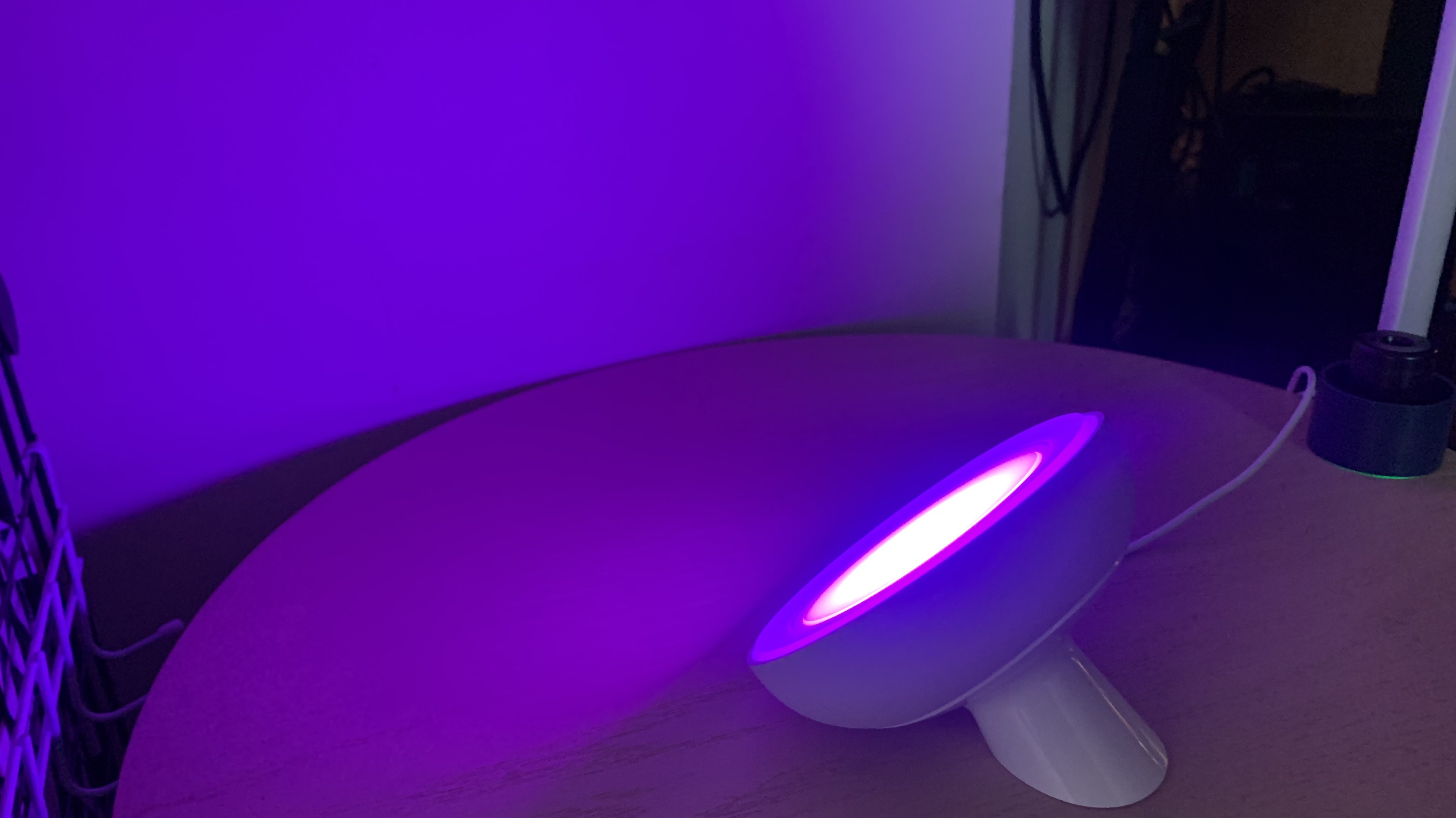
Philips Hue Bloom table lamp

(Image credit: Future)

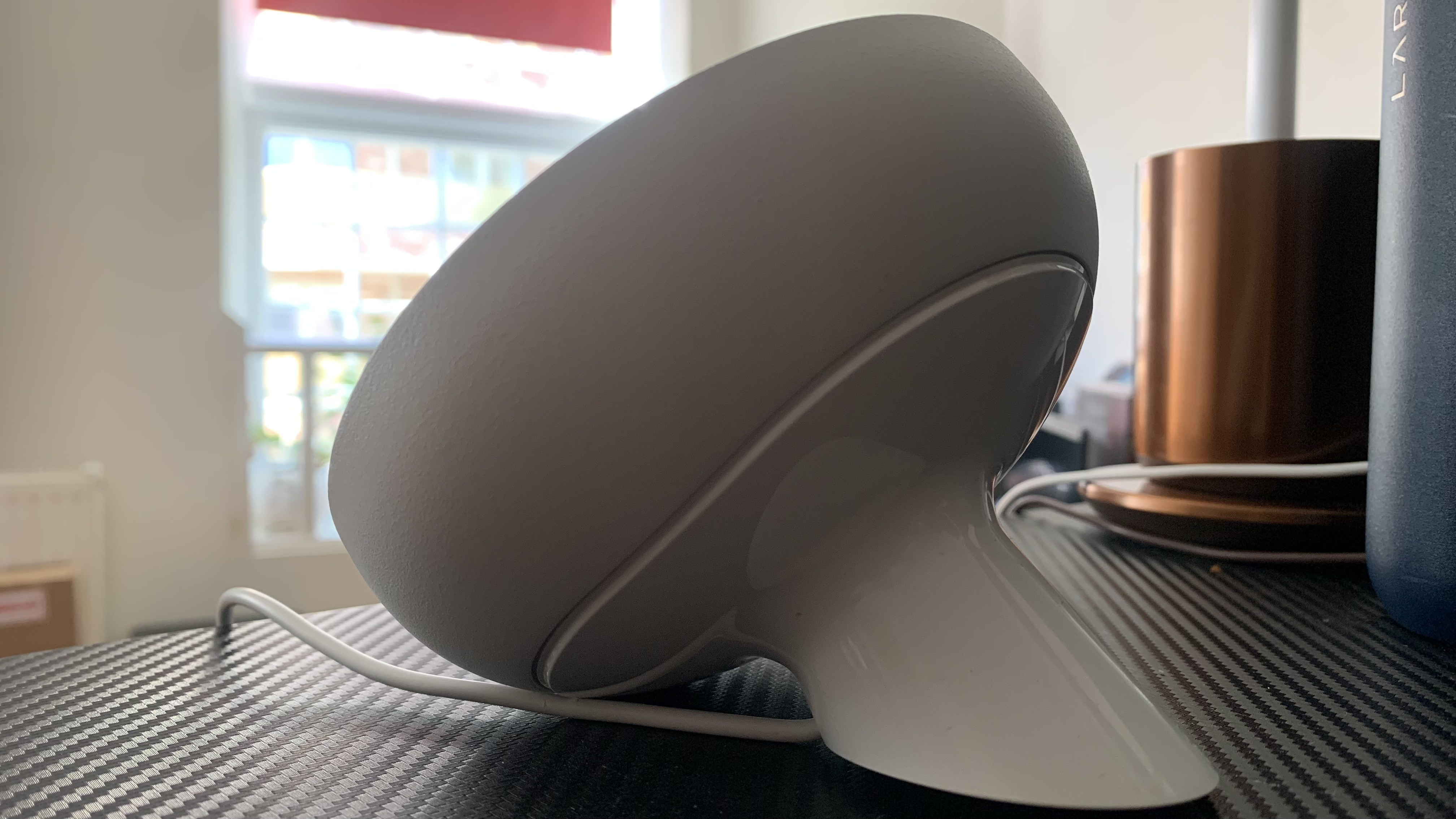
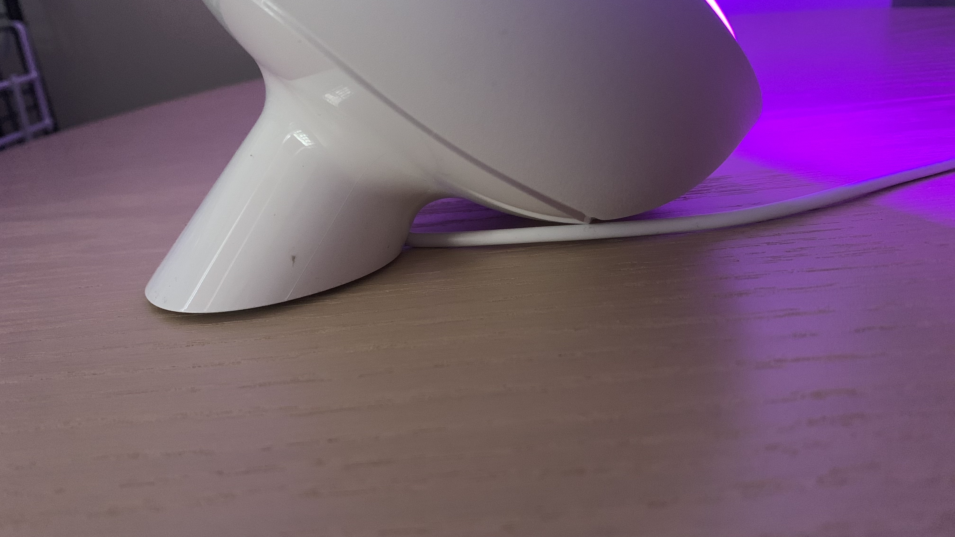
It sports a fairly discreet appearance, especially when it’s off, with a sort of ’70s sci-fi look; neutral, curvy, and clad in white plastic and metal. The front of the light is a flat, angled disc with a small bezel; however, you’re most likely to only ever see the rear or side of the light, since it’s for indirect lighting and performs best when facing walls and corners. The light sits on a short stem, which is home to the power cable; the cable exits through a small arch at the front-facing side of the lamp. Depending on where your power supply is in relation to the lamp, this can prove a little fiddly to set up.  

You can set up the lamp via Bluetooth or the Hue Bridge. The latter comes at an additional cost of $59.99 / £49.99, and enables further devices to be connected, while also bringing more features such as remote control. As with all Philips Hue lights, the Bloom is super easy to set up in the app, with the overall user experience splendid. Adding the light to your smart home ecosystem is just as easy, and it’s compatible with Amazon Alexa, Google Assistant and Apple HomeKit. 

Philips Hue Bloom table lamp

(Image credit: Future)

Its slightly low lumen output somewhat betrays the age of the Bloom – and that’s despite it having had a few generational updates over the years. At just 500 lumens at 4000K, which is about as low as you’d ever want a table lamp to go. However, Bloom isn’t designed to spray light across the room, just to provide an interesting and ambient splash of color – and for that it’s perfectly balanced. There’s also a welcome softness to the Bloom as a result of the frosted covering, which diffuses the light wonderfully.

With the now-standard full 16 million array of colors, the Bloom can produce some beautifully vibrant hues, and you can adjust the temperature and brightness with ease using voice controls with the best smart speakers or via the app. As time has gone on, and Bloom has evolved through different Hue generations, color accuracy has improved significantly, and the most recent version I’ve been testing is exemplary of that evolution.

Philips Hue Bloom table lamp

(Image credit: Future)

While there are still a few niggles that I’d have expected Hue to have tackled by now (the cable exit in the stem really irks me, for example), overall the Philips Hue Bloom is an excellent – albeit basic – bias or accent light, offering vibrant and bright ambient lighting in your home. It’s discreet enough to work well in any room, but still a good-looking device in itself.

Philips Hue Bloom review: Specs table

Should I buy?

Buy it if...

Don't buy it if... 

Philips Hue Bloom review: Also consider

How I tested the Philips Hue Bloom

  •  I tested the Philips Hue Bloom for a month 
  •  I used it as part of my smart lighting setup  
  •  I paired it via the Philips Hue Bridge and Alexa 

To test the Philips Hue Bloom, I set it up in my living room for a month, alongside a set of other smart lights from other manufacturers. 

My primary smart speaker controller is Alexa, which I used in tandem with the Philips Hue app to test the responsiveness, accuracy and ease of use when operating the lamp. I compared its color accuracy to smart lights in various form factors and from different manufacturers, too.

I used the Bloom as both a bias light behind my TV screen and as an accent light for a display cabinet, as well as a table-side light to add some more color spray to my smart light setup

Yeedi Cube robot vacuum and mop review: lots of features on a budget

Yeedi Cube: One-minute review

The Yeedi Cube comes among a litany of combo robot vacuums capable of both vacuuming and mopping. In that regard, it’s one of many. What sets it apart then is the fact that it comes with a self-emptying base station for a much lower price than much of the competition.

Whether it ranks among the best robot vacuums for you depends on whether you can accept its quirks. After all, there are a few issues here that might make you reconsider as the virtual mapping is not as good as it could be (though that should be fixed with a firmware update) and assembly can be involved to the point where, if you don’t hit every step correctly, you could end up with an issue. Of course, the issue with getting edges and corners is inherent in this type of vacuum. So, if that’s a concern, you can look at one of the best vacuums for something able to do a deeper clean.

That said, the Yeedi Cube is a cheap way, relatively at least, for a hands-free vacuuming and mopping experience that will leave your floors clean.

Yeedi Cube: price and availability

  • List price: $699 (about £559 / about AU$1,054)
  • Available in the US only at the moment

At $699.99 (about £559 / about AU$1,054), the Yeedi Cube is decidedly cheap for what it offers. Sure, you can find robot vacuums capable of mopping for less. For example, the Bissell Spinwave R5 costs $549.99 / about £455.19 /AU$799 and it has both functionalities. What the Bissell doesn’t have that the Yeedi Cube has is a base station that not only empties the debris that’s been vacuumed up but the dirty water as well.

A better comparison then is the iRobot Roomba Combo J7 Plus, which goes for a much higher price tag of $1,099.99 / £999 / AU$2,199 and also includes a self-emptying base station. Though the iRobot’s mopping ability is a bit better, the self-emptying functionality only applies to the dust and debris the Roomba picks up. Anything mopping-related is done manually. The Yeedi Cube’s base station also sucks out the dirty water.

That said, an area that both the Bissell and iRobot robot vacuums as well as that of most established brands have over Yeedi is the fact that the Yeedi Cube is currently only available in the US.

  • Value: 4 / 5

Yeedi Cube: specifications

Yeedi Cube on the author's floor

(Image credit: Future / James Holland)

Yeedi Cube: Design and features

  • Completely flat on top
  • Self-emptying base station
  • Lots of assembly

There are a few intriguing elements of the Yeedi Cube robot vacuum unit that stand out compared to other models I’ve seen. To start, the clean water tank sits on top of the vacuum instead of being shoehorned into the back with the dustbin. Because of its placement, it can store quite a bit of water (one liter specifically).

Also, the vacuum is completely flat, instead of having a raised area for mapping purposes. Because of this, the Yeedi Cube can get under couches and some furniture that might be out of reach for other units.

Yeedi Cube on the author's floor

(Image credit: Future / James Holland)

As far as attachments go, the Yeedi Cube has two side brushes (many especially cheaper models have one) and a single large brushroll underneath. The brush roll uses bristles so it is susceptible to getting tangled up, so you’ll have to check it somewhat regularly if anyone in the house has long hair.

The mop pad covers the back half of the vacuum and vibrates up to 2,500 times a minute to clean. Though you can easily remove the mop pad to clean it, the base station will wash and dry it every time it docks.

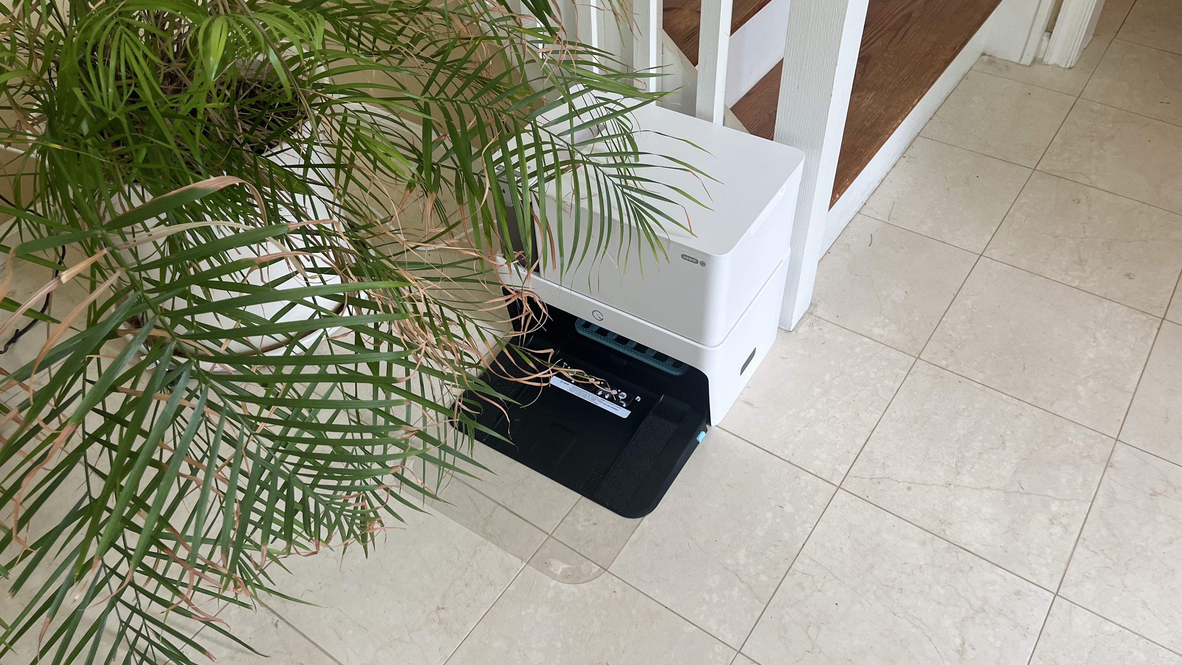
Speaking of the base station, it’s sizable but not too bulky. As it measures 15.74 x 17.72 x 14.76 inches, you’ll have to set aside a good amount of space, especially as the actual robot vacuum likes to do a three-point turn to back into it from about four feet in front.

The base station takes up this much space for a couple of reasons. As soon as the vacuum is docked, the station will suck the debris out of the dustbin into a disposable bag inside the base station, so you don’t have to regularly empty anything. Since having started testing for this review, I have not needed to replace the bag despite cleaning up after two dogs.

Yeedi Cube on the author's floor

(Image credit: Future / James Holland)

The base station also has a dirty water tank that’s big enough (1.2 liters, specifically) that it rarely needs to be emptied. Also, as mentioned above, when the vacuum docks, the station will wash and dry the mop pad to keep it clean and free of mold.

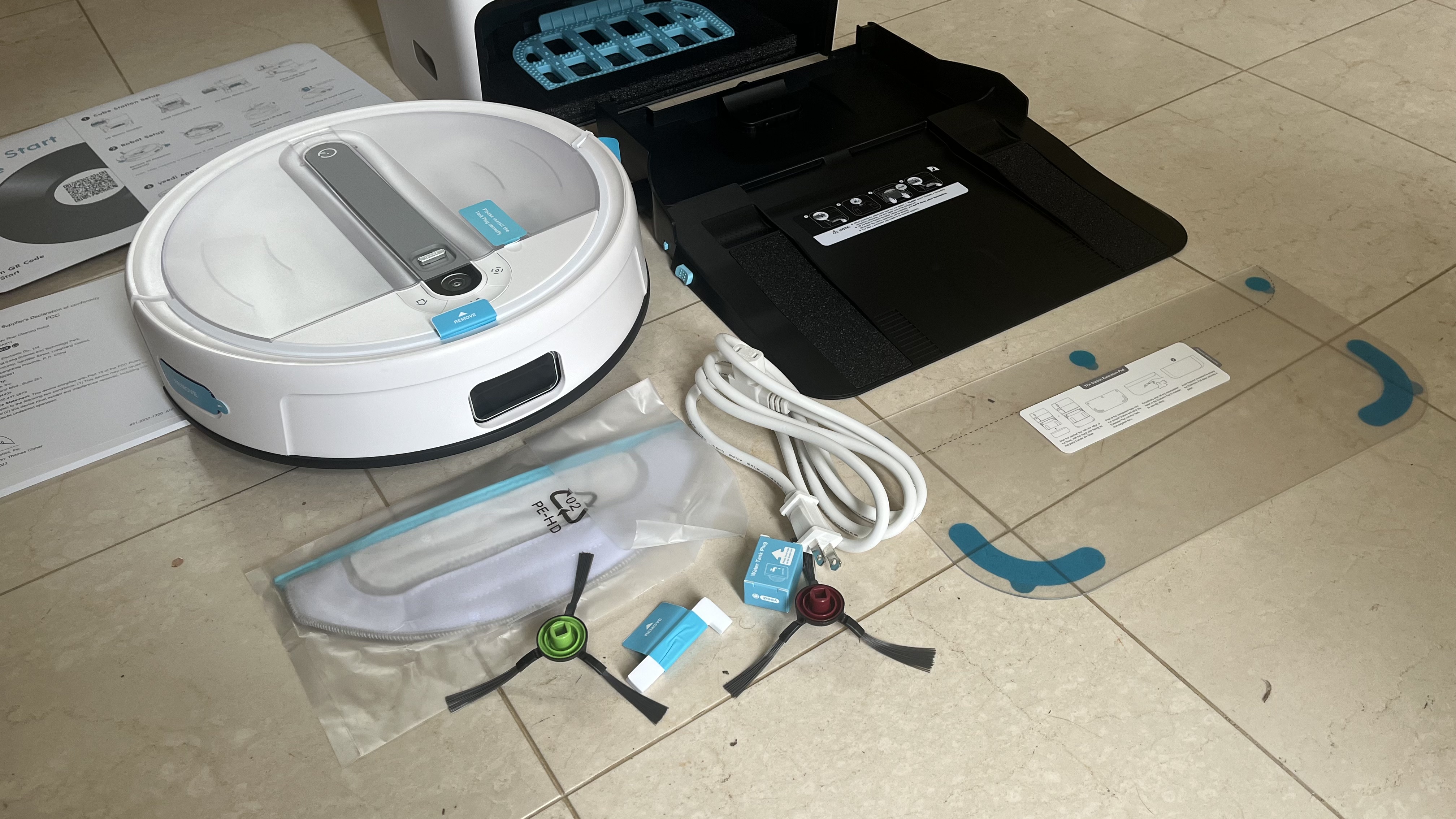
This is all well and good once you have it all set up, but it requires a little bit extra in terms of assembly. Namely, there are a lot of different areas where you have to remove tabs and stickers for correct operation.

Yeedi Cube on the author's floor

(Image credit: Future / James Holland)

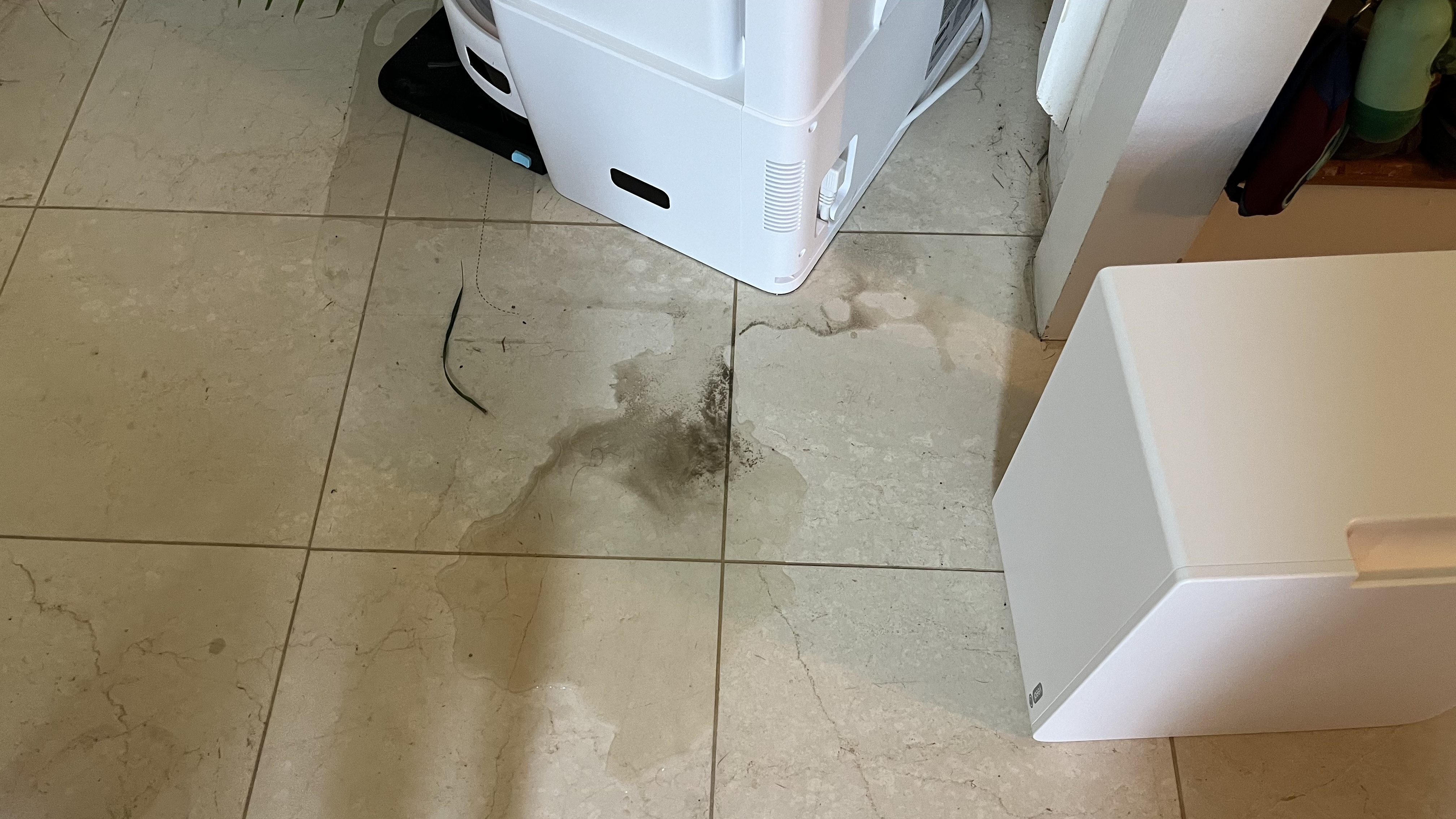
To that end, I had trouble with the base of the base station as I thought it was properly installed, but because it didn’t fully click into place, all the dirty water that was supposed to go into the dirty water tank ended up leaking out of the base station. While I’ll admit that it’s user error, it’s something that I checked more than once trying to troubleshoot. And, if you’re not careful and fully push in that base when assembling this vacuum, you might end up stepping in a puddle of murky water as well.

  • Design: 4 / 5

Yeedi Cube on the author's floor

(Image credit: Future / James Holland)

Yeedi Cube: Performance

  • Solid vacuuming ability
  • Object avoidance is okay
  • Mopping is good

As far as vacuuming ability goes, the Yeedi Cube is as capable as any robot vacuum I’ve tested. It has two side brushes to the single one that most models have so that it’s able to feed all debris towards the brush roll instead of kicking debris out. 

Having had to run the Yeedi Cube somewhat regularly to pick up after two French Bulldogs and a cat (mostly the dogs), it did a great job of getting all the pet hair off the floor. It did have some issues with larger objects since that brush roll uses actual bristles. Long hair and larger leaves will get stuck there as I experienced, requiring some manual clearing of the brush roll and brush roll area before being able to continue cleaning the floor.

Robot vacuums tend to have issues with this in general so it’s not a major point against the Yeedi Cube. You’ll just have to do a little pre-cleaning before running it if you see big pieces of debris lying around.

In the same vein, its object avoidance is okay but not great. It will bump up on objects before deciding to go around. This is a little bit of a frustration as that means it can get stuck on some lower-lying objects. In my case, the robot vacuum has gotten stuck on some floor vents that are a couple of centimeters higher than the surrounding floor, requiring me to rescue it. However, it seems to have learned from the first couple of times getting stuck and no longer does so when being run.

As with many other robot vacuums I’ve tested, the edge cleaning is not nearly as good as advertised and the Yeedi Cube will leave areas along the wall with some dirt and debris that I would have hoped it to pick up.

Yeedi Cube on the author's floor

(Image credit: Future / James Holland)

The mopping functionality is also pretty good. At first, it was a little streaky, but it seemed to find its stride after the first time or two running it. While Yeedi doesn’t offer any cleaning solution or advice on what to use, just using water does pick up quite a bit of dirt. The dirty water tank on the self-emptying base station attests to its ability to go the extra mile with mopping.

That might be from the physical mopping pad. Instead of dragging it behind it, the Yeedi Cube vibrates the mopping pad to physically remove dirt. If you want to take it to the next level, you can use any cleaning solution except for strong acids or alkali-based ones that could corrode the cleaning tank.

  • Performance: 4 / 5

Yeedi Cube on the author's floor

(Image credit: Future / James Holland)

Yeedi Cube: App

  • Fairly intuitive to use
  • Lots of adjustments for both vacuum and station
  • Room mapping needs work

The Yeedi app is generally intuitive to use. The main screen depicts the overall map that the robot vacuum has made of your space including whatever room divisions you’ve made. Information about the vacuum such as current settings, battery life and what it’s currently doing is listed at the top of the screen, while access to controls is at the bottom.

The “Robot” tab allows you to select between just vacuuming or vacuuming and mopping, how loud you want its operation (which affects how deeply it will clean), the amount of water you want it to use, whether you want it to do a quick or full clean and more. There are some advanced settings here available such as creating scheduled cleanings, how you want each room to be cleaned, and Do Not Disturb hours.

There’s also a “Station” tab with some base station-specific settings such as toggling on/off the self-emptying functionality and how long you want it to wash or dry the mopping pad.

The one area where the app falls short however is in its ability to subdivide the map into different rooms. After the initial mapping of my space, it all showed up as one big room. I was able to subdivide the whole space into two rooms but not any further than that even though I should have been able to break it down further. That means that I have to clean half the floor space when I want to clean just one room, so I end up just running the vacuum to clean everything.

Now, I run this vacuum in an area that is almost an open floor plan with wide door frames that lack doors and the Yeedi Cube apparently has more trouble with these sorts of spaces compared to a more typical apartment or house layout. So, this issue may not even apply to you. It’s still a major annoyance as well as a consideration when comparing robot vacuums, though I’ve been told that Yeedi is working on this and will hopefully have rectified this issue with a future firmware update.

If you’re on the smart home train, be aware that it is compatible with Alexa and Google Home but not HomeKit.

  • App: 3.5 / 5

Yeedi Cube: Battery life

  • Long battery life
  • Constantly returns to base station

The crazy thing about the Yeedi Cube’s 150-minute battery life is that it’s so careful about emptying its contents regularly and washing that mopping pad before continuing that it never got below 50%.

So, it would run for 40 or 50 minutes, return to the base station to clean, and then return to the job. That said, it wouldn’t wait to fully recharge. So, I never was in any danger of it running out of battery. The only time it did was when it got stuck on something when I wasn’t around to rescue it.

Even beyond that, a 110 or 120-minute runtime is typical so what this robot vacuum can achieve is far above average.

  • Battery: 5 / 5

Should I buy the Yeedi Cube?

Buy it if...

Don't buy it if...

Yeedi Cube: Also consider

Not sold on the prowess of the Yeedi Cube? Below are a couple of alternatives that you can consider.

How I tested the Yeedi Cube

  • I used the Yeedi Cube for a month
  • Tested different settings and features
  • Tested on different surfaces with various obstacles

To test the Yeedi Cube Robot Vacuum and Mop Self-Empty XL, I used it for a month to vacuum and mop the hardwood floors in my house. I also tested all the features listed in the app, from mapping to different levels of cleaning. 

I took note of how well the vacuum cleaned the edges of a room as well as around obstacles, not to mention running it over different surfaces including two different types of hard flooring. 

Read more about how we test

First reviewed October 2023

!!!!!!!!!!

Popular Posts

Categories

Blog Archive