Onyx Boox Page review: the Android ereader that can shop both Kindle and Kobo stores
Onyx Boox Page: Two-minute review
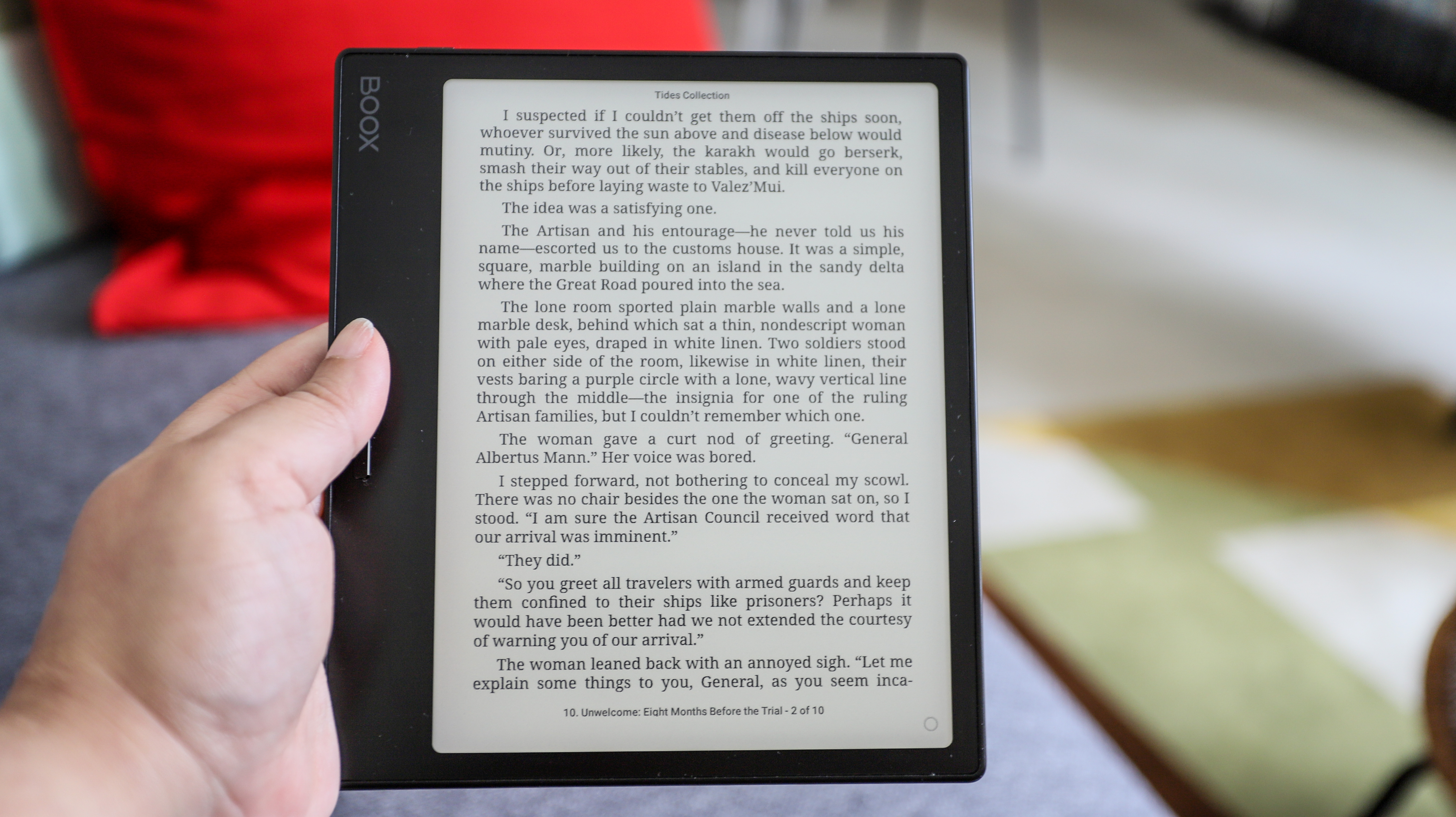
The Onyx Boox Page is very much like the Kindle Oasis, especially since its plastic body looks far more premium than the Kobo Libra 2. Sharing the same 7-inch screen size as both the older models from Amazon and Kobo, the Onyx Page is just a touch faster thanks to a better processor.
Like the other two, there are physical page-turn buttons here that also double up as the volume controls. Yes, there’s a speaker built-in, but don’t expect the sound quality to wow you. It sounds a little tinny but it suffices if you’re only using it for audiobooks. However, a better listening experience would be via Bluetooth-connected headphones or speaker of your choice.
There’s a very generous 32GB of storage here, just like the Kobo Libra 2, but the Page also features a microSD slot in case you want to expand storage – after all, audiobooks take up more space than ebooks. Moreover, the battery life here is excellent, thanks to a 2,300mAh pack under the hood.
My main complaint is the afterimage issue caused by bringing up the E Ink Center to access shortcuts or control sliders. I’ve seen this before on other Onyx ereaders, but where that’s usually been a ghosting issue, here it’s a dark overlay of the control panel remaining on the page. This doesn’t happen every time, but often enough that it gets annoying.
Another complaint I have is the lack of waterproofing for the Page, so avoid the bath, the pool and the kitchen sink when using this ereader.
Access to content on an Onyx Boox ereader is also still disappointing. While there are two bookstores on the Page, one is Chinese, the other only has ebooks that are already in the public domain.
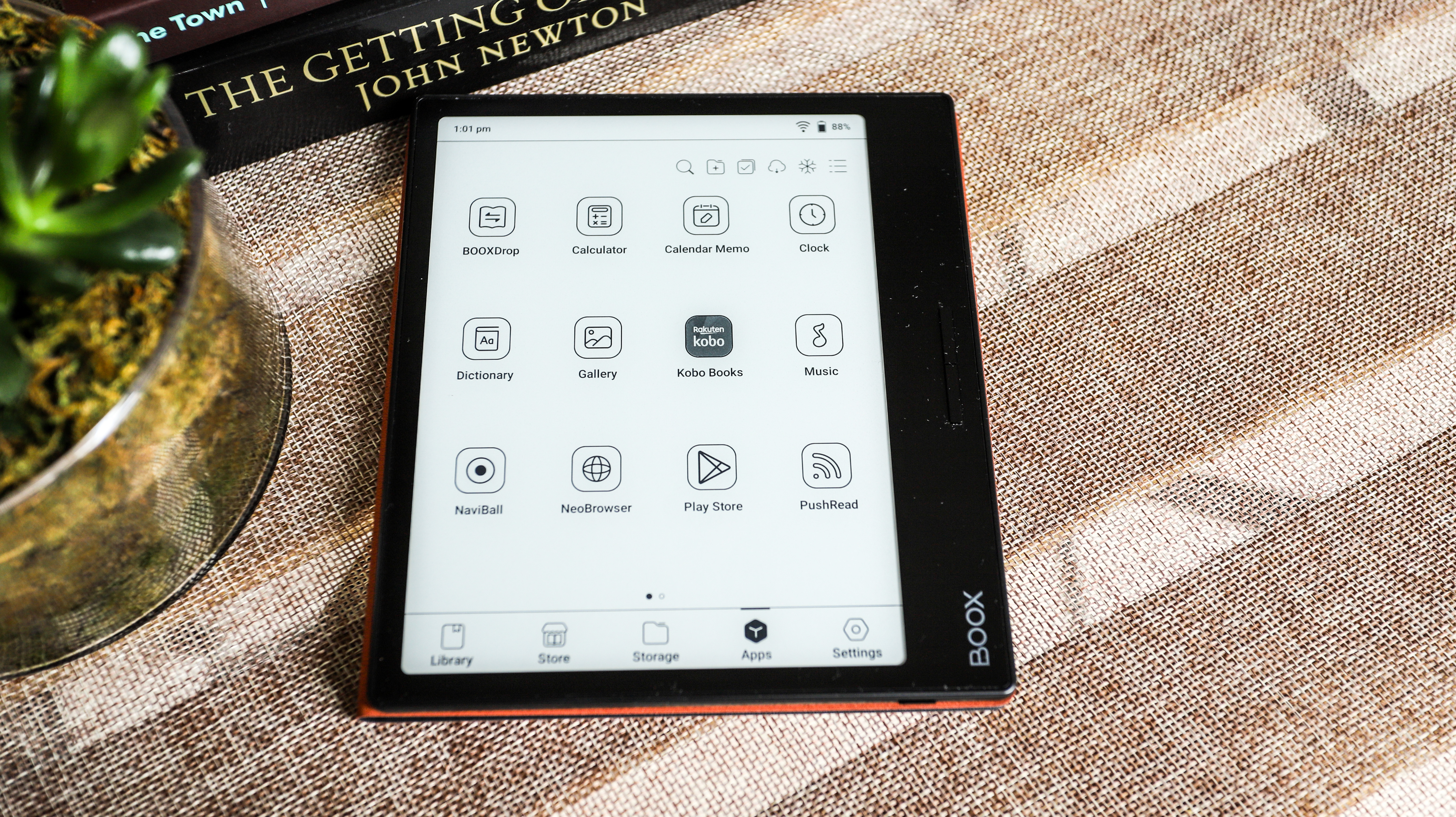
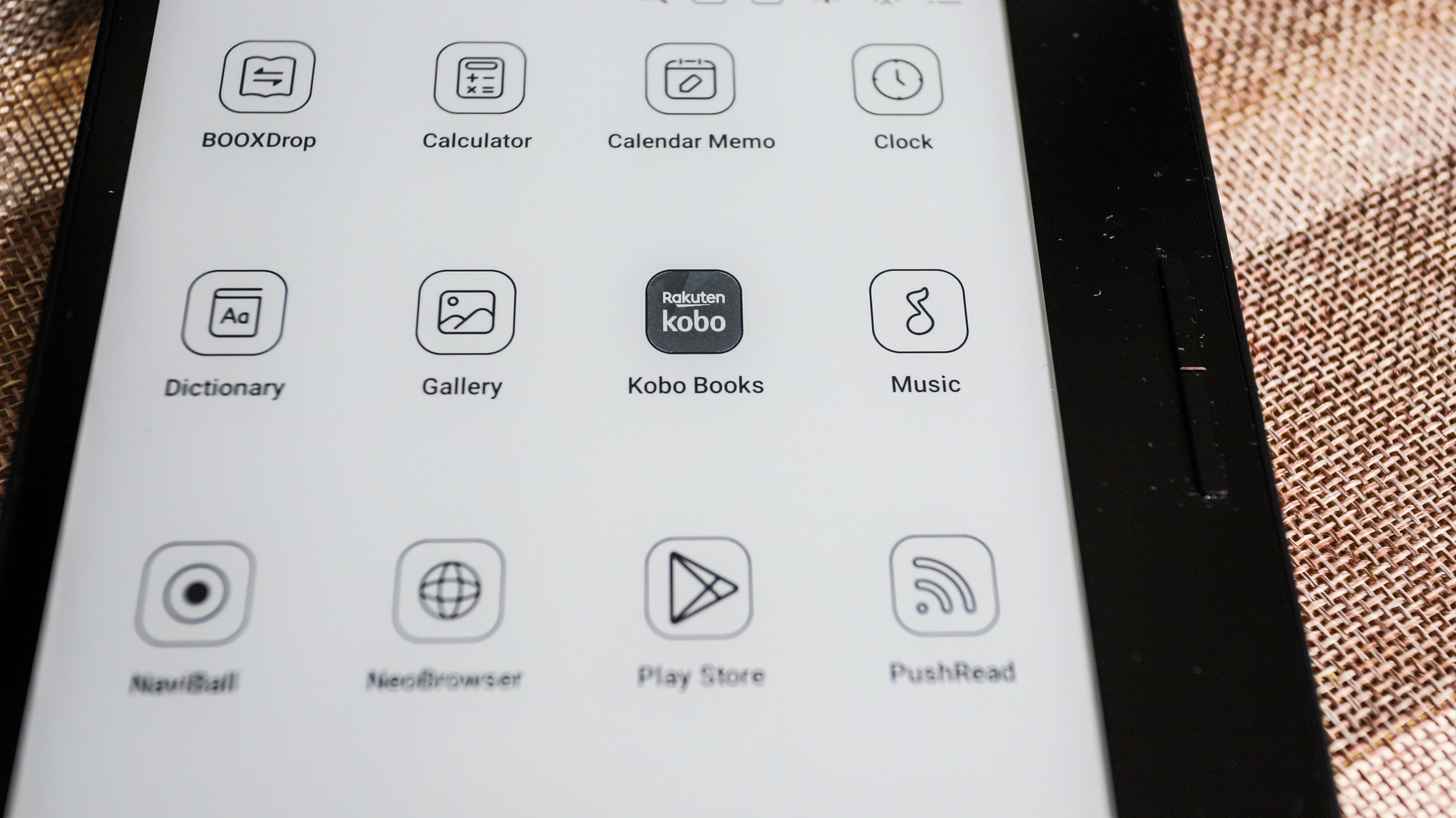
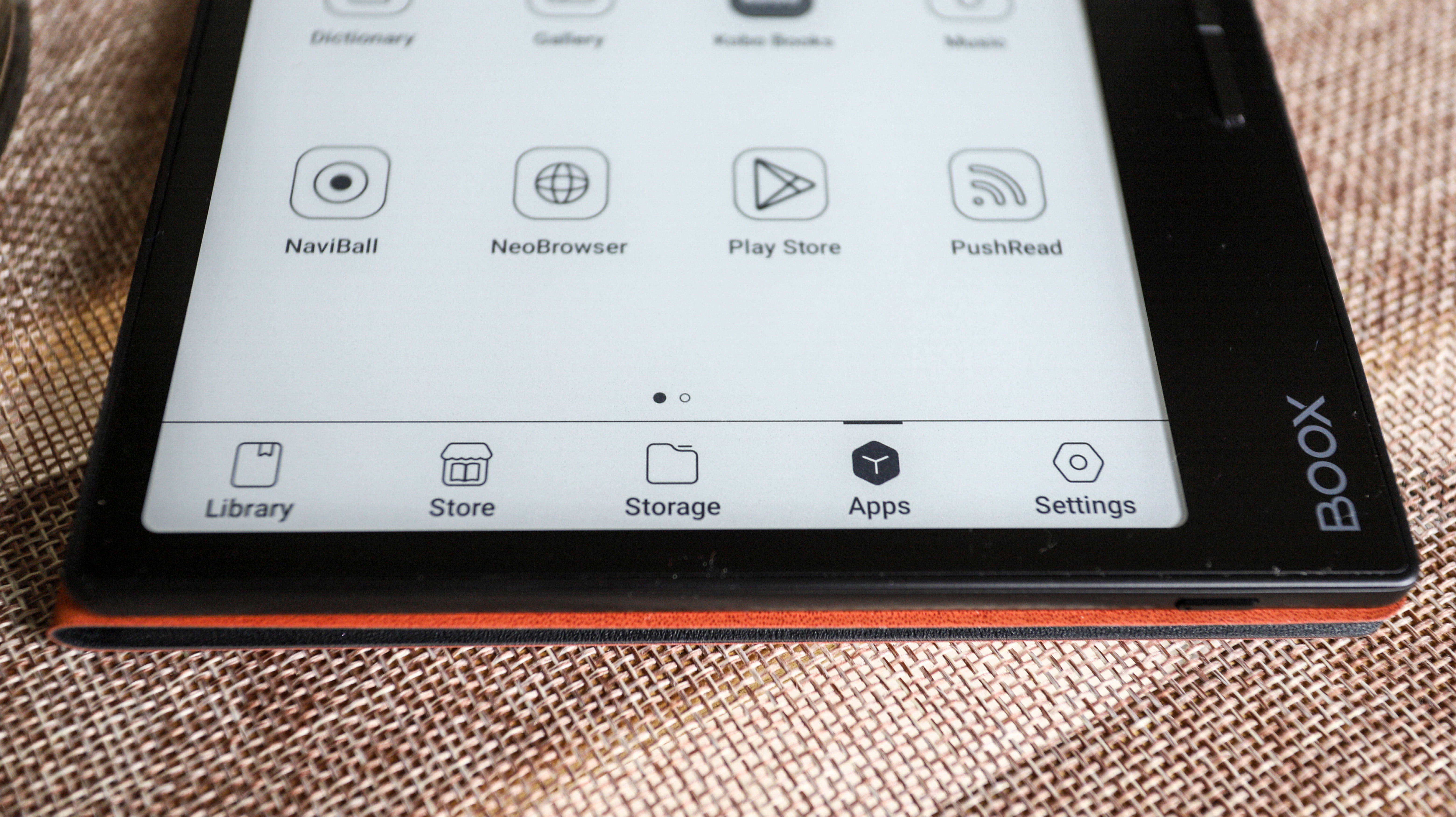
That said, the Page runs on a simplified version of Android 11 and gives you access to the Google Play Store. From here, you can download the Kindle or the Kobo app (or both) and find your next read there. The flip side to this is your purchased content from the apps won’t get added to the Page’s default library, taking away the plethora of customizations you can apply to ebooks within that default folder.
So if you don’t mind being restricted within the Android apps for Kindle or Kobo, the Onyx Boox Page can be considered to be two ereaders in one. And it's certainly priced competitively in some markets, costing as much as the Kobo Libra 2 in the US, which is still our #1 pick of the best ereader overall.
Onyx Boox Page review: price and availability
- Retails for $249 / €279 / AU$419
- Available now directly from Onyx or select retailers
Announced in the first half of 2023, the Onyx Boox Page is available to purchase directly from the manufacturer or from selected retailers like B&H in the US. Onyx has an European warehouse from where UK customers can order the Page, and potential Aussie customers can grab one from third-party retailers like Big W.
It will set you back $249 / €279 / AU$419 at full price (around £240 in the UK), matching the Kindle Oasis in the US and UK, but costing more in Australia where the Amazon alternative is AU$399. It’s more expensive than the Kobo Libra 2 in all markets, however, which now retails for $189.99 / £169 / AU$319.95.
While it might cost more in some regions, it's worth considering if you want one ereader to access both the Kindle and Kobo Stores, although it’s important to keep in mind that you will be restricted to reading on those apps if you purchase content from there.
• Value score: 4 / 5
Onyx Boox Page specifications
Onyx Boox Page review: Design and display
- 7-inch E Ink Carta 1200 screen with glass anti-glare layer
- Premium looks despite plastic body
- No water resistance
When it comes to ereaders with physical page-turn buttons on a side bezel, the popular models like the Kindle Oasis and the Kobo Libra 2 are slightly thicker on that side to allow for a comfortable grip. The Onyx Page, on the other hand, has uniform thickness throughout, which gives it a sleek aesthetic. The page-turn buttons are comfortably located, although I think a little bit of space between them would make switching between the two a bit more ergonomic (but that’s me just nitpicking, really).
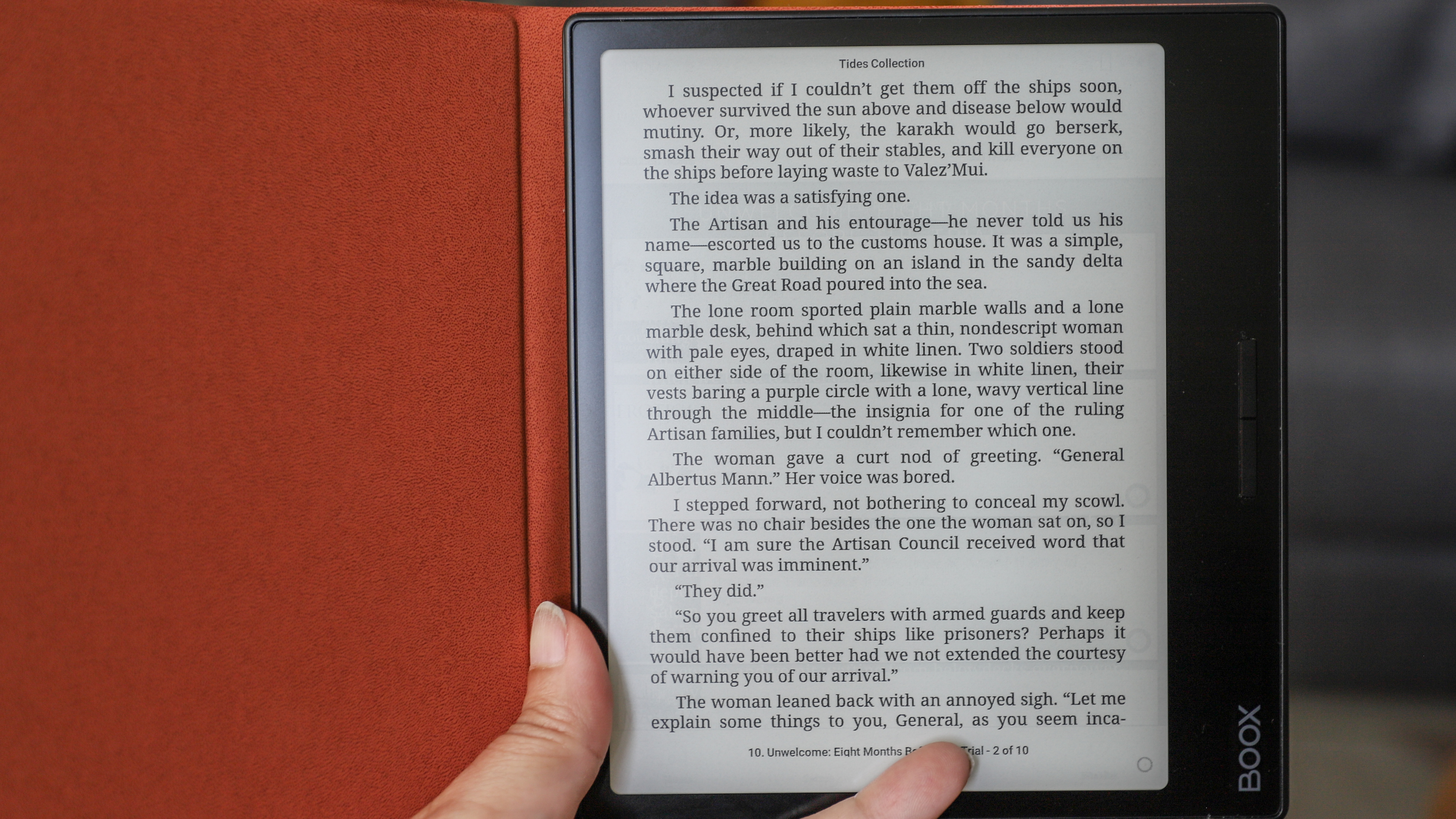
The 7-inch E Ink screen – which has a glass anti-glare layer on top and sits flush with the bezels – is encased within a plastic body that looks much better than what we saw on the Kobo Libra 2. At first glance, I thought the Page had a metal chassis like the Kindle Oasis. There’s a strip of subtle artwork on the rear panel where you would expect a grip and it seems to be silk-screened on. However, there really is no grip here and I think the magnetic case that Onyx has made for the Page might be a good (additional) investment in case of butter fingers.
Another reason I think the sleepcover would come in handy is to avoid smudges on the device. As nice as the chassis looks, it’s a magnet for fingerprints – both front and rear.
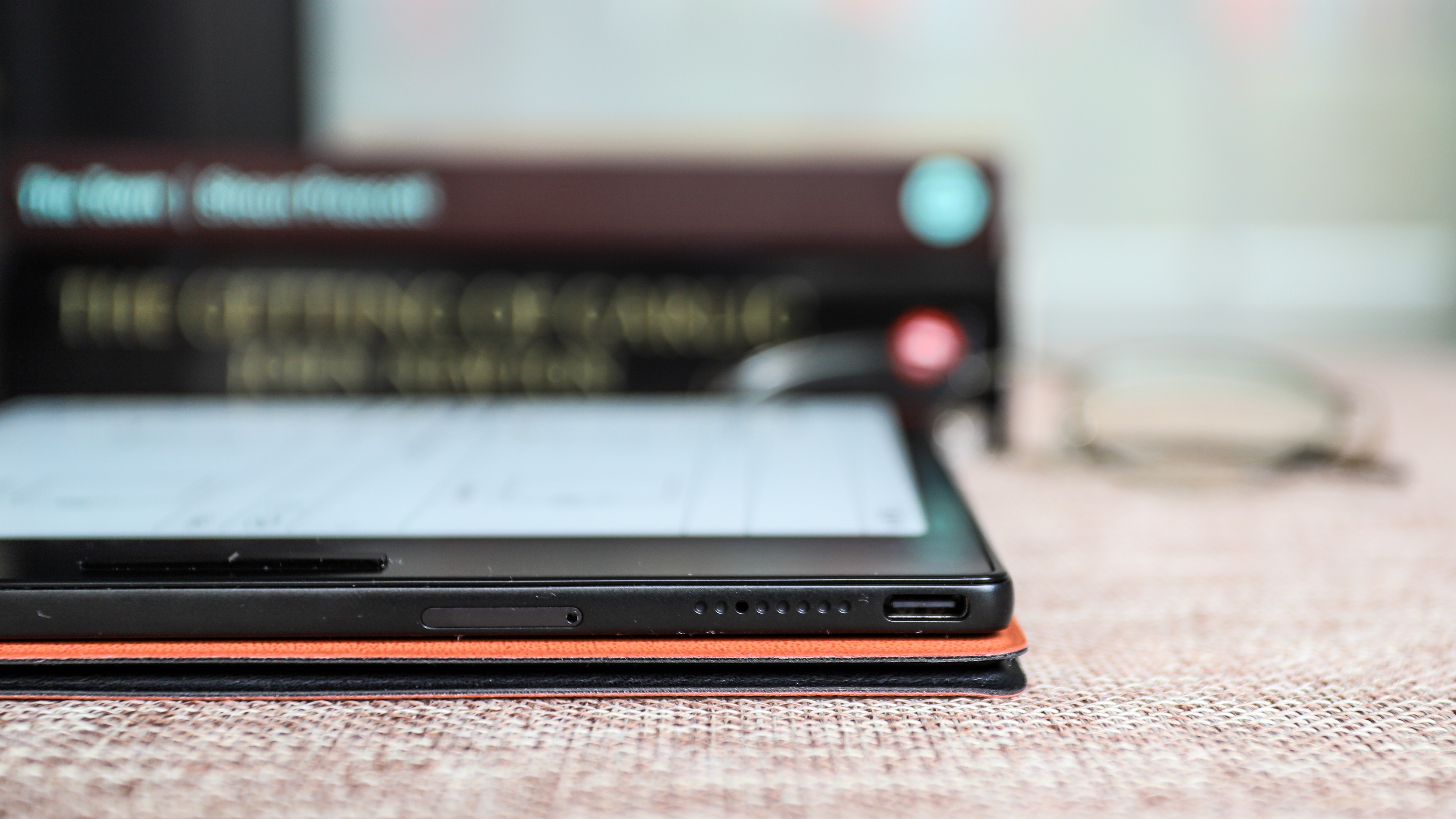
On one corner of the device’s edge is a power button, so subtle that it’s easy to miss. Another long edge has the rest of the physical goodies, including a USB-C port for charging and data transfer, dual speaker grilles and a microSD card tray. In the box, Onyx has thoughtfully included a pin so you can open the card slot in case you want to expand the 32GB built-in storage.
The screen itself is lovely and very responsive. Most ereaders I’ve tested that use the E Ink Carta 1200 screen tech offer good contrast, so text stands out nice and sharp on the display, and that’s the case here. It’s a capacitive multitouch screen with no writing capabilities.
You can adjust the screen’s frontlight to either cold or warm hues but there’s no way to set automatic light temperature changes from cold to warm as the day progresses – both the Kindle Oasis and the Kobo Libra 2, however, do offer this feature. That said, none of the Onyx Boox tablets I’ve tested allow you to set automatic light hue changes for reading in the evenings and nights, so I’ve always just set it to a slightly warmer setting that I find comfortable at any time.
• Design & display score: 4 / 5
Onyx Boox Page review: User experience
- Overwhelming device settings options
- Auto-rotates orientations, which can be locked if needed
- Onyx’s Control Center is handy but often leaves overlay
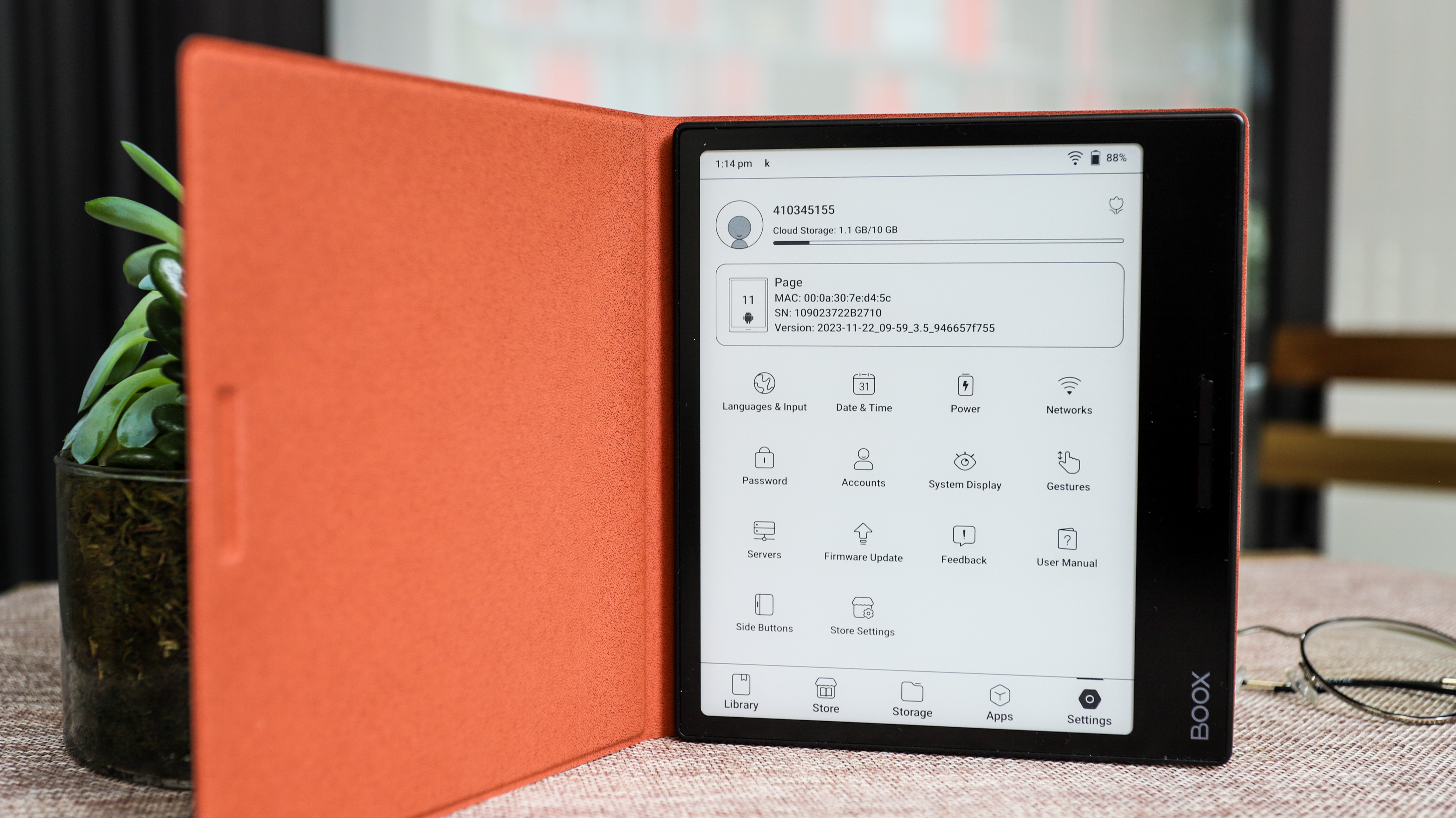
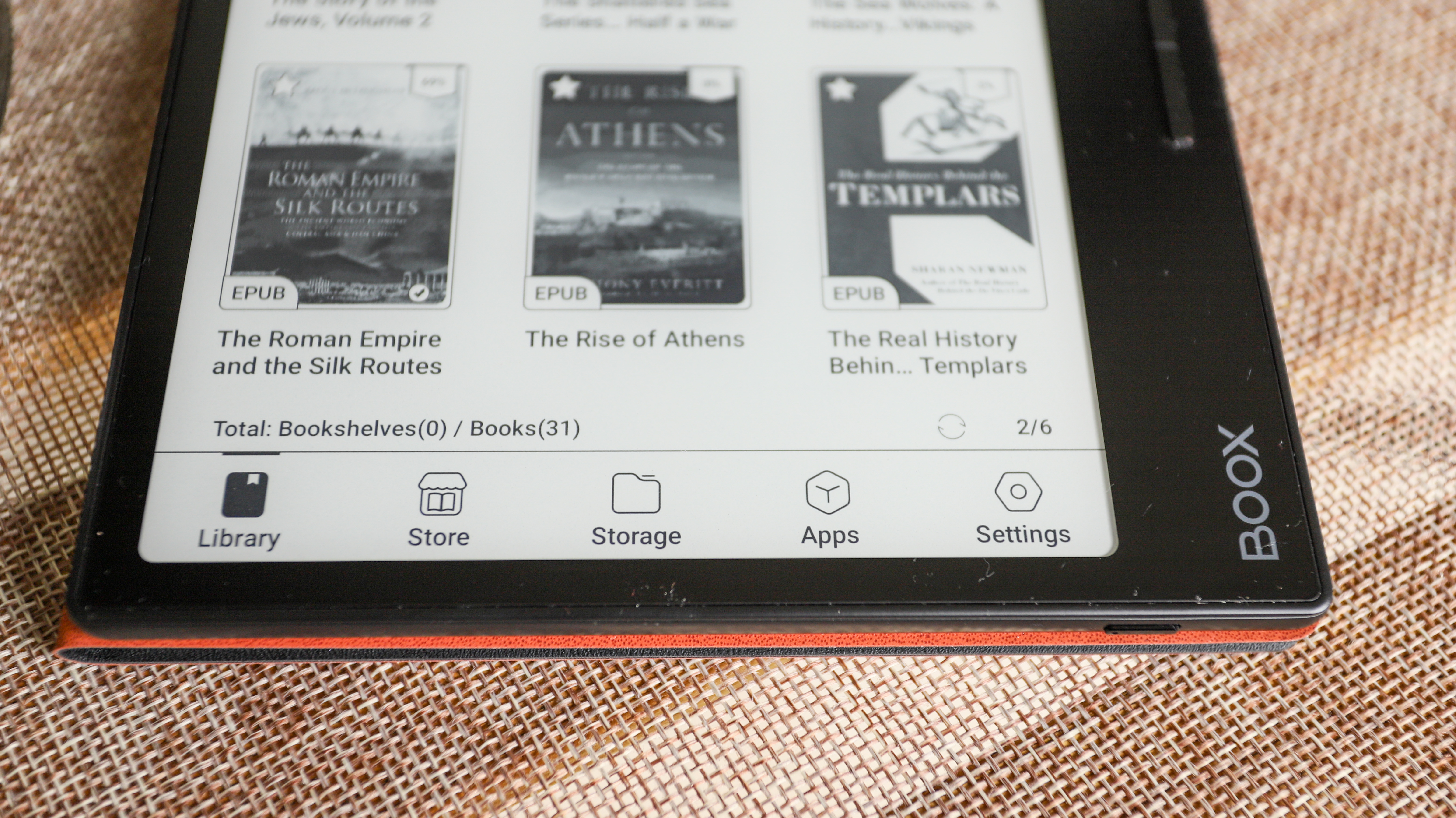
As with most Onyx ereaders, the user interface takes a little getting used to – it’s not as intuitive as, say, Kindle or Kobo, but you do get a lot of control on how you want your e-paper tablet set up.
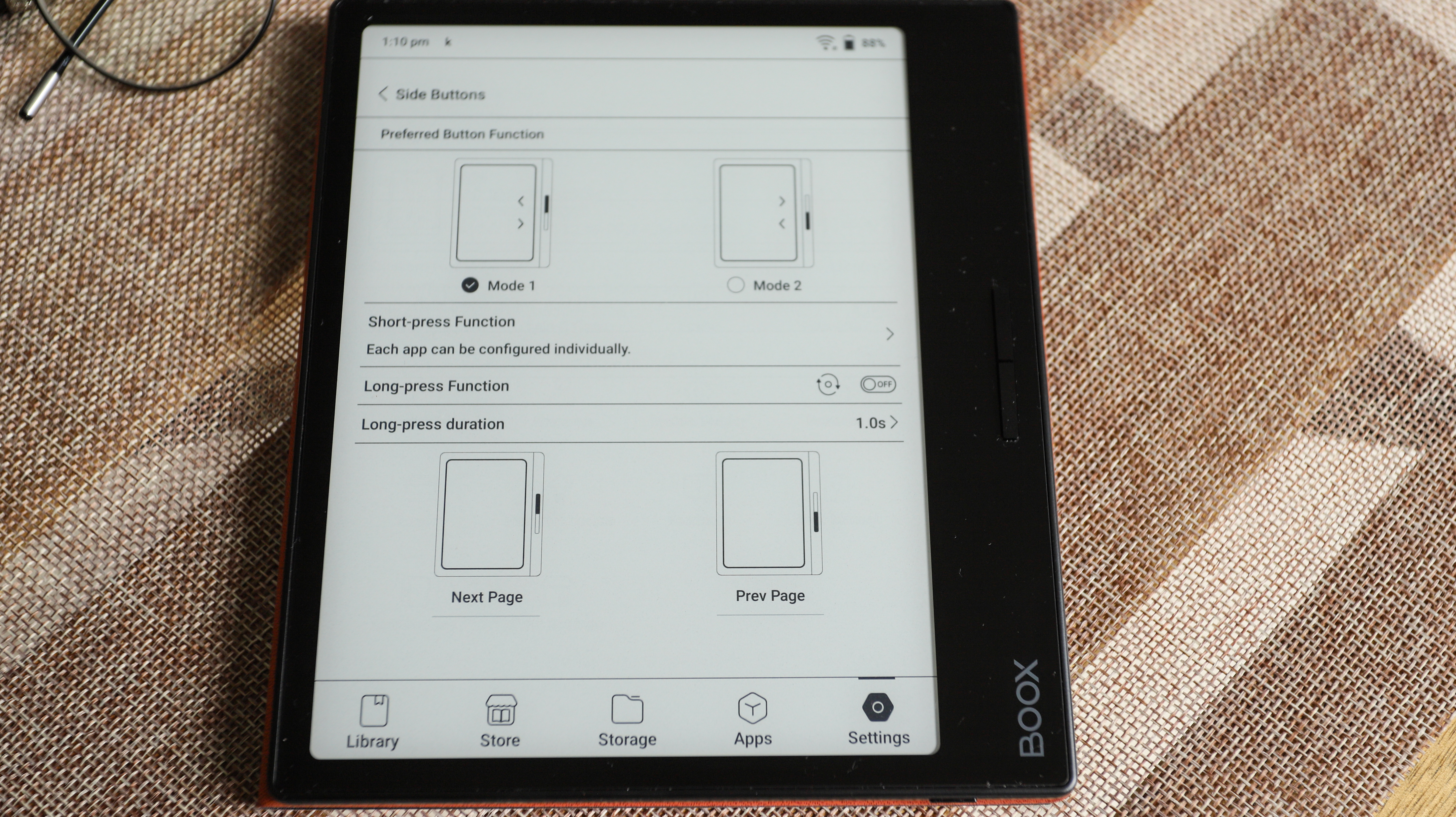
For example, you can set the page-turn buttons to scroll instead of turn a page, and they also double up as the volume controls when you’re listening to an audiobook or music (which you can sideload, and there’s a dedicated player too).
By default, the screen is set to refresh after every five taps, but this can also be changed as you see fit. I had mine set to refreshing after every tap, however, as I found ghosting can be an issue, and it also meant any overlay from the Control Center dropdown would disappear immediately too. This, though, can affect battery life and, if you don’t need the Control Center too often, leaving screen refresh rate at five or 10 taps will help push the charge for longer.
You can choose what you see as soon as you wake or power on the Onyx Page (default library, the apps page, store, etc) and set up on-screen gesture controls as well. I personally think that Onyx’s customization options are overkill for basic ereaders like the Page, but it’s also nice to know they’re there.
Speaking of the Control Center: this is where you get shortcut access to a lot of controls, including Wi-Fi and Bluetooth connectivity, plus volume and frontlight adjustments. To access the Control Center you just swipe down from the top right corner of the screen. This is also where you get other options, like setting the device to airplane mode, auto-rotation controls and a screen recorder. There’s also a Kids’ Mode option that allows you to set a screen password, but keep in mind that you cannot reset this password once set.
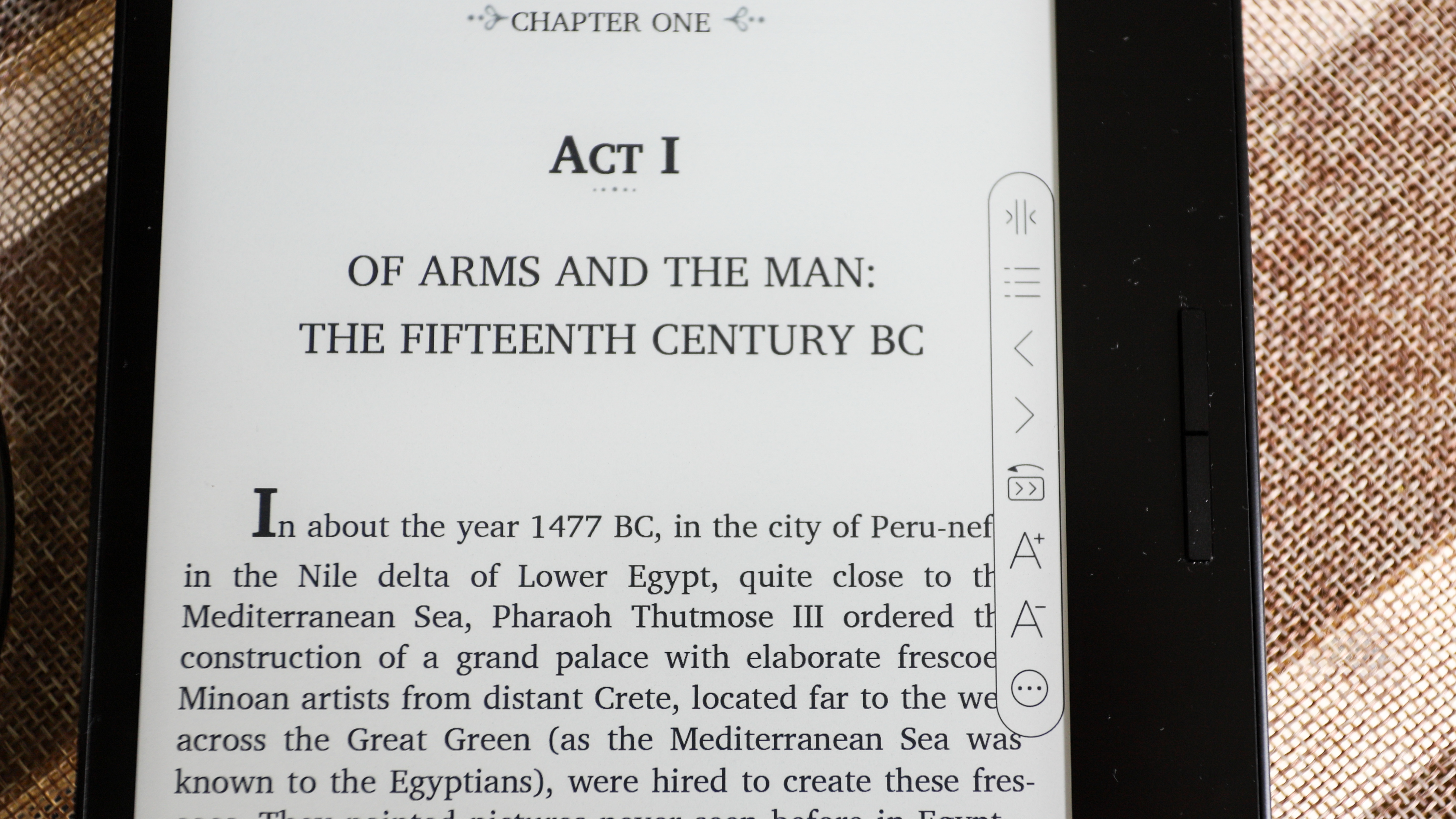
Within the default library application – where all ebooks are automatically stored when you sideload – is a floating toolbar that gives you easy access to font and page controls. This, too, can be customized to include the shortcuts you will actually use within this application. The floating toolbar isn’t available outside of the default library application however.
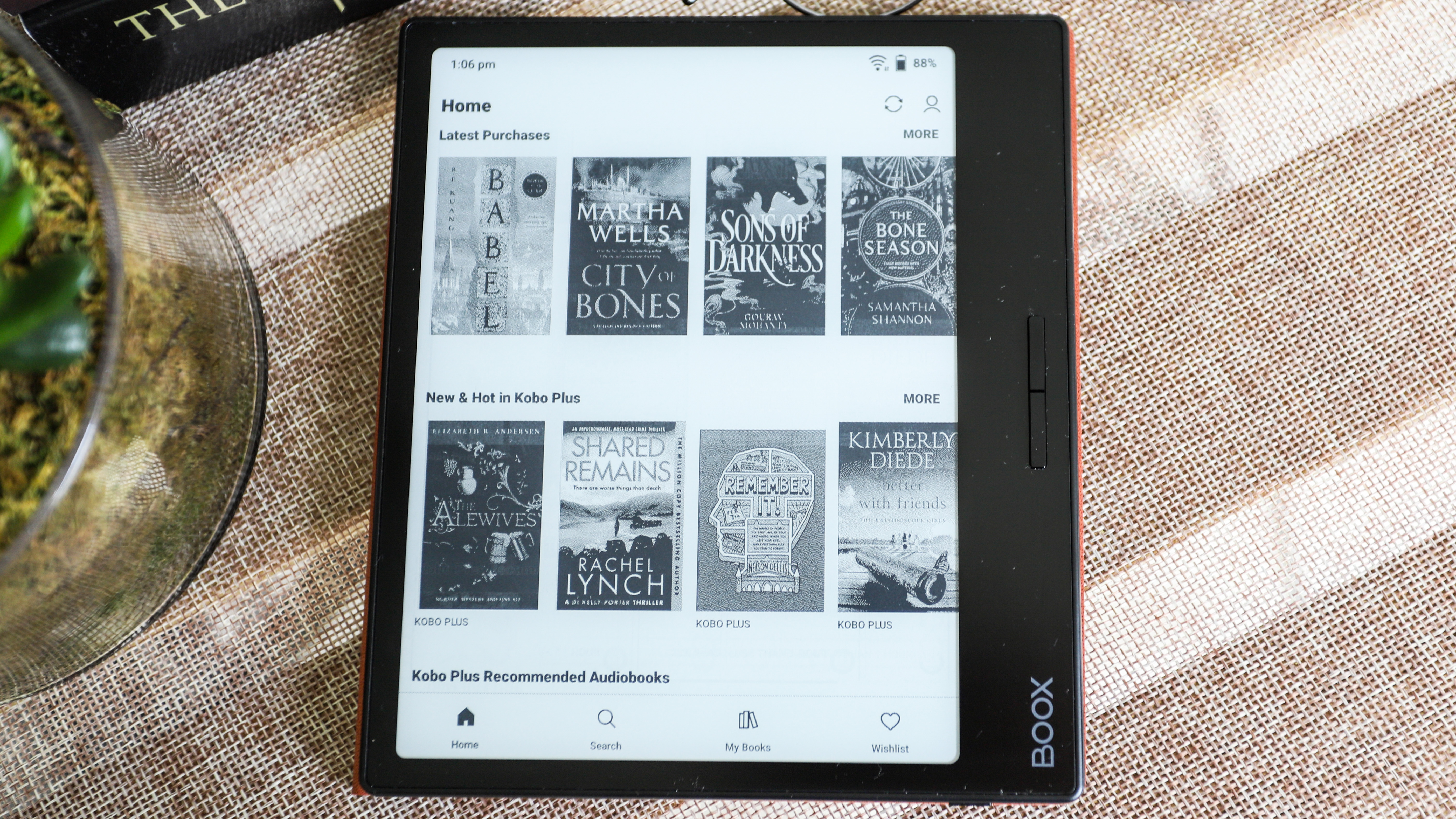
As I’ve already mentioned, this Android tablet gives you access to the Google Play Store, from where you can download handy apps. In my case, it was the Kobo and Kindle apps so I could access not only the respective bookstores but also my existing library on each, as well as the ebook subscription services I pay for (Prime Reading and Kobo Plus in my case). While you can’t move your purchased content to the default library application, you can read within the app, but without the advantages of the floating toolbar.
The Onyx Boox Page allows you to sign into select cloud services, which is handy if you have an existing library you want to sideload onto the device. This includes Dropbox and Google Drive, but if your files aren’t on any cloud storage service, I found using BooxDrop was the best option to transfer content. You don’t need to create an Onyx account – you can use your mobile number to receive a verification code, then drag and drop what you want transferred onto the web version of the application.
Like I said, there’s a lot here to wrap your head around and it takes some experimentation, but once you’ve found the best setup for you, the Page can be quite enjoyable to use.
• User experience score: 4 / 5
Onyx Boox Page review: Performance
- Remarkable battery life
- Quick page turns and responsive screen
- Ghosting occurs intermittently; occasionally significant when using the Control Center
When it comes to overall performance, it’s hard to fault the Onyx Boox Page. Reading is a good experience, with page turns working well via both screen taps and the buttons. Text appears nice and sharp, although if what you’re reading has low-resolution images, they can appear a little fuzzy.
I found sideloading files (ebooks and music) via Google Drive and BooxDrop was very easy; while I didn’t try signing into my Dropbox account, I reckon it’s just as simple and quick.
The speakers, though, aren’t anything to write home about. They’re fine for listening to audiobooks, although they don’t get too loud, but music doesn’t sound great. Pairing a set of Bluetooth headphones with the Page was easy when I tried it and I found that using headphones or a paired speaker to be the better listening experience for both audiobooks and music.
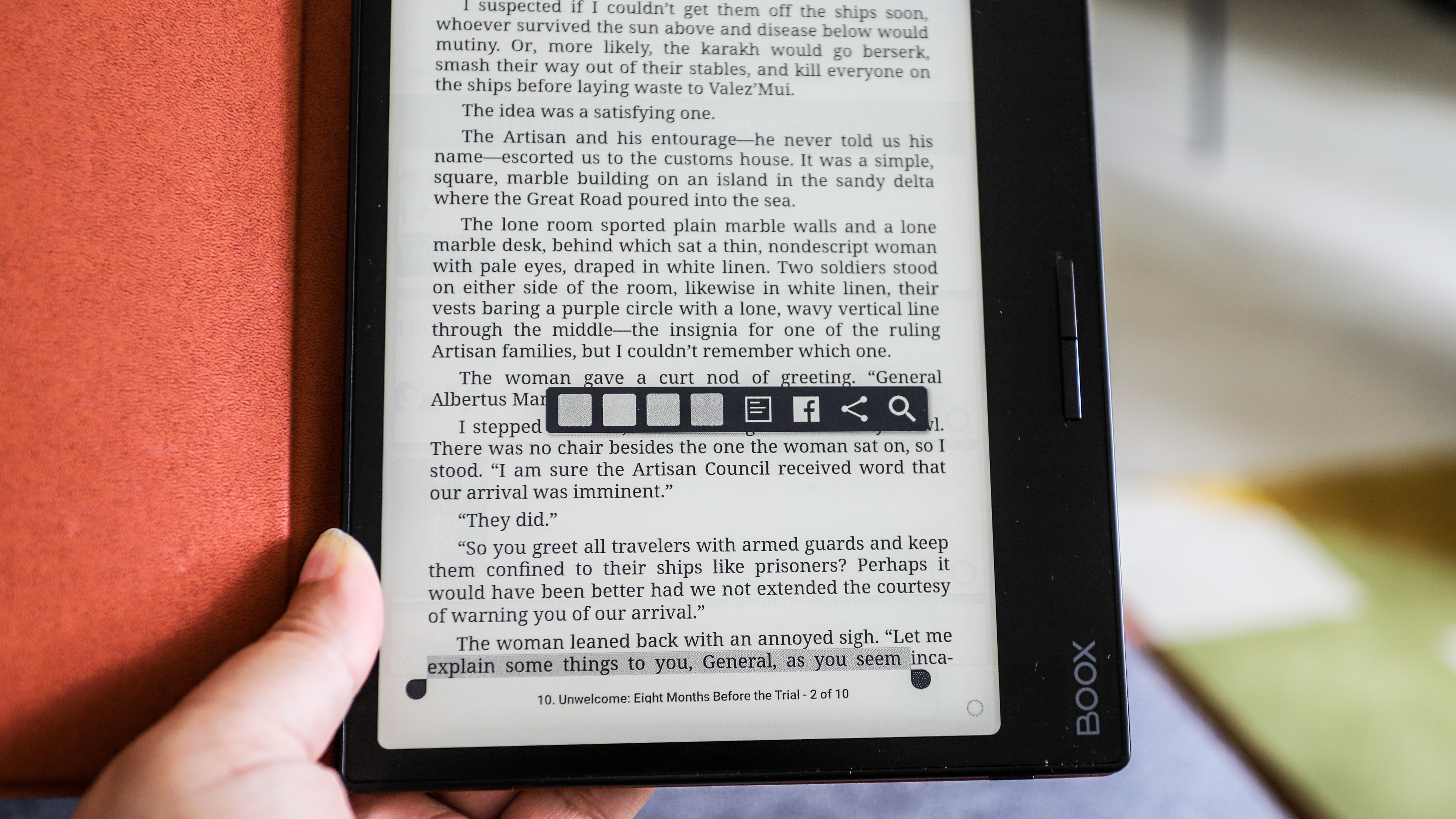
Ghosting can occur occasionally if the ebook you're reading has images in it, but the most significant problem is the dark overlay of the Onyx Control Center as I've mentioned before. While it doesn't occur all the time, it happened often enough that I changed the refresh rate to be after every 1 tap from the default 5 taps. This is my only complaint when it comes to performance and it's not isolated – a lot of the Onyx ereaders I've tested do have issues with ghosting.
Where the Page really excels is battery life. It houses a 2,300mAh pack and that can last you about six weeks with an hour of reading each day. I had my review sample of the Page set to 40% brightness and approximately 25% yellow light, refresh rate set at 1 tap and Wi-Fi always on to access my Kindle and Kobo accounts. I also used the device for an average of two hours and got about 4.5 weeks of reading till it dropped to 10% battery. My battery life test also included a few minutes of web browsing using the built-in browser app, as well as listening to audiobooks on the Kobo app.
Topping up for me was just as good – I had it plugged into a 65W GAN wall charger via good quality USB-C to C cable and it took about an hour and 20 minutes to go from 9% to full.
Performance score: 4.5 / 5
Should I buy the Onyx Boox Page?
Buy it if...
Don't buy it if...
Also consider
The closest competitors to the Onyx Book Page are the Kindle Oasis and the Kobo Libra. While both these options are now aging, they're still excellent alternatives and we've listed direct specs comparisons below.
How I tested the Onyx Boox Page
- Used as main ereader for about eight weeks
- Read for about two hours a day, with some ad hoc listening sessions
- Use the device to browse the web and download Android apps
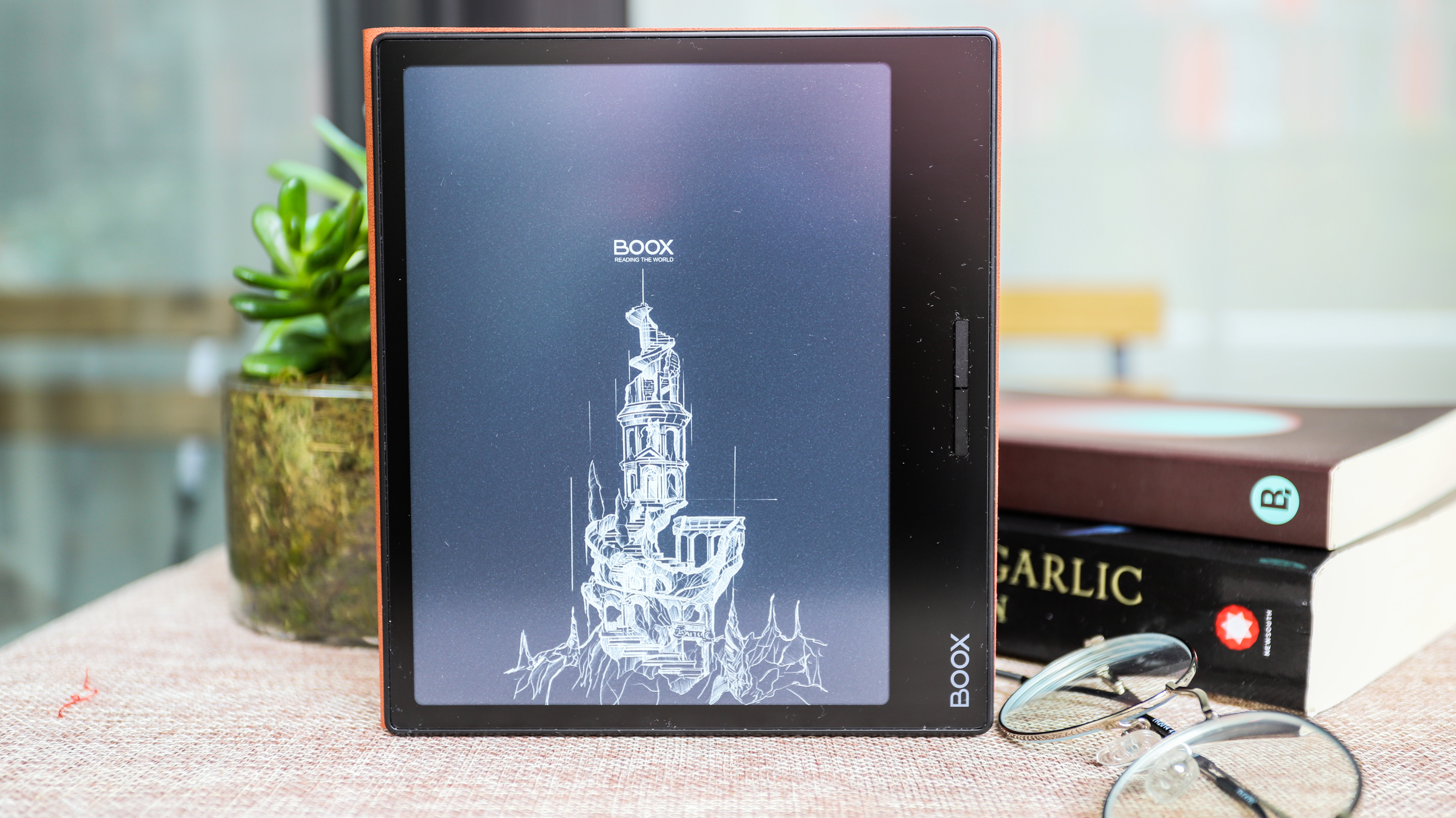
I am a voracious reader, so reading every single day for at least an hour or two is normal for me. So I just switched out my usual ereader for the Onyx Boox Page for a period of about eight weeks.
During this time, I averaged about two hours of reading each day, although every once in a while I listened to an audiobook for about 20-30 minutes on the Kobo app, which I downloaded via the Google Play Store that is already available on the Page.
I also downloaded the Kindle app to access my purchased content there.
I signed into Google Drive to sync some ebooks I already own, plus used BooxDrop to sideload other content, including music files, which I also listened to intermittently without headphones. Most of my listening sessions, however, were via a set of paired Bluetooth true wireless earbuds.
I used the default browser occasionally as well and kept tabs on battery drain as I performed different tasks on the Onyx Boox Page.
Read more about how we test
[First reviewed December 2023]
0 comments:
Post a Comment