Tommy Hilfiger TH24/7 You
The 'designer' smartwatch category is one of the most burgeoning areas of wearables at the moment, so it’s easy to see why a watch such as the
Tommy Hilfiger TH24/7 You exists.
Attach a brand to a gadget and it immediately attracts a customer to a market that they may not be that familiar with. Alongside this, there is a certain amount of expectation when a designer brand is involved in terms of the quality of the product.
The Tommy Hilfiger TH24/7 You wins precisely no stars when it comes to its nomenclature but the watch itself has been made by some tech and timepiece heavyweights.
Movado - a fantastic brand itself - has been creating watches for Hilfiger since 2001. It’s a company that also creates watches for Hugo Boss (the Hugo Boss Touch), Guess and Lacoste. It’s safe to say, then, that the design of the timepiece is in safe hands.
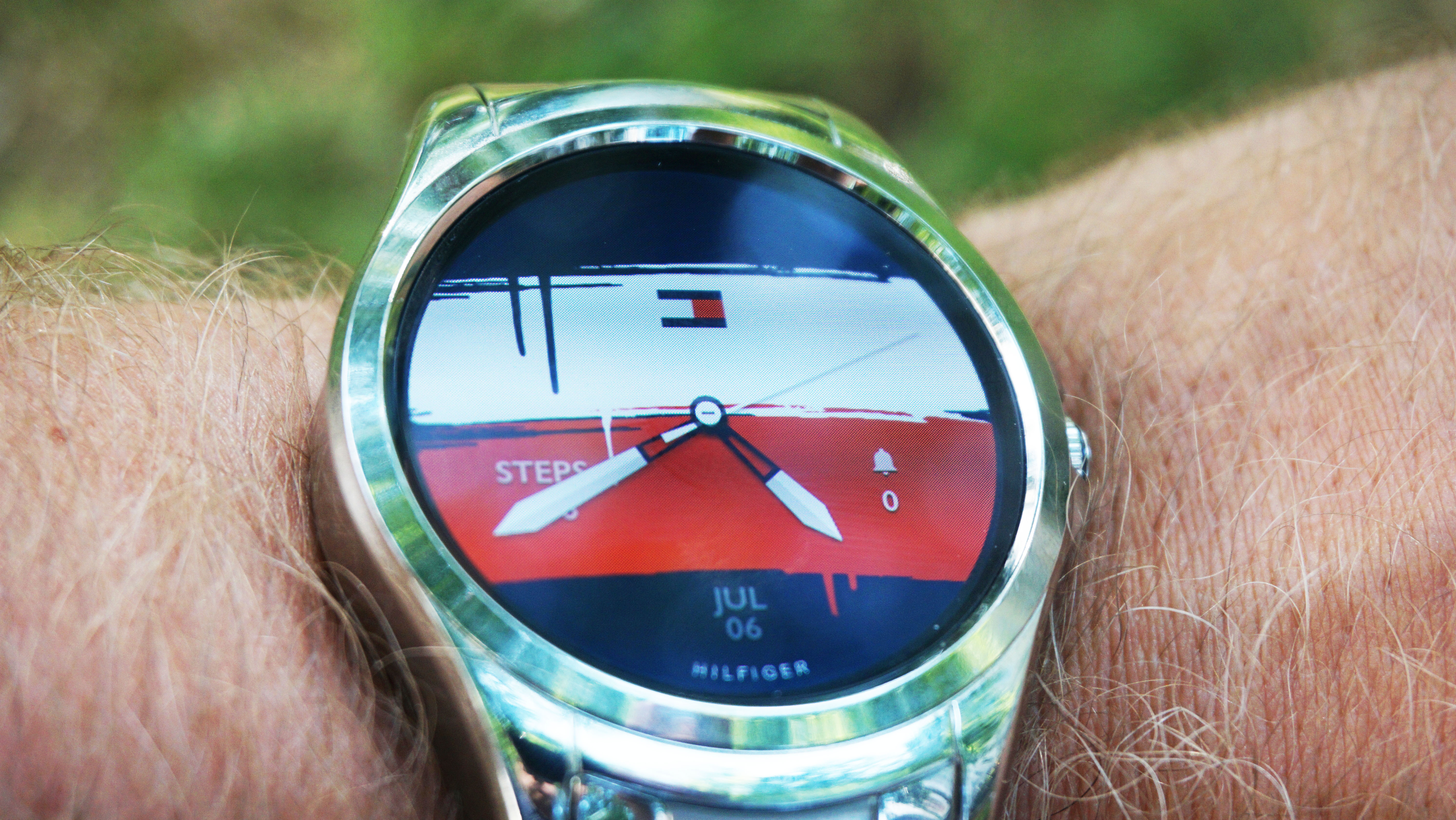
That’s the watch part. The smart, connected part is powered by HP - given it's got a partnership with Movado, it also powers the Hugo Boss smartwatch. Then there’s the other familiar layer of Wear OS. Mix all of this together and what you have is another safe, fine-looking smartwatch that’s also frustratingly missing some key features.
Tommy Hilfiger TH24/7 You price and release date
The Tommy Hilfiger TH24/7 You is out now - it was first announced at Baselworld 2017 - and has an RRP of $299/£289 (about AU$400) but if you shop around you can certainly get it a lot cheaper.
The version we tested came with a stainless steel strap but there is also a brown leather strap version available.
Design and comfort
The Tommy Hilfiger TH24/7 You has all the design quirks we have come to expect with a smartwatch. Its circular screen is cut into the device, so there’s a lip between the bezel and the chassis - it’s not as deep as we have seen on other models but it is enough to protest the screen from accidental knocks.
There’s a great, curved design to the chassis that envelopes the wrist and on the right side is a crown but this is a bit of a cheat. It’s been designed to look like a rotating crown but it is actually static, just there to hold the button in place. On the base of the button is a the iconic Hilfiger 'H'.
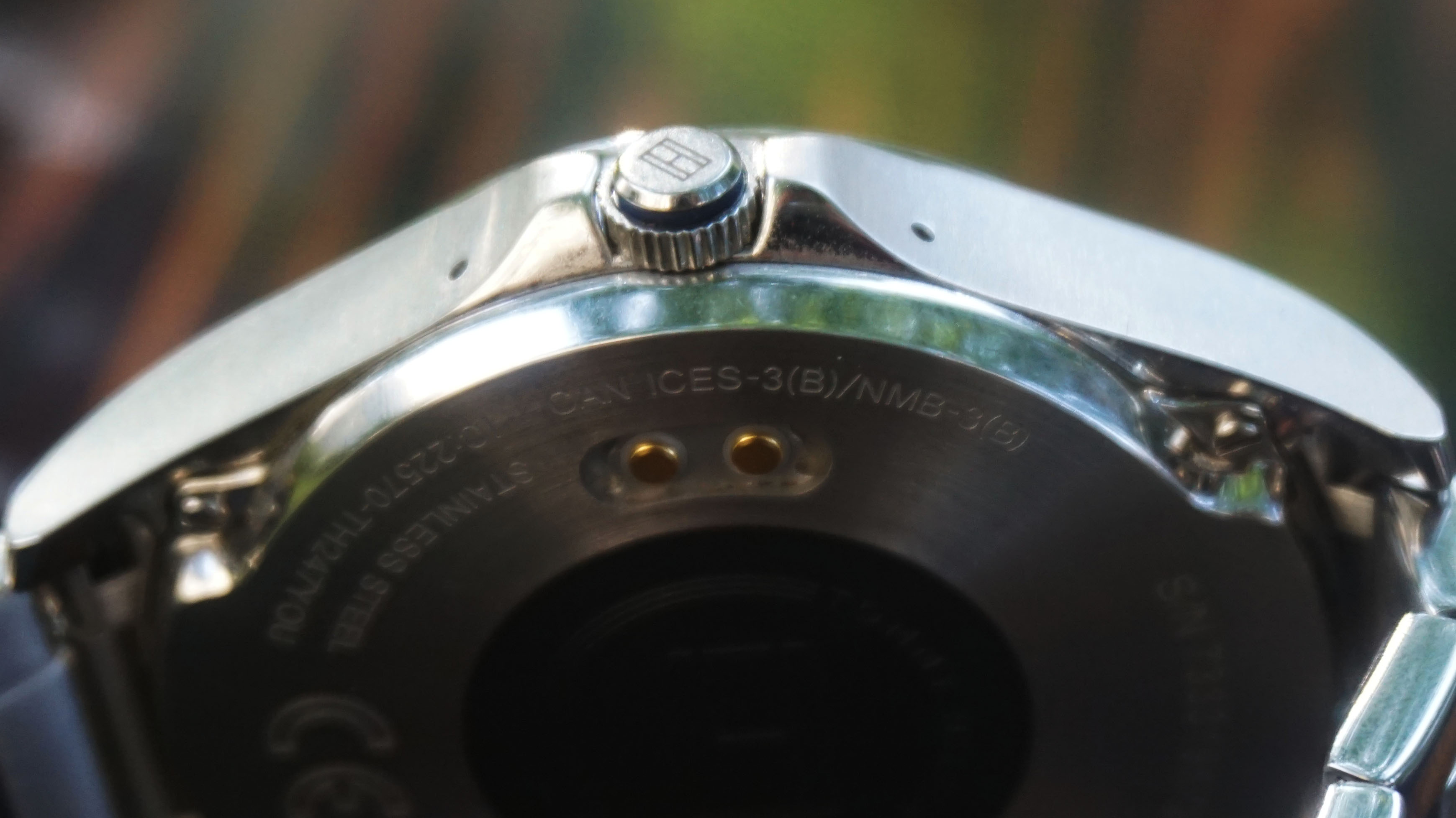
The design of the watch is close to some of the ranges that Hilfiger has released in the past. Surprisingly, though, it doesn’t look much like the Tommy Hilfiger TH24/7, a smart/analog hybrid which was the company’s first foray into smartwatch territory.
The stainless steel strap is well made but feels a touch thinner (thickness, not width) than some of the straps we have used on other smartwatches. It is also slightly squeaky.
While this did stop after having the watch on the wrist for a few days, it was a touch irritating. If you do go for the metal strap, then expect to have to get a number of links taken out of the thing.
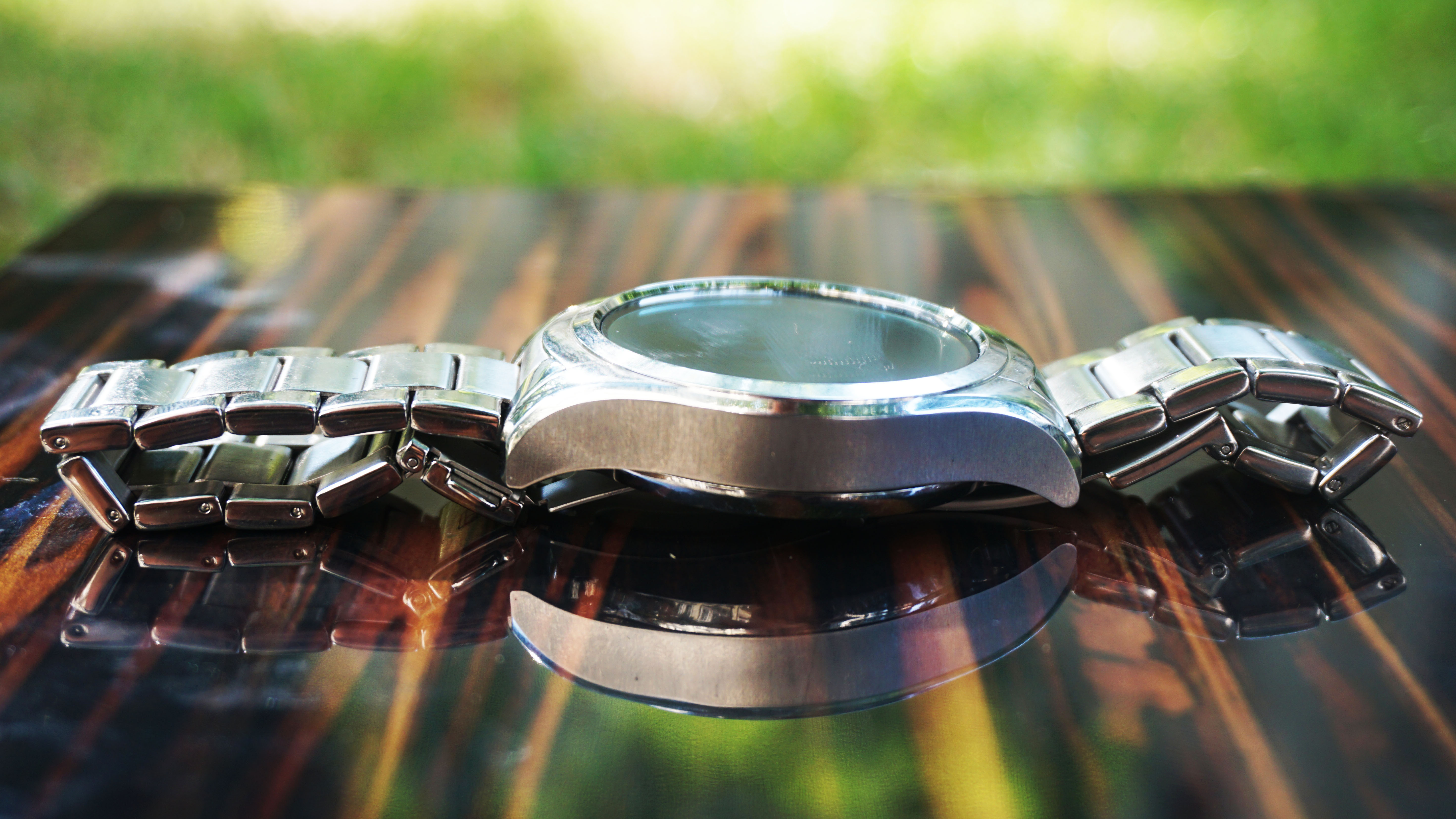
Flip the watch over and you have the familiar two charging dots and and a circle of plastic in the middle.
It’s a well-made, solid watch that has a rather thick bezel that makes it a little weighty. But it makes sense given the watch face is a sizeable 45mm.
Display
We have no qualms about the Tommy Hilfiger TH24/7 You screen. We also have no information about the screen - this is also the situation with the Hugo Boss Touch. Both screens, however, both are bright and caused us no issues viewing them in bright light or a dark room.
Testing the screen in the bright light of a British summer - stop laughing, there is such a thing - we never had to squint to see the detail on the screen.
Tommy Hilfiger’s insistence on digital watch hands is a boon too (if you decide to keep the branded watch faces) as it’s easy to see the time at a glance.
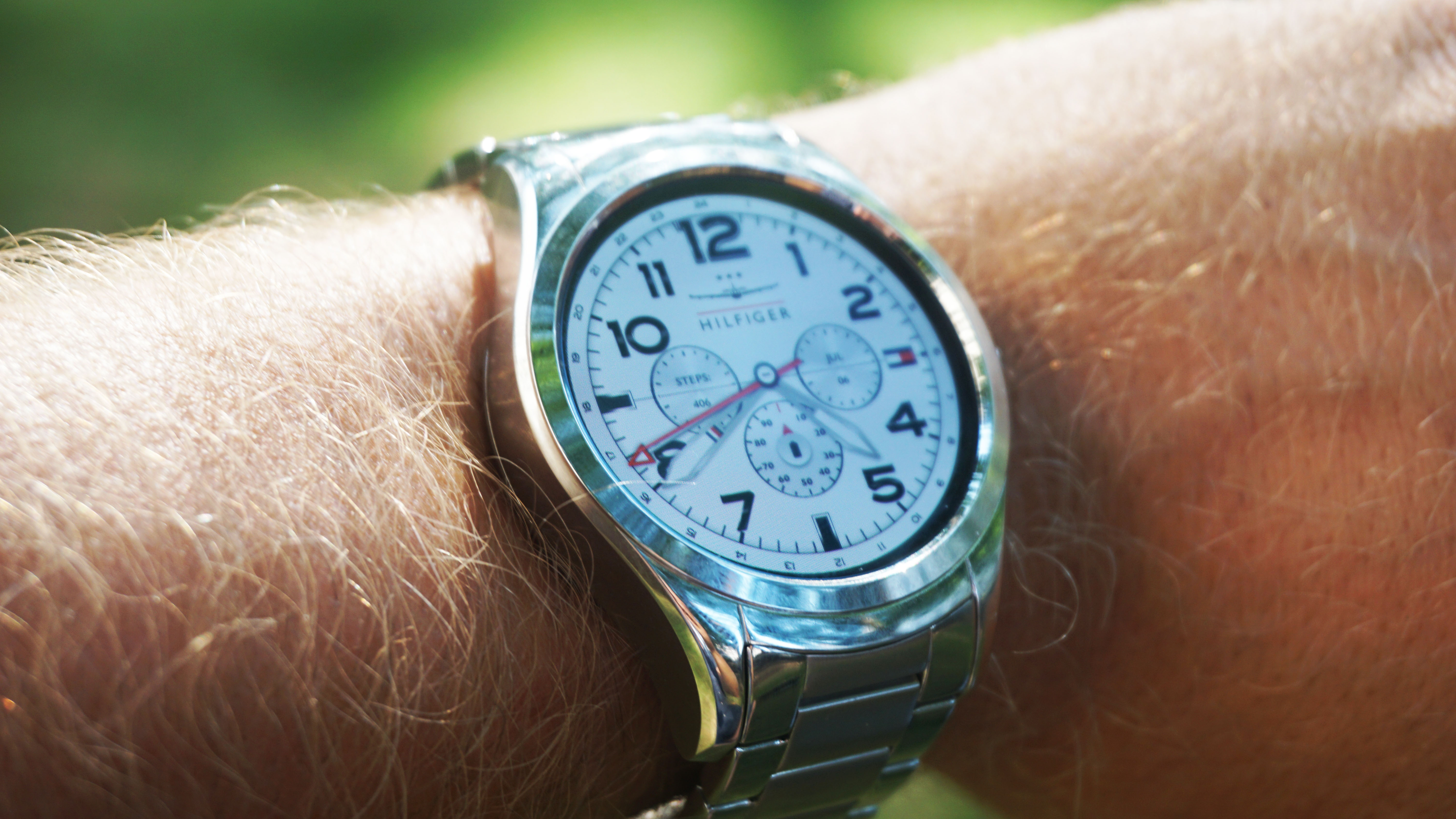
The watch face worked well with our wrist action, too. Stop it. We never had to wait for the watch face to illuminate, as the gesture of moving our wrist to our face (again, stop it) meant it woke when needed.
It does this as a two-part process too on a number of the faces - the watch’s hands appear over a black screen, then the screen appears underneath.
As this is an Wear OS watch, you can have the screen always on if you want but we never felt the need to choose this feature. The screen is a full circle screen too (encased in a shell diameter of 45mm, with a height of 13mm) there’s no flat tyre in sight.
The face that comes as standard with the watch is quite a, er, statement. An animation of thick-brushed paint strokes of blue, white and red take swipe over the screen revealing the Hilfiger brand. It’s a fun watch face to have and one that screams Tommy Hilfiger but there are far more subtle screens for those who don’t want their watch completely on brand.
Specs and performance
It will be of no surprise to those who have kept their ear to the wearable ground that the Tommy Hilfiger TH24/7 You comes with a a Snapdragon Wear 2100 chipset. This is the chip that is in the majority of watches of this type and offers enough grunt to get the watch through the majority of tasks, without any dreaded stutter.
Saying that, this is a chip that’s starting to show its age - it’s been around for two years now. So we would have preferred something more of an upgrade.
None of the mid-range manufacturers seem to be jumping to a rival such as Intel Atom, so we are stuck in a bit of a holding pattern for now. We didn’t spot any noticeable performance problems that detracted from our enjoyment of the watch, however.
This is probably more to do with Google making sure that Wear OS works well with a chip that’s the mainstay for most wearables in the market at the moment, than anything fancy HP has done behind the scenes.
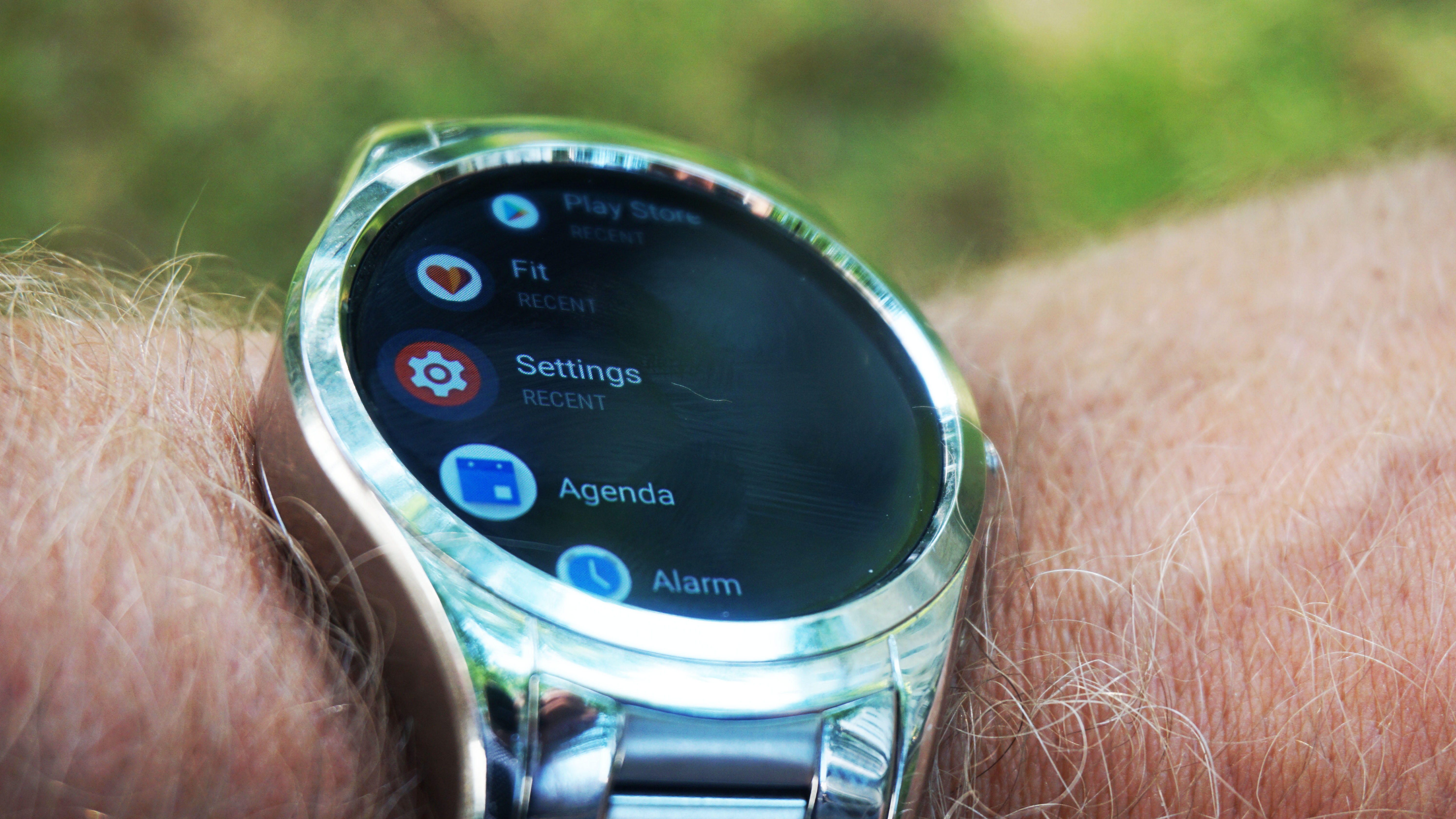
There is only one button on the Tommy Hilfiger TH24/7 You and that is situated in the fake crown. Press it once when you are on a screen that isn’t the main interface and it brings up a cascade of apps, services and Google Play - so you can customize your Wear OS experience as you wish - a longer press summons Google Assistant.
The rest of that navigation is done via the screen. While this leaves inevitable fingerprints, it’s a fairly smooth ride. Swipe left and it will offer up the ability to change the screen from something Tommy Hilfiger branded to screens that are a little bit more subtle. There’s also a cog that you can press to choose the Complications. These are the bits of additional information you want to see on the screen - step count, notifications etc.
Swipe up and you get the current app you are using, continue to swipe up and it will go through other notifications, such as emails and texts received, until you get to a screen where you can clear up the notifications.
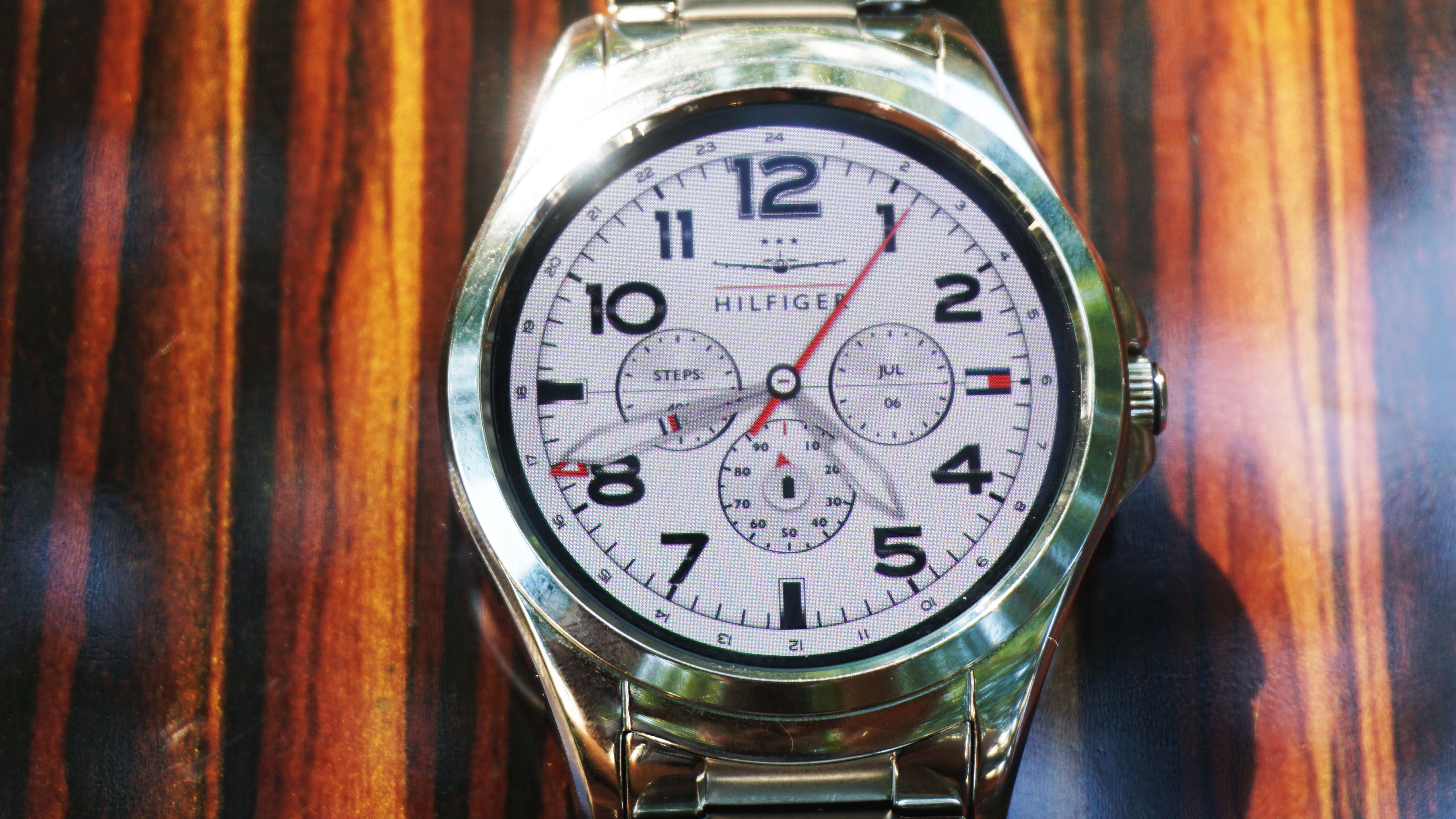
A downward swipe get you to a notification panel for settings, turning the screen off, screen brightness and putting the watch in flight mode. It’s here you can see how much battery is left as well.
As a conduit to your phone, the Tommy Hilfiger TH24/7 You is a great device but try and do anything more and the cracks start to appear. There’s no NFC for a start, so that rules out mobile payments. The smartwatch doesn’t have LTE or GPS, either, so that rules out using it as a true standalone running watch. The step counter is good, though, but we found ourselves leaving this smartwatch in our gym bag, rather than keeping it on during a workout.
When it was on, there’s no heart rate monitor either to help us make sure we are training effectively.
Battery life
Tommy Hilfiger TH24/7 You is also disappointing when it comes to battery life but it's nothing we haven’t come across before. If we didn’t charge it nightly then it was by sheer good luck that the thing was still charged for us by the end of our commute the next day. It was made even worse when we turned the screen to ‘always on’ (again, this was to be expected though).
We have definitely seen better batteries on a smartwatch and it is an area that lets the rest of the watch down. Yes, we are well versed in charging our phones everyday but there is something about a smartwatch that makes you pine for more juice.
The Tommy Hilfiger TH24/7 You doesn’t have any warning mechanism (well, not one that's automatically turned on) either to let you know it is in need of a charge.
There’s nothing worse than finding out your smartwatch is dead when all you want to know is the time. It’s like putting your hand into a bag of sweets and finding out you have already eaten the last one.
Verdict
Most smartwatches fall into two categories: fitness and fashion. Those that manage to straddle these categories are in the minority and the Tommy Hilfiger TH24/7 You isn’t one of them. But that’s okay. As a fashion-focused watch it’s great-looking, it uses Wear OS well and won’t let you down when you need an at-a-glance look at your busy life.
The Tommy Hilfiger branding on the chassis is subtle but you can amplify this through the screen, depending on what watch face you go for. We reckon most will want to do this, as what’s the point of buying a branded smartwatch if you aren’t going to show off the brand?
Who’s this for?

Fans of the Tommy Hilfiger brand and those who want their smartwatch to be more watch than smart will want this watch. If you are looking for something fitness focused and packed with features, look elsewhere.
Should you buy it?
If you want your wearable to be an extension of your phone and not a replacement, then the Tommy Hilfiger TH24/7 You is a great wrist warmer. You can definitely get more for the price elsewhere (unless you seek out a discounted version of this watch) but you are paying for the Tommy Hilfiger branding here.
First reviewed: July 2018
The competition
Don't think the Tommy Hilfiger is designed for you? Below we've put together some alternatives you may want to consider.
Samsung Gear Sport review
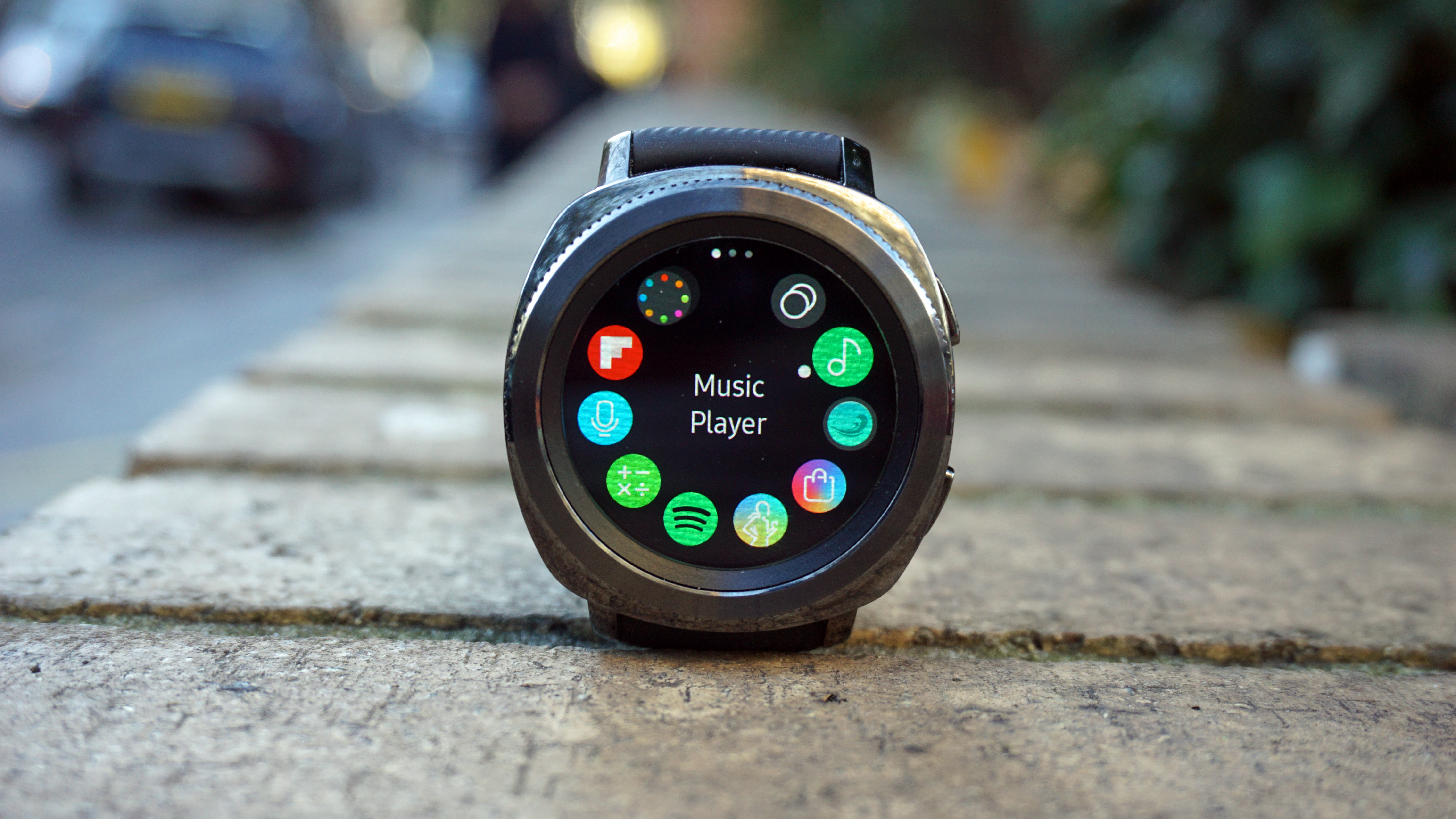
A good-looking watch that benefits from having GPS, the Samsung Gear Sport may well soon get usurped but if you are looking for a smartwatch with looks and specs appeal, then this is it.
Read our Samsung Gear Sport review
Huawei Watch
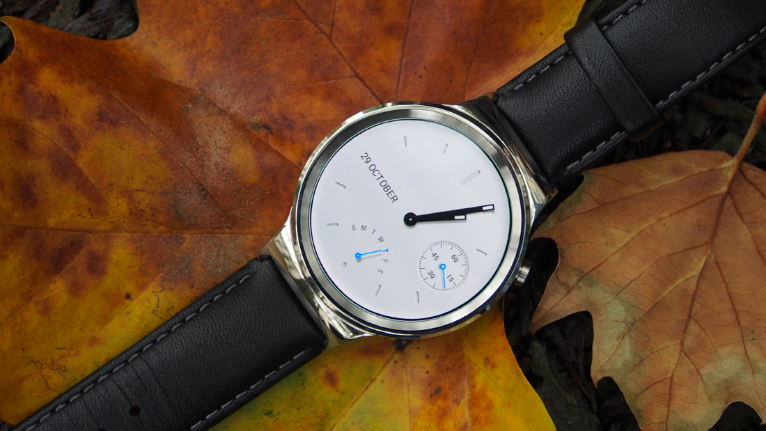
One of the most elegant smartwatches around, the original Huawei Watch blends traditional watch aesthetics with smarts. This again doesn't feature GPS and it hasn't been upgraded to Wear OS, so this may not be a watch you can use for years and years.
Read our Huawei Watch review
Emporio Armani Connected
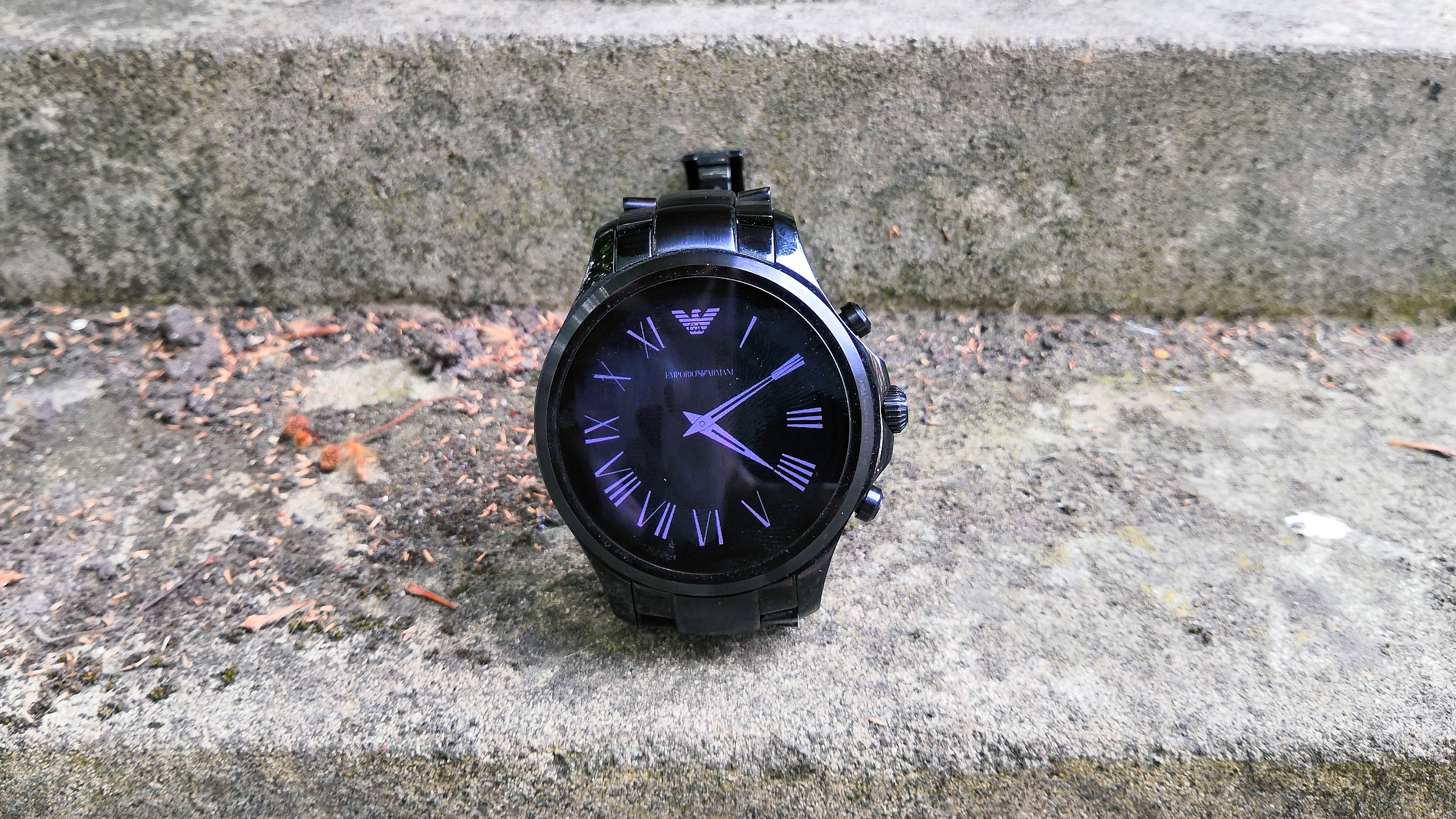
Another branded smartwatch that looks fantastic on the wrist but doesn’t quite cut it in the specs department. If we were to compare, though, the Emporio Armani Connected just about edges the Tommy Hilfiger TH24/7 You in terms of looks and performance. Only just, though.
Read our Emporio Armani Connected review
0 comments:
Post a Comment