Honor View 20
Honor is a brand that’s been coming up on the rails for a few years now, packing decent tech at a lower price point than many of its rivals. However it’s never really been able to grab the headlines when it comes to real technological innovation – but that’s changed with the Honor View 20.
The new handset was the first to be unveiled with both the ‘punch-hole’ display (the front-facing camera no longer in a notch, but just a small hole in the screen) and a 48MP camera, the first in the world to hit those megapixel numbers on a smartphone.
The proof, as ever, of technological innovation is not in the numbers though, but in the way a phone feels in the hand – and it’s the design of the Honor View 20 that’s arguably more of a headline-grabber.
Design

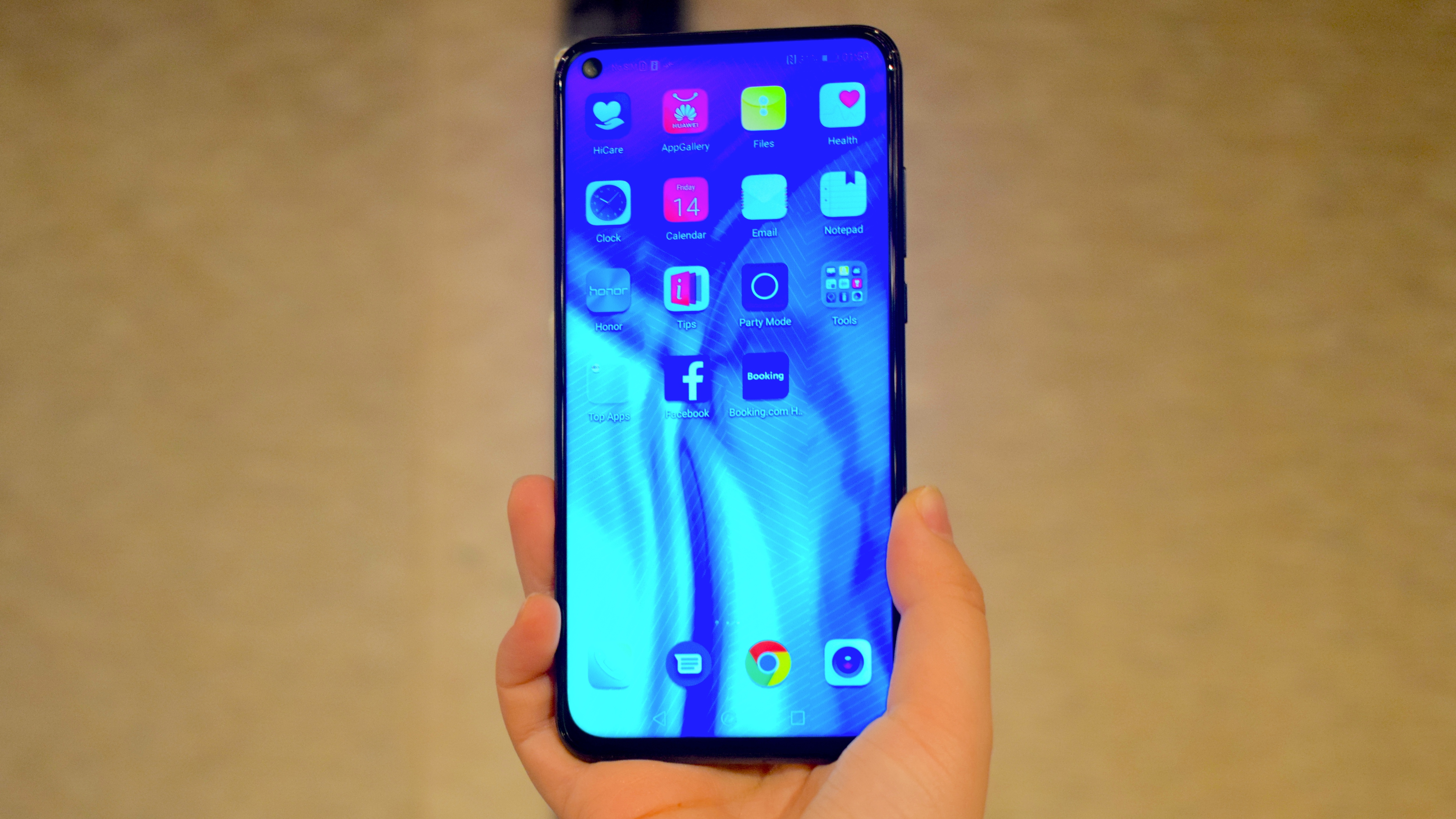
The Honor View 20 is nearly all screen on the front, with minimal bezel around the sides, so aside from the punch hole at the top there’s little to mark it out visually when it’s in the hand.
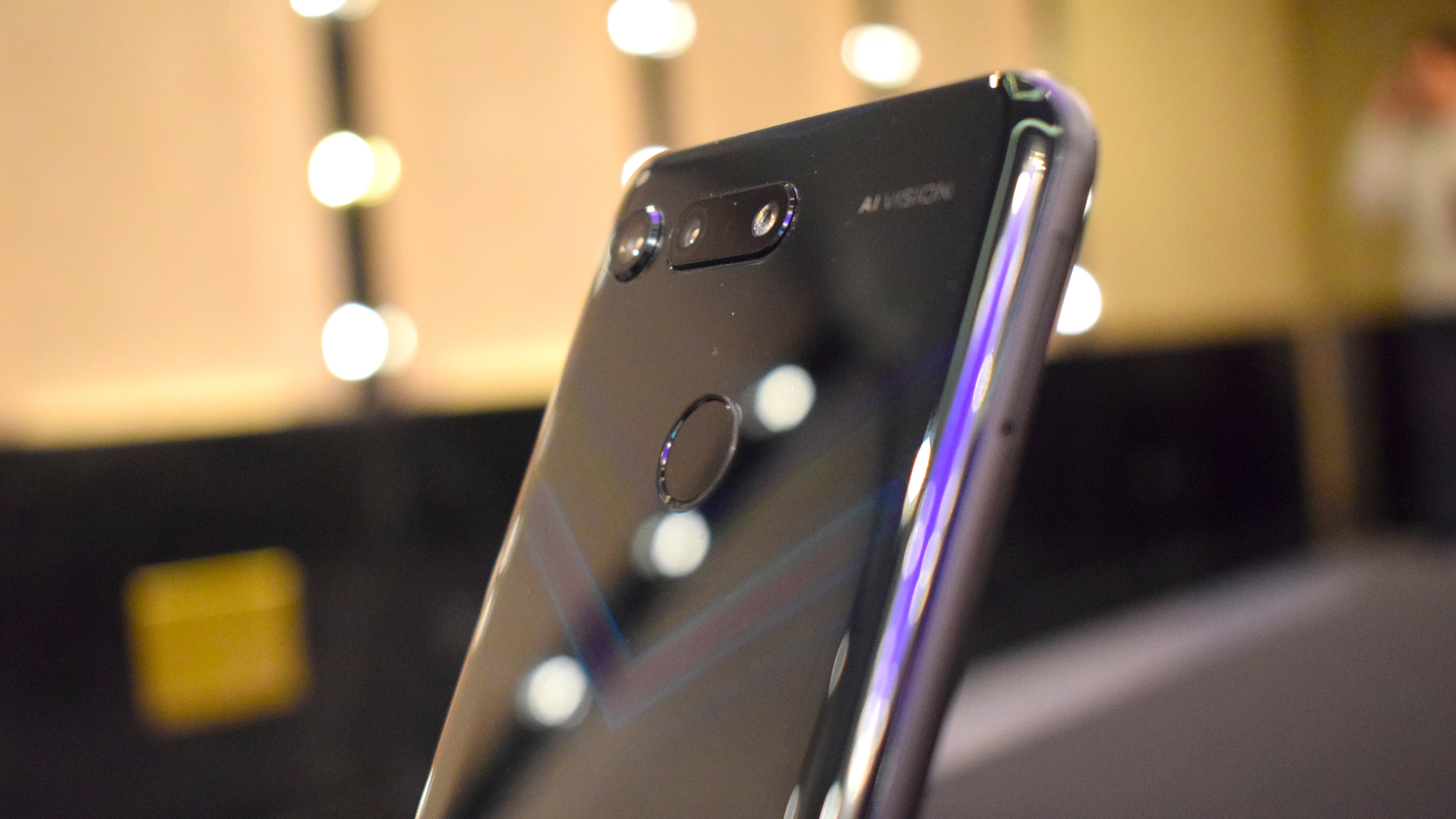
Perhaps to compensate, Honor spent time creating a new visual design on the back, which results in a kind of ‘cascading V’ as you tilt the phone forward and back into the light.
This means the View 20 looks incredibly impressive when the light catches it – the black model in particular catches the eye with an almost neon, 8-bit look. It’s reminiscent of the ‘80s revival that’s going on… think Stranger Things bashed into a phone design.

As on other Honor phones the volume and power buttons on the same right-hand side, which is fine and feel like they'll be comfortably reachable for most users. The rear is slightly curved to allow for the larger 4,000mAh battery inside, but the phone sits just fine in the hand.
The single speaker at the bottom fires out sound at a decent volume, but the lack of dual speakers on a phone this technologically advanced feels like something of a miss – as does the fact that it’s not water-resistant to the same IP67 / 68 levels as many of its flagship rivals.
What it does have as an advantage over the competition is the headphone jack; it’s on the top of the phone, rather than the bottom, but for many people this is going to be a reason all of itself to buy the View 20.
Screen
The 6.3-inch LCD display of the Honor View 20 is, as mentioned, quite distinctive, with the small hole punched out in the top-left corner.
Honor went to great pains to tell us that this aperture was made smaller than it might have been, to take up less visual space on the screen. This was achieved by Honor actually combining the hole within the layers of the LCD itself, rather than just drilling a space in the pixels and being done with it.
This allowed for a thinner construction, a more tightly integrated camera and, as a result, less light bleed around the edges.
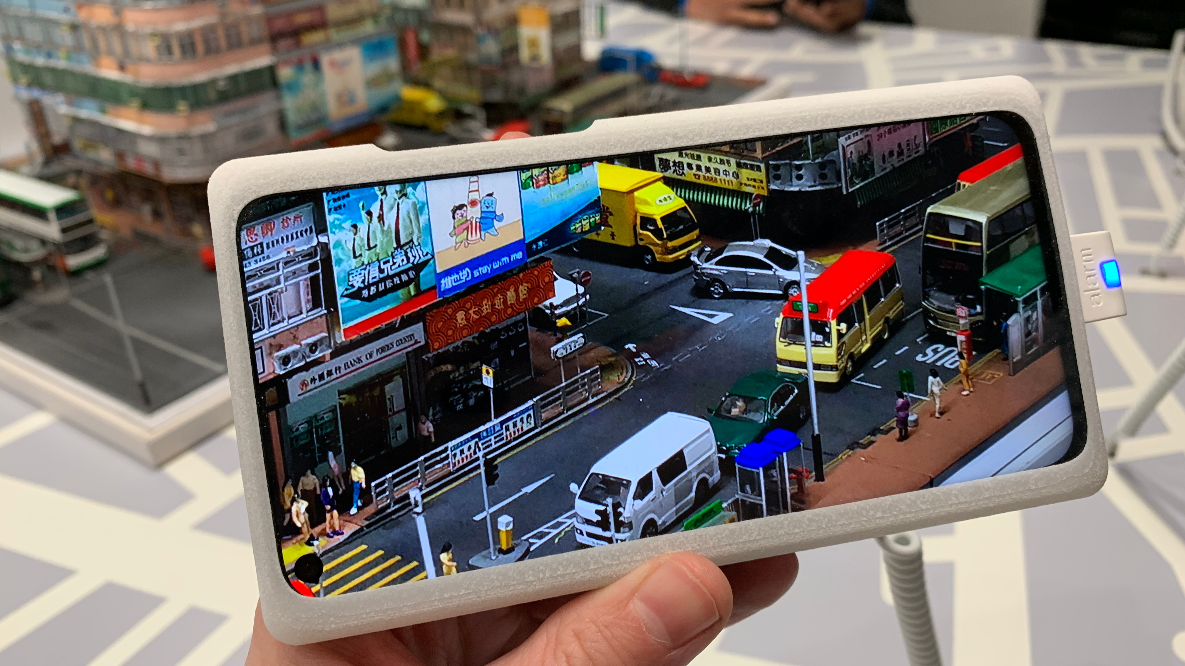
The resolution is a longer version of Full HD, with a 19.25:9 screen ratio – so watching standard movies and TV shows may be a little irritating, as you’ll have black bars left and right.

There was no dedicated content to view on the demo device we were trying out, but it’ll be interesting to see just how annoying the punch hole is when you’re trying to watch content. Will it get in the way of key things? Or will it be like the notch, where it’s irritating to have it in the eyeline, but it doesn’t really obscure too much of the movie you’re trying to watch?
One of the reasons for the punch hole placement is that it’s a spot Honor believes gamers will naturally cover with their hand, thus giving a true full-screen experience when you’re gaming away on the phone. When asked why Samsung seems to putting the hole on the other side, David Yuan, chief design expert at Honor Design Center, questioned whether Samsung thinks users actually play games.
Magic UI
This is a curious one – where normally we wouldn’t touch too heavily on the user interface of Huawei or Honor phones, in this case we’re seeing something a little different. It’s no longer Emotion UI, Huawei’s phone interface (mostly shortened to EMUI) but the Honor-exclusive Magic UI.
Except… it’s not really clear what the difference is. Visually, it’s very, very similar, to the point where we can’t see if there’s actually any material change beyond the name.

Perhaps this is what we’re going to get at the start – tiny differences that many might not immediately notice but which will over time become chasms, a real point of differentiation between the brands.
In terms of what you’re getting here, it’s standard Honor EMUI fare. It looks a lot like the standard user interface Huawei and Honor are using, but this is going to be the new UI that Honor will be using going forward, so it will undoubtedly evolve.
What it offers in China is YoYo, Honor’s Bixby / Siri AI assistant rival, but it will be some time before that lands in other parts of the world. Apart from that, it’s just a few colors and fonts that mark the difference between Magic UI and EMUI, so don’t expect to find much different if you’re used to Honor or Huawei phones.
Camera and battery
The camera is the big talking point on the Honor View 20, specifically the fact that it’s got a bonkers 48MP camera on the rear. Seriously, 48MP on a phone… and if the theory pans out, it won’t be the worst idea either.
The main issue with having something this high-res in a phone is that, given the small size of the sensor, the pixels themselves necessarily need to be extremely small, thus reducing the amount of light that each is able to collect. Less light isn’t good in this scenario, as it’s basically where the photo information comes from.
However, Sony (the makers of the sensor) has created technology that fuses together the info from the surrounding pixels, thus creating the effect of larger pixels gathering more light'. It sounds pretty technical, and we’re looking forward to seeing if it works.

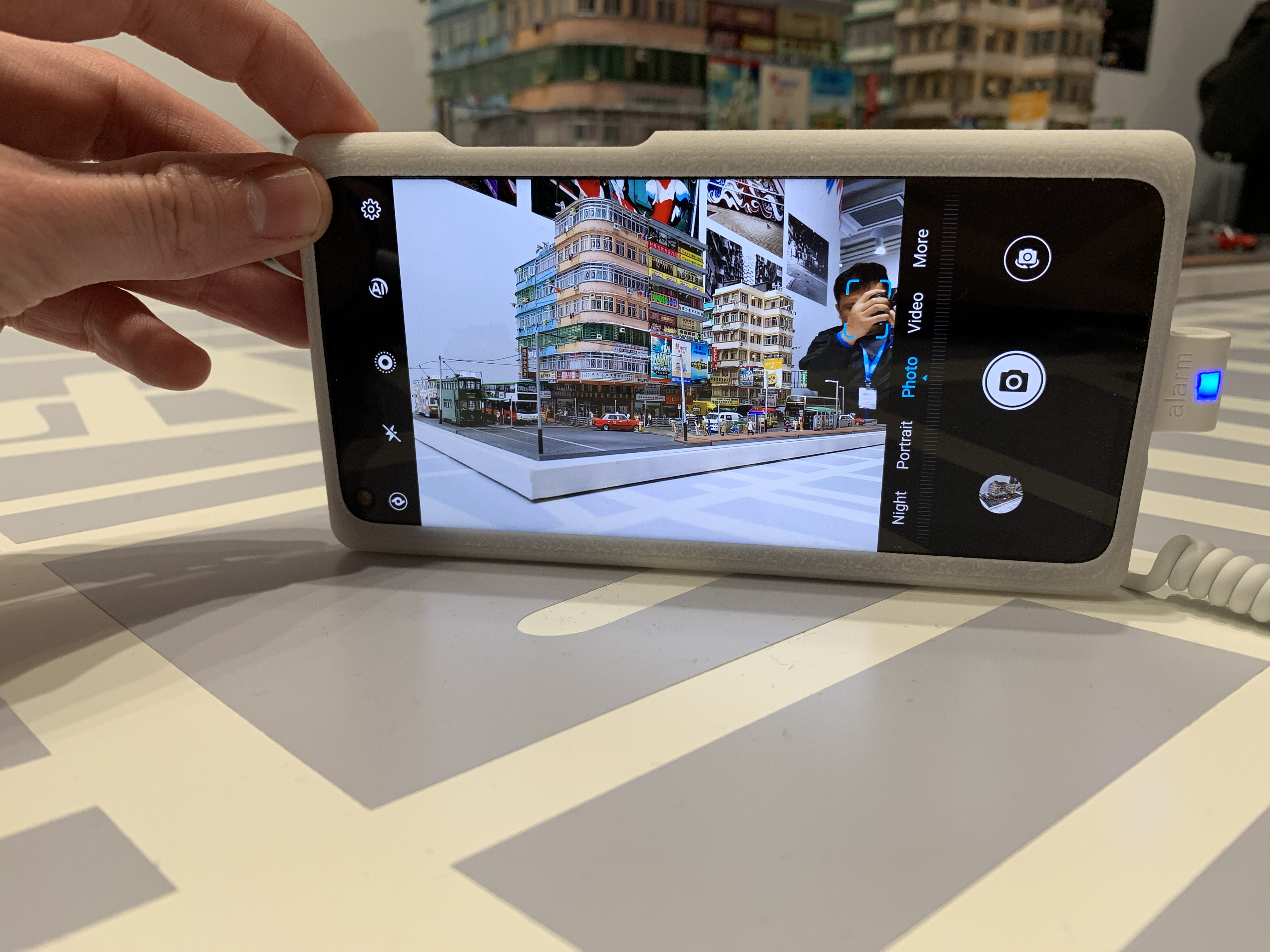
In our testing of the camera’s night modes it wasn’t the sensor itself that came to the fore, but the AI Vision camera on the rear. This made everything seem a little brighter – but there’s a difference between photographing under a table and in the real dark of night, so we’ll need to test this feature a little more.
However, there’s certainly some good sharpness on offer here, and not much noise visible when you zoom into more detailed shots – although things looked far from perfect on the pre-production software we saw.
The other new camera element – and one we sadly didn’t get the chance to try properly – is the 3D time of flight (TOF) sensor inside the phone, which allows the Honor View 20 to function in the same way as a Microsoft Kinect might work.
That means the View 20 can scan real-world objects and create 3D animated characters, and have them move around your world in a virtual form, interacting with real-life objects as your phone is able to scan the surroundings.
This will either be something of a game-changer, or a novelty that people don’t engage with – and given it’s already been seen on the Huawei Mate 20 Pro, it may not be all that exciting.

One thing we do expect from the Honor View 20 is a decent battery life – with 4,000mAh inside and the Kirin 980 chipset pumping away to make everything more efficient (which it can do thanks to its 7nm structure, which means the transistors are closer together and less energy is needed), alongside AI battery management, there’s a lot to be hopeful for here.
Huawei and Honor phones often bring better battery life than some of their rivals, and it looks likely that it’ll be the same story here.
Early verdict
The thing that impresses most on the Honor View 20 isn’t the display or camera, but the distinctive design on the back, with the ‘flying V’ design offering something genuinely different.
That’s not to say that the punch-hole screen isn’t impressive, nor the raw performance of the 48MP camera, but the former doesn’t seem that much of a step forward over the sliding-camera designs of other full-screen phones (such as the Honor Magic 2, the Xiaomi Mi Mix 3 and Oppo Find X) and that 48MP sensor does have some question marks hanging over it.
It would have been nice if this phone was water-resistant too, as that seems like something most brands are offering now, and we’d also like to have seen Honor bring dual speakers to the party.
However, given that we’re expecting this phone to come in at a lower price than many other flagships, perhaps a lower spec list is acceptable – and for a phone that looks this good, and with a novel new display, perhaps that’s all that’s needed.
- Unfortunately we had limited time with the new Honor View 20 for photography - we'll be updating it with new imagery in the near future. All images here kindly used under permission from Matthew Hughes of TNW.
0 comments:
Post a Comment