WhatsApp's new dark mode has arrived, but it just isn't dark enough
After many months of speculation and hints, WhatsApp dark mode has finally arrived for beta testing on Android, and I've been using it full-time since it arrived. It's rather nice, and it's certainly easier on the eyes at night than bright green and white, but there's just one problem: it's still not dark enough.
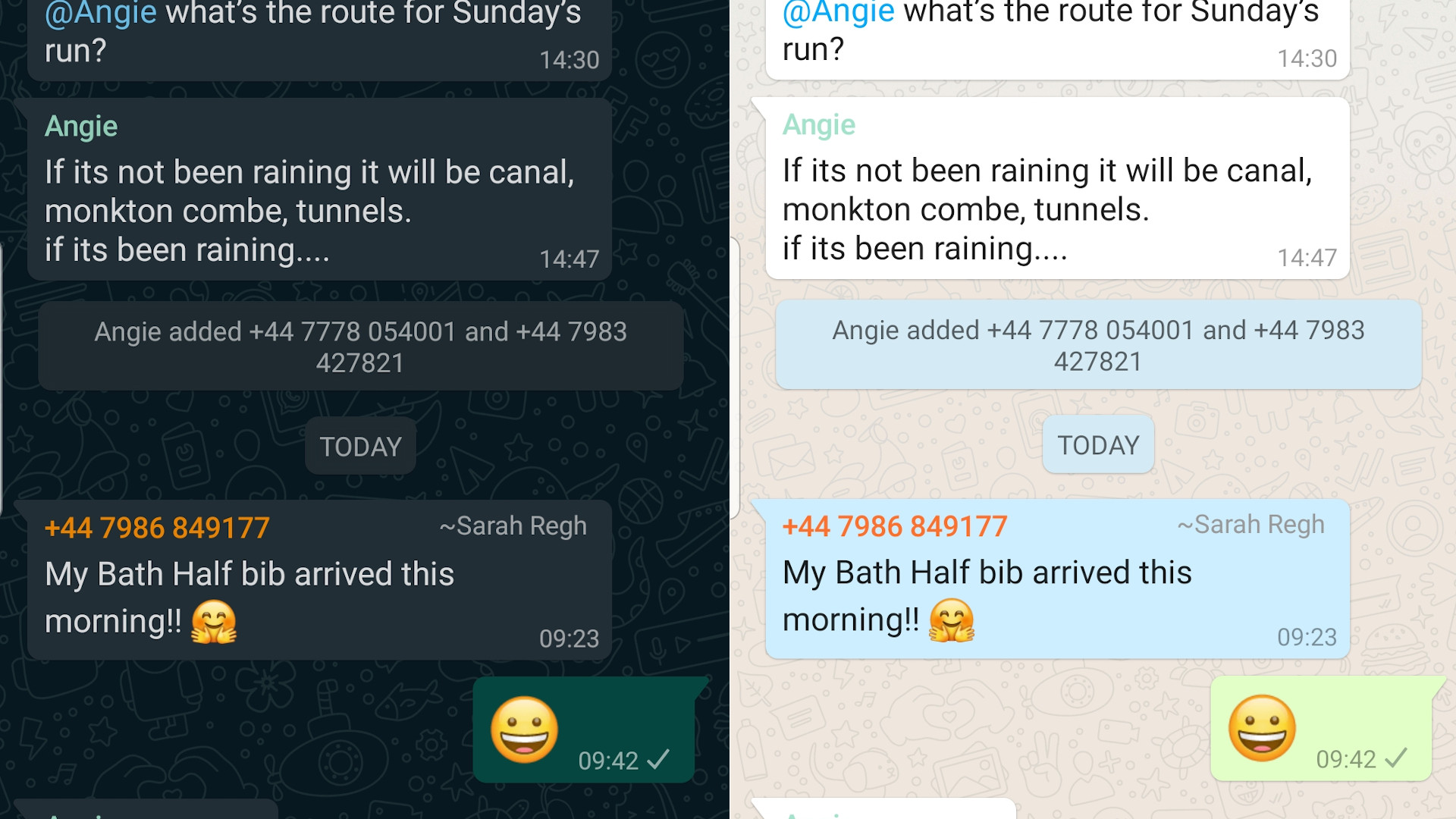
First, there's the app's main background. Rather than black, it's a dark greenish gray. That's all find and tasteful, but on an AMOLED screen you really want the background to be fully black so those pixels are switched off and not draining your battery.
Yes, a truly black background would mean missing out on the fun WhatsApp wallpaper (peer closely – can you see it?) but that's a small price to pay. Even if you enter the app's wallpaper settings and choose 'solid color', the darkest swatch isn't actually black. If you want a truly black background, you'll have to create a black image and set that as your wallpaper. That's quite a lot of hassle.

Speech bubbles are much clearer in WhatsApp's light mode than the new dark version; an issue that could be remedied by a proper black background
Next, there's the text, which is mostly stark white and therefore a little hard on the eyes. A more subtle shade would be easier to look at, and wouldn't have me dialling down the whole screen's brightness to lower the contrast.
That's something I'd rather avoid because the color of the message bubbles is extremely similar to the background. Dial down the overall brightness and you can't see them at all. The speech bubbles in light mode are much clearer to see, making it that little bit easier to follow the conversation. A black background would knock the contrast up a notch without any further changes.
Not-so mellow yellow
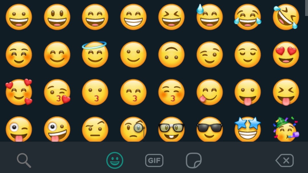
Then there are the emoji. Open the menu and squint as they slide into view in all their bright yellow glory. It'd be less dazzling if they'd been reworked in a different hue for dark mode – a pleasant shade of blue, perhaps. Yes, it would have been a lot of work, but dark mode has already been so long coming, what's a little longer?

WhatsApp's emoji are still a gaudy shade of yellow in dark mode
All that grumbling aside though, WhatsApp dark mode is still in beta testing, so there's a chance it could change substantially before it starts rolling out properly.
Also, let's not forget that the APK files include menu options that suggest it might eventually be possible to choose between two different dark modes, possibly including one specifically made for AMOLED displays. Here's hoping it might tone down some of the gaudier colors, too.
And even if it doesn't, there's still hope for Facebook's mobile dark mode, when it eventually makes an appearance. Fingers crossed.
0 comments:
Post a Comment