Saturday, October 30, 2021

Lenovo Smart Clock 2

30-second review

The Lenovo Smart Clock 2 is an interesting hybrid device, sitting between an alarm clock and smart speaker. If you currently use an Android phone to rouse you in the morning it feels like a natural upgrade, with full Google Assistant integration and music streaming.

For a little extra cash, you can also get a wireless charging dock for the Smart Clock 2 that allows you to charge any Qi-compatible devices without the need for a tangle of cables beside your be, and doubles as a night light.

It’s a likeable little device, and works well. The main problem is that the Google Nest Hub 2 does all of the same things and more, for around the same price. The Nest Hub can serve as a clock and music player, but also offers features like sleep tracking, a sunrise alarm, and the ability to stream content from services including Netflix and Disney+.

The Lenovo Smart Clock 2 serves its purpose well, but unless the charging dock is a game-changer for you, or you really need something particularly compact, it’s tough to recommend over the Nest Hub.
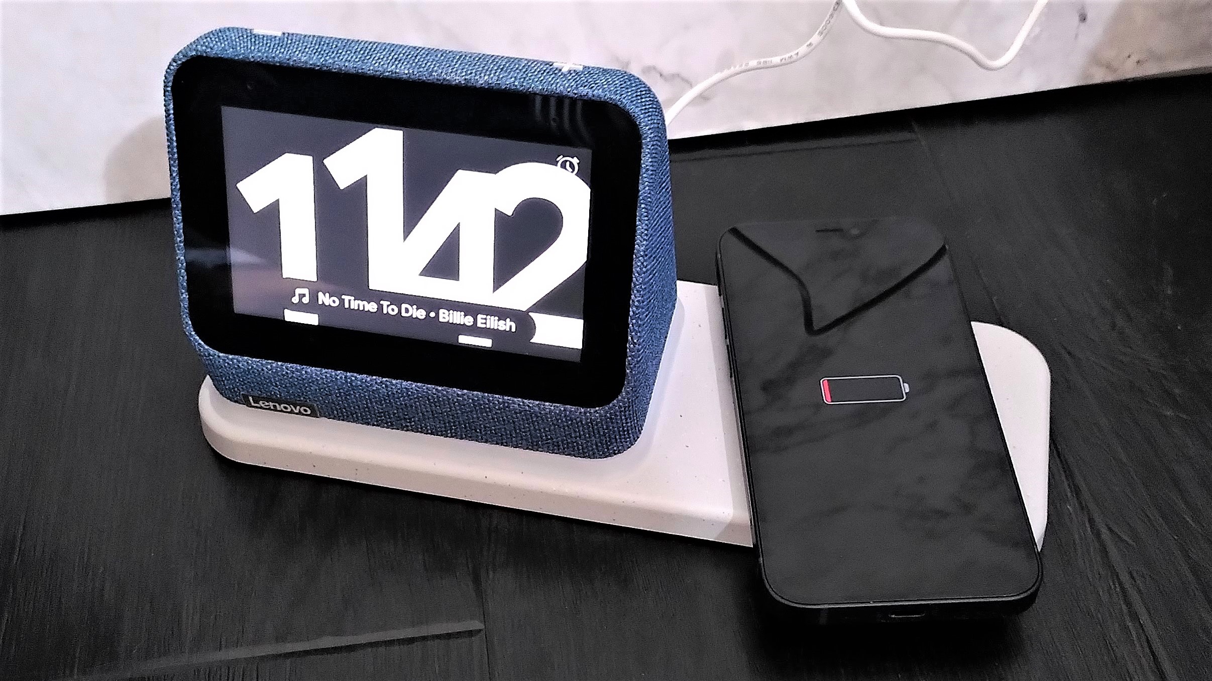
Lenovo Smart Clock 2 with charging base, charging iPhone

The wireless charging base is an optional extra for the Lenovo Smart Clock 2 (Image credit: Future)

Price and availability

The Lenovo Smart Clock 2 was released in September 2021, and costs $69.99 / £59.99 / AU$129 by itself, or $89.99/ £85.99 / AU$208.85 with the wireless charging base. For comparison, the Google Nest Hub 2 costs $99 / £89 / AU$149, and although it lacks the charging capability, the device itself has a lot more functionality. 

Design

The Lenovo Smart Clock 2 is a small device (measuring just 9.3cm x 11.3cm x 71cm), which can be used alone, or attached to a wireless charging base that roughly doubles its footprint. The base also has a USB-A port on the back of the dock for devices that don’t support Qi charging (like your Fitbit, for example), and is extremely handy if you don’t have multiple power outlets available for plugging in an array of different chargers.

There's a light in the base, which illuminates when you settle the clock on its connector or place a phone on the charging pad. This also serves as the clock's night light, which can be activated by pulling down on the clock's homescreen and selecting the appropriate option.
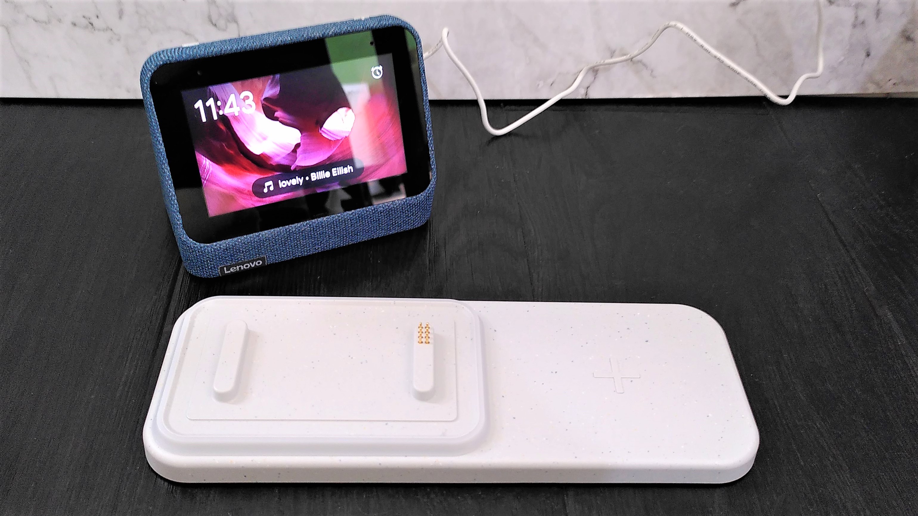
Lenovo Smart Clock 2 beside wireless charging base

The wireless charging base also contains a light that illuminates when the clock or a phone is placed on top, and serves as a nightlight (Image credit: Future)

The clock is covered in soft-touch fabric, like most modern smart speakers, and comes in three colors: Abyss Blue (reviewed here), Heather Gray, and Shadow Black). There are few physical controls: just a pair of volume buttons on the top, and a switch on the back that toggles the microphone on and off.

This is essential since you can’t reactivate the microphone with a voice command, but also adds a welcome degree of privacy; with the switch toggled, you can be certain that the speaker isn’t listening in.

It has a 4in display (considerably smaller than the Google Nest Hub’s 7in screen), which is bright, but has a relatively low resolution of 480 x 800 pixels and isn't the most responsive we’ve ever used. Thankfully, you won’t need to operate it too often after choosing your preferred clock face and background, as most of the Smart Clock 2’s day-to-day operations are carried out via voice commands.
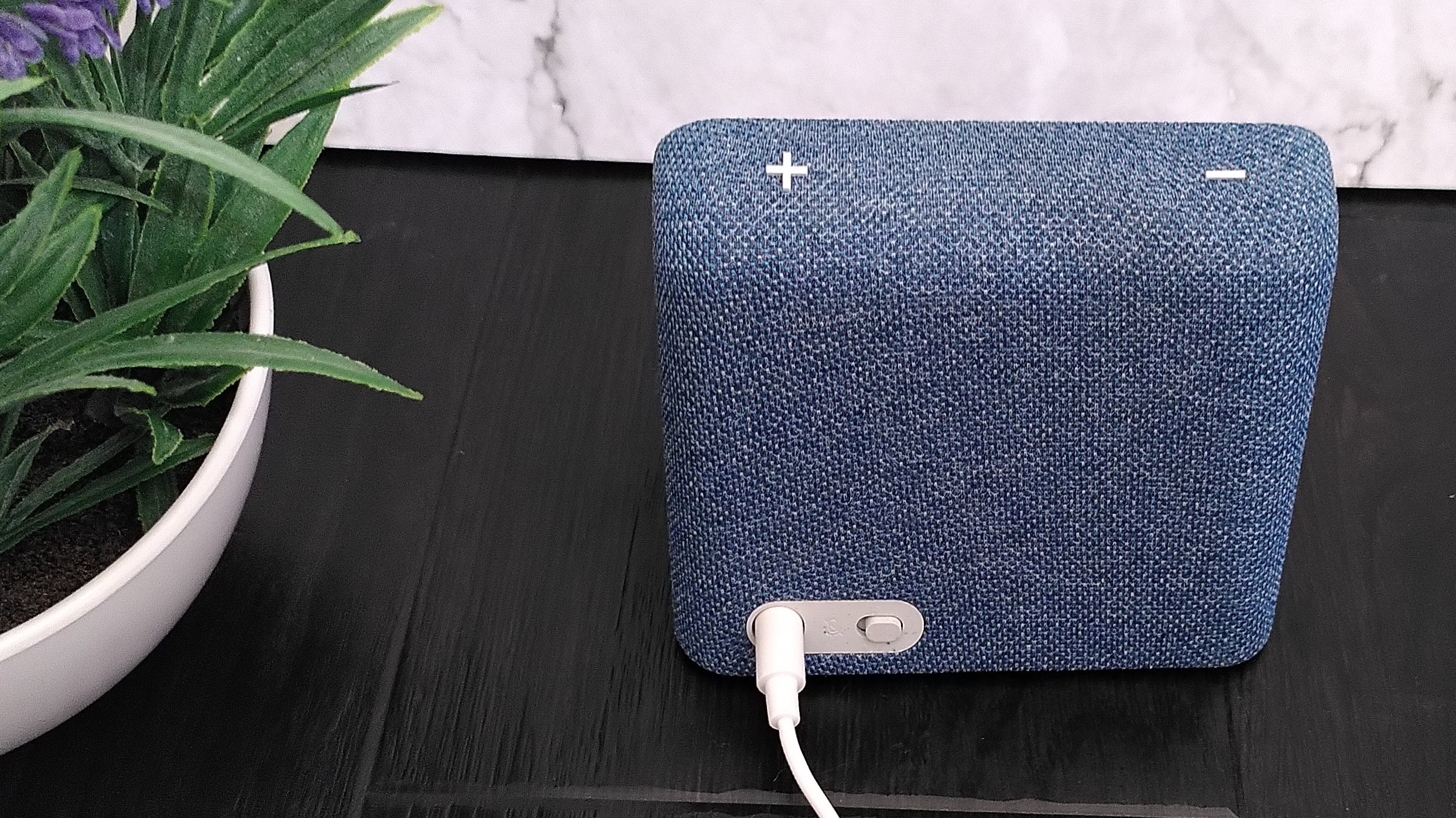
Rear of Lenovo Smart Clock 2 showing mute switch, power cable, and volume controls

The Smart Clock 2 has volume controls on top, and a switch on the back to mute the microphone (Image credit: Future)

It’s a shame that the Lenovo Smart Clock 2 doesn’t have a rechargeable battery so it could be disconnected from the charging dock and used without wires. The clock is small enough to tuck easily into a bag or suitcase for use when travelling, but would be more practical if it could be used without a cable.

Performance

The Lenovo Smart Clock 2 runs Android 10, and provided you have a Google account, setup is a straightforward process. It can connect to your home Wi-Fi network through your phone, so you don’t need to spend time tapping in your password, and all your data and Google services are imported automatically. Once that’s done, the Smart Clock 2 will take you through the process of configuring its faces, adding custom background images, and creating an alarm.

There’s a good choice of analog and digital faces, most of which are animated, so you can find something that fits your bedroom. Choosing one wasn’t always as simple as we’d have liked, though the touchscreen wasn’t always particularly responsive, occasionally taking a few attempts to register a finger-swipe.
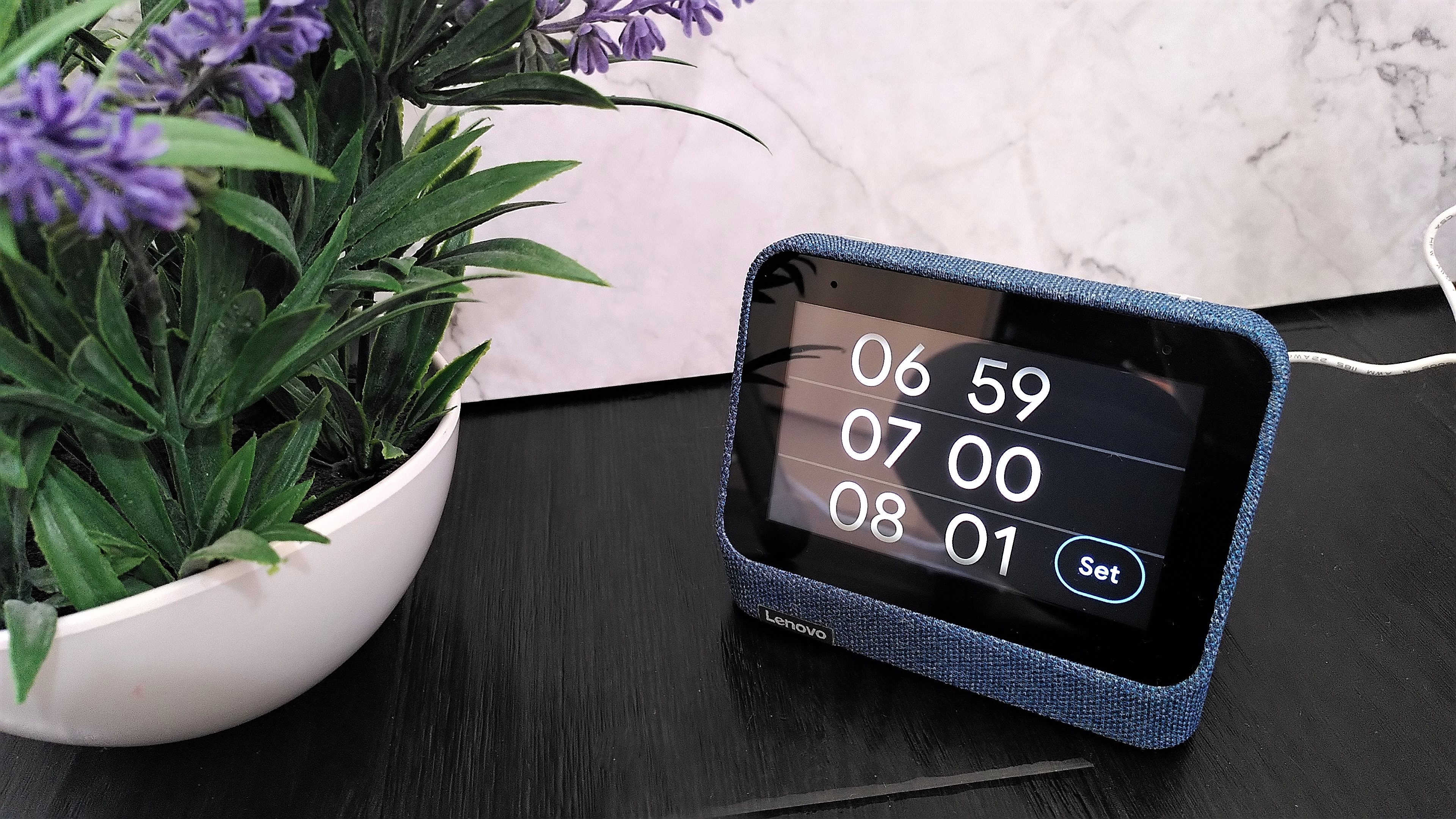
Setting an alarm on the Lenovo Smart Clock 2

Alarms can be set using the touchscreen or voice controls (Image credit: Future)

The Lenovo Smart Clock 2 can be used to control any Google Assistant-enabled smart devices, including lightbulbs and thermostats, and doing so is a breeze. The clock’s microphone is excellent, and once trained to recognize our voice, it never failed to register a command in our tests.

The Smart Clock 2 has front-facing speakers, and can stream tunes from YouTube Music or Spotify (either for regular listening, or as a wake-up alarm using a command like “Okay Google, set alarm for 7am and play No Time to Die” or “Set a music alarm”). If you want more room-filling sound, you can also link the clock to other smart speakers, and the volume controls atop the Smart Clock 2 are easy to hit for making quick adjustments.
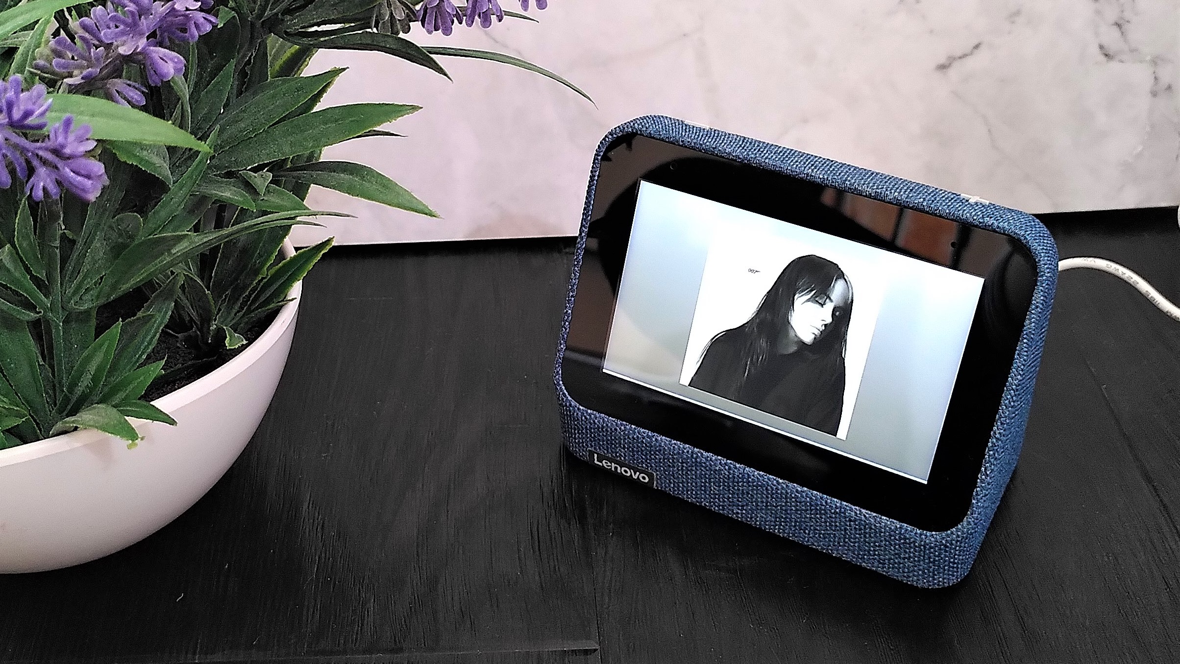
Lenovo Smart Clock 2 playing music

The clock can stream music, but not videos (Image credit: Future)

The Smart Clock 2 doesn’t support video playback though (except for video from some Nest cameras). This is understandable, as watching on a relatively low-res 4in screen wouldn’t be the best experience, but is a bit of a disappointment when the Google Nest Hub doesn’t just let you watch YouTube clips, but even stream movies and TV shows from the likes of Netflix and Disney Plus.

You can use it to set reminders and alarms, but the fact that it can only run from a mains power source (there’s no rechargeable battery) means you can’t easily take it with you into different rooms in the house. Although it would work well as a clock in your study, allowing you to set an alarm to activate after a certain period so you remember to get up and take some exercise, setting it up outside your bedroom means you’re not making the most of its night-time functions.
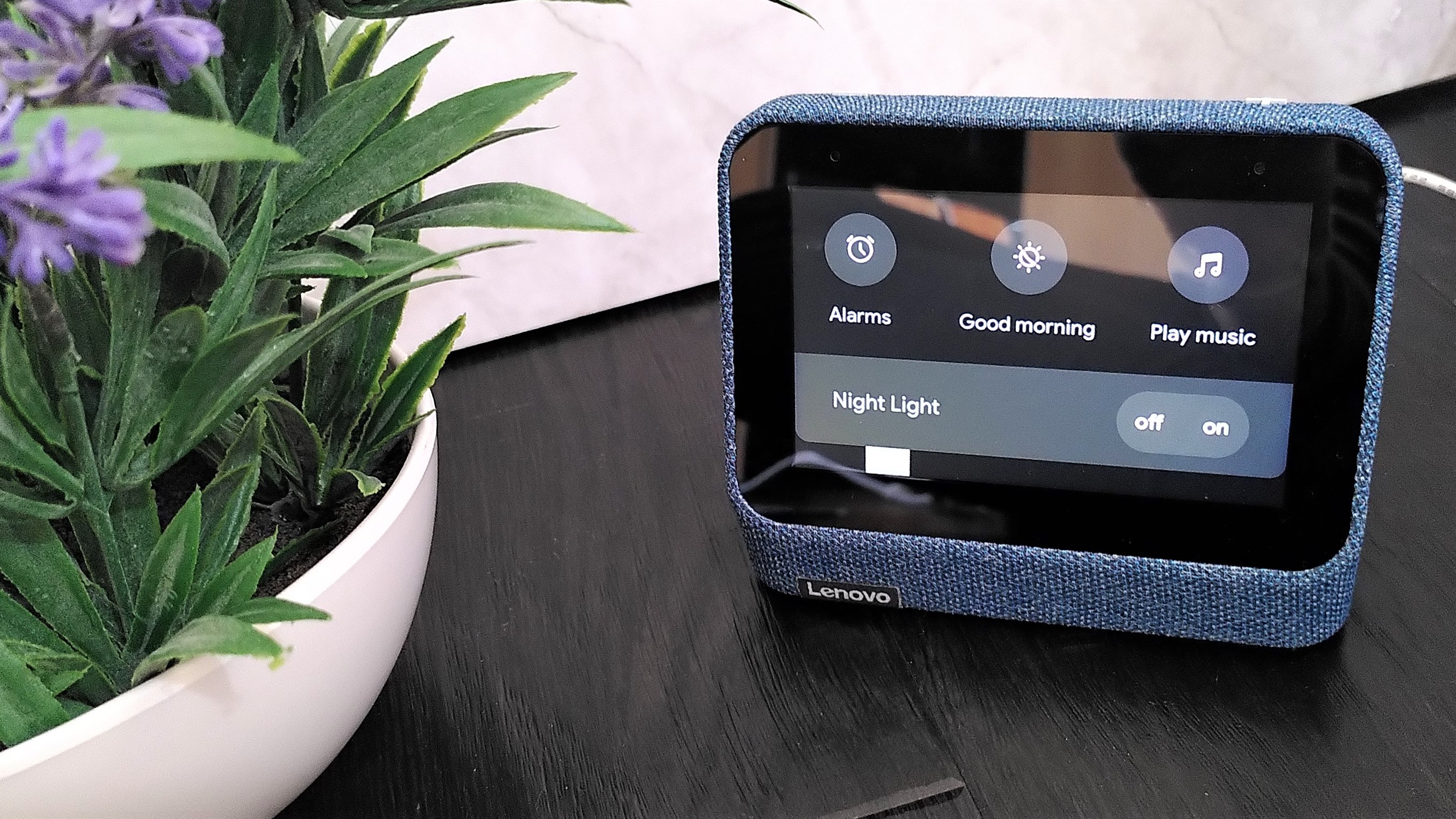
Lenovo Smart Clock 2 menu, showing nightlight option

The dock provides a nightlight, which you can activate through the clock's top menu (Image credit: Future)

That would be a shame, because those features are well implemented. We particularly liked the ability to fall asleep listening to nature noises (removing the need for a separate white noise machine to muffle distracting sounds). The night light function was also a welcome addition for reading before bed, though it would be even better if there was an option to use it as a wake-up light, gradually brightening in the morning to help you wake naturally.

That’s another feature that you get with the Google Nest Hub 2, and which makes the Smart Clock 2 tricky to recommend. Unless you’re particularly short on space, and really value the wireless charging dock of Lenovo’s device, we’d be inclined to opt for the Nest Hub as our alarm clock instead – particularly thanks to its ability to make video calls, which the Smart Clock 2 also lacks.

Buy it if

You're short of space
Particularly without its dock, the Lenovo Smart Clock 2 is super compact and will take up the bare minimum of room on a cluttered nightstand.

You hate tangled charging cables
The wireless charging base is a great addition, especially if you don't have multiple electrical sockets by your bed for juicing up your phone, watch, and other devices.

You use Google Home devices
The Lenovo Smart Clock 2 integrates seamlessly with your existing smart home, and you don't even need to get out of bed to control it all.

Don't buy it if

You want to watch videos
Although it has a color display, the Lenovo Smart Clock 2 doesn't allow you to play TV shows and movies from your favorite streaming services.

You want a wake-up light
The Smart Clock 2's dock does have a light, but it'd purely for reading by; it doesn't brighten gradually to simulate a gentle sunrise and wake you naturally.

You want to make calls
There's no camera in the Lenovo Smart Clock 2 for video calls, which is useful from a privacy perspective in your bedroom, but you can't use it for voice calls either.

This article is part of TechRadar's Sleep Week 2021, our in-depth look at sleep and how to snooze better. We've teamed up with experts in their field to bring you proven sleep techniques and tips to help you drift off easier, and to stay asleep for longer, and have rounded-up the very best sleep kit to transform your bedroom into a den of zen. So from Sunday 31 October to Sunday 7 November we'll be sharing interviews, features and essential buying guides with the aim of helping you to sleep better than ever.

Friday, October 29, 2021

Moto G Pure

Two-minute review

The Moto G Pure has an incredibly enticing price tag. At $159 (around £115 / AU$210), it’s coming at about as low a price as you’ll find a mainstream smartphone from a well-known brand. But in spite of Motorola’s prowess for making high-value smartphones that come in at a low price, the Moto G Pure is a dud.

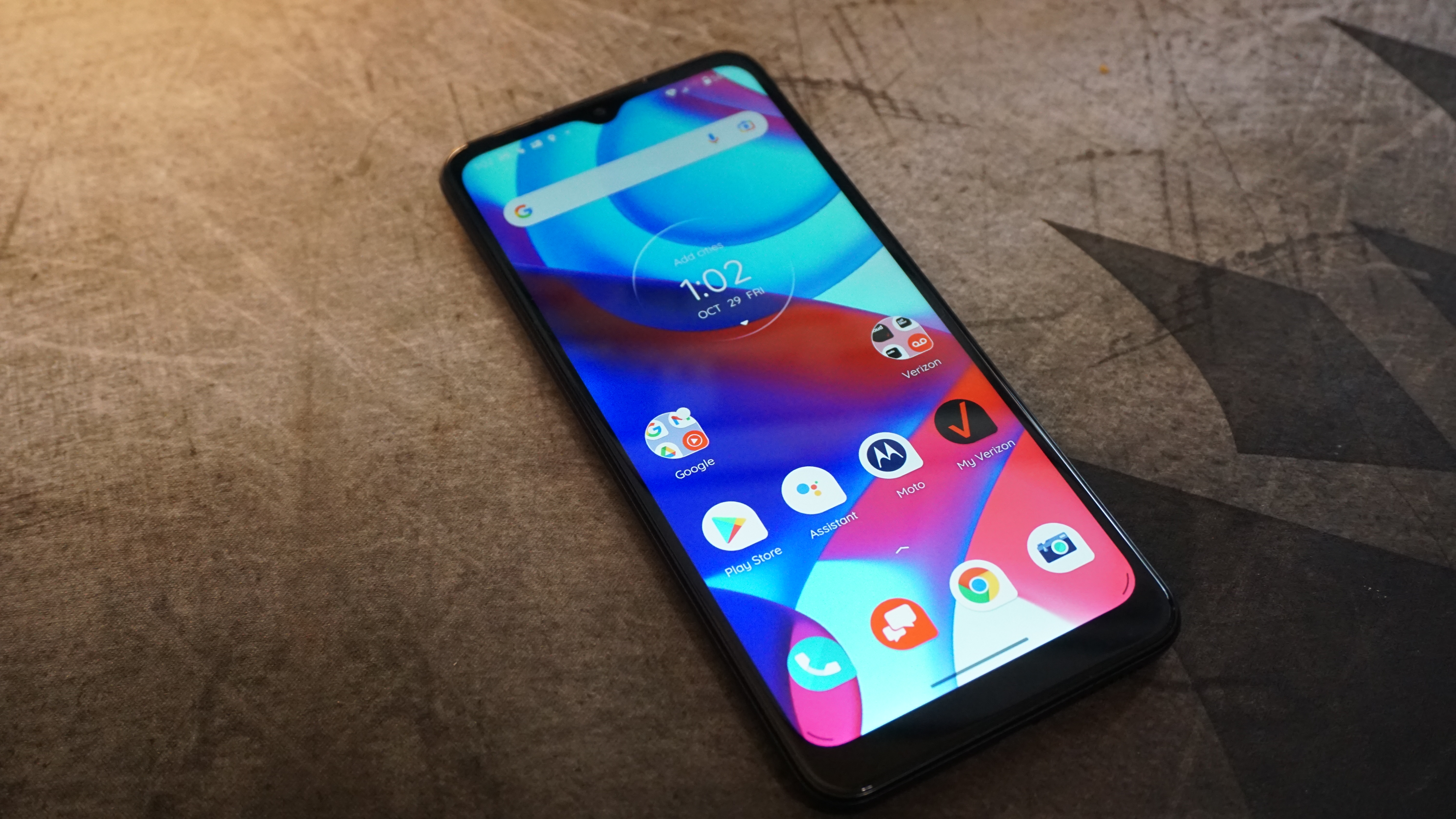
The phone has a neat-looking design that actually makes it easy to get over its plastic construction. It feels and looks good in the hand. The display is big, but it’s of a pretty low caliber with visibility easily impacted just by slightly changing the viewing angle. 

Beyond the big screen, all the phone has to offer is a big battery. That helps it last when you’re away from a charger, and can last multiple days if your uses of the phone are particularly light. That said, you may find yourself spending more time using the phone than you’d expect because of its slow performance.

Regular tasks on the Moto G Pure are punctuated by extended delays, slow responsiveness, and just general hiccups. There’s just not a lot of muscle inside this phone.

That weakness unfortunately holds back what could have otherwise been a decent enough camera for the price. While the Moto G Pure’s main camera can snap a pretty photo, it’s exceedingly tricky to do since there’s an unavoidable lag between pressing the shutter and the camera actually capturing a photo. 

There may not be a lot of other new phones that’ll undercut this one on price, but we’d hands-down opt to go with the $199 Moto G Fast (2020), Moto G9 Play or a refurbished Moto G Power (2020) for about $187 and benefit from the extra performance and cameras those phones can deliver. A small bump up can also land something even more worthy, like the TCL 20S, a $250 (around £180 / AU$345) phone that easily justifies that extra expensive with a bigger, better screen, a ton more storage, more speed, more memory, a bigger battery, and a better design, though the TCL 10L might also do the trick. All the better if you can snag an even higher-end phone second-hand or refurbished. 

Moto G Stylus 5G price and availability

The Moto G Pure is available in the US as of October 7 for $159 (around £115 / AU$210). It’s on sale in the US from carriers, Best Buy, Walmart, B&H, Amazon, and directly from Motorola, and there are no plans to sell it outside the US. 

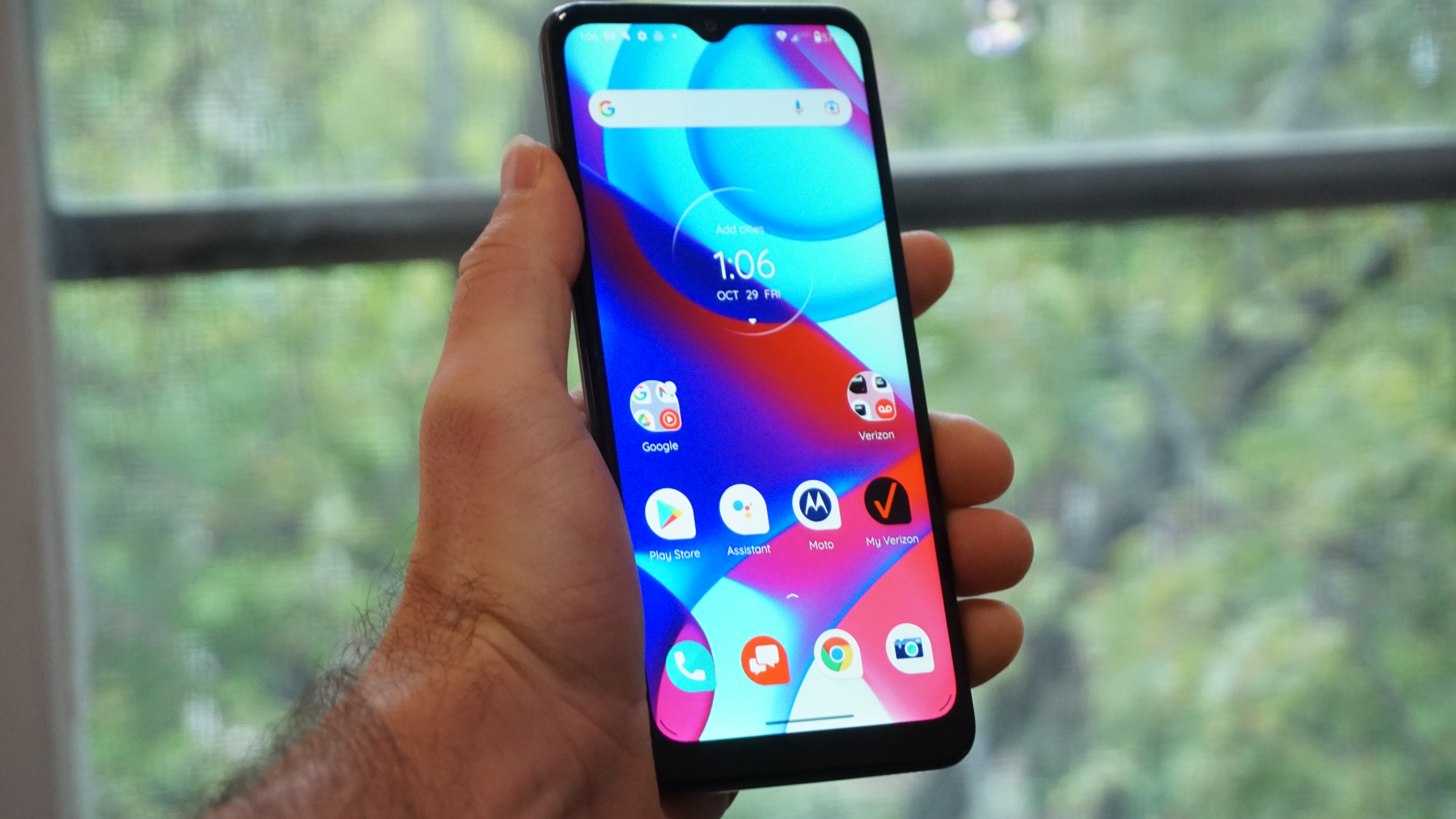
Moto G Pure smartphone

(Image credit: Future)

Design and display

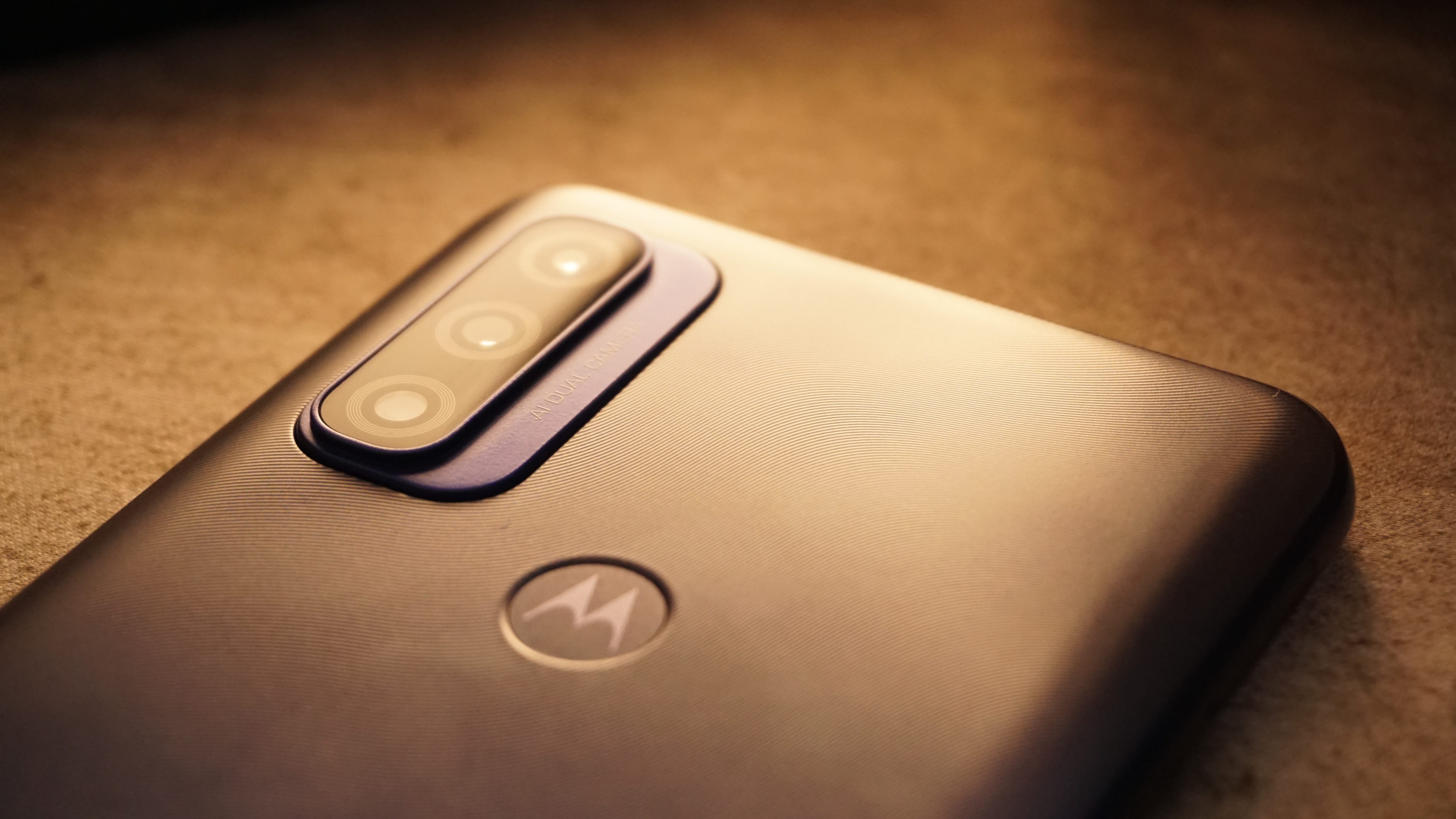
The Moto G Pure has a design far better than expected for its price point. An elegant, wavy texture on the back makes it easy to ignore its plastic construction because it just feels pleasant in the hand. And the hard frame of the phone doesn’t feel cheap either. It has a modern look to it right down to the vertical camera stack. 

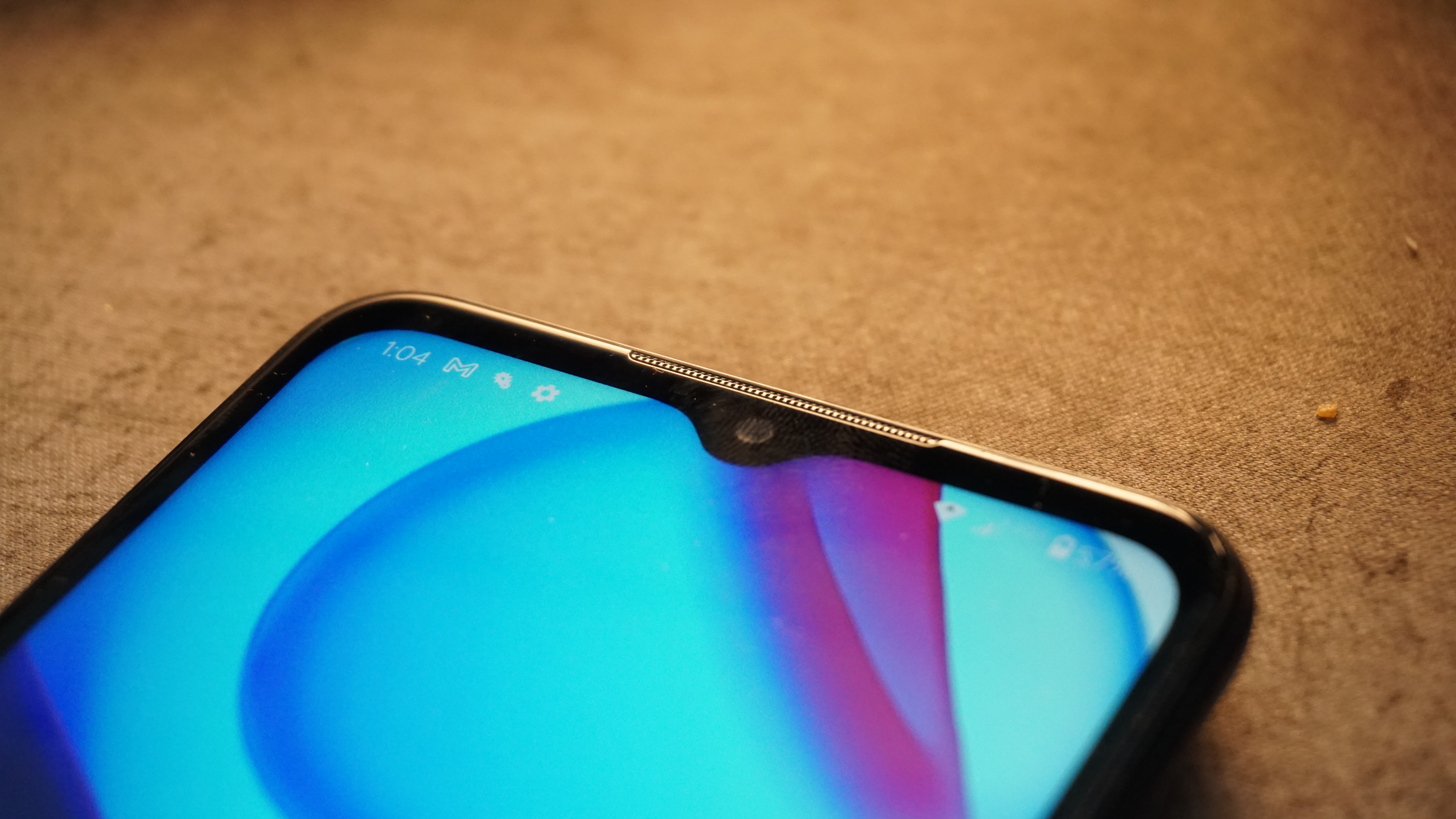
Motorola even works in a large display, but it's when the display lights up that the budget nature of the device shows. It has narrow bezels on the sides, but the chin bezel is monstrous for 2021, and the teardrop camera cutout has had some serious staying power on Motorola’s phones. 

The phone’s large size does require some juggling to use, but it’s not too heavy or wide for comfortable use. Motorola could have put the rear fingerprint scanner a bit lower or used a side-mounted one to make it easier to unlock and go straight into using it, though.

Moto G Pure smartphone

(Image credit: Future)

Motorola conveniently includes a microSD slot to boost the phone’s paltry 32GB of built-in storage, and you can still use this phone with wired headphones thanks to its 3.5mm jack. Motorola even went as far as to get this phone a proper IP52 rating to withstand splashes, spills, and rain — no submersion, though — instead of just calling it water-repellant and leaving us to wonder just what that actually specifies.

The LCD screen is really the only regrettable part of the design. It’s large, at 6.5 inches, and its 1600 x 720 resolution may not be the sharpest but isn’t so overly stretched that it's easy to pick out pixels. The problem stems from the quality of the panel, which doesn’t look as appealing when viewed at even a slight angle, losing considerable brightness.

Performance and battery

Where the Moto G Pure really falters is in performance. It is simply hamstrung by one of the weakest performing chipsets we’ve seen recently. Our GeekBench 5 results see the MediaTek Helio G25 chip inside the Moto G Pure earn a dismal 496 points, which trails well behind a ton of other budget phones. And, while benchmarks don’t always translate into real-world performance, they do in this case.

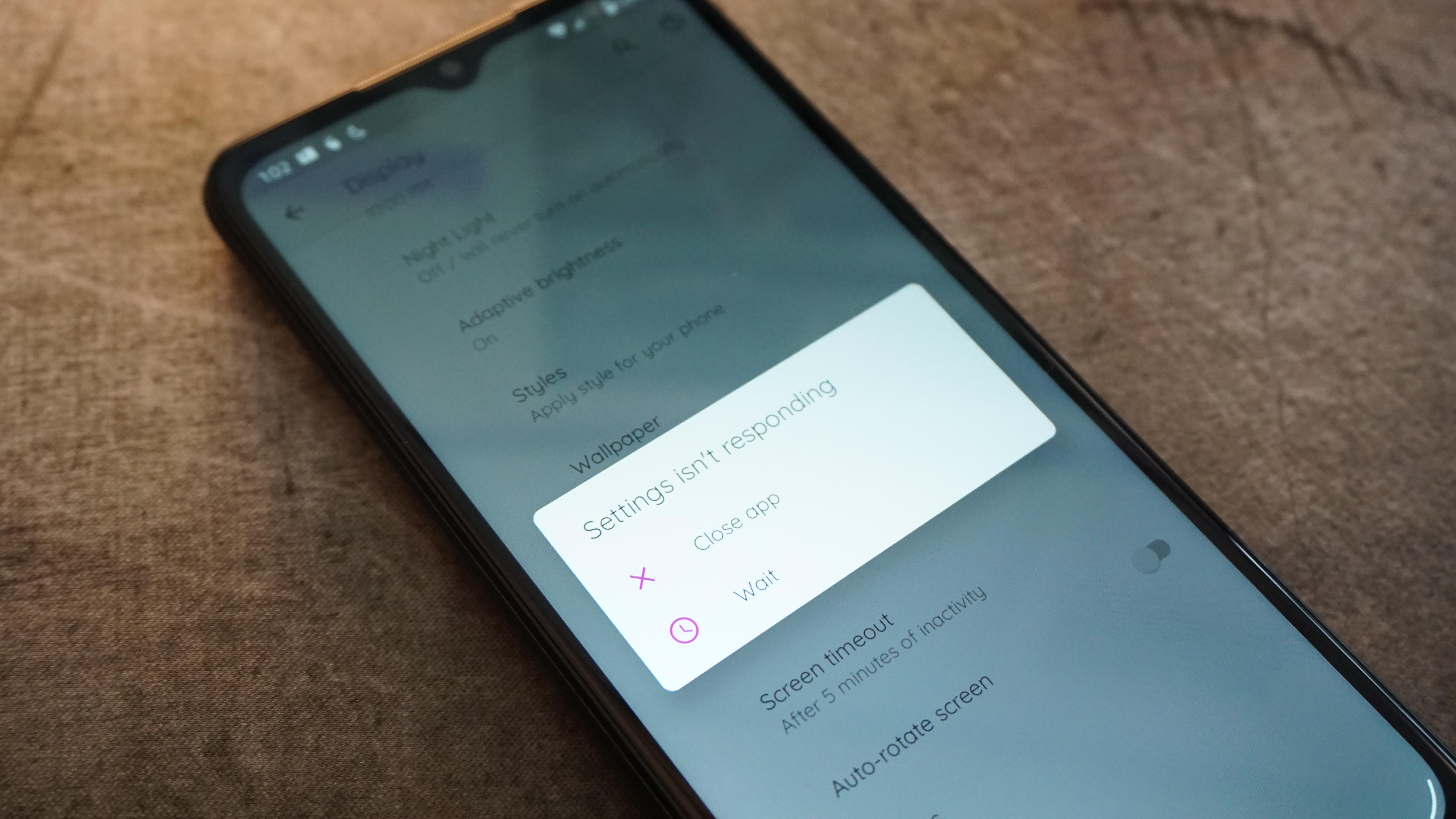
Moto G Pure smartphone

(Image credit: Future)

The phone has consistent delays in responsiveness and is slow to launch apps. The fact it comes running Android 11 could have been a boon (many budget phones still haven’t gotten the upgrade) if the phone wasn’t too slow to reliably run it. This makes regular use tedious. While it can still perform the tasks of sending texts, making calls, and browsing the web, it doesn’t make them a breeze. We even experienced some apps simply crashing at launch instead of loading — not exactly behavior we want from a brand-new phone when we’re simply trying to open up Google Maps.

The worst of the performance rears its head doing one of the more demanding yet mundane things we all do with our phones: using the cameras. The Moto G Pure takes a solid 3-4 seconds to launch the camera app — so much for reacting to the moment. Worse still, after we press the shutter button, the phone invariably waits a full second before capturing. Subjects move, moments pass, and the camera fails to get them. We feel like we have to be wizards to snag anything but stationary objects.

In our battery test, the phone managed to only drain 7% over the course of a 90-minute video playback at 50% brightness, so you’ll easily get a full day out of this phone even if you’re interspersing a few episodes of your favorite shows. You can even stretch to couple of days if you’re mostly just responding to the occasional call or text. It’s one of the few performance areas that holds up.

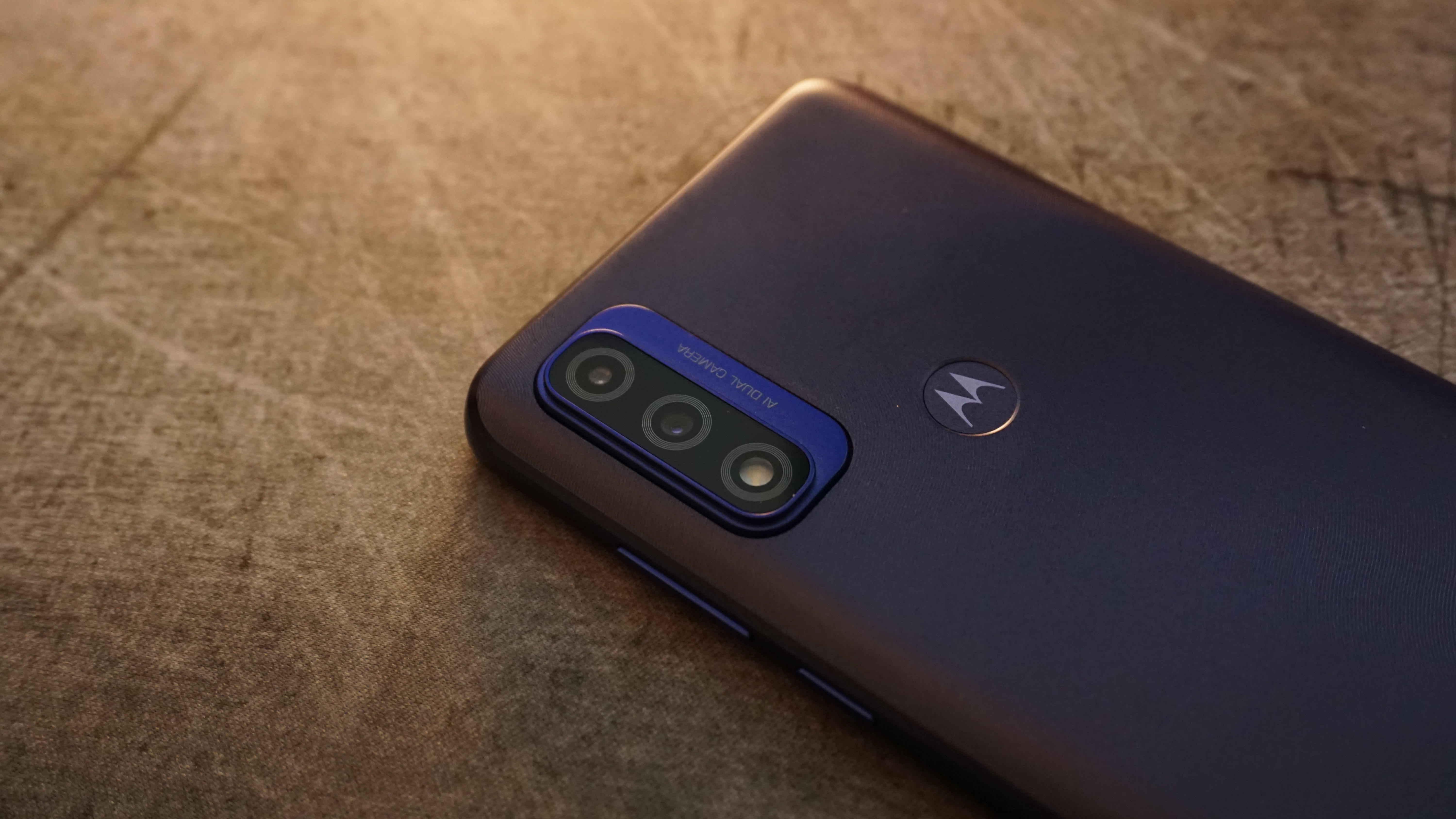
Moto G Pure smartphone

(Image credit: Future)

Moto G Pure Camera

The Moto G Pure’s camera system doesn’t have a lot going for it. It may present itself like a three-camera system, but one of those slots is just a flash, and the second camera on the rear is a depth sensor that doesn’t offer the same versatility of an ultra-wide or telephoto camera.

The 13MP main camera manages a decent amount of clarity in each shot. The color in photos is a bit subdued, but not bland. And, as long as there’s plenty of light, it can actually take pleasant-looking photos. The phone’s struggle to actually take a picture when the shutter button is pressed presents serious challenges, though.

Moto G Pure smartphone

(Image credit: Future)

The selfie camera is also reasonably sharp. Surprisingly, it even pulls out some finer detail in shots, such as individual hairs — something that can often turn into something of a blur.

The dynamic range the phone’s cameras are capable of is limited though. There’s no magic on board to make a backlit subject show up clearly without blowing out the background. 

Camera samples

Image 1 of 11

Moto G Pure Camera Samples

(Image credit: Future)
Image 2 of 11

Moto G Pure Camera Samples

(Image credit: Future)
Image 3 of 11

Moto G Pure Camera Samples

(Image credit: Future)
Image 4 of 11

Moto G Pure Camera Samples

(Image credit: Future)
Image 5 of 11

Moto G Pure Camera Samples

(Image credit: Future)
Image 6 of 11

Moto G Pure Camera Samples

(Image credit: Future)
Image 7 of 11

Moto G Pure Camera Samples

(Image credit: Future)
Image 8 of 11

Moto G Pure Camera Samples

(Image credit: Future)
Image 9 of 11

Moto G Pure Camera Samples

(Image credit: Future)
Image 10 of 11

Moto G Pure Camera Samples

(Image credit: Future)
Image 11 of 11

Moto G Pure Camera Samples

(Image credit: Future)

Should you buy the Moto G Pure?

Moto G Pure smartphone

(Image credit: Future)

Buy it if...

Your needs are very basic
Texting and calling on the Moto G Pure isn’t going to run into the same issues as more extensive use, and you won’t find a smartphone much cheaper than this.

You need the extra screen
The larger screen will let you see more and have a larger user interface, which can be helpful if you have bigger hands or more difficulty seeing small fonts and interface elements.

You don’t get around to charging often
The battery on the Moto G Pure can hold up for a good while, especially if you’re not using the phone frequently — helpful whether you’re on the go or just forgetful.

Don't buy it if...

You’re a photography fiend
The cameras can take an OK picture, but they have a really hard time keeping up, with delays in opening the app and taking photos. That sluggishness makes them a pain to use and liable to miss the best moments.

You want a modern device
The phone may look nice, but it’s screen is dated, it doesn’t have access to 5G networks, and even its Wi-Fi 5 connection is behind the times.

You can get a good second-hand phone
Buying used and refurbished isn’t always enticing, but you should be able to get a dramatically better phone for a similar price by going with one that’s a generation or two older.

Apple Calendar

The ideal calendar app can look very different from one person to another. Some are looking for advanced organizers that can help them make some sense of their chaotic schedules. Others want to be able to plan their upcoming weeks and months efficiently. For others, a good calendar is simply a tool that shows the current date and maybe has some options for tasks and reminders, nothing more.

Apple Calendar leans towards the slimmer side of feature variety, offering the bare essentials and little more on top of them. But it does that with Apple’s traditional style and attention to detail, meaning that if you’re looking for a simple calendar app that just gets the job done, this should be right up your alley. Unfortunately, the same can’t be said for users with more advanced requirements, as Apple Calendar is definitely not the most feature-rich app of its type out there, and the free price tag doesn’t compensate for that either.

Apple ID

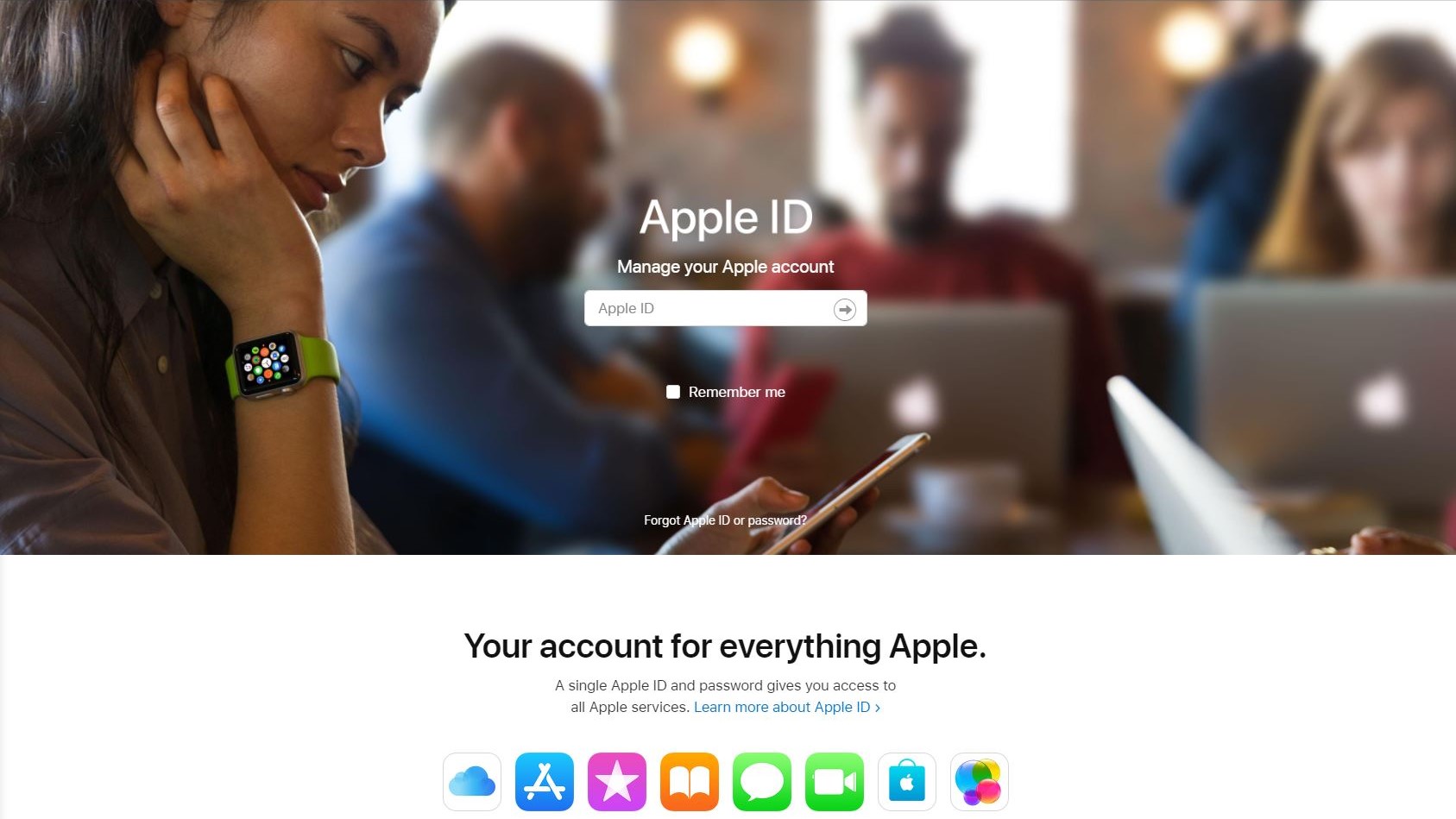
Although Apple Calendar is free, you will need to sign up for an Apple ID first before you can use it (Image credit: Apple)

Plans and pricing

Apple Calendar is offered completely free. This is one of the few calendar apps on the market that come at truly no price, no strings attached. It doesn’t feature any in-app ads or other monetization methods, and it won’t spam you with annoying promotions for other products.

That said, the fact that it’s exclusive to Apple’s operating systems could be seen as a sort of a payment barrier. However, we don’t expect anyone would purchase an iPhone for the sole purpose of using Apple Calendar, so this is a moot point. In any case, it’s worth keeping in mind that if you’re specifically interested in Apple Calendar for whatever reason, you’ll need an Apple device to use it. The app is also available on Mac computers, much like Apple’s other default apps.

Invites and Events

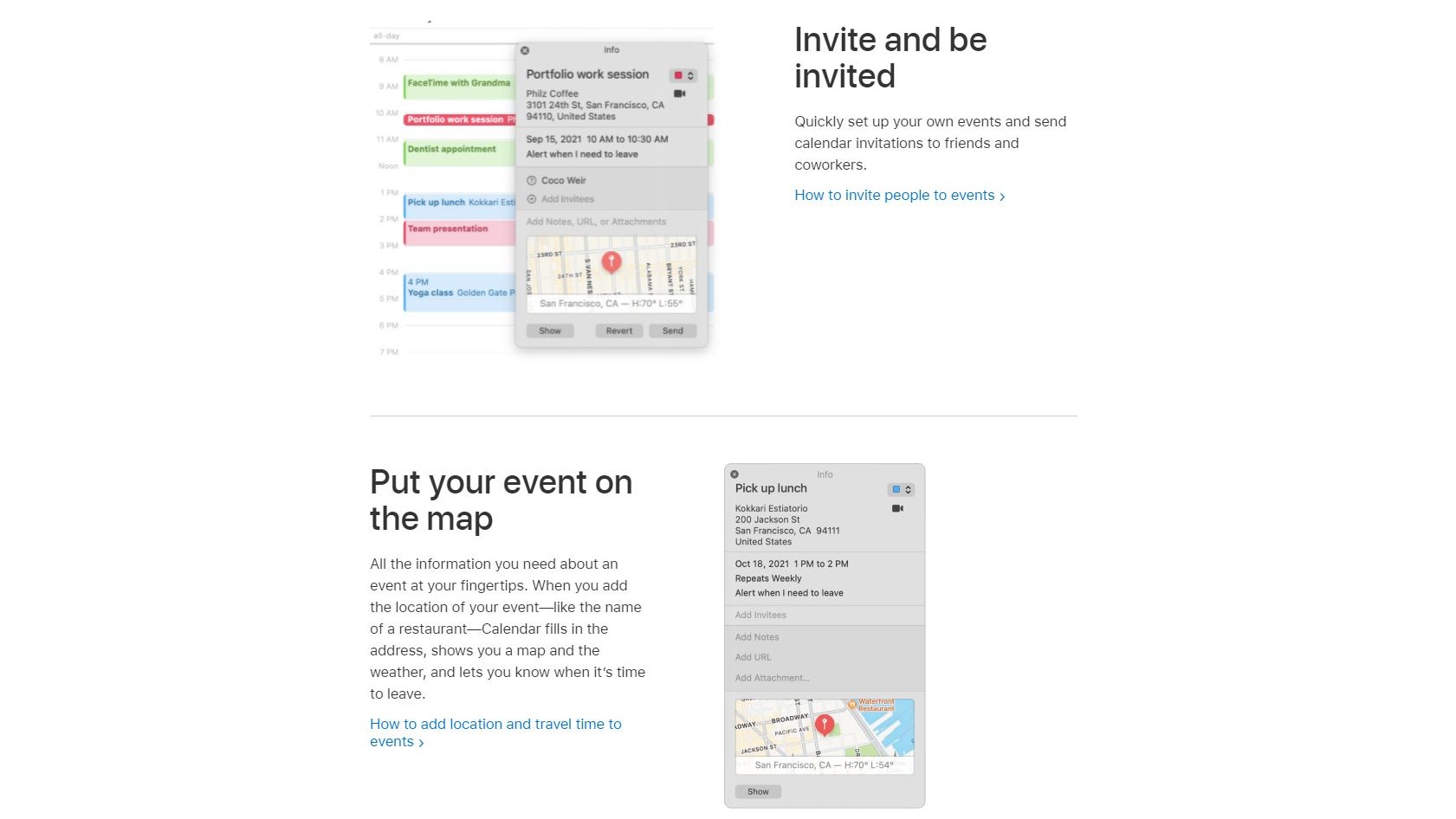
Apple Calendar allows you to create events and add their locations (Image credit: Apple )

Features

As we mentioned above, Apple Calendar doesn’t offer too many features outside of the standard package you’d expect to find in most similar apps. You can create and edit events with standard settings like time/date, location and recurrence. You can also invite others to your events, although you must have the person as a contact first.

Events support additional notes and links, and even file attachments. A schedule view is available, similar to the one in Google Calendar, showing you a list of your upcoming events in a clean, organized manner. It can be argued that Google Calendar does a better job at presenting information in this kind of manner, especially with regards to color coding and readability. You can color-code your events, allowing you to more easily browse through a large list of them.

Interface

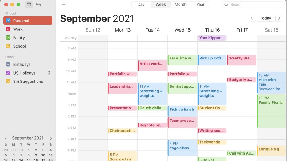
You can manage multiple calendars in one app and color code your events to keep them organized (Image credit: Apple)

Interface and in use

Just like Apple’s other apps, the interface of Apple Calendar is clean, intuitive and easy to navigate. It doesn’t take too many taps to get to where you want to be – although this is also helped by the relatively small number of features to begin with. Presentation is clean, yet offers a lot of information in every view. Previewing an event with an attached location and files is nicer than in most other calendar apps, and it’s easy to browse through a large number of events.

There isn’t much in the way of customization of the basic interface, which is typical for Apple’s apps. If you don’t enjoy the overall presentation, you likely won’t have too many options for tweaking it. However, the default look of the app should be good enough for most people’s needs, especially once you start color-coding your different events and organizing everything that way. 

Support

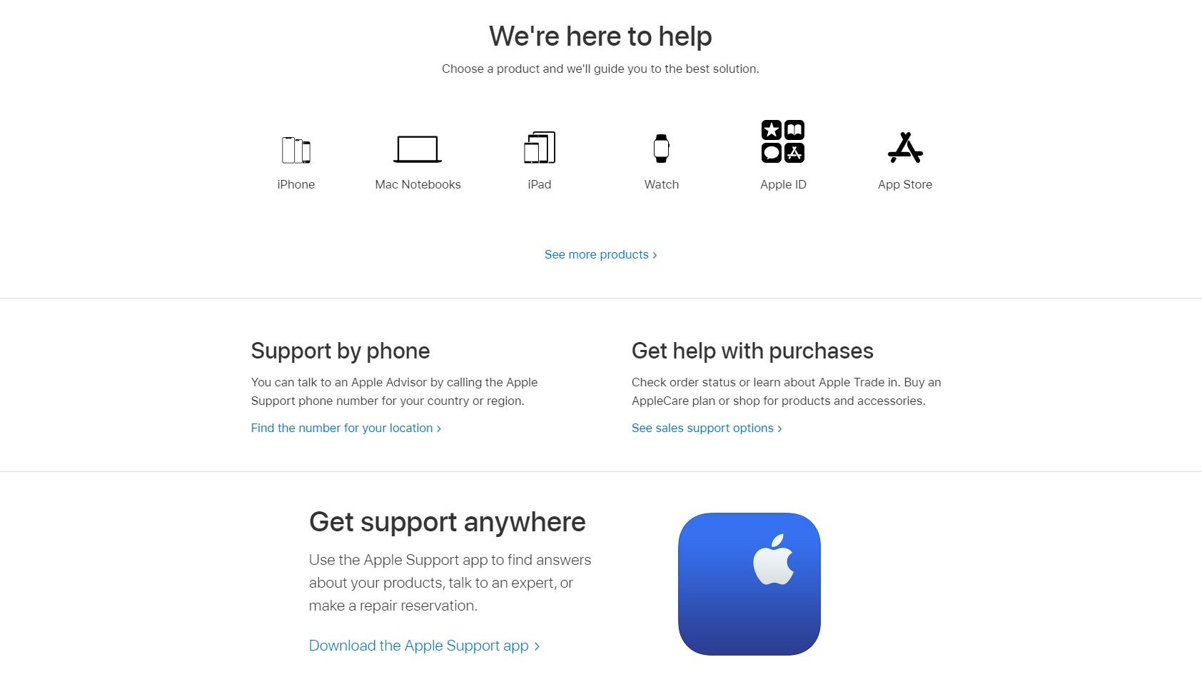
You can get in touch with apple by phone or from anywhere by downloading the Apple Support app on your devices (Image credit: Apple)

Support

Apple’s support is nothing special, but it gets the job done. The company doesn’t take too long to respond to most support requests, and their help center is already populated with a lot of information to browse through. The app is known for a relatively stable patch history, meaning that you should rarely encounter any serious issues – but if you do, you can rest assured that they will be addressed in a reasonable timeframe. 

The competition

Apple Calendar’s biggest competitor is Google Calendar, seeing as how they’re both free and offered as a default app for the two main mobile operating systems. While Apple has been able to offer solid competition to Google in other areas, their calendar is definitely not one of them. Google Calendar offers more features and an arguably more intuitive interface, making it the better option for those who want something that’s easy to use and reliable in the long term. This is still a highly debated topic, with lots of people defending both sides, so it’s something you should check for yourself before jumping to any conclusions, especially if you’ve never used a calendar app before.

Final verdict

Apple Calendar works fine, but it leaves a lot to be desired for those looking for advanced features and more customization. If you don’t consider yourself to fall in that category though, you should find it a perfectly fine offer in an otherwise very crowded corner of the market. Definitely give a try to alternative apps before committing to this one, just to see what other options are typically available.

We've also featured the best calendar apps

Fairphone 4 review

Two-minute review

If you’re looking for the most eco-friendly phone of 2021, the Fairphone 4 is far and away the best option for you - it’s the newest smartphone from Fairphone, a company that specializes in tech made from eco-friendly material sourced in sustainable ways and built in factories that treat employees well.

We normally see one new Fairphone device a year, and the Fairphone 4 is 2021’s entry, but it’s the first ‘new’ device from the company since the Fairphone 3 in 2019. We say that because 2020’s Fairphone 3 Plus was actually just an upgraded version of the 3 - and we don’t say that flippantly, as you could literally replace the parts in your 3 to turn it into a 3 Plus.

Fairphones are modular, which means you can easily remove and replace the components yourself if one gets damaged or you want an upgrade. This is great for the user, as it means you don’t have to pay someone to repair your device, and it stops you needing to replace your smartphone if one small part plays up.

The modular nature of the phones is just one of many ways in which they’re eco-friendly. Lots of the body is recycled, particularly the removable rear which is made from 100% recycled plastics. What parts Fairphone does need to mine from the ground, it does so from sustainable sources, while making sure workers are treated fairly and are paid well. This applies to factory workers making the devices too.
In short, this is the perfect phone for someone who cares about the environment, as Fairphone laps other tech brands in how green it is, and that target audience has already probably stopped reading to find out where they can buy one of these things. But beyond its green facade, the Fairphone 4 is a competitively-priced and capable smartphone that impressed us.

For a device with a relatively small power pack, the Fairphone 4 had a surprisingly long battery life, reliably seeing us through a day of use and often seeing in the next afternoon with ease. Talking of reliability, we found its sturdy metal frame and plastic rear ensured the phone could take a beating (or a drop, or many drops) without even taking a scratch.

With a fairly capable mid-range chipset, the Fairphone 4 felt snappy to use and handled games just fine - likewise the display looked good and the stock Android software is clean and easy to use, as most people would want from their phone.

So the Fairphone 4 is a strong all-rounder; if it has one issue, it’s that it doesn’t stand out spec-wise in any particular department, which may put off people who follow the competitive mid-range phone market (as almost every phone there has at least one super-strong suit).

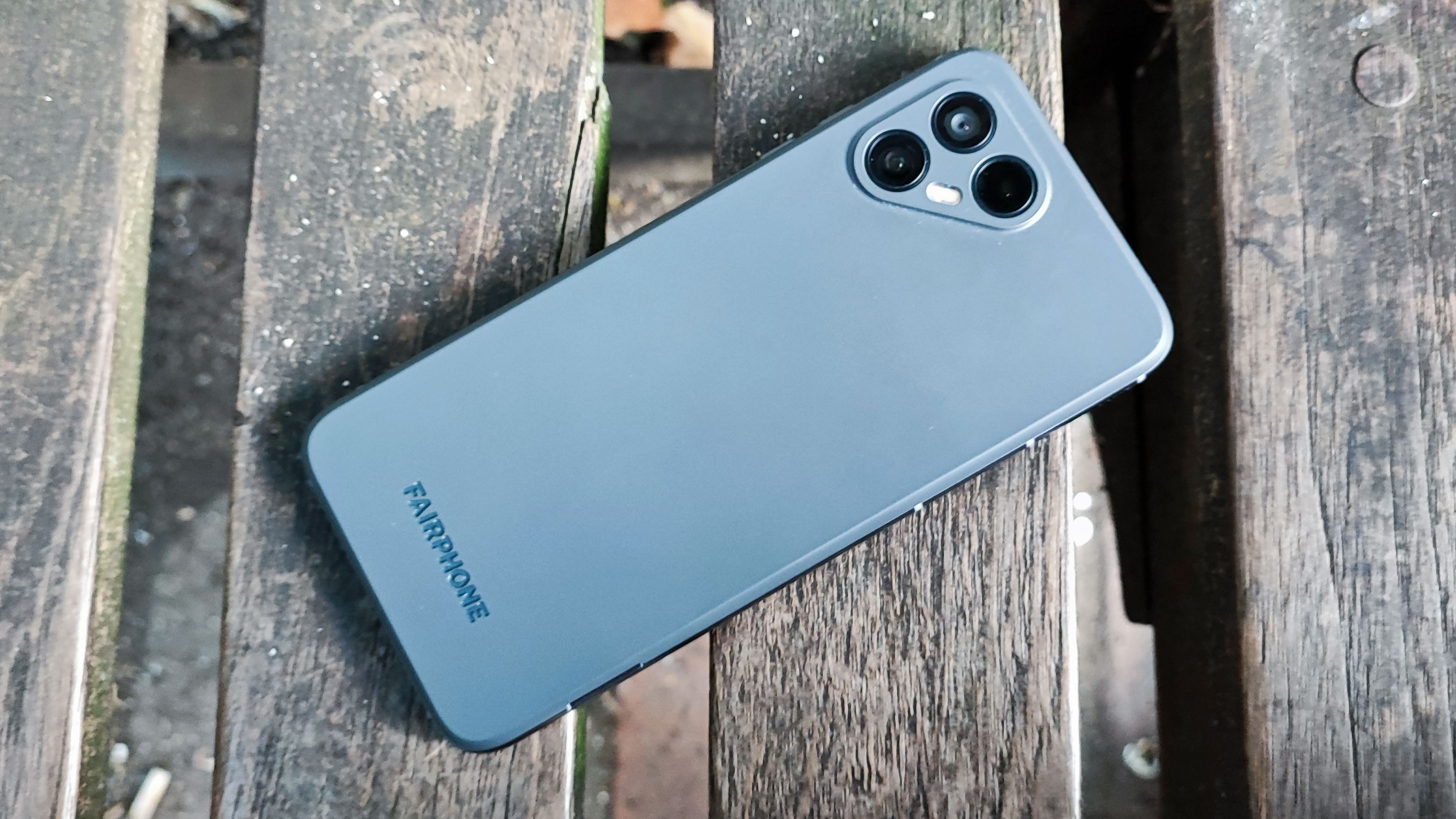
Fairphone 4

(Image credit: Future)

In particular the cameras leave a lot to be desired - pictures looked fine, but we often had to pull them over to a photo editing app to really make them look good, while many native camera apps will do the same thing as soon as you take a picture.

On the topic of issues, we found the fingerprint scanner on the side of the phone sometimes struggled to pick up our finger, leading to a few awkward raise-thumb-lower-thumb-and-repeat moments when we wanted to unlock the thing. Some may also find the lack of a 3.5mm headphone jack, something previous Fairphones had, a deal-breaker, though with the way the phone industry is going you’ll struggle to find alternatives.

The Fairphone 4 has a mid-range price and its specs all fall in line with what you’d expect from a phone at this cost. None of the specs particularly stand out, but they don’t need to, as the unique selling point is in the name: it’s a fair phone, and for some, that’s enough in itself.

Fairphone 4 price and availability

Fairphone only sells its smartphones in Europe for now, so if you live elsewhere, don’t expect to be buying this thing anytime soon.

In the UK, the device costs £499 (around $670, AU$930) for 6GB of RAM and 128GB of storage, and you can bump that up to 8GB / 256GB for £569 (about $770, AU$1,060). If you’re not sure how much storage you need, it’s worth considering that both models have a microSD card slot for up to 2TB of extra room.

Fairphone 4

(Image credit: Future)

Design

If we were to compare the Fairphone 4 to other devices, it’d be to members of the ‘rugged’ niche - these are hardy devices designed to withstand bumps and knocks, useful for workers in certain fields or adventurous types.
The phone’s rear is made from 100% recycled plastics, and it feels tough yet is easily grippable. There’s also a metal frame and these two factors combine to give the device a hardy feel, something which the phone’s specs back up, as it’s IP54-rated against splashes and dust, and also has the MIL-STD-810G certification against environmental and climate hazards, which is something we typically only see on rugged devices.

Measuring 162 x 75.5 x 10.5mm, the Fairphone 4 is pretty thick, and it’s a little on the heavy side too at 225g. However we found it fairly comfortable to use one-handed.

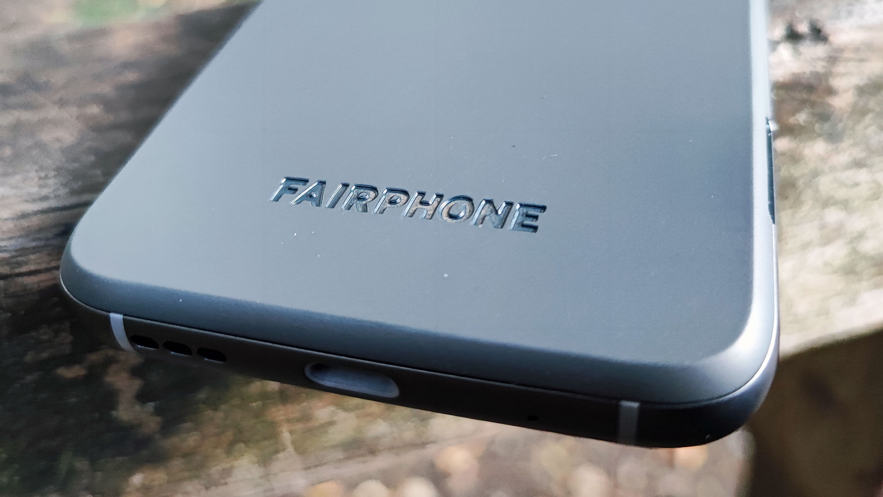
The phone has a USB-C port but no 3.5mm headphone jack, unlike previous handsets from the company, so fans of wired audio will have to use a USB-C adapter to keep using their chosen cans.

Fairphone 4

(Image credit: Future)

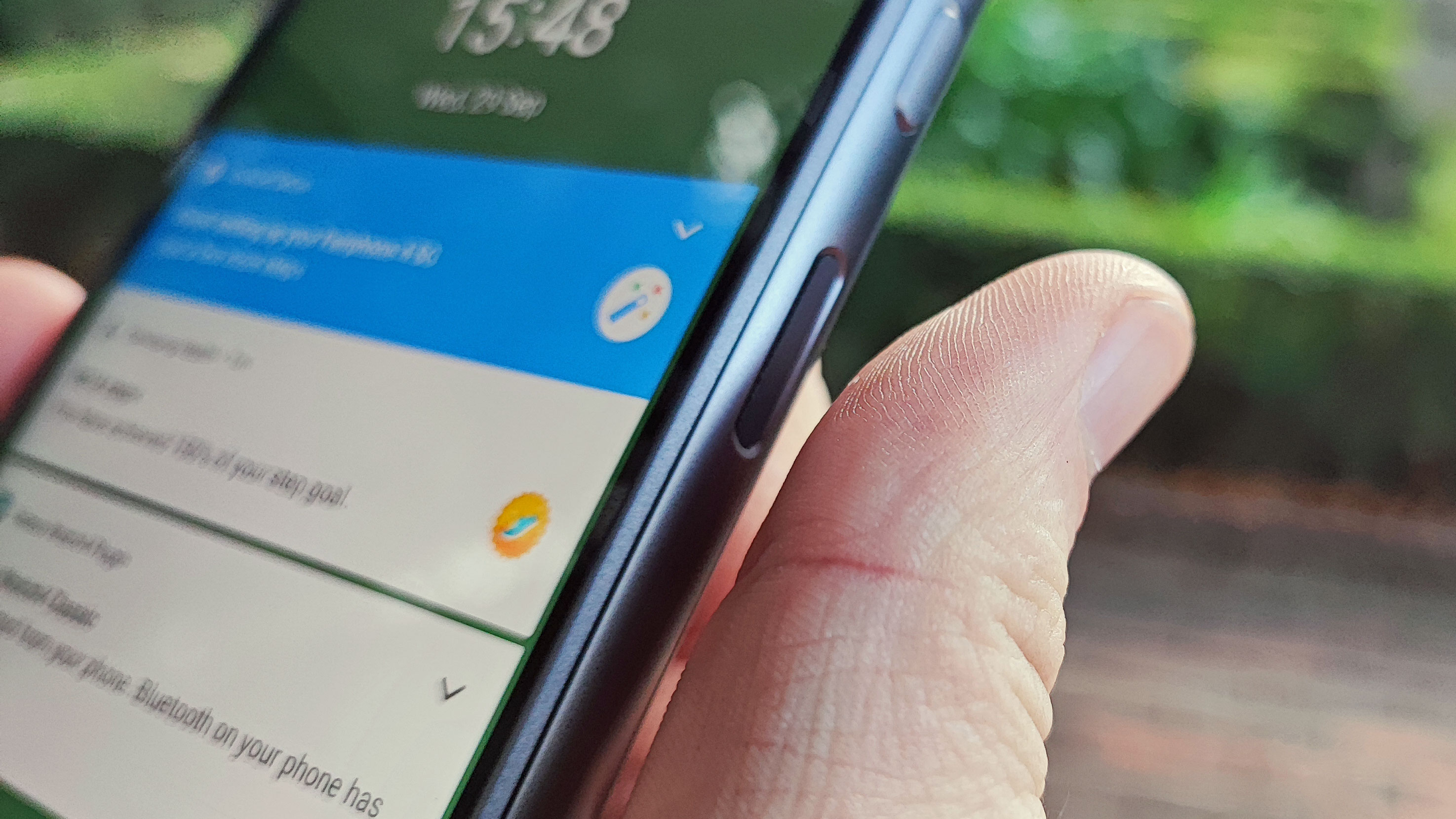
On the right edge of the phone there’s a fingerprint scanner embedded in the power button - this didn’t always pick up our touch straight away, and we sometimes found it a little fiddly to use, though we’ve seen worse. Above this is the volume rocker.

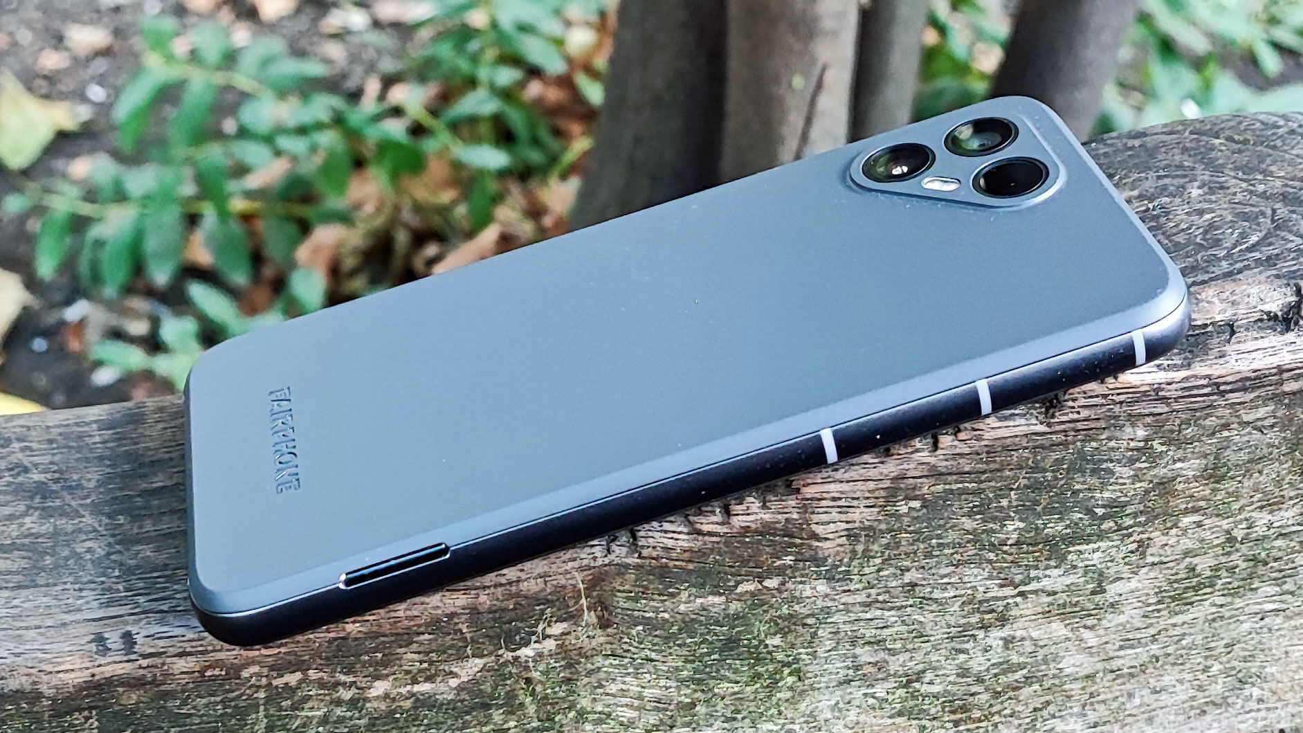
On the back, there are two rear cameras arranged in a triangle, along with a sensor. Likely due to this layout, our test unit was confused with an iPhone multiple times during our testing.

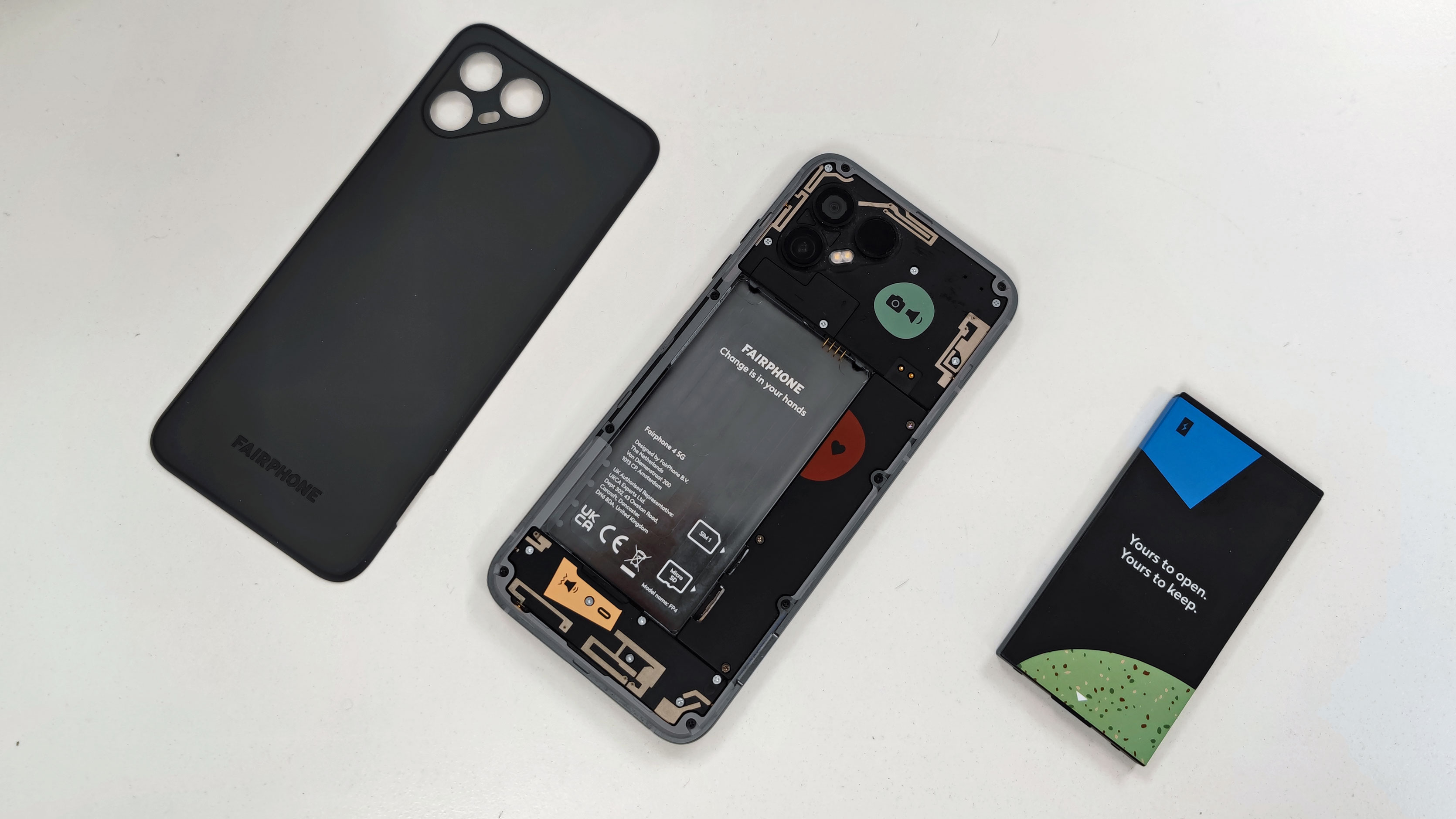
The Fairphone 4 (as well as its predecessors) is a modular phone – this means you can take off the back of the device, remove the battery, and use a screwdriver to replace parts like the rear camera, display and audio module.

Not only does this modularity enable you to replace damaged parts (which you can do yourself, just by ordering spares from Fairphone’s website), it also lets you upgrade your handset if and when the company releases a Fairphone 4 Plus. We saw this with the Fairphone 3 Plus, which had the same body as the Fairphone 3 but with improved specs – if you had the non-Plus device you could simply buy a few parts to upgrade to the Plus yourself.

Fairphone 4

(Image credit: Future)

The replaceable nature of most of the Fairphone 4’s parts is one of its great eco-friendly perks, as if the device breaks in some way, you can easily repair it yourself without needing to send it off somewhere or buy a new device.

You can remove the rear and battery just by hand - you used to be able to do this for most phones in years gone by, but most power packs are non-replaceable now. The Fairphone 4 truly is a blast from the past in many ways, including this.

Display

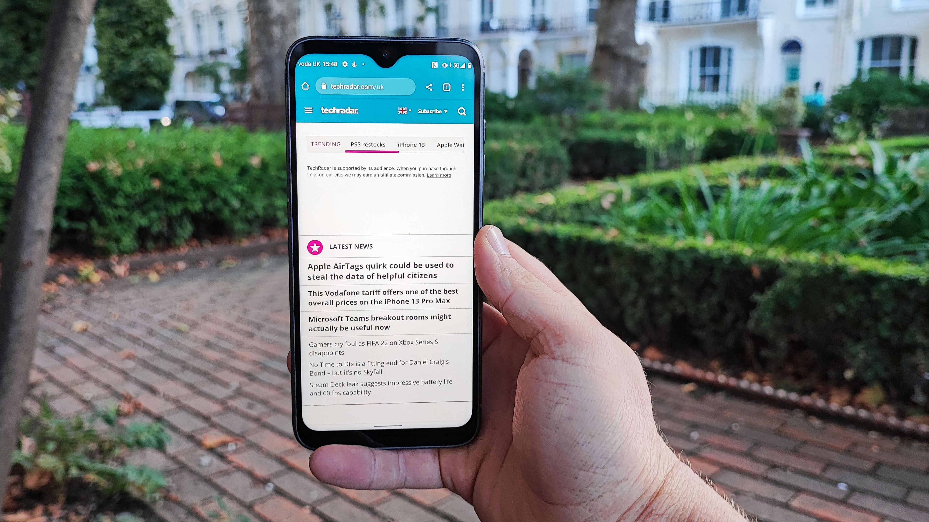
The Fairphone 4 packs a 6.3-inch screen, broken up by a ‘teardrop’ notch at the top which houses the front-facing camera. With the vast majority of phones at all price points opting for ‘punch-hole’ front-facing cameras now, in which the camera is housed in a little cut-out in the screen, a notch feels like a blast from the past.

The resolution here is 1080 x 2340, which is basically the same resolution as all but a few budget or top-end smartphones. It’s an LCD display, so colors aren’t as vibrant and contrast isn’t as pronounced as on an OLED screen, but it is easier to see in daylight than some OLED panels.

Fairphone 4

(Image credit: Future)

Some may find the 60Hz refresh rate on the phone a little slow - this means the image updates 60 times per second, but lots of phones at this price point offer 90Hz or even 120Hz, which makes motion appear smoother.

You wouldn’t buy the Fairphone 4 for its screen quality - it’s the phone’s most journeyman spec - but we weren’t disappointed by it either.

Cameras

The weak link of the Fairphone 4 is its camera array, as pictures weren’t fantastic, and in particular, we had some selfie issues.

The Fairphone 4 has a 48MP main camera, just like the 3 Plus, although it’s a slightly better snapper with an f/1.6 aperture and optical image stabilization. While the 3 Plus only had one camera, the new phone has an extra camera in the form of a 48MP f/2.2 ultra-wide snapper, and also a 3D Time-of-Flight sensor.

Pictures taken on the Fairphone 4 aren’t bad, but they have a problem - there’s very little in the way of scene optimization here. While most other brands design software to spruce up a photo when it's taken, often boosting the saturation and brightness depending on the scene, Fairphone doesn’t seem to have much of this.

We can’t say there’s ‘no’ AI post-processing, because you can actually choose a scene category here as you can on many other phones. It just rarely seemed to do anything.

Fairphone 4

(Image credit: Future)

So pictures taken looked a little desaturated and dull in most settings, though we did get some good shots in good light conditions. Photos were sufficiently sharp though, and by pulling the snap into an image editing app, we could turn them into (near) masterpieces.

The average phone user likely doesn’t expect to have to edit snaps though, not when most devices tune pictures automatically, so if you want great photos right out of the gate, this might not be the best device for you.

We had one other camera issue too, and that was with the 25MP f/2.2 selfie camera. Many selfies we took were strangely dark, with an odd green glow, but the most head-scratching thing is that this effect wasn’t present for every single selfie. Our best guess is that some errant scene optimization is trying to do something here and failing, but it’s hard to tell. You’ll be able to see some images accompanying the review which illustrate this.

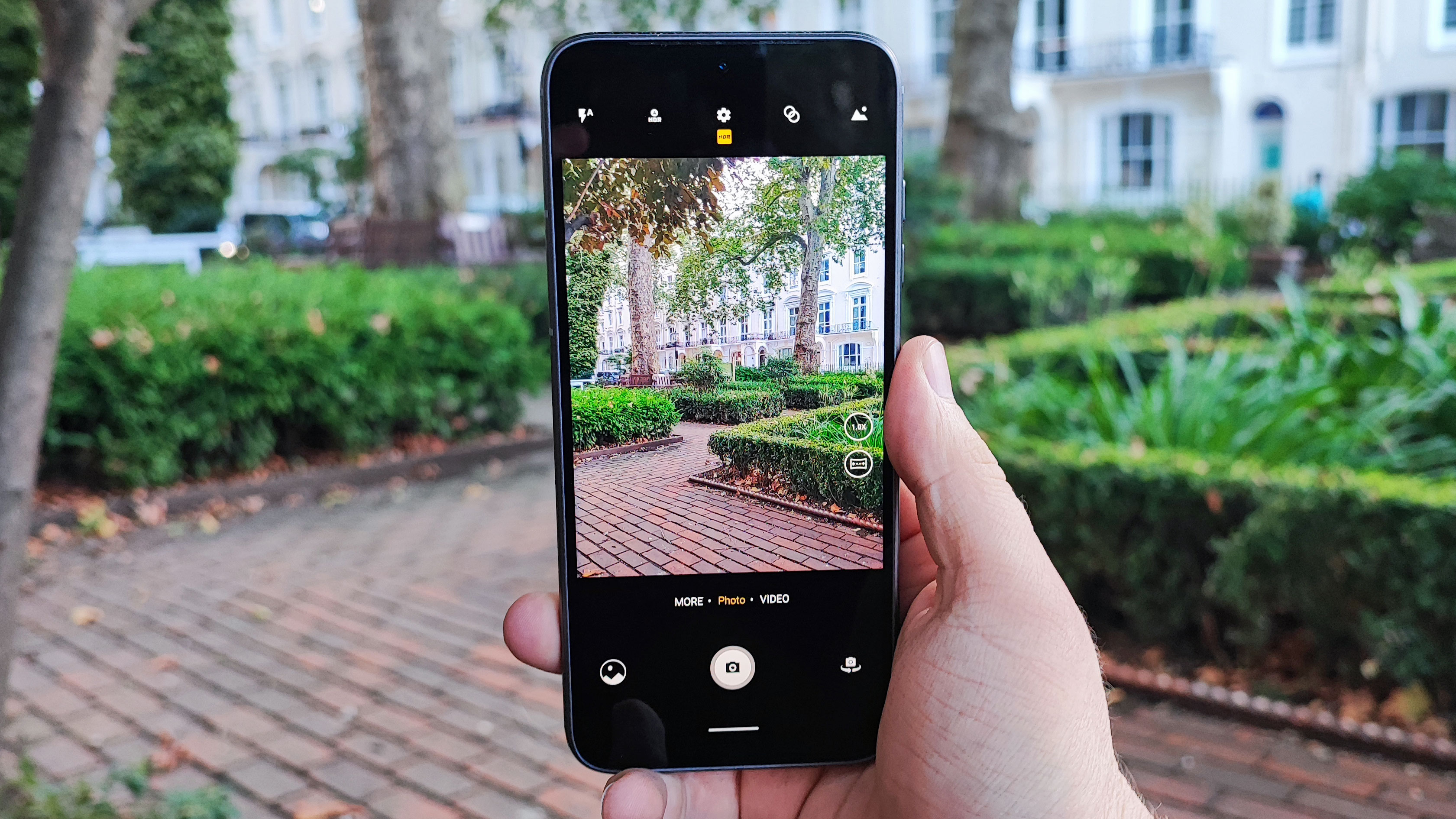
Video recording here goes up to 4K at 30fps or 1080p at 60fps, and there’s a select range of other modes like high-res (instead of 4-in-1 pixel binning like in the default mode, where the camera treats the 48MP snapper like a 12MP one but with giant pixels), slow-motion video recording, time lapses, night mode and panorama shooting.

Camera samples

Image 1 of 5

Fairphone 4 camera samples

This selfie is bizarrely green (Image credit: Future)
Image 2 of 5

Fairphone 4 camera samples

This is taken on the main camera, and lacks the odd greeness of the selfie (Image credit: Future)
Image 3 of 5

Fairphone 4 camera samples

This is a standard picture taken on the main camera (Image credit: Future)
Image 4 of 5

Fairphone 4 camera samples

This ultra-wide shot is - well, you can tell how prevalent the shadows are. (Image credit: Future)
Image 5 of 5

Fairphone 4 camera samples

This close-up picture has good natural depth to it. (Image credit: Future)

Specs and performance

The ‘brain’ of the Fairphone 4 is the Snapdragon 750G chipset - that’s a mid-range processor that we also saw in the Samsung Galaxy A52 5G and TCL 20 Pro 5G. It’s not the most powerful chipset in the world, but it’s enough for most people.

We put the phone through the Geekbench 5 benchmark test, and it returned a multi-core score of 1798, which puts it in league with the Poco X3 NFC and Redmi Note 9T which got 1699 and 1799 respectively. That’s about 200 points above the Galaxy A52 5G but 100 below the TCL phone.

That’s a middling amount of power, which will be enough for ‘average’ phone use like social media, online banking and low-end games, but it won’t quite cut it for video editing or high-end gaming. We tried a few top-end games and the experience could be a little stuttery at times, though mid-range titles were fine.

This chipset is paired with 6GB or 8GB of RAM and 128GB or 256GB of storage depending on which you opt for - as we’ve already mentioned there’s expandable memory for up to 2TB if you buy a microSD card, so unless you want the extra RAM, the smaller option may be enough.

Fairphone 4

(Image credit: Future)

This is Fairphone’s first 5G phone, so you’ll be able to connect to next-gen data networks if and when they roll out in your region. This makes internet much faster, which is useful for downloading files and conducting video calls, though if your area doesn’t have 5G you’ll be able to use 4G just fine too.

The Fairphone 4’s speaker was totally fit for purpose, with calls and videos sounding fine, and it didn’t sound terrible for playing music either (as some mid-rangers can put out tinny noises), though obviously an actual dedicated speaker or headphones will be much better.

Software

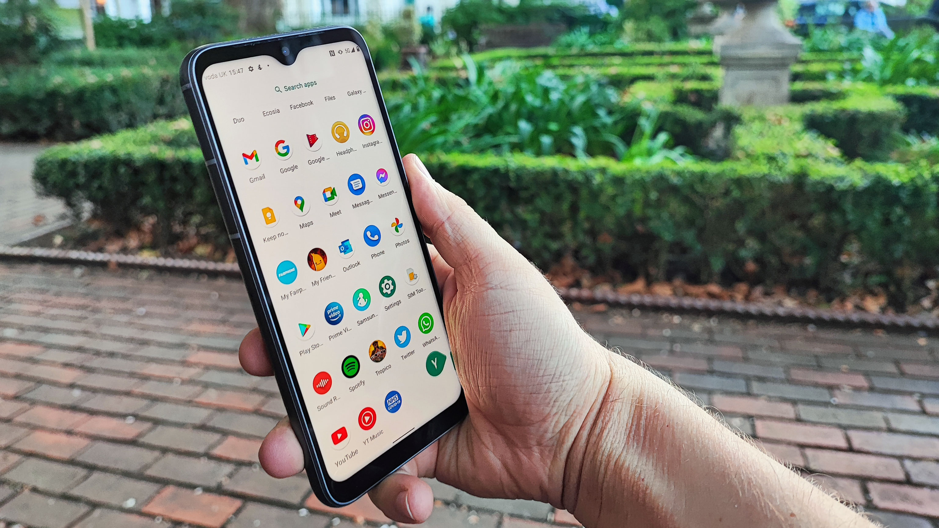
The Fairphone 4 runs stock Android 11, as designed by Google - the only thing the company has added is a Fairphone app which comes pre-installed, and tells you about the brand’s mission.

Otherwise, this is the same Android operating system as you’d find on your Pixel, Motorola or Nokia mobile, with a clean appearance, round icons and Google’s pre-installed apps like Pay, Maps and Keep.

Fairphone 4

(Image credit: Future)

If you like your phone lasting a long time, this is a good choice for you, as Fairphone has pledged to keep updating the phone with software and security patches until at least 2025, and will definitely keep the Android version up to date until Android 13, and possibly further.

We found the user interface fairly slick to navigate, though there were times, particularly when we were downloading big apps, that it stuttered a little.

Battery life

Despite having a 3,905mAh battery - that’s pretty small compared to lots of rivals, with their 4,500mAh to 5,000mAh power packs - the Fairphone 4 had very impressive battery life.

The phone easily lasted a day after being charged, and it often sailed far into the second day of use too. That was the case even when we played lots of games, streamed hours of music and spent too long scrolling through social media; heavy use still ensured the phone lasted a full day.

This must be a case of software optimizations done by Fairphone. Charging speeds are a little less impressive at 20W though, and the phone took well over an hour to power up to full.

Fast charging can degrade a battery, so slower charging makes sense given longevity is one of the Fairphone 4’s key points. However the battery is easily replaceable by ordering a new one online and replacing it by hand, so we would have liked to see slightly quicker powering.

Should I buy the Fairphone 4?

Fairphone 4

(Image credit: Future)

Buy it if...

You care about the environment
From its recycled body and energy efficiency to its conflict-free components and fair production environment, the Fairphone 4 is a great device for people who care about the environment. 

You treat your phones rough
If you’re prone to dropping your phone, or bumping it into things or just dropping things onto it, you’ll find the Fairphone 4’s plastic rear and metal frame can take a beating. 

You need a long-lasting phone
The Fairphone 4’s build and software promises ensure the phone will keep working for years to come, and the fact you can replace parts easily just ensures you won’t be throwing it away in a year or two if it breaks. 

Don't buy it if...

You want fantastic camera performance
There are a fair few phones at the Fairphone 4’s price that lap it in the camera department, with higher-res sensors and better image optimization, so if you just need a portable camera it’s perhaps not the best choice.

You need to use your wired headphones
You can’t just plug your wired headphones into the Fairphone 4 like you could its predecessors, so if you need to use cans with cables, you’ll either need to buy an adapter or just pick up a different device.

  • First reviewed October 2021

Roberts Radio Revival Petite DAB radio

Two-minute review

Do you need one of the best DAB radios? It's not difficult to listen to digital radio. From your smartphone you can fire-up any number of apps and choose from thousands of global digital radio stations, streaming them live in an instant. If you’re in front of a PC or Mac and you can easily do the same via a web browser. 

However, it’s much quicker just to hit a big orange button on a small box the size of a can of beans. 

That's the thinking behind this latest DAB radio from Roberts Radio, which has come up with a diminutive and rather cute-looking box that delivers everything a regular size digital radio can, but in a small package. It also acts as a Bluetooth speaker

The Revival Petite doesn’t connect to the mains. Instead, it’s battery-powered, with its internal battery recharging over micro USB and going for about 12 hours on a single charge. It’s not pocket-sized as such, but cube-shaped, measuring 73 x 124 x 76mm and weighing a reassuring 430g. 

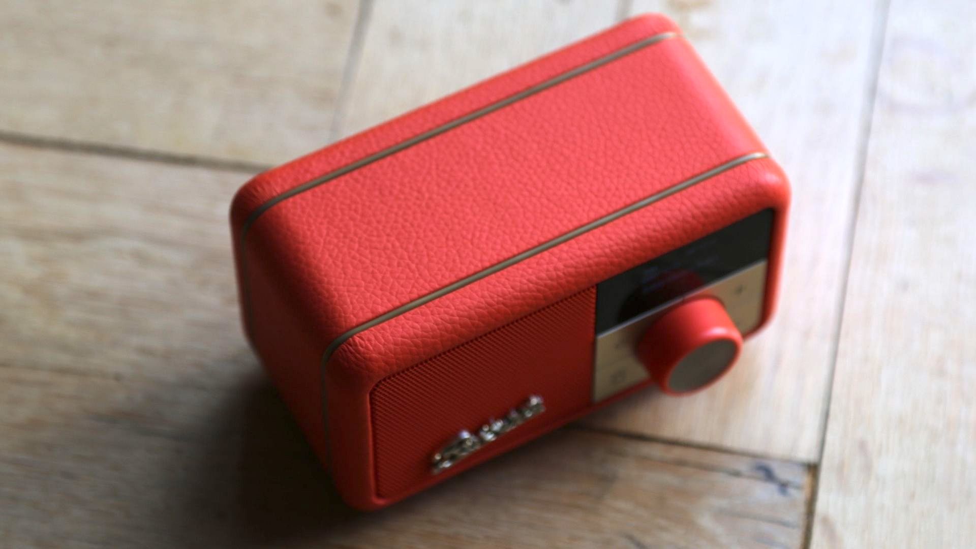
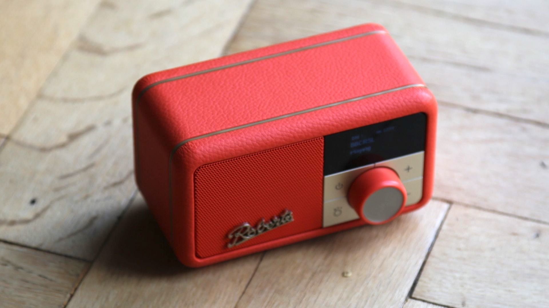
a top-down view of the roberts revival petite digital radio

(Image credit: TechRadar)

We love the styling – its mottled vinyl covering and unusual colours lend retro goodness while its small OLED screen updates it to the present – and we’re almost as impressed with the audio. The Revival Petite may appear to be more about convenience and portability than sound quality, but it features an impressive bass response that’s good enough for music. It doesn’t quite go loud enough,  cleanly enough to be a candidate for using outdoors for, say, a BBQ, but it’s highly impressive at slightly lower volumes or when used indoors. 

The most unusual-looking and smallest-yet DAB radio isn’t the best-sounding around and nor is it the most fully-featured, but it’s easily good enough for a kitchen worktop, bedside table or a desktop.

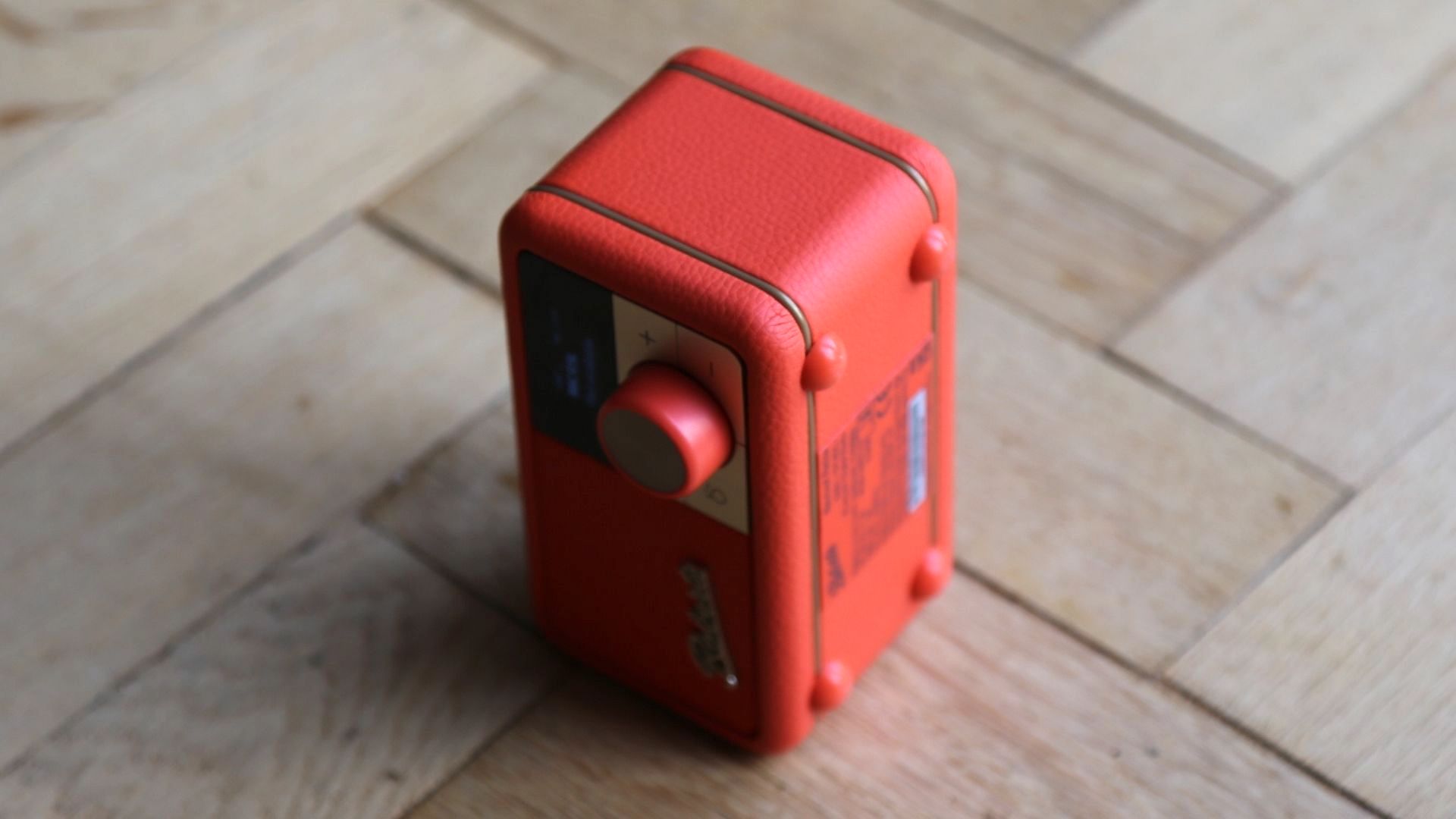
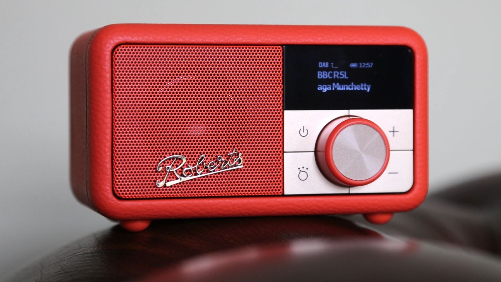
the roberts revival petite digital radio in red

(Image credit: TechRadar)

Roberts Revival Petite price and release date

  • Out now
  • Costs £99.99 

The Revival Petite is a new addition to the Roberts Revival range, which has been around for many years and is one of the UK’s best-selling radio ranges – it’s flagship is the Roberts Revival RD70. Available in black, yellow, pink, orange, blue and duck egg blue, the Revival Petite is by far the smallest and most unusual-looking product in Roberts Radio’s stable. 

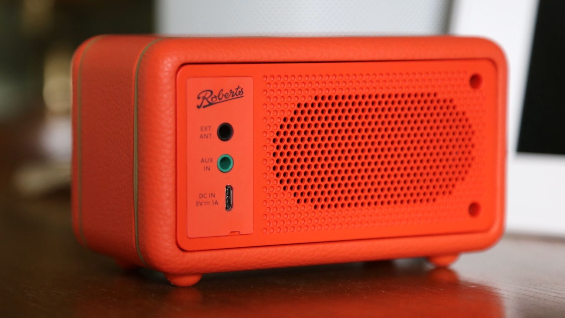
the back of the roberts revival petite dab radio

(Image credit: TechRadar)

Design

  • 50 x 23mm OLED screen 
  • Diminutive size
  • Rechargeable battery

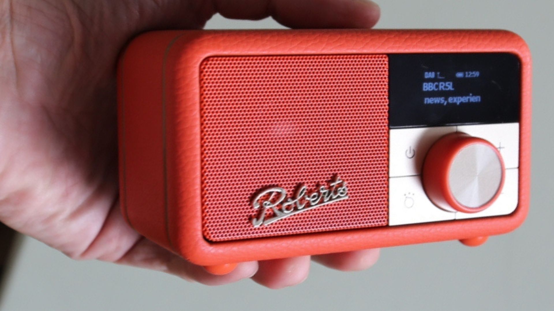
The Revival Petite has a highly unusual look. The initial unboxing was a shock, revealing the Revival Petite to really live up to its name. At a mere 73 x 124 x 76mm this is a tiny digital radio, though it’s much deeper than your average portable DAB radio. That bodes well for the sound we expect to come from its small mono speaker. Its 430g weight is reassuring, too; the Revival Petite is much heavier than it looks. 

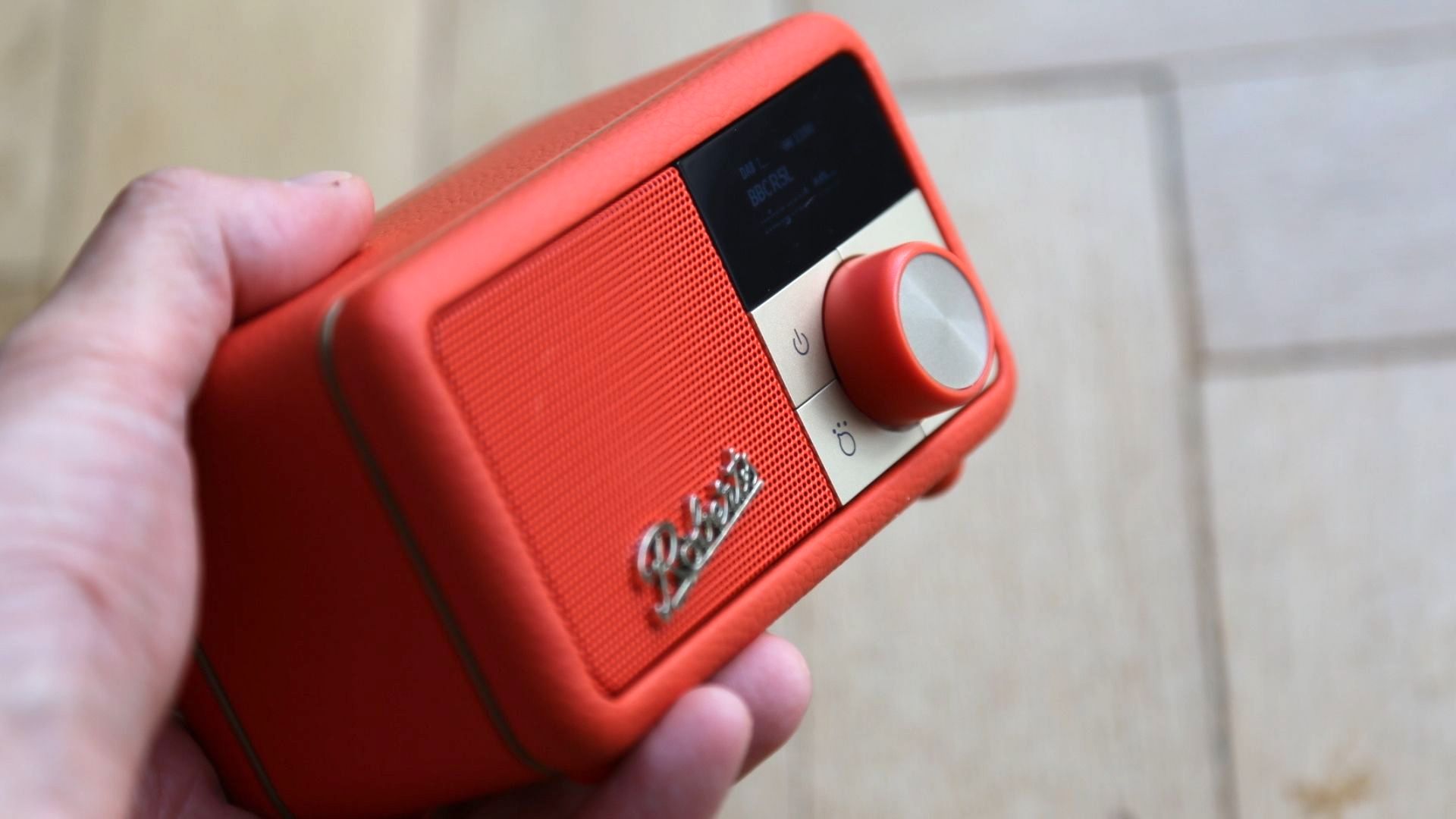
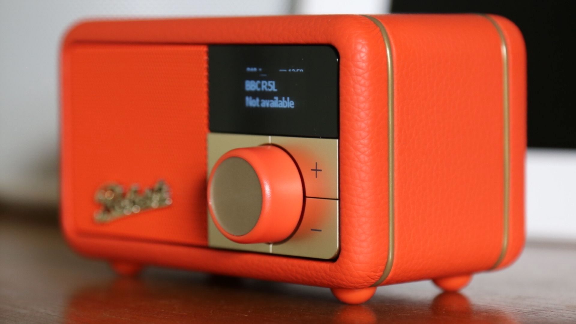
Although it’s a (highly) miniaturised DAB radio it sports the same styling as everything else in Roberts Radio’s Revival line-up; there’s a mottled vinyl covering and a highly tactile button protruding 12mm from the front of the product’s right-hand side. It acts as the main control. It’s ranged between four other buttons, but below a 50 x 23mm OLED screen. 

As space-saving designs go it’s hard to beat the Revival Petite – it’s tiny! 

someone holding the roberts revival petite dab radio

(Image credit: TechRadar)

Setup

  •  DAB/DAB+/FM and Bluetooth 
  •  20 presets (10 DAB and 10 FM) 
  •  OLED screen is very small 

The Revival Petite couldn’t be easier to set-up, but there are a few options depending on the scenario you want to use it in. Switch it on using that big orange button and it instantly goes into autotune, which during our tests took less than a minute. 

In our initial test zone it failed to keep a steady signal, with lots of drop-outs. So we moved it around the room and found that it mostly achieved an excellent reception. Roberts also provides a 65cm long aerial cable that fits in the 3.5mm jack in the back of the Revival Petite (though you can also use that input to attach almost any audio device). 

Although you can use the Revival Petite as a portable, standalone device just by topping up its internal battery every 12 hours using any micro USB cable, Roberts does include a 100cm micro USB-to-USB cable in the box. It’s specifically designed to let you attach the Revival Petite to a main plug sporting a USB slot.

the orberts revival petite dab radio red

(Image credit: TechRadar)

The only thing we had a slight concern about is the size of the text on the tiny OLED screen. Scrolling through a list of DAB radio stations was relatively easy – as is assigning regularly-used stations to one of the 20 presets (10 for DAB and 10 for FM), though if you have poor eyesight this could be a struggle. 

Attaching a smartphone to the Revival Petite is easy; you just toggle the input button until it reaches Bluetooth, and it’s a cinch to find it on a smartphone. It remembers up to eight devices. 

a top-down view of the roberts revival petite digital radio

(Image credit: TechRadar)

Audio performance

  • 40mm speaker with passive radiator 
  • Surprisingly good bass response 
  • Some distortion at highest volume 

Nobody is expecting the tiny Revival Petite to offer anything special when it comes to music, right? However, despite being so small it has a surprisingly good bass response, with both voice-based DAB radio and music – including that streamed from Bluetooth – demonstrating impressive depth given its size. 

It’s certainly good enough for any kind of voice radio and podcast, but adept enough for music, too. It’s not going to get loud enough for an outdoor garden party or BBQ, but used indoors it’s an impressive performer.  

the roberts revival petite dab radio on its side

(Image credit: TechRadar)

We were also fairly impressed by the quality of music streamed to the Revival Petite from a smartphone, though there are a few caveats. To get even a basic performance it’s necessary to turn up the volume on a smartphone to max, and to whack it up to a relatively high level on the Revival Petite, too. 

That’s not unusual for DAB radios with Bluetooth modes, but while we did hear a little fling and buzzy distortion at the very highest volume, the Revival Petite managed to produce a reasonably good soundstage from streamed music. The one issue is that you must remember to turn down the volume before swapping to the built-in DAB or FM tuner to avoid being blasted. 

Should I buy the Roberts Revival Petite DAB radio?

the roberts revival petite dab radio in red

(Image credit: TechRadar)

Buy it if...

You want one-touch DAB radio
Sure, you can find any DAB radio station online via your phone, tablet, laptop or desktop PC or Mac, but fiddling about with apps and browsers can get annoying if you always listen to the same DAB radio station. The Revival Petite gives you one-touch access – and doubles as a Bluetooth speaker – though it lacks alarms, so isn’t perfect for the bedside table. 

You want more from a Bluetooth speaker
Bluetooth speakers aren’t exactly hard to use, but if you mainly want it for DAB radio then the Revival Petite offers the best of both worlds. Its 12-hour battery life is more than most portable speakers, too.

Don't buy it if...

You’re expecting room-filling sound
With a mono speaker, the Revival Petite is best thought of as a vehicle for voice radio and podcasts, though it’s fine for casual listening to music radio stations. If you’re after a great Bluetooth speaker for outdoor BBQs and parties then there are better options, but its bass response is surprisingly good.

You’ve completely swapped to USB-C
Sadly the Revival Petite recharges its battery via micro USB, which is a little old-fashioned. It’s also rather inconvenient if all of your other gear now uses USB-C. 

!!!!!!!!!!

Popular Posts

Categories

Blog Archive