Microsoft Surface Duo 2
Two-minute review
When Microsoft released the original Surface Duo back in 2020, it was all about providing professionals an easy way to work on the go, getting rid of the barrier between being in the office and being on the road. It was an odd thing to sell in the middle of a global pandemic, to be sure, but the Surface Duo 2 is here right when the world seems to be at least starting to reopen.
And because the world just wasn’t at a stage where something like the Surface Duo 2 was needed a year ago, it feels kind of like a fresh start this time around. We know we’re much more out-and-about than we were when we reviewed the original Android phone, and we know we’re certainly not alone.
But the Surface Duo 2, in the face of this fresh start, comes with a higher price tag, starting at $1,499 in the US, which is a bit more than the $1,399 (£1,350, about AU$1,930) that Microsoft asked for last time. With that higher price you are getting a flagship-level mobile chipset in the Qualcomm Snapdragon 888, along with 8GB of RAM and way better cameras – both front and back.
The specs aren’t the most impressive part of the new Surface Duo though. Instead, it’s the improvements Microsoft has made to actually using the device on a day-to-day basis that makes it feel more like something we’d be comfortable carrying in our pocket each day. There is still some bugginess, especially when you’re really pushing the device, but rather than it feeling like problems that are inherent to the device, like last time, it feels like something that can easily be fixed in a firmware update.
Now, we haven’t been able to carry this around quite as much as we’d like to, due to an issue with our mobile plan, but that doesn’t mean we haven’t been poking around at the phone in our home on Wi-Fi for a while. So while we’re going to be doing more testing to give the Surface Duo 2 a final score and review at a later date, we can at least provide some impressions that go beyond the 20 minutes or so that we spent with the device back in September 2021.
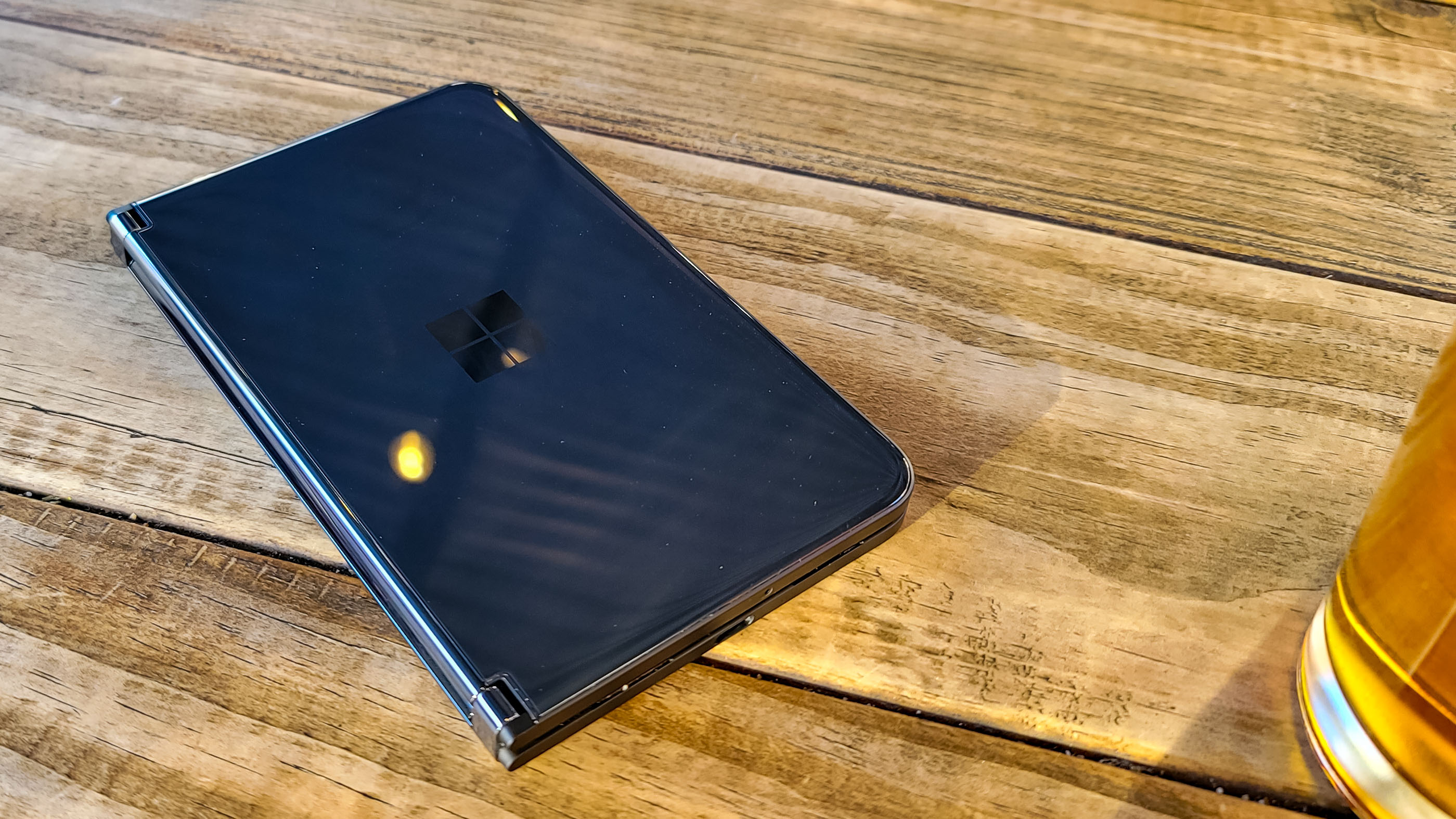
Microsoft Surface Duo 2 price and availability
The Microsoft Surface Duo 2 is available today, starting at $1,499 / £ 1,349 / AU$2,319. For that price you’ll get the standard configuration with the Snapdragon 888 chipset, 8GB of RAM and 128GB of storage.
You can upgrade the storage to 256GB for $1,599 (£1,349, AU$2,469) or 512GB for $1,799 (£1,429 AU$2,769). If you want the top-end 512GB option, you’re going to have to go with the Obsidian colorway – which is the better one anyway if you ask us – but you can get the 128GB version or the 256GB version in the Glacier White colorway as well.
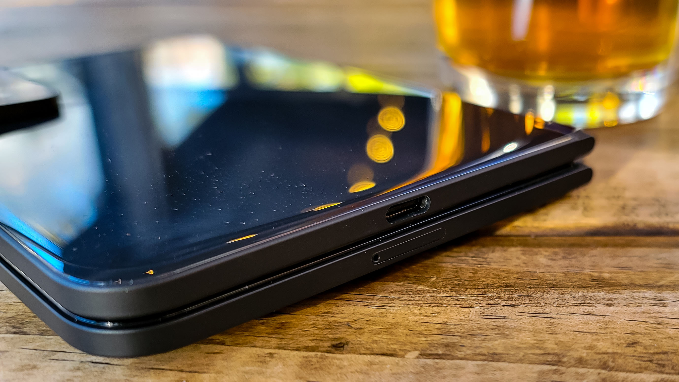
Unlike the original device, though, the Surface Duo 2 doesn’t come with the Bumper case that’ll protect it from falls. That’s not as big of a deal as the last time around, as the sides of the phone are a more rugged plastic this time. Still, it does have the added benefit of letting you magnetically attach the Surface Pen to the device, so it’s something you’re probably going to want to get if you plan on using Microsoft’s stylus.
So, the Surface Duo 2 is an expensive device, but especially now that it has a high-end chipset rather than the mid-range silicon in the original device, it’s more competitive with the phones around it. The Samsung Galaxy Z Fold 3, for instance, will cost you $1,799 / £1,599 / AU$2,499, which is slightly more expensive than a similarly configured Surface Duo 2. Then again, the Samsung Galaxy Z Fold 3 has 12GB of RAM, which makes it even better at multitasking – but more on that later.
Design
In so many ways, the Surface Duo 2 feels like a finished product in ways that the Surface Duo never did. While it’s recognizable as a follow-up to the original Surface Duo, key refinements have been made that put it above and beyond the original – and that device wasn’t exactly hard to look at.
The new obsidian colorway we have in for review is the first thing that comes to mind. It’s a black phone, which means it won’t show dirt or scratches quite as easily, which is good because it’s still using the same glass outer casing as the last device. This does mean that fingerprints are a bit more visible, but we’re able to get rid of the fingerprints easily with a quick wipe, so that’s not a big deal.
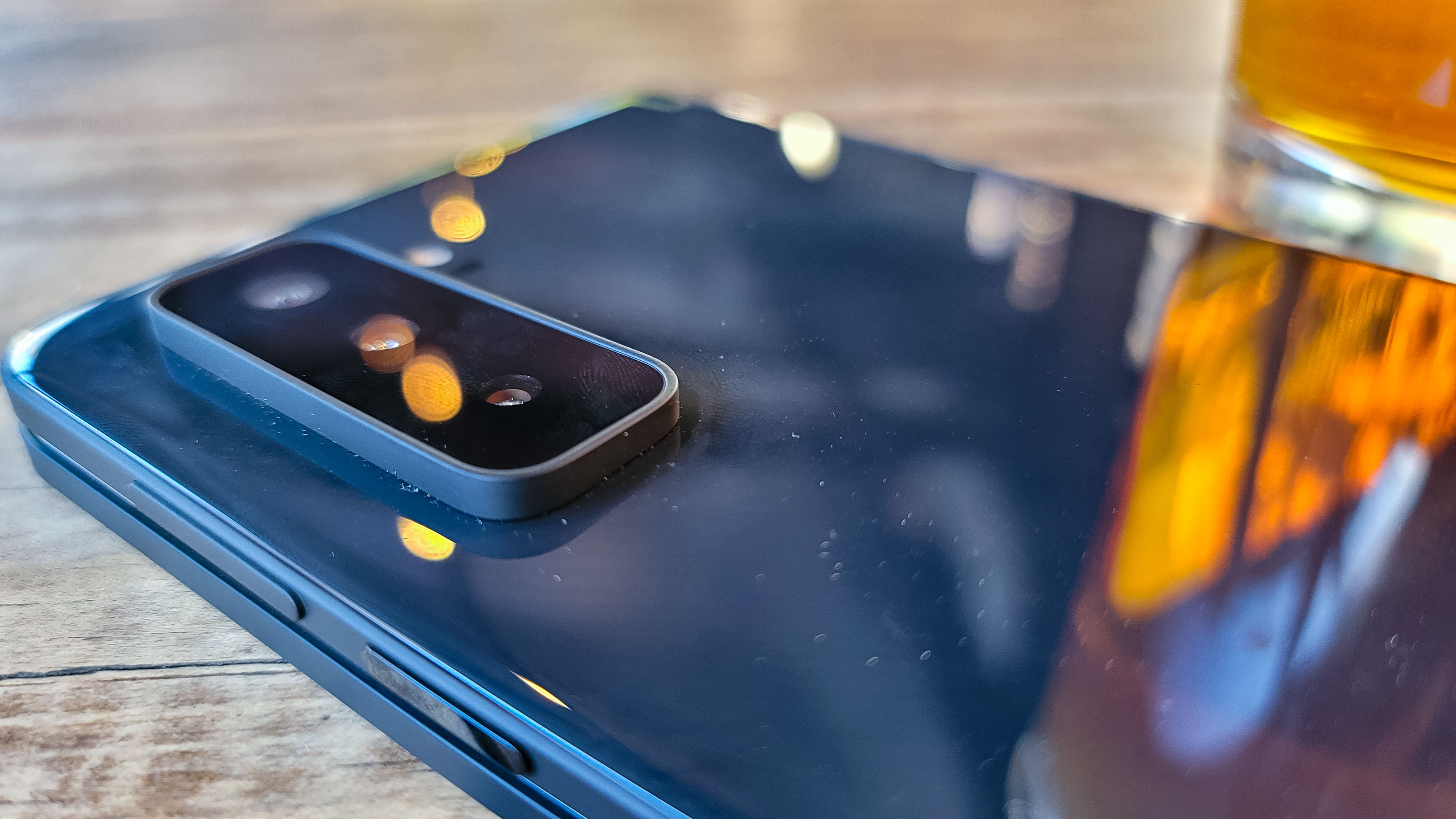
One of the most noticeable changes, though, is the huge camera bump on the back. Microsoft went with a more powerful triple-lens camera setup this time around, which means the camera now protrudes a considerable amount from the back of the phone. This is something we’re used to in the Samsung Galaxy Note 20 Ultra we use as a personal device, but there’s one critical difference between the two devices: the Surface Duo 2 needs to close on top of this camera bump.
That was one of our first worries when we first started using this device, but it’s one that has since turned out to be assuaged. The camera is surrounded with this plastic material, which extends a bit further than the glass back of the camera. This means that the actual lenses aren’t making direct contact with the back of the left side of the device when it closes, and the glass casing of the device isn’t in danger of shattering after opening and closing it repeatedly.
The only real side effect of this, though, is that the Surface Duo 2 just kind of feels a bit odd when you’re using it in a one-screen mode, which we often do when we’re just looking to type out a quick text message. It’s not enough to be uncomfortable, but it feels a bit funky, though this is probably something you’ll just get used to during the life of the device.
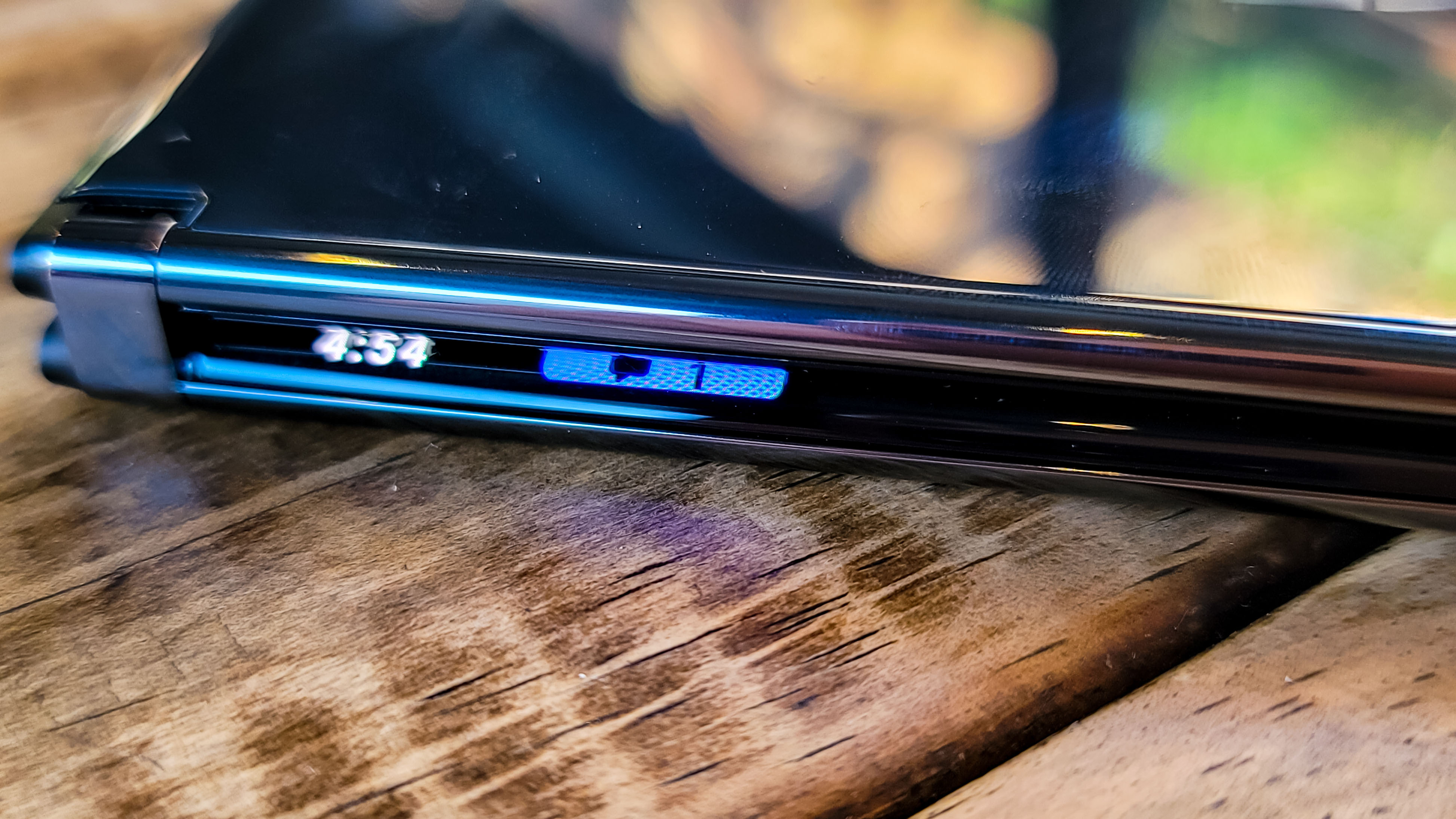
Microsoft has also addressed one of the most annoying parts of using the original phone – it was just a pain to have to open the device just to check the time or whether you had any missed texts. Luckily, the Surface Duo 2 has displays that curve around the edge of the device and you can quickly tap the unlock button to show the time printed on the side.
This will also show a little light-based notification when you’re getting a call or a text, but beyond those basic notifications you’ll have to open the device to look. It’s a start, and we wish Microsoft would have included at least a notifications counter or something, like how the LG V60 does in its always-on display portion.
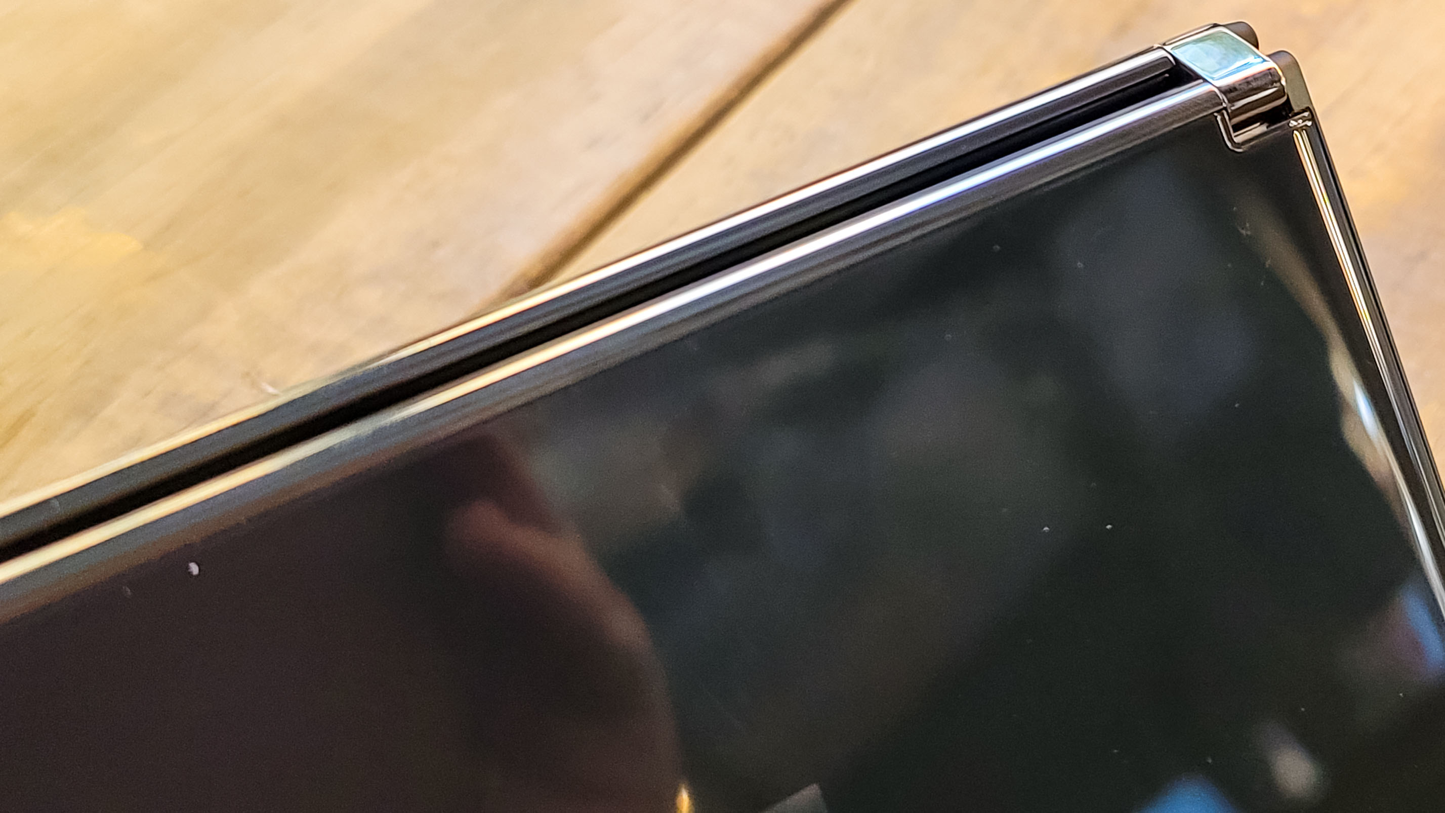
As far as we can tell the Surface Duo 2 hinge is exactly the same as it was on the Surface Duo, and that’s a good thing. It has just enough resistance that it won’t accidentally open, and once it is open, you won’t find it swinging around or anything. We prefer this to the folding display you’d find in something like the Fold 3, too, because the two discrete displays mean you don’t get an ugly crease in the middle of your screen when you’re working – unless you span an app across both screens.
Dual screen
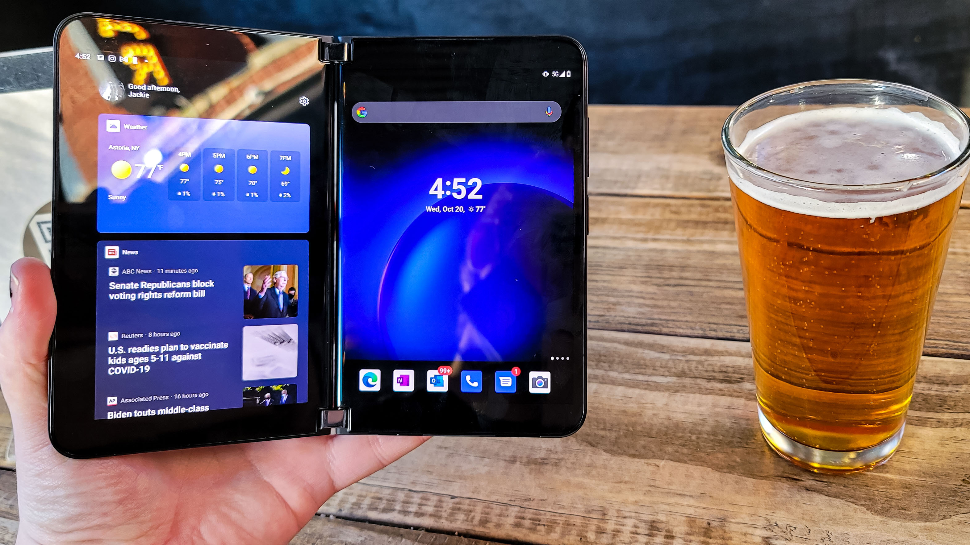
Just like the Surface Duo, the Surface Duo 2’s entire pitch revolves around its dual-screen design. But at least they’re better screens this time around.
Where the original device had two 5.6-inch AMOLED displays with a 1,350 x 1,800 resolution, which combined into a “single” 8.1 display with a 1,800 x 2,700 resolution, the Surface Duo 2 narrows the bezels a bit to expand the displays.
This time, there’s two 5.8-inch displays, which open up to a full 8.3 inches. And Microsoft keeps the PixelSense classification, by making each display 1,344 x 1,899, which makes it a combined resolution of 2,688 x 1,892. This is a slightly higher resolution, but the larger display basically cancels it out.
What does make the displays even better though is that they each have a 90Hz refresh rate and a peak 800 nits of brightness. Although, in our testing, the peak brightness only ended up being around 672 nits. It does hit 87.3% of the DCI-P3 color gamut, though, which is incredibly impressive, and is actually better than the Microsoft Surface Laptop Studio, which is a laptop entirely geared toward artists.
This means that all content looks absolutely gorgeous on the two displays, and whether you’re browsing Instagram, watching Netflix or struggling to pay attention in a long Teams meeting, everything will look beautiful.
However, there are still some problems. Sometimes, when running an especially heavy application on one of the displays and trying to run something like Edge or Slack on the other screen, the UI crashes, which leads to a black screen and us having to restart the phone. We’re still not sure what’s causing this and it’s one of the things we want to do a bit more testing on, but it’s a worrisome bug, and could severely impact the use of the device. But, again, stay tuned on that one.
The gestures for dual-screen usage are the same as they were the last time around, and you can swipe up and drag towards the middle of the two displays to have an app span across both screens. This basically works the same as it did on the original Surface Duo, but some apps, like Instagram, for instance, will only be available in one orientation.
Most Microsoft apps, on the other hand, take full advantage of the dual displays on the Surface Duo 2 again. What we find ourselves using the most is Outlook across both displays, as having both your email list and your current email side by side makes going through our morning emails so much less of a chore.
This will also be beneficial in Teams, where you can have the chat open on one display, with the actual video call open on the other. That’s not something we’ve tested much, as we honestly just never find ourselves using Teams for anything, but if you primarily work through the Microsoft Office suite, you’ll get a lot of use out of the dual-screen functionality.
For everyone else, it’s still just neat to have two apps open side-by-side, but the Surface Duo 2 is far from the only phone that can do this.
Camera
We wouldn’t think of the Surface Duo 2 as being a device where an excellent camera is super necessary, but when you’re paying this kind of cash for a phone – even if Microsoft isn’t calling it that – the camera had better be at least decent.
That definitely was not the case with the Surface Duo. But with the Surface Duo 2 Microsoft has made some huge improvements, making it at least good enough to get photos that look like they came from this decade.
It’s not going to match the photos taken by the iPhone 13 or the Samsung Galaxy Note 20 Ultra, but they’ll be good enough for most people – especially if you just need to get a quick shot of something for work.
This time around there are two cameras, one 12MP front facing camera, and a triple-lens camera on the back. This includes a 12MP wide lens, a 12 MP telephoto lens and a 16MP Ultra-Wide lens. We’ve included some camera samples down below. It’s such a huge improvement from the original device, and one that honestly should have just been there to begin with.


Performance and specs
Finally the Surface Duo has a decent chipset in it. The original device, while it was a neat idea, struggled precisely because Microsoft has the same problems with its phones that it does with its laptops – it never includes powerful enough componentry.
This time around, Microsoft has included the Qualcomm Snapdragon 888 chipset, which is a marked improvement over the Snapdragon 855. And while Microsoft has also included more RAM in the Surface Duo 2, with 8GB instead of 6GB, it still isn’t quite enough for what this phone is trying to do.
In our ideal world, we would be able to constantly run multiple demanding apps side by side as our work requires – as it often does. But because Microsoft didn’t include the 12GB of RAM that most flagship devices run these days, running a demanding app like, for instance, Genshin Impact, on top of Discord is what led us to the UI crash we mentioned before.
Again, we’re going to have to spend more time with this device as our daily carry before we make any final judgments here, but it’s baffling to us that Microsoft wouldn’t just go all-out with the specs. Sure it’s not a gaming phone, but productivity work can be just as demanding as a game, especially on a phone.
It’s just a shame because the Surface Duo 2, along with the optional Surface Pen, would be such a good option for artists that want a device to whip out to do a quick sketch, but to get there, Microsoft needs to include more RAM.
And this goes for the entire Surface lineup – from the Surface Duo 2 to the Surface Studio – please stop underestimating how much power your users may need, especially for enterprise products like the Surface Duo 2.
Battery life
We’ve only been using the Surface Duo 2 for about 48 hours and have only had to charge it once. That’s less experience than we’re comfortable with for coming up with a judgement call, but it seems fine.
The one time it ran out of battery on us, we were able to get it back up to about 50% battery in about 15 minutes, but that was through the Razer GAN charger, rather than through the charging brick Microsoft includes in the box.
Microsoft is claiming up to 15.5 hours of video playback and 28 hours of talk time, which will definitely be impressive if it’s true. We’ll be taking the phone out and about over the weekend to see how it fares in actual, realistic, use, though.
Early verdict
The Surface Duo 2 is a huge improvement over the Surface Duo. It’s faster, prettier and has a camera that doesn’t suck. However, there are still some bugs present, which does affect how you’ll be using the device.
Microsoft is pitching this device as a sort of savior of productivity. To be honest, that’s where the original shined, and it’s where the Surface Duo 2 really gets into a groove. If you’re the type that is always trying to get some work done no matter where you're at, this is still the device for you, even in the face of some slight usability kinks.
Microsoft tells us that it will be releasing monthly updates for the Surface Duo 2, and it feels so close to a finished, polished product that it probably will be about a month or so after launch. So, if you’re the target audience for the Surface Duo 2, it’s probably worth buying.
0 comments:
Post a Comment