[Editor's Note: What immediately follows is a rundown of the latest developments and features Microsoft has added to Office 365 since this review was last updated.]
February 2018
- In the face of GDPR, Microsoft 365 is gaining powers to help protect sensitive data, including a Compliance Manager for Office 365 Business and Enterprise users in public clouds.
- Resume Assistant arrived in Office 365, allowing Word users to leverage the power of LinkedIn in order to craft a better CV.
- Microsoft Planner gained some new features including a Schedule View which makes it easier to plan ahead, along with Group and Filter options to help with meeting deadlines.
- Not strictly Office 365 news, but it emerged that Microsoft is making Office 2019 a Windows 10-only affair – showing the firm is still pushing folks towards its subscription offering.
- Office 365 Education received a new learning tool, Dictation in Office, which allows students to write using their voice across Word, PowerPoint, Outlook Desktop, OneNote for Windows 10, and Word/OneNote Online.
January 2018
- Microsoft Teams saw some extensive work, including the ability to use interactive cards pulled from third-party apps directly in conversations as easily as you might drop in a GIF.
- Microsoft made an important move for iOS and Mac users, with the introduction of seamless co-authoring across Word, PowerPoint, and Excel.
- Mac for Office 365 subscribers got another new feature: AutoSave in Word, Excel, and PowerPoint, facilitating automatic saving for files stored in the cloud (OneDrive and SharePoint).
- Yammer users benefited from improvements to the mobile app which allow them to post announcements to groups, as well as adding animated GIFs, and more besides.
- OneDrive for Business users received the ability to easily restore files to any point in the last 30 days, a feature which will hopefully be coming to consumer accounts soon.
December 2017
- Outlook’s mobile app got smarter with the arrival of Cortana’s ‘time to leave’ feature which lets the user know when to depart for a meeting, taking into account things like traffic jams.
- Microsoft Word received a new feature which uses machine learning to identify commonly-used acronyms across an organization, and automatically surfaces definitions for them.
- Excel was bolstered with a preview of Insights in the spreadsheet app, which automatically highlights patterns and trends in data using AI (the firm is currently on a big drive with AI).
- OneDrive and SharePoint were graced with the ability to automatically pull out searchable text from images (like receipts) for Office 365 commercial subscribers.
- Microsoft rolled out its Whiteboard Preview app which the company describes as a ‘freeform digital canvas’ where people can collaborate creatively.
November 2017
- It’s worth noting that Office Android apps have arrived for Chromebooks which are capable of running software from Google’s Play store.
- Resume Assistant was announced for Microsoft Word, a feature which helps Office 365 users put together a sparkling resume/CV with personalized insights drawn from LinkedIn.
- Three new apps arrived for Office 365 Business Premium, as well as Microsoft 365 Business, namely: Microsoft Connections, Microsoft Listings and Microsoft Invoicing.
- Microsoft 365 Business – which comprises of Office 365, Windows 10 plus various security and MDM features – moved out of testing this month, and into general availability,
October 2017
- Microsoft powered up Word’s translation tools, allowing for the translation of entire documents across some 60 languages.
- Microsoft brought premium Outlook.com features to Office 365 Home and Personal subscribers, including an inbox storage capacity of 50GB, and no more adverts.
- Microsoft announced that Office 365 now has 28 million consumer subscribers (up from 24 million this time last year), and 120 million commercial users (up from 85 million).
- Microsoft To-Do, the company’s task management app, began rolling out across the Office 365 user base.
- Outlook for iOS and Android got some smart new features including the ability to sync shared calendars to your phone, and added capabilities for managing events.
- Microsoft ended support for Office 2007 and Outlook 2007, meaning no more security patches, with the company pushing for users to upgrade to either to Office 365 or 2016.
September 2017
- Microsoft revealed that Office 2019 will be out next year, so the company will continue to cater for those who don’t want (or aren’t ready) to move to the cloud with Office 365.
- Skype for Business has reached the end of the road, with Microsoft set to roll the service into Microsoft Teams – with audio conferencing capabilities already in preview.
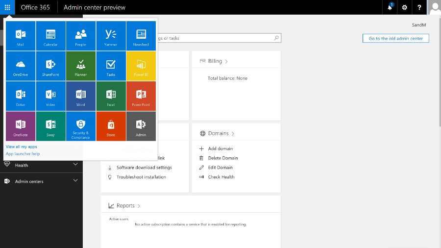
- The Office.com website has been redesigned, and Office 365 app launcher simplified to help users open the apps they need swiftly, and to easily switch between them.
- Microsoft kicked off a new program called ‘Windows Insider Lab for Enterprise’ which allows IT pros to try out Office 365 and other services for free, with a view to upgrading.
- Microsoft Teams was improved by the rollout of guest access for Office 365 commercial and education subscribers, allowing guests to join a team and subsequent meetings.
August 2017
- Microsoft brought co-authoring to Excel, along with an auto-save function for Word, Excel or PowerPoint files being worked on in OneDrive or SharePoint Online.
- Security firm Barracuda has warned about an ongoing series of phishing attacks aiming to steal the login credentials of Office 365 users. As ever, be cautious about links in emails.
- Microsoft released a new preview of Office for Windows PCs introducing in-line chat functionality to Word, Excel and PowerPoint, along with new ink effects.
- A redesigned Outlook.com began rolling out in beta this month, with a number of touches to make your inbox smarter, and the webmail service more responsive in general.
- Microsoft added new features for Office 365 users to the OneDrive app for iOS, including the ability to take folders offline for access, and scan multiple pages into a single PDF.
July 2017
- With its latest quarterly financial results, Microsoft announced that Office 365 revenue surpassed traditional Office licenses for the first time ever.
- The Outlook apps for iOS and Android have benefited from a redesigned navigation and conversation experience, and new intelligent search capabilities are promised soon.
- Three new apps are coming to Office 365 Business Premium: Microsoft Connections (email marketing), Microsoft Listings (managing online listings) and Microsoft Invoicing.
- Microsoft 365 was revealed, a new offering which combines Office 365 and Windows 10 in a single streamlined package, with additional security and management features.
- Microsoft launched Workplace Analytics as an add-on for Office 365 enterprise customers, a system which uses behavioural metrics in an attempt to boost employee productivity.
June 2017
- Microsoft Teams got new classroom experiences, allowing Office 365 for Education customers to benefit from virtual classroom environments with rich chat capabilities.
- Office 365 Advanced Threat Protection received improved reporting on malicious emails which have been blocked, and a new Safe Links policy was introduced.
- Microsoft Forms, a web tool for creating surveys, is rolling out for commercial customers, entering public preview for these users (previously it was only available to education customers).
- Microsoft Stream was introduced for Office 365 commercial customers, an intelligent video service which allows users to share videos and benefit from speech-to-text transcription.
- Microsoft pushed out iOS and Android apps for Microsoft Planner, allowing Office 365 users to update their plans while they’re on the move.
May 2017
April 2017
- Microsoft used another tactic to push folks towards Office 365, announcing that those with a standalone version of Office will eventually lose access to OneDrive and Skype for Business.
- It was confirmed that Windows will have twice-yearly major updates to align with Office 365 ProPlus’ update schedule, with said upgrades coming in September and March.
- Outlook Customer Manager, which is designed to make it easy for SMBs to track and manage customer relationships, is now rolling out worldwide.
- The PowerPoint app for iPad was improved with the introduction of Designer, which gives you quick and easy ideas for designing and laying out slides.
- Microsoft revealed that Wunderlist – which is available as an add-on to Office 365 subscribers using Outlook 2013/2016, and on the web – will be replaced by To-Do.
March 2017
February 2017
- Microsoft has updated Visio Pro for Office 365 with a database reverse engineering tool that allows you to easily create a visual representation directly from source data.
- Office 365 benefited from the introduction of a security analytics tool which rates your current security configuration, and makes suggestions on possible improvements.
- The Office team announced that the OneNote REST API now supports application-level permissions.
- Excel got new features based on Power Query technology, including support for the percentage data type, along with a new OLE DB connector.
- Microsoft released Office Training Roadmaps which help businesses keep track of training programmes for the various productivity apps.
January 2017
- Office 365 Advanced Threat Protection got several new features for tighter email security, namely URL Detonation and Dynamic Delivery.
- Microsoft graced Office 365 with a new Setup section on the navigation menu, which provides convenient and easy access to all setup-related settings in one location.
- Office 365 was crowned king of all productivity apps by Okta, outdoing second-place Salesforce.com by a factor of 1.3 to 1 as 2016 came to a close.
- Microsoft brought in a raft of new courses from LinkedIn Learning to the Office Training Centre, with over 20 offerings on working with Word and PowerPoint.
- StaffHub, a nifty new app which allows for the management of shifts for deskless workers, became available for Office 365 users with a K1, E1, E3 or E5 plan.
December 2016
- A new OneDrive for Business admin centre began rolling out to release customers, with general availability promised for early 2017.
- Microsoft laid out its grand vision of how the firm intends to integrate Teams (its Slack rival) with Microsoft Planner so working across the two is a seamless affair.
- Microsoft made the Accessibility Checker more easily found across all Office 365 apps, and introduced automated alternate text descriptions in Word and PowerPoint.
- An official guide on the ‘preferred deployment practices’ for Office 365 ProPlus was released, including advice on preparing the ground, and maintenance afterwards.
- New statistics emerged from data protection firm Bitglass showing that Office 365 is twice as popular as Google’s G Suite.
November 2016
- Office 365 users got the benefit of real-time co-authoring in PowerPoint, as well as in the Word app.
- Office Lens received a couple of new features, including the full integration of Immersive Reader, and a new tool called Frame Guide to help the visually impaired.
- Outlook Customer Manager arrived in Office 365, enabling businesses to track and manage – and hopefully grow – their customer relationships.
- Microsoft reintroduced Access, its heavyweight database software, to Office 365 Business and Business Premium customers.
- Microsoft officially took the wraps off Teams, the firm’s Slack rival that leverages the whole gamut of Office 365’s apps and services.
October 2016
- Excel 2016 got new features based on Power Query tech, including an improved web connector and enhanced Query Editor, as well as Query Parameters support.
- Microsoft introduced the ability to create (and collaborate on) Office documents from within a Yammer group.
- In an earnings report, Microsoft announced Office 365 user numbers: 85 million active commercial users, and 24 million consumers.
- A batch of new apps were revealed for Office, including an app for invoicing, and tracking expenses, along with one for keeping tabs on your business’ web presence.
September 2016
If you want to see older news and developments pertaining to Office 365, then check out the Archives page at the end of this review.
Otherwise, now move on to Page 2 for our full review and detailed look at what Office 365 offers, and how it can help you become more productive.
Darren Allan contributed to this article
It's been a long time since Office just meant Word, Outlook, Excel and PowerPoint (plus Access - remember that?). In fact, there's a confusingly wide range of tools and services under the Office umbrella.
In the last few years, Office 365 has established itself as the definitive business cloud service bringing together those familiar productivity services, plus an ongoing range of new features.

There are personal and business versions of Office 365 – home users get the latest version of the Office desktop and mobile applications plus email with Outlook.com and extra cloud storage with OneDrive, along with free Skype minutes every month. If you want to edit documents in Office on your iPad, or using the mobile Office apps on a Windows 10 PC, you need an Office 365 subscription.
Office 365 Personal is for a single user and allows one download of Office. Office 365 Home Premium costs $99.99 per year (£79.99, AU$119.99) for Word, Excel, PowerPoint, Outlook, OneNote, Access and Publisher.
That's good value if you share it with the family; up to five people in the same household can have their own installations of Office on their PC or Mac at the same time (for the Office programs that run on a Mac).
When the next version of Office comes out, you'll get it on the same subscription, and you'll get new features as they become available. If you're at college or university (or you teach at one) you're eligible for Office 365 University on a four-year subscription for $79.99 (£60, AU$99) that you can use on up to two PCs or Macs.
Office 365 for business
Microsoft offers three tiers for businesses with less than 300 seats. Office 365 Business Essentials allows you to use online Office apps only (no desktop applications) plus 1TB of online storage per user and a 50GB Outlook inbox with email, calendar and contacts for £3.10 ($5, AU$5.50) per month per user on an annual contract.

Office 365 Business offers Word, Excel, PowerPoint, OneNote, Outlook, Access, Publisher and Lync, with a subscription licence for each user to run them on up to five PCs or Macs at once. You still get the online storage but no email services. Office 365 Business Premium combines Office 365 Business and Business Essentials; all the applications, plus email and storage.

Enterprise business users get a full collaboration service with Exchange email, SharePoint document storage, Skype for Business unified communications, OneDrive for Business storage sync and sharing, Yammer enterprise social networking, Delve for tracking what your colleagues are working on, and Groups for ad hoc collaboration.
All that, alongside an increasing list of new services like GigJam (for sharing just parts of documents so you can have the right information available in a meeting) and Planner (a simple planning tool for groups), plus a subscription to the Office 2016 desktop and mobile applications, which includes early access to new features.

There are several different plans, depending on what mix of services you need. The E5 plan, for example, includes rights management services for encrypting documents and choosing who can see them and how long they're available for, Delve Analytics for tracking how people are spending their time, Power BI for graphical data analysis and business intelligence, and the Office 365 video portal for publishing video inside your company.
In the year since Office 2016 was released, Microsoft has continued to add new features to both the Office 365 service (which you expect in a cloud service) and the Office 2016 applications (which you might not), as well as the mobile versions of the apps for iOS, Android and Windows, new apps like Sway for 'digital storytelling' (that's somewhere between making a mobile app and designing a website), and the Office Online web apps.
That includes new admin features like the new look portal, customising sign-in pages, improved encryption controls, self-service password reset, plus a deal to use Wix to build websites after SharePoint public websites were removed.

The Office Online apps get regular updates, including new features plus integration with other cloud services like Skype and Dropbox – Word and PowerPoint now have the Format Painter for transferring formatting from one section to another, and Excel Online has more number formats, more features in Pivot tables and a high contrast view for accessibility.

The mobile apps keep adding features like Find and Morph transitions in PowerPoint, or ink annotations in Word, Excel and PowerPoint. You can record audio in OneNote for iOS and on the web; that's better than OneNote on Windows 10 Mobile where audio recordings cut off after a minute.
Because Office 365 is a subscription service, the familiar desktop applications get new features. Word is about to get a spelling and grammar checker that uses machine learning to understand your writing, and a Researcher tool for easier searching for facts and quotes.
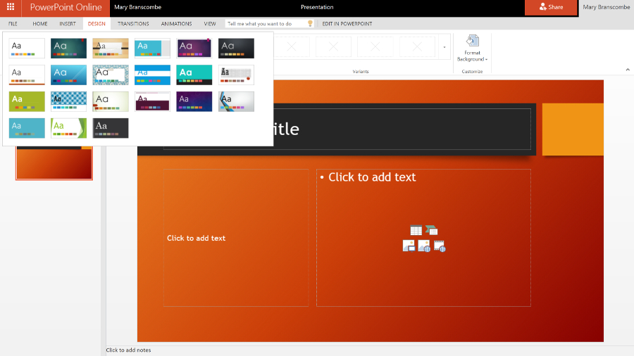
PowerPoint has gained several new transitions, a Designer tool that comes up with new looks for your presentation (very much like Sway) and a way to summarise your presentation with Zoom. Excel has new functions and charts and shape recognition when you draw on-screen, plus many more connectors for getting data into Power Query, while Outlook lets you '@ mention' people in email the way you would on Facebook or Twitter.

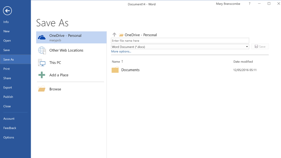
But the changes also include removing some useful features. Changing the Save As options in Office 2016 has been particularly painful, and Office 365 no longer allows you to temporarily stream Office 2016 to a PC that you want to work on, if the Office Online versions don't have the features you need. Desktop Outlook is going to get the Focused Inbox that's so popular in Outlook for iOS and Android – but it will replace the Clutter feature in Exchange Online that files emails you're not likely to be interested in. Clutter worked in every client that you can read Exchange email in, including on older devices (especially Windows Phone 8.1), whereas Focused Inbox will only work in the latest versions of Outlook.
The enterprise Office 365 service is also where Microsoft tries out new features that will appear in the on-premise server products, like the new SharePoint 2016. Exchange Server 2016 is based on the latest version of Exchange Online, which has been available on Office 365 for some time (and you can buy some Exchange Online features to use with your own Exchange Server, like Exchange Online Protection spam and malware filtering).

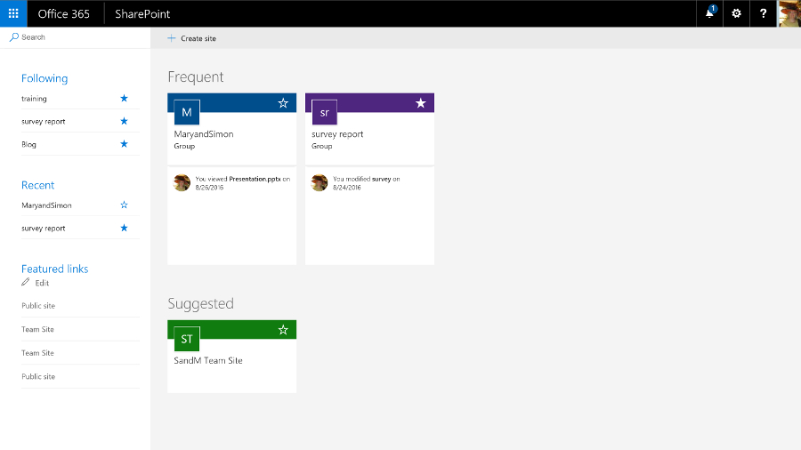
SharePoint 2016 catches up with existing Office 365 features like chatting while you're collaborating on documents stored in OneDrive for Business, and will get newer features gradually. Improvements like the new document library experience, and the suggestions in the new iOS SharePoint app of what sites you should look at, are already showing up in SharePoint Online and will appear on premises once they've been tested in the cloud.
In the past, Skype for Business hasn't had the full unified communications features of the on-premise version because PABX integration is harder in the cloud, but Microsoft has been signing up partners like BT to offer voice services for Office 365, as well as creating cloud-only features like Skype for Business broadcast meetings for very large numbers of users (which will soon include real-time live translation and captions).
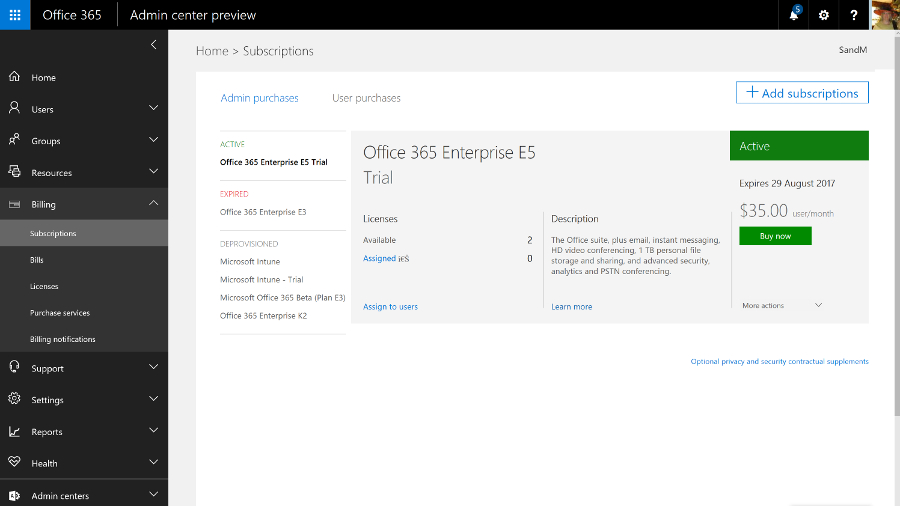
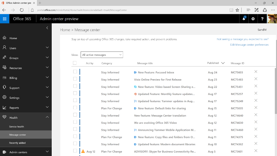
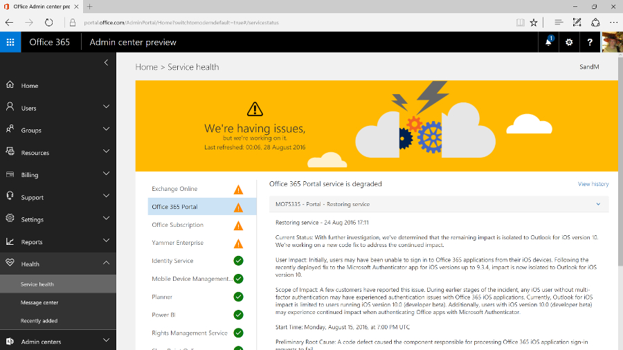
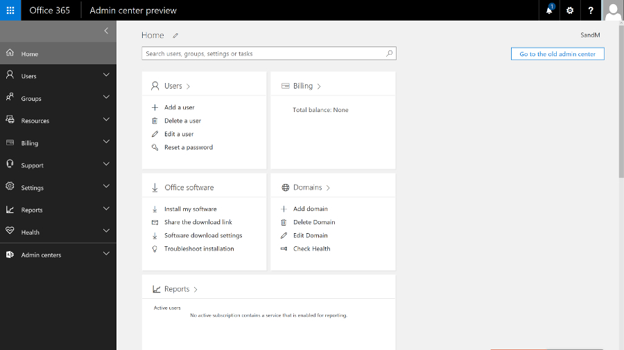
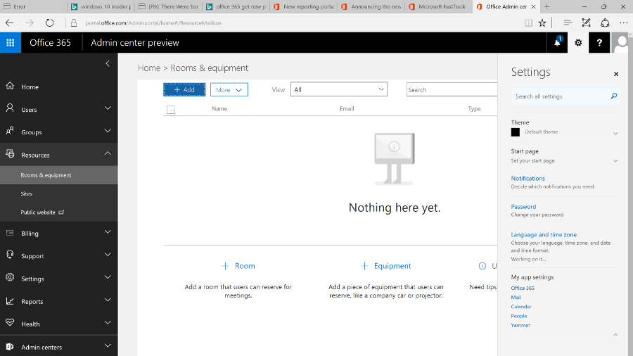
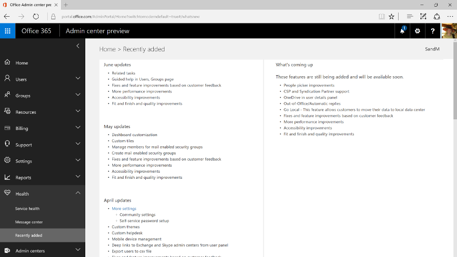
As you'd expect, you manage Office 365 mainly through the browser (although you can use PowerShell commands if you need to change settings in bulk). The admin portal is getting a major redesign that will soon become the standard way to manage the service.

The previous interface had a minimalist, low-contrast, 'Metro' style that wasn't particularly efficient, with key tools relegated to a list of links at the side of the page and a dashboard that always showed the setup features even when you'd been running the service for years.

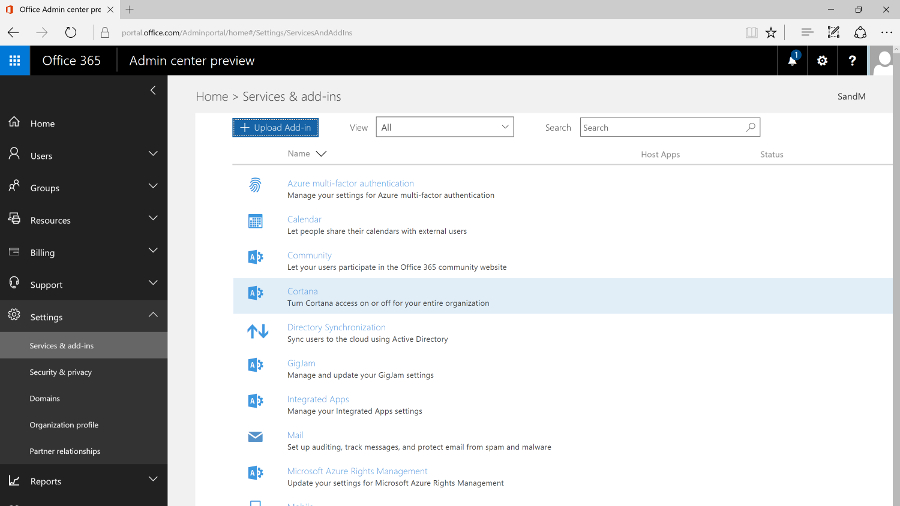
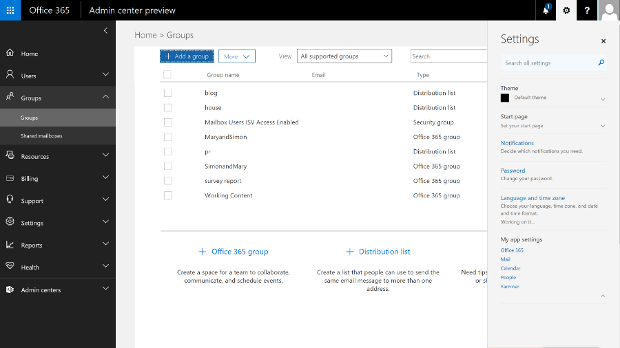
Now there's an expanding menu on the left with ten sections for managing and monitoring the Office 365 service, each of which expands to let you click straight into the specific area you need. This also makes room for features like Groups that have been added to the service over the years, which show up in their logical place (along with the traditional role-based groups).
As you navigate through the different sections, the tools are also grouped logically, and when you click on the details for a user or a group, all the information pops up in a window, with the most common commands (like resetting a password or deleting the user) at the top.

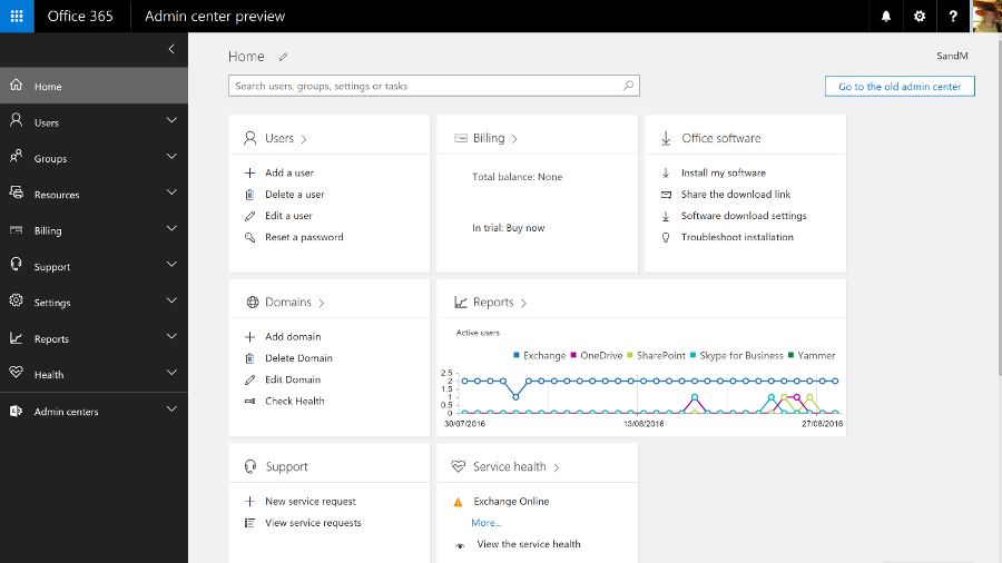
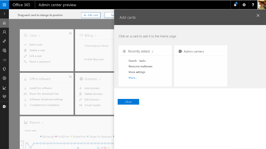
The home screen that replaces the former dashboard is far more useful – and you can even customise it. There are 'cards' for common tasks, from managing users to downloading the Office clients, and you can rearrange them, delete any you don't need quick access to, and add others.

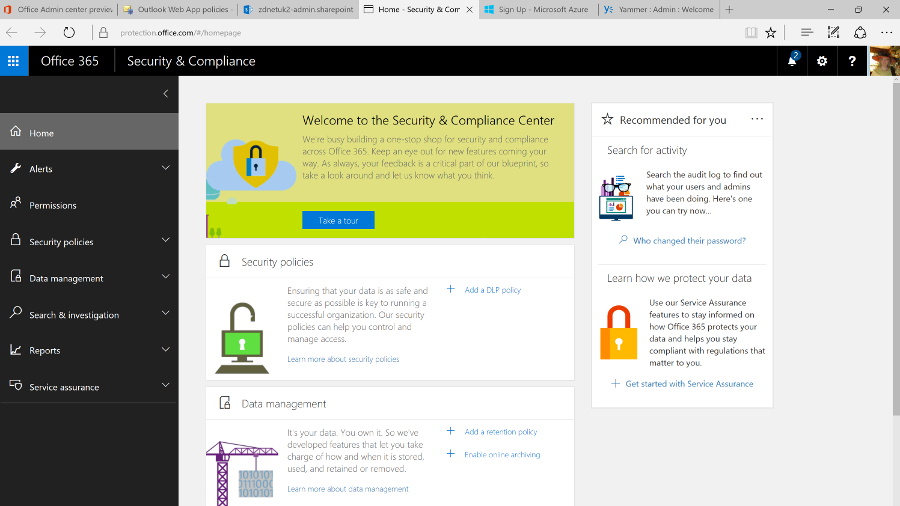
The admin interfaces for Exchange Online, SharePoint Online, Skype for Business and Yammer are now much easier to find as well; they have their own section on the menu, which also links to the new Security and Compliance centre, and to Azure Active Directory (even if you don't buy any of the premium AAD services, using Office 365 automatically creates an Azure AD for your business, but in the past it hasn't been obvious how to get to it in order to carry out any management).
You'd expect Azure AD to open as a separate site, because it's a separate service. It's slightly more confusing that the Security and Compliance centre opens in its own browser tab, but has the same design as the Office 365 admin centre.

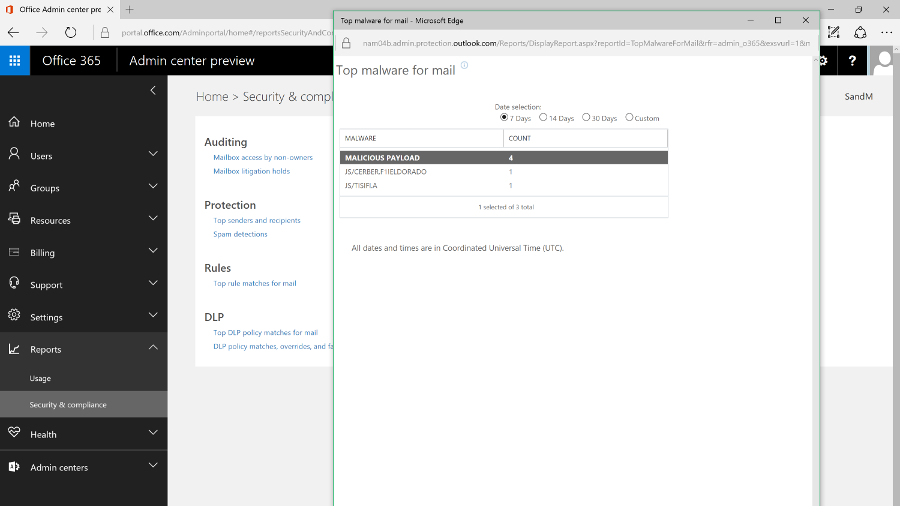
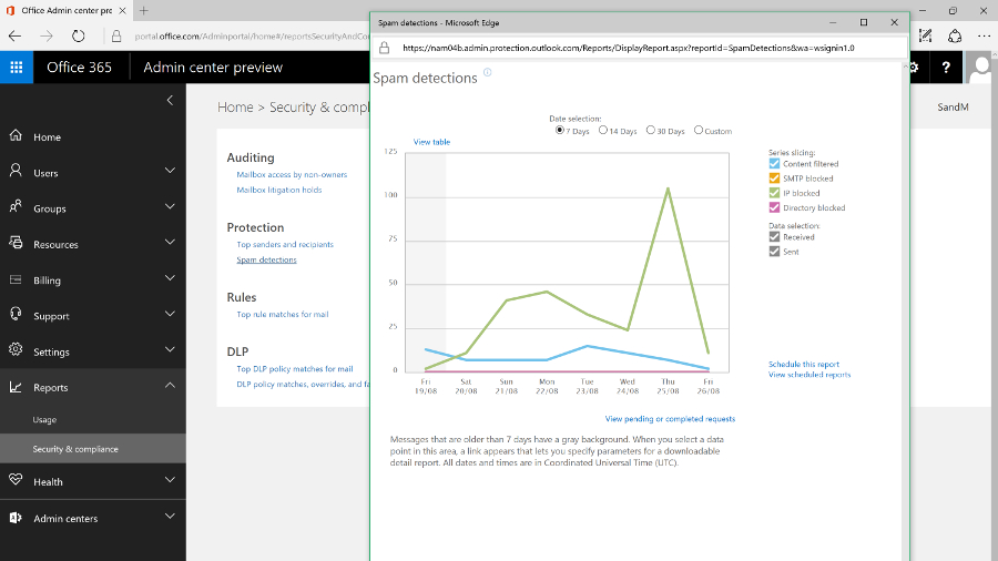
This new portal brings together all the security tools for the service, from assigning permissions to admin users, to managing devices, setting up alerts for user and admin behaviour and choosing how spam and malware in email are handled. All that sits alongside the tools for setting retention policies, running ediscovery searches and archiving content, and details of how Microsoft secures the different Office 365 services.
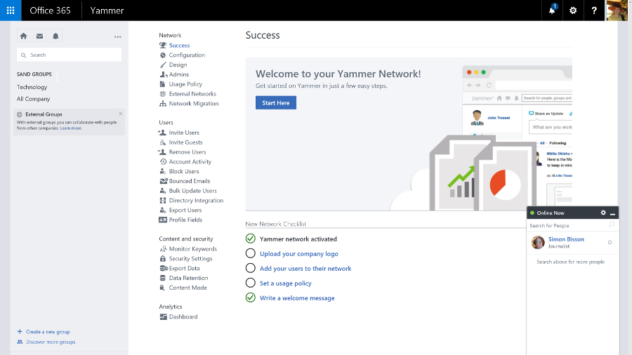
And it's downright annoying that all the admin portals for the Office 365 services still open in different tabs. Plus they still have the white-space-heavy, hard to navigate interfaces that are basic rather than simple, in which it can be hard to find the tools you need quickly (and Yammer has its own design again). We'd like to see them move to the new portal design too; the current mix of interfaces feels fragmented and confusing.

It might even make sense for more of the settings to move to themed admin portals the way the security and compliance options have, rather than matching the admin options for the separate on-premise Office servers. Key settings from the Exchange, Skype for Business and SharePoint services are already duplicated in the new admin portal; if they're all you need, you'll never need to use the full service portals at all.

Getting started
Setting up Office 365 is fast – provisioning an E3 or E5 tenant takes only a few minutes – and it's straightforward for a small company, especially if you're migrating from Exchange Online. You can start the wizard to walk you through setup – including connecting to the domain you're using for email addresses, or buying one if you don't already have one – straight from the purchase screen, or you can come back and work through the individual steps later.
You can set up users by connecting to your on-premise Active Directory by importing details (from a CSV file, for example) or by creating users one at a time (that's most suited to a small business); and when you create individual users you can assign licences as you go. If you want to pick and choose who gets which features, you can allocate licences individually for Office 2016, Office Web Apps, SharePoint, Skype for Business, Exchange and any other services.
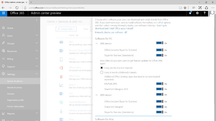
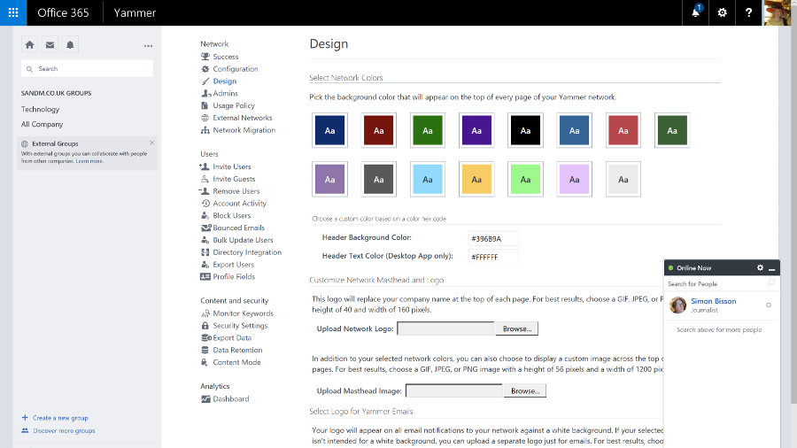
There are other settings that you can change if you want, but not so many that things get confusing. You can customise the Office 365 theme, set the password expiry policy, choose whether you get new features when they're generally released or try them as soon as they're in preview (and that can apply to all users or just the more advanced users that you pick individually), turn on multi-factor authentication, set the policies for Azure Rights Management if your plan includes this document encryption service, and choose whether users can search Office 365 content using Cortana, or use Office Online to work with files in other cloud storage services like Box.

There's more work to do if you have email accounts on other services that you need to import data from (there's an import option where you can upload data or even ship drives to Microsoft if that would take too long), and if you're a large business that needs to mix on-premise servers with Office 365 you'll need to plan which users have accounts where and how you sync between your AD and the cloud service. But you don't have to be an expert to get a small business online with Office 365.
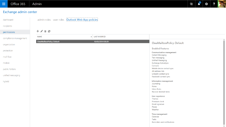
Ever since Exchange 2013, the web version of Outlook has had the same features and interface as the Outlook client – it's also what the Exchange Online admin centre is built on, and you can just mark a user as an administrator. This removes the need for an Exchange mailbox to administer Exchange, so you don't have to waste a mail licence and storage quota on a shared mail admin account. You can also give different administrators limited permissions; if someone only needs to use the compliance or discovery tools, they won't get access to mail flow and user settings.
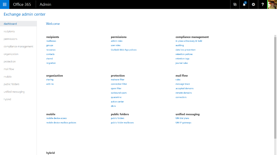
The admin centre is crammed with features, organised into around a dozen categories. Previously complex tasks, like setting up a federation trust to make free/busy times in user calendars visible or setting up shared mailboxes for call centres, are far simpler and you are guided through important steps (like giving users the right permissions to access the shared mailbox).

Public folders are still available, by popular demand. Like everything else in the new Exchange Online, they're simple to set up with helpful error messages that make clear what you've done wrong and how to fix it.
There's also a helpful balance between enforcing policy and users getting work done. The data loss prevention tools in the Enterprise version of Exchange Online let you set up rules to stop people emailing personal information like credit card numbers (with a smart check that employs the same algorithm used to issue credit card numbers, rather than just looking for any 16 numbers in a row).
But users can also override most of these policy warnings by filling in an explanation and confirming they know the message will be logged. The information can be encrypted to keep it safe until the manager approves the explanation.
The tips reminding users of the policy show up in Outlook clients, and Outlook webmail. But if you send a message from your smartphone that breaks a policy, the rule can forward the message to your manager or mail you to confirm that you meant to break the policy.

But while the ultra-minimalist, white-space design is well organised, and will be familiar to Exchange Server admins, it doesn't match the style of the new Office 365 portal. There is also quite a lot of overlap – many tools from the Exchange Online portal also show up as links in the main portal to the auditing, mail flow and information protection tools (spam and malware protection and data leakage policies that block or warn users who are trying to send details like credit card numbers in email). These open the tools in either the Exchange Online or Security and Compliance portals.

There are also some settings you might expect to find in Exchange that are in the main Office 365 portal, like choosing whether users can share their calendars with people outside your organisation.
Like Exchange Server, you can use Exchange Online for mobile device management by setting policies that will apply to any smartphone, like forcing the user to turn on encryption and set a PIN, and even setting how often they have to re-enter it.
Office 365 also includes Microsoft's Intune MDM service which adds extra features like detecting whether devices are jailbroken, and letting you mark emails and documents that can only be opened in approved mobile apps, like Office, and only saved in specific locations. You can also selectively wipe devices, removing business data but not personal photos and information.

The Exchange tools for managing mobile device access are still in the Exchange Online admin portal, which is where admins who are used to Exchange Server will expect to find them. The Intune MDM features are in the Security and Compliance centre – and yet again, that opens a new browser tab, because it has its own interface.

This is the kind of duplication we expect Microsoft to clean up as it continues to improve the Office 365 admin UI, and the disparate interfaces shouldn't distract from the fact that you're getting a powerful mail system with all the options you need. And if you don't need to delve into those options, you can be up and running quickly with a rock solid mail system. Exchange Online remains one of the crown jewels of Office 365.
If you've used Office 365 before, you'll remember the admin portal for the unified communications service formerly known as Lync was distinctly minimal, with very few settings you could change. As Skype for Business gains more features, there are correspondingly more options and controls, but it's a far cry from the complexity of the on-premise version; this is one of the services where being in the cloud makes unified communications dramatically simpler.
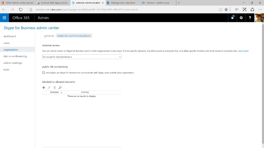
Now that Skype for Business can connect to Skype, you can control that integration, as well as allowing or blocking calls and chats with Skype for Business users outside your company, and choosing whether the Skype Broadcast service is available for creating large public online meetings. Again, the controls for external connections are duplicated in the main Office 365 admin portal – for many businesses, they're the only settings you might want to change, so you might never need the full admin centre.

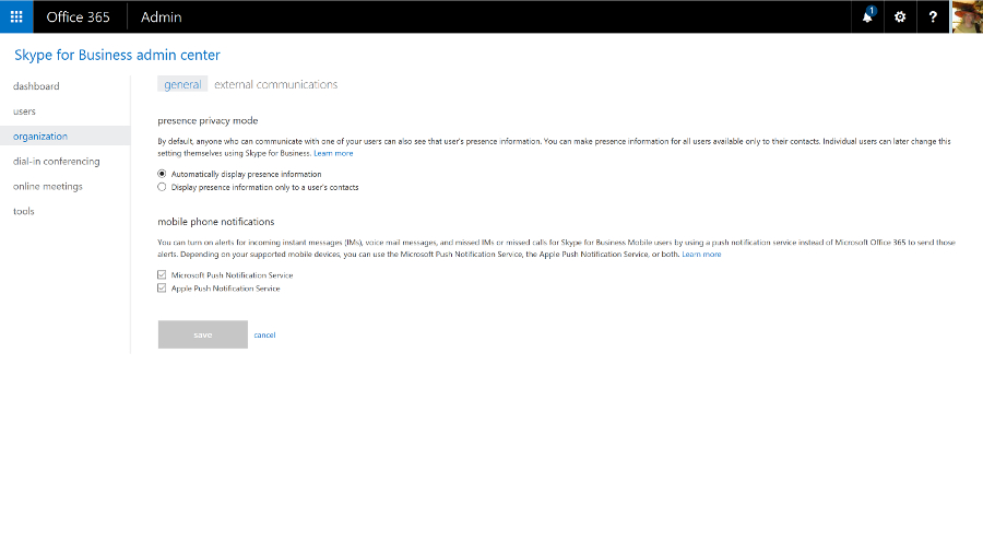
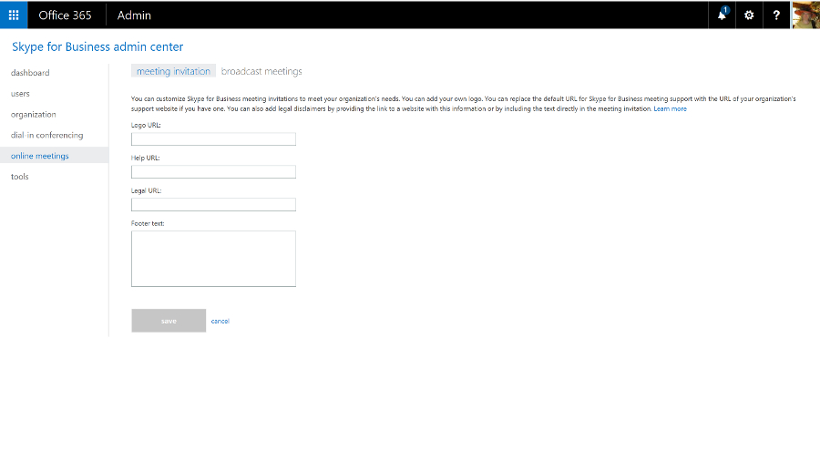
You can also set the defaults for notifications and privacy mode and add your own boilerplate to meeting invitations. You can include your company logo, links to support, any legal terms and conditions that apply to meetings, or a few lines of text you wish to be included in all invitations.

You can use Skype for Business for dial-in conferencing, with or without toll-free numbers, so your users can phone in rather than using the Skype for Business client – that's included in the E5 Office 365 plan, or you can buy it as an add-on. You can also use PSTN Calling to call standard phone numbers and receive calls from anyone, not just other Skype for Business users (again, that's included in some plans but not in others – confusingly, there's a version of the E5 plan that has it, and another that doesn't).

You can even use Skype for Business as your PBX – as well as making and receiving calls, you get PBX features like transferring calls, having several phones ring when a call arrives, putting your phone on 'do not disturb' except for a few key contacts, playing hold music and handling voicemail. Again, you need the right licences.
The admin centre also includes a handy list of tools for troubleshooting, and a very minimal set of reports.
Lync Online was already an impressive HD videoconferencing system with excellent tools for online meetings. The Skype integration makes it a great choice for letting your customers and partners reach you without the cost of a phone call, and if you add the dial-in conferencing, PSTN calling and PBX tools, it's close to being a cloud service that offers a full unified communications system. But buying all those options as separate add-ons, some from third-party communications providers, does make everything more complicated than we'd like.
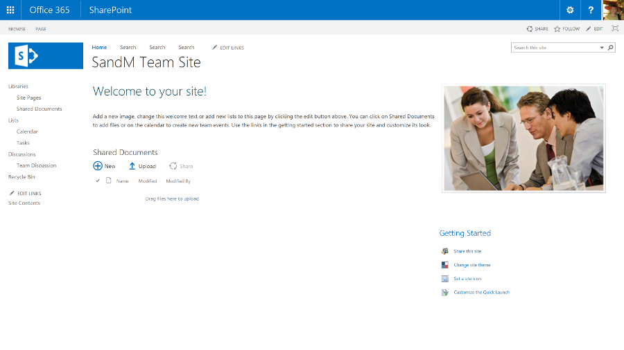
For a while, SharePoint Online was the red-headed stepchild of Office 365. The name didn't even appear in the list of apps – users just saw links to OneDrive and Sites – and the ribbon-based interface felt dated and out of step with the rest of Office 365.
But cloud competition like Box and Dropbox hasn't killed off SharePoint, and even though the personal cloud storage of OneDrive for Business is still part of Office 365, Microsoft has just given SharePoint itself a major refresh that updates the key features for document sharing and collaboration, and adds far better mobile support.
SharePoint Online also connects to the new services Microsoft has been adding to Office 365 like Groups and Planner, making the collaboration options feel more coherent.

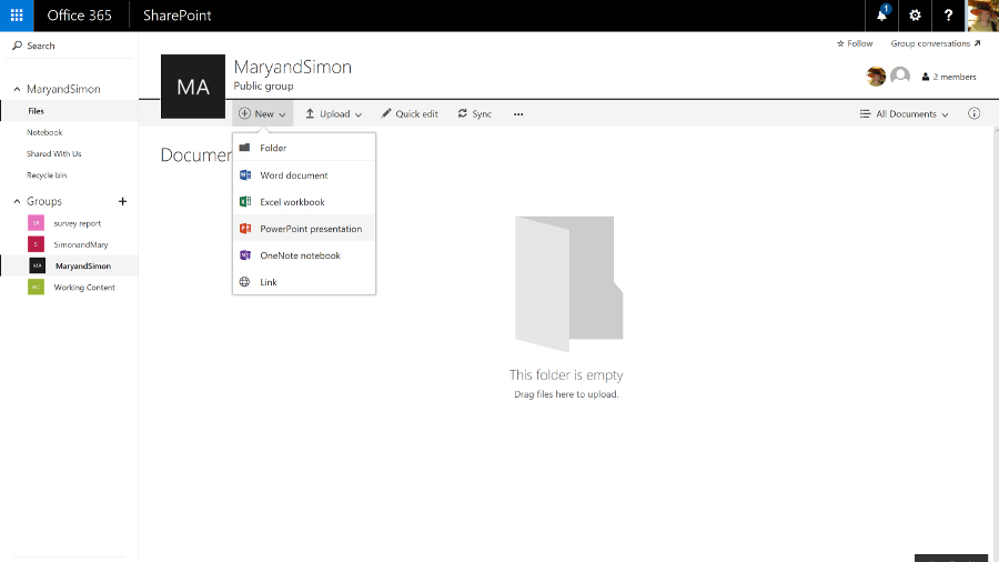
Sites for personal and shared team use and document libraries are still at the heart of SharePoint – document collections can now be as large as 25TB, and there's a new document library experience that looks much more like OneDrive, or a blog.

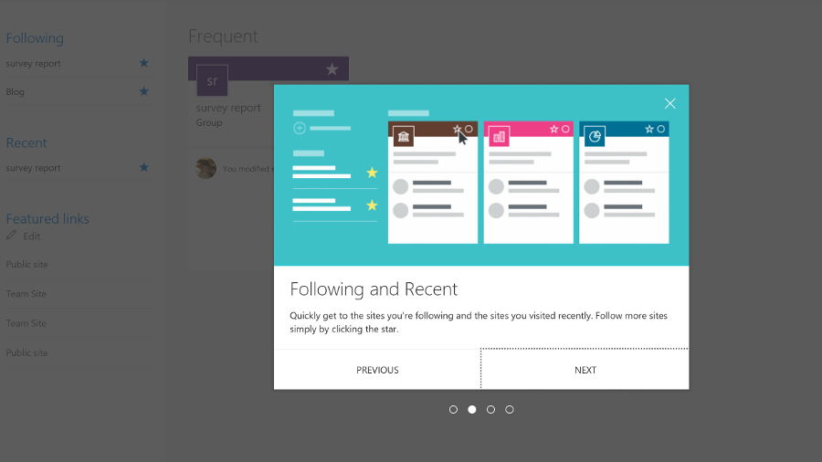
Team sites automatically show popular documents and details of who in the team has been working on what, and there are new tools for creating pages on the site as if you were writing and publishing a blog – so you don't need to create HTML or use a separate publishing tool any more. Just pick web parts – images, events, links, videos, Yammer feeds – and drag them into place.

Some Office 365 plans include the SharePoint Video service, for uploading and streaming videos. This is going to be replaced by the Azure Streams video service, though not until the new service has all the same features as the existing one.

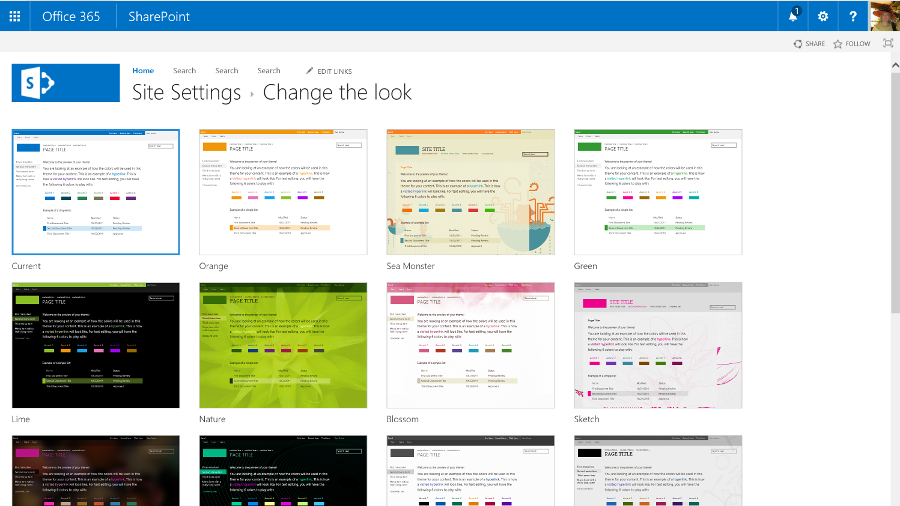
All the existing options for customising SharePoint are still available. You can include language translation services for sites and documents, and for structured tasks you can add workflows designed in Visual Studio and have them hosted on Azure, or you can create a Flow or a PowerApp on Azure that lets you configure workflows that connect other services – like Salesforce or Dynamics – to SharePoint.
If you need the same kind of full-trust managed .NET code that lets you customise SharePoint on your own server, you can put that on Azure. As a multi-tenant cloud service, SharePoint Online has to protect users from each other's potentially performance-hogging code, so this is a sensible approach. But many of the features you'd once have built that way are available as apps written in HTML and CSS that run on SharePoint: you can get blogging tools, mapping tools, address checking tools and more – and admins can choose which apps are available in the SharePoint Store and who is allowed to buy more.
Plus SharePoint 2016 adds a new extension framework based on common JavaScript frameworks like React and Angular, where the code runs on the client device, not on the server. That's still in development, but it brings SharePoint up to date with the latest web development technologies.

SharePoint also has a new way of controlling access. Admins can still grant and block access to SharePoint sites, but team sites work with the new, self-service Groups feature in Office 365. Anyone can create a group of colleagues and the group automatically gets a team site with a document library, a shared calendar and inbox, a Skype for Business chat room that you can also get as email, along with a OneNote notebook, an always-on Skype conversation you can drop in and out of, and the new Planner task management tool.
It works the other way round, as well; make a team site or add colleagues to Planner and you create a group.
Planner is like a simple version of Trello – you create a card for each task, assign it to someone and save it into different 'buckets' that you use to organise your plan. It doesn't have much in the way of notifications yet, but Microsoft is adding features quickly.

Groups also have the kind of connectors you might have seen in Slack. You can connect a Twitter feed or a variety of services like GitHub, Trello and ZenDesk to a group to get alerts – so you could follow the hashtag for the product your team works on, or see customer support issues in the group.
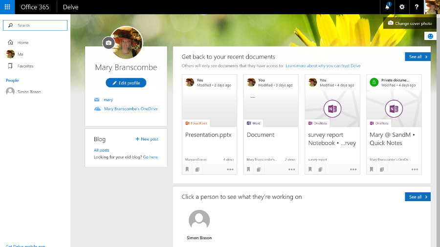
You can search across all the sites you have access to and when you find a useful document, you can follow it as if it was a friend on Facebook. Results include automatic recommendations based on what the people you're connected to are working on, and your previous behaviour. That's based on the Delve feature, which analyses what documents your colleagues are working on that are relevant to you – you can see that in the Delve service but the information will now show up in SharePoint too.
Search is smart: search for 'marketing deck' and results will include PowerPoint presentations (that don't have the word 'deck' anywhere in the contents), with particularly relevant slides highlighted in the results.
The SharePoint newsfeed is still available if you want to use that to keep track of what's going on. This looks very much like Facebook or Twitter – you can follow people, sites, projects, hashtags, documents and events, and you'll see in the activity stream when someone does something new or makes a change (you can filter the stream to make it more manageable). You can also preview documents and videos straight from the Newsfeed, or turn any item into an action that becomes part of your task list.

You use Twitter-style @ names to mention people and you can see when other people have mentioned you (you get an email as well as seeing it on the Newsfeed, so you don't have to update feverishly to stay on top of work). Also, you can post your own updates to everyone or just the team you're working with.

But now that the Yammer social network service is available to all Office 365 customers, you can switch to using that instead. It's a much more powerful tool for collaboration that's getting regular updates – and again, it's going to integrate with Groups soon, so a team can choose to collaborate through Yammer or the other Groups tools.

You can view and edit documents in the Office Online web apps, and you can preview file types you can't edit, like Visio. Sharing documents – with colleagues or up to 10,000 external partners and customers who don't need to have SharePoint themselves – is also much simpler. Click on the sharing icon and type in names or email addresses, choose whether they can view or edit – or copy an obfuscated URL you can send in an instant message or put in a blog post.
Shared documents are marked by an icon you can click to see who you're sharing with (and you can stop sharing a document when you're done collaborating). Many Office 365 plans include Azure Rights Management Services, so you can control not just who can see a document but what they can do with it, turning off the printing and copying functions for confidential information.
SharePoint started out as a way to share document libraries and create workflows. It's now a flexible collaboration tool for ad hoc groups as well as a formal, centralised information store, with mobile apps as well as simple web publishing.
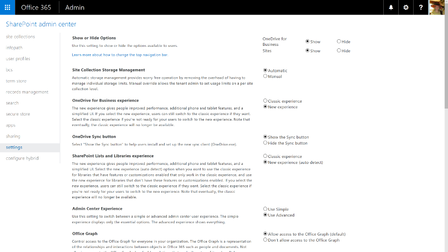
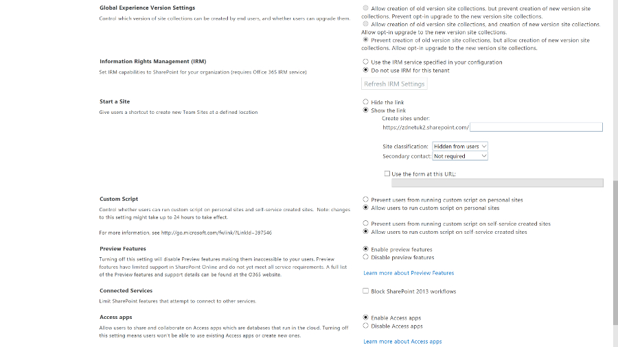
The SharePoint Online admin centre reflects that. There's a long list of settings that lets you control apps, connections, rights management, collaboration and whether users get new features and the new OneDrive for Business interface.
For many smaller businesses, that's all you need and you can hide the other controls. But if you need them, there's a full set of configuration options for everything from InfoPath to the taxonomy for how documents are indexed, in an interface that SharePoint Server administrators will find familiar (although it's going to confuse anyone starting with the new Office 365 admin centre).
OneDrive and OneDrive for Business
Microsoft uses the same name for its business and consumer cloud storage services: OneDrive and OneDrive for Business are now more similar than they used to be – in particular they use the same sync client, which fixes a lot of problems with OneDrive for Business – but they're still different services.
OneDrive is Microsoft's consumer cloud storage service, which gives users 5GB of free storage with the option to purchase 50GB for $1.99 a month (£1.99, AU$2), plus Office Web Apps. If you buy Office 365 Home, Personal, or University, you get 1TB of OneDrive space.
OneDrive for Business is the cloud storage service that's part of the business Office 365 plans (and also available as part of on-premise SharePoint Server), with either 1TB or 5TB of storage per user, depending on which plan you choose.
Office 365 tenants also get SharePoint Online, which includes 10GB of secure cloud storage with an extra 500MB per user, and the option of paying for up to 25TB of storage in total. You can choose how the SharePoint space storage is allocated between users and control how they use it, like limiting who they can share documents with or forcing them to encrypt confidential documents using rights management software.
OneDrive for Business, which is confusingly labelled OneDrive in the Office 365 portal to fit on the ribbon, lets users store their own working documents privately. If you're familiar with SharePoint, you can think of it as like the storage in My Site – and documents can still have workflows or be checked in and out.

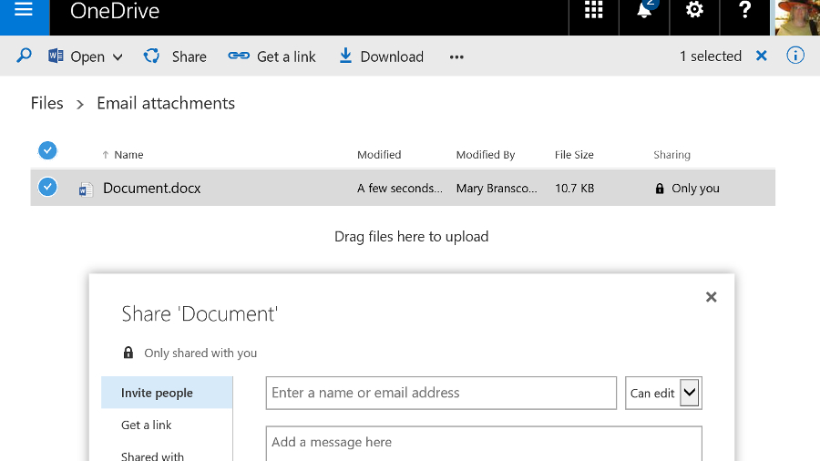
Users can also share documents with specific people – inside or outside the company – by clicking the three dots next to the file name and choosing Share, or from the properties and preview pane for the file. This interface has been updated a couple of times but it's still easy to share documents and see who has access.
Users can choose whether each person they invite can edit or just view the document and whether or not they need to sign in (it's possible to choose whether to enforce sign in globally). It's very clear if a document is shared and with whom, and you can stop sharing a document at any point. OneDrive for Business storage is part of SharePoint and you can apply policies to it in the same way.

If you want to share a document in OneDrive for Business with everyone (including those to whom you give the URL of your OneDrive for Business), you can move it into the Shared with Everyone folder by default.
If you want to make it available only to a specific group of people, you can put a document into the library for a Team Site instead. That uses the SharePoint tenant storage and you can get those files onto a PC by opening them from SharePoint Online, opening the document library in Explorer (from the ribbon on the SharePoint site) or syncing the document library as a list in Outlook. Team mailboxes also save information into the SharePoint library.
Although the range of storage and sharing options in Office 365 sound confusing, in practice they make a lot of sense. Users get the option to stick to SharePoint shared document libraries or use something that looks like popular free cloud storage services – but which gives you control and security.
Sharing documents is simple and users can easily collaborate (they can even edit the same document simultaneously, in the Office desktop applications or the Office Web Apps) but again, you have tools to control this.
When it first came out, Office 2016 had excellent integration with OneDrive, on both Mac and Windows, letting you browse your online folders and see the folders you'd used recently right on the Backstage menu. A recent update stripped that out on Office 2016 for Windows, replacing it with a very slow dialog that doesn't show any recent folders at all – and doesn't even show you what the file name will be. It's a definite step backwards.

What else is in Office 365?
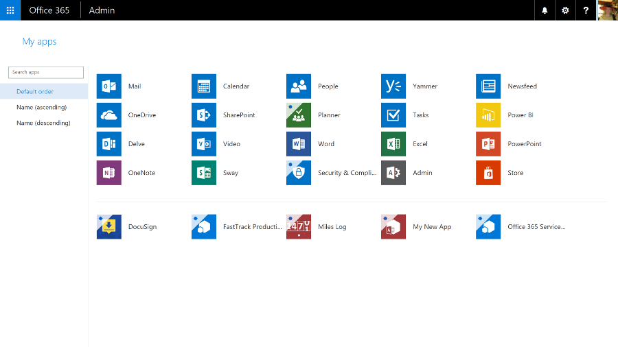
Depending on which Office 365 plan you choose, you'll get a range of new apps and services. All the plans include Sway, a new authoring tool that uses machine learning to do a lot of the layout work for you, creating responsive layouts that work on smartphones as well as desktop web browsers.
Business plans include the Planner service, as well as GigJam, a collaboration service that lets you share specific pages inside a document – you can just cross out pages and paragraphs you don't want colleagues to see. It's an interesting idea that needs a lot more work to be really useful.

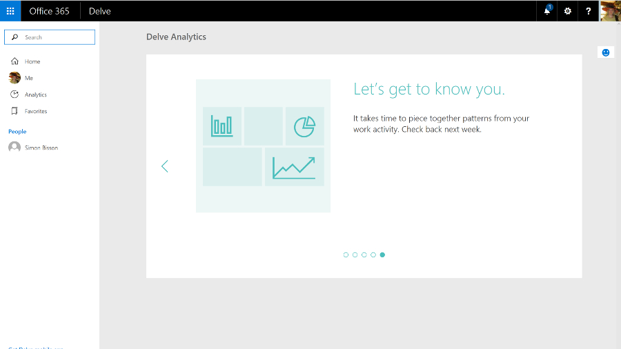
The E5 plan includes the Power BI cloud service that lets you visualise information in charts and dashboards, and an extra tool in Delve called Analytics that analyses your working habits to tell you how much time you spend in meetings and email compared to your colleagues, to help you make the most of your time.
There are also related Office services you can add to Office 365, like Project Online, which is a full-fledged portfolio project management system.

Expect Microsoft to keep adding new services to Office 365 – like the ones it plans to create from LinkedIn.
Office 365 is hands-down the best way to buy Office, whether you're a consumer user wanting the Office desktop apps with all the latest features, or a business that needs email and collaboration tools without the hassle of running your own servers. Yes, you pay a monthly fee, but you keep getting new features as well as useful cloud services.
We liked
The new Office 365 admin centre is a real improvement, making it easy to find features that used to be tucked away inside specific services
Exchange Online is one of the best business email systems around, and no-one knows how to run it better than Microsoft. Skype for Business has gone from VoIP meetings in the cloud to something that can be a full unified communications service – if you're prepared to pay for all the conferencing and telephony services you need to make it work. And SharePoint is getting a much needed refresh, plus the formerly infuriating OneDrive for Business is now both usable and reliable, and Groups give teams a simple way of working together on projects.
We disliked
Overall, the Office 365 admin interface remains disparate and disjointed; Microsoft needs to do more work here. In part, that's due to the overlapping tools, from the formal systems that replicate the server options larger businesses want – especially if they're migrating to the cloud – to the simpler, ad hoc tools based on Groups that are more approachable but also sometimes lack features. Whatever you need, you can probably do it with Office 365 – if you can find out where and how.
If you want the latest features and improvements, you need to opt-in to try previews – but that can mean losing useful options as well, like the confusing changes that make the Save As dialog slow and unwieldy in Office 2016. If you don't get features in preview, it can still take a long time for them to reach all the Office 365 tenants once they're supposed to be available.
Final verdict
Office 365 is a reliable service that integrates email, document sharing and conferencing almost seamlessly with the latest desktop versions of the Office software – which now get regular updates and extra features – and is evolving new cloud tools and services like Sway and Planner.
It's simple enough for small businesses and also has powerful options for larger companies, who will find that the savings from putting commodity IT in the cloud, while still being able to integrate with on-premise servers through Active Directory and hybrid Exchange deployments, make the combined subscriptions for server and desktop products very attractive.
You do need to pick the right plan though – there's a confusing number of them, all with slightly different features. This means you don't have to pay for services you don't need, but it also makes it hard to point at Office 365 and know exactly what you'll get.
Microsoft has officially released Office 2016 for Windows and it is available for consumer customers (Office 365 Home and Personal) immediately for download. Mac users have already been able to download Office 2016 for a few weeks already.
Office 365 will likely keep its name and could be joined by Windows 365 as Microsoft will apparently add a subscription option to Windows 10, and it has trademarked that name. Amongst the flurry of features added to Office 365 in recent times, the ones worth highlighting are:
Microsoft acquired Sunrise, a popular calendaring app for touch devices, which is likely to be incorporated into Office 365. Calendaring has been one of the areas where Microsoft hasn't devoted as much resources as many would have expected especially with the rise of mobility.
Microsoft also bought Acompli (which it almost immediately turned to Outlook), LiveLoop for to prep ip PowerPoint and 6Wunderkinder for its popular to-do-list application.
The company also announced that it was giving away 100GB of free storage for a year to existing Dropbox users to lure them away from the popular cloud storage provider – which incidentally is a close Microsoft ally.
That bonus is on top of a 100GB giveaway of OneDrive storage for two years if you subscribe to its Bing Rewards scheme. Your files will be read only after the subscription ends unless you buy a top-up and if you want to get a cheap one, Ebay seems to be the place to go with plenty of deals available for Microsoft Office 365 Personal available for less than £40.
Okay, let's move on to the most recent developments over the past couple of months. Microsoft recently announced that it has updated Office 365 for Exchange Online, so that users will no longer have their emails automatically deleted after a period of 30 days. Previously, deleted items were shifted into the Deleted folder before disappearing from there after 30 days, but the new update allows the system admin to change this period to a different length, or simply to set all emails to be kept indefinitely.
Also on the email front, Microsoft has just updated Office 365 to allow users to send email attachments which are far, far bigger than was previously possible. In fact, attachments can now be six times as large, with the new size limit being 150MB (whereas Office 365 users were limited to 25MB before – that said, note that the 25MB limit will remain in place unless the administrator actually changes things).
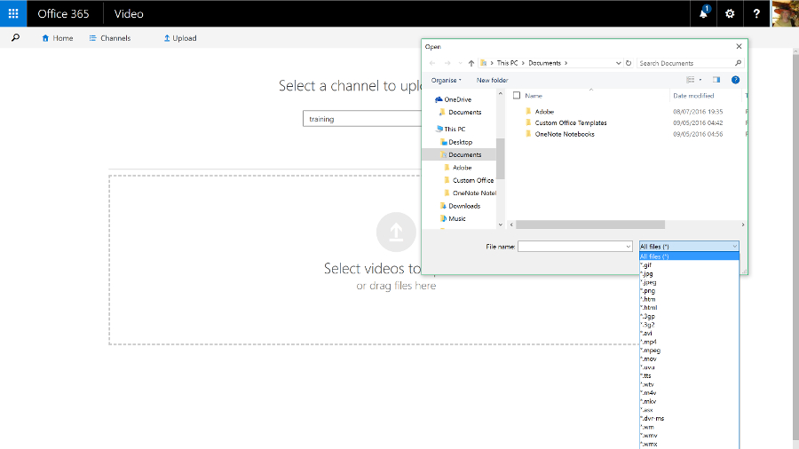
Video content is an arena Redmond is moving to cover with its subscription Office suite, as well, with the creation of the Office 365 Video portal that allows businesses to distribute videos internally. This is a free additional service which is currently in the process of rolling out globally for Office 365 enterprise users, in order to provide a fully integrated solution for video sharing within an organisation with security in mind. Office 365 Video employs an HTML5 player so it can work across all devices from mobiles to desktop computers, although Microsoft is also producing an app for iPhone users.
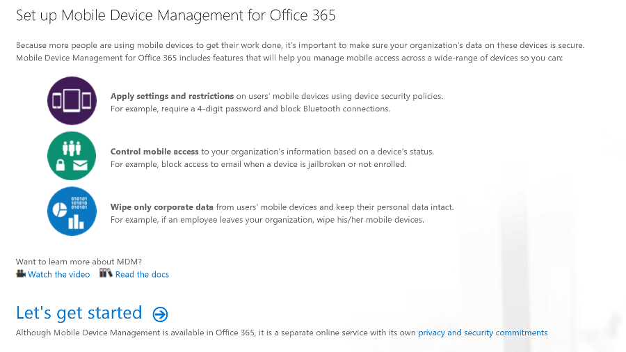
Furthermore, Redmond has bolstered Office 365 with the addition of mobile device management (MDM) again free of charge, at least for those on commercial plans. System admins will be able to use these features to manage access to data over a range of devices and platforms, from smartphones upwards and on Windows Phone, Android and iOS.
This will put in place measures such as the detection of jailbroken devices, and will allow for security policies to be set up to ensure that certain business emails or documents can only be accessed on approved devices. A selective wipe feature will strip corporate data off a device running Office 365, without touching any personal data on said piece of hardware.
Another major move on the security front which has only just happened is Microsoft and Samsung's announcement of an agreement, following settling their legal arguments over Android, whereby a version of the Office 365 suite will come to Samsung's Knox. In other words, Excel, Word, PowerPoint, OneNote and OneDrive for Business will be included wrapped up in the Knox container.
Redmond has also just changed things with Office 365 so that documents can now be exported in the Open Document Format (ODF), to bring the suite in line with UK government guidelines on document sharing.

Recent news
The following is a list of updates to the Office 365 suite going back from August to the beginning of 2016:
August 2016
- Microsoft is going to more tightly integrate Office 365 and Windows 10 by implementing an 'Office Hub'that offers easy access to your documents from within Windows.
- Office 365 saw the introduction of a Service Assurance Dashboard which provides a range of details on privacy, security and compliance controls, including third-party auditing.
- Microsoft said that the rollout of the overhaul of Outlook.com, which brings fresh Office 365 features to users of the webmail service, has been further delayed.
- Office 365 Education introduced a raft of new features including Microsoft Classroom, School Data Sync, Microsoft Forms, and Learning Tools.
- Microsoft brought some new ink effects to OneNote, and also the ability for the app not just to convert a handwritten equation to text, but also to teach you how to solve it.
- Two new Visio apps popped up: Visio Online Preview which allows users to view and share Visio diagrams with only a browser, and the Visio for iPad app.
- Various accessibility updates were applied across Office 365, including tweaks to make Narrator (the screen reader) a better experience in Word, Outlook and SharePoint.
July 2016
- Microsoft highlighted two major new features coming to Word – Editor and Researcher, which help with proofing/editing, and citing sources respectively.
- A new service arrived in the form of Microsoft Bookings, which gives Office 365 business users a hub web page that allows customers to schedule appointments.
- Microsoft announced that Office 365 now has 23.1 million subscribers.
- The free preview version of Microsoft Stream was launched, a YouTube-style service for businesses which will eventually become the de facto video experience in Office 365.
- The Secure Productive Enterprise offering was revealed, bundling Office 365, Windows 10 Enterprise (in its new E3/E5 cloud-based form) and Enterprise Mobility + Security suite.
- Redmond released a free videoconferencing tool for SMBs, noting that Office 365 business subscribers get similar facilities on a much grander scale via Skype for Business.
- Microsoft revealed that later in 2016, Office 365 users will get a preview of an automatic live translation caption service for Skype Meeting Broadcast supporting 40 languages.
June 2016
- Microsoft Planner was rolled out to Office 365 users worldwide, an app which lets you tackle project management in a fresh and user-friendly fashion.
- Microsoft made a number of tweaks to Sway, its 'digital storytelling' app, including upping content limits so you can use more photos, videos and so forth in your Sways.
- Outlook received some new features to help users better manage their travel plans and track the status of package deliveries.
- Excel got a new set of Power Query features designed to make working with and getting the most out of your data easier.
- A new Office 365 admin app was pushed out with a more slickly designed interface that makes important information easy to spot at a glance.
- A new SharePoint mobile app was also launched for iOS offering quick and easy access to your company's portals, sites and resources when you're on the go.
- The preview version of GigJam – a collaboration app inbound for Office 365 that allows users to easily share all manner of content – was made available to all comers.
- Office 365 was struck by a major ransomware attack that exposed some 57% of its 18.2 million subscribers to phishing attempts.
May 2016
- Office 365 Business was enhanced to allow co-editors to chat in real-time when collaborating on documents stored in OneDrive for Business or SharePoint Online.
- Accessibility improvements, including a new high contrast theme, were applied to Office 365 to make it easier for the visually impaired to work with the apps.
- Microsoft tweaked security for Office 365, with Exchange Online Protection getting safety tips that give warnings about suspicious emails.
April 2016
- Office 365 received a front-end facelift with a new welcome page designed to be more helpful and intuitive.
- Redmond bolstered the capabilities of Microsoft Graph, meaning that going forward developers can build better and smarter apps powered by data drawn from Office 365.
March 2016
- A new admin centre arrived on Office 365 boasting powerful search functionality and enabling easy access to in-depth reports.
- Office 365 Connectors were introduced, allowing apps and services to be hooked up to Office 365 Groups, so notifications from said apps automatically get sent to the Groups shared inbox.
- Office 365 became the only non-Apple accessory offered to those purchasing iPads online.
- Google expanded its Identity Platform, which is made up of a number of solutions including Google Sign-In, to cover Office 365.
- And as March ended, we discovered that according to one study, Office 365 is the king of all business web apps.
February 2016
- A ton of improvements were applied to Excel including new functions to make building common calculations an easier process, and deeper integration with Power BI.
- Outlook also got some attention with a new system that lets users easily archive messages, and a new Groups section was added to the ribbon.
- We saw a leaked pilot web page that indicated Redmond's incoming premium email service, Outlook.com Premium, will be free for Office 365 users.
January 2016
- Microsoft extended its Office Insider preview program, which allows the curious to test early builds, to include Mac users.
- Redmond introduced new inking features for the Office for iPad apps, allowing for scribbling on documents with a stylus or your finger.

