Tuesday, January 31, 2023

Apple HomePod 2 review: rich sound, but doesn't fix the original's problems

Apple HomePod 2: Two-minute review

The HomePod 2 is a surprising relaunch for Apple's smart speaker, because at first glance, it doesn't appear to offer much that’s different to the original model. And after taking a much deeper glance (and listen), I can report that it does not, in fact, offer much that’s different to the original.

The HomePod 2 is a fairly compact speaker (smaller than most of the best wireless speakers, though obviously larger than the dinky HomePod mini) with a lot of speaker power built in – and you can hear it. It's energetic, bursting with detail, dynamic, and underlined with natural and resonant bass. For its price, no single speaker sounds quite as good – and combining two in a stereo system makes for even bigger and bolder sound.

But access to this power is frustratingly limited. The only ways to play audio are through the Siri voice assistant, or the Apple AirPlay 2 system via Wi-Fi. There's no Bluetooth, no Chromecast, no Spotify Connect, and no aux-in. The only way to send audio to the speaker is from Apple devices, so if anyone in your house doesn't have one, you'll have to decide if you’re okay with excluding them from being able to use the speaker in the same way that others can.

Siri can work with multiple music services now, and can connect to your Apple account to do things like add calendar entries; but it's not as smart as Alexa or Google Assistant for generally interpreting your questions well, so if you're looking for one of the best smart speakers, it may not be top of your list.

However, if you sit in the sweet-spot demographic for the HomePod – an all-Apple house, with Apple Music to take advantage of its upgraded Dolby Atmos skills – the HomePod 2 is perhaps the best-value speaker out there. It’s cheaper than what you get from the hardcore hi-fi brands (such as the Naim Mu-so Qb 2), and with a more full sound than the Sonos One can deliver.

And its new smart-home skills are welcome too, though we'd flag them as 'nice bonuses' rather than 'reasons to buy in the first place'.

Apple HomePod 2 review: Price & release date

The HomePod 2 is released on Friday February 3, 2022.

It costs $299 / £299 / AU$479, which is pretty much what the previous model cost by the time it was discontinued. It's the same price in the US, while it's slightly more expensive in the UK, but that's no surprise given recent currency exchange rates; it's AU$10 more expensive in Australia.

The price is high compared to most of the best smart speakers – even the Amazon Echo Studio, the most expensive Alexa speaker, is nearly half the price. The Sonos One is also much cheaper.

However, there are plenty of much more expensive wireless speakers, including the likes of the Bowers & Wilkins Zeppelin (2021) or the mighty Naim Mu-So Qb 2nd Gen

So the HomePod is in the middle of the market overall – it's just definitely beyond the high end of what most people will pay for something like this. But then, the HomePod mini covers the more affordable end.

Apple HomePod 2 review: Specs

HomePod 2 on shelf in a home

(Image credit: Future)

Apple HomePod 2 review: Features

  • Uses Siri and AirPlay 2 to provide music
  • Dolby Atmos support, including from Apple TV 4K
  • Matter smart home support, with temperature and humidity sensors built in

The features of the new HomePod are very close to the original. It's a Wi-Fi-connected smart speaker based on Apple's Siri assistant, with the ability to also send music to it over Apple's AirPlay 2.

That means it's geared towards music in the Apple ecosystem very heavily. You can use Siri to request songs from Apple Music, though Siri now works with some other music services too. And while you can send music (or any other audio) to it over AirPlay 2 from Apple devices, there's no Bluetooth, or aux-in, or other way to get audio into it – that means Android devices are left in the cold with the HomePod, as is your turntable.

If you're in an all-Apple house and have no plans to change this in the future, then that's okay. But if one of your two kids uses Android when everyone else uses iPhones, it makes the HomePod 2 a poor investment. There are lots of other speakers that support AirPlay and have options for Android – from the likes of Sonos, Audio Pro, Bowers & Wilkins, and Naim (see our guide to the best AirPlay speakers). If you're in a mixed-device house, you should think very hard whether HomePods are the best option for you, especially at this price.

The HomePod 2 works as part of AirPlay multi-room systems, naturally, and you can use one HomePod on its own, or two in a pair.

The new HomePod is geared up for Dolby Atmos music support from Apple Music, including Spatial Audio – it will bounce sounds off your walls to try to create the feeling of the music being separated into different angles, elements and layers.

And these Dolby Atmos skills will come in useful if you own an Apple TV, because you can use two new HomePods as an alternative to one of the best soundbars – the Apple TV can send all of its sound to the HomePod, including Dolby Atmos 3D audio.

The HomePod 2 also supports lossless audio from Apple Music, for higher-quality audio overall, if you're signed up for that service. This is the only way it support Hi-Res music, though – Apple AirPlay 2 tech doesn't currently transmit it, so it's no good for playing stored FLAC files or anything.

The HomePod 2 has an ultra-wideband chip built-in, which means it can detect when an iPhone 11 or later is close to it, making it easy to beam music from your phone to the HomePod (or vice versa) by just bringing it close. 

This also makes setup very easy – turn on the HomePod 2, and bring your iPhone nearby. A pop-up will appear, asking you to bring the top of the HomePod into view of your phone's camera. Then the HomePod will play a sound to identify itself to the iPhone, and that'll be it. It'll be connected to your iCloud account, gaining access to your Apple Music subscriptions.

HomePod 2 on shelf in a home

(Image credit: Future)

For smart home lovers, the HomePod 2 is even better now. It supports Thread and Matter, which are the next-gen protocols that work with more accessories than ever – as well as Apple HomeKit – and it can trigger automations in your smart home when you're not there. 

It also has built-in temperature and humidity sensors, which are useful for climate-control smart home gear, or just for checking on your home's status. Open Apple's Home app and you can see this info in the 'Climate' option at the top, though during my time with the HomePod the temperature always showed as being within a range (for example, 17-19°C) which is a bit odd. Sometimes the range is as low as 1.5°C, sometimes it was 3°C. It's not a huge deal, but it's unusual to see imprecision in temperature reporting. The humidity also tends to be in a range, but it was of just two percent in my experience (ie, 63-64%), which is close enough to not bother me.

It's easy to build these into an automation – you could trigger one of the best smart plugs connected to a dehumidifier to turn on if the humidity passes a certain point, for example – from the Automation tab in the Home app.

As for Siri – it works well technically here, being very quick and accurate to pick up commands, and answers from the internet come rapidly. But it still gives some strange responses to even pretty basic music queries, and that's supposed to be its raison d'être here. I asked it to "play Blue Monday". "Playing Blue Monday," Siri responded instantly. I was expecting New Order, but figured I'd maybe get a cover. Instead, I got a song called Here By the Grace of God by Greg Hester, from an album called American Story. This segued into a Bob Dylan song. I'm guessing it found me a playlist called 'Blue Monday'? But there's no way of knowing that for sure – I can see on my iPhone what is playing, but not why.

I asked Siri what the weather will be tomorrow, and it said that Location Services hadn't been activated yet (they had, but only a few minutes earlier, so we'll forgive that to a syncing issue), so it asked me where I wanted to hear the weather for. I told it my home city's name. It read me some facts about my home city and then asked me if I wanted to hear more. Yes! The weather!

Siri is good at taking very clear commands within certain structures. It can take requests to send messages and you can ask it to add basic calendar entries (and it can differentiate voices, if you choose to set that feature up). You can also ask it for basic factual information. But it's alarming just how often it stumbles. It simply hasn't made the same progress that other smart assistants have, and should be thought of as a simple voice remote control for your speaker rather than a smart voice interface. And I'm fine with that personally, because audio quality is the draw here for me – if it's the smart part of smart speakers that interests you, look elsewhere.

  • Features score: 3/5

HomePod 2 on shelf in a home

(Image credit: Future)

Apple HomePod 2 review: Sound quality

  • Better suited to acoustic/classical than the original thanks to greater upper-mid clarity
  • Very full and well-balanced sound overall (but slightly slimmer bass than original)
  • Dolby Atmos is much more pronounced and effective, especially in a pair

Let's get something out of the way for people who used the original HomePod: the new version is not as loud as the original. I tested it directly against the original model, and the HomePod 2 at about 50% of maximum volume was equivalent to the original being at roughly 33%. Now, that's not really a problem, because it's still capable of going far beyond filling the average room in a house even with just one HomePod, let alone a pair – but still.

I've already mentioned several times that the audio quality is fantastic for the price. The high-end pops and hits with great clarity, the mid-range is fulsome and expressive, and bass is weighty yet controlled.

So to dig deeper into it, I'm going to compare it to the original HomePod directly. The first thing I noticed was that the top-end feels brighter, which is driven most by more pronounced upper-mids than the original. This is especially clear in higher-pitched vocals in songs like Foxes Gentleman and Haim's Don't Save Me, and in trumpets in Holst's The Planets. The vocals are lifted clearer of the rest of the mix, and it's also easier for denser collections of instruments at the top end to show you every detail.

At the other end, the bass is a little more resonant, but slightly less punchy. In M83's Midnight City, each synth bass beat rolls off slightly slower and feels more dispersed, which is great, but it also doesn't feel like it's hitting as hard – just a little less deep and guttural. Of note, though, is that when I tried it on one of my shelves, the new HomePods produced fewer vibrations into other objects on the shelf.

In South's Paint the Silence, which starts with strummed guitars and a bass line, the guitar pops out more and feels more natural in the new HomePod; but the bass line drops deeper and has more definition from the old HomePod. I would say the elevation of the guitar is more prominent, but I definitely noticed the difference in the bass.

In the mid-range, individual instruments get a little more room to breathe during especially dense moments. Not every song benefits from this, but it was fairly clear when one did – there's definitely more to chew on from the new model.

The sound is a little more forward and aggressive than from the original, which is energising, but also makes it feel more like it's coming from a small point. The original disperses stereo sound a little more, so it feels like it's coming from a corner of the room; the new one feels more like it's being delivered to you from a single unit. I found this clear listening to Dancing in the Dark – the original gave me a whole gritty wall of Bruce's voice hanging out at the back of the room, and the new one felt like the singing was directed right towards me.

This all comes together in The Prodigy's Firestarter in interesting ways. The piercing sounds at the start explode from the new HomePod 2 to grab your attention by the… ears far more than they do from the original HomePod. But then the new version's bass is relatively tame, and it's the original that can bang its head that little bit harder. And the heavily twisted and distorted guitars spread out more in a way that's interesting and enveloping from the original – again, it sounds more dispersed. They lash out excitingly from the new model, but I'm more into the what the original does with them.

I go back and forth on which I prefer when it's one single speaker against the other, basically on a song-by-song basis, and sometimes within the same song. Which is obviously not a problem in itself, but I had hoped for an AirPods Pro 2-style leap forward in audio quality.

However, that's all with stereo music (in Lossless or Hi-Res Lossless, from Apple Music). Switching to Dolby Atmos music allows the new HomePod 2 to reveal its real sound dispersal skills… depending on your positioning.

A single original HomePod doesn't do a ton with Atmos – but the new one is clearly positioning sounds in the mix. In Sweet Child O' Mine, the iconic guitar riff comes from the center, but when Axel Rose's voice is layered over itself, it's clearly coming from more than one angle. Lady Gaga's Chromatica album is a Dolby Atmos playground, and it's the same thing here – the HomePod 2 is able to steer sounds around in the mix in a way that's totally different to what you get from a stereo setup, and more than the original can.

However, Dolby Atmos music doesn't sound as natural as regular music from the HomePod 2. Ironically, adding more spreadable sound makes the sound feel boxier – a little more clipped, a little harder.

HomePod 2 on shelf in a home

(Image credit: Future)

Stepping up to a pair of HomePod 2 units combined into a stereo set gives the system an extra boost with all kinds of music. The forward-ness of the sound doesn't matter, because things are spread between the two anyway. And it feels like the bass gets to go a bit harder – I can't tell if that's just my perception or a freeing up of the system because one unit isn't trying to handle everything at once. Either way, I'm loving them as a pair even more than I liked using the originals in a pair.

And in Dolby Atmos, it's a totally different thing with two HomePod 2s. With them positioned in stereo in front of you, and in a room that's conducive towards sound being bounced around (ie, with walls not too far to the side of you), they can do some pretty incredible things with audio positioning. Instruments come from the side or even slightly behind you, which is a feat that even some of the best Dolby Atmos soundbars can't manage convincingly without actual rear speakers. It's a little spooky, and quite convincing. The joy of Dolby Atmos music is that it makes your favorite tracks a surprise again, and you can really get that with a pair of HomePod 2 speakers.

This largely follows through to using a pair with an Apple TV 4K as Dolby Atmos speakers for movies – an alternative to a soundbar. The HomePods are great at adding height in terms of positioning sounds to match the action on the screen (even a 65-inch screen), though they can't quite manage the exact 'above you' Dolby Atmos height that the best soundbars can produce. There's not a lot of precision to it – just sort of generically high. It's the same with a lot of side or rear effects – they don't sound very precise from movies. Yes, it's clear there's width and that you're being roughly 'surrounded', but without the precision that would make it totally convincing. 

Where it can't get behind you, though, it often does a great job with layering the sound instead. In BlacKkKlansman, responses to Brother Kwame's speech echo around, clearly coming from a different source to his words – without real rear speakers, this is as good as you can do, and it works well.

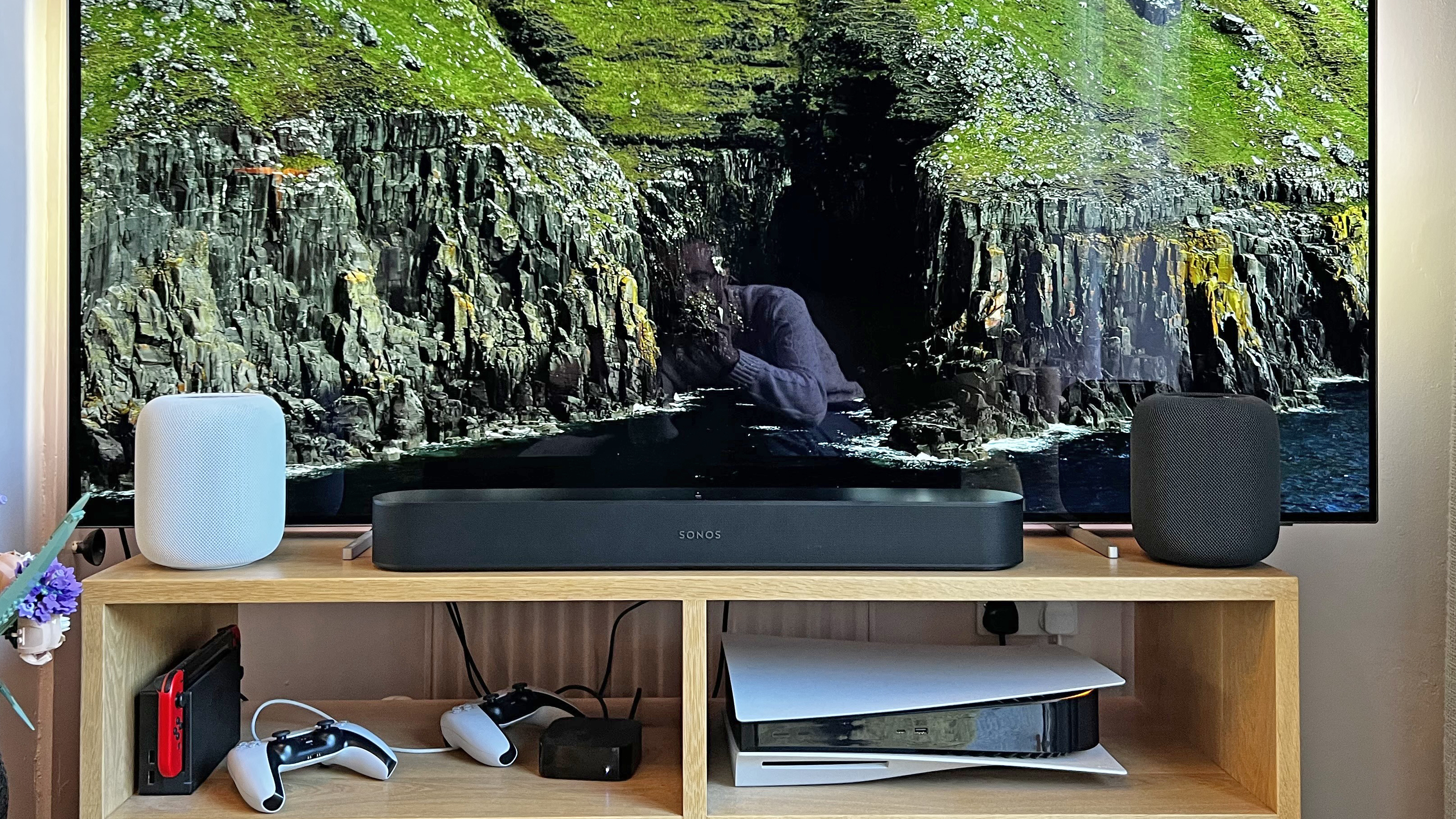
The problem is that the HomePods are so damn tall. Unless you have space to place them past each end of your TV (which I don't, personally), or on a bench under a wall-mounted TV, they will absolutely block part of the screen.

I tried a direct comparison with a Sonos Beam 2nd Gen, which costs around 75% of the price of two HomePod 2s. I would say that the HomePods were marginally superior – the width of their sound expanded further past the edges of the screen, they had more pronounced height, and they're a little more dynamic – but when it came to the core positioning of sounds to the screen, vocal clarity and general sound balance, I think the Sonos delivered 90% of the HomePod 2s' performance… for movies. For music, the HomePods were the winner, especially with Dolby Atmos music.

Going back to looking at the HomePod as just a single standalone unit, and speaking of Sonos… compared to the Sonos One – our other favorite small wireless speaker that goes in an easy multi-room setup – the HomePod 2 remains a clear step up in vibrancy, dynamic range, richness around the mid, and especially in bass. But then, you can get two Sonos One SL units for a little more than one HomePod 2, and (as with the Beam) as an individual speaker you're definitely getting more than half the performance.

And compared to the HomePod mini, it's obviously a big step-up here, too, in every conceivable way. More volume, more clarity, more range… the HomePod Mini is really good for a smaller room, but for anything larger, the HomePod 2 really comes into its own. 

  • Sound quality score: 4.5/5

HomePod 2 on shelf in a home

(Image credit: Future)

Apple HomePod 2 review: Design

  • Lovely fabric exterior in Midnight (black) or white
  • Swirling lights on top are fun
  • Short cable (five feet), but you can swap it

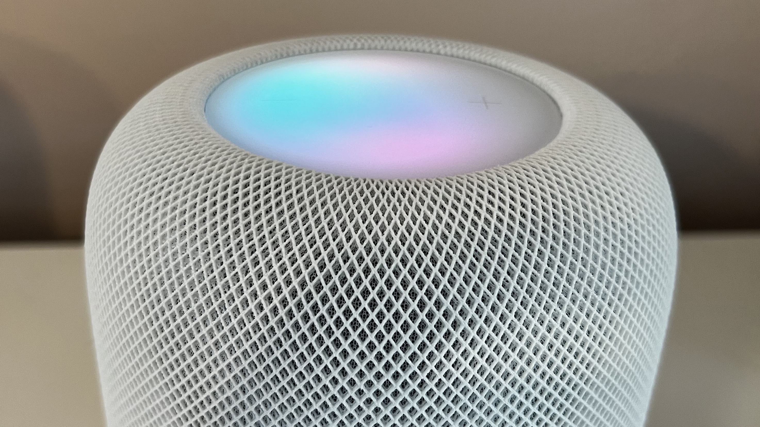
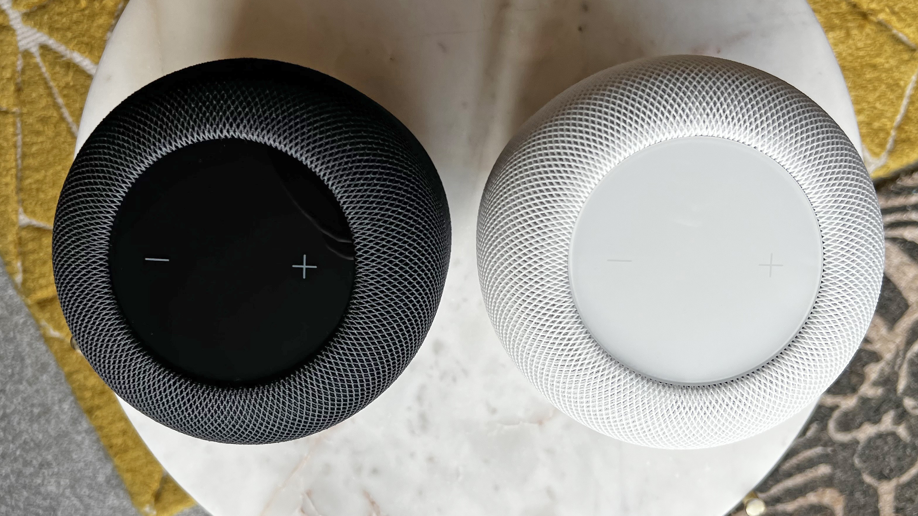
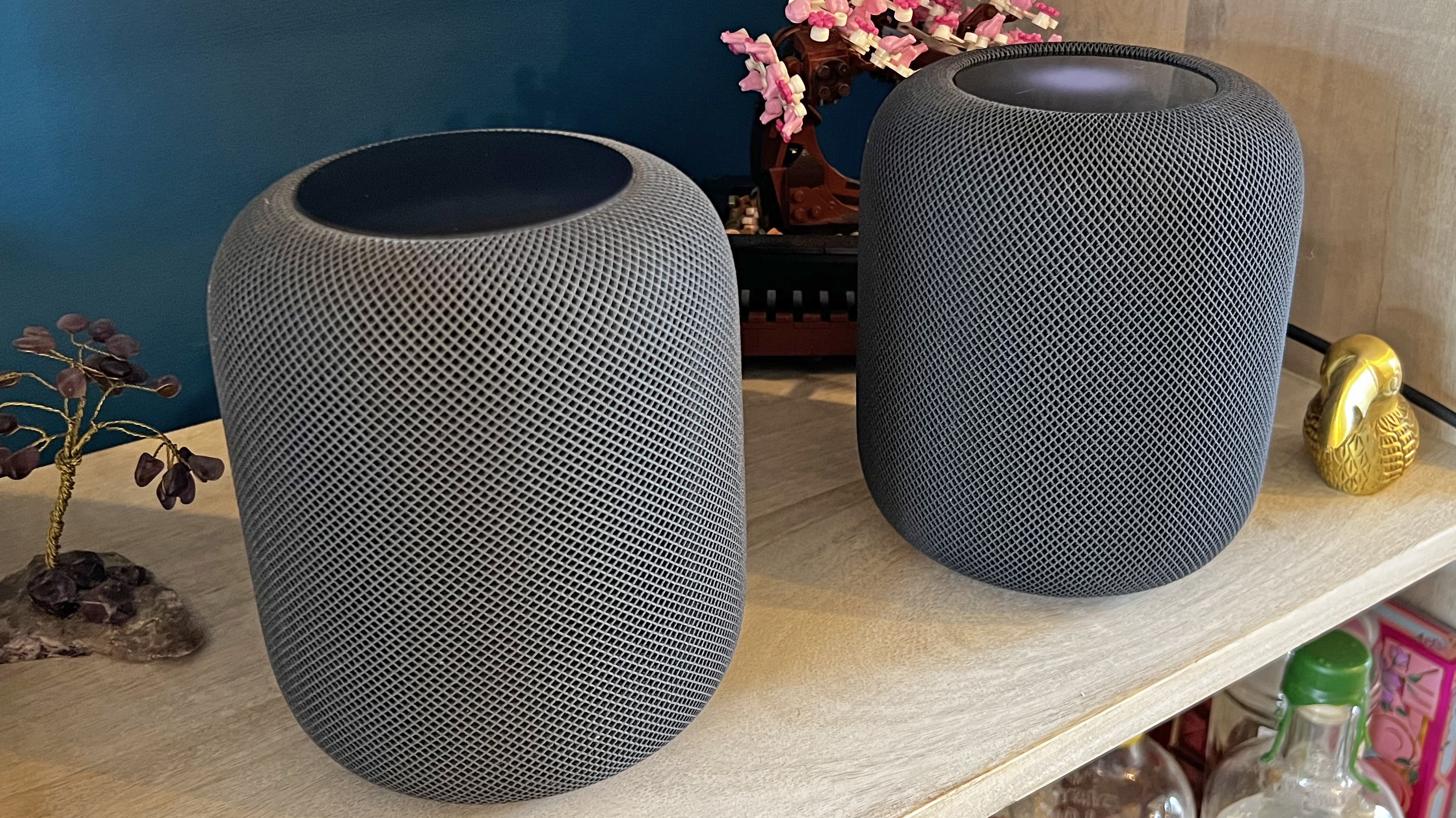
The new HomePod 2 looks almost the same as the original HomePod, with its round shape and fabric-covered exterior. I like this design a lot – it looks nice when you focus on it, but it's also great at just blending into the background when you're not, because it feels very neutral. The fabric looks nicer than plastic or a similar finish, and doesn't reflect light. The black (sorry, 'Midnight') and white finishes are lovely and neutral, though I would've liked to see some funky colors like the HomePod mini has.

On top, there's a swirling colored 'screen' (it doesn't show info, it just shows when Siri or music is active). On the original HomePod, this was just a small dot in the center, but now it's the whole top, just like on the HomePod mini. The top is also sunken slightly 'into' the fabric.

The new model is the same diameter as the original at 5.6 inches / 142mm, and is nearly the same height – it's imperceptibly shorter at 6.6 inches / 168mm rather than 6.8 inches / 173mm.

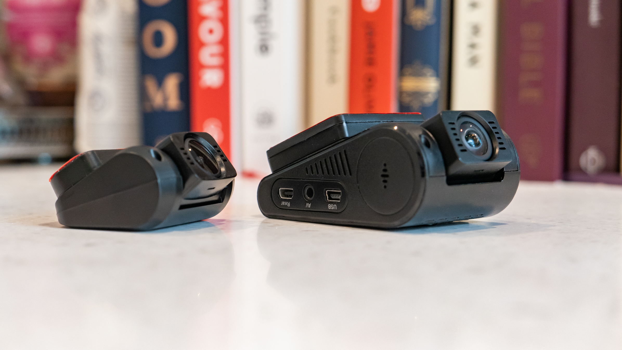
One useful change is that the power cable isn't permanently attached any more – you can just pull it out the back, which can help with installing it on a set of shelves or something. Even more usefully, it means you could swap the annoying short included five-foot cable out for a longer one, because it's a standard figure-eight connector (though you'd need to make sure that the one you buy will fit in Apple's hole).

The inside of the HomePod 2 is very different, even though a lot of the principles are the same. For example, there's still a big four-inch high-excursion woofer at the top to handle mid-range and bass. Being 'high-excursion' means the driver moves especially far forward and back (20mm, in this case), so it can displace more air and produce a bigger, deeper sound.

And there's still a ring of higher-frequency tweeters underneath the woofer, but now there are five tweeters instead of the seven in the original HomePod, and they're placed at the bottom of the unit and angle upwards, to help avoid audio reflections from the surface the HomePod is placed on.

  • Design score: 4/5

HomePod 2 on shelf in a home

(Image credit: Future)

Apple HomePod 2 review: Value

  • Sound quality for the price is excellent
  • Limited inputs harm overall value
  • It'll depend partly on how Apple-mad you are

I am the perfect target for the HomePod 2. I use Apple Music as my main music source. I use Apple TV 4K for movies. Everyone in my household has an iPhone. I don't need a single set of speakers to be able to connect to a turntable or other more traditional music source. And I don't have a lot of spare space – for me, their mix of big sound from a small package is ideal. I think they're a great value in my situation, even if I think Siri is practically a bit vestigial at this point (I do use it to request music, but that's pretty much it, and I've been using HomePods since 2018).

However, despite offering me a huge amount of options and nice features, the HomePod 2's inflexibility outside of that can't be ignored. I think of the Apple TV 4K (2022), which is really popular with people who have no other Apple products, because it's simply the best streaming device on the planet, and doesn't require other Apple devices to function. With Bluetooth and/or an aux-in, the HomePod 2 could be the same for music – the best-sounding speaker for those who want more than they can get from the best Bluetooth speakers, but without spending serious hi-fi money.

As it is, its value is a bit all-or-nothing. It's either a great buy for all-in Apple users, or a poor buy for everyone else. So the score below is for the people who actually should consider buying it – it's great value, but it'd be even better with some extra options.

  • Value score: 4/5

Should you buy the HomePod 2?

Buy it if…

Don't buy it if…

Apple HomePod 2 review: Also consider

How I tested the HomePod 2

  • I listened to the HomePod 2 for about 12 hours overall
  • I listened mainly to music from Apple Music, and movies from Apple TV 4K
  • I tested and reviewed it as a single unit mainly, but also tested it in a stereo pair

I tested the HomePod 2 at home, where I've used other wireless speakers including the original HomePod, HomePod mini and Sonos One. To prepare my HomePod 2 units for testing and let them run in, I allowed them to play music for about 12 hours before I listened with any judgment.

While testing, I switched between multiple genres of music, and primarily listened through Apple Music, because it provides lossless audio as well as Dolby Atmos support (and, y'know, it's what the HomePod 2 is built to work with).

I compared it directly with the original HomePod for some forensic level analysis, placing both speakers next to each other, and playing the same track on both, switching between them. For most of my listening time, the HomePods were placed on a wood-fibre shelving unit, to avoid vibrations.

For testing their movie skills, I used them with an Apple TV 4K (2021), playing movies from Apple's own store that included Dolby Atmos soundtracks. To compare with the Sonos Beam, I connected the Sonos Beam to my TV over HDMI eARC, and played the exact same movies via the Apple TV.

Garmin Instinct Crossover review: The smart Casio G-Shock of my dreams

Two minute review

The Garmin Instinct Crossover is a Garmin Instinct 2 with an upgraded chipset and analog hands, and I love it. It’s one of my favorite activity watches of 2022 based on the novelty factor alone, although the fact it uses the excellent Garmin Instinct 2 as a base means it’s a very capable adventure watch, not just a one-and-done gimmick. It's definitely one of the best Garmin watches out there and the best hybrid outdoor watch I've tried, although it falls slightly short of perfect as it's overpriced for what you get.

The hands are based on a technology Garmin calls ‘RevoDrive technology’. Revodrive ensures that if the watch takes a big knock, moves into a different timezone, or undergoes any other event which would cause an ordinary analog watch to display inaccurate time, RevoDrive will automatically calibrate the watch using its satellite technology. 

This technology is also what allows users to actually make the most of the Garmin Instinct 2’s smarts. A simple press of any of the function buttons (other than the light) will stop the watch’s analog timekeeping and swivel the analog hands to form a horizontal line between the 9 o’clock and 3 o’clock positions. 

Information and workout statistics are generally presented in list form, so you can scroll through the info and see it clearly, even though the analog hands are in the way. When you’re done, return to the home screen, and RevoDrive will return the analog hands back to the correct time. 

Overall, there are a few improvements in the Instinct 2’s hardware, which we’ll cover later, and all the usual Garmin stuff is as good as ever, including Body Battery functionality, route tracking with TracBack, excellent running metrics, and all the usual health-tracking features, such as heart rate variability. 

The only issues preventing the watch from earning an elusive five stars is the increase in price as a result of the analog hands, which pushes it into the same territory as Garmin watches with more functionality, such as the Forerunner 955

Garmin Instinct Crossover: Price and availability

 The Garmin Instinct Crossover is available pretty much everywhere you can get Garmin watches, including at Amazon and direct from the Garmin website. It’s priced at US$499.99 / £479.99 / AU$999.99 for the base version, although the solar-charging model costs $549.99 / £529.99 / AU$1,049.99. A tactical version of the Solar, with stealth mode and a kill switch to clear all user data instantly, is also available at an additional premium, although the extra features are unlikely to appeal to anyone outside of the military or those with a love of 'tacticool' gear.  

Garmin Instinct Crossover

(Image credit: Garmin )

Garmin Instinct Crossover: Design

  • Great integration of analog elements
  • Rugged exterior
  • Very thick – maybe too thick?

The Instinct 2 was already one of the best-designed rugged watches available at its price point. It’s cheap enough to feel like you can throw it around without worrying about spoiling a four-figure watch, yet expensive enough to carry lots of Garmin’s best features and use premium materials in its construction. Garmin hasn’t reinvented the wheel here, with chemically strengthened glass on the non-solar version (the solar version gets Garmin’s Power Glass), and the fiber-reinforced polymer/stainless steel case and bezel that are also present on the Instinct 2. Garmin has also swapped chipsets, from the Instinct 2’s Sony to an Airoha, which expands the watch’s GPS options.

It’s still a 45mm watch, but slightly deeper at 16mm compared to the 14mm Instinct. This adds additional wrist protrusion to an already very chunky watch, but it’s easy to see why: Garmin has added the analog hands, which have a super-Luminova glow-in-the-dark coating, inside the case of the Instinct. This requires that extra 2mm of space, although we imagine future iterations will be able to streamline the tech somewhat, and bring it down to 14mm or even 12mm. As is, thanks to the rugged bezel, thick silicone strap and analog hands, the whole thing gives off real Casio G-Shock vibes. 

Until, that is, you press one of those function buttons and the watch bursts into life. Considering that it’s built like a tank, the way the hands are designed to interact with the smart elements of the watch – rotating with the touch of a button to be as unobtrusive as possible when reading the information on the screen – is surprisingly elegant. In the words of Futurama’s Zapp Brannigan, it’s built like a steakhouse but handles like a bistro. 

The satisfying whirr of the motor as the hands buzz around to form a straight line doesn’t really get old. I’ve been using the Instinct Crossover for around a month, and I’m still not tired of showing people. It’s like I said when reviewing the blood-pressure strap on the Huawei Watch D: I love that innovations in smartwatches are getting physical again. Tech should be fun as well as functional, and it needs to look good. Despite the depth of this watch, face-on it’s a really attractive beast, as good-looking as any other analog adventure watch I’ve come across. It’s like a Garmin had a baby with a G-Shock Mudmaster, and I wholeheartedly love the design. 

I’m a longtime Garmin user, so I already love the design of the Garmin Connect companion app. It’s easy on the eye, and intuitive to navigate for the most part, although I’m still using my thumb to hit the wrong portion of the screen occasionally after a workout, slamming my thumb directly below the stat I want to expand rather than switching tabs. I love the heat map the app generates after a run, with different colors depending on my speed and exertion during particular parts of the course – it’s one of Garmin’s most useful features, and an example of beautifully-presented data. 

  • Design score: 4/5

Garmin Instinct Crossover watch

(Image credit: Matt Evans)

Garmin Instinct Crossover: Features

  • Great health and fitness tracking
  • Good adventure credentials
  • Lack of screen space means certain features are missing

There are tons of functions and features here, pretty much all of which have already featured on the Instinct 2. Activity tracking features abound, providing notifications on floors climbed, distance traveled and steps taken, as well as other health metrics, such as a sleep score and Garmin’s very useful Body Battery score, which monitors your recovery and tells you how prepared you are for your next adventure. There’s no Training Readiness though, which is essentially a more advanced version. 

The Instinct Crossover measures your heart rate 24/7. It also offers a heart rate variability measurement (which watches for irregularities while you sleep), and an estimated respiration rate to help monitor your exertion during exercise. It’s a really terrific watch for the outdoors in particular, offering environmental information such as sunrise and sunset from the watch face, as well as GPS coordinates, elevation information, and your distance from a designated destination, which you can set up in the app. 

The sports profile I use the most often is running, and I’ve given that an extensive go with the Crossover up to around 14 miles. There’s great GPS integration, on-wrist running power, and TracBack, which can help you return to the start of a route.  The autolap feature works well whenever I pass the kilometer marker, as Garmin Connect provides an update in my earbuds with a few stats such as time and average pace, just like most conventional running apps. 

The cycling and swimming profiles offer similar functionality, with speed, cadence, lengths and stroke counts replacing granular running information like stride length. Like the Instinct 2, this is a perfectly good triathlon watch, and if you’re looking for something a bit stylish and quirky that’ll still give you all the info you need, the Crossover might be an ideal fit. 

There’s no onboard music on the watch, just music control, which is disappointing at this price point. In fact, there are a few features here that are missing. The Garmin Forerunner 955, which you can get for around the same price, offers onboard music storage, a Training Readiness score, a daily Morning Report push-notification digest, Pace Pro advanced pacing tools, and topographical maps. I can appreciate that it’s hard to include maps with the analog hands, but it’s a feature that’s really missed here, especially as so many of the Instinct Crossover’s features are geared towards the great outdoors. 

In its haste to raise prices, Garmin has done the Crossover a disservice by placing it above the Instinct. It’s now in the ballpark of the premium Forerunner and Fenix ranges, all of which specialize with topographical map functionality and dedicated sporting features. The Instinct 2 is a phenomenal watch at its current price, and the Crossover is a wonderful alternative to it, but it can’t compete with Garmin’s other watches in the $500 / £500 / AU$1,000 space. 

  • Features score: 4/5 

Garmin Instinct Crossover and Forerunner 955 watches

Left: Garmin Forerunner 955. Right: Garmin Instinct Crossover. (Image credit: Matt Evans)

Garmin Instinct Crossover: Performance

  • Accurate GPS and health tracking
  • RevoDrive works a treat
  • Quite bulky for everyday wear

During my tests, the GPS was highly accurate, and comparable to the Garmin Forerunner 955 Solar, as well as the Apple Watch Ultra, when it came to measuring my overall speed in time per kilometers covered, and comparable heart rate measurements. I’m completely satisfied with its accuracy, having tested it alongside other high-standard watches, and I’d have no qualms about using it as an everyday running watch. 

As mentioned above, I love the heat-map design of the routes shown in the app, and as usual, the watch fed my data into Strava and uploaded my runs automatically. LiveTrack, the feature which allows friends and family to monitor your runs remotely, works a treat.

I personally don’t need onboard music and maps, as I generally use Spotify, stick to the roads, and keep my phone on me, but habitual trail runners might like to make use of both features, in which case they’d be better off with a Forerunner. I can see why people might need these features, but I’ll be keeping my phone on me as a matter of course – as a runner with asthma, I may one day need to stop and call my wife to pick me up, although that’s not happened yet.

The watch was big and bulky, and took a little getting used to. As good as it looked, its extra thickness was very noticeable, bulging under my sleeve when I wore it during the day, and it’s big enough to feel obtrusive when worn at night. However, it wasn’t an uncomfortable wear; Garmin’s silicone straps are generally very good, and this watch was no exception. It’s just big. 

It provided me with a good selection of Garmin’s baseline health metrics, with all the detail I’ve come to expect, from daily stress scores broken down into minutes of rest, low, medium and high energy, to continuous heart rate monitoring and an HRV score. 

You can pick your watch face configuration to show the information you want, and although the 176 x 176px monochrome display is quite basic, that’s part of the charm: the idea of having an analog watch is to make sure you’re not as connected as you would be with a full smartwatch, and the hybrid offers you the best of both worlds by limiting your interactions with yet another screen. The Crossover’s display reminds me of a Casio LCD screen, which is just another part of its retro charm – I really did fall in love with it, and the RevoDrive technology never showed me an inaccurate time despite my constant flitting between modes. 

  • Performance score: 4/5

Garmin Instinct Crossover: Battery Life

  • 28 days in smartwatch mode
  • 25 hours in GPS mode
  • 70 days for solar-extended unit

Garmin claims the battery life for the standard Instinct Crossover is up to 28 days in smartwatch mode, or up to 25 hours in GPS mode. On average, with moderate GPS usage, that will take you down to a hair under three weeks, which is pretty much exactly what I found – I used my Instinct Crossover for around 18 days before the battery depleted, and charged it up in a little under an hour. 

The Solar version offers a longer battery life, with 70 days of solar-extended use provided that you spend around three hours a day outside to make the most of its Power Glass technology. Unfortunately, I didn’t have the Solar version (or 70 days) to test it. 

  • Battery life score: 4.5/5

Garmin Instinct Crossover: Buy it if…

Garmin Instinct Crossover: Don't buy it if…

Also consider

First reviewed: January 2023

Ulefone Power Armor 17 Pro review

Two-minute review

When you’ve recently reviewed the 16 Pro and then are sent the 17 Pro, it’s not an unreasonable conclusion that the new phone will build on the previous design.

But, the Ulefone Power Armor 17 Pro takes very little, if anything, from its predecessor.

Where that was a super-cheap and heavy, rugged phone with a massive speaker on its back, the 17 Pro is double the cost, significantly lighter and generally has a much better specification.

Where the 16 Pro uses the lacklustre MediaTek Helio G25 SoC, the 17 Pro sports the very pinnacle of the Helio series, the G99. A chip that, in comparison to other SoCs, the G99 is a very powerful ARM processor and offers excellent performance.

The underlying platform allows this phone can handle most tasks with ease while also offering great battery life. Additionally, it supports a wide range of features, such as dual-SIM support, NFC, and Wi-Fi 6. In terms of gaming performance, the Helio G99 is enough power for most games, although it may struggle with more intense titles.

The strengths of this design over other rugged options are that at just 290g it is much lighter than most, and the case isn’t oddly shaped and thickened. That makes it a more practical phone to carry, even if you don’t use the optional protective case and its belt clip.

It also has an impressive 108MP rear camera, along with an 8MP PDFA wide-angle sensor and an 8MP night vision camera, Though even with that massive rear sensor, it still can’t capture 4K resolution video, only 2K.

There are two significant weaknesses in the 17 Pro, and the first of those is a battery capacity of just 5380 mAh, an amount that you would find in any typical mid-priced phone.

The battery can be fast charged, and the phone supports wireless charging, but this isn’t a phone that you would want to take on a long hike away from civilisation.

The second major weakness is that it doesn’t support 5G, making this a 4G phone with LTE support at best. Phones costing this much are starting to come with 5G, but this one doesn’t.

Overall, a phone that is more practical than most rugged designs and an interesting divergence from the previous 16 Pro.

This isn’t an expensive device and has plenty of useful features for the asking price..

Ulefone Power Armor 17 Pro

(Image credit: Mark Pickavance)

Ulefone Power Armor 17 Pro price and availability

  • How much does it cost? $340 / £290
  • When is it out? It is available now
  • Where can you get it? You can get it in most regions direct from AliExpress or on Amazon.com

Typically, on Amazon or other mainstream online retailers, the 17 Pro costs around $340, but for those willing to wait for AliExpress to deliver, it can be purchased for $60 less.

That still makes it almost twice the cost of the 16 Pro, but the power and performance in this design justifies the additional cost.

Alongside just the phone, the 17 Pro can be bought with an additional protective case, a wireless charging base, a portable Bluetooth speaker, or various combinations of those items. With them all included by AliExpress, it costs about the same as just the phone from Amazon.

Even with the increase over the 16 Pro, this is still one of the cheapest phones built around the MediaTek Helio G99 SoC and more sophisticated than the typical rugged designs.

Ulefone Power Armor 17 Pro

(Image credit: Mark Pickavance)
  • Value score: 4/5

Ulefone Power Armor 17 Pro design

  • Solid construction
  • By-the-numbers buttons
  • Dedicated flashlight

Rugged phones tend to fall into two subcategories; chunky or slim. And, the 17 Pro is distinctly in the ‘slim’ category, only 12.5mm thick.

It would be even thinner if the camera cluster on the rear didn’t project outwards.

At just 290 g, this is one of the lightest phones from Ulefone we’ve seen, and unless specifically primed, most people picking up this device would assume it was a regular Chinese smartphone.

That said, there are a few rugged hints, in that the back has a faux carbon fibre finish, and the sides and all the buttons are metal.

The button layout is the de facto standard comprising of the audio rocker and power button (doubling as thumbprint reader) on the right and the custom button and SIM tray on the left.

On the bottom edge is the USB-C charging port and a 3.5mm audio headphone jack, and neither of these is protected by a rubber plug.

Despite the lack of a plug, the phone is rated for IP68 (maximum depth of 1.5 metres up to 30 minutes) under IEC, and it even has underwater camera modes.

Also, in the bottom left corner is a lanyard hole for those wanting to secure the Pro 17 to a strap or belt.

Ulefone Power Armor 17 Pro

(Image credit: Mark Pickavance)

As with most modern phones, the standout feature is the display. It’s a 20:9, 1080 x 2408 FHD+ screen, offering 6.58‑inches of touch panel that even those with big fingers should be able to operate. It’s bright and colourful and has a decent resolution for viewing captured images and video. The refresh rate is 120Hz, enough to avoid screen tearing when rapidly scrolling images.

In the centre of the back are the cameras, in a generally good position for those that often accidentally put their fingers on the edge of their photos. This is a triple-sensor cluster with the top sensor offering an amazing 108MP resolution. The two other sensors are one for wide-angle work (8MP) and a night vision camera (also 8MP).

To provide flash illumination, three conventional LEDs and two IR LEDs are also part of the rear camera cluster.

The 16MP selfie camera on the front is centrally mounted in a cutout at the top of the display. Normally the loss of a part of the panel to this feature would annoy us, but the screen here has extra pixels to avoid this being a factor in presenting video or images.

Overall, the Pro 17 is a good example of a new generation of ruggedized designs where its ability to withstand the environment and a few hard knocks hasn’t compromised it as a phone in any substantial way.

Ulefone Power Armor 17 Pro

(Image credit: Mark Pickavance)

Design score: 4/5

Ulefone Power Armor 17 Pro hardware

  • Low spec platform
  • Decent battery size
  • Endoscope option
Specs

The UleFone Power Armor 17 Pro that was sent to us for review came with the following hardware:

 CPU: MediaTek Helio G99
GPU: Mali-G57 MC2
RAM: 8GB LPDDR4X
Storage: 256GB eMMC 5.1
Screen: 6.58-inch IPS LCD
Resolution: 2408 x 1080
SIM: Dual Nano SIM (+microSDXC up to 128GB)
Weight: 405g
Dimensions: 172.7 x 80.4 x 12.5 mm
Rugged Spec: IP68, IP69K and MIL-STD-810H
Rear cameras: 108 MP, f/1.9, (wide), 1/1.52”, 0.7µm, PDAF 8 MP, f/2.2, 119˚, (ultrawide), 1/4”, 1.12µm 8 MP, (night vision), 2 infrared night vision lights
Front camera: 16 MP, f/2.2, (wide), 1.0µm
Networking: Wi-Fi 5 dual band, Bluetooth 5.2
OS: Android 12
Battery: 5380 mAh

The Mediatek Helio G99 is a mid-range mobile system on a chip (SoC) released in 2021. It is based on the 12nm fabrication process and is the successor to the Helio G90T. The Helio G99 is an 8-core CPU with 4 ARM Cortex A-76 and 4 ARM Cortex A-55 cores. This package includes a Mali-G57 MC2 GPU for graphics and support for up to 8GB of LPDDR4x RAM and UFS 2.1 storage.

In this design, 8GB of memory is combined with 256GB of main storage, providing enough space for most use profiles. But this is also one of the new designs where some of the main storage can be reallocated to RAM, boosting the amount available by up to 5GB. But, the maker warns that not all Android software is compatible with this Virtual Memory Expansion feature.

While this chip doesn’t compete with some of the latest Snapdragon designs, it’s an excellent all-around performer and allows the 17 Pro to deliver impressive benchmark scores.

An SoC of this performance level is critical when you have a camera capable of 108MP images in the system for the post-processing of that data.

One contradiction of this design is that the screen has a resolution of 2408 x 1080, providing more space than a 1080p video requires to be fully represented without scaling.

However, the Pro 17 doesn’t support the Widevine L1 video decryption standard, resulting in streaming services like Netflix and Disney+ reducing the best resolution available to just 480p. It is possible to get 1080p playback on YouTube and with capture videos, but not over most streaming services.

This limitation appears to be the norm among Chinese phones, and it may be to do with the additional cost of getting L1, over the L3 decryption many come with.

While still image capture can be made at crazy resolutions, even with a 108MP sensor, the Pro 17 can only offer 2K recording at 30fps, with no 4K options.

While there may be good reasons for avoiding 4K, why they didn’t include faster frame rate versions of 1080p, 720p and 480p is a mystery. They’re all locked at 30fps.

Ulefone Power Armor 17 Pro

(Image credit: Mark Pickavance)

For western buyers, the lack of 5G comms might be an issue, depending on the locale, but it does offer a pervasive selection of 4G LTE frequencies (FDD and TDD) alongside support for 3G and 2G legacy services.

One curiosity is that this design supports simultaneous dual SIM support, allowing both connections to be active. However, the support of two 4G connections to a single device depends on the local telecom operator and if they allow this on their service.

Ulefone Power Armor 17 Pro

(Image credit: Mark Pickavance)
  • Hardware score: 4/5

Ulefone Power Armor 17 Pro cameras

  • 108MP sensor on the rear
  • Wide-angle, macro and night vision
  • Four cameras in total

Ulefone Power Armor 17 Pro

(Image credit: Mark Pickavance)

The Ulefone Power Armor 17 Pro has four cameras:

  • Rear cameras: 108MP Samsung HM2, 8 MP GC08A3 Sensor (Wide), 8MP Samsung S5K4H7 Sensor (Night Vision)
    Front camera: 8MP SONY IMX481 Sensor (Wide)

When you see the Samsung HM2 108MP sensor on this phone, one is immediately drawn to conclude that this might be a good phone for pictures, and it is.

However, the 108MP mode that captures whopping 12000 x 8992 resolution images isn’t the one that most people will use. Because none of the ‘Pro Mode’ features exists at this level of detail, and with the exception of 4X digital zoom, there are no options.

The standard resolution for pictures is only 12MP, or 4000 x 2992, or about 12% of the sensor area.

Admittedly not as impressive as 108MP, but the lower quality setting gives full control over ISO, aperture and speed, resulting in much better quality results.

It’s also worth considering that the typical size of a 108MP image is between 20MB and 25MB, whereas a 12MP is usually below 10MB. It takes longer to take 108MP images, you have less control, and they take up excessive space.

Usually, we might complain that RAW isn’t supported, but 108MP RAW images would be exceptionally large and probably not practical on this platform.

It’s tempting to think that the 108MP is just a hook to get customers who want the best pictures, but it’s more complicated than that due to the results of using a 108MP sensor to take 12MP images.

These pictures are predictably good, display relatively few artefacts and chromatic aberrations, and are well colour balanced even with everything set to auto.

It would have been nice to have a 24MP or 56MP mode which had all the controls of 12MP, but it is possible to get some excellent results out of the Pro 17, just not by using 108MP.

Camera samples

Image 1 of 11

Ulefone Power Armor 17 Pro Photo Examples

(Image credit: Mark Pickavance)
Image 2 of 11

Ulefone Power Armor 17 Pro Photo Examples

(Image credit: Mark Pickavance)
Image 3 of 11

Ulefone Power Armor 17 Pro Photo Examples

(Image credit: Mark Pickavance)
Image 4 of 11

Ulefone Power Armor 17 Pro Photo Examples

(Image credit: Mark Pickavance)
Image 5 of 11

Ulefone Power Armor 17 Pro Photo Examples

(Image credit: Mark Pickavance)
Image 6 of 11

Ulefone Power Armor 17 Pro Photo Examples

(Image credit: Mark Pickavance)
Image 7 of 11

Ulefone Power Armor 17 Pro Photo Examples

(Image credit: Mark Pickavance)
Image 8 of 11

Ulefone Power Armor 17 Pro Photo Examples

(Image credit: Mark Pickavance)
Image 9 of 11

Ulefone Power Armor 17 Pro Photo Examples

(Image credit: Mark Pickavance)
Image 10 of 11

Ulefone Power Armor 17 Pro Photo Examples

(Image credit: Mark Pickavance)
Image 11 of 11

Ulefone Power Armor 17 Pro

Night vision (Image credit: Mark Pickavance)
  • Camera score: 4/5

Ulefone Power Armor 17 Pro performance

  • Performance powerhouse
  • GPU isn’t the very quickest
Benchmarks

This is how the Ulefone Armor 17 Pro performed in our suite of benchmark tests:

Geekbench: 537 (single-core); 1592 (multi-core); 1619 OpenCL)
PCMark (Work 3.0): 9176
Passmark: 9359
Passmark CPU: 4489
3DMark Slingshot: 3675 (OGL)
3DMark Slingshot Extreme: 2763 (OGL); 1367 (Vulkan)
3DMark Wild Life: 1359
HWBot Prime: 4846

These results are right up with the very best we’ve had from rugged phones, bettered only by those powered by the MediaTek Dimensity 900 SoC or Qualcomm Snapdragon 480 5G.

And, even those devices only make a handful of score points more, and not across all benchmarks.

To underline this, the Passmark score of 9359 is one the highest we’ve tested from a rugged phone, and only Dimensity 900-powered devices did better.

The only weakness we noticed is that the Mali-G57 MC2 isn’t as quick as the Mali-G68 MP4 that the Dimensity 900 SoC uses, delivering 1359 on the Wild Life test on this phone, but more than 2000 on the Doogee V30 and Ulefone Power Armor 18T.

That makes the G99 a little less suitable for gaming, but not by an amount most players would immediately notice.

What is more likely to be noticeable is the amount of battery capacity.

  • Performance score: 4/5

Ulefone Power Armor 17 Pro battery

  • Small capacity for rugged design
  • 66W super fast charging
  • Qi charging and MagSafe

The elephant in this powerhouse is the battery, or more specifically, the 5380 mAh battery Ulefone blessed the 17 Pro with.

By rugged phone standards, that’s not huge, and while it is bigger than the 4,323mAh that Apple gives the iPhone 14 Pro Max, we typically see phones with 10,000 or more mAh in this sector.

The available capacity has a quoted standby of 294 hours and a talk-time of 29 hours, but realistically most phones don’t run out of power on standby or while being used as a phone.

With a smaller battery, Ulefone did make some effort to enable the phone to charge quickly, and with a suitable charger like the one included with the phone, it can handle a 66W fast charge. Due to the flattened back, this design can also wireless charge up to 15W using Qi charging pad (not included). It will also wireless reverse charge to another phone with Qi.

Its final trick is that it can also magnetically wireless charge in much the same way as a recent iPhone, allowing it to be used with a magnetic wallet. Included in the box is a soft magnetic wallet that doubles as a phone stand, conveniently.

While the 17 Pro might not have the battery capacity of the 16 Pro or 18T, it does have a few other neat charging features that go some way to balance this equation. The smaller battery positively impacts the phone's overall weight, importantly.

  • Battery score: 3/5

Ulefone Power Armor 17 Pro

(Image credit: Mark Pickavance)

There are many things to like about the 17 Pro that address some of the issues with the 16 Pro and also offer a hint at where Ulefone is likely to go with future rugged designs.

Instead of emulating spare parts from a transformer, the Pro 17 offers a large but not excessively sized phone that is robust and protected from the environment without resorting to shipping container aesthetics.

The MediaTek Helio G99 SoC gives plenty of processing performance, and the 108MP camera sensor delivers excellent photo capture. The only real caveat is the limited battery capacity, making it less than ideal for long adventure holidays away from mains power.

It might cost nearly double the cost of the 16 Pro, but the 17 Pro is a lot more phone for the cash and probably better value on the investment.

Ulefone Power Armor 17 Pro score card

Ulefone Power Armor 17 Pro GT?

Buy it if...

Don't buy it if...

Also consider 

Cisco CBW150AX Access Point

Cisco’s new CBW150AX Wi-Fi 6 wireless access point and CBW151AX mesh extender provide fast wireless connectivity on a shoestring. It is simple to deploy and works out of the box. A 1.5Gbps wireless throughput will be more than enough to fully utilize the built-in 1G Ethernet port, while a 2x2 radio offers enough gain to cover a 10-meter radius at over 100Mbps.

The CBW150AX can support up to 25 CBW151AX mesh extenders. Accessories provided with the Access Point include a 15W 1G PoE AC. The AP firmware has features such as VLANs and a basic firewall. Monitoring the AP and its connected clients is limited to the intranet with no cloud option, while the mobile app could benefit from some polishing, such as giving custom names to clients. 

Cisco CBW150AX: Pricing

The Cisco CBW150AX access point will take $125.58 off your budget, while the CBW151AX mesh extender will cost another $105.49. Both Cisco products come with a limited 3-year warranty. 

Cisco CBW150AX accessories

(Image credit: Future)

Cisco CBW150AX: Design

The Cisco CBW150AX access point ships in a generic brown box. It is small for a Wi-Fi 6 AP, measuring 15 cm x 15 cm x 4 cm and weighing 330 g. The white plastic enclosure blends perfectly on a white wall and can be mounted either horizontally or vertically. The accessories are a 15W 1G power injector and a mounting bracket with hardware. The access point is passively cooled, drawing a maximum of 9.2W over the PoE port.

The CBW150AX has one multi-colored LED on the front and a single 1G Ethernet port at the back. A reset button also accessible at the back with a pin allows restoring the device to its factory settings. A small rubber pad conceals a four-pin header that connects to a service port. A small slot prevents unauthorized removal of the AP when combined with a Kensington lock.

The access point sports a Broadcom quad-core processor clocked at 1.5GHz with 1GB of DDR4 and 512MB of flash memory. Four radios arranged as two transmitters and two receivers provide the hardware to utilize the 1.5Gbps Wi-Fi 6 bandwidth across multiple devices efficiently. Finally, an onboard Bluetooth Low Energy radio is included but unused.

The Cisco CBW151AX mesh adapter has similar hardware as the AP. The white plastic case measures 17cm x 9.2cm x 5.3cm and weighs 285g. It ships without any accessories and integrates an AC adapter. The total power drawn is under 9W, which is what the access point consumes. 

Cisco CBW150AX ports

(Image credit: Future)

Cisco CBW150AX: In use

Powering the CBW150AX requires connecting the supplied PoE injector and Ethernet cable to an existing LAN. The access point is slow to boot and can take up to ten minutes on the first power-up. When ready, the front status LED goes green, and the setup continues on the mobile app or a web browser.

As with most access points, software setup requires registering a username and password before the actual configuration can begin. Cisco uses QR codes printed at the back to identify its products. After registration, the user can add network components by scanning the QR code with the mobile app. Clear on-screen instructions guide the user through the remaining steps.

Once added, the AP and mesh extender work without any hitch. It is recommended to update both devices’ firmware before using them. The welcome page provides a quick overview of connected clients, the most used SSIDs, and if guest accounts are in use.

The Wi-Fi 6 AX standard allows wireless clients to seamlessly switch between the primary unit and extender. In practice, a test smartphone favored the extender module more than the access point. A thorough investigation showed that Optimized Roaming is off by default, and enabling the feature solved the issue.

The range of the access point increases with the use of mesh extender modules. Radio channels reserved for the data backhaul differ from what clients will use, thus preserving client bandwidth without degrading throughput. The AP contains software to benchmark the wireless link, which can help troubleshoot and optimize the network.

Cisco CBW150AX back

(Image credit: Future)

Cisco CBW150AX: The competition

There are plenty of options when it comes to Wi-Fi 6 access points. The main differentiators are the mobile app and technical support, while the hardware is mostly the same at this price point.

For just under $100, the TP-link EAP610 is one of the cheapest Wi-Fi 6 access points available, and with an advertised throughput of 1800Mbps, it is a decent investment. But hidden beneath these excellent specifications are drawbacks that will make the EAP610 more expensive in the long run compared to the CBW150AX.

The EAP610 consumes about 5W more than the CBW150AX, which might seem negligible but will cost with the AP running 24/7. Lastly, the EAP610 requires additional hardware to support a mesh configuration in addition to the extender module.

Cisco CBW150AX: Final verdict

The Cisco CBW150AX Wi-Fi 6 access point is a fast and easy-to-use Wi-Fi. It comes with all bells and whistles that one can expect in a modern AP, such as additional range with mesh extenders, RF optimization, and mobile app support. With its 1GE port and PoE support, it will adequately find its place in a small office setup. The 1.5Gb throughput is lower than competitive products, but that should be sufficient for daily usage, including streaming media on multiple connected devices.

What we liked about the CBW150AX and its mesh extender, the CBW151A, were the simple setup procedure and the snappy web interface. The extender module can lead to lower throughput or regular disconnect without proper setup. The online documentation provided by Cisco is sufficient to resolve most issues.

We've listed the best wireless routers.

Monday, January 30, 2023

Viofo A129 Pro Duo review

As the ‘Duo’ in its name suggests, the Viofo A129 Pro Duo is a two-camera system. The front has a 4K sensor for recording video at Ultra HD resolution while the rear is limited to 1080p Full HD – both record at 30 frames per second.

This kit also includes a GPS module. It’s fairly chunky but attaches neatly to the front-facing camera and adds precise speed and location data to video recordings. Also in the box is a tool for tucking the cables neatly behind the interior panels of your car, several adhesive clips for running a cable along the windscreen, and a 12V power adapter with two USB ports (for charging your phone and powering the dash cam simultaneously).

Viofo A129 Pro Duo release date and price

The Viofo A129 Pro Duo was first launched in October 2019 and is available to buy now, with a January 2023 list price of £187.67 / $224.99 / AU$ 333.67. 

On top of all this, our review kit provided by Viofo also included the optional polarizing lens cover (£11.25 / $13.49 / AU$20.01) to help improve the front-facing camera’s video quality, and a Bluetooth remote button (£14.99 / $17.99 / AU$26.69), which provides a convenient way to record footage without taking your eyes off the road. 

The Viofo is well-priced considering it’s a dual-camera system and also records the front-facing view in 4K. But while it stands up well on a technical level, and we’ll delve into the performance more later, the look and feel is a reminder of its more accessible price tag. It’s a clunky, cheap-feeling dash cam that lacks the sense of quality offered by those from Garmin, Thinkware, and Nextbase. The plastics are scratchy, the cables are frustratingly thick, and the overall aesthetic feels like a tech product from a decade ago – only one with modern, 4K internals.

The Viofo A129 Pro Duo placed inside a car with urban background

(Image credit: Future)

Moving on from the so-so hardware, the software also lacks polish, with a slightly confusing button design where the Rec and Mic buttons also perform the role of scrolling up and down through the menu system. A jarring beep that sounds with every button press can thankfully be switched off, and the Settings menu can also be accessed via a Wi-Fi connection with the Viofo app. We like how this app works without demanding you create a user account, and despite a lot of poor reviews on the Apple App Store, we found it worked fine, although in the clunky way common among most dash cam apps. 

The setup experience could be slicker, but dash cams are mostly set-it-and-forget-it devices, quietly getting on with their job without much interaction. There are more settings here than with most other dash cams, and we wonder if some buyers might be confused by the need to select a preferred bitrate and video frequency. We’d rather the dash cam worked that out for itself, but can see the extra configurability appealing to some buyers.

The Viofo A129 Pro Duo on a table with USB ports visible

(Image credit: Future)

Both cameras attach to your vehicle’s windscreen with adhesive pads. he front camera can be removed from this pad (which is attached to the GPS module) by sliding it to the side. It’s a quick and easy way to remove the Viofo from your car, but it’s just as easy to pop out the microSD card (not included) or connect to the phone app via Wi-Fi when you want to transfer footage. 

We were pleasantly surprised by the video quality produced by the Viofo A129 Pro Duo and its Sony Exmor R sensor. The front camera was especially impressive. The 4K resolution is doing a lot of the heavy lifting here, allowing for more detail and a crisper image than would be possible with a Full HD resolution. But it’s impressive nonetheless, with key details like road signs and vehicle registration plates easy to identify. Saturation is quite high, but since this is footage intended to defend yourself after an incident – not to share on YouTube or Instagram – this isn’t a concern.

The Viofo A129 Pro Duo from the outside of the car through a car windscreen

(Image credit: Future)

Although video quality is higher than 1080p dash cams, there’s still a lingering doubt as to whether 4K recordings are truly worth it, at least from a practical perspective. Each one-minute recording created by the Viofo is approximately 300MB, so your microSD card will fill up quickly, and transferring then viewing footage can be a cumbersome process. 

The rear camera is limited to Full HD, so naturally doesn’t produce as impressive footage, but it’s still perfectly adequate. However, the 140-degree viewing angle for both cameras could be higher, especially at the front where we’d like to have seen 160 or even 180 degrees to match some of the Viofo’s rivals.

The Viofo A129 Pro Duo on a table with GPS module label

(Image credit: Future)

Helpfully, footage automatically saved when a collision is detected by the G-sensor is put in a different folder. That way, when viewing it back on your computer or tablet it’s easy to find the right file – handy, given that Viofo’s naming convention smashes the date and time, to the second, into a barely-comprehensible file name.

A parking mode is available, but this requires a hard-wiring kit sold separately. As with other dash cams, this gives the A129 a permanent power source, allowing it to sense collisions while parked and record potentially crucial evidence of what happened. As ever, we’d recommend hiring a professional to install the hard-wiring kit. And on that note, the Viofo’s rather thick USB cables make it harder to install discreetly than other dash cams on the market.

The Viofo A129 Pro Duo on a table with screen and user interface

(Image credit: Future)

Should you buy the Viofo A129 Pro Duo?

Buy it if…

Don’t buy it if…

See where the Viofo A129 Pro Duo sits in our best dash cams round up.

First reviewed in October 2022

Nintendo Switch Lite review

The Nintendo Switch Lite takes the standard Nintendo Switch console but presents a compact alternative, which is ideal for gamers who spend more time playing handheld than docked. Without straying too far from the original, there are still several features of the Nintendo Switch Lite to appreciate and acknowledge that help it carve it's own identity.

The Nintendo Switch Lite is significantly lighter and slightly smaller than the standard console, making it super convenient to take with you wherever you go. However, if you appreciate the flexibility of playing the Nintendo Switch or Nintendo Switch OLED handheld or docked, then the Nintendo Switch Lite might be a perfect match.

But if you’re a gamer on the go, there are a lot of perks with the Nintendo Switch Lite. It has the potential to offer a fantastic alternative to the standard console due to its lighter weight and smaller size. But as with any new release, there are pros and cons to consider before you make the Switch.

Nintendo Switch Lite: cut to the chase

  • What is it? A more compact, handheld-only version of the Nintendo Switch
  • When does it come out? Out now
  • What does it cost? $199.99 / £199.99 / AU$329.95

Nintendo Switch Lite: price and release date

Nintendo Switch Lite launched over two years on from the original Switch model. Arriving on September 20, 2019, the Lite may have ditched the ability to dock your Switch to a TV, but it came with a significant price cut too.

Unlike the standard Switch, which these days retails for £259.99 / $259.99 / AU$435, the Nintendo Switch Lite comes in at $199.99 / £199.99 / AU$329.95. So, if you can accept this trade-off in the long term, a substantial saving can be made by opting for the handheld-only model.

Fortunately, Nintendo has advised that there won't be a price hike just yet for the Nintendo Switch Lite, unlike the recent ones for Oculus Quest 2 and PS5 that were blamed on global inflation. So, if you've not yet picked up a Switch Lite, there's no need to rush.

Nintendo Switch Lite: design

Nintendo Switch Lite review

(Image credit: TechRadar)

The main difference between the Nintendo Switch Lite and the original Nintendo Switch is that the Switch Lite is solely a handheld device. Therefore, the Switch Lite is much more compact and lighter than its predecessor. That comparison also applies to the Nintendo Switch OLED, which is slightly larger than the original Switch.

The Switch Lite measures 91.1mm x 208mm x 13.9mm and weighs 275g, compared to the 102mm x 239mm x 13.9mm dimensions and 297g weight of the original Switch. This means the device comes with a smaller LCD touch screen, measuring just 5.5 inches but still providing 1280 x 720 pixels.

In other words, it's a smaller screen than the original Switch's 6.2 inches, but with the exact resolution – so you're not losing anything regarding picture quality. In fact, this gives the Switch Lite a pixel density of 267 pixels per inch (ppi), a bit sharper than the original Switch's 236 ppi.

However, the trade-off is that it can sometimes be difficult to read small in-game writing on a smaller screen. We had to hold the console closer to our faces to read some text. It's a minor issue but slightly odd for onlookers on a morning commute.

Where the Switch Lite truly shines is that it feels more comfortable as a handheld device. Due to its smaller size, it's more portable and convenient to use on the go than the original Switch: you need less elbow room, and it could probably fit in quite a large pocket.

As someone with small hands, this writer is aware that the original Switch can be uncomfortable to use in handheld mode; while relatively compact, it's still large by handheld standards. By contrast, the Lite is considerably more portable and fits snugly in your hands. However, it remains wide and doesn't feel quite as comfortable as the 3DS did.

Nintendo Switch Lite review

(Image credit: TechRadar)

In addition, the Switch Lite comes with integrated controls rather than Joy-Cons. While you can connect up to four separate Joy-Cons wirelessly, you won't get an additional pair out of the box with the Lite. 

Despite the controllers being fixed, they offer mainly the same buttons as the original Switch – except the left, right, up, and down buttons, which have been replaced by a D-Pad, or Plus Control Pad, as Nintendo calls it. The D-Pad replacement feels natural, like it's always been there – and is undoubtedly more suited to handheld play.

The ZL and ZR triggers feel perfect and help cement that snug fit. However, the L and R buttons are thinner than on the original Switch. Arguably a bit too thin, as we sometimes found our fingers slipping off them. Both models also allow wireless connectivity, Bluetooth headphones, and MicroSD cards to increase the 32GB internal storage.

So, you aren't losing too many features aside from docked mode – which means no TV play. Due to the Switch Lite only being a handheld device, the console doesn't come with a dock, HDMI cable or kickstand. All you get in the box is the device itself and a charger – simple. The Switch Lite isn't meant to connect to a TV – and while we tested it out with our own HDMI cable anyway, Lite doesn't support this.

The Switch Lite also comes in turquoise, coral, blue, and yellow models – shaking up the gray and neon Switch models we've been eyeballing for the past two years. For anyone after something a little more special, Nintendo's also put out various special editions over the years, like the Dialga and Palkia variant for Pokemon fans.

Nintendo Switch Lite: performance

Nintendo Switch Lite review

(Image credit: TechRadar)

The Nintendo Switch Lite has essentially the same performance as the Switch, except that the Lite has a slightly longer battery life of 3-7 hours, about 30 minutes more than the original Switch, and 1-2 hours less than the upgraded Switch model entering stores (although Nintendo warns that this depends on the games you play).

However, it is definitely worth noting that the Switch Lite does not come with HD Rumble or an IR Motion Camera. The device is made to play handheld games solely, and will therefore only play the best Nintendo Switch games that support handheld mode.

That's not to say you can't play games which don't support handheld mode, but you would have to wirelessly connect Joy-Cons for this to work (and buy them plus their charging grip separately). We found that connecting Joy-Cons allows you to use HD Rumble. 

Nintendo Switch Lite review

(Image credit: TechRadar)

At a hands-on preview event, a Nintendo representative explained that the console would be compatible with more devices than just the Joy-Cons, but what exactly would not be revealed until a later date.

The following games are unsuitable for the Switch Lite: 1-2 Switch, Super Mario Party, and Nintendo Labo accessory kits. While games which require Rumble could be played with Joy-Cons attached, we found that trying to play with more than one person on the Lite's small screen isn't exactly practical - so we wouldn't advise trying to take on party games as the device wasn't built for this.

Despite missing these two features, the Switch Lite still has an accelerometer, gyroscope, and brightness sensor. That means you can still use gyro controls in games like Breath of the Wild – tilting the console to aim the bow, for instance – and the screen's brightness adjusts depending on your surroundings. 

Wireless online play still means you can play with friends (not necessarily couch co-op), as we could easily play Mario Kart 8 Deluxe online. If anything, all the games we played felt less clunky due to the compact nature of the device.

Nintendo Switch Lite: verdict

Nintendo Switch Lite on top of a regular Nintendo Switch

(Image credit: TechRadar)

The Nintendo Switch Lite is the perfect console for those who prefer comfortable handheld gaming and have never been sold by the Nintendo Switch's docked mode. The compact and lighter device feels considerably better than its predecessor and is much less clunky. 

When it comes to portable gaming, the Switch Lite is easier to transport, takes up less elbow space on commutes and fits in your hands much more snugly. It's not quite as comfortable as the 3DS, but packing in the same performance as the Switch means we can let that slide.

However, anyone thinking about picking up the Switch Lite needs to focus on the fact that it is intended to focus on solo, portable play, and the number of games which are compatible with the device is slightly less than the original Switch. It is not simply a smaller Switch model.

But suppose you're looking for a more comfortable, lighter and overall better-looking handheld device (and a range of snazzy colors) and don't particularly care about losing the few games we've listed. In that case, the Switch Lite is likely for you. 

Nintendo Switch Lite: recent updates

Nintendo’s continued building upon the Switch since the Lite's launch. Alongside the Nintendo Switch OLED launch, it's also seen continued system updates.

Between reminding us to use our Nintendo Switch reward points and adding Nintendo Switch software folders to better organize our library of games, a Nintendo Switch Online achievements system also went live. Elsewhere, you can now add friends through the Nintendo Switch Online companion app, available on iOS and Android mobiles. It means adding friends is easier than ever on Nintendo Switch.

There’s no end of upcoming games to look forward to, but if you’re after the older classics, fear not. Thanks to the Nintendo Switch Online subscription service, there’s a continually growing library of NES and SNES games to play. If you’ve opted for the Expansion Pack, there’s Sega Genesis/Mega Drive and more N64 games are coming. We'd say keep your Nintendo Switch Online subscription for now.

Looking for advice on how to connect Nintendo Switch to your TV? After some recommendations for Nintendo Switch SD cards? We've got you covered.

!!!!!!!!!!

Popular Posts

Categories

Blog Archive