Web.com website builder
Website Builders can be found all over the internet, promising to simplify the creation of webpages so you can get on with managing your business. Many fulfil that promise, while others fall far short. Web.com is a new service. It’s got the perfect name, but how does its features hold up?
- Want to try Web.com? Check out the website here
First off, web.com doesn’t offer a free trial, nor does there seem to be a money back guarantee. You have to commit to at least four weeks, but on the plus side, that first payment is only $1.95. You’re then offered to choose a domain name. There’s a complimentary offer of a free URL (some restrictions apply), which remains free as long as you renew your website builder service. If you already own one, you can use it instead.
This could put off a few people, but as the focus of this service is on businesses, the initial outlay is tiny for what you’re being offered.
- These are the best website builders on the market
Getting started
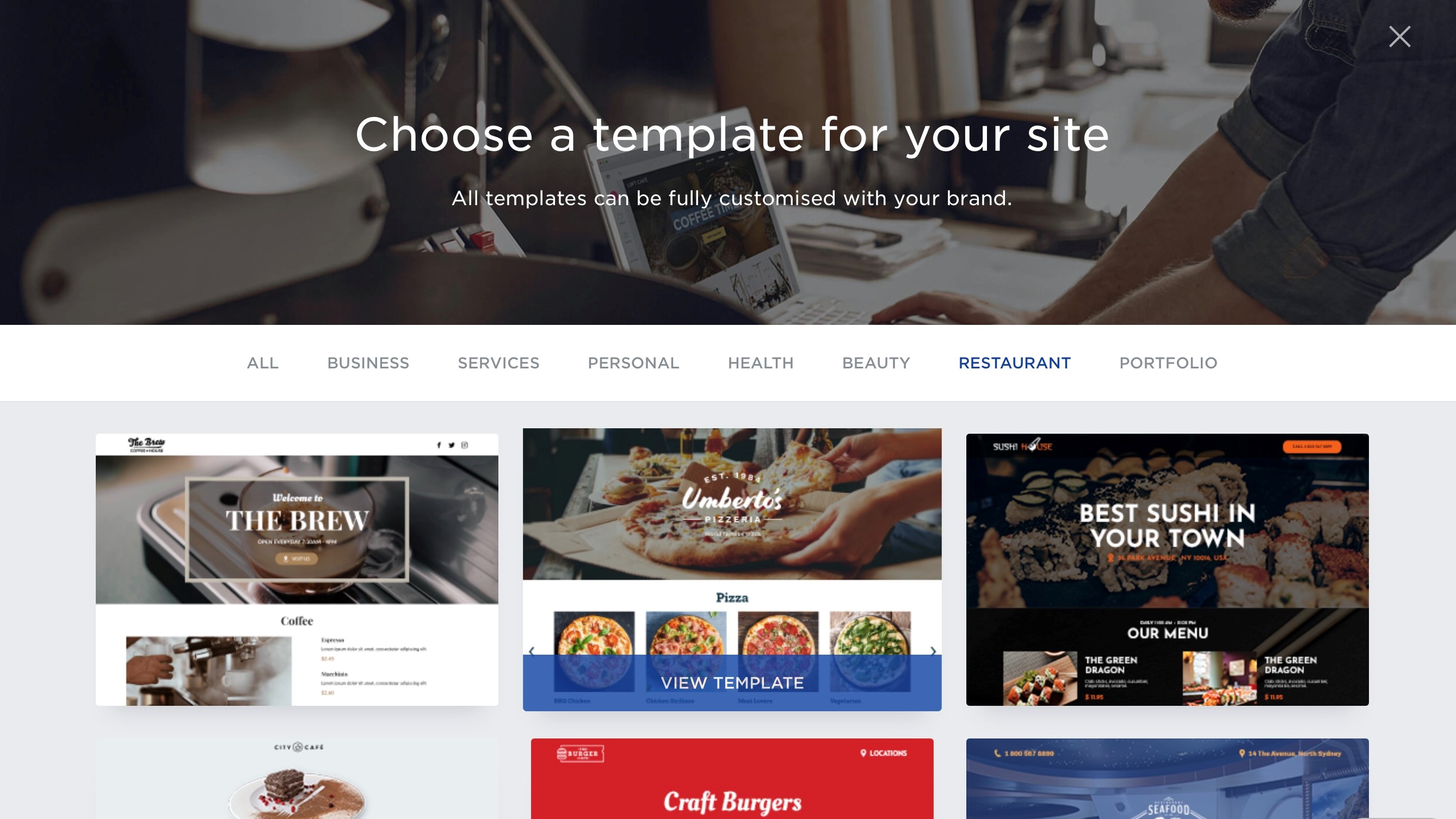
Having bought your first month and hooked up your account to a domain name, the next stage is to choose the template you’d like to work with. Even though this is a new service, there are already 125 to choose from, all broken down by categories such as “Business”, “Services”, “Health”, and “Portfolio”, among others. ‘Blank’ is also available should you prefer to start from scratch.
Each template is then further divided based on whether you need to create a single or multi-page website.
Once you’ve chosen your template, you’re then introduced to the website builder proper, with a few handy tool tips. You have the option of switching between Desktop, Tablet and Mobile thanks to icons at the top of the page, to see what your creation looks like on various devices.
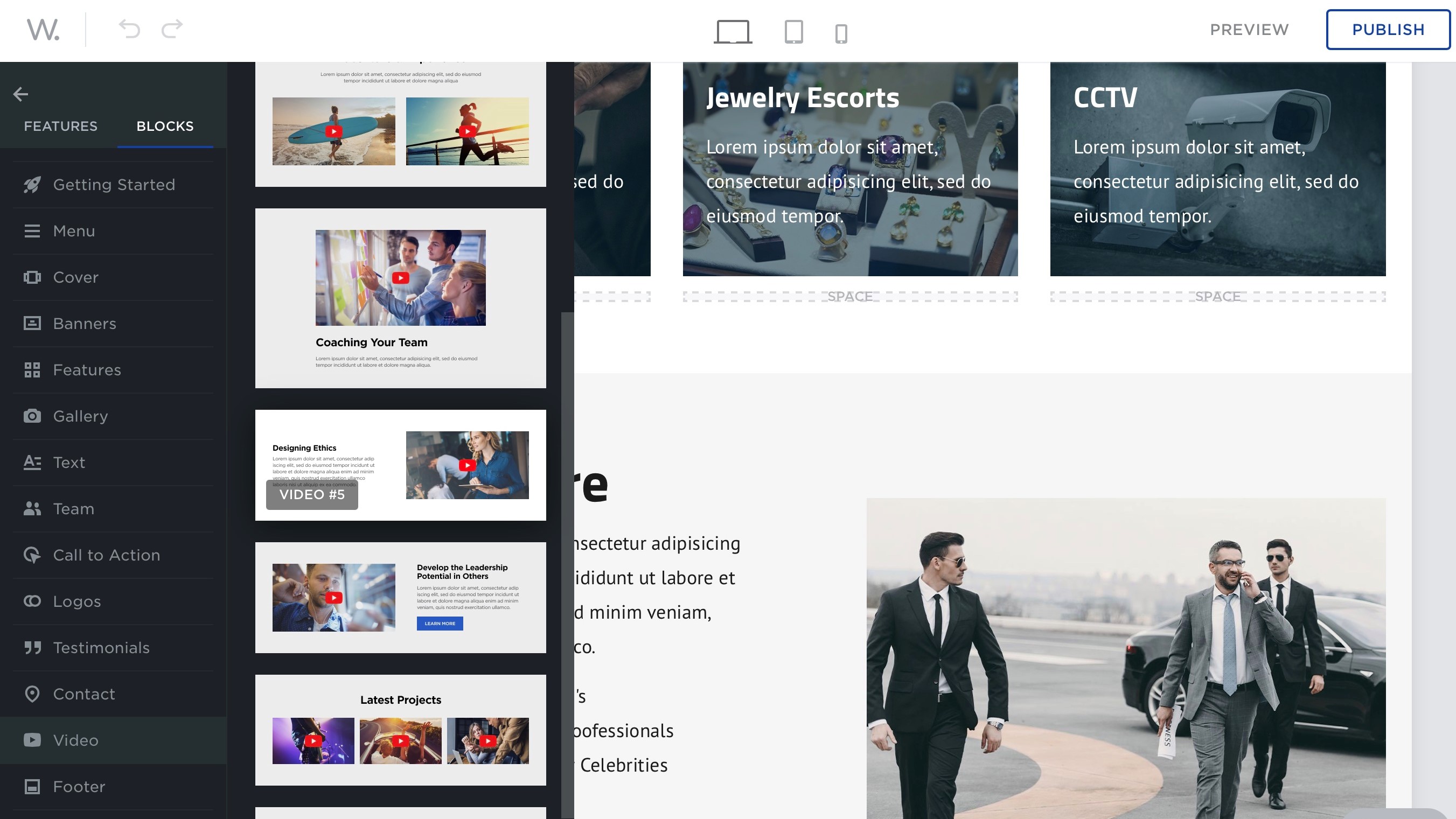
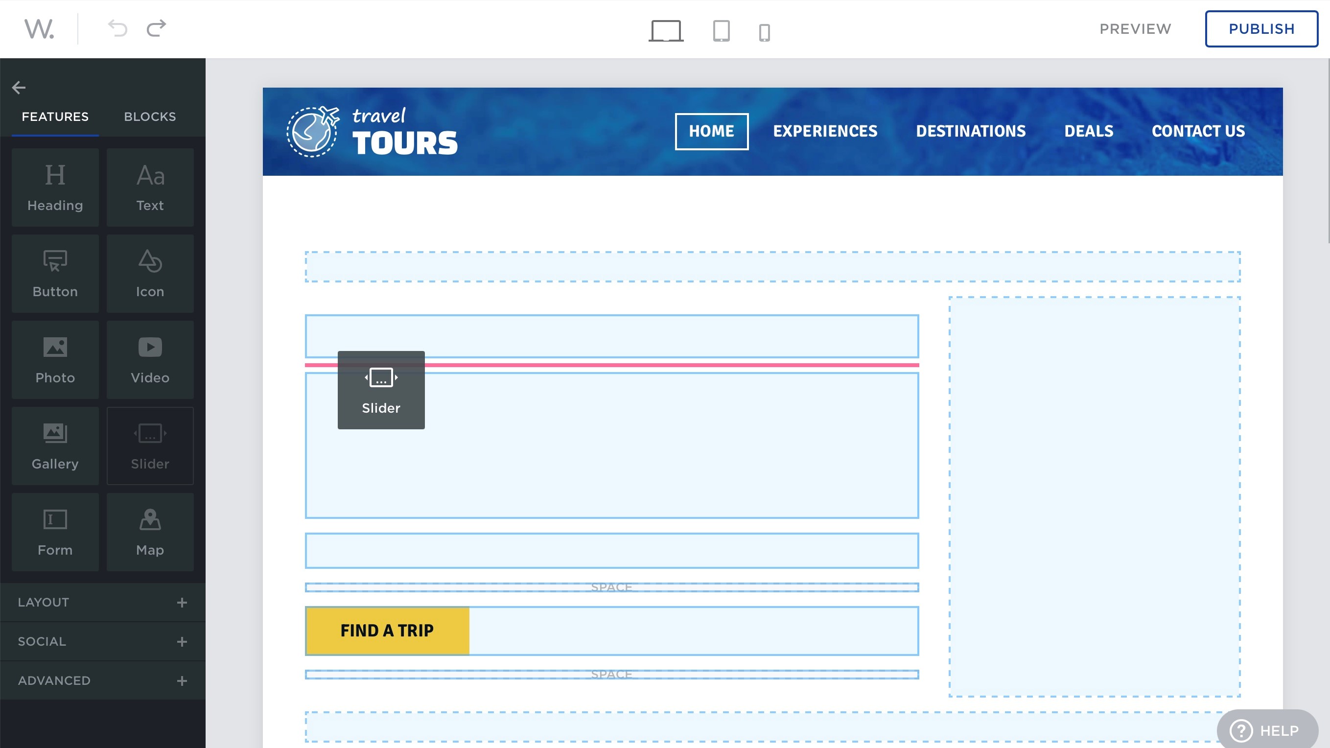
The whole concept of web.com’s website creation process is centred around dragging and dropping ‘features’ or ‘blocks’. The Features’ titles are pretty self explanatory: Heading, Text, Button, Icon, Slider, etc. Just drag them onto the page, as the right section turns red, release the mouse button to insert that feature there.
Blocks behave in the same way, but come more pre-assembled, with placeholder text and images in various location. This is a great and easy way to add what could be seen as more complex parts of a website - like a navigation menu - in seconds. It’s also great to quickly generate sections which you can easily customise, such as Testimonials, a Call to Action, Galleries, etc.
Media
Whether you use Features or Blocks, inserting photos and images is essentially the same: once the placeholder has been added to a page, click on it to choose what to replace it with. Options are pretty straightforward: drag and drop them from your computer, access your photos from your Facebook, Dropbox, Box.com, or Flickr accounts, or browse through thousands of royalty free images, courtesy of Unsplash.
We quite liked the ‘My Photos’ section, which displays all the images you’ve uploaded to web.com and are using in one of your websites. It’s a great way to not have to constantly re-upload the same image over and over again.
We noticed a glitch when embedding a video from YouTube, Dailymotion or Vimeo onto a Video Block: be aware that its thumbnail isn’t automatically displayed, and you’re stuck with the placeholder image until you manually remove it yourself. This doesn’t happen when using the Video Feature.
When it comes to text editing, you have over 60 fonts to choose from, including the option of setting a different font for your headings and for your text, should you want to do that, and of course you have control over colour, style, positions, everything you’d expect from such an editor.
Other noteworthy features include being able to add links and share options to social media, inserting custom forms, and embedding Google Maps. All great options to make your pages more interactive.
Settings
The Settings options in the Sidebar are where you can access various features such as Google site verification and Google Analytics. It’s also the place to set up Pinterest pin buttons, and your site’s Favicon, essentially, anything that affects your website as a whole can be located here.
It’s all subdivided into categories, from General (which includes options for image optimisation - which is on by default), Domains (to manage all URLs connected to your account), Marketing (the place for analytics, tag manager and site verification), Legal (to toggle banner to warn visitors that cookies are collected - a legal requirement in many countries), and Advanced (where you can choose and customise a layout for your 404 page, for instance, and turn on the ability to use your own custom blocks across all your websites).
Blogging
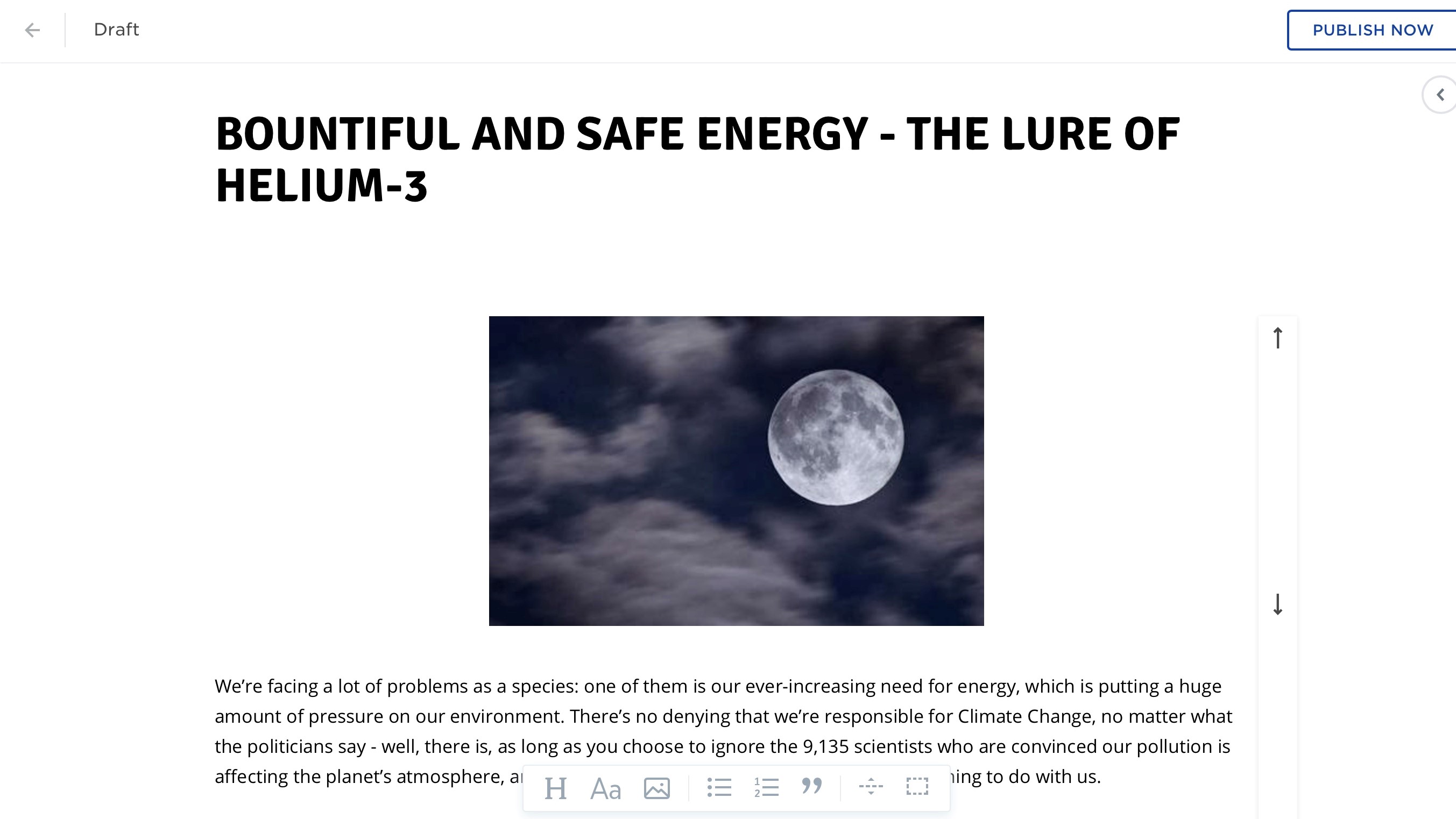
You’d be forgiven for thinking web.com doesn’t support blogging, but that’s because this feature is hidden by default - possibly because it’s still in beta. To reveal it, go to Settings in the Sidebar, select Blog and click on ‘Enable Blog’. A new Blog icon will then appear in the sidebar and a ‘Blog’ page will have been added to your site (which you’re free to rename of course).
Blogging itself is pretty straightforward. You add a title, write your piece, and pepper it with images. We can add an image above or below a section of text, but can’t apparently get the text to wrap around the image.
We also couldn’t find a way to schedule a post’s publication, add a featured image, or even tags. Although simple and trouble-free, blogging with web.com feels pretty bare bones and definitely earns its ‘beta’ monicker.
E-commerce
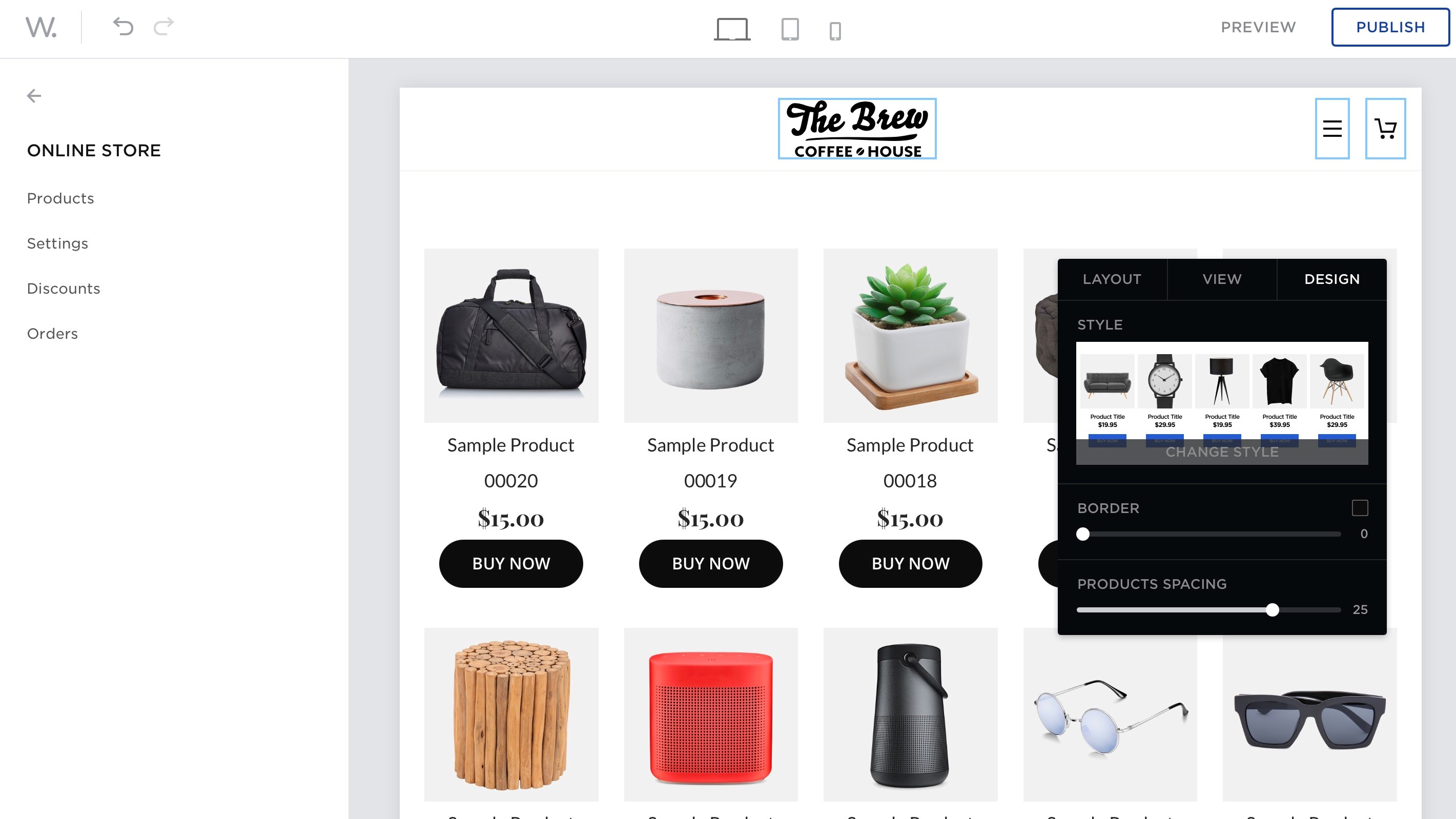
Adding an online store to your website doesn’t come with the standard plan, and is only available with the E-Commerce package (more on that later).
The main layout is very clean and simple. You’re given a choice of four layouts but they look so similar, it’s really hard to tell them apart. Other customisation options include changing the number of columns and rows to display your products, and whether or not to add specific information such as SKUs and even a ‘Buy Now’ button for each.
You’re able to sell physical and digital products, deal with taxes, handle shipping options, set up electronic payments, as you’d expect, but the store isn’t designed to handle a massive inventory as you have to add each product one at a time. We couldn’t find an option to import a file with all the info already stored on it for instance
There is however a nice Discount feature which allows you to create various coupons, set their value, limit the products which can be used with it, and set an expiry date.
Support
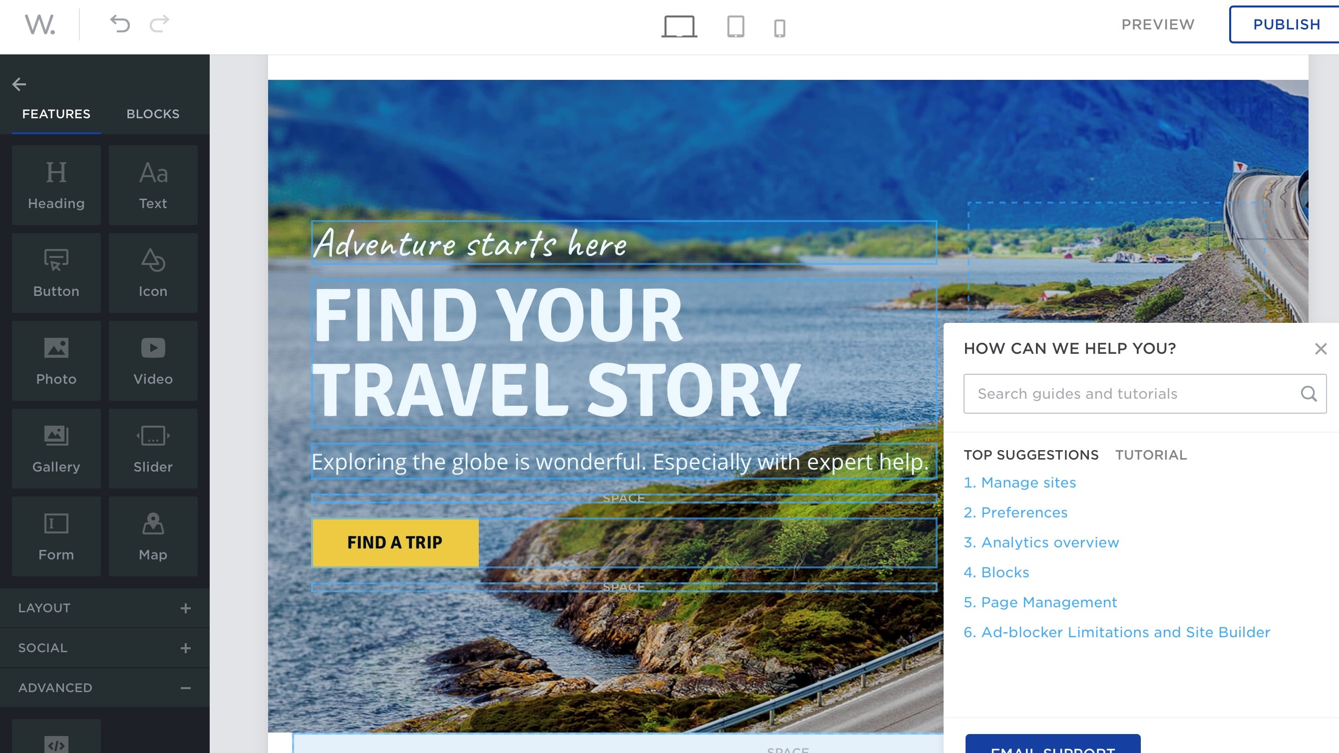
Tech support was friendly and responsive, and they also have a knowledgebase which contains a wealth of information about the workings of web.com’s service, broken down into short clear, and well illustrated articles, which answered most of the queries we had.
Plans and pricing
As mentioned earlier, the basic package starts at $1.95 for the first four weeks, then goes up to $10.00 every four weeks after that. You can choose to pay yearly instead, with the first year being $50, and all subsequent ones being $100.
If you want the e-commerce package, your first four weeks will cost you £3.95, followed by $20 for all subsequence four weeks. Again, you can choose to pay yearly, with $100 for the first year, and $200 after that.
Final verdict
We found web.com to be a very good website builder. Its features and blocks allow you to create a unique and visually interesting page (or series of pages) in minutes. Beefing up the blogging, and offer bulk product imports for the online store, would make it even better. It’s a simple, and affordable solution.
- We've also featured the best web hosting
0 comments:
Post a Comment