Sunday, July 31, 2022

Razer Barracuda Pro

Razer Barracuda Pro: Two minute review

The Razer Barracuda Pro is part of a trio of Razer releases this year, with three new headsets aimed at a more casual "lifestyle" audience rather than the hardcore gamer: the Razer Barracuda X, the Razer Barracuda, and the Razer Barracuda Pro. Each one targets a different segment of the market, mostly on price and features, with the X priced the lowest and the Pro being the premium option at a very lofty price of $249 (£249, about AU$350).

Though thethe Barracuda Pro is not a dedicated gaming headset, meaning it won’t outperform many (if any) of the best PC gaming headsets at this price point in terms of pure solid clarity and depth, but that's not what the Barracuda Pro is about, and as a hybrid device, it performs incredibly well. 

The Barracuda Pro adapts to any type of sound or music from whichever device it’s currently connected to, with some pretty solid bass reproduction. And because it’s not particularly oversized for a headset nor features clunky attachments like a large mic (instead opting for a built-in mic that can be toggled on via a button click), you can actually go outside and not look foolish. 

The biggest selling point of the Razer Barracuda Pro is the ability to switch between two paired devices which can be any combination of PC, phone, and gaming device through its dual Wireless (2.4GHz) and Bluetooth support. Though it comes with a USB Type-A dongle, which allows you to connect to non-Bluetooth enabled devices that have the port, this headset is meant for Bluetooth as the main features only really work with it. 

This is both convenient and headache inducing, as any Bluetooth device owner can tell you, since sometimes the tech can be a bit spotty including the dedicated button for connecting to and switching between paired devices.

The second biggest selling point is its active noise-cancelling capabilities which comes in three flavors: Off, On, and Ambient. The difference between each mode is staggering in the best way, with the Ambient mode perfectly balancing which sounds are filtered. This setting and tons of others can be controlled through the Audio app.

On balance, it's tough to call this one of the best wireless gaming headsets around because it not quite that, but also much more than that, and as a first real step into the Lifestyle market, it succeeds far more than it should for a first attempt. If you're the kind of person who is looking for this kind of device, the Razer Barracuda Pro is about as good as it gets. 

Razer Barracuda Pro: Price and availability
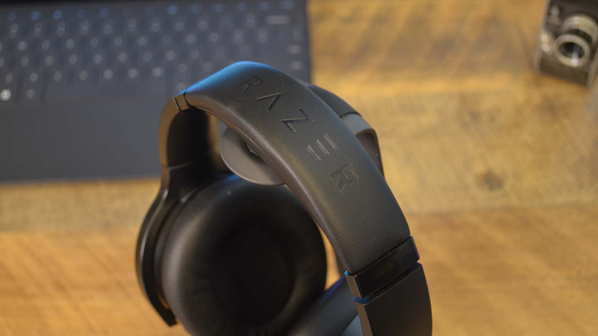
A Razer Barracuda Pro on a headset stand in front of a computer with the techradar logo on it

The headband on the Razer Barracuda Pro is incredibly comfortable and sleek as hell (Image credit: Future)
  • How much is it? MSRP is $249 / £249 / AU$439
  • When is it available? It is available now at Razer.com, and through other retailers

The Razer Barracuda Pro will run you $249 / £249 / AU$439 for a pair, which comes with a handy carrying case that includes a little section for the USB dongle and charging cord but does not come with a base station, which is disappointing considering the price of the headset.

Another drawback is somewhat the lack of availability outside the US. While it’s available for Australia at AU$439 as well as European regions, those in the UK might have a hard time finding one (we sure did), and you might have to resort to importing a pair — something that makes an already expensive piece even more so.

  • Value: 3.5 / 5

Razer Barracuda Pro: Design
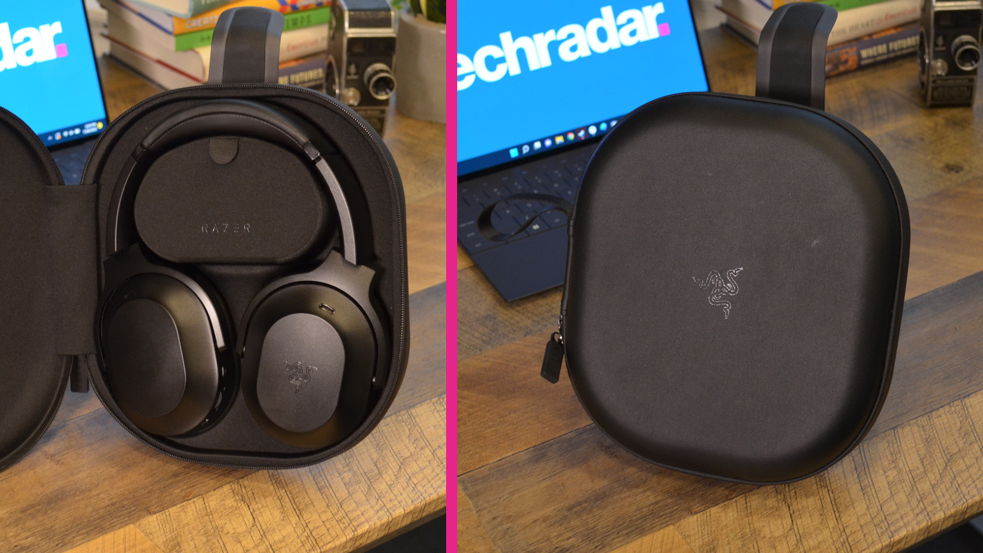
A Razer Barracuda Pro on a headset stand in front of a computer with the techradar logo on it

The carrying case for the Razer Barracuda Pro is a great feature, but we'd have liked a base station as well. (Image credit: Future)
  • Sleek and gorgeous
  • Comfortable ear pieces
  • Quality build
Razer Barracuda Pro Key Specs

 These are the specs on the Razer Barracuda Pro sent to TechRadar for review

Connectivity: SmartSwitch Dual Wireless (2.4GHz and BT)
Drivers: TriForce Bio-Cellulose 50mm
Earcups: Memory Foam Cushions
Weight: 340g
Battery life: 40 hours
Charging port: USB-C
Features: Hybrid Active Noise Cancellation (ANC) Technology, THX Achromatic Audio Amplifier, THX Spatial Audio, Dual Integrated Noise-Cancelling Microphones

The Razer Barracuda Pro is a well-designed headet, and that's putting it lightly. Its simple yet svelte and sexy figure combined with an elegant black paint job results in a product that oozes sophistication without being too overt. It’s appealing for those who are interested in a hybrid headset that offers a mix of features but doesn’t need to attach giant gaming mics or have a double headband paired with equally cumbersome earpieces.

What we especially appreciate about the design is the memory foam cushions on the earpieces, in which you’ll feel the comfort instantly. Despite most headsets having large cushions, the vast majority are cheaply made and can become borderline painful after an hour. 

But the Pro is easily one of the most comfortable headsets we’ve ever tried on, the memory foam pillowy and plush. The headband is also coated in memory foam, which forms the perfect cushion from the sturdy stainless steel that it’s made from. Not only is this headset built to last, but it doesn’t sacrifice comfort to achieve that.

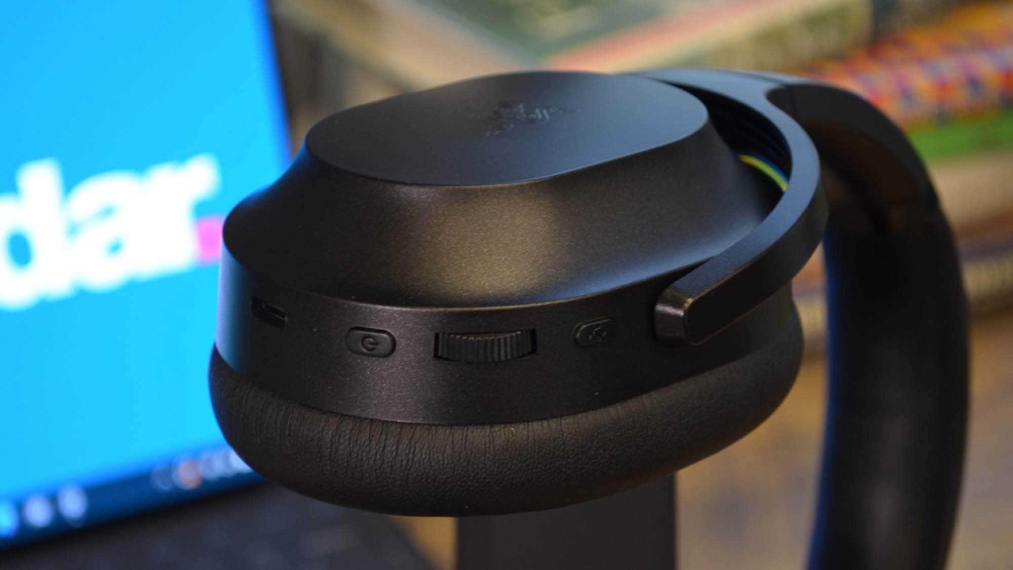
The buttons located on the earpieces are conveniently placed and once you memorize which one does what, it’s easy to access them. It really shows an attention to detail, ensuring that the average user can take full advantage of each of these buttons’ functions without having to constantly remove the headset each time to check what button you're pushing.

  • Design: 5 / 5

Razer Barracuda Pro: Features
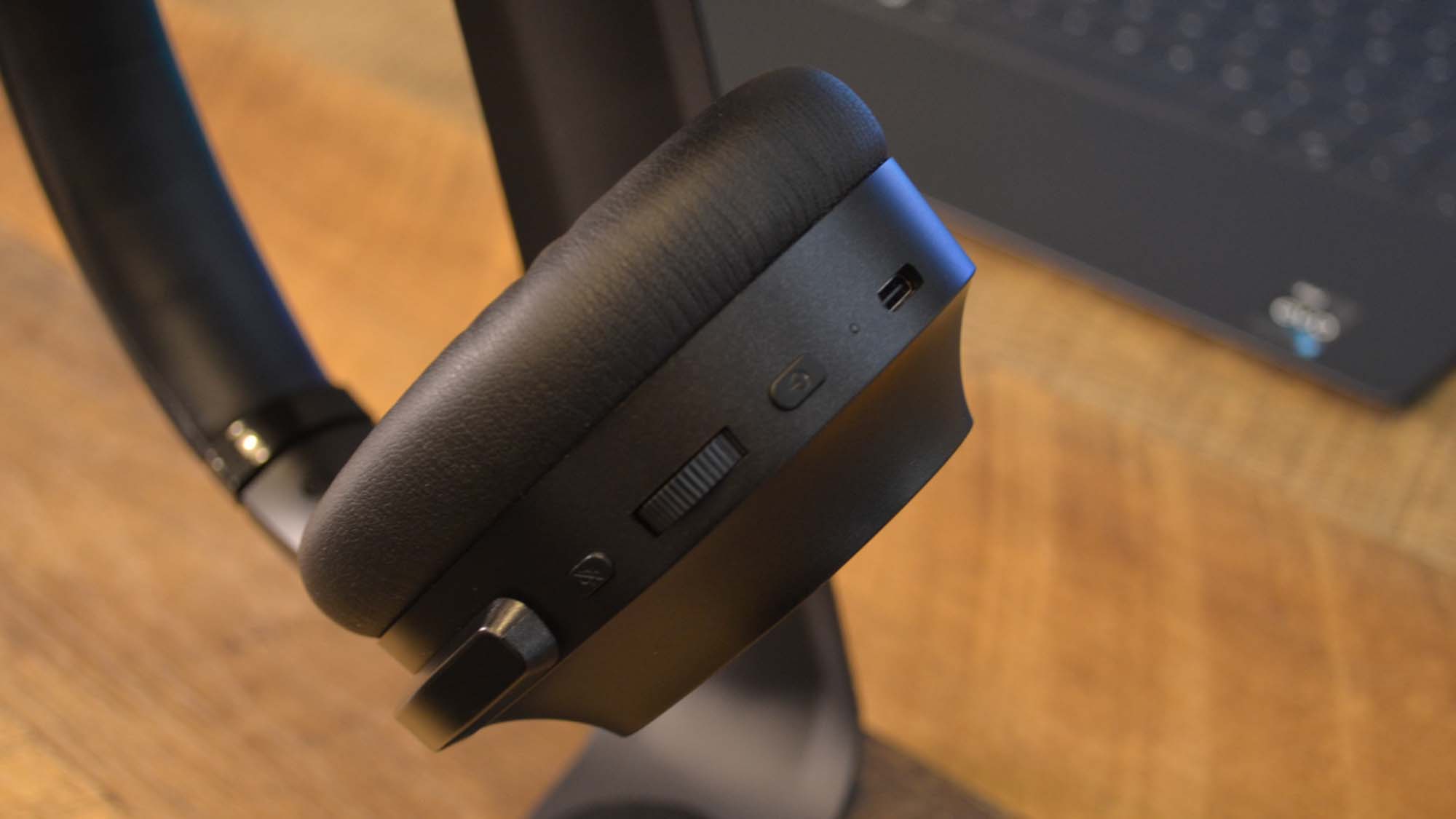
A close up of the controls for the Razer Barracuda Pro

The controls for the Razer Barracuda Pro are very easily accessible (Image credit: Future)
  • Noise-cancelling is top-notch
  • Bluetooth/wireless switch is spotty

There are several handy features that make up the bulk of the Razer Barracuda Pro’s offerings, the top one being the active noise-cancelling. Through a separate app that can be downloaded on Google Play or the App Store, users can control whether to turn off the noise-cancelling or to adjust it depending on your needs. It can also be toggled off and on through a button on the headsetm, but the app allows for way more precise control.

Other than turning it off, you can choose between Ambient and On with the former selectively filtering which outside noises to let you hear and the latter filtering out all background noises. The Ambient mode is our favorite, as it balances out unnecessary noises versus the ones you definitely need to still hear. 

The full active noise-cancelling is a treat as well, with a scale to control how thoroughly it blocks out other sounds. At its maximum, it becomes almost a hazard because of how well it keeps out other outside noises.

The other major feature is the ability to switch between two connected devices by using the assigned button on the headset. And it’s a great feature in theory, but in practice it falls victim to the spottiness that Bluetooth and wireless are so well-known for. It’s often easier to simply reconnect the device via its Bluetooth settings page.

There are also minor features that are pretty handy, such as the customization options available in the app, as well as the ability to suppress phone calls during gaming if you have your phone paired to the headset.

  • Features: 4 / 5

Razer Barracuda Pro: Performance
A Razer Barracuda Pro on a headset stand in front of a computer with the techradar logo on it

The Bluetooth connection can sometimes be spotty, but when is that ever not an issue with a Bluetooth headset? (Image credit: Future)
  • Great all-around sound quality
  • Game Mode speeds up wireless performance

For those looking for a dedicated gaming headset with top-of-the-line audio, this is probably not the headset for you. Though it does feature some excellent audio quality, especially for what’s meant to be a hybrid headset, there’s no way it can match a far more specialized piece of equipment. However, for being more of a lifestyle headset it really is one of the best.

According to Razer, the Barracuda Pro uses bio-cellulose 50mm drivers, which are supposed to reduce distortion and allow for “distinct clarity and deep, impactful bass reproduction.” While we fully can’t comment on the tech itself, we can say that the Barracuda Pro sounds fantastic. It’s incredibly clear and the bass reproduction is quite good — not subwoofer good, of course. But for the average user who doesn’t particularly dabble in the details, it’s more than good enough for regular gaming sessions or movie streaming.

There are also plenty of other bells and whistles including in the package like THX Spatial Audio and THX Achromatic Audio Amplifier, which all serve to create a superb sound experience. Combined with the truly great noise-cancelling feature and it’s honestly shocking how immersive any sounds that play through this headset can be. Not to mention how downright incredible the battery life is on this, giving you 40 hours in between each charge, which is phenomenal.

The Barracuda Pro is compatible with PC, PlayStation, and various mobile devices, though Xbox fans are out of luck. For gaming, there’s even a devoted Game Mode which allows for faster wireless performance within a smaller range, which works well for those who need the headset to be particularly responsive during a session.

  • Performance: 5 / 5

Where does the Razer Barracuda Pro sits in the market?

The Razer Barracuda Pro currently sits in a unique position in the headset market. They blend in features like noise-cancelling and a sleek design reminiscent of the Beats line or something made by Sony, combined with solid bass reproduction and faster wireless performance from high-quality gaming headsets.

So it’s really pretty difficult to compare the Pro to most other gaming headsets out, though the Sony line of headsets in general, like the Sony WH-1000XM4 or the Sony WH-CH510, come the closest, in our opinion.

Should you buy a Razer Barracuda Pro?

Buy it if...

Don't buy if...

Also consider

Razer Barracuda Pro: Report Card

Value Though it offers plenty for its price, the Razer Barracuda Pro is quite pricer compared to other non-gaming headsets and it isn’t available in the UK. 3.5 / 5
Design Easily the best reason to buy this headset, it’s gorgeous and well-built with some downright cozy eaarpieces. 5 / 5
Features The noise-cancelling feature is the top one, as it’s high quality on its own with tons of options that allow you to customize your experience. 4 / 5
Performance Though it doesn’t match gaming headsets, it’s an excellent hybrid with great sound quality on all fronts. 5 / 5
  • First reviewed July 2022

How We Test

We pride ourselves on our independence and our rigorous review-testing process, offering up long-term attention to the products we review and making sure our reviews are updated and maintained - regardless of when a device was released, if you can still buy it, it's on our radar.

Read more about how we test

Saturday, July 30, 2022

Zotac Zbox PI336 Pico

Zotac has been making small systems for some time, with a progression from small form factor down to Nano, and now even smaller.

Lots of companies made small computers, often for embedded applications or for media players, but the arrival of the Intel NUC machines focused many on what ultimately became a lucrative market.

One direction that these devices have gone is to be mountable on the rear of a monitor, effectively turning that screen into a system.

That’s the slice of the market that Zotac has aimed with the implausibly small ZBOX PI336 Pico.

Being small can have advantages for computer hardware, but is a PC this small and underpowered truly practical?

Zotac Zbox PI336 Pico

(Image credit: Mark Pickavance)

Price and availability

The Pico has yet to arrive in the sales channels but is expected to do so in the next few weeks. The UK MSRP is £319, including VAT, equating to around $300 or 320 Euros.

Once released, this hardware should be widely available through online retailers.

Zotac Zbox PI336 Pico

(Image credit: Mark Pickavance)

Design

Plenty of computers are marketed as ‘small’, some that aren’t significantly reduced in size from conventional desktop systems.

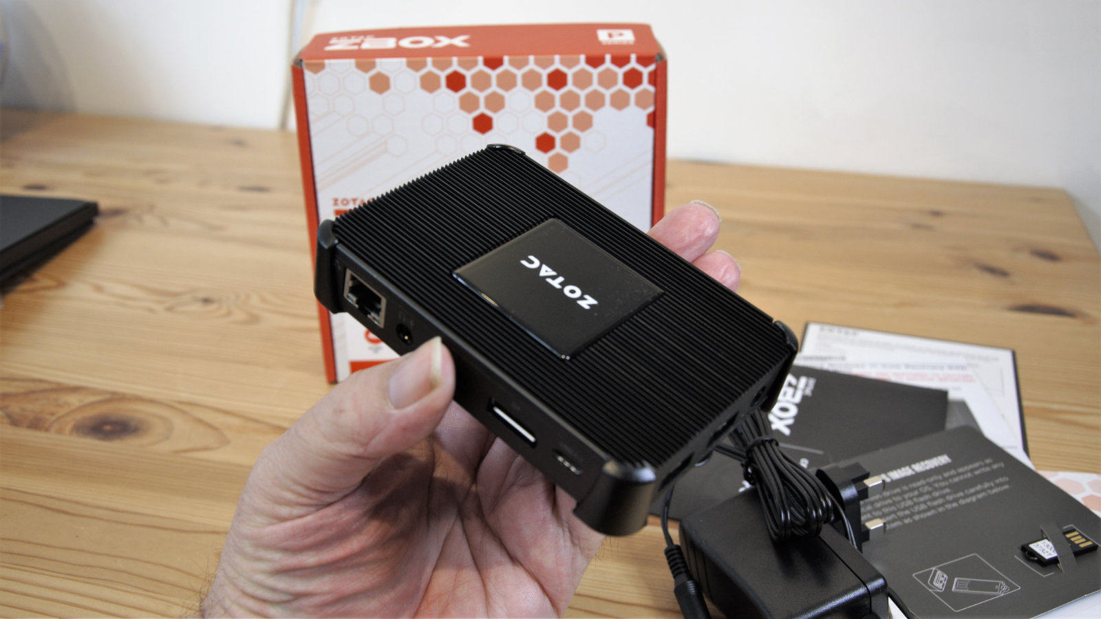
But the ZBOX PI336 Pico, or Pico as we’ll call it from this point onwards, is almost implausibly tiny.

Measuring just 115mm long by 76mm wide and 20.7 mm deep, this is incredibly petite for a machine sporting an Intel X86 compliant processor.

However, being so small has inevitably led to some compromises on the number of ports and the upgradability of this device.

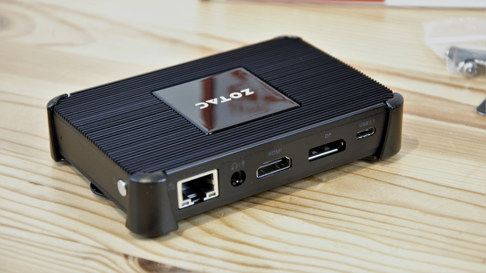
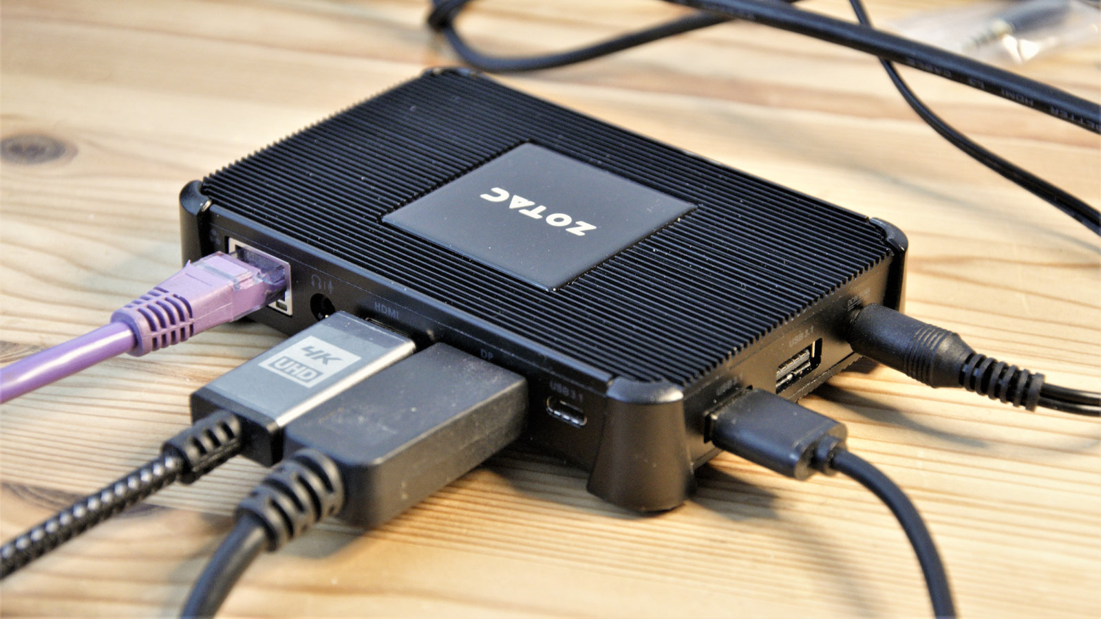
The rear has a full-size HDMI and DisplayPort, allowing for the dual output to 4K, according to the marketing material. Alongside those are a gigabit Ethernet port, Headphone/Mic in combo, and a type-C USB 3.1 port.

There are two more USB 3.1 ports on the left side of the Type-A variety, but no USB 3.2 ports at all, disappointingly. The only features on the right side are a power button and its associated LED, and the front has a single MDHC/SDHX card slot for those with tiny fingers.

Each Pico comes with a plastic bracket to VESA mount the machine to a monitor and an outlet PSU to power the unit.

The construction appears to be mostly metal, with fins on the top and underside along with a ceramic plate bearing the maker's name on top. This surface modelling is critical, as the Pico is passively cooled, making it both silent in use but also desperately in need of airflow.

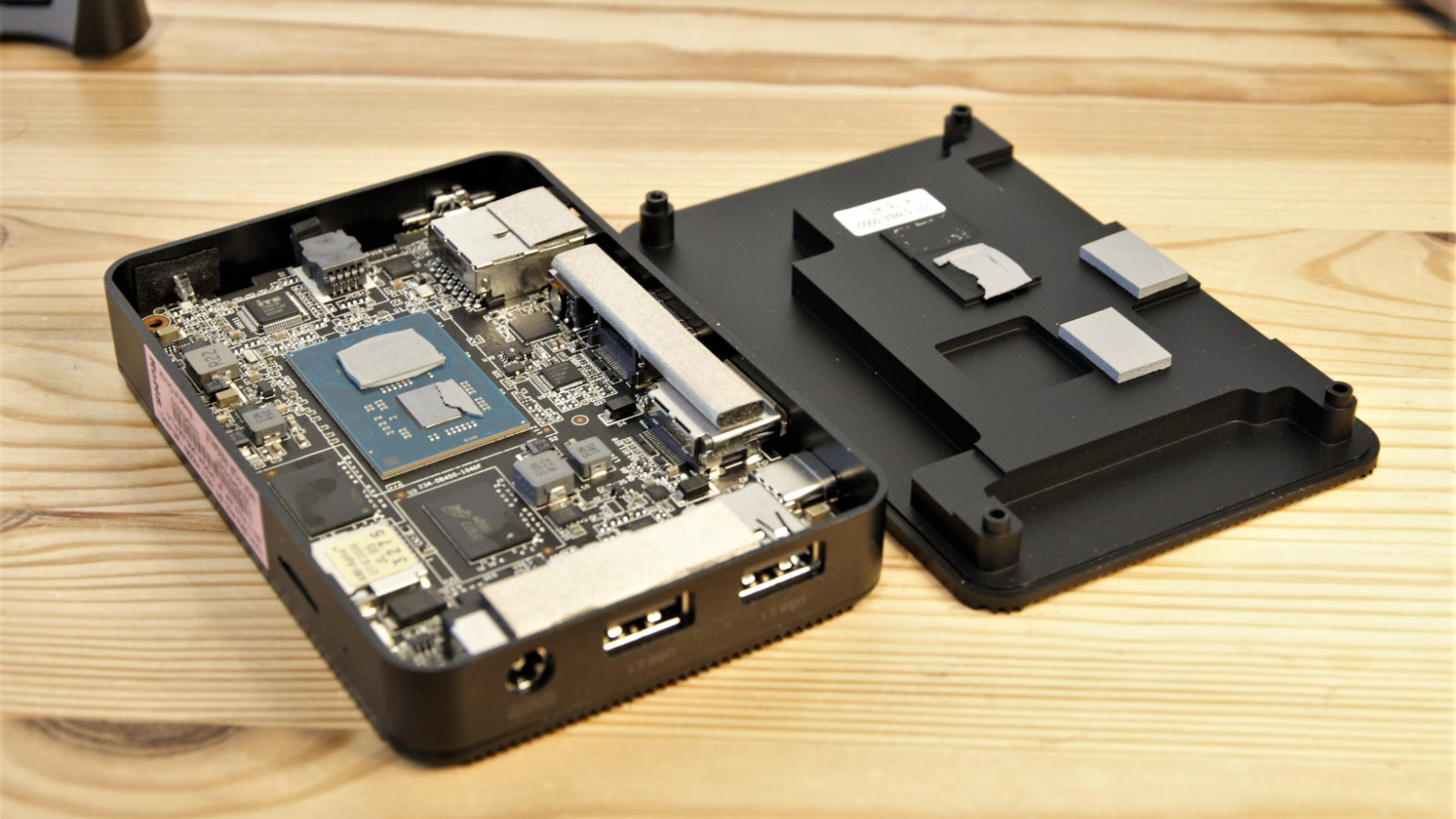
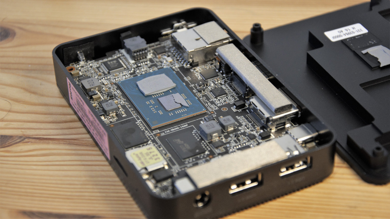
More about thermals later, but as you might expect with such a compact design, everything is packaged tightly inside, and while it has a removable underside, this machine wasn’t made to have owners tinkering inside.

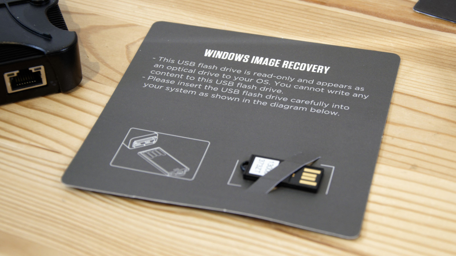
The machine comes with Windows 11Pro N  pre-installed, and a USB recovery key that can put the OS back should something catastrophic happen to that installation.

Zotac Zbox PI336 Pico

(Image credit: Mark Pickavance)

Hardware

Spec sheet

Here is the ZOTAC ZBOX PI336 Pico configuration sent to TechRadar for review:

 CPU: Intel Celeron Processor N6211 (dual-core 1.2 GHz, up to 3.0 GHz)
Graphics: Intel UHD Graphics
RAM: 4GB LPDDR4x onboard memory
Storage: 128GB of eMMC memory
Ports: 1 x USB 3.1 Gen 1 USB-C, 2 x USB3.1 Gen 1 Type-A, 1 x HDMI 2.0, 1x DisplayPort 1.4, 1 x universal audio jack, 1 x micro SDHC/SDXC slot
Connectivity: Intel WiFi 6E, Gigabit LAN adapter, Bluetooth v5.2
Size: 115 x 76 x 20.7 mm (W x D x H)

Building such a small computer requires very deeply considered part choices, and Zotac engineers went in the Pico with the Celeron N6211 dual-core processor from Intel.

Launched in 2021, this is probably one of the lowest specification processors Intel makes and is designed ideally for IoT, not personal computers. The silicon inside is the Elkhart Lake generation built for low-power PC, tablet and client system use. But this chip is the lowest rung on the Elkhart Lake ladder, with dual cores clocked at just 1.2GHz, with a boost to 3GHz until thermal dynamics chooses otherwise.

The TDP of this chip is a very low 6.5W, has a maximum of 8 PCIe lanes and the integrated Intel UHD Graphics for 10th Gen Intel Processors GPU.

And critically, for the Pico, its maximum operating temperature is 70C.

The SKU Zotac sent for review, it came with 4GB of LPDDR4X RAM and 128GB of eMMC onboard storage. Networking is via the cabled LAN or Intel WiFi 6E adapter, and the device has Bluetooth 5.2 for those that like to keep their USB ports empty.

Zotac Zbox PI336 Pico

(Image credit: Mark Pickavance)

From this specification, it’s easy to imagine that this equipment is meant for light or the very lightest duty. As the processor can handle only two threads (no hyperthreading) and the speed of eMMC storage isn’t close to SSD levels.

There is enough power to do one task well, and this device would be ideal for a rapidly deployable firewall or monitoring sensors.

What isn’t realistic is the idea that you could use this for gaming or use the dual outputs in 4K for much that would be meaningful. This CPU and GPU combination isn’t built to drive two 4K screens smoothly until it’s a slideshow you need.

It can drive one if the source is a media file, but streaming 4K content from the internet is a very stop-and-go exercise.

The general performance we’ll discuss shortly, but those expecting something dramatic here are likely to be sorely dissatisfied.

In use

It’s understandable why the Pico comes with Windows 11 on it, but conversely, its use effectively sticks giant neon signage above the performance limitations of the N6211 and eMMC storage combination.

The first hours, or even a whole day, of owning this hardware are a torrid experience. Both cores are comprehensively logjammed by the tsunami of updates that Microsoft unleashes on its customers.

After what turned out to be a very long time, we eventually reached that point where the system accepted that it was up to date. On a more powerful system, that would largely be the end of the issue since the computer should be able to ingest new updates while doing other things. But here, that’s a flawed assumption.

Should Microsoft decide to upgrade something in the background, it directly impacts foreground performance as apps and the browser becomes curiously unresponsive.

While I didn’t put a Linux installation on the Pico to see what that was like, I can say that Windows 11 on it is a horribly staccato experience where the users’ inputs are frequently ignored or stored up for a scatter-gun of unexpected action at some later date.

But incredibly, these are not the worst aspects of the Pico.

While testing this machine, it became remarkably hot. So elevated were the temperatures that it wasn’t possible to touch the top surface for more than a few moments.

Zotac Zbox PI336 Pico

(Image credit: Mark Pickavance)

Performance

Benchmarks

Here's how the ZOTAC ZBOX PI336 Pico scored in our suite of benchmark tests:

3DMark Wild Life: 1,176; Fire Strike: 439; Time Spy: N/A;
Cinebench R23 CPU pts: 432 (single-core); 720 (multi-core)
GeekBench 5: 531 (single-core); 817 (multi-core), 1045 (OpenCL)
CrystalDiskMark: Sequential Read: 280.8MB/s; Sequential Write: 107.63 MB/s
PCMark 10 (Office Test): 1,351
Windows Experience Index: 4.5

Investigations inside revealed that the processor and chipset silicon is inverted and then connected to the underside of the Pico by a finely milled metal plate. This is the side of the machine that won’t be seeing much, if any, airflow, and the outside of the case is one big passive heatsink.

With the CPU limited to 70C, and no fan to increase in speed, once the system reaches this temperature, its only course of action to stop runaway thermals is to throttle the already slow processor.

Even if you don’t run the Pico aggressively, there is one issue with this machine that isn’t Zotac’s fault, other than they agreed to install it; Windows 11 Pro N.

Zotac Zbox PI336 Pico

(Image credit: Mark Pickavance)

What a horrific mess this OS is, considering how long Microsoft has had since Windows 10 launched to address those foundations.

Out of the box, this version of Windows won’t even play video files back without a complicated installation of the Media Features pack. Why isn’t this included by default, and what does Microsoft think people do with their machines?

While Windows 10 is far, far from perfect, compared with Windows 11, it's mostly functional from the installation once you’ve got past the awkward updating phase.

With only 4GB of RAM that can’t be upgraded, Windows 11 was a poor choice and makes the performance hill for the poor Pico seem marginally steeper than it needed to be.

Zotac Zbox PI336 Pico

(Image credit: Mark Pickavance)

To be brutally honest, this is one of the slowest systems this reviewer has tested in some time. It even makes some cheap laptops seem agile and athletic in comparison.

What made some of these tests even more challenging was all the things Microsoft decided to leave out of the Windows 11 Pro N install, including all the code needed to drive video streams.

Initially, PCMark10 wouldn’t run at all until the Windows 11 Media Features Pack was installed.

The only test that wouldn’t eventually run from our normal selection was 3DMark Time Spy, because it complained that there was insufficient VRAM to work. Sometimes it is possible to adjust VRAM in the BIOS of systems using an integrated GPU, but not on the PICO.

That said, the number it might have generated had it run would have been small, as indicated by a score of just 439 in the less demanding Fire Strike test.

Even the Wild Life test isn’t smooth, and most phones can achieve that distinction.

Of the other tests, the most significant is the CrystalDiskMark 8.04 score, as it shows where some of the performance bottlenecks are beyond this lacklustre processor.

The read speed of the eMMC drive isn’t terrible, even if it's not an SSD, but the write performance is worse than most conventional hard drives.

For anyone reading this review and wondering if this unit might make a suitable streaming solution, it won't. Selecting 4K video streams from YouTube results in the CPU hitting 100% and then the stream pausing, repeatedly. It will play media files to a degree, but not any better than a much cheaper Chromecast with Google TV.

Overall, the performance on the Pico isn’t sufficient for most applications, however basic they are.

Final verdict

Not sure what Zotac engineers thought when they devised the Pico. Its performance is poor whatever task you throw at it, especially if you are rash enough to use it with a 4K monitor.

A combination of things undermined the Pico from the outset.

The first candidate is the Intel Celeron Processor N6211, a very limited SoC further limited thermally by a passively cooled enclosure. Without any active means to manage heat, this system will throttle, inevitably. The next nail in its hardware coffin was the eMMC storage that performs like an old 2.5-inch hard drive when writing data.

But, even with those limitations, it could have managed expectations if it wasn’t for Windows 11 Pro N, an operating system expecting to find a Threadripper cored CPU and an RTX GPU just around the corner. This OS doesn’t come loaded with the files it needs from the outset, and it sucks what get-up-and-go the Pico had to begin with.

This system needs a significant rethink because this combination of hardware and software isn’t a viable solution for most applications or users.

Friday, July 29, 2022

LG A2 (OLED55A2)

LG A2: Two-minute review

LG’s A2 series TVs are the company’s least expensive OLED offerings, but they nevertheless provide the key picture quality benefits viewers expect from the technology. The A2’s feature set is sparser than what you get with pricier models further up the LG line, and a more limited peak brightness makes it a better choice for viewing in light-controlled environments. But movie fans will find a lot here to love, and the A2 series’ low prices compared with other OLED TVs will keep their wallets happy.

The webOS 22 smart TV platform found in LG’s latest TVs takes a bit of getting used to, but it’s possible to customize it to a degree and a new feature allows for multiple family members to create their own personalized profiles. A built-in mic on the remote control lets you search for content using Alexa and Google Assistant, and webOS 22 also supports connection to wider range of smart devices via the TV’s interface.

Watching movies on the A2 proved to be a fully satisfying experience: images had the deep blacks and detailed shadows typical of the best OLED TVs, while colors looked both fully saturated and clean. Brightness isn’t the A2’s strong point – you’ll need to ramp up to LG’s C2 or G2 series sets if powerful picture brightness is a concern – but it was good enough to flesh out highlights in movies and TV shows with HDR, something helped along by the set’s effective Dynamic Tone Mapping.

While there’s nothing glamorous about A2’s design, it has a sleek look and cool Magic Remote that lets you navigate the smart TV interface and setup menus using both point-and-click and scrolling functions. The set’s included feet should keep it placed firmly on a table or TV stand, but they are relatively spindly and don’t allow much space for a soundbar – something that you’ll want to add given the A2's pedestrian audio performance and features.

The A2 isn’t lacking for gaming-related features: it has a Game Optimizer mode and a Game Dashboard menu to directly access related settings. GeForce Now and Stadia cloud gaming are also available in the webOS 22 smart interface, and the set’s measured input lag in Game Optimizer mode is very low for a TV. But what it doesn’t have is a 120 Hz display and HDM1 2.1 ports with Variable Refresh Rate (VRR) and FreeSync – features that you’ll find in the company’s step B2 OLED models.

LG A2 review: price and release date

  • Release date: April 10, 2022 
  • OLED48A2:  £969 
  • OLED55A2 :  $1,297 / £1,149 / AU$3,176 
  • OLED65A2 :  $1,697 / AU$4,176 

LG’s lowest-priced OLED TVs, the A2 series is positioned just below the company’s B2 series sets. Those models are currently available in screen sizes up to 77 inches, while the A2 series is available in 55- and 65-inch screen sizes in the US and Australia, with a 48-inch model additionally sold in the UK. 

The price difference between A2 and B2 series models is marginal, while LG’s C2 models with a next-gen “evo” panel represent a higher step up in cost.

LG A2 OLED TV back panel inputs

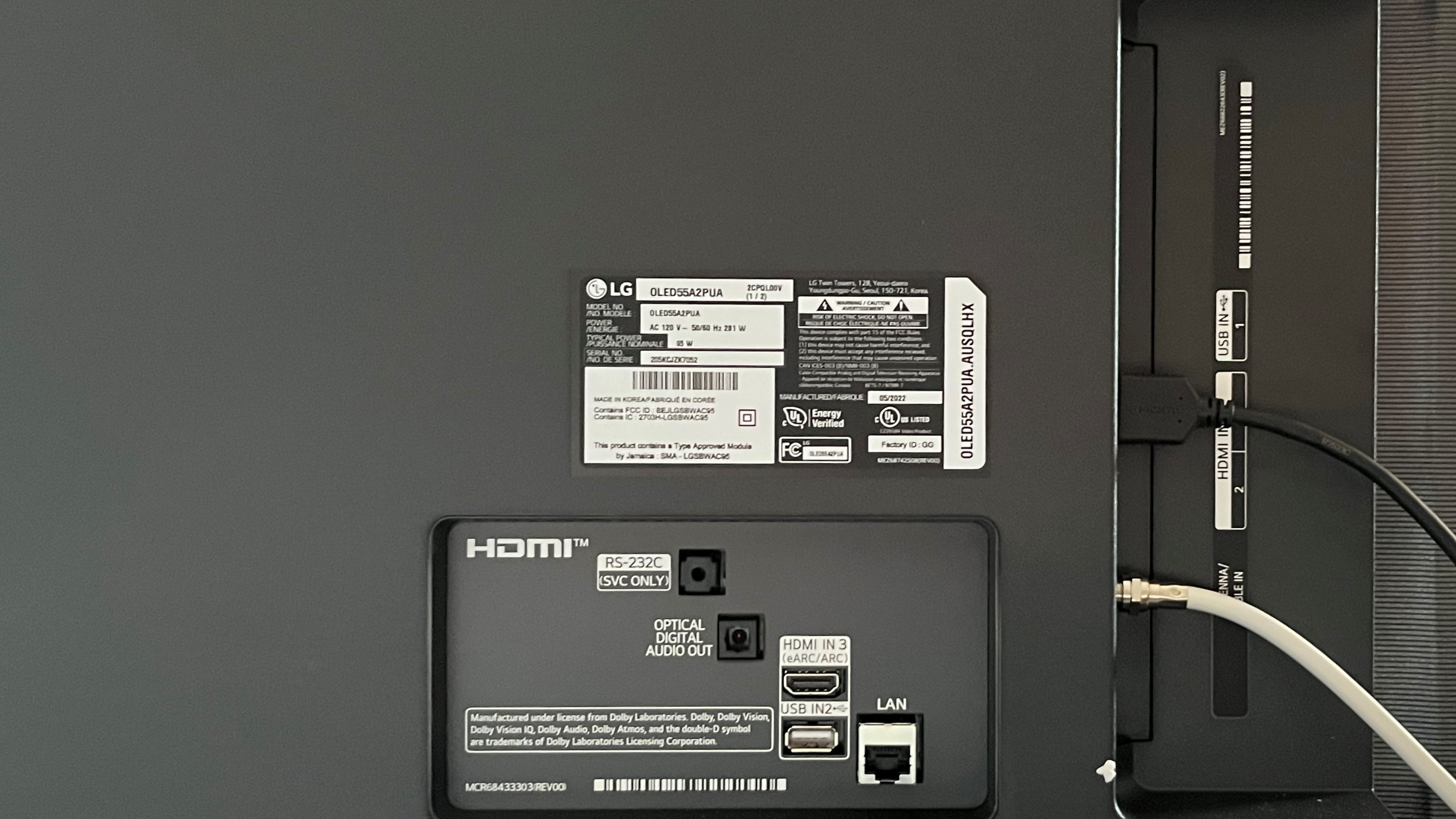
The A2 OLED's back panel inputs include an HDMI port with eARC plus 2 side-mounted HDMI 2.0b ports and an antenna connection. (Image credit: Future)

LG A2 review: features

  • WebOS 22 smart TV interface
  • Dolby Vision, HDR10, and HLG high dynamic range 
  • HDMI 2.0b inputs with auto low latency mode (ALLM) and enhanced audio return channel (eARC)
  • Built-in Google Assistant and Alexa voice assistant
  • GeForce Now and Stadia cloud gaming

Like other 2022 LG OLED models, A2 series sets feature the company’s webOS 22 smart TV interface. This offers a wide range of streaming apps, including Netflix, Disney+, Amazon Prime Video, HBO Max, Apple TV+, and Hulu. Several of these can be accessed directly from buttons on LG’s remote control. The A2 series also has built-in Google Assistant and Alexa voice control, which allows for voice-activated searching.

The A2 series is outfitted with LG’s  α7 Gen 5 AI Processor. This first appeared in the company’s 2021 models, and provides features such as dynamic tone mapping and 5.1.2-channel sound upmixing. The Dolby Vision, HDR10, and HLG high dynamic range formats are all supported by the A2 series, along with  Dolby Vision IQ and HGiG (HDR Gaming Interest Group). A Filmmaker mode is provided that provides accurate color and motion settings, and also shuts off any automatic processing that would change the picture from the way a movie’s director originally intended for it to be presented.

The A2 has 3 HDMI inputs, 2 of them on a side-facing panel and one directly on the set’s rear. All of these are version 2.0b with auto low latency mode (ALLM) support, along with HDMI eARC on the 3rd, rear-facing port. There’s also an RF input for connecting an antenna to feed the set’s ATSC 1.0 digital TV broadcast tuner.

Wireless streaming to the set from a phone or tablet can be carried out using AirPlay 2 or Bluetooth 5.0.

Overall, the A2 series is relatively low on features compared to both LG’s other OLED TVs and the best 4K TVs generally. The main differences are in gaming-related specs such as HDMI 2.1 inputs, a 120Hz display, VRR (Variable Refresh Rate), and FreeSync, all of which are available on the company’s step-up B2 series TVs.

  • Features Score: 3.5/5  

LG A2 OLED TV angle showing smart TV interface

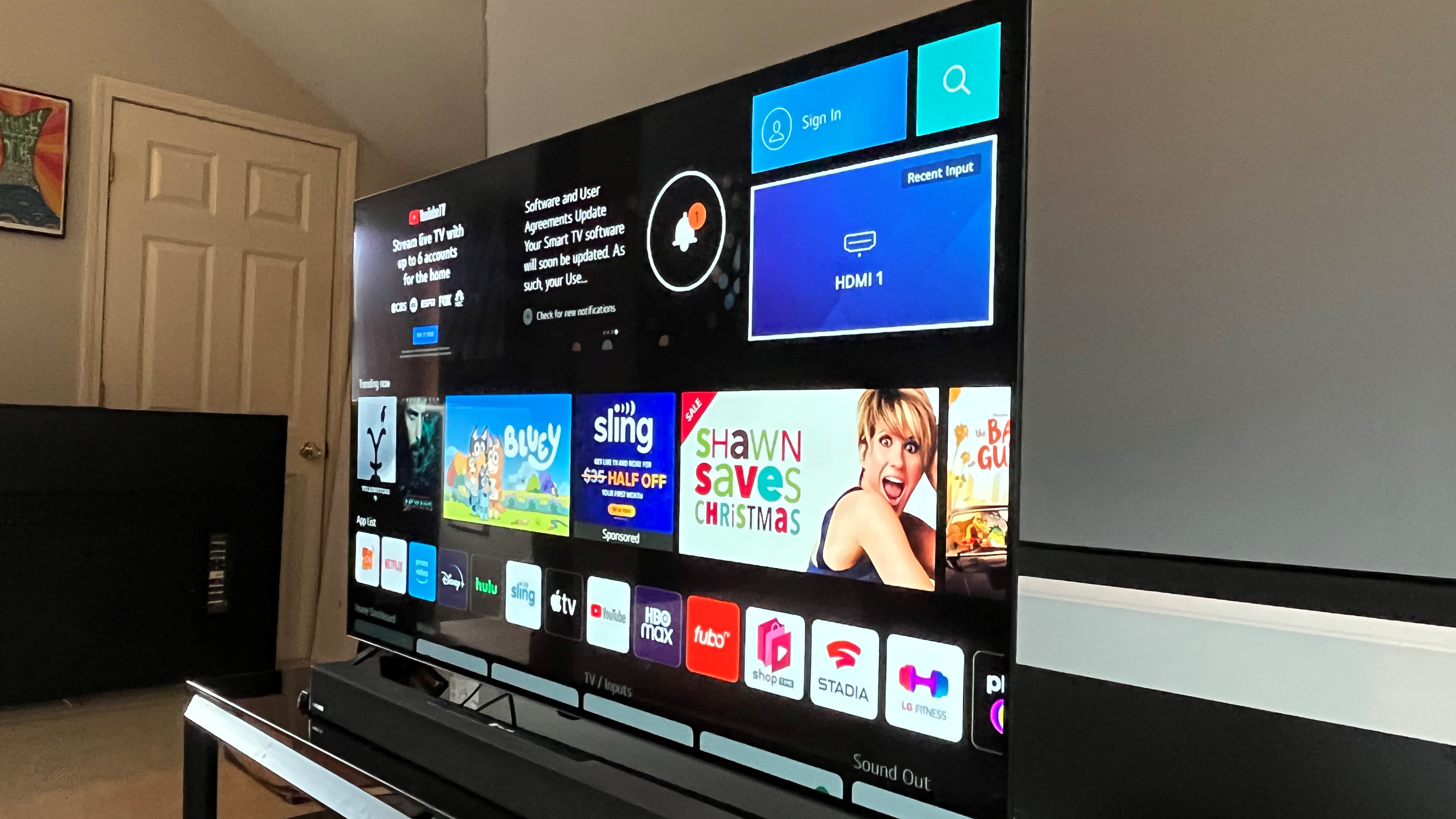
The A80K OLED's design is simple yet sleek, but the included feet are somewhat spindly.  (Image credit: Future)

LG A2 review: picture quality

  • Rich color reproduction
  • Deep blacks with detailed shadows 
  • Limited brightness for an OLED TV 


The A2 lived up to LG’s claim of “near-infinite” contrast, delivering deep blacks, along with eye-catching highlights. We measured 524 nits maximum light output in the Standard (HDR) picture mode, 542 nits in Vivid, and 526 nits in Filmmaker mode. 

The upshot there is that the A2’s brightness is notably less than the company’s C2 model, and also Sony’s A80K OLED. The slim brightness variance between Vivid and Filmmaker is good news, however, since it means the set comes close to hitting its maximum brightness in the same mode that also provides the best color rendition.

Coverage of DCI-P3 color space when displaying 4K/HDR was 98.8% – an excellent result. Also, the A2’s out-of-box picture performance in Filmmaker mode was mostly accurate, requiring only slight adjustments to optimize brightness, color, and contrast.

How did the A2 fare once those adjustments were complete? Watching a 4K Blu-ray of the latest James Bond franchise entry, No Time to Die, colors looked fully saturated without looking cartoonish, while the black in both the image’s letterbox bars and deep shadows in the early scenes of Bond’s “vacation” looked completely solid. Shadow detail in both this disc and other 4K ones like The Batman and Dune was also very impressive.

One other interesting point of the A2’s performance was its very good handling of motion, even in Filmmaker mode. For example, when watching a scene from No Time to Die where the camera pans slowly over a craggy hilltop, the image looked mostly solid and detailed. This same motion shot viewed on other TVs, including Sony's A80K OLED, revealed a fair amount of judder and smearing.

Key specs

Screen size: 48, 55, 65 inches
Resolution: 4K
Panel technology: OLED
HDR support: Dolby Vision, HDR10, HLG
Audio support: Dolby Atmos, Dolby Digital
Smart TV: webOS 22
HDMI ports: 3

With more limited light output than other TVs, newer OLED models included, the A2 won’t be the best option for viewing in well-lit environments. And while the set’s screen isn’t the glassy type that reflects room light back in a highly distracting manner, there was some screen glare to contend with when the blinds were open and overhead light turned on.

The set’s more modest brightness capability didn’t prove to be an issue for displaying movies and shows with high dynamic range, however. A Dynamic Tone Mapping setting is turned on by default in Filmmaker mode, and this helps a great deal to optimize picture contrast with HDR programs. An Auto Dynamic Contrast setting that’s available alongside Dynamic Tone Mapping in the TV’s Brightness menu proved less effective – the likely reason why it’s switched off by default the same Filmmaker mode.

To test this out, I watched some of the demonstration video footage in the Spears & Munsil UHD HDR benchmark disc with the output set for 1,000 nits. Images with clouds looked consistently detailed and had punchy contrast with Dynamic Tone Mapping on. With that setting switched off, the same shots had a dull, overcast look.

Same as with other OLED TVs, the A2’s picture retained its contrast and color saturation when viewed from off-center seats. Full-screen gray test patterns revealed somewhat less perfect picture uniformity: a slight degree of color tinting was visible at the edges of the screen, though this wasn’t an issue when viewing regular shows and movies.

  • Picture quality score: 4/5

LG A2 OLED TV angled left showing smart interface

The A2 has adequate built-in audio, but you'll want to use an external soundbar to get the best sound with movies. (Image credit: Future)

LG A2 review: sound quality

  • Sound gets congested during loud movie scenes
  • AI Sound Pro mode best for general use
  • 5.1.2-channel sound upmixing when used with soundbar

The A2 series supports Dolby Atmos, but its built-in audio capability is limited to 2.0 channels, which are conveyed by downfiring speakers. It does have 5.1.2-channel sound upmixing of stereo soundtracks courtesy of the α7 Gen 5 AI Processor, but you’ll only get that benefit when using a separate soundbar.  

In fact, using a separate soundbar with the A2 series is something I’d recommend since the TV’s built-in sound proved to be relatively thin, with limited bass. Dialogue was clear for the most part with movies and TV shows that had a simple soundtrack, but when music and sound effects were mixed in, dialogue could get obscured and dynamic range was lessened.

For most of my viewing with the A2 I selected the AI Sound Pro mode. This proved to be the best one for most content, though it didn’t save the day when watching movies with explosions and other aggressive effects.

  • Sound quality score: 3/5

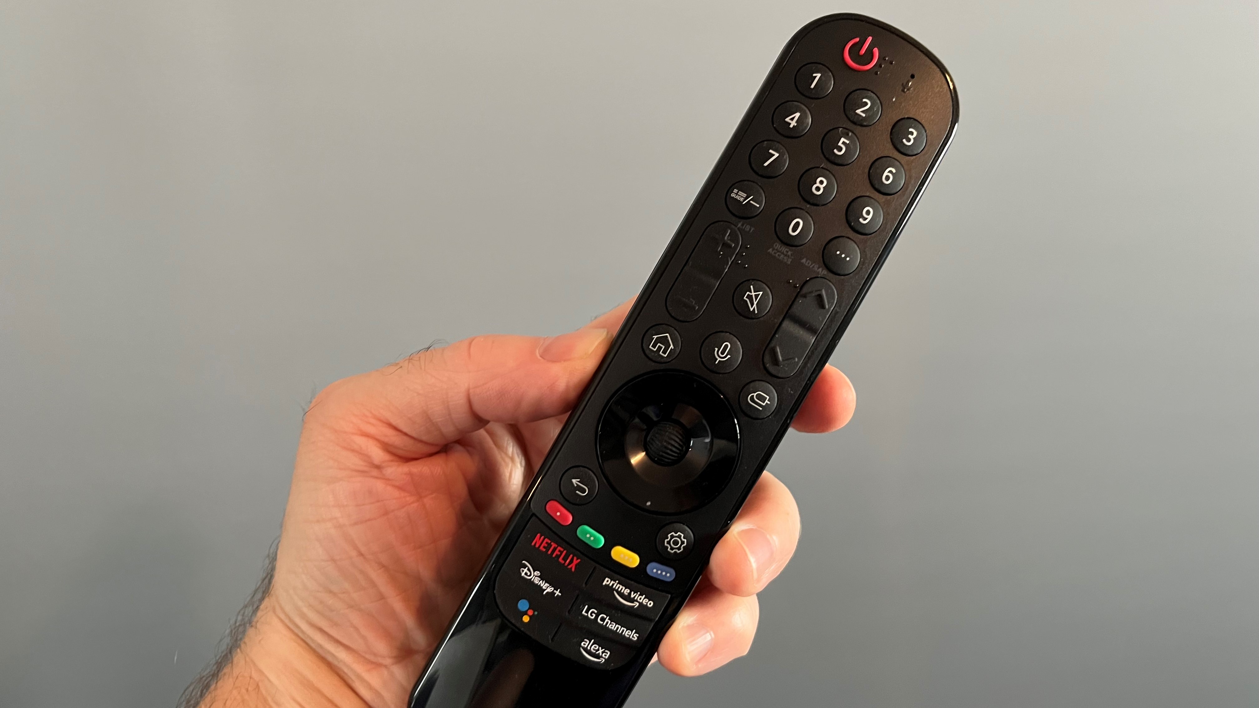
LG A2 OLED TV remote control being held in hand

The A2's unique Magic Remote lets you control things onscreen using point-and-click and scroll functions. (Image credit: Future)

LG A2 review: design

  • Sleek design with ultra-thin bezel
  • Somewhat spindly support feet
  • Magic Remote with onscreen point-and-click

The A2 series has a sleek look, and while it lacks the glamorous design of the company’s G2 “gallery” models, most people will be completely content with the way it looks in their living room.

Basic feet are provided to support the set. Compared with the stands you get with higher-end models, even the step-up B2, these are a relatively spindly design, though I did feel confident they’d hold the TV upright. They also didn’t provide much in the way of clearance for a soundbar.  If you’re looking for something more design-savvy, LG has an optional Gallery stand that lets you position the set places other than a TV stand or on a wall.

LG’s Magic remote control lets you both point-and-click and scroll through onscreen menu items rather than just stepping through them using a basic navigation cursor (that’s the magic part). It also has a built-in mic to use for the set’s voice command features.

While not everyone will warm to the Magic remote’s unconventional design and functionality, I found it easy to use once I got the hang of it, and it also provides direct input buttons to access Netflix, Prime Video, and Disney+.

  • Design score: 4.5/5

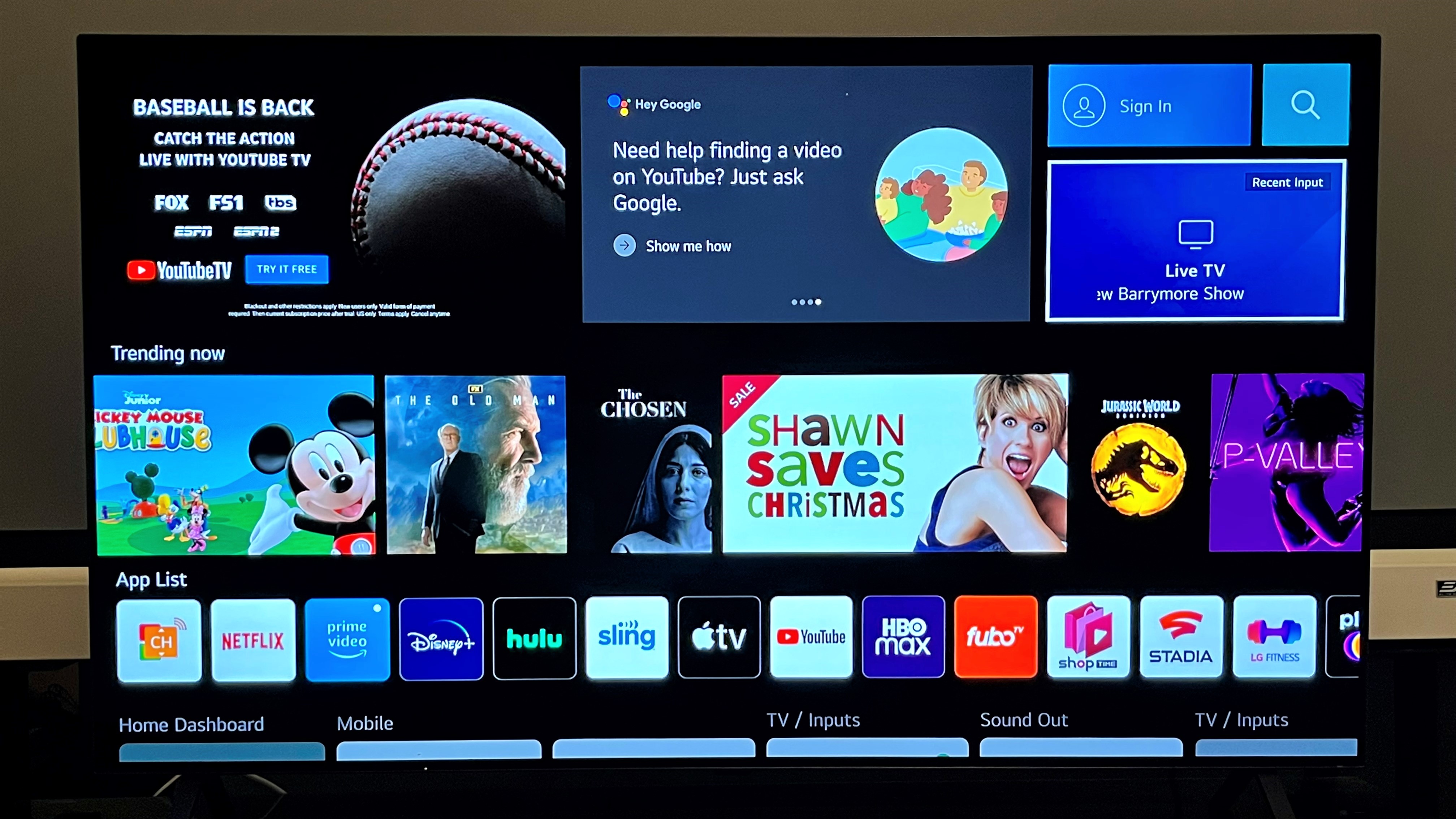
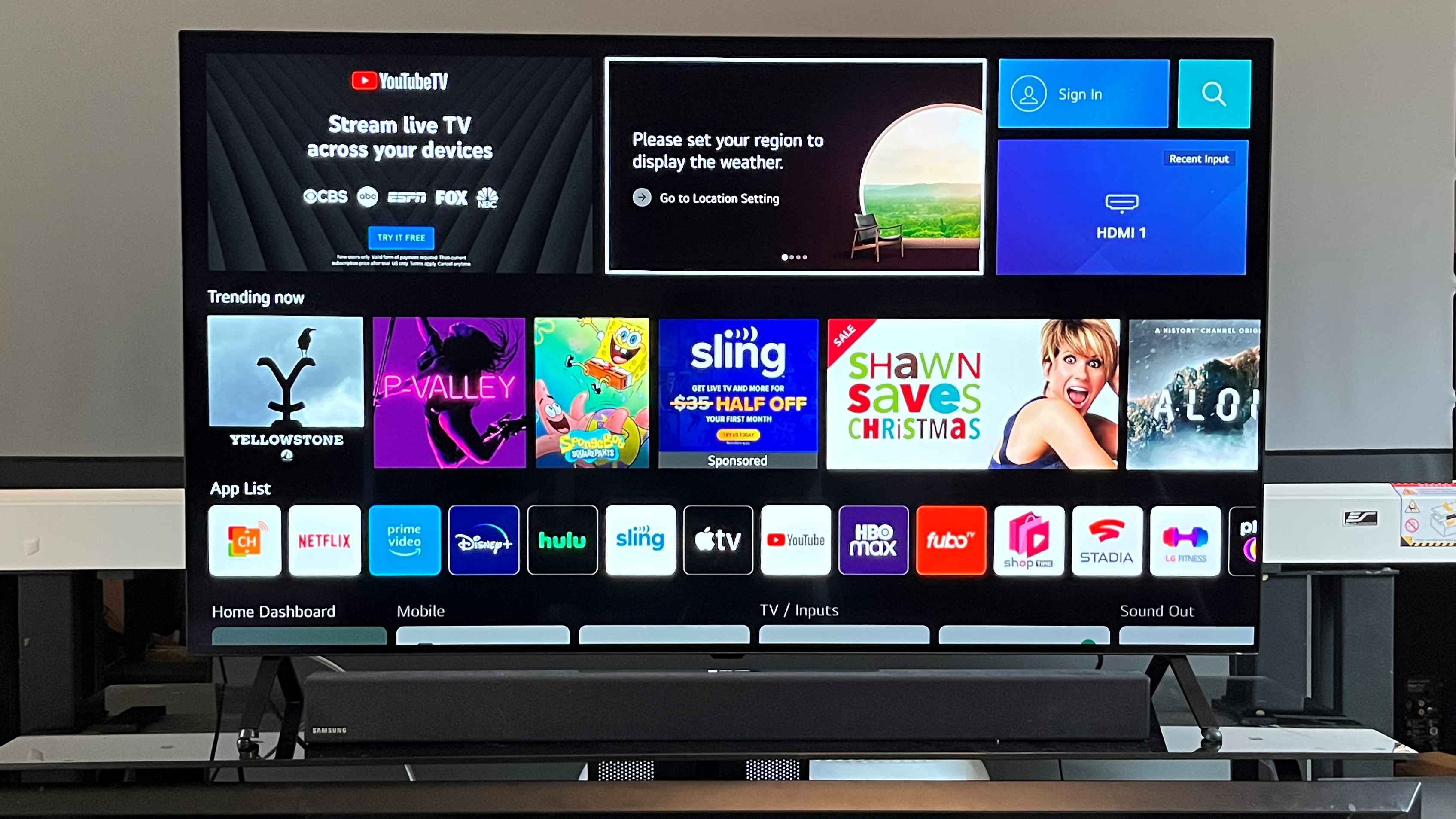
LG A2 OLED TV webOS 22 interface

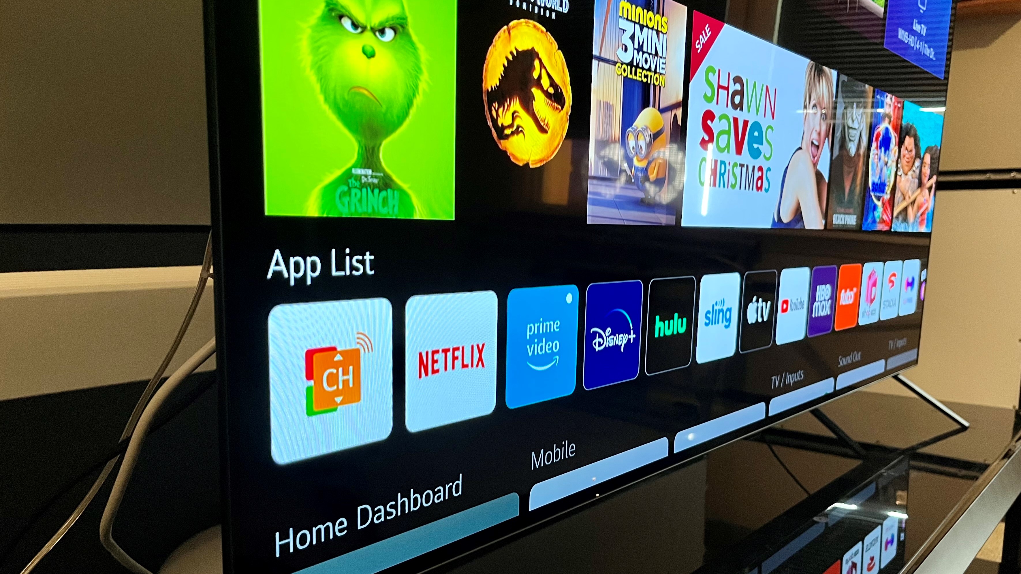
LG's webOS 22 smart TV interface is somewhat cluttered, though it can be individually customized for multiple viewers. (Image credit: Future)

LG A2 review: smart TV & menus

  • webOS 22 interface
  • Google Assistant and Alexa voice control built-in
  • No ESPN+ app

LG’s webOS 22 is a typically busy smart TV interface, though it offers the ability to populate it with your preferred apps. Multiple profiles can also be created, giving other family members the ability to access their own personalized smart TV screen – a new feature for 2022. There’s also a picture mode for displaying art, though it’s not as sophisticated as what you get with the company’s G2 Gallery TVs, which offer a low-power “ambient” mode.

Note that you’ll have to input either your email address or a social media account to create a user profile – a somewhat annoying and time-consuming process. Another annoying thing about LG’s smart TV interface was the omission of the ESPN+ app. If you’re a sports fan, that’s one you’ll undoubtedly be looking for, and will be disappointed to not find.

You can’t make picture adjustments directly from the TV’s remote. Instead, you’ll need to dive into the Advanced Settings sub-menu of the Picture menu to do that. All picture modes can be individually customized. You also get the option to apply your picture adjustments across all inputs–a useful and time-saving feature.

  • Smart TV & menus score: 3.5/5

LG A2 review: gaming

  • Game Optimizer mode with Game Dashboard
  • Low 10ms input lag in Game Optimizer mode
  • ALLM support

The A2 series lacks many of the features that serious gamers and owners of next-gen Xbox and PlayStation consoles would look for. To run down the list once again, there’s no 120Hz display, Variable Refresh Rate, or FreeSync.

Even so, the A2 series doesn’t come up completely short when it comes to gaming-related features. It has a Game Optimizer mode with a Game Dashboard menu that gives quick access to related settings. GeForce Now and Stadia cloud gaming are available through the webOS 22 smart interface, and there’s also Auto Low Latency Mode (ALLM) and HDR Gaming Interest Group (HGiG) support.

LG’s specs for the A2 series claim extremely low input lag, and that proved to be true in our testing. With its Low Input Lag setting selected in Game Optimizer mode, the LG measured 10ms when tested with both 1080p and 4K input lag meters – a very impressive result, and one that holds up against the best gaming TVs.

  • Gaming score: 3.5/5

LG A2 review: value

  • LG’s least expensive OLED model
  • Lacks key features found in step-up B2 series
  • OLED TVs more expensive than QLED TVs

As LG’s least expensive OLED TV, the A2 series is inherently a great value. The only thing that detracts from its overall value score is its close pricing gap with the B2 series, which has a wider array of gaming features, including a 120 Hz display and HDMI 2.1 inputs, plus a sturdier stand. 

The thing that really boosts the value of the A2 series is its performance with movies: If you’re mainly using this TV to watch movies in a properly dimmed environment rather than sports in a bright room, it’s an affordable, high quality option. But if you’re more interested in gaming, or just regular everyday TV viewing, you’d be better served by an LED or QLED model, which can usually be found for a better price than an OLED with the same screen size.

  • Value score: 5/5 

LG A2 OLED TV webOS 22 interface

The LG A2 is a good lower-cost OLED option for movie fans. (Image credit: Future)

Should I buy the LG A2?

LG A2
Attributes Notes Rating
Features Somewhat light on gaming features, but includes Google and Alexa voice assistants 3.5/5
Picture quality Deep blacks and strong color, but limited picture brightness 4.5/5
Sound quality Adequate audio, but doesn't handle loud soundtracks well 3/5
Design Sleek design and cool remote, but with spindly stand 4/5
Smart TV and menus webOS 22 is an acquired taste, but gets the job done 3.5/5
Gaming Decent gaming features, but less so than higher-end sets 3.5/5
Value A great overall value, especially for movie fans 5/5

Buy it if...

Buy it if...

Don't buy it if...

Also consider...

Also consider...

If our LG A2 OLED review has you considering other options, here are three more TVs to ponder.

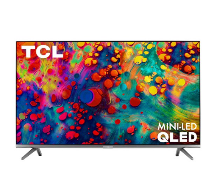
TCL 6-Series
TCL’s 6-series sets are among the least expensive models offering mini-LED backlights and Quantum Dots for enhanced brightness and extended color. A good option if you’re looking for a high-quality TV at a lower-than-OLED price.

Cuisinart Elemental 13 Cup Food Processor with Dicing review

One minute review

Cuisinart is a worldwide brand that’s now known for all sorts of kitchen appliances as well as cookware and bakeware. However, for many of us, the brand is synonymous with some of the best food processors, and it even claims to be the first brand to introduce the food processor to the US in the early seventies with reported fans including the late great Julia Child.

The Cuisinart Elemental 13 Cup Food Processor with Dicing as it’s known in the US, goes under the name Cuisinart Expert Prep Pro FP13 in the UK. This large 13 cup/ 3.3 liter food processor offers a bigger capacity as well as more functionality than the Cuisinart Elemental 8 Cup FP8 / Cuisinart Easy Prep Pro FP8, but that means it’s also more expensive and takes up more space too.

In addition to the large main bowl, it also comes with a smaller inner bowl and blade for when you just need to mix or chop smaller quantities like herbs or salsa. And there’s a handy storage case to house the shredding and slicing discs, chopping blades, as well as the plastic dough blade. There’s also a dicing accessory for speedy diced fruits and vegetables. UK buyers will get an additional spiralizing accessory in the box, and although this doesn’t come as standard with the US model, it is available as an optional extra.

It excelled in virtually all of our tests, chopping, mixing, shredding and slicing everything we threw at it. Plus, we were impressed with the dicing and spiralizing accessories too. This food processor is best suited to passionate home cooks who will get the most out of all the functions it offers. But those looking for an appliance for basic chopping, shredding, and slicing tasks might find this one comes with too many accessories that’ll just clutter up valuable kitchen storage space.

Cuisinart Elemental 13 Cup Food Processor with Dicing: price and availability

  •  List price: $199.95/ £280 

The Cuisinart Elemental 13 Cup Food Processor with Dicing is known as the Cuisinart Expert Prep Pro FP13 in the UK. It’s available direct from Cuisinart or Amazon in both countries as well as other appliance retailers.

The UK model comes with the spiralizing kit bundled in. However, if you’re buying it in the US, you won’t get the spiralizing kit included in the box, so you’ll have to purchase it separately for $49.95. The advantage of this though, is that you don’t have to have it unless you really want it.

Design

  • Good safety locking features
  • Two speeds plus pulse
  • Dishwasher friendly parts

If you’re thinking of leaving it out on your counter, the Cuisinart Elemental 13 Cup Food Processor with Dicing has a relatively compact footprint given all the functions it’s able to perform. The main food processor measures just 16.43 x 8.1 x 10.43 inches/ 41.7 x 20.6 x 26.5cm (h x w x d). However, it’s important to consider that there are plenty of accessories that’ll need space in your cupboards.

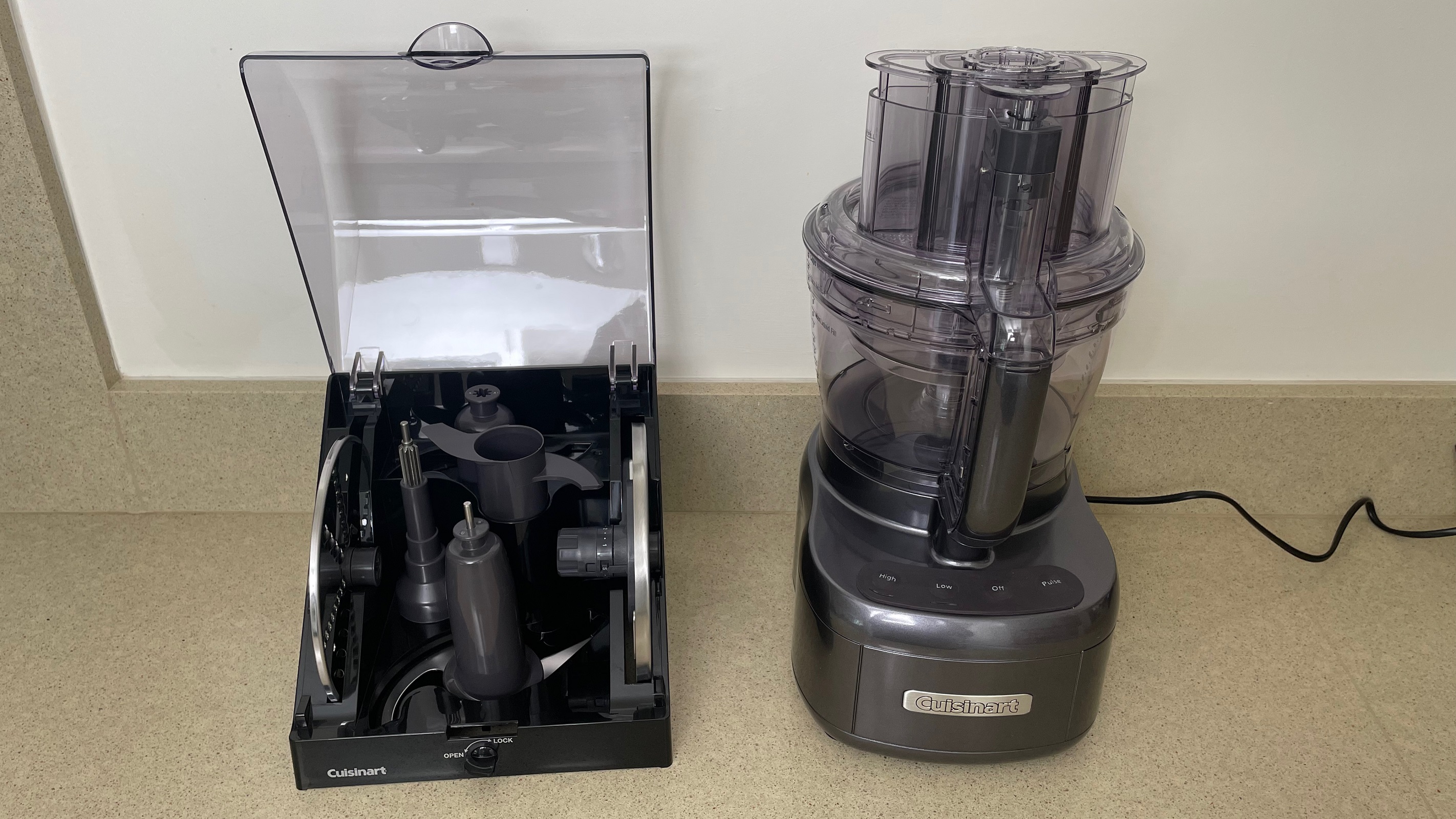
The storage case is super useful for keeping all the sharp blades and main accessories safely organized together in one box. It houses the reversible shredding disc, adjustable slicing disc, dough blade, large blade, small blade, spatula, and the stem adapter. It’s got a latch on the front to lock the lid closed too, but at 7.4 x 9.1 x 8.3 inches/ 18.7 x 23 x 21.2 cm (h x w x d) it’s chunky.

Cuisinart Elemental 13 Cup Food Processor with Dicing with storage case

(Image credit: Future)

The dicing kit offers a quick and easy way to dice all sorts of fruit and vegetables and even comes with its own storage case. Again though, you’ll want to consider where you’ll store it as it measures 4.6 x 8.3 x 8.7 inches/ 11.7 x 21 x 22cm (h x w x d).

The spiralizing kit which comes as standard with the UK model offers both a spaghetti and ribbon cut disc, but the storage solution for this kit isn’t quite so neat and you’ll have to store most of these extra parts individually rather than in a case. If you buy this optional extra kit in the US, it comes with a third Angel hair disc.

There are only two speeds and a pulse button, so the controls don’t take much figuring out. Assembling the food processor bowl and lid is a little trickier. The safety lid-locking mechanism means that it all has to be assembled in a particular order and the work bowl cannot be removed from the base before the lid is unlocked. Once you’ve got to grips with the order of things, it’s actually quite simple to slot together and everything locks into position with a firm twist. Plus, it’s reassuring to have these safety features in place when using an appliance with such sharp blades.

Performance

  • Simple to use
  • Fast, even results
  • Can be noisy

We did plenty of testing on this food processor, trying out virtually every function to get a true picture of whether it's worth the money and in short, it's good at what it does. First up, we tried out the slicing disc, and although the adjustable thickness is labelled 1-7, there are levels between the numbers, so it actually offers 20 thickness options. Needless to say, cucumber was no match for this disc and it powered through half a cucumber in seconds, creating even slices with no waste.

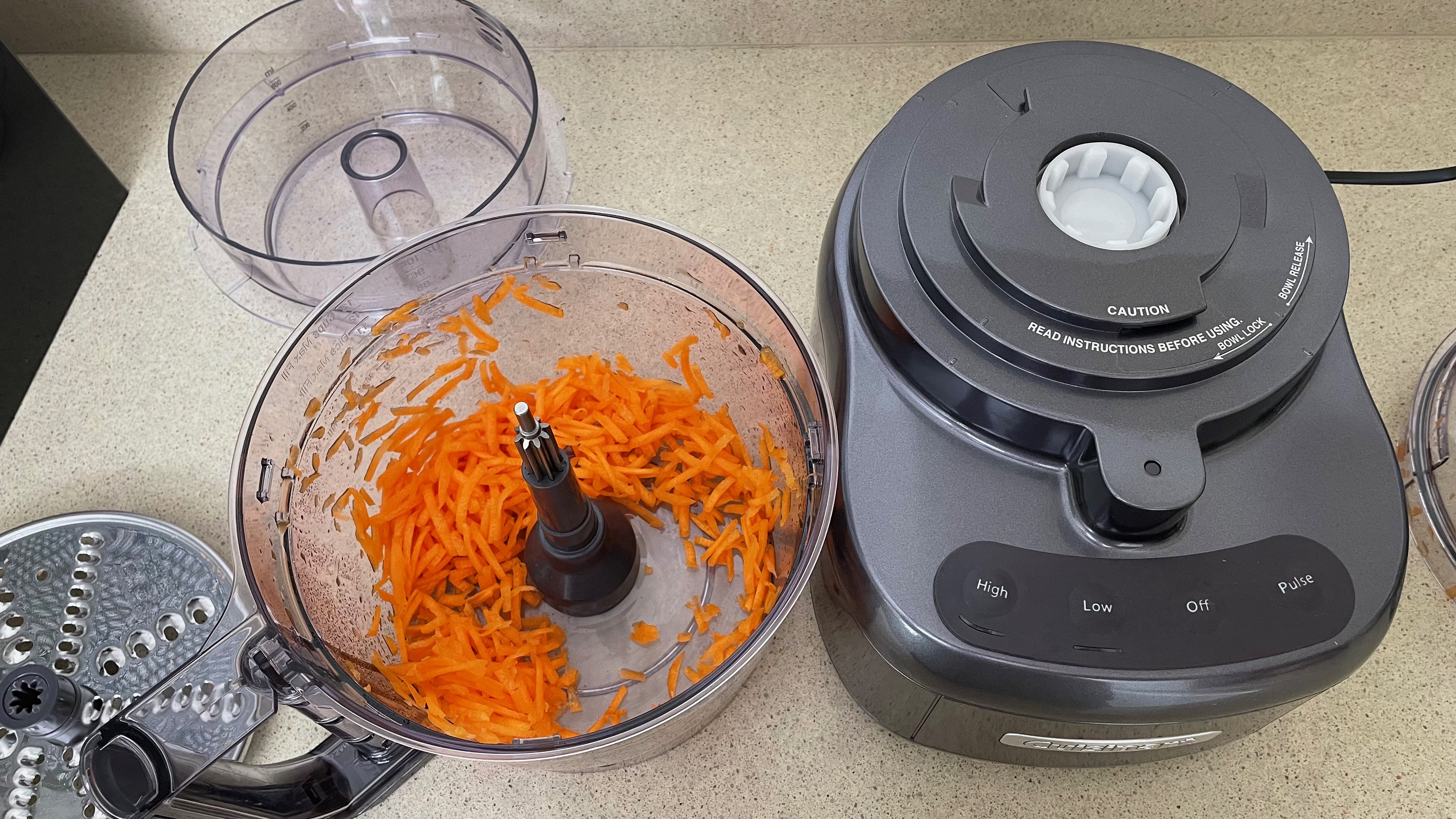
When it came to shredding, we used the small shred side of the reversible disc for chocolate. Unlike other food processors we’ve reviewed, very little chocolate melted to the disc during shredding. The majority of the shredded chocolate was even and fine, but some chunkier pieces got through as well, so we had to pick them out. There was also some chocolate lodged in the lid, which amounted to 17% of the total.

shredded carrot with the Cuisinart Elemental 13 Cup Food Processor with Dicing

(Image credit: Future)

We switched the disc round for cheese and carrot to produce thicker shreds, which was effortless for this appliance. Both were shredded evenly and quickly, none of the carrot was left un-shredded and only a small amount of cheese (about 6%) got lodged in the lid, which you can just use in cooking instead.

The large chopping blade is powerful, we cut an onion into six wedges and it only required six presses of the pulse button to turn it into even, finely diced pieces. The tougher task of grinding diced beef was no match for it either, taking just 15 seconds on the lower speed setting to chop up all the meat to a fine ground beef texture. Similarly, the ingredients for cake were quickly mixed up into an even, smooth batter in under a minute.

To chop nuts we used the smaller bowl and blade, it was a little slower than the large blade and required 20 pulses to turn whole hazelnuts into a finely chopped texture. And although the nuts were a bit uneven with some fine powder mixed in, it was a good result in comparison to many other food processors.

chopping nuts in the Cuisinart Elemental 13 Cup Food Processor with Dicing

(Image credit: Future)

When dicing potatoes, they had to be cut in half to fit in the feed tube. Unlike slicing, the size of the dice isn’t variable and the pieces come out at around 0.4 inch/ 1 cm cubes, but it’s fast and effective. It diced a whole potato in around 10 seconds. Some potato did get lodged in the blade after we diced a second potato, but given the speed and convenience, we were happy to open it up to remove a bit of potato before continuing.

Dicing potato in the Cuisinart Elemental 13 Cup Food Processor with Dicing

(Image credit: Future)

Spiralizing was equally fast and easy, we made cucumber ribbons and carrot spaghetti. There was some waste, but there always is when spiralizing foods. It’s worth noting that the pusher has to be in position for the spiralizer to start up, so you have to cut food down to size accordingly, you can’t have a whole cucumber poking out of the top for example.

spiralizing cucumber with the Cuisinart Elemental 13 Cup Food Processor with Dicing

(Image credit: Future)

The dough blade is effective at combining bread dough and we mixed up the ingredients with five pulses, followed by 30 seconds on high speed, however, it can’t continue on and knead the dough. If you leave it too long and allow it to continue mixing after a dough has been formed, it shakes violently and has to be held down. The usually firm suckers on the feet aren’t enough to hold it to the counter in this instance, so we’d advise kneading by hand.

Making dough with the Cuisinart Elemental 13 Cup Food Processor with Dicing

(Image credit: Future)

Our noise meter maxed out at 86dB on several of the tests, but since this food processor is so speedy, the noise doesn’t last too long, making it bearable.

Cleaning any food processor is a fiddly chore, this one’s no different. Thankfully though, all the parts can be cleaned in a dishwasher which certainly makes life easier. It’s worth noting that if you do wash it in the dishwasher, water droplets get trapped in the handle and some parts of the lid, it does eventually dry out though. If you need some more top tips about how to clean a food processor then our step-by-step guide will help.

Buy it if...

Don't buy it if...

  • First reviewed: June 2022

Foxit PDF Editor 12

Editing PDFs can be very important for businesses - and a limited PDF editor will stifle productivity and slam the brakes on otherwise efficient workflows. 

Foxit’s PDF Editor sidesteps all of that, and more besides, making it easier to tweak an existing document. No more going back to the software where the file was originally created, performing the changes, exporting it as a PDF, only to discover another problem and go through the whole process again.  

Foxit PDF Editor: Pricing

Pricing plans for Foxit PDF Editor editions

Not all Foxit PDF editors have the same features (Image credit: Foxit )
  • Flexible pricing with free trials, monthly & annual subscription, and perpetual licenses 

Foxit’s PDF editing software comes in three different editions: PDF Editor, PDF Editor Pro and PDF Editor Pro+. 

The base software, PDF Editor, is multi-platform, working on Windows, Mac, iOS and Android. 

  • Monthly subscription: $15 / €15 
  • Annual subscription: $ $79 / €78 
  • Perpetual license: $159 / €156 

PDF Editor Pro is Windows only, and offers more advanced features with better editing, collaboration and security tools. 

  • Monthly subscription: $17 / €17
  • Annual subscription: $ $99 / €98
  • Perpetual license: $179 / €176

PDF Editor Pro+ is Foxit’s PDF editor for Windows and Mac, and includes eSign software, and a PDF editor for the cloud and mobile. 

  • Annual subscription only: $149 / €147.

For the purposes of this review, we tested the base Foxit PDF Editor 12.

  • Pricing: 4/5

Foxit PDF Editor: Interface & experience

Using text tools in Foxit PDF Editor

The various text tools available are on par with most common word processors  (Image credit: Foxit)
  • A clean, easy to understand interface 

The interface is quite simple, with a row of commands at the top, representing different aspects of the work you wish to carry out, such as ‘Edit’, ‘Convert’, ‘Protect’ and ‘Share’. 

Click on any of them and the row of icons beneath it changes to offer you the tools you need to perform the desired action. The interface is well organized, only showing you the tools you need when you need them.

If you just opened the app, you’ll also see some ‘Tool Wizards’ in the middle of the interface (where the PDF file would usually be displayed), which allow you to quickly access 

  • Interface & experience: 5/5

Foxit PDF Editor: Editing

Joining text boxes in Foxit PDF Editor

Connect the various text boxes together to create a seamless flow when editing their content  (Image credit: Foxit)
  • Almost as easy as using a regular word processor 

Should you need to make changes to an existing PDF, you need to take a trip to the ‘Edit’ section - which is actually automatically selected once you open a document.

You’ll find your PDF is divided into text boxes, which can be selected, moved around and resized at will. The text contained within one will automatically reflow as you alter its size. This also happens when you alter the content of these boxes.

You might notice that the main body of the document will likely be split up into multiple such text boxes, making editing a bit of a pain, as words won’t automatically flow from one box to another. However, Foxit has solved that problem with its ‘Link & Join Text’ feature.

Select it, then click (in order) the boxes you wish to connect together. Once done, go back to your editing, and you’ll be able to write seamlessly through the boxes.

When it comes to text tools, you have the basics you’d expect from any word processor. You’re able to change the font, its size, color and alignment. Bold, italics, underline, strikethrough, and so on, are also available, as are options to alter character, line and paragraph spacing, and character scale.

Foxit PDF editor pretty much covers most, if not all, the functions you’d need to make your necessary changes. There’s even a built-in spellchecker.

  • Editing: 5/5 

Foxit PDF Editor: Conversions

Converting to PDF in Foxit PDF Editor

The conversion process from a webpage to PDF sounds great, but it failed us badly  (Image credit: Foxit)
  • Convert data from one file format to another 

Foxit PDF Editor can also help you convert documents into other file formats, such as Office docs like PDF to Word, PDF to PowerPoint, and PDF to Excel. You can also convert RTF, plain text, HTML and even various image formats. This level of flexibility is great should you need to extract the content of the PDF to create something new based on it.

This conversion process works in the opposite direction too, allowing you to convert files like Word to PDF. You have options to convert from an existing file, from your scanner, based on copied data stored in your computer’s clipboard, or even convert a webpage to PDF.

The latter sounded interesting but it looks like it might only work for simple pages: we tried converting techradar.com, and only got page after page of our ‘We Value Your Privacy’ popup.

Regarding the scanner option, it’s great that Foxit PDF Editor can connect directly to your device. You can even choose for the software to automatically perform an OCR pass automatically, enabling you to edit as soon as the process is done.

This OCR software functionality isn’t restricted to the scanning process, meaning that you can use it to convert any scanned PDF in your possession. You’re given two main options: turn the scanned image into a searchable one (meaning you can use the search field to find specific text only), or convert the file to make the text editable.

We found the results to be pretty good.

  • Conversions: 4/5 

Foxit PDF Editor: Online collaboration

Online collaboration tools in Foxit PDF Editor

Foxit PDF Editor has many useful annotation tools for collaborative work  (Image credit: Foxit)
  • Work as a team, thanks to a long list of annotating tools 

As Foxit PDF Editor is aimed at businesses, it stands to reason that you’ll find online collaboration tools. These are located in the ‘Comment’ section. 

From there, you and your team are able to highlight text (with a choice of 4 colors), link said highlighted section to a note, add a free floating note, strikeout, replace, or insert text, draw shapes, and more. 

There are many options here to make sure other members of your team know exactly which changes need to happen.

  • Online collaboration: 4/5 

Foxit PDF Editor: Redactions

Redact documents in Foxit PDF Editor

Foxit PDF Editor comes with many powerful redacting tools  (Image credit: Foxit)
  • Keep sensitive information away from prying eyes 

Businesses need to protect their information. In certain industries, it’s absolutely imperative to stay compliant with global data laws - with the threat of operational, financial, and reputational damage hanging over any firm that doesn’t treat data security seriously. 

There are basic ways to redact information, usually by placing a black box over sensitive data, but if it’s not done right, you can still select, copy and paste what was supposed to be restricted. 

Foxit PDF Editor doesn’t work like that. 

The tools for this job reside in the ‘Protect’ section. From there. You could use ‘Whiteout’, for instance. This is a simple one: click and drag the section you wish to delete, and it’s permanently removed from the document. You can’t even undo this. It’s also not possible to see if any info was there in the first place.

Another option is the ‘Mark for Redaction’ tool. This allows you to select text to be blacked out. You have more control than the Whiteout tool, although you don’t appear to have the ability to edit your selection (undoing your action is possible though). Once you’re ready, click on ‘Apply Redaction’, and after confirming this, the chosen content is no longer selectable or editable (or undoable).

It’s a powerful tool which also allows you to perform search and redact options, automatically looking through the document for a specific word for instance, or instructing Foxit PDF Editor to redact all phone numbers or emails in the file.

  • Redactions: 5/5 

Foxit PDF Editor: Scorecard

Attributes Notes Score
Pricing Monthly & annual subscriptions and perpetual licenses available (software dependent) 4
Interface & experience Clean UI, simple to find what you need 5
Editing Incredibly simple with some clever touches 5
Conversions Plenty of conversion tools and OCR functionality 4
Online collaboration Good remote collaboration integration 4
Redactions Excellent way to remove sensitive data in documents 5

Should I Buy?

Screenshot of Foxit PDF Editor homepage

(Image credit: Foxit)

Buy it if...

Don't buy it if...

Alternatives

Adobe Acrobat DC is our pick for best PDF editor overall - thought Foxit PDF Editor certainly gives it a run for its money. "Sometimes," we wrote in our 5-star review, "the best solution on the market has its reputation for a reason."View Deal

Apple Preview is a free PDF reader and manipulator for Macs. Coming preinstalled on Apple machines, in our review we hailed its powerful editing tools as "able to cater to all but the most demanding PDF road warriors."View Deal

EaseUS PDF Editor is an impressively powerful PDF editor with plenty of tools up its sleeves. During our time with the PDF editing software, we found it offered "total control of PDF documents, whether you're working on your own or as part of a team."View Deal

I Love PDF

Editing PDFs is something you can’t easily do - most free tools just let you read the content and search for keywords. There are some services that broaden the capabilities of what you can achieve with no down payment required, and I Love PDF is one such option.  

I Love PDF: Pricing

Premium subscription options for I Love PDF

You’ll find a handful of tools are only available to premium customers (Image credit: I Love PDF)
  • A free service with added functionality for those who subscribe 

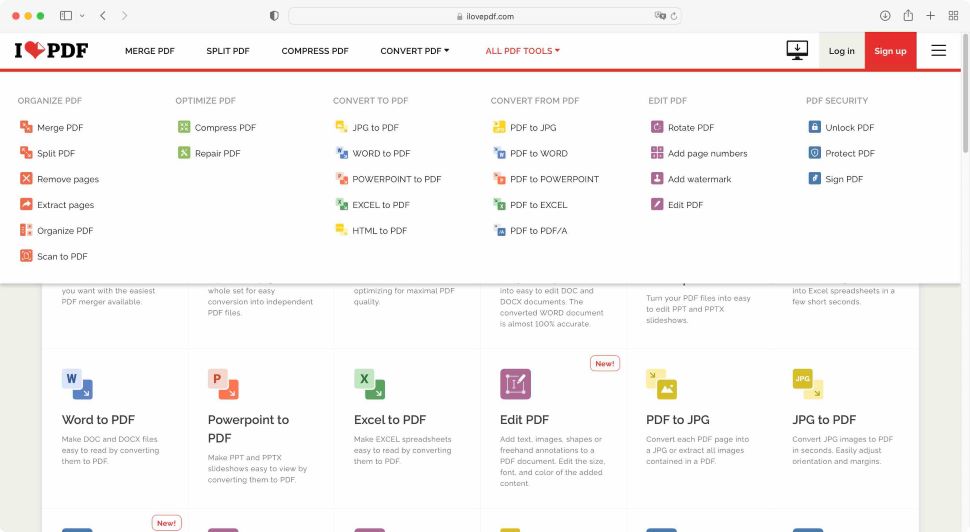
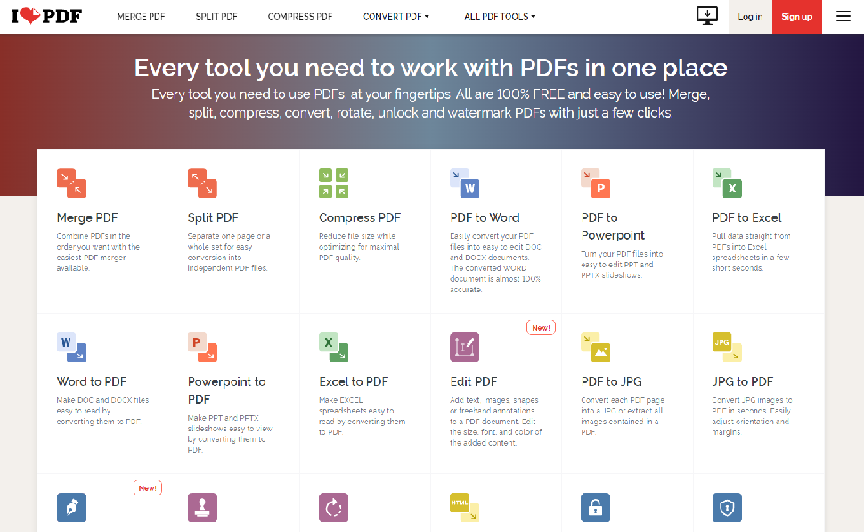
You access I Love PDF via their website which houses 23 tools, all displayed in rows and columns. Top of the page, you’ll find a selection of those most commonly used ones: a PDF merger tool, a PDF compressor, and the option to split documents. These are followed by all the options to convert to and from the PDF format, and lastly, a menu containing all available tools, only broken down by category.

You’ll find login and signup options top right of the interface, but you don’t actually need to register to use I Love PDF.

Although the service is free, there is a subscription option of $4 / £4 per month (billed annually at $48 / £48). You’ll find that there are some restrictions with the free service compared with the subscription one, like batch processing for instance, forcing you to convert files one at a time if you’d rather not pay. 

If your needs are modest, you’ll find the free service more than sufficient. However, the option to expand your capabilities, even downloading software so you can work offline, enable OCR software functionality, remove adverts, and gain access to customer support, can prove valuable to those who would rather subscribe. 

  • Pricing: 4/5

I Love PDF: Interface and experience

Interface of I Love PDF document editor

I Love PDF’s interface may feel cluttered but all the tools you need are easy to access, either from the main page, or via the menu bar at the top  (Image credit: I Love PDF)
  •  The interface is simple to understand and consistent throughout 


Using the available tools is pretty straightforward: you click on an icon, and browse through your files to select the one(s) you need - whether on your computer, or through cloud storage service providers Dropbox or Google Drive - or drop them straight onto the page.

What happens next depends on your chosen tool of course: ‘Split’ for instance will display thumbnails of the PDF’s pages. You’ll find contextual options in the sidebar on the right. In this case you either get to select a range of pages, at which point I Love PDF will cut the document for you, or, more interestingly, you get to ‘Extract’ pages. This is where you can select any page - contiguous or not - to save them in a separate document.

You’ll find all tools work in that way: large icons, easy-to-understand features, and thumbnails big enough to just about make out which page you need to keep and which to discard.

Any option that isn’t available to the free service will have a yellow ‘Premium’ label next to it, making it easy to see what’s off limits.

To get out of a selected tool and return to the main menu, either select a new one from the menu bar at the top of the page, or click on the large ‘I Love PDF’ title, top left.

  • Interface & experience: 5/5

I Love PDF: Tools

Using I Love PDF

Sign your document, using your phone to draw your signature with (Image credit: I Love PDF)
  • Some tools are implemented in a very clever way 

Out of the usual suspects for a service of this type, there were a few implementations that we quite liked.

For instance, ‘Sign PDF’. The eSign software allows you to add a signature somewhere on a PDF page. You’re given a few options on how to do this - type your name using a script font, use your laptop’s trackpad to create a digital signature, or, and this is the part we liked, choose ‘Draw from your mobile device’. 

When you select that feature, a QR code appears. Use your phone’s camera to hover over it to reveal a URL. This takes you to a special page where you can draw your signature straight on your mobile device. Once you’re done, tap on ‘Apply’, and that squiggle will be sent back to the page you’re working on on your computer, ready to use.

This is a great blending of technologies, which works seamlessly.

This feature is also used with the ‘Scan to PDF’ tool. You might find that your phone already has the capability of scanning documents with its camera, but here, once the document is scanned, it is sent right back to your I Love PDF page on your computer, ready for you to continue working from there. It’s a great feature which we enjoyed using very much.

Adding a watermark to a PDF in I Love PDF

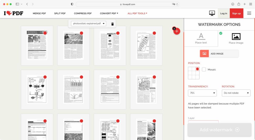
The way you add page numbers or a watermark is very similar with I Love PDF (Image credit: I Love PDF)

Another one we appreciated, although somewhat lacking the wow factor of the previous one, is ‘Page Numbers’. If you need to add them to a PDF, this is a fantastic and quick way to do so: load the PDF, and you’ll be presented with a series of thumbnails for each page. Choose where the number will be displayed on the pages, and you’re done.

Yes there are other options, such as changing the number of the first page to a value other than 1, selecting how the number is displayed, its font, style, and other options, and so on. All this is an added bonus, but if you need to number the pages of a PDF document quickly and easily, this is an ideal tool.

  • Tools: 5/5

I Love PDF: PDF editing

Editing in I Love PDF

The Editing function is more limited than other advanced competitors (Image credit: I Love PDF)
  • Editing isn’t actually editing to the fullest extent  - it's document manipulation

If you’ve seen other competing software packages, you might think that ‘Edit PDF’ will allow you to alter the very content of a PDF document.

But I Love PDF isn’t a full-fat, premium PDF editor like Adobe Acrobat DC. It’s more of a free PDF editor of sorts; a PDF manipulator with limited editing capabilities. 

See, what is written and displayed in the selected PDF cannot be altered. However, you can add to it. You can insert text boxes, images, and even shapes, allowing you to make notes, add comments, even highlight sections. 

If you’re looking to fix typos or rewrite a section, ‘Edit PDF’ can’t go that far.

  • PDF editing: 4/5

I Love PDF: Scorecard

Attribute Notes Score
Pricing Free and annual subscription plans available 4
Interface & experience Clean, consistent, easy to use 5
Tools Clever implementation and results from classic PDF tools 5
PDF editing Limited editing; mostly document manipulation 4

Should I try?

The I Love PDF home page

(Image credit: I Love PDF)

Try it if...

For a free PDF reader and editor service, I Love PDF is pretty good. Its interface is easy to navigate, and the capabilities on offer are often only available to paying customers with competing services. 

There is a lot of clicking around though to get from one tool to another, but the proof’s in the pudding: the tools are good, they are easy to use, and you get your modified PDF in seconds. 

Don't try it if...

From what we can see, the only feature I Love PDF doesn’t offer is the ability to fully edit the content of a PDF. If you need this, then this service isn’t for you. 

Alternatives

!!!!!!!!!!

Popular Posts

Categories

Blog Archive