Nothing Phone (1)
If you’re reading this hands-on Nothing Phone (1) review, you likely fall into one of two camps: those who’ve never heard of Nothing before, and are wondering exactly what the Phone (1) is; or those who’ve been glued to the story of the London-based startup’s long-anticipated debut smartphone, and are eager to find out whether the wait was worth it now that the hype train has finally pulled into the station.
Nothing remains a rather mysterious company, with the Phone (1) being only the second physical product it’s released in its short existence, following on from 2021’s Ear (1) true wireless earbuds. Those buds set the tone for the kinds of products the company aspires to make, defining a clear design aesthetic for both the brand and its wares that’s been carried through to the Phone (1).
Ahead of the Phone (1)’s launch, Nothing CEO and co-founder Carl Pei (of OnePlus repute) stated early on in its development that it was being made to help inject some joy back into the mobile market, and quickly created excitement among fans and tech enthusiasts using tricks and tactics familiar to anyone who followed his work at OnePlus.
Teases of the Phone (1)’s design, hardware and features were seeded out to reputable media outlets that place a focus on trends and style (Wallpaper*, Input, GQ etc.) in the months prior to release, while the phone also received exclusive coverage from high-profile influencers like top tech YouTuber, Marques Brownlee (MKBHD).
As a result, this little-known brand with an unproven track record has managed to cultivate a disproportionate amount of excitement and interest around its first phone. So does the Nothing Phone (1) live up to the hype? Read on to find out…
Nothing Phone (1) price and availability
Nothing unveiled the Phone (1) on July 12, and the handset will be available from July 21 across the UK, Europe, India, Japan, Hong Kong and Australia. Ahead of launch, the company had already confirmed that a US release will follow at a later date, but couldn’t specify when (it’s speculated that modifications would need to be made to the phone to properly leverage the region’s 5G infrastructure).
As for pricing, the Nothing Phone (1) is available in three storage/RAM variants: 8GB RAM/128GB, 8GB RAM/256GB, and 12GB RAM/256GB, priced at £399 / €469 / AU$749, £449 / €499 / AU$799 and £499 / €549 / AU$899, respectively. Those UK prices convert to roughly $475, $530, and $590.
Ahead of release, a select number of eager fans were given the opportunity to bid on a limited run of 100 engraved devices via the StockX auction platform, even before the finer points of the Phone (1)’s hardware and software had even been made public. Some of those bidders reportedly paid over $3,000 / £2,500 / AU$4,300 for the privilege of being among the first to own a Phone (1).
Separately, Nothing also created an invitation system (not unlike that employed by Pei’s former company for the original OnePlus One) that allowed those with an invite to join a waitlist to be among the first to pre-order a Phone (1).
Nothing Phone (1) design
Although we were able to study the Phone (1)’s design in Nothing’s official press imagery ahead of its launch, getting hands on the device is unquestionably a richer experience.
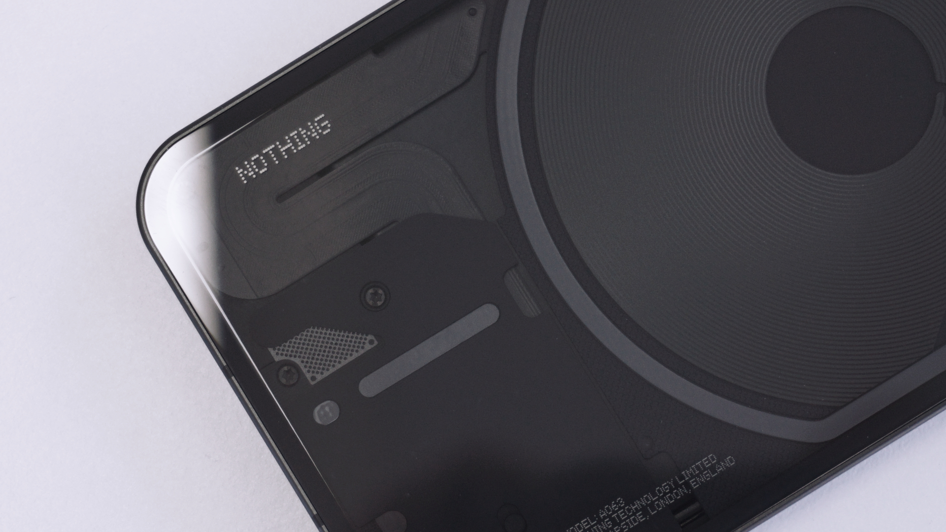
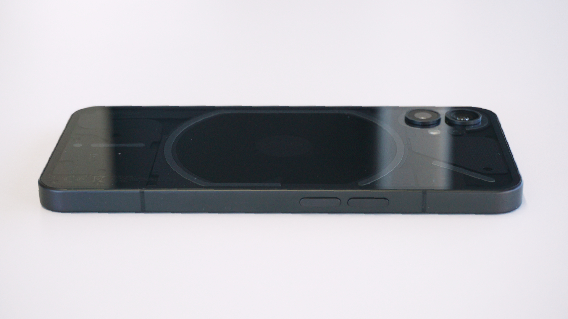
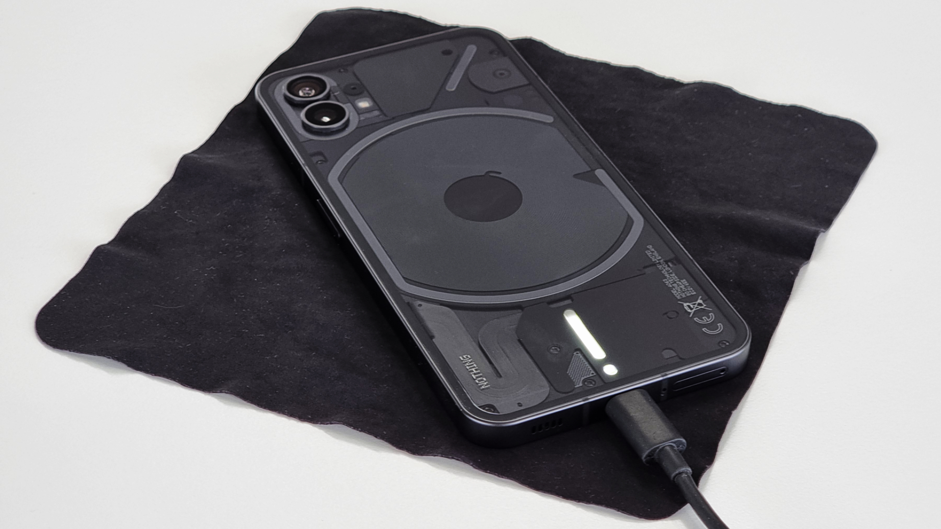
The overall design bears an immediate resemblance to Apple’s iPhone 12, namely due to the Phone (1)’s straight-sided metal frame, rounded corners, flat front and back, and dual rear camera placement; just scale it up, run it through an X-ray machine and voila. ‘Why an X-ray machine?’ you might ask; well, the big hook of the Phone (1)’s form is its back – it’s completely transparent.
While we’ve seen transparent-backed phones before, usually the components underneath are either only partially visible (as on the HTC U12+) or wholly fake (as on Xiaomi’s Mi 8 Explorer Edition). Nothing, for its part, has designed the exposed parts underneath to be both functional and aesthetically pleasing.
As you turn the phone in your hand, the shifting specular highlights and shadows that appear over and under the layers of differently-textured components, screws and ribbon cables beneath the Phone (1)’s back glass make it a far more interesting rectangle of electronics to look at than most other phones on the market; not to mention it has Teenage Engineering’s (a trendy Swedish consumer electronics company, who collaborate with Nothing on its industrial design) fingerprints all over it.
Speaking of fingerprints, even with a completely clear Gorilla Glass back, the Phone (1) does a decent job of repelling them, and when you do spot smudges, they buff out easily enough. Buyers who spring for an official Phone (1) case might appreciate its clarity out-of-the-box (the case is also, not surprisingly, transparent); however, expect prints to adhere to it far more readily, and require more elbow grease to buff out, than on the phone itself.
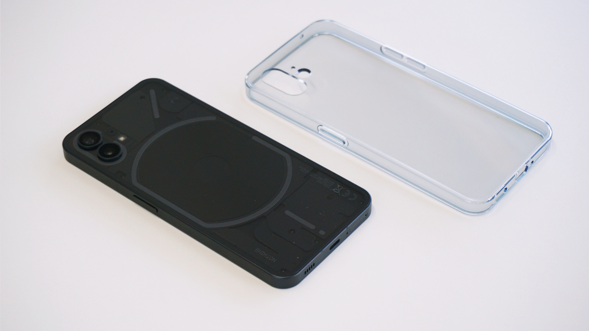
At launch, Nothing serves up the Phone (1) in two finishes: a black model and a white one – with the former offering a more understated appearance, while the latter serves to accentuate that standout design element in a way that’s sure to get people talking when you walk into a bar and casually plonk it down on the table.
Despite its straight sides, the edges of the recycled aluminum frame are subtly rounded to ensure that the Phone (1) is more comfortable in the hand than you’d expect and, what’s more, it feels lighter than its build might suggest – at 193.5g it sits below the 200-gram threshold beyond which a device’s weight starts to feel noticeable.
The power key on the right side of the frame and the two volume controls on the left are large, easy to reach and respond with a satisfying click, without requiring a lot of force, while IP53-certification means the Phone (1) can be used in a light drizzle without issue, and should prevent dust from working its way into the cavity behind that clear back glass; just don’t drop it in the sink or throw it around at the beach.
Although we’re still in the middle of testing the Phone (1), the glass and metalwork across aren’t yet showing any signs of wear, save for the pre-fitted screen protector and charging cable, both of which came scuffed out of the box. This could be down to Nothing’s limited start-up operational capacity – with the company’s small size increasing the chance of quality control slip-ups compared to a well-oiled behemoth like Samsung or Xiaomi – or it could just be a faux pas limited to the press sample we received.
Nothing Phone (1) glyphs
While the phone’s transparent back is a conversation starter, its statement feature is what Nothing has dubbed ‘glyphs’ – a series of 900 white LEDs arranged across the phone’s back in a distinct configuration that act as something of a notification light on steroids.
The LEDs are diffused to form bars of light that run around the edge of elements like the rear camera module and wireless charging coil, and each segmented glyph can light up independently of the others. It’s a unique feature that Nothing has put to use in a number of creative ways.
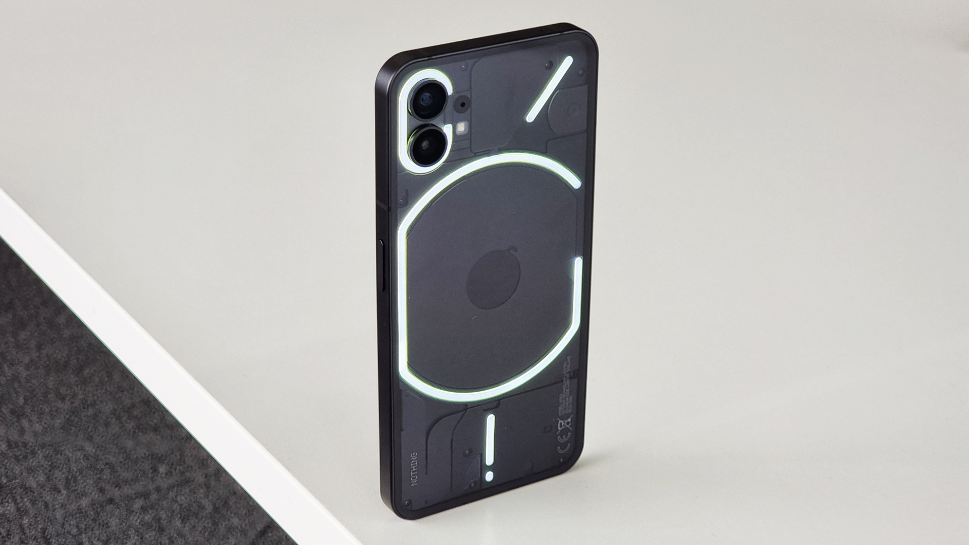
Dipping into the Glyph Interface in the phone’s settings, you can customize what the glyphs react to, and when they react. By default, they’re paired to one of Nothing’s 10 own-brand ringtones and notification tones, with the various light and haptic patterns perfectly synchronized – in terms of brightness and strength, respectively – to the audio of each.
The glyphs’ usefulness goes beyond glanceable notifications, however: they can also act as a battery charge indicator for both wired charging and reverse wireless charging; show when the Google Assistant is listening and picking up your spoken commands; and serve as a soft light when you’re shooting video, in place of the camera’s single LED flash.
The option to set different glyph/ringtone pairings to specific contacts in your address book is nice, but additional customization options for app-specific notifications, in-game actions, and the ability to compose your own glyph patterns to your own tones would be nice additions that Nothing is hopefully already considering.
Nothing Phone (1) display
There was some speculation around the panel that the Phone (1) would sport, based largely on its expected price point, and now that it’s here we can confirm that Nothing has graced the device with a 6.55-inch Full HD+ AMOLED panel boasting a 120Hz high refresh rate, along with HDR10+ compatibility and 10-bit color support.
The screen is surrounded by a not-insignificant bezel, but it claws back some aesthetic points by sporting a consistent thickness all the way around (something that’s not always a given and not always easy to do, from an engineering standpoint). The phone’s punch-hole front-facing camera sits in the top-left corner of the panel, while an optical in-display fingerprint sensor sits low and close to the bottom edge of the panel.
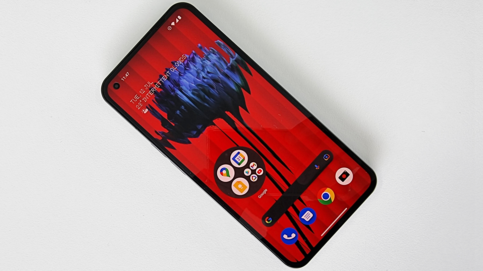
Despite the technical advantages an OLED panel usually brings, there’s no always-on display functionality, as yet (Nothing hasn’t confirmed any such functionality); however, a faint ring demarcating the fingerprint sensor’s placement does linger on the screen when the rest of the display shuts off, and despite the handset offering raise-to-wake functionality, you don’t need to rouse the Phone (1)’s display before pressing on the sensor to gain access.
As for the panel itself, the Full HD+ resolution offers a pleasingly sharp image with bold colors, while simple controls that let you adjust color temperature and vibrancy. You can also toggle the refresh rate between 60Hz and 120Hz to suit what you’re doing on the phone or to preserve battery life.
Nothing Phone (1) audio
Given that Nothing’s first product was a pair of Bluetooth earbuds, it should come as no surprise that the Phone (1) doesn’t feature a wired headphone jack, instead delivering audio over Bluetooth 5.2. Nothing’s own quick-pair functionality makes connecting select buds – such as the company’s own Nothing Ear (1) – instantly (although a full list of supported products hasn’t yet been shared).
The phone also sports dual stereo speakers, but understand that it’s not an even split, with the majority of the power being driven from the down-firing speaker, while the earpiece outputs mids and highs.
Nothing Phone (1) software
Nothing gave users a taste of its bespoke Android-based user experience ahead of the Phone (1)’s launch by releasing a launcher that could be installed on supported phones from other brands; however, the native experience offers a lot more depth.
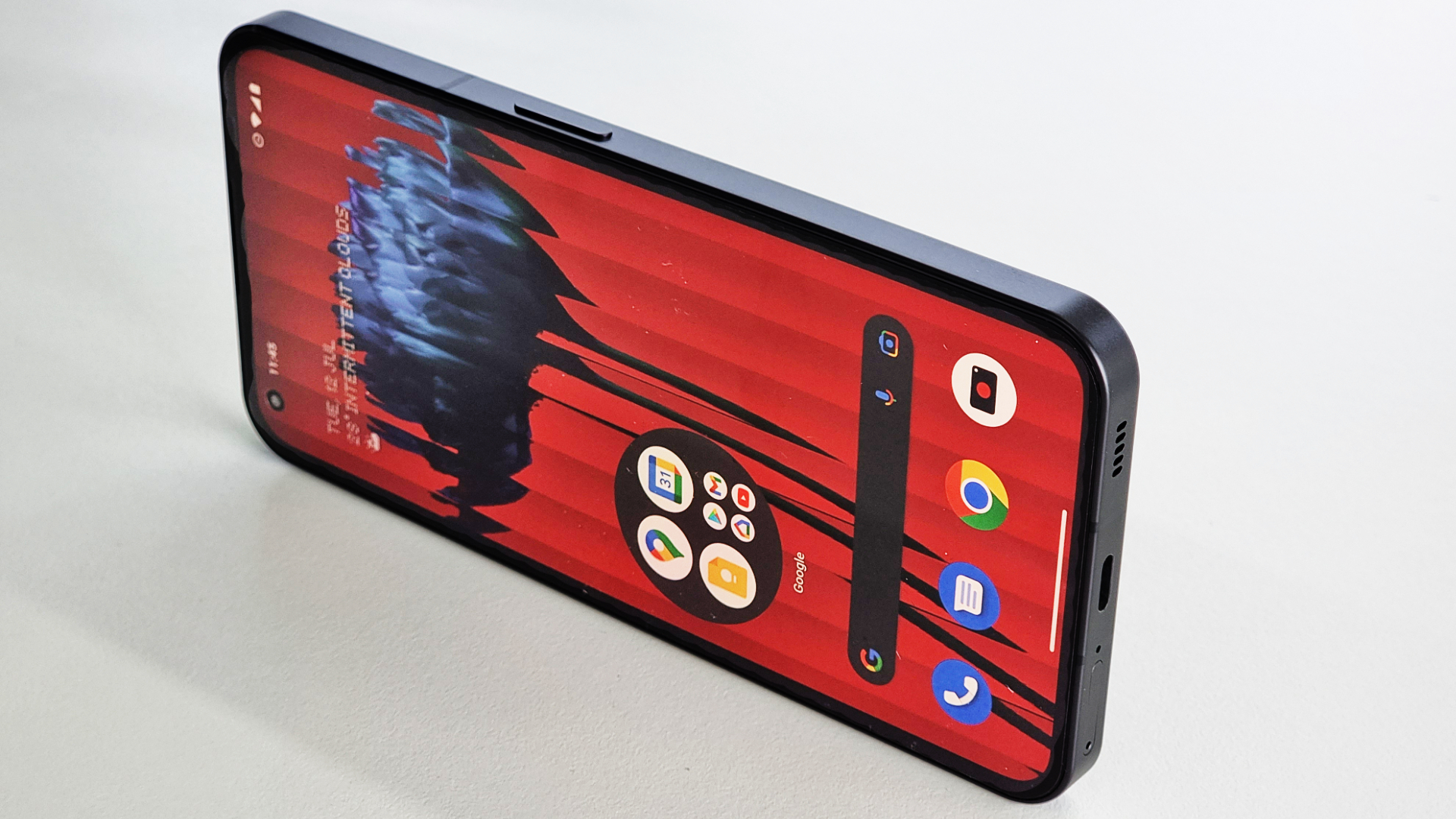
The brand’s signature dot matrix font, which can be found across the phone’s hardware – such as on its glass back and even in the SIM tray – also carries across to the user interface, dubbed ‘Nothing OS’, fronting menus and select widgets.
Nothing OS falls into a similar camp to that of Motorola’s and Google’s own takes on Android, with mild adjustments that set it apart from a truly stock experience: folders can be enlarged to occupy a 2 x 2 space on a home screen, offering hybrid functionality; specific quick-settings widgets can be swiped through, providing more connectivity options at a glance; and, while it’s tucked away, there’s even a pop-up view for more convenient multitasking.
Nothing Phone (1) performance and battery
One of the most controversial aspects of the Phone (1) ahead of launch was Nothing’s choice of chipset, with the company surprising industry watchers by implementing a tuned version of an older seventh-generation Qualcomm chipset – the Snapdragon 778G+.
This comes paired with a base 8GB RAM, but the top-tier model can be had with 12GB, while the ‘+’ denotes the inclusion of wireless (up to 15W) and reverse wireless (up to 5W) charging support.
Behind the glass and the visible components, the Phone (1) packs in a 4500mAh battery, which Nothing says delivers up to 18 hours of use per charge and refills to 50% in 30 minutes, provided you’ve picked up the appropriate 33W PD/Quick Charge 4.0-compliant power adapter. Nothing offers its own adapter, but doesn’t include one in the box, meaning all you’ll find is a white USB-C to USB-C cable.
Nothing Phone (1) cameras
While the front-facing snapper clocks in at a somewhat unassuming 16MP, both rear cameras pack in the pixels at 50MP a piece.
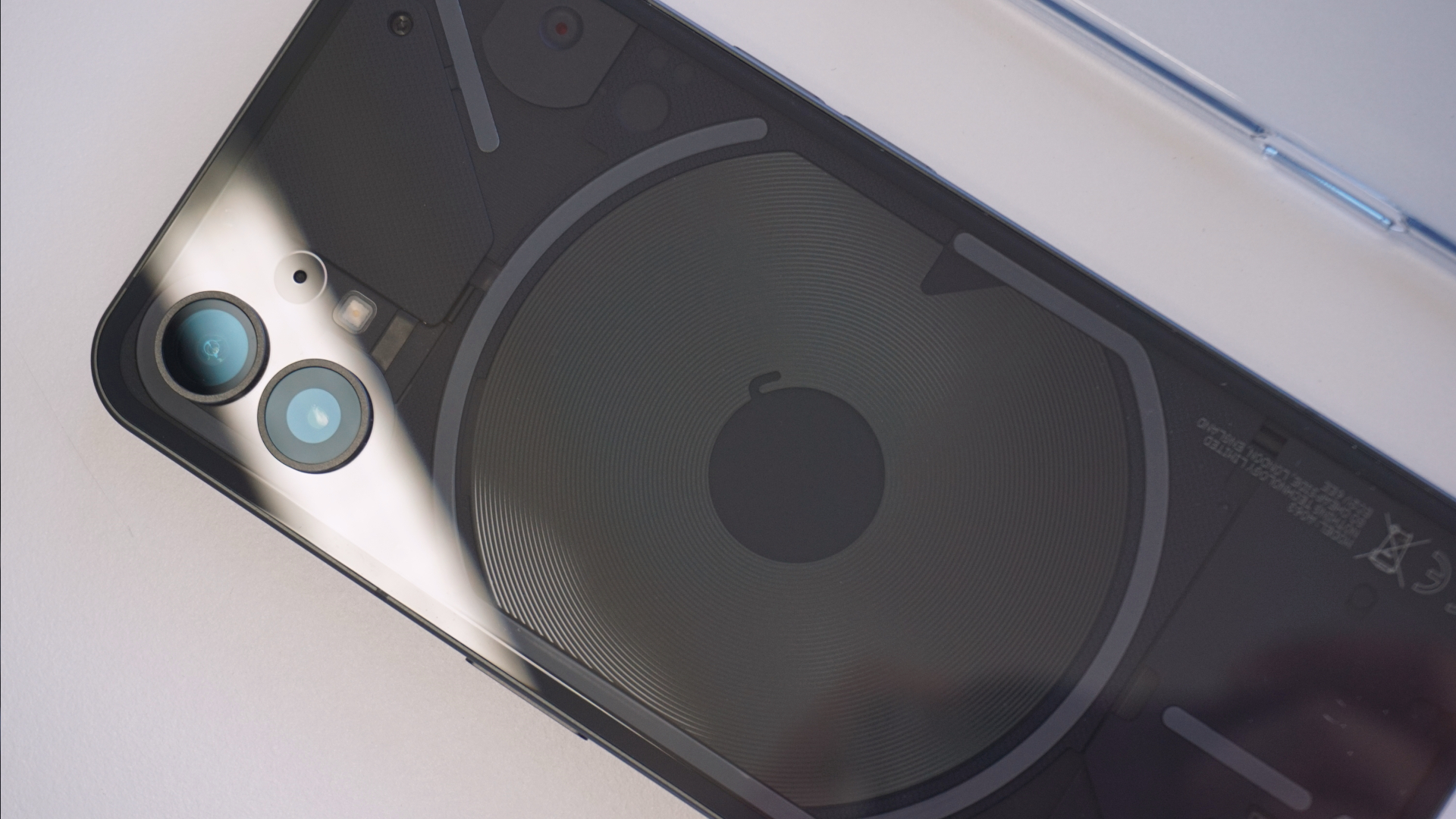
The main Sony IMX766 sensor supports by OIS (optical image stabilization) and is ubiquitous amongst phone makers (found on current offerings like the flagship Xiaomi 12 and mid-range OnePlus Nord 2), while the secondary 50MP Samsung JN1 ultrawide means you don’t have to compromise on sharpness when switching between the two focal lengths (at least where pixel count is concerned).
One of the few apps that Nothing pre-loads on the Phone (1) beyond its own-brand audio recorder is a tailored camera experience that features the brand’s black, red and white color palette and, among others, includes a dedicated macro shooting mode.
Early verdict
For those that have been following along, the Phone (1)'s July 12 arrival marks a significant milestone for Nothing as a company, and serves as the true starting point for the their long-promised ecosystem.
The Phone (1) also fulfills its purpose as a statement piece with standout features that current rivals can't compete on, if only because they didn't think to.
In contrast to its unique design and lighting, the hardware that the Phone (1) serves up seems a little more pedestrian, but while there are a number of worthwhile alternatives around the Phone (1)'s price point few, if any, are as unforgettable.
0 comments:
Post a Comment