Wednesday, November 30, 2022

Kindle Scribe review: not enough of what we want

Two-minute review

Amazon Kindle Scribe e-ink writing tablet

(Image credit: Future / Philip Berne)

 Finally, a Kindle you can write upon… said who, exactly? If you’re a student or academic, you’ll be disappointed by the limitations on how you can annotate books. If you’re trying to be productive, this is far from a productivity tool. If you’re into journaling, there are better options for writing tablets, though admittedly nothing handles reading and books quite like the best Kindle ereaders.  

That’s the bottom line – the Kindle Scribe is a great, big Kindle, and Amazon doesn’t try to take the device much further than adding a few basic writing features; less than you’ll find on any competing E Ink tablet with a pen. The reMarkable 2 has many more writing templates and more robust pen options, and the Onyx Boox Tab Ultra runs Android 11 and can convert text to type as you write. 

The Kindle Scribe has its advantages. It has plenty of storage and amazing battery life, and it’s one of the cheaper writing tablets when you factor the cost of the pen. It has a bright backlight that can adjust for night reading, and it can access the full Kindle book library, which is essential if you’re an avid reader. Still, it’s hard to find a reason why folks who need an ereader with a pen should prefer the Kindle Scribe over alternatives.

Kindle Scribe review: price and availability

  • $339.99 / £339.99 / AU $549.99 for 16GB with basic pen
  • Premium pen includes eraser and shortcut button

Amazon Kindle Scribe E Ink writing tablet

(Image credit: Future / Philip Berne)


It’s hard to compare the pricing on tablets like the Kindle Scribe, but overall we think it’s very good value for what you get. Even though the screen is larger, Amazon hasn’t sacrificed the crisp level of detail, so it still reads at 300ppi, which is even sharper than an Apple iPad’s 264ppi. The iPad 10.2 (2021) starts at $329 in the US, which is comparable, but you don’t get a pen. Of course, comparing a colorful, extensible tablet like the iPad to the Kindle Scribe is like comparing apples to, er… Kindles. 

The Kindle Scribe might be better compared to the reMarkable 2 writing tablet, which starts at a deceptive $299. We say deceptive because reMarkable doesn’t include a pen and charges exorbitant fees. The reMarkable 2 with a pen costs $378, or $428 for the premium pen. 

Kindle Scribe specs

Weight: 433g
Dimensions: 196 x 230 x 5.8mm
Display size: 10.2-inch
Storage: 16, 32, 64GB
Charging: USB-C charging
Backlight: LED (35 lights)
Pen Included: Yes

That bundle with Amazon’s premium pen, which uses the exact same technology, is $369.99, which makes the Kindle Scribe look like a steal. The reMarkable also doesn’t have a backlight, so you need a light source to use it in the dark. It also cannot access the Kindle library, or any large eBook library easily.

Amazon Kindle Scribe e-ink writing tablet

(Image credit: Future / Philip Berne)

There are even more advanced E Ink tablets that use a pen, like the Onyx Boox Tab Ultra. That tablet is a more feature-packed device, and in its own class in terms of capability and price. It has a camera for document scanning and runs Android, for instance. For that reason, it’s almost twice the price of Amazon’s Kindle Scribe. 

The more interesting price comparison is between the Kindle Scribe and other Kindle ereaders. If you want the best ereader around, and you need a big screen, there’s no comparison. The Scribe costs $90 / £110 / AU$150 more than the Kindle Oasis, which has only a 7-inch display, half the storage space, and no pen support. The only thing the Scribe cannot do is take a dip in the ocean, which the Kindle Oasis can legitimately handle, saltwater and all. 

Kindle Scribe review: design

  • Big and bright display doesn’t sacrifice sharpness
  • Port and power are weirdly placed on the side

 The Amazon Kindle Scribe looks like a very large Kindle. It has rounded corners and smoothly curved edges with a wide, flat back. It has a bezel all around, with a larger edge on the left side, if you hold the tablet Amazon smile-up. You can flip the Scribe and hold the larger edge with your right hand, but then the Amazon logo will be frowning. 

The USB-C port for charging, as well as the power button are both strangely placed on the side of the device, near the middle. The pen, which is included, hangs on by a magnet on the opposite side edge of the Scribe. 

Amazon Kindle Scribe e-ink writing tablet

(Image credit: Future / Philip Berne)

This is our least favorite way of holding a pen. The strongest rare earth magnets cannot keep a pen in place when we slide a tablet in and out of a backpack sleeve. We lost the Scribe pen on day one and spent a half hour searching before we found it. Thankfully, an old Galaxy Note pen works just as well in a pinch. 

If you spring for the leather folio case, a nice addition that Amazon sent along with our review sample, the flap opens up over the top like a reporter’s notebook, though much larger. The pen then slots into a holder on the edge of the flap. 

Amazon Kindle Scribe e-ink writing tablet

(Image credit: Future / Philip Berne)

Compared to the competition, the Kindle Scribe is a bit thicker than the reMarkable 2 tablet, which makes sense because the reMarkable lacks a backlight. The Kindle has a very bright LED backlit screen, and it can switch from a bluish-gray tint to a bluelight-free tint that’s better for nighttime reading. 

The Kindle Scribe is also wider than the reMarkable, and less tall. The screens are roughly the same size, it’s just that the reMarkable puts its big bezel edge at the bottom instead of the side. 

For reading, we found the Kindle very comfortable to hold and use, even for such a large tablet. We’d love to see it shed some weight, but it isn’t clumsy. 
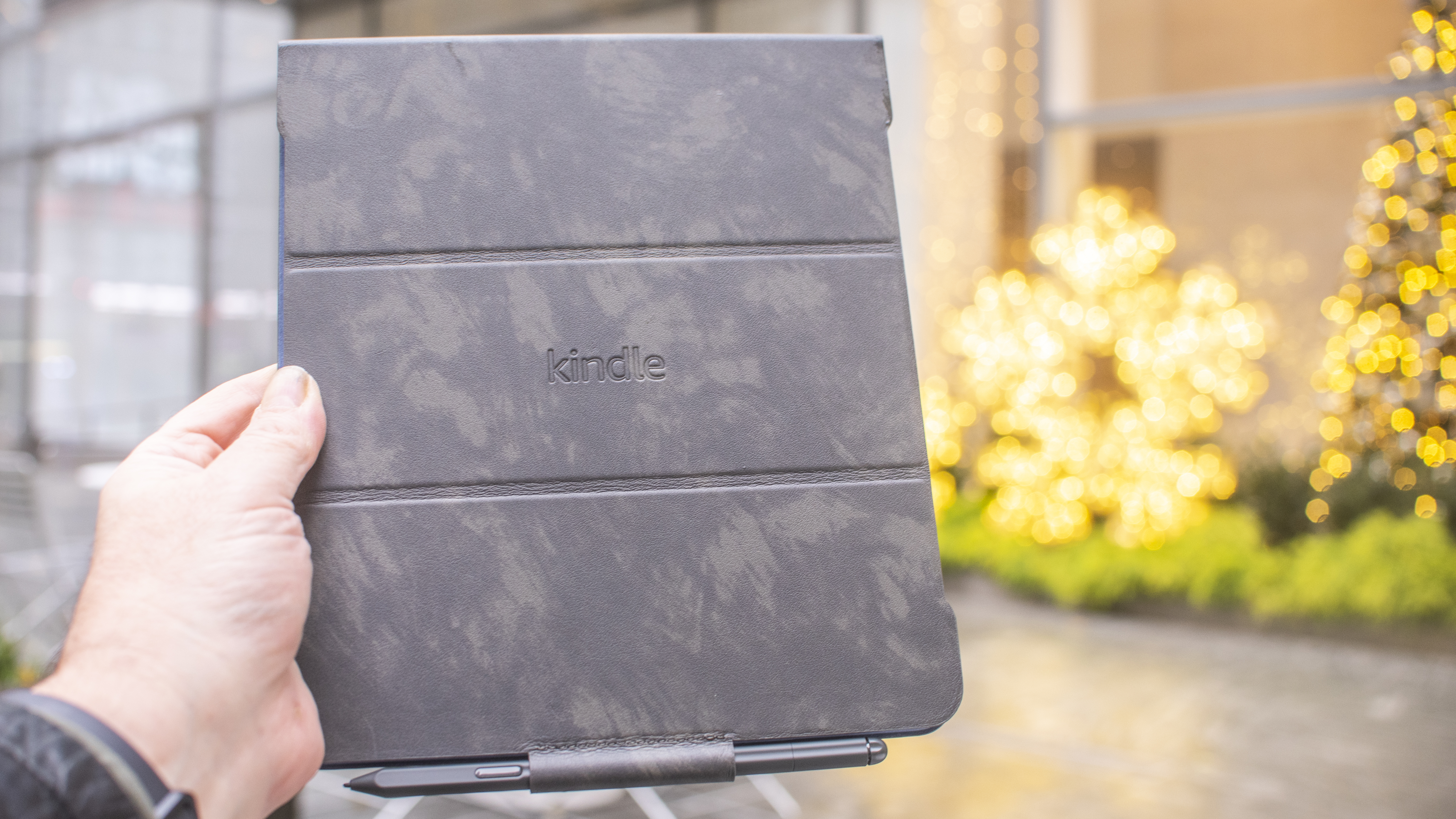
Amazon Kindle Scribe e-ink writing tablet

(Image credit: Future / Philip Berne)

Kindle Scribe review: using it

  •  Excellent large screen Kindle for reading books 
  •  Middling e-ink writing tablet for journaling and notes 

Amazon Kindle Scribe e-ink writing tablet

(Image credit: Future / Philip Berne)


If you want to read books on a large screen Kindle, the Kindle Scribe is an easy ereader to recommend. The price is high for the category, but the screen is much larger than the next-biggest Kindle Oasis, without sacrificing the remarkable pixel density. If you’ve been craving a gigantic reading screen for bigger fonts and larger images, the Scribe is a joy to use. 

On the other hand, if you’ve been excited about a Kindle that you can also use for journaling, note taking, and other writing tasks, the Kindle Scribe is a huge letdown. For most fans of notebooks and written tasks, the Scribe offers the bare minimum, and there are better options to be found in the competition. 

For students and academics, the Scribe only allows you to write notes as sticky notes appended to a book. You cannot actually write on the book page, in the margins, for instance. College students who buy their own books love the ability to interact directly with the text in writing, and it is a huge letdown that the Kindle Scribe cannot support this feature. 

Amazon Kindle Scribe e-ink writing tablet

(Image credit: Future / Philip Berne)

For journaling and freewriting, the Kindle Scribe offers few template options, and none that work well with popular journal methods. We use bullet journaling and found some basic dots and lined pages, but nothing as organized or creative as the templates we enjoy on the reMarkable 2 tablet. If you keep a journal or take detailed notes, that’s the better option. 

If you were hoping to doodle and draw, the Kindle Scribe is not interested. There are no pen options beyond thick or thin. The reMarkable tablet gives you numerous pen styles, including a calligraphy pen that reacts to direction and tilt. The Kindle Scribe gives you a pen, a highlighter, and an eraser, and that’s it. 

It isn’t difficult to use the Kindle Scribe for basic productivity. When we needed to sign a document, we simply sent it to a custom email address that we set up through our Amazon Kindle account. The pdf file arrived on our Scribe, and we could sign it and email it back with no trouble. 

There is no way to convert handwriting to typography, which is a real miss for the Scribe. This would be a great way to search through all of the sticky notes we take on a book, or a better way to send a written document via email. For note taking alone, the Kindle Scribe needs to be able to make the conversion.  

Kindle Scribe review: connectivity

Amazon Kindle Scribe e-ink writing tablet

(Image credit: Future / Philip Berne)
  • Easy setup over Wi-Fi, no device needed 
  • Send documents to a dedicated email address 

Amazon makes it easy to set up the Kindle Scribe and get all of your books and documents on and off the device. We had no trouble finding our Wi-Fi network, and the Kindle does not need a second device for setup. If you have a smartphone with the Kindle app, that helps speed the process along, but it isn’t required. 

When we needed to sign documents with the Kindle Scribe, we found a dedicated email address @kindle.com was the easiest way. It is set up with a random username by default, but you can change this online, and we made it more convenient. As soon as we sent a document it appeared in our library, and we could email it to up to five recipients. 

Amazon Kindle Scribe e-ink writing tablet

An Audible audiobook on the Kindle Scribe (Image credit: Future / Philip Berne)

Of course, there are many more connectivity options we’d like to see, but at this price the options are fair. Some folks may want an LTE connection at least for downloading books or emailing simple black and white documents. Amazon sells a deluxe version of the Kindle Oasis with an unlimited AT&T connection for downloads on the go. 

We could also imagine a microSD card slot being very useful for transferring and signing documents. If this were a more serious productivity tool, that would be a top request. 

Should I buy the Kindle Scribe?

Buy it if

Don't buy it if

Kindle Scribe review: also consider

If our Kindle Scribe review still has you on the fence then consider this trio of alternatives below:

  • First reviewed: November 2022
8BitDo Ultimate controller for Nintendo Switch review

It’s rare for a third-party controller to almost completely outclass what’s offered by manufacturers like Nintendo – which is what makes the 8BitDo Ultimate controller for Nintendo Switch so noteworthy.

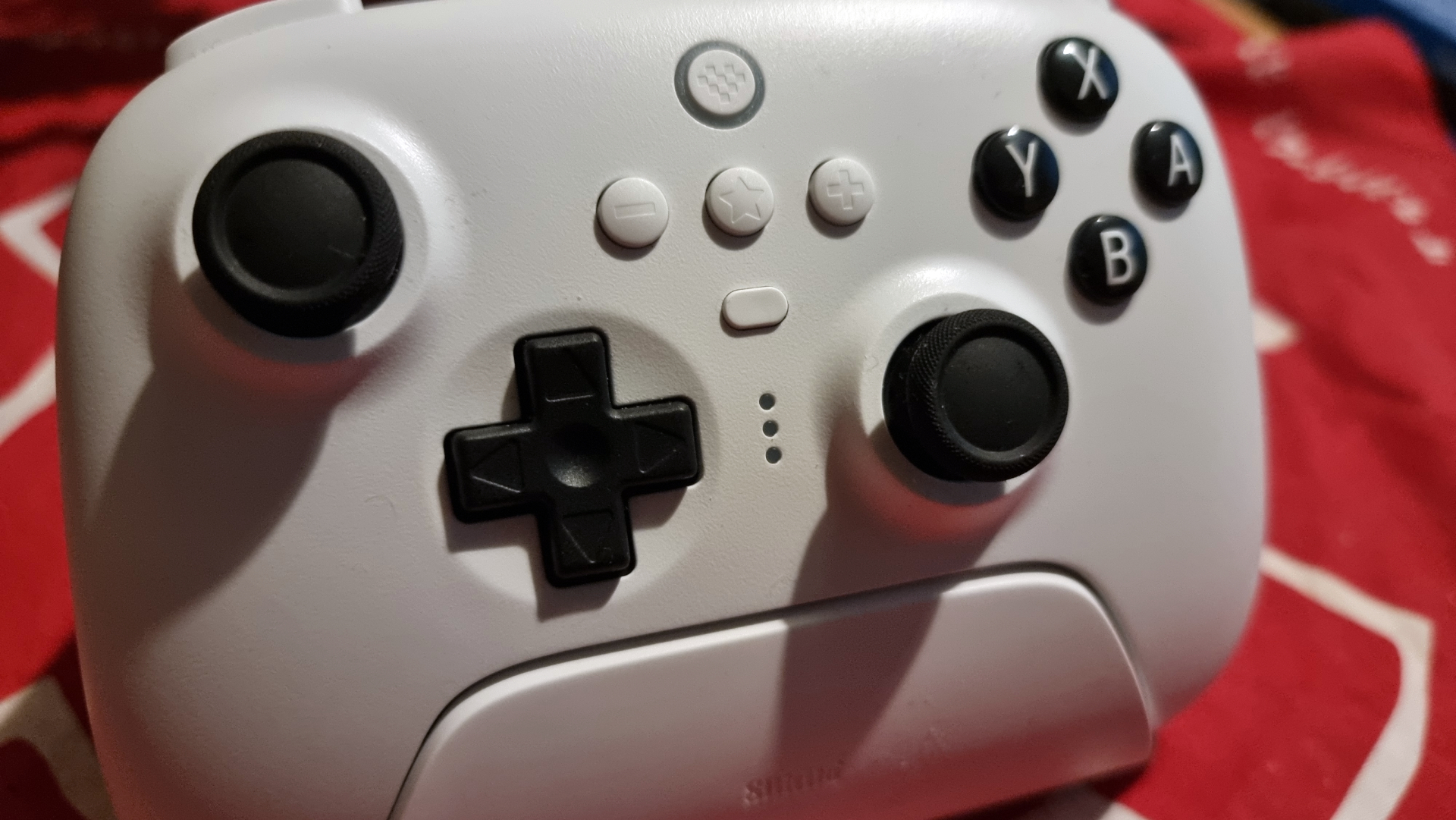
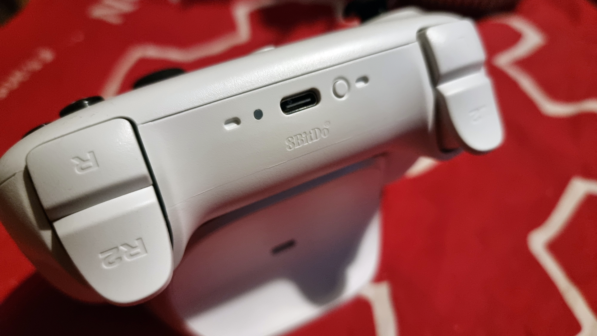
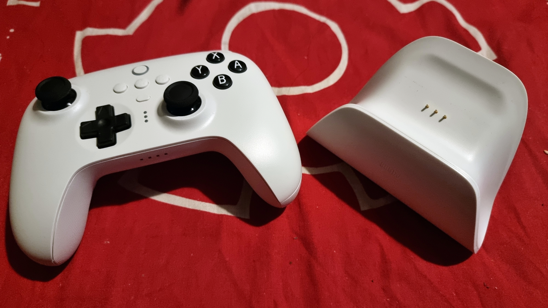
First impressions of the 8BitDo Ultimate are strong before you’ve even loaded up a game. The packaging is pleasingly compact, containing the pad, its charging dock, and a USB-C cable, and upon holding the controller for the first time its quality is immediately apparent.

The 8BitDo Ultimate is ergonomically sound, thanks to the rounded design that rests easily in your grip. The textured grips ensure that you’ll have a firm grasp on the controller at all times, even when your palms get sweaty in the heat of battle. Button and stick quality is fantastic across the board, too, offering a tactile experience that’s an improvement over the already excellent Nintendo Switch Pro Controller.

It’s also a top choice if you’re after a level of customizability not afforded by the Pro Controller. This can be configured using the 8BitDo’s app, which allows for full button mapping, trigger and stick sensitivity settings, and support for button combination macros.

Battery life is adequate for a controller of its kind, even if it can’t quite match the Nintendo Switch Pro Controller’s stunning 40 hours of charge. Thankfully, this is largely alleviated by the included charging dock, boasting a short 2-3 hours of charge time.

Overall, the 8BitDo Ultimate is a top choice if you’re looking to graduate from Nintendo’s own Joy-Con controllers. Additional features such as rear paddle buttons, profile customization app, and a charging dock make it an excellent value proposition, especially as it’s even cheaper than other options like the Nintendo Switch Pro Controller and the PowerA Fusion Pro.

Price and availability

8BitDo Ultimate Controller

(Image credit: Future)

The 8BitDo Ultimate controller for Nintendo Switch comes in at $69.99 / £59.99 (around AU$104), including the controller and its charging dock. It’s purchasable in the US and UK via 8BitDo’s official store page.

The controller’s available in white and black colorways, and while its primary use is for the Nintendo Switch, it also works on Windows PCs, as well as Android and iOS devices via Bluetooth connectivity.

Design

8BitDo Ultimate Controller

(Image credit: Future)

The 8BitDo Ultimate controller for Nintendo Switch sets a very strong first impression, thanks to its stellar build quality and high level of comfort brought on by its form-fitting design and firm textured grips. It presents an effortless experience during longer gaming sessions, and said grips feature just the right amount of roughness to provide stability without irritating your hands.

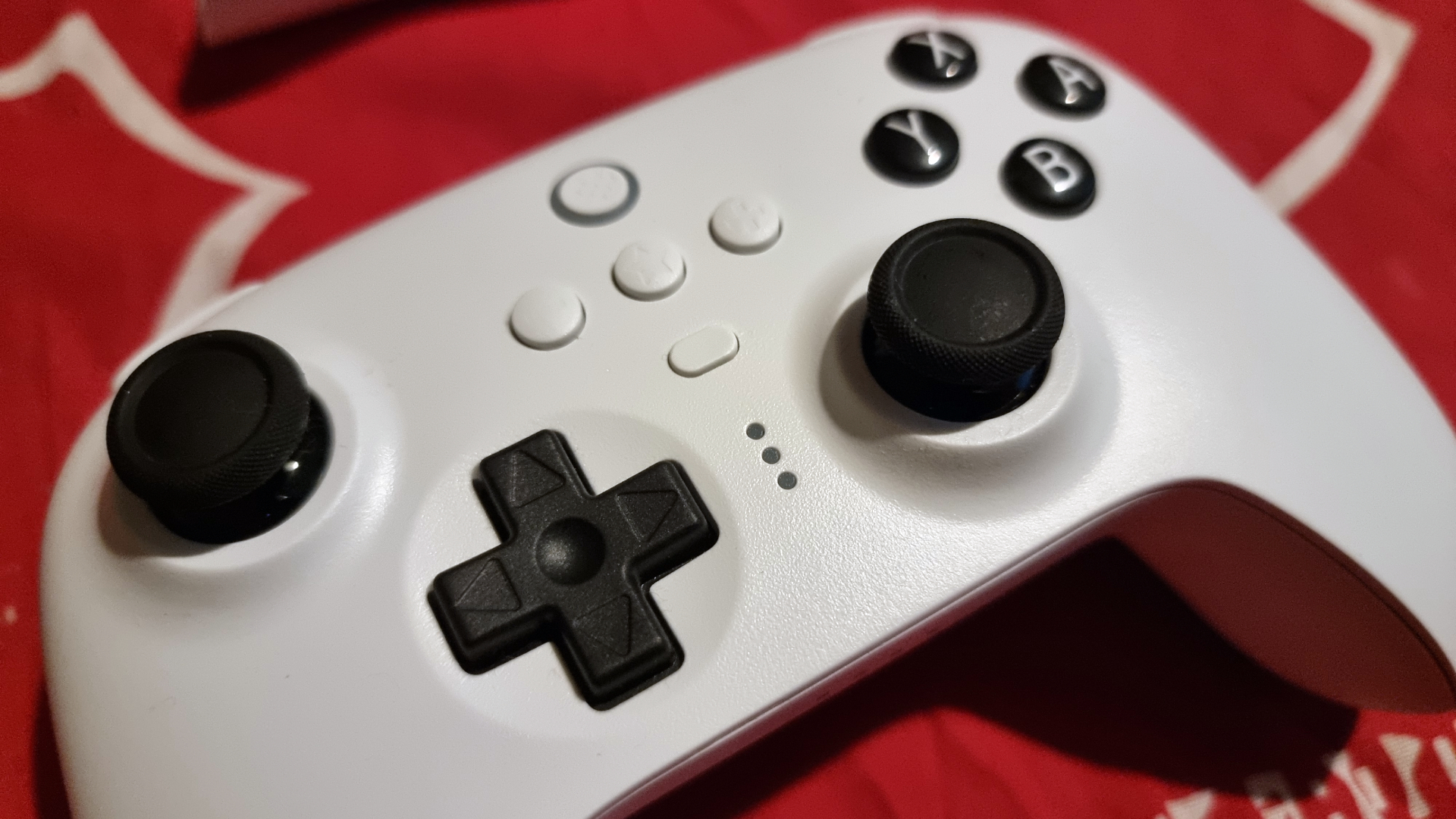
Buttons and sticks are also a step up above the Nintendo Switch Pro Controller. The analog sticks, triggers, and shoulder buttons are raised ever so slightly higher than on Nintendo’s pad, which we found to be an overall benefit to the comfort factor. ABXY face buttons are tactile, offering an improvement over the softer feel on the official Nintendo Switch pad.

Special mention has to go to the D-pad, too. It has a subtle concave design with slightly depressed grooves. As a result, it’s more textured than the Pro Controller’s flat design, and consequently more satisfying to use to play games made with digital input in mind such as Nintendo Switch Online’s various retro game libraries.

Design-wise, then, the 8BitDo Ultimate is remarkably close to perfection. The only flaw we can point to is that the central buttons (Plus, Minus, Home, sharing, and profile switch buttons) are all a bit too close together. This makes it easy to hit multiple buttons by accident. This becomes less of an issue once you’ve gotten a feel for it, but we wish these buttons were slightly more spread out. This would also alleviate the awkwardness of reaching your thumb over the right analog stick to hit the Plus button.

Performance

8BitDo Ultimate Controller

(Image credit: Future)

The 8BitDo Ultimate nails the design aspects, but it sticks to the landing when it comes to performance, too. First off, pairing the controller to Nintendo Switch via Bluetooth is effortless, achieved by simply holding the pad’s pairing button while in the console’s controller order menu.

The controller remained responsive when testing a variety of games. We primarily used it for Bayonetta 3 for its fast-paced combat that requires long sequences of button combos, as well as Splatoon 3 for its gyro aiming support. In both cases, the 8BitDo Ultimate was more than up to the task, never exhibiting noticeable input lag through its Bluetooth connection.

Battery life also fares well, as you’ll get roughly 20 - 22 hours on a full charge. It’s true that that’s about half of what the Nintendo Switch Pro Controller offers, but still more than enough for a handful of long gaming sessions. And thanks to the included charging dock, you’ll be back up to full after just a couple of hours, three at most from our experience. Charge your pad overnight and you’ll likely never run out of juice during the day.

And if you’re after more than what the default options present, the 8BitDo Ultimate Software app is available on Android and iOS devices. By pairing your controller to your phone, you’re able to completely remap your button layout. That includes the controller’s rear buttons in case you’d like a secondary mapping for a particular action. Macro creation is also supported, allowing you to bind multiple button inputs to a single one. It’s a robust app that also lets you tweak stick and trigger sensitivity for an experience that’s all yours.

Should I buy the 8BitDo Ultimate controller?

8BitDo Ultimate Controller

(Image credit: Future)

Buy it if...

You want a true ‘Pro’ controller for Nintendo Switch
The extra options afforded to players here outclass the Nintendo Switch Pro Controller, with greater options for customizability.

You’re after a multiplatform pad
Nintendo Switch is the primary console for the Ultimate, but it’ll also work on Windows PCs, iOS, and Android devices.

You’re on a budget
The 8BitDo Ultimate is slightly cheaper than Nintendo’s official gamepad and offers more options and overall higher build quality.

Don't buy it if...

You need a PS5 or Xbox Series X|S controller
The 8BitDo Ultimate may work on the platforms listed above, but owners of the competing consoles will need to look elsewhere.

You like in-game amiibo benefits
The controller doesn’t support NFC, so amiibo figures can’t be scanned for in-game bonuses.

You’re not after a ‘Pro’ controller
It’s about as affordable as ‘Pro’ pads get, but the 8BitDo Ultimate is still pricier than more basic options from the likes of PowerA, YCCTeam, and other third parties.

LG Tone Free T90Q

LG Tone Free T90Q: two-minute review

The LG Tone Free T90Q are the latest release from LG’s Tone Free range of true wireless earbuds. 

We were impressed with the very similar-looking LG Tone Free FP8, launched in April 2022. However, the one major difference here is that the T90Q now include Dolby Atmos head tracking support, delivering an immersive listening experience akin to Apple’s Spatial Audio in the AirPods Pro 2

We tried this out when the T90Q first launched, and wrote a highly complimentary feature detailing our delight at LG's head-tracked immersive solution when compared to our AirPods Pro. But of course, this is the full story: how they perform across the board. 

Another change for the T90Q (over the slightly older FP8) is that you can now transmit Bluetooth audio from analog sources now via the 3.5mm port in the charging case. This is a cool feature, although not everyone will have a use for it. 

These buds are clearly positioned as AirPods competitors with their stem-like design and we found them extremely comfortable to wear all-day-long. They come in a compact charging case with UV tech inside that LG claims kills bacteria on the silicone tips of the earbuds. (Does it really? We suppose yes, it must do. Did we want to think about it? Maybe no.) 

Elsewhere, LG gets top marks for its app, which comes packed with features and is among the easiest we’ve used. You’ll find Meridian EQ settings, ANC controls, a fit test and more.

Listening to music with the LG Tone Free T90Q earbuds is enjoyable, but that’s mostly thanks to the Dolby Atmos features. The sound quality and noise-cancellation is good, but doesn’t reach the levels of some of the best true wireless earbuds we’ve tested. 

Then again, these buds are cheaper than higher-end rivals and most people will be impressed by the immersive audio experience, the fit and all of the features within LG’s comprehensive app. Let’s take a closer look at the LG Tone Free T90Q true wireless earbuds.

TechRadar reviewer Becca Caddy wearing the LG Tone Free T90Q

LG's T90Q are device agnostic AirPods competitors, with their head-tracked Dolby-Atmos audio and those stems (Image credit: Future)

LG Tone Free T90Q: price and release date

  • Released September 2022
  • Cost $229.99 / £199.98  

The LG Tone Free T90Q true wireless earbuds were released in September 2022 in the US, UK and European markets but we don’t have confirmation concerning their availability in Australia just yet. 

They cost $229.99 / £199.98, although it’s worth mentioning that these buds were already discounted at the time of writing, to $179.99 / £149.98. This makes them a little more expensive than the LG Tone Free FP8 that came before them, yet significantly cheaper than the AirPods Pro 2 – nearly $100/£100 cheaper in fact. 

At that lower, discounted price they fall into a similar price bracket to the likes of the JBL Live Pro 2 earbuds and Huawei Freebuds Pro 2. To our mind, this is testament to the value of the LG Tone Free T90Q, as the immersive sound on offer here beats both of these buds – although the competitors arguably perform better in terms of overall audio. Not so easy then… 

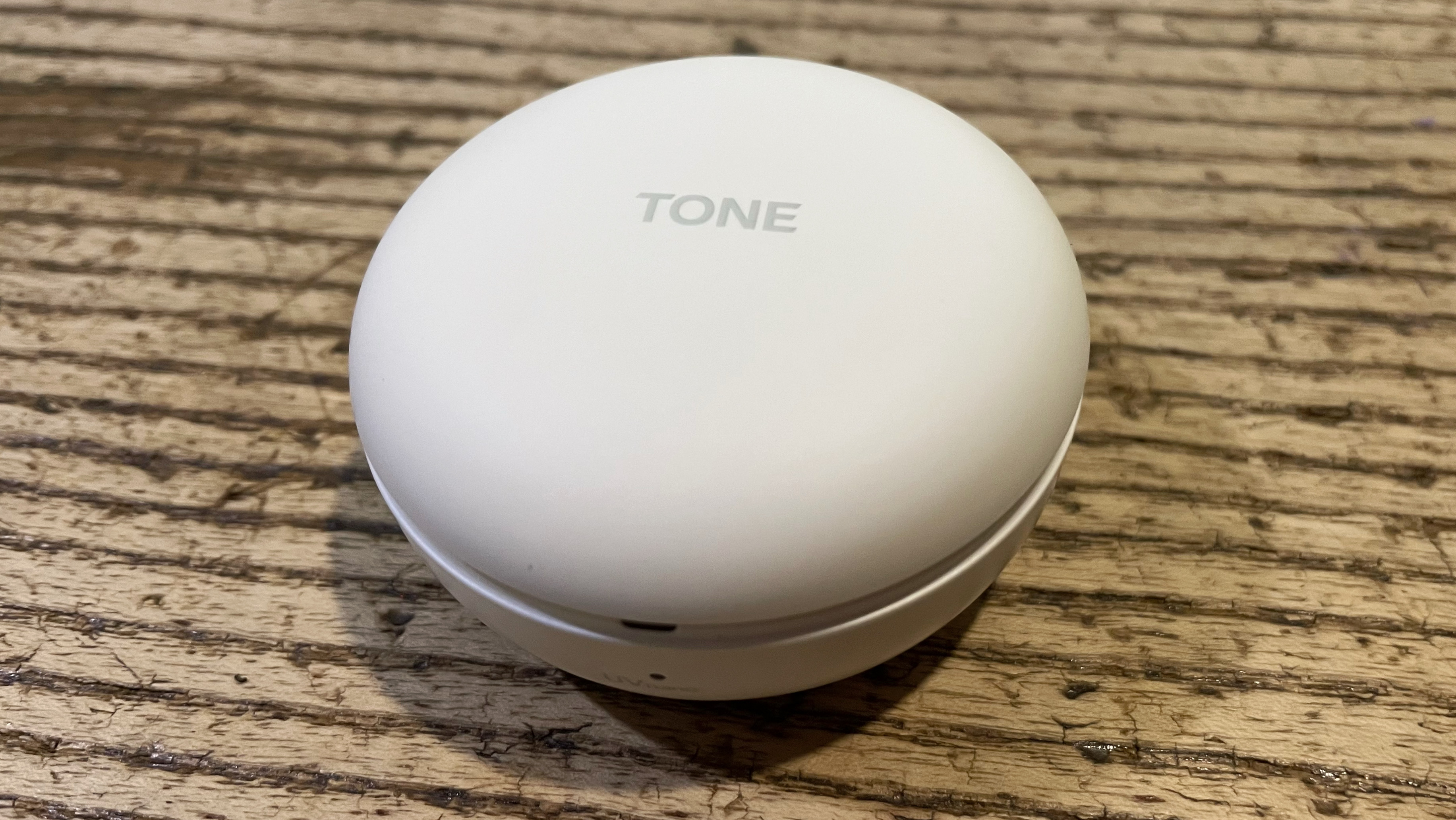
LG Tone Free T90Q case detail, on wooden table

The case is compact and even includes a UV light feature to “clean” 99.9% of the bacteria from the ear tips (Image credit: Future)

LG Tone Free T90Q: features

  • Touch controls work well
  • App is fantastic
  • A decent 9 hours of battery from the buds

At the top of the stems there are touch sensitive controls. Finding the right spot to activate them is tricky at first, but we like that when you do use them there’s a little sound for confirmation, like a soft button press. All the basics are covered here, including play/pause, calls and ANC modes, but within the app you can change them to whatever you like.

On that note, the LG Tone Free T90Q app is among the most comprehensive we’ve ever tested. You’ll find dozens of options for customizing your buds here, all from a simple-to-use and clean interface.

There’s a fit test, which ensures you’ve got the correct size eartip and a good seal for ANC, multi-point pairing settings, a find my earbuds feature, options for toggling auto play/pause on/off, ANC controls, the Dolby Atmos head tracking mode and Equalizer Settings. 

You’ll get 9 hours of battery life from the earbuds with ANC and Dolby Atmos off and 29 hours total if you count the charging case too. With ANC on, you’ll get around 5 hours – which is acceptable rather than excellent, although there’s a useful quick charging feature that’ll give you roughly an hour of play for about five minutes of charging. A handy LED indicator on the side of the case goes from green when you’re at full charge to yellow then red when it’s empty.

Another cool feature of the LG Tone Free T90Q charging case is that you can turn it into a Bluetooth transmitter. Just plug one of the accompanying cables into the case then into a digital or analogue audio source. Let’s say you’re on an aeroplane and don’t want to use the free wired headphones the airline provides. No problem! You can simply  connect the case and listen with your T90Q buds instead. 

There’s multipoint pairing here, so you can connect the buds up to both a phone and a laptop if you need to. This is handy for working and moving between calls and music streaming and the app makes this simple to understand by showing the different devices you’ve connected to. 

  • Features score: 5/5

LG Tone Free T90Q earbuds close-up, showing their small design

The top of the stems is where you'll find touch sensitive controls. Finding the right spot is tricky at first, but when you get it, there’s a reassuring confirmation sound.  (Image credit: Future)

LG Tone Free T90Q: design

  • AirPods-style stems
  • Super comfortable
  • Charging case is compact

The LG Tone Free T90Q are small, light at 5.3g and super comfortable to wear. They have a smooth design with silicone tips that fit in your ear canal and a stem that hangs down outside your ear. If you’ve seen or worn Apple’s AirPods, you’ll be very familiar with this aesthetic and feel. 

The LG Tone Free T90Q have an IPX4 water resistance rating, which means you can’t shower with them but they should handle sweating during exercise. On that note, we wore the LG Tone Free T90Q during several workouts and although they did come a little loose during a jog, we were impressed with how snugly they fit considering they’re not marketed as exercise or fitness buds.

The accompanying charging case has a small, circular, pebble-like design – a welcome change to all the pill box-shaped cases we’ve tested recently. The buds are part of LG’s UVnano range, which means the charging case has an ultraviolet light inside that LG says can “clean” 99.9% of the bacteria from the ear tips of the buds. We’re conflicted about whether this is a useful addition or a bit of a gimmick. (Although opening the case to see the glowing blue light is very cool.)

  • Design score: 4/5

LG Tone Free T90Q on wooden bench

The small, circular, pebble-like design of the case is both pocketable and a welcome change from the ubiquitous pill-box shape of AirPods.  (Image credit: Future)

LG Tone Free T90Q: sound quality and ANC

  • Dolby spatial audio tech is fantastic
  • Sound is good, but it's a shade off audiophile quality
  • ANC is acceptable rather than great

The LG Tone Free T90Q are the first wireless earbuds to use Dolby Atmos head tracking tech. What that means is these buds can track your head movements, altering the soundstage of the track, film or video game to make you feel truly immersed (Apple's top-tier AirPods can do this too, of course, but you have to be streaming from an Apple device to get the head-tracked enhancement. That's not the case here). 

We listened to the Spatial Audio track Frisco by Little Dragon through Apple Music and we were really struck by how much it feels like you’re watching the band perform live when the Dolby Atmos feature is switched on. Bass was thumping around us, but when we moved our head to the left, the right bud dominated, just as if we’d turned our head away from the stage. 

This feature is a rival to Apple’s Spatial Audio feature with head tracking, which you’ll find in its top tier AirPods Pro (first or second-generation), AirPods Max, AirPods (third-generation only) and Beats Fit Pro. However, if we had to choose, we prefer LG’s solution. Why? We find Apple’s proposition more subtle and, let’s face it, less fun – although it is worth mentioning not everyone will enjoy this feature as much as we did and might deem it a novelty than a necessity. 

The EQ settings on offer in the app are powered by Meridian and you can choose from Immersive, Natural, Bass Boost, Treble Boost or 3D Sound Stage. There’s a huge difference between each of them, delivering a completely different listening experience each time. We found the Bass Boost powerful, and Immersive created an expansive sense of space with you at the centre. You can customize the EQ too, with no fewer than eight sliders across low, mid and high frequencies to play around with. 

All in all, each option presents a fun and zealous performance though, rather than a collection of integrated hi-fi sound profiles. Nuance, extra increments of detail and refinement are not the name of the game here – the sound is good quality, but it's not for the audiophile in your life. 

Active noise cancellation works well. The buds almost completely silence the sound of a fan whirring next to us as we write this, as well as a conversation on the other side of the room. Louder sounds are dampened, but they will get through. Although that’s to be expected and only a few buds, such as the Bose QuietComfort Earbuds 2, provide a significantly improved experience. An Ambient Sound mode is handy and you can choose between Listening mode, which lets any environmental noise pass through, or Conversation mode, which makes voices particularly clear. 

Call quality is decent and works notably better indoors where there are fewer competing sounds. In those cases, the buds struggle a little but still preserve your voice on the other end. This isn’t a huge deal, but is worth considering if you tend to use earbuds to make a lot of calls throughout the day. 

  • Sound quality score: 4/5

LG Tone Free T90Q earbuds on a wooden table

LG Tone Free T90Q earbuds present a compelling case (both literally and figuratively) but do they represent value for money? We're not so sure.  (Image credit: Future)

LG Tone Free T90Q: value

  • Dolby Atmos head-tracked audio is excellent
  • Loads of features
  • Budget options don’t come close

It’s difficult to comment on the value of the LG Tone Free T90Q earbuds, but it's our job to try. At a mid-range price they certainly check a lot of boxes (and create a few new ones other products cannot check, too), delivering solid audio, lots of customization features and a great fit in an OS agnostic package – as well as the ability to use the case as a Bluetooth transmitter and deploy that bacteria-zapping case.  

Some people are going to love those more unique features, such as trying out Dolby Atmos head tracking and popping the buds back in the UV case. However, others might not consider those important, in which case the buds lose a bit of their appeal and you’d be better off opting for a cheaper rival such as the JBL Live Pro 2 or Audio-Technica ATH-SQ1TW instead. 

  • Value score: 3.5/5

Should you buy the LG Tone Free T90Q?

LG Tone Free T90Q
Attributes Notes Rating
Features An impressive suite of features and excellent app, plus unique head-tracked Dolby Atmos 5/5
Design Compact case, comfortable design and touch-sensitive stems 4/5
Sound quality Fun sounds and wild head-tracked spatial audio, but they're not the last word in sonic detail 4/5
Value It's tough to call: some excellent original features, but a tad pricey if you prioritize sonic chops 3.5/5

Buy them if…

Don't buy them if…

Also consider…

If our LG Tone Free T90Q review has you considering other true wireless earbuds, then take a look at some of our top recommendations below.

Tuesday, November 29, 2022

Antwi H10 electric scooter review: snazzy-looking e-scooter for urban flats

Antwi H10: One-minute review

The Antwi H10 is a quirky electric scooter from London-based Antwi, a newcomer in the electric scooter market. It features a 300W motor that provides enough power to take you from A to B quickly, especially if A and B aren’t from each other. Said motor isn’t the most powerful on the market, and it might struggle to get you up hills. 

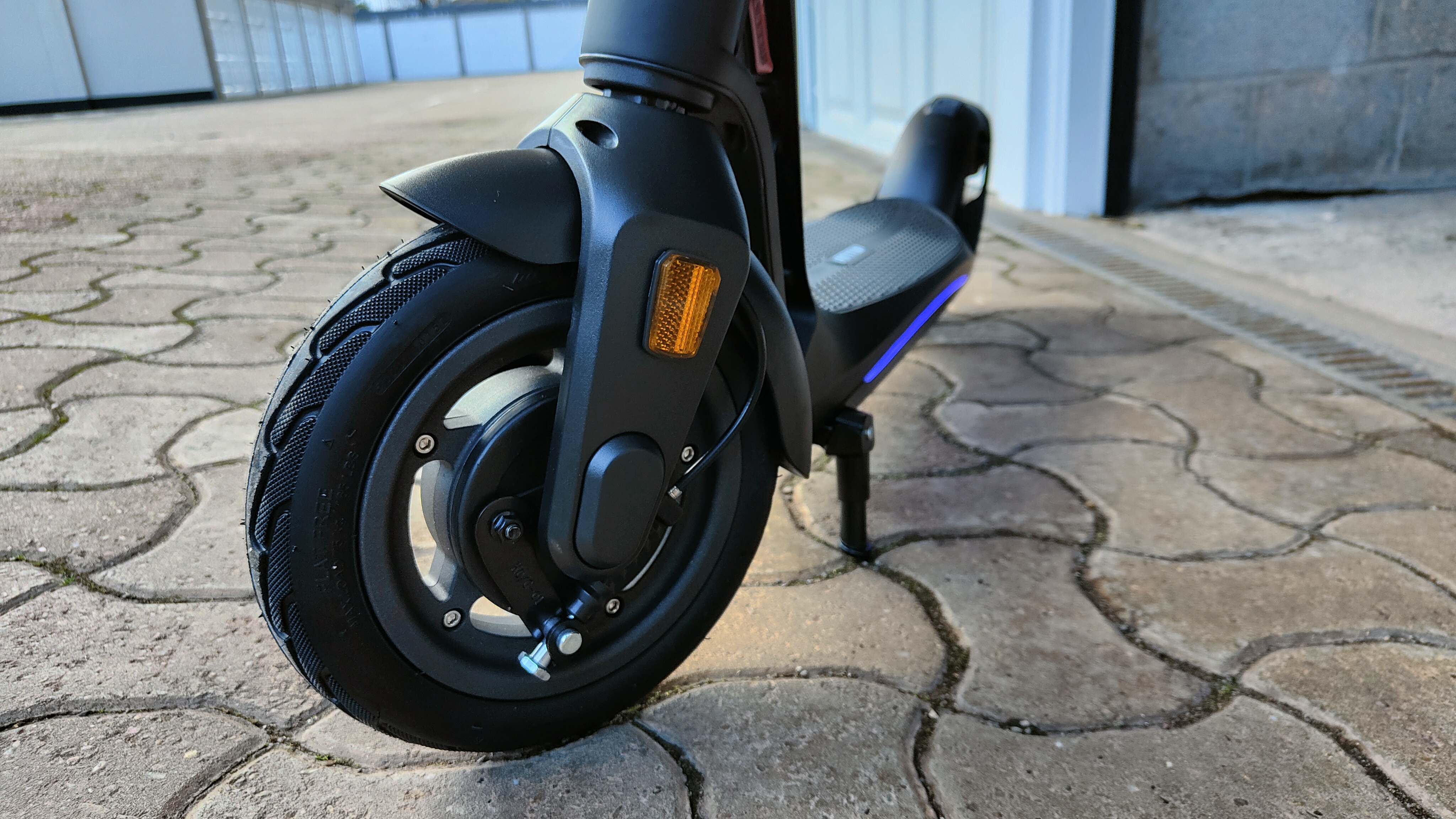
Thanks to its foldability, the Antwi H10 can be carried around easier than full-size scooters, making it all the more ideal for commuting. The ambient light under the deck not only looks fun, but when combined with the bright front and rear lights, it ensures you’re always visible on the road, no matter the light conditions. The puncture-free tyres provide a firmer ride, but in return, you don’t have to worry about getting a flat when you’re out and about.

The Antwi H10 is definitely not the best cheap electric scooter; there are many inexpensive models on the market with similar specs. It’s also not the best electric scooter. But, it’s decent enough and looks kind of fun, too. Although the deck is tall enough, the lack of motor power makes the Antwi H10 less suitable for off-road adventures.

Antwi H10: Price and availability

  • How much does it cost? £499 (approx. $593/AU$875)
  • Where is it available? Available now
  • Where can you get it? Currently only available in the UK
Antwi H10: SPECS

Motor: 300w
Top speed: 25km/h (15.5 mph)
Range: 25km/15.5mls
Braking system: Mechanical drum brakes, Rear E-ABS electronic brake + Regenerative braking (KERS)
Weight: 15kg/33Lb
Max load capacity: Approx. 100 kg/220Lb 

The price of the Antwi H10 Electric Scooter is on par with the second-gen Pure Air Pro, which makes it one of the more expensive scooters on the market. There are many cheaper scooters available, including the also 2nd generation Pure Air Go and the Segway Ninebot F25E, both featured in Techradar’s best electric scooter guide.

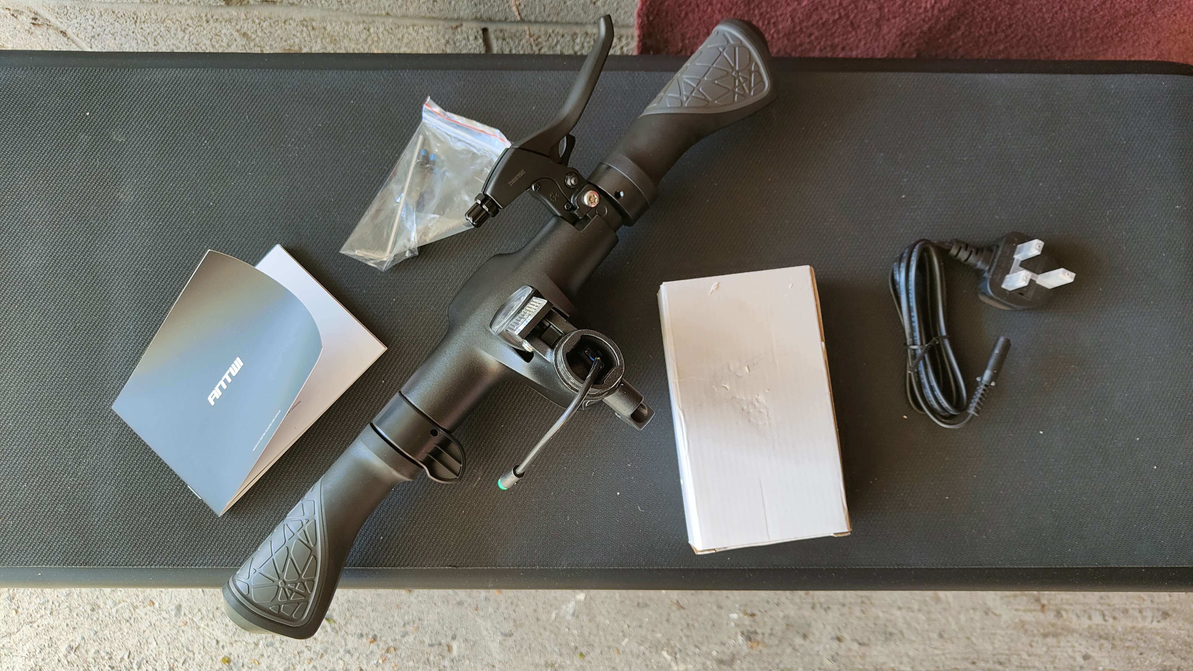
Antwi’s H10 e-scooter is currently the only product they offer, and they only ship in the UK, sadly. The scooter is only available through Antwi; no third-party retailers stock it, although it might change in the future. In the box, you’ll find the e-scooter itself, an 84w wall charger (UK plug), a hex tool and screws (see Setup section below) and the manual.

  • Value: 3 / 5

Antwi H10 in a private space

(Image credit: Future / Matt Kollat)

Antwi H10: Setup

  • Arrives pretty much ready to go
  • All tools included in the box
  • Brake cable needs to be attached by the user

The Antwi H10 Electric Scooter arrived in a slim box. Two boxes, actually: a nondescript cardboard box outside to ensure the inner box with all the branding stayed intact. The scooter was secured with plenty of polystyrene dividers inside the box. Getting the scooter out of the box was easy; all parts and nits were stacked in a way that made sense.

Assembling the scooter was easy, as all I had to do was to secure the handlebar to the main column with the four screws and the hex key that was also provided in the box. I used my own hex key, as it would’ve taken me a bit longer to tighten all the screws with the small tool provided in the box.

The one thing I found slightly worrying is that the brake cable needs to be attached to the lever by the user. I appreciate the handlebar comes fully detached from the main column, but still, it would have been best to have the cable attached in the factory to ensure maximum safety later. The manual (also included in the box) explains how to attach the cable, though.

Once you have done the screws and attached the cable, the Antwi H10 Electric Scooter is essentially ready to go. It even had some charge, so I could fire it up and take it out for a little ride without having to charge it, which is a nice touch, as I imagine people can’t wait to ride their new e-scooter once they receive it. All in all, a simple and straightforward process.

  • Setup: 4 / 5

Antwi H10 in a private space

(Image credit: Future / Matt Kollat)

Antwi H10: Design

  • Integrated ambient lighting and brake light
  • Lightweight magnesium alloy frame
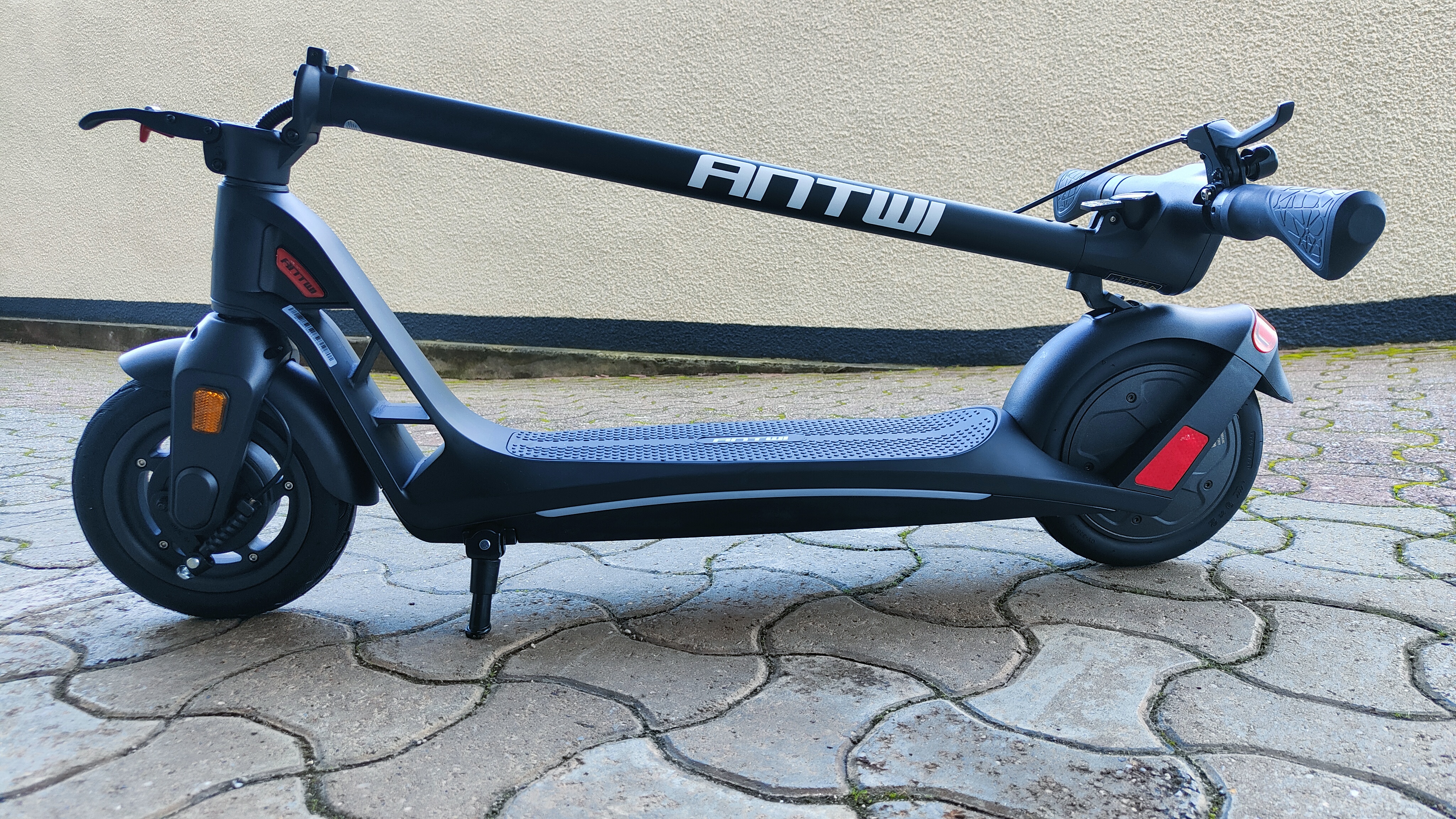
  • Column folds without resistance

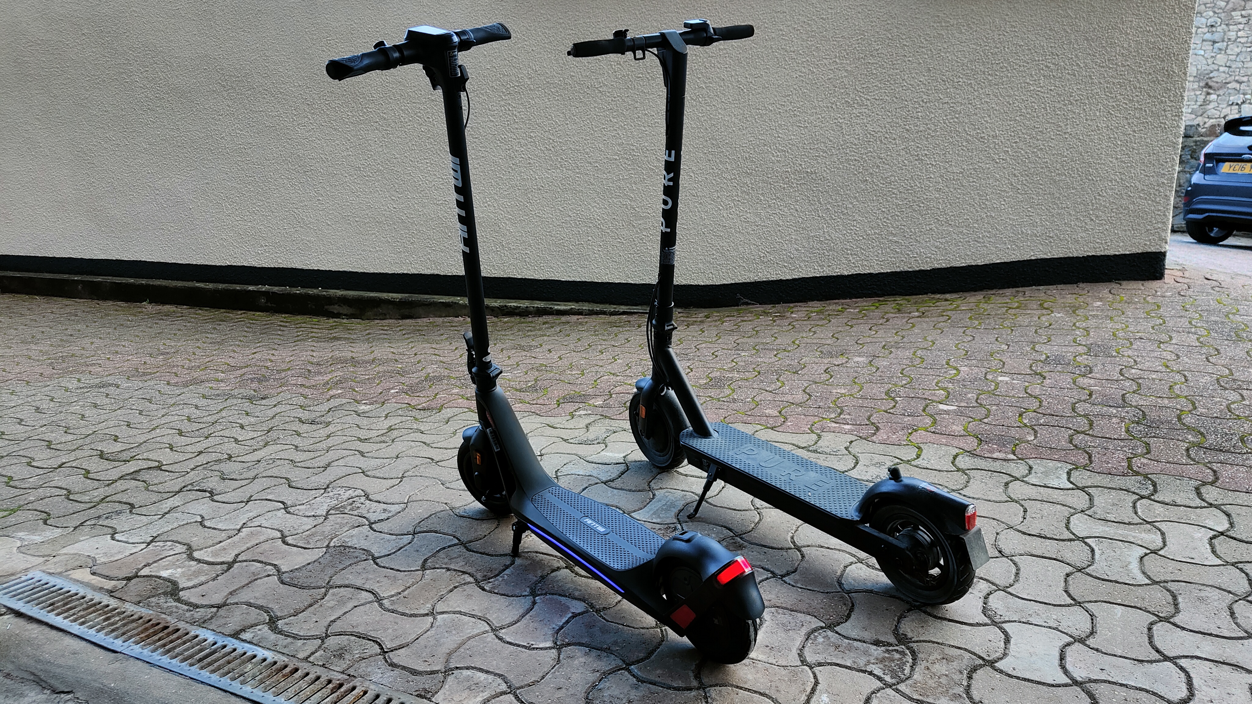
The Antwi H10 Electric Scooter has a lightweight folding design, making it ideal for commuting to and from work (where it can be used for such purpose, e.g. not in the UK). It has similar dimensions to the 1st-gen Pure Air Pro – same height, same width and more or less the same length, too. Despite the matching dimensions, the Antwi H10 is lighter than Pure’s model, probably thanks to the magnesium alloy frame that provides shock absorption without compromising rigidity.

Antwi H10 in a private space

(Image credit: Future / Matt Kollat)

The column folds easily, maybe a bit too easily. When you loosen the clasp – which is easy to do – the column practically starts falling straight away unless you hold onto it. This is not a big hindrance, but you must make sure it’s secure when folding the scooter or when securing the clasp. The kickstand is short and stocky but seems to support the scooter fine.

Antwi H10 in a private space

(Image credit: Future / Matt Kollat)

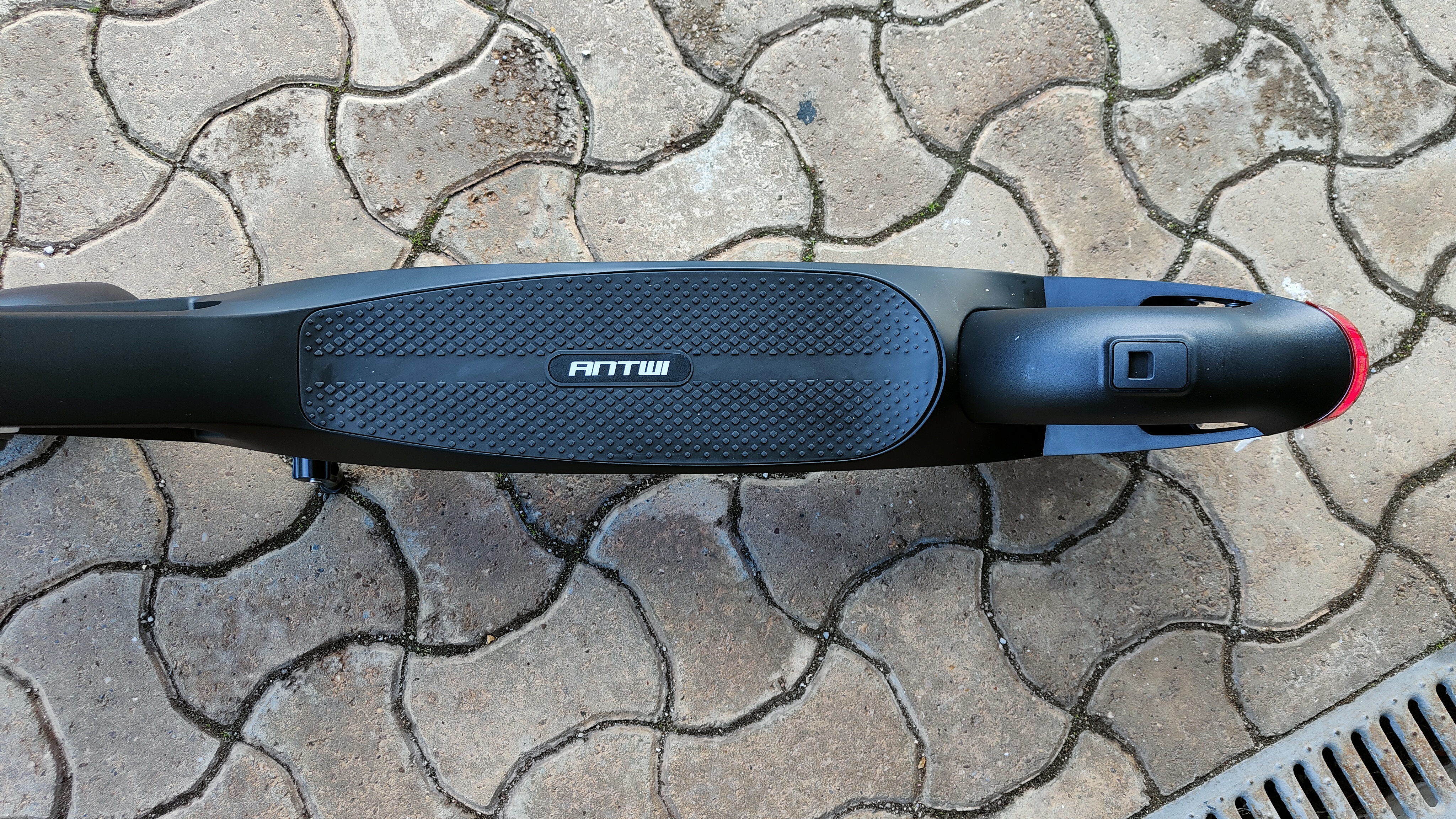
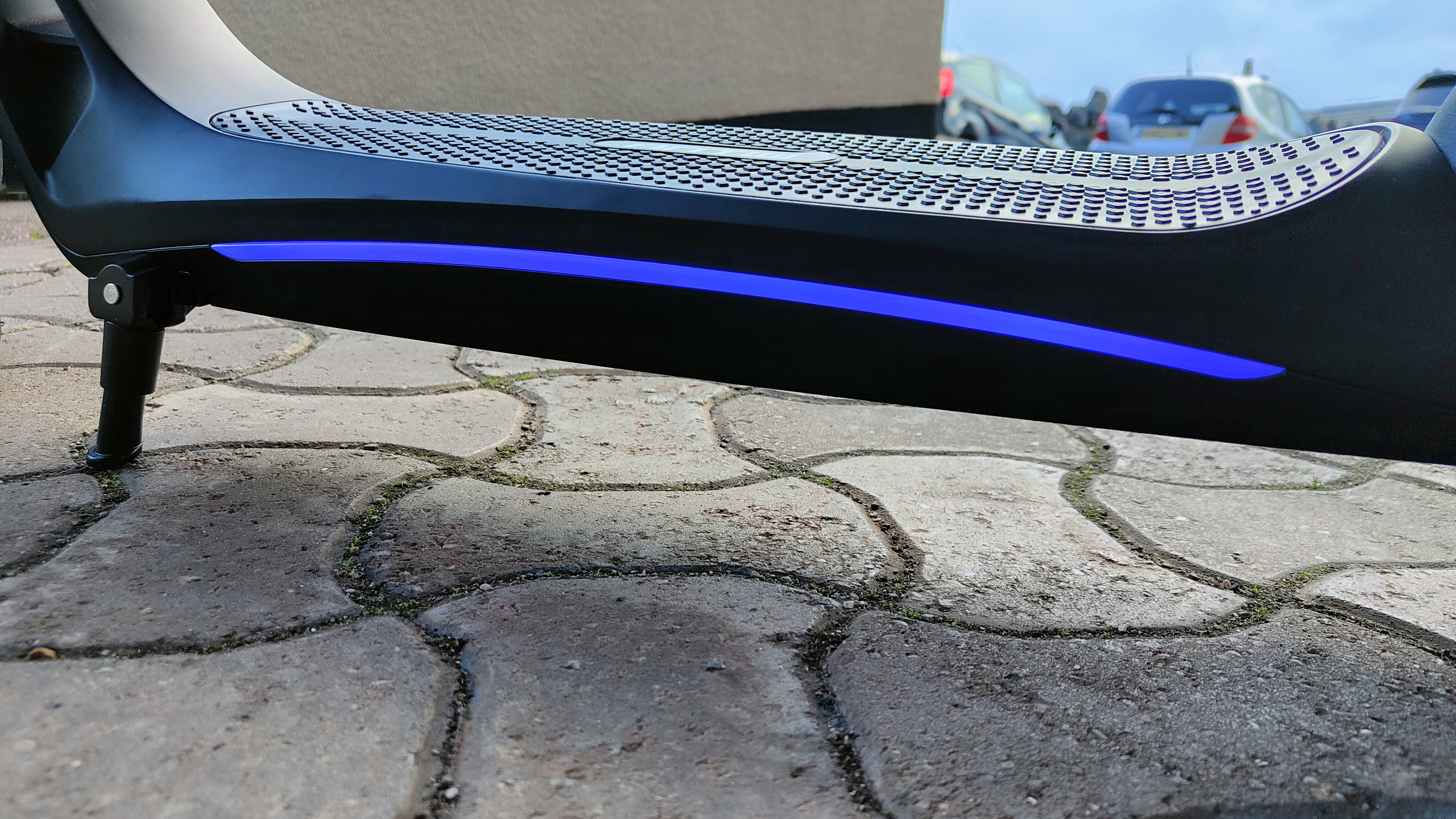
The deck is a decent size and has a tear drop-like shape that narrows towards the column at the front. The section connecting the steering column and the deck has triangle-shaped cutaway sections. These reduce overall weight and help the Antwi H10 look different from other electric scooters on the market.

Antwi H10 in a private space

(Image credit: Future / Matt Kollat)

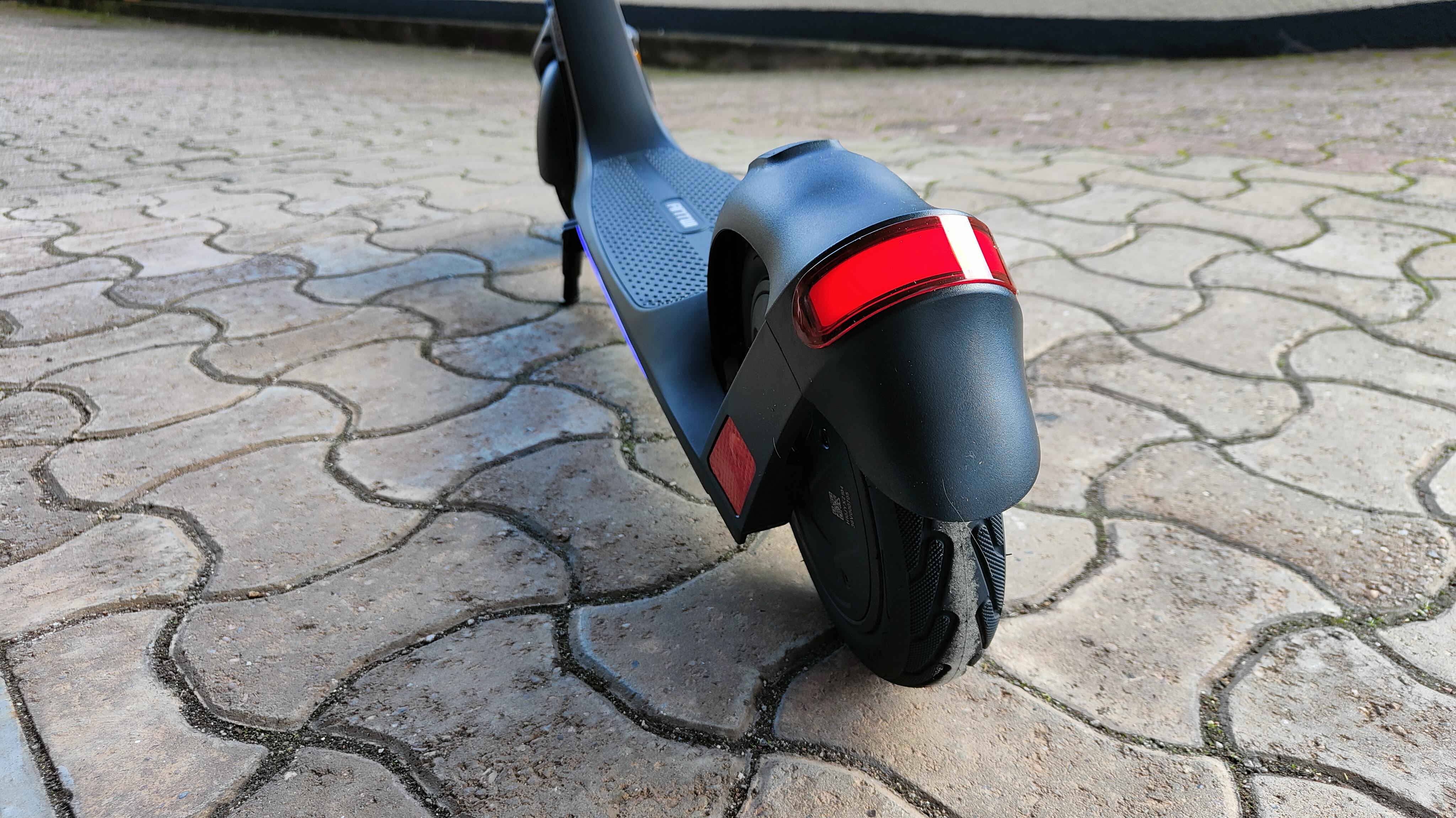
The integrated ambient lighting under the deck also helps the H10 stand out from the crowd. This blue light, as well as looking cool, increases visibility. The front and rear lights are also bright – Antwi claims the rear lighting has been manufactured and approved according to the standards of the automotive industry.

Antwi H10 in a private space

(Image credit: Future / Matt Kollat)

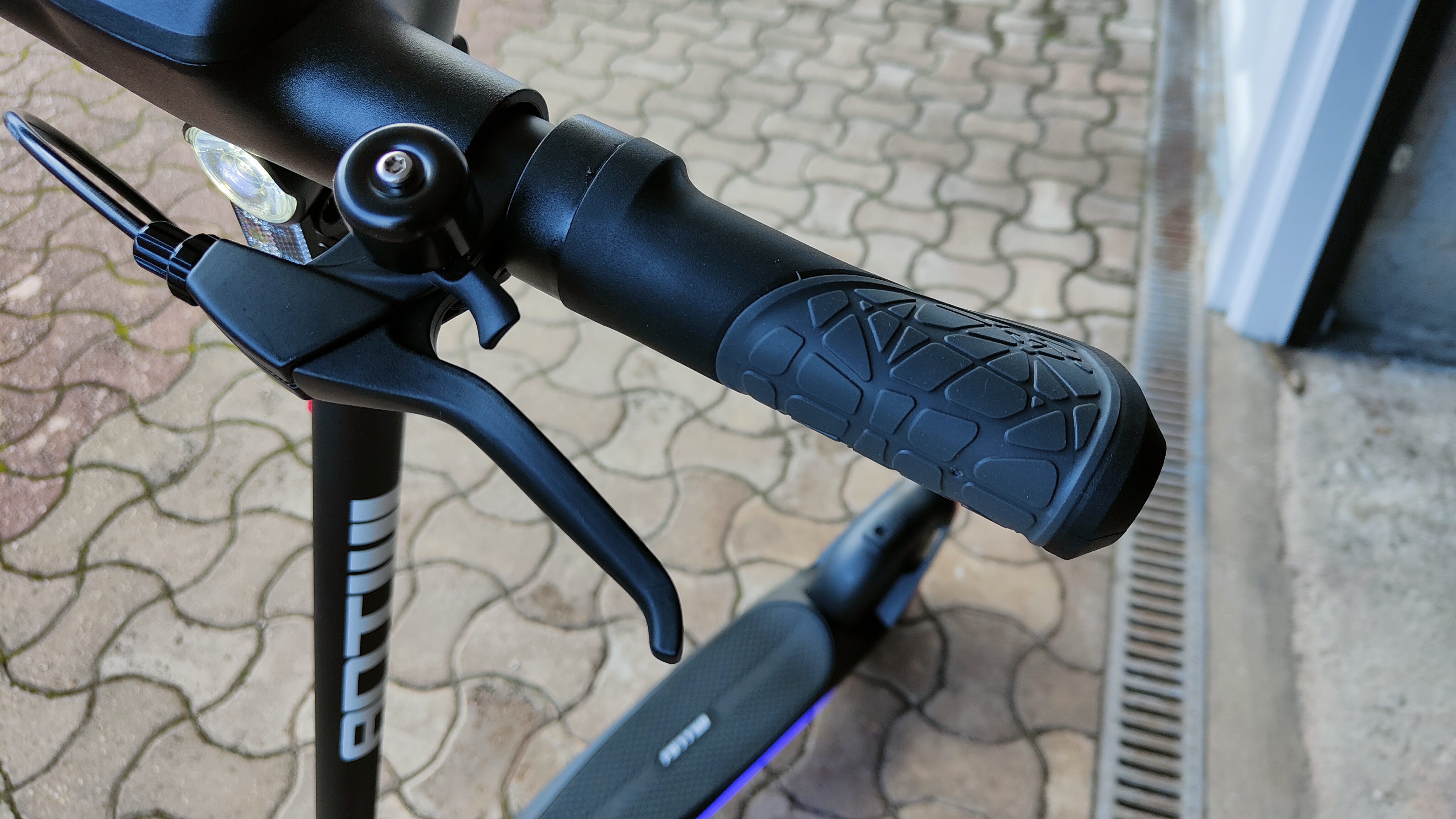
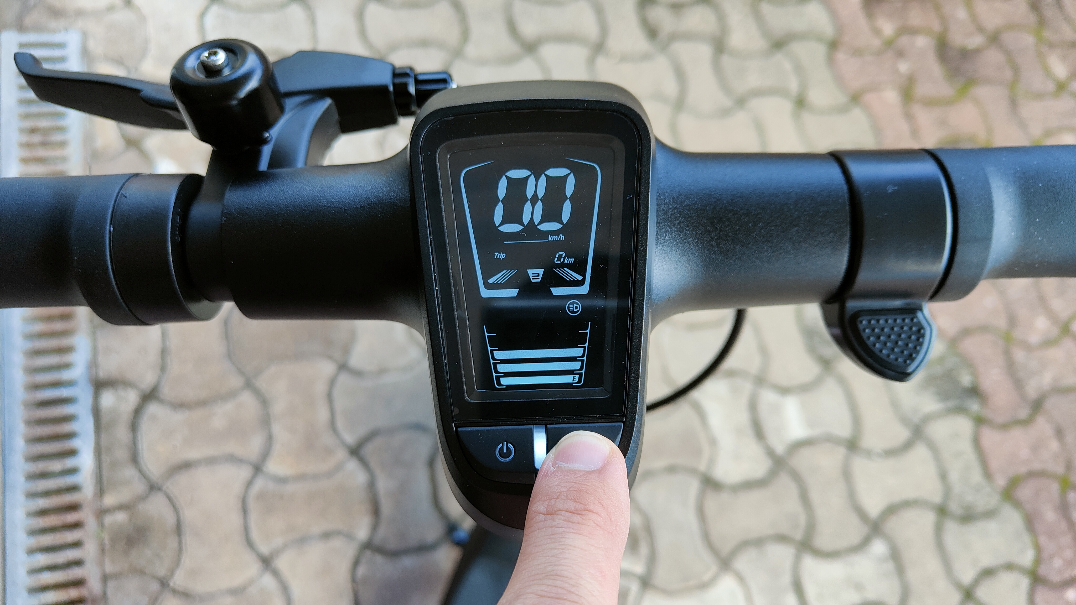
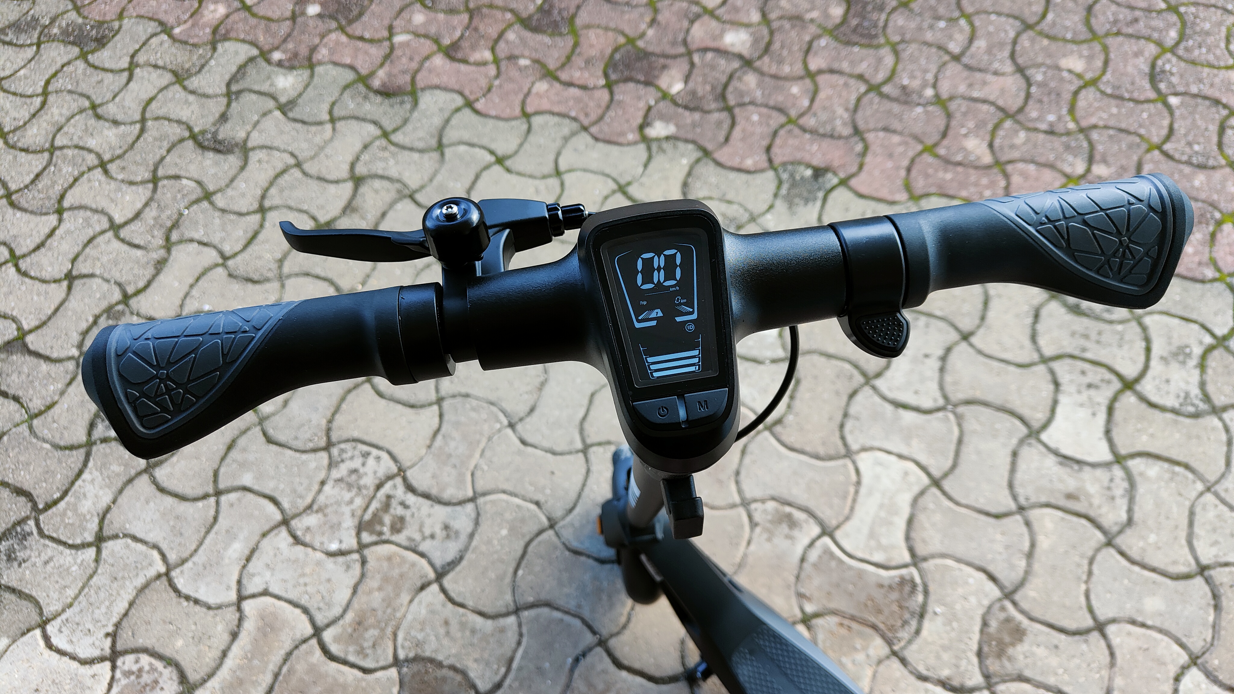
The handles are wide, which are comfortable to hold and feel stable in hand. The handlebar is straight and just the right width (at least it was for me, and I'm 6”1’). The dashboard in the middle of the handlebar is easy to read and displays information about speed, trip length, battery status, which mode the scooter is currently in (there are three), and lighting (on/off). The display is bright enough to read in broad daylight. 

  • Design: 4 / 5

Antwi H10 in a private space

(Image credit: Future / Matt Kollat)

Antwi H10: Features

  • Rear E-ABS electronic brake + Regenerative braking (KERS)
  • Battery chagrin info would be handy

In terms of features, the Antwi H10 isn’t the most well-furnished electric scooter out there. There is no app support for ride stats and battery information or for features like ‘find my scooter’. There is no anti-theft protection, and the battery isn’t removable either, so there is no way to swap them in and out to extend the 25 km range. And although there is no fast charging either, the Antwi H10 has a rear E-ABS electronic brake and regenerative braking (KERS).

Antwi H10 in a private space

(Image credit: Future / Matt Kollat)

In case you’re unfamiliar with the technology, Kinetic Energy Recovery System – or KERS for short – helps recharge the battery by recovering some of the kinetic energy during braking. Don’t expect this to fully charge your battery, but at least KERS will top it up slightly. Speaking of charging, the only way to tell whether the scooter is chagrin or not is by looking at the little LED light on the charger box – it would’ve been nicer to display how long is left until the H10 is fully charged via the dashboard.

  • Features: 3 / 5

Antwi H10 in a private space

(Image credit: Future / Matt Kollat)

Antwi H10: Performance

  • Silent operation
  • 25 km range
  • Slightly jerky electronic brake

I enjoyed riding the Antwi H10 scooter. Its 300W motor is agile, albeit not the most powerful, but strong enough to move you forward on flat surfaces. Antwi claims the H10 has a 14-degree maximum climbing angle; I’d say don’t expect it to zoom up hills. Even if it manages to climb smaller inclines, the effort will drain the battery quickly.

Antwi H10 in a private space

(Image credit: Future / Matt Kollat)

There is no need to kick-start the Antwi H10; the motor has enough power to move you forward from a stationary position. It also has plenty of braking power, thanks to the rear E-ABS electronic brake system. I always find scooters with electronic-only brake systems a bit risky – what happens if the battery gives in? How am I going to slow down, then?

Not like this happened to me while testing the Antwi H10 scooter. Nor did I have range anxiety, despite the relatively small range (25km/15.5mi), although considering you can’t use electric scooters on public roads in the UK, where the Antwi H10 is sold, I guess there isn’t much point talking about range anxiety. Even if we could use electric scooters on roads, I would probably use the Antwi H10 for shorter trips in the city.

One thing I really liked about this scooter was how quiet it was. I’m sure pedestrians wouldn’t think the same, but apart from the quiet whirring of the motor, the Antwi H10 hardly made any sound. And even though the flat-free tyres are solid, riding the scooter didn’t rattle the life out of me; excellent. 

  • Performance: 3 / 5

Should I buy the Antwi H10?

Antwi H10 in a private space

(Image credit: Future / Matt Kollat)

Buy it if...

Don't buy it if...

Also consider

Antwi H10: Report card

Value The price of the Antwi H10 Electric Scooter is on par with the second-gen Pure Air Pro, which makes it one of the more expensive scooters on the market. 3 / 5
Setup The brake cable needs to be attached by the user, but it isn't hard to do so. 4 / 5
Design Snazzy-looking with fun deck lighting, e-scooter lovers will find it appealing. 4 / 5
Features There aren't a lot of extra features here, but the regenerative brake is nice. 3 / 5
Performance Boasting solid tires and a quite yet agile motor, the H10 is a good-performing electric scooter for urban commutes. 3 / 5
Total The Antwi H10 is a snazzy-looking scooter is fun to ride. If only it has a bit more power. 3.5 / 5
  • First reviewed November 2022

How we test

We pride ourselves on our independence and our rigorous review-testing process, offering up long-term attention to the products we review and making sure our reviews are updated and maintained - regardless of when a device was released, if you can still buy it, it's on our radar.

Read more about how we test

Adobe Illustrator 2023 (v27) review

Adobe Illustrator is a powerful, complex, and highly versatile vector-based graphic design software that has been around for what seems like forever. As such, it has greatly evolved since those early days, has legions of dedicated professional users, and keeps going from strength to strength. Case in point, Adobe released version 27 in October (also called Adobe Illustrator 2023), and we thought we’d check out what the newest features bring to the table.

This latest update doesn’t introduce earth-shattering concepts or features - however, Illustrator was already a very powerful, versatile and stable behemoth. What’s brought to the table simply improves upon an already excellent tool.

Adobe Illustrator 2023: Pricing & plans

  • If you love subscriptions, you’ll love what Adobe has to offer 

Adobe is a subscription powerhouse: all of its professional software can only be obtained that way. The advantage, of course, is you’ll be able to download and use the latest features as and when they’re released. Major releases like this one are only part of the story, as new tools and improvements go live throughout the year. 

The downside of course is you need to pay every month, but if this is your bread and butter, the cost is more than justified.

As usual, you’re able to solely pay for Illustrator on its own, through a monthly subscription ($32 / £31) or an annual subscription, paid monthly for $21 / £20. There’s also a single annual subscription, which runs to $240 / £239. 

However, the incentive is to embrace the entire Adobe Creative Cloud portfolio, which can be yours for a monthly or annual subscription, and offers access to Illustrator, Photoshop, InDesign, Lightroom, and plenty more. Considering these creative apps are designed to work together, going for the full Creative Cloud experience is often the way to go.

If you’re new to Illustrator though, and don’t want to commit just yet, Adobe offers you a 7-day free trial to check it out.

  • Pricing & plans: 4/5 

Adobe Illustrator 2023: Intertwine

Adobe Illustrator graphic design software in action

Creating complex overlapping shapes is now easier than ever  (Image credit: Adobe)
  • A clever feature that can help create more complex interactions between objects 

The new tool that’s getting a lot of attention is Intertwine. As you know, you can design with layers. Adding shapes on different layers allows you to move them around independently, and overlap them. But what happens when you want to create complex overlaps, like a part of a circle on top one, but under others? You could do it before of course, but it involved a lot of copying and pasting.

Intertwine is designed to greatly speed up the process by swapping the layer order solely at user specified sections.

You activate it from the menu bar, which turns your cursor into a lasso. Circle around the area you wish to swap and once the loop is closed, the change is instantaneous. You can do this as many times as you need. There’s also an option to remove all changes or edit them further.

Be aware though that the positions of those swapped sections are fixed on your canvas. They aren’t linked to the affected objects. So, if you move an object after the effect has been applied, and you might see some strange and unexpected results, as the swap starts to affect other parts of the object you’re moving around.

  • Intertwine: 4.5/5 

Adobe Illustrator 2023: Collaboration & cross-app compatibility

Adobe Illustrator graphic design software in action

Allow people to download your work, or simply provide comments and advice - it’s all in the ‘Share’ menu  (Image credit: Adobe)
  • Working while collaborating within the app - shows potential but still in its infancy 

Being able to work with others, and across programs is becoming more and more crucial to our workflows, and Illustrator doesn’t disappoint in the online collaboration stakes.

The blue share button, top right of the interface, grants you access to ‘Invite to Edit’ and ‘Share for Review’ (which is currently in Beta).

In either case, obviously, you’ll need to upload your project to Adobe’s Creative Cloud. Once done, you’ll be offered a link which you can copy and share with others. As expected, you have control over who gains access to your work: those you specifically invite, or anyone who knows the link.

‘Invite to Edit’ allows people to mark your design by drawing on it and commenting, or (if you allow it) lets them download a copy of your file to their own account. They obviously have to be logged into their own Creative Cloud account for that. Commenting can be done as a guest.

‘Share for Review’ is like the commenting part of ‘Invite to Edit’, without any ability to save a copy of the work. You can’t even right-click on the image to save that as a PNG, as you can with ‘Invite to Edit’.

Although useful, it feels weird that those two options aren’t actually rolled into one. ‘Invite to Edit’ already offers all the features of ‘Share for Review’, and you can add all the restrictions you want there as well should you want to prevent the downloading of your work.

That aside, being able to communicate and collaborate with others, with the ability to comment from a web browser without even having an Adobe account, can be extremely useful and valuable.

As for compatibility across apps, you can now copy and paste text between Illustrator and InDesign (and vice versa), while retaining its format. This can be a huge timesaver.

  • Collaboration & cross-app compatibility: 4/5

Adobe Illustrator 2023: Quick Actions

Adobe Illustrator graphic design software in action

An interesting addition, but the paltry number of actions available make it feel more like a gimmick than anything else  (Image credit: Adobe)
  • This interesting new feature can become a huge time saver - when more options are added 

Quick Actions is an interesting one. As the name suggests, you’re able to perform what could be considered complex changes with the click of a button. These range from color alterations, to text modifications. 

They live in the Search panel, they’re fun and easy to use, and once applied, they’re also editable, so that’s a big plus. But there’s only 5 of them. Maybe Adobe will add more of them as time goes on? Until then, it feels more like a gimmick than anything else. 

  • Quick Actions: 2.5/5 

Adobe Illustrator 2023: Other improvements

  • New file format supports and performance improvements are always most welcome 

You’ll also find some under the hood improvements, like support for additional 3D file formats, such as glTF and USDA. These are compatible with Adobe Substance and other 3D apps.

If you work with linked files a lot, especially PNG formats, you’re bound to appreciate the performance improvements in this latest version. Files containing such links now open more quickly, and dragging objects around the canvas feels much more responsive than before.

  • Other improvements: 3.5/5 

Adobe Illustrator 2023: Scorecard

Pricing & plans Subscription-only via standalone sub or All Apps 4
Intertwine A very clever feature designers will love 4.5
Collaboration Shows great potential but needs work 4
Quick Actions Interesting start, with a lot of room to grow 2.5
Other improvements Welcome support for file formats 3.5

Should I buy?

Adobe Illustrator graphic design software in action

Adobe Illustrator’s latest version brings some interesting tools to an already extremely powerful application  (Image credit: Adobe)

Buy it if...

Don't buy it if...

Adobe Illustrator 2023: Alternatives

Affinity Designer from Serif is an excellent alternative to Adobe Illustrator, seeing some impressive upgrades in the latest version.  

We've also tried out the best free Adobe Illustrator vector alternatives if that's what you need.

Monday, November 28, 2022

His Dark Materials season 3 review: a wondrous but inconsistent end to the fantasy HBO Max show

Key information

- Launching on Monday, December 5 on HBO (no UK release date set yet)
- Third and final season in the HBO-BBC adaptation
- Comprises eight episodes
- Two-episode weekly releases until December 26's series finale
- Based on Philip Pullman's iconic fantasy novel series
- Written by Jack Thorne
- Stars Dafne Keen, Amir Wilson, Ruth Wilson, and James McAvoy

Two years is a long time in the TV industry. Popular shows can find themselves replaced by others if the gap between seasons is big enough, thus undoing all their good work at building an established fanbase.

His Dark Materials season 3 falls into that category. The HBO Max show’s second season ended in December 2020 and, while the pandemic played a large role in season 3’s delayed release, viewers have had to wait a long time to find out how Lyra and Will’s story ends.

So, has the wait been worth it? Yes but, like its predecessors, His Dark Materials season 3 sporadically creaks under the weight of the source material it tries to adapt. It’s a largely faithful recreation of Philip Pullman’s beloved fantasy novel series, and captures the heart and soul of this compelling and deeply human story. However, inconsistencies in some areas prevent the series’ final season from giving this joint HBO-BBC TV adaptation a perfect send-off.

Dust-ing up on the state of play 

Mrs Coulter cradles a drugged up Lyra as she leans against a giant rock in His Dark Materials season 3

Sleeping on the job, Lyra? (Image credit: Simon Ridgway/HBO)

Based on The Amber Spyglass – the final book in Pullman’s trilogy – His Dark Materials season 3 opens immediately after the second season’s finale. Lyra (Dafne Keen), the supposed reincarnation of Eve, has been kidnapped by her mother Marisa Coulter (Ruth Wilson), and is being kept drugged up in a remote location far from prying eyes, including the autocratic Magisterium.

With Lyra’s distant father Lord Asriel (James McAvoy) absorbed with his great war against the Magisterium – and, by proxy, the kingdom of Heaven – it’s up to Will (Amir Wilson), bearer of the Subtle Knife, to rescue Lyra. Even if Will and Lyra are reunited, the pair can’t rest on their laurels. Lyra and Will, as well as Marisa, Asriel, and Doctor Mary Malone (Simone Kirby), have vital roles to play in not only the battles to come, but also the survival of the entire multiverse.

The initial problem His Dark Materials’ final chapter has is the aforementioned time that’s passed between the show’s second and third seasons. The latter doesn’t come equipped with a recap of its forebear – a small grievance, sure, but it has been a couple of years since the last episode aired. A brief refresher of the series’ main plot threads wouldn’t have gone amiss to help re-immerse us in this fantastical world. Without one, viewers might find it helpful to rewatch the season 2 finale to jog their memories.

Will walks through a woodland searching for Lyra in His Dark Materials season 3

It's up to Will to save the day – initially, at least. (Image credit: HBO)

This isn’t the only story-based complaint that can be leveled at His Dark Materials’ third season. It’s also a slow burn, particularly in its early episodes, with its leisurely pacing seemingly allowing viewers to settle back into proceedings after two years away.

That sedentary build-up to more thrilling moments, though, doesn’t aid its narrative flow. 

Will’s search for Lyra is a classic example of season 3’s sluggish start. It’s a storyline that works well in The Amber Spyglass, with Pullman’s detailed descriptions helping readers to imagine Will’s journey as it plays out on the page. However, it doesn’t translate as effectively in a live-action format. Will’s search for Lyra is unnecessarily dragged out across season 3’s first two episodes and subsequently lacks the tension required to feel suitably suspenseful. Other storylines, such as Doctor Malone’s adventures before she arrives in the Mulefa’s homeworld – more on this later – and Marisa’s abduction of Lyra, suffer from similar hiccups, making season 3’s initial entries feel ponderously paced and slightly disjointed.

Angels and daemons

Will and Balthamos stand with their backs to the camera as Baruch flies off in His Dark Materials season 3

The angels play a major role on both sides of the fight. (Image credit: HBO)

Once His Dark Materials season 3 gets over its narrative bumps and builds up a head of steam, it becomes a pulsating watch. That’s especially true when storylines converge, such as Will, the Magisterium, and Marisa’s subplots intersecting as they look to rescue, murder, and protect Lyra, respectively.

In fact, season 3’s thrilling and engrossing appeal is largely down to the complex relationships between the show’s characters and the fascinating deep dives it takes into their psyches. Like the novels, you never truly know who to root for, which is often a sign of great characterization and individualistic evolution.

Season 3’s initial entries feel ponderously paced and slightly disjointed

Reunions between Asriel and Marisa make for particularly compelling viewing. The pair’s dynamic is akin to two chess masters meticulously – and occasionally barbarically – moving pieces about the proverbial board, regardless of the cost to themselves or others. Marisa’s interactions with Father President McPhail (Will Keen) are equally devilish and wicked, the latter a cruel and creepy presence throughout who’ll stop at nothing to prevent the prophecy about Lyra from coming true.

It’s a goal that, after two seasons of being fraught allies, chillingly pits McPhail against Marisa to riveting effect. It’s a relationship in sharp contrast to the tempestuous one Marisa shares with Asriel. McPhail’s dogged pursuit of Lyra juxtaposes Asriel’s flippant disregard for his own child in intriguing fashion, and the callousness and arrogance that Keen and McAvoy bring to their respective roles – towards Lyra and those around them – make for uncomfortable but captivating viewing.

Mrs Coulter stands looking at the kingdom of Heaven, which is off camera, in His Dark Materials season 3

Ruth Wilson delivers another outstanding performance as Mrs Coulter. (Image credit: HBO)

That said, the duo’s performance wouldn’t be as enthralling without Wilson’s powerful performance as Marisa Coulter. Wilson delivers a stunning portrayal of His Dark Material’s most complicated character, running the emotional gauntlet of an individual pulled in multiple directions. Marisa is not only a mother who’s unable to control the love she feels for Lyra, but also a strong and independent character who’s powerless to pacify the guilt she feels over the evil she’s committed. That Wilson commands each scene she’s in and elevates the performances around her is evidence of her importance to His Dark Materials’ success. This may be Lyra’s story, but Wilson’s Marisa is the real star of the show.

The final bout between Asriel’s army and Heaven feels a tad underwhelming

In fact, Lyra and Will’s partnership is arguably the weakest of those among the third season’s primary cast. Periodically, the drama between them feels superfluously forced, while the chemistry between Keen and Wilson is occasionally incongruent. Part of that is down to the irksome nature of how certain scenes have been edited – the jump cuts between some sequences are off-putting – and the uneven writing, which is intermittently sloppy. That’s a pity because, in later episodes, Lyra and Will share a number of beautifully intimate scenes that don’t feel as labored and showcase the natural rapport between the two young actors.

Even the relationship between Lyra and Pan (Lyra’s daemon, aka a physical embodiment of her soul) is slightly relegated to the sidelines. In some ways, fans of the novels won’t be surprised by that – there’s a moment in the books where, without spoiling much, Lyra and Pan are separated. It’s an absolutely heartbreaking moment perfectly adapted for the show; a scene as emotionally scarring and impactful as they come. Still, as the emotional fulcrum of the whole story, seeing Lyra and Pan’s dynamic play second fiddle to other relationships in season 3 might dissatisfy some viewers.

Novel deviations

One of the mulefa smiles and looks at an off-screen Doctor Malone in His Dark Materials season 3

His Dark Materials season 3 introduces the mulefa in a wonderfully pleasing way. (Image credit: HBO)

Like the seasons preceding it, His Dark Materials’ third installment doesn’t stray far from the book it’s based on. It retains all the main story beats from The Amber Spyglass, which won’t come as a major shock to those who have read the novels. That includes the preservation of the fantasy book series’ LGBTQ-plus representation, such as the same-sex relationship between exiled angels Baruch and Balthamos.

Of the storylines and locations adapted from page to screen, it’s the Mulefa and their homeworld, plus the Land of the Dead, that are respectively awe-inspiring and dread-inducing.

Seeing the Mulefa realized in live-action is a wonderfully satisfying experience. It’s a delightful moment amid the somber and drama-led plot threads elsewhere, and watching them interact with Kirby’s Malone – and other characters later on – gives season 3 a real tangible feel. Sure, it takes a while for Doctor Malone to actually get to the Mulefa’s homeworld but, once she’s there, the show does a good job of adapting this storyline’s main points without including additional fluff from the books – something that can’t be said for other parts of His Dark Materials’ final season.

Lord Asriel talks to commander Ogunwe in His Dark Materials season 3

Lord Asriel has a bigger role to play in His Dark Materials' final season. (Image credit: Peter Baldwin/HBO)

On the flip side, the Land of the Dead (and its fear-inducing Harpies) is spookily captured in great detail. There’s a nuanced zombie/horror stylization to its make-up, and the decision to build the walls of this realm out of the possessions of its dead inhabitants certainly lends to its eerie, sinister atmosphere.

There are instances, though, where character arcs and subplots vary from those in Pullman’s source material.

Some are somewhat insignificant changes, such as Ogwene’s title being changed from king to army commander, which won’t really annoy longtime fans of Pullman’s works. Others, though, are likely to vex His Dark Materials fanatics, including character deaths that don’t happen in the novels and the absence of key individuals from the series’ climactic battle between Asriel’s forces and the kingdom of Heaven.

Speaking of action, season 3 is light on fight sequences. Yes, His Dark Materials is a franchise that favors drama over battles, but it’s still disappointing that a few of the physical conflicts in the books are removed entirely from the show’s final season. Even the final bout between Asriel’s army and Heaven feels a tad underwhelming, even if there are instances when it’s truly engrossing.

Our verdict

His Dark Materials season 3 is a fairly enjoyable if relatively erratic ending to the HBO Max series. It’s grander in scope than its predecessors and the stakes are certainly higher for the characters inhabiting its story, which make it feel slightly more epic than the seasons before it.

Still, it’s an uneven finale that can’t shake off some obvious problems. Its lack of emotional punch at vital moments, a dearth in the action department, divergence from some important source material aspects, and the varying quality of its writing and editing make for a too-often frustrating watch.

His Dark Materials is at its best when it adapts the franchise’s plot points and character arcs beat-for-beat, and it shines in its quieter moments. Whether that’s enough for the show to be considered a success is up for debate. If HBO and the BBC have aspirations of adapting any of His Dark Materials’ spin-off novels, such as Lyra’s Oxford or even The Book of Dust trilogy, it’ll need audiences to support this season and demand more adventures with Lyra, Pan, and company. If His Dark Materials season 3's up-and-down nature is anything to go by, though, those fantastical wishes might not come true.

His Dark Materials season 3 launches on HBO Max with a two-episode premiere on Monday, December 5. A UK release date is yet to be announced.

Thursday, November 24, 2022

Amazon Echo Dot with Clock (5th gen) review

Amazon Echo Dot with Clock (5th gen): Two-minute review

The Echo Dot with Clock (5th Gen) is, unsurprisingly, more evolution than revolution – but Amazon has done a great job over the years of providing some of the best smart speakers that don't cost a fortune, and it keeps up the tradition well.

The new Echo Dot with Clock is probably not worth upgrading to if you already own an earlier Echo Dot (particularly the 4th generation). However, many of us own more than one Echo Dot. After all, these are the ideal devices to scatter around your home to make things smarter.

The Amazon Echo Dot (5th generation) with clock takes mere seconds to set up. We set it up half paying attention to the Alexa app on our phone and half paying attention to something on TV. Of course, this is extra quick if you already have an existing Echo setup at home. Still, even if you don't, it's remarkably intuitive. 

As with the non-clock Amazon Echo Dot (5th generation), you now get a room temperature sensor that ties in nicely with specific Alexa skills. In the US, Eero is built-in to extend your Wi-Fi, but that feature has yet to make it elsewhere. 

There are also new tap gestures alongside the existing buttons up top, which allow you to do things such as snooze an alarm (and only snooze – no disabling allowed) or pause music. It's inessential, but a nice bonus if you need a bedside alarm. 

The main strength behind the Amazon Echo Dot (5th generation) with clock is the seemingly endless supply of Alexa skills. Whether you're looking to entertain the kids with a spoken word game, check sports scores, or find different radio stations, there's a skill for you. 

And, of course, you can set up routines tying into your smart home. For instance, you can be woken each morning by an alarm, followed by your favorite radio station and your lights coming on.

Regarding the listening side of things, the Amazon Echo Dot (5th generation) with clock is slightly better than before. It now has a larger 1.73-inch front-firing speaker that provides more bass and better range than the 4th generation version. It's not as strong as the pricier and chunkier Echo (2020), but we'd hardly expect anything else at this size.

There's also its clock feature. An LED display in the middle of the speaker can show the time, alarms, weather, and even song titles. Most of the time, it will display the time, but it's a nice extra feature for those moments when you don't want to keep asking Alexa what time it is.

The Amazon Echo Dot (5th generation) with clock is a reliable all-rounder. Its audio quality won't satisfy audiophiles, but that's not the point of this cute, unassuming speaker. Instead, it's all about convenience and making your home smarter for you and your family. It succeeds easily on that front by simply working, and working well.

Amazon Echo Dot (5th generation) with clock product shot

(Image credit: Jen Allen)

Amazon Echo Dot with Clock (5th Gen): price and release date

  • Available in the UK, USA, and Australia
  • Price: $59.99 / £64.99 / $AU99
  • Available in two colours

The Amazon Echo Dot (5th generation) with clock is available directly from Amazon and is frequently discounted. While its MSRP is well-priced, you'll often find it discounted as part of any Amazon sale. That goes for all colour schemes, with the Amazon Echo Dot (5th generation) with clock available in glacier white and cloud blue. 

Amazon Echo Dot with Clock (5th Gen): Design and features

  • New temperature sensor
  • LED display on the centre
  • Tap gestures as well as buttons

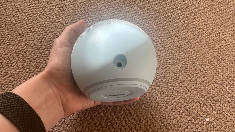
The Amazon Echo Dot (5th generation) with clock offers the same spherical design as the previous generation. It measures 3.9 x 3.5 inches and weighs just over 300g. You can hold it in one hand being slightly bigger than a tennis ball but not as big as a soccer ball. 

Its design means it fits pretty much anywhere in your home, from the kitchen countertop to the bedside cabinet. It only has one cable – the power cable – with the 3.5mm audio jack no more. 

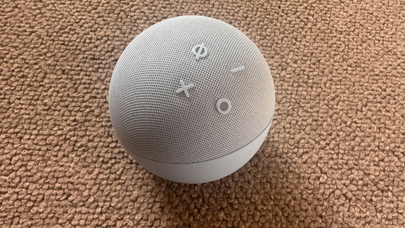
On the top of the Echo Dot are the volume buttons, an Alexa action button, and the mute button for those times you don't want to be heard. The bottom of the sphere illuminates red any time this is activated, so you know when you're being left alone. 

The Amazon Echo Dot (5th generation) with clock now also has tap gestures. If you tap the top of the speaker, it pauses a song, ends a call, or snoozes an alarm. There's no way of turning off the alarm through taps, but it's a timesaver over speaking to it. 

A new temperature sensor is also perfect for anyone with a smart heating system. You can assign certain Alexa routines to be performed once the temperature dips or goes too high. 

The LED display across the centre of the device shows the time, any alarms set, or a song title if you're listening to music. It's bright and vibrant without being distractingly so. Again, perfect for the bedside cabinet. 

Using the Amazon Echo Dot (5th generation) with clock is super-easy. Simply saying 'Alexa' followed by seemingly any request and Alexa does the hard work for you. Even when spoken quietly, we were still heard. The Alexa app is similarly easy to use and regularly keen to suggest new things you can do. That's great if you're new to Alexa and need help figuring out where to start. You'll soon be impressed at the breadth of options here. 

Features score: 4/5

Someone holding Echo Dot so the back and power cable connection is visible

The latest Echo Dot offers the same spherical design as the previous generation (Image credit: Jen Allen)

Amazon Echo Dot with Clock (5th Gen): Sound quality

  • Well-balanced sound
  • Support for all major music services
  • Improved bass

The Amazon Echo Dot (5th generation) with clock supports seemingly every music service you can think of. That includes Apple Music, Apple Podcasts, Deezer, iHeartRadio, Pandora, SiriusXM, Spotify, Tidal, TuneIn, and Amazon Music. While it won't provide you with the highest music quality, if the service supports it, the device certainly simplifies things. 

Like the Amazon Echo Dot (5th generation), it's a bit bass-heavy, but that does mean you get a louder experience than you would expect for the size. Be cautious turning up the volume, though, as while playing songs like Hysteria by Muse, we discovered distortion was an issue at high volumes. 

More subtle music like Beach Boys' God Only Knows and The Beatles' Yesterday comes across as a little weak. If you're looking for crispness and a speaker that conveys the complexities of Under Pressure, you won't find it here. Not that we expect it really. The Amazon Echo Dot (5th generation) with clock is all about accessibility rather than music quality. 

Sound quality score: 3/5

Amazon Echo Dot with Clock (5th Gen): Value

  • Well-priced… and there'll be lots of deals
  • Ease-of-use makes it a great buy

The Amazon Echo Dot (5th generation) with clock makes owning a smart speaker very accessible in terms of price and ease of use. 

You'll soon wonder how you lived without that kind of speaker, and having a clear clock on the front further helps.

Value score: 5/5

Should you buy Amazon Echo Dot with Clock (5th Gen)?

Buy it if…

Don't buy it if…

Also consider...

!!!!!!!!!!

Popular Posts

Categories

Blog Archive