Nothing Phone 2a review: Distinctive design meets mid-range magic
Nothing Phone 2a: Two-minute review
The Nothing Phone 2a aims to shake up the mid-range market, by taking some of the DNA of the Nothing Phone 2, but swapping out select higher-end components for scaled-back parts. The result is a phone that’s aimed at those who want a reliable device for day-to-day use in Nothing’s style but aren’t interested in higher performance and flagship features, that the higher price of the Phone 2 affords.
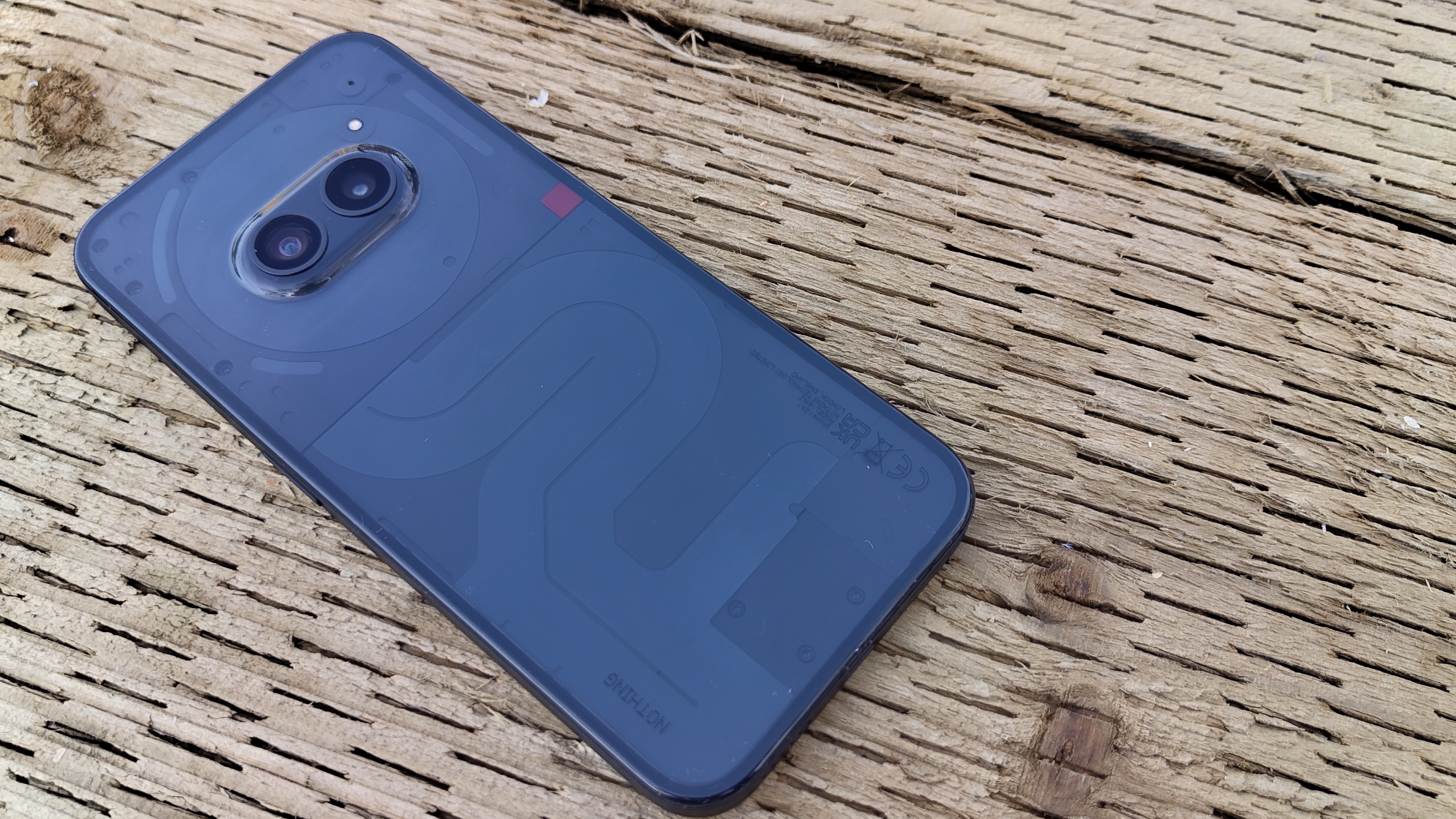
Although the Nothing Phone 2a has been scaled back versus the company's flagship, it’s still very much a Nothing phone. It provides a spacious and vibrant display, steeped in vivid colors and deep blacks; great for watching media and gaming.
Phone 2a’s custom MediaTek chip further enhances the experience, providing snappy performance that can handle any day-to-day tasks. The chip is also efficient enough to give you days of standard use, helped by the phone’s large 5,000mAh battery.
I still can’t get on board with the Glyph lighting system offered up by Nothing’s existing handsets, so the fact that it’s been cut-down on the Phone 2a didn’t bother me, although I missed the fill light it offered for portrait photography and its signature lighting design.
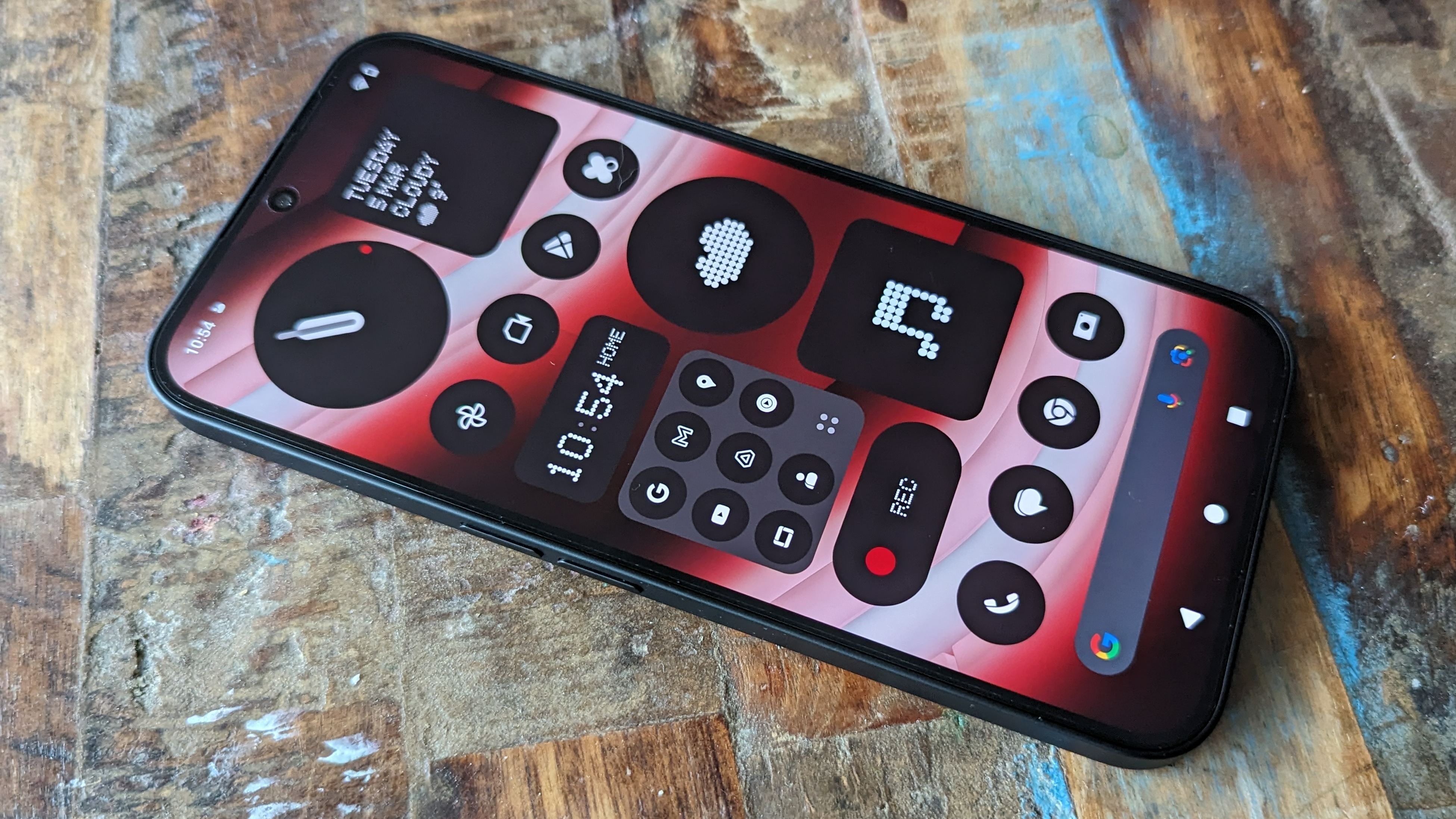
The Nothing Phone 2a has a dual-camera setup, comprising a 50MP primary camera and a 50MP ultra-wide camera. It offers mostly true-to-life colors and a decent amount of detail, and I was left impressed by how it managed in low-light conditions; keeping pictures bright while also stopping them from looking overprocessed.
It provides decent performance for its price range, however, it faces tough competition from the Google Pixel 7a, which offers superior image quality and editing tools. Although the camera may not match competitors in a slightly higher price range, it still delivers decent results for everyday use.
While I preferred the design of the original Phone 1, the Phone 2a’s enhancements are hard to ignore. It gets the fundamentals right – such as a great display, long battery life, and a clean and fast user experience – making it a compelling choice for budget-conscious buyers.
Overall, the Nothing Phone 2a is a breath of fresh air in a market saturated with mundane cheap smartphones. Behind its unconventional glossy plastic design, it’s one of the most solid and sensible affordable phones on the market.
Nothing Phone 2a review: Price and availability
- Announced March 5, on sale March 12
- Priced from $349 / £319 /AU$675
- Cheaper than Google Pixel 7a and Samsung Galaxy A54
- Limited US availability at launch
The Nothing Phone 2a launched on March 5 and is now available in Nothing's homeland of the UK (as well as many other markets across Europe), while US availability is limited. This means Stateside buyers will need to sign up for Nothing's developer program if they want to be in with a chance of getting the phone for themselves.
If you can get hold of it, the Phone 2a is very affordable for what it offers; priced from £319 for 8GB RAM and 128GB storage and$349 / £349 /AU$675 for 12GB with 256GB storage, which puts it in the same price range as the Samsung Galaxy A54 and Honor Magic 6 Lite.
- Value score: 4 / 5
Nothing Phone 2a review: Specs
Nothing phone 2a review: Design
- Modern, minimal design
- Glyph lighting system
- IP53-certified
One of the most significant changes of the Phone 2a is its new design, which is a slight but irrefutable departure from the look established by both previous Nothing Phones. The stripped-back glyph lighting, plastic build, and moved camera all make it clear the Nothing Phone 2a is a very different device from its predecessors.
It retains the flat-edged aesthetic, curved frame, and semi-transparent back that Nothing phones are known for.
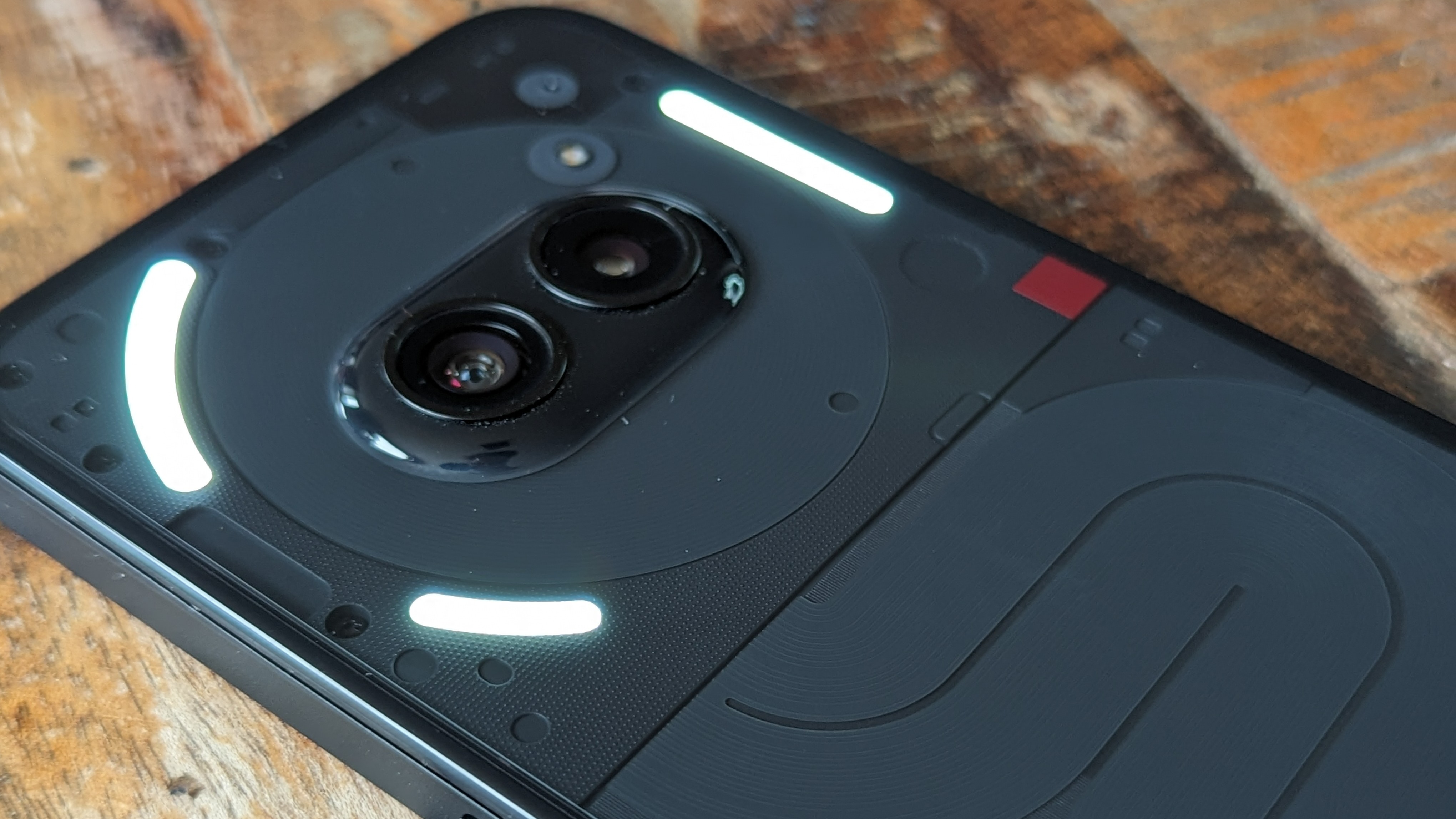
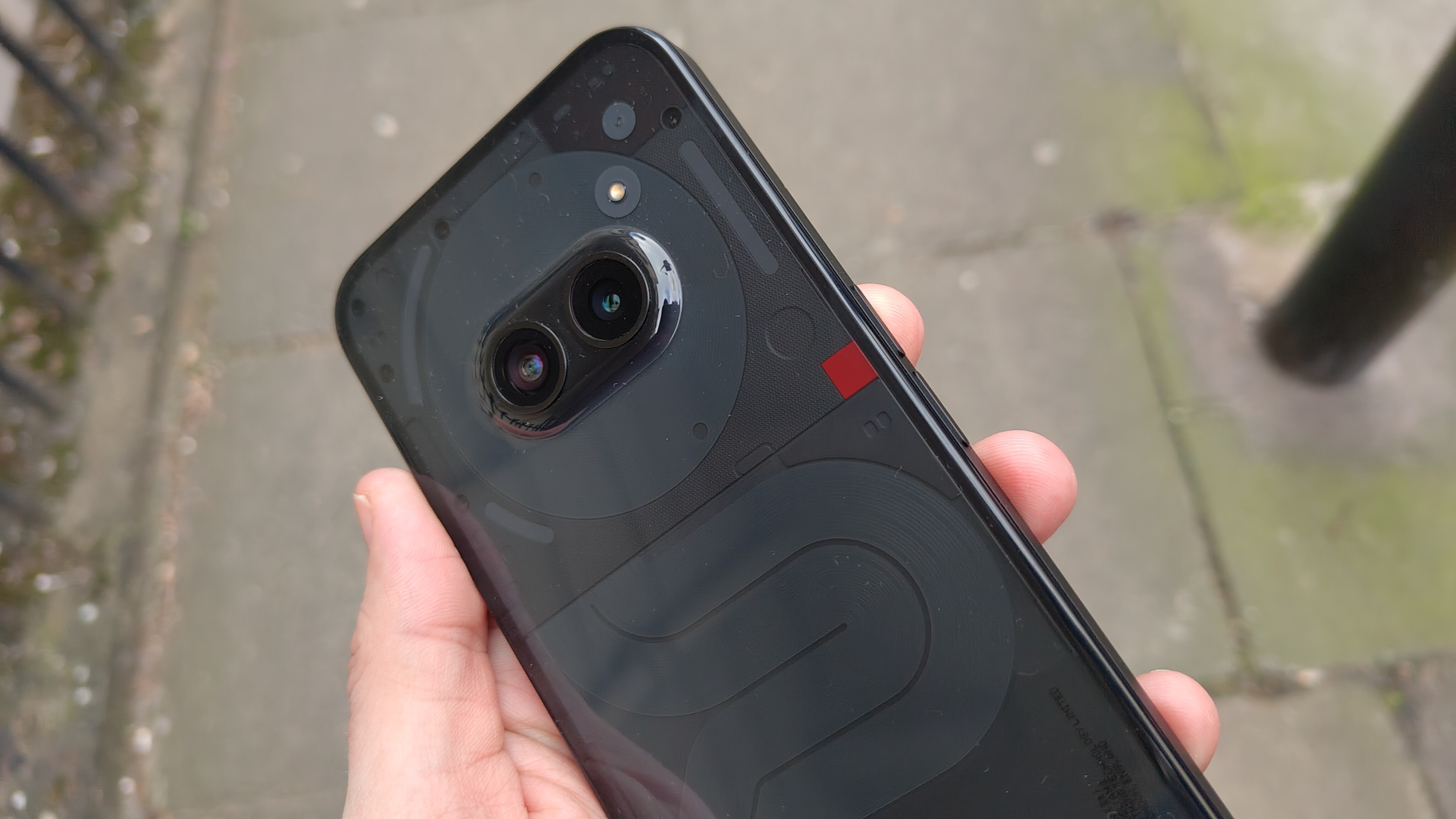
The unique Glyph system is still present – albeit in a more cut-down form that only takes up the top third of the phone, comprising three LED elements surrounding the rear camera module. It still provides soft, fill lighting when using the camera but is considerably weaker than the more comprehensive Glyph systems on past models.
Despite this more modest Glyph lighting, the Phone 2a’s back can still offer visual cues for notifications and ringtones without you needing to look at the screen, while the Glyph timer returns to tick down on that perfect soft boiled egg. One of my favorite Glyph features is third-party integration with apps like Uber, and this works seamlessly on the Phone 2a, just as it does on Nothing’s other phones. It works much like the timer function and provides a visual time, with one LED slowly lighting up as your car gets closer, however, it only works if your phone is face down on the table.
The lower half of the phone’s back, meanwhile, looks like an asymmetrical ribbon cable; only there to serve the Phone 2a’s distinct aesthetic. It’s harder to appreciate the details on our review device as, unlike the Phone 2’s gray finish, Nothing has once again opted for a true black color, rendering fine design details a little too dark, but these visual tidbits are at least more visible on the white and Milk finishes.
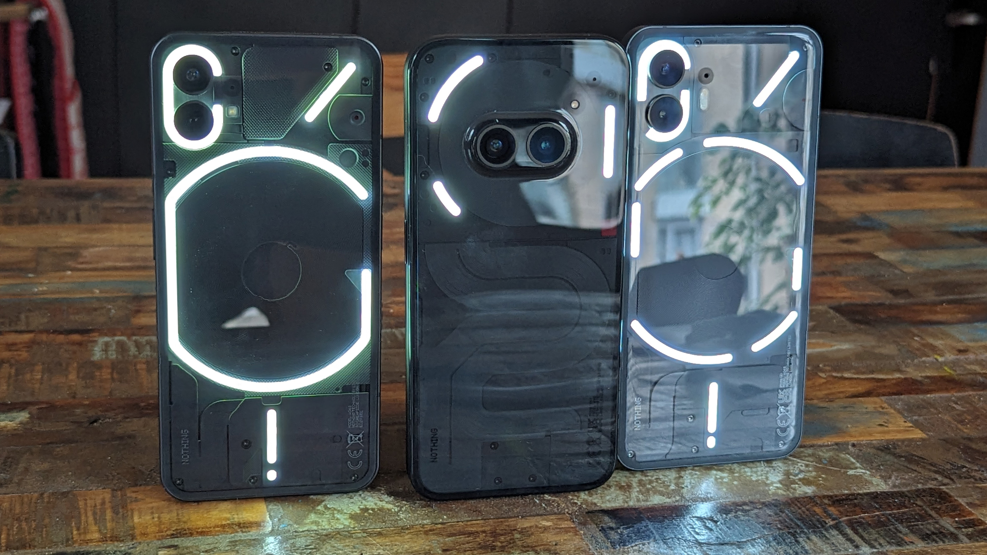
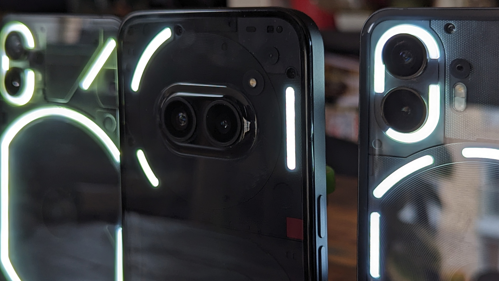
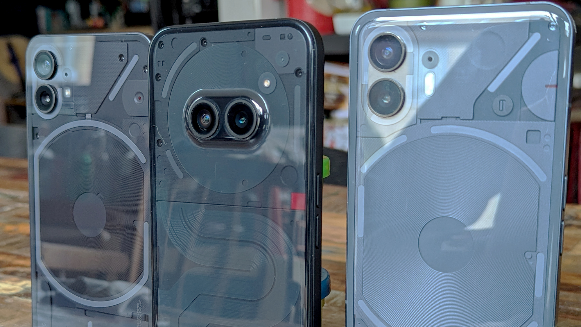
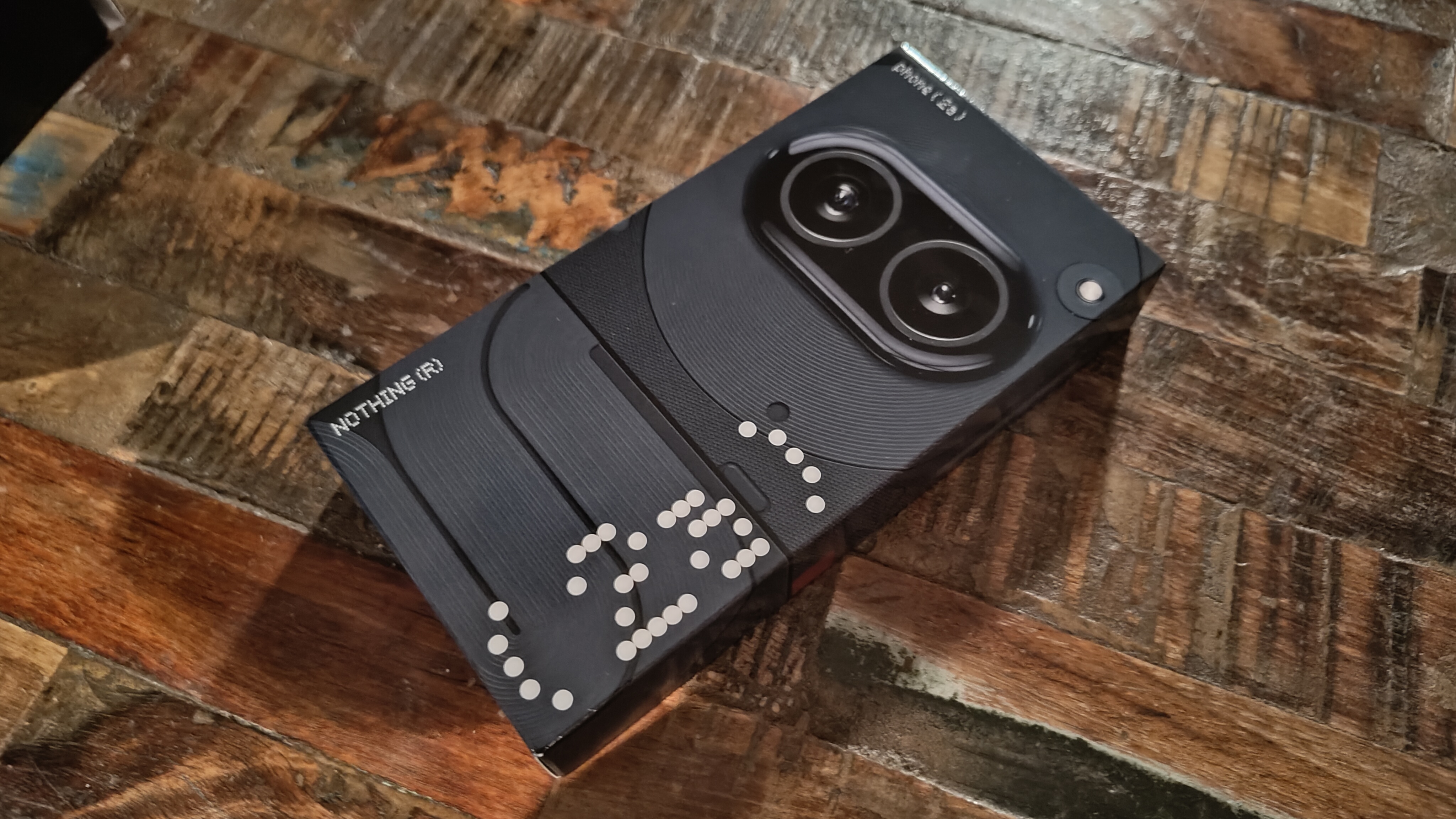
The other most prominent change from Nothing’s existing phones is the 2a’s camera module, which has ditched the vertical layout and moved from the top left, as on Phone 1 and 2. The Phone 2a places the camera module in the center of the upper third of the phone’s back, as part of a slightly raised pill-shaped bump, which looks like a pair of eyes, giving the phone a retro robot look.
The mostly-polycarbonate build of Phone 2a renders it lightweight for its size and more shatter resistant than its glass-backed siblings, but plastic is plastic and is more prone to scratching in everyday use. It isn’t as slippery or likely to slide off surfaces as the Phone 2’s pillowed glass back is either. Nothing claims that the 2a is more scratch-resistant than the glass used on the previous models, and I didn’t notice any nicks or scratches in my time with it, however, it does pick up fingerprints, dust, and smudges easily, which could be annoying for some. The frame is made of recycled aluminum coated in the same polycarbonate used elsewhere across the body, providing more texture and an easier grip than some glasses back phones I’ve used in the past.
Like the full-fat Phone 2, the 2a comes IP54 certified, meaning it can handle some dust ingress and splashes but you won’t want it to get completely submerged. It does, however, mark an improvement on the original Phone 1’s IP53 protection. While different from both Phone 1 and Phone 2, Nothing’s strong design aesthetic – influenced by architecture and graphic design, with its bold shapes and lines – is on full display here. While I like its new retro–technological design, I still prefer the cleaner finish of Phones 1 and 2.
- Design score: 3.5 / 5
Nothing Phone 2a review: Display
- 6.78-inch 1.5K 120Hz AMOLED display
- Peak brightness up to 1,300nits
- 91.65% screen-to-body ratio
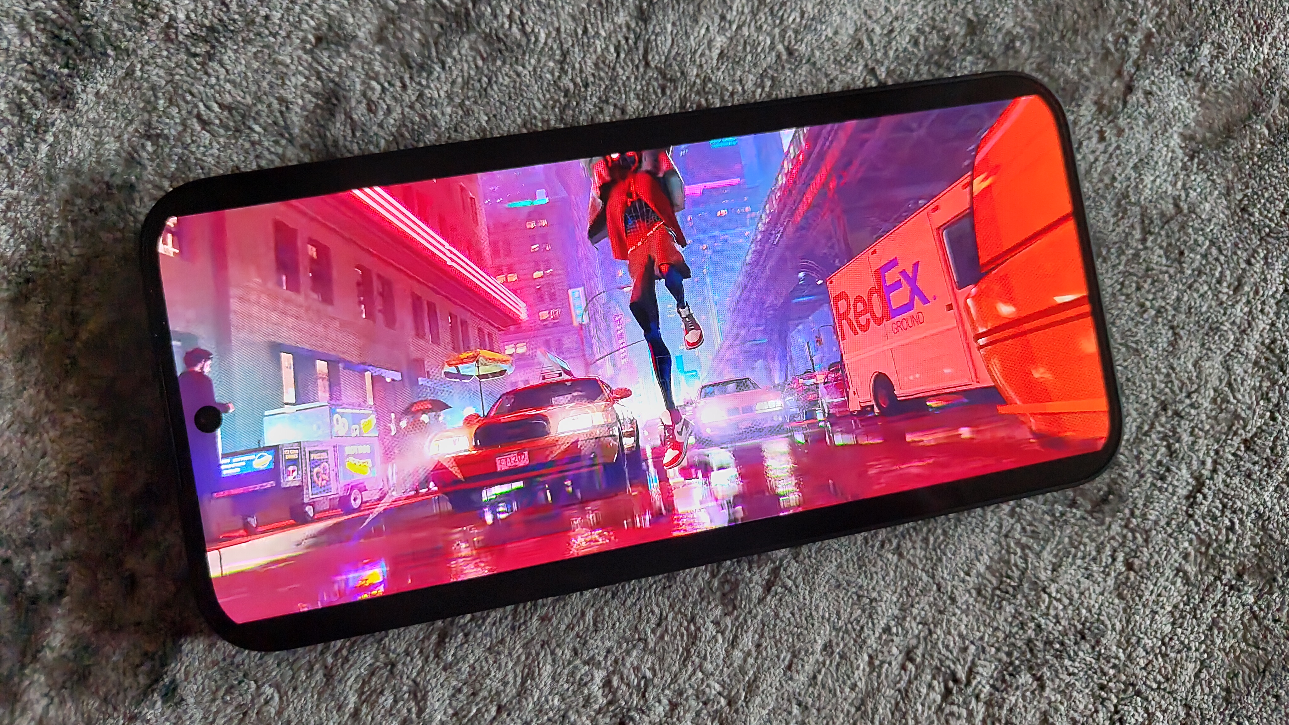
As with Phone 1 and Phone 2, the display is one of the Phone 2a's best features and stands out within its price range. The large panel provides an impressive 91.65% screen-to-body ratio (pricier rivals like the Galaxy A54 top out at just 82.9%), and offers strong contrast and sharp image quality, making it a joy to use. The 6.7-inch flexible AMOLED screen supports an adaptive refresh rate of between 30 and 120Hz; preserving battery life when needed, and then ramping up to higher refresh rates when playing supported games. It doesn’t rely on LTPO technology – like the Phone 2 – so can’t drop down as low (for even greater power saving), but it isn’t bad for its price range.
It also supports a resolution of 2412 x 1080 (that’s 394ppi), HDR10+ compatibility and 10-bit color depth, which delivers sharp, high-contrast images; making it great for watching films or gaming.
The screen is framed by small and evenly sized 2.1mm bezels on all sides that look clean and aren’t too distracting, while the panel itself is also protected by Gorilla Glass 5 (the same as Nothing’s other phones). The front-facing camera has moved from the top, left-hand corner to the top-center of the screen, while an optical in-display fingerprint sensor sits low and close to the bottom edge of the panel. The sensor also seemed faster and more reliable than the sensor used on Phone 1. It also used Face unlock but that wasn’t as consistent at unlocking the phone quickly.
Peak brightness is cited at 1,300 nits (trumping the Phone 1), however, most of the time you’ll experience a peak of 1,100 nits in sunny conditions, where the phone jumps to high brightness mode to remain comfortably visible. In testing, when using my phone at night, it dimmed down enough to avoid hurting my eyes too.
- Display score: 4 / 5
Nothing Phone 2a review: Software
- Android 14 with Nothing OS 2.5 on top
- A few pre-installed apps
- Strong visual identity
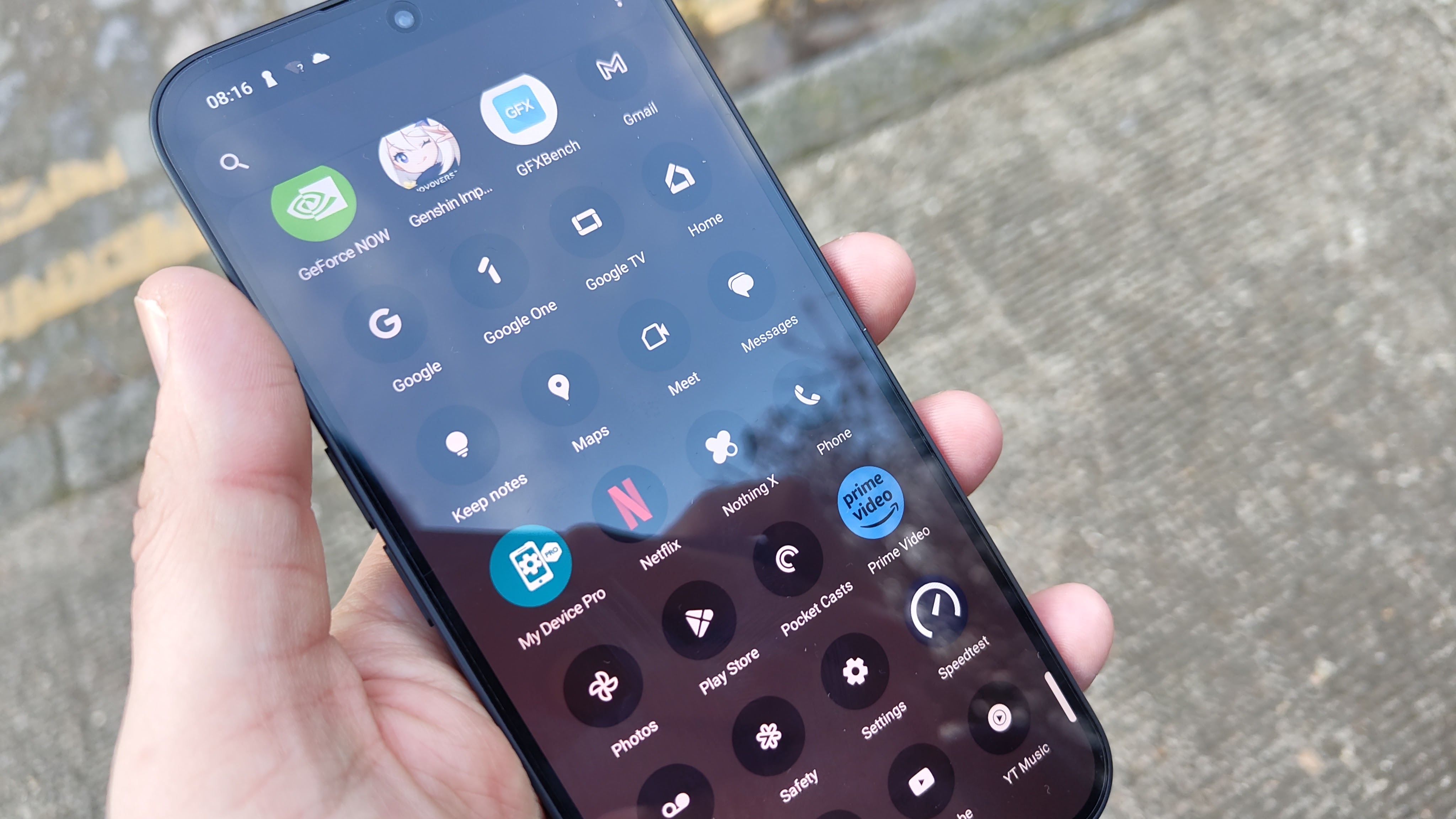
The Phone 2a comes running Nothing OS 2.5 out the box, which is based on Android 14. The company’s user experience stands out from the crowd due to its strong visual identity and otherwise near-stock Android 14 qualities, making for a stylish and well-featured interface that doesn’t feel overwhelming.
The distinctive graphic, dot matrix-inspired look – with unique widgets, stylized app icons, and near-monochrome palette, all make a return, as do retro notification sounds that take me back to the nineties.
There are a few included apps, like Nothing X – which lets you configure your Nothing Ear 2 buds, and the Glyph Composer – which lets you put your own Glyph animations to music, but unlike many other devices, the Phone 2a isn’t riddled with pre-installed bloatware.
It’s supported by three years of software and four years of security updates, which is lower than Samsung's four major OS upgrades on the Galaxy A54 but better than the Honor Magic 6 Lite, which provides only two updates. The Phone 2a also includes some unique features not included on either Phone 1 or 2. The first of these is Smart Clean, which automatically removes duplicate and temporary fragments of files. This feature uses AI prediction and becomes active in the background when the device is charging, with the intention of staving off the minor slowdowns that happen over time, ensuring the 2a runs at peak performance for longer.
Nothing has introduced a RAM Booster feature as well, which augments the existing RAM with internal storage to act as virtual RAM. This results in the ability to open more apps and reopen them quicker when still active in the background. Although standard on mid-range and even some flagship devices – as a way to enhance their RAM capabilities – it’s worth noting it’s not currently available on Phone 1 or Phone 2. Whether a subsequent update will change that remains to be seen.
NTFS optimization is another new feature, providing faster transfer speeds when moving files from a Windows PC to the Nothing Phone 2a. This is a pretty niche feature that most won’t notice or care about, but if you’re old school like me and still keep a lot of your music as MP3 files, you’ll appreciate those faster transfers.
- Software score: 4 / 5
Nothing Phone 2a review: Cameras
- 50MP main, 50MP ultra-wide
- 32MP selfie camera
- Redesigned camera module compared to Phone 1 & 2
For photography, the Nothing Phone 2a offers a dual camera setup on the back: a 50MP primary sensor and a 50MP ultra-wide sensor. In a nutshell, these cameras are ‘okay’ but aren’t especially bright or sharp, and save for the occasional hiccup when opening the camera app, focusing and capturing feels fast enough.
By default, the rear cameras capture 12MP stills, which are serviceable for the likes of social media, if unremarkable. You can set the phone to shoot in 50MP, increasing the amount of detail captured, but this locks your focal length, leaving you unable to zoom in a similar trade-off from the previous model; making it less versatile.
Details were okay at 12MP a distance but couldn’t hold up to close inspection. Some photos showed the camera struggling to capture a deeper dynamic range, leaving some elements of photos too dark or blown out.
Nothing Phone 2a camera samples


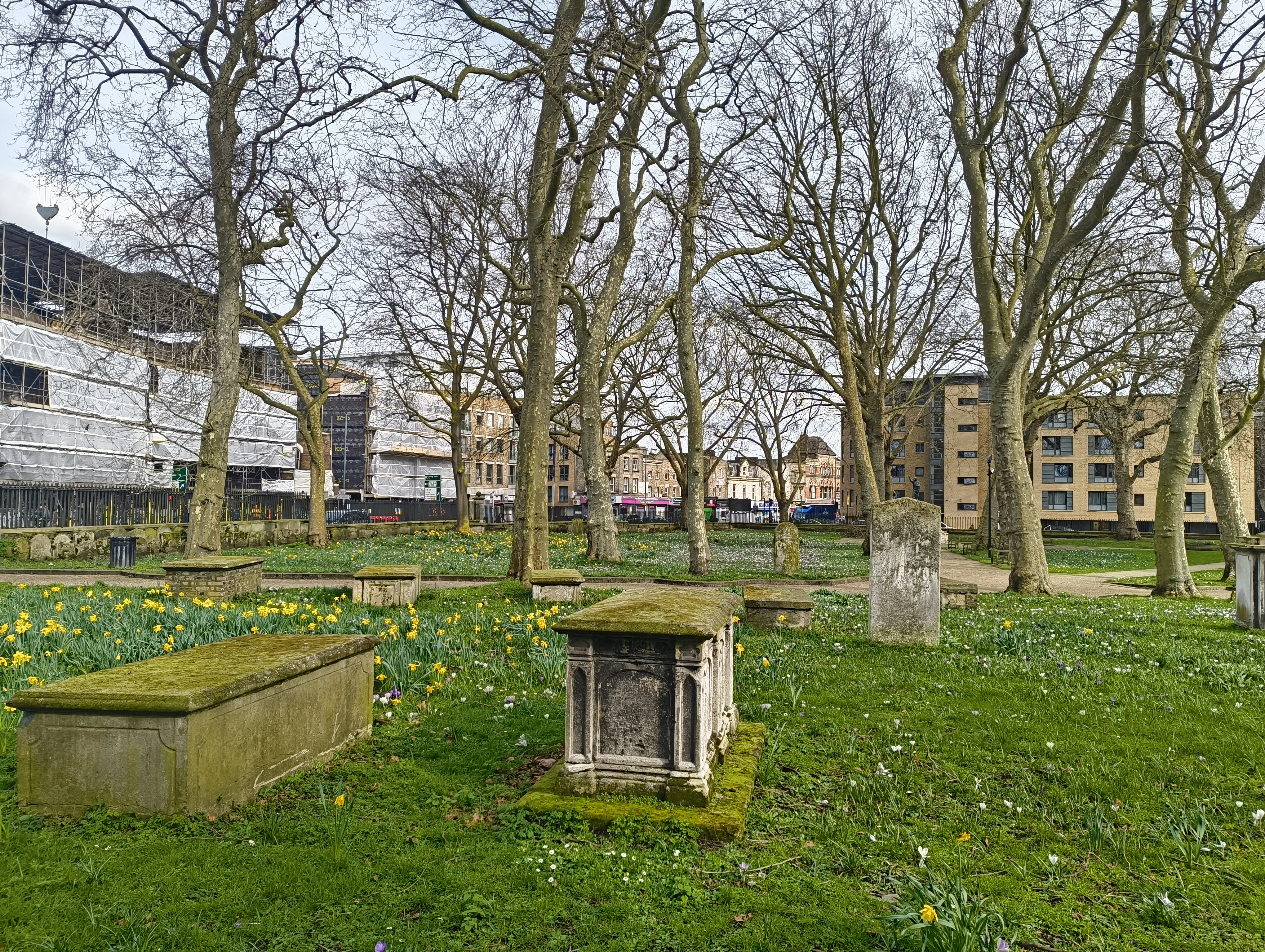

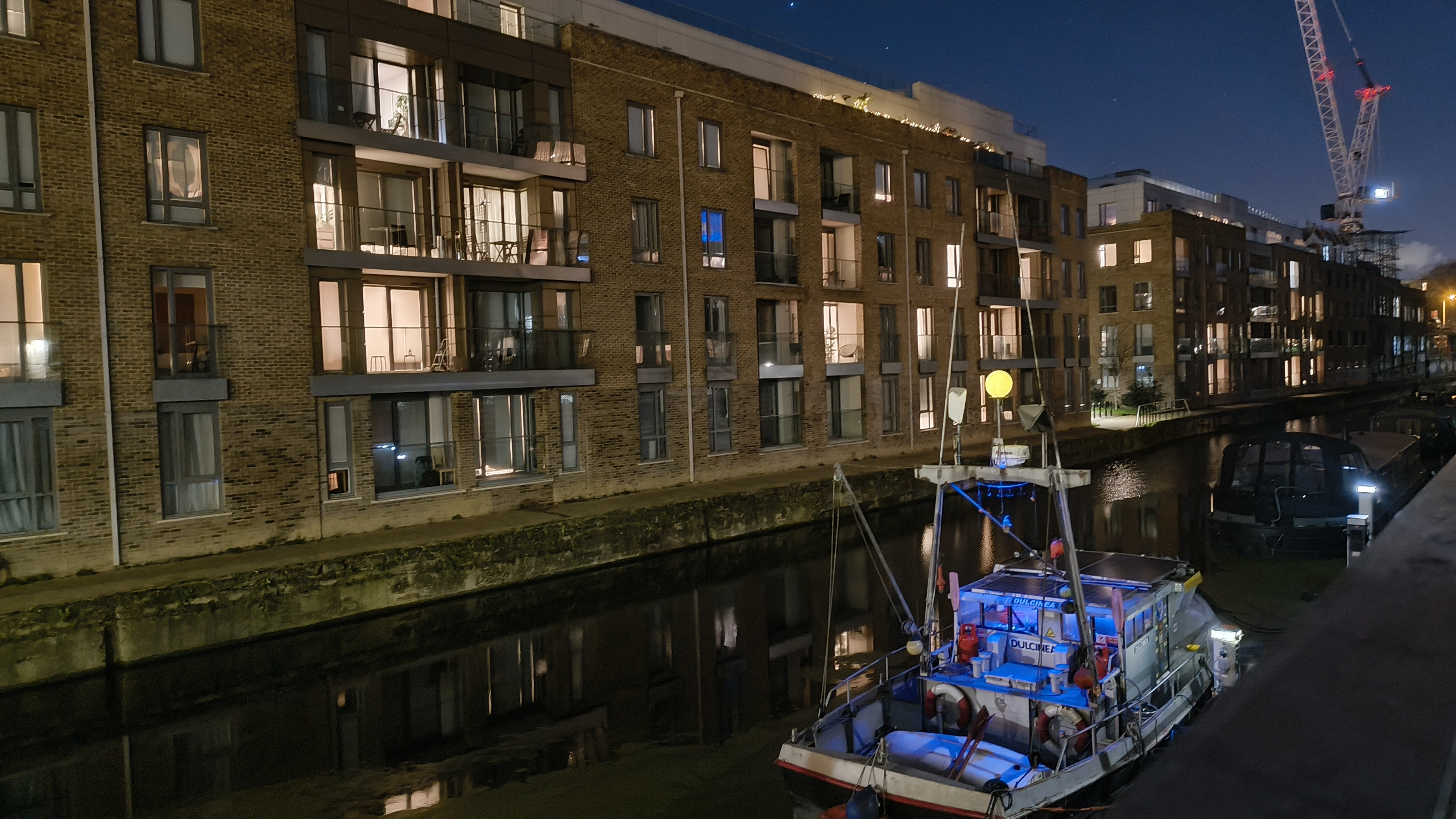
Like most phone cameras without a telephoto sensor, image quality drops significantly when zooming in all the way, with the phone’s attempts at sharpening in post only making resultant images look worse.
Colors appear saturated and strong, but sometimes shots come out woefully underexposed. This was especially apparent in one particular shot I took, with bright greens and yellows, that appeared dark and moody.
Low-light performance makes for a pleasant surprise, especially with the 2a’s primary camera. It’s aided by OIS (optical image stabilization) to help mitigate and prevent too much motion blur, so w. While I could tell my night images had been enhanced in camera, they still looked relatively natural.
The front camera looks to be an upgrade from the Phone 1’s 16MP snapper to a 32MP sensor, which helps capture greater detail when chatting on video calls and taking selfies.
- Camera score: 3.5 / 5
Nothing Phone 2a review: Performance
- Good performance for a mid-range phone
- Very power efficient
- RAM Booster
Nothing has moved away from Qualcomm’s Snapdragon chipsets for the Phone 2a; instead turning to the MediaTek Dimensity 7200 Pro. This custom chip offers a modest jump in performance from the previous Snapdragon 778G used in Phone 1.
Nothing claims the Phone 2a offers an 18% improvement in performance compared to its predecessor, built on a more efficient 4-nanometer process. The company accounts for this uptick through better software and hardware integration, but I didn’t see any dramatic improvements in normal use, save for gaming performance and battery life.
Day-to-day use was generally swift, with most apps snappy and responsive, however, the camera app sometimes took a few seconds to open up, which could be frustrating for those moments when all you have is a split-second to grab that perfect shot.
Benchmarks put its performance just behind Qualcomm’s Snapdragon 7s Gen 2, which is used in the comparable Xiaomi Redmi Note 13 Pro 5G; that said, I didn’t notice much difference between the two in regular use.
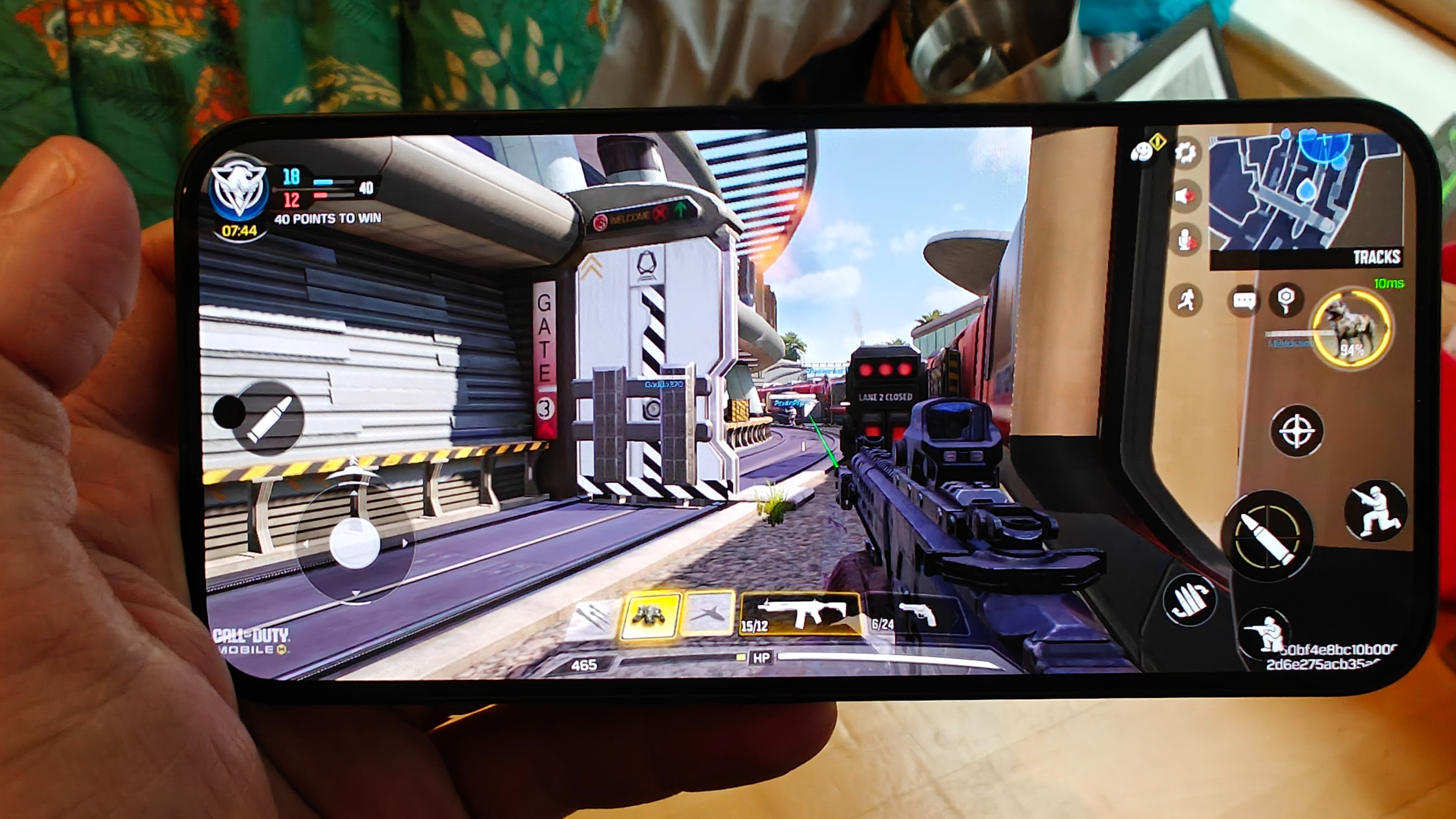
Gaming with the Nothing Phone 2a proved better than expected, considering the price point. Genshin Impact ran well at ‘medium’ to ‘high’ settings but did stutter when there was a lot of action and particle effects on screen. I also noticed the phone got warmer when playing the likes of Genshin and COD Mobile with ‘high’ settings enabled, but not nearly enough to feel uncomfortable or hinder performance.
I was surprised to see that Nothing didn’t include a microSD expansion slot, which still appears in some mid-range phones. This slot provides extra storage space and makes some budget phones even better value, but sadly in the case of the Phone 2a, you’re stuck with the onboard 128GB or 256GB of storage.
- Performance score: 4 / 5
Nothing Phone 2a review: Battery
- 5,000mAh battery
- USB-C cable, but no power adapter included
- 45W wired fast charging
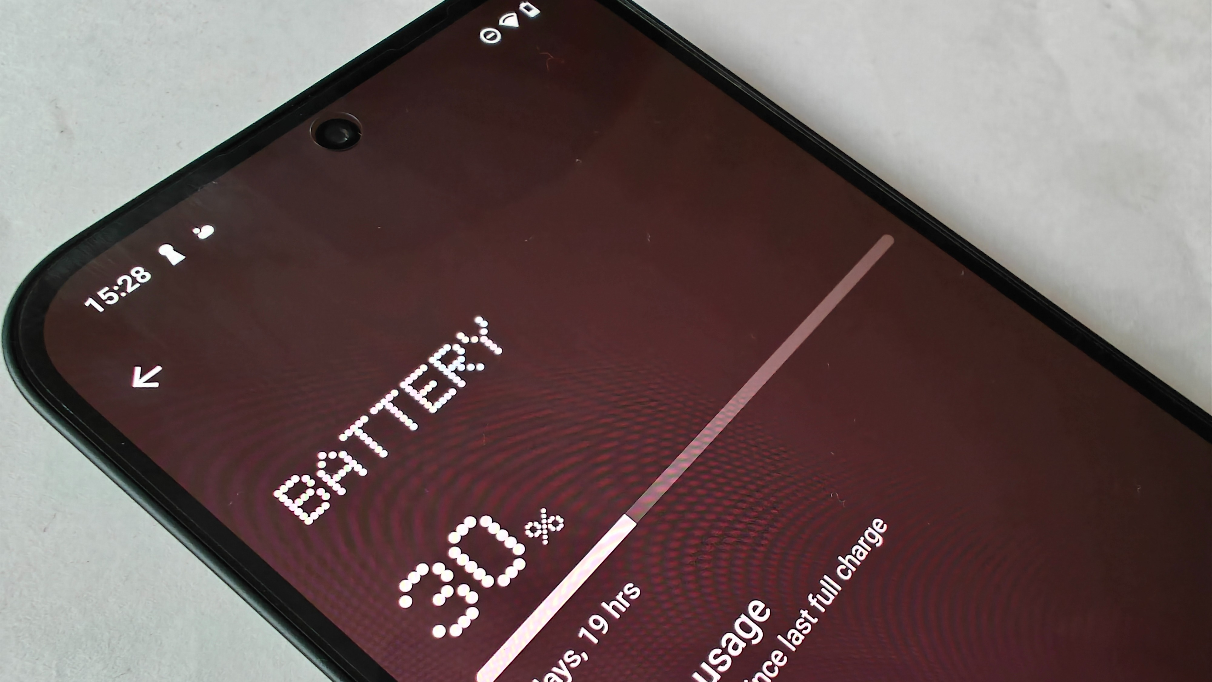
The 2a comes equipped with Nothing's largest battery so far, a 5,000mAh unit that beats the Phone 1’s 4,500mAh cell and trumps the 2’s 4,700mAh power pack too. Nothing claims it provides around two days of use, and in my testing, I got an impressive 11 hours of screen-on time, which included browsing, gaming, and streaming video.
Fast charging up to 45W is also supported, which is an improvement over the Phone 1’s 33W however, no wireless features on the Phone 2a. It’s also worth noting that no charging brick is provided with the phone, so you’ll need to buy that separately (Nothing sells its own for $35 / £35 / AU$35).
The battery's longevity shouldn’t be a problem either; Nothing claims the Phone 2a’s cell is designed to weather 1,000 cycles while maintaining 90% of its original capacity, which is around three years of use; meaning this phone is in it for the long haul.
- Battery score: 4 / 5
Should you buy the Nothing Phone 2a?
Buy it if...
You want a taste of Nothing for less
You want to try out the Nothing ecosystem without committing to a flagship device like Phone 2 or an older device that's about to be phased out, like the Phone 1.
You want an affordable all-rounder
If you're after an option that's cheaper than some of the better-known brands, like Samsung, but still offers great performance and features.
You want a phone that stands out
The 2a offers a unique design and OS that is eye-catching, to say the least. If you want something different and unique, designed to stand out amongst the crowd, while still offering high-quality performance, the 2a fits the bill.
Don't buy it if...
You need a phone that's durable and tough
The plastic body, while lightweight, is as resistant as the glass and metal of some phones. Water and dust resistance is also only IP54-certified, which isn't as protected as a lot of modern phones.
You want the full Nothing Phone experience
If you're after the full Glyph system, an even more eye-catching design and solid build, you'll have to pay more for something like the Phone 2, instead.
You want a performance-focused phone
The new MediaTek chip inside the 2a is only marginally faster than the Snapdragon that powers the Nothing Phone 1 and it can't handle heavy workloads or intensive gaming.
Nothing phone 2a review: Also consider
The Nothing Phone 2a is a compelling budget choice, however, it's not for everyone. Here are some alternatives:
How I tested the Nothing Phone 2a
- Review test period: 10 days
- Testing included: everyday use including web browsing, photography, gaming, streaming video, music playback
- Tools used: Geekbench 6, GFXBench, 3DMark, My Device Pro
I used the Nothing Phone 2a for ten days for this review, adding my own Google, video streaming, and social media accounts.
The phone was used to take photos and record videos, these were then analyzed on a PC. I watched both local and streamed video content from various streaming services too. Although performance was tested using publicly available benchmarking apps to meter the CPU and GPU, along with real-world use, though we don't always publish the results, we do take them into consideration and keep them on file for comparison with other devices.
Interestingly my Geekbench 6 scores show the older Nothing Phone 1 slightly outperforming the Phone 2a in multicore processing, but again, this didn’t really translate to any delay in real-world performance.
Battery usage was measured from fully charged down to zero in 15-minute increments. The Nothing 45W charger was used as no adapter is provided with this phone. The camera was tested in several different situations and conditions as part of the review process.
I have previously reviewed several smartphones including the Nothing Phone 1 and Nothing Phone 2, with the latter serving as my main phone since its release.
0 comments:
Post a Comment