Oppo R11s
Ever committed to giving consumers a flagship feel at a reduced cost, Chinese smartphone maker Oppo's latest handset is the R11s, a device that delivers a premium experience in almost every aspect of its design.
While the original Oppo R11 was an exceptional mid-range phone, the Chinese electronics firm has managed to improve on it in every way with this new upgraded model. So much so, in fact, that it might even sway cost-minded consumers away from the likes of Apple and Samsung.
In the West, the 6.01-inch R11s has only launched in Australia so far, where it's priced at AU$659 (about $518, £370). Those who prefer their handsets even more phablet-sized also have the choice of the Oppo R11s Plus, which has a 6.43-inch display and is priced at AU$779 (around $612, £438). In both instances, the phones are less than half the AU price of an iPhone X or Samsung Galaxy Note 8, which will be quite a selling point for many people.
That said, despite sporting some high-end features, the R11s is undeniably a mid-range phone, as it lacks a few of the key aspects we've come to expect from flagship handsets. Still, if you can look past those shortcomings, the Oppo R11s offers terrific value.
Design
- Tiny bezels make the R11s feel modern
- 64GB of internal storage can be expanded to 256GB
- Dual Nano SIM option
- Rear fingerprint scanner is lightning fast
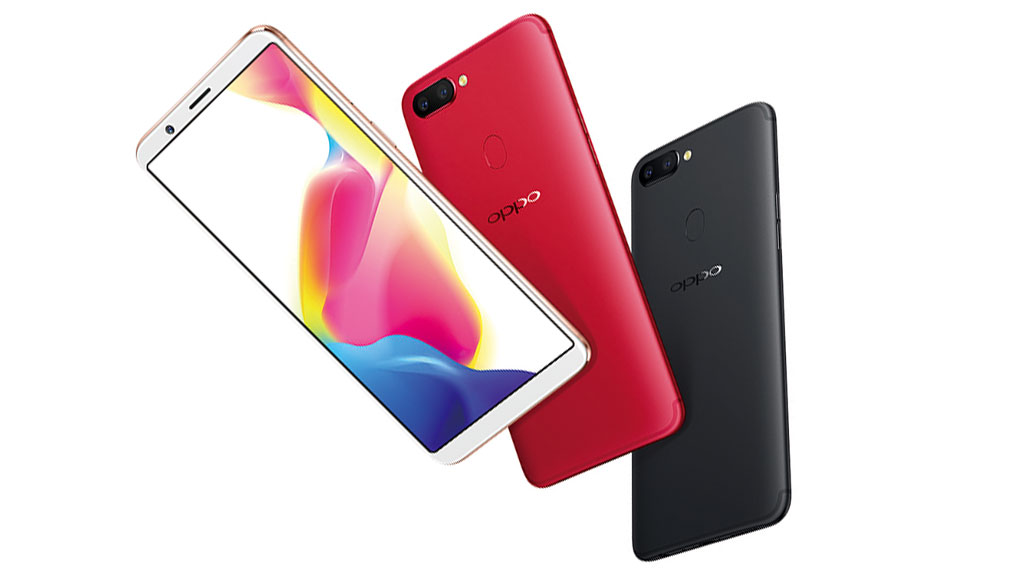
One of the key improvements that the R11s holds over its predecessor is a drastically-reduced bezel size, giving the phone a similarly-modern look to the the Samsung Galaxy S8 and the Huawei Mate 10 Pro.
Those smaller top and bottom bezels (which are less than half of the size of what the were on the R11) mean Oppo's had to drop the physical home button that's featured on the front of pretty much every one of its phones up until this point. Instead, the company's now opted to use an on-screen navigation bar, while also moving the fingerprint sensor to the rear of the phone.
As is typical of most smartphones, you'll find the power button on the right side of the screen and a volume rocker on the left. It's got a combination dual SIM and microSD slot on the right side of its all-metal unibody chassis, which has such thin edges that it actually feel a little strange in the hand when the phone is naked.
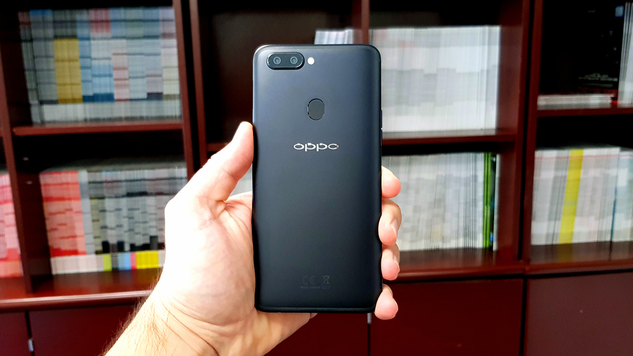
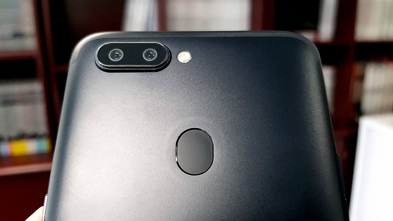
When its case is off (Oppo continues its much-appreciated tradition of including a clear gel phone case in the box), it also has a significant camera bump, made all the more noticeable by its wide, dual-camera nature.
Music lovers will be happy to know that a 3.5mm headphone jack has been mercifully included on the bottom of the unit to the right of its Micro USB port. Yes, you read that correctly – it appears that Oppo isn't ready to jump on the USB-C bandwagon just yet.
Along the top and bottom edges of the phone you'll find some fairly subtle iPhone 7-style antenna lines, which were barely noticeable on our black review unit.
Screen
- Full HD+ (18:9 aspect ratio) AMOLED screen
- Very similar to iOS layout
The Oppo R11s may have more screen real estate available than its predecessor (the phone's display now takes up 85% of its front), but its resolution remains in the 1080p realm (2,160 x 1,080).
Thankfully, it's got a gorgeous AMOLED screen with a pixel density of 401ppi, offering inky blacks, vibrant colors and exceptional brightness. In the past, we've noted Oppo's tendency to oversaturate the colors on its displays, but that isn't the case here.
Watching widescreen media on the R11s is a real treat, thanks to its wider 18:9 display. We also like that Oppo has managed to squeeze in that extra screen space while keeping the same physical dimensions as the R11.
Likewise, the fact that the R11s already has a screen protector on it right out of the box is something we love. It's a thoughtful touch that saves customers from the hassle of purchasing and then awkwardly applying one themselves. It's the kind of practice we wish more phone manufacturers would adopt.
Interface
- Oppo’s ColorOS 3.2 is based on Android 7.1.1
- Improved notification drawer and iPhone-style control center
- Still no app drawer option
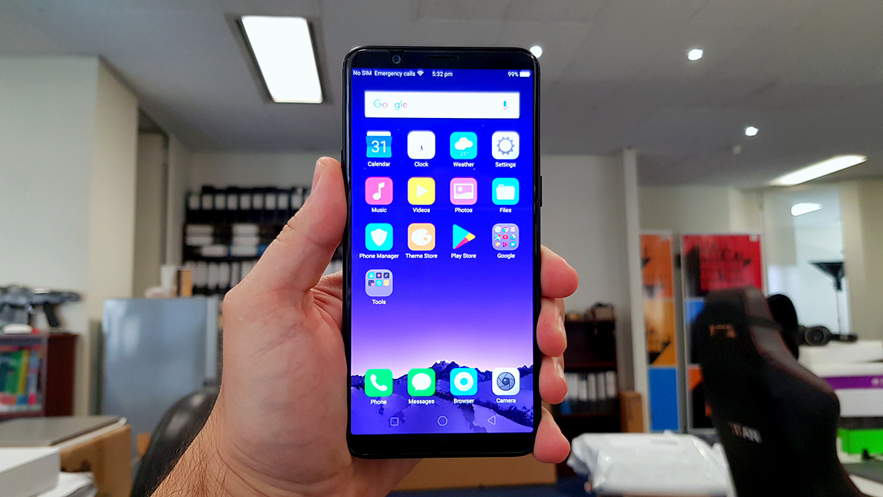
Like previous versions of Oppo's ColorOS interface, it's clear that the Chinese phone-maker wants to provide an iPhone-like user experience, despite its operating system being based on Android 7 (aka Nougat). Some people will be fine with this approach, but Android purists may consider its iOS-inspired look and feel tantamount to heresy.
As with previous Oppo phones, all of your apps are still spread across multiple pages on a 4 x 5 grid, with no option to quickly sort them in alphabetical order or only display selected applications.
By contrast, Huawei's EMUI interface has offered the choice between this method and the traditional Android app drawer for a while now, and it would've been nice for ColorOS to finally do the same. Still, we're happy to report that ColorOS 3.2 has improved upon previous iterations of the software in other areas.
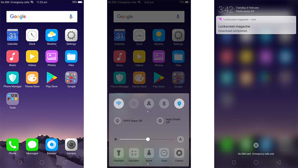
One thing in particular that always bothered us about Oppo's software on previous handsets was that you couldn't view your notifications with a single swipe down. Instead, the quick options menu would take up the entire screen, and you'd have to swipe again from left to right to see your notifications.
Thankfully, this has been fixed – swiping down from the top now takes you directly to your notifications, and you can now reach an iPhone-style control center by swiping up from the bottom.
Fans of Oppo's gesture controls will be happy to know that they've also returned, allowing you to quickly launch the flashlight and camera, as well as execute other functions, with some swirly swipes.
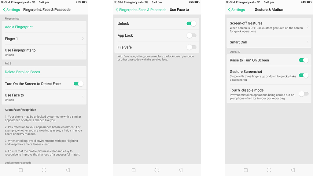
Our favorite new feature? Face unlock, which was introduced on the Oppo F5 but seemingly perfected (or at the very least, greatly improved) here. We can't say for certain whether it's more or less secure than Samsung's own facial recognition tech, though.
According to the disclaimer in the 'About Face Recognition' section of the phone's settings, Oppo states that "Your phone may be unlocked by someone with a similar appearance or objects shaped like you," which doesn't offer a whole lot of confidence.
Still, we tried to fool our R11s with several selfies taken on another handset and couldn't get it to unlock. After three failed attempts, the R11s required the PIN to be entered.
One flaw with the face unlock that was implemented on the Oppo F5 was that you had to hit the power button for it to kick into gear. The Oppo R11s has fixed that thanks to a 'raise to wake' feature, which bypasses this button press and means you only have to lift your phone up and face it for it to unlock. And the R11s' facial-recognition is so lightning fast that, on most occasions, you won't even see your lock screen.
Camera
- Dual camera setup (20MP + 16MP) on the rear
- 20MP selfie camera backed by Oppo's AI-driven Beautify software

Oppo continues to make big strides when it comes to its camera technology with the R11s, including a magnificent 20MP front-facing camera that implements artificial intelligence and machine learning in its quest to provide users with the most flattering selfies imaginable.
Working in conjunction with Oppo's Beautify software, your phone will eventually learn to adjust your selfie settings in an attempt to provide the best possible outcome, whether that's by making your face slimmer, your skin clearer or applying a pinkish hue to the pallor of your face.
If you hate blemishes, wrinkles and freckles, you'll love what this phone can do. The Oppo R11s and its Beautify software will make you look ten years younger without additional tweaking.

On the back side of the handset, the R11s packs a 20MP+16MP dual camera setup that automatically switches between the two lenses to maximize the quality of low-light photography.
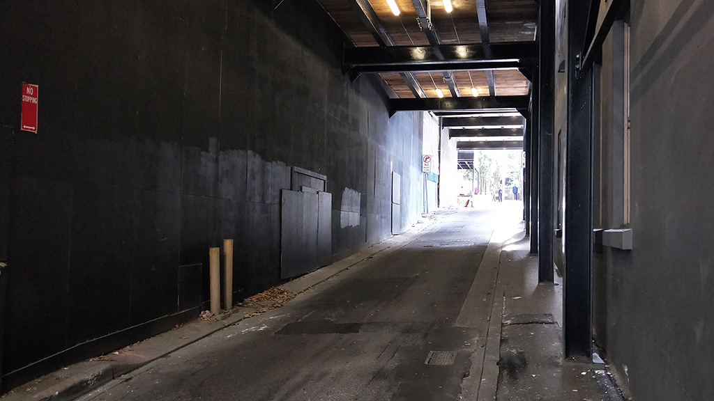
In our experience, most low-light handheld shots looked quite sharp, though blur would occasionally creep in to some images, even when we only made slight movements. A tripod would help out quite a bit with that, as would some tinkering with shutter speeds and ISO settings – something that might also need to be done in overly-bright environments.

Daylight photography, for the most part, is excellent. As has become tradition with Oppo's phones, the R11s features a Sony-developed IMX398 sensor that takes wonderfully-bright photos in well-lit environments.

That dual camera setup we were talking about earlier? It can also used to create impressive depth-of-field effects via a dedicated Portrait mode. For the most part, this feature works well, keeping images in the foreground sharp and clear while blurring the background nicely.

Occasionally, it can struggle with edge detection, leaving the edges of the object you're focusing on looking a little blurry. That said, a bit of practice goes a long way, and once you've figured out the best way to frame your shots in Portrait mode, this becomes less of a problem.

Once again, video capture is not one of Oppo's strengths, as 1080p recording is limited to 30fps. 4K capture is also available, though like on the Oppo R9s Plus, our video at this resolution was always less than smooth, and appeared particularly choppy during movement.
Music
- Software-based equalizer offers some customization
- Volume needs to be up high to enjoy music and movies
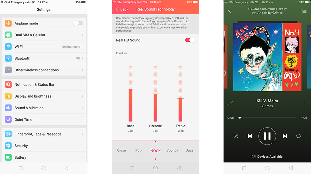
As has become custom with Oppo’s phones, a built-in equalizer offers 10 different presets, with room for you to create custom settings to your liking.
There are three sliders to change bass, baritone and treble, which make a slight difference when tweaked, but nothing earth shattering. Additionally, a ‘Real HD Sound’ setting can be switched on to give your music a bit more clarity.
As for its built-in speaker, the Oppo R11s does a passable job, with audio coming through clearer than we expected and without the usual tinny sound that many handsets produce. In fact, we'd go as far as to say that it outperforms some high-end flagships in that regard.
Performance
- Outpaces Google Pixel XL
- Keen multitasker
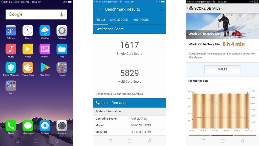
While not a beast by any means in terms of performance, the R11s does quite well for a mid-range phone. Unsurprisingly, our Geekbench 4 benchmarks put the Oppo R11s right alongside its predecessor, the R11, with a single-core score of 1,617 and a multi-core score of 5,829.
These scores also put it within spitting distance of the LG G6 – a high-end handset that scored a little higher in its single-core test (1,741) but much less in its multi-core benchmark (4,127).
The R11s sports a Snapdragon 660 chipset, which is essentially the top option from Qualcomm's mid-range 600-series family of chips. Given that limited pedigree, it is actually quite impressive that it's performed almost as well as the Snapdragon 821 featured in LG's flagship.
Although we were still tests the bigger R11s Plus at the time of this review, we have to imagine the latter will perform even better given that it has a total of 6GB of RAM – a full 2GB more than the standard R11s.
Battery life
- Battery will last all day
- Terrific fast charging
With its large 3,200mAh battery, the Oppo R11s lasted 8 hours and 4 minutes of heavy use in our PCMark battery benchmarks. That's a great result for a mid-range phone, lasting just as long as the Samsung Galaxy S8 did in our tests.
That said, the R11s fell short of its predecessor, the R11, by roughly 50 minutes, and didn't even come close to topping last year's Oppo R9s, which gave us a very-creditable 12 hours and 10 minutes of juice.
The R11s Plus packs a whopping 4,000mAh battery into its larger frame, and while we were still testing the latter at the time of writing, it's probably safe to assume that it would last a little longer than the R11s.
Thankfully, the R11s sports fast charging capability, with Oppo promising that a 30-minute charge will bring the phone to at least 75%.
Verdict
Simply put, the R11s is the most impressive handset that Oppo has released so far. Almost everything about it feels premium, even if a couple of things do keep its feet planted squarely in the mid-range.
We liked
It's beautiful 18:9 AMOLED display is one of the best we've ever seen on a mid-range phone, and its face unlock functionality is easily the fastest we've ever experienced.
We disliked
NFC functionality is still missing from Oppo's phones, and we have to question the decision to keep the Micro-USB port around for another generation. We'd also like to see Oppo venture away from its iOS-aping ways when it comes to ColorOS.
Final verdict
Oppo's R11s is the best handset that the Chinese electronics film has produced yet, with a fantastic modern design, a gorgeous screen, lightning-fast face unlock and a host of other top tier features on offer. When Oppo eventually irons out its remaining issues, it will be hard to keep calling its phones mid-range.
0 comments:
Post a Comment