Wednesday, August 31, 2022

Logitech G502 X Plus

Logitech G502 X Plus: One-minute review

The Logitech G502 X Plus ushers in a new era for the legendary and still popular Logitech G502 line. The release of this new entry, launched alongside the new wired Logitech G502 X and the new Logitech G502 X Lightspeed Wireless, has been a long time coming. But, now that it’s out, it’s proven to be worth the wait, thanks to the improvements in its optical switches, wireless performance, and design.

Massive changes, especially to cult classics like the Logitech G502 and the Logitech G502 Lightspeed Wireless, never truly go down well with the fans, and we expect some resistance against Logitech G’s decision to pull the weight customization feature, opting for a more lightweight design. After all, that’s one of the things that made the G502 among the best gaming mice out there.

However, there are also heaps of welcome improvements here, including Logitech G’s brand-new hybrid optical-mechanical switch and a Lightspeed wireless protocol that’s faster than the previous generation and most of the best wireless gaming mice. And, we’re confident that those will endear the Logitech G502 X Plus to gamers just as much as the legacy models have done.

Logitech G502 X Plus: Price and availability

  • How much does it cost? $159 (£149, AU$279)
  • Where is it available? Available for pre-order, shipping September 20
  • Where can you get it? Available in the US, UK, and Australia

The Logitech G502 X Plus is asking gamers to shell out $159 (£149, AU$279) of their hard-earned money for that wireless-gaming-with-RGB-lighting privilege, which makes it a pricey proposition. That’s especially because its predecessor, the Logitech G502 Lightspeed Wireless, is slightly cheaper and comes with removable weights.

However, that price tag is also expected on this type of premium wireless gaming mouse. It costs just as much as the newly-released and equally-impressive Razer Basilisk V3 Pro, which is quite similar in features and design. You’re getting a whole lot for it in terms of performance, customizations, and features, giving you more bang for your buck – including wireless charging capability.

Unfortunately, the privilege of being able to charge wirelessly comes extra, as you’d have to invest in Logitech G’s Powerplay system to do so, and that will cost you an additional $119 (£109, AU$199). Though we would have preferred a wireless charger to come included, we don’t mind paying extra for it as long as it didn’t cost us more than $100/£100. As it stands, however, it knocks off an extra half point from Logitech G502 X Plus in value.

  • Value: 3.5 / 5

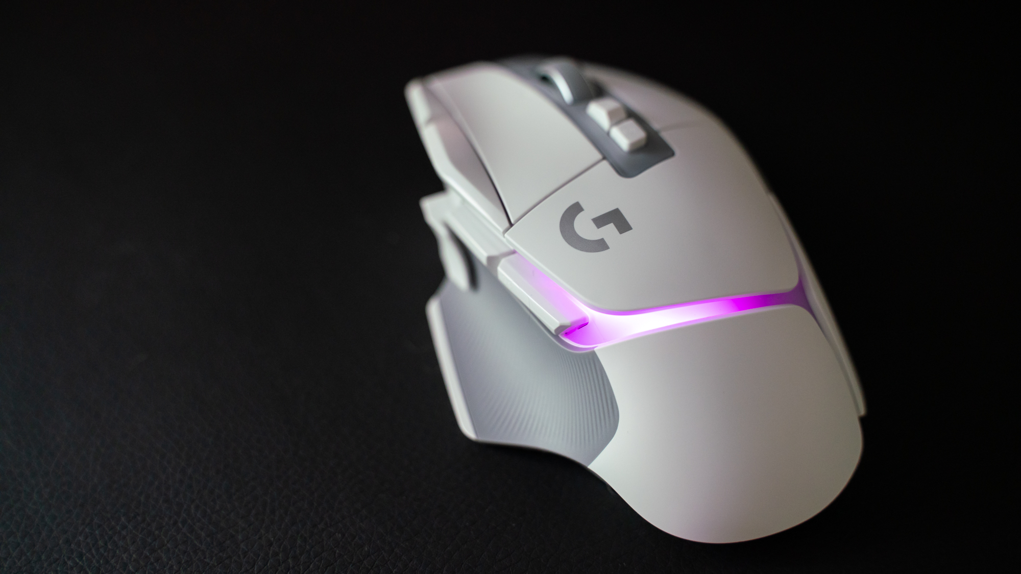
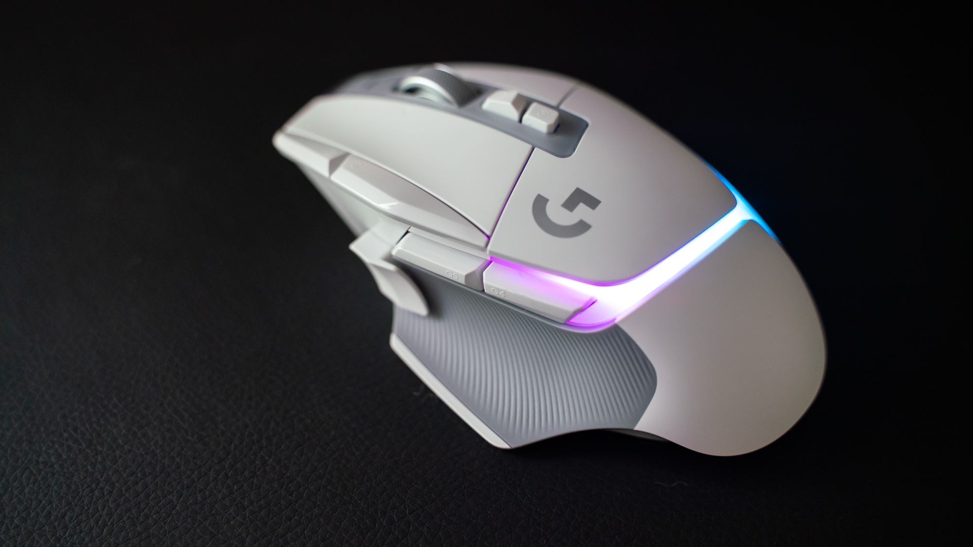
Logitech G502 X Plus on a leatherette desk mat with its RGB turned on

(Image credit: Future / Michelle Rae Uy)

Logitech G502 X Plus: Design

  • Lighter than its predecessor
  • Great thumb rest support
  • RGB redesign is appealing

With the Logitech G502 X Plus, Logitech G is undoubtedly following the light and fast gaming mouse trend. While this isn’t the lightest wireless gaming mouse we’ve tested in 2022 – that honor goes to the Razer DeathAdder V3 Pro – it is slightly lighter than its predecessor as well as its aforementioned direct competitor, the Basilisk V3 Pro.

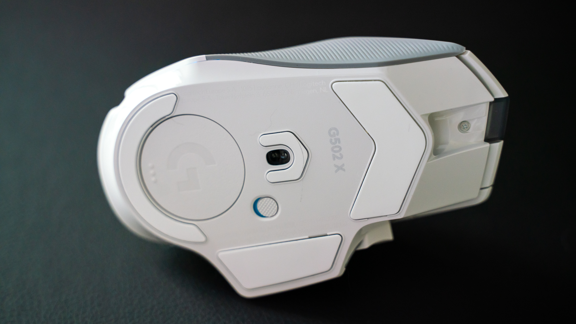
That 106g weight coupled with its low-friction PTFE feet, which deliver effortless glide on most surfaces – but especially the best gaming mouse pads – and allows users an enjoyable gaming experience with less strain on their gaming arm and shoulder. Unfortunately for fans of the line’s customizable weight feature, however, Logitech G has gotten rid of it, limiting the Logitech G502 X Plus to its base weight. 
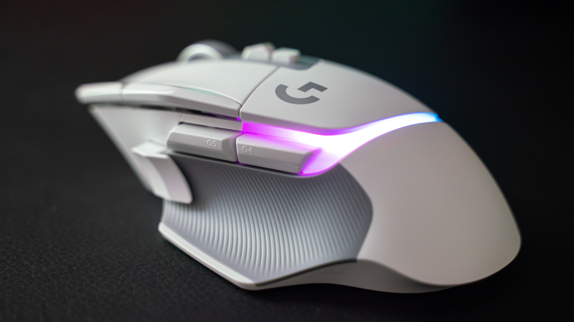
Logitech G502 X Plus on a leatherette desk mat with its RGB turned on

(Image credit: Future / Michelle Rae Uy)

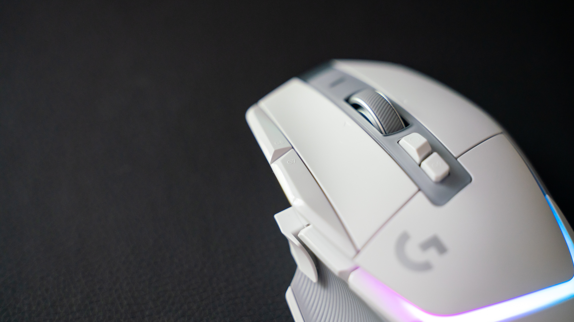
Still, as far as its ergonomics, the Logitech G502 X Plus offers good support for palm grip gamers. It isn’t as supportive as the Razer Basilisk V3 Pro or the Roccat Kone XP Air. However, it’s comfortable to use in its own right, even for smaller hands. The side panels are finely-textured and rubberized to offer a better yet premium-feeling grip, the dip on the left button is a welcome touch, and the thumb rest is very supportive. All 13 programmable controls, thanks to the brand’s new hybrid optical-mechanical switches, only require light pressure and are incredibly satisfying to press. 
Logitech G502 X Plus on a leatherette desk mat with its RGB turned on

(Image credit: Future / Michelle Rae Uy)

Claw grip gamers would have appreciated seeing the side buttons a little flushed with the side panel and shifted slightly forward for easier, more seamless access. But, palm grippers shouldn’t find the side button placements as much of an issue.
Logitech G502 X Plus on a leatherette desk mat with its RGB turned on

(Image credit: Future / Michelle Rae Uy)

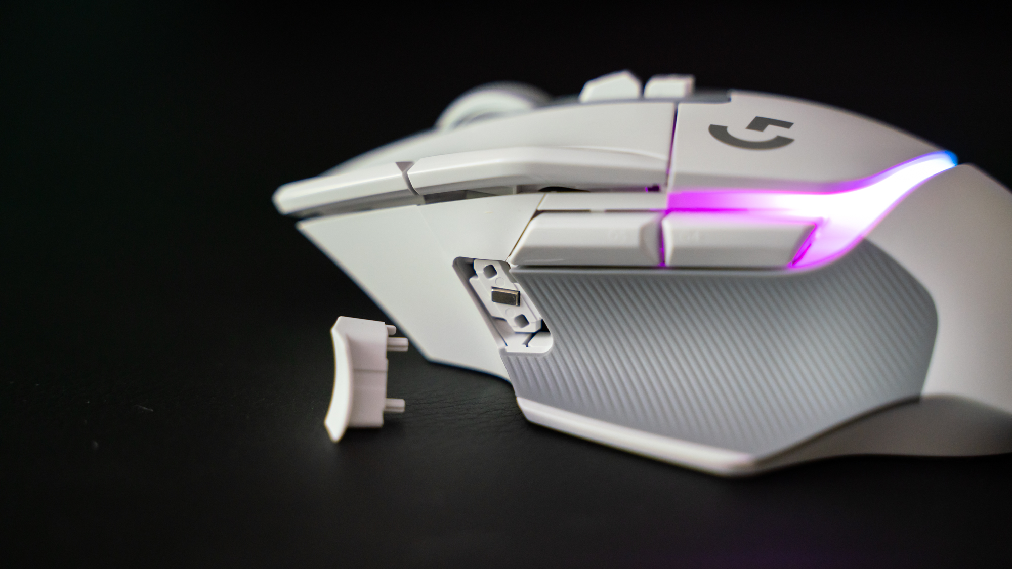
Another mention-worthy thing here is the third side button sitting right in front of the thumb rest. It’s a button with a tail, designed that way so that those with a shorter thumb can still click it without extending their thumb. 

What’s cool about it though is that it’s magnetic and can be flipped depending on whether or not you want easy access to it. It’s a DPI Shift button at default and works great, but if you want it out of the way but still usable, you can easily reverse it so that the tail is pointing forward. If you have no use for it, you can even replace it with a non-clickable cover.
Logitech G502 X Plus on a leatherette desk mat with its RGB turned on

(Image credit: Future / Michelle Rae Uy)

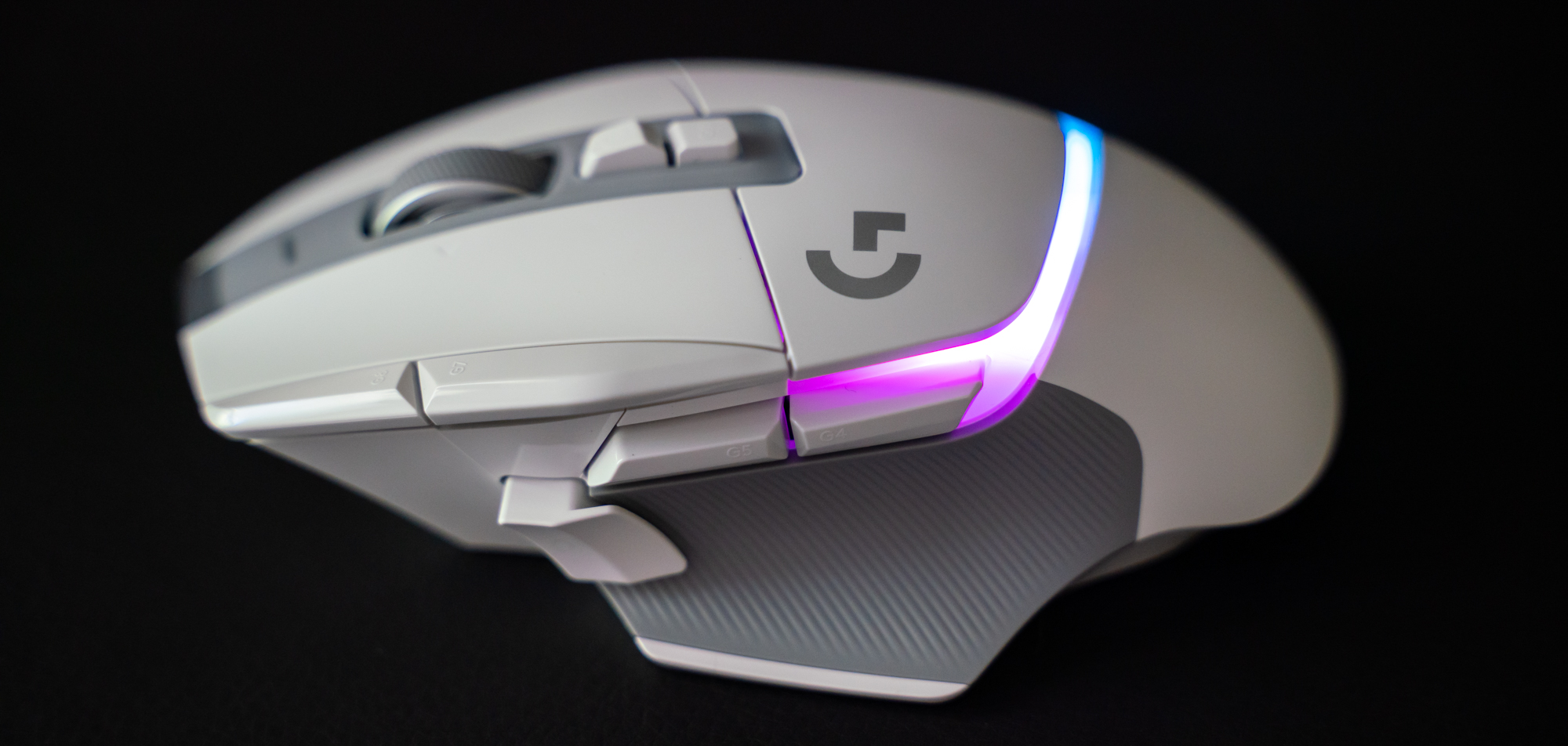
There’s beautiful eight-zone RGB lighting that cuts across the palm rest – an obvious and welcome upgrade from the Logitech G502 Lightspeed Wireless’ two-zone lighting. It’s customizable via the G Hub software and comes with an active play detection feature that dims the lights under the right side of your palm when in use to conserve battery power. If you’d prefer a non-RGB version, however, the slightly cheaper Logitech G502 X Lightspeed Wireless comes with all the features of the G502 X Plus minus the fancy lights.

  • Design: 4.9 / 5

Logitech G502 X Plus on a leatherette desk mat with its RGB turned on

(Image credit: Future / Michelle Rae Uy)

Logitech G502 X Plus: Performance

  • Buttons are incredibly responsive yet very satisfying
  • 25K sensor allows for effortless movements
  • Battery life gets a considerable boost

In terms of performance, we’ve got zero complaints. The Logitech G502 X Plus’ low-friction PTFE feet glide beautifully, even on the same leatherette pad that the Basilisk V3 Pro had a hard time with during its testing. Though not the lightest, its weight is good as well. It’s got a little more heft and is a little back-heavy, but it hasn’t gotten in the way of our gaming. If you’re used to light mice, you might just have to take some time to adjust. 

All 13 controls are macro-programmable and remappable, which should please macro fans. But, the best part about these buttons is that they’re incredibly responsive and satisfying at the same time. Those hybrid optical-mechanical switches deliver the immediate response to presses optical switches are known for as well as that satisfying tactile feedback that only mechanical switches can deliver.

Thanks to its HERO 25K sensor, the one big thing it inherited from its predecessor, turning is smooth and accurate, regardless of whether you’re playing a slower-paced game like Sable or a fast-paced combat title like Kena: Bridge of Spirits. 

Of course, that sensor is a little too fast for most people, but that just means it’s just as great for pros as it is for non-pro gamers who will appreciate those effortless movements. And, if you prefer playing at higher DPIs, you’ll be happy to know that its 106g weight adds a bit of heft to help you control the mouse better.
Logitech G502 X Plus on a leatherette desk mat with its RGB turned on

(Image credit: Future / Michelle Rae Uy)

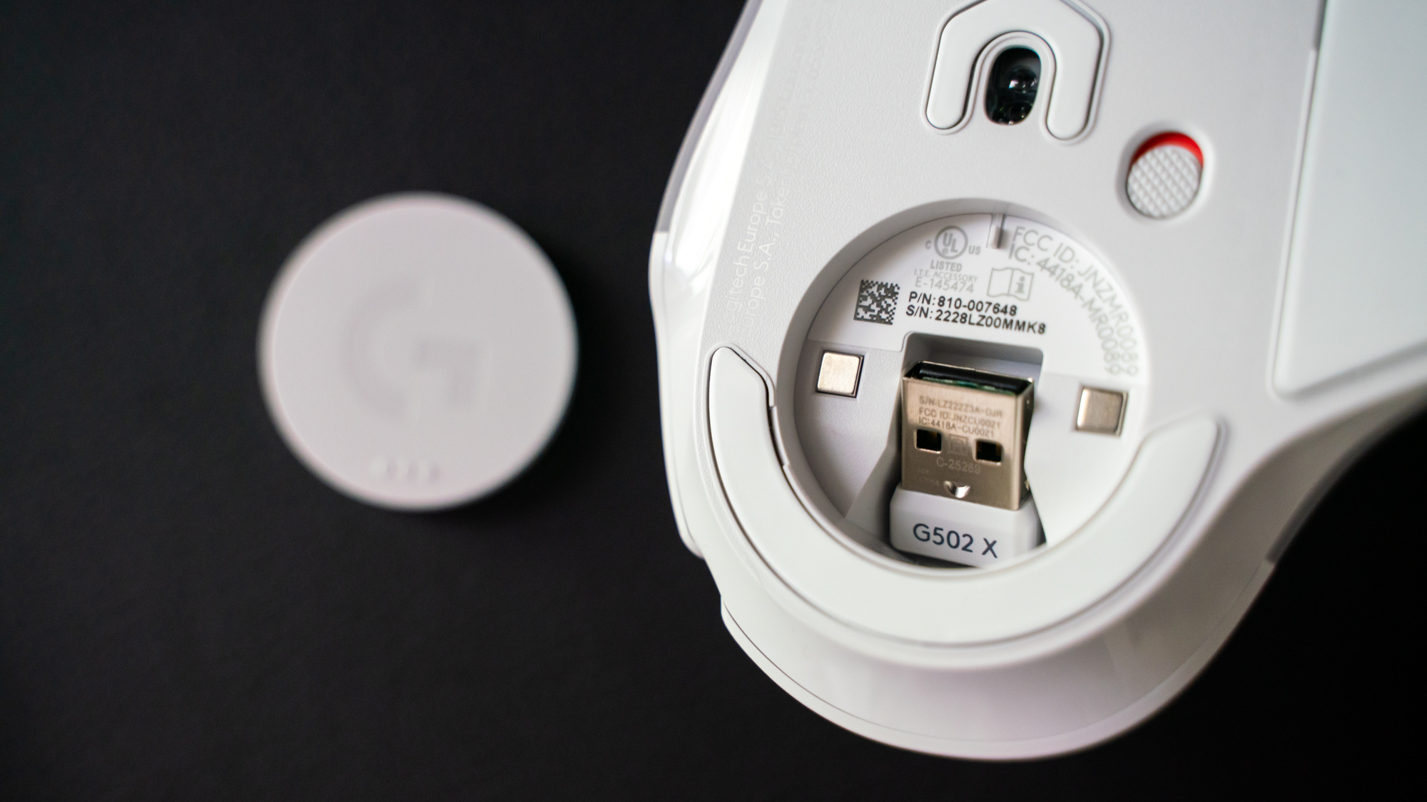
While the sensor didn’t get an update (not that it needed one), Logitech G has undoubtedly given its Lightspeed wireless connectivity a boost. Not only does the Logitech G502 X Plus use a wireless protocol that’s 68% faster in response rate than the previous generation, but it’s also capable of sharing one Lightspeed receiver with another compatible Lightspeed peripheral like our favorite, the Logitech G915 TKL, saving you a USB port.

The battery life is better as well. While the Logitech G502 Lightspeed Wireless tops at 60 hours without RGB lighting (up to 48 hours with RGB turned on), the Logitech G502 X Plus knocks it out of the park with up to 120 hours without lighting. Since it does have more RGB zones than its predecessor, however, it only gives you up to 37 hours with its RGB blasting away.

  • Performance: 5 / 5

Logitech G502 X Plus on a leatherette desk mat with its RGB turned on

(Image credit: Future / Michelle Rae Uy)

Should I buy the Logitech G502 X Plus?
Logitech G502 X Plus on a leatherette desk mat with its RGB turned on

(Image credit: Future / Michelle Rae Uy)

Buy it if...

Don't buy it if...

Also consider

Logitech G502 X Plus: Report card

Value The Logitech G502 X Plus is worth it in price, even if it is expensive. However, the fact that you have to pay $100+/£100+ more for wireless charging is a turnoff. 3.5 / 5
Design An attractive design, good ergonomics, and buttons that are satisfying to click make the Logitech G502 X Plus among the best mice to game with. 4.9 / 5
Performance The Logitech G502 X Plus is made for speed with that legendary 25K sensor as well as a new hybrid switch and a new wireless connectivity protocol. 5 / 5
Total With not a lot of misses, the Logitech G502 X Plus is among the best gaming mouse hits we’ve tested in recent years. 4.5 / 5
  • First reviewed August 2022

How we test

We pride ourselves on our independence and our rigorous review-testing process, offering up long-term attention to the products we review and making sure our reviews are updated and maintained - regardless of when a device was released, if you can still buy it, it's on our radar.

Read more about how we test

The Last of Us Part 1 review

I’ve never been one for replaying games once I’ve finished them. Restarting? Yes. The Witcher 3 and Divinity: Original Sin are just a couple of victims of my ADHD-addled brain, abandoned and returned to. My pile of shame is practically the entirety of my gaming library. Which is why it’s bordering on a miracle that I’ve watched the credits roll on every Naughty Dog title I’ve played. 

Whether it’s Uncharted or The Last of Us, the cinematic storytelling is perfectly paced to hold my attention. These are games for people who love movies. Uncharted is your action-adventure summer blockbuster with a charismatic lead and ensemble cast of memorable characters. The Last of Us has its fair share of action, but by contrast, its post-apocalyptic backdrop is home to tragedy, desperation, and sadness. 

And while I loved The Last of Us Part 1 back when I played it back on PS3, that book was closed as soon as I put my controller down. Revisiting old games – even for a quick, novelty dabble – always leaves those rose-tinted glasses with a few cracks in them. If you’re lucky. Sometimes, the lenses fall out altogether. The Last of Us’ PS4 remaster did nothing to change that conviction. Even ardent replayers of games would have been hard-pushed to pick out any significant improvements that warranted buying it a second time. As for me: been there, done that, got the spore-sprinkled t-shirt.

So it’s simply lived on in the dank recesses of my memory, amidst a small pile of games, labelled with a tattered post-it that reads ‘GOAT’. 

You can understand, then, why I was indifferent when The Last of Us Part 1’s PS5 remake was announced. ‘It’s not for me,’ was my immediate reaction. It’s for the obsessives who are out there buying GTA 5 each time it gets a new release. You know, the people already thinking about their PS6 and Xone Box X pre-orders (Microsoft’s naming system remains a mystery). 

If a classic game’s not being sullied because the nostalgic sheen has been peeled away by a fresh pair of eyes, a remake can veer the other way – stirring up outrage in its fanbase with misplaced concepts and ideas. But somehow, Naughty Dog has deftly navigated its way through those waters, plotting a narrow and careful course and docking at port with a masterpiece intact.

It’s been almost a decade since I played the original. And as I revisited this shiny and expensive remake, it felt like absolutely nothing had changed. That’s not an indictment; it’s the highest praise I can possibly heap on it. 

Last of Us Part I, Ellie looking out of the window of a car while Joel drives in the background

(Image credit: Sony Interactive Entertainment)

 Future past 

Sony has reeled off a list of the enhancements and improvements intended to bring this remake in-line with the developer’s original vision – while taking advantage of new tech. Of course, DualSense features have been incorporated, using the PS5 controller’s haptic feedback and trigger effects. And there are two performance modes to choose from, because we’re not animals: native 4K targeting 30 fps, and dynamic 4K targeting 60 fps. 

Deeper than that are the completely rebuilt character models and animations, plus upgraded AI. And the PS5 allows for in-game physics which are going to make things slightly tougher, now that bullets can tear through the environment. But to me, it’s how I remember the game always being, like a perfect restoration of an old painting – not that smeared Jesus meme we all know.

Lead cinematic animator Eric Baldwin summed up the conundrum Naughty Dog faced perfectly: “No matter what we were making, it was gonna be compared – not to the original. It was gonna be compared to the memory of the original.” And the developer nailed it. Everything is as I recall it being the first time around. Which obviously isn’t the case. There’s wizardry afoot that has improved everything, while preserving the essence to the point that those improvements are almost invisible. It’s as if a video game remake were developed by the kindly restoration specialists of The Repair Shop.

The only discernible difference in my experience between the original and the remake is the combat. And that’s only because I cranked it waaay down. There are four difficulty options in the PS5 remake, not counting the Survivor Mode unlocked after completion. Easy, Normal, and Hard have given way to Very Light, Light, Moderate, and Hard. In other words, there’s a new low and I gleefully wallowed in it. On Very Light, ammo is plentiful, human enemies are practically blind, and the infected are still scary as heck – but the terror was dialled down a notch, knowing I could almost rub shoulders with them without being mauled to death. 

Joel from The Last of Us Part 1 PS5

(Image credit: Sony)

 Good grief 

The Last of Us Part 1 is full of memorable moments, in combat and out – but as a verified secret softy, it’s the heart-wrenching ones that have scored their marks in my heart. And boy howdy, does the revamped intro qualify for that and then some.

I know, I know – I was just this week taking a shot at the The Last of Us remake’s launch trailer for dropping 10-year-old spoilers. But the death of Joel‘s daughter at the outset gets a pass, I think. Right? It’s a zombie apocalypse – or near as damn it. People died in droves. Joel has a grief beard that didn’t come from nowhere. And a teenage daughter-shaped hole in his heart that Ellie helps heal.

Suffice to say, I was left bawling and snotty, just as I was back in 2013. Possibly even snottier, and it’s undoubtedly because of the subtleties afforded by the PS5 hardware, new development tools, and the fact that everything has been rebuilt from the ground up.

You see the shock of being shot sketch across her face, and the pain in her tiny little body as she lies bleeding out, unable to comprehend

There are a few moments where we helplessly watch Joel in his panic and despair, cradling his daughter, Sarah, in his arms. You see the shock of being shot sketch across her face, and the pain in her tiny little body as she lies bleeding out, unable to comprehend. As Joel holds her close, their faces touching, the life drains from her eyes, and a tear trickles down the side of her face. He realizes she’s gone. I was fully prepared for this scene. And it still got me.

I couldn’t tell you which of those details were present in the original game and which have been added in the remake; it doesn’t matter, ultimately. Every beat, every moment – whether it was tragic, hopeful, frightening, or adrenaline-fuelled panic – is exactly as I remember it.

Our minds tend to take our memories, smooth down the edges, and buff out impurities, without warping the kernel of whatever it is we hold dear. Naughty Dog has taken The Last of Us Part 1 apart, and rebuilt it with a finesse and subtlety that matches even that romantic and unrealistic bar. It truly honors the original game and the fans. And it’s done in such a way you won’t even notice.

Amazon’s expensive Lord of the Rings gamble pays off in fantastical fashion: The Rings of Power review

The Rings of Power: key information

- Launching on Prime Video on September 1 (US) and September 2 (worldwide)
- Created by JD Payne and Patrick McKay
- Based on J.R.R. Tolkien's legendary Lord of the Rings novels
- Set during Middle-earth's Second Age
- First season comprises 10 episodes
- Morfydd Clark, Robert Aramayo, Cynthia Addai-Robinson, and Markella Kavenagh among 23-strong main cast
- First season cost $465 million

The Lord of the Rings: The Rings of Power represents a massive gamble for Amazon Studios. The multinational entertainment division has enjoyed relative success with its other movie and TV offerings, including The Boys and Invincible. However, Prime Video – Amazon’s streaming service – lacks a cultural behemoth, such as Netflix’s Stranger Things, the Disney-owned Marvel Cinematic Universe (MCU), or HBO's Game of Thrones within its extensive back catalog.

With The Rings of Power, a Prime Video series set in legendary author J.R.R. Tolkien’s fantastical world of Middle-earth, Amazon has the opportunity to muscle in on Netflix's, Disney Plus’ and HBO Max's prestige TV turf. Such aspirations are fraught with danger, though – after all, The Rings of Power’s first season cost $465 million. If it completes its $1 billion, five-season run, it’ll be the most expensive show ever made. And should it struggle to obtain positive reviews, the negative financial and reputational impact on Amazon could be catastrophic. Simply put, failure is not an option.

It’s just as well, then, that The Rings of Power is a pricey gamble that pays off in dazzling and enchanting fashion. It’s high fantasy at its finest; an enthralling, drama-fuelled show that’s breathtaking in scope and scale, and one so meticulously crafted Tolkien himself would approve.

Dawn of a new age

Silvan elf Arondir looks out onto the sunlit Southlands from an elven tower in The Rings of Power

The Rings of Power precedes the events of The Hobbit and Lord of the Rings. (Image credit: Prime Video)

Set during Middle-earth’s Second Age, The Rings of Power tells the multi-narrative story of the forging of the titular Rings of Power, Sauron’s attempt to become the world’s tyrannical ruler, and how Middle-earth’s races band together to thwart his masterplan.

With five seasons comprising 10 episodes each – as long as its first season is successful – already plotted out, Amazon’s Lord of the Rings series is certainly ambitious. From a storytelling perspective, though, The Rings of Power needs to walk before it can run. This is a series that, despite some Tolkien fans' frustration, aims to condense 3,500 years of Middle-earth history into a tale that spans decades than millennia – a significant creative diversion from the source material.

So it’s unsurprising that the show’s first two episodes are entirely devoted to setting up its characters, locations, and various story strands. The premiere’s opening scenes are dedicated to covering important moments in Middle-earth’s First Age, such as the elves’ centuries-long war with Morgoth, aka Sauron’s master. It’s a history lesson – narrated by Galadriel (Morfydd Clark) – that provides essential context on events preceding the show’s main story. It’s similar to the prologue seen in Peter Jackson’s The Fellowship of the Ring movie, but goes deeper and further into Middle-earth’s history than its movie counterpart.

A regal-looking Queen Miriel smiles as she sits on a horse in the center of Numenor in The Rings of Power

Amazon's Lord of the Rings marks the live-action debut of Númenor and its long-living human population. (Image credit: Ben Rothstein/Prime Video)

From there, the show takes viewers on a whistle-stop tour of its multiple races, core cast, and key locations. With 23 main characters and eight world regions – that’s discounting a ninth realm in Númenor, which doesn’t appear until episode 3 – Amazon’s Lord of the Rings has plenty of moving parts to establish.

Pleasingly, The Rings of Power productively blends these together. Taking inspiration from Jackson’s Lord of the Rings and Hobbit film trilogies, The Rings of Power uses a map of Middle-earth to jump between regions, introducing each territory’s major players and plot points as it goes. 

The Rings of Power provides plenty of amusing, dramatic, and emotional moments

Like Game of Thrones, The Rings of Power routinely shifts between myriad locations, striking a largely satisfying balance between the time we spend in each realm and giving its core cast the necessary screen time to ingratiate themselves to audiences. It’s less concerned with the political backstabbing seen in HBO’s wildly successful show (and spin-off series House of the Dragon), and the horror machinations of Stranger Things, so viewers shouldn’t expect to see such similarities here. However, Amazon’s Lord of the Rings employs the multi-narrative approach that this trio of TV shows uses to great effect, allowing it to weave an intricate tale that occasionally prefers slick transitions – largely based on the Middle-earth map it implements – over hard cuts between scenes.

The Rings of Power’s setting and lack of extensive plot and character-specific source material means it doesn’t require an in-depth understanding of Tolkien’s works to enjoy it, either. It benefits from telling a story set in an age with relatively little background information – compared to The Lord of the Rings anyway – to draw from, negating the anxiety-inducing prospect of having to binge watch other shows and movies to catch up. That’s a big issue that newcomers to the MCU have to contend with, but this isn’t the case where The Rings of Power is concerned. Instead, it acts as a wonderful entry point to Middle-earth for Tolkien novices; one that doesn’t rely heavily on exposition dumps – the first episode’s prologue aside – to help audiences enjoy what’s on offer.

Nori Brandyfoot and Poppy Proudfellow look behind them with their faces lit by a lantern at night in The Rings of Power

The Harfoots, a Hobbit precursor race, have a big part to play in The Rings of Power. (Image credit: Ben Rothstein/Prime Video)

It should be noted that some storylines and subplots are weaker than others. The Southlands arc, which centers on silvan elf Arondir (Ismael Cruz Córdova), as well as human characters including healer Bronwyn (Nazanin Boniadi) and her troubled son Theo (Tyroe Muhafidin) is ground zero for evil’s return to Middle-earth. Significant though this is, it’s not as thrilling – save for a couple of tense, terror-fuelled Arondir-centric moments – as Galadriel’s more action-packed, multi-location tale, which is far more gripping stylistically and narratively.

Similarly, the Southlands plot isn’t as charming or supernaturally imbued as events concerning a hobbit precursor race called the Harfoots, or the emotionally-charged and diplomacy-led plot involving key personnel like Elrond (Robert Aramayo), Durin IV (Owain Arthur), Disa (Sophia Nomvete), and Gil-galad (Benjamin Walker). That said, non-Southlands story threads aren’t immune to the odd blip, with some scenes feeling pretty pedestrian or uneventful. Here’s hoping that season 1’s subsequent eight episodes fine-tune the equilibrium between its multiple narratives. Otherwise, The Rings of Power may suffer from similar storyline issues that occasionally plagued Game of Thrones.

Of elves and men (and dwarves and harfoots) 

Disa leads her fellow dwarves in singing a song to resonate Khazad-Dum's caverns in The Rings of Power

The Rings of Power pleasingly digs into the culture, traditions, and family life of Middle-earth's dwarves. (Image credit: Ben Rothstein/Prime Video)

While there are some problems with The Rings of Power’s branching narratives, the same can’t be said of its talented cast.

For one, characters that diehards and casual fans already know, such as Galadriel and Elrond, are younger and more inexperienced than the versions in Jackson’s movies, providing ample opportunity to explore how they become the individuals we see in the Third Age.

Delightfully, Clark and Aramayo bring many new dimensions to their respective characters. Clark’s hot-headed Galadriel is imbued with a steely and stubborn resolve; a sharp contrast to the ethereal and mythic version she becomes. Meanwhile, Aramayo’s Elrond possesses a naivety and youthful exuberance that belies the cautious but wise persona we previously met in The Lord of the Rings. These conflicting personalities make for captivating encounters between Galadriel and Elrond in The Rings of Power, as well as other characters within their sphere of influence; verbal jousts that are riveting to watch. That conversations between Galadriel and Elrond, in particular, happen in person – they only share one physical conversation in all of Jackson’s movie adaptations – is all the more pleasing, too.

Halbrand looks over at a solemn looking Galadriel in the foreground in The Rings of Power

Amazon's Lord of the Rings pairs different characters together to satisfying drama-fuelled effect in its opening episodes. (Image credit: Prime Video)

It’s not just Clark and Aramayo’s elven pair that shine. Harfoot duo Nori Brandyfoot (Markella Kavenagh) and Poppy Proudfellow (Megan Richards) bring levity, curiosity, and goodwill in a manner reminiscent of Merry and Pippin from The Lord of the Rings. Dwarven pair Durin IV and Disa (Sophia Nomvete) provide equal parts humor and heart to the cavernous halls of Khazad-dûm, too; the latter being particularly poignant as dwarves have generally been used as the comedy relief in live-action Lord of the Rings productions. Even the mysterious Stranger (Daniel Weyman), a character many fans have speculated on since the first trailer was released, brings something unique to the equation, with Weyman’s predominantly physical performance amplifying the enigma surrounding him.

Partnerships between various characters – unexpected or otherwise – also make for engrossing viewing. Whether it’s Galadriel’s initially distrustful encounter with human outcast Halbrand (Charlie Vickers), Durin’s complex and decades-long bond with Elrond, or Arondir’s Shakespearean-style forbidden romance with Bronwyn, the continual shifts in character dynamics within The Rings of Power provide plenty of amusing, dramatic, and emotional moments. Expect more politically fraught and tense exchanges to play out with the introduction of the Númenóreans and Bridie Sisson’s cryptic, unnamed character and her gang of white robed, secondary antagonists.

Absent action and amazing architecture 

A snow troll attacks Galadriel's elven party in a Forodwaith cave in the Rings of Power

The Rings of Power is disappointingly light on action in its early episodes. (Image credit: Prime Video)

Disappointingly, The Rings of Power’s opening episodes are lacking in the scintillating set-piece department. That’s somewhat expected, given the sheer amount of setup required to immerse audiences in the show’s richly detailed world.

Still, save for a few brief skirmishes, The Rings of Power is devoid of truly spectacular action sequences that’ll thrill viewers. The series is sure to find its footing in this area once all of its principal characters and locations are established – based on the trailers, there are sizable set-pieces to come in the show’s first season. Even so, a stirring or electrifying action sequence – maybe a longer sequence depicting the War of the Elves and Sauron? – wouldn’t have gone amiss.

The Rings of Power doesn’t just handle pressure – it spectacularly thrives on it

Conversely, The Rings of Power’s production design is astonishingly detailed. Yes, numerous scenes utilize green and blue screen technology to varying degrees of success. Mostly, sequences with VFX backgrounds and CGI characters blend seamlessly with physical sets, but there are instances – Galadriel’s ship heading to Valinor, for example – where green screen use is frustratingly noticeable.

Elrond is led through Khazad-Dum's awe-inspiring cavernous halls by a dwarf in The Rings of Power

(Image credit: Prime Video)

However, those occasional moments don’t detract from the stunning and richly intricate physical sets built for the show. Some critics will point to the first season’s $465 million budget as evidence that such elaborate sets would be prerequisites for a series of this scale. Even so, they’re environments that needed to be painstakingly crafted to bring a real sense of authenticity to proceedings, and allow places such as Khazad-dûm, Lindon, Rhovanion, and Tirharad to feel real and lived in. Each environment is sure to contain multiple references and Easter eggs to Lord of the Rings’ wider history, too; a goldmine for Tolkienities wanting to scour scenes to find even the most inconspicuous of secrets. 

No matter how much cash Amazon threw at The Rings of Power, there’s no substitute for production – and costume – design. Thankfully, The Rings of Power benefits hugely from the throng of Lord of the Rings fans among its behind-the-scenes crew, whose due care and attention ensured it’s an astounding visual feast for the eyes. 

That extends to its soaring cinematography (delivered by Aaron Morton, Alex Disenhof, and Oscar Faura), too, which bears the hallmarks of Andrew Lesnie’s spectacularly sweeping aerial shots and fantastic flair for character close-ups from Jackson's movie trilogies – frames more than ably supported by Bear McCreary’s anthemic and, when necessary, beautifully muted musical score.

Our verdict

The Rings of Power is fantasy-based prestige television at its absolute best. It invites you to explore Tolkien’s familiar world through fresh eyes thanks to its novel setting and eclectic cast of characters, while its labyrinthine plot has only just begun to set up ominous and more foreboding events to come. Equally, though, it doesn’t neglect the source material, as Amazon’s Lord of the Rings captures the core essence – namely, the magic and mystique – of Tolkien’s iconic works in all aspects of its production.

Based on The Rings of Power’s opening episodes, Amazon Studios is onto a winner with its latest big-budget offering. Some critics will argue that’s what $465 million will typically get you, but Amazon’s monetary outlay didn't guarantee The Rings of Power’s would be received well by fans and critics alike. It could have been the most expensive flop in TV history – a monumental failure that, according to industry insiders, might lead to the shutdown of Amazon’s Prime Video streaming service completely.

And yet The Rings of Power doesn’t just handle the pressure of being a Lord of the Rings production – it spectacularly thrives upon it. Quite honestly, it feels like a near-perfect adapted piece of literature ripped right out of Tolkien’s hugely popular novels – and what greater honor could a live-action Lord of the Rings project receive than that?

The Rings of Power launches exclusively on Prime Video on Thursday, September 1 in the US and Friday, September 2 in other world regions.

FlexiSpot E8 Frame + Bamboo Series Standing Desk

The FlexiSpot E8 Frame and overall desk setup is an impressive offering that feels like a significant upgrade from any other desk we have tested. Largely due to an intuitive control panel, added accessories that compliment a productive workspace, and other features that elevate the quality, this desk screams productivity. 

Unboxing

FlexiSpot E8 Standing Desk

(Image credit: Future)

FlexiSpot E8 Standing Desk

(Image credit: Future)

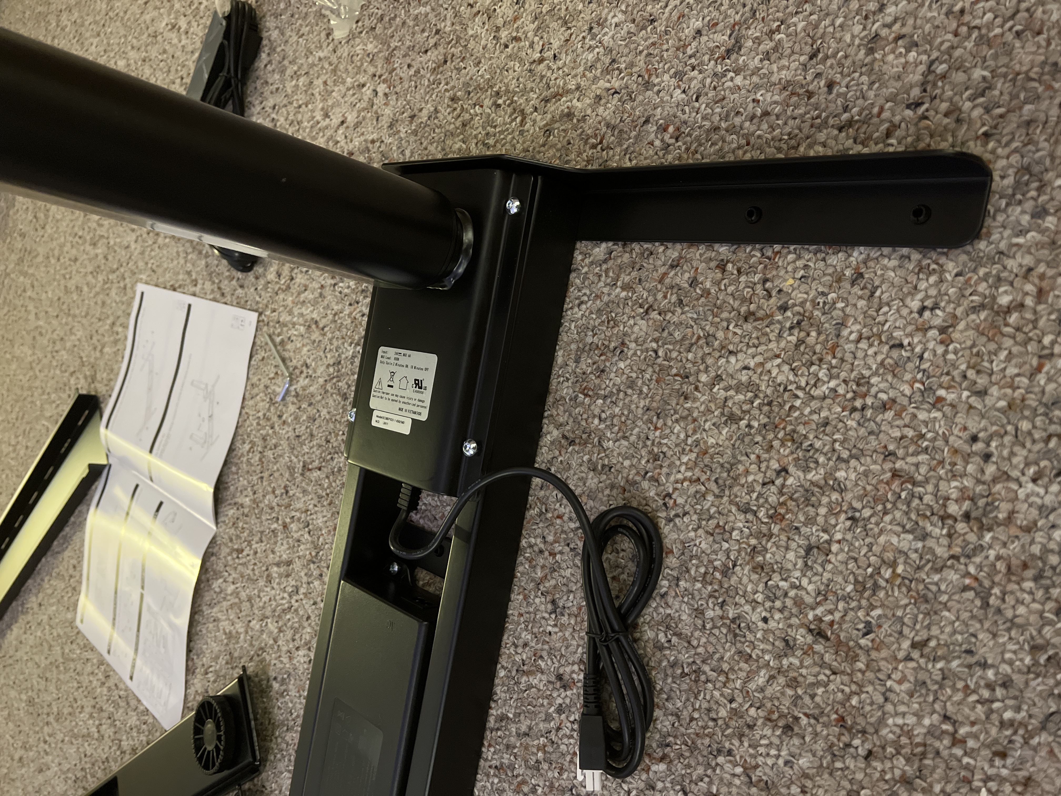
Unboxing this large desk was rather straightforward, although it did arrive in four separate boxes. Altogether, this process took about 20 minutes to complete, without being too strenuous or difficult.

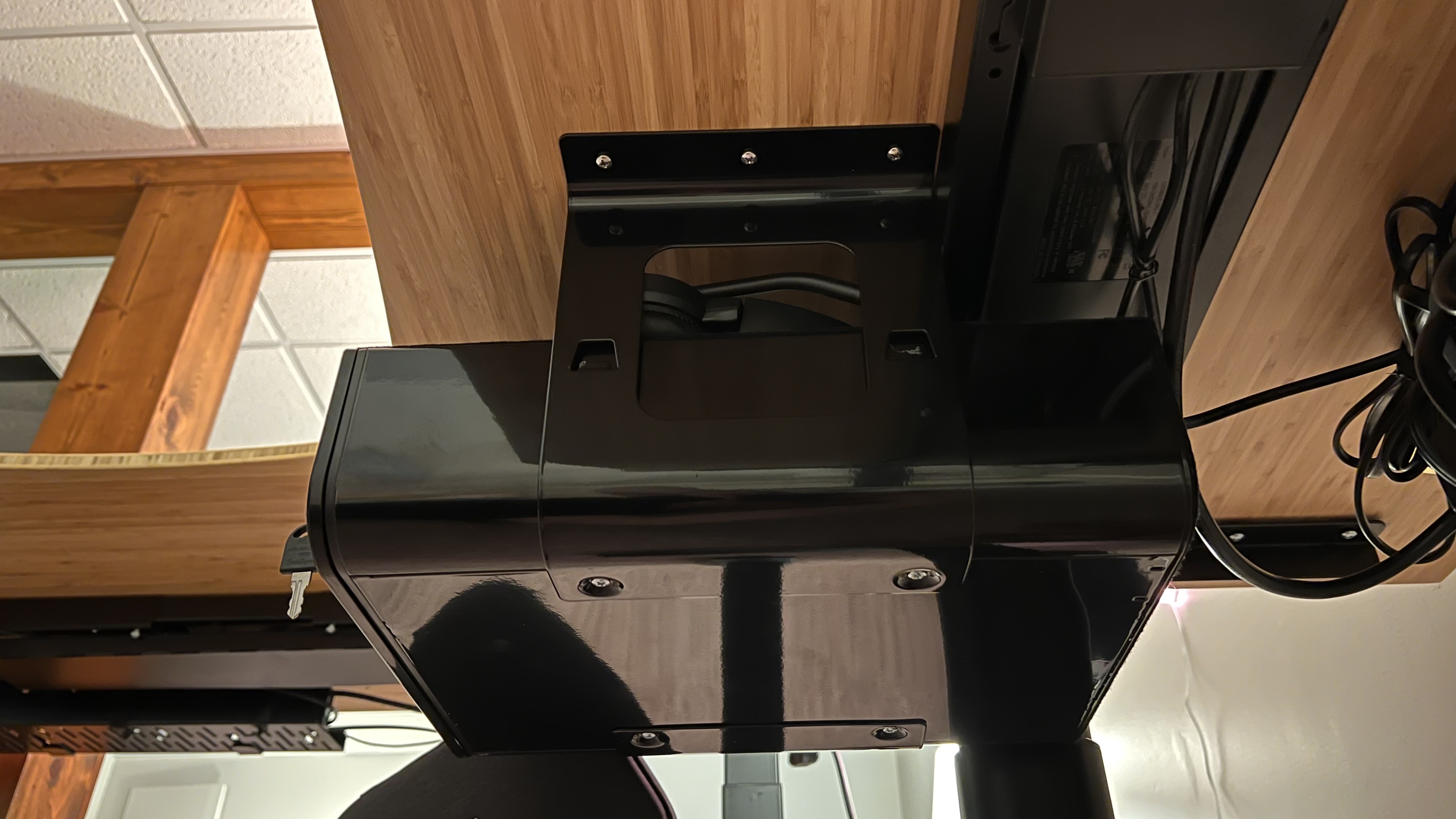
The first box contained the desk drawer with all the hardware, including the screws, the key, and mounting brackets. Prepping the drawer for installation on the larger desk was painless, before adding the brackets (stored in the drawer) to the side and bottom of the drawer and putting it off to the side to continue building the desk.

The second box contained the monitor riser. With only a few pieces as well, this took maybe two minutes to assemble. Included was the monitor riser itself - that is, the piece of bamboo - alongside two arms designed to mount to the edge of a desk to elevate the plank of wood. As previously alluded to, this was painless to set up and took almost no work.

The third box contained one single piece – the desktop. One piece, no assembly needed -  just take it out of the box and put it off to the side for assembly.

The fourth box came with all the rest of the pieces of this desk. This includes the legs, the feet, the hardware, the wheels, the control panel, and the other miscellaneous attachments to fully assemble this desk. The desk has pre-drilled holes on the underside to make attaching the legs to the desk painless.

The included instructions for building this desk were clear and very helpful.

FlexiSpot E8 Standing Desk

(Image credit: Future)

First Impressions

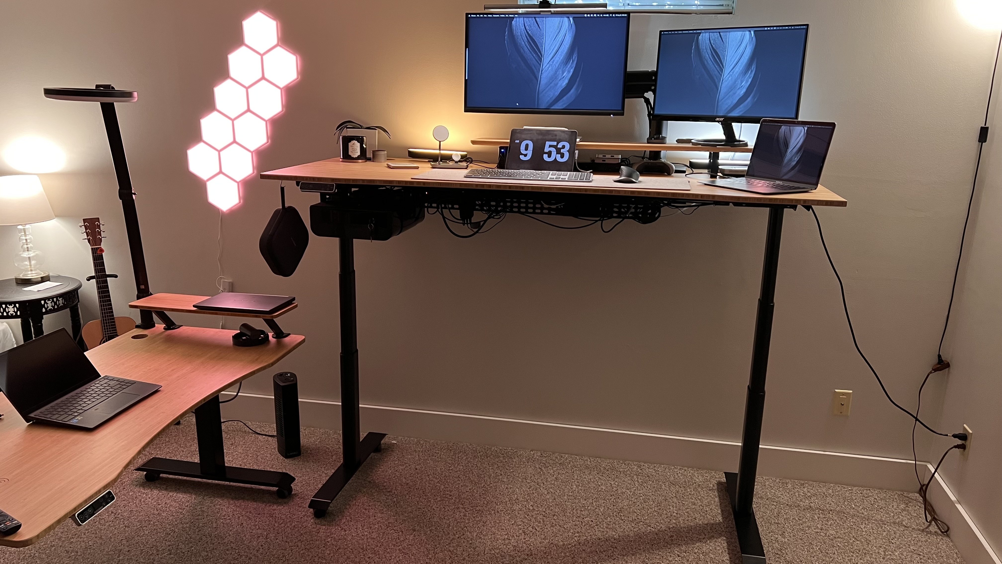
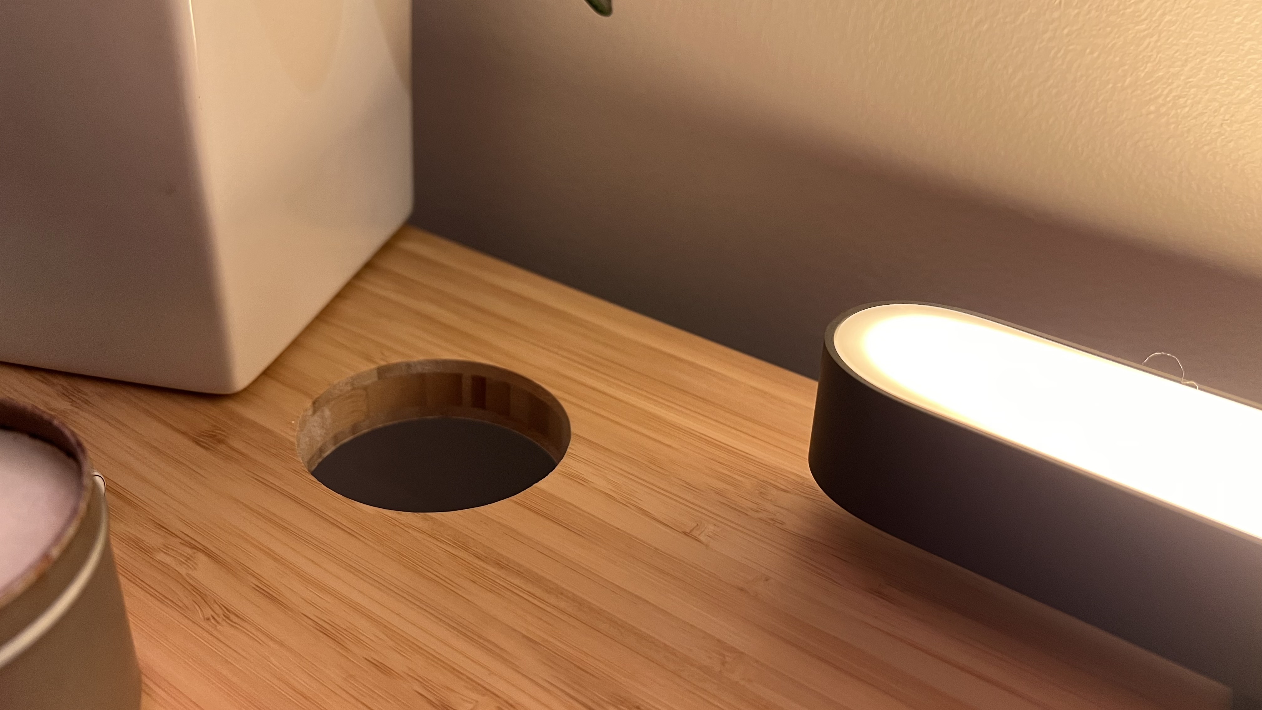
The model we reviewed was the bamboo top with the body cutout (“Curved”). This build comes with the Premium Keypad, black frame, a desktop size of 76x183cm, an under-desk drawer in black, and standing desk casters W1. With the width being 183 cm, it’s noticeably wider than what we usually have seen in desks, however nothing outrageous - and in fact, the extra width has been quite nice.

Specs

Desktop: 76x183cm (30x72in)

Wheels: 5.08cm (2in)

Height: 59.9cm - 125cm (23.6in - 49.2in)

Weight: 125kg (275lbs)

The bamboo top is nice and smooth, dropping overall weight compared to a solid wood top while keeping a nice wood look. The legs are honestly quite impressive, as while they do make enough noise to definitely be noticed (<50dB), it is well worth the tradeoff of working as well as they do. 

Design and build quality

The feature we were most impressed by is the anti-collision system built into the motorized legs. While the desk is rising or lowering, if it encounters a disturbance of any kind, it will stop moving. We tested this feature by trying to move the desk (on wheels) while lifting it up to a taller height and it stopped - and the same when lowering down, as the desk hit our chair and it stopped immediately. This is a wonderful safety feature, as the desk otherwise moves from setting to setting without further interaction.

FlexiSpot E8 Standing Desk

(Image credit: Future)

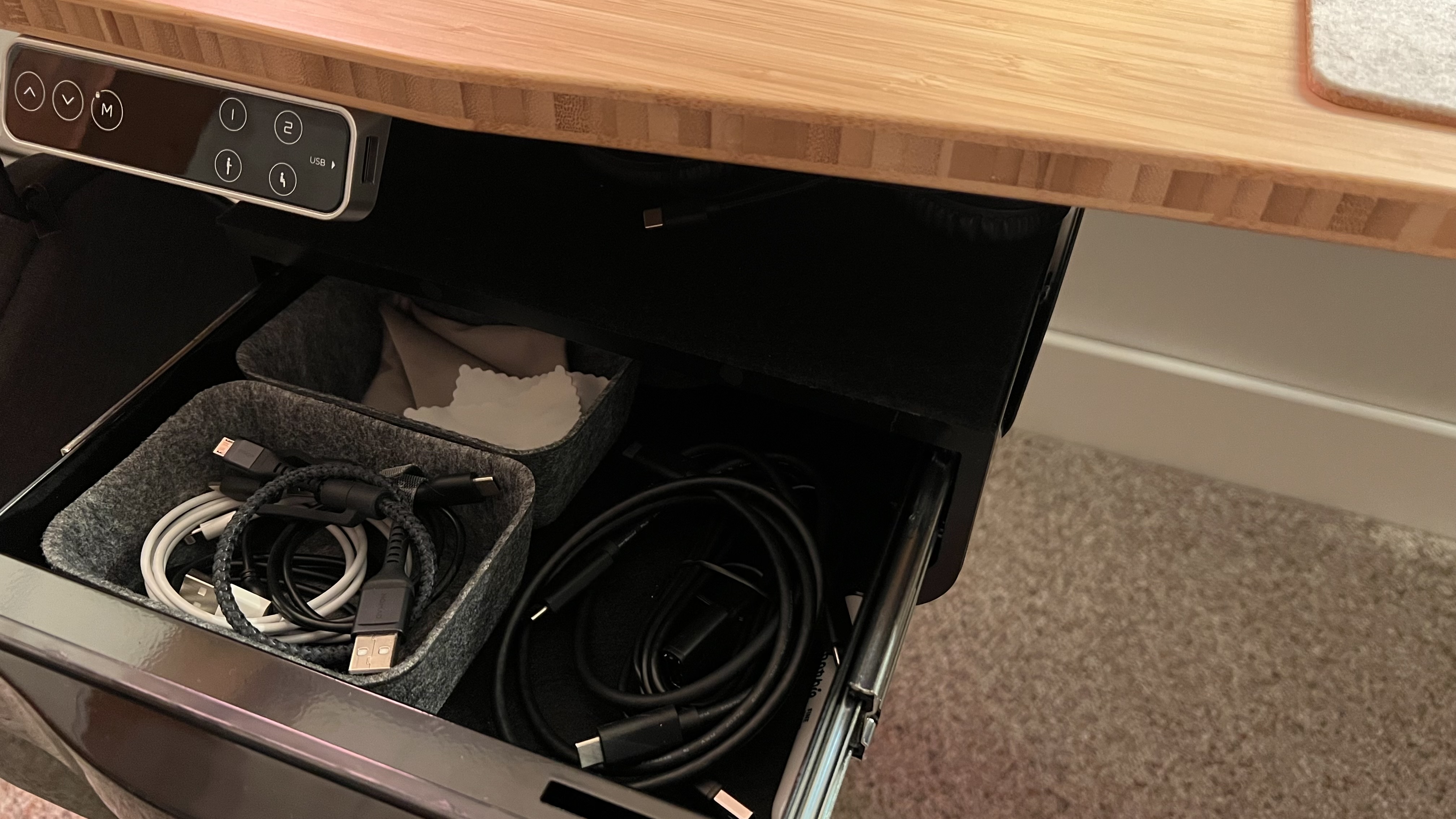
The added drawer was actually a huge game-changer, as this size desk can attract a lot of clutter. The drawer contains things out of sight that might be needed but don't need to be present on the desk. The shelf on top of the drawer was a nice added surprise, being the perfect size to house a closed laptop, a pair of headphones, or something similar. The drawer is lined with a soft padded material, allowing for no scratching of the drawer or your items – a very nice bonus. The drawer also locks, allowing you to utilize this in a co-working area knowing your items are safe, an office space where you can tuck personal belongings, or at home to keep your kids away from drives, scissors, or an iPad.

FlexiSpot E8 Standing Desk

(Image credit: Future)

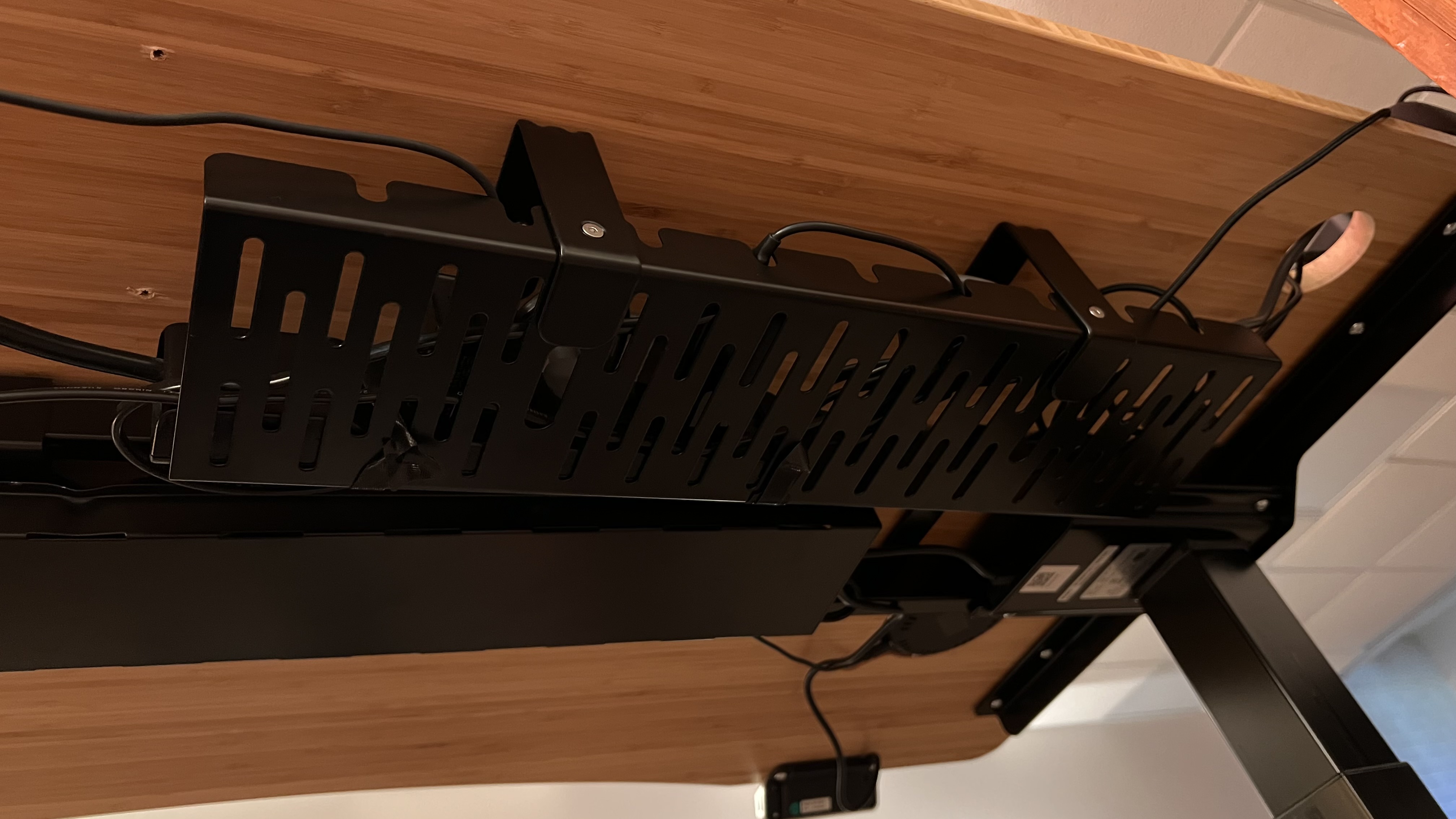
We chose to get the additional cable management, though some may not need it due to the built-in capabilities included with this desk setup. The underside of this desk, between the two legs, holds a space to tuck all cables, power bricks, and even surge protectors for the average user. For power users, with more needing to be hidden, the cable management add-on is a necessity.

FlexiSpot E8 Standing Desk

(Image credit: Future)

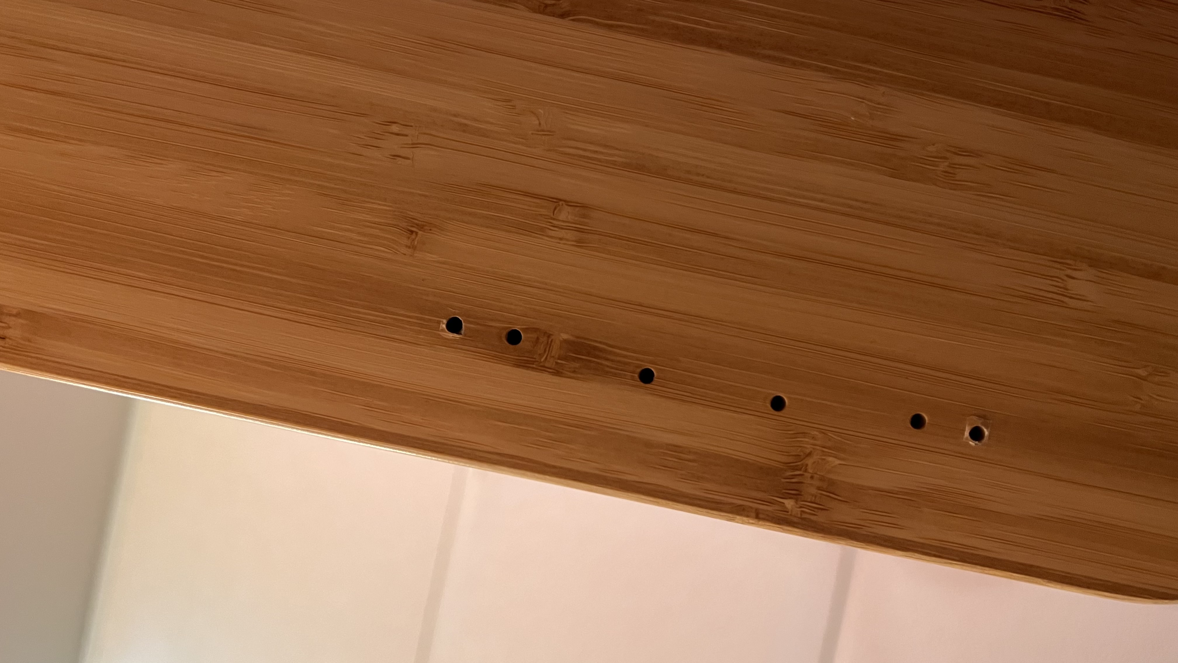
While the leg frame had pre-drilled holes to ensure proper installation and safety for the desk overall, the other pieces do not. What this allows for is a truly customizable experience for any user to be able to pick and choose where they want their drawer, keyboard arm, cable management, headphone hook, and whatever else they may want to add. This freedom and lack of structure oddly enough gave a sense of approval to do whatever we wanted when it came to placing accessories.

FlexiSpot E8 Standing Desk

(Image credit: Future)

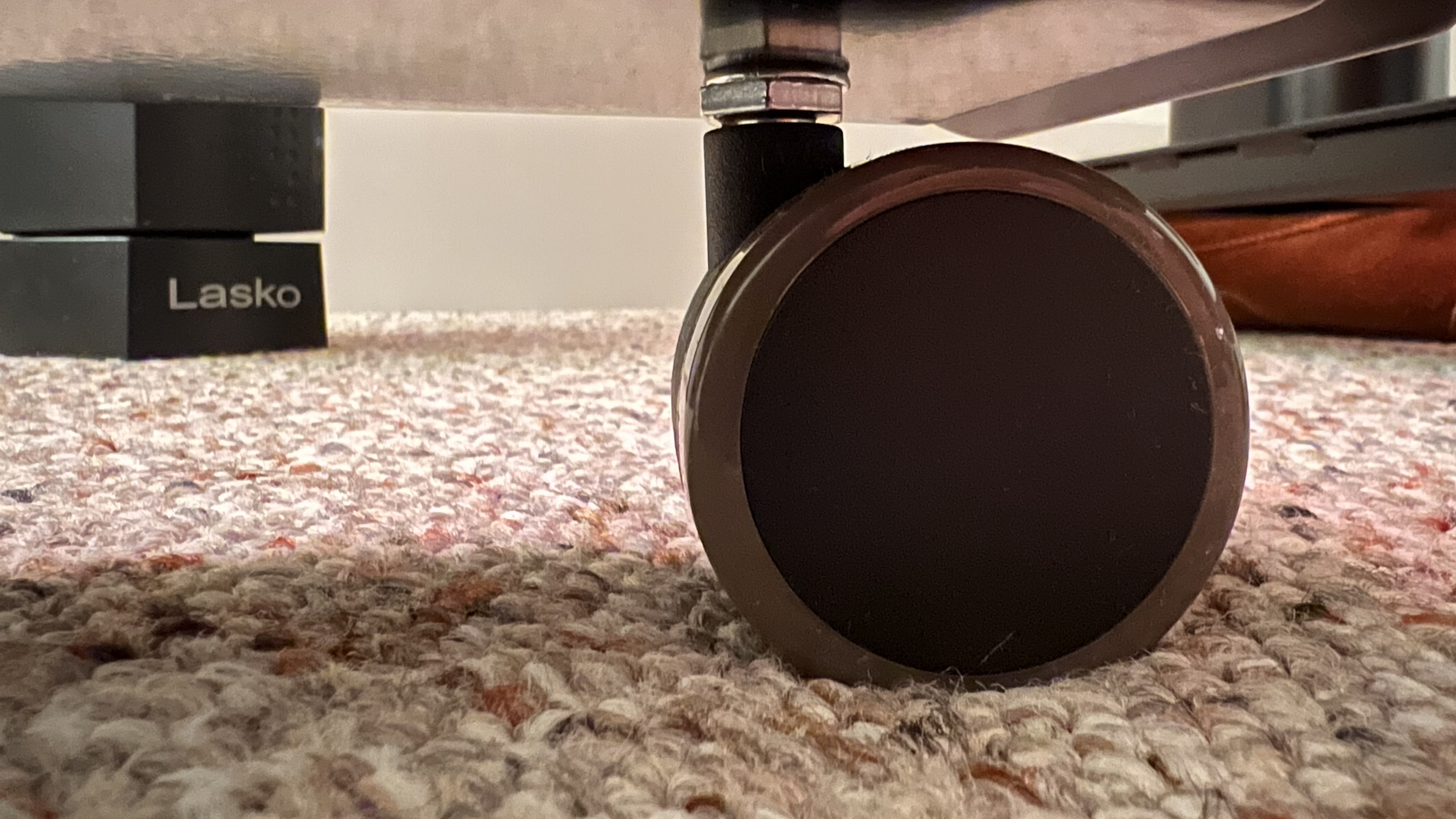
The last add-on we decided to try out was the wheels. These added around 5cm (2in) to the overall desk height but were absolutely worth it, allowing the ability to access the back of the desk with ease. Even if only when upgrades or modifications are needed, or even as infrequently as when there is a troubleshooting issue that needs to be resolved, not having to pick up the desk, squeeze into a tiny area, or disassemble half of what is on the desk just to check one cable is incredibly useful.

FlexiSpot E8 Standing Desk

(Image credit: Future)

In Use

The desk feels solid, with excellent build quality. The added wheels were a great choice, making it easy to add or adjust things on this desk. Additionally, the motors are something we grew used to rather quickly, as while they make noise, it’s nothing that is unbearable or unpleasant - rather, a good reminder that a desk full of gear is moving, so pay attention. The dual-motor system is capable of 3.8cm/s lifting speed and can lift up to 125kg. With a top height of 125cm (plus an additional 5cm for the wheels which we tested as previously mentioned) and a bottom height of 60cm (plus the same 5cm for the wheels).

FlexiSpot E8 Standing Desk

Top height and bottom height, compared (Image credit: Future)

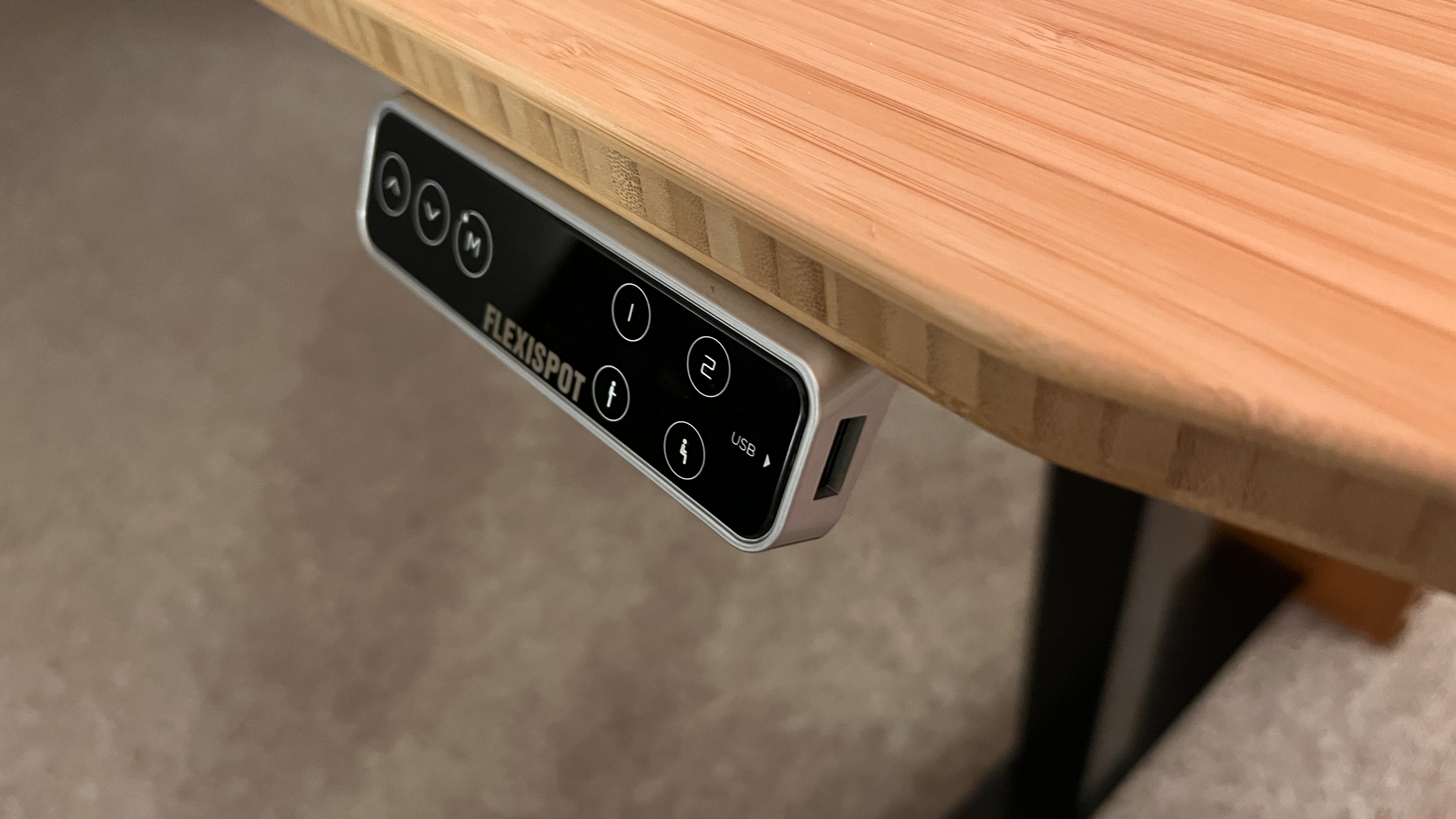
The interface to control the desk height proved very easy to use, as with four preset heights, we were able to set a perfectly dialed-in sitting height to compliment the FlexiSpot OC14 Ergonomic Chair we used alongside this desk, a perfect standing height for the most frequent user, and two other height presets also open. 

We frequently reset the extra two until we landed on one being a higher-up option (nearly top height), allowing ease of reaching under the desk, and one “working height” meaning the perfect height not to type at, but open boxes, check ports on a laptop, take product photos, etc. 

The fact that the interface has a built-in screen, and USB-A charger is extra icing on the cake. The height readout helps with having multiple users, as they can remember their ideal height if there are no open presets, and also makes it really easy to match height with another standing desk from the same company

FlexiSpot E8 Standing Desk

(Image credit: Future)

As previously mentioned, the built-in cable management was surprisingly helpful. While it looks like a simple cover to not have exposed mounting brackets, FlexiSpot was smart enough to see the open space and find a way to have it be usable by the owner to hide cables in plain sight. 

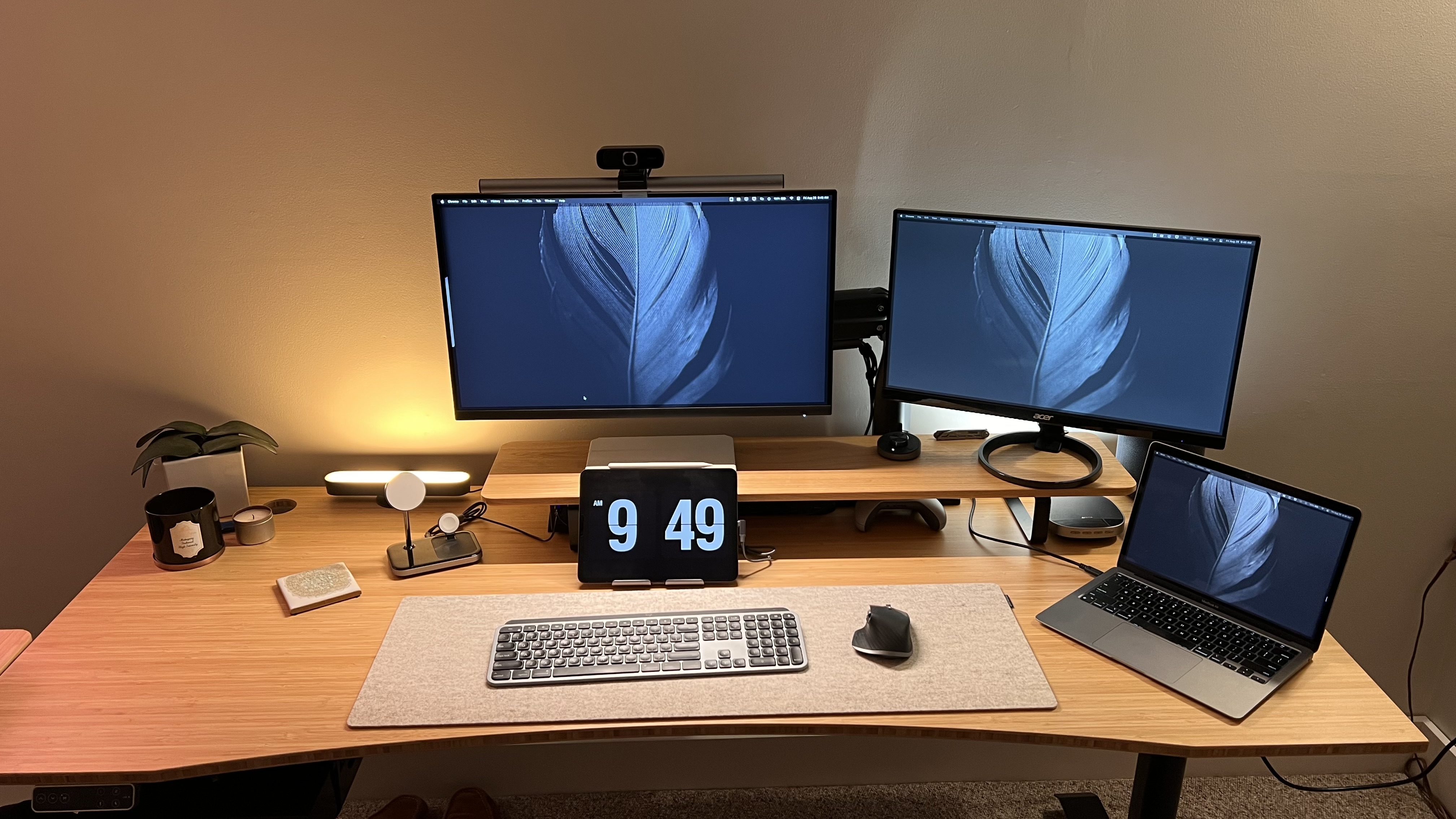
However, for heavier users, for those who have multiple monitors, or a lot of tech on their desk (guilty, while writing this there are three monitors on this desk, power supplies, an iPad, a Macbook, a Mac Mini, an Apple TV, an Apple HomePod and full color changing smart lights, plus multiple docks, hubs and more) additional cable management is a must. 

FlexiSpot E8 Standing Desk

(Image credit: Future)

The drawer was something we originally thought would simply be there and used occasionally. 

At first, that was true, but as we began to put this desk setup to the test with daily work, we found that this drawer helped out quite a bit and was very useful. Having an out-of-sight but still, a within-reach place to put things away helped with overall focus during the day. It also helped keep the desk looking cleaner. The little shelf subsequently created by the drop-down height of the drawer is perfect for housing a closed laptop, some headphones, a tablet, etc. 

The lining of the interior of the drawer is perfect for just about anything to be put in here without the worry of scratching the item or the drawer. Lastly, this drawer being lockable, as mentioned above, adds peace of mind, whether the goal is to keep out strangers, your boss, your children, or your nosy co-workers.

FlexiSpot E8 Standing Desk

(Image credit: Future)

Final verdict

Overall, this desk is a great option for those who don’t just need a standing desk, but a larger standing command center. Granted, we chose the second largest option, though that should show that if there are even bigger options available, the size does play a significant factor.

The legs on this desk are powerful, albeit slightly noisy, and have helpful features such as anti-collision detection, and the added accessories are built with the same quality and standard as the rest of the desk, feeling like an extension rather than an add-on or afterthought.

This feels like a desk that will last for quite some time, holding its quality and premium feel.

Also recently reviewed:

> FlexiSpot E7

> Uplift V2

> Fully Jarvis Bamboo

Tuesday, August 30, 2022

Motorola Edge (2022)

Two-minute review

What’s amazing about the Motorola Edge (2022) is not that Motorola has taken a scalpel to its flagship Motorola Edge Plus and managed to cut out $500 worth of features while still delivering a premium device. It's that, although the phone is larger than competitors in this price range, with a bigger battery than most, it feels as unobtrusive and light as a phone half its size.

We’d recommend the Motorola Edge (2022) for those looking for the lightest phone you can find; it’s easy to slip into a pocket and it isn’t tiresome to balance on the edge of your pinky finger. And there are other solid features, especially the big, bright screen that looks great when watching movies or shooting photos in bright sunlight – even if you can find better screens and better cameras elsewhere. The winning feature on the Motorola Edge is definitely its weight. 

In such a thin and light phone, it may be surprising to hear the battery doesn’t disappoint; Motorola somehow managed to fit a large, 5,000mAh cell inside. It charges fairly fast too, with 30W charging, so it can last more than a day and get back to full charge in just an hour and a quarter. 

On a spec sheet the Edge (2022) looks like it has great cameras, but in our tests they didn’t hold up as well as the competition. Even when pitting the phone’s 50MP primary shooter against the Google Pixel 6a’s piddling 12.2MP equivalent, the Moto couldn’t keep up. Motorola brags of a slew of special features, including a so-called “macro” mode and super slow motion video capture, but these all proved to be duds. The camera experience is a disappointment. 

The phone launches with an intentionally-clean take on Android 12, with only a few Motorola-specific tweaks thrown in, but the company promises Android OS upgrades for at least three years, an improvement on some of its other recent flagships and the bare minimum for what we’d expect.

Typically, in the $500 range, you can have a nice display, a nice camera, and a phone that excels in design, but you can only pick two of those traits. The Motorola Edge (2022) delivers on the display and the lightweight design, the Pixel 6a looks cool and has a nice camera, but the display doesn’t compare, the Samsung Galaxy A53 gives you the camera and the display, but it’s heavier in weight and laden with Samsung’s One UI. If you don’t take a ton of photos, but you spend your whole day watching your screen, the Motorola Edge (2022) looks like the right pick. 

Motorola Edge (2022) price and availability

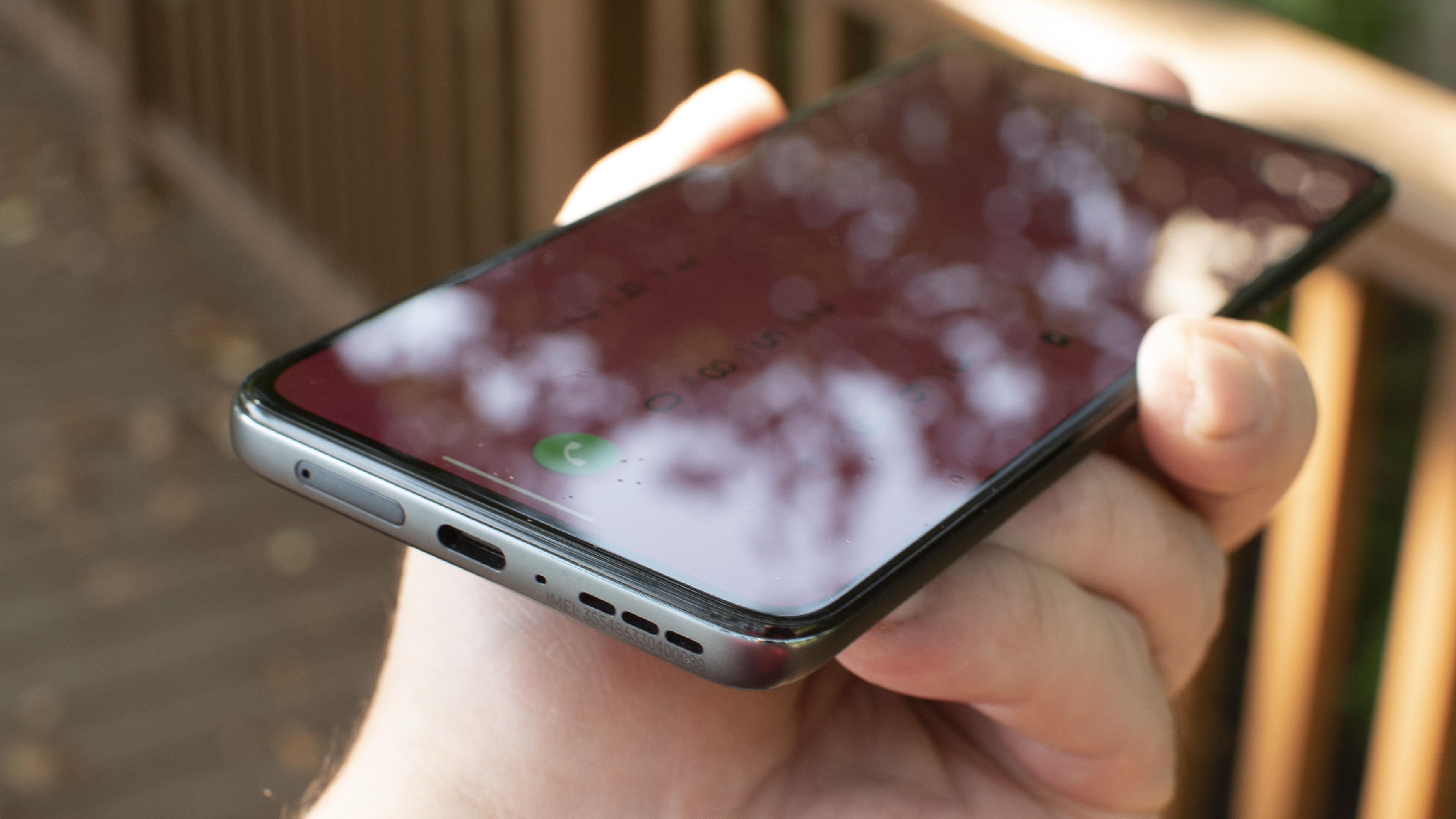
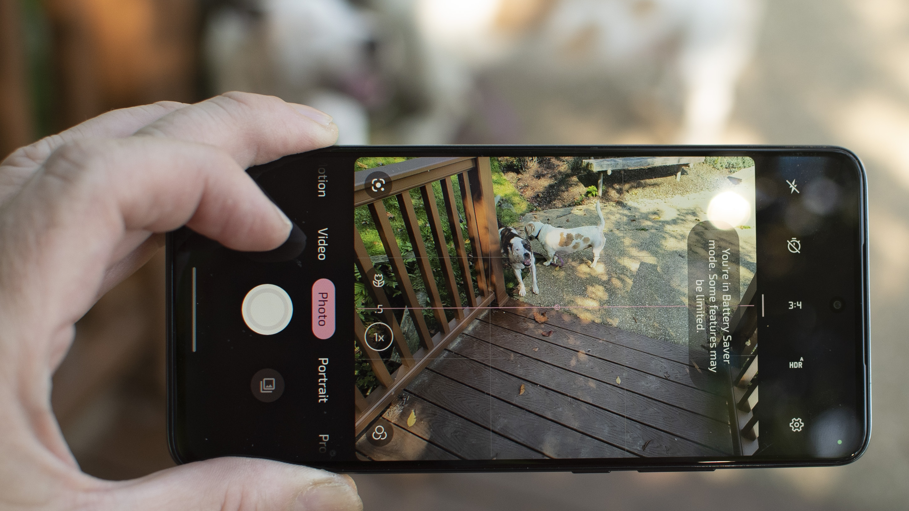
Motorola Edge (2022) lifestyle photos and close ups

(Image credit: Future / Philip Berne)
  • Available September 1 on T-Mobile and Unlocked 
  • Prices start at $498 on T-Mobile, or free with a new line of service
  • Two tiers: 6GB/8GB of RAM and 128GB/256GB of storage 

The new Motorola Edge (2022) is available as of September 1 on T-Mobile for $498, or unlocked from a variety of retailers for $499.99. The $500 segment for smartphones is quite competitive, especially recently. For about the same price you can buy the aforementioned Samsung Galaxy A53 5G or a Google Pixel 6a, both new. You can also find deals on older phones like Apple’s iPhone 11 or possibly pick up a Google Pixel 6 for the same price. 

There are two variants for the Motorola Edge (2022): one with 6GB of RAM and 128GB of storage, and a boosted model with 8GB of RAM and double the storage. We wouldn’t pay extra for the premium edition, unless you keep a lot of photos and videos on your phone (as opposed to a cloud service like Google Photos) or if you pre-download a lot of video to take on the go. 

  • Value score: 4/5

Motorola Edge (2022) design

Motorola Edge 2022 close ups camera and buttons

(Image credit: Future)
  • Very light for such a large screen and battery
  • Feels a bit cheap and plastic
  • No splash protection, be careful around water

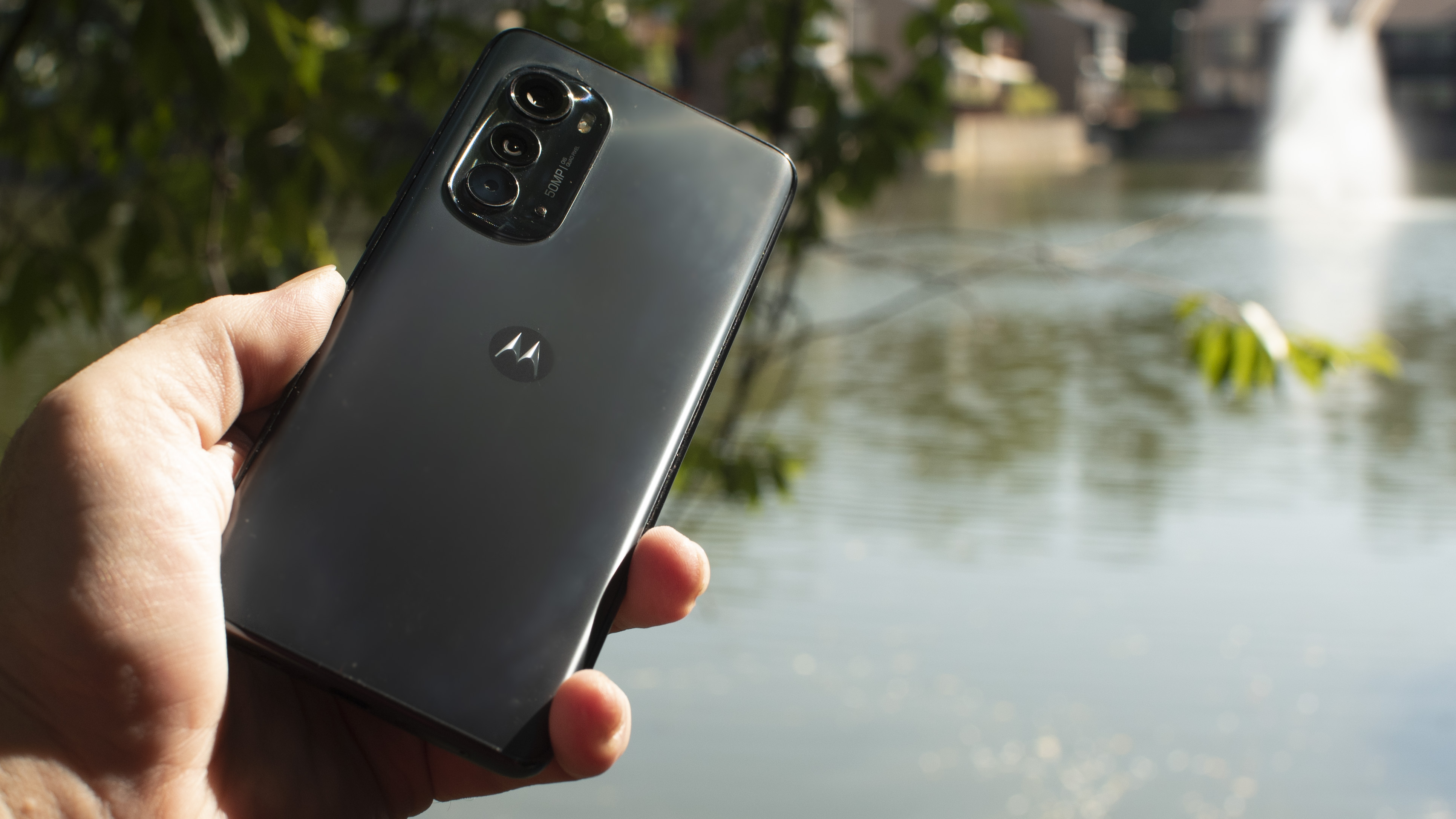
When you pick up the Edge (2022) for the first time you’ll be struck by how incredibly light it is. The phone weighs a paltry 170 grams. To compare, it weighs eight grams less than the Google Pixel 6a, even though its screen is a half-inch larger diagonally, and it has a bigger battery. It’s also more than 0.5mm thinner than the Pixel, which is marginal but only adds to the impressive feats of engineering Motorola has executed here. 

The back of the phone feels plastic, and Motorola did well to keep the color scheme simple with a dark graphite grey finish. It’s nice but not quite premium –  glossier plastic would have made the phone seem cheaper. The risk with lightweight phones is that we naturally equate a feeling of density with a product being premium, but the overall effect of this latest Edge is a device that feels nice without standing out. 

The fingerprint reader is incorporated under the display, and it did not work as well as most other phones we’ve used. It failed often, or took a long time to register prints. 

You’ll need to be careful around dirt and moisture with the Edge (2022) because it is only rated to IP52 protection. That means it can’t get wet beyond a few rain drops; seriously, it’s not even splash-proof. Both the Pixel 6a and Galaxy A53 can take a full dunk in a pool, so this is a major miss from Motorola.

  • Design score: 3/5

Motorola Edge (2022) display

Motorola Edge (2022) lifestyle photos and close ups

(Image credit: Future / Philip Berne)
  • Big 6.6-inch OLED screen
  • Variable refresh rate up to 144Hz
  • Bright and colorful even in overhead sunlight

The screen on the Motorola Edge (2022) is a real winner, using an OLED panel that can refresh up to 144Hz, which means on-screen content looks snappy and smooth, no matter what you’re doing. Even though the screen is large, the phone is slim and light enough that it’s incredibly easy to hold and manipulate with one hand. We never got pinky-tired during testing. 

The huge, 6.6-inch display is bigger and brighter than the 6.1-inch Pixel 6a by a wide margin, and it makes a difference, especially when using the phone outside. The 2022 Edge was able to crank the brightness high enough to help us focus our photos in overhead sunlight, while the 6a missed the mark, literally, because we couldn’t focus on what we were shooting. 

That 144Hz refresh rate is far beyond the pitiful 60Hz the Google Pixel 6a can muster and just a step above the Samsung Galaxy A53’s 120Hz display. In practice, we couldn’t detect a difference between the next-fastest screens, but the higher refresh rate was especially noticeable against the slower Pixel 6a (meaning other 60Hz display phones, such as the iPhone 13 would feel equally slovenly, if viewed side by side). 

  • Display score: 4/5

Motorola Edge (2022) software

Motorola Edge (2022) lifestyle photos and close ups

(Image credit: Future / Philip Berne)
  • Clean version of Android with few software tweaks
  • Only Android 12, but four years of upgrades are promised
  • Handy gestures to turn on the camera and the flashlight

Motorola brags that its phones run on a “clean” version of Android. Unfortunately, that’s Android 12, which is what most flagship phones are running, to be fair. Yet Android 13 is already available on select Google Pixel phones (at the time of writing). That said, we’re running Android 13 on our Pixel 6a and the differences between Android 12 and Android 13 require a trained eye to spot. Motorola promises the Edge (2022) will receive three years of major OS upgrades and four years of bi-monthly security updates. 

We love some of the shortcut gestures Motorola has built into the user experience here, even though they can feel silly to use. Many phones let you press the Power button twice to open the camera. On the Motorola Edge, you twist your hand back and forth a couple of times and the camera opens. It’s more ostentatious, but also it works much more consistently than stabbing a button on repeat. Likewise, you can turn the flashlight on and off by making a few chopping motions. It’s ugly, but it’s faster and easier than turning on the screen for a shortcut. 

Motorola has some features to get the Edge working on an external display or with a laptop computer. We tried some of these and never managed to get them functioning properly with our work laptop or our external TV. This could be a problem with our own gear, but we should note these features likely won’t work perfectly every time, if that’s what you need. 

  • Software score: 4/5

Motorola Edge (2022) performance and specs

Motorola Edge (2022) lifestyle photos and close ups

(Image credit: Future / Philip Berne)
  • Mid-range MediaTek Dimensity 1050 processor and chipset
  • Performance was good for movies and gaming
  • Gametime lets you max-out performance and screen refresh rate

In the $500 price range, you get a mid-range chipset with mid-range performance. We never had any serious problems with the Edge (2022) that point to performance issues and in fact, it performed well in our tests. The phone uses a Dimensity 1050 processor from MediaTek, which isn’t as well-known a brand as Qualcomm’s Snapdragon silicon; watch for it and you'll see the company's chips show up in more and more devices, however. We never had a stutter running any apps or games we wanted to play. 

The included 128GB of storage is plenty for most people, but if Motorola offers a deal to double the storage space for free, take the larger capacity. The screen on this phone is the best feature, so you’ll want to download plenty of shows and movies in advance before you take this thing on the road. With a large battery and that big bright display, this phone performs very well as a personal media player.

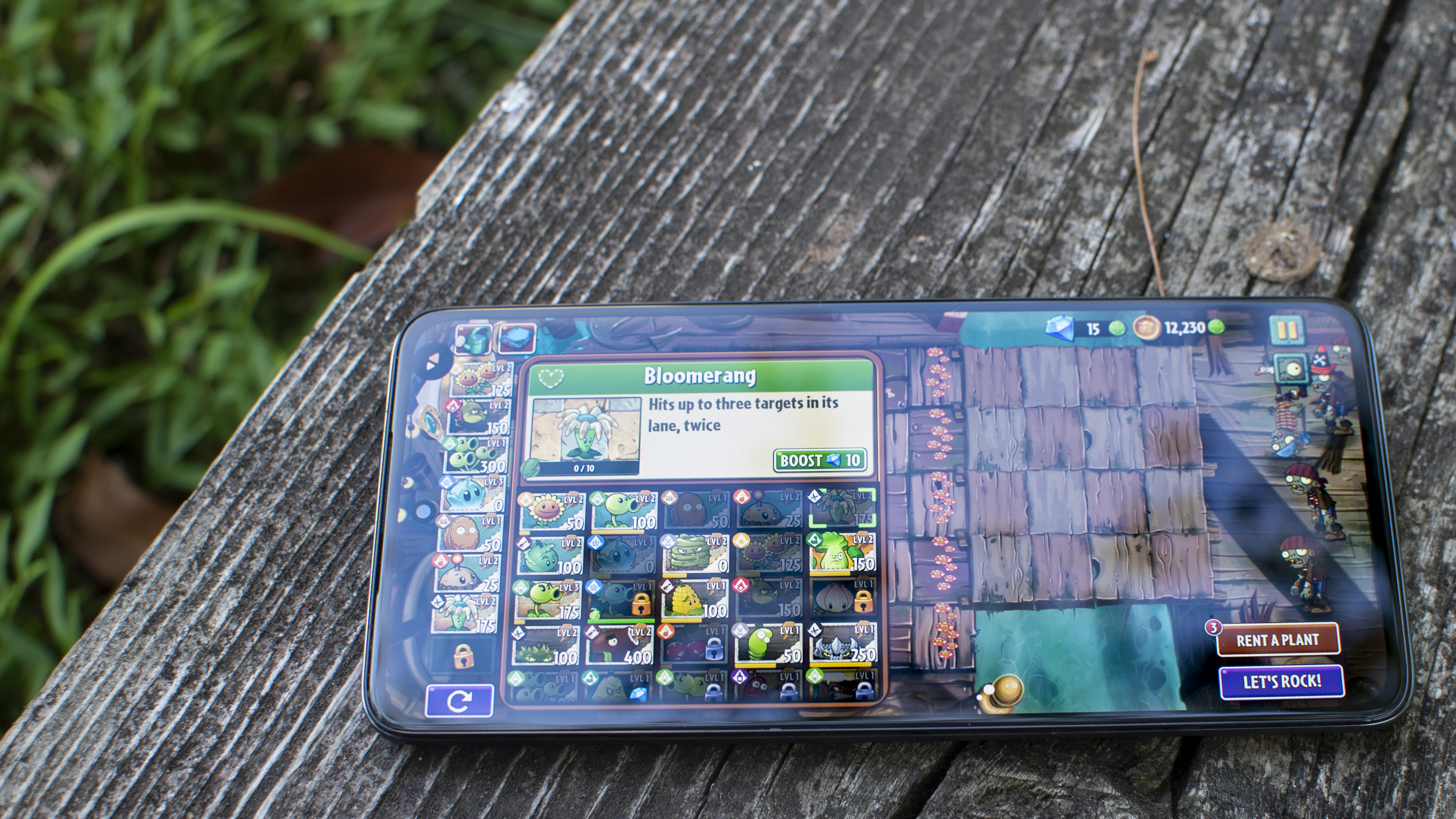
Motorola offers a gaming panel of shortcuts that pops up when you open a recognized game. You can turn on screen recording, or start a Twitch broadcast. You can also adjust phone settings to lock the refresh rate up to 144Hz, crank up the brightness, or boost system performance.

The phone looks amazing for both games and when streaming shows. The edge of the Edge does not contain too many dead pixels to interrupt gaming taps, though the little pop-up button for Motorola’s Gametime gaming features did get in the way from time to time.

  • Performance score: 3.5/5

Motorola Edge (2022) battery life

Motorola Edge (2022) lifestyle photos and close ups

(Image credit: Future / Philip Berne)
  • Big 5,000mAh battery equals plenty of battery life
  • 30W wired charging, 15W wireless charging, 5W reverse wireless charging
  • Day-long battery life, charge to full in just over an hour

Battery life on the Motorola Edge (2022) is very good, which isn’t a surprise considering the huge 5,000mAh battery inside. The Samsung Galaxy A53 packs a similar cell, but the rival Pixel 6a uses a smaller battery. On Google’s phone, battery was our chief complaint, but on the Edge it was never a problem. We got about a day and a half of use with it, which is great even if it isn’t mind blowing. 

Motorola does not include its own 30W ‘TurboPower’ charger in-box (although you can buy it separately for about $30), but Anker was kind enough to send us its third-party Nano Power Delivery charger, which worked perfectly. They do make some of the best wireless chargers!

Charging times were a bit unusual: the Motorola Edge (2022) seemed to need time to rev up, reaching close to 50% power within 30 minutes of charging and always reaching 100% within 75 minutes. 

There is a battery saver mode in the quick settings, but most of the power saving options actually seem to serve the opposite purpose. That is, there are plenty of options available in the Motorola Gametime menu that let you kill your battery much faster, but you could use these to save power as well, if you go through the right game options. 

Through Gametime, for instance, you can change or lock the refresh rate of your screen. A screen running at 60Hz needs to draw itself half as many times as a screen running at 120Hz, so this is a great power saver. 

The Motorola Edge (2022) also has two-way wireless power. You can charge it on a Qi-compatible pad at up to 15W, or you can place a device on the back of the phone and charge your accessories using the Edge’s power. Motorola sent along a set of wireless earbuds with a wireless charging case. We left them on the Edge for a few hours and the earbuds were in fact charged, but the Edge isn’t smart enough to stop charging, so the phone battery was dead. 

  • Battery score: 4/5

Motorola Edge (2022) cameras

Motorola Edge (2022) lifestyle photos and close ups

(Image credit: Future / Philip Berne)
  • 50MP camera uses quad pixel technology to make a 13MP image
  • Images were overprocessed, not as good as competition
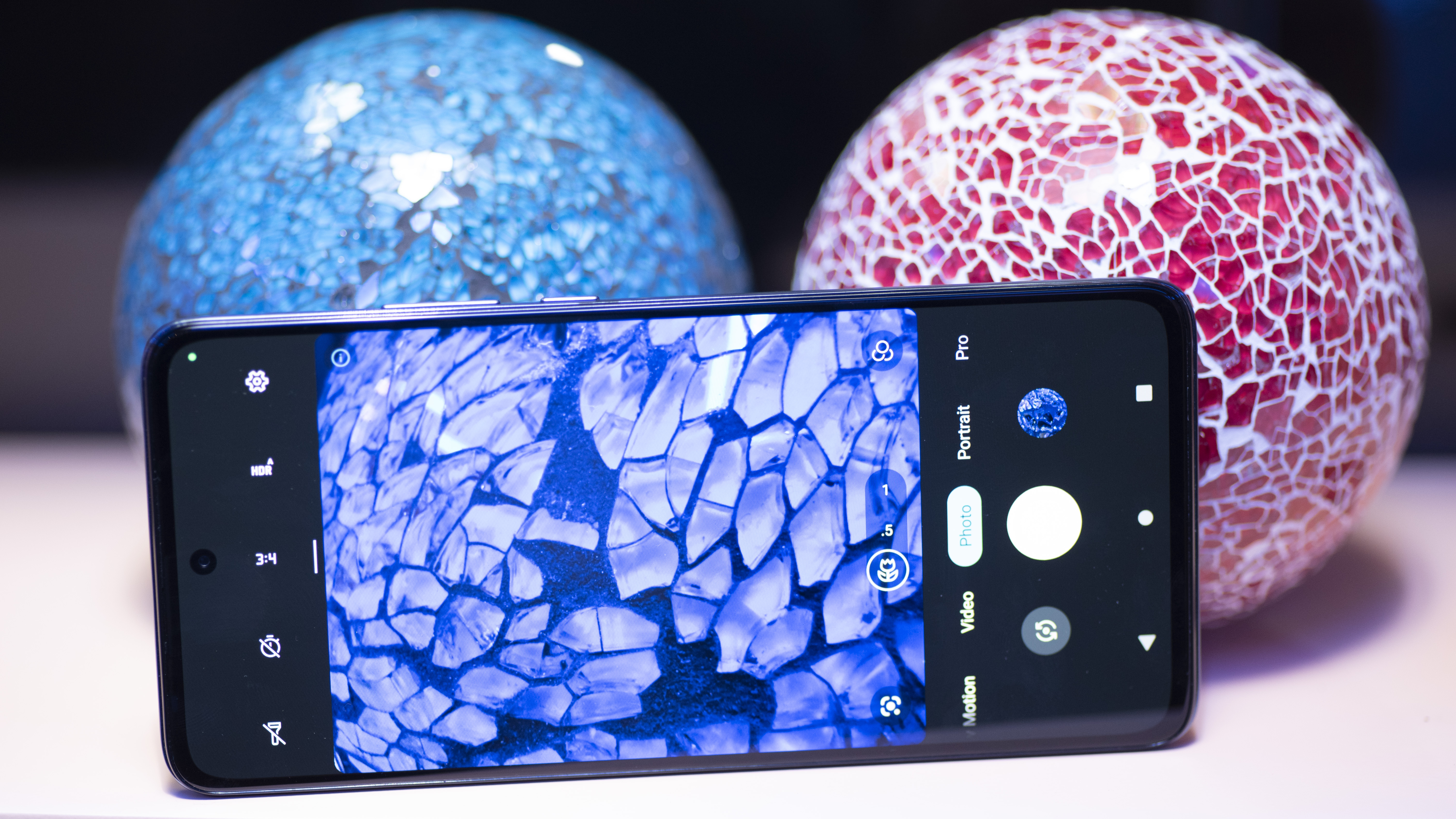
  • Macro mode just over-sharpens images

On paper, the Motorola Edge (2022)’s camera should be much better than shots we got from it, and we fear that some of Motorola’s own meddling may be to blame. The phone uses a respectably large 50MP sensor, with large 2μm pixels; meaning it should let in more light than even an iPhone 13 Pro Max

The phone uses pixel binning (taking the image data from four adjacent pixels and compositing them into one) to spit out an output image of around 13MP, not 50.

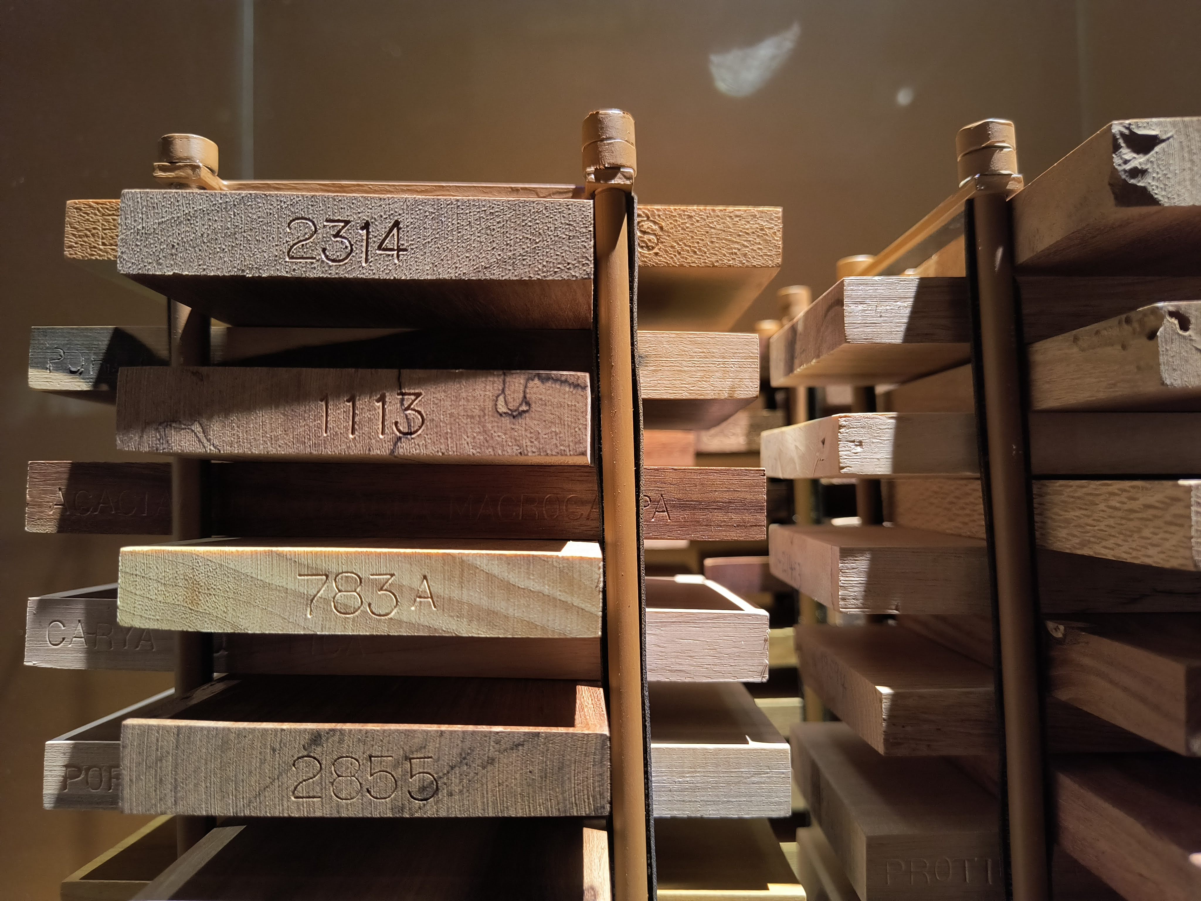
In a nutshell, the Motorola Edge (2022) takes images that look sub-par compared to the competition. Whatever hackery it uses to paste photos together is quite evident in the final product. We saw distinct edges from software sharpening, used to create more detail and contrast in images. The camera could handle dramatic lighting with some flair, but fine details were a mush. 

The camera also includes a “macro” mode, which should always be set aside in quotations, as it does not seem to rely on an actual macro lens. Instead, it appears that Motorola uses the wide-angle lens, itself just a 13MP sensor, and applies a heap (and we do mean a true mountain) of sharpening. In the same way that most digital “space zoom” cameras create images that are just about recognizable and in no way exemplary, so too is the effect of the Edge (2022)’s “macro” mode. 

We checked out the video recording on the Edge, and it was fine, but not exceptional. The slow motion and super slow motion modes were especially disappointing. Super slow motion is supposed to bring out the details in fast-moving subjects, but instead the level of sharpening applied made subjects impossible to discern.

Camera samples

Image 1 of 15

Image samples from Motorola Edge (2022) camera

(Image credit: Future / Philip Berne)
Image 2 of 15

Image samples from Motorola Edge (2022) camera

Flowers in "macro" mode (Image credit: Future / Philip Berne)
Image 3 of 15

Image samples from Motorola Edge (2022) camera

Flowers not in "macro" mode" (Image credit: Future / Philip Berne)
Image 4 of 15

Image samples from Motorola Edge (2022) camera

Close up in "macro" mode (Image credit: Future / Philip Berne)
Image 5 of 15

Image samples from Motorola Edge (2022) camera

(Image credit: Future / Philip Berne)
Image 6 of 15

Image samples from Motorola Edge (2022) camera

(Image credit: Future / Philip Berne)
Image 7 of 15

Image samples from Motorola Edge (2022) camera

(Image credit: Future / Philip Berne)
Image 8 of 15

Image samples from Motorola Edge (2022) camera

(Image credit: Future / Philip Berne)
Image 9 of 15

Image samples from Motorola Edge (2022) camera

(Image credit: Future / Philip Berne)
Image 10 of 15

Image samples from Motorola Edge (2022) camera

(Image credit: Future / Philip Berne)
Image 11 of 15

Image samples from Motorola Edge (2022) camera

Double coconut, the world's largest seed (Image credit: Future / Philip Berne)
Image 12 of 15

Image samples from Motorola Edge (2022) camera

(Image credit: Future / Philip Berne)
Image 13 of 15

Image samples from Motorola Edge (2022) camera

(Image credit: Future / Philip Berne)
Image 14 of 15

Image samples from Motorola Edge (2022) camera

(Image credit: Future / Philip Berne)
Image 15 of 15

Image samples from Motorola Edge (2022) camera

(Image credit: Future / Philip Berne)
  • Cameras score: 2/5

Motorola Edge (2022) score card

Attributes Notes Rating
Design Super lightweight but plastic, and lack of water protection is a huge problem 3/5
Display Big, bright and colorful with an uneccessarily fast refresh rate 4/5
Software A clean version of Android 12 with a few useful gestures to boot 4/5
Performance Kept up with the basics no problem but couldn’t handle more advanced tasks 3.5/5
Battery A standout feature, the big battery and fast-ish charging are great 4/5
Cameras Huge letdown that the big sensor couldn’t compete, and the special shooting features were all duds 2/5
Value Keeps many of the features of the Edge Pro that cost twice as much 4/5

Should I buy the Motorola Edge (2022)?

Buy it if...

Don't buy it if...

Also consider

If you’re shopping for the Motorola Edge, price is a primary concern, but you still want something cool that won’t be mistaken for a cheap phone. Here are some alternatives if the Edge isn’t your thing

  • First reviewed August 2022

!!!!!!!!!!

Popular Posts

Categories

Blog Archive