Saturday, March 31, 2018

LifeLock

LifeLock is a popular American identity theft protection company now owned by Symantec.

The service combines multiple techniques and technologies to keep you safe. It looks out for your identity being used to obtain loans, credit and services. It checks court and criminal records to warn you of others using your name. Change of address records are monitored, detecting attempts to redirect your mail, and the service is always scanning the dark web for any sign of your personal or financial details.

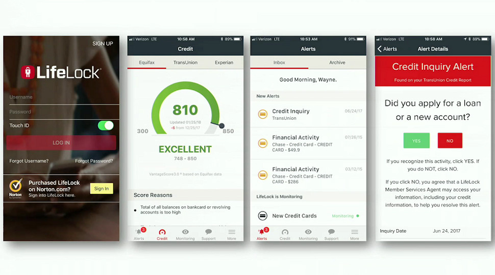
Mobile apps and near real-time alerts keep you in touch with what's going on. If LifeLock detects an auto loan application in your name, for instance, you'll get a notification asking if this was a legitimate request. Say no and the LifeLock support team will investigate.

LifeLock isn't another me-too company using a standard data feed to access this information. It's coming from Symantec's own ID Analytics network, a comprehensive data consortium which takes input from multiple lending, service and other industries, and now receives more than 100 million new identity elements every day (read more about it here).

If you've been hit by fraud, LifeLock's team of ID specialists are on hand to help fix the problems and restore your identity. This isn't just about giving advice – they take on all the main admin tasks on your behalf, making phone calls, filling in paperwork and more.

That can be an expensive process, especially with legal fees, but LifeLock helps here, too, with up to $1 million worth of reimbursement for losses and expenses due to identity fraud.

Pricing

LifeLock is available as three products.

LifeLock Standard gives you social security number and credit alerts, as well as up to $25,000 coverage for identity fraud-related losses. It's reasonable value at $9.99 a month on the annual plan.

The $19.99 a month LifeLock Advantage plan raises cover for ID theft losses to $100,000, while adding alerts about bank and credit card activity, and monitoring for crimes recorded in your name.

Spending $29.99 a month on the top-of-the-range LifeLock Ultimate Plus gets you up to $1 million reimbursement for stolen funds, alerts for 401(k) and investment activities, and adds three bureau credit reports and score monitoring. That's more expensive than some of the competition, with IdentityForce UltraSecure+Credit available from $19.99 a month paid annually, and ID Watchdog's similar Platinum plan priced from $18.25.

You can optionally add Norton Security Online to each of these plans, maybe blocking malware before it can steal any of your personal information. This enables securing up to five Windows, Android or Mac devices and is free for the first year, then an additional $3 a month with LifeLock Standard, and an extra $5 with LifeLock Advantage and Ultimate Plus.

Norton Security Online isn't as powerful as the full Norton Security suite, but it does give you strong protection against online threats (Symantec ranked sixth in AV-Comparatives' Real-World Protection tests for July - November 2017, comparable with F-Secure and Kaspersky). If you'll use it to cover multiple devices then it's decent value, particularly at LifeLock Standard's $3 a month price.

LifeLock doesn't offer a free trial, but it's still more generous than you might expect. IdentityForce gives you 14 days for free, then charges you and doesn't provide refunds as standard. LifeLock takes your money upfront, but gives it back in full if you cancel within 60 days, and even if you cancel after that, you'll still be refunded for unused months.

LifeLock

Reports

Opening your LifeLock account works much the same as with competing products: hand over your name, email, physical address, birth date and social security number, and you're given access to the basic service right away.

Credit-related features (reports and scores) require a separate validation process before you can access them, and the website says LifeLock Ultimate Plus 'three bureau credit monitoring' could take several days to begin. Still, this doesn't necessitate any further intervention from you, and there are plenty of other options to explore while you're waiting.

LifeLock's web dashboard looks good and is thoughtfully designed. The main part of the screen highlights all the details you're likely to need right now – recent transactions, new alerts, your current credit score – and a sidebar gives speedy access to the other areas of the service: Alerts, Credit, Transactions, ID Restoration, Support and more.

LifeLock's iOS and Android apps enable receiving near real-time alerts on credit events, wherever you are. If the company's ID Analytics network spots a new credit card application, a wireless account opening (Verizon, AT&T), a new loan (auto, payday and others) then you're notified right away, and asked to confirm that this is a legitimate action. Click Yes, and all is fine. Click No and LifeLock's member services team will look into it. There’s no need for you to do anything: the company gets back to you when it has found out more.

LifeLock Advantage and Ultimate Plus can also monitor and raise alerts for bank and credit card transactions. You're able to set per-account thresholds for transactions you might consider unusual, and if that threshold is exceeded you'll be alerted.

For this system to work, you must provide LifeLock with your login credentials for each account. That may not appeal to everyone, and it also means you'll have to update LifeLock whenever you change your password in a monitored account. But if you can live with that, it's a useful system which effectively allows you to build a personalized financial portal where you can track multiple accounts and providers in one place.

Just like most of the competition, LifeLock says it monitors the dark web for signs that your personal details are being sold. We're generally skeptical of these claims as most providers give you no information on what this involves, but LifeLock is a little different. The company at least provides an idea of the scale of what it's doing by claiming to check more than 10,000 dubious websites, and with Symantec's security expertise to call on, we're more confident LifeLock will deliver more in this area than we are with most of the competition.

No service can guarantee 100% protection from ID theft, so LifeLock also provides a 1,000-strong team of US-based restoration specialists to help you recover if the worst happens. This isn't just a matter of having someone advise you what to do. LifeLock handles many major tasks itself: collecting details, investigating facts, preparing for and remediating the case, settling insurance claims, retaining legal representation, and more.

If you need help or have any general questions, LifeLock's support team is available 24/7/365. The website explains that 'priority live member support' is reserved for Ultimate Plus users only, which leaves us wondering what lesser customers might experience.

Smart design decisions elsewhere – including the ability to call support directly from LifeLock's mobile apps – suggest LifeLock is working on providing decent support for everyone, though, and the generous 60-day money-back refund gives you plenty of time to test the service for yourself.

Final verdict

LifeLock is a very comprehensive identity theft protection service with strong detection, alerting and recovery features. The option to include Norton Security Online is a welcome plus, and it'll be very interesting to see what more Symantec can bring to the service in the future.

Exclusive: Android Go Based JioPhone 2 to Launch in April at Rs 1999

Back in August 2017, Reliance Jio announced the 4G VoLTE enabled feature phone called JioPhone for Rs. 1,499. After many delays, the company started shipping the device in few numbers. Almost eight months after its launch, Reliance Jio has generated more feature phone sales than the other brands like Nokia and Samsung. However, the JioPhone still misses the popular apps like WhatsApp.

Even the company hasn’t started selling the JioMedia cable for screencasting. Now, we have some exclusive information about the company’s next big launch. In the coming weeks, Reliance Jio is going to launch the JioPhone 2 as the successor to last year’s JioPhone. Though the JioPhone 2 comes with a price tag of Rs. 1,999, it will be sold for an effective price of Rs. 0. However, the process of getting the money back is not yet known.

The Rs. 49 unlimited plan with 1GB of high-speed 4G data will also be applicable for this new device. It will mostly come with the similar sized display and T9 keypad as seen on its predecessor. Under the hood, the device will be powered by the Qualcomm 205 Mobile Platform. The JioPhone 2 will also offer cameras both on the front and rear. While the JioPhone came with KaiOS, the upcoming JioPhone will be running on Android Oreo (Go Edition).

The Yun OS powered Nokia 3310 4G launched in China is also rumored to go on sale in other markets with Android Go onboard. The Google Assitant on JioPhone 2 will support both English and Hindi languages. It comes pre-loaded with the Jio suite of apps and Go-edition Google apps. This week we had covered a detailed video on the features of the Android Go where we clearly mentioned why you shouldn’t be buying a phone that comes with this special version of Android OS.

The reason was primarily influenced by the prices of the phones launching i.e. the Nokia 1 & the Lava Z50 but with the JioPhone 2’s price of Rs 1,999, it might be worth buying. Again, do make a note that these are easy rumors from the same source who shared us information on the Galaxy S8 Mini last year. Let’s wait for a few weeks & look forward to more leaks on this upcoming feature-rich smartphone from Reliance Jio.

The post Exclusive: Android Go Based JioPhone 2 to Launch in April at Rs 1999 appeared first on PhoneRadar.

Friday, March 30, 2018

Asus ZenFone Max Plus M1

The Asus ZenFone Max Plus M1 is a budget smartphone wearing a premium flagship phone’s skin. It has a smooth metal chassis and rounded 2.5D glass over a display that fills most of the phone’s front side. Without CDMA support, it unfortunately can’t connect to Sprint or Verizon, but it will work for just about anyone else, since it’s compatible with AT&T, T-Mobile and any other carriers using GSM networks.

For an unlocked model with 3GB of RAM and 32GB of storage, Asus is only charging $229, which puts it well into the low-cost tier of smartphones, where it will compete with Motorola’s Moto G5S Plus, the upcoming Moto G6 and the others in our list of the best cheap phones.

At first glance, the ZenFone Max Plus M1 looks like it might be worth it, with its design, big display, facial recognition and dual-lens camera, but not everything is as great as it sounds. 

Design

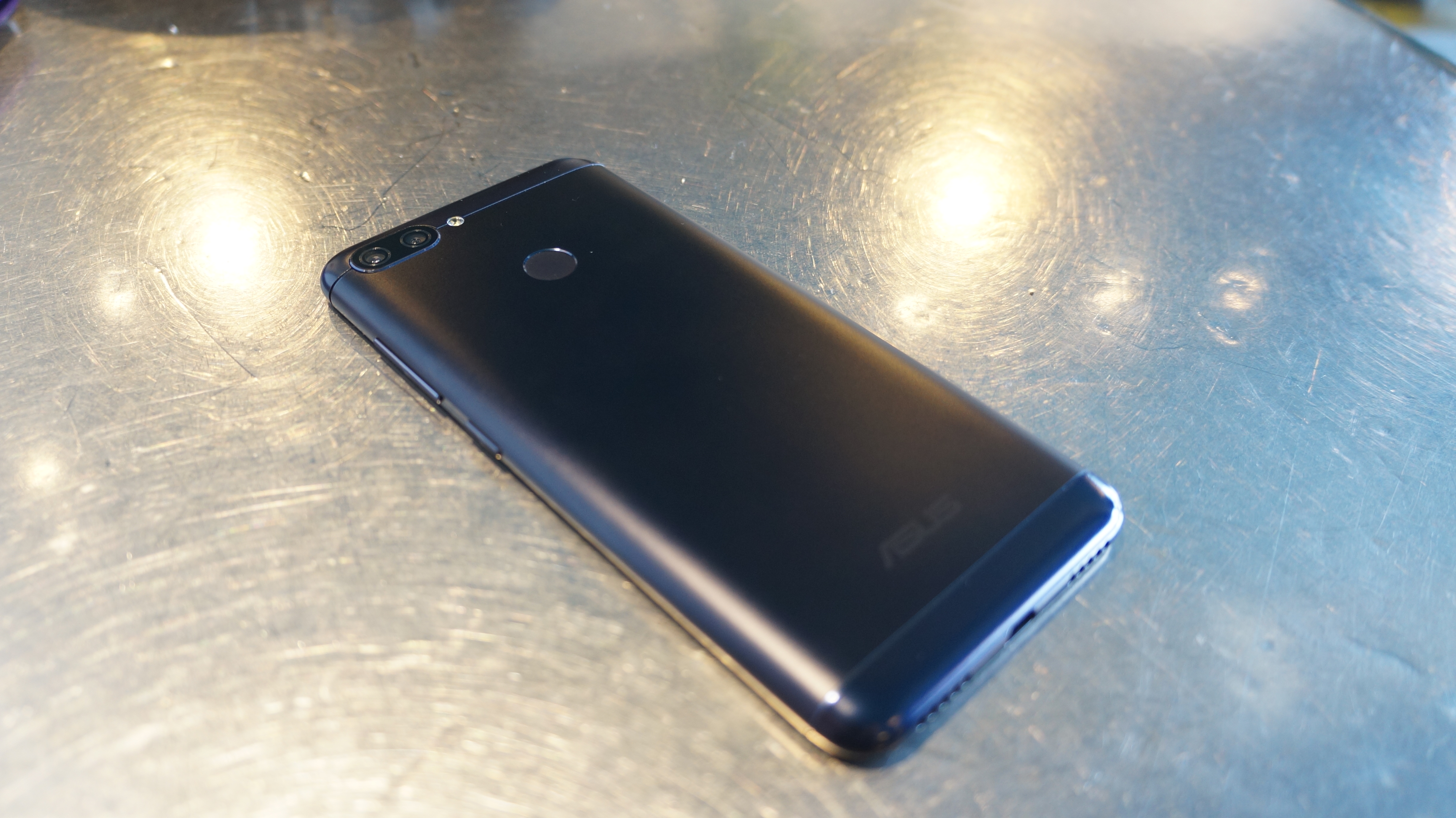
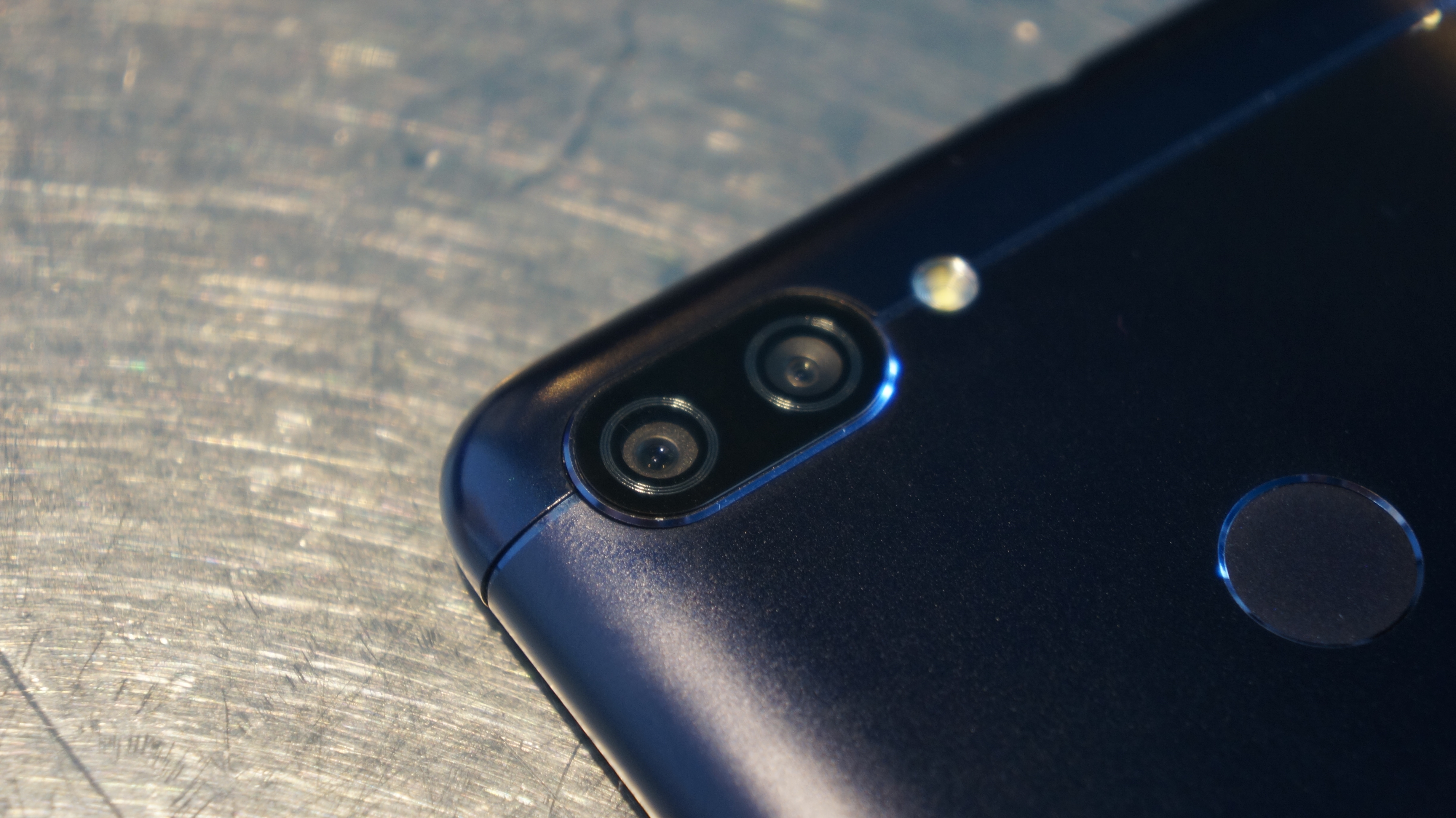
From the get-go, the ZenFone Max Plus M1 comes across as a much more premium device than its price would suggest. It has the elegant build of a flagship smartphone. The back is a smooth aluminum, with shiny antenna bands recessed at the top and bottom. The power button and volume rocker on the right side are also metal. Dual-cameras grace the back, and a fingerprint scanner is situated on its the middle, similar to the Google Pixel 2.

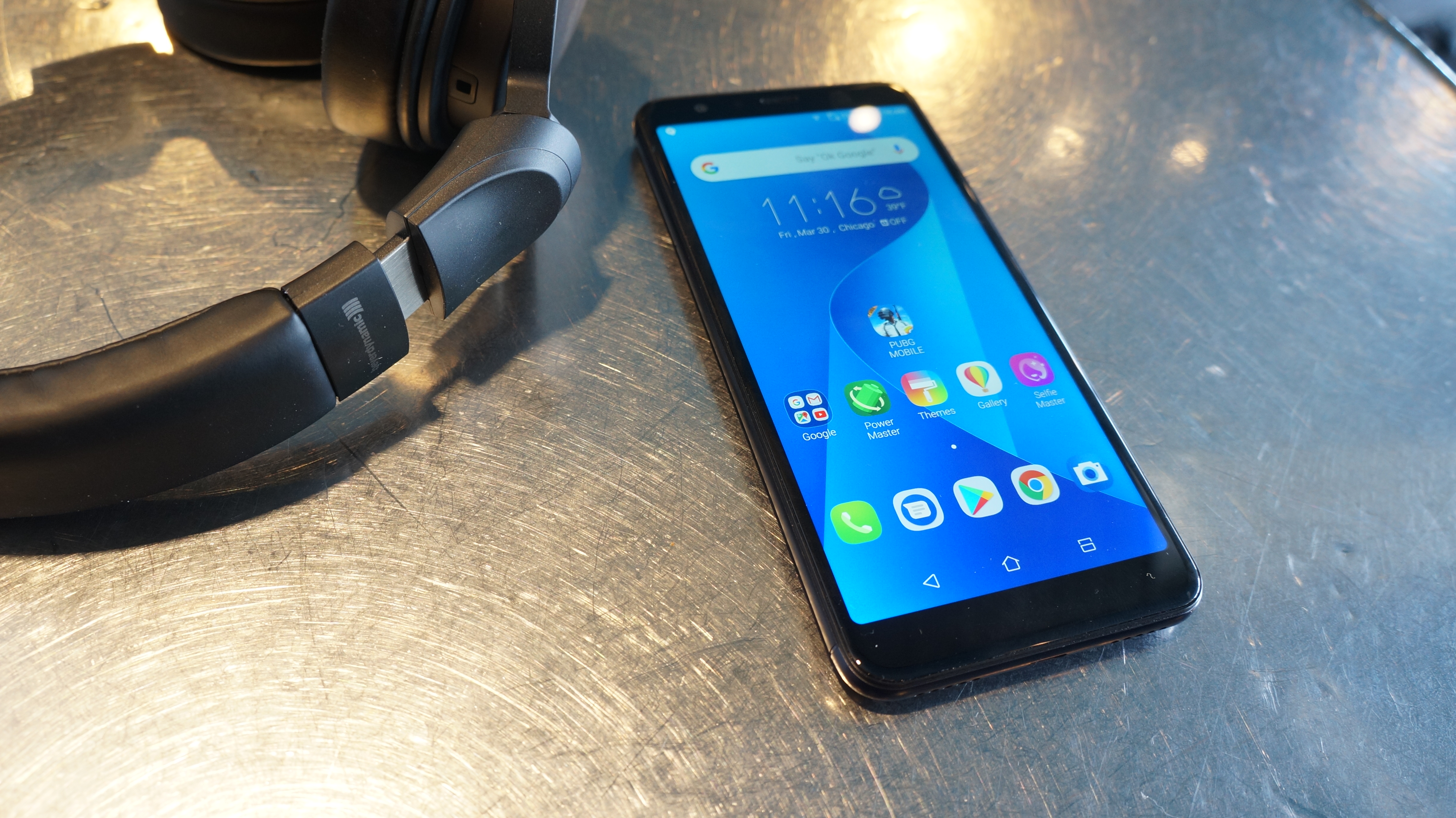
The front of the phone is largely filled with the screen, which measures 5.7 inches at a resolution of 2,160 x 1,080 and accounts for an 80% screen-to-body ratio. If the ZenFone Max Plus M1 had managed to go truly bezelless, it would be easy to confuse for a top-tier phone.  

Unfortunately, that display isn’t OLED, so the picture isn’t always as good as it could be, especially while viewing videos that don’t fill up the 18:9 aspect ratio, as the black bars on either side of the image let a little light bleed through. Video can stretch to fit the screen, but in our opinion, the stretching looks even worse than the black bars.

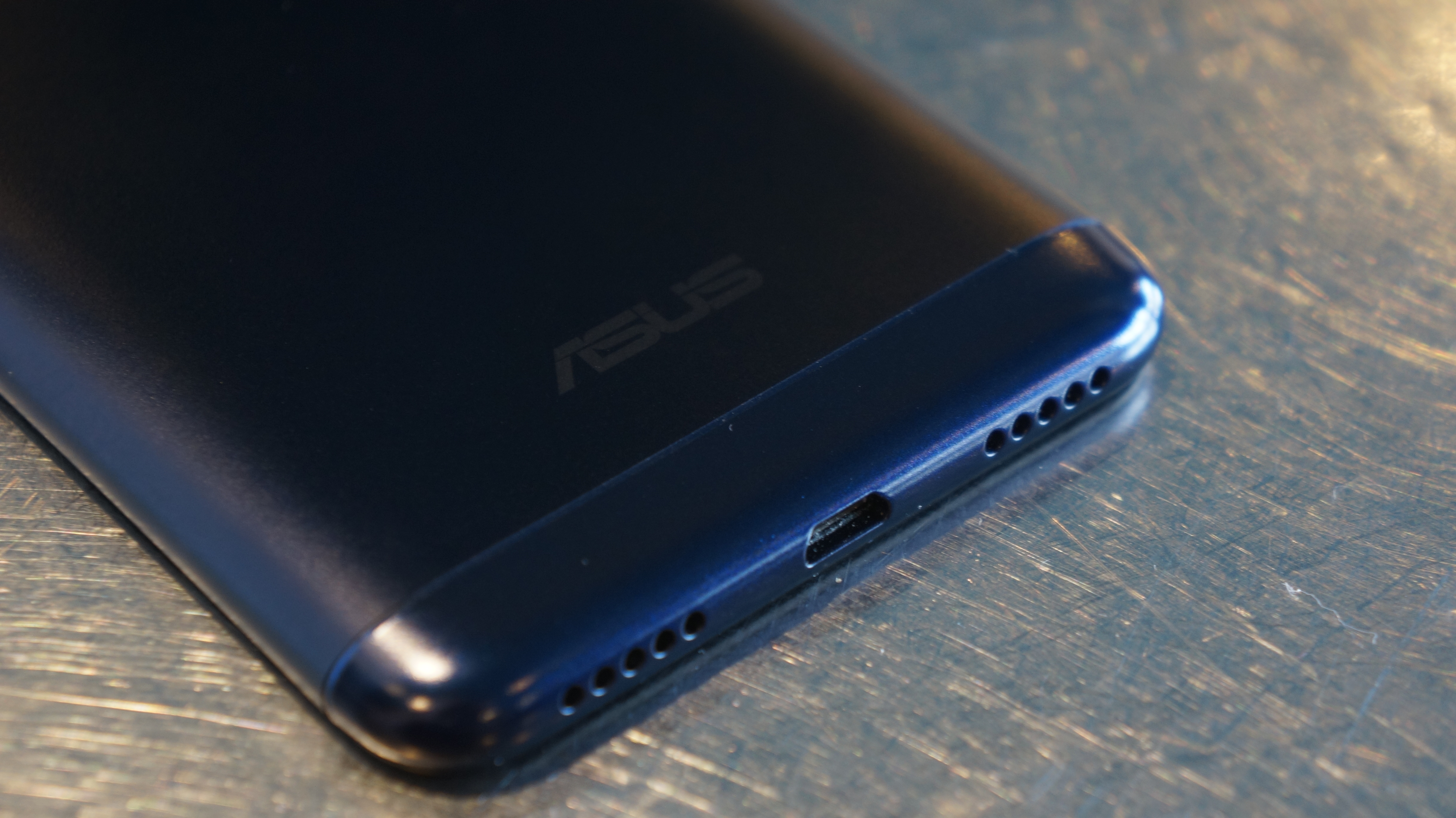
It feels nice in the hand as well, though that smoothness comes with the risk of dropping the device, especially while wearing gloves. The now-antiquated micro USB port at the bottom and perhaps the small image sensors are the only visual hints that this isn’t a more premium device.

Still, there are more positives to the design than negatives. A dual-SIM card slot offers support for multiple network connections, and the tray also includes a microSD card slot for up to 256GB of extra storage.

The ZenFone Max Plus M1 stays lean, measuring 152.6 x 73 x 8.8mm  and weighing 160 grams. It’s very pocket-friendly, unless it becomes warm during use, but we’ll get into that shortly.

It’s a bit disappointing that no ingress protection rating is offered on this phone. Speaking more to its durability, we heard creaking while giving it a bit of flex, and Asus doesn’t say anything about the screen strength, so the functional structure of this phone is a bit dubious, even if the aesthetic structure is lovely.

Features and performance

Asus seems to be a bit shifty about disclosing the MediaTek chipset powering the ZenFone Max Plus M1. MediaTek doesn’t have the reputation that Qualcomm has with the Snapdragon chipset powering so many smartphones. 

In the phone’s settings, the CPU details simply say, 1.5GHz,” and on the tech specs page for the device, Asus just lists, “Octa-core Processor.” But, the ZenFone Max Plus M1 is powered by an 8-core MediaTek MT6750T processor with 4 cores at 1.5GHz and 4 cores at 1.0GHz. That was paired with 3GB in the model we tested. The device runs Android 7.0 Nougat with Asus’s ZenUI, which is generally nice, though maybe a tad too cutesy for some and pre-loaded with a few more apps than is necessary.

We were impressed by the fluidity of most applications, since we had expected more performance tradeoffs to balance the nice design and screen. Doing one thing at a time is more or less perfectly smooth. Switching between multiple apps quickly does see the phone stumble a bit, but never to the point of being dreadful. 

Gaming performance isn’t stunning, but that’s to be expected at this point. Booting up PUBG Mobile, the game automatically picked the lowest settings, and even then there were some hiccups during gameplay. Nonetheless, we managed to play through a full game and land second place with 13 kills. Not bad if we say so. The ZenFone Max Plus M1 may hold back on the quality aspect of performance, but it won’t slow you down terribly.

Video playback is smooth, whether it’s streamed or played locally, and the screen gets plenty bright when needed. The 4,130mAh battery does a good job of supporting video as well. In our 90-minute, 1080p video playback test, the phone drained from 100% to 83%. That was with Bluetooth, Wi-Fi and mobile network on the screen set to full brightness. With a few settings dialed down, like adaptive brightness, the ZenFone Max Plus M1 can keep you watching all day. Using this phone for two days without recharging isn’t out of the question, but don’t expect to do so while using it heavily both days.

With such a big battery, Asus even includes a special dongle so you can plug another phone in and use the ZenFone Max Plus M1 as a battery bank. We tested it with our OnePlus 5, and it charged it, but slowly.

While you can spend a long time watching videos on the ZenFone Max Plus M1, you’ll want headphones, because at high volumes the single speaker gets crackly (yes, despite having two grilles at the bottom, there is only one speaker).

The dual-cameras on the back are interesting. The main 16MP shooter is decent, capturing color well in well-lit environments, but fine detail is more miss than hit, and low-light performance is poor, despite its f/2.0 aperture. The secondary camera has a nice 120-degree field of view, but the default setting is to shoot in 18:9 at 5MP, which was glaringly low resolution. It can bump up to 8MP, which is fine when you just want to get everything into one shot. 

Even at its best, the camera software is a tad annoying. We went into settings multiple times, and changed them, then went back to the camera only to find that the settings had immediately reverted themselves. Asus’s product page says the front-facing camera is 16MP, but we couldn’t get it to shoot above 8MP, unless we activate the wonky selfie-panorama or SuperResolution modes. Fans of Japanese photo booths may enjoy the Beauty Mode, but the ZenFone Max Plus M1 has sadly lost a lot of the fun filters that were available on the ZenFone V. And, Asus’s advertised “Instant camera switching” takes more like a second.

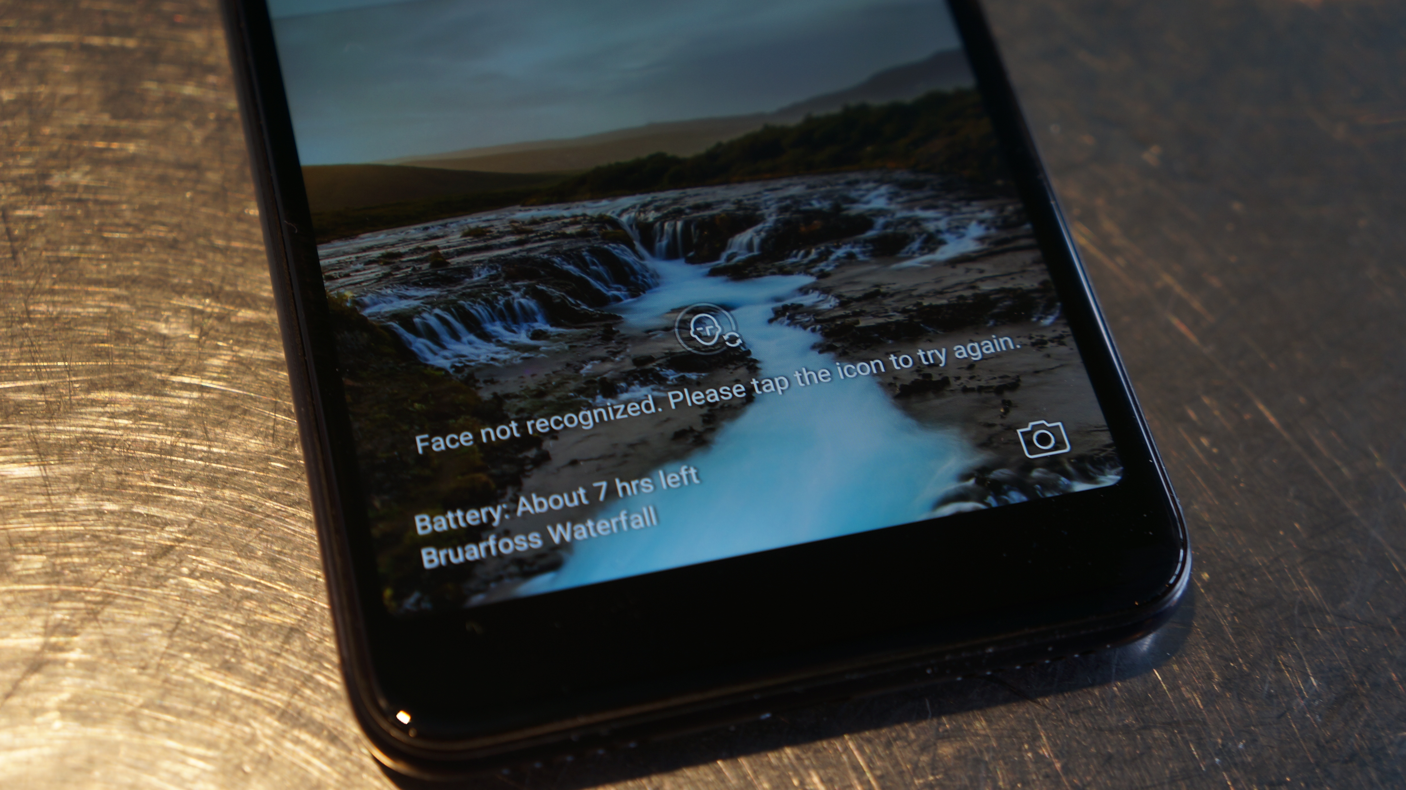
More tedious than the camera switching is the biometrics. The fingerprint scanner often fails to recognize our finger enough times in a row that we’re forced to use a standard unlock pattern. The ZenFone Max Plus M1 also features facial recognition, but the lock screen doesn’t show you what the camera sees, so it’s hard to be sure you’ve got the camera lined up. And, even if the camera seems perfectly lined up, the recognition fails more times than not.

Perhaps the most concerning issue was that the phone often got very warm during our testing. Even if it was just hanging out in our pocket, we could feel it getting a bit toasty. The included PowerMaster app displays the phone’s temperature, and on several occasions the phone was above 90 degrees while we weren’t even running anything.

Verdict

The ZenFone Max Plus M1 does a decent job of balancing features, performance and design on a budget. It has the looks and feel of a flagship phone, even if it lacks the breakneck performance of one. 

Unfortunately, in its effort to masquerade as a high-end phone, it forgot about some essentials to allow it to better compete in the mid-range market.. The 18:9 IPS display is nice, but would have been better as a standard 16:9 OLED display. The premium aluminum build would have been better if it had any kind of waterproofing, and it still feels breakable. Heat is also a big concern.

Still, for the right customer, this is a nice pick. At such a low cost, it’s a well-performing, sharp looking smartphone that can easily get through the day on its massive battery. It’s just a shame Asus’s superior ZenFone V is still tied exclusively to Verizon. For anyone that can wait and spare a few extra bucks, the Moto G6 lineup looks to be a more impressive budget option.

Moto G6, G6 Plus, and G6 Play – Everything You Need to Know

Lenovo will be launching the Moto G6 smartphones in 2018 to compete against the other budget smartphones. Last year, we have seen the Moto G5 & G5 Plus along with the upgraded Moto G5s & G5s Plus smartphones. Now in 2018, the company is actually going to launch three devices under the Moto G series – Moto G6, G6 Plus, and G6 Play. Looking at the current market trends, we expect the company to embrace the 18:9 display technology.

Moto G6, G6 Plus, and G6 Play Listed Online with Full Specifications

In the past few weeks, there are quite a few leaks about the upcoming Moto smartphones. Now, the Moto G6, G6 Plus, and G6 Play listings are found one of the Hungarian online stores. The first look and complete specifications of all the three devices are now revealed. However, there is no information regarding the pricing or availability of these devices. The Moto G4 Play launched in 2016 is the last smartphone to launch under the Play series.

On the design front, the Moto G6 and Moto G6 Play exactly similar but comes in different sizes. The Moto G6 comes with a 5.7-inch Full HD+ (2160 x 1080 pixels) display with 18:9 aspect ratio. On the other hand, the Moto G6 Plus sports a slightly bigger 5.93-inch display with the same Full JD+ resolution. While the Moto G6 is powered by Qualcomm Snapdragon 450 Mobile Platform, the Moto G6 Plus comes with a much better Snapdragon 630 Mobile Platform.

Talking about the Moto G6 Play, it comes with a 5.7-inch HD+ (1440 x 720 pixels) display and is powered by unknown octa-core processor. We expect the company to opt for the MediaTek chipset for this device. The Moto G6 Play comes with 2GB of RAM and 16GB of expandable storage. Both the Moto G6 & G6 Plus come in 3GB & 4GB RAM variants with 32GB and 64GB of internal storage respectively.

The Moto G6 Plus additionally comes in 6GB RAM variant. Even with the 18:9 displays, the upcoming Moto G6 smartphones offers relatively larger bezels. The Moto G6 and G6 Plus sports a fingerprint sensor on the front. Whereas the Moto G6 Play comes with a rear-facing fingerprint sensor integrated into the Moto dimple. All the three devices will be running on the Android 8.0 Oreo out of the box.

Coming to the cameras, the Moto G6 and G6 Plus shares the same camera sensors. There is a 12MP + 5MP dual camera setup on the rear and a 16MP selfie camera on the front. The Moto G6 Play comes with a 12MP rear camera and a 5MP front camera. There is an LED flash on the front and rear of all the three devices. Interestingly, the Moto G6 Play is backed by a 4,000mAh battery, while the Moto G6 Plus with a bigger screen size comes with a 3,200mAh battery.

Stay tuned on PhoneRadar for more details about the Moto G6, G6 Plus, and G6 Play smartphones!

Source

The post Moto G6, G6 Plus, and G6 Play – Everything You Need to Know appeared first on PhoneRadar.

Garmin Forerunner 645 Music review

The Garmin Forerunner 645 Music is the watch that’s designed to fix the brand’s biggest flaw with its running trackers: the lack of entertainment.

If you’ve been exercising for any amount of time, you’ll know that Garmin offers some of the best running watches around - but they’ve been largely functional, just showing you performance numbers.

But with the likes of the Apple Watch 3 and Samsung Gear Sport encroaching on this space, bringing both GPS tracking and the ability to stream music to a Bluetooth headset, Garmin needed to catch up.

And finally, it’s begun that journey, adding in the capability to listen to tunes, audiobooks or podcasts on the go, as well as being able to pay contactlessly from your wrist (although that feature's not supported by a huge number of banks yet). But it’s not going to be cheap...

Garmin Forerunner 645 Music price and release date

Here’s the thing that will probably stop many in their tracks: the Garmin Forerunner 645 Music is going to cost around £399 / $399 (around AU$520) - which is a lot of any kind of running watch. 

You can get a model without music for £350 / $350 (around AU$440) - but that would really strip it of the main USP. 

While you’re paying for some impressive features, it’s also worth noting that TomTom has been offering running watches with music playback capabilities for years, and for a much lower price. However, with these likely to be slowly coming off sale in the coming months, there’s an opportunity for Garmin to jump in.

The Forerunner 645 Music is already available, with the release date landing in February 2018.

Music

  • Streaming music isn't supported yet
  • Can put on MP3s and audiobooks from your PC

Right, let’s get into the groove here - music is the main reason Garmin fans will be buying this watch. And we’re here to tell you that the experience is disappointing for a running watch in 2018.

The Forerunner 645 Music got the right bits to be a great little entertainer on the go: 4GB of internal storage should carry 500 songs with you, and deals with iHeartRadio and Deezer will give you access to reams of tunes.

But those two services don’t yet have the requisite apps on the Garmin ConnectIQ store, which means you can’t transfer any streamed music onto your watch. Which is pretty terrible given the main reason you’d buy this device is to have access to millions of songs - and Garmin doesn't know when it's coming.

So you’re left with putting your own MP3s on there, and if you’re still someone that’s got a vast digital music collection, you’ll be fine. 

The downside comes when you find out what you’ve got to do to actually get them on there - fire up your computer, open up Garmin Express (which most won’t have ever done, given they’ll have only ever paired with the app) and then search for the songs on your machine, before getting them sent to the watch.

While audiobooks and podcasts are supported, there’s no way that most people would bother putting them on the watch through the PC. It’s just so, so much easier to listen to them from the phone that we would rather just bring our handset with us - and to be honest, we feel the same about listening to streamed music... it's just so much easier on the phone.

But if you do go down the route of putting music on your Garmin Forerunner 645, the experience is fine. It’s nothing special, and precisely the same as you’re used to on something like the TomTom Runner or most smartwatches on the market - choose from albums, playlists or shuffling all songs.

It’s quite tough to get used to the nuances of the interface by moving up and down and pressing enter, but it’s understandable enough after a while. The main thing is being able to easily change your tracks while running, and that’s possible here.

If you want to change album or playlist on the go it’s quite a few presses, but actually having a physical button is easier than trying to do this with a touchscreen when sprinting around.

The music playback is supposed to be a massive feature of this watch, but not having Spotify was already a hindrance… not having any music streaming services ready at launch is terrible.

Design and screen

  • Lightweight design
  • Lovely look
  • Large screen

One of the most striking things about the Forerunner 645 Music is the way it’s designed - apart from some of the hyper-expensive fashion-led Fenix models, it’s the most attractive Garmin watch out there.

The impressive feature is the metal rim around the edge of the 1.2-inch display - it not only protects the Gorilla Glass 3 that covers the display, but adds a more industrial, yet stylish, look to the watch.

The other thing is that feels really light in the hand and on the wrist - at 42.2g it’s much lighter than the Garmin Forerunner 935, for instance, and puts it more in line with the Forerunner 735XT.
That loss of weight is partly to do with the smaller battery though, and as you’ll see later that comes at a cost to the function of the watch.

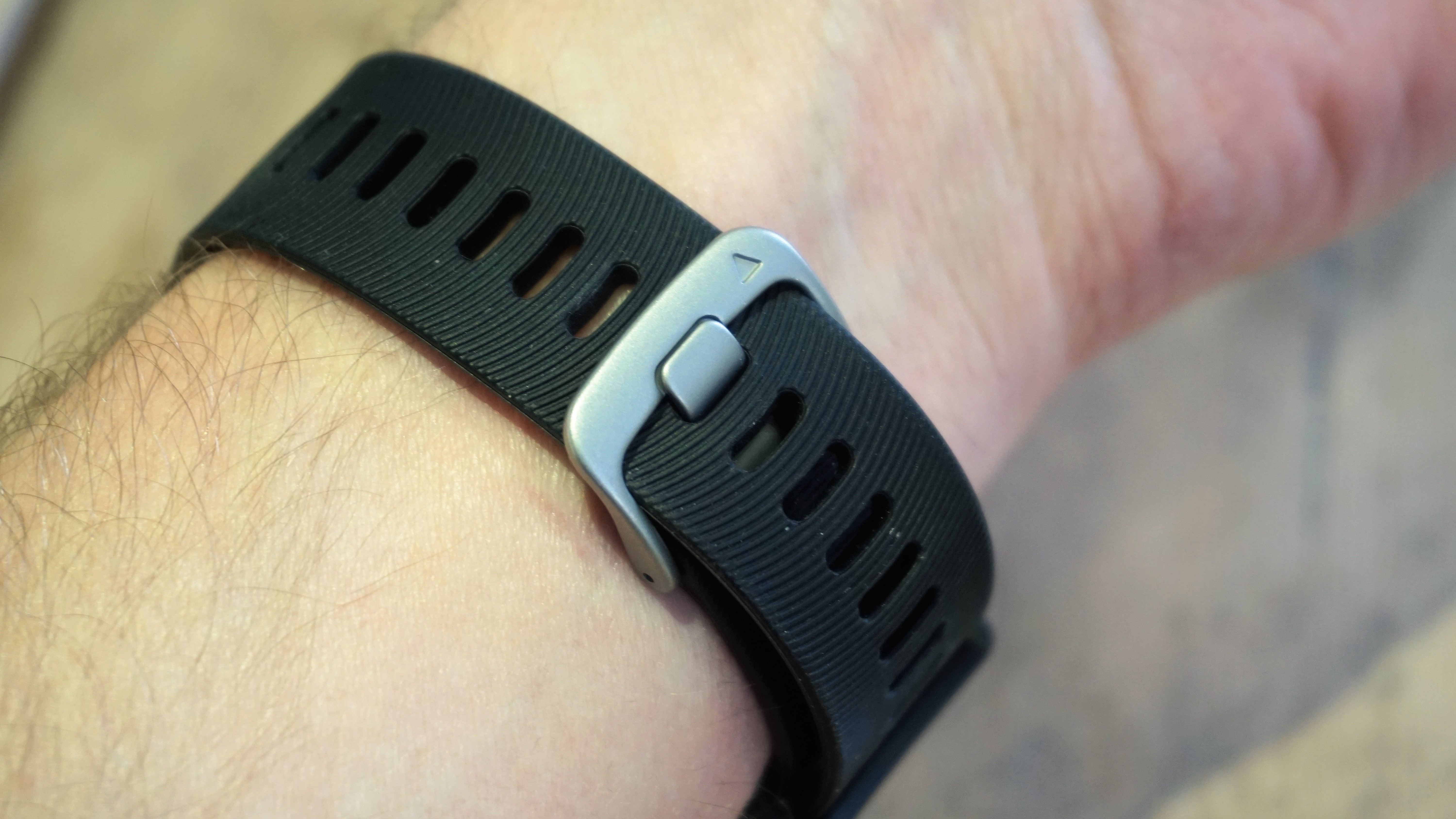
The strap is silicone and also pretty lightweight - it feels comfortable on the wrist, although those with sensitive skin might need to swap it out. Thankfully you can use any 20mm strap here, thanks to the standard lugs.

The screen, like many Garmin running watches, is transflective technology, which makes it clear and bright in most scenarios when light is shining directly on it, meaning it catches even a small amount of photons pretty well to help you see what’s on the display.

If you’re in the dark there’s an illuminating light, and Garmin has done pretty well with the accelerometer to make the watch light up whenever you raise your wrist - to do this on a run is pretty advanced.

The screen itself is very clear, and a had a nice degree of sharpness. It’s not in the same league as many modern smartwatches, granted, but it’s more than good enough in day to day use and we never were unable to see the numbers when out on a run.

And really, that’s all that matters. The rounded display can make things a bit congested when you’ve got four different bits of data on one screen, but even then it’s easy to make out what’s being shown.

The only slight downside is that colors are a little muted, but that’s the price paid for the transflective technology. 

  • Loads of fitness options
  • GPS is rapid
  • Swimming, yoga and paddle boarding on there too

Take away the (admittedly useful) gimmick of music playback and you’re still left with a Garmin sports tracking watch - and like the other members of this family, it’s excellent in this regard.

Once again eschewing the touchscreen, everything you do with the Forerunner 645 is through the buttons around the watch, and it means it’s very easy to start, stop and flick through exercise data at any point.

The heart rate monitor on your wrist is one of the more accurate we’ve tested… so much so that we didn’t ever feel the need to use a strap on our chest when out testing.

When testing the Forerunner 645 in extremely cold weather, we did find that it struggled to pick up our pulse, so if that’s going to be a regular for you then we suggest you invest in a chest strap.

This also unlocks some more of the running dynamics that some might like, such as ground contact time and vertical oscillation. Honestly, we rarely use this feature despite it being rather interesting to see your actual metrics, like which foot impacts harder each stride.

Unless you’re training very specifically and have a coach, we’d say you can skip buying the heart rate monitor or foot pod you need to enable this.

One thing you will like with the Forerunner 645… the GPS is rapid to lock. Seriously, one of the best we’ve seen and even without being constantly connected to your smartphone.

If you’ve not had your phone synced for a while it can take a little longer (in a new built up area with no phone connection it took nearly two minutes, but the next time was instant), so if you’re in a recognisable or open area we’re talking a few seconds before you’re off and running. It’s excellent.

You can also create interval sessions right from the watch too, which is nice if you’re in the mood for something a little more advanced - and there are little beeps that count down when you’re about to move into the next phase.

Sadly these don’t translate to audio in connected headphones, but you do get your laptimes if you’ve got the feature enabled - on a twenty mile run it’s nice to have someone soothingly telling you your last mile time, although it can get a bit mixed up and robotic.

If you want something a bit more technical in your workout, you can set a session directly from your phone and sync it right to the watch - perfect if you want to do sprint repeats followed by a long run, or switch between power and pace on the bike.

Running

The main thing we used the Garmin Forerunner 645 Music for during our testing is the running capabilities - and it’s pretty darn good for them.

It’s not a lot different in look or function to the Forerunner 935 or the Fenix 5X, with the ability to see your heart rate, distance, pace, time, averages of all the above and even the time the sun is going to rise and set. 

In short, there’s very little that can’t be shown on this watch when you’re running, and customising your screens to what you like to see can be done in seconds, as we found just before beginning and realizing that we’d put in actual pace rather than average pace a data field.

The accuracy of the GPS was pretty good - perhaps a little generous over a longer run, with two long runs of 18 and 20 miles showed us running 1% further than the measured distance.

It’s not big deal, but in a marathon that 0.2 extra bit of a mile can be a bit disconcerting if you’re trying to run to a specific pace, although we didn’t find it a tremendous problem.

Over shorter distances it was fine, and treadmill running proved pretty accurate too - after your first session you’ll ‘teach’ the watch how far you’ve gone and it’ll offer better distances form that.

Cycling

One of the nice things about Garmin watches is their compatibility - while there’s still too much reliance on Ant+ sensors (the old version of connectivity before Bluetooth), the fact both Bluetooth and Ant+ are supported means pretty much any cycling accessory can be connected.

That means power meters, turbo trainers, bike lights and even cameras can be operated from your watch on the go, and that’s pretty easy given the large screen and simple-to-press buttons.

Just like the running mode, there’s not a lot to really say here other than it worked fine, the screen is bright and legible and having that audio feedback on a cycle is even better than on a run, as you can less easily glance at the display when cycling along.

The heart rate monitor also stayed pretty true during our pedalling, reacting well to changes in effort and helping us push harder in the interval sessions we set up from the Forerunner 645.

Strength training

It’s really great that so many watch manufacturers are trying to track gym efforts, and Garmin recently introduced the same thing.

The idea is that the watch uses the accelerometer to read the motion of each exercise, something called its ‘fitness envelope’, and then count how many of those motions you’ve done.

You can then set how heavy the weight is afterwards, thus giving an accurate measure of how hard you’ve worked.

It’s a nice idea....it doesn’t work. The rep counting is so often off unless you’re doing the motion very slowly and to the exact parameters each time, which many can’t manage nor want to do.

In order to preserve the fitness envelope Garmin recommends you don’t look at the watch during the set, so the motion is consistent - so you can’t even check how many reps you’ve done.

It’s also a little irritating having to enter the weight using the up / down keys every time, so in the end we just stopped using the feature.

The rest timer on there is pretty good though, allowing you to make sure you’re allowing enough time between each action - and you can see each element after.

You can even pre-prepare your workout on your phone, coding in the exact exercise you want to do (and there are loads listed on the Garmin database) and it’s nice to just plug in and go.

However, you’ll need to be quick to spot which exercise is coming up, as it doesn’t stay on the screen long and there’s no way to call it back up.

The Garmin Forerunner 645 Music is only any good for strength training if you’re willing to correct the number of reps and weight after each set - and it’s just too much hassle.

That said, it’s nice not to have to carry your phone around to listen to music.

Other exercises

It’s rather impressive what other exercises the 645 Music can track, thanks to the accelerometer and altimeter being able to assess motion and elevation.

You can ski and snowboard, or swim in a pool and have the lengths and distance tracked. However, open water swimmingg isn’t allowed for some reason, despite all the right sensors being in there, and inexplicably there’s no triathlon mode.

Given that last mode is just being able to stitch together a swim, run and cycle into one activity, with transition timers in between, it’s very strange Garmin hasn’t added it in.

Paddle boarding, yoga, step / elliptical / rowing machines in the gym are all supported too - while not perfect thanks to some weird omissions listed above, the Forerunner 645 is generally a very good sports tracker.

  • Battery life is poorer than other Garmin watches
  • Around 10% battery lost per hour

Here’s the biggest issue we’ve got with the Garmin Forerunner 645 Music: it’s got poor battery life for a watch from this brand, when its watches are usually sterling at lasting.

Given it’s got the same screen size and operating system as the Forerunner 935, which can last for up to 10 days with daily activity, it’s maddening that the 645 can only manage 3-4 days.

What’s weird is it’s not the GPS tracking that munches the battery, nor the music playback. It’s just in general use that the issues come, with it falling to 8% after 16 miles run and a Bluetooth connection to a phone over four days.

Some more stats: we charged the watch to 100%, and took it on a 20 mile training run with music playback the entire time.

By the end of the run it was down to 65%, after 154 minutes of running. That’s not a bad stat at all, meaning even seven hour marathon runners should be able to track their race and have music the entire time. A good result.

But by the next day, we’d lost another 20% of the battery without any more GPS tracking or music playback… just having the heart rate and step tracking on.

It means you can’t feel confident in always having battery ready for a run like you do with other watches in the Garmin range… and it’s a shame. 

Garmin is quoting five hours battery life in GPS mode, which is a lot shorter than many others in its watch line-up, so it knows that this is going to be one of the poorer options when it comes to holding charge.

If you’re going to exclusively use the Forerunner 645 for running with tunes, then you can expect a drop of 10-12% every hour of running, dropping to around 6-8% if you’re not using the Bluetooth streaming - with a similar result from cycling, as you’d expect.

So as only a running watch, it’s pretty good. But as a top-end all-day fitness tracker, as the Garmin watches often are, it’s quite poor.

Interface and activity tracking

  • Slow interface
  • Activity tracking is excellent

One of the more irritating things about the Garmin Forerunner 645 Music is that the interface is really, really slow at times. 

We’re talking pressing a button to start a run and waiting two to three seconds just for the screen to change - even just taking a quick peek at your heart rate by pressing the down button will take a second.

It’s a long way from the snappy interface of the Apple Watch 3, and seems quite poor for a watch of this cost.

However, what the Forerunner 645 Music does do well is fitness tracking - like most of the high-end Garmin watches.

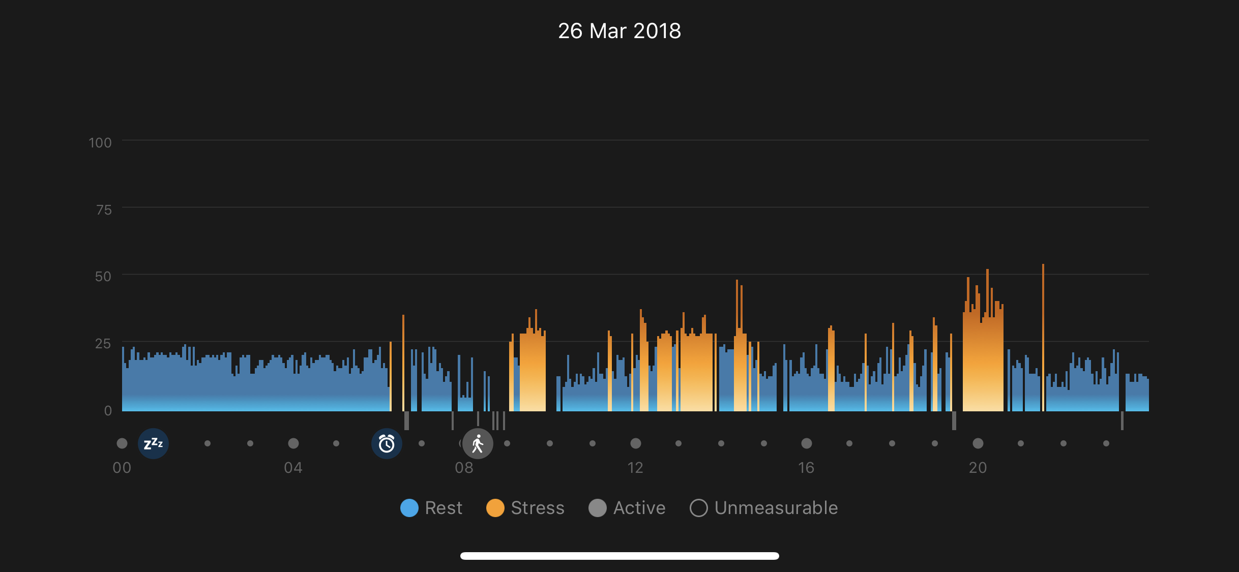
Sleep, step, heart rate and even stress tracking are all very well presented on the watch, meaning there are few devices that offer a more complete experience in terms of showing your overall fitness level.

The stress testing is among the most impressive, with the ability to read your heart rate variance (the difference in shape of each heart beat) and from that discern your stress levels.

It’s very accurate, and provides great insight - like how when you’re on a long-haul flight you’ll have a higher level of background stress than if you’re just sitting quietly at work or at home, which explains why long flights are always so much more stressful.
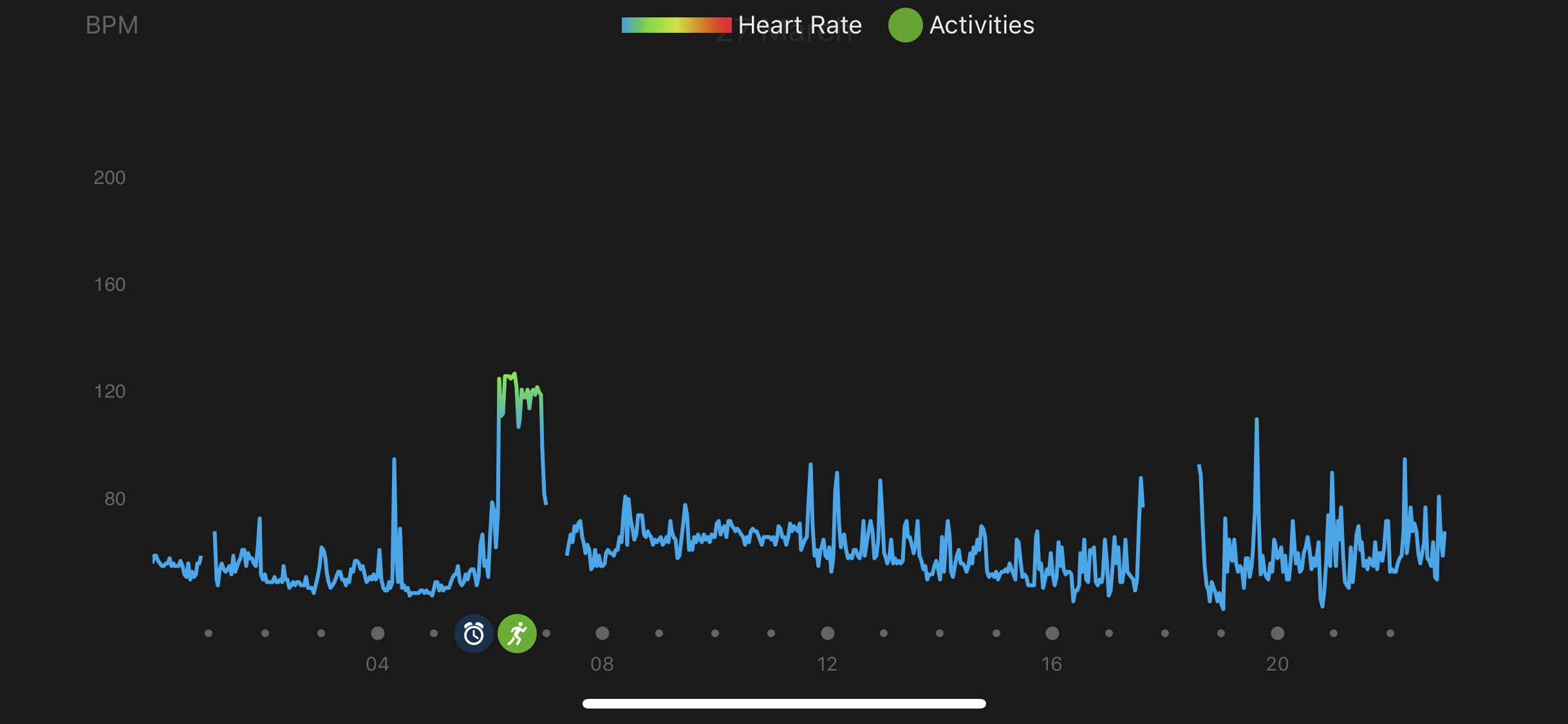
That heart rate variance can also pinpoint accurately your lactate threshold, meaning the Forerunner 645 can tell you with good accuracy when you’re going to start tiring in a race. It’s not a new feature to Garmin watches, but it’s really advanced and useful.

There’s also the ability to use the Forerunner 645 Music as a smartwatch, with the Bluetooth connection firing messages and phone calls to your wrist so you can respond or dismiss them accordingly.
If you’re using an Android smartphone you can even like certain social media posts or archive email - while rudimentary, we didn’t find we really wanted a lot more from a connected screen on our wrist, making the Garmin Forerunner 645 Music one of the better smartwatches around.

On top of all that, you’ve got the Garmin Connect app, which not only gives insight and advice on your fitness streaks (useful, if not a little rudimentary) but also gives long-range looks at your fitness levels.

Being able to see how your resting heart rate has improved, see how your daily stress level has moved or how well you’ve been sleeping is really cool, and all covered pretty accurately.

It would be nice to see this information used in a more cohesive way, fusing all three together with your effort levels in a run to give tailored information on how best to exercise, but that will surely come in the future.

From this app you can also download new watch faces or ‘apps’ from the ConnectIQ store, but these are little programs that add a small amount of functionality to the mix and aren’t super professional in the way they look - although you can get some nifty watch faces.

The Garmin Forerunner 645 Music is a disappointing fitness watch in a number of ways. There are lot of features on here that should make it one of the best running / sport-tracking watches around...but it misses out.

With a contactless payment on board, access to millions of songs and a new stylish design, it should have leapt to the head of the Garmin pack as the poster child of the next generation of sports watches from the brand.

But instead it feels like a halfway house that doesn’t quite manage to sit well in either camp and is out-performed by other watches in the range.

Who's it for?

Those people that don’t like to run in silence but hate having a bulky phone strapped about their body - they’ll love the convenience here.

Also, if you’re looking for a smart fitness watch that looks good on the wrist, then you’ll probably like the metallic rim around the bright and visible screen… it certainly looks the part.

It’s also smaller and lightweight, so those with more delicate wrists would probably gravitate towards this watch.

Should I buy it?

Unless you’re precisely the person described above, then no… don’t buy this watch, at least not right now.

It’s too expensive for what it offers, which is poorer battery life than other Garmin models, and it’s shorn of its headline features.

Without music streaming services added in, it feels like the 645 Music is unfinished, and while it can to contactless payments a lot of locations and banks aren’t set up for it yet.

The slow interface irks, and while the GPS lock is brilliant (seriously, we’re so impressed, as you can probably guess from the rest of this review) there aren’t enough unique, redeeming features of the 645, as all the good bits are available on other watches.

If the Garmin Forerunner 645 Music actually came with something like Spotify and the contactless payment was as widely supported as Apple Pay, maybe the buying advice would be different… but combined with the high price and poor battery, it’s a tough sell.

  • First reviewed March 2018

Competition

Not convinced by the Garmin Forerunner 645? Try these on your wrist instead.

Garmin Forerunner 935 
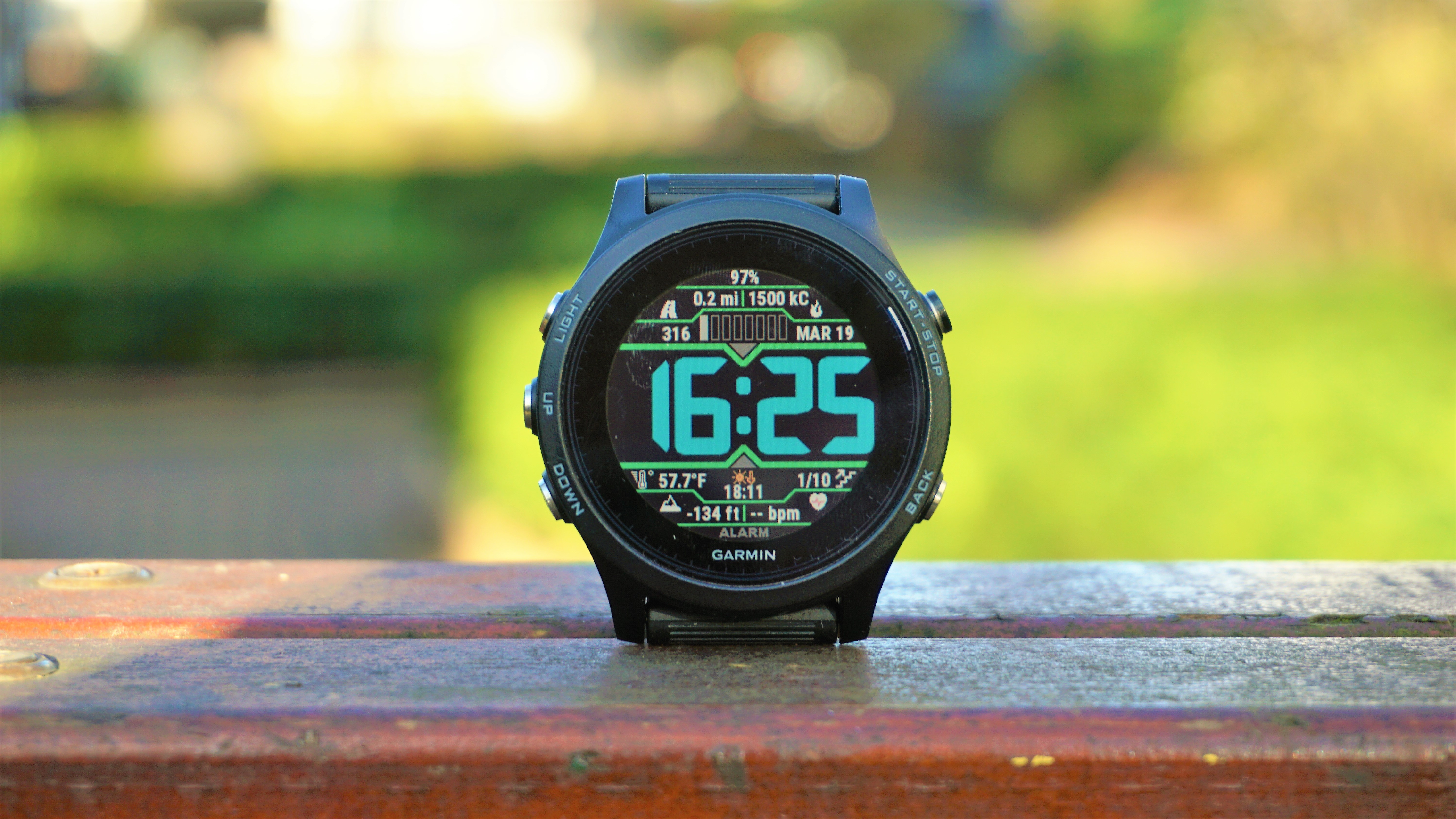
The Garmin Forerunner 935 is roughly the same price as the 645 Music, but can track more activities, has a longer-lasting battery and more rugged casing.

In short, unless you’re desperate to have music and a more stylish-looking watch on your wrist, we’d thoroughly recommend this model, as it does all the 645 does and more.

Read the hands on Garmin Forerunner 935 review

 Garmin Forerunner 735XT 
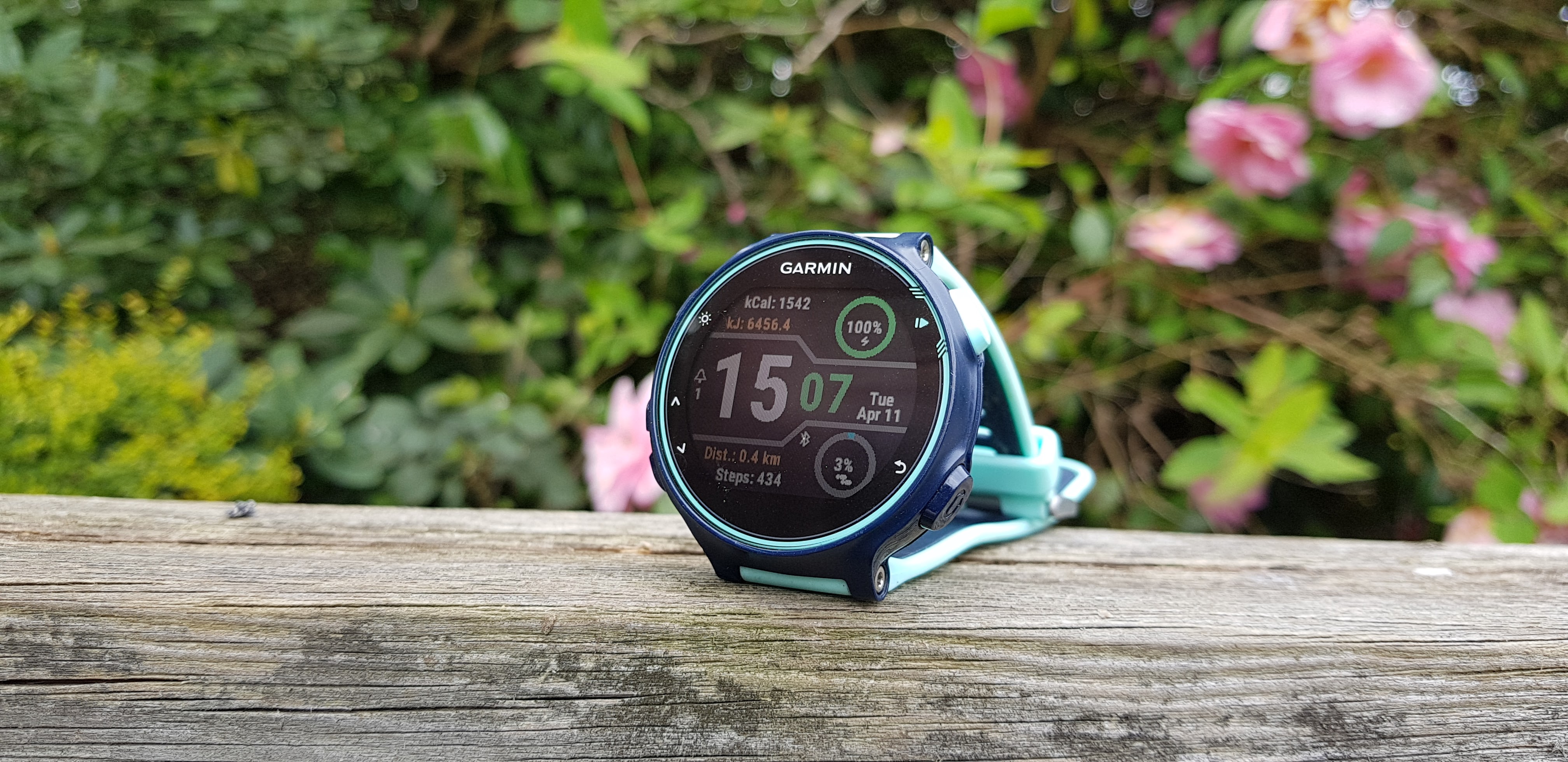
If you’re not sold on the 645 Music and don’t want to spend as much, then the 735XT is your next best bet.

It’s shorn of the music, doesn’t look as premium and lacks things like strength tracking and stress monitoring, but it’s a slick and lightweight watch for less, and is brilliant for triathletes in particular.

Read the full Garmin Forerunner 735XT review

Suunto Spartan Trainer Wrist HR

The latest watch from Suunto packs an excellent heart rate monitor, a smart route finder in the app and a clean and usable interface. 

It’s not as fully-featured as the Garmin, but is more rugged and offers better navigation capabilities from the wrist too.

Read the full Suunto Spartan Trainer Wrist HR review

Huawei Launches Enjoy 8 Plus, Enjoy 8 & Enjoy 8e Smartphones in China

Just after launching the flagship Huawei P20 smartphones in France, Huawei now announced three new budget smartphones in China. The Huawei Enjoy 8 Plus, Enjoy 8, and Enjoy 8e Smartphones come with the same FullView display with 18:9 aspect ratio as seen on other budget smartphones from Huawei and Honor. While the Huawei Enjoy 8e and Enjoy 8 Plus comes with a metal unibody design, the Enjoy 8 sports a 2.5D glass on the front and rear.

All the three devices come in Black, Blue, Gold, and Pink color options. The devices will be running on Android 8.0 Oreo-based EMUI 8.0 out of the box. Just like other Chinese manufacturers, Huawei is still opting for the MicroUSB 2.0 port over the USB Type-C port for its budget smartphones. Connectivity options include 4G LTE, Wi-Fi, Bluetooth, GPS, 3.5mm audio jack, and Micro USB 2.0 port.

The power button and volume rocker can be can be found the right edge. On the rear, we can also find the circular fingerprint sensor for securely unlocking the device. Interestingly, all the three devices come with triple card slot for adding two SIM cards along with a single MicroSD card. The Huawei Enjoy 8 and Enjoy 8e comes with HD+ display and are powered by Qualcomm Snapdragon 430 octa-core processor.

On the other hand, the Huawei Enjoy 8 Plus sports a Full HD+ display and in-house Kirin 659 octa-core processor. While the Enjoy 8 and Enjoy 8e offers 3GB of RAM and 32GB of internal storage, the Enjoy 8 Plus includes 4GB of RAM and 128GB of onboard storage. Talking about the cameras, all the three devices are equipped with 13MP + 2MP dual cameras on the rear with f/2.2 aperture and LED flash.

Coming to the front camera, the Enjoy 8 Plus comes with 16MP + 2MP dual selfie cameras. The Enjoy 8 and Enjoy 8e comes with 8MP and 5MP front cameras respectively. Just like the other specifications, the Enjoy 8 Plus also comes with a larger 4,000mAh battery. The other two devices only offer a 3,000mAh battery. While there is no information, we don’t think the devices will support fast charging.

The Enjoy 8 Plus with superior specifications is priced at 1899 Yuan and will go on sale starting April 4th. The Huawei Enjoy 8 and Enjoy 8e are priced at 1299 Yuan and 1099 Yuan respectively. As of now, there is no information about the availability of these devices in other markets. Stay tuned on PhoneRadar for more details!

The post Huawei Launches Enjoy 8 Plus, Enjoy 8 & Enjoy 8e Smartphones in China appeared first on PhoneRadar.

G-Technology G-Drive 4TB

While solid-state drives are all the rage and have displaced spinning hard disk drives from most end-user devices bar entry-level products and the data center, there are ways in which HDDs still rule the roost.

While SSDs boast low power consumption, faster performance and shock resistance, they have yet to catch up with hard drives in terms of cost per unit storage – especially for multi-terabyte capacities.

The G-Technology G-Drive for example costs as little as £153 (around $215) for the 4TB model with the 6TB model available for only £20 more. You will be hard pressed to find a 1TB external SSD for less than £300 (G-Tech’s very own G-Drive being the exception at less than £200).

G-Technology G-Drive 4TB

Design

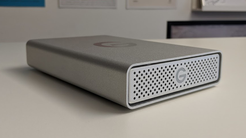
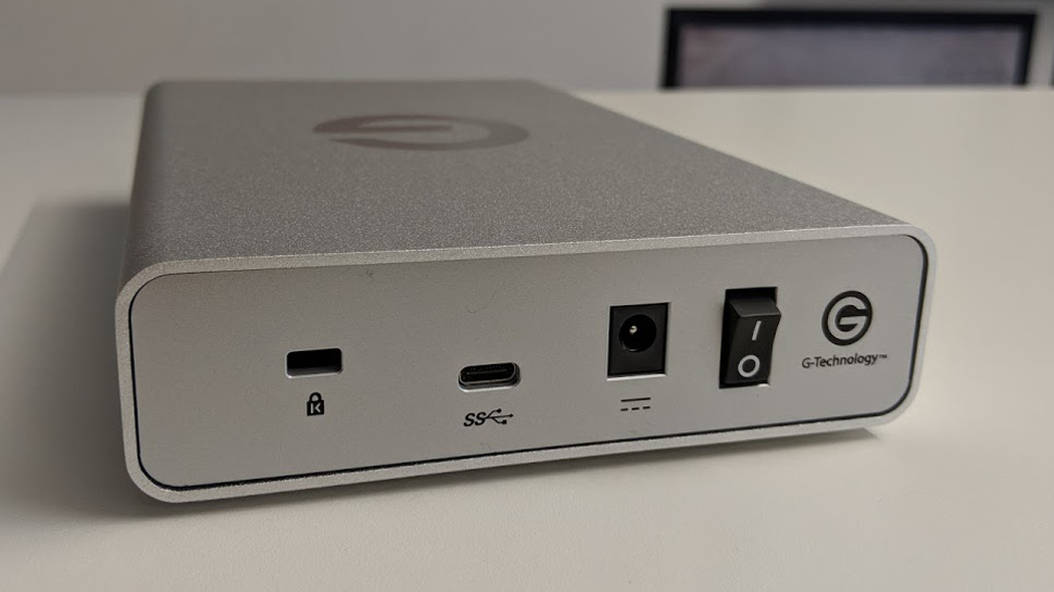
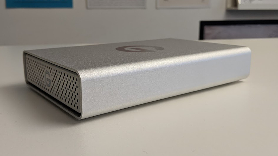
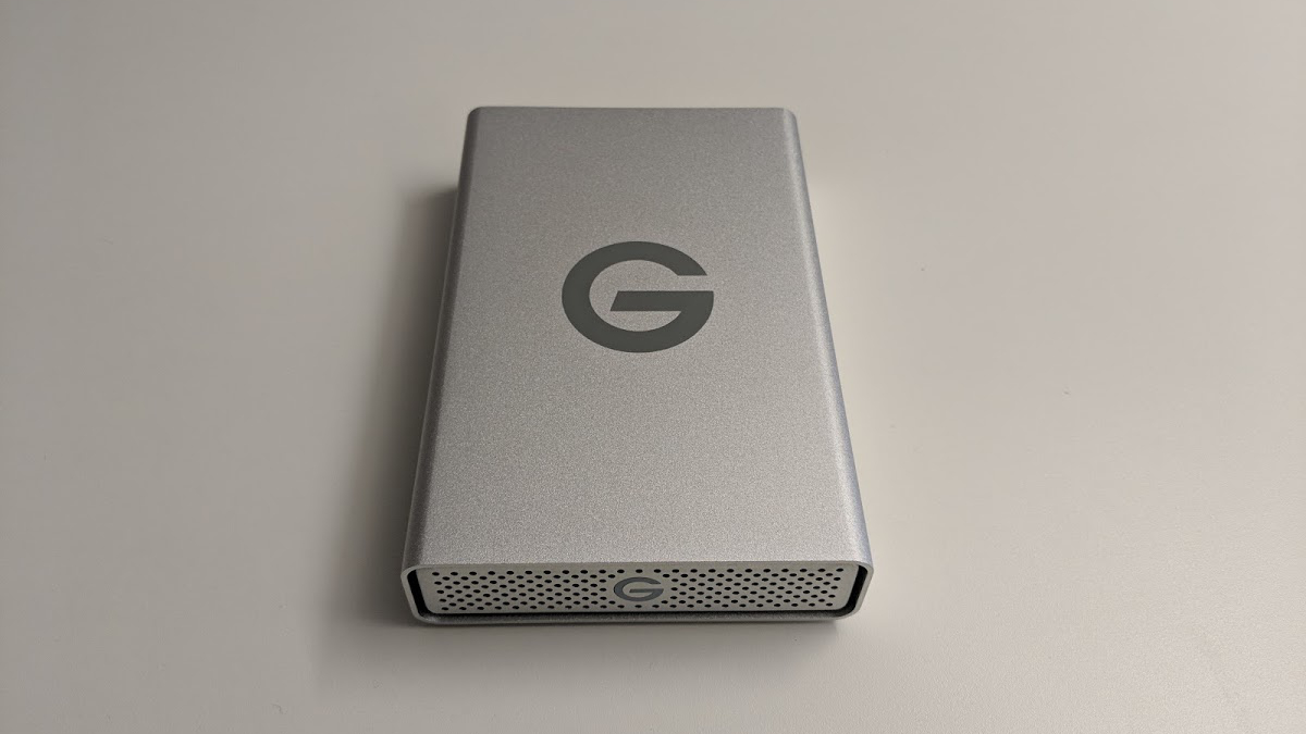
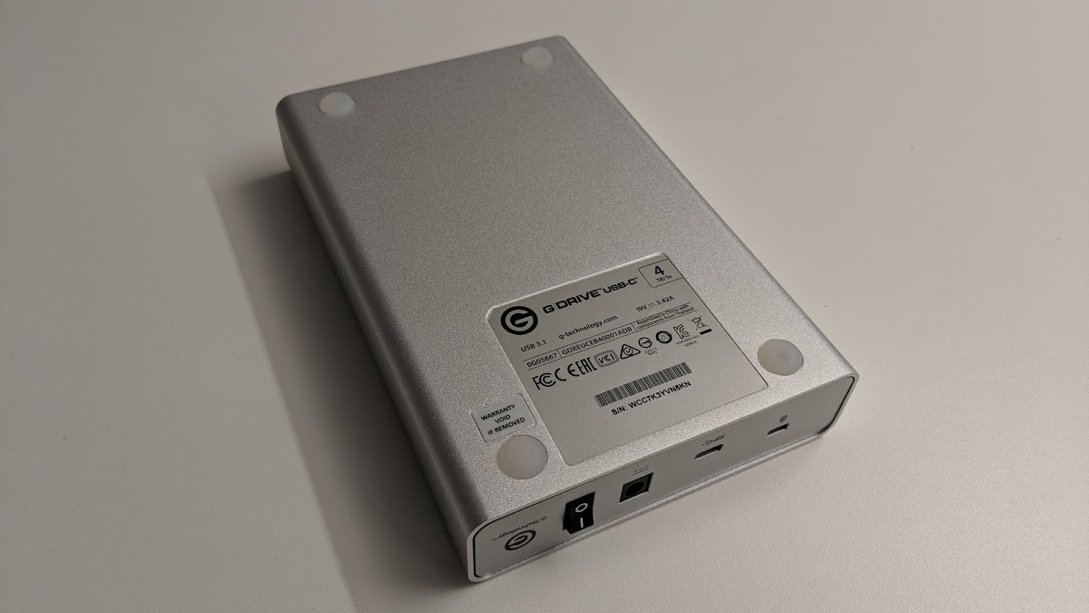
Designed to match the Apple product range, the G-Technology G-Drive external hard disk features an all-aluminum enclosure with an illuminated ‘G’ logo and air vents (to cool the drive) on the front. A large ‘G’ adorns the top of the device and there’s a power switch, a USB Type-C connector (Gen 1 so only up to 5Gbps) and a power socket at the back.

It is a relatively large piece of kit at 196 x 128.5 x 35.3mm with a weight of just over 1kg, and that’s because of the 3.5-inch hard disk drive that’s inside.

G-Technology G-Drive 4TB

In addition, a wieldy 19V, 3.42A (65W) power supply unit accompanies the device, which is at odds with the minimalist design of the drive. Four rubber feet plus the usual details (serial number, barcode) are located on the base of the device.

The drive can even charge your MacBook or MacBook Pro (or indeed any recent laptops that support Power Delivery).

G-Technology G-Drive 4TB

Usage and performance

The G-Drive external drive is plug-and-play on Apple Mac and can be easily reformatted for Windows. It is also Time Machine ready so you will be able to quickly backup all your files.

Pry open this drive and you will find a Western Digital WD40EMRX-82UZ0N0, otherwise known as the WD Red. This is a 4TB hard disk drive spinning at 5400RPM with 64MB cache – a storage device that has been fine-tuned to deliver cooler temperatures in use and targets NAS users.

There is a 10TB model – with a staggering 256MB cache – available directly from G-Technology in the US for $370 (around £260) but it is not yet available in the UK.

WD says that its Red range has features such as NAS compatibility, increased reliability, error recovery controls as well as noise and vibration protection that make it a great choice for use cases that require better reliability than your run-of-the-mill hard disk drive.

Not surprisingly, the drive comes with a three-year limited warranty, plus a pair of USB Type-C cables and extra plugs for mainland Europe territories.

The drive achieved some great numbers on CrystalDiskMark hitting 180MBps and 152.6MBps on sequential read/write benchmarks respectively, while reaching 182MBps and 184MBps with sequential read/write speeds on the popular ATTO disk benchmark. That’s not far from the ‘up to’ transfer rates of 195MBps claimed by the manufacturer.

As expected the drive warmed up a bit during our testing, but this represented nothing alarming for a storage device that is expected to be powered on 24/7.

G-Technology G-Drive 4TB

The competition

There’s plenty of competition out there both from Western Digital – the parent company of G-Technology – and from others, although few can match the level of reliability set by the G-Drive.

There are, for example, plenty of 2.5-inch external hard disk drives that cost about £100 (around $140). However, leaving those to run 24/7 is not advisable because they were not designed from the ground up to work that way.

Western Digital has a 4TB Elements drive for around £100 ($140) and a 4TB WD My Book desktop hard drive, while Seagate-owned LaCie sells a 4TB Porsche Design USB-C drive – that targets the same audience as the G-Drive – and a high performance drive called the D2 that is surprisingly inexpensive.

G-Technology G-Drive 4TB

Final verdict

The G-Drive external HDD shows that spinning hard drives still have their place in an increasingly SSD-centric marketplace. This product hits a good balance between being relatively affordable and suitably capacious.

Although it was launched more than a year ago, the G-Drive is still very much competitive with rivals launched in 2017. It is fast, reasonably well built, compatible with Apple products and has a faster implementation of USB Type-C.

It would be great if G-Technology decided to produce a mini version of this drive (or even simply shrink the current device for a new 2018 offering), and also introduced a 2TB version to compete with Samsung. Making it waterproof would be the icing on the cake but that’s unlikely to happen, mainly because that would put it in direct competition with SanDisk products, another sub-brand of Western Digital.

Thursday, March 29, 2018

Braven Stryde 360

These days, the wireless speaker market is so over-crowded with similar-looking (and sounding) speakers that it’s making it more and more difficult to differentiate between the myriad options at your disposal. 

In some ways, this is nice. If you're just an average person looking for a speaker, you have more options for great sounding, weatherproof speakers than ever before. But, for manufacturers, it means you’ll have to perform at a very high level in order to get noticed or out-do the competition. 

Unfortunately for the Braven Stryde 360, it just doesn’t fare well against the competition. Don’t get us wrong, the Stryde 360 is a solid weatherproof speaker but compared to the dozens of other, better-sounding speakers out there right now, we just can’t recommend it against the rest of the competition. 

Said simply, this $99 (around £70, AU$130) speaker is a jack of all trades, but master of none.

Design

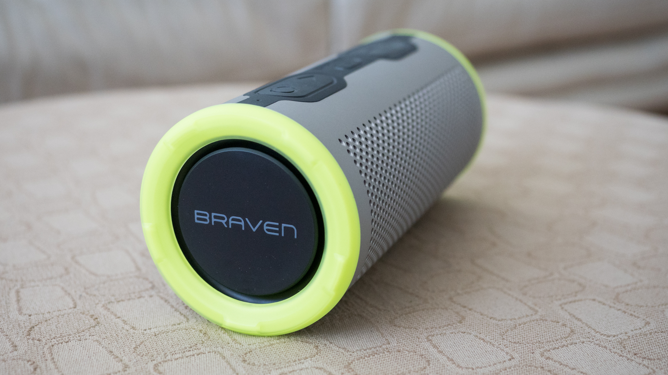
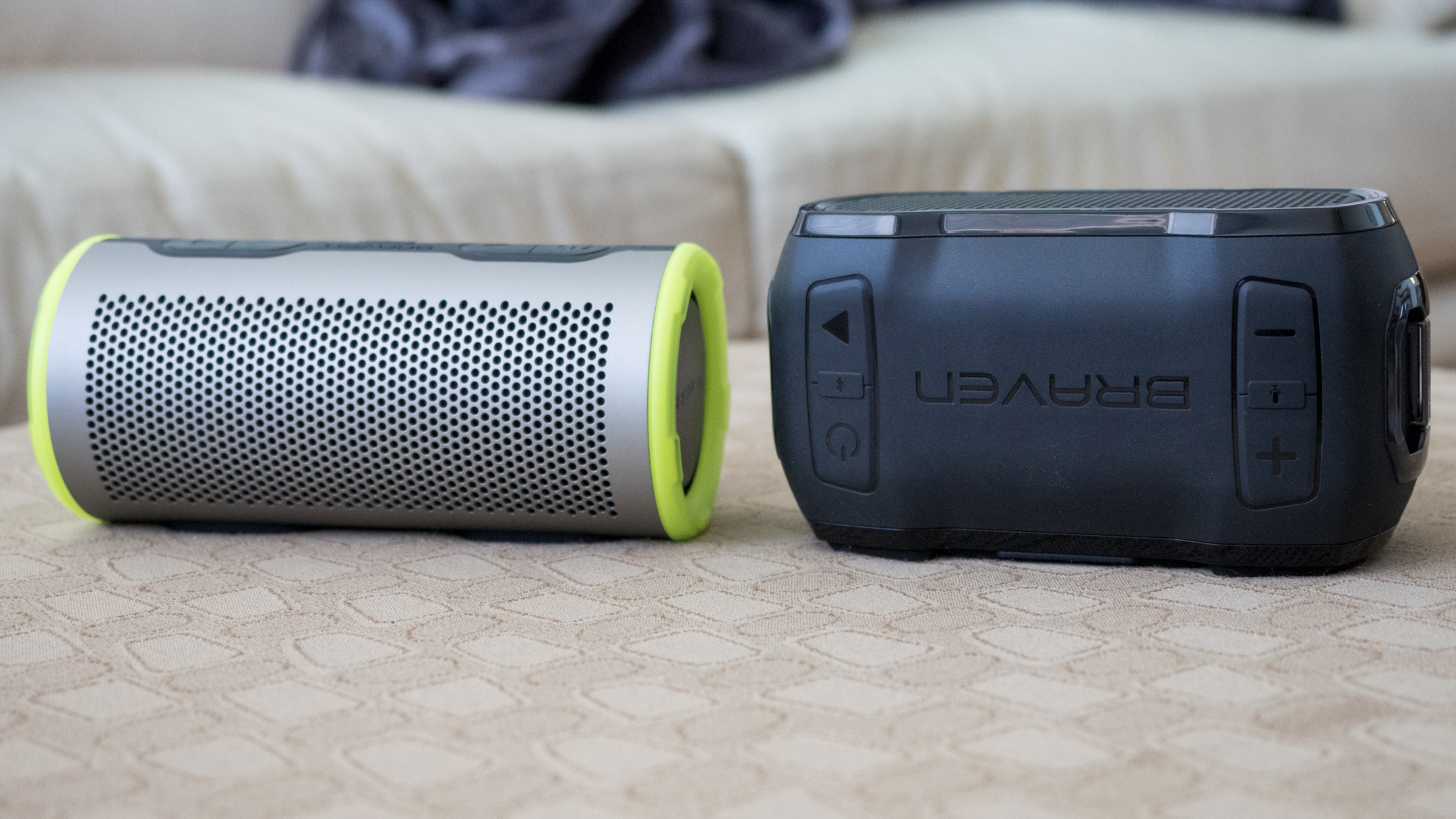
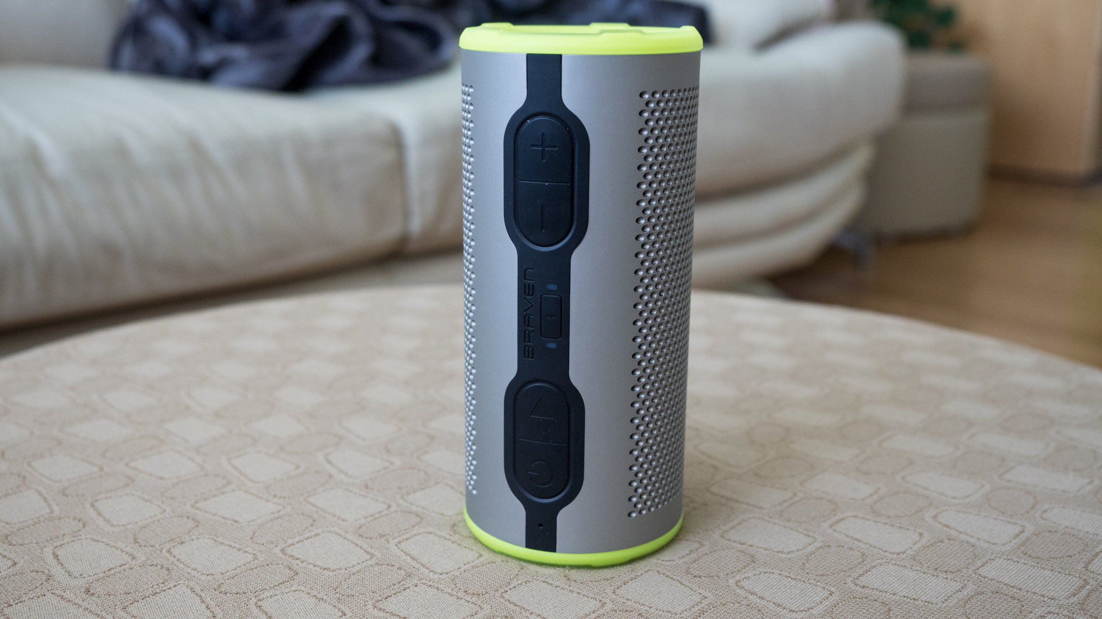
The Braven Stryde 360 offers a cylindrical design that can be stood up like a soda can or laid down horizontally for more stability. Sound quality in both positions is the same so you don’t need to worry about prioritizing a position for optimal performance.

The chassis of the Stryde 360 is extremely rugged with a tough plastic and rubber construction. The yellow colored rings surrounding the woofers on our review unit are built to withstand drops and bumps. 

Even though the speaker is made mostly of plastic, it offers IP67 water and dust resistance, which means you won’t have to worry about taking the speaker to the pool or outdoors. The speaker is also surprisingly light, making it easy to take with you in your bag without feeling like you’re being weighed down.

On top of the speaker you’ll find big buttons that make the speaker easy to operate, and there’s even a mic so you can use the Stryde 360 to make calls, which is a nice feature to have. 

On the bottom of the speaker you’ll find a frustratingly difficult rubber flap which hides the microUSB charging port, 3.5mm aux jack, and USB-A port that pumps out 5V/1 amp to charge your smartphone in a pinch. The flap is so difficult to open because of the amount of force required to break the rubber seal, but also because the nub you’re supposed to grab is impossible to lift with your fingers. The speaker is great at keeping both water - and you - out at all costs.

 Inside the Braven Stryde 360 is a 2,500 mAh battery, which will net you 12 hours of playback at moderate volume. This is average for the segment but it’s nice that you can use the Stryde 360 to top off your smartphone in a pinch.  

Performance

Sound quality for the Braven Stryde 360 is good, but the speaker clearly lacks bass response, which is surprising for the size. (For reference, the UE Wonderboom offers slightly more bass and is a much more compact, weatherproof speaker.) 

We were hoping the Stryde 360’s dual woofers would provide more bass response like the JBL Charge 3, but we were left disappointed by the anemic bass slam for music like EDM and rap. 

What stands out about the Stryde 360’s sound quality are its mids: The speaker sounds good with voices, which sound full and warm. Highs, similarly, are good, but slightly become too bright at times. Bass, as we've mentioned, sounds uncontrolled and highs are piercing at 100% volume. 

While the speaker gets quite loud for outdoor use, it also distorts at high volume. 

If you decide to take a call while you're poolside, call quality is surprisingly good - especially so considering the fact that there aren't many weatherproof wireless speakers out there with built-in microphones. 

Calls were clear and our friends and family reported hearing us just fine.  

Verdict

If there weren't dozens of other speakers offering the same specs at around the same price, the Braven Stryde 360 would be a good speaker: It does everything most people could want in an outdoor speaker and it sounds decent. 

However, it’s too hard to recommend over the competition - we think the JBL Flip 4 sounds better and offers a better design for the same price, while for those looking for more bass can buy the JBL Charge 3 for slightly more money. 

If you want a more compact speaker for ultimate portability, the UE Wonderboom is an ever better choice, punching above what its size would suggest, getting loud and offering decent bass response from such a compact speaker.  

You won't go wrong buying the Stryde 360 ... but it's well worth considering the dozens of better-sounding, more feature-rich speakers first.

Intel Hades Canyon NUC

Intel’s ‘Next Unit of Computing’ hardware platform has always showcased some of the chipmakers most interesting silicon concepts. This year, the Hades Canyon NUC represents a partnership between Intel and AMD we would have never expected – or even fathomed.

It’s easily the smallest VR-capable PC that marries together an Intel quad-core processor with integrated, ‘discrete-class’ AMD Radeon RX Vega graphics into a single chip. With all that power under its belt, this gaming PC easily smashes through Full HD gaming with most modern titles and performs like a productivity champ.

Despite all the caveats of that comes with a barebones computer such as this, the Intel Hades Canyon NUC earns top marks for packing so much performance into a small package. It’s one of the best and our favorite mini PC of the year so far.

Price and availability

Our particular Intel Hades Canyon NUC8i7HVK review unit costs $999 (about £710, AU$1,302), which is about half-to-a-third off the price of an equally competent gaming laptop. Not too shabby for a PC equipped with a quad-core Intel Core i7 and nearly Nvidia GTX 1060 equivalent graphics.

That said, this barebones unit doesn’t come with storage, memory or an operating system, so you’ll have to get those pieces on your own.

There’s also an entry-level Intel Hades Canyon NUC8i7HNK priced at $799 (about £570, AU$1,040). This more affordable NUC comes still comes with a quad-core i7 CPU, but it maxes out at a slower frequency. Meanwhile, the onboard Radeon RX Vega M GL GPU has four fewer compute units and won’t run as fast either.

Compared to other barebone PCs, the high-end Intel Hades Canyon NUC compares well against the $949 (£619, AU$1,739) Zotac Zbox Magnus EN1060K and $999 (£819, AU$1,579) Gigabyte Brix GB-BNi7HG6-1060. Both of these mini PCs feature older Kaby Lake processors but a Nvidia GTX 1060 with two more GB of video RAM and higher CUDA  

Design

At first blush, the Hades Canyon NUC looks more like a set top box than a desktop PC, and that’s honestly a good thing. The device is interesting enough to look like more than just a plain box in your home entertainment setup while also not being too distracting if you decide to use it as your work computer.

If you remember the Skull Canyon NUC Intel released two years prior, the Hades Canyon should look very familiar. Both units share the same overall shape, plus an identical hexagonal motif for the ventilation holes and top panel. Of course, with the integration of ‘discrete-class’ graphics and sufficient cooling to back it up, Intel’s flagship NUC is almost twice as large as its predecessor.

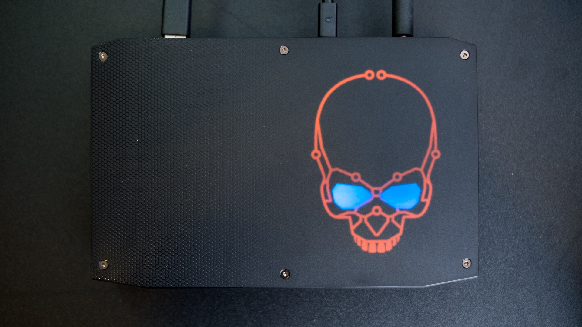
Intel’s design has also seen some improvements. The old interchangeable plastic panels have been replaced by a much slicker light-up skull fashioned after the silicon that resides within. The lighting on this part of the case and all the little hard drive and power indicators are fully customizable – or you could just turn them all off for a stealthy unit.

Despite this PC’s small size, it packs an impressive amount of ports. Along the backside alone you’ll find four USB 3.0 ports, two ThunderBolt 3 ports, two mini DisplayPorts, HDMI 2.0 and even two Gigabit Ethernet ports. That’s more connectivity than you’ll even find on some full-size desktops.

Cracking open the Hades Canyon NUC is a breeze, as it just requires undoing six torx screws and a single Philips head. With the top cover removed, you can access the computer’s memory slots as well as the M.2 NVMe and SATA drives.

Performance

The ‘discrete-class’ Radeon RX Vega graphics are every bit as impressive as Intel and AMD promised. We can play all our favorite games, including Far Cry 5 and Warhammer: Vermintide 2, at a steady 60 frames per second (fps) with high-quality graphical settings and a 1080p resolution.

Even more impressive is that the little PC holds it own through Overwatch and Hitman at 1440p with HDR active on a Samsung CHG70 QLED gaming monitor. The only title to give us some measurable difficulty is Assassin’s Creed Origins, but it still runs at a completely playable 40fps with high quality settings and a 1080p resolution.

Outside of gaming, the Intel Hades Canyon NUC runs like a champ through all our regular web browsing and word processing, as well as our image and video editing needs. For those multi-monitor fans, the Intel Hades Canyon NUC can also drive up to six screens.

Compared to comparable notebook hardware in the 15-inch Microsoft Surface Book 2, the Intel NUC almost wins the complete race in both processor and graphically intensive tests. A full-on gaming laptop like the Dell Inspiron 15 7000 Gaming manages to close the gap a little better, but for the most part the Hades Canyon stays on top.

Meanwhile, a gaming PC with actual desktop parts, like the Asus ROG G20CI, proves to be tougher competition.  While the NUC manages to score better in the processor tests, the integrated graphics just can’t keep up with a Nvidia GTX 1080 – then again, neither could the AMD Radeon RX Vega 64.

Final verdict

The Intel Hades Canyon NUC is the company’s most impressive mini PC yet, capable of playing most modern games with ease and offering plenty of performance for everyday computing. And, that’s all without the help of an external GPU, unlike the previous Skull Canyon NUC. 

This is true high-end desktop computing on a single, standalone chip. Beyond this one device, it represents a turning point for thin-and-light laptops like HP Spectre x360 15 and Dell XPS 15 2-in-1 to be just as powerful as full-on gaming laptops

Although the Hades Canyon NUC might be expensive and require additional parts, you won’t find another mini PC as powerful as this. The expansive array of ports and support for high-end internal components is equally as amazing. Thanks to its small size, it's also the perfect home theater PC.

All in all, Intel has produced an incredibly tiny and VR-capable gaming PC worthy of your attention and consideration.

!!!!!!!!!!

Popular Posts

Categories

Blog Archive