Huawei MatePad Pro 12.6 (2021)
Huawei’s MatePad Pro 12.6 takes on the Galaxy Tab S7 Plus and iPad Pro 12.9 with its size and specs. What’s more, debuting Harmony OS 2.0, Huawei’s answer to its Google-free ecosystem also features a host of interface upgrades that differentiate it from traditional Android tablets.
It’s no secret, Android tablets have historically failed to match up to Apple’s iPad line. Their hardware has been great at times, but their interfaces have been woefully unoptimized for big screens. In turn, it’s a stroke of genius for Huawei, a brand on the back foot when it comes to app support thanks to the Google ban, to shift focus to an inherent Android weakness, and fix it.
The new Huawei Harmony OS 2.0 tablet UI is also matched with some eye-popping hardware, thanks to a huge, 12.6-inch OLED display, flagship power courtesy of the Kirin 9000, as found in the Mate 40 Pro, and stacks of storage.
With reverse wireless charging, a triple camera set up and plenty more party tricks within its slender chassis, has Huawei finally made a post-Google-ban device that bests the competition?
Huawei MatePad Pro 12.6 price and release date
- Availability to be confirmed
- Price to be confirmed
- No US availability expected
The MatePad Pro 12.6 price is yet to be confirmed. It is expected to launch in regions Huawei has traditionally launched its phones, including Asian markets, Australia, Europe, the Middle East, New Zealand, and the UK.
With no confirmation at the time of writing, check back for full pricing and availability. As with all Huawei products, no US availability is expected.
Design
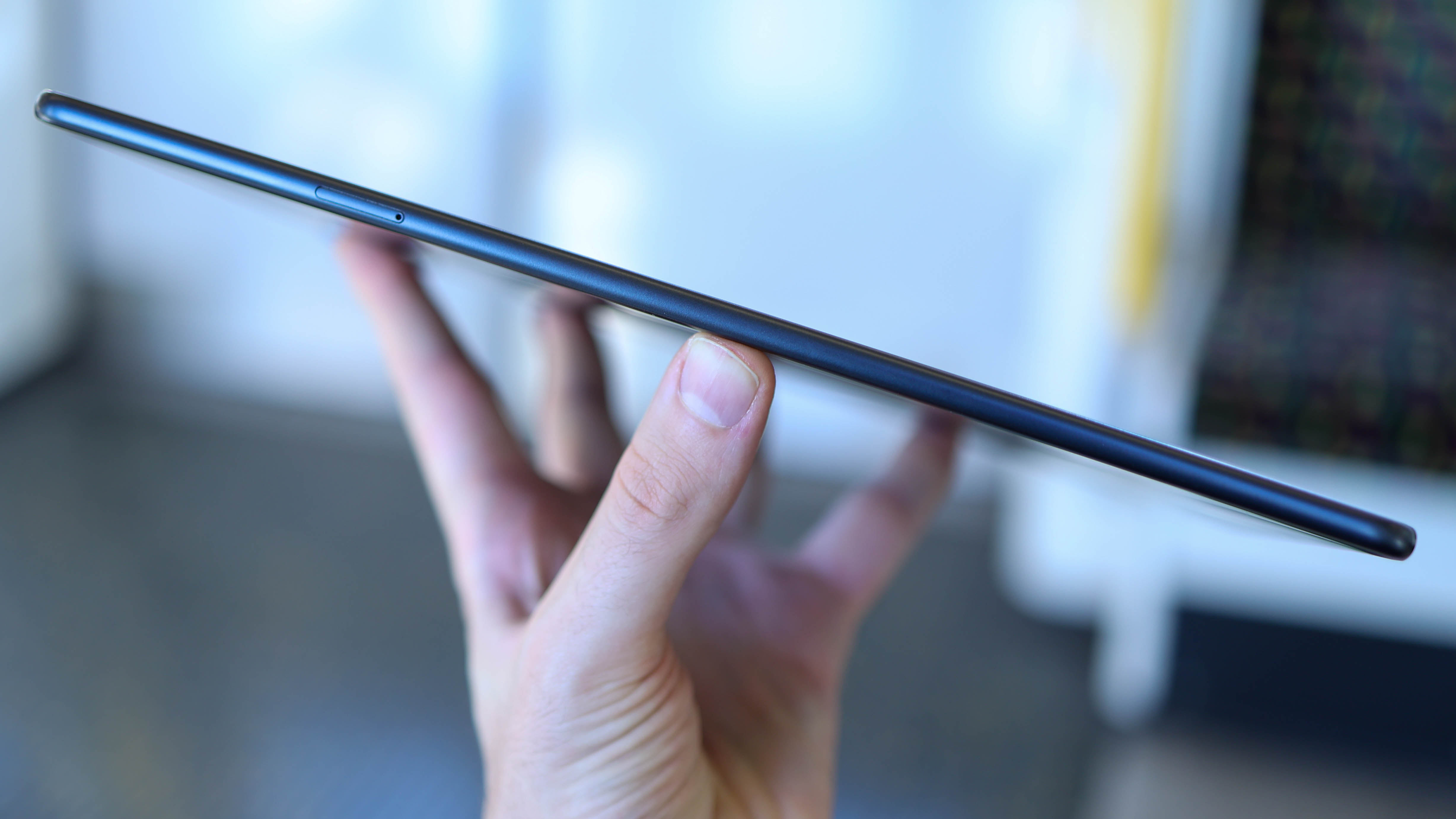
Huawei has kept its MatePad design language from 2020, with an understated look across the new line. While Samsung’s uber-frosty metal is turning heads in its Mystic Bronze colorway, Huawei’s most flamboyant option is instead a demure Olive Green, with Matte Grey and Silver Frost alternatives. The tab ultimately has a very utilitarian, practical, intentional design.
More practical than the iPad or Galaxy Tab S7 Plus with its softer angles and curves, it feels forgiving in the hand, though looks less premium than it's main competition in the same breath.
One design decision we can get behind is the removal of the punch hole selfie camera. Instead, the front camera has moved to the bezel in the top center of the display (when in landscape orientation). This not only results in an uninterrupted display but a video call camera that isn’t off-angle – much better.
When in landscape orientation, the MatePad Pro 12.6 sports a power button on the left side, and a volume rocker on the top left. This is intuitive positioning, resulting in minimal confusion when going for one or the other given they aren't side by side.
The new M Pen magnetically attaches to the top right of the tab, while the USB-C port is on the right side. Unlike the stark, flat Galaxy Tab S7 Plus and iPad Pro, the metal frame is rounded, for a super-comfortable in-hold feel.
The back also misses out on metal, which is another reason for the MatePad’s slender frame and relatively light weight. As with last year's model, the 2021 MatePad Pro also supports wireless and reverse wireless charging, so it can be used to power up your wearable or smartphone, which is a handy feature given the tab’s ample battery.
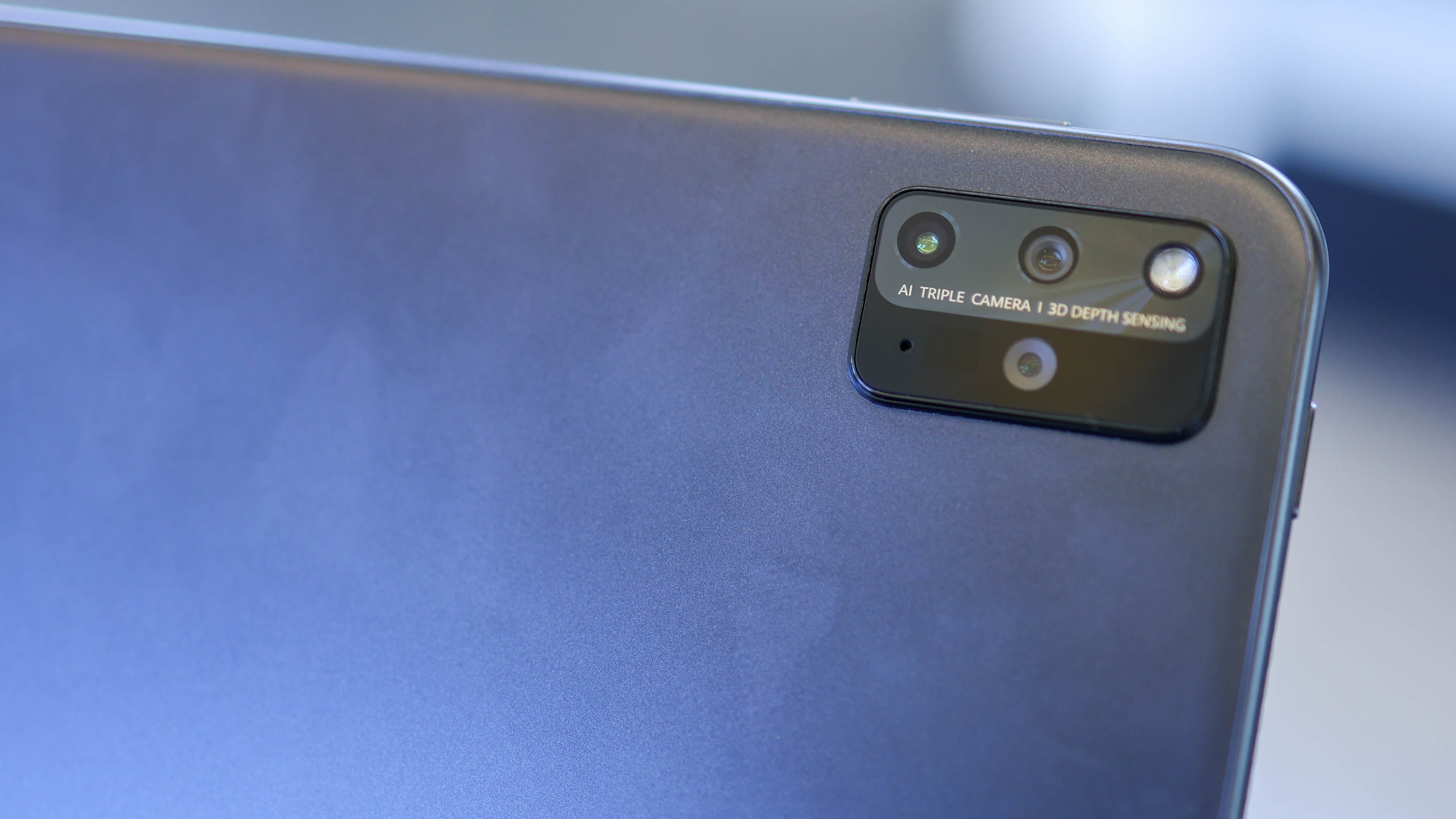
The MatePad Pro enjoys slimmer bezels than we’ve seen before on a tablet from Huawei, and they’re uniform around all four sides, making for a clean front. The only notable interruption around the back of the tab is the triple camera, whose styling mirrors that of Huawei’s P40 Pro with its rectangular shape.
Ultimately, the MatePad Pro 12.6 delivers quality design, without necessarily offering standout style. It’s a slim, well-built tablet, and its hardware serves as a vehicle for that huge, immersive namesake display.
Display
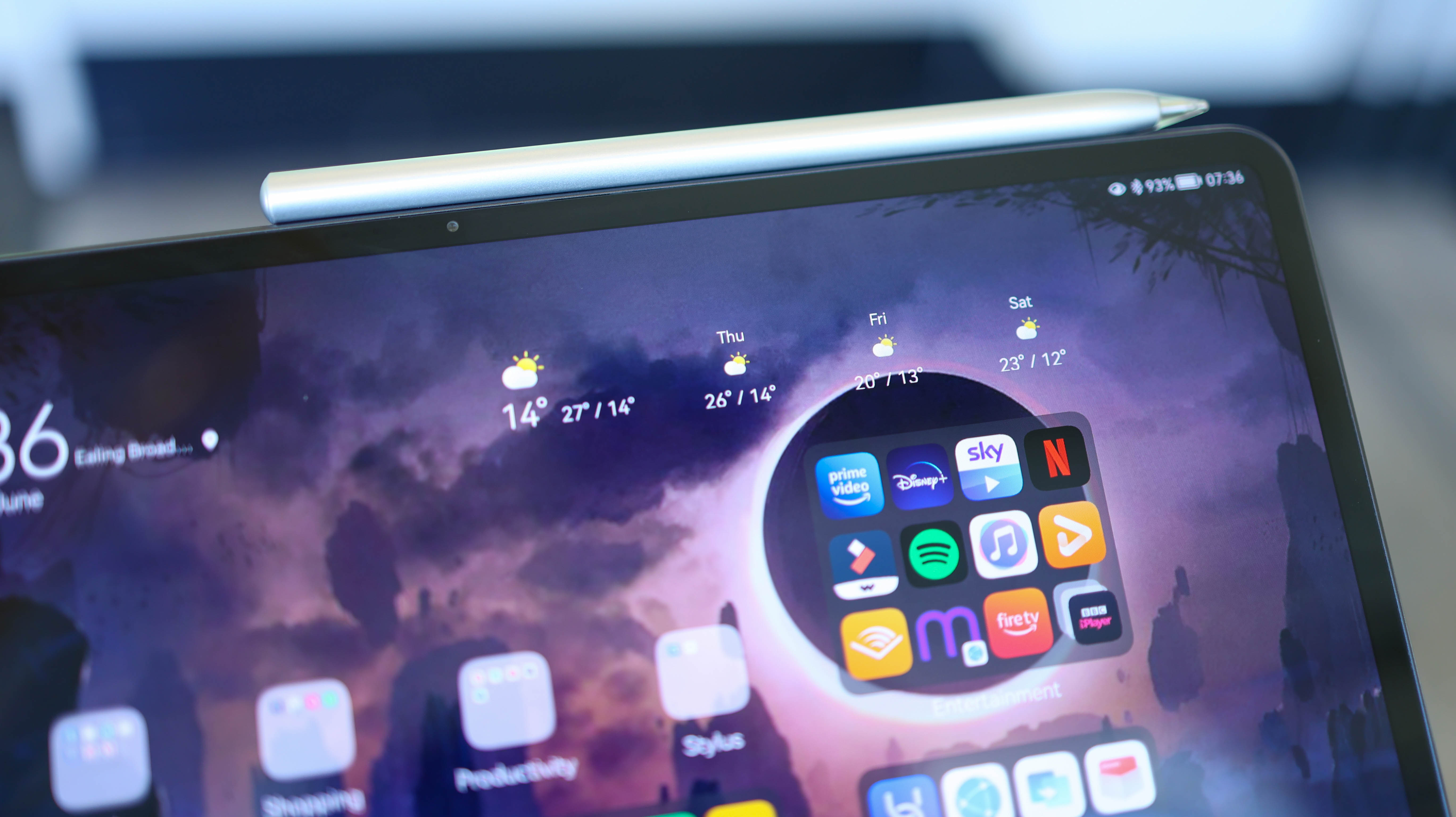
The MatePad Pro 12.6 features a FullView OLED screen, making it one of the only big-screened tablets with OLED display tech, promising deep, inky blacks and punchy colors.
With a 2560 x 1600 resolution display, that results in a pixel density of around 240 pixels per inch (PPI), similar to the iPad Pro and Tab S7 Plus’s 265 PPI, but not quite as crisp. With DCI-P3 wide color gamut, a 1,000,000:1 contrast ratio, and a Delta E of below 0.8 percent, the quality on paper is nothing short of flagship nevertheless.
In our short time with the tablet, the screen quality held its own in side by side comparisons with other top-tier tabs.
One thing the MatePad Pro 12.6 doesn’t deliver is a high refresh rate though. Capping out at 60Hz, while it looks perfectly smooth when watching Netflix, scrolling through feeds isn’t quite as floaty as on an iPad Pro.
Camera
Huawei’s known for its killer cameras, and the MatePad Pro ups its imaging game for the brand’s tablet line, being the first triple camera of the bunch. With a 13MP primary camera, the MatePad misses out on a flagship smartphone sensor, like the 50MP Sony module found in the P40 Pro Plus.
That said, it still combines the main cam with an 8MP ultrawide, matched with a 120-degree field of view and a Time of Flight sensor.
Specs and performance
Loaded up with a Kirin 9000E processor, the MatePad Pro 12.6 is flagship inside as well as out. Delivering smooth day-to-day performance in our time with the tab, even with Huawei’s heavily redrawn interface, Harmony OS 2.0, we didn’t encounter any stutters, pauses or app crashes.
The tablet’s also loaded up with 8GB RAM and up to 256GB storage. While there’s no SIM card or microSD card slot, the MatePad Pro does support Nano Memory card expansion, so takes Huawei’s proprietary storage cards in case you're running out of space on it.
Software
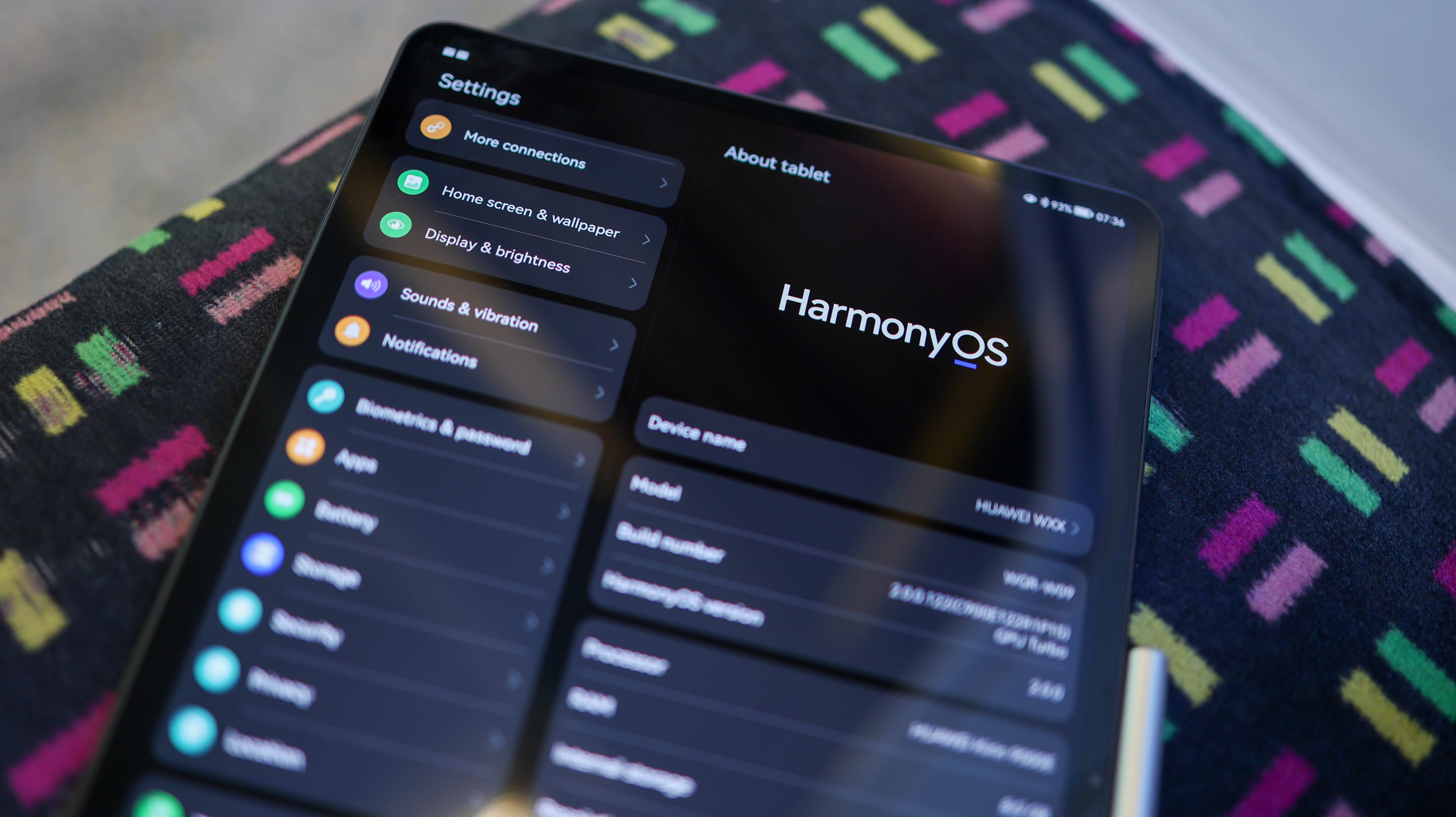
The best and worst things about the MatePad Pro 12.6 can be covered when talking about software. The good is all down to Huawei’s customizations. The bad is all down to app limitations when compared to other Android-based tablets and iPads. We say Android-based, because even though the MatePad Pro runs HarmonyOS 2.0, Huawei's experience is clearly built on Android, with support for APKs and a familiar Android UI.
Why Harmony? This is Huawei’s operating system created in response to the Google ban imposed by US sanctions. While V1 of HarmonyOS was a carbon-copy of the Android experience, with version 2.0, things are much more unique, at least on tablets.
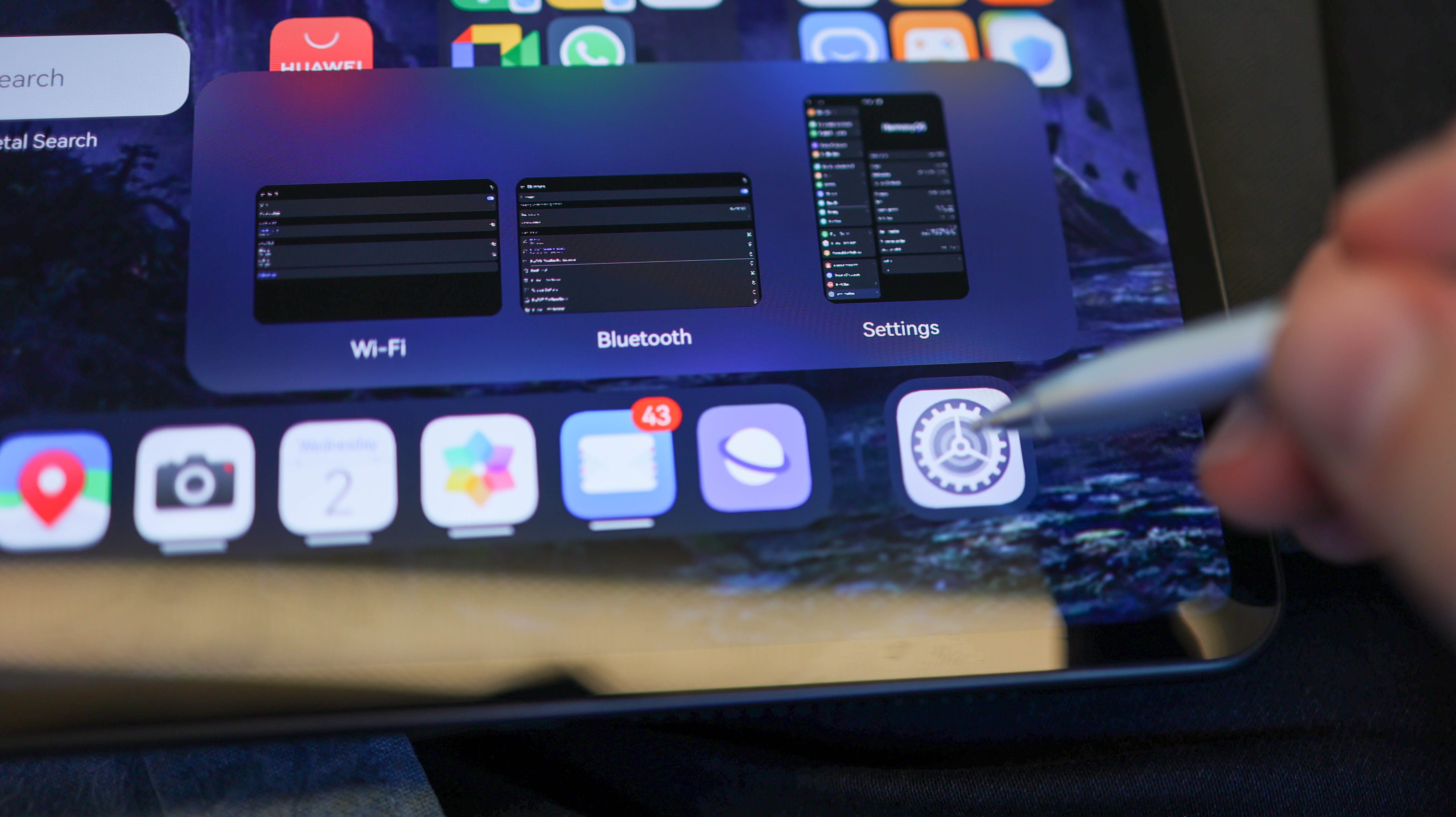
The most notable point about HarmonyOS 2.0 on the MatePad Pro is how tablet-optimized the interface is. Huawei lifts a huge amount of inspiration from iPad OS and Windows 10, and takes everything even further. The home screen, for example, has a dynamic tray at the bottom a la iPad, displaying recent apps. Hover over them with the M Pen, and you get a Windows-style pop-up preview of the app.
Swipe up on optimized shortcuts, and you can also activate a snippet, Huawei’s proprietary take on widgets. They live alongside widgets, so are of questionable value (two solutions that do the same thing are generally bad), but they do look pretty. Additionally, app snippets have more options versus their widget counterparts.
Huawei has brought back some old favorites like floating windows and split-screen multitasking, so up to four apps can run on-screen at once. Matched with other UI joys like picture-in-picture, when hooked with a keyboard dock and mouse or M Pen, the big tablet can be used more like a Windows machine than a traditional Android tab.
Innovation aside, there are real app limitations. You have to give up the idea of Google Play Store support, or Gmail or YouTube app installs at this stage. Side-loading Google Mobile Services is too much effort in 2021, with methods working for a few weeks or months, but then requiring a factory reset to work again. Apps can however be downloaded through Huawei’s AppGallery or Petal Search. Google services can be accessed through the website versions. In fact, many of the apps that require Play Store support like HBO Max work just fine through a browser which offered a usable solution. The main limitation of using a browser, however, is no offline support.
Frustratingly, one of the MatePad Pro 12.6’s headline features, Wireless Extend mode, wasn’t available on the early version of the tablet we tested. What makes it so great is that it turns the MatePad Pro 12.6’s excellent display into an extended display for your PC or tablet. In standard second-screen style, the MatePad Pro can be used as an extended display or a mirrored display. Smarter still, it also works in a very cool Share Projection mode. This allows a shared clipboard, mouse, keyboard, and even file transfer across any PC and the MatePad.
Battery life
The MatePad Pro 12.6 ships with a 40W charger in the box, powering up the tab's 10,050 mAh battery by roughly one percent per minute until it reaches around 80 percent. Between 80-100 percent, things slow down, and a full charge of the tab takes just over two hours.
Comfortably lasting a couple of days with relatively heavy use, it depletes by around five percent after an hour of Netflix streaming over WiFi at full brightness, making for hours of watching.
Also of note, the MatePad Pro 12.6 supports wireless and reverse wireless charging. Perfect for wireless charging wearable or phone owners, it's a feature not found on other big battery packing slates.
Early verdict
There are still a few unknowns about the Huawei MatePad Pro 12.6 that means we aren't able to give a final verdict on this tablet.
That said, HarmonyOS seems to be offering a new experience that makes this look like one of the best Huawei products in recent years.
0 comments:
Post a Comment