Kobo Sage
Two-minute review
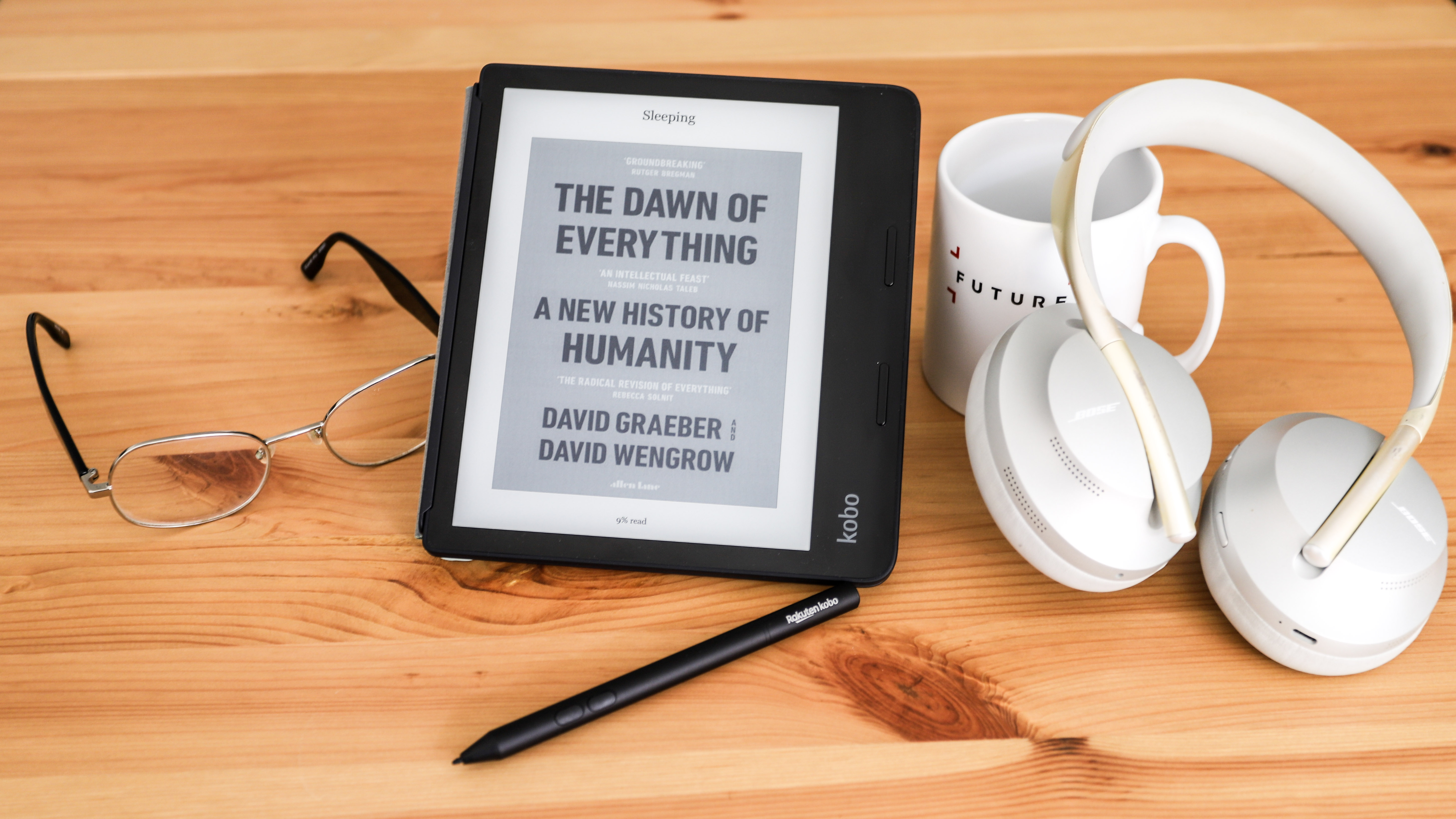
The Kobo Sage is ostensibly a more refined version of the now three-year-old Forma, one-upping Amazon’s Kindle Oasis by offering an 8-inch display that also boasts stylus support. It’s the first ‘mainstream’ Kobo ereader to come with the latter but, unlike the Elipsa (a bigger and more niche device), you’ll need to buy the Kobo Stylus separately.
To further justify its premium price, the Sage has a noticeably improved chassis. Although it’s still plastic (unlike the metal body of the Kindle Oasis), it’s a step up from the slightly janky design of the Forma. The body has a cleaner and more elegant look with less distinct sections; it’s effectively just one front piece and one back piece that are cleanly sandwiched together.
Fitting into the sleeker chassis is the latest in E Ink displays. The 8-inch screen is now a Carta 1200 panel that enables faster page turns (Kobo claims it’s 20% more responsive than the previous-gen E Ink display) and has a higher contrast ratio that makes text appear sharper. Additionally, the new touchscreen integrates a ‘digitizer’ that allows handwriting and drawings to appear smoothly and clearly on the display.
Under the hood are even more notable changes, starting with a 1.8GHz quad core processor (inherited from the Elipsa) to keep the device running smoothly no matter how much you read or write on it. More importantly, there’s now 32GB of internal storage to store thousands of ebooks, notes and audiobooks.
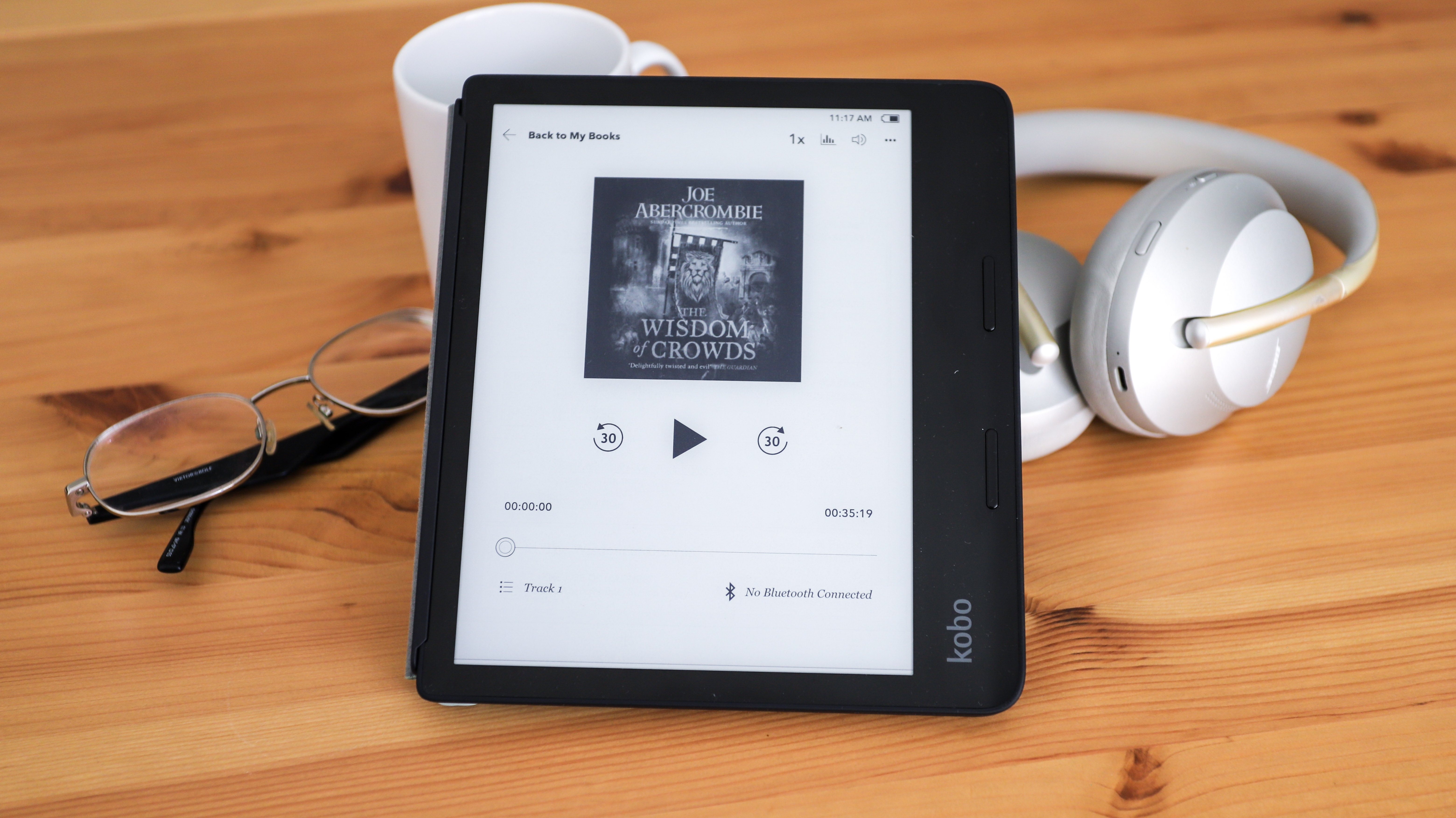
Like the Libra 2 that launched alongside it, the Sage now has Bluetooth support built in. This allows you to pair a set of wireless headphones so you can listen to those aforementioned audiobooks, but note these have to be purchased directly from the Kobo Store, and can’t be sourced from elsewhere.
Despite all these improvements, the one area the Sage is a letdown is battery life. Unlike the Kobo Libra 2, which got a new 1,500mAh battery, the Sage sticks to the same 1,200mAh pack used in the Forma. It’s a strange choice, as the quad-core processor seems to suck up a lot more juice and, even after a recent firmware update that promised improvements, battery life on the Sage seems to max out at about 20 hours.
Somewhat frustratingly, though, the Sage’s design improvements over the Forma make the latter, older reader very hard to recommend at its current price, which is just $10 / £10 / AU$10 less.
If Kobo can address the battery issue, the Sage will get a lot closer to qualifying as the perfect package for anyone seeking a premium ereading and note-taking experience, especially since it packs OverDrive, Pocket and Dropbox integration too. With its sub-par battery life, however, it’s difficult to recommend for users who plan to use it exclusively for reading.
Price and availability
- Announced October 2021
- Launch price of $259.99 / £239.99 / AU$439.99
- Kobo Plus available in select markets
The 8-inch Sage is Kobo’s most premium ebook reader (not counting the 10-inch Elipsa, which we consider a note-taking device first and ereader second) and as such it carries a high-ish price of $259.99 / £239.99 / AU$439.99.
For comparison, Amazon’s 32GB Wi-Fi Kindle Oasis is a touch more expensive at $299.99 / £259.99 / AU$449, but the Oasis does include an aluminum chassis, whereas the Sage uses soft-touch plastic (not to mention more functionality thanks to stylus support); the Kindle is undeniably the more premium option here.
Depending on where you live, the Sage’s price is still a significant 50-60% step up from the next Kobo model down – that’s the 7-inch Libra 2, which sells for $179.99 / £159.99 / AU$279.99 and shares a very similar design in a slightly smaller (and arguably more convenient) size.
The Sage is now broadly available across the major regions that Kobo ereaders are sold in (North America, Europe, Asia and Oceania) and can be purchased directly from the Kobo online store in select markets.
Design and display
- Slightly refined body
- 8-inch display
- Latest E Ink screen tech
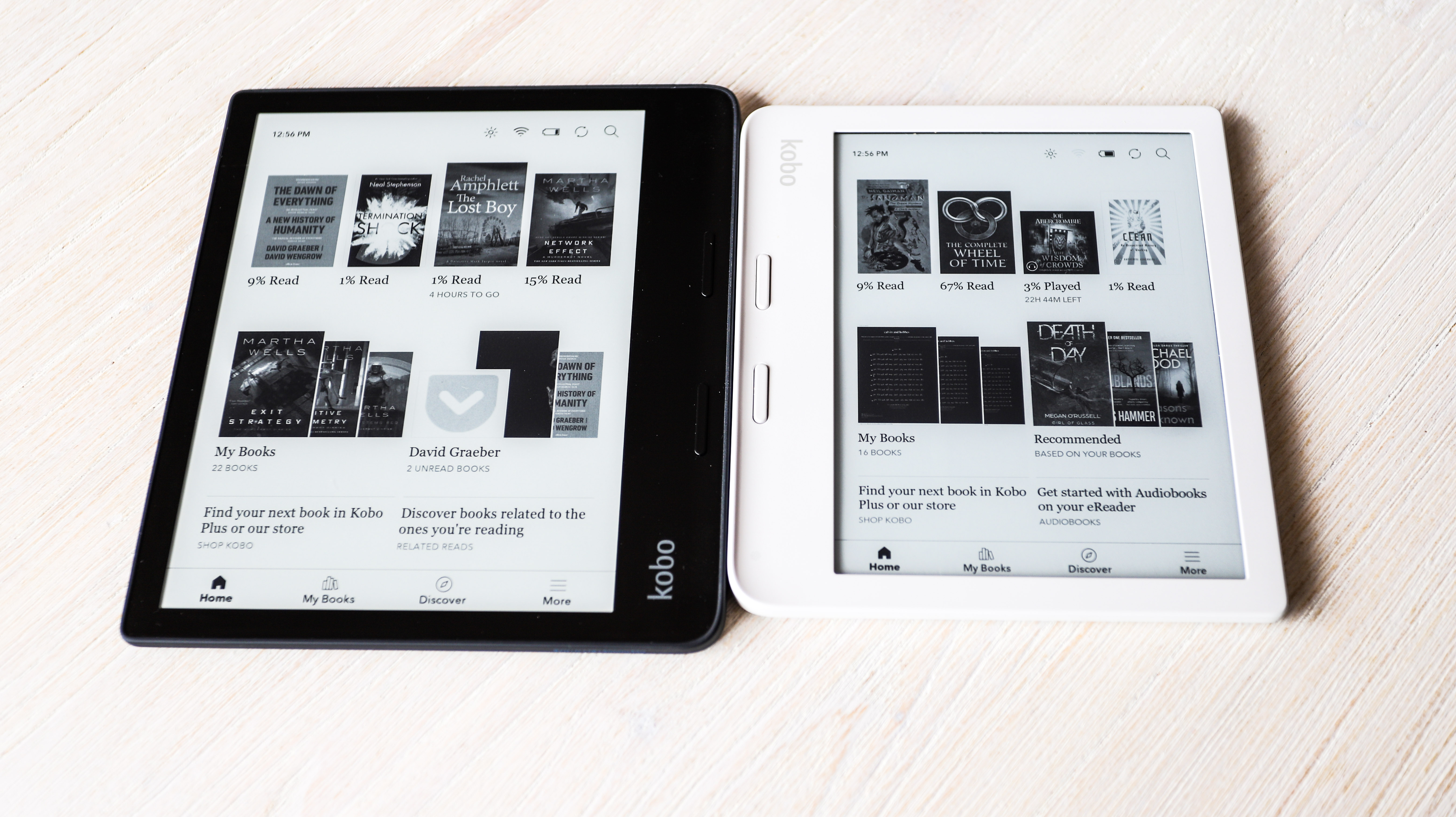
In many respects, the Sage is a more refined and polished version of the 2018 Kobo Forma. Both have an asymmetrical design and big 8-inch screens as their main draws, with the latter providing a significant step up from their 7-inch siblings in terms of visual real estate. That size difference may not sound like much on paper, but (as you can see in the side-by-side comparison image below) if you compare the Sage to the 7-inch Libra 2 in the flesh, you’ll find that the former is a surprising degree larger.
Display: 8-inch E Ink Carta 1200
Storage: 32GB
Processor: 1.8GHz quad-core
Battery: 1,200mAh
Connectivity: Wi-Fi, Bluetooth, USB-C
Weight: 240.8g
The display on the Sage and Forma provide roughly the same amount of physical space as the page of a printed paperback and their bigger screens give you more flexibility when it comes to font size, and also means onscreen images are bigger – both elements that lead to a generally more comfortable reading experience. The larger display also makes reading comics and graphics novels a more pleasing experience, with fewer frames and speech bubbles getting cropped as compared to the Libra 2.
From a tech standpoint, the Sage’s screen has had a generational upgrade from the Forma – employing an E Ink Carta 1200 panel versus a Carta 1000 one – however both displays share the same 1,440 x 1,920 pixel resolution, so they’re essentially the same in terms of sharpness, packing in 300 pixels per inch (ppi).
In many respects that generational jump is a subtle one. As mentioned earlier, Kobo claims a 15% improvement in contrast on the Carta 1200 and while it’s true that when compared side by side, black text on the Sage appears ever-so-slightly darker than on the Forma, we suspect some of that may be down to the Sage screen’s panel being fractionally darker overall – it’s whitepoint is slightly yellow, as compared to the Forma’s marginally bluish hue.
One area where the Sage’s screen upgrade does become apparent is with images; there’s a clear improvement when rendering gradients, in particular. On the Forma, subtle changes in color (like you’ll see on clouds, clothing and skin tones) can often result in what’s called ‘banding’, where similar colors get smooshed together and rather than blending into one another, you end up with distinct different colors separated into clear layers or ‘bands’. The Sage’s next-gen display almost eliminates this issue and makes reading image-heavy content (like comics, online articles you’ve saved via Pocket, or just books with lots of pictures, diagrams or graphs) a more natural experience.
Physically, the Sage has also seen some notable changes – although arguably not all of them are positive. The chassis design feels more robust and is undeniably cleaner, friendlier and overall just more attractive as compared to the Forma. Much of that comes from the new seamless, single-piece front face, which is only broken by the two page-turn buttons.
In the hand, the page-turn buttons are, physically at least, a step up from the Forma. While they’re in an almost identical position, they’re sleeker and more distinct – very reminiscent of the Kindle Oasis – and provide a cleaner and more satisfying click action, making the Forma’s buttons feel sloppy and spongy by comparison. Despite the similarity of the page-turn buttons to those on the Oasis, the Sage’s are a bit longer and widely spaced apart.
The robust soft-touch plastic back remains a single molded piece like on the Forma, wrapping around all four sides and coming up to meet the screen, which is now flush with the bezels as on the Kindle Oasis. Kobo’s designers have also moved the power button, so it’s now on the back of the reader rather than the spine, and it’s also round and significantly larger (similar to what’s on the Kobo Libra H2O and Libra 2 models).
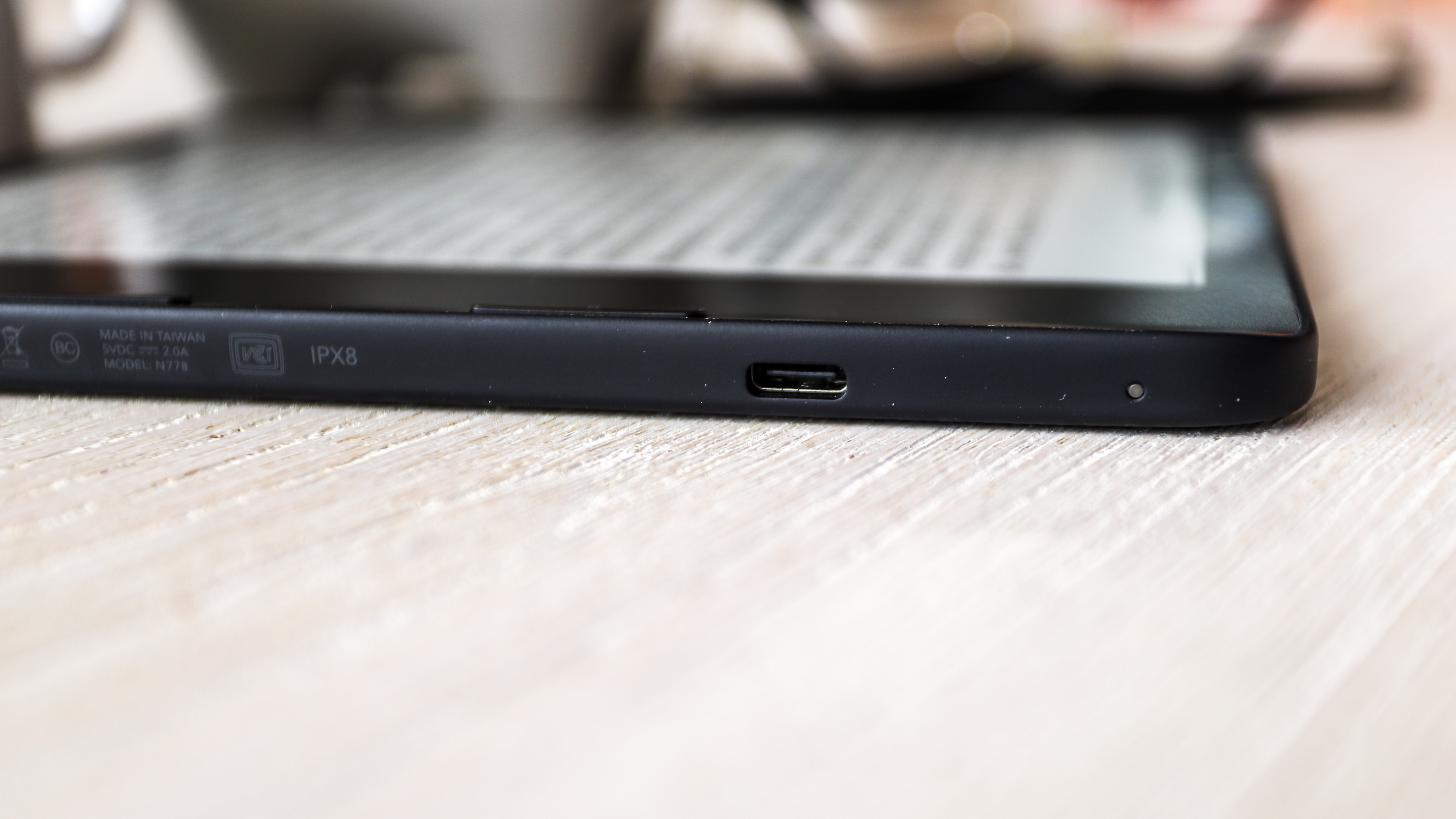
The charge/data port is now a far more convenient USB-C – ereaders are one of the final categories that have been hanging onto the (now-ancient) USB micro-B, so this change is arguably well overdue.
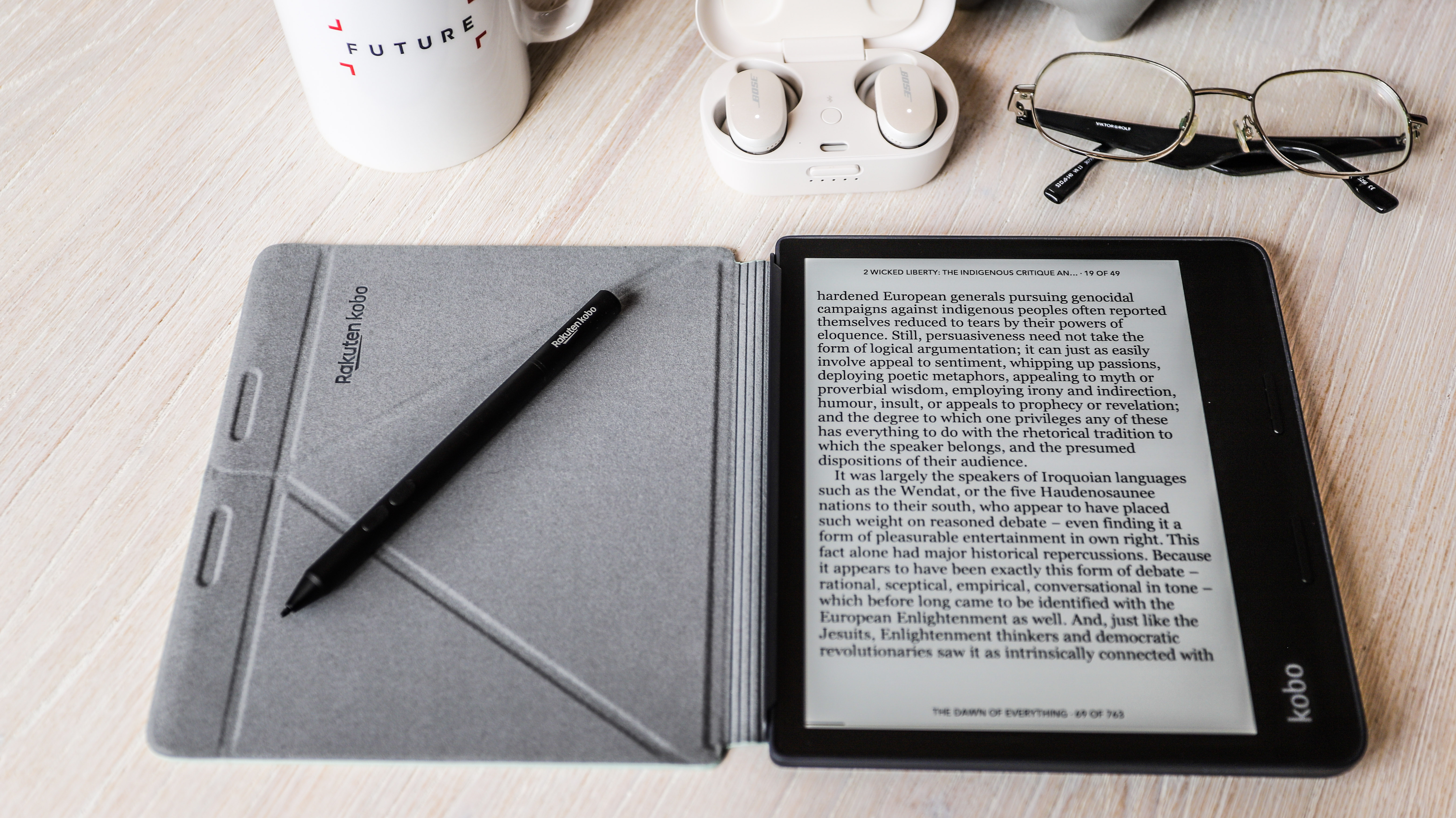
One change we’re not so enamored with is the Sage’s thicker body, which is where we assume most of the device’s extra weight comes from; it’s 20% heavier than the Forma, at 241g vs 197g. And that is something that’s definitely felt in the hand – and almost doubly so if you’re using it with a cover, which takes the Sage to 400g on the dot; that’s considerably heavier than all but the chunkiest of paperbacks.
Features and ease of use
- Stylus support
- Bluetooth connectivity
- 32GB storage
The Sage brings with it the same flexibility and range of features that we’ve come to expect from Kobo’s ereaders. On the hardware side, that means there’s IPX8 waterproofing, and on the software front there’s useful things like wide file-format support (ePub, PDF, TXT, RTF, Mobi, CBZ/CBR, BMP, PNG and more), the ability to sign into Adobe Digital Editions to read DRM-protected ePubs or PDFs you’ve bought from third-party ebook stores, and the potential to sync web articles via the Pocket ‘read-it-later’ service.
A more recent addition is Dropbox integration; it’s only available on the more premium Kobo ereaders, having debuted on the Forma. This allows you to save your personal digital library in the cloud and transfer ebooks and files back and forth wirelessly, without the need to ever plug your ereader into a computer.
And let’s not forget the quintessential Kobo feature – baked-in OverDrive support. Every Kobo ereader has this, including the Sage, and most libraries in countries where Kobo is available now allow users to borrow ebooks via the app – all you need is a library card.
Completely new is support for audiobooks, albeit at the requirement of pairing Bluetooth headphones. That’s thankfully easy to do, and similar to how it works on a phone. There’s one major audiobook caveat though – for the first time Kobo has shut its open-door and inclusive ecosystem by only allowing audiobooks purchased from its own store to play on the Sage (or Libra 2). Still, the catalogue is vast and you’ll find many popular titles on the Kobo Store.
In order to accommodate those audiobooks, the Sage comes with 32GB of internal storage by default – there's no long a smaller (and cheaper) option for those who might just want to stick with books.
Also new is the addition of a dark mode, thanks to that new generation of E Ink screen tech. Available under the Settings pane, this allows you to invert the default colors to display white text on a black background… or pretty much how dark mode works on phones and computer screens. It’s important to note that dark mode inverts colors only for ebooks you’re reading – the home screen remains the usual black on white.
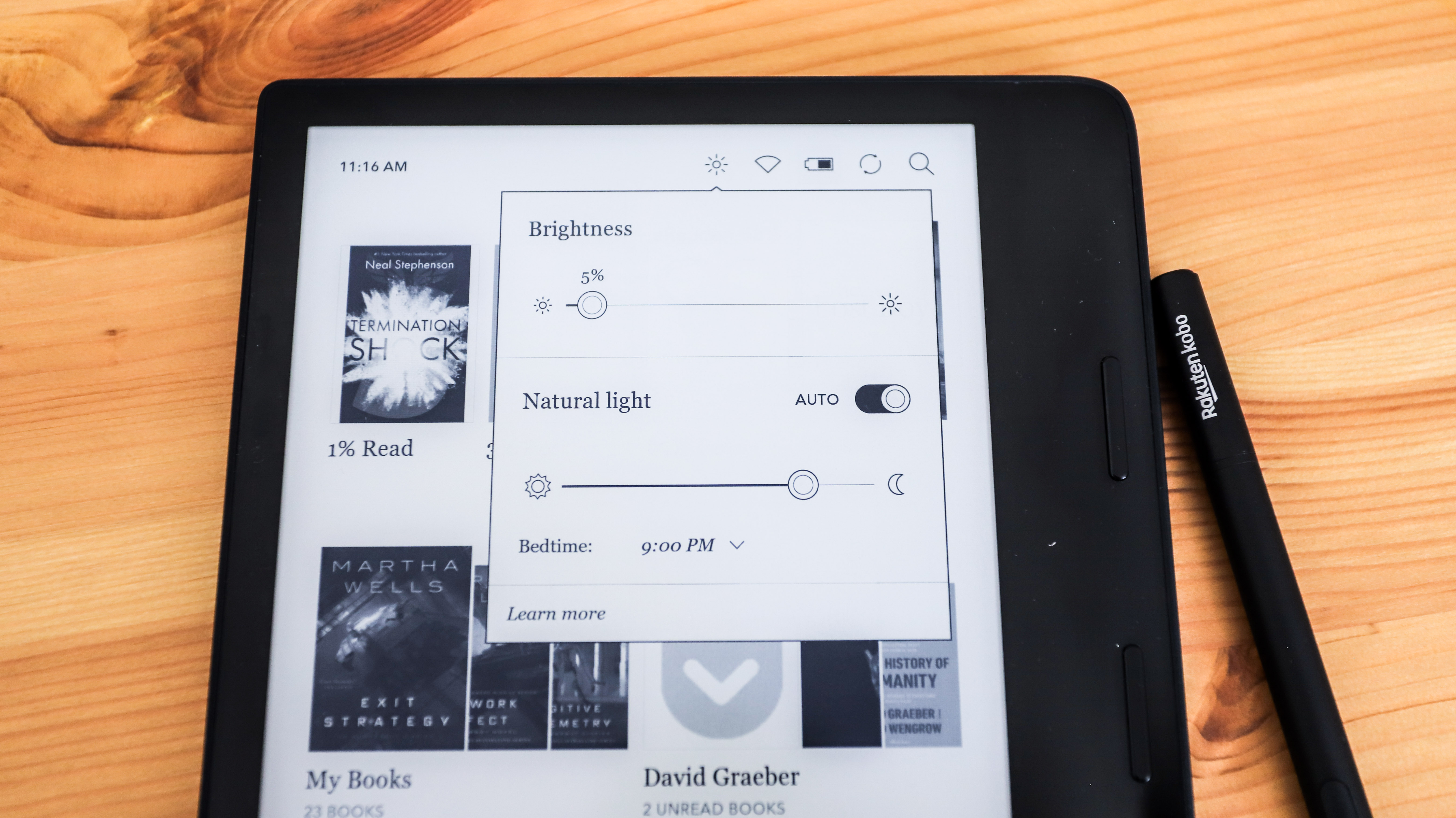
If you’re not a fan of dark modes, then Kobo’s proprietary ComfortLight Pro technology should ease the strain on your eyes. This is available on pretty much every Kobo ereader and involves a series of white and amber LED lights embedded just under the bezels. If you like reading at night, then setting the light to automatically change from cooler hues to a warmer yellow light is possible. If you’d prefer a vibrant white screen, though, all amber LEDs switch off. This tech works remarkably well as the light is projected absolutely evenly throughout the screen, with no evidence of gradients, bright spots or shadows.
When it comes to the interface, the Sage retains an almost identical fixed setup as the Forma, which again largely revolves around books. A bank of icons across the bottom gives you quick access to the main areas and features: Home, My Books, My Notebooks and Discover (aka the Kobo Store and OverDrive library lending) as well as More for secondary areas, like settings, saved articles, activity tracking and so on. On that main home screen, a strip across the top displays the four most-recent titles you’ve had open with cover previews, and below this are two large tiles linking to My Books and a selection of titles from a specific author. Directly underneath those tiles are text links – the left to the Kobo Store, and the right a dynamic notification that cycles through various options; spruiking Kobo Plus subscriptions, what’s new in the latest firmware, or reminding you about saved Pocket articles, for example.
Somewhat frustratingly, there’s still no way to customize the home screen – you can’t move elements around or replace less-used features with others (and reduce some repetition; there’s effectively two links to both the Kobo Store and My Books areas with the default setup). We’d love to be able to permanently pin a link to My Articles on the home screen, for example, rather than having to dig into the More menu to access it.
Arguably the biggest feature addition on the Sage is stylus support. If you’re old-school and like to jot down notes in margins of books or feel the need to doodle on the page, the Sage is the first mainstream ereader that lets you. However, as we’ve mentioned above, the Kobo Stylus is an additional accessory that needs to be purchased separately at a cost of $39.99 / £39.99 / AU$69.95. As with the larger Elipsa, the UX on the Sage includes a ‘My Notebooks’ tab on the homepage from where you can access all your notes and lists, and even upload those to Dropbox or transfer to a computer, if desired.
Reading experience
- Sharp, high contrast display
- Redesigned page-turn buttons
- Heavy in the hand
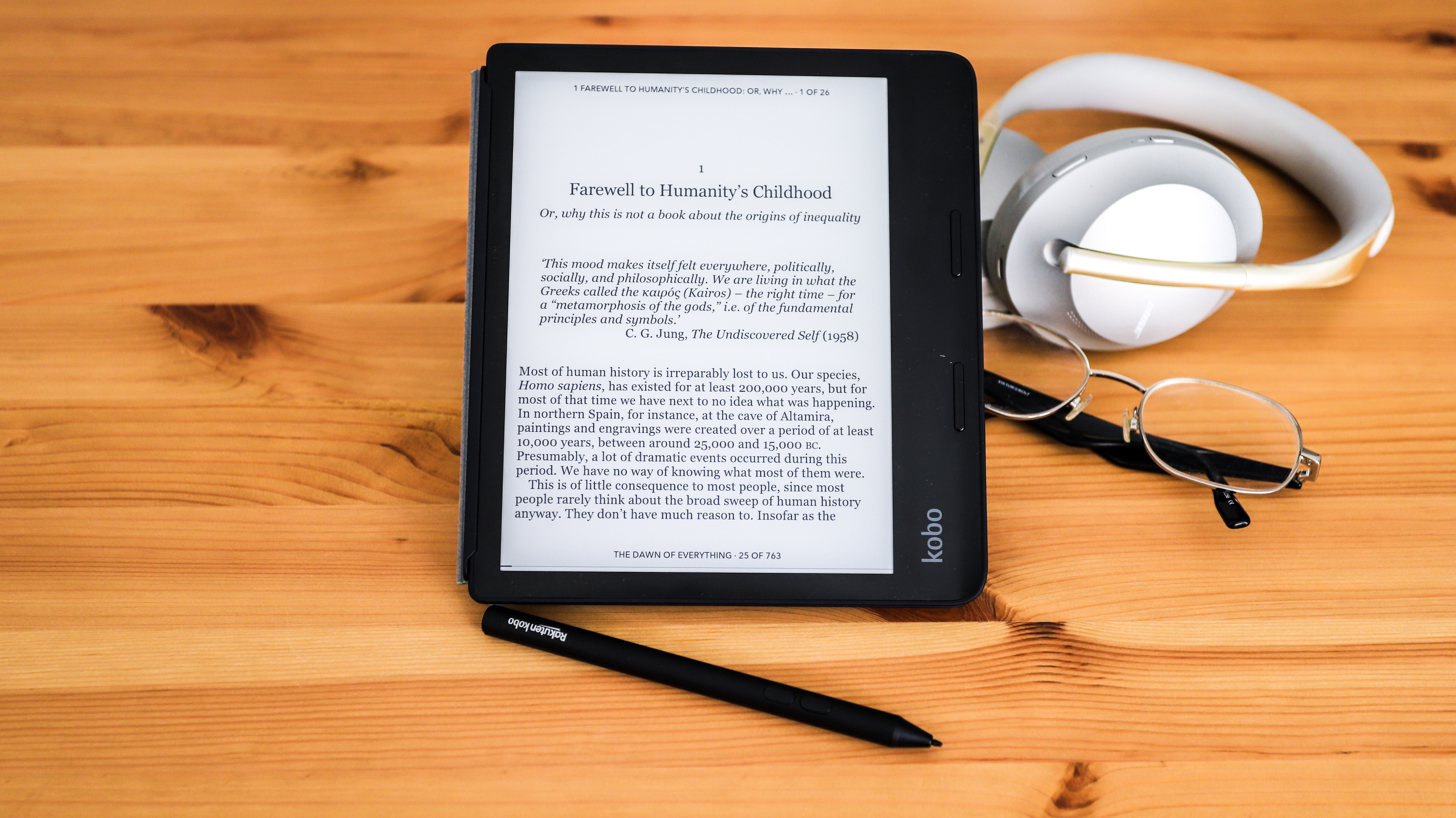
Reading on the Sage is for the most part a first-class experience. The large, sharp, high-contrast screen delivers great-looking text and images, and the speedy new processor makes page turns and other interface actions both fast and responsive. In many respects, however, the Sage’s improvements over the Forma are only marginal – and depending on your preferences, some of them could arguably be a step backwards.
Firstly, as we touched on above, the Sage feels heavier in use. While that weight isn’t too much more than on the Libra 2’s 215g, its distribution across a larger surface area does subjectively make it feel heavier and more fatiguing over the long term. In comparison, we could single-handedly hold both the Libra 2 and Forma in the air for long periods of time but, even when not in its standard case (which takes the weight to 241g), the Sage does eventually start to feel heavy.
That’s not the only physical issue with the Sage – the ‘improved’ page-turn buttons now require a firm press to ensure they register. It’s possible to press hard enough that they’ll actually physically ‘click’ underneath your thumb, but not actually trigger a page turn. While the buttons operate as intended the majority of the time, they’re broken frequently enough that it does become frustrating – and interrupts your reading flow – because it’s not always obvious that the page hasn’t turned and you end up re-reading a line or two on top of the old page before you realise the error. It’s a flaw that we’re frankly surprised made it through quality-assurance testing. Ultimately, we tried to avoid using the Sage’s page-turn buttons and just resorted to tapping the screen all the time – that element, at least, works without fault.
Redesigning the power button from that of the Forma was a good move by Kobo; its position on the back means it’s now easy to locate just by touch, and it provides a nice, crisp click that isn’t prone to accidental pushes. However, the new position means it’s not quite as simple to use one-handed unless you have something to rest it on (a bit of a pain if you’re, say, standing up on public transport). And if you’re using it with the sleepcover designed specifically for the Sage by Kobo, it’s completely covered up, unlike the two Libras that have cutouts in the cover to access it. This might seem like a minor irritant, but when your device has gone to sleep due to inactivity, the only way to switch it back on is to close and open the sleepcover, as opposed to just reaching for the button.
Writing and drawing experience
- Stylus available as additional accessory
- Smooth writing experience
- Handwritten notes can be digitized and saved
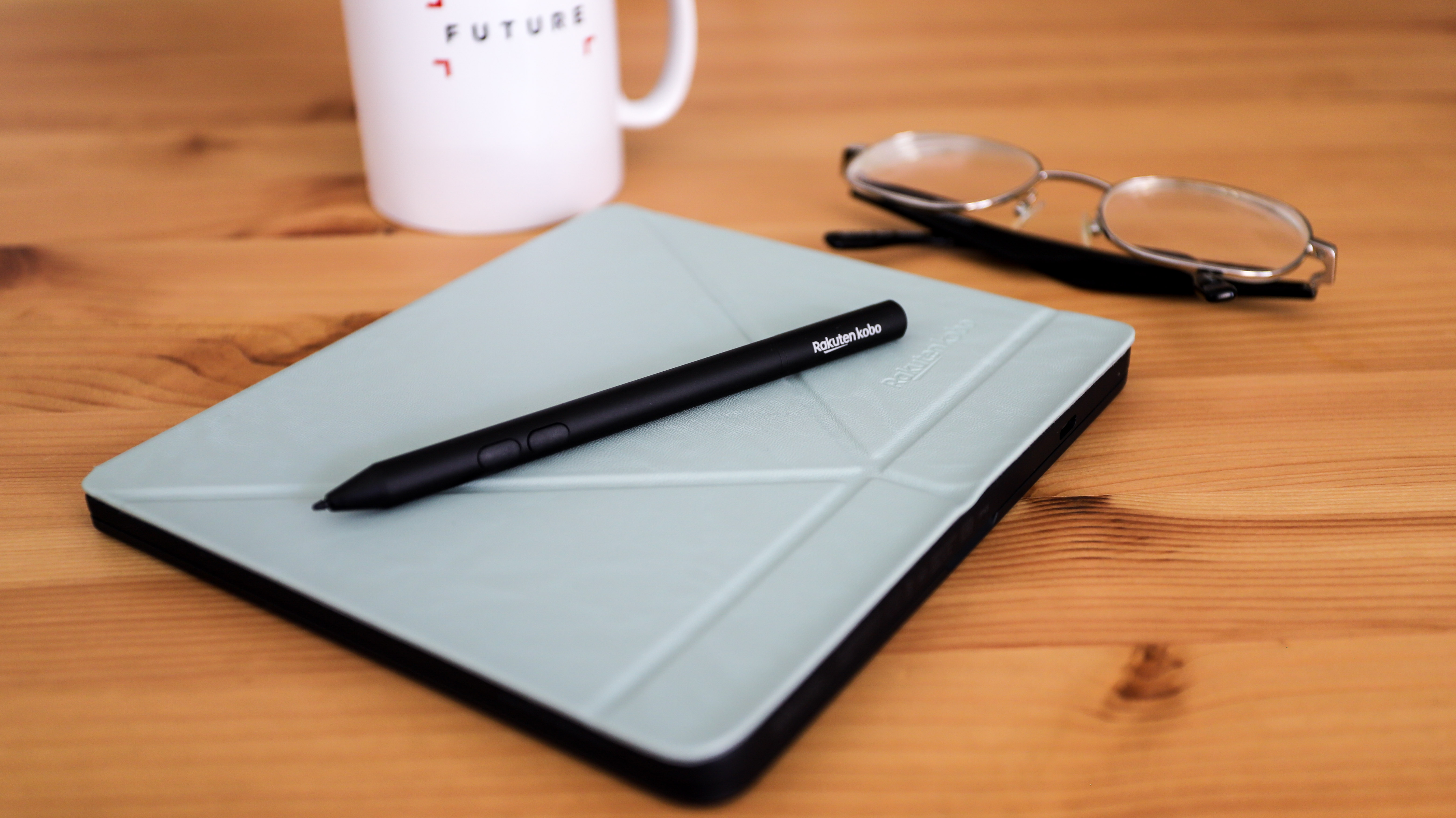
As mentioned earlier, the Sage’s headline act is stylus support. This is an entirely optional extra, with the Kobo Stylus available for separate purchase at a cost of $39.99 / £39.99 / AU$69.95. If you choose to get the stylus, you’ll quickly find there’s nowhere to safely stow it (for that, you’ll need to pony up for the battery-equipped PowerCover, at $79.95 / £69.95 / AU$129.95), and chances are high it could just roll away and hide under some piece of furniture.
If you do manage to hold on to it, you’ll find it’s powered by a single non-rechargeable AAAA battery (it's thinne than the standard AAA battery), has a replaceable plastic nib and two buttons about an inch down the shaft – it’s the same pen that ships with the Elipsa. It’s all-metal body feels great in the hand and writing with it is quite natural. Using it also feels quite intuitive and you get used to the buttons very quickly – one lets you highlight text while reading, the other allows you to erase whatever you’ve done on the screen.
Writing or drawing with the Kobo Stylus is almost real time, with minimal lag before marks appear on screen – a few milliseconds at most. However, the 8-inch screen is still relatively small, so the margin space you have is limited on screen, and scribbling marginalia can feel cramped. That said, Kobo’s devs have been clever enough to realize that changing things like font style/size or margins will mess with the placement of notes, and have built in an option to switch back to the settings that were in place when the note was made.
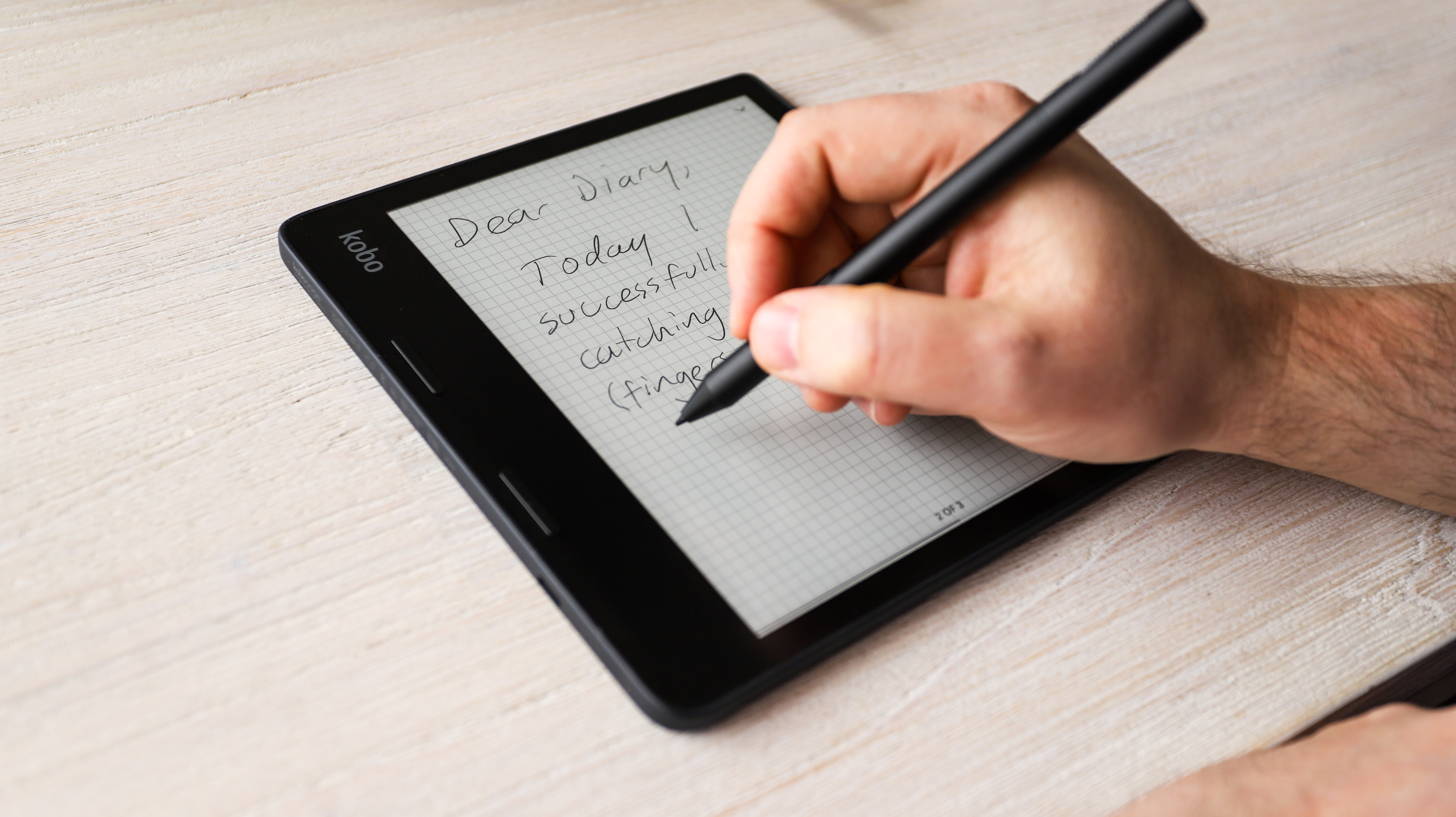
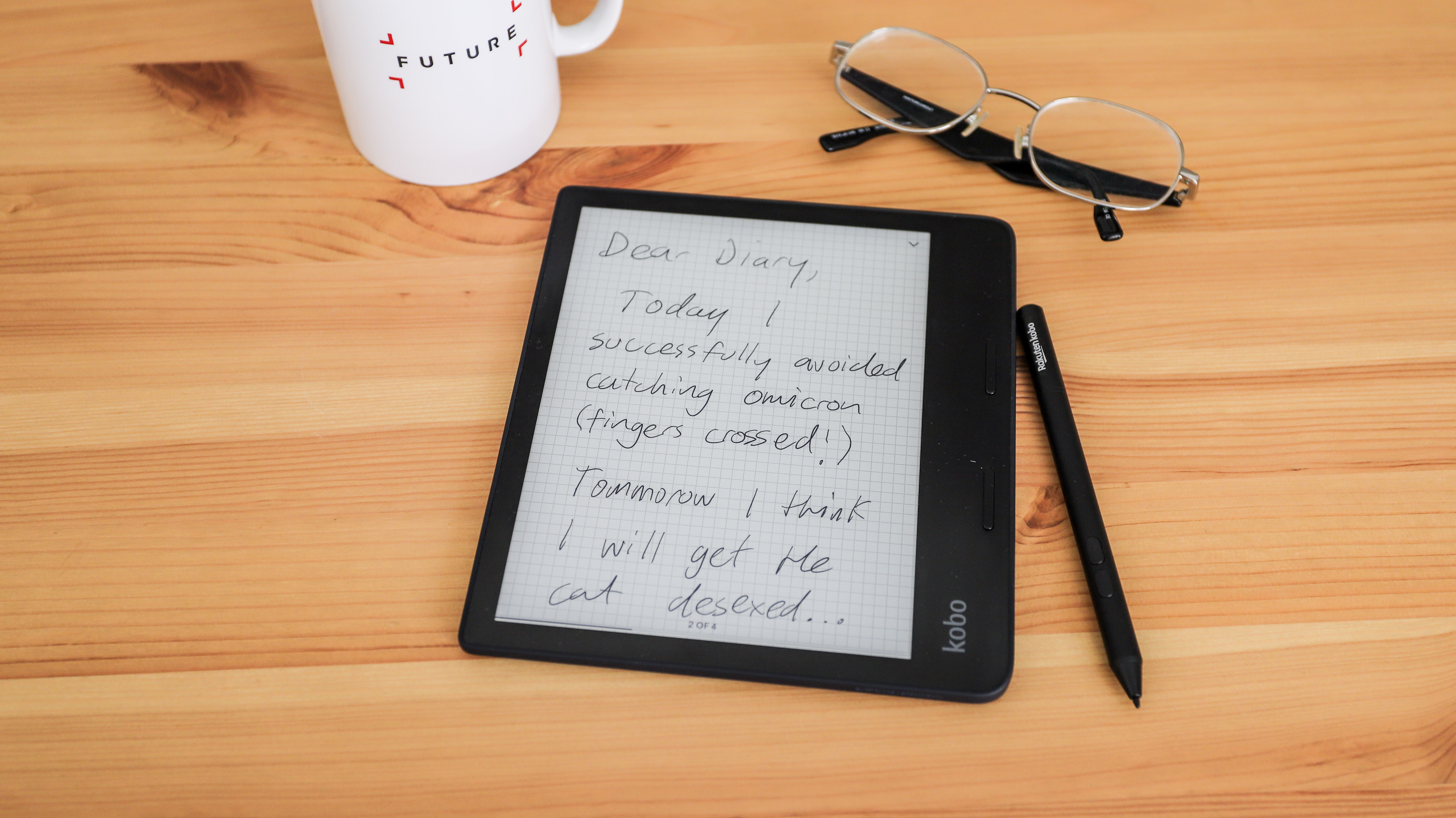
As well as being able to scribble in the margins of selected books (including sideloaded and Kobo Store-bought ePubs – with marginalia available under the Annotations section), the Sage also provides a dedicated My Notebooks app as on the Elipsa. This lets you create virtual notebooks, each with its own title and (theoretically) infinite pages inside it – a new blank page is created as soon as you enter anything on the ‘last’ one.
Within notebooks, there’s also the capacity to convert handwritten notes to digital text, and this generally worked well (even with our less-than-perfect handwriting), although it can sometimes take 20 or more seconds for the conversion to complete, depending on how much you’ve written.
If you’re a doodler, there’s a variety of pen styles to choose from (ballpoint, fountain, calligraphy, brush and highlighter), plus five widths and five shades, giving you plenty of flexibility to create quite detailed black-and-white art. However, with only two levels of pressure sensitivity and inability to zoom in, it’s not at the same level as a dedicated graphics tablet (or even an iPad) when it comes to image creation.
If you think you’ve made a mistake at any point, whether while writing or drawing, the eraser button on the stylus will let you remove any marks you’ve made (stroke by stroke) by just tapping it, making quick work of deleting whole words or lines.
Despite being able to scribble in margins of books, there’s sadly no way to attach a written note to highlighted text – as with other Kobo ereaders, text highlighting only supports typed notes using an onscreen keyboard. It feels like implementing handwriting here (even if it then needs to be converted to digital text) would have been a no-brainer – perhaps it’ll be made possible with a future firmware update.
Battery life
- Poor battery life for an ereader
- USB-C charging port
- Additional PowerCover accessory works like a portable charger
One of the main reasons for choosing a dedicated E Ink reader over a small tablet (like an iPad mini or Kindle Fire, for example) for digital books is that ereaders provide significantly improved battery life – or at least they’re supposed to.
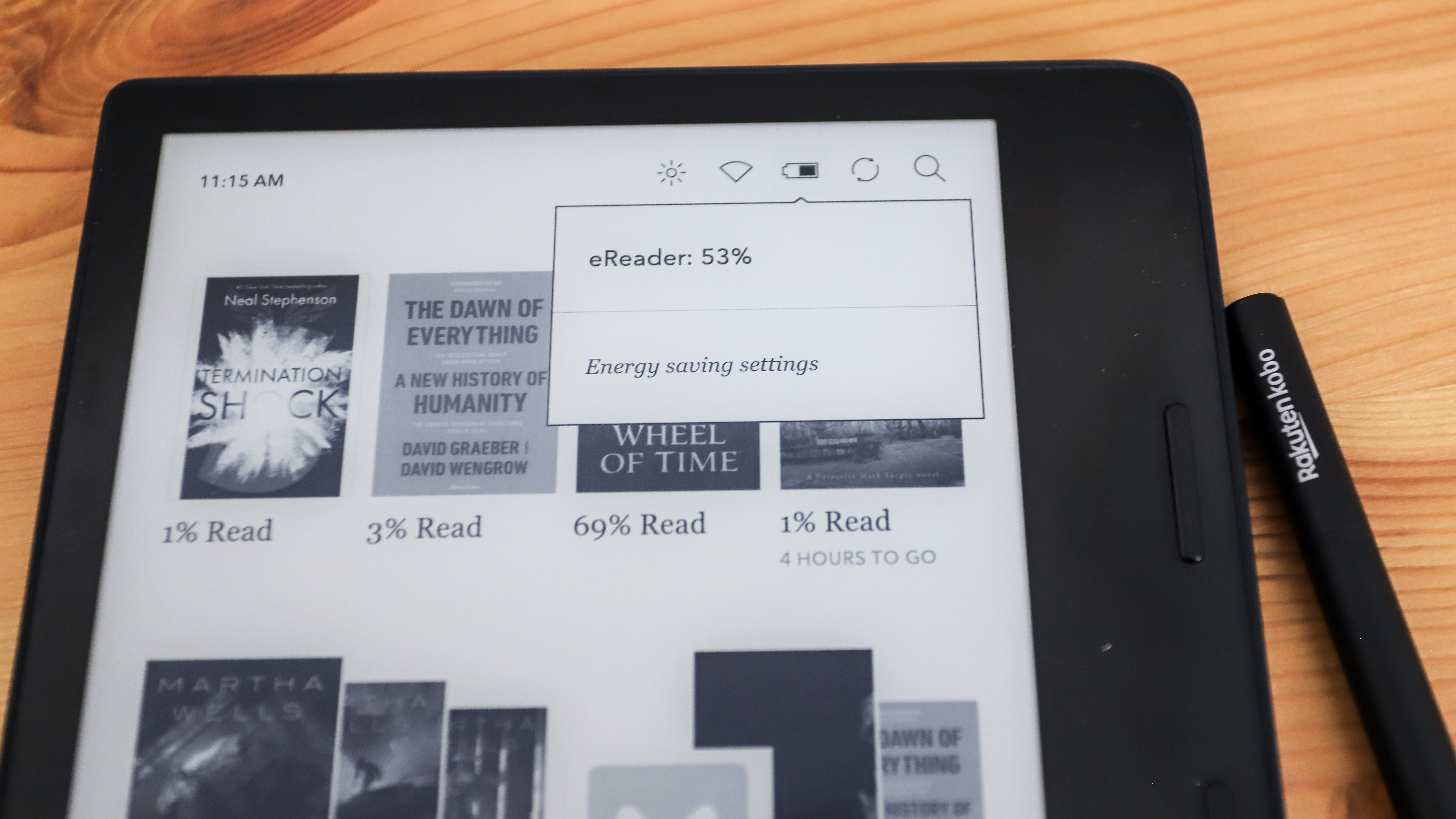
The Sage packs the same size li-ion battery as the Forma – a 1,200mAh pack – but sadly doesn’t offer anywhere near as much battery life as its older sibling. During our initial testing, we got no more than a maximum of 15 hours on a full charge (and that’s restricting use to just reading – no writing or browsing the Kobo Store), which is rather dismal for an ereader.
We suspect the new quad-core processor and new digitizing layer in the screen (both of which are required for stylus support) are in large part responsible for the additional drain, but it’s worth noting that even if you’re not using the stylus (or don’t even have one paired) the Sage still depletes its battery much more swiftly than its predecessor.
A firmware update that arrived late in our testing did improve battery life marginally, extending reading-only time with the Sage up to about 18-20 hours, depending on backlight brightness and use. That’s a good improvement, but still far shy of the 35-40 hours you’ll get with the Forma, or the 50+ hours we achieved on the Libra 2.
Why Kobo decided to stick with a 1,200mAh pack for a device with a significantly more powerful processor is unclear (the Forma has a single-core 1GHz chip, while the Sage has jumped to a 1.8GHz quad-core CPU), especially since it gave the Libra 2 a 1,500mAh battery. Perhaps this oversight (if it truly was one) was only realized late in the device’s development, and Kobo’s answer was to create the PowerCover we mentioned earlier – that’s essentially a magnetic sleepcover with a built-in 1,200mAh battery, essentially doubling the battery capacity. We weren’t sent a PowerCover for testing, so we’re not certain on how much more life it would add, but it should theoretically offer another 15-20 hours.
The Sage’s shortish runtime isn’t the only slightly underwhelming element when it comes to the battery – we found it also takes up to 3 hours to fully recharge. Despite that shiny new USB-C port, the Sage generally takes longer to recharge than the Forma – the latter goes from about 10% to full in 2 hours. While the Sage initially charges at about the same rate, once the 90% mark has been hit it seems to switch to a very slow trickle-charge setting, meaning the last 10% takes about an hour to complete.
Should I buy the Kobo Sage?

Buy it if...
You prefer a larger screen ereader
While the Kobo Elipsa’s 10.3 inches is perhaps a bit too unwieldy for an everyday ereader, the Sage’s 8 inches hits that sweet spot for screen real estate – not too big, not too small – and is suitable even for fans of comics and graphic novels. That little extra space on the display over a 6- or 7-inch ereader means you also have the space for marginalia. Which segways right into our next point for why you should consider buying the Sage…
You really like making notes while you read
It’s one of the few broadly available ereaders to feature stylus support. There are other options, like some Onyx Boox models but, depending on where you live and their availability, they’ll cost you more than the Sage and the Kobo Stylus together. The writing and drawing experience on the Sage is generally very smooth… you’ll just need to figure out how to safely store the stylus.
Don't buy it if...
Battery life is important to you
It’s our one major complaint – considering we’ve come to expect between 4-10 weeks of battery life from most ereaders, the Sage’s dismal 15-20 hours is disappointing. The Libra 2 got a significant battery upgrade over its forebear, so it’s somewhat perplexing that Kobo has stuck to a 1,200mAh capacity pack for the Sage, particularly given its more-powerful processor. Some of this battery drain could potentially be handled by adding a PowerCover accessory, if you’re willing to spend extra and can handle the additional weight.
You spend long hours reading
We think the Sage’s 8-inch screen is the perfect size for reading, but its weight distribution isn’t quite even. During our testing, we found that holding the Sage for over an hour can cause wrist and arm fatigue, making the Libra 2 a more compelling option if stylus support isn’t important to you.
You’re on a budget
The Sage might be feature-packed but considering its flaws, it’s hard to recommend at its retail price. And then there’s the added extras, specifically the Kobo Stylus, that you’ll need to take into consideration if you want to get the most out of the Sage. In the current ereader market, we’d argue that the Libra 2 offers far better value for money, albeit without stylus support and a 7-inch display.
[First reviewed February 2022]
0 comments:
Post a Comment