Wednesday, January 31, 2018
Nvidia Shield (2017)
Update: The Nvidia Shield 6.3 update is rolling out this month. With the new update, you'll be able to control more than 1,000 smart home devices using Google Assistant on the Shield - including Nest and LG SmartThinQ products - watch commercial-free recordings on PLEX and stream lossless music from Tidal.
Original review continues below...
There’s plenty to appreciate about the new Nvidia Shield. But out of everything –the 40% reduction in overall size, the integration of Google Assistant, the addition of Amazon Instant Video for the first time on Android TV – the best changes are the ones that happened to the streaming video box’s operating system, Android TV.
It’s far and away better than it was when the gaming-centric streaming box first came out close to two years ago. A greatly improved universal search function on top of a larger selection of apps on top of Google Home and Assistant integration have finally empowered Nvidia’s hardware to really shine.
Said simply, if there’s ever been a time to take a serious look at Nvidia’s already-great streamer, this is the time to do it.
But let’s hold on for a second. Maybe this is your first experience with the Nvidia Shield, the $199 / £189 (about AU$260) 4K-capable, HDR-ready video streaming device that’s been developed by a primarily graphics card-focused company.
If it is, what you’re reading about is one of the most powerful streaming video players on the planet – one that can double as a gaming system, and triple as the center of your smart home. It has the power to stream your favorite shows like Amazon Fire TV or any one of the Roku players, but with the added perk of being able to play Android TV and some PC-quality games via GeForce Now. Finally, while other streaming devices might make you tack on a Bluetooth controller in order to really enjoy games (cough, Apple TV), Nvidia Shield comes with a completely re-designed gamepad that works much better than it did previously.
It has its shortcomings, but overall Nvidia’s Shield TV has enough on offer to persuade even the most ardent of skeptics to give this little streamer a shot.
Design
When you picture a streaming video player you might call to mind a sleek, flat square no more than an inch or two high, or a small hockey puck-shaped plastic box.
Nvidia Shield isn’t quite like either of those. Nvidia eschewed traditional design years ago and has developed its own style for the Shield that’s neither round nor flat, but an interesting mix of criss-crossing lines, unique slants and stark angles.
The headline feature here is that the 2017 Shield is 40% smaller than before, bringing it from about 20cm (8-inches) wide down to about 13cm (5-inches). It’s able to shed some plastic by dropping the micro-SD card slot that used to hang out on the back and retail in only one hard drive size – 16GB. (Of course, Nvidia tells us that the 500GB version of the Shield will still be available at the old 2015-version size, too, but it will cost a bit more and be called the Nvidia Shield Pro, check out our original Nvidia Shield review for an overview of the hardware).
So what ports are left? Spin it around and you’ll still find Gigabit Ethernet, HDMI 2.0a and two USB 3.0 ports. Although the box is compatible with 802.11ac Wi-Fi your best bet for consistent 4K video streaming or GeForce Now gaming is going to be running an ethernet cable directly from your router into the box.

All that said, its diminutive stature actually makes the console smaller than the included controller, something which has also gotten a facelift for the new year.
The 2017 Shield TV controller is less bulky than its predecessor and much more angular. The surface of the controller is covered in a triangle pattern that, in some ways, makes the controller easier to hold in your hand. These new controllers won’t offer the touchpad that you’d find on the ones that shipped with the original Shield, and that’s because Nvidia said those were a holdover relic from the “web browser on your TV” craze. That said, you can still use the original gamepads with the 2017 Shield should you have any of them laying around.
And while the latest controllers say goodbye to the touchpad, you can still find a built-in microphone on each and every controller. That’s used, among other reasons, to activate Google Assistant – a Siri equivalent built for Android devices – which we’ll touch on soon.

The controller is a step in the right direction on all accounts, but admittedly it’s still not the best pad out there for extended play sessions, especially when stacked up against Sony’s DualShock 4 or Microsoft’s Xbox One controller. We could enumerate the number of tweaks Nvidia needs to make here, but the first steps Nvidia should consider taking here would be to make it weightier, more durable and redesign the triggers, D-Pad and face buttons.
Nvidia says the controllers are rated for around 60 hours of battery life, but didn’t say if that number is for active use or standby mode. The controller turns itself off after a period of use to save on power so it’s sort of tough to say how long it can last on one charge.
Here’s some good new, though: Each and every Nvidia Shield will now ship with a basic remote – something that used to be an optional accessory – for free. The remote has a built-in microphone in case you stray too far from your controller, a set of three simple buttons for navigation and a touch-capacitive channel to raise and lower the volume.
It’s an excellent addition, and something that makes it much easier to use the console as just a streaming box if you don’t want to bother with the gaming side of things for a session.
Let’s focus for a minute on Android TV, the brains behind the Nvidia Shield and the user interface you’re going to need to get accustomed to should you pick up a Shield.
While Roku’s interface is minimal and Amazon Fire TV’s is more or less just a collection of shows and movies from Amazon Instant Video, Android TV tries to show you a buffet of content from different sources. The top row is all recommended content based on shows that you watch on Netflix, your YouTube history, games you’ve played and Twitch streamers you like. Of course, this could change if, say, you’ve installed STARZ or HBO GO, and then yours could be completely and utterly different.
Below the recommended row is the apps row where you’ll find mostly a bunch of first-party Google apps – Google Play TV and Movies, Google Play Music, Google Play Store, etc… – at first, but can then be outfitted with whichever apps you find on the surprisingly robust Android TV store.
So what, exactly, can you watch on the Shield? As far as its media playback abilities are concerned, Nvidia’s game-centric streaming box is a pretty capable one. It has nearly every main streaming service we could think of – HBO Now, Showtime, Netflix, Amazon Instant Video, Vudu, Kodi, Plex, Disney Movies Anywhere, Hulu, Sling TV, Crackle, EPIX and many, many more.
The box also contains ITV Hub in the UK, which makes it the first Android TV device to do so.
Many of these apps weren’t available when the original Shield launched in 2015, which made tough to recommend primarily as a streaming device, so it’s nice to see how much the platform has evolved in the last two years. Moreover, though, Android TV has seen a number of functionality improvements, including a more robust universal search that should be able to hunt down your favorite TV shows and movies on a number of services.

But the real reason you’d want to pick up the Nvidia Shield over, say, a Roku Premiere or Amazon Fire TV is because the Shield is first and foremost a gaming device. Like the last iteration, the 2017 Shield will be able to play Android TV games natively as well as stream titles taken from Nvidia’s online streaming service GeForce Now or from your own PC via GameStreaming.
Each of these sources could warrant their own in-depth look, but instead of bogging you down with the details we’ll try to keep their descriptions concise.
Android TV games that you can download are generally a few years older (see: the Tomb Raider reboot) or are ports of their mobile counterparts (see: Age of Zombies). Games from GeForce Now are much, much newer but come with the caveat that they’re all streamed from a server that’s probably located pretty far from where you live. Lastly, GameStreaming allows you to take games from your PC and stream them to your Shield. It’s a neat concept and not one you’ll likely ever find on any other streaming video player, although you can achieve similar functionality with the cheaper Steam Link.
Once you’re done with your game session, you’ll probably want to kick back and binge-watch your favorite show or movie. To that end, expect some one notable improvement to the Shield platform in 2017: Amazon Prime Video.
By some way and we’re not sure how, Nvidia got Amazon to agree to put a Prime Video app on the Shield – Amazon, the company who refused to sell Chromecast on its store because it “offered a less than ideal streaming solution”.
So Nvidia deserves some serious kudos for making that happen.
Performance
How do all of these apps work? In short, quite well. Obviously streaming is much more consistent when using a wired connection to your router, but we were able to get surprisingly smooth HD playback over Wi-Fi – even in a relatively slow network environment.
Now, that being said, if you want to really see what this box is capable of, you should plug it into your router, plug into a 4K, HDR-ready TV and watch your favorite shows in all their ultra high-res glory.
Currently the Nvidia Shield supports Netflix, Amazon, Vudu and Google Play Movies and TV in 4K UHD and all of them look excellent playing through the streaming device. We got a chance to watch House of Cards and Mad Dogs, both in 4K and, surprisingly, using Wi-Fi instead of an ethernet cable.
Also new this time around is the ability to Cast in 4K, i.e. send UHD video streams from your mobile device to your Nvidia Shield.
If 4K UHD video isn't your scene, Google has also updated the YouTube app on the Shield to support 360-degree video.
On the audio side of things, Shield supports pass-through of 5.1 and 7.1 audio and delivers an excellent surround sound experience. It also supports Dolby Digital (AC3), Dolby Digital Plus (E-AC3), DTS-HD, DTS-HD MA, Dolby TrueHD, Dolby Atmos, DTS-X and DTS Core Audio Streams in pass-through mode.
GeForce Now as a service has also been improved since we first saw it a few years back – gameplay is smoother and it rarely, if ever, disconnects you.
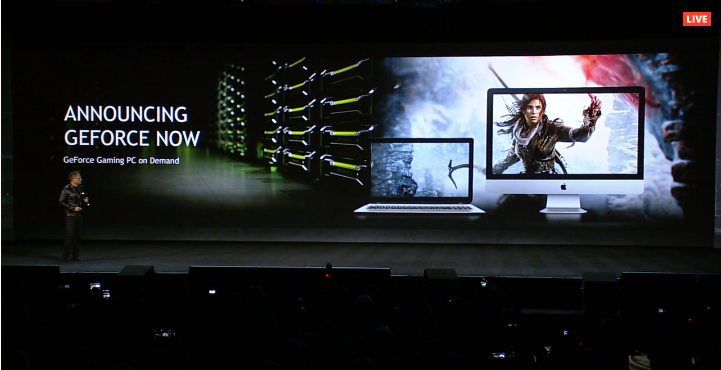
Here comes a caveat: Just as we’ve mentioned for both the Sling TV, PlayStation Now and, well, pretty much any streaming service or streaming video box review, your mileage will vary. You might buy the Shield expecting 4K playback out of the box only to take it home and find out that your 10Mbps connection can’t really handle UHD video all that well. It also requires having a 4K UHD TV, a given for most people, but you’d be surprised how many times that’s been the answer to a problem we’ve tried to troubleshoot for friends and family.
But here’s the larger problem. What you’re getting for $199 / £189 / AU$260 is a competent micro games console, better than any other Android TV gaming console hybrid out there. And yet, it really doesn’t hold a candle to the Xbox One and PS4, two proper game consoles that play the latest games – without needing to stream them – and cost just a bit more. Those systems have nearly all the functionality listed so far, and are therefore probably the better buy unless you really, really want a 4K streaming player and a games console rolled into one. If you just want 4K streaming system and don’t need a games console you’re probably better served looking at the Chromecast Ultra or much cheaper Roku Premiere+.
One more point: because the only thing that Nvidia has changed about the 2017 Shield is its size and controller, you can get so much of what this console offers at a hefty discount if you’re willing to just find a retailer still selling the 2015 model.
Smart home integration
The Nvidia Shield was always intended to be something more than a simple game console or streaming device. The purpose of the console Nvidia pitched journalists on at CES 2017 was a hub for the home, one that could not only answer inquiries via Google Assistant, but actually control your burgeoning smart home via Samsung SmartThings.
Now, after six months of waiting, that functionality has finally arrived.
We’ve seen Google Assistant on a handful of devices before – including the Google Pixel smartphone and Google Home – but this is the first time the company has allowed its AI to escape the confines of a Google-made product.
What makes having Google Assistant so special on the Shield is that it’s always listening to you through the microphone on the controller. If you don’t have the controller handy, the Nvidia Shield remote will work just as well by holding down the microphone button.
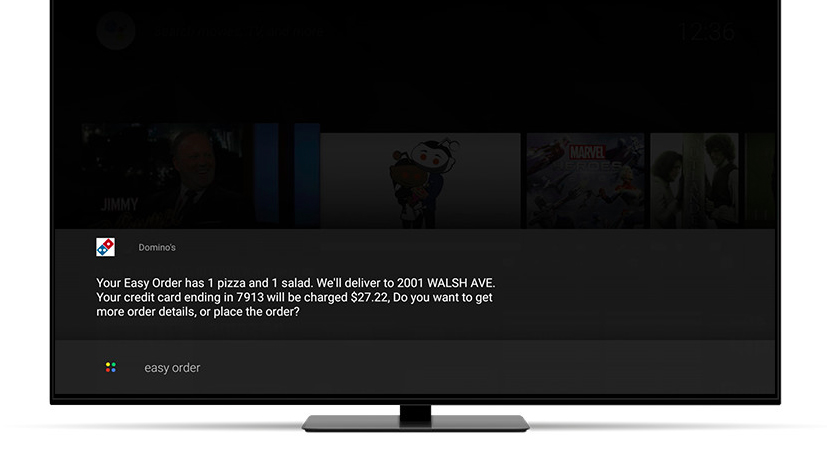
Want to see how your favorite sports team is doing? All you need to do is ask. Need movie recommendations? The Shield has you covered. Want to turn off the lights, lock the door and turn down the heater? Starting today, the Nvidia Shield with Google Assistant can do that, too.
And while we now have Google Assistant embedded into every device, there's still one part of this equation that's missing: a device called Spot, that works like a smart microphone and plugs into any wall outlet in your house, giving direct connection to your Shield, wherever, whenever.
While we're still waiting on Spot, we have had the chance to hook the Shield up to the new Samsung SmartThings Link, a small USB dongle-sized device that plugs into the back of the Nvidia Shield. With it, the Shield becomes a Samsung SmartThings Hub – one that scan for new SmartThings devices and automate processes around the home. It's a neat system, and one that we could see being of value down the road as Samsung SmartThings continues to grow.
Between Google Assistant and Samsung SmartThings, the Shield has become a competent smart home device – one that rivals Google Home or the Amazon Echo, largely because it borrows some of the best technology from both.
The Nvidia Shield has always satisfied a niche market incredibly well. It has and always will be one of the most premium streaming video boxes on the planet that’s made even better by baking in a fair amount of features for gamers.
The latest Shield, however, goes one step further by offering Amazon Instant Video, and will soon be able to act as the head of your smart home.
Of course, there are some real problems here – the controller still feels a bit like the third-party pad you’d hand off to a friend so that you could use the first-party controller, and GeForce Now can still get hung up or lag behind.
More importantly, though, Nvidia Shield still sits in the no man’s land between a fully functional console that can play all of the latest games you care about and a basic streaming video player that can access UHD versions of Amazon and Netflix. You can spend a little more and have the former or, spend less, and have the latter. The Shield is just sitting there in the middle and that might make it less appealing for some folks.

The final problem we see with the Shield, and it’s not so much a problem as it is a “buyer beware” situation, is that the old Shield can do almost everything this one can, and will likely cost you half as much. There are still plenty of reasons to upgrade if you liked the previous version, but most people would be just as happy picking up the two-year-old device.
So should you buy the Shield? If you want a machine that’s a jack of all trades, then the answer is “Yes, absolutely”. If you’re looking for a 4K streamer that can play some games natively and stream most others then the Shield does a good job of each of these tasks.
That said, if you don’t mind dropping the game-streaming component or would rather play good ol’ fashioned discs instead of streaming, there are machines out there that can do each individual task better or cheaper (though rarely both).
A dedicated games console like a PS4 or Xbox One will do native gaming better, but you’ll pay more. A Steam Link will do cheaper local streaming, but it doesn’t do it as seamlessly. A Chromecast Ultra will do 4K/HDR streaming more cheaply, but doesn’t support Amazon Prime Video.
The Nvidia Shield does each of these things well, and it integrates them seamlessly into a single package, but if you only want one or two then you might be able to save money with an alternative device.
We liked
Nvidia has really gone back to the drawing board for the new Shield. It might not be a 100% different machine than it was two years ago, but a 40% reduction in size and complete retooling of the controller are certainly large steps in the right direction. On top of that, this is an Android TV box that can not only play multiple content sources in 4K, but it does Amazon Instant Video in UHD as well – a huge boon for us Transparent or Mozart in the Jungle lovers out there.
On top of that, the Shield is a fun micro gaming console. It might not be able to play the latest retail release on its own, but it certainly can stream it from a PC using GameStreaming or suggest any number of slightly older titles on GeForce Now or straight Android. The selection of titles will surprise you, even if you’re used to having more modern options.
We disliked
It’s a cop out to say it, but we really wish the Shield was a bit cheaper than it is. It’s at this tricky price point that makes it hard justify to someone who might be deciding between this and, say a Roku Ultra and Xbox One S. Going with the former saves money while the latter adds additional features you won’t find on the Shield.
But moreover, there are still some hang-ups that ruin a relatively pristine streaming device. GeForce Now is much improved but game playback isn’t exactly flawless if you’ve got a slower internet connection or home network. Likewise, the controller is a huge step forward, but still feels like a third-party pad you want to hand to someone else while you use an Xbox One or PS4 controller. These problems are minor in the grand scheme of things, and shouldn’t dissuade you from purchasing the Shield should it mostly fit what you’re looking for.
Final verdict
Nvidia Shield is much improved, yes, but it’s really the improvements that have been made to Android TV that really steal the show. Refining universal search to be more egalitarian was a massive leap forward, and the upcoming addition of Google Assistant is sure to scratch that smart home itch many of us have been feeling.
There are some other options out there around this price point that are worth giving full consideration but, should you desire a 4K video streaming player that can handle some of your favorite games, Shield is perfect addition to your audio visual armory.
Corsair Void Pro RGB Wireless
The Corsair Void Pro RGB is the follow-up to Corsair’s Void RGB headset, which ups the audio and recording quality while bringing 7.1 surround sound and customizable RGB lighting, which is all the rage at the moment.
It’s a wireless headset that gives you the freedom of movement you’d expect that comes from ditching the cords – but does this freedom come at the expense of sound quality? We gave it a whirl to find out.
The Corsair Void Pro RGB costs £109.99 / $99.99 / AU$159), which is undeniably pricey for a headset, although compared to the likes of the Asus ROG Centurion 7.1 (£219.99 / $270 / AU$360) and the Razer ManO'War ($169, about £155, AU$330), which sit atop our best PC gaming headset list, it doesn’t seem quite as eye-watering.
Design
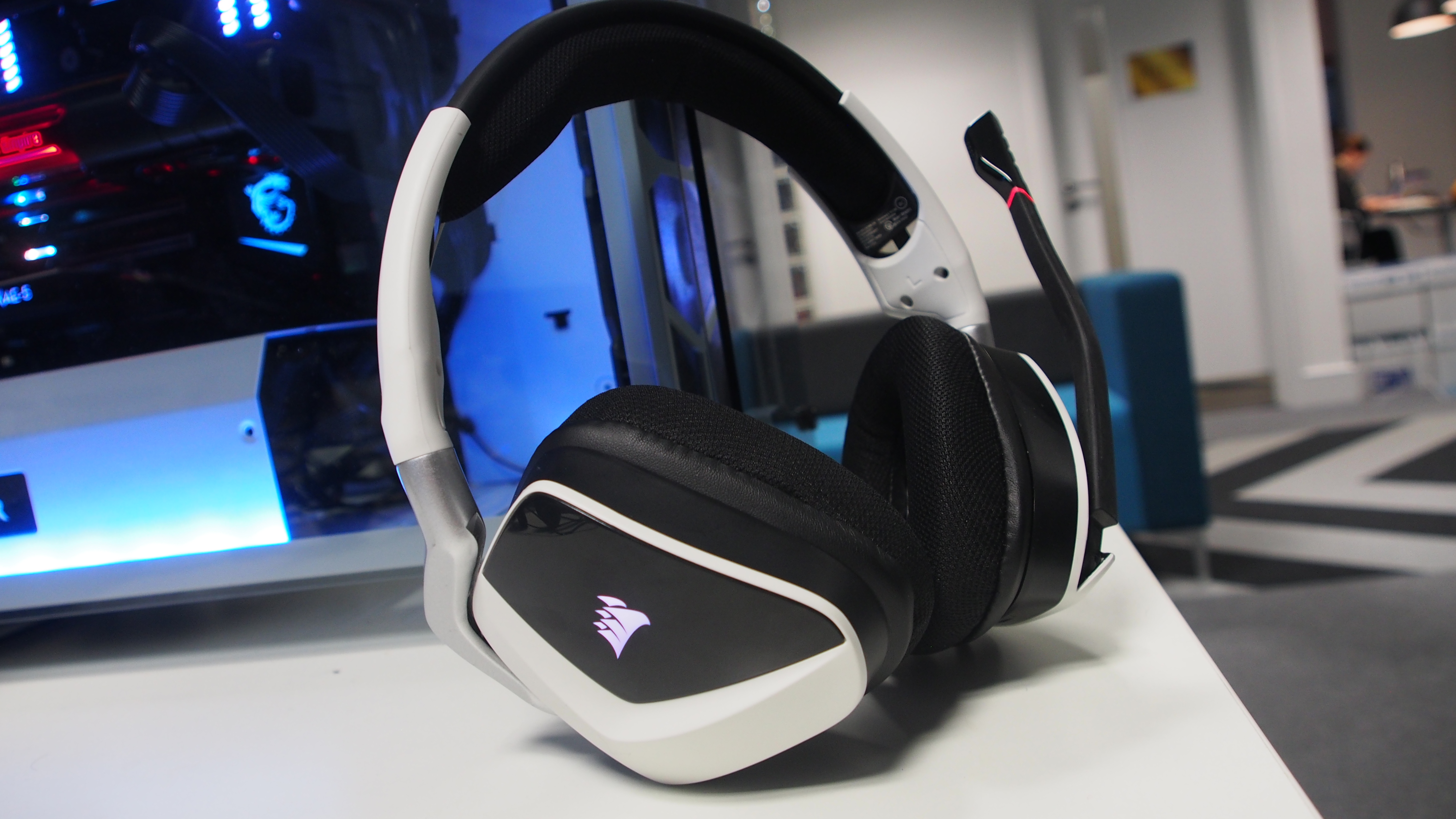
Corsair positions the Void Pro RGB as a premium headset (with a price tag to match), and its design certainly helps to create a premium impression, with a design that, will nicely understated, should still please gamers thanks to its RGB lighting.
The feel of the headset isn’t quite as premium, though, with a plastic design that lacks the robust feel of expensive headsets like the V-MODA Crossfade Wireless. However, it does mean the Corsair Void Pro RGB weighs less than some of its competitors, making it more comfortable to wear for long gaming sessions.
While the outside is plastic, it features metal pillars that make the Corsair Void Pro RGB feel like a durable headset that won't break easily, and padding on the ear-cups, and on the band that goes over the top of your head, help make this a very comfortable headset to wear.
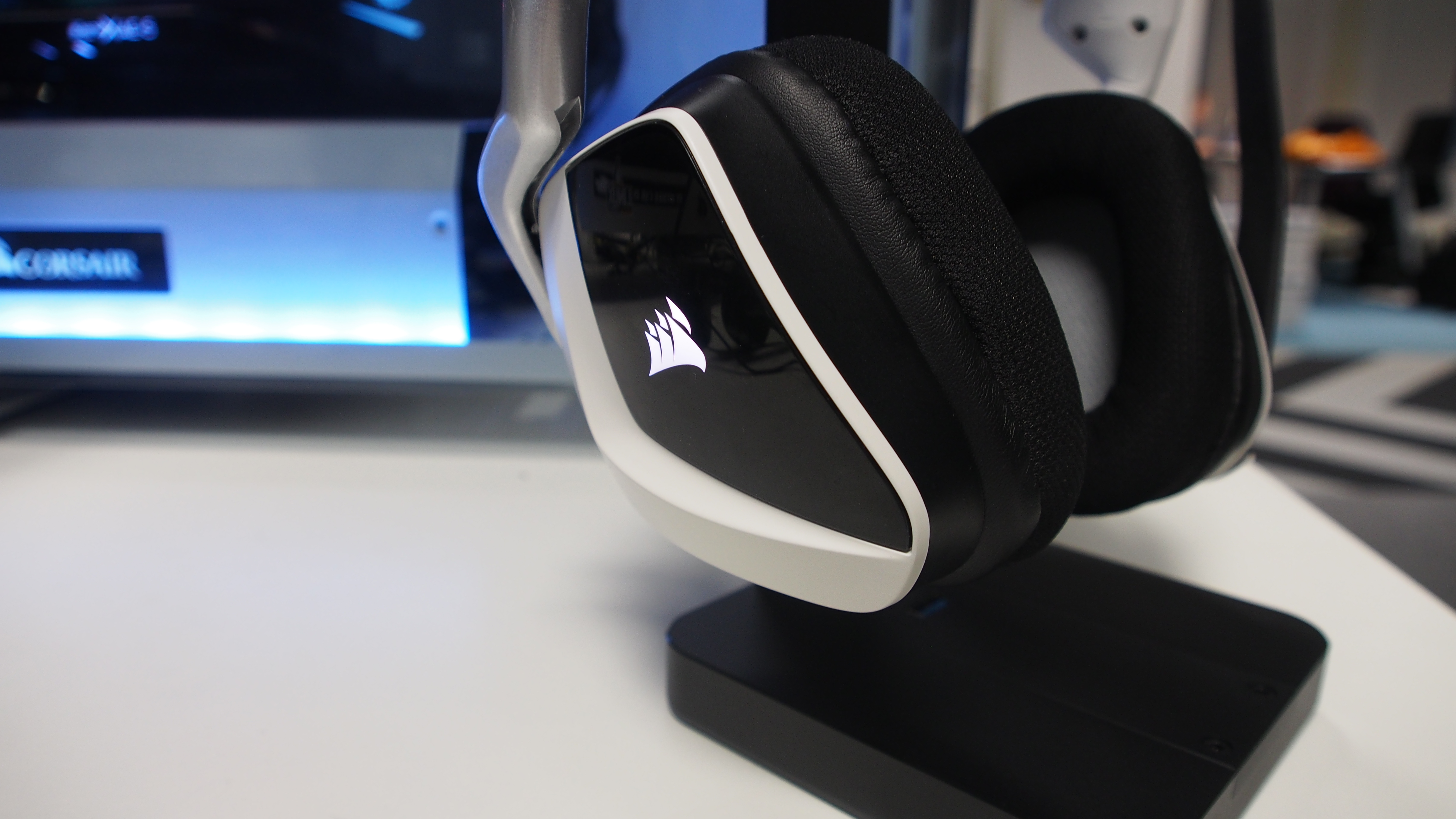
The Corsair Void Pro RGB comes in both wired and wireless versions, and you can choose from a range of colors. The cups sit comfortably over your ears, and each has a backlit Corsair logo which can be configured via software to glow in a variety of colors and to match your gaming setup (as pretty much every gaming laptop, PC, component or peripheral these days has RGB lighting).
While it’s the Corsair logo that gets the glowing treatment on these cans, it’s a nice enough logo, and Corsair is a respected brand in PC gaming, so that shouldn’t put too many people off.

On the left-hand can sits a mic arm that can be lowered and raised to turn the mic on and off. It’s a nice touch, as putting the arm into the up position mutes the microphone. The headset also alerts you via a sound when the mic is raised and lowered, so you’re aware of when the mic is on or off. The mic can also be adjusted slightly by bending the arm, so you can fine-tune its position for optimum recording quality.
Also on the left side is a button for muting the mic, a power button for switching the headset on, and a micro USB port for charging the headset. Overall, the Corsair Void Pro RGB is a very nicely designed headset that manages to balance a stylish design with gaming aesthetics like RGB lighting.
Setup
Setting up the Corsair Void Pro RGB is pretty straightforward, as it doesn't require an external amp. We tested the wireless version, and all we needed to do was plug the transmitter (which looks like a USB memory stick) into a USB port and turn on the headset, which then paired instantly.
Windows 10 recognized the Corsair Void Pro RGB when we plugged in the wireless adaptor, and we also installed the Corsair Utility Engine software.
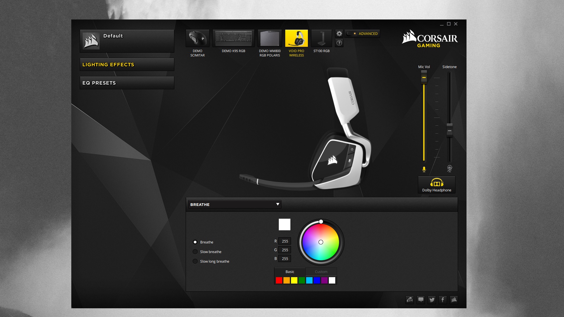
This software lets you adjust the settings of the Corsair Void Pro, as well as customize its lighting settings. There aren't a huge amount of customization options, but you can choose the color from a wide range, as well as the effect (such as quick blinks, slow breathing, and more). If you have other Corsair products, such as the ST100 RBG stand or K95 RGB keyboard, you can also configure them via this app.
Sound quality
Sound quality is the most important factor when it comes to headsets, and in this respect the Corsair Void Pro RGB doesn’t disappoint, especially considering its price and the fact that it’s a wireless headset aimed primarily at gamers. Gaming headsets will often concentrate on delivering skull-rattling low tones to make explosions and other action scenes feel more ‘impactful’, but the Corsair Void Pro RGB is pretty well balanced, with non-gaming media, such as music, coming through well.
Of course, as the EQ settings in the Corsair Utility Engine software show, this is primarily a gaming headset, so the EQ presets are all aimed at gaming, except for one that's for movies. If you want a headset primarily for listening to music, then this probably isn’t the best choice.
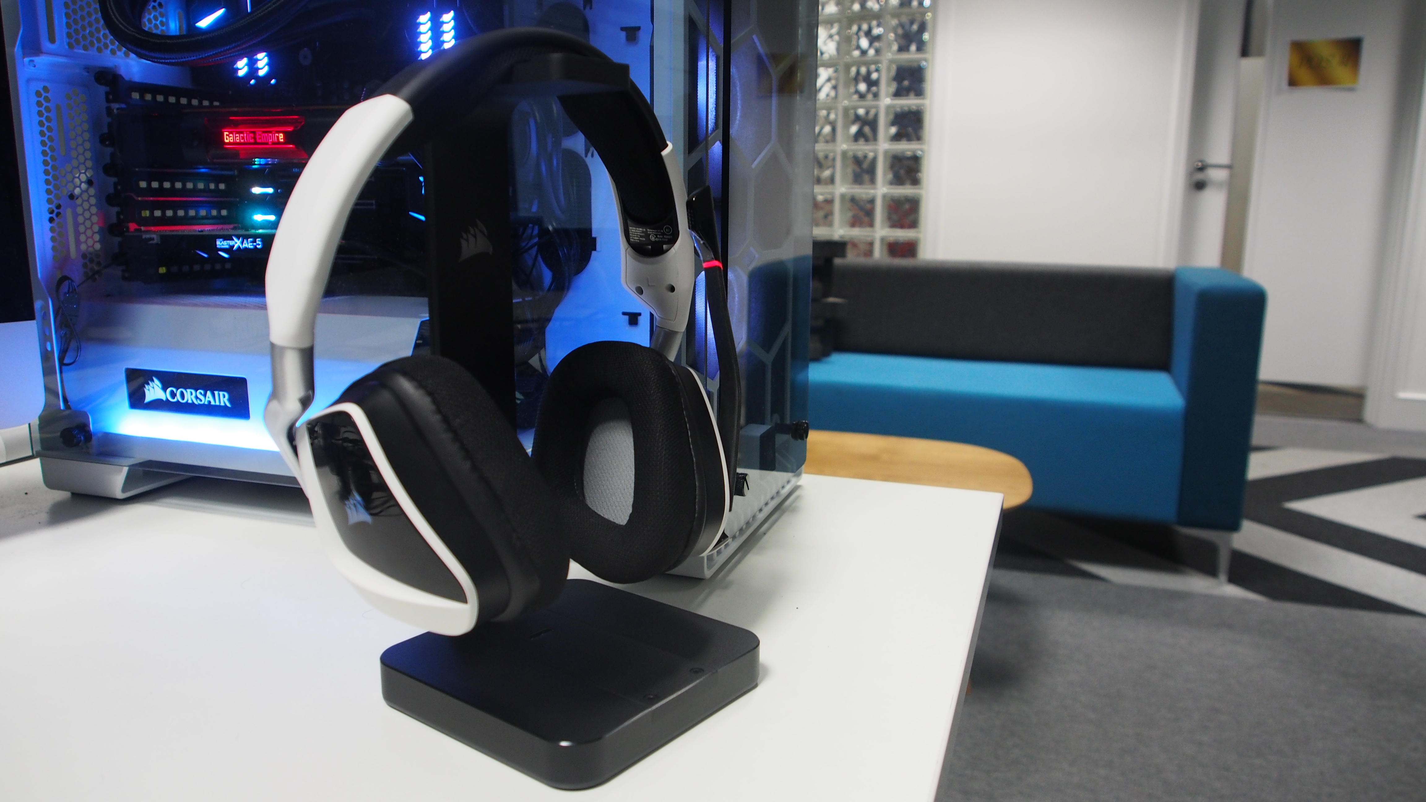
Gaming-wise, the Corsair Void Pro RGB performed brilliantly, with punchy and vivid audio and a good use of virtual surround sound; a hectic gun battle in Wolfenstein II: The New Colossus was made far more immersive by the sounds of bullets flying past as we played. Volume can be controlled via a dial on the left headphone can, and the mic did a very good job of delivering speech both during gameplay and on video calls, while also keeping background noise to a minimum.
However, we did find that sometimes when we lowered the mic arm the microphone wouldn’t turn on, which led to a bit of fiddling around in Windows’ sound settings and turning the headset on and off again.
Battery life was good. There's an auto-shutdown feature that turns the Corsair Void Pro RGB off when not in use, and we rarely found ourselves unable to use the headset due to a dead battery – you just have to remember to plug it into the USB. The Corsair ST100 headset stand can be used in conjunction with the Corsair Void Pro RGB, with the RGB lighting matching up between the two devices.
If you want to go all-in on the Corsair ecosystem the stand is a nice accompaniment to the Corsair Void Pro RGB, although it doesn’t do very much apart from holding your headset while looking pretty, and also acting as a USB hub. It does have a 7.1 virtual surround processor for adding that effect to other headphones (which can be plugged in via an audio jack), although if you have the Corsair Void Pro RGB you won’t need that feature.
We found that the Void Pro RGB's wireless range was very good, covering pretty much all of the large room we were using it in, although it lost connection when we went into another room. Overall, the sound quality was very good, with a believable 7.1 virtual surround sound implementation.

We liked
The Corsair Void Pro RGB is a good-looking wireless gaming headset, and if you have quite a few Corsair products already, it will fit in well. Sound quality is also very good, and the virtual surround sound is a decent effect that can help make games more immersive.
We didn’t like
There wasn’t much we didn’t like about this headset, the only complaints being that sometimes the mic didn’t turn on automatically when the arm was lowered, and that the RGB lighting is limited to the two Corsair logos. But these are relatively minor complaints.
Final verdict
Overall, we were very impressed with the Corsair Void Pro RGB. It offered very good sound quality for games and movies, and the virtual surround sound was well implemented. Recording quality via the mic was also good, making this a great headset for communicating with team mates, and even for doing a spot of livestream broadcasting.
The sound quality, and various EQ profiles, are decidedly game-orientated, which won’t be a problem if you just want to use this headset for playing games. However, if you want a headset primarily to listen to music on, while just enjoying the odd burst of gaming, then you may be better off taking a look at something from our best headphones of 2018 list.
If you’re a committed gamer with a number of Corsair products already sitting on your desk you’ll be very pleased with the Corsair Void Pro RGB, especially considering its relatively low price compared to other gaming headsets.
- Here's our list of the best gaming headsets in 2018
Acer Aspire 5
With high-end laptops getting ever slimmer, lighter and more expensive, while budget laptops continue to show that they can still be perfectly capable options despite their rock-bottom prices, it can be easy to overlook mid-range machines such as the Acer Aspire 5.
Rather than packing cutting-edge technology and extravagant designs, many of these mid-rangers quietly and competently get on with the tasks you set them, while striking a balance between packing up-to-date and powerful components, and keeping prices as low as possible.
Midrange laptops are the laptops many of us are most likely to buy, and they’re ideal if you want something that’s future-proof, as they have more powerful and recent components than budget machines, but don't want to pay over the odds.
Acer has recently updated the Acer Aspire 5 range to include 8th-generation Intel Core processors, so now’s the perfect time to take a look at what this affordable laptop can do.

Price and availability
The Acer Aspire 5 comes in a range of configurations and price points, starting at $399 (around £300, AU$500) for the Acer Aspire 5 A515-51-3509, which comes with an Intel Core i3 7100U processor, 15.9-inch 1080p display, integrated graphics and 8GB of DDR4 RAM.
In the UK, the lowest-specced Aspire 5 comes with an older Intel i3-6006U processor, 15.6-inch Full HD display and 8GB of RAM, for £469.99. In Australia, the Aspire 5 A515-51G is the cheapest model, and comes with a new Intel Core i5 8250U processor, 15.6-inch 1366 x 768 display, 8GB RAM and a dedicated GeForce 940MX graphics card.
Beyond these budget options there's a huge range of Acer Aspire 5 configurations to choose from, which again vary depending on where you live, with top-of-the-line models like the Acer Aspire 5 A517-51G-8433 boasting an Intel Core i7 8550U processor, 17.3-inch 1080p screen, 12GB RAM, a HDD and SSD and dedicated graphics courtesy of an Nvidia GeForce MX150 GPU, for $999.99 (around £700, AU$1,200).
The version reviewed here is the Acer Aspire 5 A515-51-50Y5, which comes with an Intel Core i5 8250U, integrated graphics, 8GB DDR4 RAM and 256GB SSD.

Design
The design of the Acer Aspire 5 is what you’d probably expect from a mid-range laptop: nothing too flashy, and not as svelte as ultrabooks such as the Dell XPS 13 or the Asus ZenBook 3. However, that doesn’t mean this is a chunky, ugly laptop. With dimensions of 2.16 x 38.16 x 26.3cm and a weight of 2.20kg (4.85 pounds), the Acer Aspire 5 is quite a large laptop, but it’s not too heavy or unwieldly to carry around. You may find it a bit of a struggle to whip out and work on a busy train, however.
It’s actually quite a nice-looking, understated machine with a few design flourishes. The chassis is mainly made out of plastic, with a textured surface on the lid, along with a reflective Acer logo.

Opening the laptop reveals a decent-sized screen surrounded by fairly thick bezels, which some may feel is wasted space. It does, at least, allow for a large keyboard on the bottom half of the laptop, which we’ll get to in a moment.
The large bezels also mean the webcam can be positioned in the center of the top bezel, which in our opinion is the best place for a webcam to reside.

The bottom bezel holds another Acer logo, and below that is the nicely-designed laptop hinge that has ‘Aspire’ engraved on it – a nice touch, we think. The hinge allows for a decent degree of adjustment of the screen at a range of angles, although this isn’t a laptop on which you can flip the screen 360 degrees backwards, into a tablet-like position – for that you’ll want a convertible laptop, such as Acer’s own Spin 7 series.

The Acer Aspire 5 comes with two USB 2.0 ports, one USB 3.0, a USB-C, Ethernet and SD memory card port, giving you plenty of options for connecting peripherals.

We’d have liked maybe one of the USB 2.0 ports to be another USB 3.0, but the USB-C port is definitely a welcome addition that gives you some future-proofing.
Keyboard and touchpad
The bottom half of the laptop, where the large keyboard and touchpad sit, again has a plastic surface, but it has a brushed finish that, while not as premium as aluminum, is still quite pleasant. It didn’t take it too long to pick up fingerprints, however.

The keyboard itself is a nice size, which makes typing on it for long periods comfortable, although the flat keys and short travel distance mean it’s not the most responsive, or satisfying-feeling, keyboard we’ve tried.
The large form factor of the Acer Aspire 5 means it can hold a rather large touchpad, which is offset slightly to the left of the center of the chassis.

The large size ensures that using multi-finger gestures, such as pinching two fingers together to zoom out, is easy, although some people may find the larger size means they're more likely to accidentally rest their palm on it when typing, sending the curser flying around the screen. The touchpad also has a rather plastic and cheap feel to it when pushed, which is a shame, as the rest of the Aspire 5 manages to avoid that.
Acer bills the Aspire 5 as a laptop for day-to-day tasks, and for the most part it succeeds at these. The solid state drive (SSD) keeps Windows 10 feeling pretty fast, while the 8GB of RAM and quad-core Intel Core i7 8550U processor help with multi-tasking. For general Windows desktop applications, the Aspire 5 does a fine job – it doesn’t feel quite as nippy as more expensive laptops, but for regular use it’s absolutely fine.
As we just mentioned, the SSD in the model we tested helps to keep things running quickly, so if your budget allows we'd recommend going for a model with an SSD installed – and preferably with an additional standard hard drive as well. This is because the 256GB SSD our Aspire 5 came with was already pretty full without us installing much on it – you may find that you need to invest in an external hard drive to make room for your apps and media.

The IPS screen is decent, if a little washed-out, with contrast not being quite as strong as we’ve seen on other laptops. However, the Full HD (1920 x 1080) screen is welcome, making movies and photos look a lot better than on laptops with lower resolutions, and Acer has included its Color Intelligence technology, which it claims dynamically adjusts gamma and saturation in real time to make the screen look the best it can.
To be honest, we didn’t see much of a difference, and again for standard day-to-day tasks the screen will be fine, especially with that Full HD resolution; however, if you want to edit photos or videos, you may want to look at an alternative machine.
And if you’re a gamer then you should definitely look elsewhere, as while the integrated Intel 620 UHD graphics will handle photos and videos, and maybe a undemanding indie game or two, for the most part modern games won’t run well on this laptop – although, of course, that’s not what it’s been built for.

Battery life
Battery life was pretty impressive, with the Acer Aspire 5 lasting six hours and 48 minutes using the PCMark 8 battery test, which replicates medium to heavy use. If you dim the display a bit (we had it set to full brightness), and keep to light web-browsing and less strenuous tasks, you could eke out even longer life.
It at least means that you should get through most of a work day on a full charge, which compared to some laptops is really good, and a sign that the more power-efficient processor is paying off. In our own day-to-day use we found that the battery did a good job of letting us work on the Aspire 5 for most of the day.
The battery does take a while to charge, however – specifically three hours to get back to full capacity.

We liked
The Acer Aspire 5 has a nice design and good build quality – apart from the slightly loose-feeling touchpad. The large range of ports is welcome, and makes this a versatile laptop for using with a number of peripherals, and battery life is very good. It also remained cool and quiet during our tests.
For the price, you’ll feel like you’ve got your money’s worth with the Aspire 5, including some up-to-date components.
We didn’t like
The touchpad doesn’t feel as satisfying to use as those found on other laptops, and it’s an unfortunate reminder that this is not a premium device.
The screen is also a little washed-out for our tastes, with contrast not as high as we'd have liked.
Final verdict
If you’re looking for a mid-range laptop that won’t cost the earth, but which isn’t compromised with cheap build quality and out-of-date components, then the Acer Aspire 5 is a great choice.
The range of configurations available means there’s a good chance you’ll find an Aspire 5 model that suits your needs and budget – while the model we tested wasn’t too capable when it came to graphical oomph, there are options to get an Aspire 5 with a dedicated graphics card.
Battery life was particularly good, so if you want an inexpensive laptop that can dependably handle day-to-day tasks without needing to be constantly plugged into a power socket, the Aspire 5 is definitely worth considering.
However, if you like your laptops to, well, aspire to something more, such as being able to run modern games or cope with heavy-duty image and video editing, then you’ll need to look elsewhere.
Garmin Vivofit 4 review
Looking for a fitness band that will track your basic activity? Garmin thinks the Vivofit 4 will be the perfect product for your wrist, but there's tough competition in this space from the likes of the Moov Now, Fitbit Alta HR and countless other brands that want to guide you to improved fitness.
Despite having a color screen on the Vivofit 4, Garmin has managed to include battery life on this product that the company insists will last you a year from a single battery.
That means you don't have to remove your tracker at night and worry about running out of charge before you hit the gym, but there are also lots of other things to like about the Vivofit 4.
Garmin Vivofit 4 release date and price
You can buy the Vivofit 4 now from Amazon in the UK, but you can’t purchase it on Garmin’s official website yet. Originally the Garmin website suggested it’d be on sale there before March, so you may have to wait a while if you don’t want to buy through Amazon.
As for the price, you'll be spending $79.99 / £69.99 / AU$159 and it’s same price no matter if you buy the small or large version of the fitness tracker.
That price is around what we’d expect for a fitness tracker of this type, considering similar products such as the Fitbit Charge 2 currently cost around £90 / $130 and the Moov Now (which doesn’t come with a screen) has an RRP of around £50 / $60 / AU$79.
Design and display
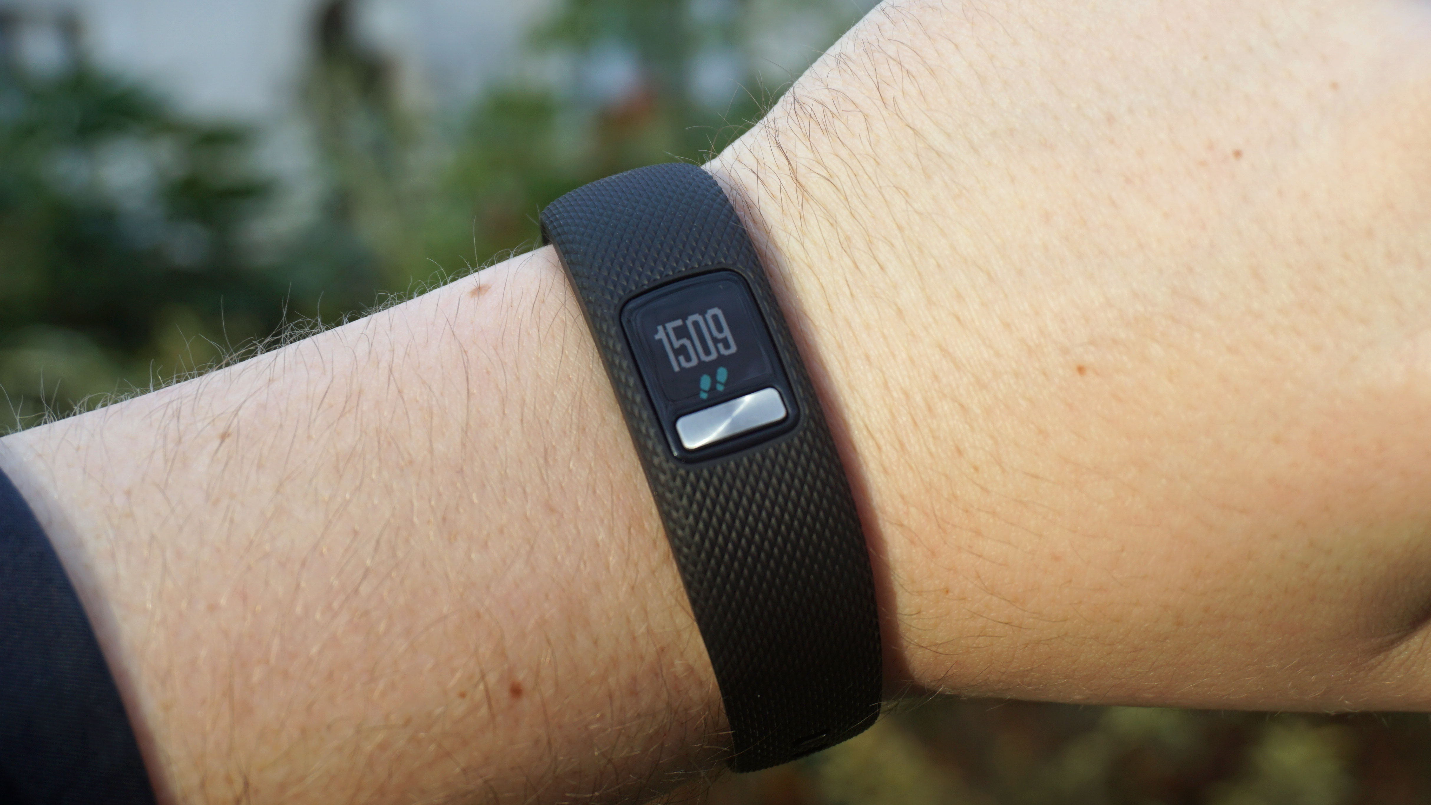
The Vivofit 4 is noticeably thinner than previous Garmin products, meaning it takes up less room on your wrist and is a touch lighter too. For that reason it's a comfortable wear. We found the plastic strap material - the only option you have with the Vivofit 4 - was easy to clean off after a sweaty run.
Garmin has provided a particularly secure strap on the Vivofit 4 that means it shouldn't go flying about your wrist either. There's both a large and a small/medium size, and while we tried the smaller option (which is perhaps a bit too small for our reviewer's wrist) it was still a comfortable fit.

The silicone material may not look that premium and won’t be your choice of look to match with some particularly nice formal wear, but it does feel comfortable when you’re working out and when worn for long periods of time.
The Vivofit 4 is also attractive for a fitness tracker and its smaller size means it’s better looking than some larger, bulky wristwear.
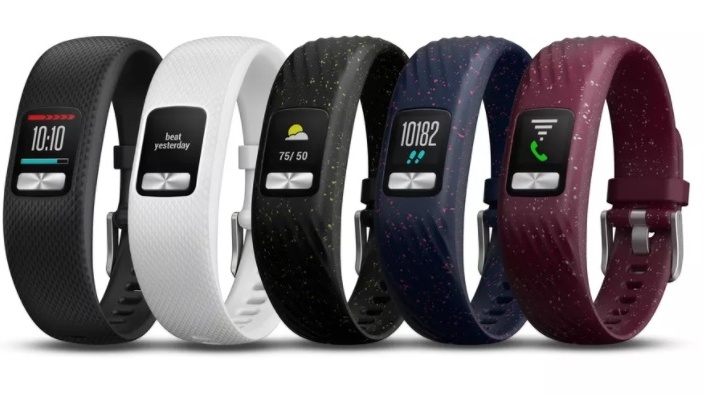
Color-wise you've got the choice of plain black or white straps, while there's also blue, black and purple versions with a speckled effect on them. We really like the speckled effect as it looks different to other fitness trackers that usually just have a solid color design.
These don’t cost any more either, so if you don’t like the plain black or white versions we’d recommend looking out for those snazzier options. Garmin also doesn’t provide other materials, so it’s worth noting you won’t be able to buy an official leather strap for more formal occasions like you can with some smartwatches.

There isn’t much on the tracker itself – and that’s one of the Vivofit 4’s strengths. You can pull the Vivofit 4 out of its strap from behind so you can switch straps, but apart from the color display and button on the front there isn’t any other way to interact with it.
That makes this a largely easy device to use. The button below the screen will cycle through all the options you have on there including things like your step count for the day, the time, the weather, calories burned and distance traveled, but for anything more than that you’ll need to head into the app on your phone.

Don’t expect any sort of control of your phone direct from your wrist either. There’s no touchscreen here and instead you will hold down a button to start up an exercise routine.
It’s an 11mm x 11mm display, so this is even smaller than the display you get on the Fitbit Charge 2. It’s designed to show you the time and whether you’re working out, but it’s not like a proper running watch where you can see detailed live stats.

The resolution is 88 x 88 pixels, but the quality is clear and the fact it’s in color means it adds a slight amount of vibrancy to the menus you can see. If you’re using the watch element at night, you’ll need to hold down the button for a second for the backlight to kick in.
That’s useful for saving battery, but we found it a little irritating when you just want to quickly look at your wrist to have a look at the time.
It’s the first time a Vivofit device has included an always-on display, and as long as you’re in clear lighting it’s much more useful if you want to use this in a similar way to a watch.
You can change the watch face here too, and while the options you’ve got are limited it adds a slight element of personalization you don’t often see on fitness trackers at this price point.
It means you can choose your own watch face color and tailor it to your style a little more, even though it’s probably only you who’ll look at the watch face on your wrist.
Fitness
Despite the Garmin name, this isn’t the ultimate tracker that runners and lots of fitness fanatics will need strapped around their wrist. Instead the Vivofit 4 is designed for those who want something a little simpler, that can track fitness but doesn’t bombard you with stats and data you don’t necessarily need.
The Vivofit 4 will track your everyday steps automatically, but it’s also suitable for jogging and a few other exercises. We found the Vivofit 4 would automatically start recording intense movement sessions from walking to jogging and this would for the most part be accurate.
The distance you’ve traveled can be a little bit off, but that’s likely because the Vivofit 4 doesn’t come packed with GPS or a heart rate monitor.
You can connect a heart rate monitor or use the GPS on your phone, but that means you’ll have to have those other devices with you when you go out exercising.

We found the tracking of running and walking was otherwise accurate with more broken-down details than you might expect at this price. It’ll give you stats such as average page, average speed, the time of your workout and a rough estimate of your calories burnt too.
Move IQ is the name for the feature that will kick start activity on the Vivofit 4 without you having to press a button. If you start running, it’ll soon kick in and start recording your exercise automatically.
This is particularly useful for when you’re out running as it means it’s not a problem if you forget to set your tracker going before you start jogging.
When the Vivofit 4 was in the pool, we found it automatically started tracking the swim but then stopped soon after we had started. We kept swimming with it on, but nothing was recorded in the app.

Even if you can get this working, you shouldn’t expect many insightful metrics. It’ll likely just show you the time you’ve been exercising, you’ll need a more extensive fitness tracker to be able to properly track swims.
We plan to test swimming further in the future, but it’s a strange occurrence that it just didn’t record any further details from our exercise. We’ve yet to test the Vivofit 4 while cycling, but Garmin is certain it’ll automatically record your bike rides too.
Then there’s sleep tracking, which we found to work as well as it does on other Garmin fitness tracker bands. The app shows you the amount of time you’ve been asleep, your sleep movement and different levels of sleep too.
This works much like how it does on other fitness trackers and it’s mostly just an estimate of how restless your night’s sleep turned out to be, but the upside is smaller size of the Vivofit 4 makes it a comfortable device to wear at night.
Specs and performance
The Vivofit 4 is fast considering it’s a basic device and doesn’t need to be particularly intensive in use.
If you’re cycling through the menus it works speedily and we found it would be reliable at all times. We don’t know the exact computing power behind the Vivofit 4, but it gets the job done just fine.
Fitness data you’ve recorded will be put onto the device so you don’t always need to have it connected to your phone, but be warned you’ll only be able to track around four weeks of data, so you’ll need to sync it with your phone every once in a while.
There’s no storage here to upload music though and no Bluetooth music support, so this isn’t particularly built as a device you can take out and about on its own.
App and compatibility
The Garmin app isn’t as easy to use as some of the competition like the app you’ll have alongside Fitbit devices, but it provides you with all of the necessary details within a reasonably easy to read format.
Once you’ve connected your Vivofit 4, the details of your daily step count and workouts will appear within the app. There’s a News Feed function that shows you all of your stats for exercises you’ve done. If you’ve worked out on a specific day, you’ll find that in the My Day section where it shows you your workouts.
This is all okay, but we particularly like it when you dive into the exercises themselves. It breaks down your data really well with a huge selection of stats for each different kind of exercise.
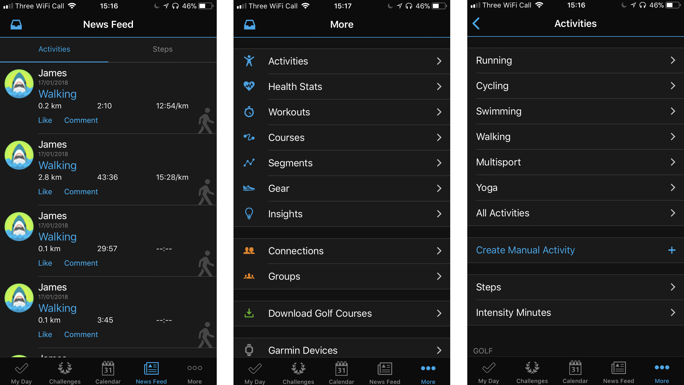
For example, with a run you’ll get a map of where you’ve been (if you’ve used GPS on your phone), the time it took, distance, an estimation of calories burned, pace, elevation as well as cadence and much more.
We’re not sure how accurate the cadence can be when it doesn’t monitor your leg movement as well, but otherwise we found this to work out well and you can then share all of your stats from within the app to your social media or Garmin’s own social networking elements.
You can connect up your Google or Facebook account to the Garmin platform so you can share your activity with friends and family or set them challenges so you can compete against each other.
If you’ve got a relatively recent Android or iOS phone, it’s likely you’ll be able to connect up your Vivofit 4. You’ll need to have an iPhone that’s running the latest in iOS software - at the time of writing that’s iOS 11 or a phone that’s got Android 4.3 or above software.
Battery life
We’ve gently see battery life improve on fitness trackers, but you can still buy a lot of devices that can only last for one or two days. The Garmin Vivofit 4 is not that device.
Garmin claims this tracker will last up to a year, so you won’t need to charge this every week. Instead it takes an SR43 watch battery (which you can manually replace yourself at home) allowing for you to wear it at night as well as during the day.
We haven’t been able to test this to its full, so we have to put our faith in Garmin that the tracker is able to last a long amount of time. It’s not clear how you find out the battery life available on the Garmin Vivofit 4 either.
Verdict
The Vivofit 4 is in a difficult market to compete in with stiff competition from the likes of Huawei, Moov and many more firms.
But it’s a generally good device and while it is missing some features we’d like to see on your wrist, if you’re looking for a basic tracker it’s likely this will make you happy.
Who’s this for?
If you’re looking for a basic fitness tracker, you’d be hard pressed to go wrong with the Garmin Vivofit 4.
It’s attractive - even more so than a lot of other devices at this price point - plus it comes with a color display and while that may not add much to the day to day experience with it we like the fact you can customize the screen that little bit.
The battery life is a big selling point too. If you’re looking for a device that can track your steps everyday and your sleep each evening without any need to recharge it, the Vivofit 4 would be the perfect tracker for you.
Should you buy it?
If you want to go running a lot and need lots of stats including your heart rate, GPS location or music without taking your phone out with you, the Vivofit 4 isn’t a good purchase for you.
But if you’re just looking to up your step count and take it out for the odd exercise, this is the perfect fitness tracker for you and while it may miss some features it’s a basic introduction into what health tracking tech can do.
The Vivofit 4 offers everything you’ll need for an average tracker with an attractive design, great battery life and much more.
The competition
Don't think the Garmin Vivofit 4 is made for you? Check out list of the best fitness trackers or take a look below for some other devices that may suit you better.
Huawei Band 2 Pro

Another cheap activity tracker you should take a look at is the Huawei Band 2 Pro, which is actually a touch more affordable than this option from Garmin.
This one comes with GPS tracking as well as 21 days of battery life from a single charge. To get that you’ll have to put up with a slightly less slick UI, and while there’s a heart rate monitor we didn’t find it - or the other metrics - to be totally accurate.
Read our Huawei Band 2 Pro review
Fitbit Charge 2

One of Fitbit’s most popular trackers is a very similar device to the Vivofit 4. It comes with a larger screen than the choice from Garmin, but it displays similar stats and there’s connected GPS for those who want more fitness features.
The Charge 2 will give you a heart rate tracker, but for that reason the device is a touch thicker than the Garmin so doesn’t look as attractive on your wrist.
Read our Fitbit Charge 2 review
Moov Now

Even cheaper than the Vivofit 4, you may want to take a look at the Moov Now as your potential new fitness tracker. It doesn’t come with a screen, but it records lots of stats when you’re running, swimming and much more.
It’s particularly good for high intensity interval training, which is something the device from Garmin above hasn’t really focused on.
Read our Moov Now review
First reviewed January 2018
Best Upcoming Smartphones of February 2018 – Expected Specs & Features

You are reading a story from PhoneRadar.
In the coming months, the smartphone market will be flooded with all-new flagship smartphones. We will be seeing a few of them at the upcoming MWC 2018 that is scheduled to be held from February 26th to March 1st. Apart from flagship smartphones and new technologies, manufacturers will be bringing several other smartphones to the show floor. Below is the list of all the smartphones that are rumored to be unveiled in next 28 days.
• Nokia 3310 4G, Nokia 6 2018, Nokia 7 Plus
At the MWC 2017, HMD Global launched the all-new Nokia 3310 (2G model), Nokia 3, Nokia 5 and Nokia 6 smartphones. This year, we are already seeing leaks about the possible launch of the new Nokia 3310 4G, Nokia 6 (2018), and Nokia 7 Plus. The Nokia 3310 4G and Nokia 6 (2018) are already launched in China. The Nokia 7 Plus is said to be an upgraded variant of the Nokia 7 with 18:9 display and Snapdragon 660 processor. While there are leaks about the Nokia 9 and Nokia 10, we don’t expect the company to launch a new flagship alongside the Samsung Galaxy S9 devices.
• Samsung Galaxy S9 & Galaxy S9+
Samsung will be unveiling the Galaxy S9 & Galaxy S9+ smartphones on February 25th at MWC 2018. The devices will come powered by Snapdragon 845 or in-house Exynos 9810 processor, depending on the markets. The new Galaxy S9 devices are said to feature stereo speaker setup and advanced IRIS + Face Unlock technology. While the Galaxy S9 offers 4GB of RAM and 12MP single rear camera, the Galaxy S9+ will be coming with 6GB of RAM and 12MP dual rear cameras. However, the primary 12MP cameras on both the devices will include variable aperture mode.
• LG G6 Lite or Compact
As we exclusively reported earlier, LG will soon launch the affordable variant of the last years LG G6 called LG G6 Lite or LG G6 Compact. It will be priced around Rs. 25,000 and offers just 32GB of internal storage. However, the device includes a MicroSD card slot for further expansion of storage. At Rs. 25,000, this new variant of LG G6 will be the most affordable smartphone with Quad HD+ display in the market. It comes powered by Qualcomm Snapdragon 821 processor and packs 4GB of RAM. The company will also release the latest Android 8.0 Oreo update for the LG G6 devices in the coming weeks.
• Moto G6, G6 Plus, E5 & E5 Plus
There are already several leaks about the Moto G6 and Moto E5 smartphones. While the Moto G6 and the Moto G6 Plus will offer 18:9 aspect ratio, the Moto E5 and Moto E5 Plus will still feature 16:9 aspect ratio and thick bezels. The Moto G6 devices will come powered by the Snapdragon 600 series chipset. Even with the 18:9 aspect ratio, the Moto G6 devices will retain the front facing home button. On the other hand, the Moto E5 will be launched with MediaTek chipset. The Moto dimple on the rear of the Moto E5 devices will feature a fingerprint sensor.
• Xiaomi Redmi Note 5
In the coming weeks, we expect Xiaomi to launch the Redmi Note 5 smartphone in India. The Redmi Note 4 was one of the most popular smartphones launched in 2017. Now, the new Redmi Note 5 will come with an 18:9 display technology. Xiaomi already sells Redmi 5 and Redmi 5 Plus smartphones in China with 18:9 displays. The Redmi Note 5 might come packed with a Full HD+ 18:9 display and the Snapdragon 630/660 octa-core processor. It will still run on Android 7.1 Nougat based MIUI 9 out of the box. Just like the Redmi Note 4, the new Redmi Note 5 will also come in different storage variants.
• Sony Xperia XZ1 Premium
At the CES 2018, Sony unveiled three new mid-range Xperia smartphones. Now at the MWC 2018, the company will unveil its latest flagship smartphone. While there is no official confirmation, the device is expected to be the Sony Xperia XZ1 Premium, the successor to last year’s Xperia XZ Premium. The new Xperia XZ1 Premium is rumored to come with a 4K HDR display in 18:9 aspect ratio. We might also see dual camera setup on the rear. The device will be running on the latest Android 8.1 Oreo out of the box. Let’s see whether Sony will opt for the AMOLED display or not.
• LG V30+ α
LG has recently confirmed that its next flagship smartphone is on schedule. As of now, we don’t even know whether the company will launch the LG G7 as the successor to last year’s LG G6. A few rumors suggest the company to launch the LG V30+ α (LG V30+ Alpha) instead of a completely new smartphone. Compared to the regular LG V30+, the new LG V30+ α is said to offer enhanced AI capabilities. Almost a year after its launch, LG now announced the LG G6 in three new color options – Moroccan Blue, Lavender Violet, and Raspberry Rose.
• Huawei MediaPad M5
While Huawei is rumored to skip launching the 2018 flagship smartphone at this year’s MWC, the new leaks hint the company to actually launch the MediaPad M5 tablets. The 8.4-inch variant of the MediaPad was recently spotted on FCC. There are also leaked renders of the 8.4-inch and 10.1-inch MediaPad M5 tablets. Both the variants sports metal unibody design and includes a physical home button with an integrated fingerprint sensor. The 10.1-inch MediaPad M5 tablet comes with magnetic pins for connecting additional accessories like a keyboard.
Stay tuned on Phoneradar for the official details, availability, and pricing of the above mentioned smartphones.
This story appeared first on PhoneRadar. Join the PhoneRadar Forums to discuss, meet experts & share your experiences. We have now launched a Hindi Website for the latest news in Hindi. Click here to read PhoneRadar Hindi
Microsoft Office 365
[Editor's Note: What immediately follows is a rundown of the latest developments and features Microsoft has added to Office 365 since this review was last updated.]
January 2018
- Microsoft Teams saw some extensive work, including the ability to use interactive cards pulled from third-party apps directly in conversations as easily as you might drop in a GIF.
- Microsoft made an important move for iOS and Mac users, with the introduction of seamless co-authoring across Word, PowerPoint, and Excel.
- Mac for Office 365 subscribers got another new feature: AutoSave in Word, Excel, and PowerPoint, facilitating automatic saving for files stored in the cloud (OneDrive and SharePoint).
- Yammer users benefited from improvements to the mobile app which allow them to post announcements to groups, as well as adding animated GIFs, and more besides.
- OneDrive for Business users received the ability to easily restore files to any point in the last 30 days, a feature which will hopefully be coming to consumer accounts soon.
December 2017
- Outlook’s mobile app got smarter with the arrival of Cortana’s ‘time to leave’ feature which lets the user know when to depart for a meeting, taking into account things like traffic jams.
- Microsoft Word received a new feature which uses machine learning to identify commonly-used acronyms across an organization, and automatically surfaces definitions for them.
- Excel was bolstered with a preview of Insights in the spreadsheet app, which automatically highlights patterns and trends in data using AI (the firm is currently on a big drive with AI).
- OneDrive and SharePoint were graced with the ability to automatically pull out searchable text from images (like receipts) for Office 365 commercial subscribers.
- Microsoft rolled out its Whiteboard Preview app which the company describes as a ‘freeform digital canvas’ where people can collaborate creatively.
November 2017
- It’s worth noting that Office Android apps have arrived for Chromebooks which are capable of running software from Google’s Play store.
- Resume Assistant was announced for Microsoft Word, a feature which helps Office 365 users put together a sparkling resume/CV with personalized insights drawn from LinkedIn.
- Three new apps arrived for Office 365 Business Premium, as well as Microsoft 365 Business, namely: Microsoft Connections, Microsoft Listings and Microsoft Invoicing.
- Microsoft 365 Business – which comprises of Office 365, Windows 10 plus various security and MDM features – moved out of testing this month, and into general availability,
October 2017
- Microsoft powered up Word’s translation tools, allowing for the translation of entire documents across some 60 languages.
- Microsoft brought premium Outlook.com features to Office 365 Home and Personal subscribers, including an inbox storage capacity of 50GB, and no more adverts.
- Microsoft announced that Office 365 now has 28 million consumer subscribers (up from 24 million this time last year), and 120 million commercial users (up from 85 million).
- Microsoft To-Do, the company’s task management app, began rolling out across the Office 365 user base.
- Outlook for iOS and Android got some smart new features including the ability to sync shared calendars to your phone, and added capabilities for managing events.
- Microsoft ended support for Office 2007 and Outlook 2007, meaning no more security patches, with the company pushing for users to upgrade to either to Office 365 or 2016.
September 2017
- Microsoft revealed that Office 2019 will be out next year, so the company will continue to cater for those who don’t want (or aren’t ready) to move to the cloud with Office 365.
- Skype for Business has reached the end of the road, with Microsoft set to roll the service into Microsoft Teams – with audio conferencing capabilities already in preview.
- The Office.com website has been redesigned, and Office 365 app launcher simplified to help users open the apps they need swiftly, and to easily switch between them.
- Microsoft kicked off a new program called ‘Windows Insider Lab for Enterprise’ which allows IT pros to try out Office 365 and other services for free, with a view to upgrading.
- Microsoft Teams was improved by the rollout of guest access for Office 365 commercial and education subscribers, allowing guests to join a team and subsequent meetings.
August 2017
- Microsoft brought co-authoring to Excel, along with an auto-save function for Word, Excel or PowerPoint files being worked on in OneDrive or SharePoint Online.
- Security firm Barracuda has warned about an ongoing series of phishing attacks aiming to steal the login credentials of Office 365 users. As ever, be cautious about links in emails.
- Microsoft released a new preview of Office for Windows PCs introducing in-line chat functionality to Word, Excel and PowerPoint, along with new ink effects.
- A redesigned Outlook.com began rolling out in beta this month, with a number of touches to make your inbox smarter, and the webmail service more responsive in general.
- Microsoft added new features for Office 365 users to the OneDrive app for iOS, including the ability to take folders offline for access, and scan multiple pages into a single PDF.
July 2017
- With its latest quarterly financial results, Microsoft announced that Office 365 revenue surpassed traditional Office licenses for the first time ever.
- The Outlook apps for iOS and Android have benefited from a redesigned navigation and conversation experience, and new intelligent search capabilities are promised soon.
- Three new apps are coming to Office 365 Business Premium: Microsoft Connections (email marketing), Microsoft Listings (managing online listings) and Microsoft Invoicing.
- Microsoft 365 was revealed, a new offering which combines Office 365 and Windows 10 in a single streamlined package, with additional security and management features.
- Microsoft launched Workplace Analytics as an add-on for Office 365 enterprise customers, a system which uses behavioural metrics in an attempt to boost employee productivity.
June 2017
- Microsoft Teams got new classroom experiences, allowing Office 365 for Education customers to benefit from virtual classroom environments with rich chat capabilities.
- Office 365 Advanced Threat Protection received improved reporting on malicious emails which have been blocked, and a new Safe Links policy was introduced.
- Microsoft Forms, a web tool for creating surveys, is rolling out for commercial customers, entering public preview for these users (previously it was only available to education customers).
- Microsoft Stream was introduced for Office 365 commercial customers, an intelligent video service which allows users to share videos and benefit from speech-to-text transcription.
- Microsoft pushed out iOS and Android apps for Microsoft Planner, allowing Office 365 users to update their plans while they’re on the move.
May 2017
- An annoying (but not critical) bug was found to be affecting Office users in May, involving a reappearing pop-up window – but Microsoft’s working on a fix that should be out soon.
- Office 365 is set to get improved inking features to benefit the new Surface Pen, including new pencil texture and ink effects, along with Microsoft’s collaborative whiteboard app.
- Microsoft Graph received considerable new capabilities, including fresh APIs which have become available to developers – namely SharePoint, OneNote, and Planner data APIs.
- Microsoft revealed that Office 365 is steaming ahead in terms of its subscription base, with the online productivity suite now boasting 100 million monthly active commercial users.
- It emerged that the full desktop version of Microsoft Office will be available in the Windows Store in June (as opposed to the touch-focused apps currently in the store).
April 2017
- Microsoft used another tactic to push folks towards Office 365, announcing that those with a standalone version of Office will eventually lose access to OneDrive and Skype for Business.
- It was confirmed that Windows will have twice-yearly major updates to align with Office 365 ProPlus’ update schedule, with said upgrades coming in September and March.
- Outlook Customer Manager, which is designed to make it easy for SMBs to track and manage customer relationships, is now rolling out worldwide.
- The PowerPoint app for iPad was improved with the introduction of Designer, which gives you quick and easy ideas for designing and laying out slides.
- Microsoft revealed that Wunderlist – which is available as an add-on to Office 365 subscribers using Outlook 2013/2016, and on the web – will be replaced by To-Do.
March 2017
- Microsoft enabled co-authoring in Excel for Windows desktops, extending Office 365’s collaborative chops, albeit for Office Insiders (testers) only at the moment.
- Microsoft Bookings, which allows SMBs to manage appointments with customers, is now being rolled out worldwide for Office 365 Business Premium subscribers.
- A huge addition arrived on Office 365 in the form of Microsoft Teams, a Slack-like messaging and collaboration app which is available to business subscribers.
- Office 365 calendars are now supported by Amazon’s Alexa-driven devices (such as the Echo) for commercial users who subscribe to Office 365 with Exchange Online.
- Microsoft announced that Visio Online, the firm’s veteran diagramming app, is now available to commercial customers running Office 365.
February 2017
- Microsoft has updated Visio Pro for Office 365 with a database reverse engineering tool that allows you to easily create a visual representation directly from source data.
- Office 365 benefited from the introduction of a security analytics tool which rates your current security configuration, and makes suggestions on possible improvements.
- The Office team announced that the OneNote REST API now supports application-level permissions.
- Excel got new features based on Power Query technology, including support for the percentage data type, along with a new OLE DB connector.
- Microsoft released Office Training Roadmaps which help businesses keep track of training programmes for the various productivity apps.
January 2017
- Office 365 Advanced Threat Protection got several new features for tighter email security, namely URL Detonation and Dynamic Delivery.
- Microsoft graced Office 365 with a new Setup section on the navigation menu, which provides convenient and easy access to all setup-related settings in one location.
- Office 365 was crowned king of all productivity apps by Okta, outdoing second-place Salesforce.com by a factor of 1.3 to 1 as 2016 came to a close.
- Microsoft brought in a raft of new courses from LinkedIn Learning to the Office Training Centre, with over 20 offerings on working with Word and PowerPoint.
- StaffHub, a nifty new app which allows for the management of shifts for deskless workers, became available for Office 365 users with a K1, E1, E3 or E5 plan.
December 2016
- A new OneDrive for Business admin centre began rolling out to release customers, with general availability promised for early 2017.
- Microsoft laid out its grand vision of how the firm intends to integrate Teams (its Slack rival) with Microsoft Planner so working across the two is a seamless affair.
- Microsoft made the Accessibility Checker more easily found across all Office 365 apps, and introduced automated alternate text descriptions in Word and PowerPoint.
- An official guide on the ‘preferred deployment practices’ for Office 365 ProPlus was released, including advice on preparing the ground, and maintenance afterwards.
- New statistics emerged from data protection firm Bitglass showing that Office 365 is twice as popular as Google’s G Suite.
November 2016
- Office 365 users got the benefit of real-time co-authoring in PowerPoint, as well as in the Word app.
- Office Lens received a couple of new features, including the full integration of Immersive Reader, and a new tool called Frame Guide to help the visually impaired.
- Outlook Customer Manager arrived in Office 365, enabling businesses to track and manage – and hopefully grow – their customer relationships.
- Microsoft reintroduced Access, its heavyweight database software, to Office 365 Business and Business Premium customers.
- Microsoft officially took the wraps off Teams, the firm’s Slack rival that leverages the whole gamut of Office 365’s apps and services.
October 2016
- Excel 2016 got new features based on Power Query tech, including an improved web connector and enhanced Query Editor, as well as Query Parameters support.
- Microsoft introduced the ability to create (and collaborate on) Office documents from within a Yammer group.
- In an earnings report, Microsoft announced Office 365 user numbers: 85 million active commercial users, and 24 million consumers.
- A batch of new apps were revealed for Office, including an app for invoicing, and tracking expenses, along with one for keeping tabs on your business’ web presence.
September 2016
- Microsoft announced several new intelligent features which are coming to Office 365, including Tap for Word and Outlook, and QuickStarter for PowerPoint and Sway.
- New usage reports arrived for SharePoint Online, Exchange Online, and OneDrive for Business, aiming to provide better insights into how staff are using Office 365.
- Office 365 Groups were changed so that you can invite guests from outside your organisation to join.
- Microsoft changed its system of Office preview builds on Windows (and Windows Mobile) to include a fast and slow ring, just as with Windows 10 testing.
- SharePoint Online got tighter integration with Office 365, so when you create a group in Office, you get a SharePoint Online team site into the bargain.
If you want to see older news and developments pertaining to Office 365, then check out the Archives page at the end of this review.
Otherwise, now move on to Page 2 for our full review and detailed look at what Office 365 offers, and how it can help you become more productive.
Darren Allan contributed to this article
It's been a long time since Office just meant Word, Outlook, Excel and PowerPoint (plus Access - remember that?). In fact, there's a confusingly wide range of tools and services under the Office umbrella.
In the last few years, Office 365 has established itself as the definitive business cloud service bringing together those familiar productivity services, plus an ongoing range of new features.
There are personal and business versions of Office 365 – home users get the latest version of the Office desktop and mobile applications plus email with Outlook.com and extra cloud storage with OneDrive, along with free Skype minutes every month. If you want to edit documents in Office on your iPad, or using the mobile Office apps on a Windows 10 PC, you need an Office 365 subscription.
Office 365 Personal is for a single user and allows one download of Office. Office 365 Home Premium costs $99.99 per year (£79.99, AU$119.99) for Word, Excel, PowerPoint, Outlook, OneNote, Access and Publisher.
That's good value if you share it with the family; up to five people in the same household can have their own installations of Office on their PC or Mac at the same time (for the Office programs that run on a Mac).
When the next version of Office comes out, you'll get it on the same subscription, and you'll get new features as they become available. If you're at college or university (or you teach at one) you're eligible for Office 365 University on a four-year subscription for $79.99 (£60, AU$99) that you can use on up to two PCs or Macs.
Office 365 for business
Microsoft offers three tiers for businesses with less than 300 seats. Office 365 Business Essentials allows you to use online Office apps only (no desktop applications) plus 1TB of online storage per user and a 50GB Outlook inbox with email, calendar and contacts for £3.10 ($5, AU$5.50) per month per user on an annual contract.
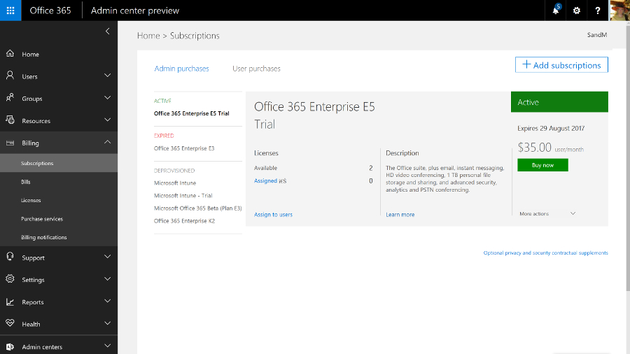
Office 365 Business offers Word, Excel, PowerPoint, OneNote, Outlook, Access, Publisher and Lync, with a subscription licence for each user to run them on up to five PCs or Macs at once. You still get the online storage but no email services. Office 365 Business Premium combines Office 365 Business and Business Essentials; all the applications, plus email and storage.
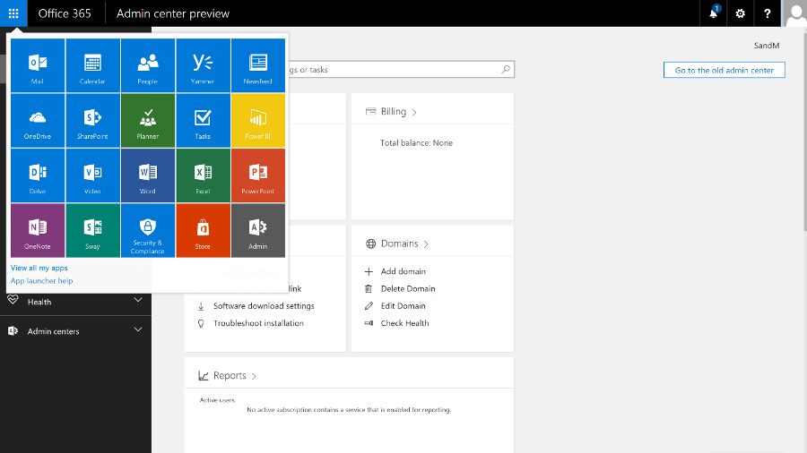
Enterprise business users get a full collaboration service with Exchange email, SharePoint document storage, Skype for Business unified communications, OneDrive for Business storage sync and sharing, Yammer enterprise social networking, Delve for tracking what your colleagues are working on, and Groups for ad hoc collaboration.
All that, alongside an increasing list of new services like GigJam (for sharing just parts of documents so you can have the right information available in a meeting) and Planner (a simple planning tool for groups), plus a subscription to the Office 2016 desktop and mobile applications, which includes early access to new features.
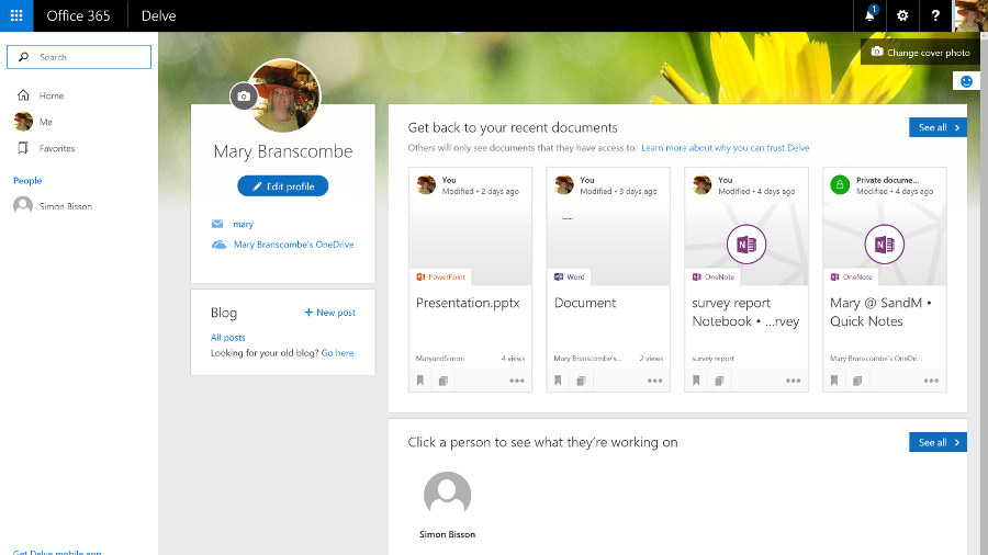
There are several different plans, depending on what mix of services you need. The E5 plan, for example, includes rights management services for encrypting documents and choosing who can see them and how long they're available for, Delve Analytics for tracking how people are spending their time, Power BI for graphical data analysis and business intelligence, and the Office 365 video portal for publishing video inside your company.
In the year since Office 2016 was released, Microsoft has continued to add new features to both the Office 365 service (which you expect in a cloud service) and the Office 2016 applications (which you might not), as well as the mobile versions of the apps for iOS, Android and Windows, new apps like Sway for 'digital storytelling' (that's somewhere between making a mobile app and designing a website), and the Office Online web apps.
That includes new admin features like the new look portal, customising sign-in pages, improved encryption controls, self-service password reset, plus a deal to use Wix to build websites after SharePoint public websites were removed.
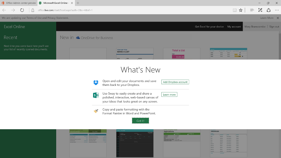
The Office Online apps get regular updates, including new features plus integration with other cloud services like Skype and Dropbox – Word and PowerPoint now have the Format Painter for transferring formatting from one section to another, and Excel Online has more number formats, more features in Pivot tables and a high contrast view for accessibility.
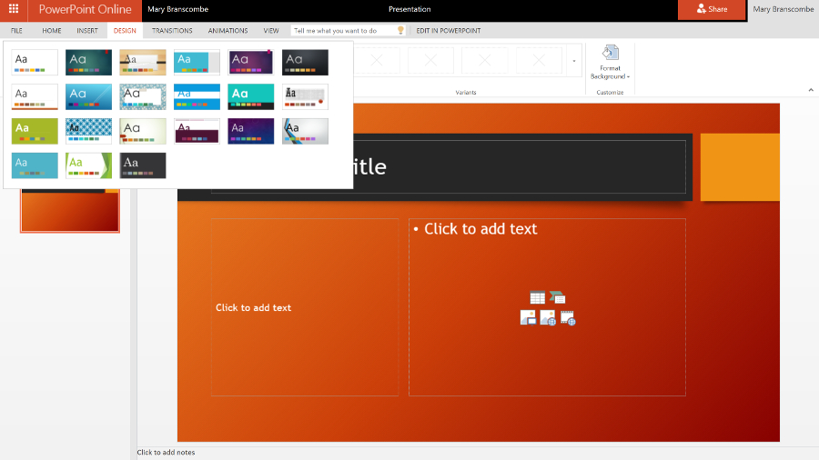
The mobile apps keep adding features like Find and Morph transitions in PowerPoint, or ink annotations in Word, Excel and PowerPoint. You can record audio in OneNote for iOS and on the web; that's better than OneNote on Windows 10 Mobile where audio recordings cut off after a minute.
Because Office 365 is a subscription service, the familiar desktop applications get new features. Word is about to get a spelling and grammar checker that uses machine learning to understand your writing, and a Researcher tool for easier searching for facts and quotes.
PowerPoint has gained several new transitions, a Designer tool that comes up with new looks for your presentation (very much like Sway) and a way to summarise your presentation with Zoom. Excel has new functions and charts and shape recognition when you draw on-screen, plus many more connectors for getting data into Power Query, while Outlook lets you '@ mention' people in email the way you would on Facebook or Twitter.
But the changes also include removing some useful features. Changing the Save As options in Office 2016 has been particularly painful, and Office 365 no longer allows you to temporarily stream Office 2016 to a PC that you want to work on, if the Office Online versions don't have the features you need. Desktop Outlook is going to get the Focused Inbox that's so popular in Outlook for iOS and Android – but it will replace the Clutter feature in Exchange Online that files emails you're not likely to be interested in. Clutter worked in every client that you can read Exchange email in, including on older devices (especially Windows Phone 8.1), whereas Focused Inbox will only work in the latest versions of Outlook.
The enterprise Office 365 service is also where Microsoft tries out new features that will appear in the on-premise server products, like the new SharePoint 2016. Exchange Server 2016 is based on the latest version of Exchange Online, which has been available on Office 365 for some time (and you can buy some Exchange Online features to use with your own Exchange Server, like Exchange Online Protection spam and malware filtering).
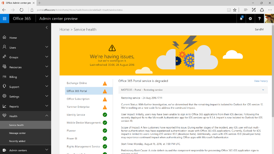
SharePoint 2016 catches up with existing Office 365 features like chatting while you're collaborating on documents stored in OneDrive for Business, and will get newer features gradually. Improvements like the new document library experience, and the suggestions in the new iOS SharePoint app of what sites you should look at, are already showing up in SharePoint Online and will appear on premises once they've been tested in the cloud.
In the past, Skype for Business hasn't had the full unified communications features of the on-premise version because PABX integration is harder in the cloud, but Microsoft has been signing up partners like BT to offer voice services for Office 365, as well as creating cloud-only features like Skype for Business broadcast meetings for very large numbers of users (which will soon include real-time live translation and captions).
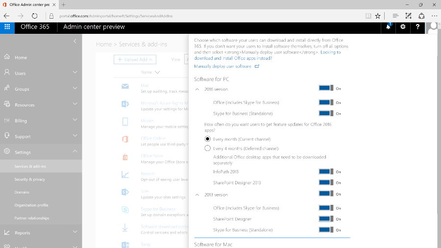
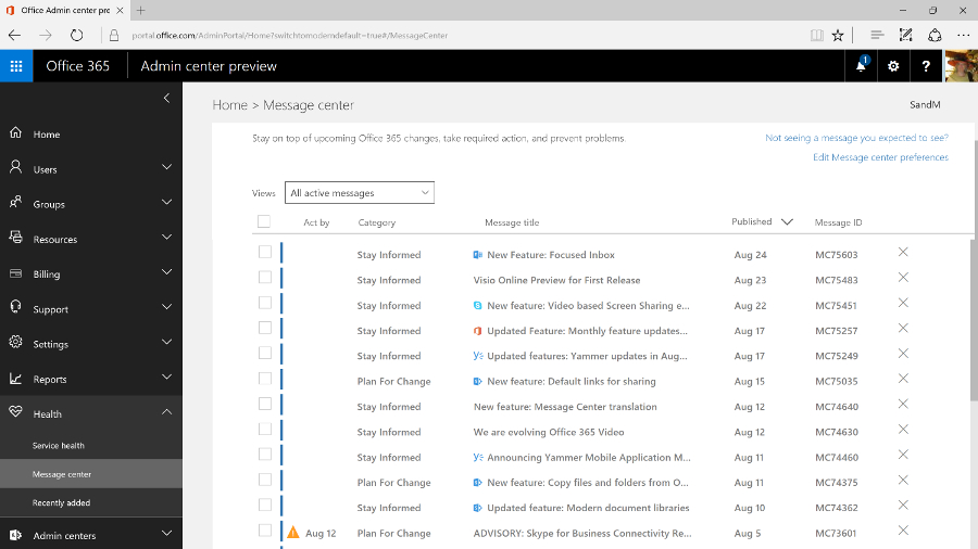
As you'd expect, you manage Office 365 mainly through the browser (although you can use PowerShell commands if you need to change settings in bulk). The admin portal is getting a major redesign that will soon become the standard way to manage the service.
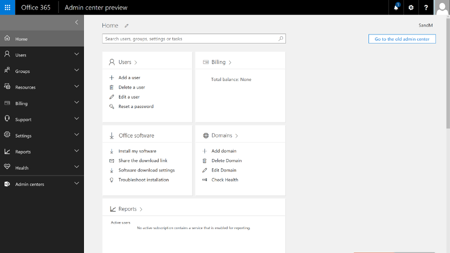
The previous interface had a minimalist, low-contrast, 'Metro' style that wasn't particularly efficient, with key tools relegated to a list of links at the side of the page and a dashboard that always showed the setup features even when you'd been running the service for years.
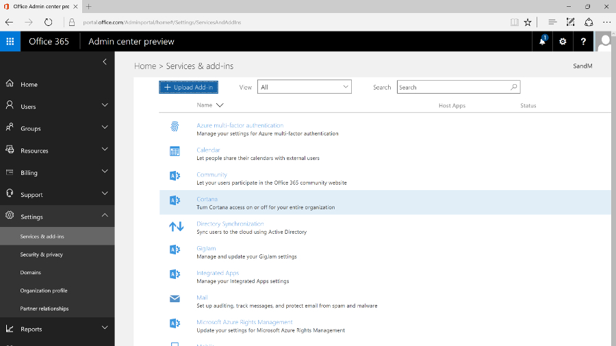
Now there's an expanding menu on the left with ten sections for managing and monitoring the Office 365 service, each of which expands to let you click straight into the specific area you need. This also makes room for features like Groups that have been added to the service over the years, which show up in their logical place (along with the traditional role-based groups).
As you navigate through the different sections, the tools are also grouped logically, and when you click on the details for a user or a group, all the information pops up in a window, with the most common commands (like resetting a password or deleting the user) at the top.
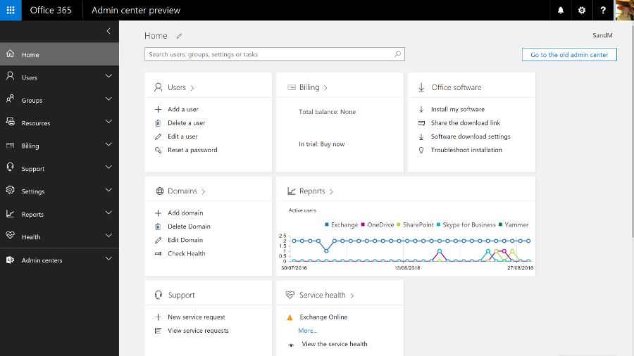
The home screen that replaces the former dashboard is far more useful – and you can even customise it. There are 'cards' for common tasks, from managing users to downloading the Office clients, and you can rearrange them, delete any you don't need quick access to, and add others.
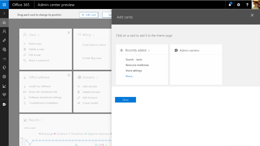
The admin interfaces for Exchange Online, SharePoint Online, Skype for Business and Yammer are now much easier to find as well; they have their own section on the menu, which also links to the new Security and Compliance centre, and to Azure Active Directory (even if you don't buy any of the premium AAD services, using Office 365 automatically creates an Azure AD for your business, but in the past it hasn't been obvious how to get to it in order to carry out any management).
You'd expect Azure AD to open as a separate site, because it's a separate service. It's slightly more confusing that the Security and Compliance centre opens in its own browser tab, but has the same design as the Office 365 admin centre.
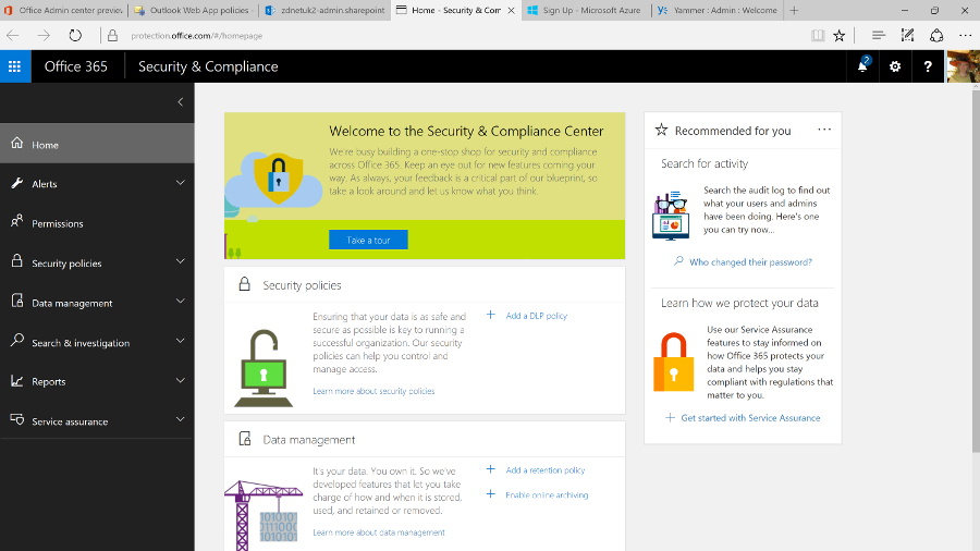
This new portal brings together all the security tools for the service, from assigning permissions to admin users, to managing devices, setting up alerts for user and admin behaviour and choosing how spam and malware in email are handled. All that sits alongside the tools for setting retention policies, running ediscovery searches and archiving content, and details of how Microsoft secures the different Office 365 services.
And it's downright annoying that all the admin portals for the Office 365 services still open in different tabs. Plus they still have the white-space-heavy, hard to navigate interfaces that are basic rather than simple, in which it can be hard to find the tools you need quickly (and Yammer has its own design again). We'd like to see them move to the new portal design too; the current mix of interfaces feels fragmented and confusing.
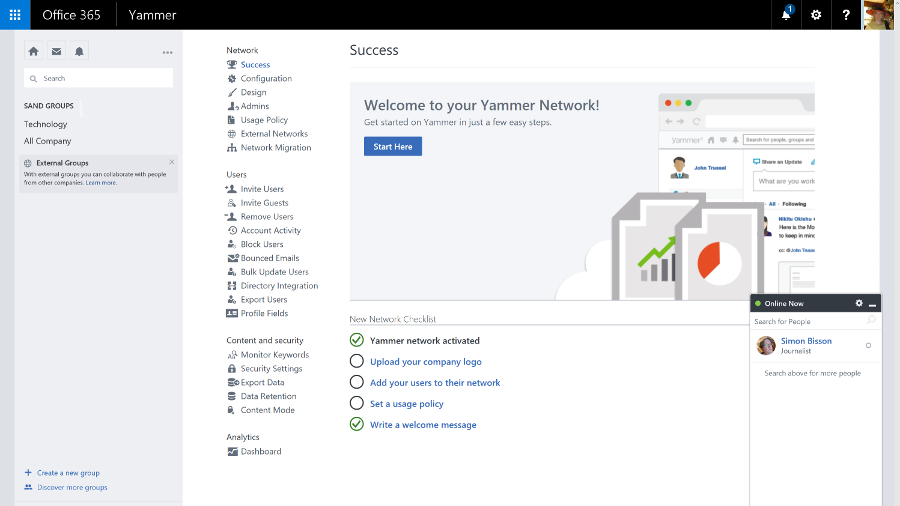
It might even make sense for more of the settings to move to themed admin portals the way the security and compliance options have, rather than matching the admin options for the separate on-premise Office servers. Key settings from the Exchange, Skype for Business and SharePoint services are already duplicated in the new admin portal; if they're all you need, you'll never need to use the full service portals at all.
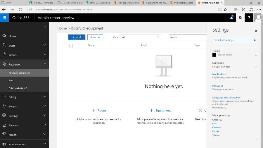
Getting started
Setting up Office 365 is fast – provisioning an E3 or E5 tenant takes only a few minutes – and it's straightforward for a small company, especially if you're migrating from Exchange Online. You can start the wizard to walk you through setup – including connecting to the domain you're using for email addresses, or buying one if you don't already have one – straight from the purchase screen, or you can come back and work through the individual steps later.
You can set up users by connecting to your on-premise Active Directory by importing details (from a CSV file, for example) or by creating users one at a time (that's most suited to a small business); and when you create individual users you can assign licences as you go. If you want to pick and choose who gets which features, you can allocate licences individually for Office 2016, Office Web Apps, SharePoint, Skype for Business, Exchange and any other services.
There are other settings that you can change if you want, but not so many that things get confusing. You can customise the Office 365 theme, set the password expiry policy, choose whether you get new features when they're generally released or try them as soon as they're in preview (and that can apply to all users or just the more advanced users that you pick individually), turn on multi-factor authentication, set the policies for Azure Rights Management if your plan includes this document encryption service, and choose whether users can search Office 365 content using Cortana, or use Office Online to work with files in other cloud storage services like Box.
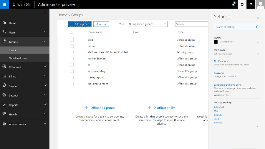
There's more work to do if you have email accounts on other services that you need to import data from (there's an import option where you can upload data or even ship drives to Microsoft if that would take too long), and if you're a large business that needs to mix on-premise servers with Office 365 you'll need to plan which users have accounts where and how you sync between your AD and the cloud service. But you don't have to be an expert to get a small business online with Office 365.
Ever since Exchange 2013, the web version of Outlook has had the same features and interface as the Outlook client – it's also what the Exchange Online admin centre is built on, and you can just mark a user as an administrator. This removes the need for an Exchange mailbox to administer Exchange, so you don't have to waste a mail licence and storage quota on a shared mail admin account. You can also give different administrators limited permissions; if someone only needs to use the compliance or discovery tools, they won't get access to mail flow and user settings.
The admin centre is crammed with features, organised into around a dozen categories. Previously complex tasks, like setting up a federation trust to make free/busy times in user calendars visible or setting up shared mailboxes for call centres, are far simpler and you are guided through important steps (like giving users the right permissions to access the shared mailbox).
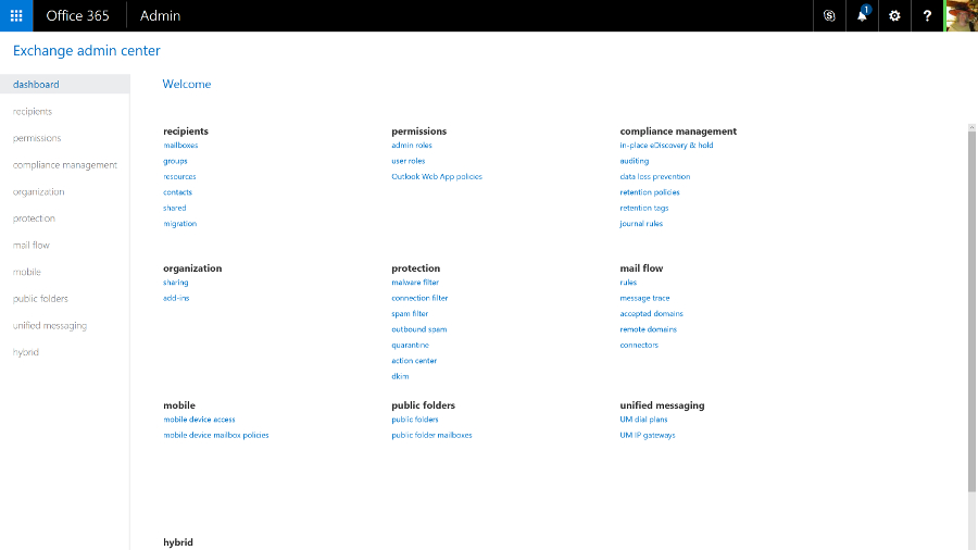
Public folders are still available, by popular demand. Like everything else in the new Exchange Online, they're simple to set up with helpful error messages that make clear what you've done wrong and how to fix it.
There's also a helpful balance between enforcing policy and users getting work done. The data loss prevention tools in the Enterprise version of Exchange Online let you set up rules to stop people emailing personal information like credit card numbers (with a smart check that employs the same algorithm used to issue credit card numbers, rather than just looking for any 16 numbers in a row).
But users can also override most of these policy warnings by filling in an explanation and confirming they know the message will be logged. The information can be encrypted to keep it safe until the manager approves the explanation.
The tips reminding users of the policy show up in Outlook clients, and Outlook webmail. But if you send a message from your smartphone that breaks a policy, the rule can forward the message to your manager or mail you to confirm that you meant to break the policy.
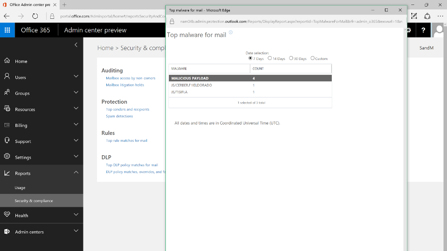
But while the ultra-minimalist, white-space design is well organised, and will be familiar to Exchange Server admins, it doesn't match the style of the new Office 365 portal. There is also quite a lot of overlap – many tools from the Exchange Online portal also show up as links in the main portal to the auditing, mail flow and information protection tools (spam and malware protection and data leakage policies that block or warn users who are trying to send details like credit card numbers in email). These open the tools in either the Exchange Online or Security and Compliance portals.
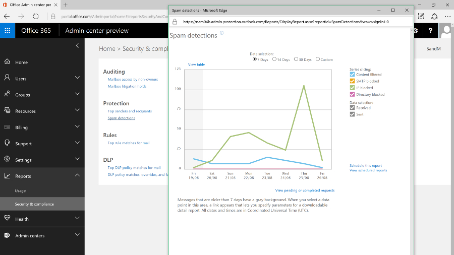
There are also some settings you might expect to find in Exchange that are in the main Office 365 portal, like choosing whether users can share their calendars with people outside your organisation.
Like Exchange Server, you can use Exchange Online for mobile device management by setting policies that will apply to any smartphone, like forcing the user to turn on encryption and set a PIN, and even setting how often they have to re-enter it.
Office 365 also includes Microsoft's Intune MDM service which adds extra features like detecting whether devices are jailbroken, and letting you mark emails and documents that can only be opened in approved mobile apps, like Office, and only saved in specific locations. You can also selectively wipe devices, removing business data but not personal photos and information.
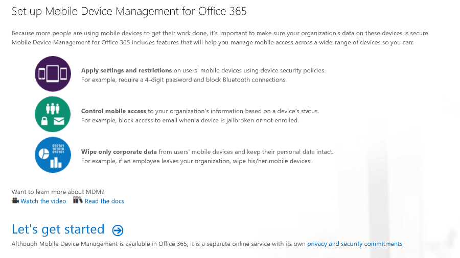
The Exchange tools for managing mobile device access are still in the Exchange Online admin portal, which is where admins who are used to Exchange Server will expect to find them. The Intune MDM features are in the Security and Compliance centre – and yet again, that opens a new browser tab, because it has its own interface.
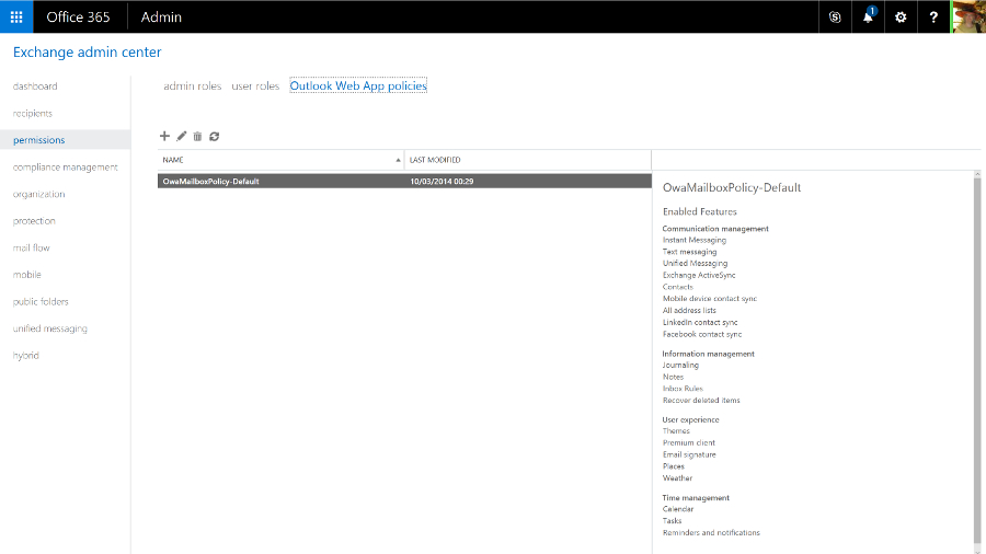
This is the kind of duplication we expect Microsoft to clean up as it continues to improve the Office 365 admin UI, and the disparate interfaces shouldn't distract from the fact that you're getting a powerful mail system with all the options you need. And if you don't need to delve into those options, you can be up and running quickly with a rock solid mail system. Exchange Online remains one of the crown jewels of Office 365.
If you've used Office 365 before, you'll remember the admin portal for the unified communications service formerly known as Lync was distinctly minimal, with very few settings you could change. As Skype for Business gains more features, there are correspondingly more options and controls, but it's a far cry from the complexity of the on-premise version; this is one of the services where being in the cloud makes unified communications dramatically simpler.
Now that Skype for Business can connect to Skype, you can control that integration, as well as allowing or blocking calls and chats with Skype for Business users outside your company, and choosing whether the Skype Broadcast service is available for creating large public online meetings. Again, the controls for external connections are duplicated in the main Office 365 admin portal – for many businesses, they're the only settings you might want to change, so you might never need the full admin centre.
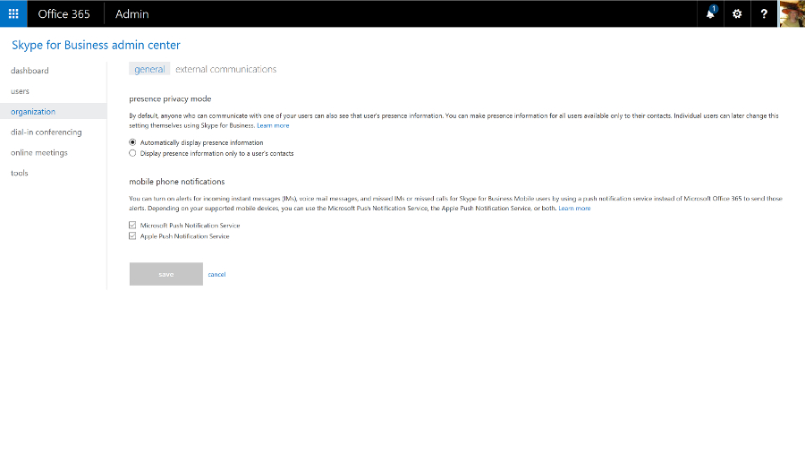
You can also set the defaults for notifications and privacy mode and add your own boilerplate to meeting invitations. You can include your company logo, links to support, any legal terms and conditions that apply to meetings, or a few lines of text you wish to be included in all invitations.
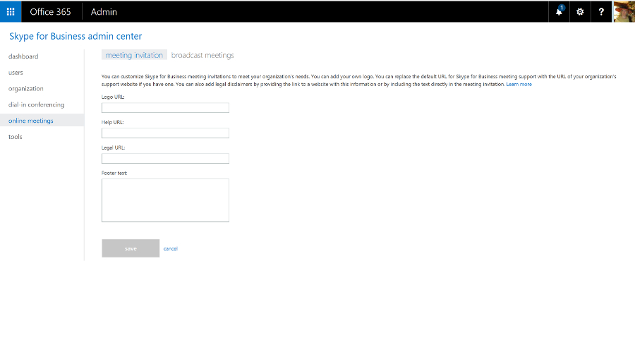
You can use Skype for Business for dial-in conferencing, with or without toll-free numbers, so your users can phone in rather than using the Skype for Business client – that's included in the E5 Office 365 plan, or you can buy it as an add-on. You can also use PSTN Calling to call standard phone numbers and receive calls from anyone, not just other Skype for Business users (again, that's included in some plans but not in others – confusingly, there's a version of the E5 plan that has it, and another that doesn't).
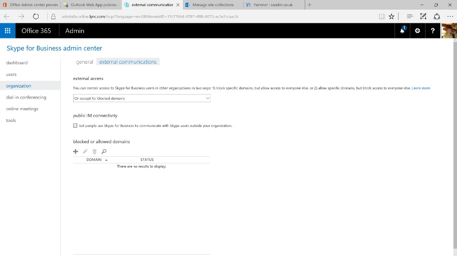
You can even use Skype for Business as your PBX – as well as making and receiving calls, you get PBX features like transferring calls, having several phones ring when a call arrives, putting your phone on 'do not disturb' except for a few key contacts, playing hold music and handling voicemail. Again, you need the right licences.
The admin centre also includes a handy list of tools for troubleshooting, and a very minimal set of reports.
Lync Online was already an impressive HD videoconferencing system with excellent tools for online meetings. The Skype integration makes it a great choice for letting your customers and partners reach you without the cost of a phone call, and if you add the dial-in conferencing, PSTN calling and PBX tools, it's close to being a cloud service that offers a full unified communications system. But buying all those options as separate add-ons, some from third-party communications providers, does make everything more complicated than we'd like.
For a while, SharePoint Online was the red-headed stepchild of Office 365. The name didn't even appear in the list of apps – users just saw links to OneDrive and Sites – and the ribbon-based interface felt dated and out of step with the rest of Office 365.
But cloud competition like Box and Dropbox hasn't killed off SharePoint, and even though the personal cloud storage of OneDrive for Business is still part of Office 365, Microsoft has just given SharePoint itself a major refresh that updates the key features for document sharing and collaboration, and adds far better mobile support.
SharePoint Online also connects to the new services Microsoft has been adding to Office 365 like Groups and Planner, making the collaboration options feel more coherent.
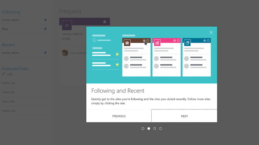
Sites for personal and shared team use and document libraries are still at the heart of SharePoint – document collections can now be as large as 25TB, and there's a new document library experience that looks much more like OneDrive, or a blog.
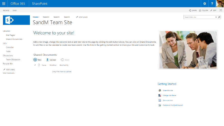
Team sites automatically show popular documents and details of who in the team has been working on what, and there are new tools for creating pages on the site as if you were writing and publishing a blog – so you don't need to create HTML or use a separate publishing tool any more. Just pick web parts – images, events, links, videos, Yammer feeds – and drag them into place.
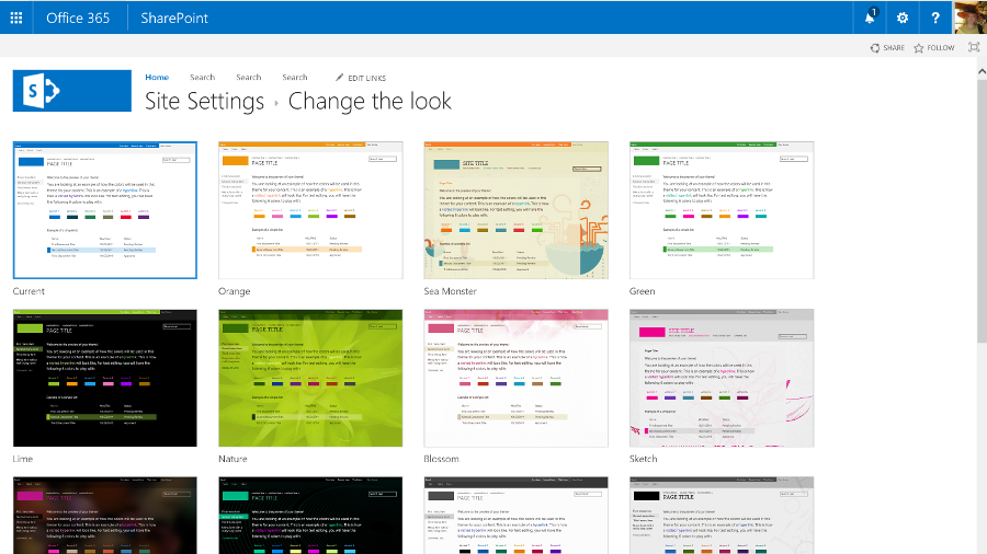
Some Office 365 plans include the SharePoint Video service, for uploading and streaming videos. This is going to be replaced by the Azure Streams video service, though not until the new service has all the same features as the existing one.
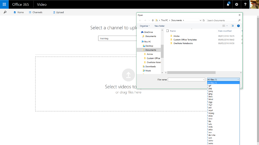
All the existing options for customising SharePoint are still available. You can include language translation services for sites and documents, and for structured tasks you can add workflows designed in Visual Studio and have them hosted on Azure, or you can create a Flow or a PowerApp on Azure that lets you configure workflows that connect other services – like Salesforce or Dynamics – to SharePoint.
If you need the same kind of full-trust managed .NET code that lets you customise SharePoint on your own server, you can put that on Azure. As a multi-tenant cloud service, SharePoint Online has to protect users from each other's potentially performance-hogging code, so this is a sensible approach. But many of the features you'd once have built that way are available as apps written in HTML and CSS that run on SharePoint: you can get blogging tools, mapping tools, address checking tools and more – and admins can choose which apps are available in the SharePoint Store and who is allowed to buy more.
Plus SharePoint 2016 adds a new extension framework based on common JavaScript frameworks like React and Angular, where the code runs on the client device, not on the server. That's still in development, but it brings SharePoint up to date with the latest web development technologies.
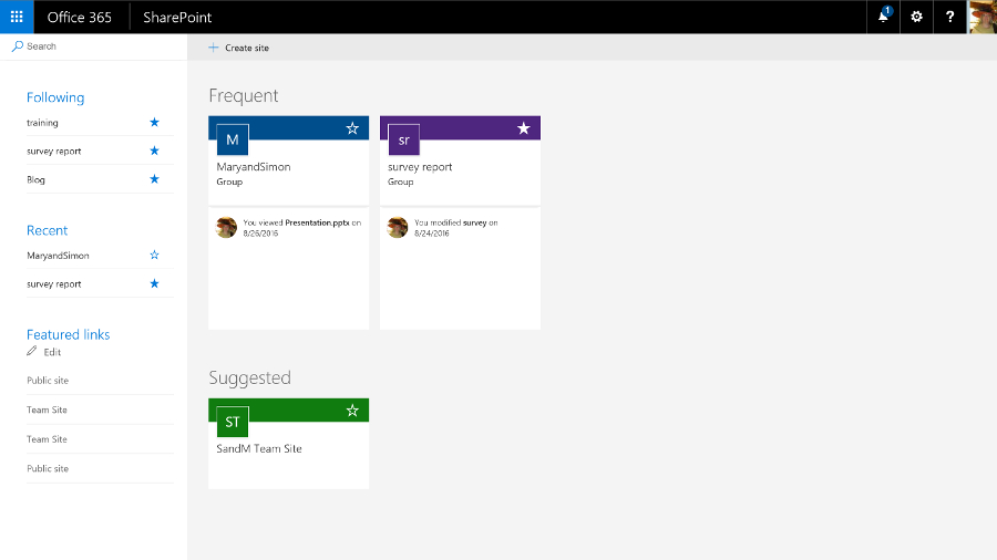
SharePoint also has a new way of controlling access. Admins can still grant and block access to SharePoint sites, but team sites work with the new, self-service Groups feature in Office 365. Anyone can create a group of colleagues and the group automatically gets a team site with a document library, a shared calendar and inbox, a Skype for Business chat room that you can also get as email, along with a OneNote notebook, an always-on Skype conversation you can drop in and out of, and the new Planner task management tool.
It works the other way round, as well; make a team site or add colleagues to Planner and you create a group.
Planner is like a simple version of Trello – you create a card for each task, assign it to someone and save it into different 'buckets' that you use to organise your plan. It doesn't have much in the way of notifications yet, but Microsoft is adding features quickly.
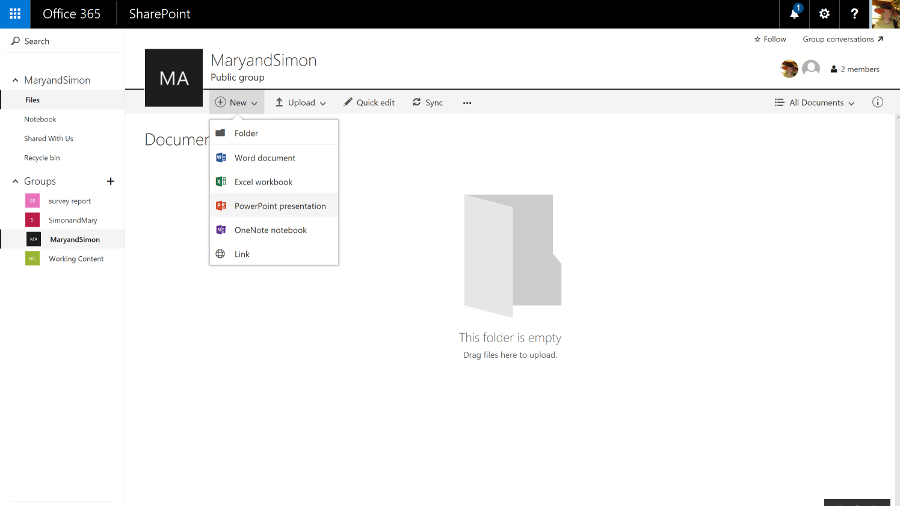
Groups also have the kind of connectors you might have seen in Slack. You can connect a Twitter feed or a variety of services like GitHub, Trello and ZenDesk to a group to get alerts – so you could follow the hashtag for the product your team works on, or see customer support issues in the group.
You can search across all the sites you have access to and when you find a useful document, you can follow it as if it was a friend on Facebook. Results include automatic recommendations based on what the people you're connected to are working on, and your previous behaviour. That's based on the Delve feature, which analyses what documents your colleagues are working on that are relevant to you – you can see that in the Delve service but the information will now show up in SharePoint too.
Search is smart: search for 'marketing deck' and results will include PowerPoint presentations (that don't have the word 'deck' anywhere in the contents), with particularly relevant slides highlighted in the results.
The SharePoint newsfeed is still available if you want to use that to keep track of what's going on. This looks very much like Facebook or Twitter – you can follow people, sites, projects, hashtags, documents and events, and you'll see in the activity stream when someone does something new or makes a change (you can filter the stream to make it more manageable). You can also preview documents and videos straight from the Newsfeed, or turn any item into an action that becomes part of your task list.
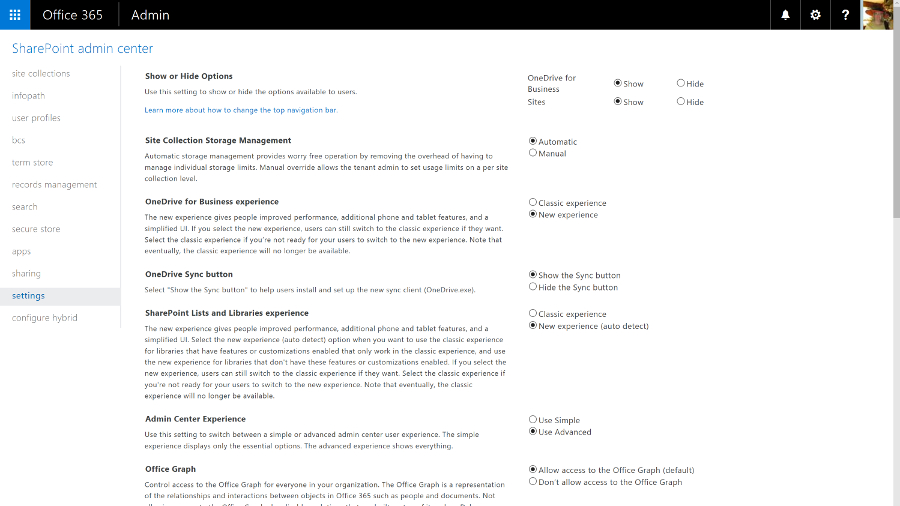
You use Twitter-style @ names to mention people and you can see when other people have mentioned you (you get an email as well as seeing it on the Newsfeed, so you don't have to update feverishly to stay on top of work). Also, you can post your own updates to everyone or just the team you're working with.
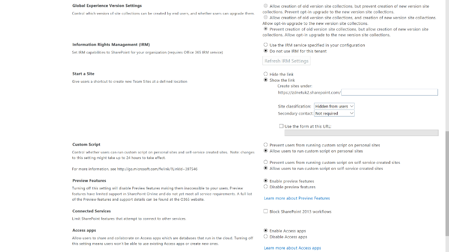
But now that the Yammer social network service is available to all Office 365 customers, you can switch to using that instead. It's a much more powerful tool for collaboration that's getting regular updates – and again, it's going to integrate with Groups soon, so a team can choose to collaborate through Yammer or the other Groups tools.
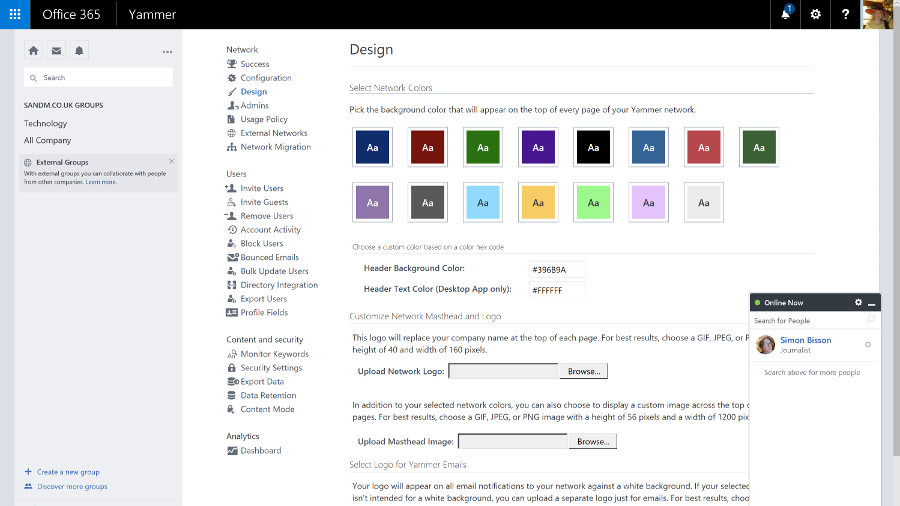
You can view and edit documents in the Office Online web apps, and you can preview file types you can't edit, like Visio. Sharing documents – with colleagues or up to 10,000 external partners and customers who don't need to have SharePoint themselves – is also much simpler. Click on the sharing icon and type in names or email addresses, choose whether they can view or edit – or copy an obfuscated URL you can send in an instant message or put in a blog post.
Shared documents are marked by an icon you can click to see who you're sharing with (and you can stop sharing a document when you're done collaborating). Many Office 365 plans include Azure Rights Management Services, so you can control not just who can see a document but what they can do with it, turning off the printing and copying functions for confidential information.
SharePoint started out as a way to share document libraries and create workflows. It's now a flexible collaboration tool for ad hoc groups as well as a formal, centralised information store, with mobile apps as well as simple web publishing.
The SharePoint Online admin centre reflects that. There's a long list of settings that lets you control apps, connections, rights management, collaboration and whether users get new features and the new OneDrive for Business interface.
For many smaller businesses, that's all you need and you can hide the other controls. But if you need them, there's a full set of configuration options for everything from InfoPath to the taxonomy for how documents are indexed, in an interface that SharePoint Server administrators will find familiar (although it's going to confuse anyone starting with the new Office 365 admin centre).
OneDrive and OneDrive for Business
Microsoft uses the same name for its business and consumer cloud storage services: OneDrive and OneDrive for Business are now more similar than they used to be – in particular they use the same sync client, which fixes a lot of problems with OneDrive for Business – but they're still different services.
OneDrive is Microsoft's consumer cloud storage service, which gives users 5GB of free storage with the option to purchase 50GB for $1.99 a month (£1.99, AU$2), plus Office Web Apps. If you buy Office 365 Home, Personal, or University, you get 1TB of OneDrive space.
OneDrive for Business is the cloud storage service that's part of the business Office 365 plans (and also available as part of on-premise SharePoint Server), with either 1TB or 5TB of storage per user, depending on which plan you choose.
Office 365 tenants also get SharePoint Online, which includes 10GB of secure cloud storage with an extra 500MB per user, and the option of paying for up to 25TB of storage in total. You can choose how the SharePoint space storage is allocated between users and control how they use it, like limiting who they can share documents with or forcing them to encrypt confidential documents using rights management software.
OneDrive for Business, which is confusingly labelled OneDrive in the Office 365 portal to fit on the ribbon, lets users store their own working documents privately. If you're familiar with SharePoint, you can think of it as like the storage in My Site – and documents can still have workflows or be checked in and out.
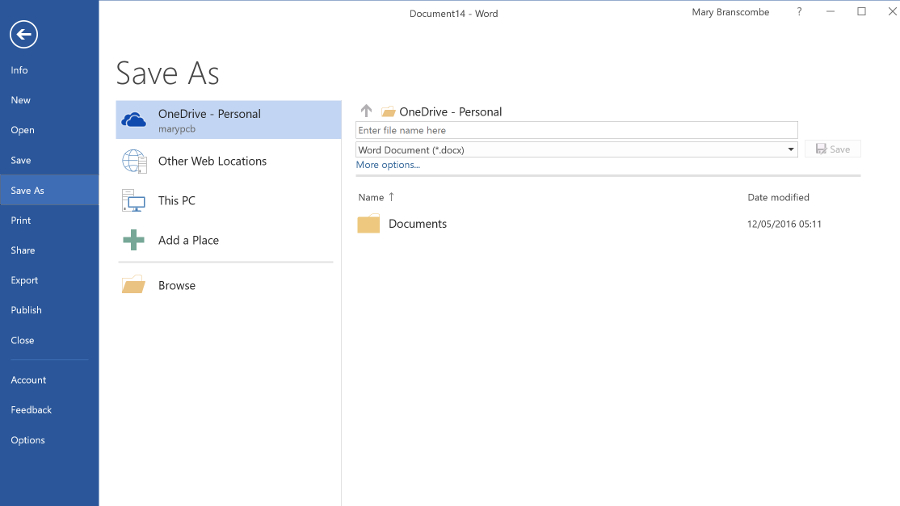
Users can also share documents with specific people – inside or outside the company – by clicking the three dots next to the file name and choosing Share, or from the properties and preview pane for the file. This interface has been updated a couple of times but it's still easy to share documents and see who has access.
Users can choose whether each person they invite can edit or just view the document and whether or not they need to sign in (it's possible to choose whether to enforce sign in globally). It's very clear if a document is shared and with whom, and you can stop sharing a document at any point. OneDrive for Business storage is part of SharePoint and you can apply policies to it in the same way.
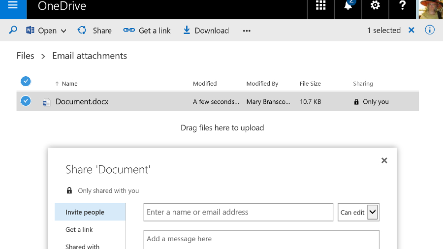
If you want to share a document in OneDrive for Business with everyone (including those to whom you give the URL of your OneDrive for Business), you can move it into the Shared with Everyone folder by default.
If you want to make it available only to a specific group of people, you can put a document into the library for a Team Site instead. That uses the SharePoint tenant storage and you can get those files onto a PC by opening them from SharePoint Online, opening the document library in Explorer (from the ribbon on the SharePoint site) or syncing the document library as a list in Outlook. Team mailboxes also save information into the SharePoint library.
Although the range of storage and sharing options in Office 365 sound confusing, in practice they make a lot of sense. Users get the option to stick to SharePoint shared document libraries or use something that looks like popular free cloud storage services – but which gives you control and security.
Sharing documents is simple and users can easily collaborate (they can even edit the same document simultaneously, in the Office desktop applications or the Office Web Apps) but again, you have tools to control this.
When it first came out, Office 2016 had excellent integration with OneDrive, on both Mac and Windows, letting you browse your online folders and see the folders you'd used recently right on the Backstage menu. A recent update stripped that out on Office 2016 for Windows, replacing it with a very slow dialog that doesn't show any recent folders at all – and doesn't even show you what the file name will be. It's a definite step backwards.
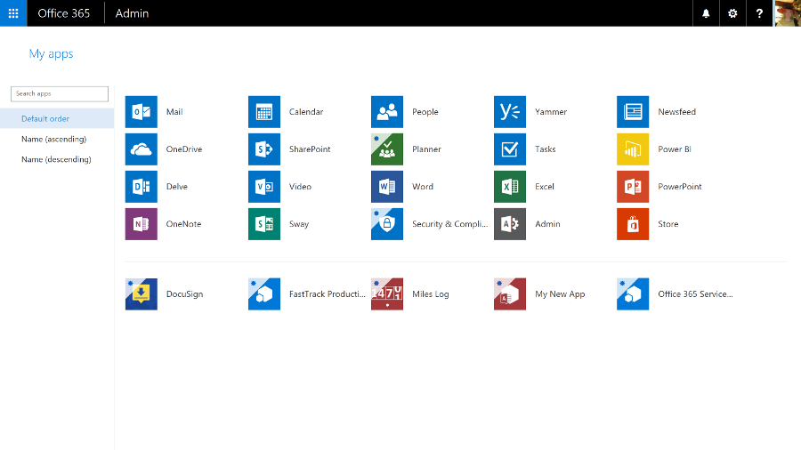
What else is in Office 365?
Depending on which Office 365 plan you choose, you'll get a range of new apps and services. All the plans include Sway, a new authoring tool that uses machine learning to do a lot of the layout work for you, creating responsive layouts that work on smartphones as well as desktop web browsers.
Business plans include the Planner service, as well as GigJam, a collaboration service that lets you share specific pages inside a document – you can just cross out pages and paragraphs you don't want colleagues to see. It's an interesting idea that needs a lot more work to be really useful.
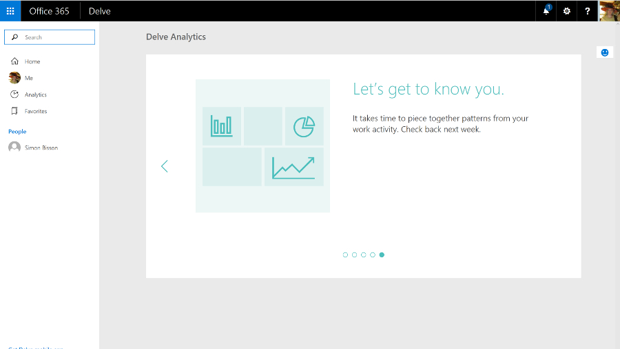
The E5 plan includes the Power BI cloud service that lets you visualise information in charts and dashboards, and an extra tool in Delve called Analytics that analyses your working habits to tell you how much time you spend in meetings and email compared to your colleagues, to help you make the most of your time.
There are also related Office services you can add to Office 365, like Project Online, which is a full-fledged portfolio project management system.
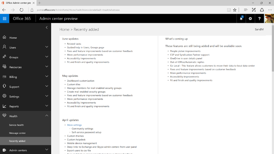
Expect Microsoft to keep adding new services to Office 365 – like the ones it plans to create from LinkedIn.
Office 365 is hands-down the best way to buy Office, whether you're a consumer user wanting the Office desktop apps with all the latest features, or a business that needs email and collaboration tools without the hassle of running your own servers. Yes, you pay a monthly fee, but you keep getting new features as well as useful cloud services.
We liked
The new Office 365 admin centre is a real improvement, making it easy to find features that used to be tucked away inside specific services
Exchange Online is one of the best business email systems around, and no-one knows how to run it better than Microsoft. Skype for Business has gone from VoIP meetings in the cloud to something that can be a full unified communications service – if you're prepared to pay for all the conferencing and telephony services you need to make it work. And SharePoint is getting a much needed refresh, plus the formerly infuriating OneDrive for Business is now both usable and reliable, and Groups give teams a simple way of working together on projects.
We disliked
Overall, the Office 365 admin interface remains disparate and disjointed; Microsoft needs to do more work here. In part, that's due to the overlapping tools, from the formal systems that replicate the server options larger businesses want – especially if they're migrating to the cloud – to the simpler, ad hoc tools based on Groups that are more approachable but also sometimes lack features. Whatever you need, you can probably do it with Office 365 – if you can find out where and how.
If you want the latest features and improvements, you need to opt-in to try previews – but that can mean losing useful options as well, like the confusing changes that make the Save As dialog slow and unwieldy in Office 2016. If you don't get features in preview, it can still take a long time for them to reach all the Office 365 tenants once they're supposed to be available.
Final verdict
Office 365 is a reliable service that integrates email, document sharing and conferencing almost seamlessly with the latest desktop versions of the Office software – which now get regular updates and extra features – and is evolving new cloud tools and services like Sway and Planner.
It's simple enough for small businesses and also has powerful options for larger companies, who will find that the savings from putting commodity IT in the cloud, while still being able to integrate with on-premise servers through Active Directory and hybrid Exchange deployments, make the combined subscriptions for server and desktop products very attractive.
You do need to pick the right plan though – there's a confusing number of them, all with slightly different features. This means you don't have to pay for services you don't need, but it also makes it hard to point at Office 365 and know exactly what you'll get.
Microsoft has officially released Office 2016 for Windows and it is available for consumer customers (Office 365 Home and Personal) immediately for download. Mac users have already been able to download Office 2016 for a few weeks already.
Office 365 will likely keep its name and could be joined by Windows 365 as Microsoft will apparently add a subscription option to Windows 10, and it has trademarked that name. Amongst the flurry of features added to Office 365 in recent times, the ones worth highlighting are:
- Branded sign-in which will allow customers to customise their sign-in page and access panel.
- The adoption of an international standard for protecting personal data storage on Microsoft's cloud infrastructure.
- The introduction of a self-service password reset feature that doesn't involve the system admins.
- The ability to build websites within Office 365 in partnership with Wix.
- Significant changes to OneNote including OCR capabilities and new features added to the free version.
- Outlook for iOS and Android getting enterprise features like pin locking and faster remove wipe execution.
- iCloud integration for Microsoft Office on iOS as well as Box, Citrix and Salesforce integration.
Microsoft acquired Sunrise, a popular calendaring app for touch devices, which is likely to be incorporated into Office 365. Calendaring has been one of the areas where Microsoft hasn't devoted as much resources as many would have expected especially with the rise of mobility.
Microsoft also bought Acompli (which it almost immediately turned to Outlook), LiveLoop for to prep ip PowerPoint and 6Wunderkinder for its popular to-do-list application.
The company also announced that it was giving away 100GB of free storage for a year to existing Dropbox users to lure them away from the popular cloud storage provider – which incidentally is a close Microsoft ally.
That bonus is on top of a 100GB giveaway of OneDrive storage for two years if you subscribe to its Bing Rewards scheme. Your files will be read only after the subscription ends unless you buy a top-up and if you want to get a cheap one, Ebay seems to be the place to go with plenty of deals available for Microsoft Office 365 Personal available for less than £40.
Okay, let's move on to the most recent developments over the past couple of months. Microsoft recently announced that it has updated Office 365 for Exchange Online, so that users will no longer have their emails automatically deleted after a period of 30 days. Previously, deleted items were shifted into the Deleted folder before disappearing from there after 30 days, but the new update allows the system admin to change this period to a different length, or simply to set all emails to be kept indefinitely.
Also on the email front, Microsoft has just updated Office 365 to allow users to send email attachments which are far, far bigger than was previously possible. In fact, attachments can now be six times as large, with the new size limit being 150MB (whereas Office 365 users were limited to 25MB before – that said, note that the 25MB limit will remain in place unless the administrator actually changes things).
Video content is an arena Redmond is moving to cover with its subscription Office suite, as well, with the creation of the Office 365 Video portal that allows businesses to distribute videos internally. This is a free additional service which is currently in the process of rolling out globally for Office 365 enterprise users, in order to provide a fully integrated solution for video sharing within an organisation with security in mind. Office 365 Video employs an HTML5 player so it can work across all devices from mobiles to desktop computers, although Microsoft is also producing an app for iPhone users.
Furthermore, Redmond has bolstered Office 365 with the addition of mobile device management (MDM) again free of charge, at least for those on commercial plans. System admins will be able to use these features to manage access to data over a range of devices and platforms, from smartphones upwards and on Windows Phone, Android and iOS.
This will put in place measures such as the detection of jailbroken devices, and will allow for security policies to be set up to ensure that certain business emails or documents can only be accessed on approved devices. A selective wipe feature will strip corporate data off a device running Office 365, without touching any personal data on said piece of hardware.
Another major move on the security front which has only just happened is Microsoft and Samsung's announcement of an agreement, following settling their legal arguments over Android, whereby a version of the Office 365 suite will come to Samsung's Knox. In other words, Excel, Word, PowerPoint, OneNote and OneDrive for Business will be included wrapped up in the Knox container.
Redmond has also just changed things with Office 365 so that documents can now be exported in the Open Document Format (ODF), to bring the suite in line with UK government guidelines on document sharing.
Recent news
The following is a list of updates to the Office 365 suite going back from August to the beginning of 2016:
August 2016
- Microsoft is going to more tightly integrate Office 365 and Windows 10 by implementing an 'Office Hub'that offers easy access to your documents from within Windows.
- Office 365 saw the introduction of a Service Assurance Dashboard which provides a range of details on privacy, security and compliance controls, including third-party auditing.
- Microsoft said that the rollout of the overhaul of Outlook.com, which brings fresh Office 365 features to users of the webmail service, has been further delayed.
- Office 365 Education introduced a raft of new features including Microsoft Classroom, School Data Sync, Microsoft Forms, and Learning Tools.
- Microsoft brought some new ink effects to OneNote, and also the ability for the app not just to convert a handwritten equation to text, but also to teach you how to solve it.
- Two new Visio apps popped up: Visio Online Preview which allows users to view and share Visio diagrams with only a browser, and the Visio for iPad app.
- Various accessibility updates were applied across Office 365, including tweaks to make Narrator (the screen reader) a better experience in Word, Outlook and SharePoint.
July 2016
- Microsoft highlighted two major new features coming to Word – Editor and Researcher, which help with proofing/editing, and citing sources respectively.
- A new service arrived in the form of Microsoft Bookings, which gives Office 365 business users a hub web page that allows customers to schedule appointments.
- Microsoft announced that Office 365 now has 23.1 million subscribers.
- The free preview version of Microsoft Stream was launched, a YouTube-style service for businesses which will eventually become the de facto video experience in Office 365.
- The Secure Productive Enterprise offering was revealed, bundling Office 365, Windows 10 Enterprise (in its new E3/E5 cloud-based form) and Enterprise Mobility + Security suite.
- Redmond released a free videoconferencing tool for SMBs, noting that Office 365 business subscribers get similar facilities on a much grander scale via Skype for Business.
- Microsoft revealed that later in 2016, Office 365 users will get a preview of an automatic live translation caption service for Skype Meeting Broadcast supporting 40 languages.
June 2016
- Microsoft Planner was rolled out to Office 365 users worldwide, an app which lets you tackle project management in a fresh and user-friendly fashion.
- Microsoft made a number of tweaks to Sway, its 'digital storytelling' app, including upping content limits so you can use more photos, videos and so forth in your Sways.
- Outlook received some new features to help users better manage their travel plans and track the status of package deliveries.
- Excel got a new set of Power Query features designed to make working with and getting the most out of your data easier.
- A new Office 365 admin app was pushed out with a more slickly designed interface that makes important information easy to spot at a glance.
- A new SharePoint mobile app was also launched for iOS offering quick and easy access to your company's portals, sites and resources when you're on the go.
- The preview version of GigJam – a collaboration app inbound for Office 365 that allows users to easily share all manner of content – was made available to all comers.
- Office 365 was struck by a major ransomware attack that exposed some 57% of its 18.2 million subscribers to phishing attempts.
May 2016
- Office 365 Business was enhanced to allow co-editors to chat in real-time when collaborating on documents stored in OneDrive for Business or SharePoint Online.
- Accessibility improvements, including a new high contrast theme, were applied to Office 365 to make it easier for the visually impaired to work with the apps.
- Microsoft tweaked security for Office 365, with Exchange Online Protection getting safety tips that give warnings about suspicious emails.
April 2016
- Office 365 received a front-end facelift with a new welcome page designed to be more helpful and intuitive.
- Redmond bolstered the capabilities of Microsoft Graph, meaning that going forward developers can build better and smarter apps powered by data drawn from Office 365.
March 2016
- A new admin centre arrived on Office 365 boasting powerful search functionality and enabling easy access to in-depth reports.
- Office 365 Connectors were introduced, allowing apps and services to be hooked up to Office 365 Groups, so notifications from said apps automatically get sent to the Groups shared inbox.
- Office 365 became the only non-Apple accessory offered to those purchasing iPads online.
- Google expanded its Identity Platform, which is made up of a number of solutions including Google Sign-In, to cover Office 365.
- And as March ended, we discovered that according to one study, Office 365 is the king of all business web apps.
February 2016
- A ton of improvements were applied to Excel including new functions to make building common calculations an easier process, and deeper integration with Power BI.
- Outlook also got some attention with a new system that lets users easily archive messages, and a new Groups section was added to the ribbon.
- We saw a leaked pilot web page that indicated Redmond's incoming premium email service, Outlook.com Premium, will be free for Office 365 users.
January 2016
- Microsoft extended its Office Insider preview program, which allows the curious to test early builds, to include Mac users.
- Redmond introduced new inking features for the Office for iPad apps, allowing for scribbling on documents with a stylus or your finger.
!!!!!!!!!!
Popular Posts
-
SE Ranking has emerged as a useful tool in the digital marketing industry, revolutionizing the way businesses manage their online presence....
-
The iPhone SE is still going. Holding out against its big-screen siblings, this 4-inch handset continues to offer a compact, one-handed use ...
-
If you’re looking for the best email marketing software available today, we highly recommend considering GetResponse . This popular softwa...
-
While HDR (high dynamic range), a display technology that offers higher contrast and more vivid colors, is becoming ever more commonplace i...
-
HomeByMe is another web-based 3D home design tool. The photos on its front page sure make for an enticing service, so let’s take a look at...
-
Between the predictable spells of rain, the 2019 Cricket World Cup has delivered all the scintillating action that we'd been waiting fou...
-
Presidents' Day 2020 has officially arrived, and that means you can find incredible deals from retailers like Best Buy, Walmart, and Ama...
-
Two-minute review Jump to... (Image credit: Samsung) Release date and price Design Camera Specs and performance Should you ...
-
One-minute review Once known for some of the best video doorbells , Ring has steadily been increasing its range of products to include sec...
Blog Archive
-
▼
2018
(3574)
-
▼
January
(236)
- Samsung Gear Sport review
- iPhone X review
- Nvidia Shield (2017)
- Corsair Void Pro RGB Wireless
- Acer Aspire 5
- Garmin Vivofit 4 review
- Best Upcoming Smartphones of February 2018 – Expec...
- Honor 9 Lite
- Google Apps for Work (G Suite) 2016 review
- Microsoft Office 365
- Kindle Oasis
- Tamron 18-400mm f/3.5-6.3 Di II VC HLD
- New iPad (2017)
- Samsung Galaxy S8
- Xiaomi Hosts IPO Kick-off Meeting, Expects US$100 ...
- Creative Sound BlasterX H7 Tournament Edition
- LG Q6
- Samsung Notebook 9 (2016)
- Samsung Notebook 9
- Fluance RT81 turntable
- JBL Bar 5.1
- Asus Zenfone 5 Max with Android 8.0 Oreo Gets Wi-F...
- Toshiba 55U7763DB 4K TV
- Sony Xperia L2
- Google Completes $1.1 Billion Deal to Acquire Part...
- Sony Xperia XA2 Ultra
- Sony Xperia XA2
- Tamron SP 24-70mm f/2.8 Di VC USD G2
- HTC Vive
- Oculus Rift
- PlayStation VR
- Taotronics TT-BH22 Noise-Cancelling Headphones
- Blackview BV9000 Pro
- Iolo System Mechanic Pro
- Sony Xperia XA1
- Sony Xperia XZ1 Compact review
- Huawei P10
- OPPO Patents Foldable Smartphone with Dual Cameras...
- Philips OLED 973 TV
- Nokia 6 review
- Honor 9
- Vivo Xplay7 Smartphone with 4K Display, Snapdragon...
- Nokia 8
- Philips 7303 Series 4K HDR TV
- Samsung Galaxy S8 Plus
- BenQ W1700
- Huawei MediaPad M5 Android Tablet Without 3.5mm Au...
- Vivo X30 Might Sport Full Screen Display with iPho...
- Samsung Galaxy A8+
- Nokia 7 Plus With Snapdragon 660 SoC Spotted on Ge...
- Exclusive – LG G6 Compact / G6 Lite with Lower Sto...
- GoDaddy Website Builder
- Nest Thermostat E
- Xiaomi Rumored to Launch Mi MIX 2S Bezel-less Smar...
- Sling TV
- Philips PUS6703 (6-Series) 4K HDR TV
- Lenovo Star Wars: Jedi Challenges
- Sony Xperia L1
- Google Pixel Buds
- Apple HomePod
- Moonfruit
- Xiaomi to Launch Mi Box 4 Powered by Android on Ja...
- iOS 11.3 Beta Hints the 2018 Apple iPad Pro to Fea...
- Sonos One review
- Microsoft Surface Pro
- Samsung Gear VR
- SteelSeries Rival 600
- Medion Erazer P7651
- HTC U11 Plus review
- Huawei’s Honor is the Top Smartphone E-brand in Ch...
- Jio & Xiaomi Might Partner to Sell Mi Smartphones ...
- 1&1 MyWebsite
- HiMirror Plus+
- LG SJ8 Sound Bar
- TicWatch E
- Voyo i7
- Asus ROG Strix GL703V
- Dell UltraSharp UP3218K
- Meitu Releases Whitepaper for its Blockchain-based...
- Apple iMac (2017)
- Google Pixelbook
- Jimdo
- Chinese Man Bites iPhone Battery & Causes Explosio...
- Intel 760p Series SSD
- Samsung 860 Pro
- Iolo System Mechanic
- SiteBuilder.com
- Creative Aurvana Trio In-Ear Headphones
- Google Pixel 2 review
- Chuwi SurBook Mini
- Essential Phone
- Huawei Mate 10 review
- Xiaomi Mi A1 Vs Honor 9 Lite Comparison – What Sho...
- Sony’s Next Flagship Smartphone Might Ditch the 3....
- Strikingly
- Upcoming Nokia Flagship Smartphone From HMD Global...
- Xiaomi Mi 6X Leaked Renders Hints at an 18:9 Displ...
- Beyerdynamic Aventho Wireless
- Vivo X20 Plus UD with Synaptics Under Display Fing...
- Voog
-
▼
January
(236)