Voog
Most website builders focus on ease of use and simplicity – in short, delivering a service that even the least technical home user can handle. And that's not necessarily a bad thing, but it could leave professional users wondering if the builder has the power they really need.
Voog takes a slightly different approach. It claims to be simple and straightforward, but the website also highlights its many pro users: businesses, developers, designers and more.
This isn't just a marketing ploy. The baseline Starter plan has a few restrictions (30 pages maximum, 2GB storage), but nothing major, and otherwise it delivers all the core features you need: responsive templates, drag-and-drop editing, custom domain support, and SSL security.
There are only a few templates, but they look better than most (check them out here), and are fully customizable.
Professional extras include support for up to three website languages, full access to CSS and HTML, an API and developer tools for in-depth customization, and a limited online store. This entry-level plan is fairly priced at €6 (£5.30, $6.60) a month, paid annually, although if you don't need the high-end features, there are better deals to be had elsewhere.
The Plus account gives you 10GB of storage, unlimited pages and a more powerful online store. A database tool helps you build dynamic content, like product catalogues – a very unusual extra – and there's a custom domain thrown in. The €10 (£8.80, $11) price looks like good value if you'll use the store and database functions.
The Premium account drops all resource limits, includes priority support and a custom SSL certificate, and has no sales transaction fees for your web store. That's a decent specification, but it might look a little expensive at €39 (£34.35, $42.90) a month, paid annually.
There's no free plan, but Voog does give you a free 30-day trial to sample the service, no credit card details required.

Getting started
Starting out with Voog is as simple as choosing a template, handing over your email address, and choosing a subdomain for your site, like yourchoice.voog.com (you can also publish to another domain of your own).
The company goes on to ask for your name and phone number, but click the Skip button and the request disappears, at least for now.
Your chosen template is then displayed in one of the most lightweight and unobtrusive editors we've ever seen, with an interface so minimalist it took us a moment to notice it at all. There's no bulky sidebar or other intimidating clutter, just a tiny menu bar at the bottom of the screen which pops up to reveal its controls.
An optional tour walks you through the editing basics. It's extremely simple – little more than a moving tooltip which tells you more about various icons and buttons – but still manages to cover the core website creation steps. Not bad for something which takes only a minute or two to read.
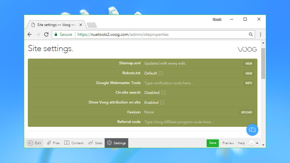
The Settings menu might be more interesting to experienced users, as it's absolutely crammed with neat and unusual features.
You can view your Sitemap.xml file, for instance. Set a custom Robots.txt file. Add your own Favicon. Integrate with Google Webmaster Tools, or insert Google Analytics or the code for other services into your pages.
Our favorite feature provides a simple way to work on the site with others. You're able to send invitations to friends or colleagues and give them editing rights over the project, allowing teams to collaborate in a secure way (no more sharing of passwords). This could be a very appealing feature for many business users, and it's not one you'll often find elsewhere.
Editor
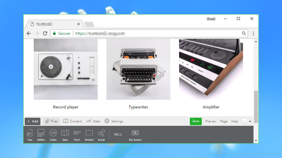
The Voog editor does its best to stay out of your way, a welcome approach which brings all kinds of benefits. There are no complicated menus to confuse beginners, no overweight toolbars hogging valuable screen real-estate, and you can browse your template much as though it was a finished website. Clicking a menu link doesn't give you fifty navigation options, for instance – it just takes you to the linked page.
Even when you start exploring the interface, it remains very compact. Tapping the Add button at the bottom of the screen displays small icons for the eight widgets that you can add to a page: a text box, image gallery, video, map, form, social bar, a Buy button, and a general Embed box.
This is far more basic than some of the big-name competition. Wix has a host of galleries, buttons, frames, forms and more, all displayed with thumbnail previews to help you find what you need. Voog is much more stripped-back and leaves you to do more tweaking and customization to achieve the effects you need.
The editor gives you little control over layout. Objects can be placed above or below each other, but you can't easily add page level columns to arrange them side-by-side. You can't drag objects to specific pixel positions, either – you're mostly restricted to aligning them to the left, right or centre of their container, and sometimes you can't even do that.
Workflow isn't always intuitive. There's no image control, for instance: to add a single image you must place it in a text box. And you can't delete a control by selecting it and pressing Del – instead you must click and drag, then drop it into the trash can which suddenly appears bottom-right.
Voog doesn't have a global Undo option, unfortunately. Take some major action, like deleting a control, and you'll be asked if you'd like to undo it. But unless you say yes, you won't be able to reverse your steps later, and there's no guaranteed Undo for lesser changes.
There is still real power here. Click inside a text box, for instance, and a lengthy toolbar appears. This doesn't just have the usual font size, style and alignment options – you can change colors, use bulleted or numbered lists, insert tables, maps or videos, even edit the HTML source to customize the effect. It's a capable word processor, all on its own.
Voog's Embed box is another all-purpose highlight. Paste in a link for a tweet, a YouTube video or other dynamic content from most of the big services and it'll be embedded on your page.
The Voog form opens with three boxes for your name, email and message, but you can change these, define an expected format (email address, web URL), mark a field as required, and more. It's far more customizable than it looks.
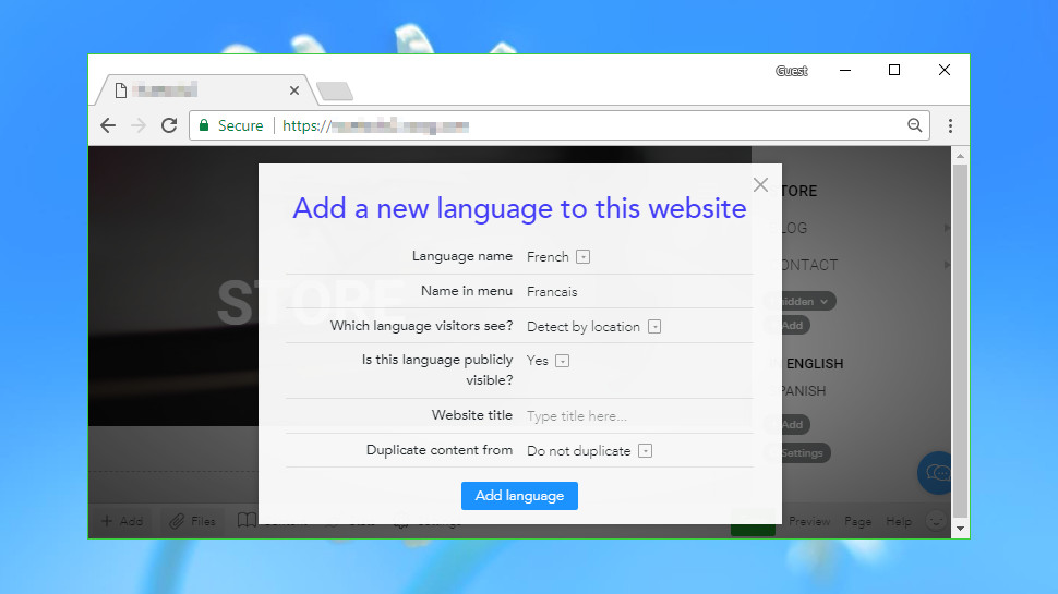
There's speedy support for multiple languages. In a few seconds you can set up your site to, for example, support English, French and German. These options are available from a menu, or you can even have the site automatically detect the language from the visitor's location.
It's a neat idea which works well, although it also has a big catch: add a new language and you start with a copy of the website template, not a clone of your existing site. That means you have to rebuild the site by adding whatever text, images and other components you've used so far.
There's a lot to like here, but the core issues remain. However good some features might be, Voog's editor doesn't offer as many options and widgets as the leading website builders, and the functionality you get isn't always easy to use.
Media
Voog offers only the bare minimum of media support: single images, image galleries, videos, and the ability to embed media from third-party sources. There's no native media player, no direct audio support and no document viewer. There's also a limit of 50MB on the size of files you can upload, which means you're not going to be able to host videos of any significant length on your Voog site.
This is a little better than it sounds. Voog may only have a single image gallery control, for instance, but it has plenty of options. Your images can appear in grids, walls, a slider or a custom 'squares' view, with full-screen viewing if you need it, and control over settings like the slider delay.
The service also scores with its ability to organize your media via the Files area. You can easily upload files of any type and optionally organize them into Collections, making it simpler to find them later. Once they're stored in Files you can then use your media on multiple pages or websites without having to upload them each time.
As we mentioned earlier, Voog's media operations aren't always straightforward. Okay, we understand the developers wanted to create a minimalist interface, but does it really make sense to expect users to add a text box before they can insert an image?
Voog has a distinct lack of media tweaks and customizations, too. While other services boast about their integrated image editors and filters, Voog can't do much more than set an overlay and background color, add a caption or assign a link.
Put it all together and Voog does a reasonable job of covering the multimedia basics, but we suspect many users will be left wanting more.
Blogging
Website builders sometimes struggle with blogging, and even basic tasks like adding a new post can take some work. For example, in Wix you must click Blog > Add a New Blog Post, then work your way through a new full-screen dialog box to set up the post correctly.
Voog avoids all that in the simplest of ways. Once you've chosen to add a new post, you just enter your content on the page where it will be displayed. There are boxes for your title, an excerpt, body copy, tags and more, and you can complete them just like any other web page element.
Voog's sophisticated text control gives you plenty of options, as we mentioned earlier. You can set text font, styles and alignment, enter lists, insert tables, images, videos, maps and more.
If that's not enough, you're able to add any of the components you can include on a regular Voog web page: galleries, forms, social buttons and more.
As with the rest of Voog, the blog is distinctly short on extras. You can't organize posts into categories, schedule their release, limit the number of comments, close them after a period of time or do anything else even faintly advanced. But the system is undeniably simple to use, and if you want a basic blog with the minimum of hassle, it could be a smart choice.
E-commerce
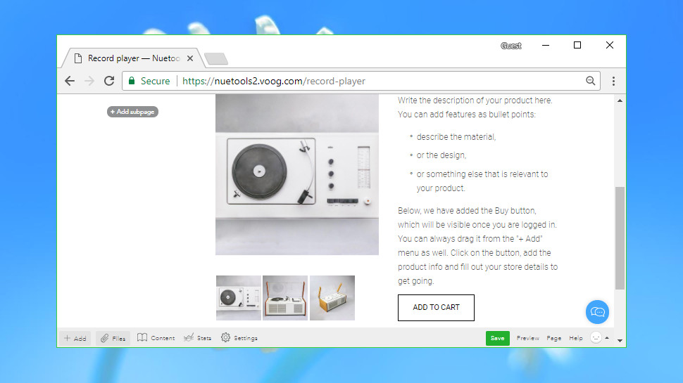
Voog wasn't really built for e-commerce, and although you can add a web store, it feels a more cumbersome and awkward process than with many website builders.
The support pages explain that you can start selling once you've configured a few key settings, for instance, but this is at the most basic level – best for adding a few products only. It's nothing like the pre-built store components you'll get with Wix and some others.
Starting from a web store template gives you the ability to create product pages and organize them by category, but that's hardly convenient, and there are only five store templates to choose from.
Supported payment providers seem to be only PayPal and MakeCommerce, and the website asks you to contact support to enable them for your site, which is hardly convenient. Keep in mind that you'll pay an extra 3% transaction fee, on top of any payment provider charge, unless you opt for the most expensive Premium account.
There are some significant limits. There's no direct support for selling digital products, physical products can't be given weights, and you can't set up custom shipping or tax rules to any significant level.
As with other Voog modules, the store does have some useful abilities. You can define product variations (size, color), set up discount codes, manage product inventories in a basic way, use multiple shipping methods, and more. It's not a bad system, but it might not be quite good enough for demanding users.
Support
Help is never far away on Voog, not least because of an unusually complete Help menu at the bottom-right of most Voog screens.
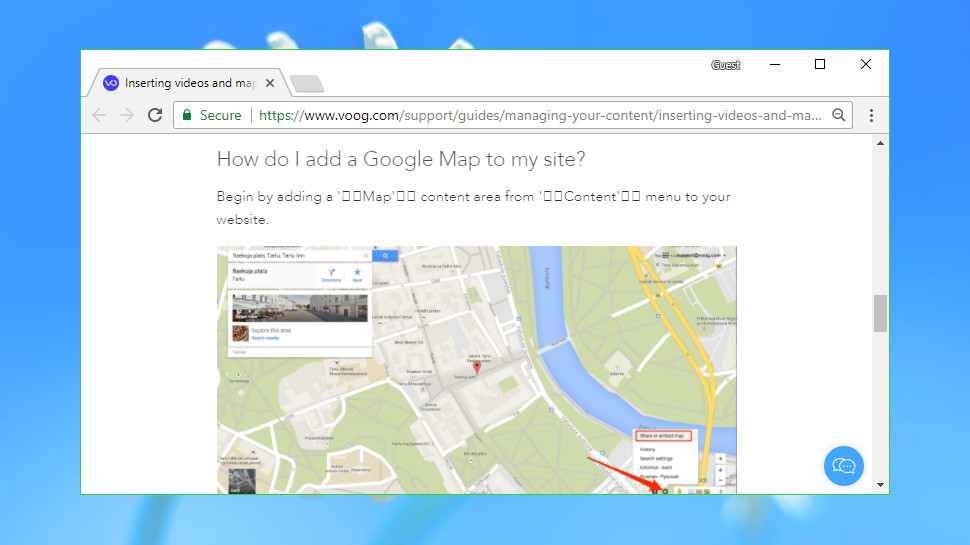
The menu gives you speedy access to a basic Voog tour, for instance. There's a link to the FAQ, and the Voog Facebook page. Start typing in the search box and matching articles appear immediately. If all else fails, there's a box where you can enter a question and send it to Voog support with a click.
The quality of this content is a little mixed. The FAQ page lists just four topics, and one of those is focused on signing up. The rest of the knowledgebase has quite a few genuinely useful articles, and these will often point you in the right direction. But we also found some occasional issues with their formatting, so, for example, links in one page we viewed were clickable in one browser, but not in another.
Still, we found the support site usually provided enough information to help solve our problems. If support is critical to you, or you just want to better understand how Voog works, check out the support site for yourself before you buy.
Final verdict
Voog's quirky interface and lack of website widgets and integrations mean it's not the best choice for novices. But if you know what you're doing, Voog's low-level and developer-oriented features may appeal, and it's certainly worth taking the free trial.
- We’ve picked out the top 10 best website builders for small businesses
0 comments:
Post a Comment