Webeden
First launched more than a decade ago, Webeden is a simple website builder from the UK.
The Webeden website is distinctly short on details about the service. The best we could do is pick out some key phrases from a few generic paragraphs: templates, drag-and-drop, a web store, social media integration, SEO-optimized, works on desktop and mobile devices.
One issue we noticed immediately is the website relies on Flash for some key content blocks, including a template browser. If your device doesn't support Flash, or it's not installed or enabled, you're left with an empty block and a plain ‘to view this content please install Flash Player’ message.
The sites Webeden creates don't need Flash, fortunately – they're standard HTML5 – but this reliance on dated technology is a hassle, and not an issue you'll see with most modern website builders.
Webeden does have its plus points. The baseline Lite plan has no bandwidth or page limits, no ads, no branding or other major hassles or restrictions. It gives you all the main editing features, allows creating a single site with unlimited pages, includes a web store which supports selling up to 20 products, and can be yours for just £3 ($3.75) a month.
The £6 ($7.50) a month Standard plan gives you a free domain, allows creating up to five sites, and supports up to 50 products per web store.
The £11.25 ($14) a month Plus plan lifts the limits to 10 websites and 150 products, and Webeden Max allows building 20 websites and selling up to 1,000 items for £18.75 ($23.44) a month. There are cheaper and better specified single site plans around, but if you're looking to build multiple web stores, that could appear to be good value.
Webeden provides a free 14-day trial, with no credit card details required. That's reasonable, although it's worth keeping in mind that there's no money-back guarantee after you've signed up. It might still be possible to get a refund, but the small print says it's at the discretion of the company – you'll have to convince them that you deserve it.

Getting started
Webeden claims it makes setting up a website "quick and easy", but the reality is a little more complicated.
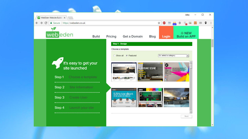
It's good to see that tapping the Let's Get Started button doesn't immediately display a web form demanding all your personal details, for instance. But we were less impressed that it took us to a Flash-based template selector that might not be visible on all browsers and devices.
Get the website working and you'll find a moderate selection of around next the templates. You can browse these individually or organize them by a few categories, but the viewer only displays small thumbnails of the front page. There's no way to preview the template to see if it might work for you, and you can't simply switch templates later and keep your change – you have to start again.
Choose a template anyway and you're asked to enter your preferred Webeden subdomain (yourname.Webeden.co.uk) and site name.
The final step asks you to choose a username and password, and hand over your email address. Details entered, our website should have appeared in the editor, except – oops – that required Flash to be enabled, too. We were using Chrome on a Windows 10 system, so this only took a couple of clicks, but other users might not be as lucky.
Once you're finally up and running, the template appears in its full-screen form, ready for your tweaks and customizations.

Editor
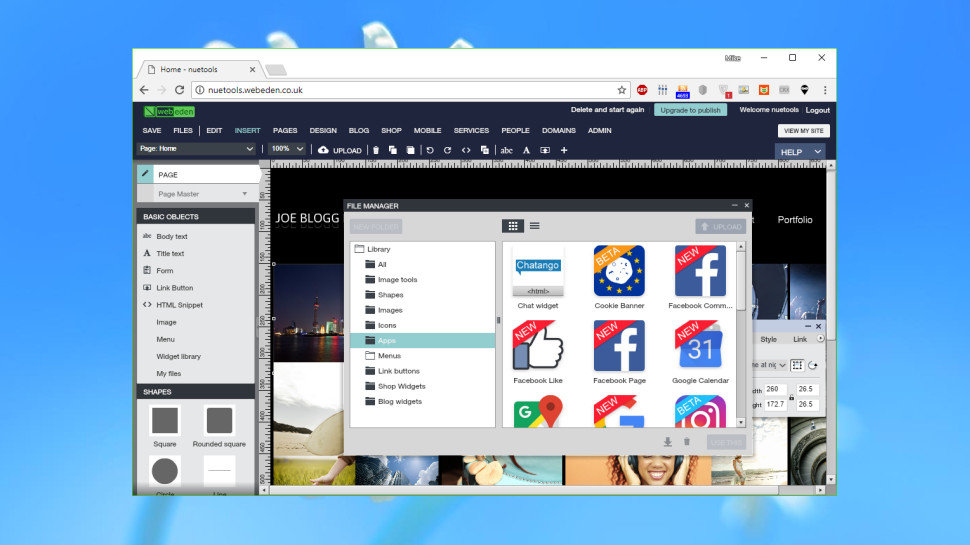
The Webeden editor doesn't make a great first impression. There's a plain text menu, a toolbar packed with tiny icons, a cramped properties box that is way too small for the information it contains. It all feels more like a Windows 95 package than a modern web app.
The interface makes little effort to help you. Wix does lots of cool things in this department – it changes the mouse cursor as you move over each component. Wix displays useful buttons if you left-click something, and shows you the most common option with a double-click. It also has a right-click menu with context-sensitive actions, and it supports a host of useful keyboard shortcuts.
Webeden has almost none of that, instead forcing you to fight your way around a properties box, the toolbar, and other areas of the service to sort out whatever you need to do.
Tapping the Insert link displays an equally uninspiring selection of objects your web page can include. The core group covers the basics: text, images, links, menus, forms and a few shapes. Widgets and apps allow integrating image galleries, maps, videos, Google Calendar, a Facebook Like button and more, but there are far fewer options than you'll get with services like Wix and Weebly.
The editor has only the most basic of visual previews to show you what objects look like, and you won't always see those. Clicking Image Gallery just adds four empty boxes to your page, for instance. Wix displays multiple styles upfront to help you choose the right one, includes sample images so that the page immediately works as a mock-up, and allows you to configure the gallery in a powerful visual editor
Even simple features don't always work as they should. When we selected an item and pressed Del to delete it, the editor displayed an 'Are you sure?' message, but annoyingly cleared the screen so we couldn’t visually confirm that we had selected the right item. And every time we switched from one page to another, the editor asked if we wanted to save our changes. Other services typically either save changes automatically or allow multiple pages to be modified and then saved with a single action, a much more convenient approach.
It's not all bad news. You do get pixel-level control over the positioning of objects on your page. The Edit menu has options to copy and paste items, send them backwards and forwards (decide which object overlaps what), align and space them. The Page manager doesn't just allow adding, copying and deleting pages, but supports creating lists and groups of users, and setting permissions to define who can see what.
These occasional plus points aren't enough, though, and they sometimes bring issues of their own. For example, we noticed that if we double-clicked the Page Permissions table, the interface grayed out and became unresponsive, forcing us to manually close the tab. We've no idea why, but it does leave us wondering what other problems might be lurking in Webeden's darker corners.

Media
Webeden offers only very limited media support. Native components allow displaying images and image galleries, while apps can embed content from YouTube, Vimeo, SoundCloud and Spotify – and that's about it.
The site Help mentions audio and video players and a few other extras, but these seemed very limited (the video player only supported FLV files, the audio player was just MP3), and none were visible from the editor while testing.
Webeden's feeble editor ensures that even the simplest of operations becomes more difficult than it should be. Select or right-click an image in most builders and we would expect to see an option to replace that picture with another, but not here. Instead, it seems you have to delete the first image, add a new one, then resize and reposition it to fit.
There are a few other general tweaks you can make – set image transparency, pop up a full-sized image when a picture is clicked, assign it a link – but there's no image editing tool, animation options or anything faintly advanced.
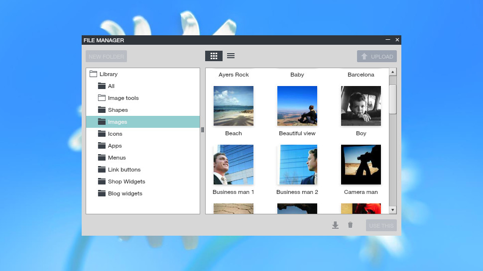
The editor does include an image library, although it's so small as to be almost useless: just 45 very generic pictures.
We tried some of the 'apps', but they were no more impressive. Choose the YouTube app, for instance, and it asks you to specify a single YouTube video ID – and surprisingly, its default example pointed at a video from the (much better) website builder, Moonfruit. Was the Webeden developer trying to tell us something?
We accepted the default video anyway, but the frame of the object didn't update within the editor to show the video thumbnail. It was visible when we previewed the site, but it's also helpful if the editor shows you how each page is going to look.
Webeden fared a little better in media management terms, with a My Files area where you can upload images you need frequently. These can then be added directly to other pages or sites, without the hassle of uploading them again. It's a welcome plus for the service, although not nearly enough to make up for Webeden's other failings.
Blogging
It took us a moment to find it, but Webeden supports a simple blog which you can add from the editor's Page menu.
Posts are basic, with support for adding text, links, images and not much else. You might be able to embed YouTube videos and other content, but only via entering HTML snippets – you can't drag-and-drop any apps from the main page editor.
It's a similar story elsewhere. The blog has the bare minimum of features, but there might be enough to get by. You can schedule posts, add tags, or set up a custom comments section with email alerts and optional comment modifications.
Webeden's feeble formatting meant there were still some problems. We added the blog to our site, but the editor wasn't smart enough to automatically adjust the page layout to fit, so the blog viewer ran into the page footer. That could be fixed, but only if we took manual action.
Still, there is a blog, it sort of works, and having integrated comments – even as basic as this – makes it easier to get started than some more full-featured builders.

E-commerce
At first glance, Webeden might seem to be a good choice for a web store. Even its cheapest £3 ($3.75) a month Lite plan allows selling up to 20 products. Wix doesn't give you a web store unless you're spending £10.10 ($12.63) a month on its eCommerce plan.
But as usual with Webeden, there's a catch. The store is hopelessly underpowered, and can't begin to compare with the other major website builders.
Product details are basic, for instance. Text descriptions can't contain formatting. Product options are plain text only (you can't define lists or show color boxes). There's support for images, but not videos. You can't assign product weights. There are simple shipping rules, but nothing to deal with taxes. And so on, and so forth – you get the idea.
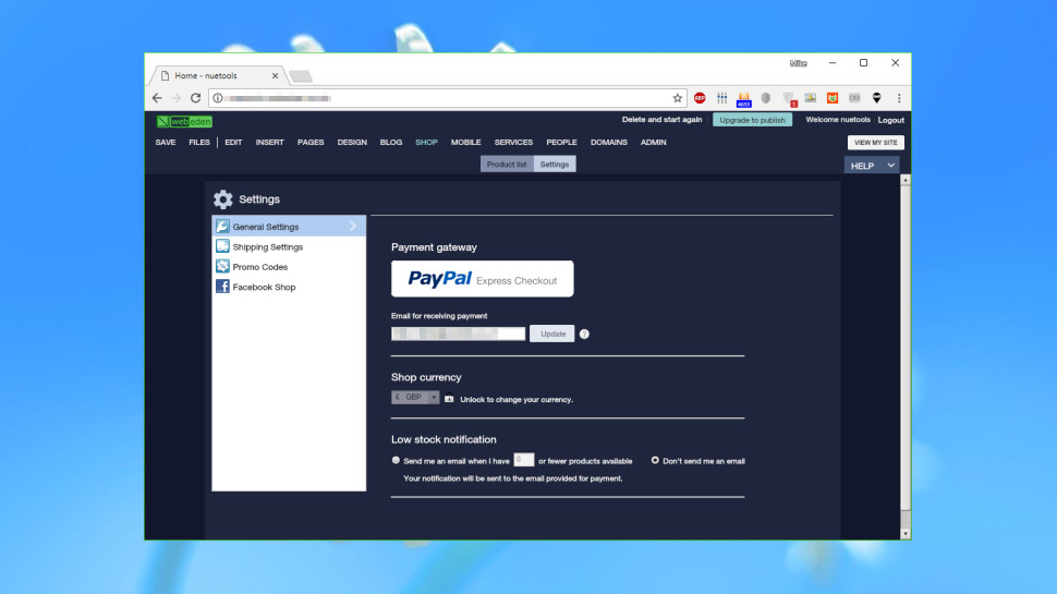
Payment gateway support is just as limited. Webeden supports PayPal Express Checkout, and nothing else at all.
There are a few mildly surprising extras. Webeden can help you set up a Facebook shop, for instance, and you're able to set up promo codes to push your products. But overall this is still a very weak web store, and you'll be much better off with almost anything else.
Support
Unlike most of the website building competition, Webeden doesn't have any context-sensitive help. Left-clicking objects doesn't display a help icon, as in Wix, and there's no support for right-click menus at all. The best you can do is head off to the Help menu to check its various options.
We started with the Beginner's Guide, which turned out to be a largely useless PDF file last updated in 2013. This spent more of its time giving generic advice about web design than anything else, and left us no wiser about many basic Webeden operations.
A searchable FAQ database seemed to be a little more useful, at least initially. We entered the keyword ‘Video’ and found links to 17 articles with straightforward titles, like 'Can I add video to my site?' and 'What kind of video files can I upload?'
Spend a few minutes reading the content, though, and you realize it's not very helpful at all. An 'adding videos' article explained that Webeden could embed videos from YouTube, Google Video, MySpace and Kewego, for instance. That seems unlikely when Kewego was bought out in 2011 and Google Video was effectively killed off in 2009, when uploads were disabled.
There are other signs of age elsewhere, with a 'Submit a support query' dialog asking if we got online via AOL or through work, and whether we were using broadband or a dial-up connection.
Put it all together and Support feels like a dusty, forgotten area of Webeden, and something no one has cared about for a very long time. It's not a resource that offers you any genuinely useful help, and if anything its many outdated references will leave you more confused than you were originally.
Final verdict
Webeden is a very dated service, awkward to use, and with none of the power, functionality or support you would expect from a modern website builder. There's no compelling reason to choose it ahead of the competition, and plenty of very good reasons to stay well away.
- We’ve picked out the top 10 best website builders for small businesses
0 comments:
Post a Comment