Duda
Launched in 2010, Duda is a popular website builder which allows users to create fast, modern and mobile-friendly websites.
Pay particular attention to that mobile-friendly aspect. Unlike some of the competition, that doesn't just mean 'we have a few mobile-oriented templates' – Duda was designed from the very beginning with full support for building quality responsive websites.
No need to take our word for it, or even Duda's: the company is confident enough in its service to offer a free plan. This has some of the typical issues of a free website builder – there are ads, and you can only use a mysite.dudaone.com address – but there are some surprises, too.
There are no limits on the number of sites you can build, for instance, or how many pages they can include, or even any bandwidth limits. And each of the sites includes a 10-product web store, supports PayPal, Stripe and Global Gateway payment providers, and comes with order and customer management tools to help run your business.
Duda's Business + plan drops the ads, enables using your own domain, and throws in an SSL certificate to reassure your visitors. Extras include multi-language website support, site backups, full analytics and tracking, and there's email support when you need it. The plan is priced at $19.25 (£13.75) for monthly payments, $14.25 (£10.20) a month on the annual plan, or you can make a one-off payment of $299 (£215) which covers you for life.
The Business + Ecommerce ramps up the web store to support hundreds or even thousands of products, gives access to 30+ payment providers, and supports product reviews integrated with Facebook. A 100-product store is priced at $29 (£21) for monthly billing, an equivalent $22.50 (£16) on the annual plan, which is reasonable value for an ecommerce plan.
A separate Mobile-Only plan enables building a custom mobile site for your existing domain (m.mysite.com). There's no ecommerce functionality, but you do get extras like click-to-call, and the price is low at just $9.99 (£7.15) a month, dropping to $7.20 (£5.15) if you pay for a year upfront.
Getting started
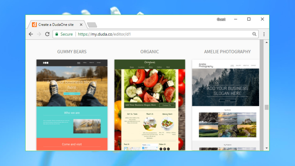
The Duda website includes plenty of information about the service and does a good job of helping you understand its features before you sign up. You don't just get a few thumbnails of templates, for instance. Viewers can browse everything the service has to offer and preview each template in desktop, tablet or mobile views.
If you're tempted, choose your preferred site design (be careful, you can't switch templates later) and Duda prompts for your name, email, company website and phone number. Pick the free plan for an initial look and you won't be asked for credit card details.
There are no other setup hassles, surprisingly. You're not told to wait while Duda 'activates' your account, or forced to verify your email address, or left to log into your Duda web account and figure out what to do next. The site simply opens your chosen template in the editor, while displaying a short and simple tutorial covering the basics.
A lightweight toolbar with handy tooltips makes it easy to find your way around the system. Clicking the Home icon takes you to Duda's web dashboard, for instance, where it displays your initial site. There are handy options to duplicate the existing site, or save it as a template for reuse later.
Alternatively, you can tap a Create button to start a second site, and a third, and as many others as you need. It's a very valuable feature, even if you don't actually need to manage multiple sites, as it makes it easy to experiment and play around without affecting your main project.
Editor
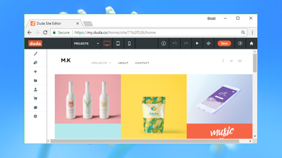
Duda's editor looks a little plain, but it's also simple and lightweight, ensuring that even total website builder novices will quickly feel at home.
A left-hand toolbar has buttons to add content elements, add and manage pages, change site-wide settings (backgrounds, text styles, content which appears on all pages), add a web store, blog and more. Click any of these and a palette expands with more options.
A toolbar at the top of the window enables undoing or redoing an action, switching between pages and previewing the current site.
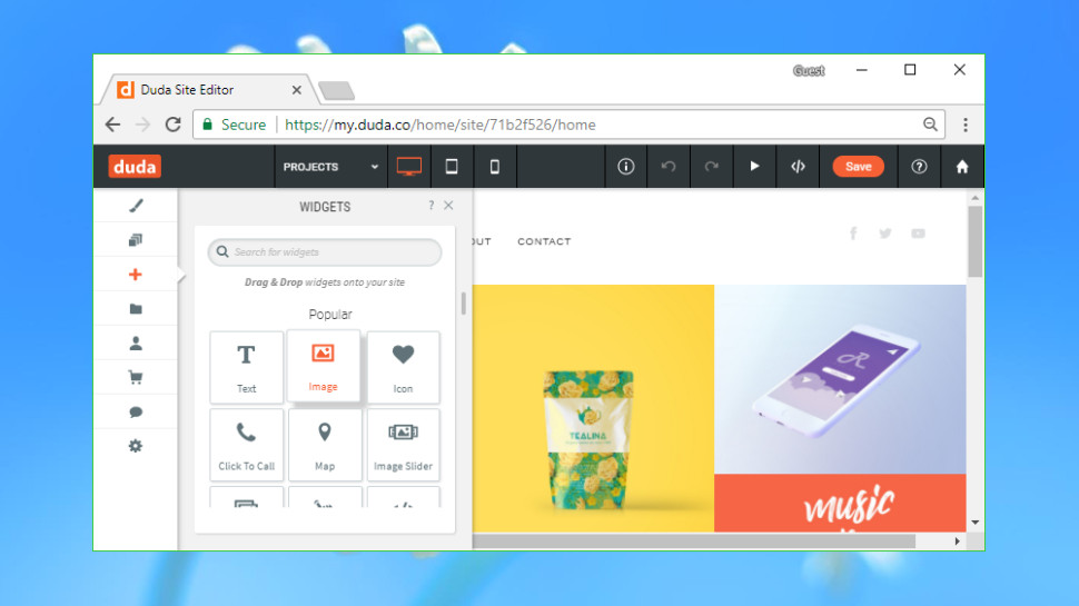
Clicking the Widgets button displays a surprisingly short list of objects you can add to your page. You get the basic elements (text, images, buttons), a few media controls, social media buttons, maps and so on, but there's not a lot of depth here. The bundled controls are sometimes basic (the forms widget provides a content form only), there's very little integration with third-party services, and no Wix-like visual previews to help you see what Duda is offering.
Experienced users may be able to get around this, to a degree at least, by adding custom HTML. Interestingly, you're also able to customize individual widgets by editing their HTML and CSS. That could be a handy feature for experts, but most other users will be left wishing they had more page elements to choose from.
Once you do find a widget you need, it's added to your page by dragging and dropping. Formatting is quite strict – you can only drag and drop widgets into certain row and column positions – but the editor gives clear visual feedback about this as you drag your mouse cursor around the page, even offering to add a new row or column if you move outside the current range.
While most widgets seem relatively underpowered, there are some unusual plus points. Right-clicking a Paragraph control displays a Pull Content option which imports text from a specified URL, for instance. Using some of all of the imported text is as easy as selecting it and clicking Use This.
A thoughtfully designed editing interface keeps most operations simple and intuitive. Hover your mouse over any control and handles and buttons appear to resize it, delete it, add a new section and more. Right clicking any page element displays a detailed menu of actions you can take, including changing alignment and applying various animations. Many elements are active in the editor, too, so for instance you can switch pages simply by clicking the appropriate item in your navigation menu. It's all very natural and comfortable to use.
Duda creates responsive websites by automatically maintaining separate desktop, tablet and mobile versions of your project. You can switch the editor between any of these views with a click, either to take a quick look, or to do most of your editing in whatever view is most important. Right clicking any page widget displays an option to hide that item on a particular device, helping ensure users only see the most important content.
Browse the interface and you'll find a few surprising extras. A Personalize feature can modify site behavior depending on the visitor's device, location, time, the number of times they've visited you, and more. You could set up promotions to run at specific times of year, display a notification bar for specific users, maybe even add a Click to Call button for visitors in your city (there are more examples on the Duda website). This kind of power is often a premium extra, but Duda makes it available to everyone – even free users.
Once your website design is complete, an excellent Settings dialog helps prepare it for the outside world and maintain it afterwards. Options include defining your site URL (something.dudaone.com on the free plan), adding custom HTML and JavaScript to the headers of all pages, translating your site text to support multiple languages, integrating with Google Analytics, and setting up URL redirects and a custom 404 page, low-level but welcome extras you won't always see with the competition.
Media
Duda's media handling abilities are basic, with widgets covering little more than the core essentials: images, image sliders, photo galleries, icons and videos. Perhaps there were some third-party controls to add extras like video walls or a Spotify player, we wondered? Nope – this really was it.
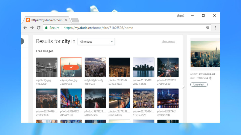
It may be a little lonely, but the image widget is smartly designed. One click and you're able to upload files or choose from a huge and searchable library of free or premium stock images, textures or Giphy-sourced animated GIFs.
If you're not happy, a built-in editor (Adobe's Aviary) allows for cropping, rotating or resizing the image, tweaking brightness and contrast, applying effects, fixing red-eye, removing blemishes, inserting stickers, text captions and more. You can then set the image border size, add rounded corners, give the image a shadow or choose an eye-catching hover effect (zoom, opacity, float, blur, grayscale and more).
The photo gallery looks more basic, producing a simple strip of thumbnails when we first added it to a test site. There are lots of configuration options – rows, columns, image size and spacing, hover effects and shadows, text position and style, frames and more – but it takes some time to explore these and figure out how they all work. Novice users or anyone in a hurry might prefer the more visual approach of builders like Wix and Weebly, where you're able to see upfront previews of different gallery styles, helping you find the best choice at a glance.
Duda's video player is also relatively limited. Add a YouTube or Vimeo URL, set the control size and spacing, and you're almost done, although there are one or two welcome options. By default the player will show YouTube's Related Videos list when your movie ends, for instance, but you can turn this off with a click.
A Content Library enables uploading and managing your images from one central location. Upload content to the Library and you can reuse it across multiple pages – even multiple Duda websites – without uploading it again.
An Import option can import images from existing web pages or Facebook URLs, at least in theory. In practice we found Facebook importing to be unreliable, not always retrieving everything we expected, and sometimes not working at all.
If you're designing the site for (or with) someone else, the surprise highlight might be Duda's Collect Content feature. In a couple of clicks this generates a URL you can share with a customer or colleague. When they visit a form enables them to upload images and files and add a host of business-related details you might want to use on the site: email address, phone numbers, business location, social media URLs, even basic text content for the site ('About Us', 'Overview', 'Services'). This all becomes accessible to you as soon as they're done.
Collect Content is an unusual feature which saves time and makes it easier for others to provide the content you need. It's aimed at business users, but anyone could benefit from it. Keep in mind that even the free Duda account allows building multiple websites, so if you want to create something for a friend or family member, the Collect Content tool could help speed up and simplify the process.
Blogging
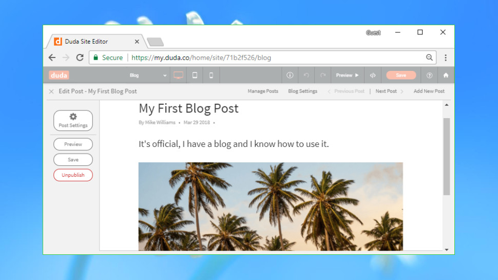
Duda offers a capable blogging system, but it's not as well integrated with the main editor as you'll sometimes see elsewhere. You can't add a blog widget, for instance, or use the main Add Page system to include a blog. Instead you must create and manage your blog from an entirely separate screen.
This isn't difficult. A Welcome screen enables importing existing blog posts from an RSS feed, or you can allow the system to create a couple of test posts for you. You can delete these whenever you like, but they're handy as a quick way to figure out how the blog works.
The blog editor doesn't use the regular Duda page editor, and offers far fewer features. You can add text, images, video and custom HTML, but there are no widgets, which means no photo galleries, image sliders, maps or any other extras you might want to use.
Post settings cover the basics – title, description, tags, author, URL and a post thumbnail – but no more. You can't schedule articles to be posted at some point in the future, for instance.
An overall blog management screen enables setting the blog name, title and description. The highlight is probably a backup system which allows creating multiple blog backups on demand, and restoring any previous version whenever you like.
This is all fairly straightforward, but the blog is a little short on features, and the disconnect between the blog and the main page editor can lead to some issues.
For example, during the review we decided to remove a test blog. There was no obvious way to do this, so we assumed that simply deleting the blog page would be enough. Makes sense, right? Except it effectively broke the system, because when we clicked the Blog button again, it didn't recognize the blog as deleted – it still showed our test posts, but provided no way to restore the blog page if we changed our mind.
We asked customer support for advice on what we should have done, and received a surprising reply:
"The blog page being deleted will essentially delete the blog. The content will remain in the editor, but if you unpublish all the blog articles nobody will be able to access the blog or its content."
In other words, the service doesn't support a feature we would expect to be available (remove a blog and start again). The issue isn't mentioned in the interface or documentation, as far as we can see. There are potentially significant side effects (deleting the page removes the Blog link from the menu, but it's still available on the site if users go to domain.com/blog). And if a user realizes all of this, they're forced to find ugly manual workarounds to address the problem (unpublishing articles individually.)
None of this will make the slightest practical difference to most users, but it’s a worrying sign of what Duda is willing to accept in its service design, and it makes us wonder whether there might be similar thorny issues elsewhere.
Ecommerce
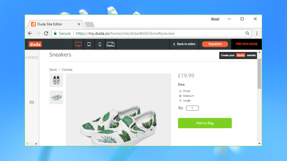
Setting up a web store can be complicated, especially for beginners, but Duda does its best to help out with a starting tutorial to explain the interface, and a setup wizard to walk you through creating an account, adding products, defining local settings (country, currency, weight details), setting up shipping and sorting out payment providers.
Individual steps are designed to keep initial options to a minimum. For instance, you can build a product catalogue simply by providing product names, prices and images. But there's much more functionality lurking in the background. Each product can be assigned a description, SKU, weight and options (color, size), and you're able to define shipping rules and rates, taxes, and set up related products which a customer might also want to buy.
This doesn't always run smoothly. We found a couple of forms insisted we hadn't entered a name in a text box, no matter how many times we typed and retyped it. There's no automated saving of changes, either, so we regularly found ourselves clicking a link to perform some setup task, only to be warned that there were unsaved changes. The warning dialog didn't include an option to save our project, so we were forced to click 'Stay on this page', then Save, then click our original link again.
Payment options start with PayPal integration, while choosing Square enables accepting Visa, Mastercard and American Express payments for 2.9% plus $0.30 per transaction (with no setup or monthly fees).
Overall, it's a very capable setup, especially for a free plan. If you're tempted, but not sure whether it's the system for you, sign up for Duda and try it out. Adding a store gets you some sample products by default, allowing you to check out Duda's abilities without having to spend more than a minute or two in setting it up.
Support
Wherever you are in Duda, a Help icon on the ever-present toolbar is on hand to get you instant support.
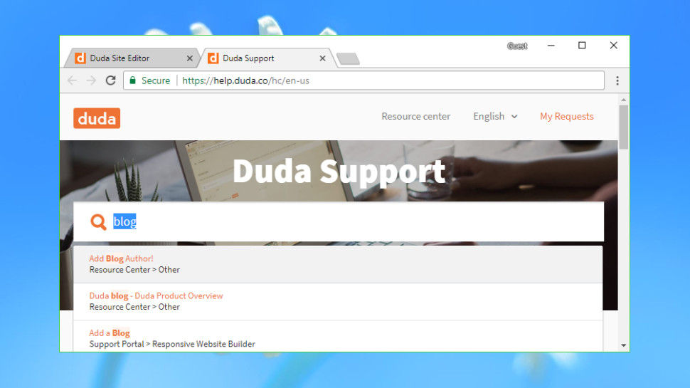
Type a keyword in the knowledgebase search box and the site instantly displays any matches. It's a good idea, but it would be even better if the search engine made the tiniest effort to sort its hits into a sensible order.
When we typed Video, for instance, the top article was described as 'All Videos - Sales Collateral - Resource Centre - Duda', article number five was 'Manage Pages Non-Branded Video' (which makes no sense at first glance), while the content most users will want to see, 'Add a video from YouTube or Vimeo', languished at number eight.
The articles had some problems, too. They're well laid out, with short sections and screenshots where necessary, but often they just describe what you can see already. For example, the Video dialog has a box titled 'YouTube or Vimeo URL'; the support page has a screenshot with the box highlighted in red, explaining that you need to 'Enter the YouTube or Vimeo video URL into the Editor.'
Some articles try to go a little further by adding troubleshooting tips at the end, but these often contained only very basic advice, and in a few cases didn't give the best solutions.
The Video page recommended adding '?rel=o' to the end of your YouTube URL to stop the site displaying related videos, for instance, but failed to mention that the Video dialog now has a checkbox to add this for you. There's probably a simple explanation – the page hasn't been updated for a long time, most likely – but that hardly fills us with confidence about the other articles.
If you find you need more help, Duda offers email support Monday to Friday, 12am to 6pm PST. The website suggests a typical response time of two to six hours, but when we sent a question an email told us we could be waiting up to a business day. In reality it took an hour longer to receive our reply, but the good news is it was a friendly and helpful response to our question.
Final verdict
Duda is a little short on features, but there are still plenty of professional tools here, plus it’s user-friendly, and has more than enough power to build top quality responsive websites. Check out the free plan to explore what the service has to offer.
- We’ve picked out the top 10 best website builders for small businesses
0 comments:
Post a Comment