Friday, November 30, 2018

Samsung Galaxy A8s gets Certified by FCC with Infinity-O Display

Well, the Samsung Galaxy A8s has been leaking from many days now after it was teased at a launch event with an image of it showing a display hole for the selfie camera and edge-to-edge design. Since then the device has been leaking and the recent leak is an image of it showing its screen protector. Not the latest news is the device has passed through FCC just before the official announcement in December.

The screenshot from FCC documents reveals the phones 19:5:9 aspect ratio display along with a display hole on the left top corner. The device comes with the model number SM-G8870 and also shows support for adaptive fast charging (5V-2A/9V-1.67A) which is similar to what we have seen on other mid-range smartphones. According to the earlier leaks, the Samsung Galaxy A8s is rumored to come with a 6.3-inch display with Full HD+ (2340 x 1080 pixels) with 2.5D glass on top.

Under the hood, it is said to be coming with a Snapdragon 710 10nm Mobile Platform (Dual 2.2GHz Kryo 360 + Hexa 1.7GHz Kryo 360 CPUs) coupled with 6GB of RAM and Adreno 616 GPU. The onboard storage is said to be 128GB which can be extended further up to a maximum of 512GB via microSD card slot. It is said to be coming with Android 8.0 Oreo operating system and might get further updates.

On the camera front, there will be a 24MP rear camera with LED flash along with a 10MP secondary camera with 120-degree Ultra Wide camera and 5MP f/2.2 depth camera. On the from there could be a 24MP selfie sensor along with a fingerprint sensor to enhance the security levels. There will be a 3400mAh battery to power the device with adaptive fast charging technology. Comment in the section below if you have any queries and stay tuned to PhoneRadar for more.

The post Samsung Galaxy A8s gets Certified by FCC with Infinity-O Display appeared first on PhoneRadar.

Asus Zenfone Max Pro M2 Slated to Launch on December 11th

Asus India has come with some interesting mid-range devices ever since the launch of the Zenfone Max Pro M1 early this year. While that was an impressive device amongst the mid-range lot, the successor is going to be unveiled next month, according to the company.

The company had taken social media to announce the new Zenfone Max Pro M2 launch, which is currently scheduled to be unveiled on 11th of December. Asus claims that it would be the unrivaled champion of the mid-range devices segment. The post further reveals that it would be the first phone to feature a durable screen with Corning Gorilla Glass 6 protection in this price segment.

The phone would be exclusive to Flipkart, and what we could see from the teaser is a notched display along with dual cameras set up on the rear as well. As per the earlier leaks and reports, the Zenfone Max Pro M2 is expected to come with a 6-inch display with Full HD+ resolution and is believed to be powered by a Snapdragon 660 processor. As for storage, the Max Pro M2 might come in 4GB/64GB and 6GB/128GB variants. The battery is expected to be massive like its predecessor, which featured a giant 5000mAh battery.

The post Asus Zenfone Max Pro M2 Slated to Launch on December 11th appeared first on PhoneRadar.

Corsair Vengeance Gaming PC

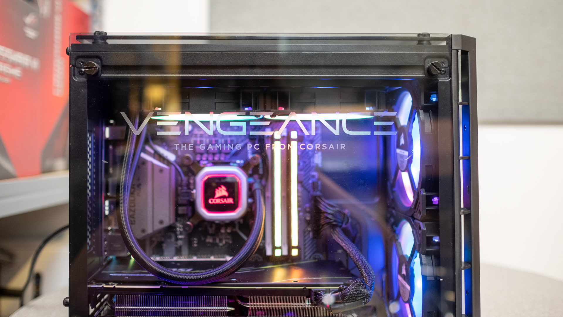
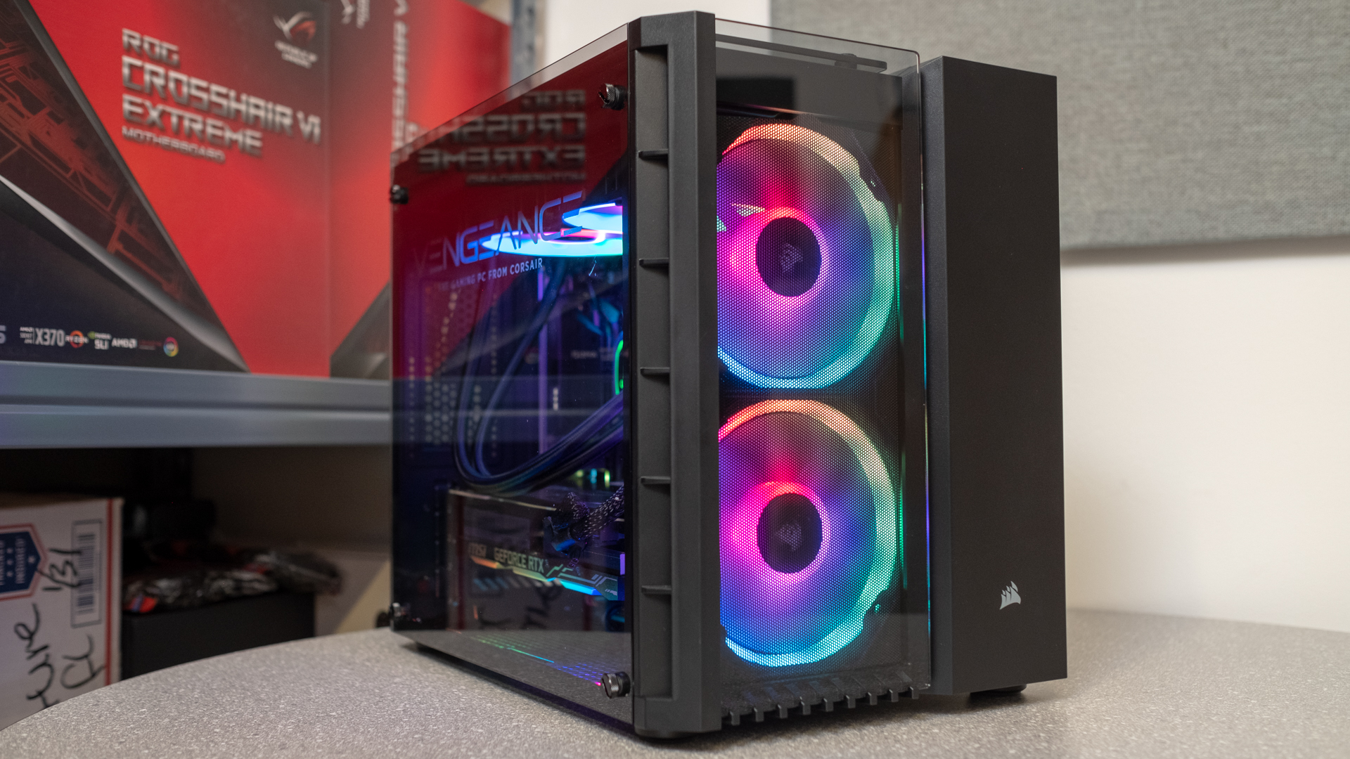
Not too long ago, we were surprised that Corsair got into the pre-built PC space with its Corsair One system. Now, the company is angling towards becoming a PC builder, like Origin and Digital Storm. Meet its newest battle-ready frag box, the Corsair Vengeance Gaming PC.

Whereas the Corsair One featured a custom design and liquid-cooling solutions to be as compact as possible, the Vengeance Gaming PC is a larger Micro ATX system that sticks to using standard PC parts.

There’s not a single no-name PC component here, but rather a collection of Corsair parts (unsurprisingly) and the latest computing hardware that amounts to one of the most powerful and most easily upgraded pre-built gaming PCs we’ve reviewed to date.

Corsair Vengeance Gaming PC review

Pricing and availability

As specced to this configuration on the right, the Corsair Vengeance Gaming PC costs a cool $2,399 (about £1,840, AU$3,325). For your money, you get an almost completely modern rig featuring an Nvidia RTX 2080 as well as ample storage and memory capacity.

The price above also factors in the cost of the included Corsair K55 RGB Gaming Keyboard and Harpoon RGB gaming mouse. One oddity about the Vengeance Gaming PC is that the motherboard Corsair chose to use doesn’t come with built-in Wi-Fi. Instead, you’ll get an Netgear AC Wi-Fi USB module included in the box.

Unfortunately, this configuration is the only one Corsair plans to release for the time being, so you’ll have to upgrade it yourself if you want more storage, memory or a newer Coffee Lake Refresh processor.

One of the Vengeance Gaming PC’s newest rivals sporting 9th generation Intel chips include the $3,299 or £2,499 (about AU$4,520) Asus ROG Strix GL12CX. This Asus gaming PC comes fitted with an Intel Core i7-9700K (essentially the 8700K successor) along with the same GPU and memory capacity, but only 256GB of SSD storage space. The one silver lining of the GL12CX’s extreme price tag is it also factors in the cost of a bundled ROG Strix Flare keyboard and ROG Gladius II mouse.

Another big competitor is the $2,299 (about £1,800, AU$3,150) MSI Trident X that features an Intel Core i7-9700K, Nvidia RTX 2080, 16GB of RAM and 256GB SSD – mirroring the specs of the Asus ROG Strix GL12CX perfectly at a much lower price. Unlike both the Corsair Vengeance Gaming PC and Asus ROG Strix GL12CX, the MSI Trident X doesn’t come with an included keyboard or mouse which would have easily put its price on par with the Asus model.

Just for the sake of comparison, we tallied up the cost of building this PC ourselves, and the amount you’ll save by going the DIY route is only about $300/£300. Of course, part of the higher price comes from labor – which, we have to say has produced an excellently clean PC build – and a two-year system warranty that covers parts and labor with 24/7 customer service.

Design

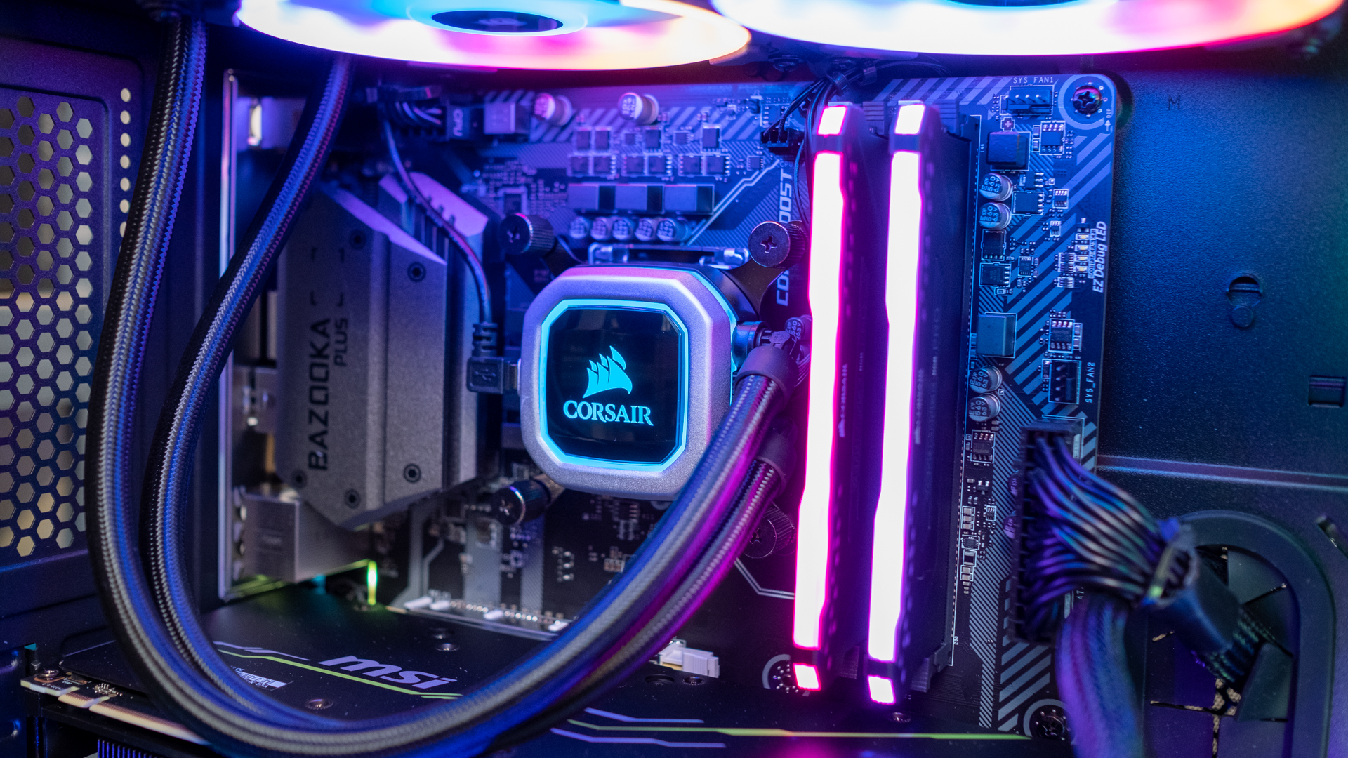
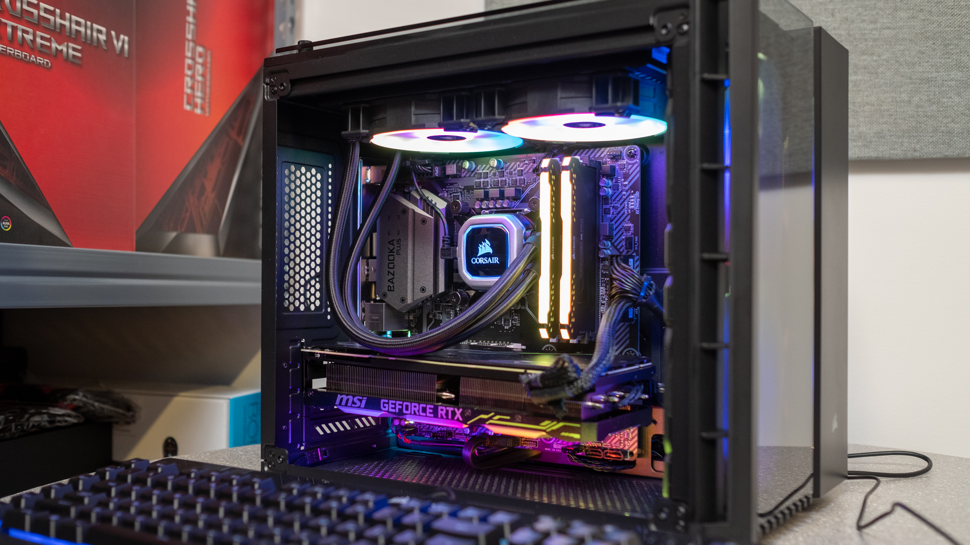
Unsurprisingly, the Corsair Vengeance Gaming PC is built around a Corsair PC case:  the Crystal Series 280X RGB to be exact. This Micro ATX case is arguably one of the best PC cases of the year, as it’s gorgeous, compact and very versatile. Despite its compact size, it can support a full-sized ATX power supply, graphics cards of all lengths, two hard drives and three SSDs.

There’s plenty of eye candy to gawk at on this PC case as well. Thanks to it having tempered glass panels on three sides, you can look clear through to see its four RGB fans, RGB memory and RGB CPU cooler – all unsurprisingly made by Corsair – shining in all their glory.

Compared to the usual pre-built chassis we’re used to seeing from major manufacturers and boutique PC builders, the Vengeance Gaming PC looks and feels like its years ahead of the curve. Of course, this should come as no surprise when Corsair has been designing PC cases for nearly a decade now – but it still feels like Corsair is almost cheating at this point.

Corsair Vengeance Gaming PC review

Upgradability

Of course, the Corsair Vengeance Gaming PC isn’t just nice to look at – it’s also easy to upgrade. Pretty much every part of this PC, except the motherboard, is anchored down by thumb screws. Meanwhile, all those slots for hard drives and SSDs we mentioned earlier utilize tool-less drive sleds as well.

The dual chamber design of the Corsair Vengeance Gaming PC also makes cable management a cinch as it basically requires none of it. You can pack all the cables into the side compartment of the chassis and never see a mess spill into the main section. But, if you’re more of a perfectionist or want to try your hand at cable management for the first time, you couldn’t ask for a computer chassis with more tie downs.

Corsair Vengeance Gaming PC review

Performance

Despite running with a now generation-old processor, the Corsair Vengeance Gaming PC holds its own against machines running with Intel Coffee Lake Refresh processors.  

The slightly cheaper MSI Trident X, equipped with an Intel Core i7-9700K and Nvidia RTX 2080, without a doubt runs faster. In processor specific tests, like GeekBench and Cinebench, this gaming desktop racks up a slightly higher 27,594 and 1,470 points, respectively, in multi-core benchmarks.

Unfortunately, the Vengeance Gaming PC falters a little farther back when it comes to productivity and gaming, as these new 9th Generation processors can squeeze out a little more of Nvidia’s new RTX graphics cards. The MSI Trident X was able to achieve a PC Mark score of 5,566 points, while running Total War: Warhammer II on 1080p Ultra settings at a slightly higher 82 fps.

The $3,799 or £2,999 (about AU$5,200) Asus ROG Strix GL12CX equipped with an Intel Core i9-9900K and Nvidia RTX 2080 outclasses the Corsair Vengeance Gaming PC even more. In our testing, this top-of-the line Asus rig delivers Cinebench scores almost 700 points higher in Cinebench and nearly 10,000 points higher in GeekBench multi-core. With gaming, the ROG Strix GL12CX doesn’t pull off such an impressive lead, only gaining an extra few frames over the Vengeance Gaming PC.

Outside of benchmarks, Corsair’s new mean machine is ready to tackle all modern games. We are able to play Hitman 2, Darksiders 3 and Battlefield V in 4K and Ultra quality settings at a relatively steady 60 fps with this PC.

Corsair Vengeance Gaming PC review

Final verdict

The Corsair Vengeance Gaming PC is one of the best pre-built rigs we’ve reviewed this year. Its beauty is unmatched, the build quality is impeccable and it comes at a great price for the parts inside. It’s no performance slouch either, keeping up with the latest gaming PCs despite its slightly older processor. The Vengeance Gaming PC runs the latest titles at 4K and maximum visual fidelity at silky smooth frame rates.

Whereas this Corsair machine comes at a great price, the MSI Trident X makes for an even better value prospect, as it serves up an Intel Core i7-9700K gaming desktop that’s noticeably more powerful. If you factor in the peripherals for MSI’s gaming rig, it loses its lower price advantage. However, it’s ultimately the machine to get for the best performance – at least for now anyway.

We have no doubt that Corsair will upgrade its gaming PC with the latest Intel 9th Generation processors that will help eliminate its performance gap. The Vengeance Gaming PC is a fantastic base that utilizes one of the best PC cases in the industry, and it’s infinitely more upgradable than any other pre-built PC we’ve reviewed before.

Scuf Vantage

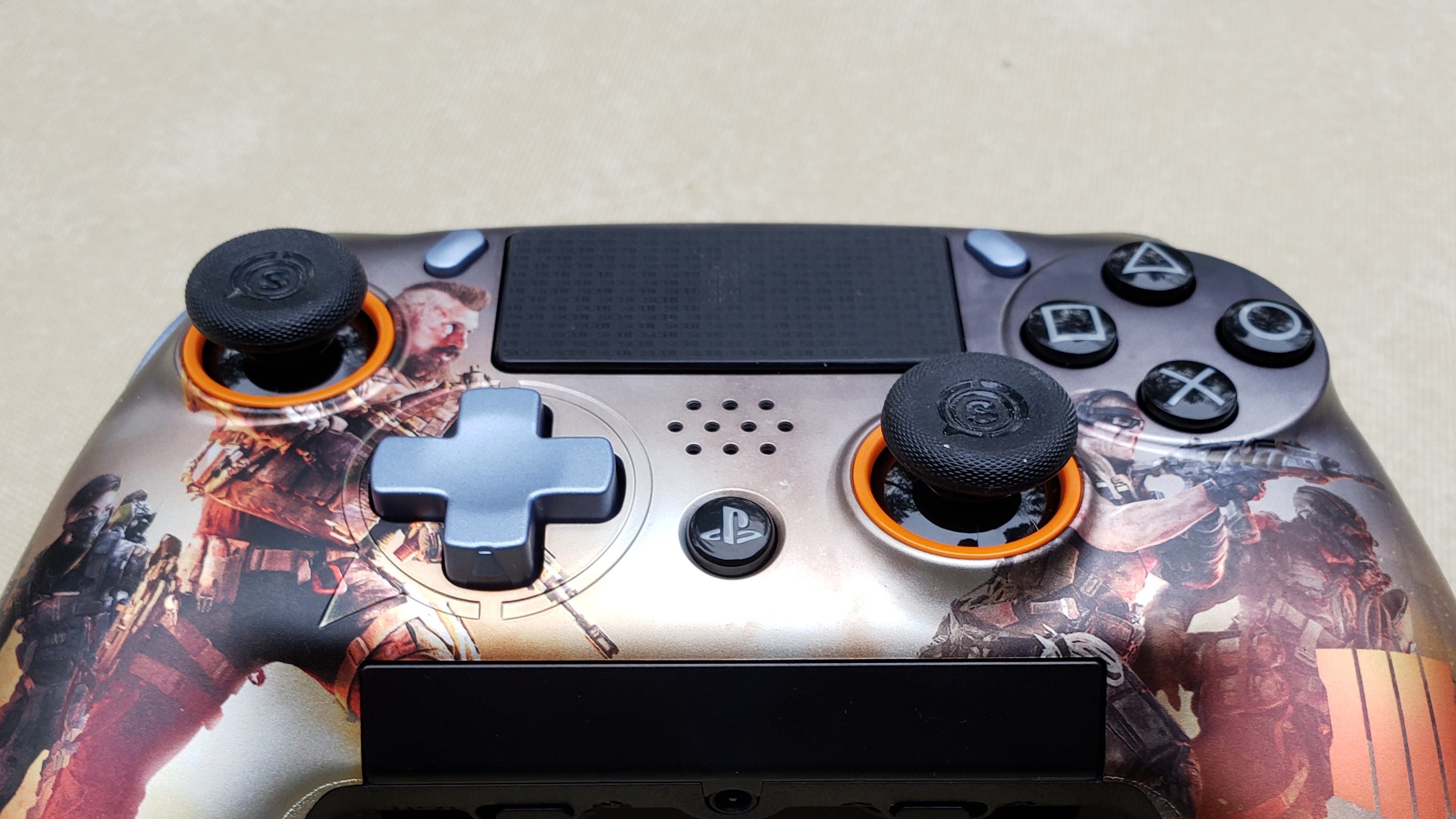
Between the Impact and the Infinity 4PS PRO, premium peripheral factory Scuf Gaming has been no stranger to highly customized PS4 controllers. Building one from the ground up, however, is decidedly new territory. 

The end result is the Vantage ($199, about £156, AU$276), a high-end modular officially licensed gamepad with excellent feel and a slew of customization options, all of which firmly positions this quality accessory ahead of similarly priced pro-controller offerings. 

That said, several bothersome drawbacks ultimately prevent Scuf’s latest innovation from attaining the perfection it’s striving for. 

Design

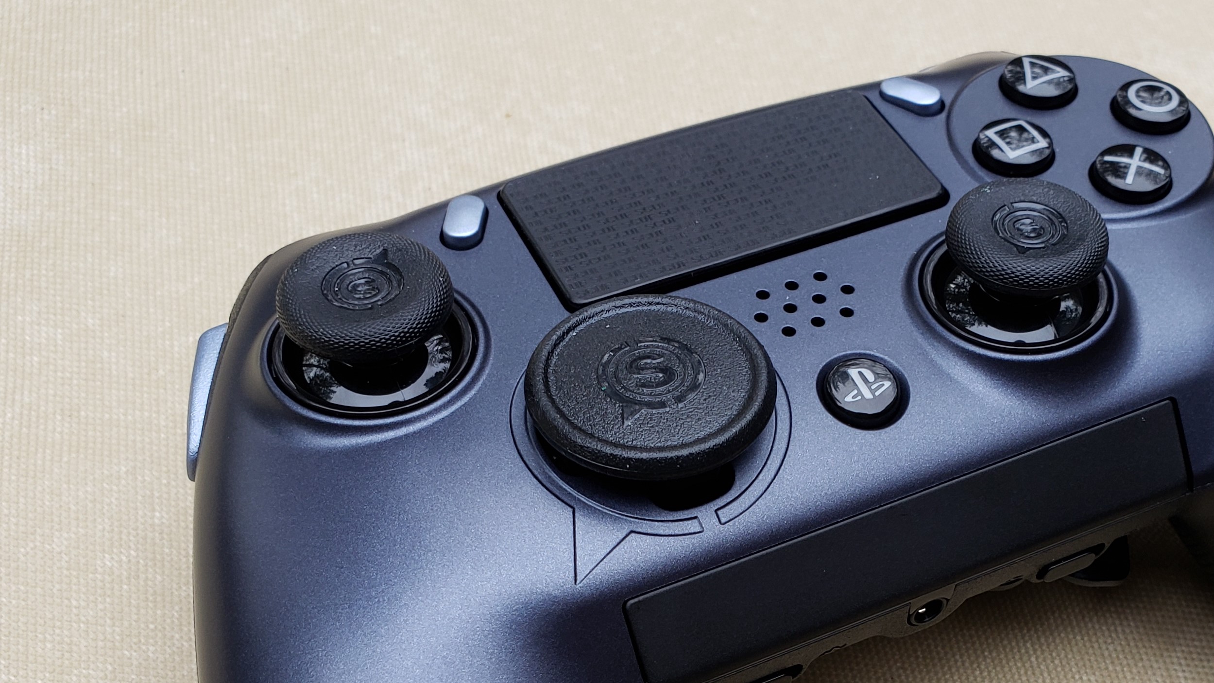
When you get your hands on Scuf’s Vantage, there’s no doubting the unmistakable ergonomics at play. Simply put, it just feels right. The overall build is slightly larger than Sony’s official DualShock 4, and much like the PS4 pack-in controller, Scuf’s peripheral rests comfortably in your hands, making use of some nicely textured, rubberized handle grips. 

The Vantage’s bulk (between 256 and 287 grams) is also similar to, if not a little heavier than, the DualShock 4’s, but it’s noticeably lighter than the Razer Raiju Ultimate. You can actually remove either or both vibration feedback motors to adjust the Vantage’s mass at any given time, and it’s as simple as popping off the faceplate and releasing them by hand from the handles—no tools needed.

In similar fashion, almost everything on the Vantage is adjustable or customizable: The analog sticks, which are offset like an Xbox One gamepad and forgo the traditional PlayStation layout of Scuf’s own Impact controller, can be changed between concave, convex, tall, as well as a selection of different colors. 

Various unique magnetic faceplates can be pulled off and swapped out on the fly, including a limited edition Black Ops 4 variant, though you’ll need to buy a whole separate limited edition controller to partake in that one (you’re actually better off buying the LE and then purchasing additional faceplates to swap out). Magnetic d-pads can also be switched, either between cross-shaped or disc-shaped. 

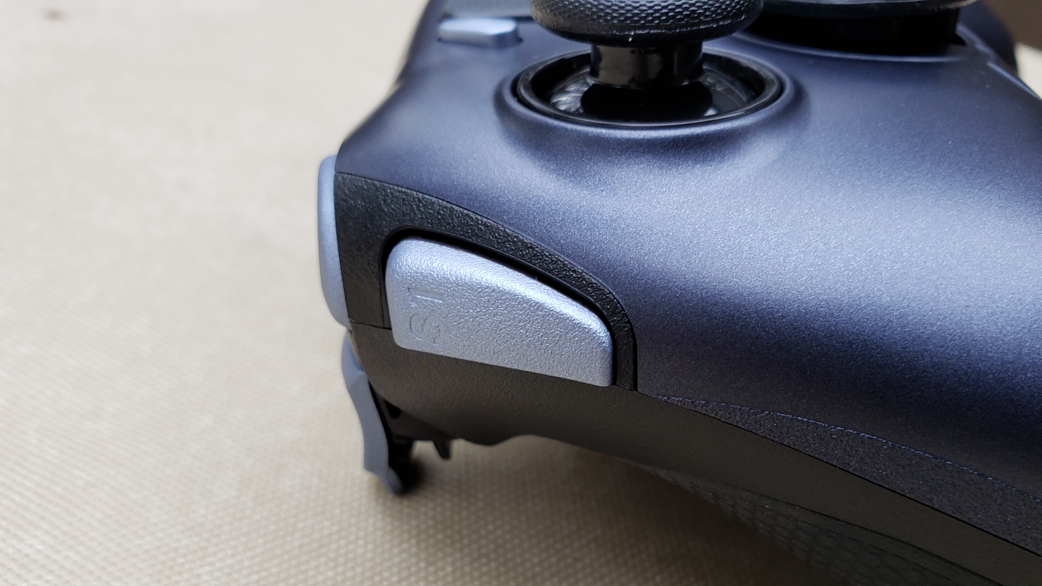
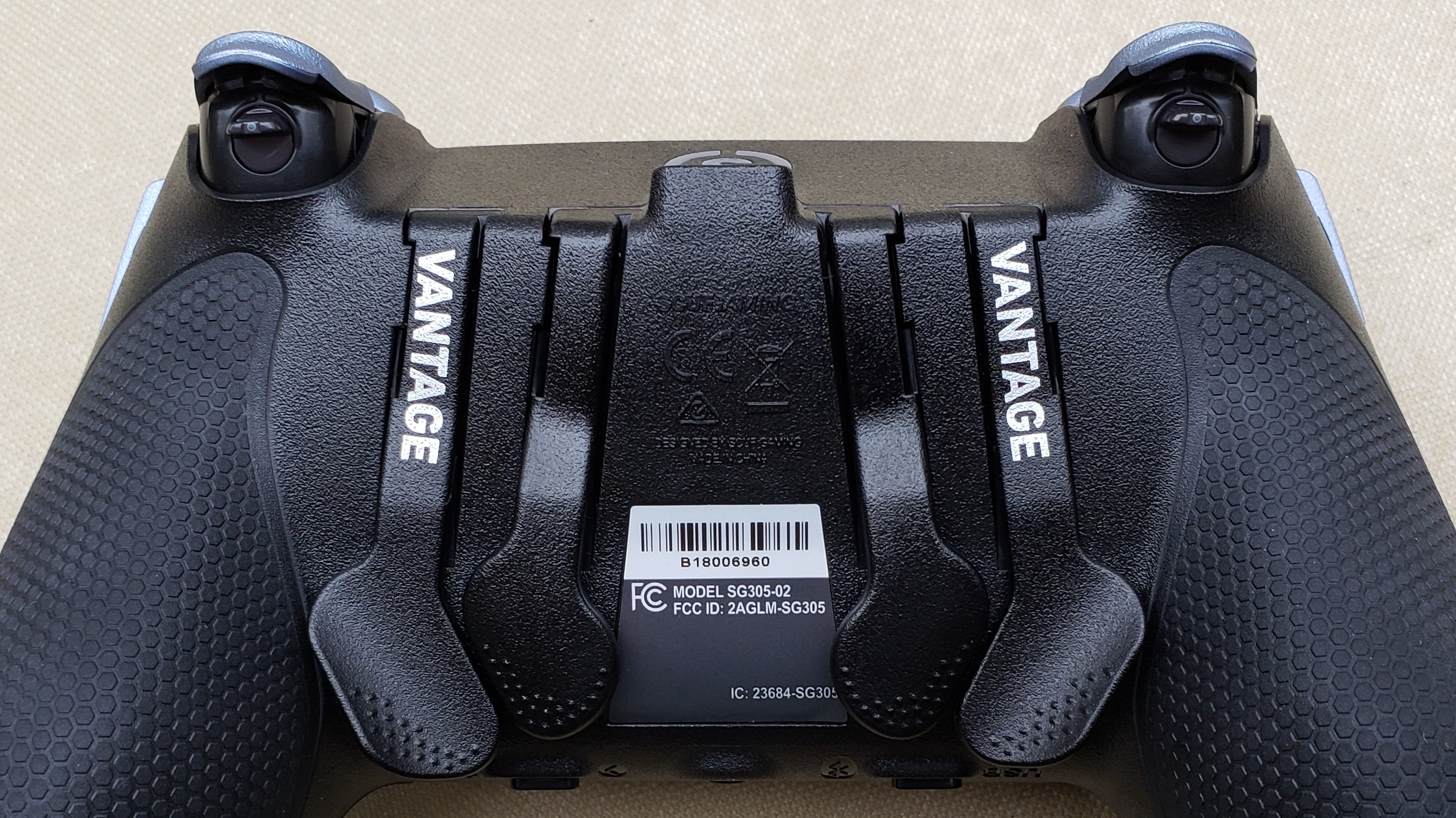
Moving to the top, shoulder buttons possess a nice amount of give, and the springy back triggers can have their tension, travel and even button lengths adjusted, by which you can simply snap plastic pieces off and on. Then you’ve got your multi-functions: Wedge-shaped proprietary Sax buttons adorn the sides of the Vantage, while the ever-present Scuf paddles, four to be exact, are situated on the backside of the controller. 

The last on-board feature is perhaps the coolest and most practical: An integrated audio touchpad, which can be slid to adjust volume and hard-pressed to mute your live microphone. The only downside here is that the headphone jack will only work while the Vantage is in wired mode. Also, note that while the Vantage does have a sort of custom Scuf-themed light bar up front, you’re unable to use the controller with the PlayStation VR.

Performance

In wired mode, the Vantage performs brilliantly, with practically zero hiccups or latency issues. The included 10-foot braided micro-USB cable allows for plenty of distance between gamer and television and should accommodate most entertainment center setups. 

Bluetooth mode, which quickly pairs to either PS4 or PC and is activated with the simple flick of a switch, isn’t flawless but works leagues better than the same mode on Razer’s Raiju Ultimate. As expected, there is some miniscule, albeit noticeable, input lag. Most of the time, it falls into what would be considered acceptable territory, though swapping in a DualShock 4 will readily illuminate the tiny delay. 

Luckily, much of this seems to have been remedied with the latest firmware update, so if you’re experiencing issues, make sure to visit Scuf’s support page for the most recent download.

The analog sticks feel absolutely great ... that is, when they’re working correctly. Control sticks getting stuck, something that’s been a pesky recurring issue with Scuf’s past controllers, is unfortunately still a problem with the Vantage. It seems to be directly related to the swappable anti-friction rings, analog sticks and faceplates, and depending on how each piece was cut at the factory, control sticks can either move perfectly freely or occasionally get jammed in any number of directions. 

The predicament can usually be resolved by switching out the faulty ring, stick or faceplate in question. It’s really a guessing game, but once you isolate the problem area, it’s relatively easy to fix. 

On another control note, the disc-shaped d-pad feels pretty solid, minus an odd springiness that can sometimes distract from gameplay. But the cross d-pad, on the other hand, is way too rigid, almost to the point of being unusable. Fighters are next to impossible while its equipped.

Multi-function button mapping is achieved via a convenient switch along the bottom of the controller, and while a confirmation vibration or a companion app like that of Razer’s Raiju Ultimate would have both been nice, the on-board customization works swimmingly. 

The Sax buttons are a love or hate thing, especially depending on your style of play. They’re designed to be accessed via extended index fingers, which isn’t the most natural position, so your mileage may vary. 

The back paddles, on the other hand, feel excellent and are extremely easy to tap in the heat of gaming. It’s also very rare to accidentally hit one.

Lastly, the Vantage’s standard 1,000 mAh battery is fine, but a larger charging capacity would have been greatly appreciated.

Final verdict

Until Sony decides to jump into the pro-controller arena and release its own premium gamepad, Scuf’s Vantage is a solid choice to reach for in the meantime. Yes, it has its share of issues—including a slightly prohibitive price—but it’s an officially licensed gamepad, and its Bluetooth mode works way better than Razer’s similarly priced Raiju Ultimate, which makes the Vantage one seriously tough premium accessory to ignore. 

Samsung Galaxy A7 (2018) review

There's a lot about the Samsung Galaxy A7 2018 that makes us happy. It has a Super AMOLED, 18.5:9 screen, a triple camera setup, and runs the same interface as the flagship Galaxy S9 range, all at a lower price. 

No phone is an island though, and the Samsung Galaxy A7 has plenty of other mid-range phones for company – and cheaper options like the Nokia 7.1, Honor Play and Motorola One offer comparable specs for less.

The question is whether, with such stiff competition, Samsung can still get away with charging more than its competitors for its A series smartphones?
Samsung Galaxy A7 (2018) price and availability

You can pick up the 64GB Samsung Galaxy A7 now for $459 or £309. No Australian release has been confirmed. 

In addition to SIM-free options, the phone is available on contract for around £19 per month in the UK. 

Key features

  • Three rear cameras
  • 6-inch FHD Super AMOLED display
  • Looks like a flagship, performs like a mid ranger

Sporting a glass front and back coupled with a plastic frame, the Galaxy A7 2018 features a mix of mid-range and flagship materials.

It does however feature an impressive Super AMOLED screen, amongst the best you can get in this price range. The 1080 x 2220 resolution is perfectly respectable and the 6-inch size is big, without being overly cumbersome.

The A7 is running Android 8.0 Oreo; it’s a shame it didn’t get Android 9 Pie, the latest version of Google’s mobile operating system, although app support will still be excellent thanks to Google Play store support. It will get Pie, but no time-frame has been given by Samsung.

The Exynos 7885 chipset powering the A7 is distinctly middle-of-the-road, and is paired with 4GB of RAM. As for the cameras, the triple-camera system on the rear of the phone is a first from Samsung, with one wide, one ultra-wide and one depth-sensing camera.

With 3,300mAh of battery power on tap, the screen to battery ratio is promising too. Connections and biometrics are also fair, thanks to the inclusion of a headphone port, 4G, face unlocking and a fingerprint scanner; however, the Galaxy A7 is also the only £300/$450+ device we can think of that doesn’t feature a USB-C port, making do with the older micro USB connection.

Design

  • Plastic and glass design
  • micro USB charging
  • Flat surface

Priced at the upper end of the mid-range spectrum, the A7 2018 is competing with the Huawei Mate 20 Lite, Motorola One and Nokia 7.1

Like the competition, the Samsung A7 features a glass back and front. It looks good, but has a slightly hollow feel, so is bested by the beautifully designed Nokia 7.1 in this respect. The sides are also plastic and they feel it, further attesting to the phone’s mid-range positioning.

Still, at 7.5mm thin it’s slender, and the AMOLED screen tech separates it from the pack, while you have a good choice of color options, with the A7 available in black, blue, pink and gold. It’s a clean design, interrupted only by a couple of logos and a slight camera bump around the back. 

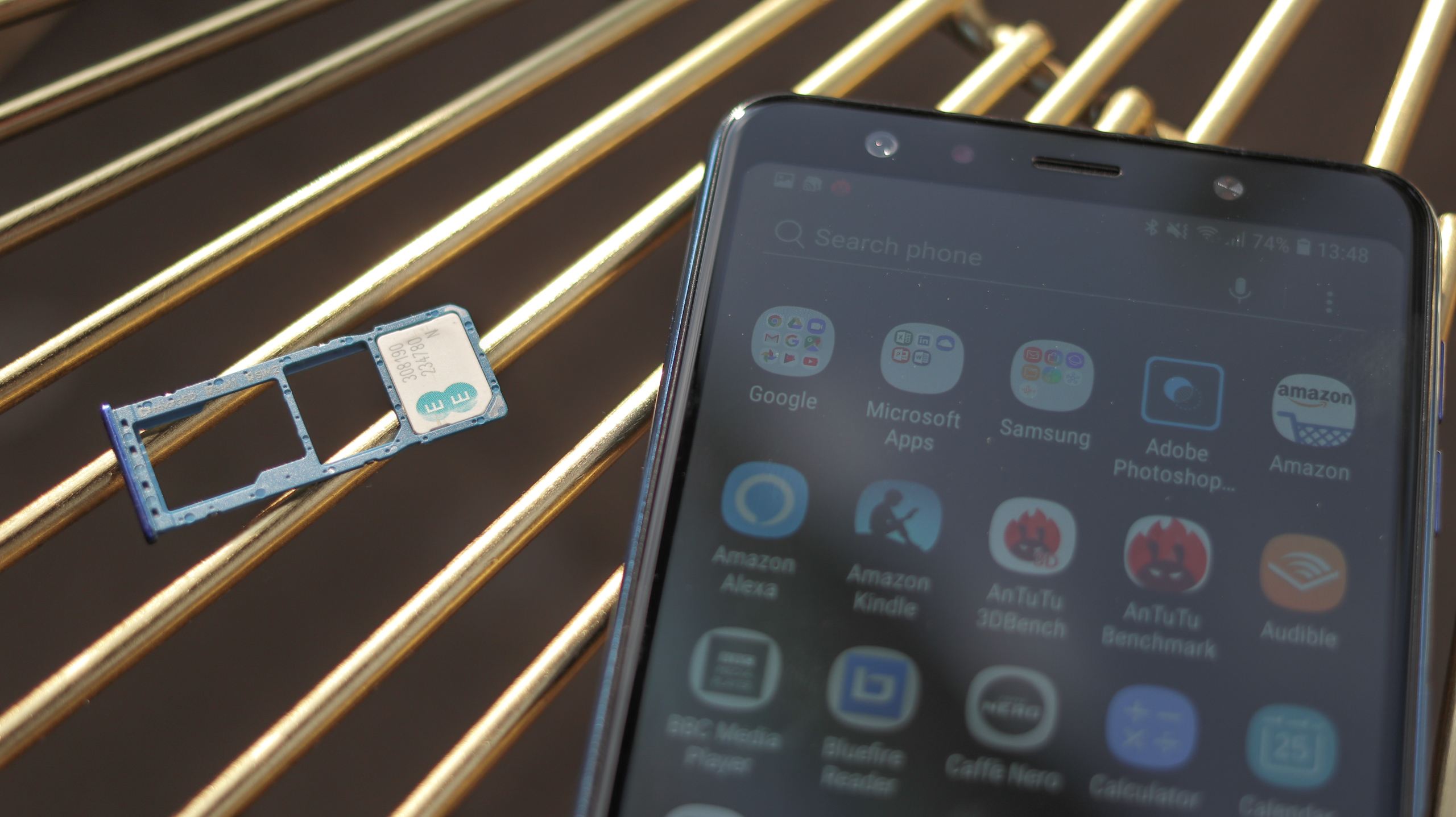
Two volume buttons and a flat, recessed, easy to hit power button are on the right-hand side of the phone, while on the left is the SIM tray, with our dual-SIM version supporting two SIM cards and a microSD card.

The power button doubles as the fingerprint scanner, a design decision borrowed from Sony phones of old. While it’s not as quick as flagship fingerprint scanners, it works reliably, not even requiring a full press to unlock the A7 securely – and there’s also Face Unlock to work in tandem and get you into your phone fast.

It’s great to see a headphone jack on the phone's bottom edge, though the micro USB port next to it is something of a letdown for any phone that costs over £200/$300. 

If all your devices still use this connector it isn't a big deal, but if you've started to migrate your arsenal of tech away from micro USB and towards USB-C, having a brand-new phone packing a last-gen port will mean a multi-wired life until you upgrade, again.

As for the A7's durability, Gorilla Glass keeps the front and back relatively protected, although there's no official IP rating, so you'll want to keep it dry.
Display

  • 6-inch 18.5:9 LCD screen, 1080 x 2220 pixels
  • No notch

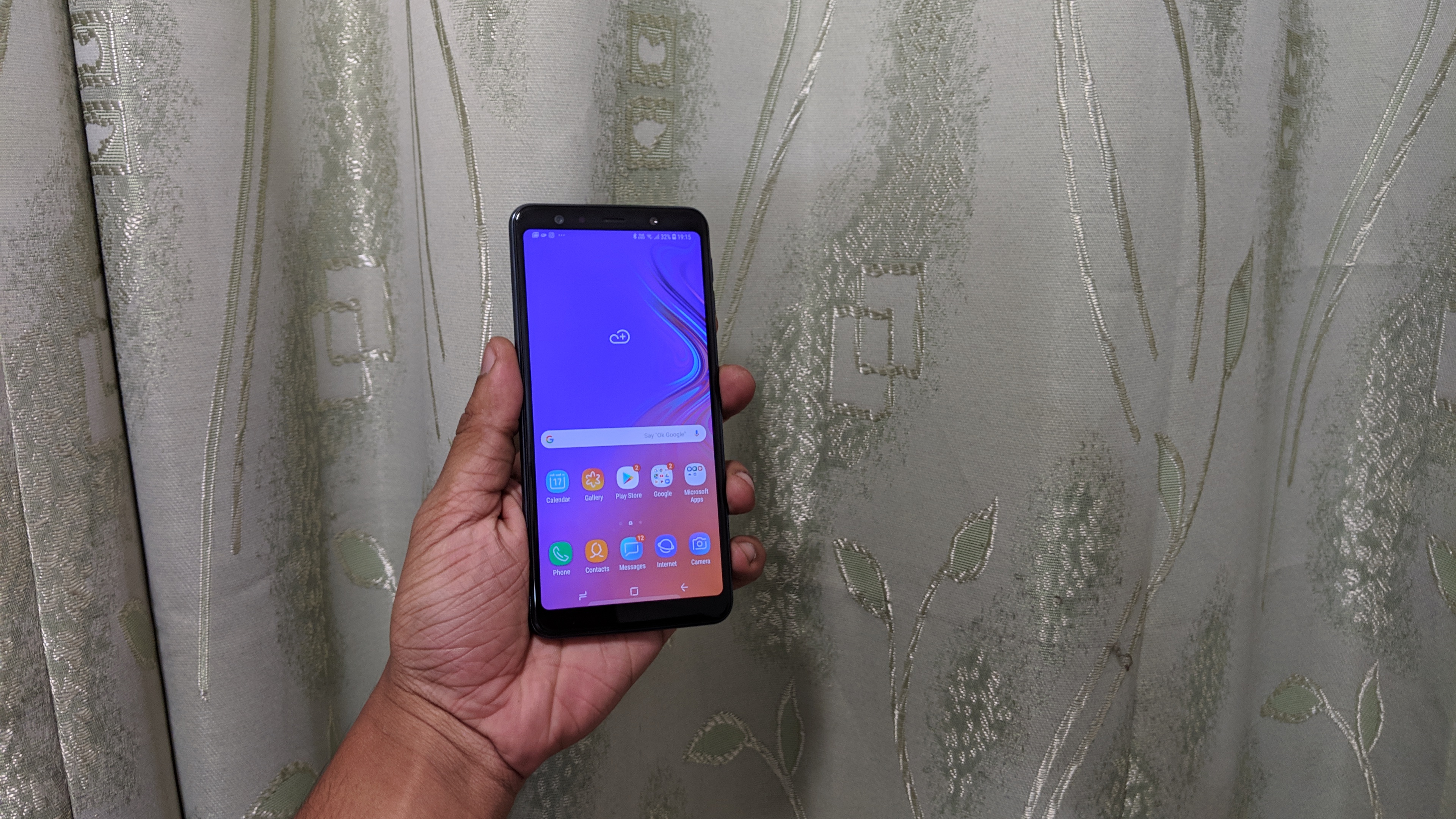
Samsung has paired the A7 with a seriously good AMOLED screen packing a Full HD+ resolution. Getting down to digits, that means 1080 x 2220 pixels, which at 6 inches delivers 411ppi.

A couple of things set this phone apart from Samsung’s flagship Galaxy S9. First off, it’s got some pretty beefy bezels, with a 74.4% screen-to-bezel ratio in contrast to the S9’s 83.6%. 

The screen isn’t curved either, and it doesn’t offer the same levels of color accuracy or detail as its flagship counterpart’s.

For the price, though, it impresses, packing punch and depth – more so than the IPS competition. The one area where it isn’t always reliable is white balance, with an old-school OLED red or blue tinge to ebooks or web pages with a lot of empty space. 

For photos, movies and general UI swiping though, the Samsung Galaxy A7’s screen nails it.

UI and performance

  • Android 8
  • Samsung UX over the top

Android 8.0 is paired with Samsung’s proprietary interface to serve up an experience similar to that of the S9 at a cheaper price.

This may sound like a good thing, and it is – but it also isn’t. Samsung is notoriously bad when it comes to getting the latest software on its devices, and in this instance Android 8 is a generation behind what we would expect from any phone released now.

If hearing this doesn’t bug you, however, and you’re not fussed about having the latest software, it likely won’t put you off the A7. Samsung skins Android so heavily that you’ll be hard pressed to notice tangible differences between Oreo and Pie, and you still get access to all the Android apps in the Play Store.

The fundamentals of the UI are all familiar – home screen, apps tray and notifications bar, but there are some useful Samsung customizations. Secure Folder, for example, lets you lock files and folders to keep prying eyes at bay. It’s also more customizable than stock Android – you can change the home screen grid size, and download a range of themes to shake up the look and feel of the UI.

The Galaxy A7 also has the optional Bixby Home screen, a screen to the left of your main home screen that replaces the stock Google home screen. It displays similar information to its Googley counterpart – news updates and weather information, although it also connects to Facebook, Spotify, Twitter and Uber, so serves as a more holistic hub. We found it a little busy and turned it off, but if you’re not a fan of opening apps, and use those four a lot, you may find it handy.

What’s also good about the UI is that it’s zippy. There’s none of the choppiness that can rear its head when using other mid-range phones such as the Motorola One, with the A7’s Exynos 7885 Octa keeping things ticking along nicely.

The benchmarks aren’t mind-blowing, but that doesn’t mean the A7 can’t handle 3D games, with apps like Monster Hunter Stories playing without too many frames dropped. 

Thanks to the Google Play Store, the selection of free and paid-for games is plentiful, and the 64GB of storage will be ample for getting a decent selection loaded on your phone.

Battery

 The Samsung Galaxy A7 2018 also delivers solid battery life. 

The 3,300mAh capacity is plenty big, able to keep the mid-range internals going for a full day, and if you’re careful with your screen brightness you could even get a day and a half out of this phone with light to moderate use. 

Samsung also loads up a bunch of power-saving options for those times when you want to stretch the battery life, and even if you don’t use them screen-on time is competitive, with the battery only dropping around 11% after 90 minutes of Full HD video playback at full brightness.

There’s no fast charging here, with a charge time of over two hours to take the A7 from 0-100%, so it isn’t all good, and there’s no wireless charging either – so every time you need to power up you’ll be forced to use that dated micro USB port.

Camera

  • Triple camera
  • 120-degree ultra wide lens
  • AI powered software

The triple-camera system on the Galaxy A7 is a first from Samsung, as is the quadruple camera system on the new Galaxy A9. Such arrays are likely the shape of things to come on the upcoming Galaxy X, although the odds are that the X will offer significantly better image quality.

That isn’t to say image quality from the A7 is bad – it’s absolutely what we’d expect from a mid-range phone, but part of us would have preferred one excellent camera over three inconsistent ones.

Starting with the specs, there’s a primary 24MP sensor (f/1.7, with phase-detection autofocus), a 5MP depth sensor for better portrait mode pictures, and an 8MP sensor (f/2.4, 13mm equivalent focal length) for wide-angle shots.

In good light the 24MP sensor fares really well, capturing bags of detail. Samsung loves to process its pictures heavily, and pictures taken on the A7 are no exception – colors are boosted, as is contrast, and these images don’t leave a huge amount of scope for editing once taken, although they’re generally social media-ready.

It can also get pretty close to a subject – about 6-7cm, enabling you to take some stunning macro shots. Low light shots aren’t terrible, but the pumped contrast and processing means they look much better zoomed out. 

Start pinching into pixels and you’ll notice the mediocre dynamic range, and heavy noise reduction and softening.

As for the wide-angle camera, this doesn’t have autofocus so is limited to landscape shots, and fares worse in poor light than the primary camera. 

It delivers GoPro levels of distortion, with barreling being more extreme than from wide-angle lenses from LG on the G7 or Huawei on the Mate 20. This all means you get stylized pictures that don’t look all that realistic, but which could be just the ticket if you’re after dynamic-looking shots.

Where the wide camera falls down is low-light video specifically, with significantly worse light grabbing capabilities than the main camera and worse noise handling. In fact, low light video is probably the only area where the Galaxy A7 just can’t hold it together across the board, with quality crumbling to unusable levels pretty quickly.

Another impressive feature, though, is the stabilization when shooting video; it’s not flagship level, but we wouldn’t expect it to be at this price, and it’s certainly better than what you’ll find on most sub-£350 /$450 smartphones.

Happily, we’re going to end this section on a couple of highs. The first is depth perception and bokeh effects – this works really quickly and relatively well. Even flagships like the Pixel 3 can take a bit of time to make the background actually blur, on account of only having one lens, so this suggests that the third, depth-sensing lens isn’t just a gimmick – it actually saves you time.

The final camera highlight is the front snapper: 24MP, f/2 and packed with modes, from beauty mode and AR emojies through to a selfie bokeh mode – if you’re looking to have a bit of fun with your selfies, the Galaxy A7 could be just the ticket.

Additional camera samples

 Storage and connections 

  • 64GB storage
  • micro USB charging port

An impressive feature here is that Samsung gives you 64GB of storage on the Galaxy A7, the same capacity found in flagships like the Galaxy S9, Razer Phone 2 and Sony Xperia XZ3, not to mention the entry-level model of the new iPhone XS.

There’s also a microSD slot, so you can bump up the internal storage by an additional 512GB, plenty for any movie nut or music hoarder. The 4GB RAM likewise matches many flagships, while the A7 offers 4G connectivity up to Cat. 6 (301Mbps).

Verdict

The Samsung Galaxy A7 is, for the most part, a great mid-range phone. It delivers a punchy screen for the price and a solid user experience, while the camera system is really versatile. It also has great battery life and plenty of storage.

Beneath its sleek exterior, however, the A7 does feel a touch hollow, with the plastic frame paling in comparison to the rich metal on the cheaper Nokia 7.1, while the micro USB port and lack of fast charging are disappointments. 

If none of that phases you though, and you want a great user experience, you can pick up the Galaxy A7 with confidence.

Who it's for

 If you don’t want to pay flagship bucks for a good-looking phone with a versatile camera system and a great screen, the A7 could be for you. 

It’ll even serve casual gamers well, and with its ample storage should keep movie fans happy. The 3.5mm headphone port is also a plus. 

Should I buy it?

Yes, if you don’t mind the plastic frame, slightly hollow finish, dated charging port and not having the latest version of Android on your phone. 

It’s also worth noting that there’s no manual camera mode and that pictures taken on the A7 are processed a fair bit, so amateur photography enthusiasts may not always love the results. 

If, however, you’re happy with a phone that makes the decisions for you when it comes to picture taking, is reliable and snappy, and has a killer screen for the price, go for it.

Before you buy the Samsung Galaxy A7 (2018), why not check out the competition?

Honor 8X

Costing almost £70 less than the Galaxy A7 in the UK, though not available in the US, the Honor 8X gives you much of what makes the A7 great, as well as more screen, more battery and more power. 

You aren’t getting the Galaxy S9-esque user experience, but with more manual camera modes and such a big saving, anyone who wants a bigger screen and doesn’t mind forgoing a few Samsung niceties could profit from checking out the 8X. 

Read our full Honor 8X review

Honor Play
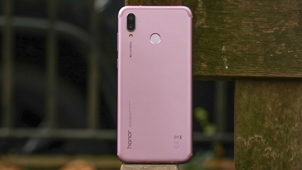
Honor Play

 Honor is nailing it in the mid-range market right now, and the Honor Play crams in a huge amount of power thanks to the Kirin 970 chipset, while costing less that the Galaxy A7. 

This also guarantees it speedier 4G speeds, and better gaming performance. The all-metal body gives it a more industrial look too, while the inclusion of a USB-C charging port makes it feel a bit more future-proof.

Read our full Honor Play review 

Nokia 7.1

 The Nokia 7.1 outdoes the A7 when it comes to the design and in-hand feel. It’s also an Android One phone, so has a stock take on Google’s mobile OS and will get software updates sooner. 

Its Achilles’ heel, however, is the 32GB onboard storage – half that of the Galaxy A7, although like the A7 it offers microSD expansion. 

Read our full Nokia 7.1 review

First reviewed: November 2018

Ashampoo Uninstaller 8

Uninstalling software can be a nuisance – if you rely on programs’ own uninstallers, or Windows’ add/remove programs dialog, you can only select one program at a time to remove and you're often left with temporary files, empty directories and old entries in the Windows Registry. These might not take up much space by themselves, but over time that clutter accumulates and it can cause errors if you later want to install a new version of the same software. 

That's why a good software uninstaller is such a worthwhile investment, and Ashampoo has updated its premium offering, Ashampoo Uninstaller 8, with several new features and enhancements for the year ahead. The software is usually priced at $39.99/£29.99/AU$49.99, but is currently discounted to $20/15/AU$25.

Monitoring and removing

Despite performance improvements under the hood, Ashampoo Uninstaller's interface has mostly remained the same since version 7, with simple menus and clear icons (plus a choice of dark and light themes), but there are some differences. The most noticeable of these is the simplified overview screen, which now contains fewer statistics, letting you focus on the numbers that matter (such as the number of applications and plugins installed).

One of Ashampoo Uninstaller's key features – the ability to automatically track changes to your PC so they can be easily reversed at a later date – is now given extra prominence, but you can also choose to leave it deactivated and log installations manually using the ‘Install’ option in Ashampoo Uninstaller’s sidebar menu.

Select this button, then locate the installation file on your PC and run it like normal. Once you’ve finished, click ‘Installation completed’ to capture a new image of your PC. When this is complete, you’ll see how many new files have been added to your system, how much space the new program occupies, and how long it took to install.

When installations are logged, Ashampoo Uninstaller takes a ‘snapshot’ of your PC before the software is installed and another one after, so the changes can be easily reversed. You can also take 'snapshots' yourself at any time - not just when a program is installed - and compare them to see how your system has changed over time.

When you uninstall an application, the option to automatically perform a deep scan for residual files is selected automatically. After the software has been uninstalled, Ashampoo Uninstaller will tell you how many (if any) files and registry entries are left over, and offer to delete them for you. If you like, you can also have the files 'wiped' (overwritten with random data so they're impossible to recover), though this takes a little longer.

Ashampoo Uninstaller 8 doesn't just remove software that's been logged (although this is quicker) - it can clean up any unwanted software. This includes Windows apps – either ones pre-installed with the operating system or downloaded from the Microsoft Store – and there's even an option to uninstall them for all users in the Settings menu. This is very handy, but bear in mind that any of Microsoft’s own apps might be reinstalled next time you download a Windows update.

PC maintenance

If your hard drive is getting full, a quick dip into Ashampoo Uninstaller 8 can help you see if there are any applications you could remove. Installed programs are split into helpful categories, including ones that have been recently installed, ones that have been logged, ones that are particularly big, and any that have been negatively rated by other users.

Ratings are a particularly helpful tool, enabling you to see at a glance if there’s any potentially malicious software on your PC that should be removed as soon as possible. You can add your own ratings to help fellow users by clicking the stars beside a program’s name. Your rating will be factored in the next time Ashampoo updates the software.

That's not the only way to Ashampoo Uninstaller 8 can help keep your PC free from clutter; as a bonus, Ashampoo has thrown in a bundle of extra optimization features. Some of these (such as the registry optimizer and startup manager) are pretty standard tools you'll find in almost any PC maintenance software, but the file associator isn't something you see very often, and is a very handy way to solve the problem of files opening with a program other than your preferred option.

Ashampoo Uninstaller 8 is a superb software uninstaller, and will be a real boon for anyone who enjoys trying new programs and is tired of spending hours cleaning up afterwards. 

Vivo NEX 2 Image Leaks Reveals two Displays & Triple Rear Cameras

Vivo NEX 2 has been leaking from few days and now fresh image leaks of the handset are out in China. These devices have surfaced on Weibo and these are revealing the smartphones front as well as back. This clearly shows that the smartphone will be having two different displays with the main display being a bigger one while the secondary display will be a smaller one since it has to house the cameras and the flash on the rear.

As per the leaks, the secondary display will be implemented to maximize the screen real estate. The users will be able to take selfies with the rear camera itself as they will be assisted with the secondary display. This ensures that the front of the device does not have any bezels and will now any place for the notch also. Furthermore, the device will be having an RGB Lunar Ring which will be placed around the triple camera setup on the back.

The Lunar Ring will be used to notify the users when they have any notifications and will be glowing in a number of different colors. Well, the Vivo Nex 2 is also said to be featuring a time-of-flight scanner which will be able to scan 3D objects that include human faces from all sides. This will be useful while it comes to augmented reality (AR) and will support all the AR captures.

The handset is expected to be unveiled in the month of December looking at all the leaks circulating and we do not have any confirmation from the company yet on the same. What do you think about the device? Will it be coming with dual displays? Will you like to use this device? Comment in the section below to share your views and stay tuned to PhoneRadar for more.

Source

The post Vivo NEX 2 Image Leaks Reveals two Displays & Triple Rear Cameras appeared first on PhoneRadar.

Norton Secure VPN

Many security vendors now offer a VPN service - Avast's SecureLine, Kaspersky's Secure Connection, Avira's PhantomVPN - and Norton Secure VPN (the product formerly known as Norton WiFi Privacy) is Symantec's entry into this field.

We were interested to see how the service compared with the specialist competition, but Symantec's website didn't make any real effort to tell us. There's no mention of the network size, where its servers are, supported protocols, or anything beyond the fact that there are apps for Windows, Mac, iOS and Android.

After installing the client, we found Secure VPN offers a fair choice of 29 countries covering North America and Europe, with other locations including Australia, Brazil, Israel, Japan, Mexico, New Zealand, Singapore and South Africa.

The service uses the speedy and secure OpenVPN protocol, but it doesn't provide separate OpenVPN configuration files or setup tutorials which might allow you to manually set up the VPN on other platforms (game consoles, smart TVs and so on.)

Prices start at $26 (£20) for a one year, one device license, rising to $52 (£40) on renewal. Covering five devices costs a more reasonable $39 (£30) for year one, $78 (£60) on renewal, and a ten device license is $78 (£60) initially, $91 (£70) on renewal.

That looks expensive, to use. Avast's SecureLine will cover a single mobile device for $19.50 (£15) a year, while Private Internet Access charges an annual $40 (£30.77) to cover up to five devices. But it's still cheaper than some - ExpressVPN asks $100 (£77) to cover three devices for one year - and you shouldn't necessarily be put off by the price alone.

There's no free product or trial to allow you to evaluate the service, unfortunately, but you do get an unusually generous sixty-day money-back guarantee. Well, that's the idea, anyway - the exact rules vary depending on where and how you buy the product. The best advice here is to carefully read the small print.

Privacy

Privacy and logging

The Secure VPN website claims the service provides a "no-log virtual private network that doesn’t track or store your activity." That's a good start, although there's no more detail on the front page.

A 'What is a no-log VPN?' support article vaguely states that the service 'collects subscriber information for communication purposes, mobile device data, and aggregate bandwidth usage', although it 'does not log information about where you go on the internet.'

Norton's Privacy Policy adds more detail. The mobile device data includes 'device name, type, OS version, and language', apparently, while the service also records 'temporary usage data to assist with debugging a problem with the service.'

This still seems very unclear, to us. Does the service really only record data for mobile devices, and not desktops? Are these the only items logged, or does that 'including' mean there might be others? What 'temporary usage data' is recorded, and how temporary is it?

Even when the policy rules something out, it still leaves us unsure. The statement that 'Symantec does not store the user’s originating IP address when connected to Norton Secure VPN and therefore Symantec cannot identify individuals' seems definitive, for instance, but it doesn't tell us that the destination IP address isn't stored, and so can't rule out a degree of session logging.

We suspect this lack of clarity isn't down to Symantec trying to hide anything underhand. Like most non-specialist providers, the company is just assuming its customers aren't that concerned about the fine technical details, and they've not made any real efforts to spell out exactly what's going on. 

Still, if Symantec wants to compete with the big VPN names, they'll need to do better than this, and we hope they'll get more specific in future.

Apps

Apps

After signing up for Norton Secure VPN, a Welcome email offered a Getting Started link to find and install the service. Except, well, it didn't, with a Device Not Supported message telling us 'Norton does not run on this Windows operating system.' What, Windows 10?!

Fortunately, the post-signup web page also offered us a Getting Started link, and this one worked correctly, offering us a chance to download a client for this device, or use another.

Countries list

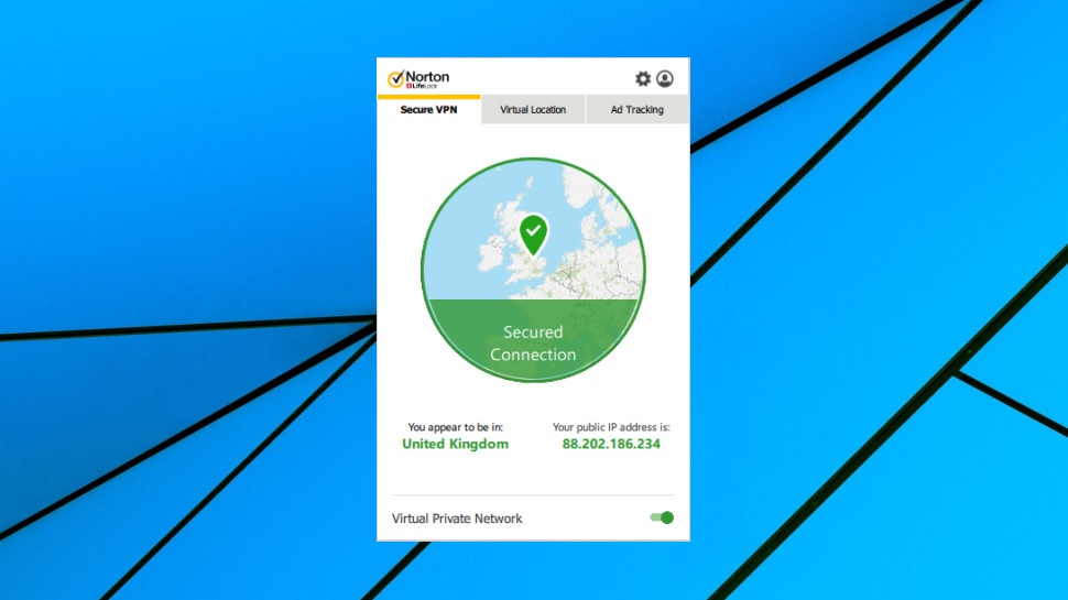
The client interface has plenty of visual appeal. Your current location and connection status are highlighted on a small map, there's smart use of color to emphasize key information, and even a total VPN novice will immediately figure out what they need to do.

Unfortunately, there's also a more technical design issue. The app is drawn to look like a regular application window, but it isn't. You can't click and drag on the title bar to move the window, for instance, and if you click on anything else, it disappears. You get used to this, but it's still an annoyance, and it's hard to think of any good reason why the developer implemented it that way.

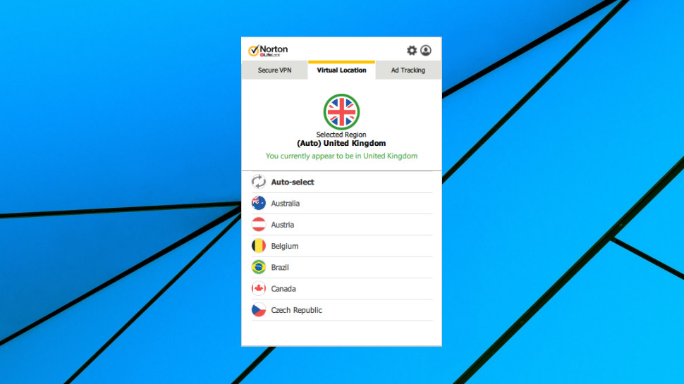
There are very few features. You must choose locations from a single alphabetically-sorted list of countries, with no way to filter or search the list, no option to choose locations within countries, and no indication of server load, ping time or any other way to help you make the best choice.

There's a usability problem, too, in that the main tab doesn't show the currently selected location. That doesn't matter when you're connected as it's displayed on the map, but when you're offline, it's a different story. You must either remember which location you used last time, or you'll have to click the Virtual Location tab first.

The Settings menu is sparse. You can have the client launch along with Windows, and optionally connect to your nearest server, but that's it. There's no ability to change protocol, adjust connection settings, have the client automatically connect when you access insecure networks, or any of the other options you'll commonly find elsewhere.

The only bonus feature we could find was simple tracker blocking. This has some value as it's implemented as the connection level, so will work on all your browsers and software, without the need to install browser extensions. But it has no configuration options beyond 'on/ off', and you'll get far more power and features by using something like uBlock Origin.

OpenVPN configuration

The client has no sign of a custom kill switch, but our tests suggested that OpenVPN covers the basics. When we tried manually closing the OpenVPN.exe process, our internet access was blocked for a brief period, the service reconnected and our previous IP was restored.

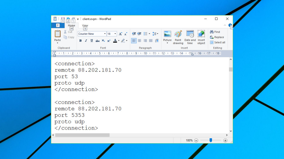
We spotted an unusual technical touch in Secure VPN's OpenVPN configuration. While other clients try to connect to a single server, in a specific way (via TCP or UDP, for example), Secure VPN is much smarter. Its configuration file can retry connections using more than 30 methods, which include changing server, port and using TCP or UDP.

This is interesting, but we're not sure how practical it is. Connecting could take a very long time if the client has to cycle through several of these, and it means you can never be quite sure which server, port or connection type it'll be using. But then usually you'll get connected first time, and if you're in a country which tries to block VPNs, having the client try multiple settings will give you a better chance of getting online.

Mobile VPN apps are sometimes very different to the desktop versions, and Norton's Android app has an immediate advantage over the Windows build: there's a 7-day trial.

Aside from that, though, the app basics are much the same. It automatically connects on launch; you're able to choose a new location from a simple list, and there's no Favorites system or any other way to speed up finding and reconnecting to specific servers.

We did notice one bonus, and it's a useful one for a mobile app: it can automatically connect to the VPN when you access an insecure network. It's a small feature, but worth having, as it means you don't have to remember to turn the system on yourself.

Performance

Performance

Norton Secure VPN doesn't provide raw OpenVPN configuration files, which means we weren't able to use our automated performance testing tools. Instead, we switched back to our older approach of manually logging in to individual locations, then checking download speeds with Fast.com, SpeedTest.net and TestMy.net.

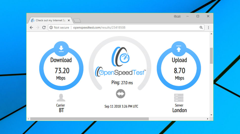
Local connections to our nearest UK server were excellent, with downloads consistently reaching 60-66Mbps. Nearby European countries were little different at 50-65Mbps, suggesting these figures were limited by our 75Mbps test connection rather than Norton's own network. If your connection is faster, you may well see better speeds.

US performance was also above average at 45-65Mbps. There's no option to choose cities, though, so results will vary depending on your location.

More distant locations didn't always fare as well - Australia was a little disappointing at 15 to 25Mbps, Mexico managed 8 to 18Mbps - but even these would be perfectly adequate for many applications.

Netflix

Netflix

While some VPNs make big claims about how they can bypass all geoblocking and get you access to any website you like, Norton Secure VPN barely mentions this at all, beyond a general claim that it allows you access to your favorite websites 'anywhere you go, just as if you’re at home.'

This doesn't mean the service is short on unblocking power, though. We connected to the UK server and were able to stream BBC iPlayer content without any issues or complications.

Switching to the US got us instant access to US-only YouTube content, another welcome success.

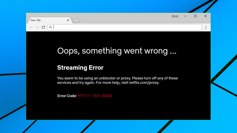
Norton Secure VPN even allowed us to view US Netflix, one of the greatest challenges in content unblocking. We would recommend testing this yourself - Secure VPN might assign you multiple IPs and we can't be sure they'll all get you in - but we had no problems, and that's a very good start.

Support

Support

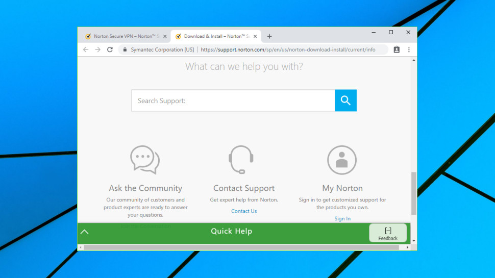
If you run into problems with Norton Secure VPN then you could head off to the support site, but we'd recommend you keep your expectations low. There are a small number of FAQs, mostly very short on detail, and if you've any VPN experience we suspect you could produce better content in an afternoon.

The chances are you'll contact the support team direct, then. Especially as Norton makes it so easy, with 24/7 live chat and phone options.

The results you'll get are, well, variable. In our experience, Norton's front line support agents aren't VPN specialists. They can answer basic product spec and setup questions, but ask them to diagnose anything more complicated and you might run into trouble. That doesn't necessarily mean you'll be left alone - they can escalate major issues to more knowledgeable staff, and use remote access to see exactly what's going on - but we think you'll generally get better support from a specialist VPN provider.

Final verdict

If your VPN needs are simple then Norton Secure VPN's stripped-back interface might appeal, and if you've only one device to protect, it's cheaper than some. Experts will be frustrated by the lack of features, though, and there are much better VPNs around.

ApowerREC

We’re great fans of Apowersoft’s free online screen recorder, so we were curious to see how the premium desktop software compares. ApowerREC (usual price $39.95 per year) is also available for Android and iOS, but here we’re looking at the PC version.

Everything is clearly laid out, with large icons that display tooltips when hovered over, plus keyboard shortcuts. At its simplest, you can just hit the red ‘Start recording’ button to begin capturing the whole screen – but the software is capable of much more than that.

You can record a section of screen with specific dimensions or a custom area (though unlike some other screen recorders, there’s no option to choose an active window to record) and capture footage from a webcam – either by itself, or picture-in-picture.

It’s also possible to record sound – from your system, your microphone (for narration), both or neither.

Recording options

There are extensive tools for annotating your recordings while they're being captured, all of which are accessible via a collapsible palette on the right-hand side. These include a paintbrush, highlighter, arrows, shapes, text and (particularly useful for tutorials and presentations) an automatic numbering tool, which isn’t something we’ve seen in screen recording software before.

To remove any annotations, simply click the undo arrow. There’s also a whiteboard mode for making more extensive notes, which temporarily turns the background a solid color.

ApowerREC also includes a screenshot tool (accessible through the Tools menu), which allows you to select a region of the screen, apply annotations and captions, and either save the resulting image or pin it to the screen. It’s a well thought out addition.

You don’t have to start recordings manually; ApowerREC includes a feature called Follow Recording, which starts capturing the on-screen action when you launch a certain program and ends it when you close it again. It’s also possible to schedule recordings to take place between certain times. Many screen recorders offer one of these options, but not both, so this is impressive.

Delving into the settings provides a mass of other options, including the ability to show, hide or highlight the mouse pointer in recordings, customize keyboard shortcuts, choose an output format for screen grabs, set audio cues and much more. There’s a lot to explore, but it’s all neatly categorized and having these advanced options tucked away means the main interface is kept uncluttered for users whose needs are straightforward.

Save and export options

Once you’ve finished your recording, it will be saved automatically and you’ll have the opportunity to adjust it using a simple built-in editing tool. A full video editing application would be overkill – this is a simple tool that allows you to clip your recordings to length, apply a custom watermark, and add intro and outro cards. There aren’t many customization options here (you can only change the text), but the designs are attractive. 

When you’ve finished editing, you can export your video in your choice of 14 popular formats, including MP4, WMV, AVI and MOV. This is an impressive selection; many screen recorders only allow you to export in one or two formats, meaning you’ll need another program to convert the exported files.

Recordings will be shown in a collapsible list below the main recording interface, and right-clicking one gives you the option to share it via YouTube, Dropbox, ShowMore, Vimeo, Google Drive or an FTP connection. 

Whatever you need a screen recorder for, ApowerREC is well worth a look. It's powerful, flexible and packed with carefully designed features that will make your life easier.

1&1 IONOS HiDrive

Recently, 1&1 has merged with the German enterprise cloud specialist, ProfitBricks, to form 1&1 IONOS, and it is this company that has developed the version of HiDrive that we’re reviewing here.

In a crowded SaaS market, what has HiDrive to offer that makes it a good alternative to Dropbox and the other big cloud players?

1&1 IONOS HiDrive

Features

Most SaaS solutions offer either synchronization or ad hoc file storage, but HiDrive is one of the few that does both in a single package.

Desktop clients (PC and Mac) can sync their folders to the cloud, and they can also place files that aren’t stored on the computer into that same space. Mobile devices are also supported, with automatic securing of photos on both iOS and Android.

A nice extra twist is that you can also hook up this product to devices that support FTP, rSync, SCP and Git, like NAS boxes.

What the service doesn’t offer is any means to secure an entire computer enabling it to be fully restored in the event of a storage or hardware failure. Instead, it’s meant as a point-and-secure mechanism where you highlight the folders you need to keep safe, and the software then dispatches them to HiDrive cloud storage.

You can redefine the tree hierarchy, enabling you to secure the majority of folders that you commonly use, and you can also tag arbitrary ‘device’ folders to accommodate those apps that refuse to store things logically.

The only limitation of this is that the main HiDrive defined folder is a live backup, whereas the ad hoc ‘device’ backups are either manual or daily. We also noticed that only folders that are physical drives and not network attached storage can be secured.

1&1 IONOS HiDrive

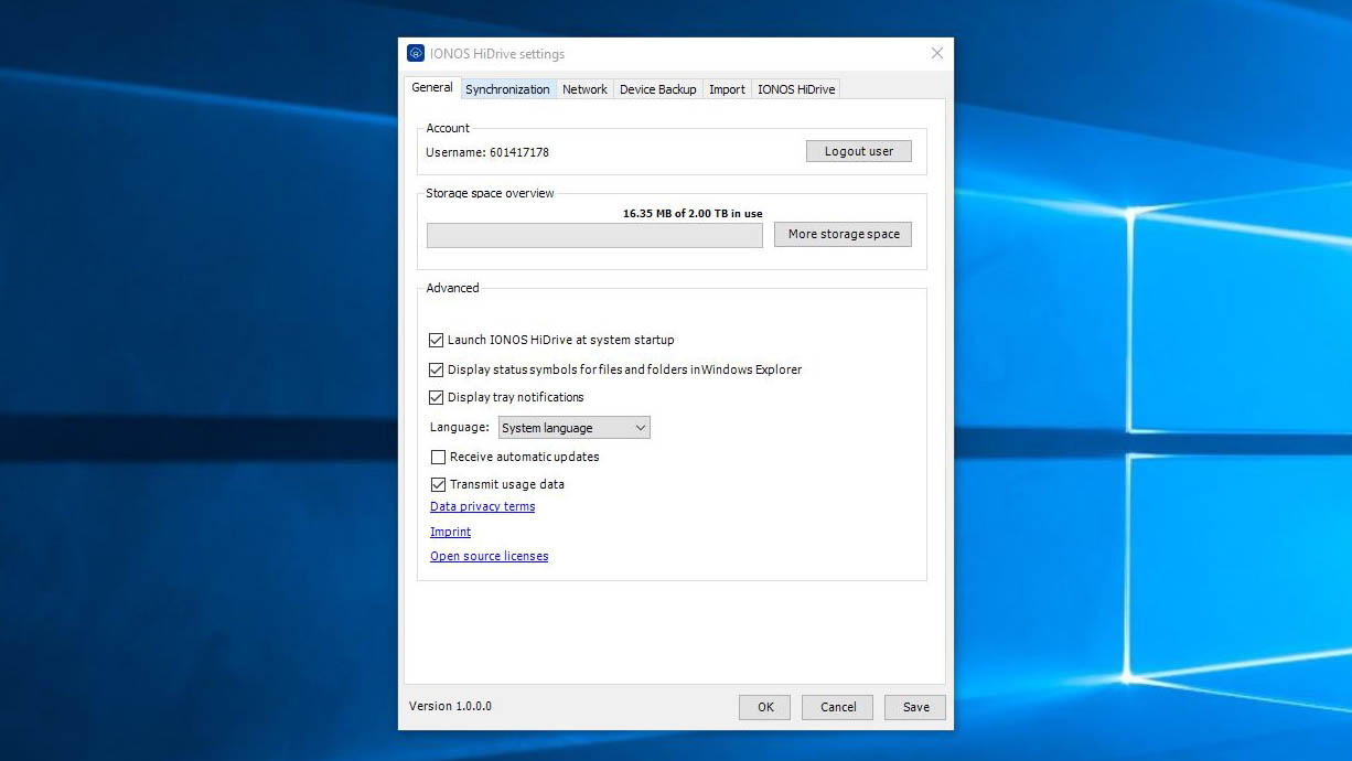
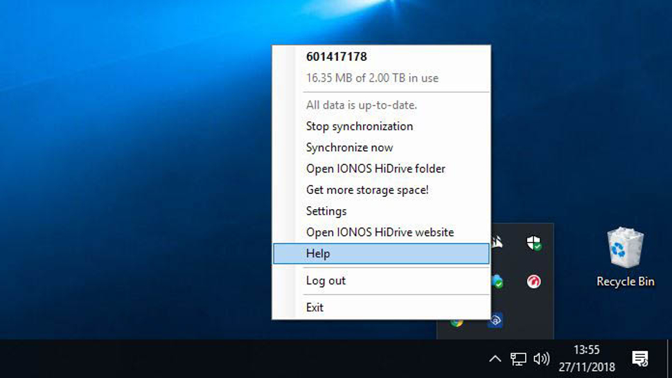
What also might confuse some users is that the client application bolts the service into the computer at two entirely different points by default.

A virtual drive letter is used to create a top-level drive pointing to the HiDrive storage, and almost the same files are also available through the C:\users\username\IONOS HiDrive folder structure, except for the Public folder level.

The danger is that users think they’re different for whatever reason and delete things from one assuming the files will remain in the other location.

A single user account is allowed 10 devices, split between Android, iOS and Windows computers, allowing you to use the service to sync the contents of multiple machines.

One noteworthy aspect is that the root of the HiDrive drive contains public folders and the user subsystem, making cooperative file and folder use much easier to organize.

A notable limitation is that in the current release of HiDrive there isn’t any versioning, so should someone foolishly overwrite an important file there isn’t any way for them to retrieve it from the live backup.

However, the device backup mode does divide each backup in a way that allows files from a specific day to be recovered. Unfortunately, you are forced to recover everything from that day to get one file, as there is no way to navigate the backup before restoration.

Overall, the latest client tool is a massive improvement over the older HiDrive client app, even if it has the odd tendency to revert to German and ask you to ‘Starten’ a process on occasion. And all dates are displayed in American format (MM/DD/YYYY) irrespective of the PC’s region settings.

Also note that links in the app often take you to German support pages, where English speaking Chrome users can have the amusement of seeing what Google Translate makes of them.

As this is version 1.0.0.0 of the app, a few minor issues aren’t unexpected.

1&1 IONOS HiDrive

Interface

We’ve already covered much of the desktop client, but the web interface has a whole slew of functionality that you can’t get from the desktop software alone.

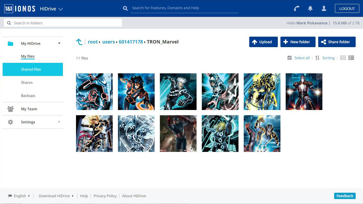
Whereas the desktop app focuses on the machine it’s installed on, the web interface not only provides global access to the files copied online, but also allows them to be shared remotely with others who don’t use HiDrive.

Shares can be password locked, write access denied and time-limited. There isn’t a means to limit the number of downloads, but the system logs the number of accesses.

As an administrator, you can also use this portal to access the folders of team members and make changes to the public area.

Probably the biggest weakness of the web interface is that it doesn’t link to any online office tools. Other than image file formats, the web interface has no plan for what to do with different document types other than to allow you to download them locally.

Security

Most cloud storage operations rely on SSL protected transfers and AES encryption on the servers to keep the contents safe from nefarious folks who might wish to access it.

This is the same security HiDrive offers. And, for most users, it is enough to keep their files safe. Although for very sensitive data there aren’t any greater levels of security, like two-factor authentication or private encryption keys.

According to the company, these options are being developed but aren’t available at this time.

In short, if you want end-to-end encryption, zero-knowledge passwords or even two-factor authentication, then look elsewhere until those features are added.

1&1 IONOS HiDrive

Pricing and verdict

Before we talk about pricing, it is worth knowing that 1&1 is a large operation, and various versions of HiDrive are being sold and circulated through its subsidiary, Strato, who are the developers for the HiDrive solution.

The version we tested came from www.ionos.com and not www.strato-hosting.co.uk or www.free-hidrive.com. The free version found at that last link, for example, is completely different from the one reviewed here – in almost every aspect.

This multiplicity is a very confusing aspect of HiDrive, and some customers might get a better deal than others depending on how they find the service initially.

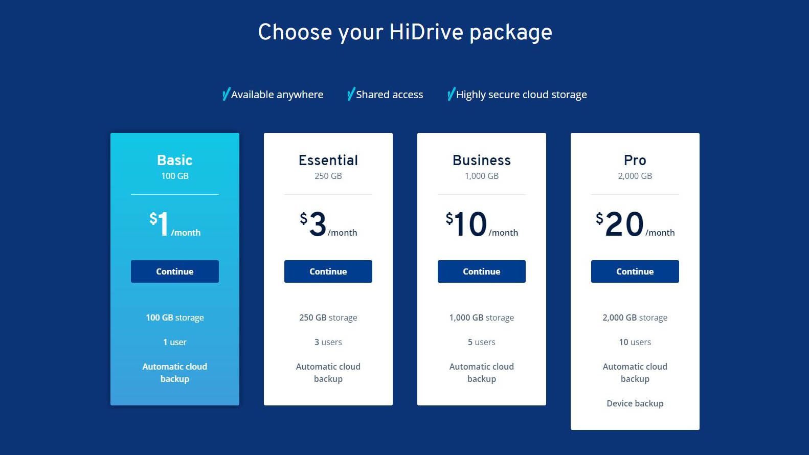
Those who go to Ionos.com are offered four tiers that start from $1 (£0.80) per month for a single user with 100GB of space – that’s the ‘Basic’ service. ‘Essential’ costs $3 (£2.40) and increases that to three users with 250GB storage, and the ‘Business’ tier boosts that to 1TB with 5 users for just $10 (£7.80) per month.

However, if you want the ‘device backup’ functionality we talked about earlier, that requires the top level ‘Pro’ tier which costs you $20 (£15.60) per month, but enables 10 users to work with 2TB of cloud storage. All these prices are with an annual contract, but you can pay a little more and have a monthly contract if this better fits your business needs.

To make it a relatively risk-free exercise, 1&1 IONOS offers a 30-day period where you can cancel and get a full refund if you are not completely happy with the service.

Those prices aren’t the most competitive, especially compared with Microsoft and Google, but they’re reasonable when the primary focus here is business users and small teams.

What you get for the investment is a fast and reliable platform that is reasonably easy to install and configure.

It needs some security enhancements, versioning support, and integration with Office 365 and Google Docs, but 1&1 IONOS HiDrive is a solid option for those businesses looking for something they can rapidly deploy which doesn’t require much user training.

Fastrack Reflex WAV Band — Top Features

Expanding its fitness trackers line-up, Fastrack has unveiled its new fitness band — the Reflex WAV Gesture Band. Priced at Rs 4,995, the new Reflex band features a sleek design (thickness of 9mm) comes with a bunch of gestures and also claims to be the first band to feature gesture-based controls. Apart from the gestures, the Reflex WAV band features an OLED display, activity tracking, 24-hour sleep tracking, syncing calendar events, and claims to have over a week of battery life. We have tested out the fitness tracker for a quite a while now, here are the top features we found on the new Reflex WAV

Despite the OLED display, the company has put in a total of 7 screens that will help you monitor all your activity through the band itself, in addition to the Reflex WAV app on your smartphone that also showcases your daily activity.

1st Display Screen

As stated since its a fitness band, after all, the first screen showcases you the necessary activity and information at a glance. For instance, it shows your time, steps and weather conditions that include current temperatures (Max & Min). There are long pressing gestures as well, where you can long press for 3 seconds that results in a vertical display on your band, where you can check the Time, Date & Day at a glance.

2nd Display Screen

This is where the band serves its actual purpose; this screen allows you to see how much distance you have covered that includes your steps taken, in addition to your calories burnt count alongside the progress bar.

3rd Display Screen

This screen primarily showcases if there are any events on your Google Calendar, which can be synced during the initial setup or via the app as well.

4th Display Screen

This screen can be utilized to show you the time, date and day and you can add a second city time as well. However, if you don’t need a second city time, you can long press the touch area for 3 seconds to get your Alarm display.

5th Display Screen

We believe a band would be complete if it allows or showcases you the music controls of your smartphone on the band itself (since music and fitness go in sync altogether). This screen exactly does that it allows you to play and pause or skip tracks by long pressing and hand-based gestures.

6th Display screen

This screen adds some extra functionality on your band; for instance, you can click a picture with your smartphone’s front or rear camera by using hand gestures. This would be useful for larger phones as clicking a selfie would sometimes be difficult in certain conditions. Long pressing the touch area for 3 seconds within this screen asks you to select the front or rear camera of your smartphone, which further takes you to your viewfinder on the smartphone.

7th Display Screen

While last but the not the least, the 7th screen showcases you the most prominent part of the band, i.e., is the battery status. There’s a bar along with battery percentage showcased on this screen. There’s also an Advance settings option on this screen as well, which when tapped allows you to explore some more settings.

The Advance Settings has a few more screens with several other options.

The First Screen – allows you to check whether the phone is connected by pressing the top touch area. There’s a start/stop sleep functionality as well, which can be enabled by pressing down on the touch area.

The Second Screen – this has an option to enable or disable the plane mode of your band.

The Third screen – allows you to factory reset by pressing on top touch area and a small press on the down touch area re-activates Bluetooth of your Reflex WAV band.

And lastly, the Fourth display screen showcases the current software version of the Reflex band.

Besides the display screens, where you have most of the control of your band or settings related to a smartphone, the Reflex WAV app allows you to dig deep into your daily, weekly and monthly activities. You can have a glance of your recorded activity through graphs. Since the Reflex WAV has a 24-hour sleep tracking functionality, the app allows you to monitor your sleep cycles and sleep times as well.

As this is featured to be the first gesture-based smart fitness band, as stated by the company, there are quite a few useful gestures that help you get along during small but necessary tasks quite easily.

As stated earlier, in the camera options screen (6th Display screen), which when enabled, a notification pops on your smartphone, thereafter rotating your hand allows you to capture the desired photo.

And while you are on the music screen (5th Display Screen), there’s a gesture to skip tracks easily. Opening your default music app on your smartphone and twisting your hand allows you to jump to the next track pretty quickly. The other gestures include controlling your Powerpoint presentations, and if you use a device based on Android 8.0 or 8.1, you can mute calls quite promptly with a gesture as well.

As acclaimed these gestures are certainly new to a fitness band, Fastrack did make this fitness band more interactable with gestures instead of just a fitness tracking device. However, the Fastrack’s Reflex Band isn’t perfect, the lack of Heart Rate Monitor is a disappointment especially for what it’s priced.

The post Fastrack Reflex WAV Band — Top Features appeared first on PhoneRadar.

Motorola’s Moto G7 Power Spotted Online with 5000mAh Battery

The upcoming Smartphones from Motorola has been in the leaks from more than a week now, and the announced G7 Power has been spotted passing through FCC filing. This new device will be included in the companies Moto G7 line that also includes Moto G7, G7 Plus and also the Moto G7 Play. All these devices are likely to be launched next year starting from the first quarter. Although nothing much about the device has been revealed through the filing, Motorola has revealed the Moto G7 Power will come with a mammoth 5000mAh battery.

The upcoming device is said to be coming in four different models varying from 2G to 6GB of RAM and the storage could be varying from 32GB to 64GB. Although nothing is been confirmed yet, we need to take all these things with a pinch of salt. Furthermore, it is expected to be coming with Snapdragon 632 chipset and might be coming out of the box with Android Oreo operating system.

The Motorola G6 Plus, which was launched earlier this year in the month of May, came with a front and back glass design with an aluminum frame. There will be a 5.9-inch touchscreen display with 1080 x 2160 pixels. It came out of the box with Android Oreo and under the hood, it was powered by a Qualcomm Snapdragon 630 Octa-core processor coupled with 4/6GB of RAM and Adreno 508 GPU. The storage variants available were 64GB and 128GB.

On the camera front, the Moto G6 Plus came with a 12MP+5MP camera set up on the rear with dual-LED dual-tone flash. On the front we can find an 8MP camera with LED flash There was a fingerprint sensor on the front and came with 3200mAh with fast battery charging 15W charger. We can expect similar kind of specs on the upcoming device also. Are you planning to get any of these handsets? Comment in the section below and stay tuned to PhoneRadar for more news and updates.

Source

The post Motorola’s Moto G7 Power Spotted Online with 5000mAh Battery appeared first on PhoneRadar.

OPPO Might Sneak Peek its First Foldable Phone At MWC, 2019

Not a long time ago, Samsung demonstrated its upcoming foldable smartphone at SDC 2018. The phone is slated to launch in the first half of next year. Huawei has also announced its plans to unveil 5G enabled smartphones sometime next year. And, LG has already filed its patent names for its foldable smartphones called Flex, Foldi, and Duplex.

Well, the bandwagon of foldable phone announcements isn’t stopping yet, a new report suggests that Chinese manufacturer OPPO might also come up with its new folding smartphone early next year. This comes right after the recent OPPO’s foldable patents filed report. According to the new report, Chuck Wang, the product manager of OPPO has spilled some beans about the OPPO’s upcoming foldable smartphone. He said that OPPO is planning to come up with its foldable phone and the company is also planning to announce it presumably at the Mobile World Congress in Barcelona, next year.

While the specifications and other significant details about the foldable smartphone are yet to be known, it appears OPPO is about to join the list of early manufacturers of foldable phones that are lined-up to be unveiled next year.

The report further suggests that OPPO would most likely release a 5G enabled phone of its Find series in the first quarter of next year, most likely in Europe. Stay tuned to PhoneRadar for more updates.

Source

The post OPPO Might Sneak Peek its First Foldable Phone At MWC, 2019 appeared first on PhoneRadar.

Thursday, November 29, 2018
1200 Xiaomi & OPPO Factory Workers Go on Rampage in Noida

Xiaomi and Oppo manufactures their smartphones in India at Hipad Technology which is at Nokia Sector 63. According to officials, The employess of Chinese smartphone makers have resorted to violence on Thursday as they were slacked from their jobs without any prior notices. The company didn’t have any official response till the report was filed. Moreover, at the site police force were deployed along with Superintendent of Police, Noida City, Sudha Singh came to assess the situation.

Sigh also said that, the police were alerted about the violence created at the factory around 10 am and it comes under Phase 3 police station limits. Several employees who were slacked, resorted to violence without any notice and likely to demand an explanation. Although after all this, the company did not lodge any complaint till the afternoon even after the police were probing the facts.

According to the reports, the trouble escalated to big level just because there was no proper communication. Furthermore, Hipad has asked its vendor not to supply workers for few weeks as there was shortage of raw material and the same has not been communicated to the workers who came to the office as usual. A police who made an interrogation from few people got to know that the manager at Hipad has behaved rudely and ask the employees not to come.

This rude behaviour from them has created the unrest among the workers and as per the police 1200 employees went on a rampage, thinking that the management has fired their colleagues. Moreover, the manager of the company insists that the temporary workers can be asked not to come without any prior notice as per the labor notice. There are also reports claiming that after the violence, several employees fled by taking several mobile phones and other electronic items from the building. Comment in the section below by sharing your views on this situation and stay tuned to PhoneRadar for more.

Source

The post 1200 Xiaomi & OPPO Factory Workers Go on Rampage in Noida appeared first on PhoneRadar.

!!!!!!!!!!

Popular Posts

Categories

Blog Archive