Webs.com
Launched as Freewebs.com back in 2001, Webs.com is a simple drag-and-drop website builder, now owned by the printing and marketing giant, Vistaprint.
If you're familiar with Vistaprint, you might know the company already has a website builder on its own site (we review it here), but this is entirely separate from Webs.com. Pricing, features, editor and everything else are all very different.
Webs.com presents its service better than most, with pages displaying all of its templates, a video explaining the editor, details on the features available and the process of building your website. It's all very clear and straightforward.
A free plan enables trying out the service basics for yourself with no risk. Free websites are feature-limited (up to five pages only, no mobile site, no web store) and include Webs branding, but there's enough functionality to give you an idea of how Webs.com works.
The $5.99 (£4.61) a month (paid two-yearly) Starter plan drops the Webs branding and gives you a free domain name and a mobile website (a parallel site rather than a strictly responsive theme), but limits storage to 1GB and offers support via email only.
The $12.99 (£9.99) a month Business plan gets you 5GB storage, premium themes and three custom email addresses. You can sell up to 20 items in your web store, and there's live chat support if you need it.
Spending a monthly $22.99 (£17.68) on the top-of-the-range Pro plan allows unlimited storage and web store items, supports 25 custom email addresses, throws in search engine submission and 'SEO Booster' tools, and adds telephone support.
The lack of true responsive themes is the major issue here, especially as the free plan doesn't have any mobile support at all, but on balance Webs.com offers what looks like a reasonable set of features for a fair price.
Getting started
Signing up with web services can often be a hassle, but Webs.com streamlines the process so much that you'll barely notice it happening.
Tap the Sign-Up button, for instance, and you're prompted to enter your email address and choose a password. But the very same page also tries to ease you into the web design process by prompting you to pick a site title, and choose a template from the selection available.
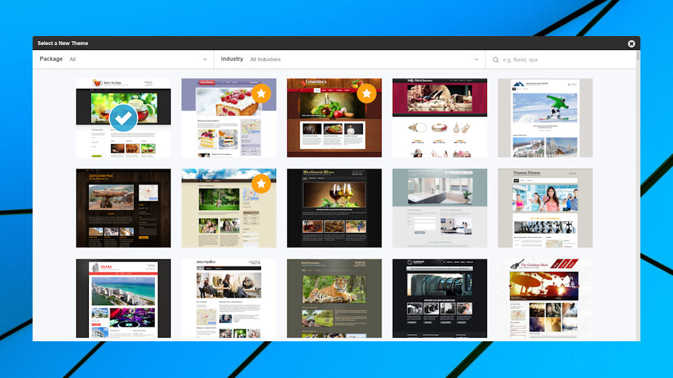
The template designs look reasonable at first, until you notice that the best ones are only available with the Business and Pro plans, while the free and Starter plans only get you around 40 more basic examples (check the full set here, the starred themes are premium-only.)
The templates are presented a little oddly, too, forcing you through endless horizontal scrolling to view the full set. That might be fine on a tablet where you can swipe right, but it's not a smart use of screen space on a desktop. Still, we made our choice in a very few seconds, and moved on to the next stage.
Webs.com allows you to use a free subdomain (myname.webs.com) or a domain you own already. The company can also register a domain for you, but with the website quoting prices 'from $19.95' (£15.34) for a dot com, it's probably better to look elsewhere (someone like name.com will register dot com domains from around £10 ($13) a year, and regular sales mean it's often less.)
Finally, confirm your choice of Webs.com plan, the website opens your template in its editor, and displays a tutorial video which walks you through all the operational basics in three minutes.
Editor
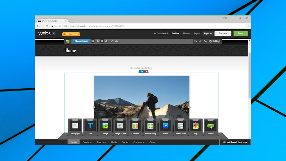
The Webs.com editor gets off to a disappointing start with its bare-bones templates. We had chosen an example with three attractive pictures and a text box on the front page, for instance, but on launch the editor displayed a single empty image box, leaving us to select the rest.
The default layout is a simple empty page, but there are other basic structures to choose from, combining your choice of a website banner with a left and right-hand sidebar.
A dock at the bottom of the page provides a decent set of widgets, covering text, images, layout (columns, tables), photo galleries, slideshows, video, audio, Twitter feeds, Facebook comments and Like boxes, PayPal buttons and more.
There are no visual previews for any of these, a problem with some of the more complex groups of widgets (Timeline, Features, Services, Team.) A Contact widget had a vague icon with a few lines on it, for instance, so we had to drag and drop it onto a page to see what it did. That's a nuisance, although the widget did at least turn out to be very capable, a block of elements including a map, text address, phone numbers, email and social media links.
Understanding what you can do with a page element also takes more work than usual. The best editors display a toolbar close to the element whenever you hover your mouse over it; Webs displays only a few, requires a left-click to display more, and even then, most of those options are displayed in a distant toolbar at the top of the screen. You'll quickly learn where to look, but the interface never feels quite as comfortable as it should.
The editor has some technical issues, too. We left our test site open until its session timed out, for instance, expecting the editor to ask us to log in again. But it apparently didn't notice, instead displaying oddball errors for even simple tasks, such as replacing an image. This can be fixed by backing out of the editor and logging in again, but newbies may not realize that, and it's easy to see how someone could spend an age trying to solve these strange issues.
There are some neat touches, such as the ability to add multiple new form data types to the Contact Form. But for every one of those, we came up with problems and issues. Like the horribly basic Twitter feed widget, for instance, which in the editor is a left-aligned box which can't be centered or significantly repositioned. Oh, and who had the bizarre idea of using a standard Search icon for the Preview function?
Media
Webs.com has several media-related widgets, but they're spread a little awkwardly between two areas of the editor dock. The 'Popular' section has Image and 'Image & Text' elements, while a separate Media section has Slideshow, Video, Audio and Icon options.
The Image widget doesn't have an integrated editor, but it covers the core basics with resize, crop, zoom and rotate tools. You can store commonly-used images (up to a total of 500MB) in a server-based My Images library, and an integrated stock image library gives you access to multiple high-quality images for free.
Videos aren't available with the free Webs.com plan, and the standard video widget only supports YouTube links. But you can host small videos on your own site, and support for custom embed codes could allow you to insert videos from many other providers.
While most website builder Audio tools essentially just embed the player from a third-party service like SoundCloud, the Webs.com offering aims to play MP3 files hosted on your own website. That could be more convenient, but we tried it with a couple of MP3s and it just didn't work. The player displayed a duration of zero seconds for our choices, and maybe investigating different encoders would fix the problem (although both our MP3s played locally), but this shouldn't be an issue Webs.com customers have to worry about.
The Photo Gallery widget allows importing images from your local system or any previously uploaded images, although annoyingly it doesn't give you access to the stock image library.
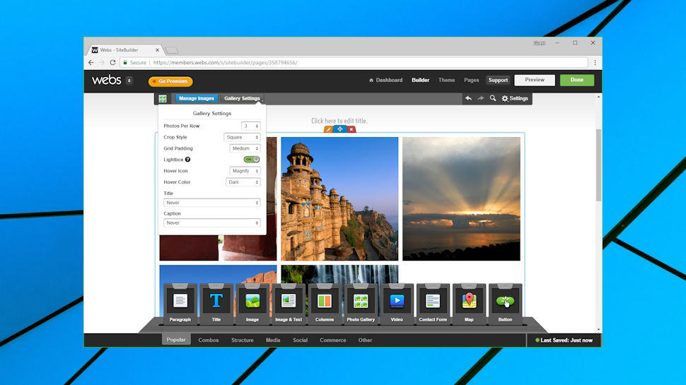
Once we had uploaded our Gallery images, though, we found it very configurable. Images can be reordered by dragging and dropping from within the editor, and you're able to adjust settings like the photos per row, the crop style, hover action, title and caption rules (when they appear, when they don't), while an optional Lightbox switch enables displaying all your pictures as a full-screen slideshow.
Alternatively, you can just use a regular Slideshow widget. It's not quite as much fun as the Gallery, but you still get to define the player background, color, the length of time to play each slide, any transition, and more.
Blog and e-commerce
Webs.com doesn't have a blog widget, instead requiring you add a blog at the page level. That's not difficult to do (click Pages, Add A New Page, choose Blog), but it's a little inflexible, as blog pages can't be customized and tweaked in the same way as the rest of your site.
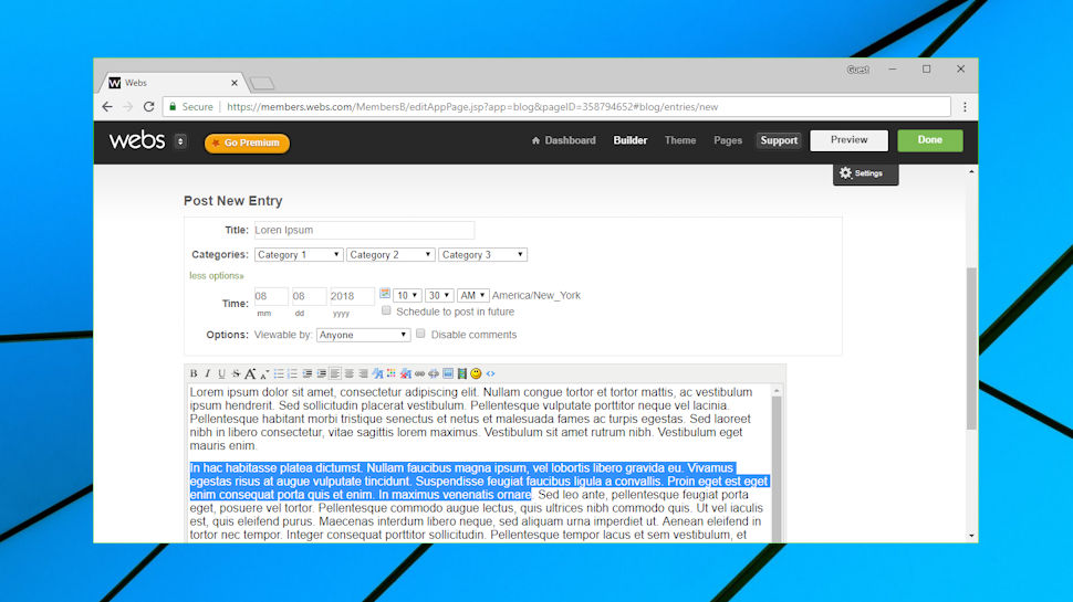
When you create a new post, for instance, you must use a simple stripped-back editor which has only a tiny fraction of the features of the main page builder. This supports formatted text, images, audio and video files, but there's no direct support for adding a photo gallery, map, or any of the other features (although an unusual feature to edit the HTML source might allow you to insert other page objects.)
Formatting issues aside, the rest of the blog performs reasonably well. The editor allows you to assign up to three categories to a post, they can be scheduled to publish at some point in the future, you're able to make posts viewable to groups of users depending on their role on the site (Members, Moderators, Administrators, more), and a very simple built-in comments system enables users to say what they think of each post.
The Webs.com web store is basic, but delivers most og the core features we would expect. Your products can have multiple images attached, you're able to define product variations like size and color, and the catalog may be organized into categories to help customers find the goods they're interested in. Payments may be taken via cards (using Stripe) or PayPal, and inventory control helps to monitor and manage your stock levels.
Specialist platforms such as Shopify give you many more settings and extension options, but the Webs.com solution isn't bad, and if you can live with the 20-product limit, the $12.99 (£9.99) a month Business plan could be very good value.
Support
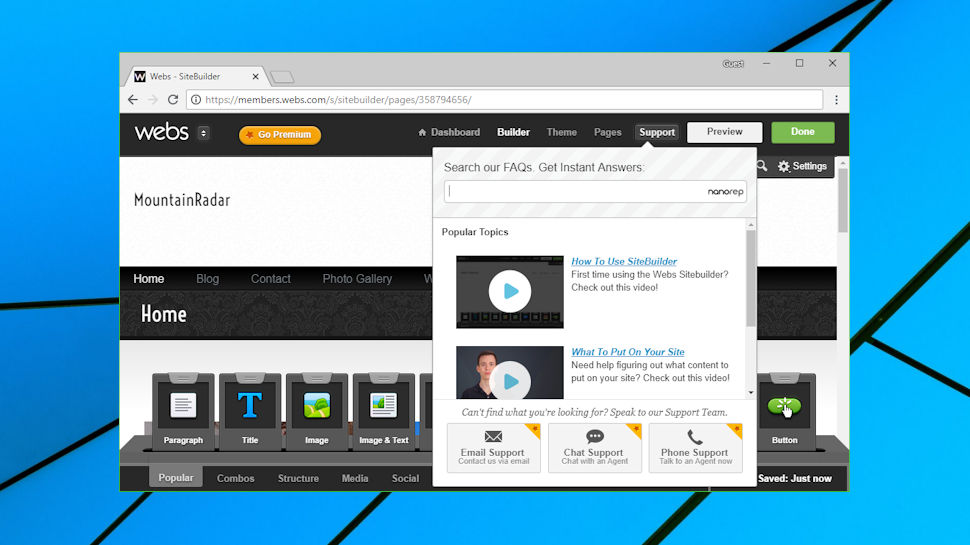
Whether you're at the Webs.com dashboard, editor, page manager or anywhere else, the Support button is always visible, apparently as an easy and convenient way to get help on your current task.
The Support interface looks good. It uses a drop-down window, rather than taking you away to another page; a search engine helps you find articles, and read their content; and there are links to video tutorials and other support routes.
Unfortunately, while the presentation is good, the support site is let down by the content. Top of the Popular Topics list is a video tutorial designed to help first-time users, for instance, but clicking this took us to a "the page you were looking for doesn't exist" error message. This wasn't a one-off mistake, as we noticed the same problem with every embedded link we tried. Webs.com clearly needs to spend more time checking and maintaining the site.
Other articles referred to features which no longer seemed to exist, such as the ability to add a video gallery. This seems to be another indicator that the help database hasn't been updated for some time.
It's not all bad, and in simple situations, we found the system worked very well. If you don't understand why there's no Blog widget, for instance, typing Blog in the search box immediately displays an article explaining how to add it from the New Pages menu. The support interface is good, but the content desperately needs an upgrade.
If you can't find what you need on the database, you're also able to contact the Webs.com support team via live chat, email or telephone, depending on your plan. We've seen a lot of online customer reviews complaining about the level of support they've received, but if nothing else, the Webs.com 30-day money-back guarantee gives you plenty of time to try the service before you buy.
Final verdict
Webs.com has a few interesting and worthwhile features, but they're outnumbered by all the hassles and problems. Ignore it, until Vistaprint spends the money to give it a massive overhaul, or closes it down.
- We've also highlighted the best free website builders in this roundup
0 comments:
Post a Comment