New Google Sites
Google Sites is a free drag-and-drop website builder and hosting service which enables anyone to create their own website and get it online. Google is in the process of rebuilding Sites, and while this carries on, the platform is available in two flavors.
New Google Sites is, well, the new version of the service. It has a better editor and supports more up-to-date technology (including the ability to create responsive pages), but it's distinctly short on features.
You can forget about ecommerce or a blogging platform, for instance. Unless you're a G Suite user, you can only publish sites to a sites.google.com domain (sites.google.com/view/yourname.) You don't even get any website templates.
The older version of the service is still available as Classic Google Sites. It has many more features, including templates, but most are very dated, there's no support for building responsive websites, and Classic Sites will eventually stop working when the move to New Google Sites is complete.
Clearly, if you're looking for stylish designs or high-powered features and functionality, neither version of Sites will work for you. Check our Wix or Weebly instead.
But if you just need a quick way to put a few basic pages together to share with friends, family or colleagues, New Google Sites could work well. It's simple, integrates well with other Google services and doesn't require any further registration: if you've got a Google account, you can use it right now in a couple of clicks.
Getting started
Pointing your browser at sites.google.com will take you to the Classic Google Sites web console. A Create button enables starting a new project in either the Classic Sites or New Sites editors.
As Classic Sites is deprecated by Google and will disappear eventually, we're not going to cover it in this review, and we'd recommend you don't use it, either. A quick tap on the New Google Sites link took us to the latest edition of the console, an even more minimalist environment where we could do little more than tap an Add icon to create a new site.
The management screen is a little more interesting than it looks. You can create multiple websites, for instance, and navigate them by name or thumbnail. Conveniently, it's also possible to share website projects with others. This enables accessing other people's Google Sites' projects from your own management console, and means you're able to work on them together.

Editor
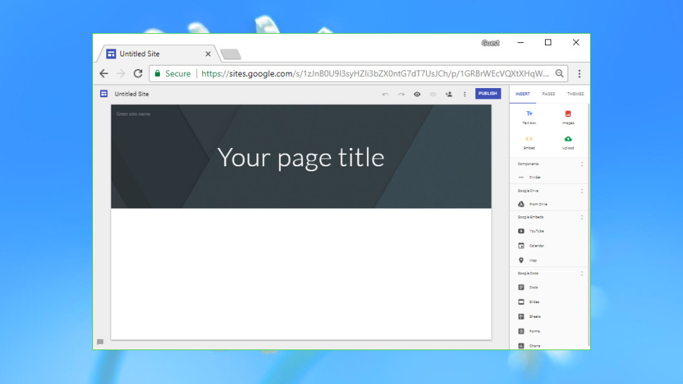
Launch your first New Google Sites project and it opens in a very sparse-looking and minimalist editor.
The bulk of the screen is taken up by a preview of the current page. Other website builders will typically provide a template to help you get started, but New Sites leaves you with little more than a dull grey header and a lot of white space.
A toolbar on the right displays an underwhelming set of widgets. General-purpose page components are limited to text, dividers and images. The ability to embed URLs or HTML code may be able to help you add more. The other options are just about embedding content from other Google services and apps: YouTube, Calendar, Map, Drive, Docs, Slides, Sheets, Forms and Charts.
This isn't quite as bad as it seems. A Themes tab gives you a choice of six header and site styles, and enables simple tweaks of website colors and font styles.
Although there's only a single Text control, it can serve multiple purposes: a title, heading, subheading, link, or regular formatted text.
Objects can be dragged and dropped onto the page, then resized and repositioned (you don't get pixel-level precision, but there's enough control to be useful).
The editor doesn't offer any right-click support – give it a try and you'll see the standard browser right-click menu – but strong keyboard shortcut support enables copy and pasting elements, resizing objects, formatting text and using Ctrl+Z to undo a serious mistake.
A Pages tab allows adding new pages to your site. By default these automatically appear as top-level pages in the navigation menu (Home/One, Home/Two, Home/Three), but you can also add subpages (Home/One, Home/One/Subpage, Home/Two) or hide pages from navigation entirely.
While the editor always displayed our site in desktop mode, tapping Preview enabled viewing the site in desktop, tablet or mobile views.
The New Google Sites editor isn't exactly powerful, then, but it's already far more capable that it initially seems, and we'll be interested to see how it develops in the future.

Media
Google Site's media handling features may seem basic, at least initially, with only images and YouTube embeds available from the standard controls. But as with the editor, dig a little deeper and the service proves a little smarter than you might expect.
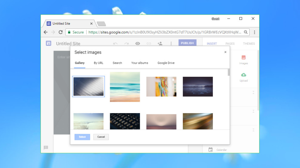
For example, replacing the horribly dull header image (or any other) is as easy as hovering your mouse over it and clicking Change Image > Select Image. You're then able to choose from a gallery of around 50 free images, as well as browsing your Google Albums or Drive, or running a Google Images search. That's far more convenient than other services, which either don't support a media library or require you to build one from scratch.
The integration with Google services is just as useful elsewhere. Click YouTube and you can embed one of your own YouTube uploads, or run general YouTube searches to find what you need. The Calendar control embeds any of your calendars onto the page, while the Map control can refer to your own maps, or whatever new location you need.
Google Docs controls allow embedding Slides, Charts, Forms and other documents. There's nothing special about the viewer – it's just a scrolling window – but this does provide an easy way to combine multiple content sources into a single page.
If you need more, the Embed control may be able to help. New Google Sites only supports YouTube videos by default, for instance, but embedding a Vimeo URL in our page displayed the standard Vimeo player and allowed us to watch the clip as usual.
Even with these features, New Google Sites can't compete with the best of the rest. There are no animations, no lightbox controls, no significant formatting options (borders, spacing, shadows), no native image galleries or sliders. Still, it's undeniably easy-to-use, and the features you do get are more than capable of handling many simple applications.
Support
New Google Sites isn't difficult to use, but if you're having problems or you're unsure how to do something, the Sites support pages should point you in the right direction.
Articles are organized into five categories: Get Started; Create; Edit, Share and Publish; Analytics, Accessibility and Troubleshooting; and New Sites vs Classic Sites. They're generally clear and straightforward with simple step-by-step guides to common tasks such as 'Add a file from your computer' and 'Add or edit headers and footers'.
We found the help pages told us everything we needed to know, but if you have a more in-depth question, there's also a Sites support forum available. This is reasonably busy with 30 or more posts a day, and when we checked, almost all had quickly received genuinely helpful replies.
Finally, a Search engine scans both the official help pages and Sites forum for anything related to your chosen keywords, and gives you an intelligently-sorted list of results with the most likely hits generally near the top. If you do have any issues with New Google Sites, a few minutes on the support site is likely to provide the answers you need.
Final verdict
New Google Sites is too limited right now for serious website building, but it could still be useful as a simple way to present Google Docs, Sheets or other Google content.
- We’ve picked out the best website builders
0 comments:
Post a Comment