Saturday, June 30, 2018

Moto E5 Plus review

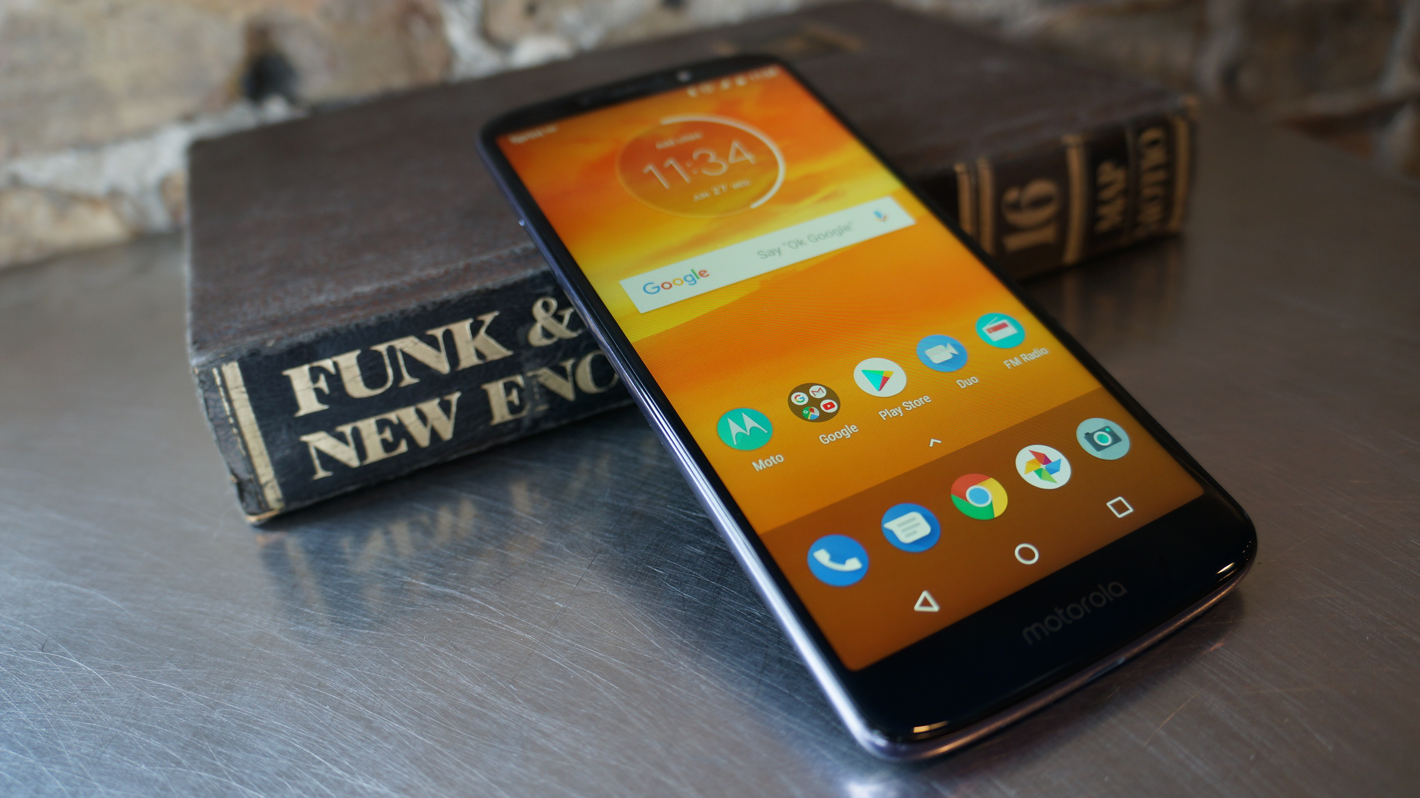
The Moto E5 Plus draws inspiration from costlier flagship phones with a large 18:9 screen and massive battery at an affordable price, but it also draws too much influence from Motorola’s other big budget challenger, the Moto G6.

It’s an Android Oreo phone with a hefty 5,000mAh battery, an expansive 6-inch display, and an upgraded octa-core processor that’s fast enough for most tasks. All that combined with a low price point makes it a fair option for almost anyone looking for a cheap phone.

Here’s the rub: right now, the Moto E5 Plus is available in the US through Sprint and Cricket Wireless. But, things immediately get complicated, as Sprint prices the phone at $288, while Cricket prices it at $179. In the UK, the Moto E5 Plus isn’t available yet, but will be coming with a chipset that’s slower than the the US model. Confusing? We think so, too.

So, for now, US consumers have the option of the Moto E5 Plus as a big, budget smartphone with credentials for TV and movie viewing. But, there are other more compelling Moto phones, leaving the Moto E5 Plus in an awkward place.
Design

The Moto E5 Plus has hints of a premium, almost flagship smartphone. The display takes up a substantial portion of the phone, with thin, though still present, bezels on the sides. 

At 161.9 x 75.3 x 9.35mm, it’s a large phone, but not overly so. However, at 200g, it has considerable heft. But, we think that’s likely because of the big battery it’s packing.

The Moto E5 Plus is built to have the look of a metal frame and glass back, but it instead uses plastics and polymers that don’t feel quite as premium. On the plus side, the plastic back panel is less likely to shatter than a real glass one. It also has Motorola’s water-repellent coating, for protection from splashes and light rain, and Gorilla Glass 3 guarding the front against scratches and cracking.

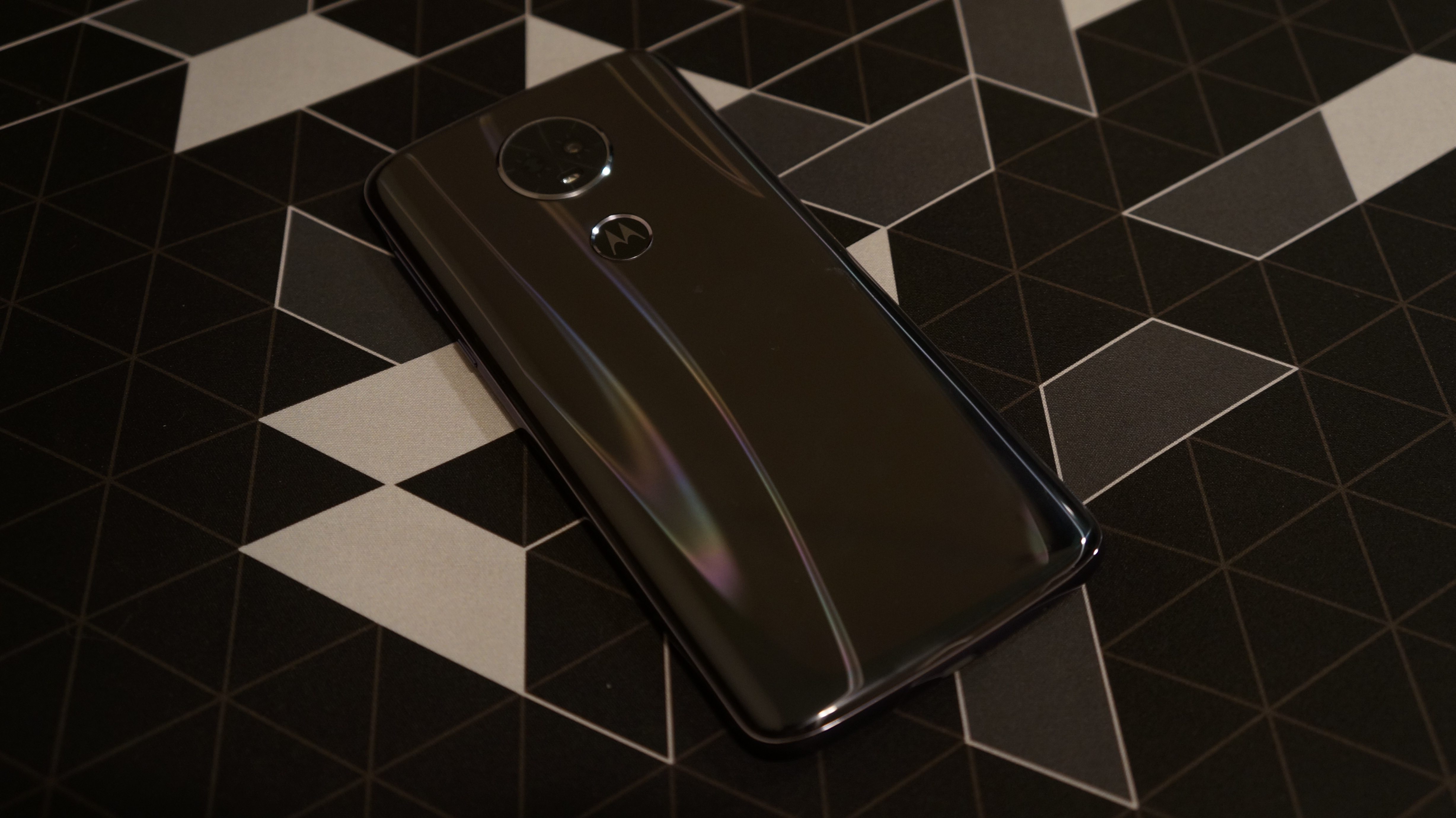
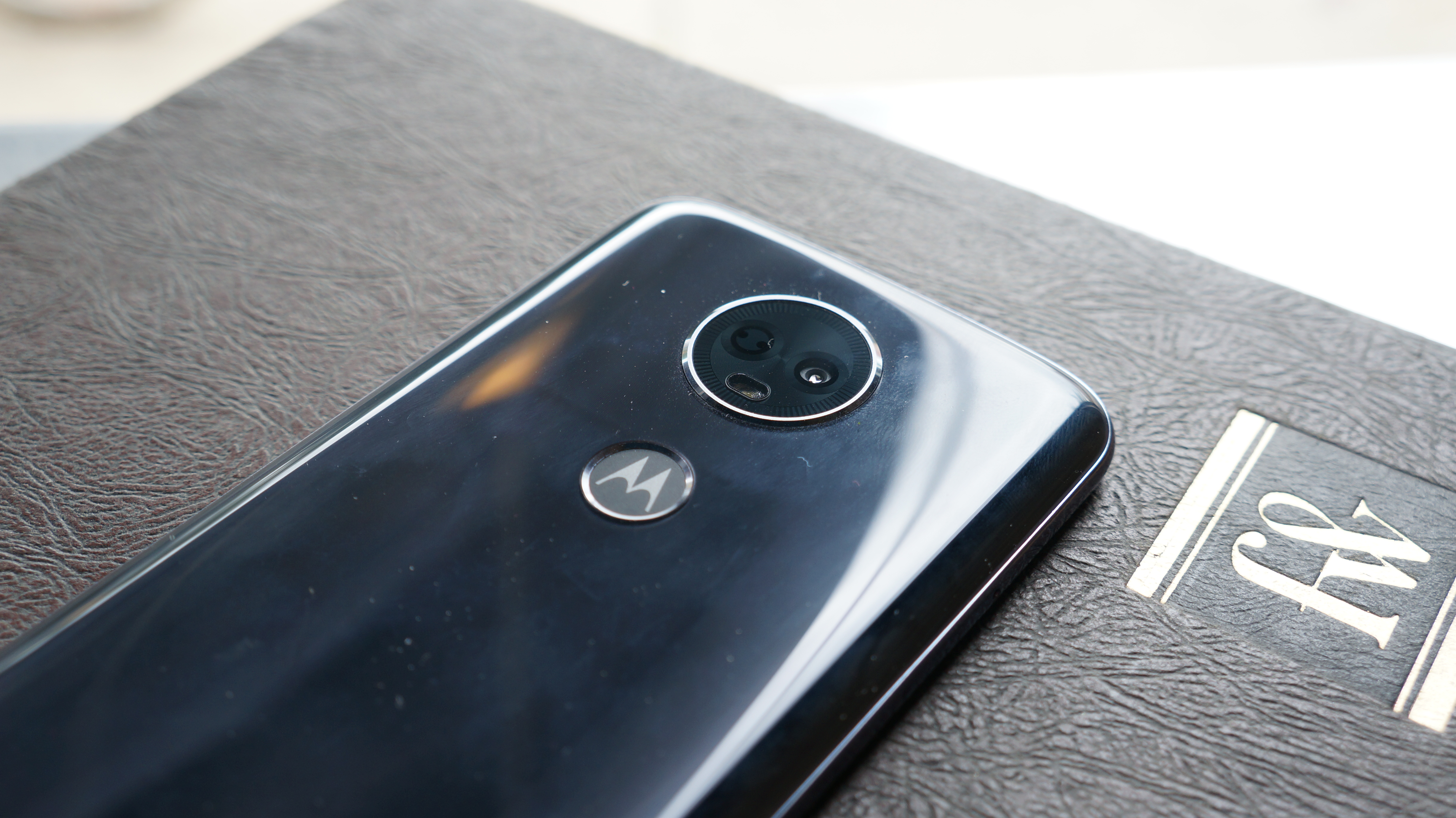
For all the flagship look, that appearance quickly vanishes. The rear of the phone is one of the strongest smudge magnets we’ve ever come across. We tried wiping it on our shirt to see if we could get it looking pretty again for a second, but that didn’t work, and would have been re-smudged in a matter of moments anyway. Dust seems attracted to it as well. The rear also houses a fingerprint scanner and what at first appears to be a dual-sensor camera, but is awkwardly just one camera and a laser auto-focus sensor.

The bottom of the phone houses only a micro-USB port and a microphone, while the top has a second microphone and a 3.5mm headphone jack. Wondering where the speakers are? The main earpiece speaker also serves as the primary loudspeaker for watching or listening to media, and it does a good job putting out sound while also being hard to accidentally cover up with your palm while listening.
Display

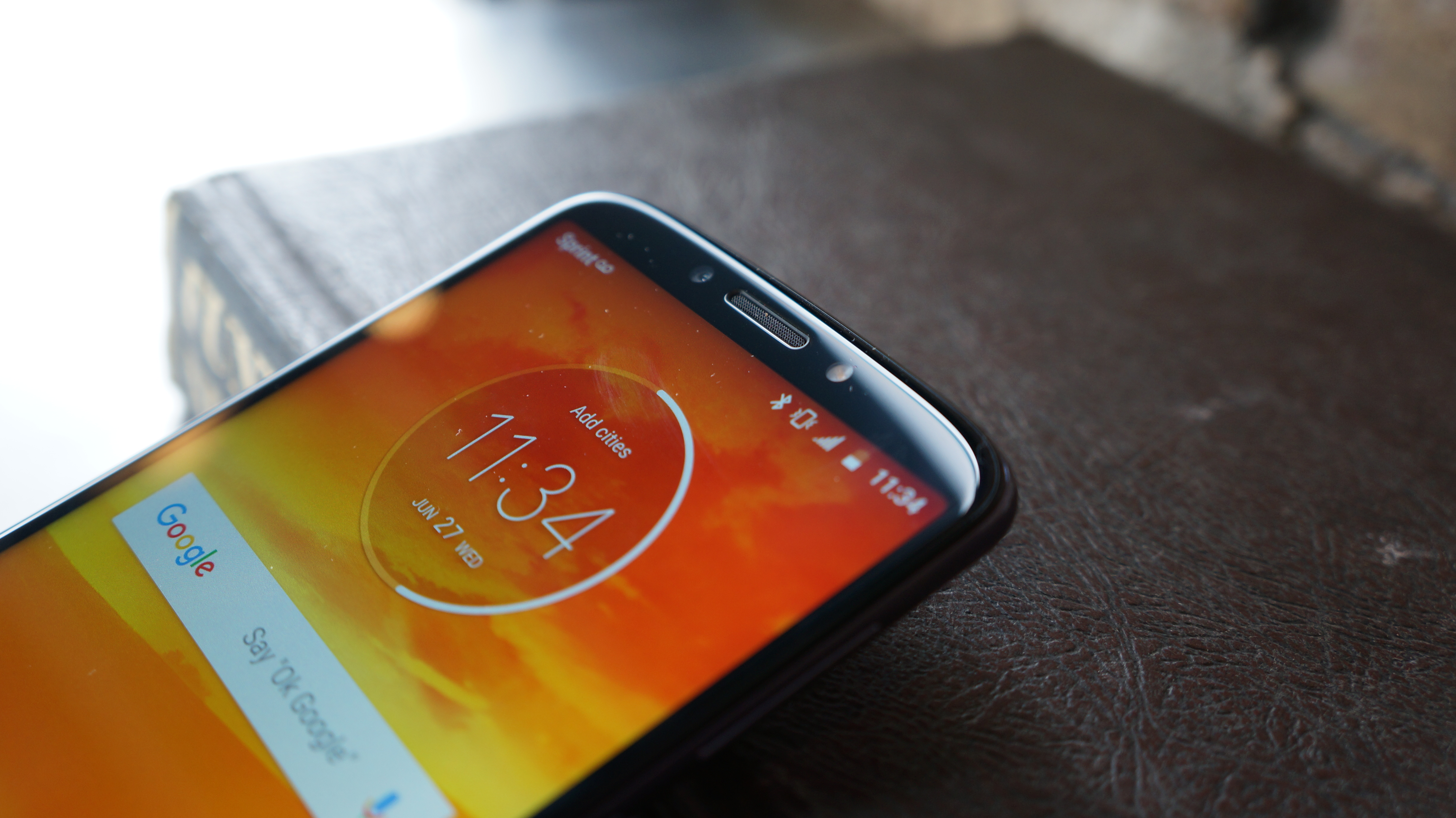
The display is the main selling point for the Moto E5 Plus, because it packs a big one in for a low price. It has a 6-inch IPS LCD display with an HD+ (720p) resolution. For a second, we were almost fooled into thinking it had an AMOLED display, because at low brightness settings, it manages to stay fairly black when Motorola’s ambient display comes on. But, with the brightness set to a more reasonable level, it was clearly an LCD screen.

While the screen is plenty big for media viewing, it’s not perfect. For an IPS display, the viewing angles aren’t the best. In landscape, viewing from the sides quickly loses brightness. At HD+, it doesn’t always appear the sharpest either.

The display’s default color mode, “neutral,” also feels a bit cold and overly blue. Switching to the warm color mode felt like it dirtied the image, but eventually grew on us.

Motorola has a screen autowake function that’s equal parts useful and annoying. Useful, because it doesn’t take much effort to have the screen show you the time or date at a glance. Annoying, because it doesn’t take much to accidentally make the screen light up. Just leaving it sitting on a small table and bumping the table will bring it up. Thankfully, you can turn this off in the Moto features menu.
What it's like to use

With a Snapdragon 435 octa-core chipset and 3GB of RAM running Android 8.0, the Moto E5 Plus isn’t challenging any high-end phones, and falls short of some mid-range phones. That said, it performs adequately enough for most people looking for a big budget phone. 

From browsing to launching apps, it was quick and smooth. We didn’t notice many hiccups with simple tasks. We ran Geekbench 4, and it earned a multi-core score of 2,319, which puts it on par with last year’s Moto G5S, but it’s still well behind the new Moto G6 and Moto G5S Plus.

One area the performance seems to really suffer those is in the speed of the storage. The model we tested came with 32GB of storage, expandable via microSD card up to 128GB. Loading up large games like PUBG Mobile or Harry Potter Hogwarts Mystery was slow. And, the screen would annoyingly timeout while loading, which in turn cancelled the loading. 

Opening up a large movie file is similarly slow. Fortunately, there isn’t too much else slow. Most of the gaming experience is even fairly smooth, though we have to keep PUBG on the lowest settings and aren’t very satisfied with the low resolution.

One thing that helps the Moto E5 Plus run as smoothly as it does on its limited hardware is the particularly clean version of Android it’s running. There’s very little software bloat, and no crazy UI changes. 

The only serious extras thrown into the software are Motorola’s gestures, such as the chop to turn on the flashlight, or the wrist twist which activates the camera and switches between front and rear cameras. And, these fan-favorite gestures work smooth as well.

The fingerprint scanner is even snappy, though not as quick as higher-end device’s scanners, and a bit too easy to only partially touch on the first try.

Camera

The Moto E5 Plus has a 12MP rear camera with 1.25 micrometer pixels and an aperture of f/2.0, making it decent in dim scenery. The front camera has an 8MP sensor with 1.12 micrometer pixels and an aperture of f/2.2.

The cameras prove better than the first impression they gives. It seems like there is definitely processing going on after the photo is snapped, as we don’t feel like what the viewfinder shows what the captured photo will look like. This likely has to do with the Auto-HDR setting that just happens to do a good deal in improving the image.

The laser auto-focus isn’t much to get excited about. While it is quick, it didn’t perform faster than the OnePlus 5 we used for comparison. So, focusing quickly and snapping a photo of a fleeting subject won’t be likely here, even with the help of the camera quick-launch gesture.

All in all, the photos look quite good, though zooming in beyond 100% quickly shows a lack of detail. We can’t recommend using this to create big framed pictures, but it’ll do just fine for photos that go on social media.

Battery

The battery is where the Moto E5 Plus undeniably shines. It packs a massive 5,000mAh battery, which is lending a lot to the 200 grams of heft it has. For most people, this battery should be enough to easily get through one day with plenty of use, and even two days for moderate users. Light users shouldn’t be surprised to make it part way into a third day.

The Moto E5 Plus also supports 15W TurboPower charging which gets the battery filled up quick. From 0%, we were able to charge the battery up to 16% in 15 minutes. After an hour, it was at 51%, and it reached 99% after two-and-a-half hours.

For our battery drain test, we played a 90-minute Full HD video file from the internal storage, though the actual playback was limited to the screen’s resolution of 1,440 x 720. During the test, all the regular radios were on and the screen was set to maximum brightness. This test only drained the battery 10%, so feel confident in the ability to get through The Lord of the Rings trilogy (extended editions even) on one charge. 
Verdict

Everything adds up nicely for the Moto E5 Plus in a world where the Moto G6 doesn’t exist. It comes at a low price, has a big screen, great battery life, and smooth enough performance to function. But, Motorola’s positioning is where things get confused.

The model sold by Sprint is priced way too high. And, though Cricket’s version is priced more reasonably, it’s obscurely renamed the Moto E5 “Supra.” Cricket customers looking for a big phone with a big battery and smooth performance can take comfort in this pick, but anyone else may need to look elsewhere.

Where specifically? Well, that’s the curious bit, because Motorola’s phenomenal budget Moto G6 is priced competitively close to the E5 Plus, has higher performance hardware, and has an improved build. It sacrifices 0.3 inches of screen, but increases the resolution and fits a fast fingerprint scanner on the front of the phone and packs a dual-sensor camera on the back. Compared to the Sprint offering for the E5 Plus, the G6 is even more affordable. 

Though the 5,000mAh of battery in the Moto E5 Plus is a strong selling point, it’s not enough to recommend it over the Moto G6. The Asus ZenFone Max Plus M1 is another close competitor with a little more carrier freedom, a more premium design, and a big enough battery at 4,130mAh.

The Moto E5 Plus has the budget phone look, feel, and performance down, but it has the Moto G6 stepping all over it. Motorola has a lot of smartphone options with all sorts of positioning up and down the price scale, so it’s not a surprise that the E5 Plus gets lost in the shadow of our top cheap phone pick, the Moto G6.

List of Huawei & Honor Smartphones to Get ‘GPU Turbo’ Feature

Recently, Honor launched the Honor Play and Honor 9i (2018) smartphones in China. Along with these two new smartphones, the company released the ‘GPU Turbo’ technology. According to the company, the smartphones with GPU Turbo can improve the graphics processing capabilities and reduces the power consumption. With the GPU Turbo, the graphics processing efficiency can be increased by up to 60% and power consumption reduces by 30%.

As these improvements can be achieved with the optimizations on the hardware and software front, the Huawei and Honor smartphones powered Kirin processors can only be benefitted. During the announcement, the company mentioned the earlier launched Honor and Huawei smartphones will receive the GPU Turbo feature through OTA update. Now, the leaked images reveal the list of smartphones to get the GPU Turbo features and time frame for the OTA update.

Talking about the Kirin 970-powered smartphones, the Huawei P20, P20 Pro, Mate RS, Mate 10, Mate 10 Pro, Honor 10, and Honor V10 will get the update from August. The above mentioned Huawei devices in Europe, Russia, Asia Pacific, Middle East, and Africa markets will only get the OTA update. Coming to the Honor devices, India will be replacing Africa from the above list. The previous flagship devices in all markets will be getting the update from November 2018.

The list of previous flagship devices includes Honor 9, Honor 8 Pro, Huawei P10, P10 Plus, Mate 9, and Mate 9 Pro. Even the Kirin 659-powered devices like Honor 7X, Honor 9 Lite, Huawei Y9 2018, Nova 2i, Mate 10 Lite are also eligible to get the GPU Turbo update. These devices will start receiving the update from September. Interestingly, a few devices in selected markets are left out from receiving the updates.

Apart from the company claims about the performance boost by GPU Turbo technology, we haven’t had any first-hand experience. Let’s wait for the Honor and Huawei smartphones in India to get the GPU Turbo update. Apart from the performance boost, this new technology is also mentioned to offer HDR-like game effects even with the non-HDR games. Stay tuned on PhoneRadar for more details!

Source

The post List of Huawei & Honor Smartphones to Get ‘GPU Turbo’ Feature appeared first on PhoneRadar.

OnePlus 6 in Red Color Teased, to Launch on July 2nd

Last month, OnePlus launched its all-new OnePlus 6 flagship smartphone. The company initially sold the OnePlus 6 in Midnight Black and Mirror Black color options. There is also OnePlus 6 Marvel Avengers Limited Edition which came in Karbon Black color. Recently, the company also launched the Silk White color variant with the matte finish. Now, the company is teasing the OnePlus 6 in Red color option.

The company will be officially announcing this new variant on July 2nd. As of now, there is no other information available about this new color option. We expect the company to launch the OnePlus 6 Red at the same price as earlier launched variants. The OnePlus 6 currently available in 6GB + 64GB, 8GB + 128GB, and 8GB + 256 GB storage options. The upcoming Red color variant should be available in any one of these storage variants.

Earlier this year, the company also launched the OnwPlus 5T Lava Red Edition in India. While the OnePlus 6T is expected to be unveiled in the month of September or October, the company might continue to bring the latest OnePlus 6 in new color options. The device comes with a 6.28-inch AMOLED display with a notch on the top. It comes with Corning Gorilla Glass 5 protection on the front and rear.

The device comes with Android 8.1 Oreo out of the box, the interested users can also try out the Android P Beta. It sports 16MP + 20MP dual camera setup on the rear and a 16 MP selfie camera on the front. While the rear cameras support OIS and EIS, the front camera has EIS. By enabling EIS, the video will be cropped in a lot, giving very less FoV. Stay tuned on PhoneRadar for more details about the upcoming OnePlus 6 Red smartphone.

Featured Image: MKBHD

The post OnePlus 6 in Red Color Teased, to Launch on July 2nd appeared first on PhoneRadar.

Best Upcoming Smartphones of July 2018 – Expected Specs & Features

In the last few weeks, we have seen several smartphone launches outside of India. A few of those new smartphones will be debuting the Indian market in the month of July. We already know the launch date of few devices like Zenfone 5z and Vivo NEX. Apart from these, there are a couple of China-exclusive smartphones which will make their global debut.

Honor 9X

Honor recently launched the new Honor 9i smartphone in China and this is not the same Honor 9i that was made available last month in India. Now, the latest news suggests the company to launch the new Honor 9i smartphone in India as Honor 9X. It sports a 5.84-inch Full HD+ (2280 x 1080 pixels) display with 19:9 aspect ratio. Under the hood is the in-house Kirin 659 octa-core processor clocked at 2.36GHz and comes coupled with Mali T830 MP2 GPU. It runs on Android 8.0 Oreo with EMUI 8.0 custom skin on top.

The smartphone comes with 13MP + 2MP dual cameras on the rear and a 16MP single camera on the front. The device comes with the rear-facing fingerprint sensor and also features face unlock support. It is backed by a 3,000mAh non-removable battery and support 5V/2A (10W) charging input. Connectivity options include 4G VoLTE, Wi-Fi, Bluetooth 4.2, FM Radio, GPS, 3.5mm audio jack, and MicroUSB 2.0 port. It measures 149.2 × 71.8 × 7.7 mm and weighs 152 grams.

Asus Zenfone 5Z

At the MWC 2018, Asus unveiled the Zenfone 5z and Zenfone 5 smartphones with iPhone X-like design. While the Zenfone 5 and Zenfone 5z comes with the same design, only the Zenfone 5z sports flagship specifications. Now, the company has confirmed to launch the Zenfone 5z smartphone on July 4th in India. The device will be sold via Flipkart and might come with an aggressive price tag. It sports a 6.2-inch Super IPS display with Full HD+ (2246 × 1080 pixels) and 19:9 aspect ratio.

The Zenfone 5z sports Qualcomm Snapdragon 845 Mobile Platform and comes coupled with Adreno 630 GPU. While the device comes with Android 8.0 Oreo out of the box, it is confirmed to get the upcoming Android P update. In terms of optics, the Zenfone 5z sports 12MP + 8MP dual rear cameras with OIS, EIS, Dual Pixel PDAF, and 120-degree FoV. For selfies, there is an 8MP front-facing camera with f/2.0 aperture and 83-degree FoV. It comes with a 3,300mAh battery and supports 18W fast charging.

BlackBerry KEY2

BlackBerry has recently launched the KEY2 as the successor to last year’s KEYone. While the device is already on sale in Western markets, it is expected to be launched in India in July. Just like its predecessor, the KEY2 also comes with a 4.5-inch Full HD (1620 x 1080 pixels) display with 3:2 aspect ratio. Beneath the display is the four-row QWERTY keypad which also supports capacitive touch. The KEY2 newly comes with the 14nm Qualcomm Snapdragon 660 Mobile Platform coupled with 6GB RAM and 64GB/128GB of internal storage.

The device runs on the latest Android 8.1 Oreo out of the box and includes Blackberry Hub. Talking about the cameras, the KEY2 sports dual rear cameras with a 12MP primary sensor with f/1.8 aperture and a 12MP secondary sensor with f/2.6 aperture. On the front is an 8MP camera for capturing selfies and video calls. It is backed by a 3,360mAh non-removable battery and supports Quick Charge fast charging technology. The fingerprint sensor is integrated into the space bar on the fourth row.

Xiaomi Mi A2

Xiaomi is long rumored to launch the Mi A2 as the successor to the Mi A1 Android One smartphone. Xiaomi has scheduled a new global launch event in Spain for revealing a new Mi smartphone. While there is no information about the device, we expect the company to launch the Mi A2. However, there are also chances for the launch of Mi 8 and Mi 8 SE smartphones. While the Mi 8 and Mi 8 SE comes with 19:9 notch display, the Mi A2 sports 18:9 notch-less display. The Mi A2 will be the same Mi 6X which was already on sale in China.

The device comes with a 5.99-inch display with Full HD+ (2160 × 1080 pixels) resolution and 18:9 aspect ratio. The device comes packed with 14nm Snapdragon 660 Mobile Platform, 4GB/6GB of RAM, and 64GB of internal storage. Just like the Mi A1, the Mi A2 should also come with stock Android UI. In terms of optics, the Mi A2 will be offering 20MP + 8MP dual rear cameras and a 20MP single front camera for selfies. The device lacks the 3.5mm audio jack and comes with USB Type-C port.

Vivo NEX

Earlier this month, Vivo launched the Vivo NEX as the retail version of the Vivo APEX smartphone. The device was launched in two variants – Snapdragon 710-powered NEX A and Snapdragon 845-powered NEX S. While the NEX A comes with a rear-facing fingerprint sensor, the NEX S sports in-display fingerprint sensor. Both the devices come with the same design and also sports similar internals. On the front is the 6.59-inch Super AMOLED display with 19.3:9 aspect ratio that offers more than 90% screen-to-body ratio.

While the NEX A comes with 6GB of RAM and 128GB of internal storage, the NEX S with 8GB RAM will be available in 128GB and 256GB storage variants. On the rear, the device sports 12MP primary camera with OIS and f/1.8 aperture, and a 5MP secondary camera with f/2.4 aperture. The pop-up front camera on this device features 8MP sensor with f/2.0 aperture. The device will be running on Android 8.1 Oreo-based Funtouch OS 4.0 out of the box. It is backed by a 4,000mAh battery that also supports up to 22.5W fast charging.

OPPO Find X

OPPO launched a new flagship smartphone called Find X in Paris, France. The front of the device is completely occupied by the display. The sliding part on the top reveals the single front camera and dual rear cameras. It comes with the glossy finish body with 3D curved glass on the front and rear. Talking about the specifications, the OPPO Find X sports a 6.42-inch AMOLED display with Full HD+ (2340 x 1080 pixels) resolution, 19:5:9 aspect ratio, and Corning Gorilla Glass 5 protection.

The device comes with Snapdragon 845 octa-core processor and packs 8GB of RAM and 128GB/256GB of internal storage. On the rear, the Find X sports 16MP primary sensor with f/2.0 aperture and OIS, and a 20MP secondary sensor with f/2.2 aperture. It sports a 25MP front camera with f/2.0 aperture. The company is including AI-based features like auto scene detection and portrait mode. The Lamborghini Edition of the Find X comes with 3,400mAh battery that also supports 40W SuperVOOC charging.

Motorola One Power

From the last few weeks, there are several leaks about the Motorola One Power smartphone. We expect the company to launch both the Moto One and One Power smartphones on the same day. Just like many other smartphones mentioned above, there is also no confirmation about the launch date of these upcoming Moto smartphones. The leaked images revealed the first look of both the devices. While the Moto One Power comes with the metal unibody design, the Moto One sports glass back body.

Both these devices will be launched under the Android One program. The devices will be coming with a notch and offer 19:9 aspect ratio. There will be dual cameras vertically stacked on the rear. The Moto One Power is unofficially confirmed to sport Snapdragon 636 octa-core processor. Compared to the Moto One Power, the Moto One might come with a smaller display and smaller battery. From the front, both the devices look very identical with the notch at the top and Motorola branding at the bottom.

Moto E5 Plus

Motorola has officially confirmed to soon launch the Moto E5 Plus in India. The device was actually unveiled two months ago along with Moto E5 and E56 Play. It comes with a plastic body with glossy finish and curved edges. On the front is the 6-inch display with HD+ (1440 x 720 pixels) resolution and 18:9 aspect ratio. It is powered by Qualcomm Snapdragon 435 octa-core processor coupled with 3GB of RAM and 32GB of internal storage. There is also a MicroSD card slot for further expansion of storage.

In the camera department, the Moto E5 Plus offers 12MP rear camera with f/2.0 aperture and an 8MP front camera with f/2.2 aperture. The Moto E5 Plus is backed by 5000mAh non-removable that also supports up to 15W TurboPower fast charging. The Moto E5 Plus also comes with Android 8.0 Oreo out of the box and includes exclusive features like Moto display & Moto Gestures. The Moto dimple on the rear also comes integrated with the fingerprint sensor.

Stay tuned on Phoneradar for the official details, availability, and pricing of the above mentioned smartphones.

The post Best Upcoming Smartphones of July 2018 – Expected Specs & Features appeared first on PhoneRadar.

Moto E5 Plus with 5000mAh Battery Confirmed to Launch Soon in India

A couple of months back, Motorola has announced the Moto E5, Moto E5 Plus, and Moto E5 Play smartphones. Earlier this week, the Moto E5 listing was found on Amazon India. While the Moto E5 is said to be already available in the offline market, today the company has officially confirmed to soon launch the Moto E5 Plus in India. Unlike Moto E5, the E5 Plus could be sold via online.

On the design front, the device comes with glossy finish body with slightly curved edges. The Moto E5 Plus sports a 6-inch IPS display with HD+ (1440 x 720 pixels) resolution and 18:9 aspect ratio. Under the hood is the 1.4GHz Qualcomm Snapdragon 435 octa-core processor coupled with Adreno 505 GPU. It comes with 3GB of RAM and 32GB of internal storage that can be further expandable via a MicroSD card.

Just like the other Moto E5 devices, the Moto E5 Plus also comes with Android 8.0 Oreo out of the box. In terms of optics, there is a 12MP rear camera with f/2.0 aperture and an 8MP front camera with f/2.2 aperture. Both the front and rear cameras come accompanied by a LED flash. While the Moto E5 packs a 4000mAh battery, the Moto E5 Plus is backed by 5000mAh.

The device also supports up to 15W TurboPower fast charging. The fingerprint sensor is placed on the rear, it is actually integrated with the Moto dimple. While the device comes with on-screen navigation buttons, the users can also enable the one-button nav gestures. The volume rocker and textured power button are placed on the right edge. It measures 161.9 x 75.3 x 9.35 mm and weighs 200 grams.

While the company announced the Moto E5 Plus to be available in Black, Flash Gray, Mineral Blue, and Fine Gold color options, we aren’t what color options will be introduced in India. As of now, there is no information about the pricing or the exact launch date. Stay tuned on PhoneRadar for more details!

The post Moto E5 Plus with 5000mAh Battery Confirmed to Launch Soon in India appeared first on PhoneRadar.

Friday, June 29, 2018

Honor Note 10 with 6.9″ AMOLED Display Rumored to Launch Soon

Back in August 2016, Honor launched the Honor 8 Note smartphone with AMOLED display in China. It then came up with a 6.6-inch Super AMOLED display with QuadHD (2560 x 1440 pixels) resolution and is powered by Kirin 955 octa-core processor. Though the company has launched Honor 9 smartphone in 2017, there is no successor to the Honor 8 Note smartphone.

Now, the latest leaks suggest the company to revive the Note series by launching the Honor Note 10 smartphone. It might come with a 6.9-inch AMOLED display. As of now, there is no confirmation whether the device will be offering 18:9 or 19:9 aspect ratio. Look at all the recently launched smartphones, we expect the Honor Note 10 to also sport dual camera setup on the rear.

Let’s wait and see, if the company uses the flagship Kirin 710 chipset or any mid-range Snapdragon chipset. Xiaomi will soon launch the Mi Max 3 as the successor to Mi Max 2 smartphone. The TENAA listing of the device has already revealed the MI Max 3 to sport a 6.9-inch display with 18:9 aspect ratio. While there is no information about the Honor Note 10, the company is also rumored to launch the Honor 9i as Honor 9X in India.

The two-year old Honor Note 8 came with 4GB of RAM and was made available in different storage options. It then offered a single 13MP camera on the rear and an 8MP selfie camera on the front. As it sports a large display, the Honor Note 8 is backed by a 4500mAh non-removable battery. Even with the upcoming Honor Note 10, we might also a huge battery. Stay tuned on PhoneRadar for more details!

Source


The post Honor Note 10 with 6.9″ AMOLED Display Rumored to Launch Soon appeared first on PhoneRadar.

Philips Fidelio NC1

Philips is an audio brand going through something of a renaissance in the headphone market. We gave the Philips Fidelio X2 full marks a few years back, and while the Fidelio NC1 doesn't quite match the X2's eloquent sound performance, they are still a superb set of headphones for the money.

That being said, there are newer noise-cancelling headphones out that could be worth trialing for yourself. The Sony WH-1000XM2 is leading the industry with its variable noise-cancellation settings and Hi-Res Audio support, while the Bose QuietComfort 35 II packs Google Assistant into the headphones themselves.

All that said, if you have your eyes (and ears) set on the Philips Fidelio NC1, you'll still be buying one of the best noise-cancelling headphones on the market.

Philips Fidelio NC1

The Philips Fidelio NC1 are headphones that have been created for the frequent traveller. They come in a plush, hard case to stop them being ruined when thrown into a bag and also fold nicely into themselves, so they don't take up much room. Couple this with a noise cancellation switch and they are practically begging to become your travel buddy.

Design

The Philips Fidelio NC1 headphones look great. The aluminium back has a slightly mottled design that looks and feels premium. I do think it is a little overkill to have High Definition Audio Philips NC1 written on both sides of the headphones but it does little to detract from the executive look.

Philips Fidelio NC1

Philips has opted to use memory foam for the earpads, which has been covered in soft leather. This foam is also used at the top of the headband, which ensures a snug fit. This makes them one of the most comfortable headphones I have used. Even after prolonged use, I never once felt the 'pinch' you get around the ear that on-ear headphones are famed for.

A slight drawback of this, however, is that the earpads sit on your ear rather than cup them. This does lead to slight noise leakage (as my workmates can attest to) and sometimes you have to readjust the headphones to position them perfectly on your ears. My ears were allowed to breath, though, making the NC1's an absolute joy to use.

Philips Fidelio NC1

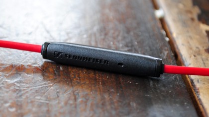
Attached to the headphones is a replaceable cable. To make sure that it doesn't tangle, Philips has used a rope-like material for the cable which is flanked by a right-angled 3.5mm jack at both ends. These have been gold plated for better conductivity. There is also an in-line controller and mic on the cable that allows you to switch between your music and phone calls.

The only other thing of note on the design is an uncovered micro USB slot situated on the bottom of the right earpad and the all-important and rather unique ANC (active noise cancelling) switch on the left earpad, next to the 3.5mm jack port.

Philips Fidelio NC1

For some reason, when wearing the NC1s, I kept having to fumble around to find the ANC switch. This may well be down to my own motor response issues rather than design, however. When I did eventually switch it on, though, the results were superb.

This is because Philips has gone for a rather novel 'optional' noise cancelation option. This means that if the battery on these powered headphones does die, you can still use them but without the noise cancellation functionality. Give the headphones a charge, however, and they will offer up 30 hours' noise cancelling in return.

Philips Fidelio NC1

I tested the ANC function of the headphones on a two-hour flight and the results were great. There was a noticeable lack of background hiss when the ANC was switched on and the ambient noise of the plane was kept to a quiet minimum.

This is all thanks to Philips using an eight mic solution - four on the outside of the headphones to counteract mid and high frequencies and the other four on the inside to block lower sounds.

To make sure that you are completely covered on a plane, Philips has also added an airplane plug.

Performance

Even without the noise cancellation, the Philips Fidelio NC1 range offer up some stunning audio reproduction.

Philips Fidelio NC1

To test the headphones, I chose a number of tracks that would give 7-25,000Hz frequency response a decent workout. For the mid-range, Father John Misty's Bored In The USA was listened to on repeat. The timbre in J Tillman's voice sounded clear and the piano pin sharp. The NC1s offer a lovely balanced warm sound that proves Philips' engineers haven't tried to favour bass in their fine tuning.

To make sure that the bass wasn't being undervalued, though, I listened to the bass drum heavy Digital Witness by St Vincent and the low-end leanings of Get Up by Young Fathers. Both tracks were again cut with clarity but still had enough low-end rumbling to the 40mm neodymium drivers a decent workout.

Philips Fidelio NC1

I did get the feeling that the NC1 preferred pushing out music that was steeped in treble. Both TV On The Radio's hi-hat heavy Happy Idiot and Todd Terje's Delorean Dynamite challenged the NC1's high-range but the headphones passed with aplomb.

We liked

There is a lot to love about the Philips Fidelio NC1 headphones. They are a joy to wear and offer up great sound reproduction. They are also one of the lightest and most compact ANC headphones around.

To top all of this off, they look great. The styling is premium, for those not looking to make too much of a shouty statement with their headphones.

We disliked

Sometimes you do forget to turn the ANC off when not using the headphones. This can be a problem if you forget to do this regularly, even though one charge should last 30 hours or so.

There was some noise leakage which could annoy work colleagues or those travelling in close proximity to your ears.

Final verdict

The Philips Fidelio NC1 headphones are a fine addition to Philips' headphone range. They are best suited for frequent travellers who don't want to lug massive cans around with them all of the time but also don't want to compromise on sound quality.

They offer superb sound that's balanced and warm and while I would love to see a wireless range, the cable offered in the mix is dextrous enough to not worry about it. A lightning cable version of the headphones was previewed at CES, so there is even more innovation to come from this range.

Philips has created a $260/£250 (around AU$350) pair of headphones that are more than worth their sticker price.

ZenMate VPN

Editor's Note: What immediately follows is a rundown of the latest changes and additions since this review was last updated.  

  • Locations increased to 30+ (June 2018)
  • Refund duration is now 30 days.
  • Changes in pricing. 1-month $9.99, 6-months $8.99 and 1-year $5.99.
  • The service now offers a 7-day free trial.
  • New protocols have been added and also, OpenVPN is now supported.

ZenMate is a straightforward VPN designed for non-technical users who want an easier way to protect their online privacy.

This simpler approach is obvious from the moment you look at the website. There's no jargon, no complicated feature lists, just a quick explanation of VPN technology and some example benefits.

One reason ZenMate doesn't spell out its features is probably that it doesn't have very many, and even the core technologies may not be what you expect. Just about every VPN provider supports the speedy and secure OpenVPN protocol, for instance, but ZenMate only uses the far less capable L2TP/IPSec.

Still, IPSec will do the job for many users, who are more likely to be interested in goodies like ZenMate's free Chrome and Firefox extensions. Both of these offer easy site unblocking and relatively anonymous browsing for no cost at all.

The commercial ZenMate Premium plans give you higher speeds and access to the full set of locations across 28 countries. ZenMate offers TechRadar Pro readers exclusive rates – £4.79 ($5.99) per month, £4.39 ($5.49) if billed 6-monthly and £3.33 ($4.16) if billed annually – and a 14-day ‘risk free’ refund policy should give you plenty of time to test the service's abilities.

Privacy

ZenMate's main website is straightforward, but poking around in the darker corners – in particular, the privacy policy and terms of service pages – revealed some of the most brain-numbingly over-complicated legalese we've ever seen.

Just about every element takes longer to describe than it should, and seems written for lawyers rather than regular users. We're told that descriptions on the website are a “mere 'invitation ad offerendum', i.e. a non-binding call to you to issue an offer”, for instance. Uh-huh.

The documents also make little effort to highlight details that might interest VPN users, such as clarifying what sort of logging takes place, or ZenMate's response to legal actions. You're forced to wade through every paragraph to find the information you need.

We went to work anyway, and from what we can tell, ZenMate seems to offer reasonable privacy. There's no routine logging or monitoring of traffic, and the service doesn't permanently log your connection IP address, or even the volume of data used.

The privacy policy does warn that individual servers might record some details depending on the data protection laws in that specific jurisdiction. This only mentions that the source IP address and site request might be "saved temporarily in order to establish a connection", though, and we suspect the clause is more about reporting a technical possibility than highlighting some major privacy flaw.

Performance

ZenMate's signup procedure is quick and easy: pick a plan, enter your email address, and choose to pay by card, PayPal, UnionPay or Qiwi Wallet.

We handed over our cash and the website displayed an invoice, explained what we'd bought and immediately pointed us to download links for the many clients: Windows, Mac, Android and iOS, along with Chrome, Firefox and Opera browser extensions.

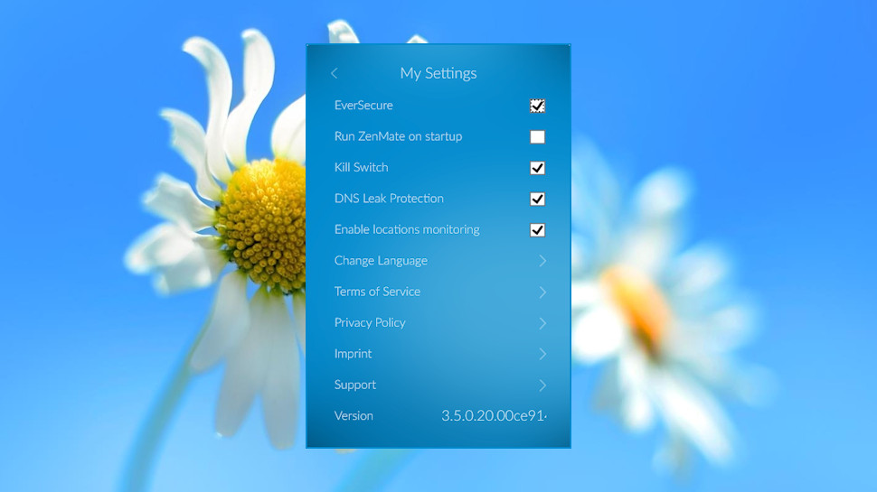
It got even easier from that point. The entire Windows installation process looked like this: we clicked a Windows icon on the website, then clicked the download. There was no setup prompt, no folder selection or options to consider, the app set up everything on its own and minimized to our system tray. The only remaining step was to log in using a password sent in ZenMate's welcome email.

The client looks good and is clearly designed for beginners. We just clicked a button to connect or disconnect, selected a flag to choose a location, and clicked an icon to tweak a few settings. Even if you've never seen a VPN, you'll be ready to go in seconds.

The interface is a little basic and lacks some of the functionality you'll often see elsewhere. You can't select locations by city, for instance (it's country-only). There's no information on server load. As we mentioned earlier, you can't change your protocol because only L2TP is supported.

Even some fundamental tasks have their own usability issues. It's important with any VPN that you know when the service connects or disconnects, but the Windows client doesn't have desktop notifications to keep you informed. The only way to see your connection status is to check the system tray icon (if it’s bright that means you’re connected, and if it’s dark, you aren’t), something that might not be convenient or even possible if, say, you're running a full-screen app.

There are some useful features – a kill switch, DNS leak protection – but these have no configuration options. It's just a click to turn them on, another to turn them off.

ZenMate's browser add-ons offer some extra functions you won't see in the native clients. The Chrome extension can automatically set a new location when you access a particular site, which could be a real timesaver. There's also built-in blocking of trackers and known malicious sites, and the extension claims to block "code snippets before they can reach your browser."

We suspect ZenMate's target audience will be more interested in performance, but our tests* found this to be disappointing. UK to UK connections managed around 16-18Mbps, which is usable but around half the speed of the top competition. Reaching out to close European locations – France, Germany, Netherlands, Sweden – saw performance fall to a lethargic 5-15Mbps.

Would switching to the US help? Our 8-10Mbps download speeds say not. The only bright spot was the performance of some Asian servers, such as Singapore's regular 10-12Mbps. That's well above average, but a similarly-priced competitor, Private Internet Access, gives you similar results in Asia and far better speeds everywhere else.

Our final privacy tests were a little better, with the client successfully blocking DNS and WebRTC leaks. Even here, there's a lack of advanced features – there’s no IPv6 leak protection, for instance – but most users should have enough to keep them safe.

Final verdict

Beginners will love ZenMate's easy setup, free browser extensions and the low yearly prices. Experienced users will be frustrated by the lack of features, though, and the below-par performance is going to be a problem for everyone. Check the service out, by all means, but try the free version first.

*Our testing included evaluating general performance (browsing, streaming video). We also used speedtest.net to measure latency, upload and download speeds, and then tested immediately again with the VPN turned off, to check for any difference (over several rounds of testing). We then compared these results to other VPN services we've reviewed. Of course, do note that VPN performance is difficult to measure as there are so many variables.

AKG K92

When it comes to headphones, the general consensus is that you very much get what you pay for. Opt for the cheap earbuds packed in with your phone and your music is going to sound tinny, flat, and lacking in any kind of musical excitement.

Move up to some high-end $1,000 cans such as the excellent Sennheiser HD800, meanwhile, and you music sounds almost unrecognisable. It's got dynamism, expression, and individual instruments that you can actually tell apart rather than having them all merge together into a mess of noise.

AKG meanwhile has always been a company willing to thumb its nose at the idea of 'getting what you pay for'. Its K451 headphones offer a level of sound quality that far outstrip their budget price tag, while its Y50 manage to offer a very stylish set of cans that feel far more premium than their price implies.

That said, at just $60 (£58.80) the K92's are a very reasonably priced set of headphones that in some ways match the features of cans double their price, but in other ways fall prey to many of the problems of a budget set of 'phones.

[Update: We've reviewed a number of headphones since the launch of the AKG K92 two years ago, and yet it remains one of our favorite pair of cheap over-ear headphones. With amazing sound and comfortable ear pads, the K92 has everything a headphone needs to compete - and win - in 2018.]

AKG K92

Design

The K92's are a big pair of headphones. With their large flat design AKG appears to be making a pair of headphones that it wants people to use in the studio or at home rather than while out and about.

Their size means you're unlikely to want to wear these headphones while out and about. They're much better suited to being used at home, at a desk, or on a longer journey such as a plane ride.

In these instances their size is an asset rather than a drawback, since it means the headphones sit nicely over, rather than on, your ears.

AKG K92

This does have the downside of making the headphones almost impossible to wear around your neck, but this shouldn't be too much of a problem unless you're using them while on the go.

The flatness of the K92's does introduce the problem of the cloth inside the headphone cup touching your ears. This might not bother you, but it always felt a little bit weird to me, like my ears were touching a bit of the headphones that wasn't meant to be touched.

Outside of the cups themselves, the band that connects them both has a well-made support strap that means the weight of the headphones sits on the top of your head rather than on your ears themselves.

When combined with their size, this headband meant I was able to use the K92's for hours at a time without feeling any discomfort, which bodes well for using them for marathon music or gaming sessions.

In terms of overall build quality the K92's both look and feel like their price would suggest. Their entirely plastic construction isn't anything special, and I wasn't personally a fan of the gold accents. I would imagine they're meant to suggest a high-end audio experience, but I wasn't personally a fan.

At least the AKG branding on each earcup is pretty tasteful.

AKG K92

Cable-wise the AKG's opt to have a single cable connecting to the left earcup which I liked, since two cables often results in more tangling. Unfortunately this cable is non-detachable, although at this price point a detachable cable is much less common.

Then again AKG did feature a detachable cable on its K451, which is even cheaper than the K92s.

AKG giveth and AKG taketh away, I suppose.

Overall I was happy with the construction of the AKG K92s. The all-plastic body and non-detachable cable is completely appropriate given the price point, and ultimately forgivable given that these headphones are comfortable to wear.

Performance

If I had to guess, I'd say that the slightly cheaper plastic construction has been chosen by AKG in order to allow it to maximise the performance of the internals of the headphones, and it's hard not to agree with its decision.

The AKG K92's 40mm drivers offer a great frequency response of 16Hz-22kHz. For reference the standard for most headphones is 20Hz-20kHz, since this is generally accepted as the audible frequency range of the human ear.

An expanded frequency range does not automatically mean a pair of headphones will sound better, but the extra headroom is helpful all the same.

Listening to a Scar Tissue by the Red Hot Chili Peppers through Tidal's lossless streaming quality reveals the K92's to have a nicely balanced sound. Chad Smith's bass drum manages to have kick without overwhelming the rest of the track, and separation between the rest of the instruments is good, but not excellent.

The soundstage on these headphone is slightly squashed compared to more expensive models. When I listened to a recording of Mozart's Violin Concerto in D major it wasn't especially easy to get a sense of the physical space the recording took place in.

These aren't meant as outright criticisms. The AKG K92's perform excellently for a pair of 'phones at their price point, but we've been spoiled by AKG in the past with models that have managed to sound as good as headphones double their price.

The final track I tried was the sonically complex Shackler's Revenge by Guns N' Roses. There's a lot going on in the track, several layers of guitars, vocal and synths, and the K92's dealt with them all well without letting the track feel muddled.

The track managed to feel nicely separated and balanced, and was very enjoyable to listen to.

AKG K92

We liked

The AKG K92's are a good sounding pair of headphones that are exceptionally comfortable to wear for long listening periods. For this price the sound they offer is clear and crisp, and they're ultimately a very enjoyable pair of headphones to listen to.

We disliked

Their plastic construction can't really be faulted at this price, but the K92's do feel like a budget pair of cans. The fact that the cloth inside of the earcups rested on my ears was a minor annoyance, but hardly a deal breaker.

Final verdict

At well under $100 the AKG K92's perform admirably for their price price point. They might not feel like a premium pair of headphones in the hand, but they make a good effort at sounding like it. Spending a little more may deliver incremental improvements in build and sound quality, but at this price point the K92's are a solid, if not revolutionary, purchase.

Sennheiser Momentum In-Ear

In-ear headphones are capable of awesome sound, but you might not be aware of that if you're used to hearing music through the cheap sets included with your smartphone. Even a slight step-up in headphone quality can nab you a set that can achieve ideal sound isolation from the outside world. Creating a tight seal can make even decent drivers sound pretty good, but you don't want decent. You want excellence.

Sennheiser's Momentum In-Ear earphones bring just that with versatile, tuned drivers. Additionally, the full feature set and spiffy design make the $99 (£89, about AU$125) price an easy pill to swallow.

[Update: Despite entering their third year of life, the Sennheiser Momentum In-Ear earphones remain one of the best in-ear headphones money can buy in 2018. If you're looking for something that sounds slightly better, we'd recommend also checking out the 1More Triple Driver In-Ear Headphones, but if you have your eyes (and ears) set on Sennheiser, you can't go wrong with these.]

Design

Similar to the Sennheiser Momentum Wireless over-ear cans, these in-ear headphones live up to the name with an active design that's as sporty as it is sophisticated. Splashed in red and black, the matte and glossy textures help to accentuate the main features of the Momentum In-Ear.

Sennheiser Momentum In-Ear review

The housing units that hold the drivers are slightly bulbous in shape and feature two pieces of dark, metallic red and glossy black plastic. They each come to a point on one end at the cylindrical stainless steel tubing where sound is delivered through. On the other end, Sennheiser embossed its logo onto a regal, spun metal cap.

Extending out from the earphones, the cables are guided through a loop at the site of connection, preventing them from getting twisted and frail over time. It's something that's not likely to happen anyway, as these cables are flat and are inherently less likely to get twisted. There's an adjustable stopper to further aid in keeping the cables tidy.

Sennheiser Momentum In-Ear review

There's a set of inline controls on the cable that reaches upward into the right earphone that also has an integrated microphone on its backside. Functionality here is pretty run of the mill, but you'll need to make sure that you select the right model for your phone. We were sent a review sample that works only in full with Samsung Galaxy smartphones.

Being an iPhone user, the headphones still worked perfectly and the functions to play, pause and make calls worked just fine. That said, I couldn't utilize the volume increase and decrease buttons. Fortunately, there's a model out there for virtually every brand of smartphone.

It seems as if Sennheiser paid just as much attention to detail with the packaging as it did with the earphones themselves. Inside the box is a tough, square-shaped zip case coated with smooth fabric and red stitching. Opened up, the headphones and inline remote are neatly packaged inside. Fortunately, they are just as easy to put back in as they are to remove from the case. Lastly, there are four different sizes of eartips included – in case the defaults aren't a good fit.

Performance

Things really click when a product's performance mimics the best qualities about its design. In the case of Sennheiser's in-ear Momentum model, the sound quality achieves what its design does well, as in offer a little something for everyone. As I stated earlier, these earphones are sporty, yet sophisticated in appearance. Just the same, its fantastic sound performance blankets over a similarly wide swath of listeners.

Sennheiser Momentum In-Ear review

If you're jumping up to these from a standard, cheap set of in-ear headphones, prepare for some impressively full sound. Once seated into your ears, the drivers inside these earphones are capable of providing booming, yet tight bass response to tracks of essentially any genre. The sound signature presented in this tiny package is warm and presented on a large soundstage wherein it's quite easy to pick apart instruments and layers of a song.

Most will heartily enjoy the sound presentation put forth by the Momentum In-Ear. But there will be a few who notice that, while the bass is punchy and the treble is pleasant, there isn't as much to enjoy in the mids. All said, these tweeters sound just about as good as $100 is going to get you.

Sennheiser Momentum In-Ear review

Comfort can be an issue for some who use in-ear headphones, as the inside of everyone's ears are unique. The Momentum headphones avoid that problem primarily because the earphones themselves are quite light. What helps more is that the size variety of eartips included should accommodate to most inner-ear sizes.

Final verdict

Splitting up the models by smartphone brand is a confusing move on Sennheiser's part. But thankfully, the fragmentation doesn't drastically affect into the overall quality of the product, so long as you get the correct model for yourself.

If your budget allows for a $100 set of in-ear headphones, you'll be greatly rewarded by the value packed into Sennheiser's Momentum In-Ear. The stunning design, with tangle-free cables and inline controls, will get you in the door, but the sound quality will keep you in the Sennheiser house.

Fugoo Style

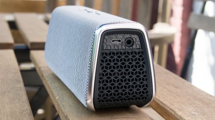
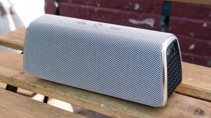
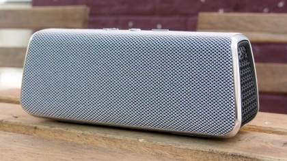
Fugoo is the Bluetooth speaker market's best kept secret. You probably haven't heard of it, but you'd be remiss not to consider this mini, but mighty, speaker as your next.

This is a speaker that's hell-bent on surprising you at every turn. First, it gets you with its customizable look, then it hits you with its booming sound quality. Lastly, it delights with battery life that is unmatched, running for about 20 hours at a loud volume. It's advertised to run for 40, if you cut the volume in half.

The Fugoo Style speaker is priced to compete with the latest and greatest Bluetooth speakers, starting at $179 (£169, about AU$281). But, as you'll see, it has some awesome tricks up its sleeve that give it the edge.

[Update: While newer models of the Fugoo Style have released since the inception of the original back in 2015 - like the newer Fugoo Style-S - this remains our favorite and one of the best Bluetooth speakers on the market.

Design

Talking about the design of the Fugoo speaker requires talking first about what's inside of it. At the heart of each Fugoo is its core: a tough, IP67-protected center. The sturdy build is constructed with plastic and accents of rubber, coming together to offer shockproof, waterproof, and dustproof peace of mind.

Fugoo review

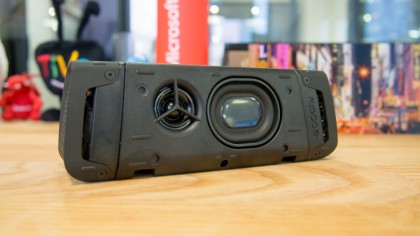
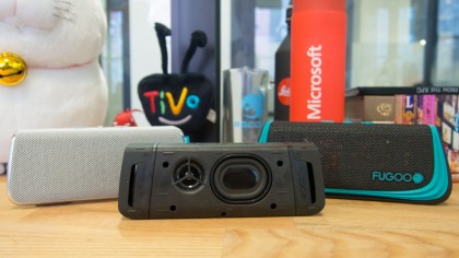
The Fugoo's core might not look like much, but it offers the solid foundation from which its customizable skins build upon. You'll find a tweeter and passive radiator nestled into its long sides. And on each of its ends, there is a woofer capped by a protective layer that's decorated with a slick honeycomb effect. All in all, this makes for six speakers total inside the Fugoo Bluetooth speaker.

On one side of the speaker, there's a microUSB port and a 3.5mm port, each of which Fugoo has provided the appropriate cables for. Glancing over at its other side, there's a power button and Bluetooth connect button. Holding the power button for a few seconds prompts an audible queue, as well as a visual one via its LED indicator, that the speaker is, indeed, turned on. A vocal prompt will follow up with a warning about battery status, should it be low enough to warrant a charge.

Which jacket suits you?

The core of the Fugoo Bluetooth speaker plays an instrumental role in providing listeners with an experience that's suited to their own lifestyle and listening habits. But, to be honest, it won't win any awards on looks alone. Thankfully, Fugoo offers a few choices to make its Bluetooth speaker fit your sense of style: Style, Sport, or Tough jackets. Each of the options offer a unique look, but differ mostly in how they tip the balance between form versus function.

Fugoo review

Fugoo supplied techradar with a core, along with a Style and Sport jacket for review. The Style jacket adds another layer of honeycomb-patterned plastic to the already-durable core, covered with mesh fabric and shiny plastic detailing. The Sport option offers up the same slick fabric to cover up the core, but comes stocked with a thicker plastic shell and more rubber to protect the Fugoo in case of a tumble.

Installing each of the jackets is a fairly simple process. There are a series of interlocking grooves on the bottom of the Fugoo's core that help each jacket stay snug. Putting the Style jacket on involves sliding the core into the jacket until you hear a snap, which indicates that it has locked into place. The Sport, being the more protective option of the two, requires a bit of disassembly before you can place the core inside.

Fugoo review

The basic package is priced at $179 (£169, AU$281) and includes the core, a Style jacket in your choice of color, as well as a 3.5mm cable, a microUSB cable and an AC adapter. If you want more than one jacket, the price to add to your collection ranges from $29 (about £24, AU$65) for the Style, to $79 (about £68, AU$129) for the Tough jacket.

The Style jacket puts the focus on form, but the Sport jacket works to add more function to the Fugoo Bluetooth speaker. Once the Sport jacket is equipped, you can attach a host of optional accessories, like a strap mount, to strap the speaker around a tree or pole. It's also compatible with its bike mount, which secures the speaker to your bike handles. These make the Fugoo more versatile, but they are totally optional and don't add all that much to the experience.

Performance

Fugoo might allow listeners to hand-pick the looks of its speaker to match their tastes, but thankfully, the speaker provides stunning performance out-of-the-box that will impress across the board. Whether you primarily use the speaker inside or out, in inclement weather or on the sunny beachside, you'll be treated to a finely-tuned experience.

Fugoo review

Connecting to the Fugoo Bluetooth speaker is simple as can be: just tap and hold the Bluetooth button and search for it on your device. Helpful voice prompts chime in along the way to help this process go even more smoothly. Usability is a cinch.

You can pause and then resume playback with a press of the circular, center button. If you want to adjust volume, give one of "+" or "-" buttons a tap. If you pay attention to the Bluetooth speaker space, you're probably aware that the buttons on many products have dual purposes.

You'll find that on the Fugoo, too. Its middle button can answer or hang up phone calls. You can also bring up Siri or Google Now, depending on the sort of device you're synced up with, by holding the same button for a few seconds. Lastly, changing songs is a breeze, just hold the middle button and tap either the "+" or "-" to skip or reverse tracks, respectively.

Fugoo review

Sound performance is one of the Fugoo's best qualities. With its six speaker setup, it dishes out the most successful attempt at true 360 degree sound I've heard yet. The sound profile defies its size, pumping out balanced audio full of bass, layered with mids and highs that don't distort. Appropriate for mellow jazz mastercuts, hip-hop and rock alike, I am constantly impressed with the Fugoo.

Listening to music on most Bluetooth speakers is enjoyable. That is, until the battery dies. Most speakers of this size tend to have a six to 10-hour lifespan until they need to sip on a power source. That's not the case with the Fugoo Bluetooth speaker; it's advertised to last a whopping 40 hours at half volume.

Of course, I had to see for myself. I listened to it at what sounded like half volume for about four hours a day over the course of a week without charging. The total time listening doesn't quite meet the advertised 40 hours, but even so, the numbers it puts up are nevertheless impressive. As I prefer to listen to music a bit on the loud side, I am pleased to see the speaker delivering close to 18 hours at more intense volumes during my testing.

As explained earlier, The Fugoo Bluetooth speaker offers support for Siri, Google Now and phone calls. The internal microphone has no problem picking multiple voices in a room, and the speaker can play through phone calls without harsh distortion.

Verdict

The Fugoo Bluetooth speaker might seem to have come from left field if your eyes are only set on the big brands. But, its offering is serious business, especially if your heart is set on killer sound performance, unmatched battery life and a durable build that's able to survive both a tumble and a swim.

This Bluetooth speaker is priced to take on the likes of the UE Boom, and gets the edge thanks to its true 360 degree sound, reasonable price and all-around solid performance. Hands down, this should be your next Bluetooth speaker.

TCL P-Series (55P607)

There's no doubt about it, TCL’s P-Series was the best value TV of 2017. 

It has its problems, especially when it comes to keeping local zones the evenly lit, but its clarity, color and ability to produce stunning HDR images were second to none in its class - and sometimes even against TVs that cost two to three times as much.

While we still love the P-Series, it's getting a lot harder to find in 2018. Some stores still carry it, but most have run out of stock. The good news here, however, is that since its release last year, TCL has released two newer models - the TCL 6-Series R617, R615 - that are even better than the P-Series. TCL has upped the number of contrast control zones from 72 to 96 on the 55-inch TCL 55R617, and it's improved video delay to only about 17.7ms, making the 6-Series a great TV for gaming.

That said, however, if you can find a great deal on the P-Series somewhere out there on the internet, we recommend taking it - this is still a fantastic TV, one year later. That said, if you want to see what we thought about the P-Series last year, read on. 

(Editor's note: TV names can be a bit confusing. The TCL P605 offers the same picture performance as the P607, the only  difference between them being the remote that comes with the TV. Also, the P605 is available exclusively at Best Buy.)

Design

If you’re unfamiliar with TCL’s gamut of televisions, the P-Series is approximately the middle-of-the-road model. It focuses on picture performance (that’s what the P stands for) but it neither holds rank at the top nor bottom of TCL’s TV echelon. 

And that’s OK. As it turns out, the middle is a very good spot to be. 

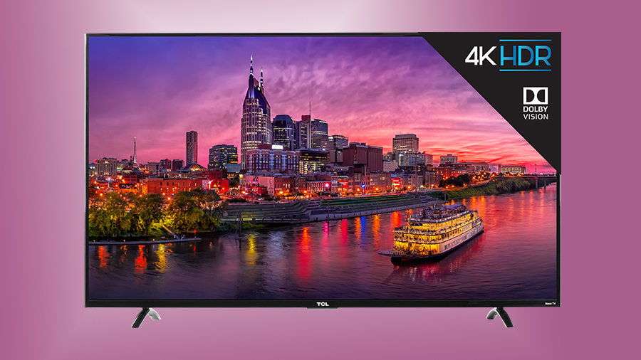
The C-Series, which stands just above the P-Series, offers a built-in soundbar and a contemporary design for an extra $50, while the S-Series drops Dolby Vision from the equation for around $100 less than the P-Series. The P-Series might not have a ‘contemporary’ design or a built-in soundbar, but it does support Dolby Vision, a crucial component of HDR performance. So far, it’s not so bad being the middle child.

The downside, however, is that for now, TCL’s P-Series only comes in one size: a formidable, but not overwhelming 55-inch model. There will be a 50-inch and a 65-inch version sometime down the road but, for the time being, all we have is the stalwart, budget-conscious 55-inch screen to sink our teeth into. 

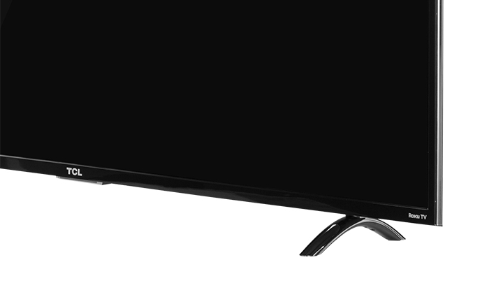
The P-Series stands on two metal u-shaped legs that have rubber padding on the bottom to prevent slippage. They can be fitted relatively quickly, and the TV should be up and running in a matter of minutes if you have all of your cables sorted and ready to be plugged in.

Speaking of plugs and ports, the 55P607 supports three HDMI 2.0 ports with HDCP 2.2, one with HDMI ARC, one USB 2.0 port, a 3.5mm Headphone Jack and Digital Optical-In, plus an AV In port that takes your standard composite (Red-White-Yellow RCA) input, great for classic gaming or older AV devices.

It’s all housed inside a slim(ish) black shell that’s somewhere in between the paper-thin OLED screens we’ve seen so much of this year and the older LED LCD screens of yesteryear. The bezel is apparent but not distracting, at least to us, but should you want something a bit sleeker there’s always the TCL C-Series to consider.

Design TL;DR: The P-Series is limited in its size (it’s only available in a 55-inch version at the moment), but otherwise it hits the nail on the head in the design department.

Smart TV (Roku TV)

Starting back in 2014 with a 1080p model, TCL has adopted Roku as its primary smart TV provider – which was a great decision considering how easy Roku’s platform is to use. 

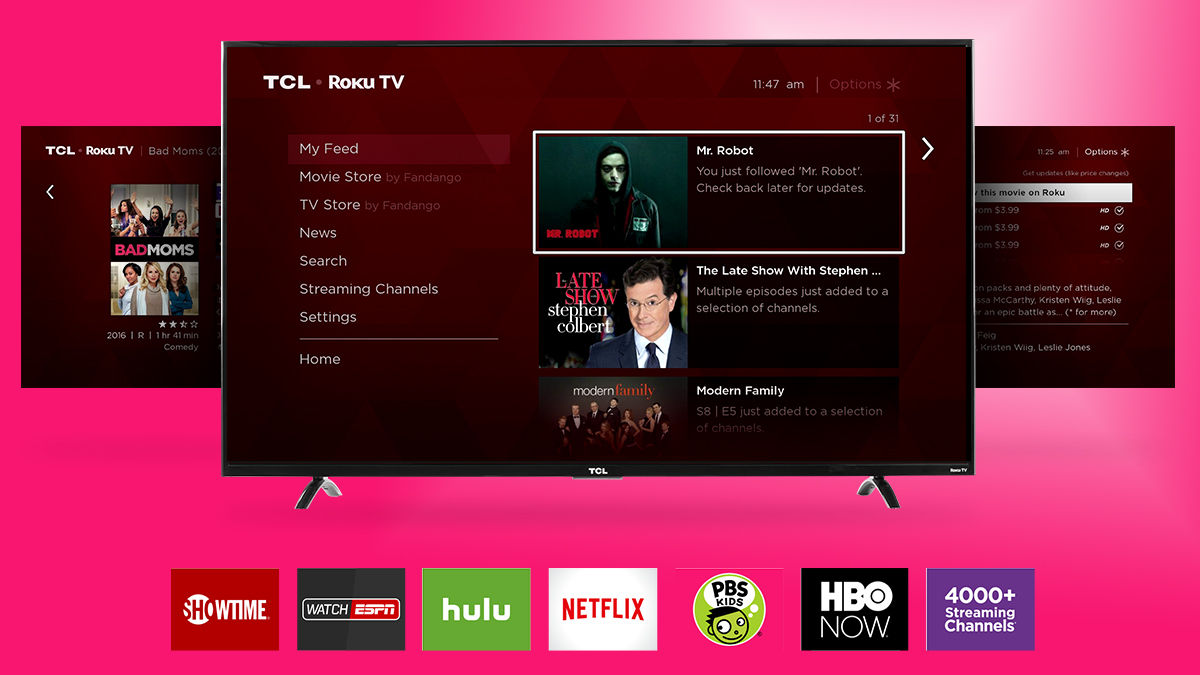
The smart TV version of Roku both looks and acts like the platform used on streaming video devices like the Roku Ultra and Roku Premiere+: The Home section contains all the apps in your library, while My Feed tracks movies and TV shows you’re interested in and shows you where they can be found. We're also pretty big fans of Roku's universal search feature that rifles through 300+ apps to find movies and TV shows and displays them with the cheapest option first.

Overall, Roku TV is simple, efficient and straightforward enough for most people to pick up and use without a problem.

New for platform in 2017 is the ability to label inputs (labeling one input as Xbox or DVD Player instead of Input 1, etc…), some additional smartphone features and, for the first time, Dolby Vision support. Dolby Vision allows you to get the absolute most from the TV in terms of performance and while tracking down Dolby Vision content is a bit of a hassle, Roku does a good job highlighting all the available content in a new row in the 4K UHD Spotlight app.   

Smart TV TL;DR: Versatile as ever and increasingly more efficient and easy-to-use with each passing day, Roku TV makes a great TV even better.

HD/SDR Performance

While 4K/HDR is the star of the show here, HD/SDR doesn’t look half bad either. Bright areas are brighter and dark parts darker thanks to TCL’s Contrast Control Zone technology that individually illuminates and dims 72 sections of the screen, and the same tech that makes HDR look so rich and vibrant also helps make HD/SDR images really shine.

If you’re looking for demo content to show off this new screen, your best bet is to stick to movies and shows that emphasize bright colors over darker, subtler tones. It’s not that the TCL 55P607 can’t handle night scenes chock full of inky blacks, it’s just significantly better at handling brighter kinds of content. Cartoon movies like Moana, The Life of Pets and more look luxurious on this screen and its performance rivals some of this year’s best and brightest panels like the Samsung Q7F QLED TV and Sony Bravia XBR-X900E. 

It’s a slightly different story when we talk about what darker content looks like on TCL’s value performer – those nice inky blacks can turn to milky grey before your eyes – but largely we came away impressed with what it could do. 

The most disappointing moment we had with the TV came during the Game of Thrones Season 7 opener when the ominous dark grey fog rolled in. What should’ve been an epic introduction to the season looked grainy and pixelated. Things cleared up by the next scene, but the slight faux-pas proved that TCL isn’t ready to take on OLED in black level performance anytime soon. 

HD/SDR Performance TL;DR: TCL’s P-Series still has a bit to do in terms of upscaling and black level performance, but overall HD/SDR content (especially bright images) looks great.

4K/HDR Performance

The star of the show here is 4K/HDR. Hands down, the TCL 55P607 provides the best performance-per-dollar in this arena than nearly any TV on the market today. In terms of 4K/HDR performance specifically, and by that we mean the result of feeding the TV a native 4K signal, the 55P607 rivals and in some cases surpases screens that cost hundreds more. 

Surprised what this TV is capable of? So are we. But there are some strong technological advantages that TCL has packed into the screen that make the most of its internal hardware. There is, of course, the Contrast Control Zone technology that we mentioned above that helps prevent areas of bright white from bleeding into darker areas, but there’s another technology called Wide Color Gamut that enhances visuals in an even more profound way.

Wide Color Gamut (or WCG) is the driving force behind the TV looking more saturated – blues being bluer, greens being greener and so on. TCL has a proprietary technology called NBP Photon that does this intelligently without risking oversaturation. In practice, the results are extraordinary and look above what a TV in this price range should produce. 

Of course, the tradeoff here is that the 55P607 is still an LED LCD screen that has all the same problems that we’ve seen with the technology over the years: there’s a blooming effect where bright areas bleed into areas that should be pitch black, and black levels here just aren’t quite as good as they were back on plasma TVs or on newer OLED screens. 

These complaints are ultimately minor, however, and unless you’re looking for them, they won’t distract you from the beautiful images this TV can produce.

4K/HDR Performance TL;DR: Loaded up with the latest in screen tech, TCL’s affordable 55-incher is quite the 4K performer. 

Sound

The TCL 55P607 is equipped with everything it needs for decent-sounding audio right out of the box: It has two downward-firing 8-watt speakers that produce a sizeable amount of noise – it’s enough to fill a small room like a bedroom or cut through larger to midsize rooms without compromising too many of the details.

In terms of tonal balance, TCL has wisely placed an emphasis on the mids and highs rather than wall-shaking bass. That means the TV performs well in shows and movies where dialogue is the most important or prominent type of audio, but falls a bit short on music or games where explosions reign supreme. 

In short, it’s not a complete slouch here, but if you’re looking for wall-shaking bass or all-around better balance, you’ll need to invest in a soundbar.

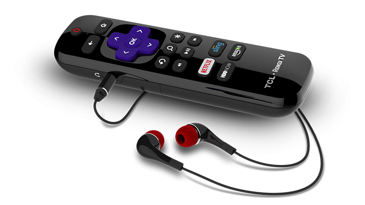
That being said, if you’re used to using a traditional Roku device, one nice feature about the 55P607’s remote features a mute button next to volume up/down – a small feature, we know, but one that makes a world of difference.

Sound TL;DR: TCL’s 55P607 offers good, balanced sound for the price. Home cinema enthusiasts might want to invest in a soundbar, however.

Other panels to ponder

If we were talking about a mid-range, $2,000 television, you’d be absolutely inundated with recommendations – the Sony Bravia X850E and Bravia X900E series are fantastic this year, and Samsung’s MU series looks to offer big-screen thrills at a more affordable price. 

But TCL’s 55P607 stands in a class of its own. 

It looks great, comes in a formidable screen size that should fit on top of most home entertainment centers and costs well under $1,000.

The only thing that we’ve found to be close to TCL’s P-Series would be the new-and-improved 2017 Vizio E-Series SmartCast XLED TVs. The 65-inch version, which supports 4K and HDR10, comes in at a still-affordable $899 – a mere $250 more than what you’d pay for the TCL 55P607 for an extra 10 inches of screen. 

Ultimately, however, all else even, we’d still opt for TCL’s P-Series. 

Verdict

TV manufacturers have long sought the formula to a great performing TV at a bargain price and, speaking for the last seven years since LED LCD hit the mainstream, have never quite achieved that perfect balance. Until now. For us, TCL’s P-Series 55P607 does just that – it packs powerful technology under the hood, including support for WCG and Dolby Vision, in an affordable package that will only get cheaper once the seasonal sales start in November.

!!!!!!!!!!

Popular Posts

Categories

Blog Archive