Samsung Galaxy S8
The Samsung Galaxy S8 was something quite special when it launched. It was a phone that was unlike anything you'd have seen on the market. And even now, more than a year on, it's still stunning.
The screen is just brilliant - clear, sharp and offers lovely color reproduction to make movie watching a dream, and that's before you've even got to the fact it has a screen larger than the iPhone 7 Plus in a chassis that feels more like the iPhone 7.
The Galaxy S8 isn't perfect - in the search to squeeze the screen in so completely, other factors were overlooked: namely, the placement of the fingerprint reader. If you want this phone, you'll need to answer this question: are you OK using an iris scanner?
And if you're looking for something even bigger, and with a much-improved battery life to boot, then the Galaxy S8 Plus is the way to go - although both have now been replaced by the new Samsung Galaxy S9 and Galaxy S9 Plus.
These are iterative upgrades over the S8, so if you want to saw some money the now-cheaper S8 is still a great shout, but if you want the very best Samsung has to offer then it's the S9 duo you need to be paying attention to.
- Read our reviews: Samsung Galaxy S9 | Galaxy S9 Plus
Samsung Galaxy S8 price
- Launch price: £639 ($724.99, AU$ 1,200)
- Current price: £440 ($499, AU$721)
The Samsung Galaxy S8 carried a hefty price tag when it arrived in April 2017, but more than a year on the cost has reduced significantly making the phone an attractive proposition for those who find the S9 a little on the steep side.
At launch, the SIM-free Samsung Galaxy S8 price was £639 ($724.99, AU$ 1,200), but now it can be found for just £440 ($499, AU$721).
In the UK, the contract price has dropped. Some deals offer the phone for less than £25 per month with a substantial amount of internet included. To find the best deal for you, check out our selection of the best Samsung Galaxy S8 deals in the UK.
We spent a week thoroughly testing the Samsung Galaxy S8 when it first came out - watch our video below to see how we got on.
Not seeing eye to eye
- Biometrics add time to unlocking the phone
- Fingerprint scanner in a poor place
- Facial recognition infuriating
Right, let’s get down to business – and we’ll start with the thing that’s concerning us most about the Galaxy S8.
The main issue we have with this phone centers around how you’ll get into it – most smartphones users now expect to use a fingerprint to unlock their device, making it secure and meaning you don’t have to peck in your PIN a billion times a day.
It’s a good idea, it’s safe enough for most people, and it just works – we’re all in agreement there.
With the Galaxy S6, Samsung got biometric unlocking right, but annoyingly with the Galaxy S8 things have become difficult and confusing.
You can unlock this phone with your face, a fingerprint or an iris scan, in increasing order of security level, making the S8 one of the most secure phones around (assuming nobody knows your PIN, of course, which is the backup method of entry).
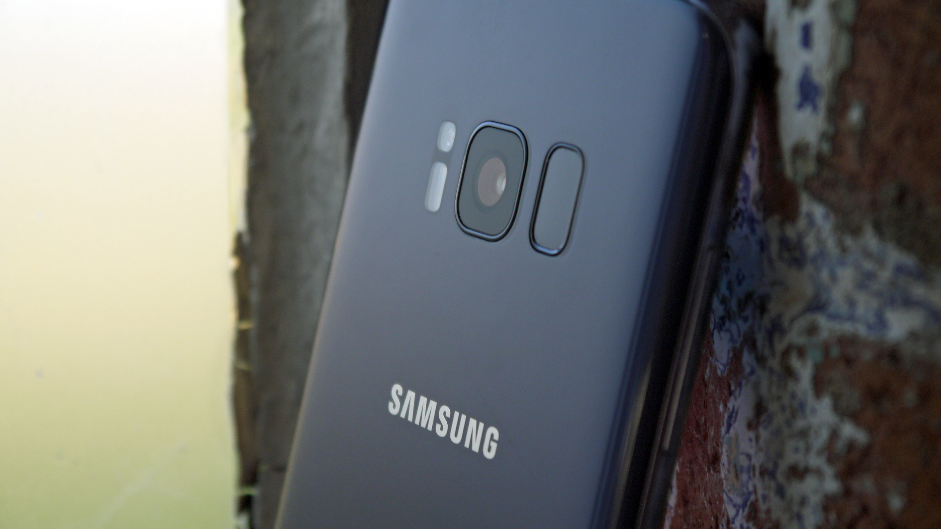
However, in creating the massive screen on the front of the Galaxy S8, Samsung has moved the fingerprint scanner to the rear of the phone – and placed it out of the reach of most fingers when holding your phone naturally.
As a result, you’ll need to shift the handset to an unnatural position in your palm to reach the scanner with your digit, and thanks to the elongated lozenge-like shape of the fingerprint sensor it can take a couple of attempts to register.
It also makes it less stable in the hand and prone to being dropped. And in terms of it being uncomfortable in the hand, the Galaxy S8 Plus takes it to the next level, with an even harder time of reaching the scanner at the top.
You will find over a few months' use that you'll get used to this - we've found after intensive testing it's not terrible... but it's certainly not optimal.
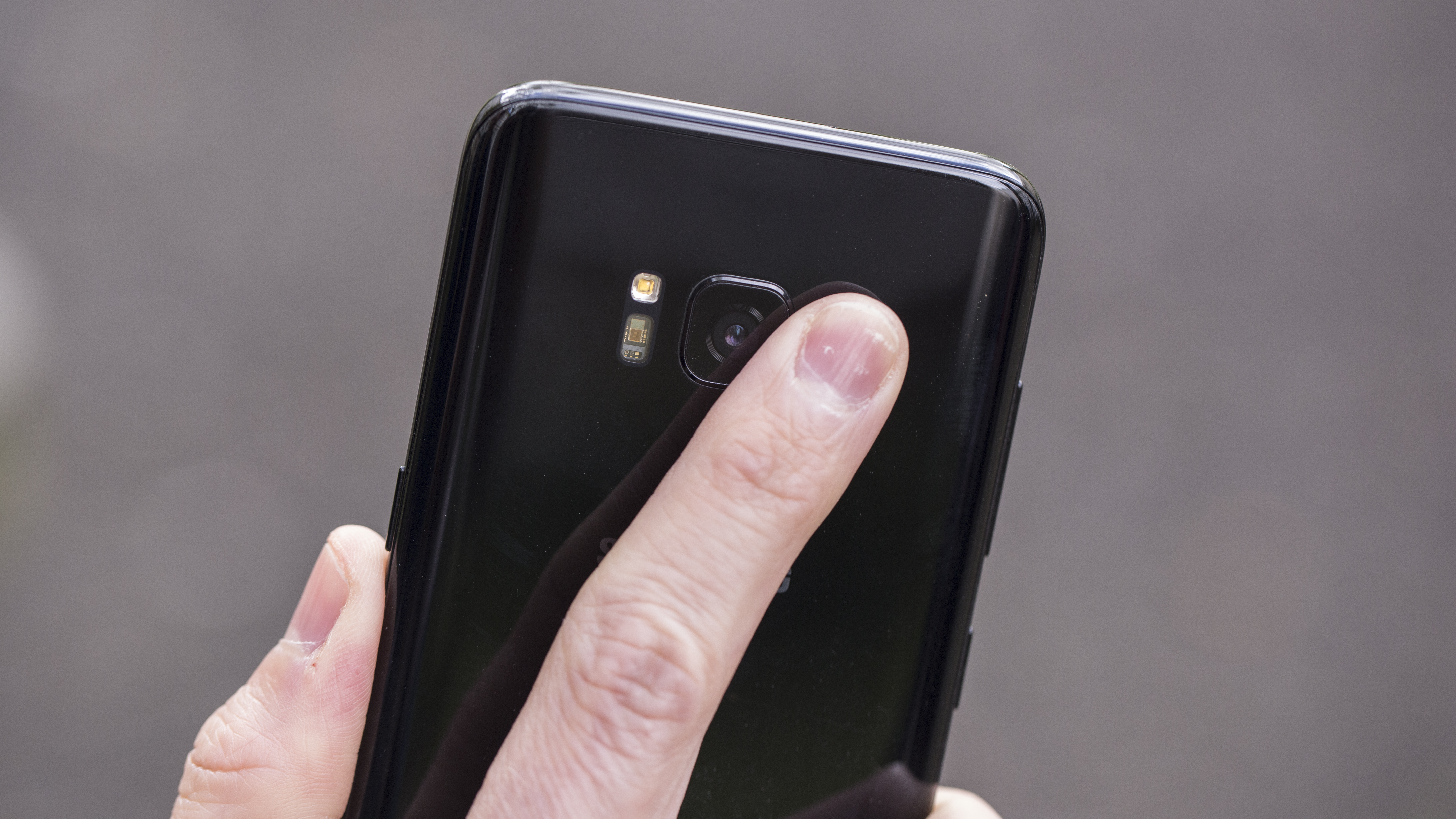
The fingerprint scanner, then, is too far away to use naturally. So how about iris scanning? Well, it’s the best implementation we’ve seen from Samsung (far better than we’ve seen on the flammable Note 7) but it’s still not perfect.
There are times when it’s flawless, where you’ll just turn the phone on and be instantly unlocked as the S8 has spotted your eyes and confirmed your identity. (Or just thinks you’ve got lovely irises and wants to impress you… either way, it’s rapid).
On the occasions when it works like this you’ll experience a genuine sense of living in the future.
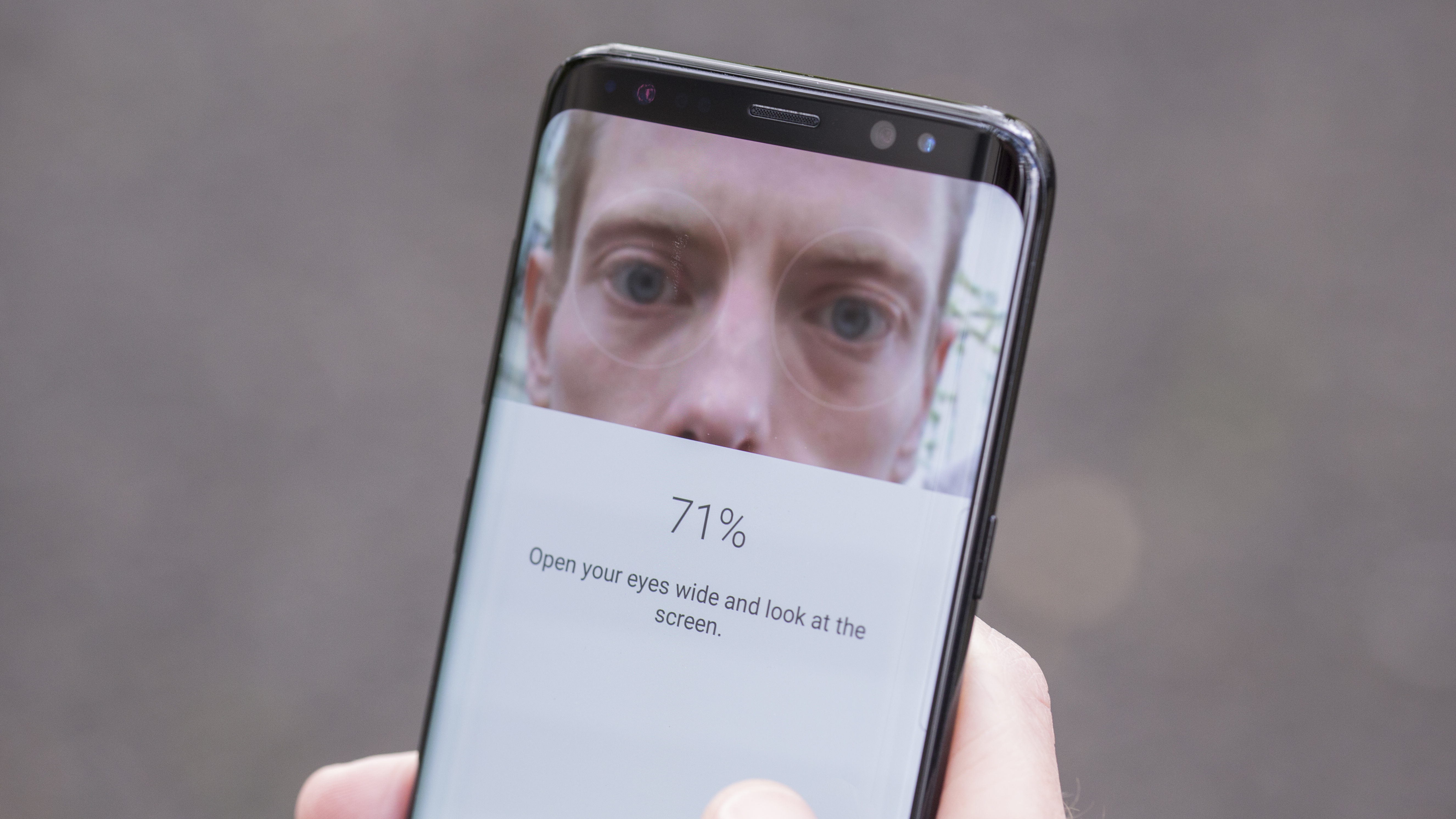
Other times, when you’re walking or in lower light, the iris scanner just failed time and again (although weirdly it works fine in the pitch-dark).
This meant we sometimes ended up gurning (by the way, we urge you to search YouTube for the gurning world championships) at the S8, trying to force the issue by opening our eyes really wide and moving the phone around in order to unlock it.
On the train, this is not acceptable behavior – and after a couple of days, it actually made our eyes hurt, pushing them out on stalks so often.
There were also times when the iris scanner wouldn’t work even in optimal conditions (sitting still in bright light), and only a restart sorted this issue out.
Not smart, Samsung. If you’re going to make people switch to an iris scanner by putting the fingerprint sensor out of reach, then make it flawless, not brilliant-most-of-the-time-but-sometimes-not.
Over a week or so we did get used to the nuances of the iris scanner; it’s fine – it’s just mildly irritating to have to hold your phone in a certain way, and it’s useless while walking or wearing sunglasses (although it did work through regular glasses).
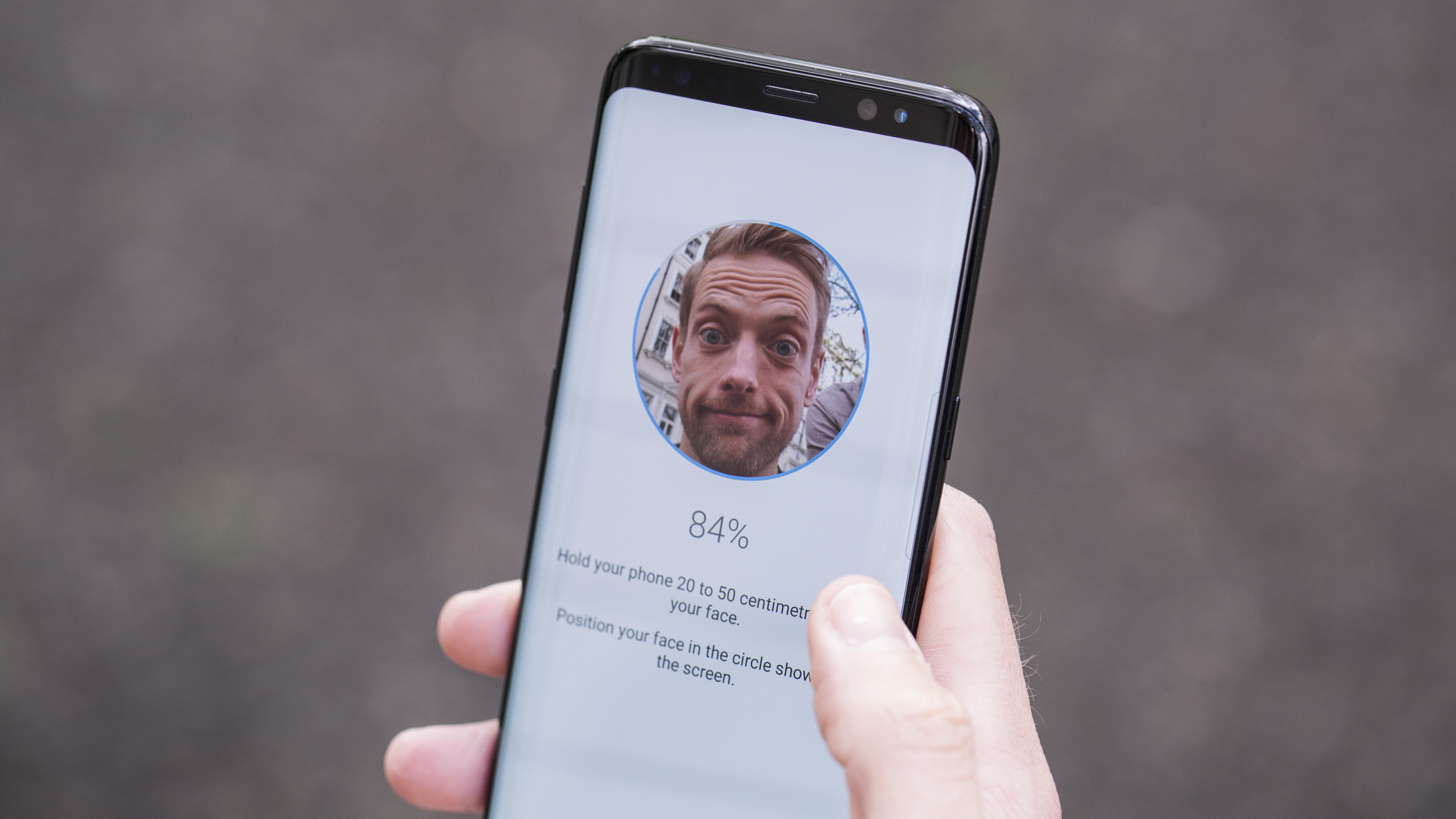
Facial recognition – despite being the default out of the box – is a non-starter for us. The phone fails to recognise your face far too often, it doesn’t work in low light, and it can be spoofed by a photo. Nope, not happening.
There's nothing more infuriating about this feature than the fact you can't see if you're 'positioning' your face correctly. There's definitely an angle to hold it at that's optimal... but you have no idea what it is, or why.
This issue has been increased now that Apple has invested seemingly billions in creating invisible dots that fire into your face to verify your identity the same way... the iPhone X is big competition to the Galaxy S8 as a result.
What users now expect from flagship phones – and what Samsung had done perfectly before – is a simple, muscle memory action that opens your phone. No extra pressing, no having to interact with the phone to open it up – just one single press to be securely into your handset.
The workaround we ended up with (as we’re not leaving our phones unlocked, which is what some might be tempted to do) is to use Smart Lock, where you can set up trusted places or connected devices to confirm your identity.
This means that if you leave your phone lying around at work or at home someone can jump right into it though, so you’re basically just preventing a thief from being able to access data if you lose the Galaxy S8 on the train.
In short, Samsung appears to have screwed this one up. We’d heard rumors that the brand was trying to add in a new feature where the fingerprint was in the same place as on the S7 (at the base of the phone) but actually under the screen.
That would have been perfect, as it’s the way most people fire up the screen anyway.
But clearly Samsung couldn’t make this work effectively, so decided to shove the fingerprint scanner way up the back of the S8, as that was the only place left to put it that didn’t require some last-minute retooling of the phone.
That's the only logical explanation, as otherwise why wouldn’t the fingerprint scanner be above the Samsung logo, which would be a perfect place for it?
A sluggish start for Bixby
- Bixby still fails to impress
- Very much a future feature
- Bixby Vision adds unnecessary bloat to the camera
The other big feature that’s launched with the Samsung Galaxy S8 is Bixby, the brand’s voice assistant rival to Apple's Siri, Amazon's Alexa and Google's less-interestingly-named Assistant.
Those who've used the Galaxy S3 and S4 will remember that Samsung already tried to match Siri with S Voice, but it was a bit pointless, especially when Google's voice chops got so gosh-darn good.
Well, Bixby is Samsung’s big play in its bid to compete in the arena of artificially intelligent assistants, and it clearly thinks it can succeed despite being so late to the game.
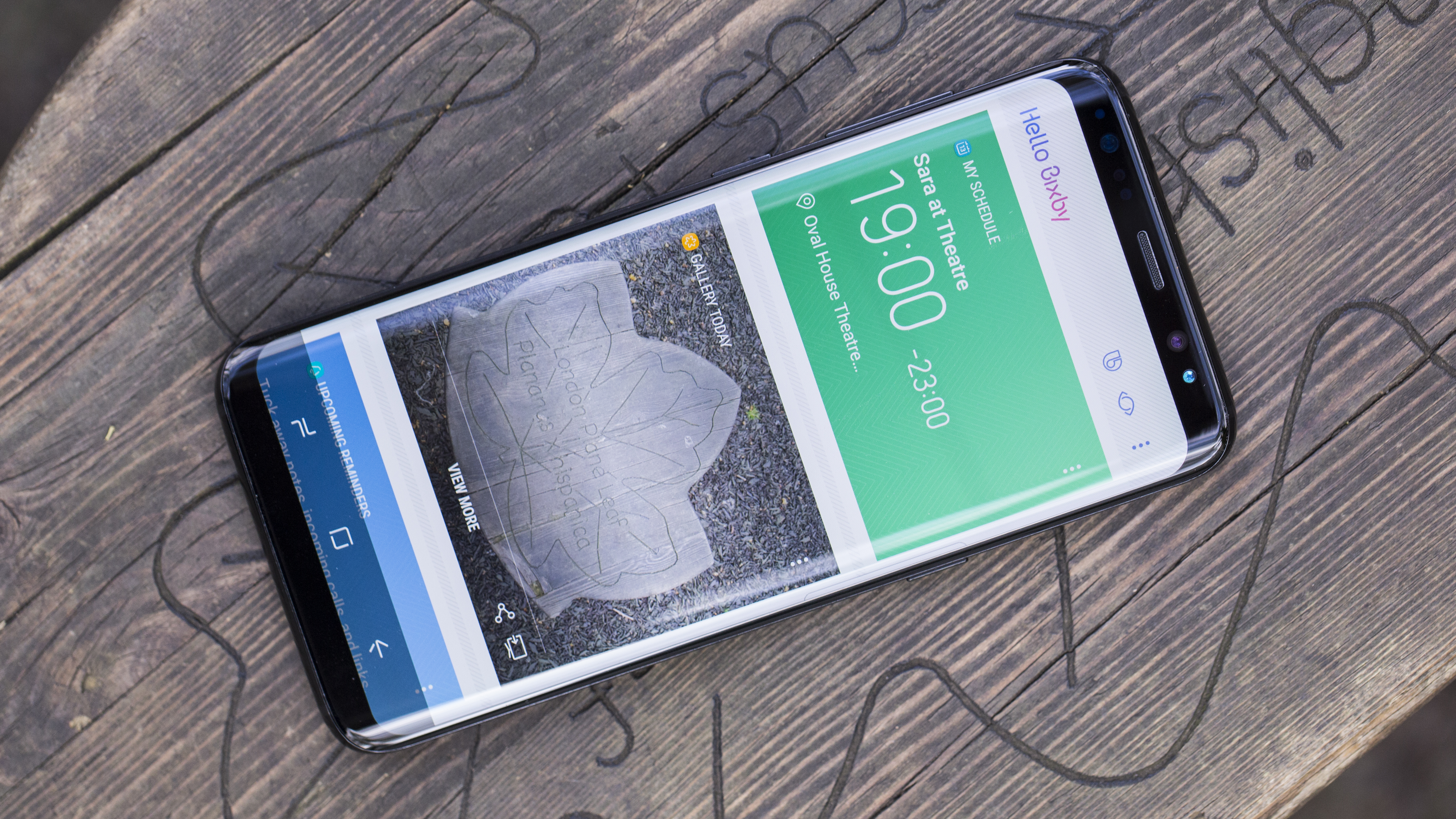
The aim here is to make Bixby an indispensable accompaniment to your daily life, reminding you of things when you need them, letting you know what you're looking at, and being a single-button one-stop shop for all the information you need.
In fact Samsung is so confident that Bixby is going to be brilliant that it's popped a button dedicated solely to this function on the side of the phone.
Yep, a phone that's so tightly designed that it can't even have the fingerprint scanner in an accessible place has a whole key dedicated to Bixby… and it's very hard to see why right now.
Bixby is pretty mundane though, despite having voice functionality added in now. It's currently only South Korean and US English and it's inherently inaccurate for voice.
We tested for a while, but as it can't support many third party apps or properly understand what's being said - even to a US speaker - it seems a bit futile. It will probably get better over time, but most people won't care about that.
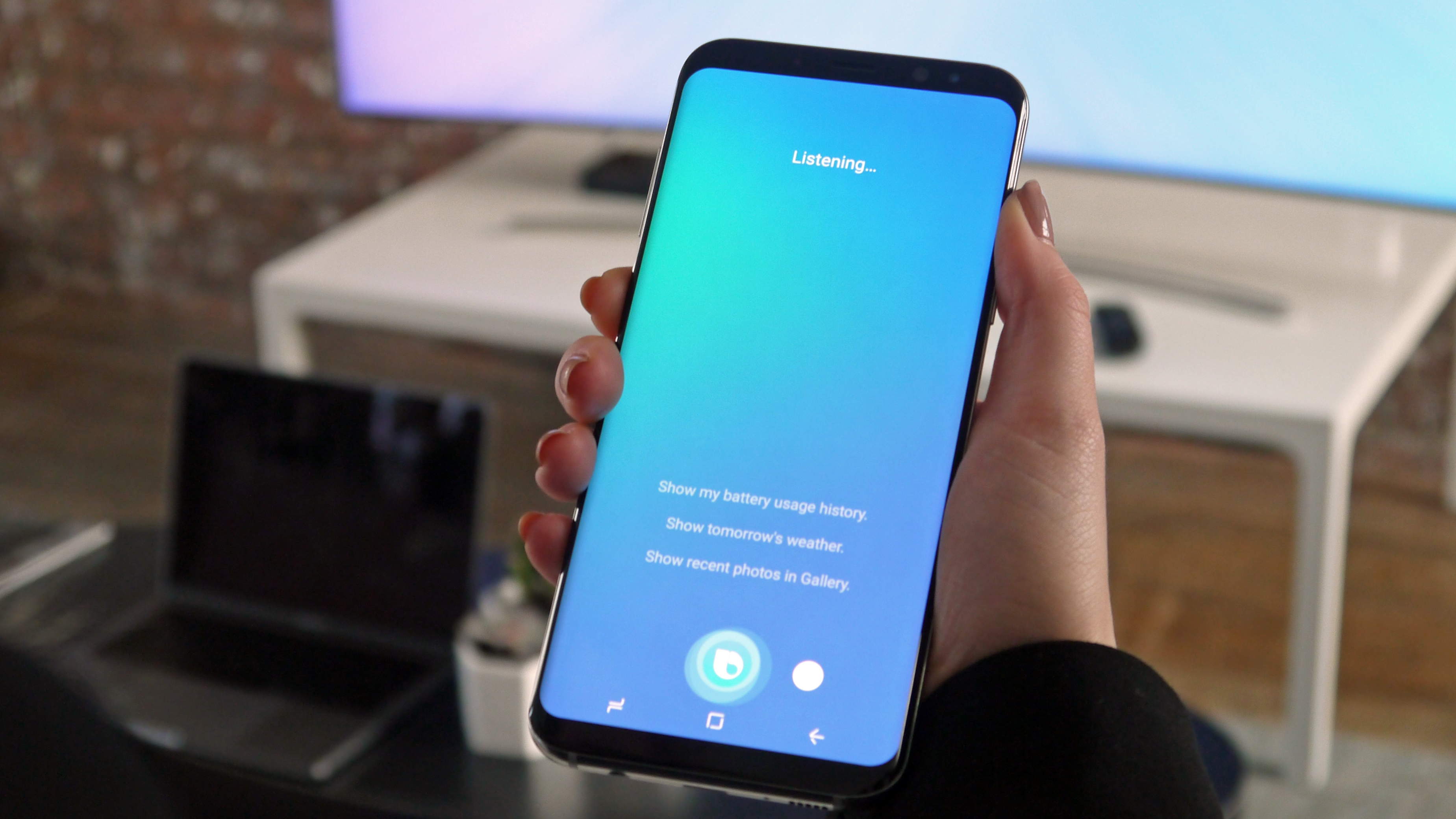
In the UK, one would assume it wouldn't be too long – but then again, that region was expecting Samsung Pay a while ago, and it's only just turning up.
So what does Bixby mean to you, the new phone buyer? Well, nothing. It's average at best, and pretty much useless at worst.
Bixby Vision, a little icon that lives in the corner of the camera, will be able to analyze what's being shown through the camera's viewfinder (both live and from a taken pic) and let you know whether you can buy it, recognize the image and given information or let you know about a place you're checking out.
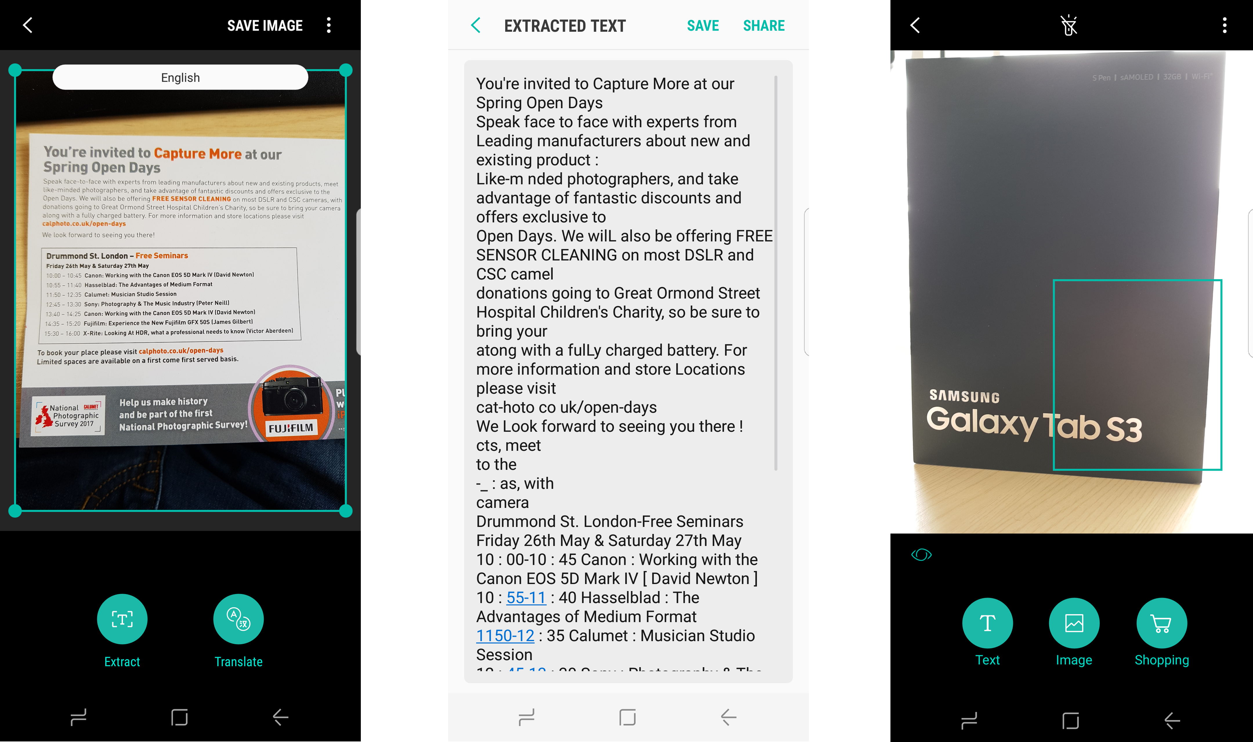
Except the results of image recognition just show you things on Pinterest, the shopping element seems to recognize almost nothing at launch and the places option is pretty patchy. It's slow to work out what it’s looking at and, overall, it’s just a waste of screen right now.
Bixby Home, the screen that lives to the side of the home screen, is much better.
It's contextual and interesting, and you can pin your favorite elements (like Spotify, for instance) to the top for easy access from anywhere in the phone.
It's nothing earth-shattering, but it's pretty neat – although there is a maddening pause every time you open it for the first time, as if Bixby is trying to remember where it left its home page.
The good news is you can disable the Bixby button from opening the Home screen, which is great as so many times we hit it instead of the volume key. It's a poor placement.
And then there's Bixby Reminders, where you'll be alerted to things you've made a note of in the past. You can set a location trigger to remind you to buy fruit when you pass a location, or ping you at a certain time to remind you to call someone.
None of this is exactly new though, and there's absolutely no reason why you'd buy the Samsung Galaxy S8 for Bixby.
Samsung is pretty jazzed about Bixby, and the fact that it'll be able to understand things contextually in the future. Right now it only can work with a handful of native apps (not even all of them...) and there’s no interaction with third-party options. But from this acorn, Samsung insists, a mighty oak will grow.
Imagine not just being able to set a location to buy fruit, but being pinged when somewhere nearby sells it. Or taking a picture of something and finding it far cheaper online straight away, or being able to ask your phone to do things contextually (for instance: ‘Bixby, can you turn on the heating when I’m twenty minutes from home?’ ‘Bixby, upload those pictures from my run today to Facebook with the caption ‘#blessed #squadgoals #ImsorryforwhoI’vebecome).
That's the world Samsung is promising, and if you purchase the S8 you'll be buying into that promise. However, right now, that's all it is... and there’s no way we can recommend a phone based on a promise, as Samsung could just pull the plug on a feature like Bixby if it really can't get it to work properly, and a few months on we've seen nothing that suggests it's going to conquer the world of AI.
- Best-looking phone on the market
- Premium design
- Headphone jack remains
The way the Samsung Galaxy S8 is put together has to be the defining feature of the handset. It looks like a phone that's been brought back from the future, a device that we've been crying out for a phone manufacturer to be brave enough to put together.
If you're coming to the S8 from the Galaxy S5 or S6, or switching from the iPhone 6, then you'll be genuinely amazed by a phone that would look thoroughly at home in a sci-fi movie.
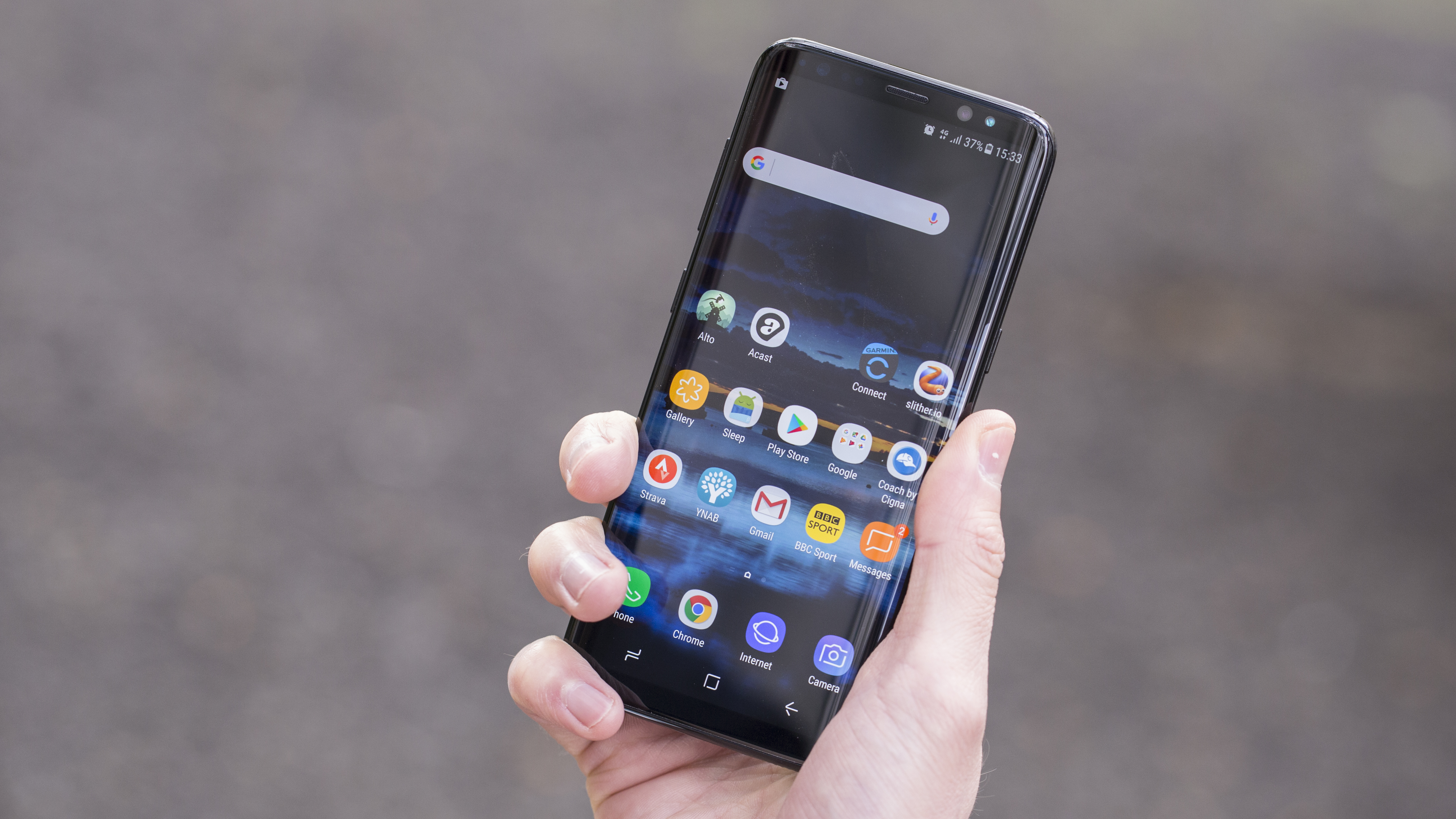
The glass is curved on both sides, with the popularity of the Samsung Galaxy S7 Edge convincing the South Korean brand that the time is ripe to make all its flagship phones look rounded and glossy, with the Edge screen now there by default.
If you’re worried about accidental tapping on the side of the screen when using the phone, we found this didn't happen at all in our early tests.
The Edge features, where you can add in quick links to your favorite contacts or top apps, are neat... but we never remembered to use them.
But back to how Samsung has designed the Galaxy S8… it's just pure premium from start to finish. The way the front and back of the phone roll into the metal rim that sits around the outside of the phone is simply exquisite, and there's a real pleasure to be had when just rolling this phone around and around in your palm.
It's worth noting here that we have heard reports of the Samsung Galaxy S8 proving to be a big fragile when dropped, but it's not something we noticed in our testing.
Looking around the reports, it seems that the rear glass is more prone to dropping, but it's hard to tell if the instances are higher than usual or this is just a more popular phone.
The key thing is that it's glass front and back with less structural support than other devices, so if you're worried there are some good cases to check out.
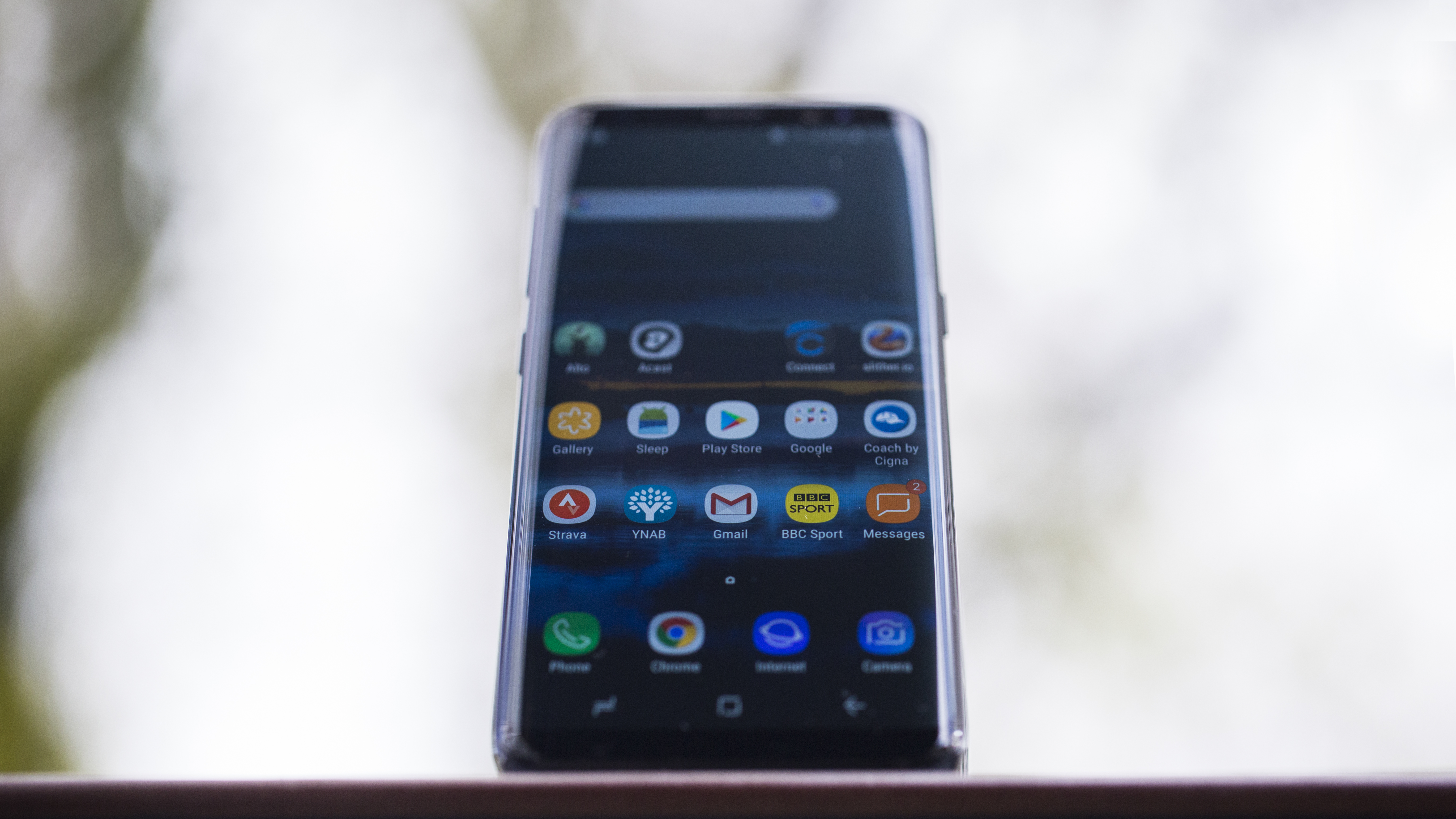
The buttons are all well-crafted, and have a pleasant click and travel – and this year Samsung has both removed keys from and added keys to important parts of the Galaxy S8.
We've already questioned the need for a Bixby button on the left-hand side of the handset, but the fact it sits below the volume rocker is annoying.
When feeling for the volume rocker to turn music down it's very easy to hit that button instead and open up the Bixby information screen.
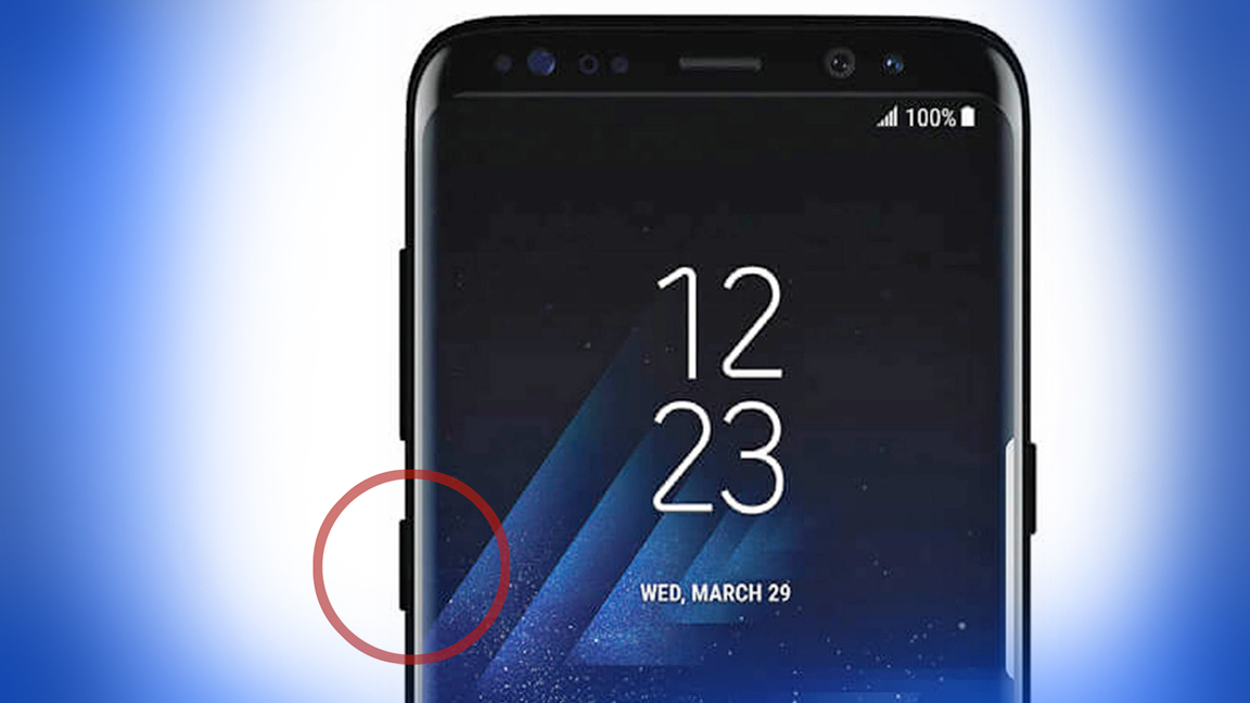
The power button on the right-hand side is well placed though – a good move to keep it separate and prominent. What’s odd here is that Samsung could have used this ‘clean’ side of the phone, devoid of anything other than this button, to accomodate the fingerprint sensor.
Sony’s placement of the fingerprint scanner in the power key is a sensible move, and if Samsung had done this on the S8 it would have avoided the irritation of the misplaced fingerprint scanner, and this would easily be a five-star phone.
But the rest of the way the phone has been put together is impressive. Samsung knows what it’s doing with phone design these days, and everything has been put in place to make the Galaxy S8 feel premium.
By sticking with the same style of camera sensor and not upgrading to a dual-sensor affair, the brand has been able to keep the back of the phone flat, with no bump.

This is much more attractive than previous versions of the phone, and apart from a small lip to differentiate the camera from the rest of the body (useful when searching for the fingerprint sensor) it’s flush to the back.
For some reason the heart rate monitor remains next to the camera - given the desire to make this phone as sleek as possible, surely that could have been up for the chop?
However, despite the Gorilla Glass on the rear of the phone, it does feel a little plasticky thanks to being so light and thin. It makes sense in terms of the phone design, but it’s not got the same pleasantly tactile feeling that metal has – and it’s here that phones like the iPhone 7 win out.
It’s also good to finally see a USB Type-C connection on the bottom of the phone – and a headphone jack alongside it.

It still feels weird talking about the inclusion of a headphone jack on a flagship phone as some kind of noteworthy achievement, but Apple has made both manufacturers and customers question the utility of the socket, and Samsung has defiantly told TechRadar that it sees the port as something consumers still need.
Already we’ve used two different pairs of headphones with the Galaxy S8, not including those in the box. Listen up, rest-of-the-phone-world: we don’t want to lose the headphone jack yet.
Screen
- Best screen on any phone
- Far too tall to use with one hand
- Movies look amazing on it
It almost feels tiring saying this, given that we say it every year, but Samsung has yet again put the world's best screen on a phone – and trust us, that’s no mean feat.
The Samsung Galaxy S8 has the most stunning display around, and while it's been proven factually through DisplayMate’s rigorous testing, it's also clear from the moment you pick up the new S8.
The colors are rich, the black and white contrast is immaculate, and everything just looks so pin-sharp. Streaming content in HD is a dream, and anything that's saved onto the device looks great.
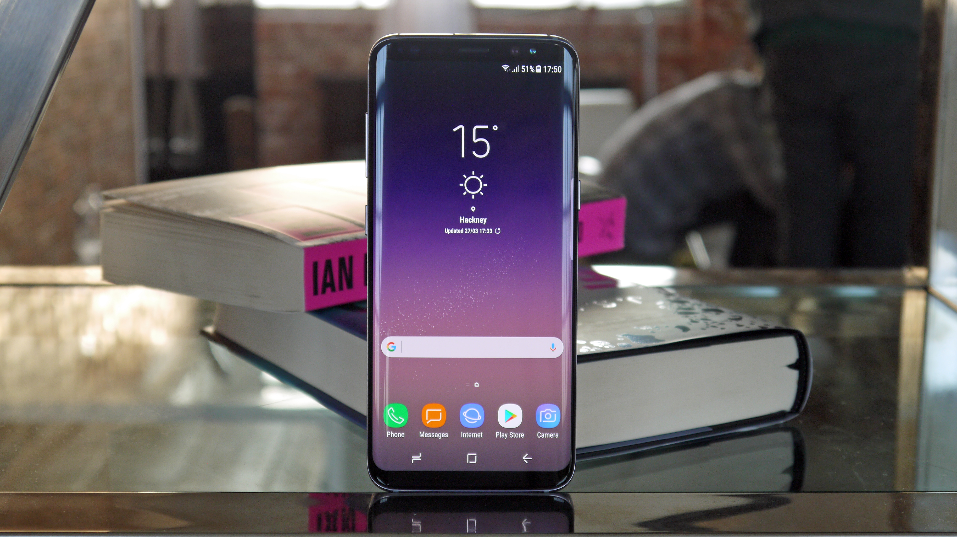
Let's get a couple of obvious issues out of the way first though, beginning with the size: the 5.8-inch display is possibly too big.
We know that sounds like an odd thing to say when Samsung has put so much effort into cramming this massive display into a smaller form factor, but, thanks to the new 18.5:9 ratio, it's terribly long.
It’s similar to the 16:9 widescreen ratio most will be familiar with, but just a bit longer. This means the length of the screen is rather long, so you've got no chance of reaching the top right-hand side when you need to go back in an app – it's just too big for that.
Phew, that's the poorer stuff out of the way – let's get back to being chirpy about a sublime feature on this phone. Watching movies on this handset has to be one of the best experiences we've had, entertainment-wise, on a phone.
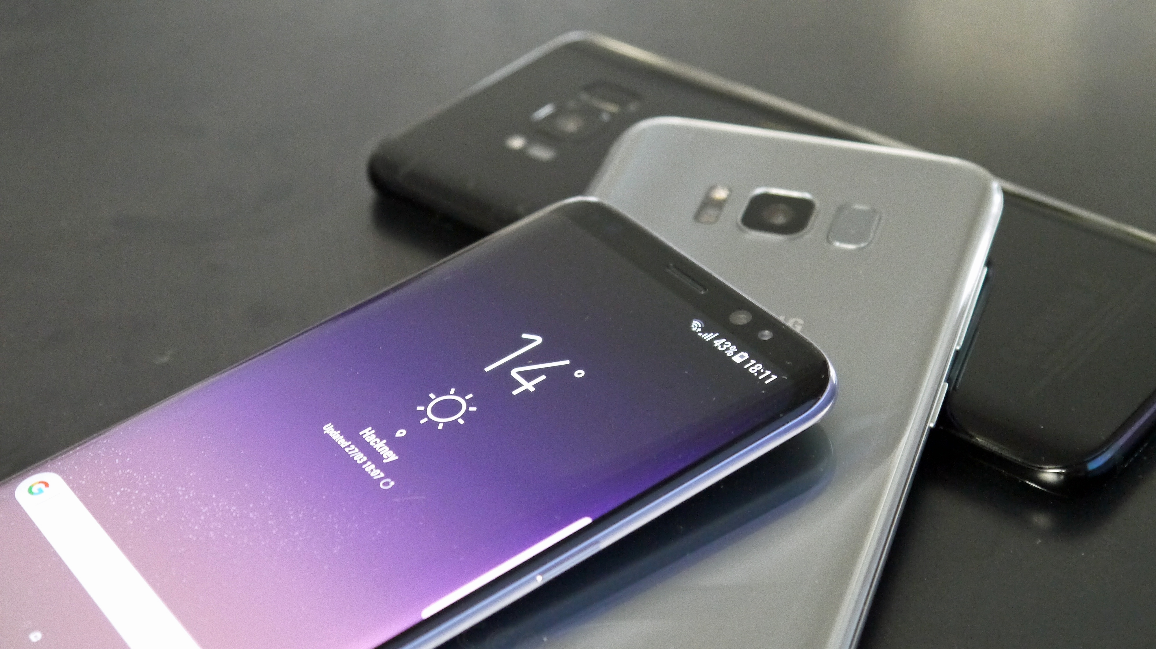
The way the screen arcs away at the side, combined with the longer display, means movies (which are shot in a 21:9 format) don't noticeably have the black bars above and below the display (well, they do, but they're almost hidden in the curves).
As a result, watching movies feels akin to doing so in a theater; it’s a far more immersive experience, and, when combined with the rich colors and contrast ratios, a completely joyous one.
It is a little annoying that you need to open the multi-tasking window and tap the ‘expand’ button to make some apps full-screen; some are set this way by default, but others haven’t yet been optimized by their developers, which is irritating, even at this early stage, as many users won’t be aware of how they can make Netflix look so much better.
The same goes for gaming: when you've got a title that would work better with more width to play with, the Samsung Galaxy S8 can scale it up nicely to fill the entire screen with some prodding.
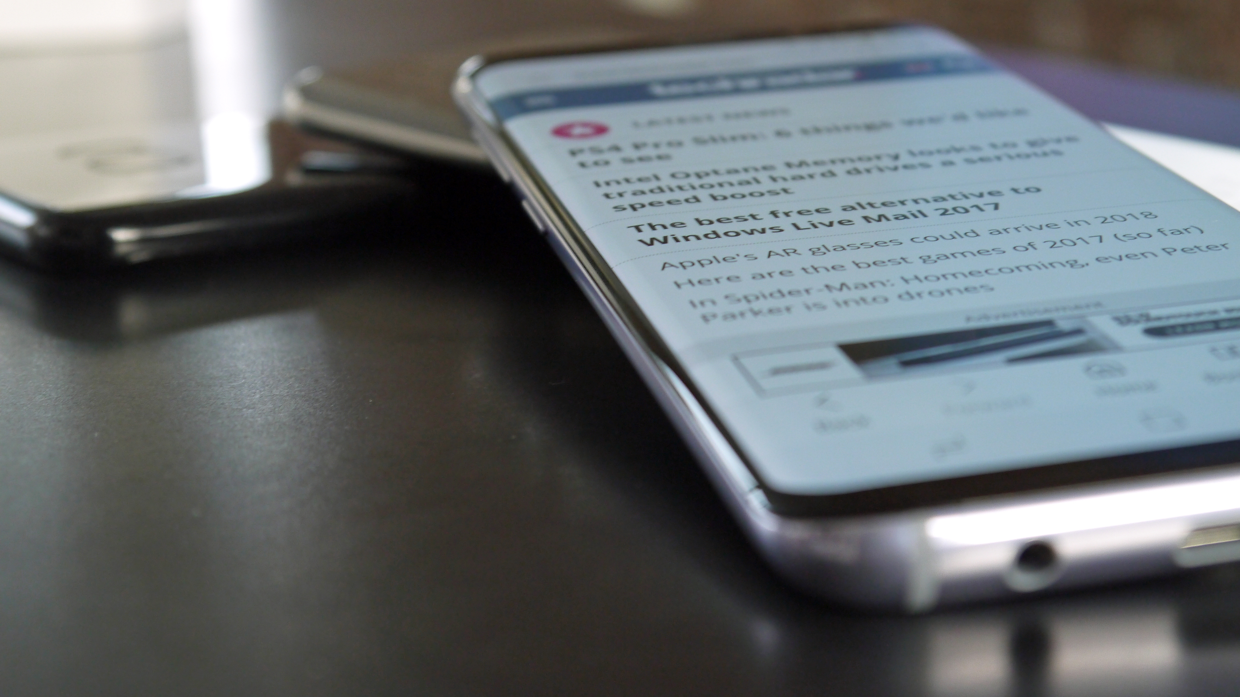
Or alternatively, if the app you're using doesn't stretch the whole way across, you can use those black bars at the side to house some of the touchscreen controls (during fighting games, for instance) meaning your digits don't block the action.
Samsung is selling the Galaxy S8 as certified by the UHD Alliance, meaning it’s HDR-compatible… and thankfully we've got some content coming through on streaming services.
(HDR stands for High Dynamic Range and is used to describe incredibly vivid images through intelligent management of the brightness and colors in any display).
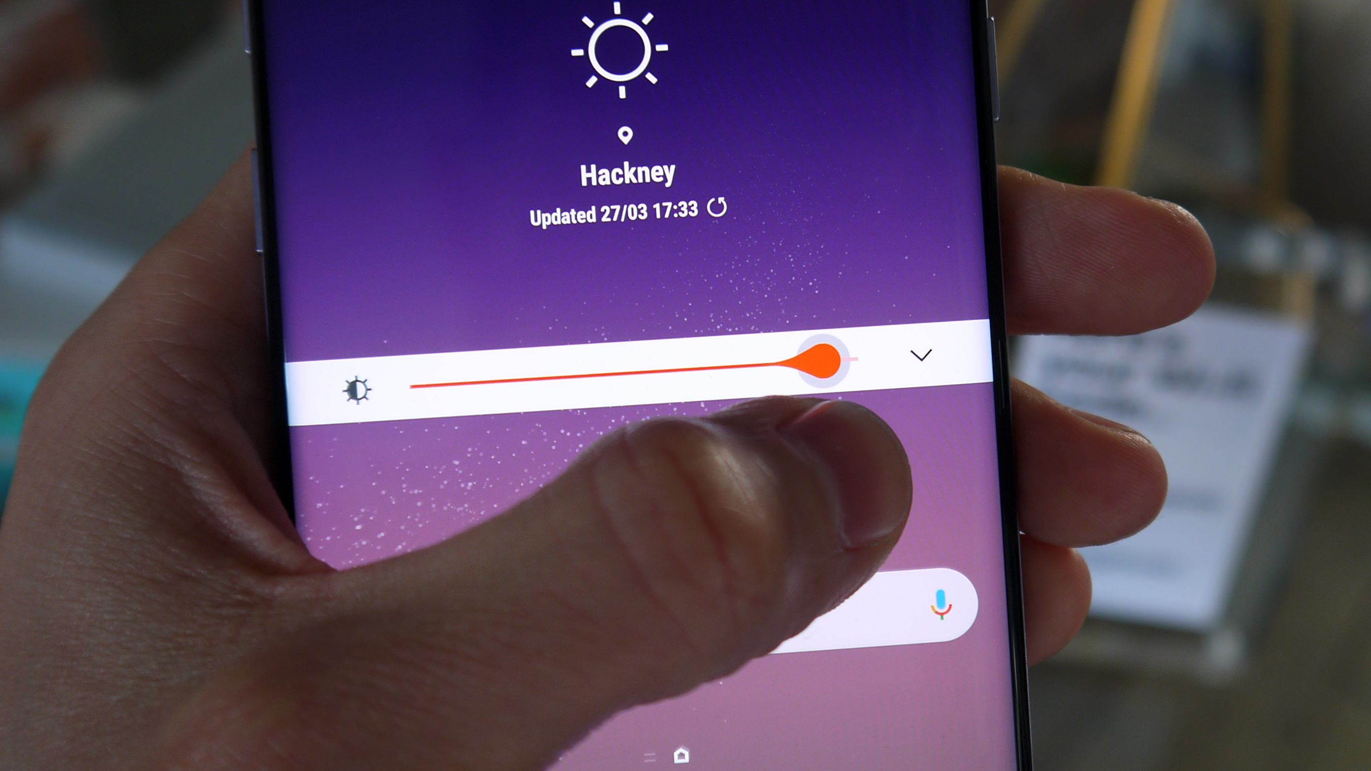
It’s a nice new feature, and now there’s mobile HDR content on Netflix or Amazon Prime Video it's much better. It's not earth-shattering, but is a boon compared to standard SD or HD videos.
On Netflix you do need to pay extra for the option though, which sucks a little.
The Samsung Galaxy S8 has 64GB of onboard storage along with a memory card slot, so you're not easily going to run out of space to hold your movies and other files – and with the powerful Exynos 8895 or the Qualcomm Snapdragon 835, this phone has enough power to plough through even the toughest of games.
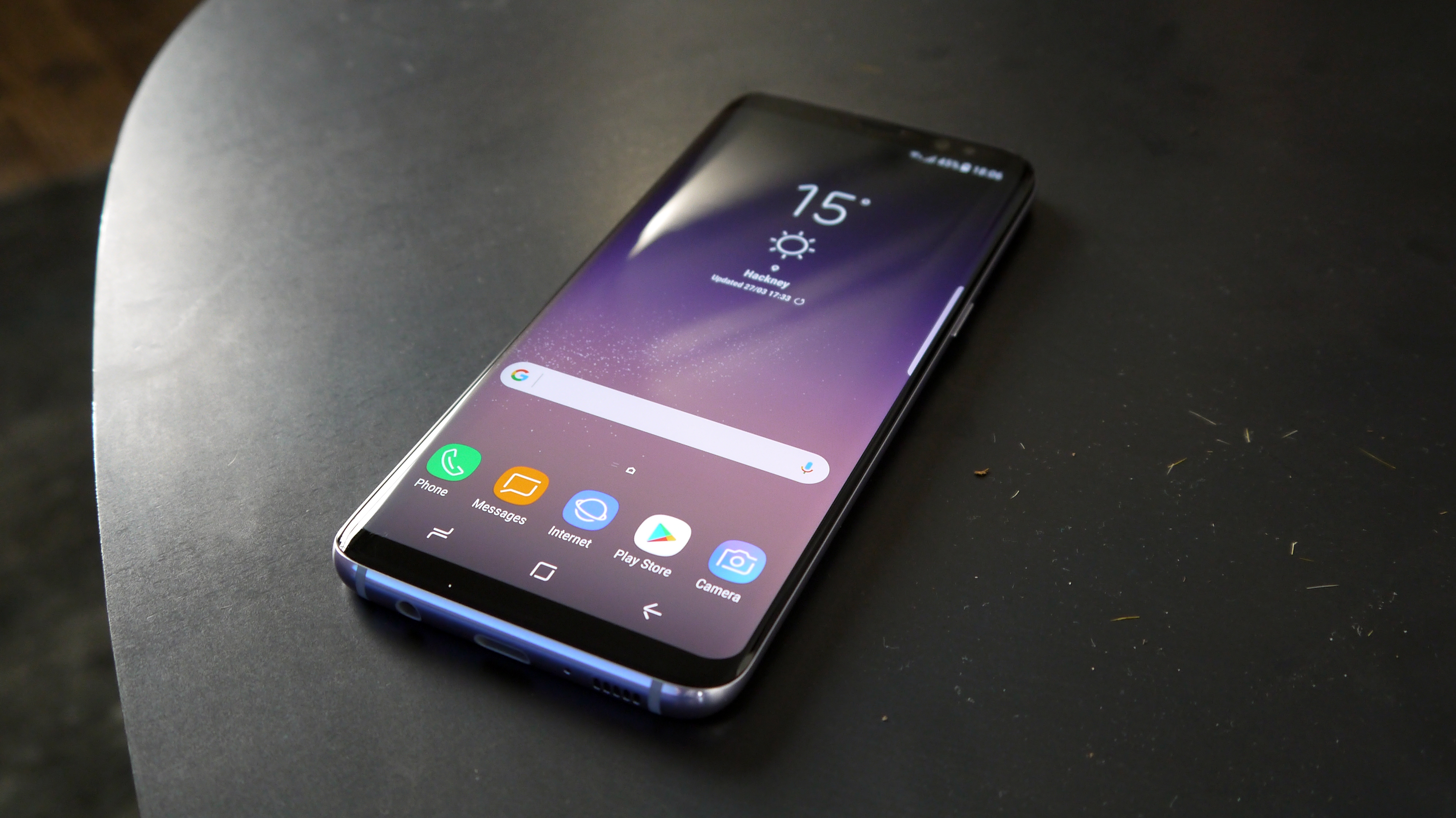
In short, we loved everything about using the display on the Galaxy S8. The curved corners of the display make everything feel more immersive, and while the design of the phone means navigating through the interface can be something of a chore at times, the overall experience was stunning.
The audio experience was interesting though. There’s only a single speaker at the bottom of the phone, and while it's loud it’s rather tinny.
The bundled headphones are a lot better – AKG-tuned, they’ve got a big name behind them rather than just being generic headphones from Samsung.
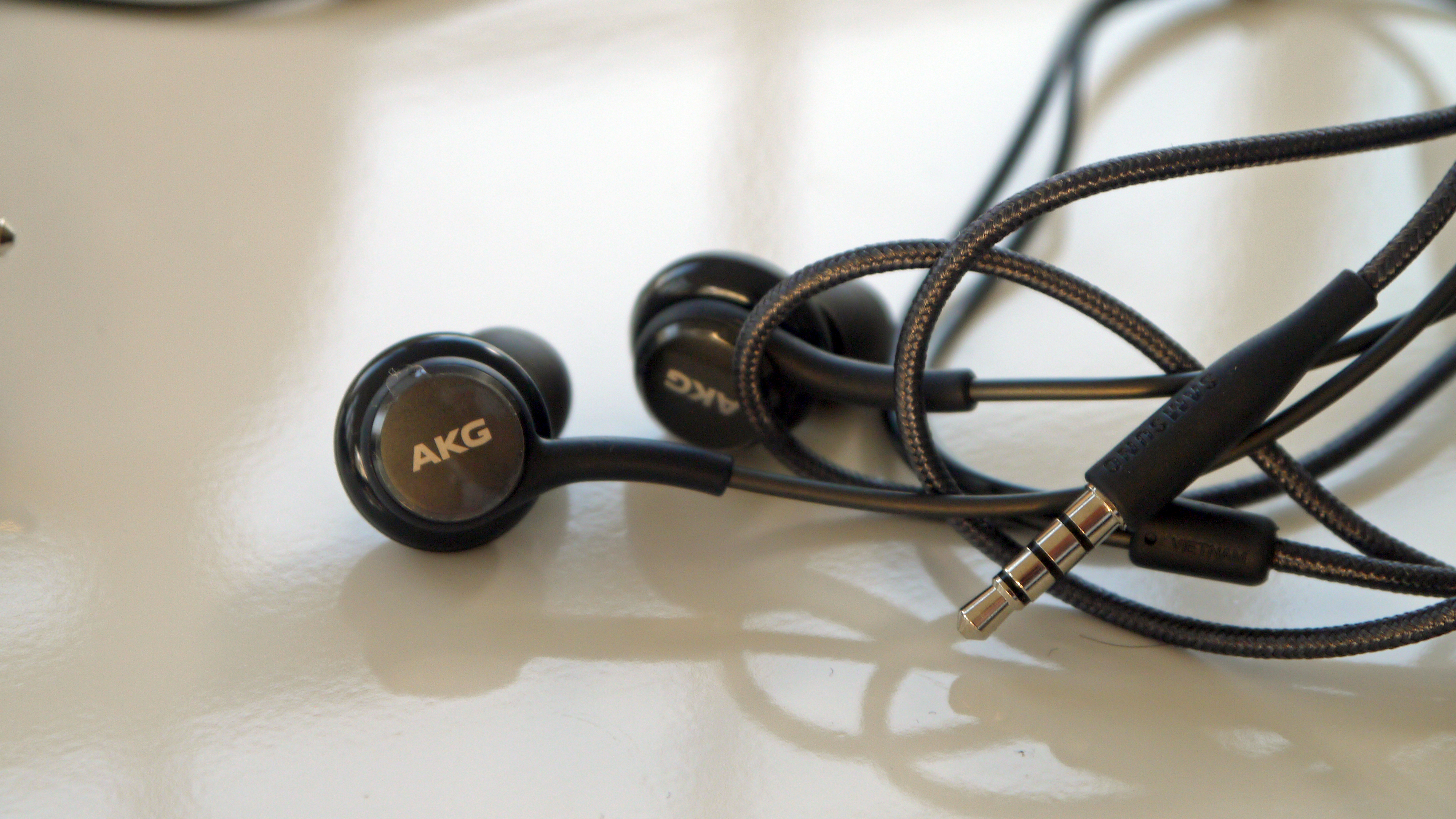
In truth, they don’t sound a lot better than the buds you normally get in the box with Samsung phones, and the build quality is a bit light – they don’t feel like they offer a huge amount of bass when you hold them in your hand.
But the overall sound quality is fine. It’s better than that from Apple's EarPods, but not in the same league as the bundled headphones HTC chucks in its phones, for instance.
- Refined user interface is fun to use
- 'Swipe to open' app drawer is great
- The most powerful phone on the market
The Samsung Galaxy S8 is one of the most powerful phones we've ever tested, and anyone who doesn't buy a Samsung because of the user interface is living in past.
That's not to say that everyone is going to love the Touchwiz* UI straight away, but to not even bother checking out a Samsung phone because you didn't like the user interface in 2013 is pointless.
(*Apparently the TouchWiz name has been quietly dropped and it's now 'Samsung Experience', although we've not seen that publicized anywhere).
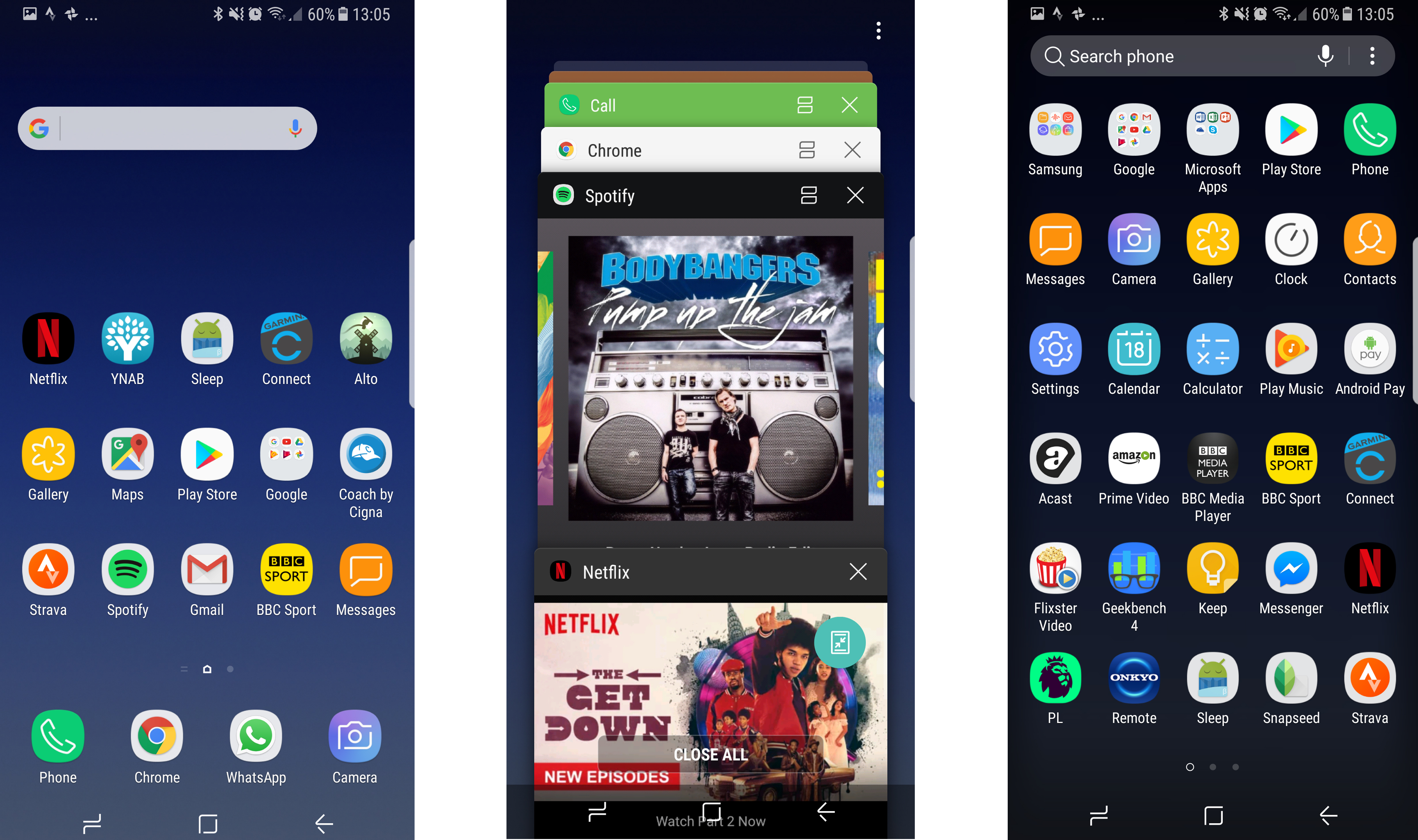
Things are miles better now in the interface, and Samsung has worked hard making everything appear where it should.
If Bixby was as powerful as the brand was promising it eventually will be, the interface would be even less of a thing to talk about, as you could just bark all your commands at your phone and it would do what you needed.
But for now you have to keep exercising those digit muscles and swipe around the display to order your favorite takeaway.
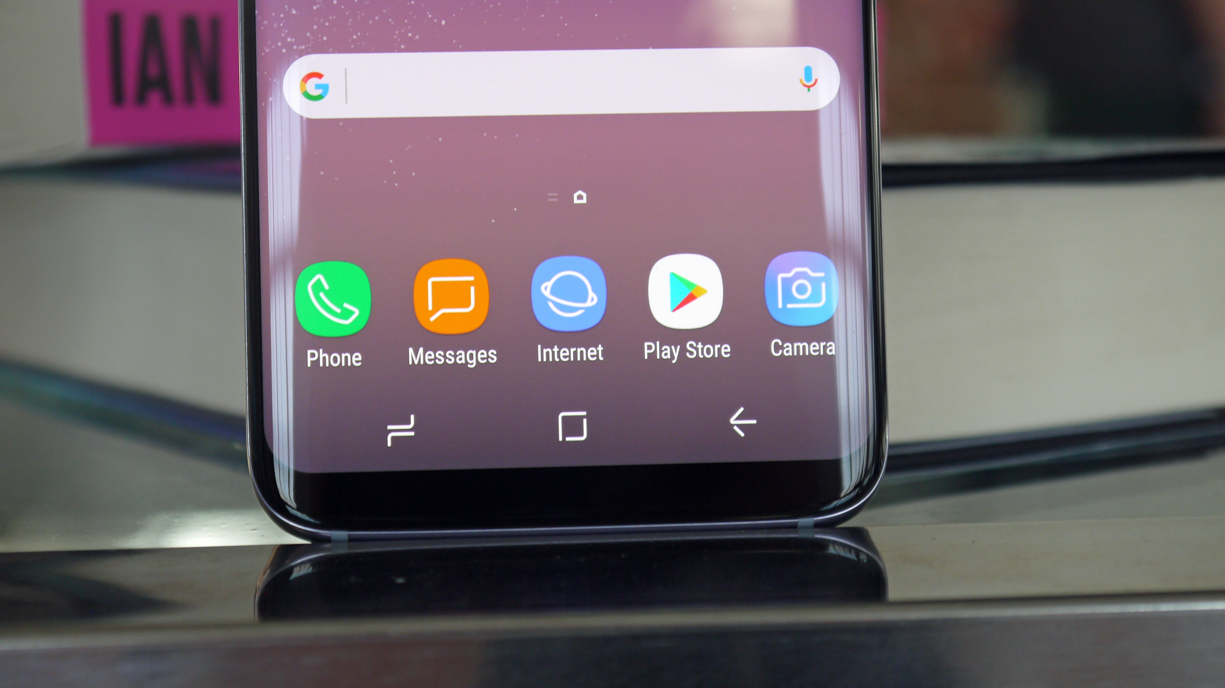
The new user interface on the Samsung Galaxy S8 is more sleek and understated than ever before. It's running on top of Android Nougat, but you'd struggle to see that... this is not a phone for the Android purists.
Android 8 Oreo has been confirmed for the Galaxy S8, but it has yet to launch. There has been a long beta process to make sure the software is up to scratch when it does come to the Galaxy S8, and we'll be sure to update this review when it lands.
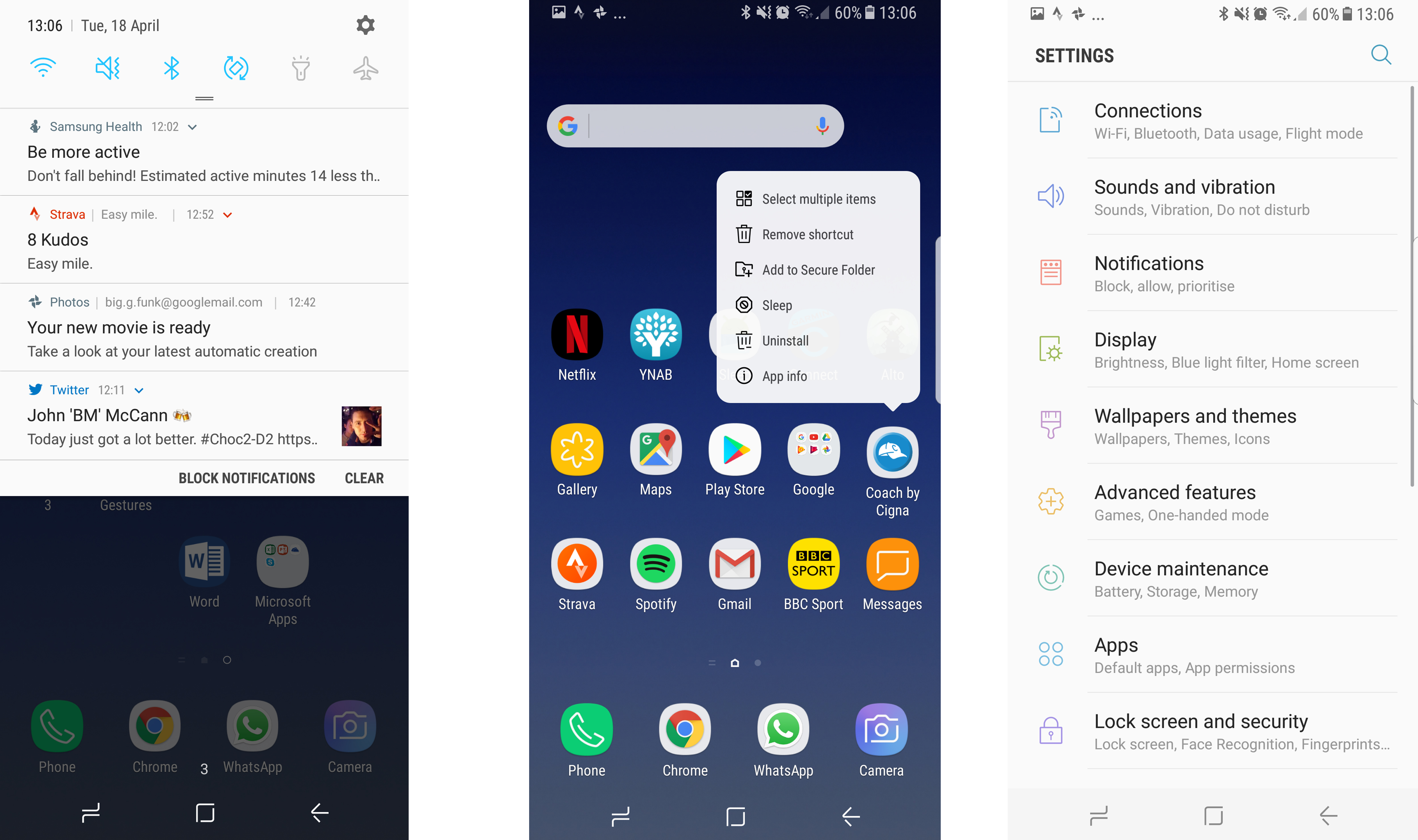
With Android 7, we like what Samsung is offering here. Long-pressing on the icons brings up contextual menus (3D Touch from the iPhone, anyone?) and the notifications shade looks premium, even if it can be a little bit complex.
One of the biggest problems Samsung will face with the Galaxy S8 and S8 Plus is the loss of the physical and soft buttons on the front of its handsets.
Samsung fans will be used to having a phone with a home button and back / menu buttons stuck below the screen, but the Infinity Display has seen to it that we don't have those any more.
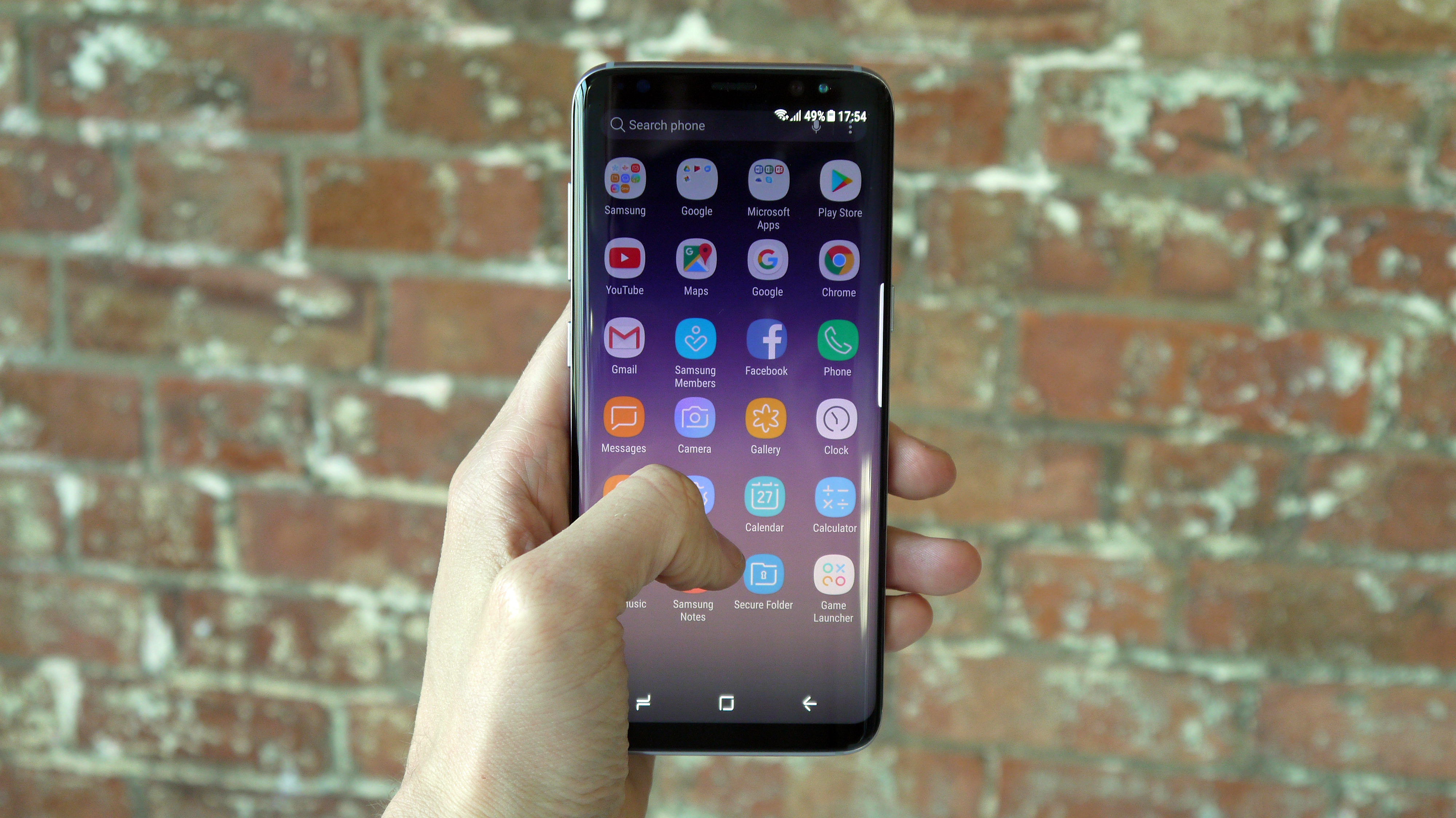
Instead the buttons are virtual, called up with a swipe of the finger whenever you're using a full-screen app. Samsung has offered a number of tutorials to help users get to grips with this new system, but it takes some getting used to.
There are some nice touches throughout the Samsung Galaxy S8's interface – for instance, when searching through the menus there's a search option at the top, and menus end with options for related settings.
The main change is the loss of the app drawer button – but the tray is still there, it's just accessed with a swipe up or down on the home screen. It's weird to think that this hasn't been used in the past on other mainstream phones, as it makes so much sense and is really intuitive.
Sadly, another potentially cool feature is marred by the poor positioning of the fingerprint scanner.
You can swipe down on this sensor to pull down the notifications shade, which saves you jiggling the phone about in the hand to swipe from the top of the screen… well, it would save it if you didn't have to bounce the phone about in your palm in order to hit the fingerprint sensor in the first place.
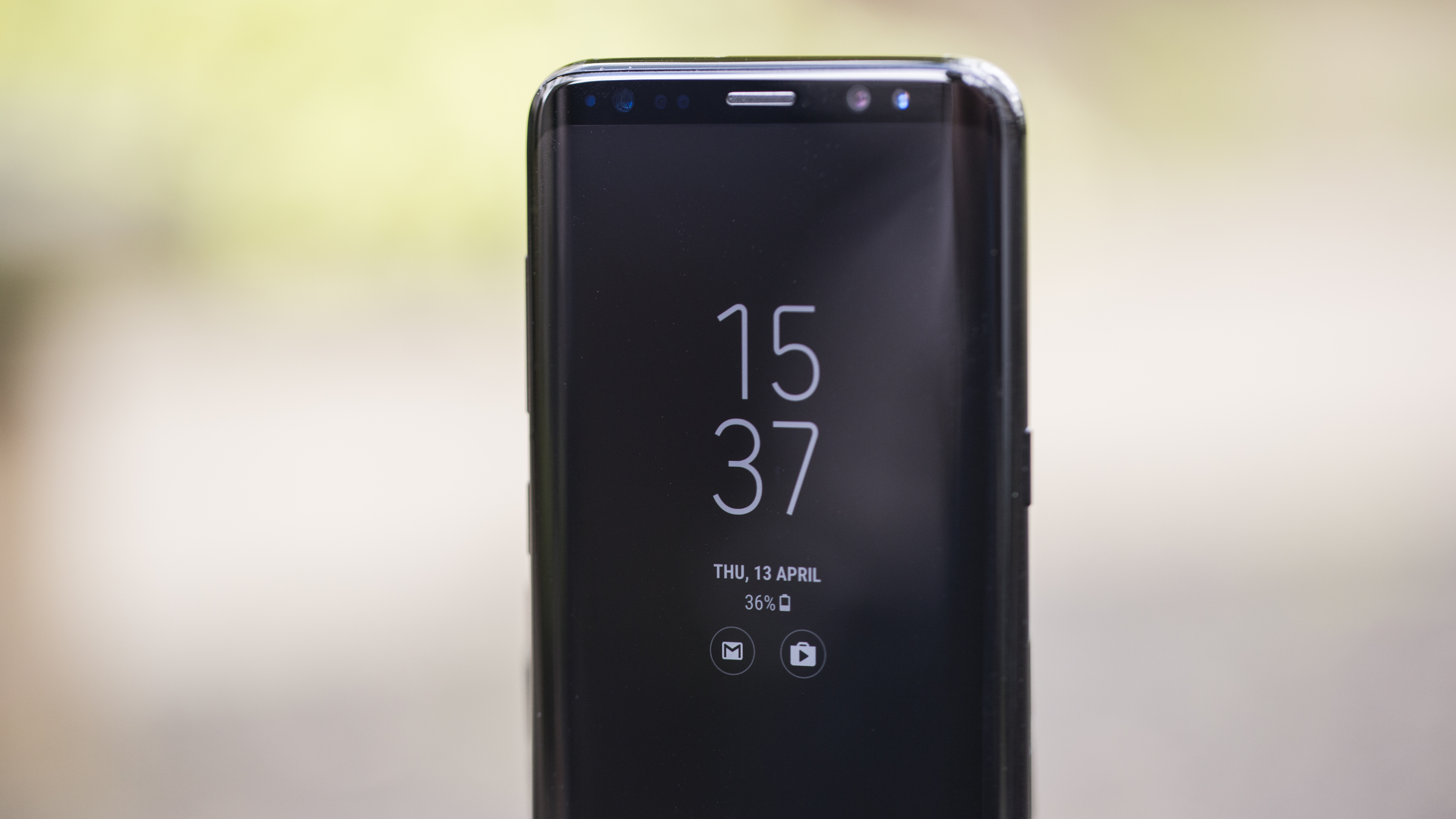
The Always-on Display, one of our favorite features of the Galaxy S7, has been included and upgraded – now you can even have your favorite photos saved on there to always look at when your phone’s display is turned off.
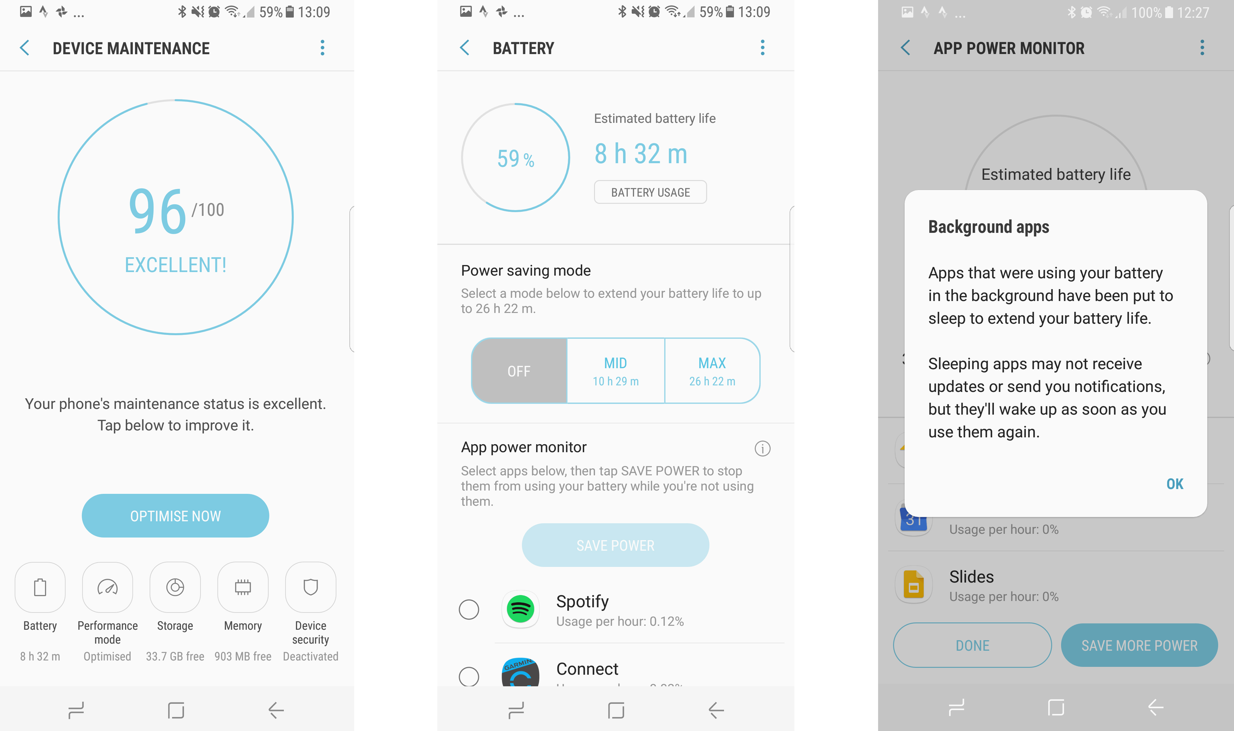
Device Maintenance is also another neat feature, gamifying your efforts to keep the phone running at optimal levels. This scans your device and offers a score out of 100 depending on the performance of the battery, apps and CPU – encouraging you to keep everything clean and hit 100%.
Every so often you'll be pinged with a note that less-used apps are being put to sleep (which sounds a bit dark) and you won't get notifications until you reopen them, but that's a small price to pay to keep the phone running optimally.
The main thing that's improved with the Samsung Galaxy S8's interface, though, is the overall look and feel of it. The font is clean and crisp, the app drawer sliding up and down is smart, and while the notifications shade can feel like a raucous mess at times, everything has a useful place and there's rarely anything superfluous there.
(Oh, we could mention that the heart rate sensor on the rear of the phone just doesn't work over two different units. For some reason it would recognise a pulse, but be unable to give a readout of an actual number).
If you've been keeping away from Samsung phones because of the interface, then you're a fool. You've been missing out on excellent phones, and they're even better now.
Specs
Weirdly the Samsung Galaxy S8 doesn't have the best spec list out there – but it's pretty close. The phone will come with either Qualcomm Snapdragon 835 or Samsung's own Exynos 8895 chipset inside, both paired with 4GB of RAM.
While the only storage capacity on offer is 64GB, the SIM tray has a slot for a microSD card which can handle anything up to 256GB of additional memory.
The battery is a 3000mAh affair and the screen comes in at 1440 x 2960 pixels, which equates to 570 dots per inch (DPI) of sharpness.
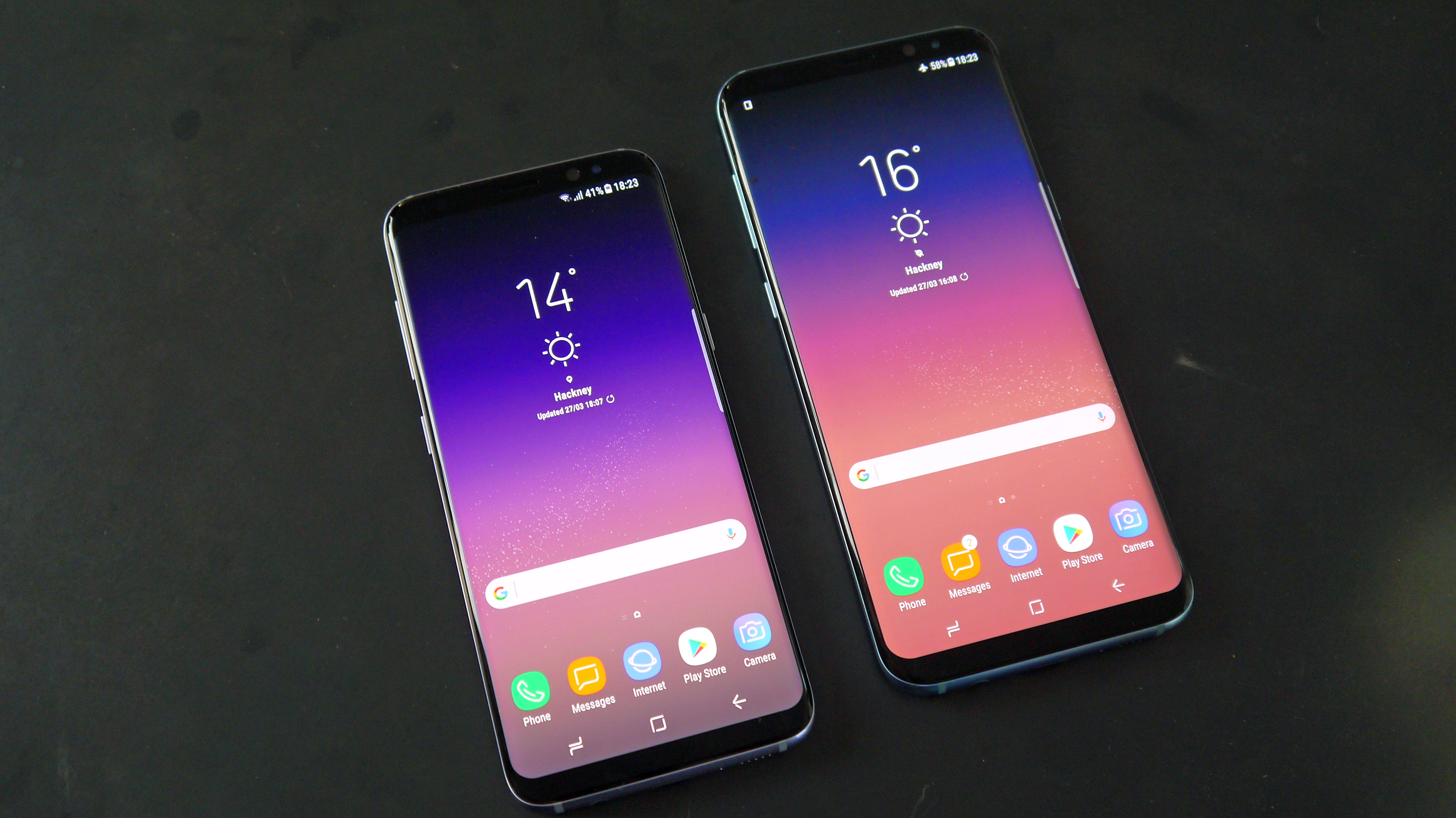
But what does all that mean in the real world? Well, it basically means that Samsung has made one of the world's most powerful phones, with a battery that lasts through a day, a high-res display and loads of storage and which exhibits a real snappiness under the finger.
Our Geekbench tests returned a single-core score of 2008 and a multi-core score of 6630, which is one of the best we've ever seen at time of testing.
In short, there aren't many better-specified phones out there on the market, and at least Samsung is putting some technological substance behind that hefty price tag.
All new Bluetooth
OK - bear with us here. The idea of a new Bluetooth standard on the Samsung Galaxy S8 isn't going to be that exciting to many users - but you really should be.
The new S8 uses Bluetooth 5, and that confers some pretty nifty options. Firstly, with the Galaxy S8 you can pair bluetooth headphones and have the volume controls sync with the phone.
It sounds minor, but this is something that really makes a big difference. It's been a feature of the iPhone and iPad for a while, but having total control over your audio levels without having to drag your phone out is great.
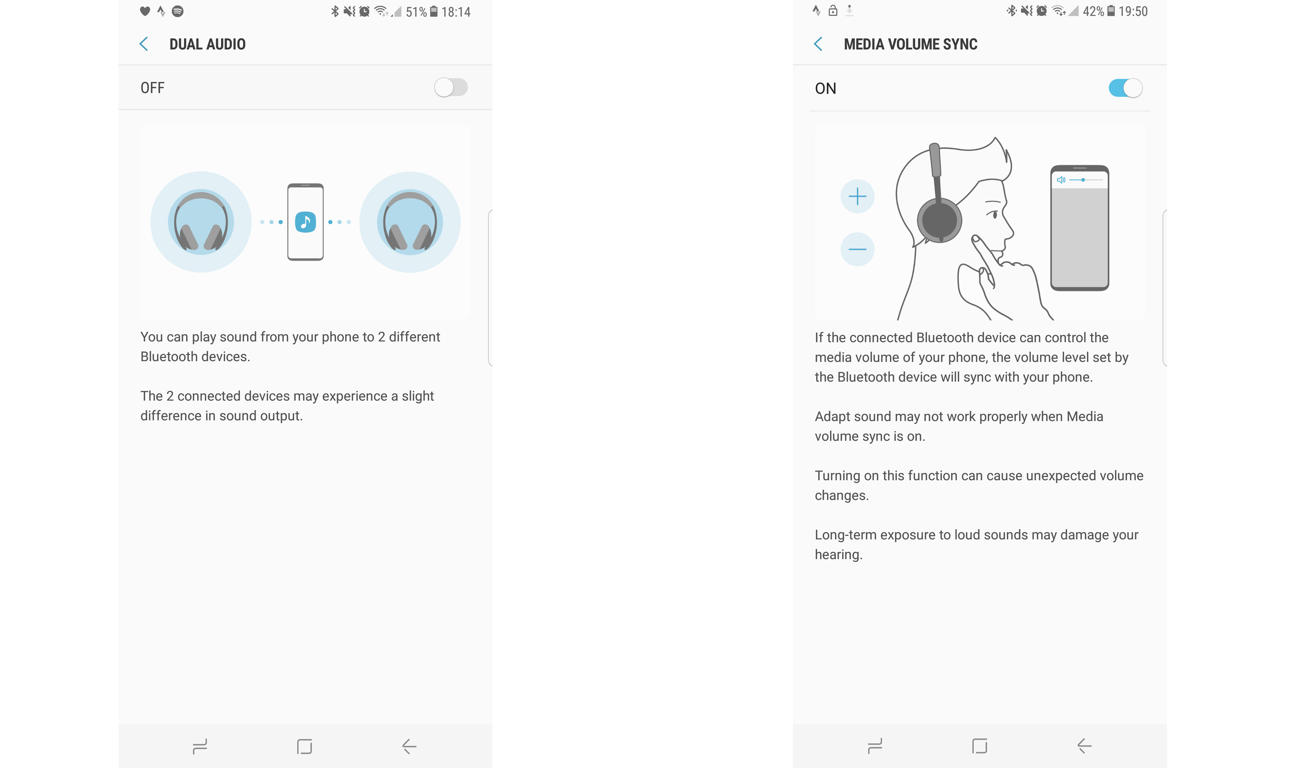
The second feature that the S8 offers is dual speaker output, something that has been enabled with the new version of Bluetooth being on board.
You can connect two Bluetooth speakers at once, but be warned: they're not synced together perfectly (which, in fairness, the phone does warn you about).
This is a feature that really only works well when you're in a large outdoor space and want to spread the sonic love, and nobody can really hear both speakers at once.
It's not terribly out of sync, but you certainly don't want to listen to podcasts using the new feature.
- Battery will easily last a day in most use cases
- Excellent power-saving modes
- Fast and wireless charging both work well
- The Galaxy S8 Plus battery is far superior
The battery life of the Samsung Galaxy S8 was always likely to be pretty good, and in our tests it proved to be just that. Let's walk you through some of the features that are on offer first though, before getting into the numbers.
The Galaxy S8 has a 3000mAh battery – one suspects this would have been larger were it not for the Galaxy Note 7 fires and explosions forcing Samsung to play it safe with the S8. However, given that's the same power pack as seen in the S7, and larger than the one in the S6, it should last just fine.
On top of that Samsung has also thrown in fast and wireless charging (using any popular wireless charging standard around), and you've got loads of ways to make sure you don't run out of power with this handset.
In terms of real-world usage, the battery life on the Galaxy S8 is hard to define... 'better than acceptable' would be a good way to put it. Under hard use things would get dicey towards the end of the day, but in more sedate conditions it's easily going to get you home to a charger.
For instance, we were left with over 60% on an average day by lunchtime (when unhooked from a charger at 6am), and performance like that breeds confidence in the power pack.
That's fine for most people, and it doesn't feel slippery – but it's not as good as the Galaxy S7 Edge from last year, for instance. Don't take that as a reason to not buy this phone, but don't see battery life as a standout feature either – you'll basically not have to worry about battery life on the Galaxy S8.
The fast charging, although not improved since last year, is miles better than on any phone that arrived in 2015 or earlier. We started charging the S8 from completely flat, and within five minutes it had reached 7% – good enough to make it home on a commute.
We tested the rapid charge from dead a couple of times, and found that the Samsung Galaxy S8 can go from no power at all to full in around 80 minutes, with a linear charging curve – so it doesn’t taper off at the end, it's more of a consistent power top-up.
It was 7% after five minutes, 45% at 35 minutes and 72% at 55 minutes, before ending up at 100% on 82 minutes.
We ran our standard battery run-down test, charging the phone to 100% and then running a 90-minute full HD video at maximum brightness, with various apps syncing wirelessly in the background, to see how much the battery drained.
The Samsung Galaxy S7 Edge managed a drop of just 14%, but the Galaxy S8 dropped 19% in the same time – and that was with the resolution set to only Full HD. Set to Quad HD (the highest resolution) the drop was 23% – not a good number compared to the best performers on the market.
That's quite a lot lower than the Samsung Galaxy S8 Plus' scores when it comes to running the same test: it scored 8% at Full HD, and 11% at QHD - which is a very impressive score indeed.
However, before you read too much into that result, it should be noted that the Galaxy S8 offers higher brightness than nearly any other smartphone around, and when the display is cranked to full it’s actually a bit too bright, with Samsung actually warning about using it at this brightness for too long.
Crank it down to a more palatable level – and the auto-brightness is excellent here – and you’ll get a much longer time using the screen in most conditions.
(For comparison's sake, we re-ran the battery test with auto-brightness on in mixed lighting conditions, and the drop was only 14%... that still hints that the battery isn't as long-lasting as the Galaxy S7, but there are more pixels to power thanks to the longer display).
But the extra brightness is great when you're outdoors, and makes everything wonderfully legible.
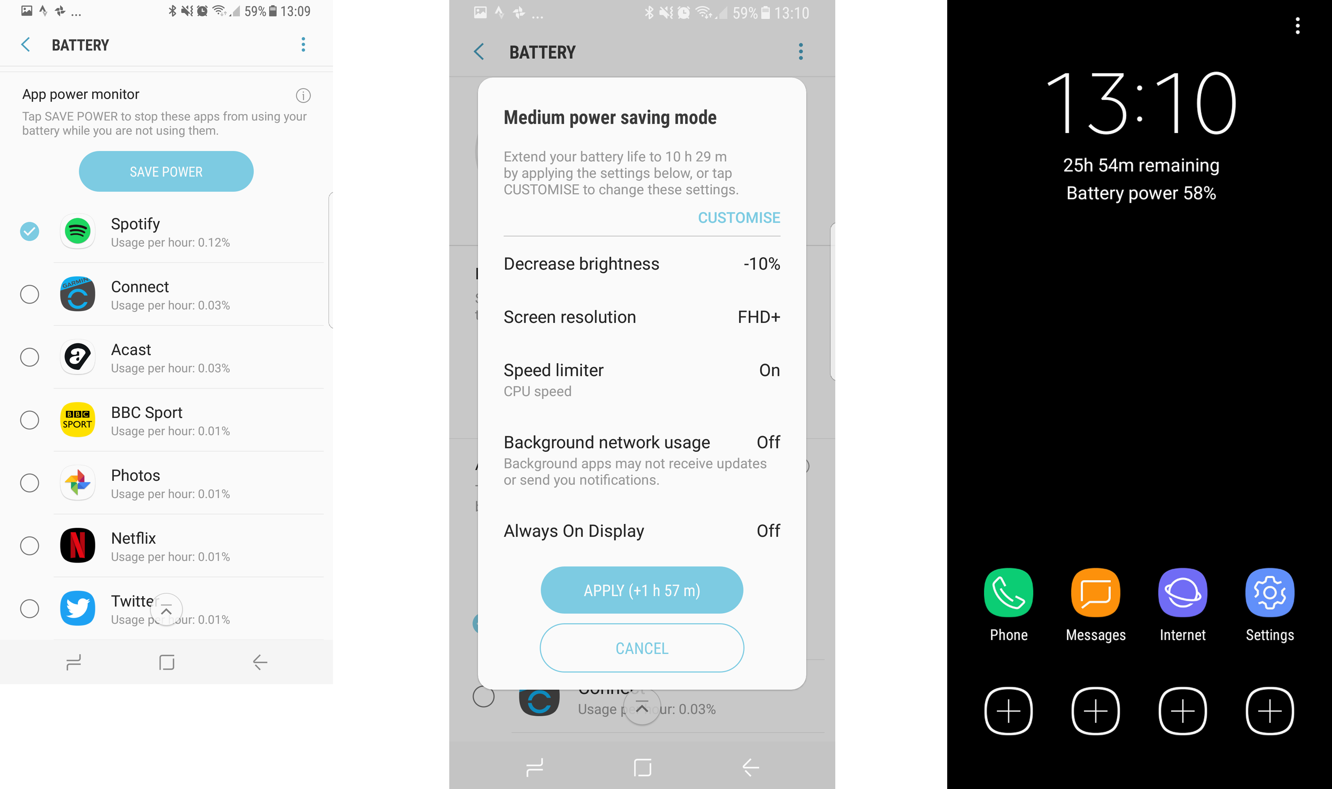
The battery interface hasn’t been improved hugely since the Galaxy S6 or S7, with the same information telling the user how long is left with the various power-saving modes.
However, they’re laid out in a much more readable format, labelled as from normal to ‘Mid’ to ‘Max’ rather than as power-saving modes. As such, users will feel more comfortable messing around and extending battery at the expense of power.
The Galaxy S8 is also excellent at learning your power usage habits, so when it tells you that you’ve got eight hours’ battery life left, it’s more believable, and means you can plan more effectively to find a charger if you know you’re going out in the evening and will need a top-up.
The battery on the S8 isn't brilliant, but will work nicely enough for most people. If you're looking to get the experience with an immense battery life, then the Galaxy S8 Plus is the way to go.
- Camera spec not upgraded
- Images still look superb
- Some snaps a touch overexposed
The camera on the Samsung Galaxy S8 is, once again, one of the best around. Its main strength is being able to just capture the image you want, taking in sharpness, light and color to make something appear just the way you saw it.
The 12MP camera on the rear and the (upgraded) 8MP sensor on the front are both brilliant in low light as well – often taking snaps that are better than we've seen in real life.
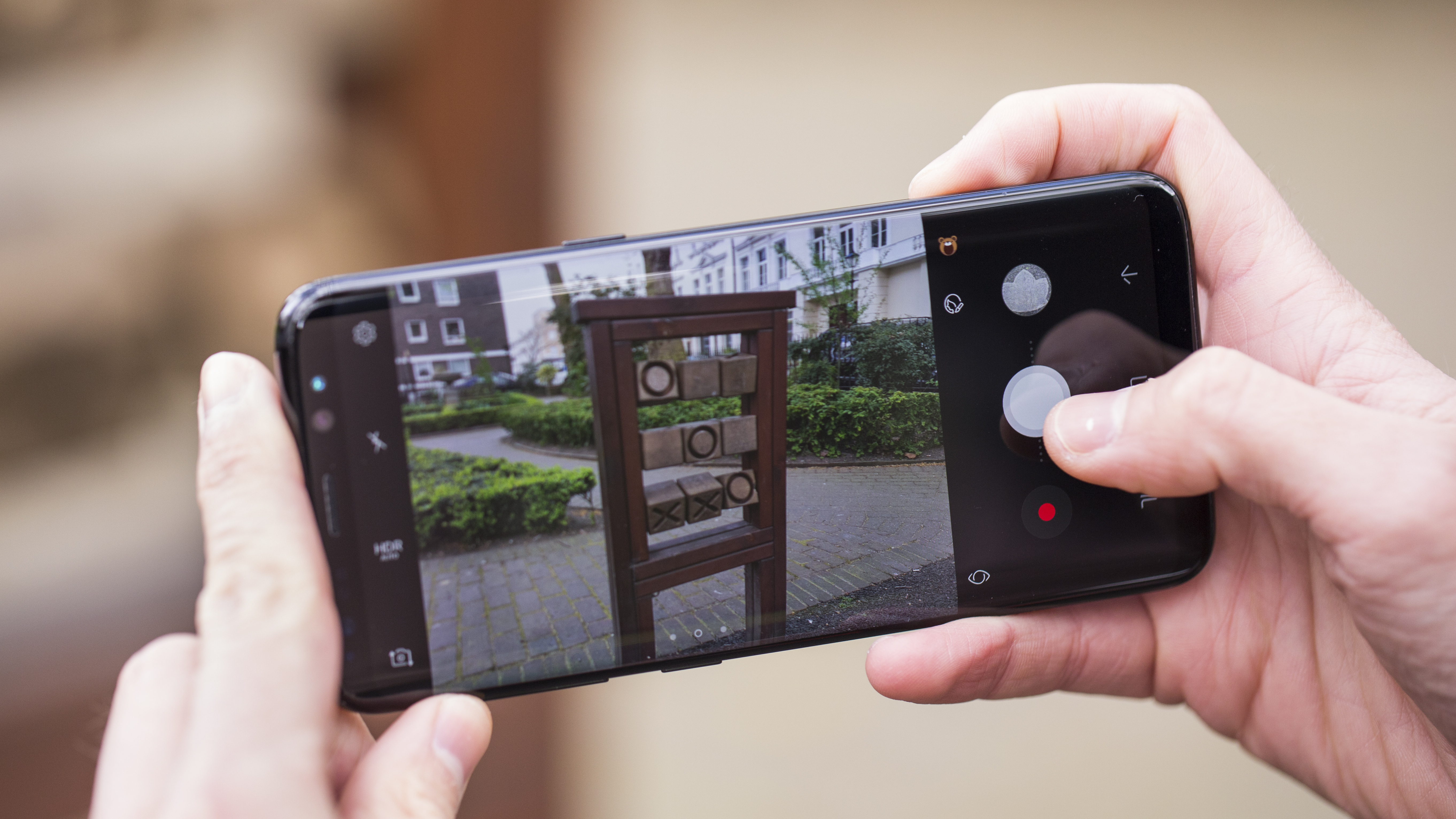
There's a small amount of noise, but while very little else has been improved in terms of spec from the Galaxy S7 to the S8, the ability to cope well in low light is better than before.
Overall, though, what we like about the camera is that Samsung has thought through the interface. It took a gamble in not sticking a dual-lens sensor on the back of the S8, which is the new fashionable thing to do in terms of smartphone cameras, and instead made it easy to take a photo.
You can double-tap the power button to instantly be into the camera app (or swipe from the lock screen) and you're less than a second away from the shutter firing. It might take a few attempts to learn the rhythm, but once you've got it there's very little lag between grabbing your phone from your pocket and the photo being saved.
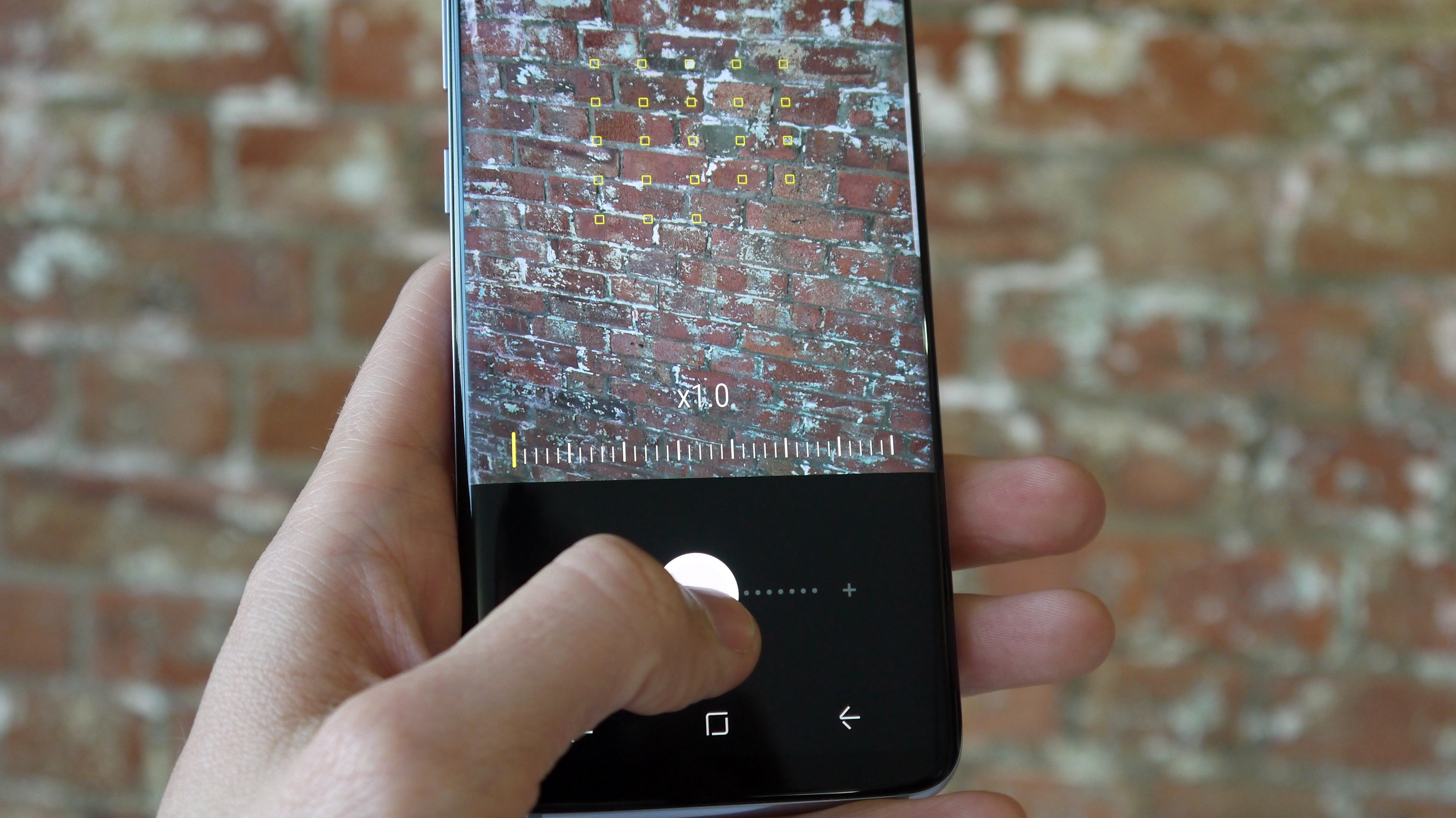
The interface on the camera is all very swipe-friendly, which will please those wanting to use the phone with one hand. Swipe from the left to display the modes you can use (and thankfully you're not overloaded with too many); swipe from the right you've got filters than you can customize.
Swipe down to access the selfie camera, hold and swipe the shutter button to zoom into your subject. The Galaxy S8 isn't brilliant at full zoom – we have seen sharper – but if you just want to get a little closer to your subject and don't want to lose the framing the zoom will do just fine.
There are also some cute little stickers and augmented reality masks you can pop over yourself (in the front-facing camera) or your friends (when the S8 recognizes them in shots from the rear camera).
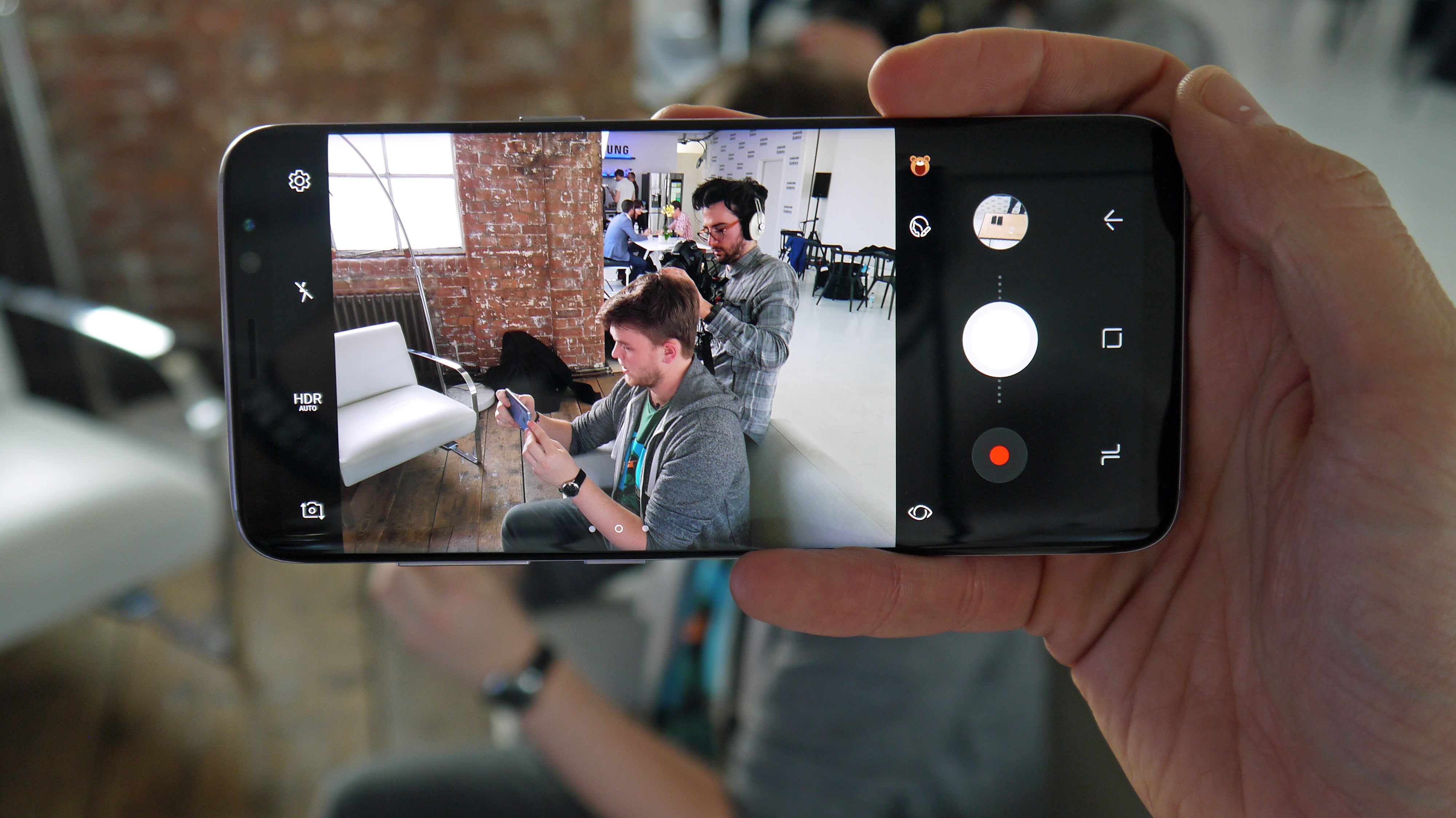
This is clearly a play from Samsung to stop people heading out to Snapchat to do the same thing, but given that Snapchat isn't really a direct rival to the South Korean brand it's interesting to see this feature being given such a strong place to live in the camera interface.
However, it is something that will delight children and is fun to play around with, so it's hard to criticize its presence too much.
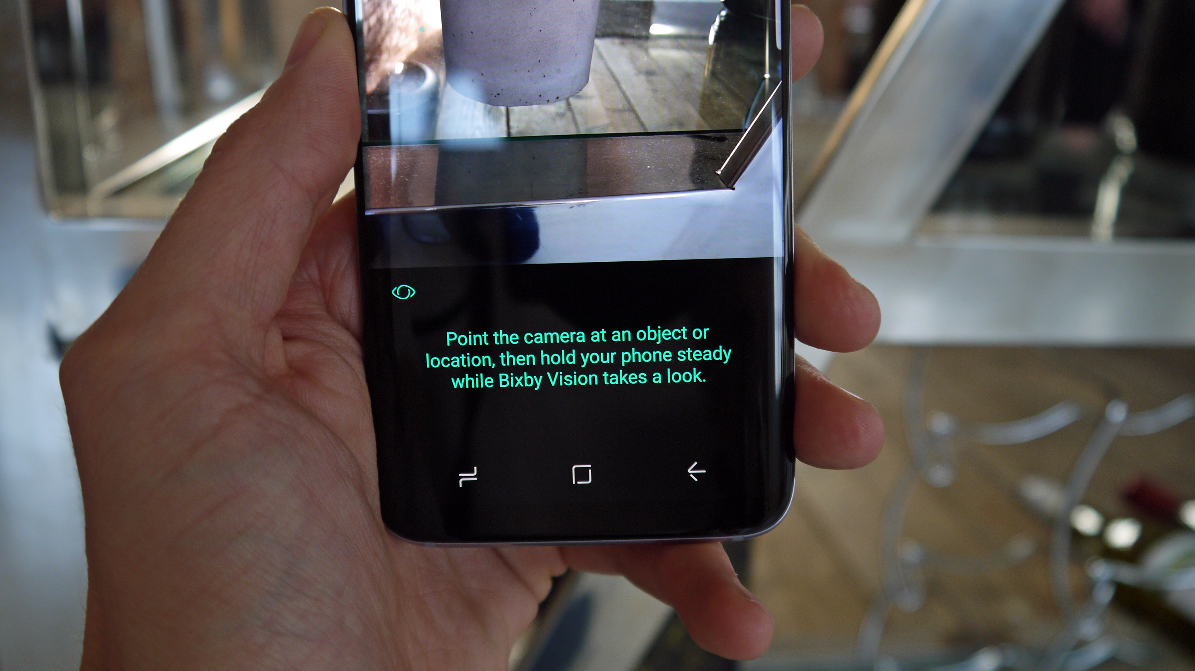
It is easy to criticize Bixby Vision being here though – it's just useless in general. While it would be cool to have the phone recognize and store everything, Bixby right now just comes along as a set of annoying green dots that plague your camera viewfinder until you turn the feature off (which you can do easily).
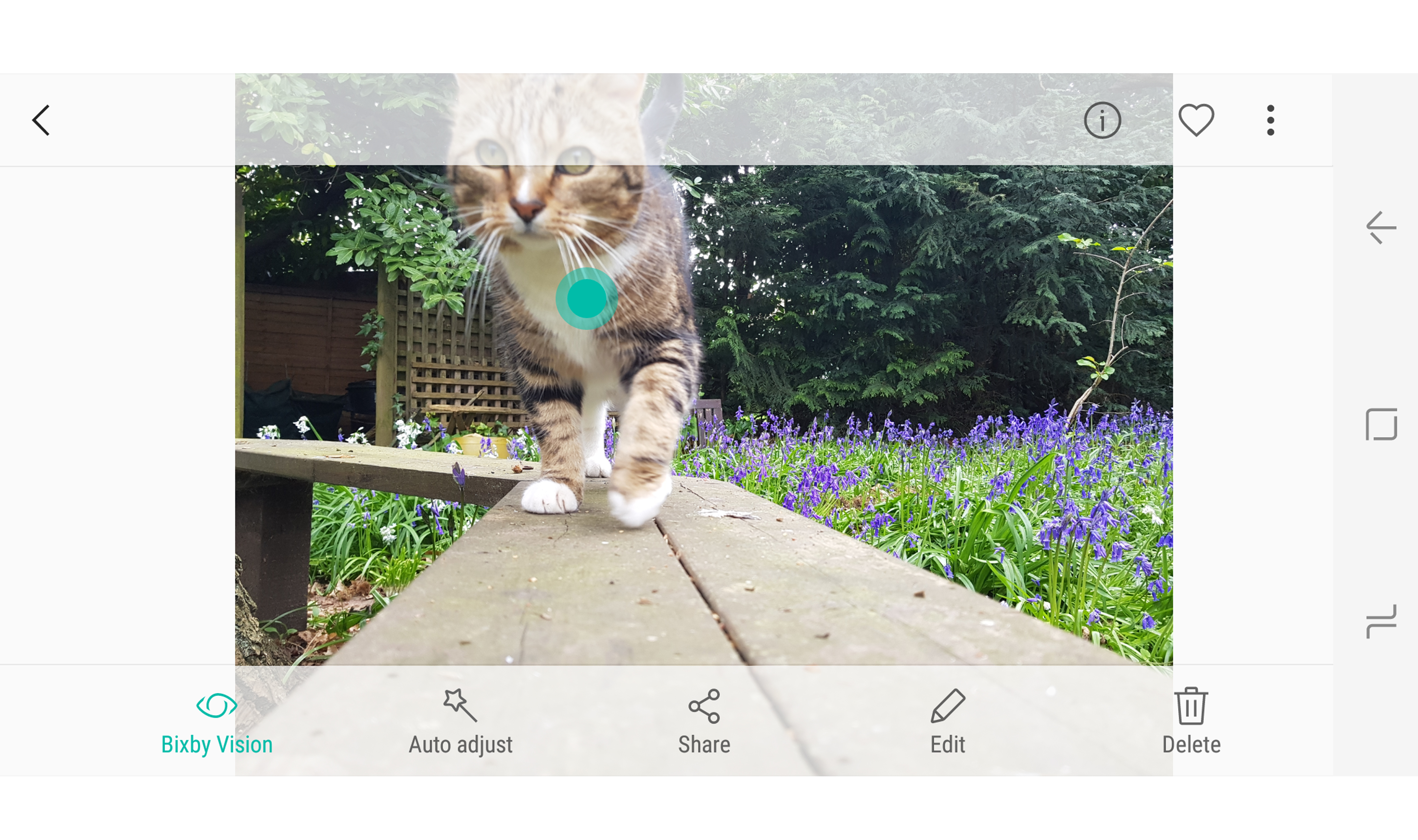
But then when you're in the gallery, you'll still get a green dot in the middle of the photo you're trying to look at as Samsung tries to entice you to recognize the image through Bixby and Pinterest, or give you information on a landmark.

This is definitely not something people want to do, and until Bixby starts doing something useful it's a hindrance.
Back to the camera itself though, and it's worth repeating that you'll very rarely be dissatisfied with the images you'll take, even quickly. The color reproduction seems a touch more muted and natural than in years gone by, but not by much, and the sharpness on offer is great.
The only real criticism is that the quality of the shots look better on the phone than on a computer screen. Our main issue is with the exposure: check out the camera samples at the bottom of this page and you'll see that in bright light the Galaxy S8 has a tendency to slightly overexpose images.
It seems that Samsung has been so busy trying to get great low-light shots (which it has managed admirably) that some of the day-to-day snaps suffer terribly from light bleeding in.
On the whole the quality is good, but you will get the odd picture that makes you wince with the amount of light flooding in – especially with bright scenes.
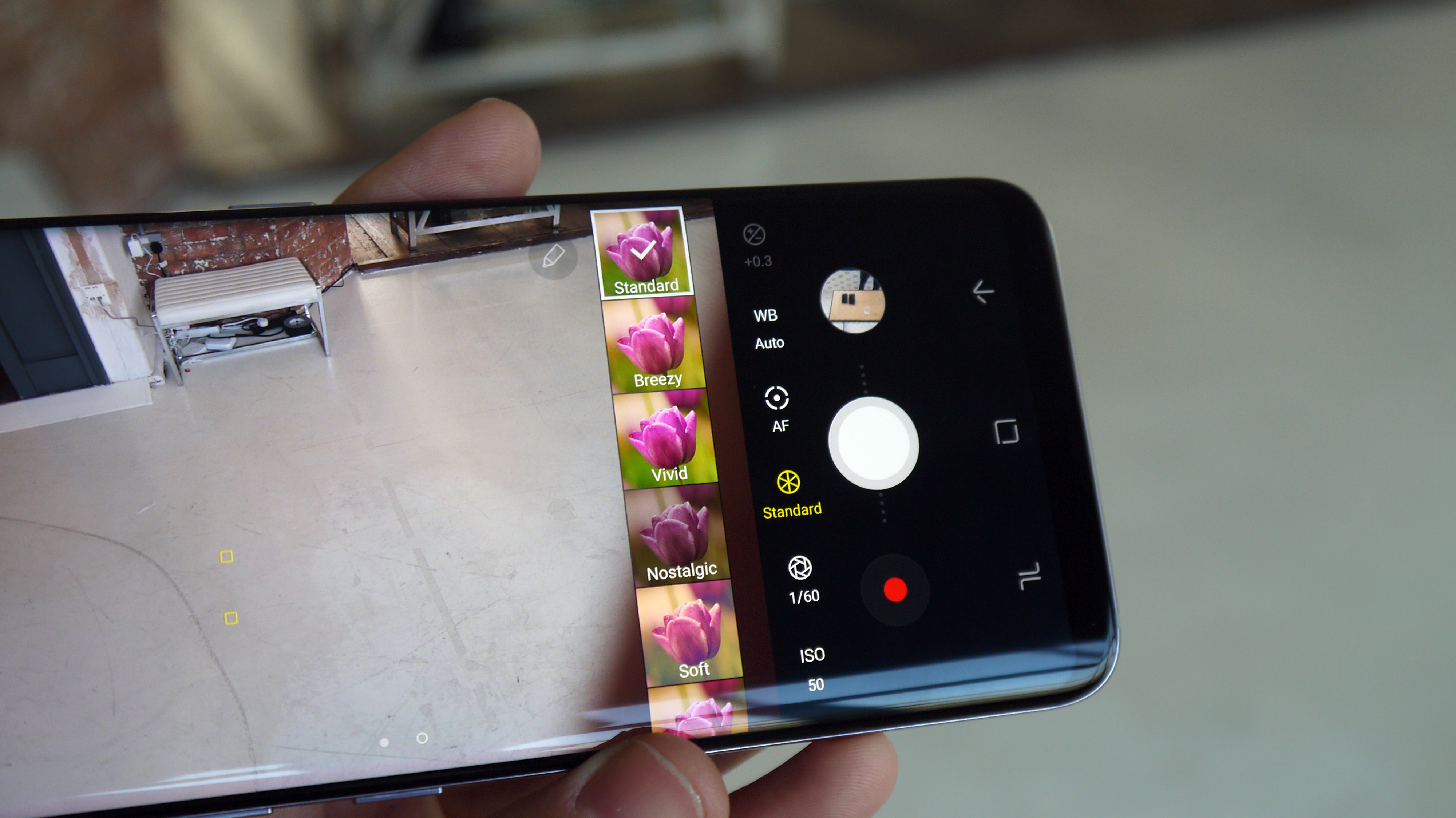
One feature we do really like is in the Pro Mode of the camera, where you can manually set the focal length of the image and the S8 will create green highlights to help you confirm that something is in focus.
It's not a big thing, but it's a perfect example of how Samsung is making sure that its camera app is as intuitive as possible.
From the speed of launching it to the clearly well-thought-out gestures to get you around the key parts of the snapper, there's very little to dislike about the S8 camera, and it's certainly enough to keep us going until we get the revamp Samsung will clearly need to bring in the Galaxy S9.
Camera samples
We've also had more of a play with the zoom and manual modes, trying out some of the low-light capabilities here to see the full range of power.
The Samsung Galaxy S8 is easily one of the best phones on the market. Heck, it’s probably one of the best phones ever made, and will be pointed to in future retrospectives as a real turning point in smartphone design.
However, Samsung is making you pay for that privilege, and while that price will drop over the year, it’s a bold move to ask people to spend so much money when the brand's reputation is on the line following the issues with the Note 7 last year.
The price isn’t the only thing that’s something of a risk: by re-jigging the placement of the biometrics, Samsung has gambled dangerously, taking a crucial element of the phone that worked and replacing it with something new in order to allow it to innovate with the Infinity Display.

The gamble hasn’t paid off – the methods of unlocking this phone securely aren’t abhorrent, but users will expect more from a phone at this price point, and to be irritated by it at all just isn’t good enough.
The iris scanner / fingerprint placement / facial recognition combination is one of the key things that stops the Samsung Galaxy S8 being a perfect handset.
Ultimately, people were already happy with the security on their phones: the fingerprint scanner was quick and easy to get into at the base of the phone, and now users will have to wait longer and sometimes jump through more hoops to just open their handset.
However, once you’re into the phone it’s hard to stay mad at Samsung for too long, because nearly everything else on offer here is brilliant.
No, it’s not got the best battery life in the world, but compared to the phones of 2014/15 that you’ll be upgrading from, it’s light years ahead, with the S8's clever battery management and power-saving tips getting you well through a day in normal use.
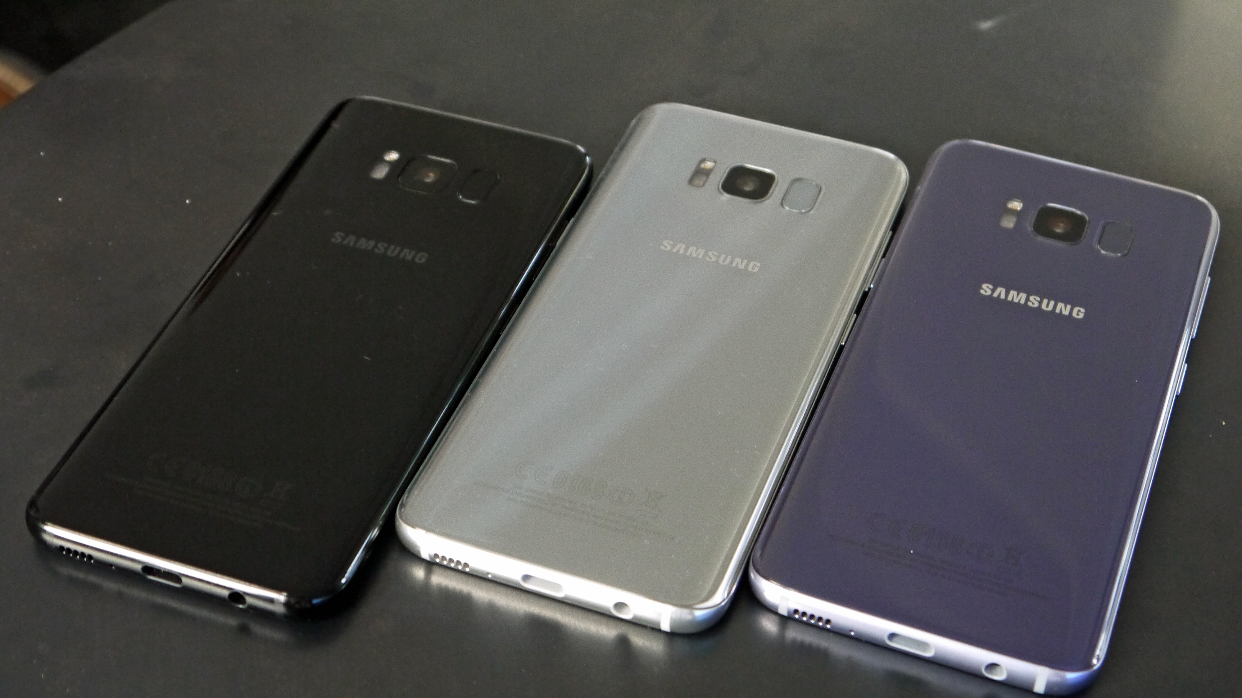
The camera remains strong, despite not being that much better than before – the key point is that it is improved, despite not gaining any megapixels, so there’s a real reason to choose this phone over the previous Galaxy S7 or S7 Edge.
But there’s one massive reason to buy this phone: the 5.8-inch display in a phone that’s just so much more compact than it should be. The Infinity Display is the first time we’ve seen such innovation on a global flagship device, and Samsung should be applauded for implementing it in a mainstream handset.
Yes, the overall user experience suffers as a result of the consequent shuffling of the biometrics – Samsung messed up there – but it’s almost worth it for the massive display.
Who's it for?
The Samsung Galaxy S8 is designed for those who just want a great phone and aren’t bothered about the cost. It’s a premium handset in every sense of the word – you’re paying more to get something really lovely.
If you’re a mobile movie buff, enjoy gaming on the go or just want something that can do more heavy lifting than nearly any other phone on the planet, then check out the S8 instantly… as long as you can afford it.
This is a pocketable, speedy and impressive phone in so many ways. If you just want a great phone and don’t care about the cost, it’s for you.

Should I buy it?
However, if you’re not desperate to own the Infinity Display on the Galaxy S8, then there’s not a lot of reason for you to buy this phone. The Samsung Galaxy S7 Edge is very similar in a lot of ways, and while it’s chunkier and less powerful, for most tasks it’s more than up to the job.
The camera is great, the screen is still tip-top, and things like high dynamic range are starting to offer real upgrades over previous iterations of Samsung's Galaxy line-up.
Samsung has thrown the best of every component it can into this phone, and it performs brilliantly as a result. Get over the high price and learn to live with the erratic iris scanner and you’re holding one of the best phones ever made.
If you’re thinking that the Samsung Galaxy S8's price is too high, or the biometric issues are too much hassle for you, don’t worry – we’ve picked out a few other phones that you might like instead:
Samsung Galaxy S7 Edge
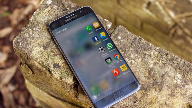
It's weird to not be recommending the Galaxy S7 here, but there's no point looking at that flat phone any more. It's too flat, with too much bezel, whereas the S7 Edge is the precursor to the Infinity Display on offer here, and has the same attractive look.
Apart from the design, you're not getting too much less in terms of spec: the Exynos or Qualcomm chipsets are from last year, but most apps will run just fine. The screen is a little smaller at 5.7 inches, but it offers the same resolution, while the quality of the color and contrast is similar, albeit a bit darker.
The Galaxy S7 Edge is also cheaper than the new S8 by quite some distance, and with a camera that's not too different, it's a strong proposition.
There's a reason this was our phone of 2016, and if you're not enamored with the design on the Galaxy S8 then this is a very strong handset to choose.
- Read our full Samsung Galaxy S7 Edge review
Samsung Galaxy S8 Plus
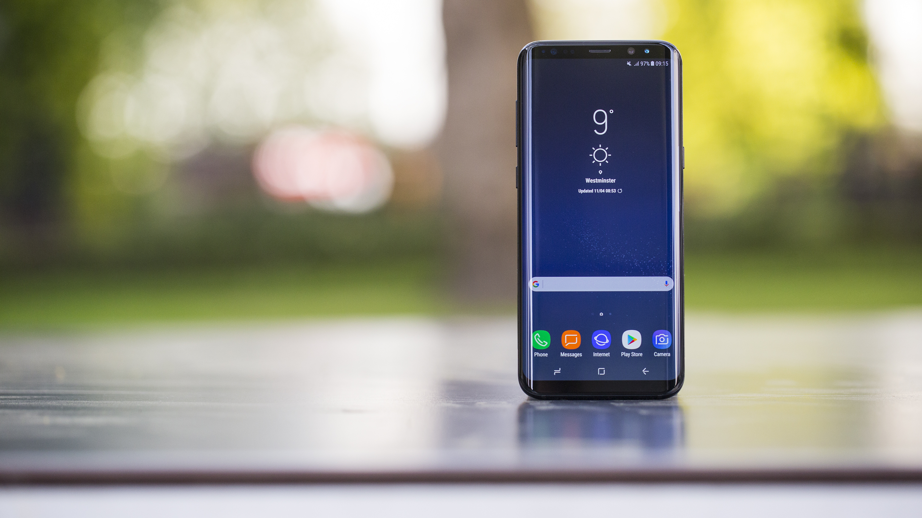
If you're after a bigger screen and slightly better battery life with the same gorgeous Infinity Display, super camera and power under the hood you'll want to opt for the Galaxy S8 Plus.
Assuming you can afford it. The Galaxy S8 is far from cheap, but its bigger brother is even more pricey - so you might want to check with your bank manager before opting for the Plus.
- Read our Samsung Galaxy S8 Plus review
iPhone X
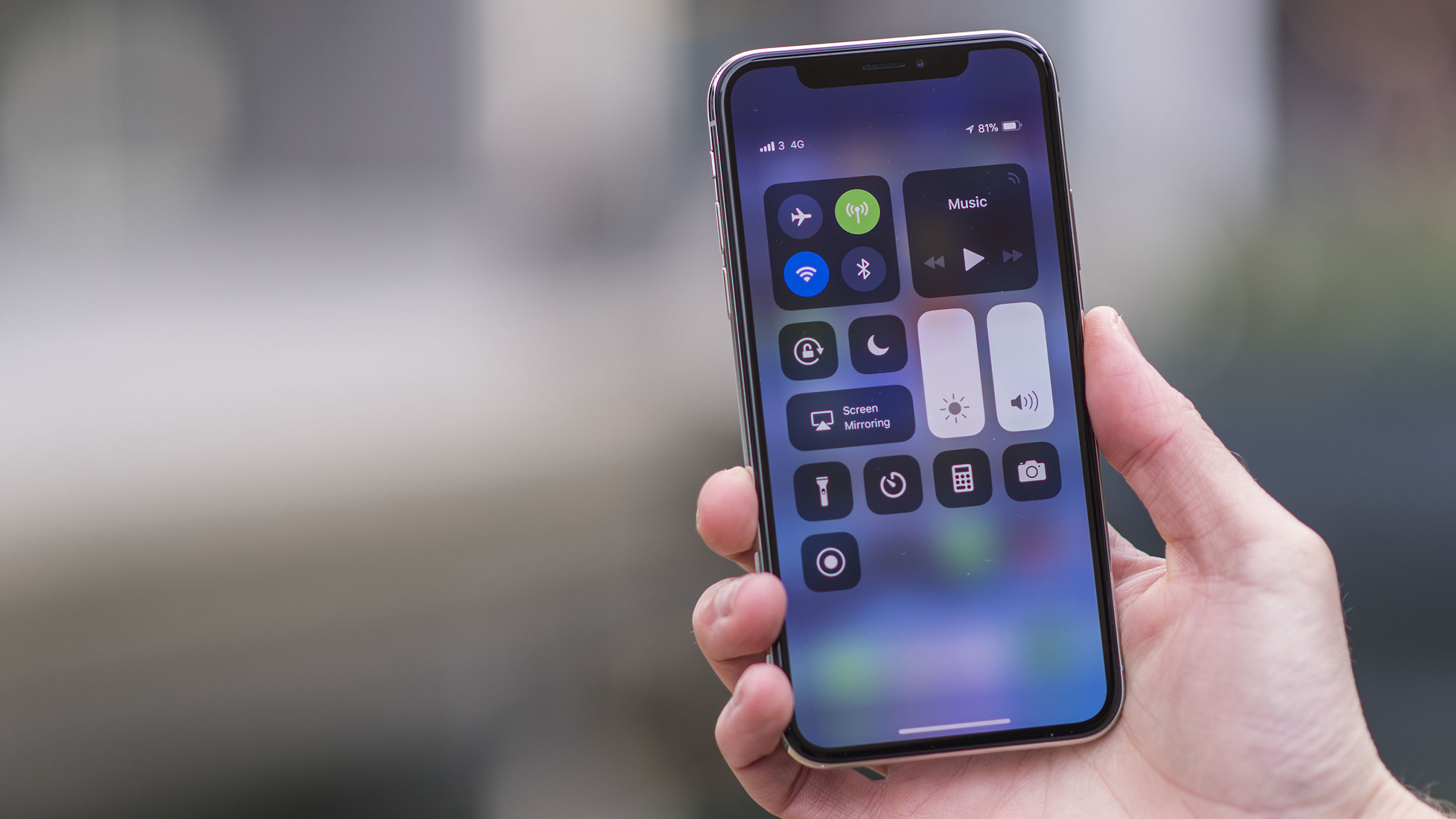
Here's another very expensive phone that may catch your eye when you're looking to upgrade your handset. The iPhone X is the best phone from Apple right now, but it comes with a very high price tag that means you may not want to grab it without some serious thought.
It does come with a bezeless screen and Face ID unlock method that uses your likeness to unlock your phone and we believe it beats Samsung's Iris scanner included on the Galaxy S8
- Read our full iPhone X review
iPhone 7 Plus
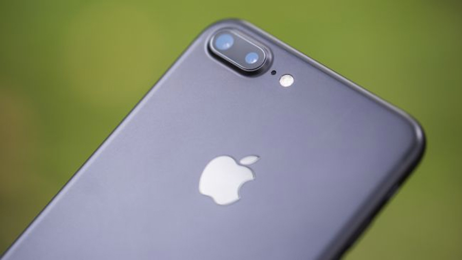
There aren't a lot of people who hop merrily between the iPhone and Samsung handsets, but if you're more agnostic then this is the phone to be checking out.
The iPhone 7 is a lot smaller, but the 7 Plus has a larger 5.5-inch screen and a more powerful camera, plus a higher-res screen.
What's amazing is how much larger this phone is than the Galaxy S8 despite having a smaller screen – this is where the difference in the screens is most apparent.
But with the iPhone 7 Plus you're still getting a large display with a great camera, and oodles of power – and the great thing about iPhones is that the quality under the finger doesn't diminish over time.
The battery life isn't as good as on the Galaxy S8, but it's not too far off.
- Read our full iPhone 7 Plus review
LG G6
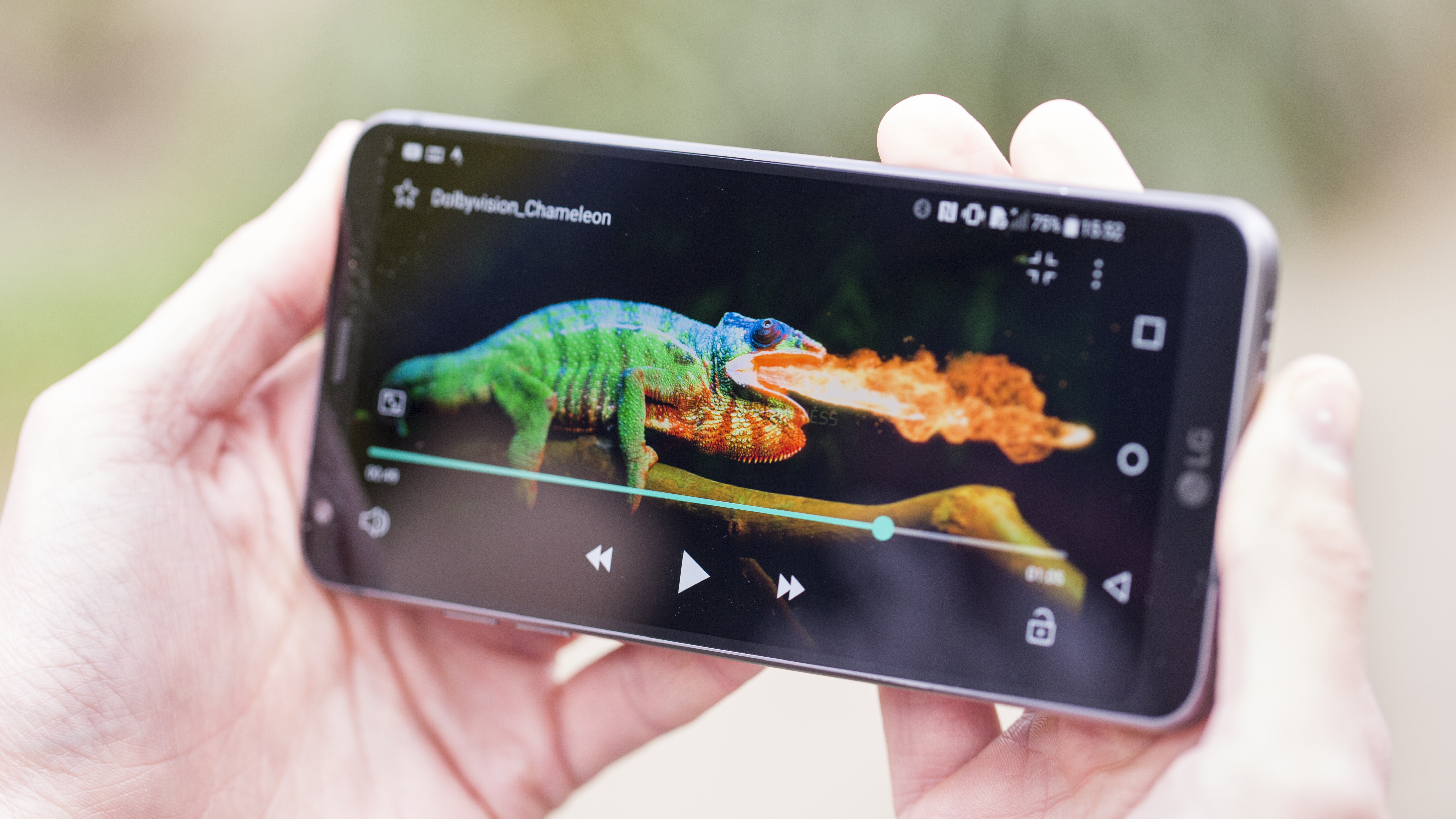
The G6 is a close competitor to the Galaxy S8 for a number of reasons, but largely due to the ethos of the two companies.
The fact they're both heavyweights in the South Korean market means the resulting handsets can be very similar, and here we've got two mainstream phones both using the wider 18:9 screen format.
That's where the similarities end though, as while both have this larger screen (and both are good quality) the S8 has the edge in nearly every other department.
Camera, design, power and battery life are all handled better on the Galaxy S8, and at launch the price is even fairly similar.
However, in many territories the LG drops in price quickly, so if you're happy to wait then it's worth seeing if the LG G6 comes down in cost some time soon, as you'll be able to get a powerful phone for a lot less cash.
- Read our full LG G6 review
Samsung Galaxy S8: what businesses need to know
If you're thinking about the Samsung Galaxy S8 for business, it offers some useful features as Samsung seeks to extend its influence beyond the consumer market.
The use of DeX, a tiny docking station, would probably be the most compelling feature for Galaxy S8 business users; the ability to convert your smartphone phone into an Android-based computer complete with all the functionalities you'd expect from a rich desktop-like experience is something that system administrators will appreciate.
Said administrators would feel more comfortable about using the Galaxy S8 as BYOD (bring your own device) for business as Samsung's own defense-grade security platform, Knox, makes device management - and keeping work and private life separate - far easier.
For additional security you can also use the biometric fingerprint scanner or iris recognition, and with dual SIM functionality, IP68-rating for ruggedisation and bundled Microsoft Office apps, there's a lot to enjoy on the Galaxy S8 for the business user.
- Techradar Pro is your go-to resource for ruggedised smartphones, business smartphones, business phone deals and more.
First reviewed: April 2017
0 comments:
Post a Comment