Garmin Vivomove HR review
The Garmin Vivomove HR is a hybrid watch that pushes the worlds of smart and “dumb” watches closer together than most.
It has a little semi-hidden screen on its front that lets you read notifications, check your exercise stats and even stress levels. Sure, it doesn’t have apps like a Vivoactive 3, but is far smarter than other hybrids that try to look like an analogue watch.
The main rival is the Nokia Steel HR, which looks a little more elegant but has fewer fitness and smart features.
Garmin Vivomove HR price and release date
You can buy the Garmin Vivomove HR now around the world after it was announced at IFA 2017. The RRP for the cheapest version is set at £169.99 or $199.99 (about AU$250), but you may be able to find it for a little bit less.
If you want the more expensive metal and leather version of the watch it will cost £249.99 or $299.99 (about AU$380). That one isn't available in all markets right now though. For example, in the UK you won't be able to buy that version until Q2 of 2018 so that's probably set for the end of June this year.
Design
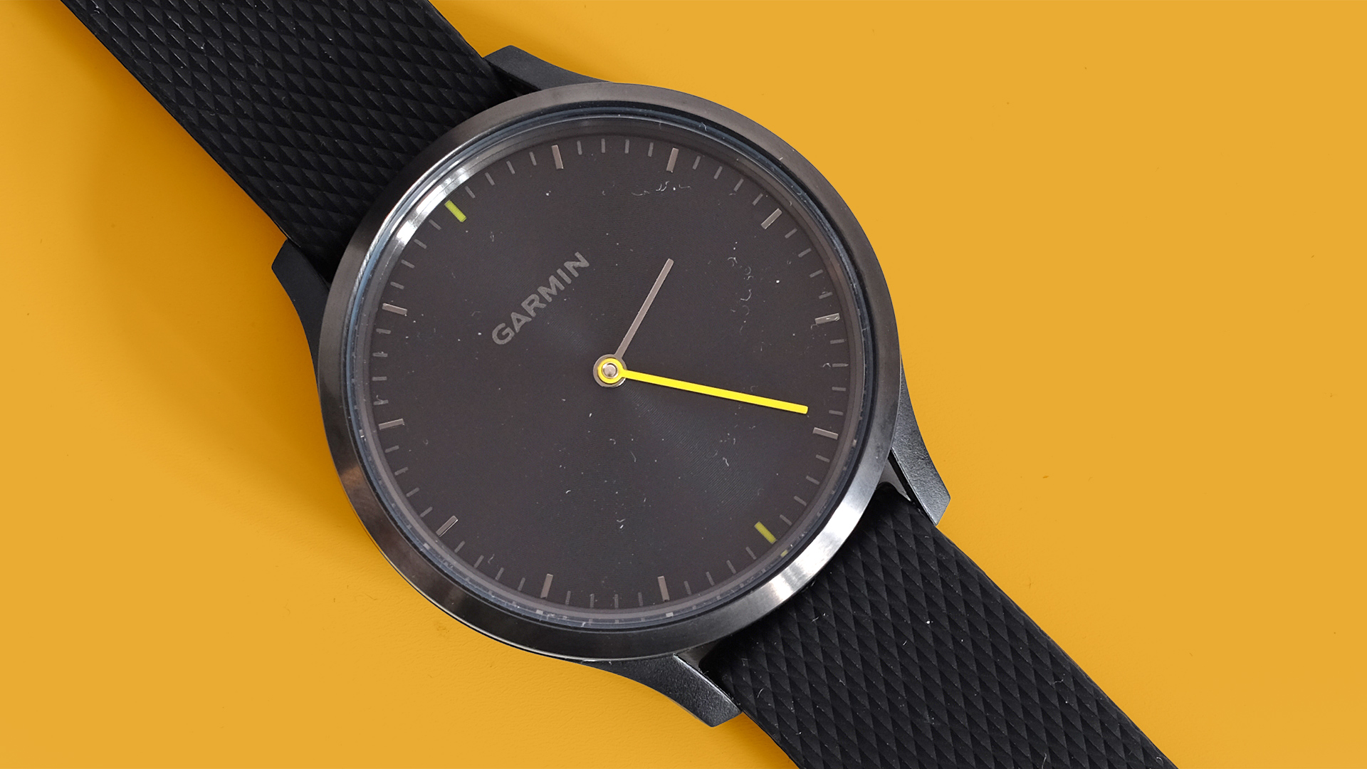
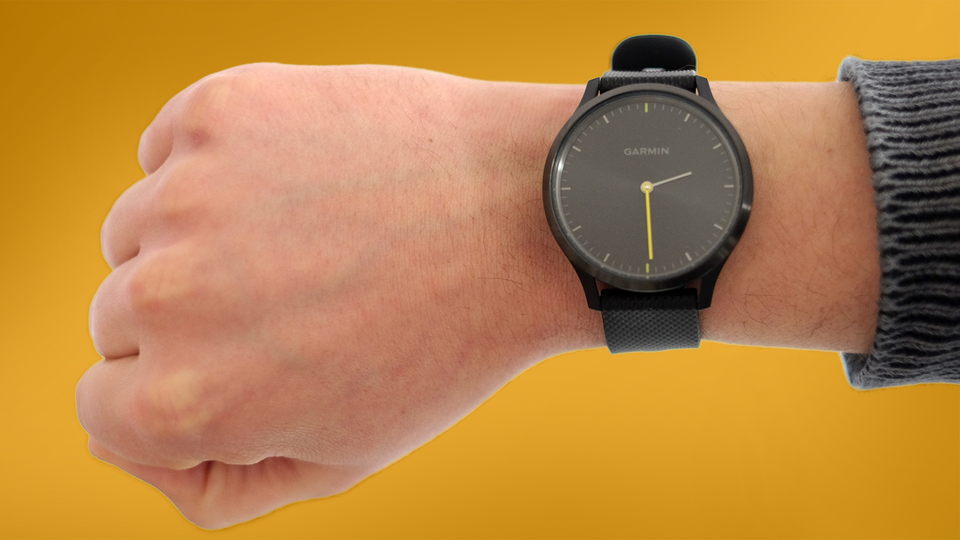
The Garmin Vivomove HR’s main design goal is to pass for an analogue watch. And it’d pull it off if it wasn’t for the Garmin name on the front. We all know Garmin doesn’t make plain old watches, right?
Its face is a flat circle with a reactive finish, sending beams from its centre when it catches the light. There are little “minute” pips around the face’s edge and normal-looking minutes and hours hands.
Until you look a little deeper there’s no obvious sign this is a smartwatch. Garmin makes a Premium version, but this is the more affordable standard Vivomove HR, which has a slightly sporty yellow minutes hand. You can also get it with a pink and gold face, and white strap.
Both of these standard models look smart, but not super-expensive. The edge of the glass covering is not perfectly finished. You can see it too much, where we should really see just the metal bezel and the face below.
However you can upgrade to the altogether classier-looking Vivomove HR Premium models. These get rid of the colorful parts to the face and switch a silicone strap for a leather one.
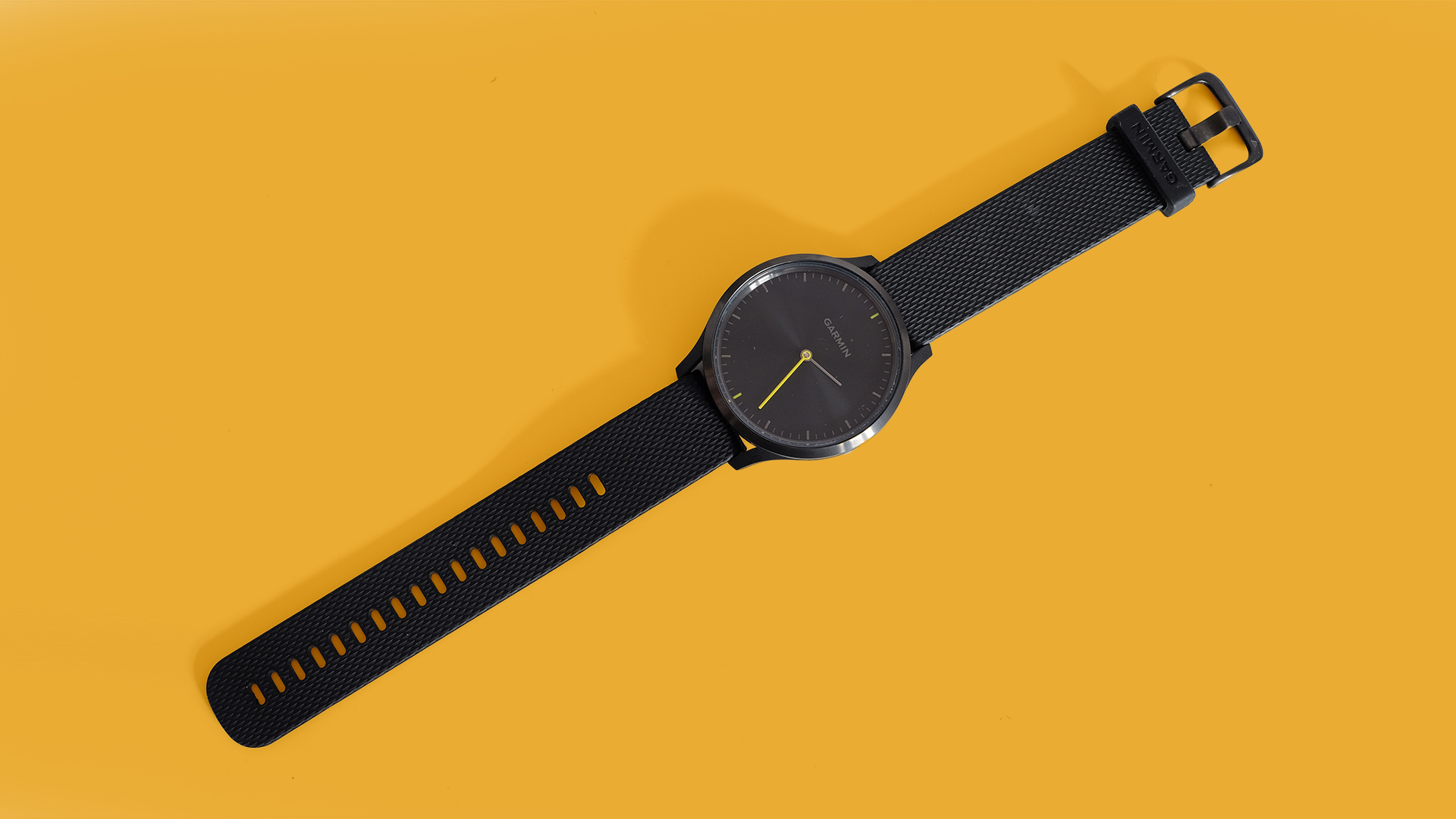
Their construction also appears to be slightly different. The standard Vivomove HR we have here has a steel surround, but the part below that forms the underside and the strap mount is hard plastic. Premium models use more metal.
It feels like the kind of hard plastic you might find on one of Garmin’s higher-end runner’s watches, not cheap and flimsy stuff. Not as classy or expensive-feeling as steel, though, is it?
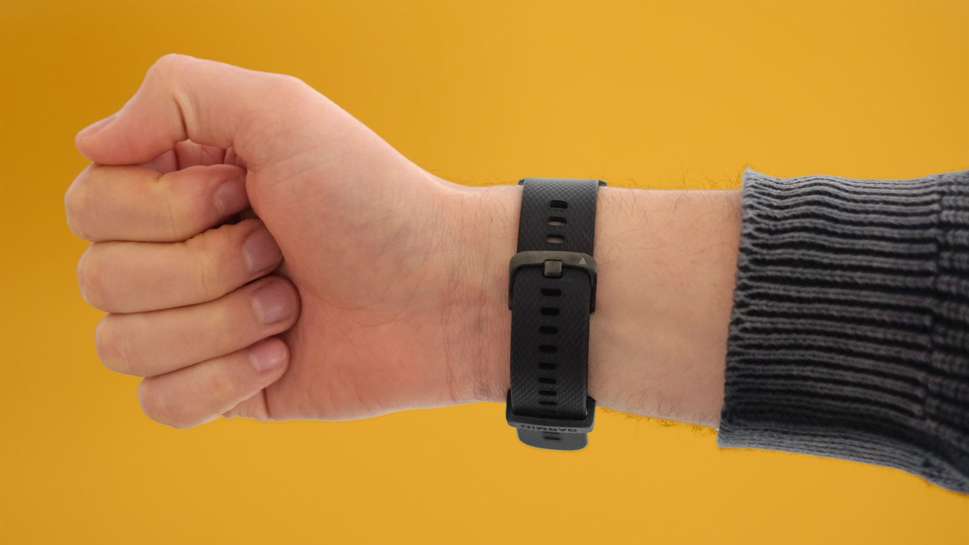
Plastic does help keep the weight down. This watch is very light, and the silicone strap has a good bit of give to it. You can do it up fairly tight without it feeling too tight. Wearing it 24/7 is viable.
Screen and features
So how is this a smartwatch? The Garmin Vivomove HR has an LED screen below its facia. It’s a two-line monochrome display that pops up when you double tap on the little display area or flick your wrist.
Look closely in a well-lit room at the right angle and you can perceive the screen’s border when the screen is not active. But you do need to try.
The Garmin Vivomove HR has no buttons, no crown. You interact with it through the touchscreen. This highlights one of the watch’s few real issues. Using the touchscreen can often feel fiddly.
On occasion a double tap doesn’t seem to register, particularly in the first few days as you get used to the Vivomove HR. It’s a strange issue as flicking through the actual pages of the watch’s micro interface is fast and responsive. Only the double tap gesture trips things up.
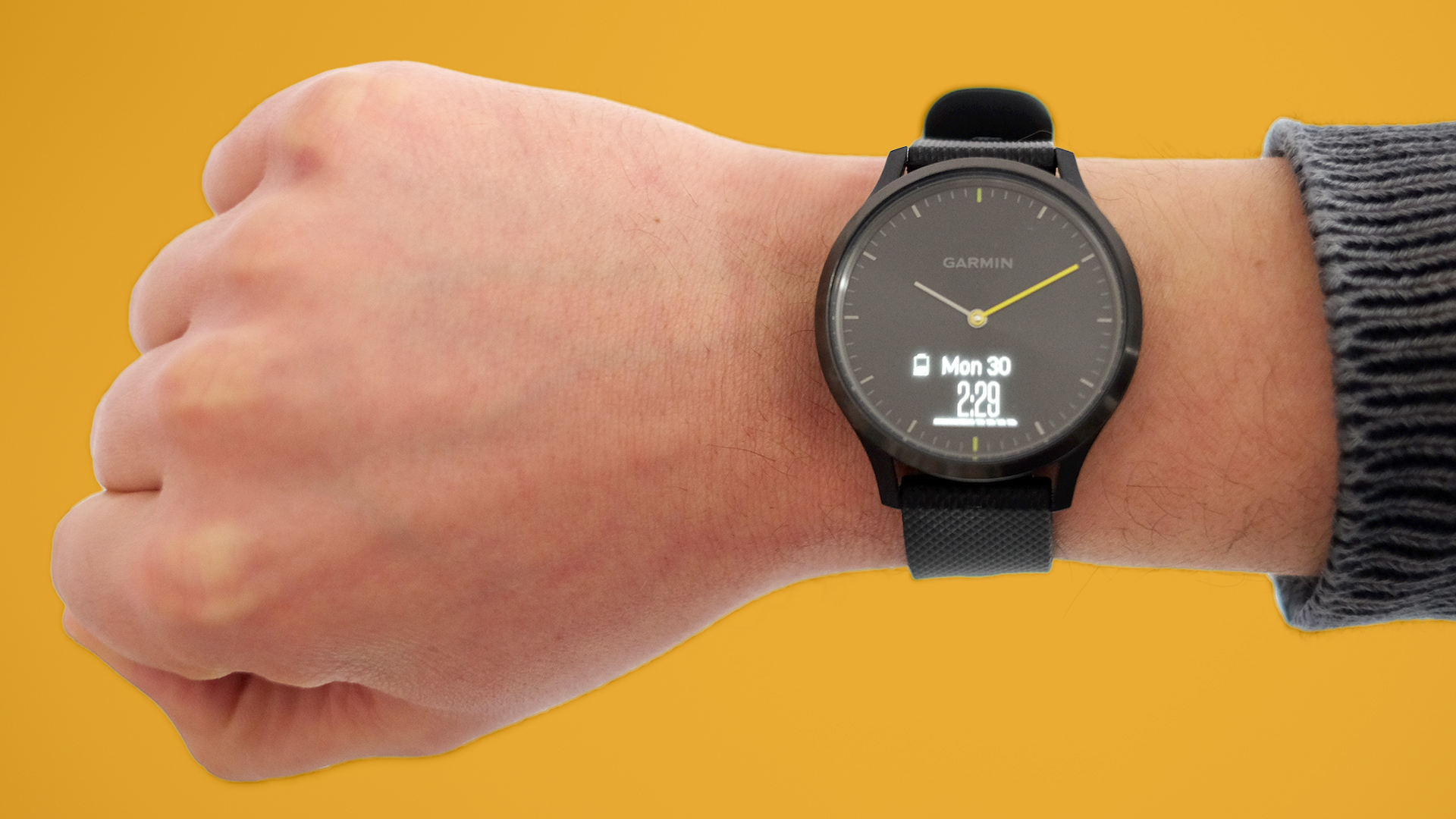
The screen is also not that clear outdoors. Inside it’s very bright and reasonably sharp. However, the more ambient light it has to deal with, the less bright and sharp it appears.
Some have all-but written off the Garmin Vivomove HR because of this. Reviewing it in London, though, where the sun is an infrequent visitor, we actually found it entirely usable while out on the street.
Let’s get a little deeper into what this screen part does.
Double tap on its window and you’ll see the home screen display. You choose what this shows: we picked the date and our step count. Flick right-to-left and the Vivomove HR scrolls through pages of exercise stats and smart features.
On the smarts side you get the weather, music controls and your notifications. You won’t want to pore over the day’s messages on a Vivomove HR. It can only fit a word or three on the screen. However, it’s surprisingly effective at relaying quick SMS and WhatsApp messages.
Checking quick notifications lets you avoid getting your phone out.
The Vivomove HR’s screen uses software very similar to Garmin’s small fitness bands. This watch is a bit like an analogue model with a Vivosmart 3 crammed in under the surface.
Fitness tracking
Don’t mistake the Vivomove HR for a full-on runner’s watch, though. Garmin makes plenty of those but this model does not have GPS.
When you record an exercise with the watch, you don’t get a map of your route. However, the Vivomove HR does record your distance, speed and scientific-looking graphs of your heart rate and pace.
Heart rate tracking is fairly accurate, with the usual wrist sensor caveat that during exercise it may take a couple of minutes to reach the peak of its powers.
There were no strangely high readings when just walking about, or any missing of dips during interval-style workouts, though. This is a sound HR tracker.
There’s a juxtaposition to the Vivomove, between the watch’s accessible style and Garmin’s more “hardcore” platform.
Garmin’s Connect app is made with high-end sport watches like the Fenix 5 in mind, so when you dig below the surface you’ll find stacks of data and numbers. Even if they are all recorded using a fairly basic combo of a step-counting accelerometer, stair-counting altimeter and the heart rate sensor.
That said, Garmin Connect is also far more inviting than it used to be. Its front page is a scroll of boxes that show you relevant stats about the day’s activity, and those of the last few days. It’s less jolly-looking than Fitbit, which takes a fluffier approach and lets you do things like take virtual tours around famous hiking routes based on your steps.
There is a weekly steps challenge here, though, which pits you against other Garmin users. You can also challenge friends, if they too use Garmin Connect. Of course, as Garmin’s other watches are made for running-obsessed types, and the Vivomove HR isn’t, you might find it hard to compete.
This does make a great watch for the gym, though. GPS isn’t any use on the treadmill anyway, and there’s a rep counter for those who bounce between cardio and weights.
Given indoor swimming can be tracked with an accelerometer and the Vivomove HR is water resistant to a swim-ready 5ATM, the lack of swim modes is perhaps disappointing. However, it does make sense. Judging by the way the screen stops working properly when wet, it appears to use capacitive touch technology. And that just doesn’t work underwater.
The last fitness-adjacent feature is stress monitoring. It looks at your heart rate level and variability relative to your resting rate, which the Vivomove HR, and spits out a score out of a hundred. Is it useful? We haven’t found it particularly so. But like the guided breathing exercises some wearables offer, it may help if you’re trying to take a more mindful approach to your day-to-day life.
Battery life

Use the Garmin Vivomove HR for a few runs, walks or short gym sessions and you can expect it to last for about four days between charges, in our experience. Garmin says it’ll last for five days in “smart” mode, which is likely what you’ll get if you lay off actively tracking fitness activities and fiddling about in the interface too much.
You can also switch the Vivomove HR to a watch-only mode, where the screen switches off and you’re left with just the analogue watch side of its personality. It lasts for two weeks like this, telling us it doesn’t have a large battery. Garmin hasn’t released its spec.
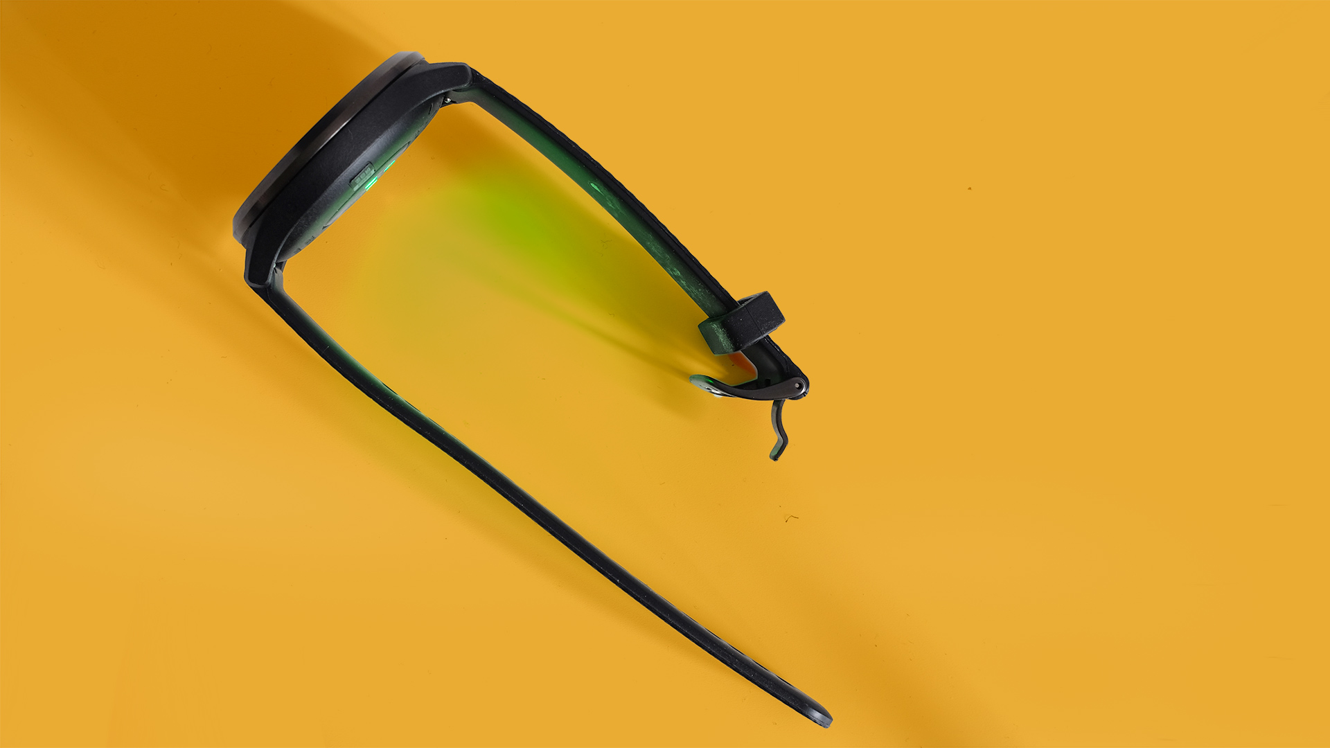
To recharge, you attach a cable with a jaw-like clip at one end. This clamps onto a set of contacts on the watch’s underside. It’s not a terribly stylish solution for a watch like this, but it works. You don’t have to worry about the Vivomove HR slipping off a wireless charge pad.
Verdict
Is the Garmin Vivomove HR a hit or a miss? It depends on the kind of activity you want to track and, strangely enough, where you live.
It doesn’t have GPS, the top feature of many Garmin watches, so is not a great fit for serious runners. And if you live in a part of the world where the sun always shines, you may find the screen just not clear enough outdoors.
However, it’s not too expensive, records the right stats for gym fans and looks good. The Vivomove HR is also the most natural or traditional looking watch that also has a display and a heart rate sensor.
0 comments:
Post a Comment